Transcripts
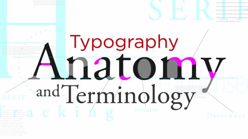
1. Class Content: Hello and welcome to my video on typography. In this class, we will begin with learning key typographic terms and their definitions. And we'll move on to eight, typographic rose to take both your typography and your design skills to the next level. Will finish the class with a project where you can put into practice all the bits you've learned throughout the video. So let's begin with defining topography. Topography is the art of making written language legible, readable and appealing. What's the difference between legible and readable? I can hear you ask, well, funnily enough, legibility is defined as being clear enough to read. Hear me up. For example, the type on the left is much more legible than the type on the right. And as for readable, where all of these paragraphs are legible, they're not reading in the intended way. By organizing the text, they are much more readable.
2. Tracking & Kerning: By tracking in kerning referred to spacing between characters. But there are some differences which I'll explain. Kerning is specifically the spacing between a pair of characters. For example, this a and V have no Kerning. And you can see that the top of the VA lines up with the base of the a. But when you add kerning, the top of the VA now overlaps the base of the a. And with kerning, you can either push characters further apart or bring them closer together. For example, here's wave without Kerning and then wave with kerning. There's quite a large difference. So Kerning has been added in-between the W and the a, the a and the v, and the V and the a, where kerning is adjusted and specifically suited to a pair of characters. Trucking is a constant distance set between all characters in a larger block of text. Often tracking is used instead of coning in larger blocks of text, as it would take too long to count each pair of characters individually. To remember the difference between Tracking and kerning iRemember token to characters are kind.
3. Leading: Reading is the amount of space from baseline to baseline. Lending is a vital part of topography because it directly affects the legibility of your work. For example, this paragraph IS bunched together and there's not much Ledi, but just adding a little bit of lending increases the legibility hugely. There's actually a simple formula I use every time for calculating my wedding. It's font size plus your font size divided by four. And it works like magic. You feel like a math genius washer there in it.
4. Rags: Brags of the uneven age of text. For example, in this first paragraph, the rag on the right-hand side is smooth and striped. In this second paragraph, however, the rag is Jaggard, it's zigzag is just horrible. Getting your rag right can increase your readability and the appeal of your text. And there's nothing worse as a designer, the noticing a bad rack. These are the three main ways that I correct my own. First of all, I use hyphens. I can split the word into, and that will quite often fix the issue. Secondly, I'll adjust my column it. And third of all, I may adjust my text, my copy to include a shorter or longer word may make the rag look more appealing.
5. Widows & Orphans: Yeah, I'm not kidding. Widows and orphans are typographic terms. A widow is a very short line on the last line of a paragraph. And an orphan is a very short line on the first line of a new column or page. Widows and orphans, or a problem in typography because they disrupt the readability of a piece of text. In this article, there are some examples of widows and orphans. The very short line at the end of the first paragraph is a widow. And the single word in the second column is an, often, it looks pretty lonely, doesn't it? These words look disjointed from the rest of their text is if there were an afterthought. Correcting your widows and orphans is the same process as correcting your rags. You can hyphenate a gestural column width where you can adjust your copy.
6. Left Align: This is a simple tip, but one of the most effective. It's no coincidence that every newspaper, book, and website article are written with left aligned text. In the Western world, we read top to bottom, left to right. It's become part of our nature when having finished reading a line to return to the left-hand side of the paragraph. With right-align text. We returned to the left-hand side of the paragraph and our eyes have a subconscious scramble to try and find the next word to carry on the reading. Ultimately, left align increases the readability of our topography. And that's key in getting our message across to the reader.
7. Font Weight: When using various font-weight, you should always try and skip await. For example, using light and bold as await pairing. You should do this because it adds contrast, which is a key element in design. It also introduces hierarchy. This is the way in which the viewer is lead around the page. For example, if there is text of the same size, the viewer is most likely to read bold text before. It's like counterpart. Skipping the weight also shows your intention. If you're using bold and regular or irregular and light, these are very similar and sometimes the reader can see them as a mistake. If you're skipping await and you're using bold and light text, then the difference is much more obvious. And it shows intention.
8. Font Size: When using different font sizes, we use round numbers when scaling up or down. For example, this text is 82, w that is 164. And w again, 328. Much like our font lights, we do this for Contrast hierarchy. And to show intention. Where these two font sizes are only slightly different, it could be interpreted by the reader as a mistake. By sticking to round numbers, having doubling, tripling or quadrupling, it makes the designs intentions clear.
9. Grids & Layout: When I first learned about the grid system and design grids in general, I was blown away. It was like a formula for a perfect layout every single time. Here's an example of what using grid can do for your design. Take this model of text just by putting the same content into a grid. It becomes organized. It's easy on the eye, and it certainly improves the readability. A similar concept to the grid system is to align your content to axis. For example. These are my title slides I created for these videos. You can see that multiple element line up in one way or another. This helps achieve an overall effect of all elements working together as part of the design. Once you've finished these videos, definitely, definitely go look at design grids because it's changed the way I think about layout and presenting my work.
10. One Font: This is another simple tip, but definitely not one to overlook. Use one font. One font increases readability of design, legibility and the consistency. Font pairings, mixing two funds that complement each other can be effective when done well. But to begin, I recommend mastering one font.
11. White Space: White space or negative space, is the part of a design that is left blank. It helps separate graphic elements. When used effectively, white-space can emphasize key aspects of your design. It can increase readability and the appeal. Whitespace is visual breathing room and it makes it easier for the viewer to digest information. Here's an example of whitespace used well.
12. Proximity: Proximity indicates relationship. This means that two elements that are close to each other are viewed as related. For example, here are two blocks of circles separated by color. And here's the same two blocks with a couple of circles switched around. We now group through the position or the proximity rather than the color. Another very common example of this is in the Google search results. We know which information relates to which website, because if effective, grouping.
13. Breaking the Rules: All these tips and tricks are good rules of thumb and who helped create legible, readable, and appealing topography. But you would have heard the saying rules are made to be broken, and this applies to Typography Two, by breaking a standard set of rows, you can help you design stand out from the rest. Here are some examples of rule-breaking in topography. Once you first start mastering the roads and breaking them, you will find yourself in a cycle between the two using rose, breaking rules, using rules, and so on and so on.
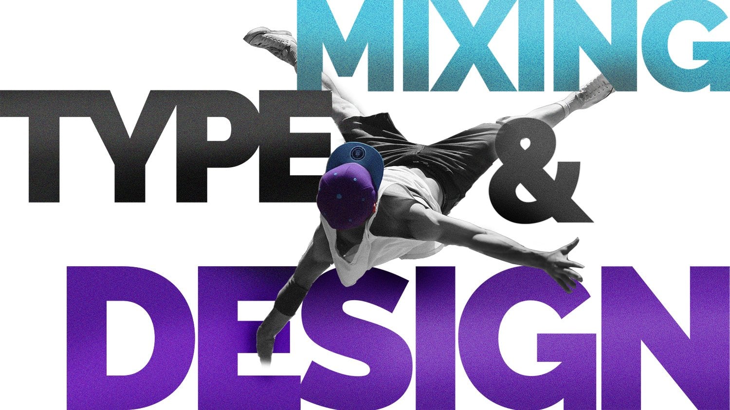
14. The Project: So before we dive right into the project, let's just recap what we've learned today. So we started by looking at tracking and kerning. We looked at letting rags, widows and orphans. Then we moved on to the golden rules of topography, like left align, font-weight, font size, grids and layouts. And we also looked at using one font, the use of whitespace, proximity, and eventually breaking the rules. And that's a lot in just under 15 minutes. Thank you for sticking with me, but we're not done yet. Next time for the project, in the project foes below, I've added some of my own photos and some sample text. Feel free to use these or some of your own. Have a go at creating some typographic layouts, mixing text and images, and be patient. It may take a couple of attempts to get something you're happy with. Here's something I put together when making this are considered all the elements that we've gone through today. And if you want to use this cool graphic I made for out of your comfort zone and feel free. You can download that with the images in sample text as well. Feel free to work from my own design or you can come up with something completely new. Just remember to watch Patrick classes if you get stuck or if something doesn't look right and definitely share your projects with me afterwards, I'd love to say what everyone came up with. Thank you for coming and I wish you all the best in your journey to become a topography grandmaster.
 Joe Blackham