Transcripts
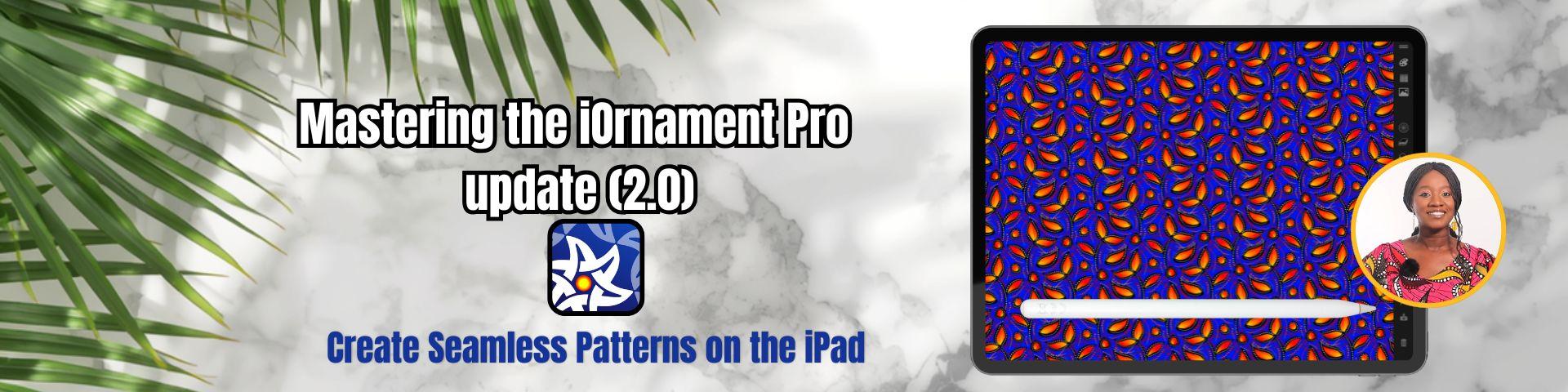
1. Introduction: Hi, everyone, and welcome to the Mastering Eye
Ornament Pro Update. I'm Priscilla, an Illustrator, surface pattern designer,
and Skillshare top teacher. Whether you're completely new to eye ornament or you've been
creating with it for a while, this class is designed to make the most recent version
of Eye Ornament Pro easy. In this course, we'll
explore some of the biggest updates to
version two point oh, and these features really expand what you can
create on the iPad. I can't wait to
show you how to use them creatively
in your workflow. If you've taken my
first iOrnament Pro class here on Skillshare, you'll know how this powerful
symmetry drawing tool can be used for
creating ornaments, mandalas, and seamless
repeat patterns on the iPad. In that class, we covered the core tools and
foundations in detail from symmetry groups and
drawing modes to building those repeat patterns and
exporting finished designs. This class is designed
a little differently. Think of it as a
companion update course for the latest version. Rather than re
teaching the basics, we'll focus specifically
on what's new so you can quickly integrate those
features into your workflow. With a 2.0 update, you'll notice right away that the interface and
menus have changed. So tools have moved and new
features have been added. The overall layout feels
cleaner and more streamlined. So we'll begin with a
quick guided tour to help you confidently navigate
the updated interface. Then we'll dive into
the new creative tools. The color palette menu has been updated and now integrates
more seamlessly with the built in brushes and the new gradient
tools allowing you to create beautiful
color transitions that add depth and
dimension to your designs. You'll also learn how to use the new custom pencil case to organize your favorite
brushes and tools, helping your workflow feel
faster and more intuitive. Then we'll experiment with the hundreds of new
built in stickers, which are perfect for adding
decorative elements to your designs or building
motifs for repeat patterns. One of the most
exciting additions is the ability to import
your own images, textures from apps like Procreate and
Affinity Designer and transform them into
symmetrical artwork inside Eye Ornament Pro, this opens up an
entirely new range of creative possibilities. To bring everything together, we'll finish the class
with two mini projects. In the first, you'll create a repeat pattern using the gradient tools,
and in the second, you'll create a pattern using imported watercolor
elements provided in the class resources, along with the new tools and features we've explored
during the class. The end of this course, you'll
feel confident navigating the updated interface and using the latest features
to create richer, more dynamic ornaments and seamless repeat
patterns on your iPad. So grab your Apple Pencil, open up iOrnament Pro, and let's get creating.
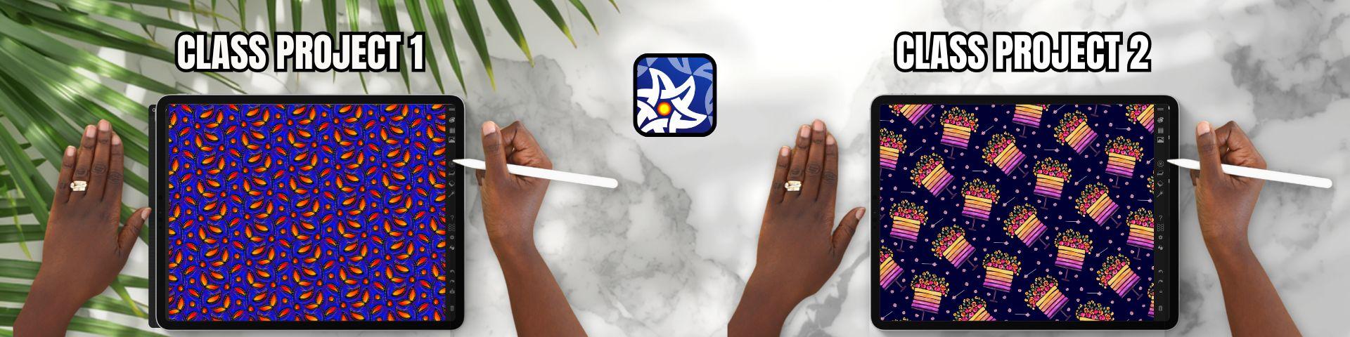
2. Class Project: Now let's talk about
your class project. For this class,
you'll be creating two seamless repeat
patterns using the new tools and features
in Eye Ornament Pro. In the first project,
you'll create a multi layered pattern using the new gradient
tools to add depth, color variation, and
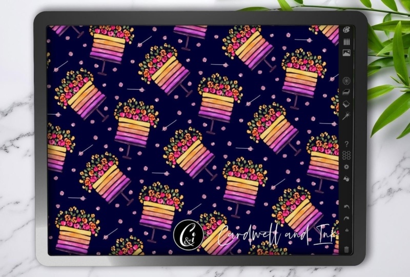
movement to your design. In the second project, you'll create a
repeat pattern using an imported watercolor
element from Procreate and to make
things super easy, I've already included
the watercolor PNG for you in the
class resources so you can follow along
and experiment with importing artwork directly
into Eye Ornament Pro. When you're ready, upload your finished patterns
to the project gallery, and you can share a screenshot or an exported image of
your repeat pattern. And if you want to
go a bit further, create a mockup showing
it applied to fabric, wallpaper, stationery,
or another product. These projects are a great way to practice the new workflow and start creating more dynamic
patterns on your iPad. I can't wait to see what you
create. Let's get started.
3. Overview of New Interface: In this lesson, we are
going to take a look at the interface of the
updated iOrnament Pro app. To begin, if you've already got the
original iOrnament Pro, all of the core tools
are still included. To update, simply head
to the app store, pay a small fee and
install the new version. On the App Store page, you'll also find
a few videos that demonstrate the capabilities
of this design tool, and they are well worth watching to see the different ways you might incorporate eye ornament into your
design workflow. I just want to mention that
all of the tools covered in the previous eye ornament
class are still here. They're embedded within
the new interface, although some of them have
slightly adjusted locations. Menus that were
previously visible on the main interface are now
nested inside other menus. There are also several new
tools which we'll take a deeper dive into
in upcoming lessons. For now, we'll focus on getting familiar with the
main icons and menus. So if you have your iPad
in landscape orientation, interface will look similar to what you see on screen here. So let's begin working from
the top to the bottom, going through each part
of the user interface. I'll briefly introduce
each menu here, and then we'll
explore the tools in a bit more detail
throughout the class. At the very top, you'll
see two lines which allow you to hide or display
the entire menu bar. Just beneath this is
the color palette icon, which opens the new and
improved pen and color menu. This is one of the main
menus that has changed. At the top, you'll see the
icons for pens and brushes, the icon for the fill tool, and the icon for
the eraser tool. Each of these has its
own contextual menu at the bottom that can be
adjusted for each setting. You'll also notice that there
is a new gradient menu, which has been added to
the color palette and opens a new menu on
the left hand side. Because the brush icon has been removed from
the main interface, the next menu you'll see on the interface is completely new. This is the pencil case menu, which contains categories
of pre designed pens, and this means you
no longer need to manually adjust
settings to create effects like gold or sparkles like you did in the
previous version of the app. You also have the brightness
and saturation sliders and size sliders for
the pens in this menu. As we move through
these first two menus, you'll notice that one
big improvement is that your color palette stays
anchored at the top, making it easier to switch
colors while you are working. Next where the layers
panel used to be, you'll now find the
sticker and Images menu. This menu also includes
your color palette at the top and allows you to work with a range of
premade stickers, whether geometric
flourishes or spirals. It also allows you to adjust the sticker colors and
use premade shapes. And at the left
above this section, you can also import your own images to add
to your patterns now. The next menu on the interface
is the symmetries menu, and here you can
adjust your pattern symmetries in real time. This menu also allows you
to turn on design modes, which allows you to overlap different orientations of symmetries on
top of each other. You can also create
local rosettes for symmetric mandalas
within your patterns. At the bottom, you
can also adjust your color symmetries
and either show these symmetries as part of the grid and also look
at the deformations. I go into all of these tools in depth in my original
eye ornament Pro class, so feel free to revisit that if you would like a
deeper explanation, as this menu is unchanged. Below this is the
layers menu where you can select one of
three working layers, and then you can also adjust the layer
properties such as color, effects, and different
blend modes. This menu hasn't
changed significantly, and I also cover this in a lot of detail
in my earlier class. Underneath the layers
menu is our background, which has its own
contextual options and sits below the
three drawing layers. Here you can adjust the colors, textures or import
background images to trace over and incorporate
into your patterns. This menu is pretty
much the same. One small update is
you can now place a background image
above your artwork, as well, which is
useful when tracing. Next on the interface
is the effects menu. Your effects menu allows
you to create gold, silver, and sparkle effects, and adjust embossing for
the three D pens. This menu is also unchanged, and I go into it in my first
eye ornament Pro class. The question mark is going
to open up the help center. When activated, it opens
an instructional panel on the left hand side of the screen that explains the
menus that you are using. At the top, you'll
find the contents, which gives you an overview of the menus that
I'm going through. Then you have the
mathematical foundations of the symmetries
used in the app, and to return to the interface, you just tap on the House icon. Then you have an
introduction to iOrnament, which takes you through
the onboarding process, and you can cancel
the onboarding to return to the main menu. Then there is an icon
that takes you to the iOrnament Instagram page for tips, tricks
and inspiration. And finally, a web page link with basic tutorials to show you how to
use the interface, which is a really
helpful resource. Beneath that on our interface
is the honeycomb icon, which activates the
tile guides so that you can see the borders of the repeating tile that
you're working on. Next are the global settings. And here you can activate the slider numbers for any
of the menus in the app. You can also customize the Apple Pencil
double tap options. Below that, you can adjust
the data settings for quick storage using
high resolution for your image and
16 bit colors. Underneath that are
the UI settings where you can adjust the
size of the interface. And at the very
bottom, you'll find an option to reset your pens if you have modified any default settings
on the interface. Below this is the shape tool. This only activates after you have created a
stroke in your pattern, and it allows you to then adjust the stroke after
you have created it. When activated, you can use the onscreen handles
to transform the strokes into
different shapes, and you can pick
which shapes you are activating by the
contextual menu at the top of the screen. You can use the circles on the screen to adjust
the positioning. And once you are happy, tapping on the screen outside of that area deactivates the
tool and sets your stroke. Underneath this on the interface are the undo and redo arrows, and below that is
your export menu. Here you can save and load patterns and save
the ornament you're working on to come back to
later or delete ornaments. The exit at the top right takes you back to
the main interface. Below that, in the export menu, you have three D and spirals, and you can also export an
image of your iPad screen or a seamless tile for surface pattern design and
print on demand sides. You can also export raw data. If you've used glitter effects, you can export an
animated video or a time lapse of your
design process. You can choose to export with a transparent background and select different
resolutions here as well. The lower resolution is
2048 by 2048 pixels, and high resolution is
4,096 by 4,096 pixels. Finally, the very last icon on the interface is your trash can, which clears your
current design. So that's the overview of
the updated interface. And in the next lesson, we'll take a deeper dive into the new and improved
pen and color menu.
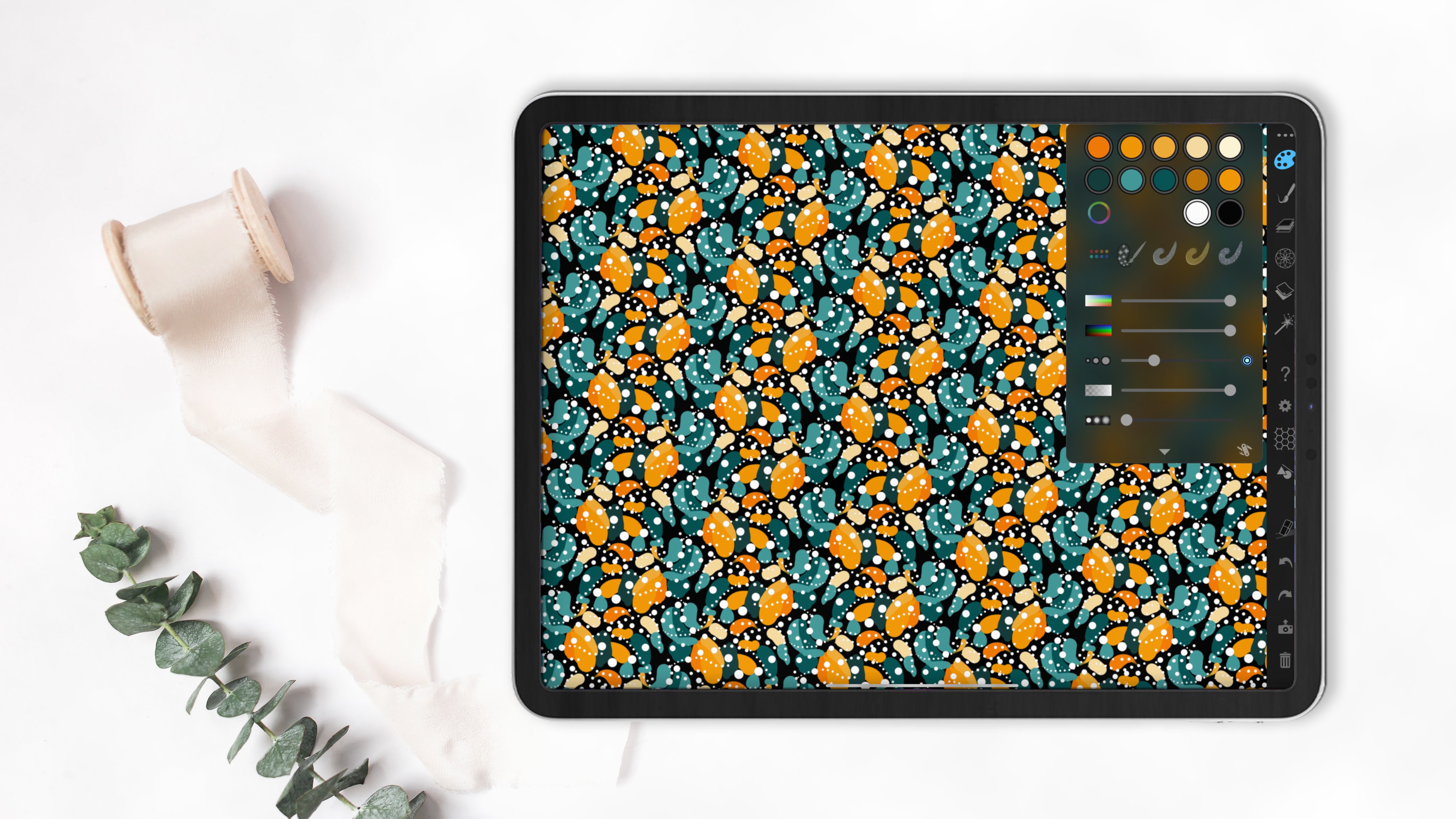
4. Pen, Colour & Gradient Menus: In this lesson, we
are going to look at the changes to the new
pen and color menu. Before we begin, I'm just going ahead to
the settings tab, and I'm going to turn on the
slider numbers at the top. This is so that when we see the sliders in
each of our menus, you can see the numerical value associated with the changes. So back up to the
pen and color menu, tapping will open the menu
on the left hand side, and you can now see
the slider numbers visible in this menu. Please note that some of the sliders start
automatically at 90%, so you may want to
increase the saturation and brightness before you begin. This is the default
setting to ensure that if you're using a white pen
on a white background, you can still see the stroke and not accidentally place strokes. Just remember to alter that if you're experiencing any
variations in color. Now, this menu has combined with what was previously
the brush menu and the color palette menu from the previous iteration
of eye ornament Pro. And it is also added an
amazing gradient tool. At the very top of this menu, you can see where our color
palettes are located, and you can tap on any color to begin drawing on
your canvas with it. There are arrows on the left and right hand side
of the palettes, which allow you
to scroll through the premade palettes in the app. Another way to do this is
to tap the palette icon, which allows you to scroll
through them manually. You also have the option
at the bottom to restore the original palettes
that came with the app if you
have made changes. You can then tap again
to close this menu. The effects of the
brushes are also still the same as in
my previous class, and tapping on the
different effects is going to activate
and deactivate them. Beneath that, we still have our brightness sliders and
our saturation sliders, our Alpha or transparency, and the slider for the
size of your stroke. Below that are the blur
settings at the bottom. All of these
settings can also be adjusted based on time, length, manually with a slider
that appears on the side or with the tilt of your Apple pencil and
lastly, pressure. If you've adjusted any
of these settings, there'll be a small circle on the right hand side that
appears to tell you they have been activated on that slider. It will be in blue. I'll just deactivate them now. Below this, you have your
pen settings that were included in the original brush
menu in eye ornament Pro. These allow you to
adjust the stroke and also the spacing of the
stroke using the slider, as well as the jitter
of the stroke. I'm just going to reset those. So you have the option of
normal strokes, brush strokes, which give you a range
of painterly brushes, and the option of a fountain pen with different nib
effects associated. This also allows you to tilt
the angle of the nib to your liking as you create those different
stroke patterns. Going to return to
a single stroke, and I'm also going
to clear the canvas and make a simple pattern
to show you the next menu, which is the film menu. Now this hasn't really changed, but it has become more precise. With a fill type, if
you select a color, you can either have
a block fill type or the second option is
an Ombre style gradient. Finally, you have a
fill that has black on the inside and the selected
color on the outside. As you continue to
tap several times, it will increase the layers of each type of fill in your piece. There are color dynamics
associated with this as well. You can increase the
threshold, the strength, the dynamics, the
offset or use Alpha. Then on the right hand side, you now have a tab
which gives you the option to mask a fill. This means that, for example, as I am currently in
the middle layer, which is highlighted
in the layers panel, I can have a mask in
the middle layer, but my target of my fill
will be at the bottom layer. I'm going to select
the gradient fill and choose a color and then
tap onto my pattern. Now on the right hand
side of the interface, if we head to our layers menu, I'm just going to reduce the visibility of the
middle layer using the slider so you can see its
effect on the bottom layer. This is a great addition, being able to fill really
easily on different layers. Alright, back to our
pen and color menu. I'm going to remove
the mask settings and return to the
plain fill type. This time, we're
going to go up to the top menu and select
the eraser tool. This works the same
as the brush tool. So you can pick any pen setting and start to erase with the pen. You can adjust the
nibs or adjust the spacing the same way that you would with
the brush menu, except this time you
will be erasing. Finally, the biggest change to this menu is the
introduction of gradients to I ornament Pro or automatic
gradients, I should say. I'm going to head back to the brush icon and
delete this pattern. Then I'm going to
select a color. See a rainbow icon that when pressed will open up
the gradient menu. To start with, you
have a whole range of automatic gradients
that will be created based on the color you select in the color palette. At the bottom of this menu on
the right, you have a cog, which allows you to adjust
the gradient by time, length, tilt of your Apple
pencil, or pressure. And I'll just turn that off. Next, in this list, you have the option of
using a free gradient. Here you can select three colors that you want in
the gradient using the color wheel or you can choose them from
a pre created grid. Next, you have the
gradient library where you can store gradients, along with the setting
that we looked at before as the last icon. If you would like to remove
the gradient on your stroke, you just need to press the
X next to the rainbow icon, and it will return back
to the block colors. So that's it for the new and
improved pen and color menu. Now, for our mini class project, I would like you to head
to the symmetries menu and select a symmetry you would
like to use for your pattern. Then open the gradient menu and select a gradient that
you would like to use. And with a few strokes, create a repeat pattern on
your canvas using that tool. You can use the preset gradients or create your own
free gradient, remembering that you can
always adjust the settings to control how long or short
that gradient appears. Once you're finished, head
down to the export menu that looks like the camera and export an image of your pattern. Not the tile and save the image and upload it for the first
part of your project. I cannot wait to see
what you create, and join me in the next
lesson when you're ready, and we will take a look at
the new pencil case menu.
5. Pencil Case Menu : In this lesson, we are going to look at the new
pencil case menu. This is the second
menu on the interface, and it is a new edition. Just like the pen
and color menu, this menu has the color
palette docked at the top, and this allows you to easily select colors for
the premade pens. You can access your
color palettes. You still have your brightness
saturation sliders, as well as the size sliders, and you can also
access your gradients. However, underneath this is
where things really change. You now have a
large selection of premade pens organized
into different categories. In the previous version
of I Animate Pro, you had to manually
adjust sliders in the pen and color menu to
create those different effects. Now, these pen styles are
already created for you. You can also still apply gradients to your strokes
when using these pens, which works across all of the different
styles and variations. The pen categories include
basic pens, gold pens, calligraphy pens, effect pens, sprays, different
styles of pencils. And then at the bottom, you have a category
called in this image. This category is especially
useful because it shows you the pens that were used
in the current pattern. This means that if you
come back to a pattern later after you have
saved and loaded it, you can easily see
which pens were used to be able to make
changes or refinements. And I think this is a
fantastic addition. Finally, you have a custom set, and here you can create your own pen settings
and add them to a custom collection that you
can save and reuse later. You have options to add a pen, add pen from an image, which adds all the pens
used in your current image, or clear your custom pens. At the very bottom, you
can save your custom pens into multiple sets up to 20, which you can return
to at any time. And this is another really useful and well
thought out update. Okay, so have a play, and that's it for the
pencil case menu. And join me in the next lesson
where we'll take a look at the new sticker
and Images menu.
6. Stickers and Images Menu: In this lesson, we
are going to look at the new sticker and images menu. To start off, I've
already cleared my gradients and returned all
my colors to block colors. There is a photo icon
on the right hand side, which is the icon
to open this menu. You'll notice that
your color palette is still docked to the top, which is a really
helpful addition for these first three menus. You also have your saturation, your brightness sliders here. At the bottom of this menu is where it gets
really interesting. We now have the ability to use premade stickers
or import images. I'm going to start
with the stickers. So the stickers tab is usually the default and
is already activated. So I'm just going to
select a bright color. And underneath this tab, you have your categories. I'm going to start with geometric stickers
and select a shape. You'll notice that
once selected, it immediately appears on my screen with a green
circle around it that has a yellow circle attached to it and four circles
around your shape. You can adjust the size of the shape using one of
those four red circles, but you can also adjust the
overlap of the shape with any other stickers
that are already on your canvas with
the yellow circle. At the bottom left hand side, you have two options
to use or dismiss. If you tap use, the shape will be placed
onto your canvas. But just remember that
you can always adjust the symmetries of your pattern even after the sticker
has been placed. Briefly head to the
symmetries menu, and if I tamp on a
different symmetry, you'll see that the program automatically adjusts the
placement of your shape. Okay, let's head back. I'm going to scroll across to flourishes and select
a flourish next. I'm going to tap to
import it on my screen. And then you'll
notice at the bottom, there is an option for
sticker variations, and you'll see different
options that you can manipulate the shape into before you set it
on your screen. I'll just tap sticker variations again to remove that menu. Then the other
option at the bottom is for the orientation
of the sticker. And with the flourish,
it is an organic shape, and so you can see how
as you tap that icon, it adjusts the orientation. Once you're happy,
you can tap to use. Next, in your menu, you have spirals that behave
similarly to flourishes. Then you have a
range of leaf types. After that, you have
a bouquet menu, which offers more
complex grouped designs, followed by flowers, and then small objects like butterflies that you can
incorporate into your pattern. Finally, after that, you
have miscellaneous elements. Okay, I'm going to head back to the geometric shapes and
just place a circle. I'm going to reduce the size and position
it within my design. Because I'm using a block color, I can then go to
the color tab and adjust the brightness
or the color mix. You can also adjust the
hue of the shape after placing it. I'll
just reset that. Next, I'll look at
the shape settings. In this section, you can place the shape in a transparent mode, which allows you to see through
it to the shapes beneath. You can also adjust
the border size and the border color and even
add a subtle bevel effect. I'm going to briefly go to the background and switch
to a white background so that you can see the edges of our stickers so far and what
that border looks like. Okay, so back in
the stickers menu, I'll show you another feature. I'll insert another shape. We're going to
choose a new color. And then I'm going
to head back to our gradient menu and
select a gradient. And I love how it applies a premade gradient
to the sticker, which is a really
powerful feature, allowing you to combine those shapes with
gradient effects. Now, the last feature is one
that I find really exciting. We can now import images. So I'm going to
clear my screen and select the import option which
opens your photo gallery. You can now import a transparent PNG
file that's been created in another program. I've included a
sample watercolor PNG that I have
created in Procreate. Now there is a class
I have on Skillshare if you want to know how
that has been made. But once the image
is on the canvas, you can head to the settings. I'm going to reduce the
border size to zero, adjust the placement to
my liking and taboos. You'll also notice
in the stickers menu that this image is now saved in the little square
on the right hand side, so that if you want to use
the same image several times, you don't need to go back and re import it from your gallery. You can see how a
watercolor image can be incorporated or any image into a seamless pattern
using the preset symmetry, and this opens up a lot of
creative possibilities. Now, this new update in eye ornament also allows
you to import images directly from
your camera roll onto your eye ornament
Canvas, as well. So I'm going to open
up my camera roll where I have some PNG images, I say from Procreate and
place the two windows side by side by reducing them using
the menu at the top left. You can press and hold the
image in your camera roll, and it will activate
the background remover. And then drag the image
across to Eye Ornament Pro, and the image will
immediately be imported into eye ornament
in a seamless repeat, and you can begin to adjust the image and use
it straight away. I believe this can be done
with normal images if you do not have a
transparent background already built in as a PNG. I just love the clean
outlines of a PNG image. Your second class project, I would like you to
create a pattern using either a sticker or an imported image with a
transparent background. You can use the one I provided. And once you are finished, you can head to the export
menu and export your image and upload an image of your pattern to the
class project gallery. When exporting, keep
in mind that what you see on the screen is
what will be exported. You can also take a screenshot and upload it
that way if you prefer. You don't need to worry about
creating a perfect repeat, and if you are using the
watercolor PNG provided, please use it for learning
and not for commercial use. Last tip if you want
to save your pattern, you can head to the
save and load menu in the export options
and save your ornament, and you can always return and open it up and
continue editing it later. In the export menu, you also
have the option to export the seamless tile
if you are creating patterns for platforms
like Spoonflower, allowing you to upload that tile directly for print on demand
products in perfect repeats. Okay, that's it for this lesson. Join me in the next lesson
for Final Thoughts.
7. Final Thoughts: Congratulations on
finishing the class, and thank you so much for
creating alongside me. I hope this class has helped
you to feel more confident navigating the updated
enamentP interface and inspired you to
experiment with some of the exciting new tools and creative
possibilities in the app. We explored the gradients, importing artwork and creating layered seamless
repeat patterns, and I hope you can
already see how these new textures can expand your creative
process on the iPad. Don't forget to upload your class project to
the project gallery. I absolutely love seeing
the different ways that students interpret the techniques
and make it their own. If you enjoyed the class, I'd really appreciate it
if you left a review. It helps support
my classes here on Skillshare and helps other
students discover them too. If you'd like to continue
learning with me, please be sure to check out my other classes
here on Procreate, surface pattern design,
watercolor Illustration, and digital art on the iPad. Thank you again for joining
me and Happy creating.
 CardwellandInk Design, B.Sc, B.A, M.Teach