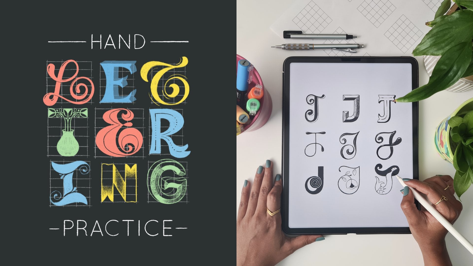
Transcripts
1. Introduction: Have you ever spent hours on a lettering piece only
to realize it feels off? Do your compositions often
feel cluttered or unpolished? Are you constantly
looking for ways to make your layouts look balanced
and professional? Well, look no further.
I've good news. I'm Venetta Merman, an
independent lettering artist, Illustrator, and top
teacher here on Skillshare. And I come bearing the
solution to your problems. Welcome to my class, Mastering
Lettering Composition. In this immersive class, we'll dive deep into the art of balance in lettering
compositions. As someone who creates
lettering for a living, I've had my fair share of frustrating moments with compositions that
just did't work. Guess what? It gets a lot easier when you break it down
to the essentials. I've developed a framework
that really works for me, and I'm excited to
share it with you. In this class, I spill with six key elements
that I personally use to create
lettering layouts that are well balanced and
pleasing to the eye. Together, we'll
explore techniques for achieving visual
symmetry and balance, and you'll see
real life examples and practical demonstrations. You'll even get to watch my
entire lettering process from concept to final piece and see these
techniques in action. You'll also get a
printable checklist of my favorite balancing
tips and lots of incredibly useful pro
tips along the way. This class is perfect for intermediate lettering
artists looking to refine their skills, and advanced artists wanting to push their creativity
even further. I'll be demonstrating
my process on my iPad using the Ptate app, but you can use any
medium you love, whether it's digital
or traditional. So are you ready to create lettering compositions
that truly stand out? Join me in this class, and let's pay some
magic together. H
2. Class Overview: Welcome to the class. I'm
thrilled you're here and ready to dive into the world of lettering
compositions with me. Before we jump in,
let me give you a quick overview of what
to expect in this class. Trust me, it's going to be
a revelational journey. This class is divided
into two main sections. First, I'll introduce you to my custom framework for creating balanced
lettering compositions. And then I'll give you a demo of my entire lettering process. In the first section,
we'll explore my tried and tested framework, which includes six key elements for creating balanced
lettering layouts. I'll share lots of examples
from my own body of work and we'll break them
down together to see how I use these elements. By the end, you'll
be ready to apply these techniques to your
own lettering projects. The second section is where I
take you behind the scenes. You'll get to watch me create a brand new lettering piece
from start to finish. It'll be like you're right
here with me in my studio. You'll see all the decisions
I make to achieve balance in my compositions and understand how small details can
make a big difference. This part is a bit longer
because I want to show you as much of my process as
I can without boring you, but I promise it's packed
with valuable insights. While brainstorming this class, I reached out to my
community of students, AAU, to find out what your biggest tugles
with composition are. There were a lot of overlaps in the responses about coming
up with layout ideas, creating variety, spacing, dealing with the
latter, and so on. I've tried to help
you get better at tackling all of these
struggles through this class, but the most recurring
frustration I heard from you was not knowing how
to handle longer codes. So I want to just
say that I hear you, and I've indeed picked a long te for my
demo for this class, instead of going for an
easier, shorter quote. It would definitely cut
down on the class duration and my production time if
I picked a shorter code, but I really wanted
this class to deliver solutions to
your very real problems. So here we are. Now, let's
talk about your class project. You'll create your
own lettering piece using your favorite medium, and you'll use the framework we cover in class to
guide your design. I'll be demonstrating on
my iPad using procreate. And while this isn't a full fledged procreate
lettering class, you'll pick up plenty of
procreate tips along the way. But don't worry, the concepts I teach in this
class are universal, so you can use any
medium you prefer, whether it's digital or analog. I've also included a handy
printable checklist that covers all the main points
from my balancing framework. You can download it from
the resource section. Before we dive into the first
section of the framework, I have a kick off
exercise for you. I'll tell you all about
it in the next lesson. Let's get started.
3. Kickoff Exercise: Before we dive into
the main content, I have a little kick
off exercise for you. This will give you a
sense of where you currently are with your
ledging composition skills. Here's what I'd like you to do. Pick a coat that resonates with you and create a
composition sketch for it. This doesn't need to be colored, but feel free to add
color if you like. The idea is to use this
catch as a baseline, so you can compare it with your final project after
completing the class. This exercise will help you appreciate later on in the class how conscious
decisions can impact your lettering compositions
in both small and big ways. If you're short on time, you can even use an existing
lettering piece you've created recently and use that quote for the
final project as well. As a heads up, the cote
I'll be lettering in my demo for this class is a
fun one by Audrey Hepburn. T plant a garden is to
believe in tomorrow. Well, I think it's best
for you to create with a different code to get the
most out of this class. You're also welcome to
use the same code as me for both this kickoff exercise
and the final project. If you feel comfortable, share your kickoff sketch with
us in the project gallery. It's a great way to track your
progress and get feedback. Otherwise, you're welcome to
keep it for self evaluation. So grab your favorite
code and get sketching. In the next lesson,
I'll talk about the role of balance
in lettering and introduce you to my
custom framework for creating balance
lettering composition.
4. Balance in Lettering: So, balance, just like pretty
much everything in life, balance was key with
lettering composition too. In fact, balance is one of the key concepts in
any design field, and lettering is
just no different. Balance is important in a lettering composition
so that it looks visually pleasing
and comfortably directs the viewer's
eye across the piece. There are several approaches
to creating balance, but in this class, I will be focusing on using
visual symmetry. Now, when I say symmetry, it does not mean
that everything in your compositions needs to be mirror images of each other. But there are ways
in which we can create an illusion of symmetry, even when everything
is not symmetric. Our aim is not true symmetry, but a visual symmetry that looks balanced and
pleasing to the eye. So let me tell you about the six things
that I consider to create balanced
lettering compositions that are visually symmetric. Here we go. Words. Containers flourishes
illustration, fillers and color. I'll talk to you more about
each of these very soon and show you lots of examples
from my own body of work. But in most of these examples, you'll notice it's not just
one of these that I'm using. I use a combination
of these to make my lettering
compositions balanced and sometimes even all six. So you'll see me use the same lettering piece
as an example for more than one of these because that's just the reality
of how it works. In the next lesson,
we're going to jump in and start with
the first point in my framework words y.
5. Words: So since lettering is first
and foremost about words, let's jump right in
and see what you can do with your words
to achieve balance. When it comes to words, they're mostly not symmetric
by themselves. Unless you're dealing
with a Palin room, which is not all
that common, mostly, you have to work
with words that are asymmetric because they have
different letters in them, they come in different
lengths and can be all over the place, right? But what we can do is play
around with their sizes, angles, and styles to create
something visually balanced. For example, in this piece, notice what I've
done with the words. Sometimes I wet my plants. All the words are of
different lengths, but when put together
like this, it works. By varying their sizes, I've got them to all sit
within the same length. Sometimes I wet and plants. I've used the variation in their sizing to help me to
get them to look balanced. I've also made the decision to combine and wet
into a single line. Because if I left on its own, I'd have to either
make that really huge or find some other way to
fill up the space around it. One of the reasons
why we vary the sizes of words and lettering
is for hierarchy. But that's not the only reason. It's also a great way
to achieve balance. Also, I've tucked in the word M right between wet and plants. I'm able to do this because I've chosen a script style for plants versus the cap style that I'm using for the
rest of the words. And so I have this neat
little space between the tall L and t to
fit in the word mine. So not only does it
highlight plants, which is the main
theme of this piece, but it helps me get the words to fit snugly with each other. I've done something
very similar here. I've varied the
sizes of my words to get them to all
be a similar length. Another example here. And in this case,
I've not gotten all the lengths match exactly, but I've used size
and style variations to get everything to
fit in with each other. Similarly here,
I've gotten dog to fit within the S and L of spoil, and I've shrunk the word to fit inside the little gap
between spoil and dog. Here's another example
where I've used size, style, and angles of my words
to create a symmetric look. Similarly here, I'm
wearing the angles, sizes, and styles of my words to create a nice
balanced composition. When I get codes like these, where the words repeat like
changes if nothing changes. I love doing these
because I get to really bring out the
symmetry aspect with these. If you notice, I haven't used the same style for when
the same word repeats. I've alternated it to
keep things interesting. The nothing on the
left side is similar to changes on the right
side and vice versa. By doing this, I'm able to
create that visual balance. Whereas in this piece, I've done the opposite. This is also a te where
the same words repeat. But in this case, I've
kept both my ones in the same style and my
days in the same style. Because with this quote, that's how I get it to look symmetric. If I did the top one and the bottom day in
the same style, then the left side
of my piece would look a lot heavier
than the right side. So it all in the end
depends on the te itself. We have to do what
we can to make the te that we have at
hand work visually. Using style to balance
your words can come in handy even when you're
working with a single word. Like, in this case, since
my upper case C is tall, I decided to end it with a big curvy like this instead of going
with a smaller case. So the whole thing looks
more balanced this way. So as you can see, there's a lot you can do with the
word themselves. In the next lesson, we'll
take a look at containers.
6. Containers: The next idea I have
for you is containers. This is also closely related
to words because these are essentially shapes to contain your words or frame
your words around. For example, I have two
sets of banners here, the orange ones to create some horizontal symmetry and the yellow ones for
vertical symmetry. The words themselves,
in this case, IM and system are
not the same length, so it's not easy to get
them to look balanced. Similarly, four and
M. So introducing these banner shapes to contain these words helps me achieve
a beautiful visual balance. Similarly here, two and dim are words of
different lengths. But putting them
inside the circles of her glasses gets them
to look more balanced. Again, here, I've used
this pink banner to contain my smaller
words, all and that. Firstly, they're of
two different lengths, and secondly, they get
lost in the composition. So the banner solves
both problems in one go. This is a piece commissioned by Skillshare, and here again, I've used shapes to contain
the words can and change, and they help get
the message across, but also brings more balance
to the overall composition. Here, the cat's tail serves
as a container for the word persistent and helps to establish that whole
wavy shape of the word. Again, with this one, that
bulb shape is the focal point and all of the lettering is drawn to fit into
that circular shape, which automatically
balances it out. With this one, I have this whole rotational symmetry
thing going on, and putting that twisted banner right in the middle
helps to anchor everything in in a
very balanced way and accentuate that twist
in the whole piece. In this case, I've used a
little circle to contain my there instead of just leaving
the word there by itself. It really helps to anchor
the whole piece right at the center of the bigger
circular floral illustrations. I normally do this
with smaller words, not so much with
the bigger ones. It really helps to keep these
small words from getting lost while also keeping everything look more
visually pleasing. Here again, I've
snuck my ampsand within this drippy
semicircle in the middle. It helps me emphasize that circular thing I've going
on with the entire piece. And here, the circle
in the middle that contains my I really helps to
anchor the whole thing in. Another thing I'd like
to do is just split my entire composition into
large blocks of space. So I've put my words
in boxes here, and these really help to get your lettering pieces
look fun and balanced. If you look at this
without the boxes, it's really just all over the
place and makes no sense. The boxes just help bring
everything together. In this piece too,
I've used a grid of boxes to contain each letter, and I believe that really
ties everything in. You can also draw containers that don't contain the words. They're more of a shape
to draw the words around. Like in this case, I love doing these arch compositions
where the illustration takes center stage and the
shape just contains the illustration and directs
how the words are placed. Here's another one like that. And yet another one. And here, I've also put the word four in this bursting shape, which helps it to not get lost, and also is a nod to the whole fighting energy that I want this
piece to convey. So that's containers for you. Lots of ways you can
use them to elevate a lettering compositions and
create a sense of balance. Next, let's look at flourishes.
7. Flourishes: Another really fun way
to get your lettering to look balanced is
using flourishes. In case you're new to
the term flourish, it refers to these
decorative strokes or swashes that extend
from your letters. They not only make your letters look more decorative and fancy, but also helps to balance
your composition. Like here, the flourishes really enhance the
ribbon lettering and help to balance out the top and bottom and
the left and right. And in this case, the
flourishing really helps to mold our letters to fit
into the circular shape, which in effect gives us
a very balanced layout. Here we have not
just the symmetry of the words in our favor, but see how the flourishes on the Ds and the ys
impact the composition. In this case, that standalone
swash on the top is there for the sole purpose of balancing out the
fancy one under the p, and because of
that, I was able to tile this up into a
fun pattern like this. So if you want to turn
your words into patterns, getting the lettering to
be balanced helps so much. Here are some more
examples where flourishes really play a strong part in
balancing the composition. So flourishes are
fantastic elements to balance out the positive
and negative spaces in your lettering
compositions and to really take the impacts of your
lettering to a whole new level. Because they fancy in the next lesson we'll
jump into our next.
8. Illustration: Now, let's look at what
we can do outside of the words themselves,
sting with Illustration. I love adding
illustrative elements to my lettering pieces. Sometimes my illustrations are a reflection of the
words in some way, and at other times, they're not. But every single time, they are amazing additions to get my compositions
to look balanced. Take this one, for example. There are no words at all
in the bottom half of this, but I've managed to still make
it look like a circle and look balanced overall with the help of the
wildflower illustration. Here's another one. Here's what this piece would look like
without any illustration. See how much visual interest, context, and balance the
illustration brings in. Another one, with
illustration and without. So much more fun and polished
with illustration, right? This one, without the
floral illustrations, would look like this. While it looks okay, there is so much unbalanced empty
space just staring at me, whereas with the illustration, now it looks so much more
pleasing to the eye. In many of these,
you'll notice that I'm heavily relying on symmetry, but it's not perfectly
symmetric either. I like to use symmetry
but with a twist. All the flowers here are drawn with the symmetry
tools in procreate, except this one in the bottom. Since the word color
is at an angle here, there was more
space to fill up on the right side than on the left. In these situations, I like
to turn off symmetry and add something in there
that is a little bit heavier on the right
than on the left. Balancing is about
looking for these things, looking at what needs to be
done on a case to case basis. Here's another one with
symmetrically placed flowers. And here's another one, where symmetry with a
touch of asymmetry makes everything look well put together. Oh look at this one. It's not an example
of using symmetry, but it is of using
illustrations to fill up asymmetric spaces in a way that feels organic to the piece. There was so much
empty space because of the descender on the
G, and the clouds, besides illustrating the breast and relaxation
concept of the words, also fill the awkward
space up wonderfully. Here again, the cat illustration fills up the asymmetric spaces very effectively and helps us achieve an overall
visual balance. This is not a fully
finished piece, but I think it's a good
example to show you here. The illustrations of
these plant women are a fun visual representation
of the sense of the words. But also, look at
this without them. So boring and so unbalanced, the illustrations actually give shape and life to the piece. Some of my pieces are even more illustration
heavy like this one. The illustration of this
woman embracing herself, takes center stage and brings some visual
context to the words. Also, I positioned her head
to create the right amount of space on either side for my
uneven words, all and that. And I've drawn her hair in a way that evenly fiilter up the
space under the banner. So it's not just an illustrative representation of the quote, but also a wonderful tool
to create visual balance. Here again, if you look
at the words themselves, they are not very symmetric. The bottom half of the te is much heavier
than the top half. But having the woman
right in the center helps to anchor everything into a
composition that works well. In this piece, I'm
using the y glass and floral illustrations to once
again break up the coat, as well as create a relevant
visual focal point. In this case, I'm using
the umbrella to do a very similar thing to break the coat into two
parts diagonally. And the shape of the
umbrella helps me to balance out the unevenness in the
two parts of the text. And of course, Hagrid's
pink umbrella is so iconic, it instantly brings in all the warm fuzzy
feels, doesn't it? You already saw how the
boxes help this one, but without the illustrations, it still looks all over
the place and drives my eyes crazy. So
much better now. I have so many more examples
of pieces where I use Illustration to support my lettering layouts,
but you get the idea. This is probably my
most used technique that really helps bring style and personality to my pieces while also keeping them
visually balanced. Let's move on to pillars
in the next list.
9. Fillers: A Our next point is very
closely related fillers. They're essentially illustrations,
but I wanted to talk about them separately
because they serve a slightly
different purpose. What I'm referring to as
fillers are small, simple, illustrative elements
that help fill up empty spaces like little dots, lines, sparkles, teardrop
shapes, et cetera. Besides filling
space, these are also fantastic in bringing energy
and whimsy to your pieces. You may have already
noticed this, but I use these filler
elements in pretty much every piece I create.
Let me show you some. See how much better
this piece is with all the dots
and the curvy lines. In this piece we saw earlier, it's not just the flourishes. The tear drop shapes
are very important in establishing that circular shape and keeping everything
look balanced. Similarly here, the dots
and curvy strokes really bring energy and life to the piece and balance
out the negative spaces. Likewise, with this
one. And here, see how much whimsy the dots and sparkles add and so
much visual balance. Because now there's something
in front of the cloud, so it makes it less obvious that there's this
big area without any lettering at the bottom.
And look at this one. Such a dramatic difference that some tiny little filler
elements can make. Similarly with this one. See how weird it looks
without the fillers. There's a bunch of empty space around the handle of
the umbrella that you really can't do
much about because that's the shape of a
closed umbrella, right? And by introducing
these fun fillers in there as well as some
spread out all over, we're taking focus away
from those bald spots, while also bringing
magic to this piece. Now, this is an example
where I've used fillers very minimally,
but intentionally. The two sparkles that
separate the words, and there are these swirls that have incorporated
into the lettering. See how it looks without these. Definitely more balanced
with the fillers, and they also help to
establish that arc shape. Too much empty space can take away from the
shape you're trying to create with your letters and fillers are a great
way to fix that. These are just a few
examples, but like I said, pretty much every piece
I create has some kind of filler element in
it. So I love them. They're tiny but really
powerful additions to lettering compositions in
my opinion. That's it. Try not to go overboard with these and crowd your
piece with fillers. They're great, but they're
not the focus of your piece. So remember to use them
very intentionally. In the next lesson, we tackle the sixth and final technique in the balancing
framework of color.
10. Color: All right. So moving on
to our last point, color. As you know, by now, color
is a big part of my work. I love using bold and bright colors and
everything I create. This is not a lesson
on color theory, but on how you can use color to create balance in your
lettering pieces. So when I make color choices, I like to think of the
overall visual balance. I don't want one
color to be heavily focused on one side and not
be reflected on the other. I try to have a more or less symmetric approach
when I pick my colors. This is a great
example to start with. It's not just the
styles of the words but also the colors that
are symmetric here. And also, the big chunk
of blue in the center is balanced by little sprinkles
of it on the outside. Similarly here, keeping the
top bottom and center areas predominantly white
and introducing other colors in between
works for this piece. Here again, we have
some symmetry in the colors in a radial fashion. We have red in the center, then orange, and then
blue on the outside. In this case, it's not
as straightforward, but you can still see that the color layout
is very balanced. There's the mustard right
at the center on top, which is also reflected at
the bottom with the hands. The flowers are
symmetrically placed, so their colors automatically
become symmetric, and then the lettering in
white, right in the middle. In this piece, we have a diagonal color
symmetry going on, which works great
for visual balance. In this one, I've used the
yellow on the largest parts of the flowers to balance out the yellow on top or
the other way around. I'm not sure which one
I decided on first, but I'm always thinking
about how to make sure my colors are laid out
evenly across the piece. Here are some more examples. And I want you to
just observe and analyze how the colors
are placed symmetrically. So that's another thing
for you to think about. With color being such
a big part of my work, literally every piece from my portfolio is an example here. But I trust that you
get the basic idea. Think about visual balance when you're making
color choices. In the next lesson,
we'll look at some more examples and see
how these techniques work in combination with
each other to really bring to life well
balanced pleasure pieces.
11. Balancing Recap: Like I said before, these
six points that form my balancing framework
work best in combination with each other rather than just by themselves. Most of the examples
I showed you had more than one of these
considerations involved, but let me show you some more to illustrate my point. This piece. This is with just
the words alone. You can already see
the lettering styles, flourishes and containers
working together here. And then the
illustrative elements come in and make it better. The filler elements come in
and take it up another notch. Okay. And with the colors also being
thoughtfully laid out, I've gotten this not so balanced long coat
to look balanced. Here, just simple
script lettering, but now the flourish
is elevated. Illustration adds a fun
touch and fills up spaces, and the fillers just bring
life and even more balance. Here. Just some carefully
considered words initially. Add in all the
plants around them. Notice how I've picked
the shades of green here. You'll see the darks and the lights are placed
symmetrically. And these pops of orange with
the watering containers, just take the color
layout to another level. And finally, of
course, the fillers. So you see how each of these just add layers of
elevation to your work. You don't have to
use all six for every single lettering
composition you create, but it's helpful to think
about them all and decide on a case to case basis as to what works for what
you're trying to create. Let me recap the six elements in my balancing framework
for you once again. It's words, containers,
flourishes, Illustration,
fillers, and color. As promised in order
to help you here, I've put all of
these pointers in a handy printable
checklist for you so that you can train
yourself to make these considerations as you
do your lettering hereafter. So you can download it and print it out to put up in
your workspace as a quick reminder till you get to the point where this comes
more naturally to you. And another thing I want
you to do as you're looking at lettering
pieces by other artists. I want you to analyze them like we just analyzed
some of my pieces. Don't just scroll by and
wonder why they can create such quality lettering pieces
and you seemingly cannot. Instead, look at them
and really observe Okay? Are they using these
elements I talked about? If yes, how are they using them? How are they creating balance? Are they using something else? Try to imagine the
pieces without certain elements and think of
what they would look like. That will help you
identify the role of those elements in
creating balance. So observe and analyze and put those discoveries to use the next time you sit
down to create something. That's how you train
yourself to get better. That's how I did it, and
I continue to do that. I'm confident that
this process will help you make progress with your own lettering compositions. In the next lesson,
I'll walk you through my own lettering
process from start to finish as I gear up
to the Monstrate the creation of an entirely
new lettering piece.
12. My Lettering Process: C. Okay. So now you have it, my entire tried and tested
framework that I use subconsciously and
consciously when I create lettering compositions. Now I'm going to take
you behind the scenes and show you my entire
lettering process. I cannot wait to share this with you because
you'll get to see all the important
decisions I take to create a beautiful
balanced lettering piece. I'll be demonstrating
on camera from start to finish right from
the concept stage to the final color piece. For this demonstration, I've picked a by Audrey Hepburn that goes to plant a garden is
to believe in tomorrow. This is not a piece
I've worked on before, so it's truly from scratch. So what's important to
understand is that balancing in lettering compositions happens throughout the process for me, not just at the initial
sketching phase, which is why I decided to
show you the whole process. That said, our focus is on how I achieve balance
in my compositions. So I might speed
through some parts that aren't directly relevant to this in order to keep this class concise and
relevant to the topic. But worry not, you'll still get a clear picture of how
everything comes together. Here are the stages of my
lettering process that I'll take you through in detail
in the next few lessons. Firstly, thumbnails. This is where it all begins. I create small quick sketches to explore different layout ideas
and composition options. It's all about experimenting and finding a direction
that feels right. My next step is guides. Once I have a thumbnail I like, I set up guides to ensure that my composition stays
balanced and aligned. This step is crucial for maintaining structure
in your work. Next is the skeleton sketch. With the guides in place, I move on to creating
a skeleton sketch. This is a rough outline
of the lettering helping me see how everything
will fit together. From here, we go on to
the refined sketch. Here I refine my
skeleton sketch, adding details and
making adjustments to improve the overall balance
and flow of the piece. I first flesh out my
lettering from the skeleton that it was and then put down
the illustrative elements. Next, I move on to inking. Once I'm happy with
the refined sketch, I draw the final lettering in black using the
final brushes, if I'm working digitally or
my final medium of choice, if I'm working analog. My last and favorite step
is illustrating in color. Finally, I add color to
bring the piece to life. I'll show you how I choose
to lay down colors and apply them to enhance the visual balance within
the composition. Remember, this is just my
process as it stands right now. It's not the only right
way to do things, and it can evolve
even for me as I go. So take what resonates
with you and feel free to adapt it to your
own style and workflow. Okay. So let's jump into the first stage and start
reading some sumils together.
13. Thumbnails: D. The first step I do when I'm creating any
lettering piece is thumbnails. T humb nail sketches
are basically tiny, very rough drafts
of your sketch. And these work wonderfully to just get ideas quickly out of my head and onto
the canvas in front of me without fixating
on the details, and they help me look at the
overall picture instead. And sometimes you need
to get ideas out of your head to make space
for better ideas. So thumbnails are very
helpful that way. And I draw a couple of these to arrive at a direction.
I want to proceed it. Let me show you how I go about my thumbnail sketching process. I'm going to open up procreate. And because this
is a longer coat, and I want to do it in
a vertical orientation. I'm going to go with
a four to five ratio. Unless I'm working for a project that requires a specific size. The standard portrait
orientation canvas that I go for these days is a 4,000
by 5,000 pixel canvas. Here it is. It's an
RGB color profile, 4,000 by 5,000 pixels, and this usually gives me sufficient number of
layers to work with. So that's what I'm
going to go with today. Now, I typically do all of my sketching using
a light blue color, which is this one usually, but to make it more
clearly visible to you, I'm going to pick this
light gray color instead. And in terms of my
sketching brush, I'm using this six
B pencil brush, which you can find in
this sketching section. It's a default brush that
comes with procreate, so you should be having it too if you're working on procreate. So before sketching anything, the first thing I do is, I write down the entire code, just the entire copy
for my lettering piece, which in this case is
to plant a garden, is to believe in tomorrow. And this code is
by Audre Hep burn. So we're just writing it down. We don't care about the style or anything else at this point. There's two reasons
why I do this. One, it's very easy to
make a spelling mistake or miss out words in between when we are focused
on the design. The last thing we want is
for us to have created this elaborate
lettering piece and later realize we've made
a spelling error, right? And the second reason is that this helps me make some
initial decisions. It helps me arrive at
hierarchy within the words, which then informs the compositions that
I want to try out. So once I write it down, then I just look at the quote, and then I say it out loud, just to try and figure
out how the quote flows, what words need to be
emphasized, and so on. I find this helps me arrive at a visual hierarchy when I know how it's
supposed to sound. To plant a garden is to
believe in tomorrow. So when I look at
this, even though it's about plants and gardens
and all of that, the word believe feels
like the word that needs to be emphasized
or stressed on the most. Because when we
say this out loud, to plant a garden is to
believe in tomorrow, belief feels like what
it's really about. You know, it could be
different for you. There's no one right
way to do this. The way I see it, this
makes the most sense to me, so that's what I'm going with. So I'm just putting a
bounding box around believe to mark that this is the word that I want
to highlight the most. Similarly, the next level of hierarchy I feel
should be garden. So I'm going to
just underline it. And then plant and tomorrow would probably
be the next level. And then the rest of them are
just little filler words. They're important for
the code to make sense, of course, but they're
not what it's about. And therefore,
they don't need to be given any special treatment. And the author's
name is going to go in very small at the bot. So that's going to be the
last level of hierarchy. Now we're ready to start
with our thumbnail sketches. I like to use some
bounding boxes for my thumbnail sketches. I want to keep these similar to the proportions of my canvas. So on a new layer, I'll just roughly go along the edges
of my canvas like this, very free hand, and then press and hold to get a
nice clean rectangle. Okay. Then we'll just
reduce the size of this box because we're going to create thumbnail
versions, right? I want to put four of
these boxes on this page. So somewhere around
this size should work. Then I'll just make
copies of this so that we finally have four
such boxes in a single lay. Four is not a rule. It's just the general
number that I go with for most of my pieces. Sometimes I'm not
happy with any of the four that I make and
after try some more, and at other times, I may have my ah ha moment
before I do all four. So four is just a
good place to start, but basically, just go
with the floor. Okay. Open up a new lay. One thing I like to do
when I know I want to include some illustrative
elements in my composition is to just write down
some ideas of things that I can illustrate that
are relevant to my code. This is not something
I do every single time because my illustrations are not always
directly related to the code or very conceptual. Sometimes it's just pretty stuff to make the composition
look better. But in this case, the
code gives me a lot of scope to create illustrations
in a more meaningful way, so I like to do this
step. So let's see. The obvious ones are
of course plants. Flowers. And then this is
about planting a garden. So essentially, gardening. So I think some illustrations related to gardening
is an activity could be a fun idea versus
just plants and flowers. Things like a shovel or a rake, a watering can, then maybe a gardening hat,
maybe some gloves. What else seed packets, soil, of course, pots. Maybe even some birds or
butterflies or lady bugs. Yeah. This looks like
a good mix of ideas. We don't have to
use all of these. We're just getting
ideas out on paper. Cool. Now I'll just turn off that layer
for the time being. These ideas are there
if we need them, but we can get to
thumb nailing now. I usually tend to start off with the words that I want
to emphasize the most, which in this case is believe. We'll just start by putting
that down very loosely. I'm thinking maybe at
an angle like that. Then I'll write the word
down in a very basic cs. Nothing fancy, just
very, very loosely. This can probably
come down a little bit to make more space on top. Next in our hierarchy is garden. I'll just maybe use this
space between the B and the L for the G and write the
rest of the word like that. We'll put the A here maybe
is two can fet in here. Now we have two plant
and in tomorrow. Maybe an arch like this and
two plant in block letters, and we can reflect the same
arch here for our tomorrow. And we can put the in over
here, just like that. Besides the basic
angles and shapes, the only lettering style
decisions we're making are between block letters and a cursive style
at this point. Even that is not set in stone, we're just getting ideas down. So that is one idea, and I think that already
looks pretty nice. But let's explore some more. Each one I do on a new layer. Now for a second
one, maybe instead of believe being cursive
and on an angle, we could just put it straight and in block letters
and see what happens. Maybe make the B and the
E in the end bigger. Then maybe garden can still be at an angle in
a script style. This here is pretty much
my usual handwriting. I'm not trying to
draw the letters just basically writing them. We can put and two over here. Let's see how it looks
if this top line is just a straight block. We can tuck in the in
like this in here. Again, a straight block
down here for tomorrow. And we need to put down
the author's name too, which we can probably
just have like this. I missed this part with
our first thumbnail, I'm just going to go to that
layer and put down that too. That's definitely not centered, so I'm just picking it up
and moving it to the center. You don't really need to
centralize stuff at this point, but I'm probably going to
obsess over it otherwise. All right, new led. Let's try another one here. One thing I like to
try out often is to split the canvas into
multiple blocks, each carrying a word in a different style or different
illustrative elements. So let's get that a go. Starting with a big
block here for believe. Then more rectangles for
the rest of the words. Then we can put the words
down in each of these blocks, varying the styles a
little bit as we go. And honestly, I'm not
liking it already because all the big words
are to the right and all the small
words are to the left. And therefore, it's not
looking very balanced. There's not much
you can do about that because that's
how the quote is. We can potentially move the two over here to balance
it out a bit. But again, that's not helping it too. I'm not feeling this. So I'll just turn
this layer off. I don't think
there's any point in keeping it visible here. But it's there, if you
want to, revisit it. Now in these cases, where
can we add illustrations, basically around the words and maybe in these
little spaces. But I want to try and explore
some options where I can assign a dedicated space for illustrations
within the composition. It's already a long cote. Now, taking out some
of the real estate for illustration may
or may not work, but there's only one
way to find out. One of the things we can do is maybe have a little
semicircle here like that. We can leave this space for
some kind of illustration, and we can put the word garden right here in block letters. To plant A can go along this
arc shape to plant a garden. And then maybe is to like this. Our belief can go here
nice and big cursive. Apart from size, you can also use style to
create hierarchy. Like in this case, where
everything else is in block letters and
belief is cursive, that automatically brings in
some attention to belief, even if it's not very
massive in size. Maybe we can mirror this arc here at the bottom
four tomorrow. And we can put in
here and Audry app here. That's another option. I like it. We can do
some garden illustration here and could be a fun
design. Let's try another one. Maybe we can put down
a triangular frame here at the bottom
for illustrations. Maybe just off the
top of my head, a person could be here
like sitting down here and maybe watering a plant or doing some
gardening, basically. And some kind of a
plant on this side. Something like this.
This is a very, very rough idea, of course. Then we can go off of this
and maybe have tomorrow here, maybe in a script
style this time. I'm working backwards
in this case because we started off with a
triangul at the bottom, we can put down the rest
of the words above this. It tight. We can move things around to
make some more space. Still a bit tight, though. We still need to put
down the author's name. Actually, we can move the entire thing down
and rewrite this bit. Give it some more
breathing room. And we can put
Audrey Hepburn here. Yeah, that looks much better. So that's another
option to have. I'm not very sure
about this though. It feels like the
illustration is taking up a bit too much space and the letters might be a
tad too crammed in there. But I don't want to
rule it out just yet, so I'll keep it in here. I feel like I want to
keep exploring some more. Now, out of my option so far, I like these two
better than these two. I'm just taking a moment to
evaluate what we have so far before moving on to
trying out more stuff. Okay? So out of these four, I think this one looks
a little boring to me. So this is the one I'm least
excited about at this point. I'm going to still
keep it around, but I'm just turning
off this layer to make some space
to try my next one. So far, I'm liking the ones with some dedicated space
for illustration. So I'm going to keep
thinking along those lines. In both these cases,
the frames we have for illustrations are quite big. I'm wondering if I can still have that illustration
frame happening, but at a smaller scale. I'm thinking maybe a
nice little circle in the central area of
the composition maybe. Just a small but
focused space to draw something fun and garden
related could be nice, I think. And maybe some banners
coming out from the circle. We're thinking containers, to contain the to contain
the words themselves. Is and two can go on these. Then we can have
our biggest words on either side of this. Garden can go up here
maybe, like that. And believe could be
at an angle here. Tomorrow can just be like
this in a straight block. I can be tucked in here. Up here, similar
to our tomorrow, we can keep it
simple and straight. Of course, Audrey Hepburn can go at the very
bottom like this. I'm just going to move this over to the center a bit more. We could draw some garden
themed illustration here. We can do some planty
illustrations all around the fees. Just leaves and plants,
you know, whatever. I'm just loosely drawing some random leafy
shapes to just indicate that I intend to put some
plant illustrations all over the edges. I like this. I like both these, so I think it's between
these two for me. Here again, we can add plants in the outer spaces as well. But I feel like
the lettering can just breathe a little
bit more here. Because, you know,
this large chunk of space is not taken away
from illustrations. So I like this one more.
It just instantly kind of clicked for me honestly,
so I think I'll go with this. This is the moment
you're trying to reach. As you put these ideas down, you'll tend to feel it in your gut that yes,
this could work. If you've tried several
options that you like, but you're not feeling that clear inclination to
one specific thumbnail, then maybe take some time
to look at your thumbnails, see which one speaks
to you the most. Ask yourself which one you're
most excited to explore. It really needs
to come from you. You need to feel excited about an idea that you want
to explore further. So far, I think I
made six thumbnails, and we ruled out two in between. You can keep going till you feel something
speaking to you, okay? You don't have to
force yourself to pick if you're not
feeling any of them yet. You can try some more
and then reevaluate it. For me, I'm very excited
about exploring this one. So it looks like
I found the one. Now, we still need to figure out what we're
going to put in here. You can also keep it open
and figure it out later. But remember, we have some illustration ideas
written down, right? We could take a look at those and see what we can use here. Just turning that layer on. At the edges, we'll of
course do some plants, maybe even some
butterflies or other bugs. But in the middle,
what do we do? I'll put this bit
on a separate layer so we can explore a few options. He again, a person gardening. I keep going back to
that for some reason. But this time at a
much smaller scale. Turning this off
and on a new lay. Maybe we don't need the person. Maybe just a watering can around here, and a little plant. It could be like this
is how it begins, and then all around, we have a nice lush flourishing
garden. I like the idea. I'm wondering, keeping
with that same idea, but maybe just taking
a step further back. Maybe drawing some soil. This looks more like
a cloud though. We'll make it flatter like that, and a tiny little plant
or a seedling over here. We can have our
watering can here, and we need something on
this side to balance it out, we can draw the sun,
just like that. Yeah, I like that. This is the planting a garden part
while believing in tomorrow. And this is a nice
glimpse of what it looks like in that eventual
tomorrow. I like that. Yes. Okay, very excited to
drive this at this point. So since this is the illustration
version that I liked, I'm just going to merge
it with the rest of our thumbnail so that
it's all in one lay. And what I typically do once I've decided
which thumb nail to proceed with is make a
copy of that thumbnail, drag it all the way to the top. Turn off all the other layers. Now we have this copy
of our thumb nel. I'm just going to make
that nice and big. So it fills up our canvas. So this year is the end
of our thumb eling stage. We've explored several options
at a small scale and have arrived at a clear direction to proceed in that we're
really excited about. Our next step is to
create some guides for our composition before
proceeding with a more refined skeletal sketch. So I'll see you in
the next lesson where we look at guides.
14. Guides: Okay. So we created a bunch
of thumbnail sketches for our coat and identify the one that we want
to proceed with. But as you saw, these
thumbnails are very rough, loose initial ideas of
the overall composition. A thumbnail sketch gives us a general direction
to proceed in, but nothing is centered or symmetric or carefully
spaced out, right? So we have some refining
to do before we can get it to a nice
and polished place. And guides are a very
effective and helpful tool in my process of refining
any lettering composition. So before I start sketching
out the letters more neatly, I like to create some
clean guides for my letters and any containers
that I might be using. Let's take a look at
how I go about this. So we have our blown up
thumbnail sketch here. I've renamed this
layer as thumbnail. I'll reduce the opacity of this lay and open up a new layer. I usually tend to
draw my guides using a light pink color,
so I'll pick that. And I'm using the same
six p pencil brush. I think I'll start with this wide screen shape
here for garden. For this shape, I
find it best to use the symmetry tools
with appropriate. So Canvas tab, drawing
guide, edit drawing guide. Symmetry. And this shape is not just symmetric
on the left and right, but it's also symmetric
on the top and bottom. So I'm going with the
quadrant symmetry option. Now you can move the center up to where we want
to draw our shape, but there's no way to
confine this point to the center line of
the canvas as of now. I think it's best not to mess with the center
point right now. I'm just going back to
how it was originally. This is the new layer
we created earlier. I'm going to turn on
drawing assist so that the symmetry setting applies to this layer
as we work on it. And I'll just put down
the shape like this. I think it needs to curve some more, so I'll
draw it again. That's too much. Maybe
something like that. Make adjustments as you need to. I'm just cleaning up
these extra lines here so that the guide
looks nice and clear. I think that looks good. You can drag it up to position and
see if it looks okay there. I think it looks okay, but maybe it could be
a tab bit taller. Yeah, I think I'd like that. So I'm just undoing
the move to bring it back to the center and just redrawing that to
make it a tiny bit taller. Cleaning it up again. Because we have our
quadrant symmetry going on, we just need to
draw one quadrant, and the rest of it is
just figured out for us. It makes things so easier. Cool. Now we move it
up to position again. That looks good to me.
So you don't have to stick to things exactly as
they are in the thumbnail. You can make adjustments. That's the whole point of
all these multiple stages in the design process. All right. Next,
we'll do this circle. So we'll open up a new layer, and we will not turn on
drawing assist on this layer. We're just going to free
hand a circle like this, press and hold, and you'll
get a clean ellipse. Then tap with one finger anywhere on the screen,
and you get a circle. Then we can move it up adjust the position to where
we want it to be. The side also looks good to me. Yes, that looks good. We have the circle in place. Now we'll open a new layer
four, these banners. I'm thinking instead
of doing it like this, it may be nice to
flip one of the sides around so that both sides
are not facing the same way. One side will be flipped over, which I think could
be interesting. Let's give it a shot
and see how it looks. Gerry. I'll start with one
side first. Just like that. Clearing it up as we go. Yeah, that could work. And then we'll duplicate this layer, select it and do flip
horizontal flip vertical. Okay. Then we carry it
over to the other side, and we to move it around to find out where it
fits with the circle. This could take some
messing around. Let me move this one
up a little bit. Move this one down somewhere
around there. Here's a tip. You can select both layers
together like this. They're both selected,
I can see that the center of the selection is at the center
line of the canvas. I know that it is pretty
much centralized. I'll just remove these
extra bits here. And I like to turn off the th layer every
now and then just to see how things are looking without the rough sketch
getting in our way. And it looks good so
far, let's keep going. I'm just merging these
two into a single layer, and then open a new layer to
make our guides for believe. We'll do an angle
line like this, press and hold to get
it nice and straight, adjust the end point
till the angle looks right to you and release. That looks like a good
baseline for belief. Now we need to draw
some more lines on top. The x height and the cap height. Instead of drawing a
new line and trying to get that to be perfectly
parallel to this, we can just duplicate this line, and we can carry it up to
where we want it to be. And we do this once more for
our cap height. Looks good. Then we will merge
these three lines, and that's our
guide for believe. A new layer for tomorrow, and we'll draw a
simple line like that, press and hold, and then tap to align it perfectly
to the horizontal. It might be a good
idea to centralize it. Then we duplicate
that and move it up to about here and
merge the two layers. We can duplicate this
whole thing once more and just move it up
for the top line. Looks good. Then of
course, we have in. Maybe we can duplicate
this again for this. But I don't think the in needs
to be as big as tomorrow. I'm just going to
scale it down like that and position it
somewhere around there. I'm going to just remove
some of this to cut it down shot and reposition it. Feels okay there, I think.
Finally, Audrey Hepburn needs another block for herself. I'll just draw another one, just like that at the
very bottom. All right. Now I'm going to select
all of our guide layers, and I'll centralize
the whole thing to even out our negative
space at the top and bottom. That's it. We have
our guides ready. I'm just going to turn
off the drawing guide and the thumb lay. Just to take another
good look at everything. And I think we're good to go. As a last step, with all
the guide layers selected, I'll group these together
and call this group guides. So if you want to
turn all of them off at some point, you
can easily do that. And it just helps to keep
things more organized. Cool. So that's how I go about laying down some
guides for my composition. In the next lesson, we will
look at our next step, which is to create a
skeleton sketch. O
15. Skeleton Sketch: Now that we have some
guides in place, we can move on to our next step, which is to create
a skeletal sketch. So what I mean by
skeleton sketch is, we're going to take the very rough and loose idea
that we have from our thumbnail
sketch and clean it up by drawing out our
letters more carefully, spacing them out evenly, making sure our shapes are all looking nice and
clean, all of that. But we're not going
to flesh them out into their actual
lettering styles just yet. It's just a skeleton or an
outline to build off of. Okay? So let's get
started with that, and you'll see
exactly what I mean. So I'd like to start by
reducing the opacity on all my guide layers
to roughly about 50%. But it doesn't have
to hit an exact 50. Then we'll open a new layer. Go back to our gray
color for sketching, six B pencil brush again, and we'll turn on
a drawing guide. Since we used symmetry earlier, that's what comes up again. But we'll go to edit drawing guide and switch to
this two D grade. I'm turning this
guide on to help me align all my letters
to the vertical. So done. Now we can
start with the words. Again, I'd like to tackle our bigger words like
garden and belief first. I'm just reducing the opacity of my thumbnail down a bit more
to keep it less distracting. Now, typically, when you try
to space out your words, it can take some trial and error if you start
from the beginning. What I like to do
instead is to start from the center of the word
and move outward, which I find involves
less trial and error in spacing the word evenly within the shape you
want it to fill up. So Garden has one, two, three, four,
five, six letters, which means we'll have three on one side and three on the
other side of the center line. This here is our center line. I'm going to start
with the d here. I'm using our grid here to make sure that my
letters are vertical. And then the E. We're going to follow the
curves of our guide. Now the n here, When
we did our thumbnail, we don't really care
about the spacing or aligning everything
to the verticle. But now when we're doing
our skeleton sketch, we care about these things.
That's the difference. If we jump right in and try to care about all of
this in one go, you can't really get
the ideas flowing from your head out
onto the paper. Each of our steps has a
purpose that is serving. Let's do the r. Once we have
this side of our word down, we move on to this side, again, from the center outwards. Especially with these
kind of shapes. We're not just having to move
the letters when we realize the spacing is off because they follow the curve
of the guide, right? So we need to adjust
multiple aspects of each letter if we want
to reposition them. This method of starting from
the center just helps me avoid all of that extra trial in error and keeps
things more efficient. We can still make changes, if we want this to
come down like this. I think I might
actually do that. But for now, we're keeping
it simple and just getting the basic letters down.
Moving on to the A. I think I want to nudge this
over to the left a tad. Then we put down our G. When we see these very pretty and
polished lettering pieces, we don't realize that a lot
of the behind the scenes, a lot of the actual
process is not that. We often just see
the final piece, and maybe a nice
and refined sketch, but there's usually
a lot of these not so pretty stages
involved in getting there. So that's one of the benefits of getting to see the
behind the scene stuff, the actual process
from start to finish. It helps you get more insight
into the process and also takes away some of the pressure of having to figure
everything out in one go. You're not just drawing
something, you're designing. And design is a night weight of process that has multiple
stages and takes time. So that's a skeleton for garden. Now, on a new layer,
we do believe. Maybe I'll do this at an
angle instead of vertical. Everything else here
is so straight. To make that believe pop, I want to give it
a bit of a slant. I'm going to edit drawing guide and just rotate
this grid a little bit. Somewhere around there
looks okay to me. I use that as my vertical angle. Now, when it's cursive, I just start with
the first letter. That just works out better. I'm fleshing out my B here. As you can see, I'm not staying very close to my
thumbnail sketch. I'm often deviating from it
quite a bit, and that's okay. I think I want to try a
different shape for the B. A smaller swirl up here. Okay? I'm not super
sure about it, but I'm going to keep going and see how it comes together. So I'll lay down the
smaller case letters, starting with the E. I'm using these lines as a guide to align these letters, okay? If you've already
drawn a letter, you can just select around it and duplicate it and
place it like this, instead of drawing a new one. Just little ways to save
yourself some time, and it's also a
great way to ensure that your letters
look more uniform. You can do that if you're
working digitally like I am. Again, we have a e, so we
can just duplicate this again. There you go. A nice work smart, not hard tip for you. All the parts we duplicate
end up in separate layers, so we'll just merge
those into a single lay. I'm going to just turn off our drawing guide just
to see how it looks. I think this is sticking
out a little bit too much. I'm just going to select that and cut it out and redraw it. Yeah, that looks better.
But I'm not very sure. Let me just duplicate this. Keep it as it is, and just
try a different kind of B on the duplicated layer because I'm not convinced
that this is the one. So maybe let's try some
different flourishes for our B. Okay. I'm going to turn off the previous lay to see
if this is working. Also turning off
the drawing guide. I think this curve needs
some adjustment here. Okay, so that's an option, but I want to try. So I'll create a new copy, cut out the B, and try
out another shape. A So now, we have these three options. Which one do we like
the best? Not this. I think it's between these two. I think I'm going with this one. Cool. So now I want to just
bring this out like this over the E and some kind
of flourish over the. Or maybe a new that, you know, mi the swirl on the B, or maybe something like this more parallel with the banner. I like that. Let me
try another one. I think I like the
very first idea I had. Let me try that again. As you can see, it's
all trial and error. It might just click
the first time or you might need to go through
several itrations. Again, we have two
options for the L, and I think this is the
one I want to go with. New layer, and we'll do
all the rest of the text. It's all caps, just
like how we did garden, it's all pretty straightforward. I'm going to go back here
and reset my drawing guide. Just go to this green
point here and it reset. It goes back to the
original straight grid. F. Let's do tomorrow next. Again, from the center outwards. We have one, two,
three, four, five, six, seven, eight letters.
So four and four. Normally, we also need to factor in the width
of our letters. Some letters like I, if we're not drawing the
cross bars of the I, are thinner than other letters. And some letters like M and W are thicker or
wider than others. We factor that in also when we do this split and make
adjustments accordingly. But in this case here,
we have a wide letter on this side and a wide letter
on this side. So we sorted. We don't need to make
any extra adjustments. We can just do four
letters to the left of the center line and four
letters to the right. So we'll start from
the center and do our letters on the
right side first. This R needs to move a tag to the right to even
out the spacing. So that side is done. Now again, from the
center outwards. We already have an here, so I'm just going to duplicate that and continue with
the other letters. So that's our tomorrow.
I'm just looking at how the B is interacting
with the tomorrow. And I might need to make
some adjustments there. I'm going to go back to the
belief layer and select the B and just move it up and maybe make
it a bit smaller. I normally like
some interactions like this between the words, but I was not liking
how it was interacting. So this feels. I think the rest of this
needs to move a bit closer. Now that the B is smaller. All right, that's that and we can move on to the
top line next. Again, one, two, we're going to consider the space as
another character. One, two, three, four, five, six, seven,
eight, nine, ten. Five on one side and
five on the other side. One, two, three, 45. So the center line
should be between, I mean between L and A. So let's go for it. Thank you. Okay. So this side is sorted, one, two, three, 45. Now we'll do these
from the center again. We have a two here
at the bottom, so I'm going to pick that
up and make a copy for the top. And that's done. Now we have our in
very straightforward. Now, for is and two, I'm going to go back
to our guides group, open a new lay, switch
back to my pink color, and I'm going to
create some guides for the actual words to
go in in the banners. I missed to do this earlier
with the rest of the guides. I'm just following the
curve of the banner itself. Then I will duplicate that. Flip horizontal and vertical, and move it across to this site. C. Then we merge these two
layers, produce the opacity. And then we go back,
open a new layer, back to the gray color and then draw the words in the new
guides we just created. Okay. So that's our word stand. Now we have these shapes. So these guide shapes are not going to be in our
final piece, right? But the circle and the banners
are going to be there. So we'll just draw
those as well. I'm just tracing this
over the circle we do and adjusting the position. And again, tracing the banner. On this side, I think
I'll do a bit of a soft wave like that to
give it some movement, and then close this
off like that. And then we'll duplicate this, and move it over
to the other side, flip horizontal and vertical, and then adjust the position. Cool. So that's done. Oh, we need to also
do Audrey headburn. On a new layer, we'll put
down Audrey headburn. 123-45-6789 101-112-1314. So 123 4567, including the space,
goes on this side, so we'll start with headburn to the right of the center line. So space here, and then Audrey, but from the center backwards. Centralizing it, adding these
little bits on either side. Turning off the guides and the thumbnail sketch and taking a good look
at everything. We have some space
here, don't we? We need to figure out
what to do with it. Maybe we can do something
with our plant illustrations. So we'll figure that out later. But for now, that's it. This
is our skeleton sketch done. So now we have an
even clearer idea of what our letters are
going to look like. Our next step is to refine
this sketch further. We'll flesh out the shapes of our letters and really work
on the lettering styles. So I'll see you in
the next lesson without refined sketch.
16. Refined Sketch: Lettering: All right, so we have our
skeleton sketch ready, which means we have an idea of how everything is going
to fit with each other. And now we're going to use this skeleton sketch to
create a more refined sketch, starting with our lettering. So far, our letters are
just skeletons, right? We need to flesh them out
into their actual shapes. So that's what we're going to
start with in this lesson. First off, I'm going to
select all of these layers that make up my skeleton
sketch and group them. And I'll call the
group skeleton Sketch. Then I'll make a copy
of that entire group. Turn off visibility on one of them and flatten the other one. So now we have our entire
skeleton sketch in one layer. At the same time, if we need the layers for some reason,
they're all in here. Okay, now I'm going to
turn on the guides again, because as we flesh
out our letters, our guides will
be useful for us. And then in a new lay, I'm going to start by
fleshing out garden. Firstly, I know I want
to extend this descender on the r and bring
it down under the D. I'm looking at what stylistic changes I need to make to the outline itself. I like to look at possibilities
of getting the letters to interact with each other to
make it more interesting, just like the R and D. You
don't have to force it, but you can always try and
then take it from there. Maybe something
like this could be an interesting way to get
the G and the A to interact. Yeah, that could work. Let's try something with our E and n. Bringing out the E
in a swirl over the n. I'm thinking of options
for this space over here. Maybe we can do a long flourish
on the n. I don't know. Can we extend the
r up a bit, maybe? Maybe something on the E. I'm just experimenting with
different ideas here. Actually, don't mind this one. Let's see where this takes us. We have some new
literatures on our outline. I'll just trace over
the rest of our outline for garden from the
skeleton sketch. I want to make these curves
on the G a bit flatter. Yeah, that looks better. That looks more balanced because the n comes all the
way to this side. With the G, we had all of this empty space in the corners. This way, we get a little bit more balance in our letters. I'll reduce the opacity of
this, open a new layer. And I'm going to pick
a different color. Let's say this blue, because
I just want to create some easy guides to keep the thickness of all
my letters uniform. Because I want to
keep the weight of the letters constant throughout. So I'm going to head to
the brush menu and go to the painting section and pick a flat brush like this
one, is a good option. And then we'll adjust a size to see to match the thickness
that I want my letters to be. I think maybe something
like that could work. Let's see. I'm just going
to follow the outline. This is just a guy. This
is not our final letters. This is just an easy way around to keep the width of
the letters uniform as opposed to
constantly trying to manually match the thickness
throughout the world. I feel like this might be
a bit thin. But let's see. These more angled letters like A limit how thick we can go. I think the thickness is fine, any thicker and the A might
end up looking too closed. So we'll carry on
with this brush size. Basically, just go over all the letters like this
using this flat brush. It's important that you pick a brush that is not
pressure sensitive. That's the whole
point. We want to make sure that the thickness
stays the same, no matter what pressure we apply on the stylus as we draw. That's what helps
us keep the weight of the letters even throughout. It does not have to be
perfect. It's just a guide. We'll do the n first before
doing this swirl of the E. See now we have the thickness of the
n. Earlier, we didn't know. But now we know how thick the diagonal stroke of
the n is going to be. We know that we need to move this a little bit to this side to give it some breathing
room. Let's finish off the E. It can take some back and forth to get curves like
this to look right. Yeah, I think that looks good. I'll reduce the
opacity of this layer, go back to the gray and go
back to the sketching brush. And now we will flesh it out. We'll use this as a guide to draw the actual shape
of our letters. Basically just tracing over
the edges of the blue layer. You see these inconsistencies
in the guide. We'll just smooth them as we go. Again, this is also
just a sketch, not our final lettering. So you don't need to be
too precious about it. We're just making
it more refined than the previous step, right? You can skip this and go
straight to the final one, which I do sometimes, depending on how
much time I have. Sometimes time
constraints are very real for real world
client projects. So if there is a time crunch, I may not do all of these steps. So at this point,
I might just jump straight to drawing
the final lettering. Now here, I don't want
to end it like this. I'll extend this
curve a bit more. And bring it to a
point like this. Even this edge, actually. I want to just
extend it out like this into a small
set of like detail. Same with the A.
I'll do this too, both of the lower edges. So we'll just keep going like that and go through
all of our letters, just refining the
outlines and making adjustments on the edges and
finishing points as we go. Now, this part, I'm
going to do in a bit. I'm going to open up a new
layer to do the n because it's overlapping with the E. Okay. And then back to the layer where the rest of
the letters are, and we'll do the
swirl on the E. T I want to adjust this
curve some more. I'll just erase this bit. Now, we're able to
do this because these two are in two
different layers. Otherwise, I would be
erasing the n also. This is why if something
is overlapping, it's a good idea to put
them on separate layers. To keep things more editable. For me, it's one of the biggest benefits of working digitally. Now, again, if you have time, it's a good idea to
fill all this in. So that you can actually
see what's going on. And then decide if
you need to make any more tweaks to get things
to look well put together. So I've gone ahead and
fill this in fully. Now, just look at everything, see if anything needs
to be adjusted, like this curve can
be smoother. Yeah. I don't see anything
else that means fixing. This actually looks good to me. So let's move on to
believe. Again, a new lay. I'm going to turn my
drawing guide back on and adjust the angle to
match our skeleton sketch. Okay. What I'm thinking
is to maybe keep the top and the bottom of the letters thicker and
the middle parts thinner. Let's see how that
goes. I'm just adding what to these curves. This is what I mean by
fleshing out the letters. It's like four calligraphy. But I'm not using the rules of calligraphy in this
case, of course, I'm thickening the
top and bottom parts and keeping the
middle sections thin. That's the only
difference. I think I'll fill this in to really
see the shapes clearly. Okay. I think this
needs to be thicker. Same at the bottom. Basically, I think it needs more contrast between the thick and
the thin sections. Yeah, better. Filling it in helped me see
that and fix it. Now I'll move on to doing exactly that to the
rest of the word. Here, we're using
this flourish to balance out this little
one here on the B. So that's an example
of how we're using flourishes to create
balance in the composition. H Finally, the dot and the eye. I'll just take a closer look at everything and see if
anything needs fixing. Let's smooth in this
connection here. Maybe even extend this
a little bit more. Round out this connection here. I think I want the bottoms
of these letters a bit. I want to round off these
negative spaces in the e. As I'm looking at this, compared to the rest,
the B is quite thick, which is fine because
it's uppercase, but I think the rest
of the letters can be a little bit thicker to
complement the B well. So I'll thicken
everything a bit more, mostly the thicker
sections and the bottle. And the L can also
be a bit thicker. Yeah, I think I like that. It looks much more cohesive
now, so that looks good. I'll just select around this and nudge it a little
bit to the left, just a small tiny bit because the gap here looked a little
bit too big. All right. So now we can move on to
the rest of the words. Let's switch our drawing guide
back to the straight grid. So just tap and reset. Open a new layer and we'll
start thickening the letters. Nothing fancy. I'm just keeping
it very basic with these. If you want, you can do
what we did earlier with the blue flat brush to get
even weight throughout. But I'm skiing that step because these are
smaller letters and very basic styles.
I'll just eyeball it. I'm just slightly widening
the ends of these, and I'm filling them in as I go. As you can see, it's
straightforward. So I'll speed this up, and I'll let you watch
me bud these out. So that's the top line done, and we do the same thing
with her tomorrow. Actually, we have
a T and O up here. So I'm going to
pick up a copy of that and bring it down here, and then continue with the rest. So that's that much less work. And it makes a good scale
reference for me to keep the words looking
uniform at the top and bottom. So win win. Oh. And finally, I'm going to make
a copy of our M, take it over to the end and
flip it and we have our W. So we have tomorrow. Now, in same exact process. But I'm keeping it super basic. I'm not doing the little
serf details on the ns. This n is looking a
little bit dense, so I'm going to spread
it out a little more and take away some of
the thickness from the sits. Yeah, that should work. Now I'm going to duplicate
that and take it here, scale it down, so we can reuse the i and have a
reference for the proportions. Then I'll flesh out the S. And for the T, I'll make a copy of the eye so that
we can build it from there. And then the o. Cool. Now we just
have Audrey Hepburn. And honestly, now I
feel it's a bit big. I don't think it
needs to be this big. I would like to scale it down. So I'm just duplicating that
layer and taking it up. And I'll scale to around there. Turning off the skeleton sketch. Y, I think this scale
is actually enough. And I'm not thickening
this at all, so I'm gonna leave it like
this and take it from there. So there we go. We have a nice, refined sketch for
all our lettering. Next, we need to sketch out all our illustrative elements within the circle and
along the borders. So that's what we'll
do in the next less.
17. Refined Sketch: Illustration: We've refined all the
lettering in our sketch. Next, we move on to refining all the
illustrative elements. Let's start with the
circle and the banner. On a new layer, I'll just
trace over the circle. And I think I want to
make it a little bit smaller to tweak how it
interacts with the lettering. Yeah, that looks okay. I think. New layer. I'll turn
on the banners in the skeleton sketch and
just trace over that. I'll turn this thumb layer
on again because we put down a loose illustration of
what goes inside the circle. We can use that to now draw
a more refined sketch. I'll start with our
little sedling. I'm just drawing
some very simple leaves and then the soil. As this extra bit here. And then the watering can. We'll need it angled
more like this to be able to actually
water the plant, right? Yeah. We'll redraw the mouth. And then the spout.
And a handle. I'm going to redraw this
leaf so that we can have some more room be the plant
and the watering can. Yeah. Then we can draw
some drops of water. Then of course,
our sun goes here. I'm going to draw a full circle and then erase off the
parts outside of our frame. I'm not drawing the rays now. I'll do that later
when we add colors. Yeah. That looks done, and I'm merging the different layers I
used for this part. Then on a new lay, we'll draw
all the surrounding plants. We don't need the guides
anymore. Or the thumbnail. We can see everything
more clearly this way. Actually, you could just label like this also and just find some way to fill up this
gap here and call it done. But I think I want to include that vision of
what tomorrow will look like with that garden all grown out and nice and lush. I'm going to stick to that
concept and fill up the edges, create a frame with
plants around my ledging. First, I think I'll start off with some of the bigger leaves. Here, I'm thinking, a
cool way to fill up this gap would be to draw
a nice big leaf here. An overall leaf shape like that, and then some notches along
the edges because I'm going for this big
tropical banana leaf vibe. I'll erase these extra bits
to see how that looks. Good so far. I'll do another one
like that over here. All right. We can we put some more of these
on the other side? We want everything to be more
or less directed inward. Maybe I'll draw one here diagonally opposite to
the first set we drew. Now, maybe a different
kind of big leave. Something more squiggly. And maybe another one up here. I'm just trying stuff out. I'm not sure about any
of these just yet. We could do some flowers
next very loosely. I'm just trying to distribute
them across all the sides. Similar kind of elements usually means
similar colors too. This is a good way to again,
balance the composition. Now, we'll give our flowers as, very simple basic leaf shapes. Then I add some of these
little pieces with smaller leaves in some
of the empty spaces. As you can see, I'm not being precious
about these at all. I'm growing very loosely. Maybe some tiny flowers, too, with some small leaves. Maybe another one
of these over here. Not sure if that's the
best place to have it. Yeah, that's better. That looks fine, I think.
I also want to draw some bugs and butterflies
and stuff like that. This space here looks like
a good place to draw a bug. Maybe a cute little lady bug. Maybe a dragon fly
here on this side. I'll move it up a little bit. I think I might
just remove this. Reposition Mr. Dragon fly. I'll just redraw these wings, make them a bit bigger
and less perfect. I think he will fit in
nicely here next to the B. Then I'll try a smaller version of this squigly leaf here. Maybe something more like this. C. Yeah, that does the job. Maybe we can put
a butterfly here. Not loving it. Maybe it
would be better here. And another one up here, maybe. What about if instead of this, we could do something else, something smaller,
like a little. Yeah, I think that
actually works. Anything else we need,
we can always add later, but I think this is a good place to stop sketching right now. It's looking pretty balanced. Our main areas of concern were this giant space over
here and this one here. And both those are sorted now. Right? In the next lesson, we'll start inking
our final letter. So I'll see you there.
18. Inking: Now that we have a nice, refined sketch ready, we can go ahead and start phasing
of final piece. I like to do all the
lettering first, and I start by
using just black or a dark gray so that
everything is nice and bold, and I can catch any
inconsistencies in the shapes or
negative spaces easily. Later on, of course,
I will switch out the colors to whatever
I want them to be, but I almost always start
off with just black. So this process of going over
all of my lettering using the final brush in black color is what I'm
referring to as inking. Since this step
is basically just tracing over the sketch
that we already created, I'm going to speed
up most of it. But as you watch me draw, I will also be sharing
some of my best tips and some advice from my experience working in the freelance
lettering industry. So if you want to soak up
all of that good stuff, I'd recommend that
you stay on and watch the whole lesson. So, shall we? Basically, we're going to
be tracing over everything. Using the final brush
that we want to use for our finished piece versus the sketching brush that
we've been using so far. Like I said, I typically
start by doing all the lettering in
black, and then later on, we'll throw in color because you can change the
color at any point, as long as you're working
digitally that is. I like to see everything in
black or a dark gray first, and then change the
colors as required. Okay, so I'll find the garden sketch and reduce the
opacity of this slay. I'm just going to group all of this and call it
the sketch group. Point. Going to
pick a dark gray, and I'll pick
there's brush called dry ink that is found
under the inking section. Again, a default
procreate brush. We'll reduce the
opacity of this n as well because it was
on a different layer. Remember, we have a new layer opened here, so
we can start now. If you want, you can
turn on the guides also. Yeah, they can be helpful,
so I'll have them on. Yeah, basically, we're just going to trace over
our lettering. Start by outlining around
the edges of the sketch. If we see any irregularities
in the sketch as we go, we'll just smooth them
over and carry on. H. I'm sure you've already noticed this
throughout my process. I keep moving my canvas
around as I draw, pinching and zooming,
and rotating, right? And if I'm working analog, I keep moving my
sheet of paper or sketchbook or whatever
around all the time. Basically, to get a good angle. This is my number one tip to get nice smooth curves to find that angle that works
best for you and keep moving your canvas
around to draw at that angle. So I always move my canvas subconsciously at
this point, really, to get that anger that I'm
most comfortable drawing in because that's how I
get my cleanest strokes. So find out what yours is. It may not be the
same for everybody. So find out what yours
is and keep moving. Because our n is
overlapping with the E, I'm going to do that separately. Before that, I'm going to
go ahead and fill this in. If you're not using a
texture brush like this, if you're using something more flat like the model line brush, for instance, you can
just drag and drop color. Even in this case,
I can do that, but I want to have
these textures. That's why I'm filling
it in manually. It's up to you and the
final effect that you want. Personally, I also really enjoy this process of manually
filling in color. I find it very meditative, but I do both really depending
on what I want to achieve. Now I'm going to turn down the opacity of this
snare that we just did a little bit so that we can see the end clearly
while we draw it. All right. Now I'm turning the opacity of the
rest of the word, back up, and garden is done. Actually, I'll turn
down the opacity of all the sketch layers
so that we can see better as to which ones are done and which ones
we need to still do. Now, we know that garden is
done using the final brush, and everything else
is yet to be done. Again, ne lay, and we'll do the exact
same thing to believe, and basically the
rest of the words. Even at this point, if you feel something needs
to change, you can. Every step of the
process is yours. All others care about is
the final result really. You can of course, choose to show the sketches,
but in the end, those are all part
of the process, and you should give
yourself the freedom to deviate from the
sketches if you need to. Of course, if a
client has approved a sketch and you're thinking
of a huge deviation, then you'll have to
discuss it with them. But I'm saying in general, just don't overthink it. If you feel like something
is off in the sketch that you didn't catch while
creating the sketch, you can always go
ahead and modify it. You don't have to
feel like you're tied to every detail in the sketch. Your sketches are
there to help you, not to restrict you
or chain you down. T is, in the end,
it's hand lettering. It's not going to be perfect. And that's the
beauty of it, right? Everything is done by hand. So it's going to be beautiful. It's going to be nothing like what a computer
can generate, but it's also not going to
be perfect, and that's okay. If you wanted something
perfect and boring, you could just go
with a font, right? Again, I'm just tracing
over all of these lines, doing just the outlines first, and I'm going to
fill it in later. But if you feel like
filling them in as you go, you can
do that as well. It really doesn't
make a difference when you fill the outlines in. Sometimes when I have more
time to dedicate to a piece, my sketches can be nice
and clean like this. But when I'm short of time, my sketches tend to be more lose and the edges
are more rough. In those cases, there will be a more visible refinement
happening when we do this. You might wonder
what the point of all these multiple
levels of refining is. But really, that's
what goes into achieving a nice,
clean, finished piece. By going through the process. But then of course, you
need to adapt the process based on the situation and the time that
you have at hand. Especially if you're doing
lettering professionally, there will always be client
work that is rushed. Whether you charge
a rush fee or not, you still have to finish
it on time, right? It's just part of our reality. We can always establish
boundaries and try our best to not put all this undue pressure on ourselves to do rush jobs. The truth is that
good illustration, good creative work takes time, but not everybody gets it. A lot of creative projects get
approved very last minute. So we need to adopt
long story short. So I'm showing you
the full process, and then you adapt on
a case to case basis, depending on your situation and the timeline and everything. Sometimes a project may
have a decent timeline, but then you have multiple such projects that
come in together. That's another reality
of the freelance world. Some ones are slow
and others are crazy with all the projects
coming in at the same time. So you have to be
willing to adapt to your process on a
case to case basis. If you can't afford to go flo on with a particular
piece, that's okay. You can always skip
steps or combine them to get the result you need to deliver within the
time you have at hand. Oh. I And that's done. We have our letters inked in
black using our final brush. The next step is the final
one and my favorite one, which is adding color. So I'll see you in the
next lesson with a fun.
19. Working with Color: We've inked all of our lettering
using the final brushes. For me, now is a good time to start introducing
colors to the piece. This lesson is where
I will replace all the blacks in the lettering with their respective colors, and also draw all of our
illustrative elements in color using the final
brushes and textures. I have a color palette in mind, so I'll start working with that. And then as long as
I'm working digitally, everything is table, so
I will tweak as I go, depending on how
things are looking. Of course, if you're
working analog, that may not be possible. So you'll need to adapt the process to work for
the medium you're using. The point of this lesson is to primarily give you
some insight into my thought process as I lay down colors in order to achieve visual balance in my
lettering composition. So I'd suggest you focus on that versus the exact process, if you're working in a
different medium. Okay? It's also not a lesson
in color theory. So let's jump in and bring our lettering piece to
life with some color. This here is a color palette that I have in mind
for this piece. These colors show up in
my work quite frequently, and I think together they will work well for this
garden themed piece. Like I said, I'm
going to start laying down the colors using
this color palette, and then we can still look at it and tweak it at any point. You can even completely change the color palette if you
want at any later stage. So see this as a starting
point as of now. This deep green is what I have in mind for the background. I'm going to drop that into a new layer below
the sketch group. So that I can still
see the sketch. I realize it's not very
visible on camera, so I'm just going
to change the color of my sketch layers
to this light blue. And then reduce the
opacity so that you can see them better against
this deep green background. Let me start with a
circle. On a new. I'll pick this light yellow
color from my palette, and I'm going to continue using the dry ink brush and
then draw a circle. You can either drop color
into it or fill it in. I want the textures, so I'm
filling it in manually. You can even long press on the layer to make
just this layer visible so you can fill color without anything
else getting in the way. And then press and hold again to bring back the
rest of the layers. I'll position the circle
correctly and move it below the sketch layers so that we can still
see what's going on. We'll draw the
stuff inside it in a bit. Let's do the banners. I want the banners to
be underneath this. I'll pick this light
orange, and just draw it. And then fill the shape end. Same thing on the other side. Now for the back
section of the ribbon, on a new layer below that, using a darker orange,
I'll draw this bed. If we talk about color balance, so far all our
colors are balanced. We have a light
yellow in the center, a light orange on
either side of that, and some darker orange
symmetrically placed behind that. So far so good. This
is something we will constantly think about
as we're adding color. How about we lay
down some colors for our letters
before moving on? The letters are all
black right now. Lettering is the main
focus of this piece. It's a lettering piece
with some illustration. I want my letters
to pop the mot. And have the highest contrast. So I'm thinking of making
all the letters white, at least for now and then
we'll take it from there. So I'm going to Alpha lock and fill lay for each of these layers
with lettering in it. That's it with the
co at. I think Audrey Hepburn can maybe
be a different color. Let's go with this pink
for the time being. Yes, that already
looks so much better. Okay, now, we can go ahead and do the rest of the
illustrative elements, all the leaves, the flowers, the rest of the garden stuff. I'll come back to
these details later. I want all my leaves to be green, different
shades of green. I'll pick this
medium green first. New lay just above
the background they, and I'll draw this leaf. I'm using the same
dry ink brush. Again, outlines first. H. Same thing with this one. I'm not trying to stay
super close to this sketch. I'm just using this sketch as a general guide, and
I'll fill them in. How you go about
all of this is of course up to your
own personal style. Everybody's style and
processes evolve over time. Mine definitely has
evolved over the years, and I'll bet it
will continue to. This is how I would
do this right now. Similarly, I'll do this one
also on the same lay. Okay. Next, I'll pick this
slightly darker shade and do these squiggly leaves. I like using a lot of bright and fun colors in my
work as part of my style, which is why I make
these color choices. But you can use this
concept of balancing the colors to any kind
of color palette, irrespective of your style and the kind of mood you
like your pieces to embody. Even if my specific color
choices don't speak to you, I'm hoping you can still learn from watching how I use color. Now we don't have any more of the same leaf,
nothing on this side. But we have this one. I think this will
create some balance. So I'll make this
set of leaves here, also the same column. I'm still going to do it on a different layer because it's
a different type of leaf. And if I feel like
switching it up later on, I can do it more easily. Okay. Now on another lay. We'll do these leaves. I'll use this bright green, draw the stems, and
then the leaves. Remember that piece
I showed you as an example earlier that said, sometimes I wet my plants. I did different kinds of house
plants around the letter, and the shades of
green were placed intentionally to create
that visual balance. So that's what we're trying
to achieve here as well. We're not trying to
create that kind of mirror symmetry situation with the exact same colors reflected on either
side of the piece, but we're trying to create
an overall balance. We don't want any light or
dark values to be more heavily placed on one side that will throw off the
visual symmetry. So that's what we're
trying to avoid by spreading out similar colors
across all the sides. We have some of this
light green here, some here, some
here, and some here. So that's more or less
balanced, I think. But maybe something around here would make it even better. So I'm deviating from my sketch and rowing
another leaf here. Yeah, I think that's actually
helping with the balance. Now we have one type of leaves
left, these teeny ones. Since they're overlapping over some of the bigger elements, and because they are small, I think something bright
is what we want for them. I think I'm going to step out of this color palette and look for something else like this one. Then draw these leaves. I'm keeping these
very loose and wispy. I think we can put one
more release over here. So yeah, I think that
looks good for now. And we can move on
to the flowers. New layer above the leaves. I want them all to be in the
yellow and orange families. Take these yellows
and oranges in the middle and spread them
around the edges a little bit. So I'll use the
different orange and yellow shades in my color
palette to draw all my flowers. I'm doing each type of
flower in a different layer, and each color within a specific type of flow
also gets its own lay. That's how I keep it table for later if you want
to change colors. Now, these tiny little
flowers in a bright yellow. The smaller the element,
the brighter the color or higher the contrast is
sort of how I go about it. Doesn't apply every single time, of co, but in general. Large areas of high bright
colors might be off visually. So I feel it's more pleasing
to the eye this way. We have two big
flowers here and here. Maybe one more around here
will be a nice balance. So there we go. I've given
it a nice little leaf to. Similarly these orange flowers. We have these two here. We could use some on this side also. So here's one on this side. I also have the centers
of these flowers to do. I'll add some more of
these tiny yellow flowers. And that looks good to me. Next, I'll row my dragon fly. I'll make the body
pink, I think. I wanted to do some pink
accents in the piece, so I think it might
work well here. And again, pink for my Lady Bug. I know they are realistically
supposed to be red, but I don't want to introduce red to this color palette now. It's already kind of busy, so I think pink works just fine. Again, instead of
black for the spots, I'm just going with
my deep green. Next, for my butterfly, I'm doing the opposite
of the dragon fly with pink wings
and a yellow body. And then finally, our B also gets a yellow body
and pink wings. And then, of course,
some cute stripes. Now we'll do the illustrations
inside the circle. I'm using clipping
masks to do this. I'll do my soil in
the dark orange. I don't like how this ends in the same line as this banner, so I've just adjusted
that a little bit. Having clipping mass
turned on is so helpful in doing these
kind of details. If you don't know what they are or how to make the most of them, you should check out my class on procreate floral
Illustration, where I do a detailed lesson on the magic of clipping mass. I'm sure you'll
find that helpful. Next, I'll do our
little seedling, our hope of tomorrow's to come. And then the water can
can probably be pink. All right. Another sun. For the sun, I don't want to do white because it's
very close to this. Maybe I'll go with a
light yellow like this. Turning off the sketch
lay to see how it looks. And I don't think it's
light, not enough contrast. I'll try going a bit
lighter. Or should I go. Or even darker.
No. You know what? I'm wondering if the
sun is even required. Maybe we can just have some
rays. Let me try doing that. We could have a sun
that's outside of our circular frame
and just do the ras. I'll use white and draw
some rays like that. Then I'll fill in every other
space between the lines. And we'll try and play with the blending modes to
see what works best. I think I like overlay, maybe if we lower the opacity. Yeah, I think that works. I'd like to have another level of brightness for
some of the rays. I'll do another layer like this. Set that to overlay also and
reduce the opacity again. Maybe add some more
lines on that layer. I'll play with the opacities again to find that sweet spot. I think that should do. Now, I want to do some little
sparkles in here. This will help fill
up that space a bit more since we don't
have the sun now, and also represent new life and magic and all the
much needed whimsy. Yeah, I like that. Maybe
I'll make these smaller ones pink. I think that works. So now we broadly have all the colors laid
down for our piece. What's left are
basically details. By doing this color blocking thoughtfully and intentionally, we put down a good foundation
for our color balance. The details themselves
don't contribute as much to the balance aspect.
Don't get me wrong. The details are important
to bring the piece to life, but they're also
time consuming and very subjective to
your own style, right? I don't want to drag
this on talking about stuff that's not relevant
to the class topic. So I'll skip ahead and take
you to the relevant stuff. Okay? Let me quickly walk you through what
I've done so far. So I've added this
border around the circle to make it stand out against
the banner a bit more. I've done some shading
on the banners. I've added a simple
three D effect to our big words,
garden and belief. I've introduced these fun
inline strokes to all of my letters to just give them
more life and dynamics. I've also added shading and
some color variations to some of the leaves to give them some more depth
and dimension, and I've added some fun
highlights to our flying friends. Now, for a final touch of
balance in the composition, we'll add some you
guess it, fillers. I'll start with this pink color. I have my trusted
spot stamp brush. And I'll sprinkle
in some dots in some of the bt spots
in my composition. If you've taken my other
procreate classes, then you've definitely
come across this brush. If you've done my class
called O the dot, then you know how to make
your own spots damp brushes. They super fun and perfect additions to bring
everything together. This filler step is a very important part of
balancing for me. It's that final touch to
mask any visual imbalance, and the fun aspect of it is a great additional
bonus to have. That's why you'll see these or at least some of fillers
across most of my pieces. Cool. Now we'll add some sparkles also,
just like we did here. Let's go with white again and throw in some
magical sparkles. Again, looking for
spots where we could use some nice contrast
with the white. I'm thinking on a
different layer, I'll add some white dots also. And then I'll pick
up this green. And just like we did these curly strokes
inside the letters, I'd like to do
some outside also. This again, helps to
balance out some of these negative spaces and adds a lot of flu and energy
to the lettering. They really emphasize
the curves in my lettering a little
bit more, which I like. I don't use them on every piece. It depends on the style
and vibe I'm going for. But in this one, I think
they'll work really well. I think we might be done. Sometimes it's
difficult to know when to stop with these
kind of details. Like I said, they don't look too good if you go
overboard with them. That's the only not so fun
part about these fillers. So just try and follow
some restraint, til you can trust
your instincts. But that's it here, we are done. In the next lesson,
we'll just quickly analyze this piece
that we just created and summarize all the
ways in which we use the different balancing
techniques I talked about while bringing it
to life. There there. O.
20. Lettering Process Recap: All right. So we have a brand
new lettering piece done, and honestly, I'm really
happy with how it turned out. I hope you enjoyed watching the different
stages that it went through before
evolving into this final polished, colorful piece. Shall we take a look at how
long it took in reality? We can find this information
here under Canvas tab, go to Canvas information,
and hit statistics. And wow, it says 8 hours and
2 minutes is the track time. So according to Ptate, I've worked on this
canvas for 8 hours. So there's some
reality check for you. Of course, there's
the added time of explaining stuff to
you as I created compared to the time I
would have taken if I was just creating and
not teaching, right? But it's still not very far from the usual
ballpark amount of time it takes me to create
a more illustration heavy, complex lettering
piece like this one. Of course, this varies from
artist to artist depending on their own design
speed and workflow. But this just gives you
some perspective on how long this piece took
me from start to finish. Let's quickly recap
the different stages that this piece went through. We started by exploring some thumbnail sketches to quickly get ideas out on paper. We tried out different
layout ideas, some that were more illustration heavy and some not so much. Out of the six
thumbnails we drew, we identified the one
we wanted to proceed with based mostly on how
excited we were to work on it. Then we laid down some guides
to clean up the shapes, even out the spacing
between words, and just bring in some
structure to the piece. With the guides
in place, we went on to creating a
skeleton sketch, which is basically a rough
outline of the lettering. We use the guides to
direct our angles and spacing and got everything to
fit nicely with each other. Then we refined the
skeleton sketch, giving our lettering some
shape and character and also laying down a rough plan for our illustrative elements. Once we had the refined sketch, we inked out all the lettering in black using the
final brushes, and then moved on to adding color and drawing all the
illustrative elements. We finished with some shading, adding details and
little fillers to polish everything up. And here we are with
our final piece. Okay. So now as promised, let's take a look at how
I used the techniques from my balancing framework
in this particular piece. This is one of those
pieces where I've in fact used all six
of the techniques. We've used words
in different ways, different sizes,
different styles, different angles
to create balance. We've used flourishes. We've used containers. We've used
illustrative elements, color, and fillers, right? So all six of them. Again, you don't
need to use all six of them in every single
piece that you create. This just happened to work out very well for this
particular piece. I hope you got a sense of
how composition and balance within the composition
is something that you think about
throughout the process, not just in that initial
thumbnailing or sketching phase. Granted, that most of the structure is established
at those stages, but there are little
decisions that really impact balance that you take
throughout the process. Color is a major factor in contributing to visual balance, which in my process, at least happens
right at the end. So, yeah, balance is something I think about
throughout the process, which is why when I
brainstormed this class, I decided that I had to show you the whole
process to give you a real sense of how I approach balancing my
ledging compositions. So I hope you picked up some useful insights on
that a long way. In the next lesson, we'll talk
about, your class project.
21. Your Class Project: Now that you've seen how I create a lettering
piece from scratch, it's your turn to foot, what you've learned
into practice. This is where you get
a shine and create your own Line lettering
piece using the framework I taught you and the insights
you've picked up from watching me work. Here's
what you'll be doing. First, pick a coat.
Use the same coat you for the kickoff exercise. If you want, you can also use the coat I
picked for the demo, but I recommend choosing your own to make the most
out of this class. Then create your piece. Take your quote from concept to final piece in
your own style. Use any medium you like,
digital or analog. It's best to stick
to a medium you're familiar with instead of
trying something new, so you can focus on applying the composition
techniques we've covered. Quick note here, if
you choose to recreate the piece that I've
demonstrated in this class, or even if your piece is heavily influenced by the design
details in my piece, please do not include it in
your portfolio, sell it, or try to pass it off as
your own work in any way. Thirdly, share your work. Once you're done, share
your final image, plus any work in progress images in our project gallery
for this class. This will not only help
you track your progress, but also inspire and connect
with your classmates. Also ask for feedback. If you want
constructive feedback from me or your fellow students, please mention this in
your project description. This way, you'll ensure you
get the feedback you're looking for without any
unsolicited advice. Okay? And finally, engage
with your classmates. Don't forget to check
out the projects by your classmates and
show them some love. It's a great way
to learn from each other and build a
supportive community. Remember, this is your
opportunity to experiment, have fun, and apply
everything you've learned. I truly cannot wait to
see what you create, the excitement and behavior.
22. Final Thoughts: Congratulations. You've made
it through the entire class. It's been quite a
journey, hasn't it? I'm so proud of you for sticking with it and
putting in the effort. I hope you feel more
confident now in creating balanced
lettering compositions. Remember to print out the
checklist type provided. Keep it handy so you can make these considerations
as you create your very own lettering pieces until they become a natural
part of your process. And like I said, when you look at inspiration from now on, remember to observe, analyze, take notes, and implement
what you learn. This process will continuously improve your skills
and creativity. If you have any
questions or need any further clarification
on anything, please use the
discussion section of this class to
reach out to me. I'm here to help. If
you enjoy this class, I would really really appreciate it if you could leave a review. Your feedback means
a lot to me and helps other creatives like
you discover this class. Don't forget to follow
me here on Skillshare to be notified right away when
I publish a new class. In the meantime, I have
an entire portfolio of classes that
you can check out, ranging from lettering
and procreate illustration to
watercolor techniques. I also share new work, as well as behind the scenes, process videos, and
tutorials on my Instagram. So if you want to be in on what I'm up to, that
would be the place. Thank you so much for sticking with me and for doing the work. It's been an absolute pleasure. Until next time, bye
bye and happy creating.