Transcripts
1. Introduction: If you are a developer
and arm to take your web development skills to the next level by
mastering CSS flexbox. Then this course is for you. Hi, I am shuffle, a
front-end developer. Weights of our seven
years of experience. Developer myself
and highlighting, I realized that beginner
developers face a hard time understanding
the concepts of Flexbox. But learning CSS,
Flexbox is essential to become a web developer there. So I created this course to help you understand
everything about CSS Flexbox with practical
examples and projects. By the end of this course, you will be able to
use CSS flexbox in your daily or posers to create different
types of layouts. So if you are ready to
master CSS Flexbox, I'll see you in the class.
2. Creating A Flexbox: Hello everyone. This video we are going to start learning does CSS Flexbox. Let's say we have a
container in here. And inside this container, there are multiple
HTML elements. And as you already know that the HTML elements can be of
two mainly different types. So the first one is
the inline element, and the second term is
the block level element. So the inline elements will be a stack like this
after each other. The inline elements only takes
the space that they need. So they actually asked this in a single line until unless they need more
space than that. But for the block
level elements, the elements are going to take all the horizontal is plus. So this is going to take all the ISP is,
there is available. Now we are going to apply the
Flexbox on this container. So applying the Flexbox on
the container is very easy. We're just going to
target the container and give this a display of flex. Now, we got to Flexbox. Now the terms related to the flexbox is not
really definitive, but we're going to call this container the
flex container. And the items are the elements
in set the flex container, we are going to call
them that flex items. So I think it will
be more interesting and easy to learn if we
do this in the code. So let's go and
see this in code. So I have created
a folder inside the folder that is
only on index.html. I have opened this up by the Visual Studio Code and by using the Live
Server extension, I also opened it by Chrome. You can use whatever browser
or go to a treaty on to use. So this is the simple
HTML skeleton, nothing else inside it. There's create a container. I'm just going to create a div with the
class of container. Inside this div, I'm going
to put multiple tapes. So let's name this item, or we're going to give them
the class name of item and another class name for
each of them separately. So item on 23 like that. So this is the
first item and I'm just going to copy
this a few more time. Let's make it six items. Now, let's just replace
the item 234.56. So this is the fourth. Turn it on. And the last one are the system. So we got six items are divs
inside the container div. Now we can actually use
an external CSS file. What I think I'm
just going to put in a style tag in here and coded. So we got six dB seen here. So in order to make
it more obvious and we can see more
about the flexbox. We are going to style it a
little bit for the container. I'm just going to give this a
background color to purple. And let's also give this
a border around it. So I'm just going to give it a three pixel border,
which is solid. And let's use the black color. Now we got this. So this is our container. I'm just going to give
this a little bit of border radius to
make it looks nice. So ten basal. Get we're done with
the container. Now let's target the
item plus sign here. So it is going to target all the divs inside
the container div. So let's target the item and give this a background
color of red. The taste color. Let's
make it color height. Otherwise it is barely visible. Okay? So now let's give this a margin, like ten pixels, so they will have a nice gap between them. Also for the taste, I'm just going to make
it a little bit larger. So let's use the font
size to maybe 70 pieces. It is mass larger. Now, also, again, let's use a border radius
to make it looks nice. Let's also add some padding so that it taste has some gaps. Found it. Okay, so you got
six they've seen here. And the deep set the block
level elements there. So there are upgrades
each other particularly, so it is going to take all the horizontal is best
that is available. Okay? Now we're going to make
this container a flexbox. So in order to do that, we're going to give
this a display of flex. Now let's save. And now this is the flakes container and
these are the flex items. Now let's talk about
the flex direction.
3. The Flex Directions: There are two different types of properties that we can apply on the CSS flexbox to align them differently
or to modify them. So the first type
of properties we can apply on the
flakes container, which is the parent element. And some of the properties
we can apply on the flex items or
the child elements. So in order to understand
it more publicly, we are going to talk
about the exits. So in here, as you can see, they are going to align in
this horizontal direction. So it starts from the left side and goes
towards the right. So this is the main exits
or the flakes exits. We need to understand
this because we can actually change
the x's here. So this is the flexor exists, so the opposite exists is
called the cross axis. So in this case, by default, the flexor exists, is, goes from the left to right. This is the main exists. On another term. This is actually the row. The column will be vertically
estate chapter on another. So this is the row and this
is the default flex axis. But we can actually
modify the reaction or the phrase sex is by using
the flex direction property. Now PlayStation property will be applied on the
flakes container. So let's see more about that. The flex direction property got four different
types of bellows. That row, column, row reverse
and the column reverse. So the default value of
the flex direction is row. It goes from left
to right and on the x-axis or the
horizontal exists. Now the next one we've
got here is the column. So the column, you, I think you already
guessed that it is going to be vertical,
upright each other. So it is starts from
the top and the bottom. In this case, if we make the
phrase direction to column, now the main exists
or main flex exists, is going to be the
vertical axis. The cross axis is
the opposite exists, which is the horizontal. So in case of the row reverse, as the names has just
the main place exits here is going to be
formed the right to left. So now as you can see in the aim is that it is true from
the left to right. So this is the row and incus or pro reverse that exists
will be the opposite. So it is starts from
the right to the left. And also for the items, it is going to start from
the right to the left. So the first item will be
at the top right corner, then the second item, then third, then fourth
item, and so on. For the column reverse, it is also exactly the same. The column will be reversed. So it will start from the
bottom and goes to the top. Now in this case,
the main exits, our main flexors is goes
from bottom to top. So I think we need to
see these things in code so that we are going
to understand it perfectly. So this is the code and we already talked about
that phrase j direction. So the default flex
direction is row, and this is the properties we are going to apply
on the flex container. With the child elements. We're going to talk about the properties on the
child elements later. But for now, we're
going to talk about only the properties we are going to apply on the
phrase container. So let's apply the
flex direction. And by default it is rho. So if we save it,
it is not going to change anything because
this is the default value. Now, if we make it something
defined like column, now it is going to be like this. So this is the column. Now the main exits
here is caused from the top to the bottom
and the vertical exists, or the cross axis is going to be starting from
the left to right. Now, if we diverge this, let's say we're going
to use the row reverse. So now in this case, the flexor exists or the main exist start from
the right to the left. And the items are going to start from the site to the left side. So the first item is at the top right corner,
then 2,345.6. Now the column reverse
is also the same. It is going to start from
the bottom and goes up. Let us use column
reverse their Save. Now the first item
is at the bottom, then the second item, third, fourth, fifth, and sixth. So in this case, the
default reaction of the flexor exists
goes from bottom to top, and the cross axis goes
from left to right. So this is everything
about the Playstation. Now let's talk about
the justify content.
4. Alignment Along The Flex Axis: justify-content: Okay, so the justify
content actually arcs along the x-axis are
the main exists. So if we change the phrase sex, these are the main
exists by using plays direction that
justify content is also going to change
because justify-content only acts on the main flex x
is not along the cross axis. So there are six
different values for the justify content poverty. The first one is
that flakes stat, which is the default value. This is the thing we
have already seen. It is third from the left, then goes until all
the items are stacked. Second value of the
justify-content is the flex end for the flux and it is going to push at the end
of the container. But the alignment is going to be the same ester from first, second, third, and fourth. But it is going to be at the
end of the flakes container. Now for the center, it is going to be at the center position of
the flakes container. Now the is between is
kind of interesting. So in case of a space
between the items or the flex items will have similar amount of gap
between each other. So the first place item
will be at the fast, our starting point of
the flakes container. And the last place
item will be at the end point of
the flex container. And all the available space
will be divided among the other flakes items
so that they will have similar amount of
gap between each other. Now the surround is kind of similar but a
little bit different. So in case of a space around all the items or the flex items will have similar amount of space at the left and the right. So as you can see here, the x is the value of similar
amount of base pairs. Every item got at the left
side and at the right side. Now the space evenly. So in case of a specifically, all the items will have the
similar amount of space. So all the gaps in, including the first one got a gap between the starting of the container
and the last item, but a gap with the end
of the container and the same amount of
gap is available between all the items
and the border. Okay? So these are the six
values of justify content and justify content only
ofs along the main exits. So we're going to see this
with code. So let's do that. I'm just going to
comment out flex direction column reverse
because we are going to use the default
value, which is rho. So justify content also
arcs on the flex container. So let's say it was
that justify content. And by default, the
value is flakes. Start. So if we save it, it is not going to change anything because this
is the default value. Now the second value
we are going to talk about is the flakes end. So in case of flakes
and it is going to push at the end of
the phrase container, which is differentiated by this violet background
and a border of blood. So this is the end of the flex container
and they are going to be pushed at the
end of the container. Now the center, and I think you already know how
it is going to happen. All the items or the
flex items will be at the center of the flex
container like this. Fellow is the space between. So let's do that is
because between now the first item will be
at the starting point of the flex container
and the last item will be at the ending point of the flakes container and all the space around the
item, so it'd be similar. The next value we
are going to talk about is the space around. Now they're going to have
the similar amount of SPs for each particular flex item at the
left and the right. Now, the last value
for justify-content is the space evenly in gossip
evenly all the items. So we will have
similar amount of space between them and between the start and ending point
of the phrase container. So this is everything
about the justify content. And again, it is going
to org along the x axis. This is the place x is now, and this is how it is
going to mind like that. But if we change the flex
direction to row, now, it will justify content will arc along the main axis
or along the column. So don't get confused. We're going to talk more
about that later on. Now in the next video, let's talk about
the align items.
5. Alignment Along The Cross Axis: align-items: The align items is
actually arcs along the cross axis because the justify content or
along the main axis. So in this case
the cross axis is, goes from top to the bottom
or the particle exists. So in order to demonstrate
this perfectly, we are going to give
the container a height. Let's give it a
height of 400 pixels. And now as you can see, the first item is
going to start from the top of the container
and goes to the bottom. This is the default value
of the align items. This is the halo is stress. So let's apply the align items and it is also applied
on the flex container. So the default value
is the stress. Now it is going to take all the space it has
cell on the cross axis. This the default value. Now, there are more hellos
available for that. Now first one is the
flakes, a stack. So as the only team as in this is the same as the
justify content. So it is going to start from the starting point
of the cross axis, which is the top. Now it is going
to be as tight at the top are the starting
point of the cross axis. Now the next term is the end. So in this case
it is going to be at the end of the cross axis. So this is at the bottom. The next one is the center. So it is going to be at the center of the
cross axis like this. It actually comes pretty
handy if you just onto LAN, something at the center. So let's say you
have a div and you want to put another div
at the center of that. So you can just give the
parent DVI display flex, and justify content center,
align items center. So it is going to
be at the center. We are going to see this in a
practical example later on. That next value here
is the baseline. So in order to
understand the baseline, we are going to target
some separate items there. So I have given them a separate class for
each of the items. Let's target the
item number two. So let's give this item
to a padding at the top, maybe on 100 pixels. And let's also give this
a padding at the bottom. Maybe. Let's give it 200 pixels. Now, it is going to
take that mass is best. There's also target
and other on, maybe the item for and give this a padding
top of 300 pixels. Now, as you can see here, actually three end it
a little bit more, so I'm just going
to save it to 200. Now, as you can see here, all the items in here, all the taste is
at the same line. So this is hard actually
that baseline do. This is everything
about the align items. And in the next video, let's talk about the flex wrap.
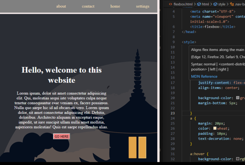
6. Real-World Example: Centering A Div: Now as we have
already learned about the align items and
justify content, I think it is the
time to actually see through a practical
real-world example. In here, I have designed a
hero section of your website. So this is very simple. We got the background
team is with the section and some text and a button
at the center of it. So this is the thing we
are going to create now. But before getting
into the course, I think it's best to
actually plan it for art. So at first we are
going to pan it, how you are going to do it, then we're going to go
through the course. This is a very good practice to plan everything before
getting into the code. So what we can do here, we can create a section and we're going to give the background team is
with their section. And inside this
section or the div, we can actually put the items, which is the text
and the button. But we are going to
apply the flicks with this entire section and make the child element
at the center. If we have multiple items
inside the parent element, it is going to be difficult. So what we're going
to do is we're going to create another div, which will contain all
the items in here. So I think this kind
of seems confusing, but it is going to get
easy if we go to the code. So I have created a folder, and inside the folder
we go to index.html, a style.css, and a
background image. I have created the markup here. We got a header tag
with the class of hero. So this is the parent element
or the flex container. So we got a header tag
with the class of zero. So this is going to be
our flex container. And inside that container, we got only on flakes item, which is the container. And inside it, I have put all
the elements we got here, like the title taste, subtitle and the button. So this is the flakes item and this is the
flakes container. I have also added a
basic styling because otherwise this is going
to take a long time. So I've just removed the basic margin and
padding of the browser by putting an asterix and
give this a **** of margin zero padding
zero for the body. I have also added a font family of Poppins and a color of black. So it is going to be
applied on the text here. And with the hero who is going
to be our flex container, I have added the
background team is also, I have also added some stylings for the taste and
also a little bit of padding bottom the items
and also the button here. So this is everything. Now we are going to apply this. So because of this design here, it is going to take
the entire viewport. So we're going to give the
hero section or the container, or the flex container a minimum height of
100 viewport height. So this is going to take all the height it can
have in the viewport. So this is going to start
from here and two here. So this is the 100
viewport height. And the section
here is the hero. So there's give it a
minimum height of 100 BAs, which is the viewport height. Now it is going to take
the entire viewport. The next thing we're
going to do is to polish on the
bag county miss. So let's apply that background. Psi is to cover, not contain. And there's also position
it at the centers. So background position center. You can also use the short form, our shorthand
method if you want. Okay, so we got date. Now let's talk about
the container. The container gotten
maximum or 878 pixels. So let's do that. We're going to target
the container div, which is going to containing
all the things inside here that tastes and button and
give this a maximum weight. 780 pixels. They're safe. Now by default, it is
going to be left aligned. But we don't want that. So we can also change that
text align to the center. Let's also add a
little bit of padding. Study Center. And we're going to
add a little bit of padding at the left and right. So let's do that. I'm just going to
give it a zero for top and bottom and from left
to right maybe 20 pieces. Because when the
display size will be smaller than 72 pieces, it is going to be
exits into the corner. So if we just remove it and
make the container smaller, as you can see, it is
going to add this. And if we apply
the padding here, it is going to have some gap. Okay? Now we have added the
maximum oil and the padding. Now we are going to center it. So in here, the parent
element is the hero, or the header tag
with the hero class. And inside it we got the flakes item, which
is the container. So we are going to apply
the flakes with the hero. So let's do that. This is the hero
and we're going to apply that display of flex. Now we go to flex
container for the item, which is this container here. And we're going to
center it both along the x-axis and along
the cross axis. So this is the flexor exists. And if you want to center
it along the x-axis, we're going to use the
justify content centered. It should be centered
horizontally. Now, we are going to
also need to center it at the particle exists
or the cross exists there. So we're going to use
the align items center. Now it should be
properly centered. There are different method
pose centering and element, but this flux method is
also very useful and it can compete a handy whenever you are going to try a
real world example, or maybe a coding a website for a client
or just for yourself. So this is totally responsive. And as you can see, this is totally centered. If we make the display
size is smaller, it is also going to be centered if I were to
make it responsive, you can also add the
media query and steps. So make the taste is
smaller than that, but we're not going
to do it here. Just for the demonstration of the centering an element or the deep inside another
Dave by using flakes. So we have done that and we
got another project here. In here we're going to
use the media query. So this is their score
to the next video.
7. Wrap or Nowrap!: I'm just going to delete
all the items in here, like the separatists tilings. There's also comment this out and let's say this is
how it looks like. Now the default hello, they align items is there, so it is taking up
as much as it has. It is available for the items. Now in here, there are
only six flex items. And I'm also going to
comment the justify content. So now insert the
flex container. We got six item. It is going to be placed
inside the flex item. It actually have a space
inside the container, but let's say we got many items that we cannot fit
in the container. I'm just going to add
some other items in here. So we got 12 flex items. And as you can see, there are only a space for nine flex items inside
the flex container. The other is going to
be at the right side. Overflowing they'll
flex container. We can actually modify this by using the flakes ramp step, also a property that can be
used on the flex container. So the default value of the
flakes trap is the no ramp. So that means it is
going to be taking only on horizontal spacing here. So if the items are
going to overflow it, it is going to be
at the same line. So let's target that flakes rep and the default
value is no wrapped. So this is not going to
wrap anything that it is going to overflow
the extra items outside the flex container. Now, if we want to put next, are the excessive items
at the next line, we're going to use the rep. Now it is going to
push the extra items. At the next line. There is also a fellow
named rapidly worse. That means it is going to, the first line is
going to be pushed at the end of the cross exit. So this is inherit
the second line. It is going to start
from the first tone, second tone, and it
goes to the app, which is the agonist that cross exits or reversal
of the cross axis. Now let's make it back to rap.
8. Alignment of Multiline Items: align-content: In here, as you can see, we got to define lines and there is a property
that we can use with the flex container to
align the second line items, that property name is
the airline content. So airline content and the airline content
is only useful if we have multiple lines
of Felix elements. Otherwise, it is of no use. So there are seven values
for the align content and the default value is as
same as the align items. So this is the stress. It is going to
take as much space it has, as you can see here. The first line is going to take, that is basically it has
and the second line also, so they are kind of similar. So there is state space. This little bit gap here is for the margin in
here we have added. So this is the default value. The next value is the flakes, is that it is also similar
as the align items. This is going to put
all the elements at the starting point
of the cross axis because the airline
contents are items always apply on the cross axis. I'm just going to make
it a little bit higher. So now this is going
to be at the start, along the cross axis. Now, if you want to
push it at the end, like inherit the bottom, we can also do that by
using the flakes end. That next value is
going to be the center. So I think you already know
what is going to happen. All the items will be at the
center along the cross axis. The list value we got here
is the space between. Now, this is going to be similar with justify
content we have seen. So now all the space
available are going to be between the two different
line of flex items. The next value is
the space around. So now they are going to have similar amount
of base pairs at the bottom and at the
top of each of the line. The next term is evenly. Now they're going to have
similar amount of space from the top and
between the items. So there will be similar
amount of space between the container div or the border of the container
div and between the lines. So these are the LAN contents and it can come in pretty handy. When we have multiple
lines of flex items. And even for responsiveness like let's say we got three items
for the larger size display. And if we make the display
size is smaller than a star items is going to be
pushed to the next line. Then in order to
align them perfectly, we can use the align
content property. Now let's talk about the cap.
9. Space Between The Flex Items: gap: I'm just going to comment out the align contents
here, and let's save. Now they're going to
get the default value. Now, we can see this little
bit cab all around items. This is for the margin. We're going to comment this out. Let's say now there
is no gap there, actually adjacent to each other. Now there is a
property to create some gap between the flex items, which is called
actually the gap. Okay? So there are two types of gap. We can use the phrase container. So the first term is the rho cap and the second
term is the column gap. So the rogue AP will be applied between two
different items, like between two different rows. So let's try that row gap. And I'm going to use
ten pieces here. Now, as you can see here, that is ten pixel gap between
the two different rows. If we want to clear
some gap between the columns are between the
items inside the column. We can use the column. Yeah. Seals, maybe 15 pieces. Now it will have nice
gap between those. But if you don't onto put two different
values or both parties. So you can also comment
this out and try the gap. The gap without specifying
the row or column. It is going to apply it
on both row and column. So let's try 15 pieces. And this is going to
get the gap between the items both along the row
and the column of 15 pixels. If you aren't different
type of values, we can also do that. So let's try five pieces here. So the first value here
is going to be the row, and the second value
here is for the column. Now the 15 pieces gap
is available between the rows hair and
the fight teases is going to be available
between the columns. So these are the properties we can use on the
flakes container. And from the next video, we're going to talk about
some different properties that we can apply
on the place items. So see you there.
10. Order of The Flex Items: So far we have only talked about the properties
that can be applied, the face container or
the parent element. Now, form this video, we're going to talk about
the properties that can be applied on the child
elements or the flex items. So at first we are going
to talk about the order. So by default, this is going to be ordered as they are, like. The first item comes first, then the second item. Way we have actually code this. This is going to order the
same direction and same order. So I'm just going to reduce it. Let's keep only four items
and till it that raised. Okay. Also, I'm just going to delete the things in here to
make it less clutter. Also, let's comment this out. Also the margin. And I'm just going to
put a little bit of gap in here, like 15 pixels. Okay, fine. Good to go. Now, the
first item comes first, then the second and the
third than the fourth. So let's say we
want to align them, are ordered them differently. So by default, all
the flakes item got a default order of zero, but we can actually apply order separately on the
child elements. And the rule is that the lower the order the element
has, it comes fast. So in here by default, all the items got
the order of zero. So if we put, if we
give it a element or the flakes item and
order of minus one, which is less than zero, it will come first. So let's say we are going
to target the item three. Here comes the third, and give this order
of minus one. So let's do that item three, and let's give this the
order of minus one, which is going to be
less than zero and less. The order is, it comes fast. Let's save this.
And as you can see, the third items come fast. So we can actually use it
and it comes pretty handy. We are going to see more
about that in the next video. But for now, let's ordered
some more items inside it. So the first item
comes at the end. So if we target the item on
which is the first item, now it is at the second
position because the third item got a
order less than zero, which is the order of on. So that is the first item
got a order of zero. Now, let's say we give it
the order of maybe five. Now it has more order
than the rest of the items because
the second item here got a default
order of zero. The third item got the
order of minus one, and the fourth item
got 84 order of zero. Now, item one has
the biggest order, so it will come at the last, because the larger the order is, it is going to be at the last
item on the order of five, and it comes at the last. This is how it's
going to work out. So let's say we want to push the fourth item, The first item. We can also do that if
we target the item for and give this order larger than the item on who's got
the order of five. So we are going to give
it a more than that. So let's give it six and it is going to come after
the first item. But on thing that if we have multiple child elements
with the same order, what will happen then? In that case, the alignment or the order will be appear
as we have coded here. So let's say the item
on the order of five, the item for a order of the
same value, this is five. Now, if we save this as
the item one comes first, then that is the item four. So now the last item
will be the item four, and before that, there
will be the item on sale. Now the four comes last and the first item
comes before that. So this is everything
about the order. And it can cause pretty handy
whenever you are going to order something like differently in a smaller size
display or anything. So in the next video, we're going to do this project so we can see more about
the order and the flux. So let's do that.
11. Real-World Example: Change The Order in Smaller Display: In this video, we are going
to keep it as simple posits that can teach you lots of
things about the flexbox. So this is our project and
this is a hero section. So before getting into the code, let's expand this out. So we got a container. This is our container here. I'm just going to
draw a rectangle. Okay? So this is the container. Just give it a stroke
and remove it. Okay? So this is the container
and we're going to put the flakes per, per day on this container. Here. Inside this container, we got another one who is
going to be our flex child. So it is going to be the child of our flex
item, which is this one. So this is the phase child and this is the flex container. So we can apply the
display effects on the parent element and also make it justify-content center, align items center
so that it is going to be centered along
the cross axis. And also the main flux analysis. We're also going to give it
a maximum height so that it is not going to exit
the white of that. So inside it, again, we're going to use the display
flex on this container, which is actually the child
element of a flex container. By using the display
flex on that, we are going to apply
to different items. Like we got this div
here, which is this one. I'm just going to
give it a stroke. This is going to be fast item or the flakes item inside
this flex container. And the second term we
got here is this on here. So the image is the
second flex item and the first list item is
going to be that taste. So we're going to put all
the tastes inside a div. So we go to different
depths inside these flakes container and
we're going to align it. So in case of a
small size display, we are going to make the
flex direction to column. Now by default, it is
going to be the row. But in a small size display, we aren't the e-mails
to come fast at the top and at the bottom we are
going to put the taste. So let's do that. I'm just going to start
it from the viscous. So let's create a header tag
with the class of Theta. So this is going to be
containing everything. So this is the parent element and we're going to add a
background color with that and use the display flex to make the contents inside
of its center. Now instead it, Let's
get the container div. This is going to be our
second flex container. Inside this container,
we got to defined DBS right on is going to be
containing all the taste. Another one is going
to contain the image. So let's do that.
Instead they got dinner. Let's create a div and I'm
just going to give this a class of container
content. Okay, fine. Now instead it later Susan
Sontag and put all the tastes. I'm just going to
copy and paste this. Okay, Here we go. Now for the Prager tech, we're going to put some
dummy text like Lorem Ipsum. Then we got two
different buttons. This is actually an EMS. I'm just going to give
Steve a class name of Hero. Hero buttons. Okay, inserted as this
is a button or a link, we're going to use the anchor
tag here and insert it, leaves seals the images. And I think the image
name is stored dot PNG. I'm just going to copy and
paste this because we've got two different items in here. The second term is
the Play Store. Okay, fine. This is the live server and we can
see the items in here. Now, there's good the second
deep inside the container. So this is going to be a
flex container and this is the fast flex item and layer
set the second flips item, which is going to
be a hero images. Let's just give this, cluster them up, hero
Amos, inside it. Let's add the hero
images dot PNG. We got it. And by default, this is going to be
a line like this. I don't know why the cursor
is blinking like that. Okay, Now let's move on to the style.css I have already added. Okay, I've done nothing, so I'm just going
to minimize this. And as you can see, there is a default margin and padding. So if we just use the aesthetics there to remove the
default styling, so you can do that much in zero. Now, there is no gap
at left and right. So let's add a padding of zero. Just be safe. Now let's target the hero here, which is the parent element, which is going to contain
a everything inside that. With the hero. I'm just going to give
this a minimum height. Actually, let's set the
background color first. I'm just going to put a
hexagonal color-code like D, E, D three CA. So this is the
colored coat color saved and we got the color hair. Now, we are going to give this a minimum height of
100 vivid height. So it is going to take
the viewport height. After that. Let's keep the hero
a display flex. But before that, there's this gave it a color of the text, like it is going to be applet, all that tasting Here. It is kinda blackish. Now let's target
the container div. So let's do that container. And we're going to
give this a maximum of eight of 13 70
pixels. Let's Save. Now. It has the 13 70 pieces high, but, but we cannot see it because this is not
actually at the center. So now we are going to apply
the display flex on that. So now you got to
define flex items. By default, the flex
direction is row, so it is going to appear after another in a
horizontal direction. So let's make it display flex. Let's save. As you can see, it appears like that. So now we aren't all the
items at the center, like along the cross axis. So we can use the
align items center. Now they are center
along the cross axis, but also just to be sure, we're also going to use the justify content
space between so that the image is going to be at the end corner of the flexbox, which is the container. And the text here
is going to be at the starting point of
the flex container. So let's use justify
content between. It is not going to
change anything because all the items are going to take all the explicit can have. There's also put a little bit
of gap between the items. I'm just going to
use phi viewport. So it is going to be five
per cent of the total OID. Now we're going to
make it center. So I think we have seen this
in the previous project. So we're going to target
the hero who is got only on child elements
inside of that. And give this a display of
flakes. So let's do that. Display fakes and
justify-content center. Align items center. So it is going to be
centered both along the x-axis and along
the cross axis. Now, let's do a little
bit of a stylings. I'm just going to copy and
paste this because I'm not going to steal
time here, so forth. A son who is is the title text. I got a font, family font, line-height, margin,
bottom to care some gap with the general text. For the paragraph tag, we got a font family
of Poppins here. And also formed size or some margin bottom to get
some gap with images here. Okay, so we got
everything right. Now Let's also add
a padding with the container because we can not see anything
different here. But for the smallest
size display, we are just going to
add a little bit up. Especially because if
we make it smaller. As you can see, whenever
it is going to be smaller than the maximum height, like 13, 70 pixels, it is going to be like
at the end point, the beginning of the container, or sorry, the browser. Now, if we add a
little bit of padding with the container
on top and bottom, let's say 50 pixels
and left and right. There's that 30 pixels. Let's save. Ok, now you have this little
gap with the padding. So let's make it responsive. So to make it responsive, we are going to use
the media query. Okay, so let's do that. I'm just going to type out the media is cleaned and we're going to give
this a maximum wide. So when the display size will be smaller than this
maximum height, it is going to apply. So let's give it a maximum
height of our 12, 70 pixels. I'm just going to break it down at that particular browser. So at first list I
get the container and we're going to make the
flex direction to column. So if we make the flex
direction to column. Who is just now is by
default that row there, so they are happier in the row. And if we make the flex
direction to column, they are going to appear at the vertical exists
after another. So let's do that.
I'm just going to target the container
and give this a flex direction to column Save. And as you can see, it is going to be I paired
and the column exists, which is the
vertical exists now, this is the main flux exists now because we changed the
default flex direction. But as you can see
here, by default, the order is going
to be appeared at the manner we
have coded in here. So inside this container div, we got the first item here, which is the container content that taste and the button there, so they come fast. Then there is the second item. Now, by default, all
the items inside the flex container
gotta order of zero. So we can, we are going to
target this e-mails here, and we're going to put it fast. And we can do this by
two different ways. We can either reduce the
order of this EMS than zero. That's how we're going to put it before the text box in here, like the container content. Now, the container
conduit got it fell of zero order and it is going
to be like minus one, which is less than zero. So it is going to appear fast. Also, we can give this the container content if
hello mode than zero. That's how it is going to be larger than the order
of the hero EMS, which is zero by default. So we're going to target
the hero image and give this the order
of minus one, so that will be less than
zero. So let's do that. Hero just going to put it
in the next line here. Hello emails. And there's keep the same order of
minus on there, save, and now the US come fast, then there is the taste. Okay, So let's make it
even more, smaller. And as you can see that image, this kind of overflowing it. So hot I'm going to do
is I'm just going to add the EMS hair
like hero image. And let's target the EMS tech, especially for the MS.
And we're going to give this a maximum OID
upon hundred percent, so it is not going
to overfly anymore. So this is our hero section. And it looks fine. Also, you can reduce
the font size a little bit for this
smaller size display. But that's not the point here. We're just going to
see how the order ofs and other flex
items and properties. So now this is totally responsive
in larger size display. That tastes come fast, then there is the images. And if we make the
display size is smaller, it is going to be
the opposite way. So the EMS count fast
after the break point, which is 1,270 pixels. And then the EMS come fast. So this is everything
about this project. I hope you liked it and
see you in the next video.
12. Distribution of Extra Spaces: flex-grow: In this video, let's talk
about the flakes grow. So as you can see here, insert the phrase container. We got four different items and they are only taking
as much as they need. The other respects,
hair is free. So these are the empty
spaces and the flakes grow. By using flex grow, we can actually use
the extra expenses. So let's see how we can do that. By default, all the items called a default
flex grow up zero. So the default value of
the phrase grow is zero. Now, if we say to a particular item or element a different
type of place grow, it is going to take
the x-rays business. So this is how it's
going to work out. So let's target a
particular item, like the item four. If we give this a phrase, grow up on what will happen. Now by default, all
the other items, like the item on to the
third phrase grew up zero. So they're not going
to take a stress versus they are just only going to take as
much as they need. But now the item for
Kata phrase grew up on and the friends group is about
the excess business, okay? Now, as it has the
phrase group on, so it is going to take
all the extra SPSS. So let's save it. And as you can see, this is going to take all
these pieces that has lived. Now, we can divide
the state spaces between multiple flex items. How we can do that? So this item for God, if they screw up on this
target and on the run. So let's say item
two, the second term. And we are going to give
this a phrase of three. So now what is
going to happen is that let's just
comment this out. So this is the express bus and this is going to be
divided into four parts. So the three portion out of
the four version is going to be given to the second item because it got that
phrase growth tree. That rest portion is
going to be given to the item for because it
got a flakes grew up on. So I'm just going
to uncomment this. And as you can see, all these spaces has been given to the fourth and
the second item. The second item got
a phase group three. So it is going to take the
three-fourths portion of the spaces and the photon
got only on portion. So if we target the
item on here and keep this the same
value as the item for. So please grow on the item for item one will get
the similar amount. And now in this case, it is going to be
divided among five parts because on two plus three, that means five
on portion or the unfit especially will
be given to the item for the same person or the
same especially be given to the item on and three-fifth portion will be
given to the second item. The third item doesn't
have any flags grow there, so it caught the
default value of zero. And it is only going to take
as much is because it needs. This is everything
about the flakes grow.
13. Align A Particular Item Differently: align-self: Okay, now let's talk
about the airline cell. So we have already talked
about the align items. So the align items is applied on the phrase container
or the parent element. But the airline sales
is going to be applied on the child element
of the flakes items. So in order to demonstrate this, I'm just going to uncomment
the height of the item. Now by default, it caught the align items is tastes
there so it is ticking. All the explicit can have
along the cross axis because the airline items
along the cross exists. Okay? Now let's say we go to airline items center and the airline sells only
arc along the cross axis. So in here, all the
flakes items got the align items center
because we have applied the align items
with the container div, which is the phrase container. Now, let's say we want a
item airline separately. So how we can do that? So in order to do that, there is the airline self. So by using a lens cells, we can target a
particular flex element and align it separately. So let's say we got the
third items and hair, and we want to align it differently than the
rest of the items. So let's do that. Let's target the item tree
and give it a aligns cell. And the palace, the
default value is auto. That means the item will have the same alignment as given with a flex container,
which is the center. So this is auto means. Now if you want to
make it differently, we can also do that. So let's target the flakes. That means you already
know it is going to be at the starting point
of the cross axis, which is at the top. It will make it flex end. It is going to be at the
end of the cross axis. Now the next one we've
got here is the center. And I think it is going
to be the same as before, because this is the center. Also if you want to
express it through the, all along the cross axis. So you can also do that. Let's press Save. We got it. Also. We can use the baseline here. So these are the values. So we can use with
the airline sells to align items
separately than the rest of the items that is going
to be aligned by using the align items property
with the flakes container. So it is also comes pretty handy whenever you are going to
create some kind of cards. Then let's say we want to LAN NIC card separately
inside the container. So this is everything
about the airline self.
14. Changing The Default Size by flex-basis: Now let's talk about
the flex basis. I don't think we're
going to use it in the real all positives
or real life. But there's learn that I'm
just going to delete it and let's say also
removed the height. Actually, I'm just going to
keep it but align items. Let's make it flex start. The fixed basis is going
to be used to give its separate flex item
and separate type of oil. Or they space it can
have along the x-axis. So let's say we are going to target the second
item here, item two. And we got some
extra spaces, right? So let's say we are
going to give the item to a height of 50 per
cent. How we can do that? We can do that by
using the flex basis. And we can give either a pixel value or
percentage value at everything. But the default value of
the flex basis is auto. So this is going to take
as much specific needs. And according to the flakes, align items or does
justify content. This is the default value. If you want to give it a
separate type of values like in-person dense
in 50 per cent, it is going to take 50 per
cent of the entire space. Let's say we got more values
than that like on 100%. Then it is going to move to the next line
because engineers to get the 100% along
the flakes exits, which is this exists. So let's try it out with
some other properties here, like the item three, sorry, we call it a dot here. Okay, let's give this a flakes basis of 50
per cent. Let's save. It is going to take up, I'm just going to reduce a
little bit like 48 phases. So we can actually put
two items inside that. Also, let's give the item
for the same yellow. Actually, I think we need to
reduce it more than that. Like 45 doesn't arc. Again, our starting. If you want to make a
complex layout like this, we can use the phrase basis, but I think this is not very practical because in case of
this type of complex layout, we can always use the
CSS grid for that, but it's better to
know other things. Okay, so this is everything
about the phase passes. See in the next video.
 Sofiullah Chowdhury, Web Developer & UI/UX Designer