Transcripts
1. Intro : Creating a design
that will stand out from the rest of the
crowd can be tough, but Amaka can make
your job easier. So what is mock-up exactly? Mock-up means of v to
express any idea, design, or art work in realistic
scenario to give the feeling on how the final
product will look and feel in live environment. E.g. when a designer creates a logo design
and show to the client, Sometimes it will
not make an impact, but when shown as a mock-up by placing it on different objects. In a realistic scenario, it will make the logo
stand out completely. The client will
get a better idea on how the logo
will look and feel. Live environment without
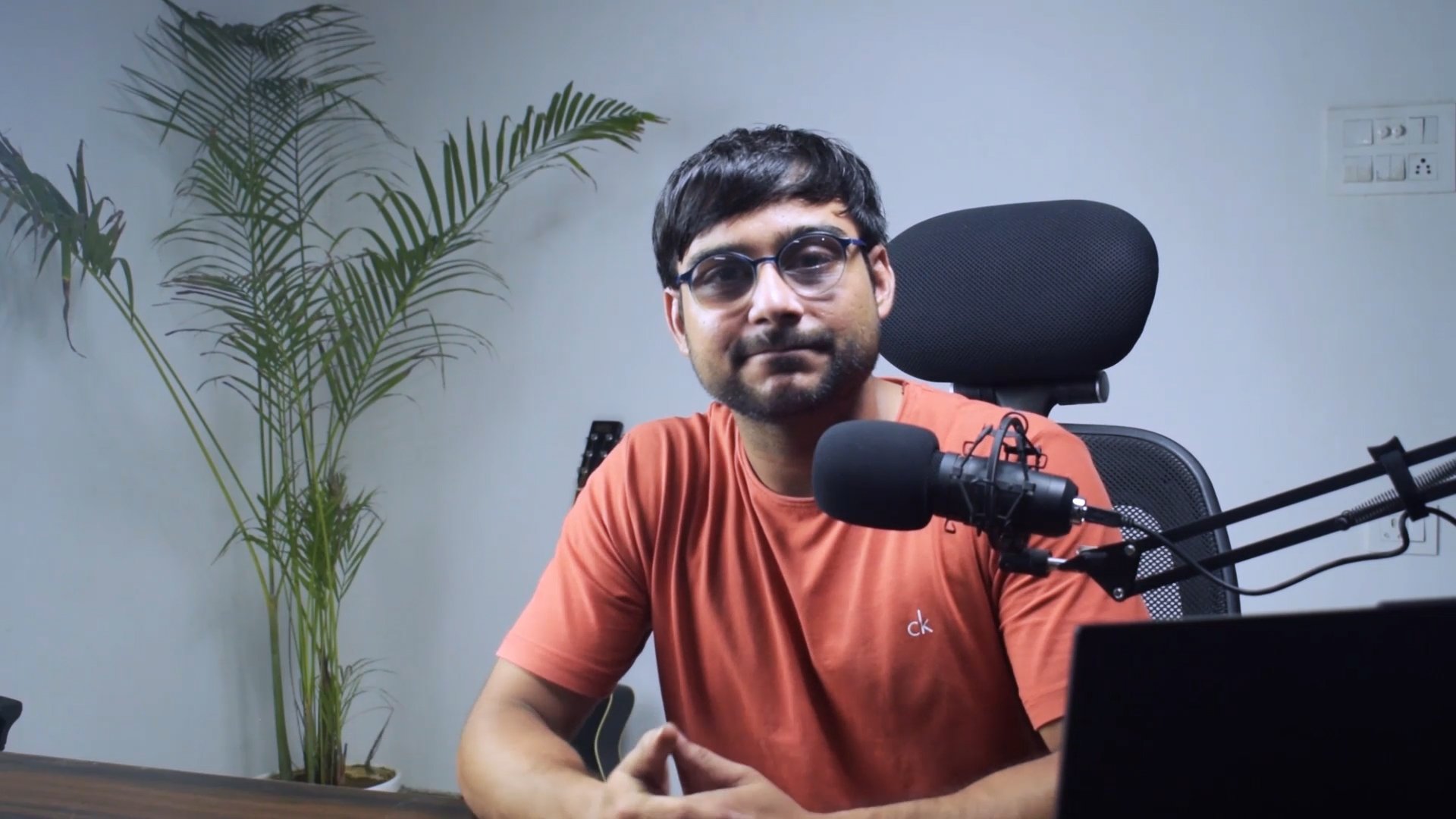
spending any money on prince. Isn't that awesome? Hi guys. My name is Shiva. I'm a graphic designer and
pretty mockups is one of my advantages to get good
impression on my clients. That really helps me to
make my designs standout. So I thought why not share this knowledge and
experience with others? And here we are at the
masterclass for mockup. In this class we will create different digital mockups like book cover, Russia, and T-Shirt. To make it easy to understand, I have divided this
class into four levels. First, we will learn
from the very basics, the novice level, where we will create a simple
book cover mockup. Next is the apprentice level. Here we will create a tri-fold
brochure and mockup with a new technique than
the expert level. In this, we will
create a mug mock-up. And finally, the master level. There we will create front and back T-shirt mockup and also learn about a
displacement map. In-between. There will be a small class for the smart object that is very essential for the mastery level. We will be using Adobe Photoshop
for this entire class. And if you don't have it,
that's completely fine. You can get a 30 days free
trial from adopt.com. I believe after taking
this masterclass, your designs will stand
out and you will be a master in creating
your own mockups. Let's meet in the next class.
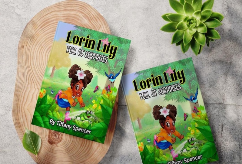
2. Novice Level : Book Cover Mockup: Before getting started, I have a request to make this
course easy to understand. Just sit back and relax. Don't skip in-between and see
this course until the end. After that, you can again see it and follow along with me. Let's get started. Creating a mock-up is so easy if you know
the basics of it. In this class, we will
create a simple mock-up. I've already prepared
these two images. First, we will open the
square book cover image, drag it inside the Photoshop. The first tool to create a mock-up is to
use a image where everything is blank and its
color is totally white. Let's drag the design
image as well. But don't drop it
over this image. Drop it on the new tab, or you can manually open it. Now, we need to copy this and paste it over
on this book cover. To do that, we will first
create a selection. Go to Select, click on all. It will select the
entire document. Next we will copy it. Go to Edit, click on Copy. Open book cover document. Go to wet it again and paste it. Now the task is to mask this design according
to the book or tap. The Move tool and make sure in the header section Show
Transform Controls is check. Also the auto select option. This option gives you
freedom to directly select any layer and also show the
transform tools for it. While holding Alt
and scrolling up, you can zoom in and just match this design
from the corner. Zoom out and check
the right side. Sometimes we are not able to see how much the design
part is covering. To tackle it. They will reduce
the opacity of the design. Now, we can see right through it and adjust all the sites. Right now we are in the
mode of transformation. That's why the header option
as totally different. So when you are done, click on taking the header. It will let you out from
the transform mode, set the opacity back to 100%. Now over-designed placement
is exactly where we want, but it's not looking realistic. This something that is
missing from this design. And that is rule
number two, shadows. Let me show you that trick now. Select the design
layer and change the layer mode from
normal to multiply. You see how realistic
does it look now? Because only of these shadows and multiply
mode multiplies the colors of the planning
layer and the base layers, resulting in a darker color. Next 45 told you to add color in the background without
disturbing the image, because right now the background
is stick with the book. Normally I use a very
simple technique for that. First, we will create a
selection only on their design. Right-click and select pixels. We don't want any color
inside the selection. Instead we want to add color
outside the selection. We will inverse it, go to Select, click on Inverse. Now the outer
portion is selected. Select the background
layer and add an adjustment of solid color right above the
background layer. You can directly pick yellow
color from the book design. It's too bright. Let's take
a lighter version of it. Hit okay. This is looking flat because
the shadows are not visible. Just like how we did
for the design layer. We will do the same, just change the normal
mode to multiply. And there we have our shadows. Because we already
created a selection, then created the solid color. It automatically
added a mask on it. Only the selection
portion will be visible. Dust of the selection
will be height. So when we move this layer, you can see what
actually happened here. This adjustment layer gives
you freedom to change it to any color you want by
just double-clicking on it. Let's choose light blue color. Hit OK. Select the design layer. Let me show you
another technique to change the color
of their design. Go to image adjustments. Click on Hue saturation. Here we will only change the
hue values by just sliding. The color is changing because Hugh does not
affect black and white. It only affect the mid tones. That's why it's work
on this design layer. Choose the color blue. Hit Okay. Now by just adding
these two layers, we created a mock-up. Isn't that easy? All
the resources used in this video you can find in attachments. Let's
meet you guys. In the next part, we will
learn about Smart Objects.
3. What is Smart Object : Creation and Benefits: What is smart object? I have prepared this file
in advance to show you the benefits of Smart Object
and how to create it. You can see here two circles. One is red and
another one is green. This red circle is a restful layer that we work
on mostly in Photoshop. And then we have our two layers that are not smart
object right now, but we are going to convert
them into a smart object. Simply select both layers. Right-click on Layer, and
select Convert to Smart Object. And that's it. It's easy as it looks. So now we have our smart
object and a restaurant, but we can't see a difference
between both layers. To show you there, Shift
select both layers. And by holding Alt Shift, scale it down from the corner. Make them very small to look. After you are done,
click on tech. Now again while holding
Alt Shift, scale them up. Now when you click on Take, you will see the difference of a smart object is intact
as how it was before. But on the other hand, the restaurant layer
gets pixelated. So that's the major
point of a smart object. It will not get
pixelated until it was not scale up to
its original size. Another major benefit is
that it is at the table. There are two ways to edit it. First, by double-clicking
on the layer, it will automatically open in a new document and you can
easily edit the content of it. Let's close it for now. And second way is
to right-click on the smart object layer and
click on edit contents. As I said before, you
can edit the content. Let's change its color
to blue. Hit Okay. Now go to file and
click on Save. To save this change, open the main
document and you can see it already updated. Within seconds, it
will take effect. Let me show you again by
pumping out the window, click and drag it out. Since the circle color hit Okay. Go to File. Save. It didn't
even take seconds. You can also press Control
or Command S to save it, and it will automatically
update in the main file. These two are the major benefits
of using a smart object. Smart object plays a very important role in
creating a mock-up. I hope you learn how to create a smart object and what
are the benefits of it. In the next video, we
will learn how to create a tri-fold brochure mockup in Photoshop by using a very
interesting technique. Let's meet in the next video.
4. Apprentice Level : Tri-fold Brochure Mockup: In this video, we are
going to learn how to create a tri-fold brochure
mockup in Photoshop. So we're going to
use these two image. First is the tri-fold
brochure image, and second is the design image. First, we will drag the
brochure image in Photoshop. You can see it's perfect for creating a mockup because
it's so key plank. And we have these three sites. Let's write the design
image in the center. Click on tech. There are three sites in the
brochure design and also in the brush and image. But how will we place it? There are several
techniques for it, but I will show you
the most effective one by holding Alt Shift, scale it down according to the size of the brush and image. And click on Text. To make the placement as
accurate and precise. They will need to do
some preparation for it. Go to View and click on rulers. Or you can press
Control or Command R. Next by clicking and dragging
to the right on the ruler, you can take out
guides from the ruler, explicit on the left side. Create another guide
on the right folder. Drag the vertical
guide from the top. Another one for the bottom one. All guides are covering
the corner now. To more guide for the
partition of design. To be more accurate, you can zoom in and
move the guides. Now photoshop have
this amazing feature where you can easily grab any design you
want to use it. Go to Edit and click
on perspective. Right now we are in
the layout mode. You can see it in the header. In this mode, we will
create three shapes. First, create a rectangle from the left corner and
covered it to the bottom. Because of the guides, it
will automatically snap. That's why we created
these guides. Fit another from
the central corner and drag it to the bottom. Notice my mic close to shapes, it will automatically
snap with each other. Like a magnet is
working between them. This message telling us when
we created the quad shapes, you can change the mode
from layout to wrap. Here in the header you
can see the red button. Let's create the last
rectangle from the corner. Here is the magnetic effect. Deletes the click
and it will snap. Now let's switch
to the warp mode. Click on here, the
shapes is gone, but we have these points. By just moving these points were actually able to modify
the shape of their design. We cannot see the
brochure image to fix it. Set the opacity to 28 per cent because it
added a transparency. We can directly see
right through it. Now we just need
to start adjusting the points according
to the brochure image. Always pros check the points. Zoom in if needed. This process takes time, but the result worth it. Then you are done. Click
on taking the header. Because we applied this
technique on a smart object, it added a smart filter
calls perspective on it. We can hide and
unhide the effect. Let's set the opacity
back to 100%. If you think you want to
read, just re-design. Just double-click on
the perspective rep and start adjusting the points. When you're done with the
changes, click on tech. I think we need to
adjust this point. Double-click, move it to
the top. Click on take. That said, Isn't this
feature very easy to use? We don't need the
ruler and the guides. So press Control or Command R to hide the ruler and go to View. Click on Clear right. Now the most important part, set the blend mode of
this layer to multiply. This mode always work if your
background image is blank. Next we will add a background, but it will be a little
different from before. This time, I'm not going
to create a selection. Add an adjustment
layer of solid color. Let's see what will happen. Next. Pick the color
from the designer. Because the color is too bright, it is not going to work. Let's choose a light color. Hit, okay? But still, it's messing
with our design. To make things better. Let's set the blend mode to multiply. So you see, no matter
how much we try, we need to subtract the
selection of the design from the main color
layer. Let's do that. Right-click on design
layer and select pixels. It created a selection
of the design. Next, select the mask. And keep looking here. When we click on the mask, there are only two
colors, black and white. Because the mass
can be filled by only two colors, black or white. The black layer
will hide the image and white color will
show the image. So when we select
the mask and switch the color from white to black, now take the paint bucket, tool. Mask is selected, selection is already filled the
black color inside it. Now, this color is not
affecting over design at all. Go to Select and
click on de-select. By double-clicking on the layer, we can change its color
to any color we want. Or even when we
reduce its opacity, it is not affecting over design. Because the mask is filled
with the black color. I hope you learn something new in this and in the next video, we are going to learn how
to create a mug mock-up.
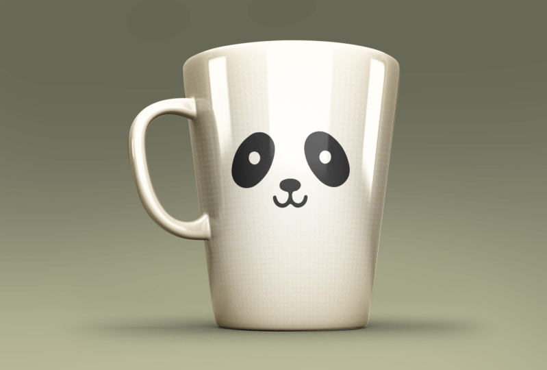
5. Expert Level : Mug Mockup: So far we have created
a simple mock-up, a tri-fold brochure Markov
by using perspective. And also got the understanding
what is a smart object, how to create one and what
are the benefits of it. In this video, we
will go one level up and create a
coffee mug mock-up. This is the image
of mug that we are going to use to
create this mock-up. This is also available
in the attachments. First, drag the
image in Photoshop. Now we will create a design. So you will know how
we take the ratio of their design
according to the mockup. First, take the rectangle tool and create a rectangle
from the left top, covering the entire cup.
I'm using yellow color. You can choose whatever
color you want. Double-click on Layer
to rename it as color. Then right-click and convert
this layer to smart object. Double-click to
edit the content. We will first create a good
design for the mug mock-up. Take the text tool. Click one time. And the font I'm using is
master of brick red color. You can easily find
this font online. Start typing coffee. Increase its size. Take the Move tool and
place it in center. While holding Alt or Option, drag the coffee text below. It will create a duplicate copy. Double-click on text layer
and rewrite this text as mug. Take the Move tool and
place it right below the coffee text to give
it a styling effect. Select the coffee text and press Control or Command
T to transform. And while holding
Control or Command, drag the right side of
the text to the top. Press Enter. Same thing we will do for the MCQ text controller
command T transform. Move to the top. To get out
from the transform mode. You can also take in the
header while holding Shift, select both texts layer and
move them in the center. Next, select the color layer and add an adjustment
layer of gradient. Click on gradient to edit, expand the basic group, select the black and white one. Hit, okay. Change the style from
linear to radial. Let's see how it looks. This is looking good. Hit, Okay. Now go to Filter
Pixelate, Color Halftone. This popup is asking
better to convert it into a smart object
or rasterize it. As we know, smart object
has its benefits. So convert to smart object here, set the radius to 20 and dust
of the value will be zero. Hit, Okay? Right now the effect is
disturbing the texts. So set the blend
mode to color burn. It gave it an orange look because the base
color is yellow. To make it more appealing, set the opacity to 30%. Now it's time to make
the text standout. First select the
coffee text and press Control or Command J to
create a duplicate layer. Now press Control or
Command Backspace to fill the white color. Drag this layer right below
the coffee texts layer. To move the layer little bit. Use the left hand down
key in your keypad. Repeat the process
for the MCQ text. Press Control or Command
J to duplicate it. Control or Command Backspace
to fill the white color. Drag the layer below
the MAC layer, move it left and down
with the arrow key. You can see the texture is
looking much more appealing. Now, let's save this design and go to File, click on Save. And because it's a smart object, it will get updated in our main file and there
is our updated design. Now the shape of this design
is totally flat rectangle, but it needs to be according
to the shape of the mug. To adjust it, go to Edit, click on transform,
and select what. You can see some points in the corner that we
are going to adjust. But before that, reduce its opacity so that we can
see the shape of the month. Now slowly, step-by-step,
select the points and adjusted. These are the
handles that will be used for adding curves. So each point have two
handles to adjust. If your design is going out of the shape, that's
completely fine. We will use another
technique to fix that. Just be sure every part
of the monk is covered. You can also directly
at just the curves. Now there's another part
that you need to be concentrated after you have
adjusted the outer part. That is the inner part, I just go inside the design. By moving it slightly to the top and then
slightly to the bottom. You need to visualize how the texts will revolve
around the cup. The corners will be narrow and the middle portion
will be white. These small changes will make your design to look
more realistic. You are done. Click
on taking the header. Let's work on the outer portion that is going outside
of the shape. Full-time, hide the color layer and select the background. We will create a vector
shape of this image. So take the pen tool, make sure to select the
shape in the header. Choose any color you want in
the fill. Let's select you. Outline will be none. Zoom in and start
creating the shape. Pen tool is very easy to use. You just click one time from
where you want to start, and it will automatically
create a shape layer. Again, click and track. If you want more controlled
by holding Alt or Option, click on the point, and
then click and drag. This is a time taken process. You can also use any
other tool if you want. But this tool is very precise. You can also reduce its opacity to see the clear
view of the shape. Let's reduce the opacity mode. I'm doing it fast. You can take your time. When you're done with the shape, make its opacity 100 per cent. Let's create the
hollow part as well. Hide this layer for now. Take the pen tool and create
a shape of the hollow part. Reduce the opacity if necessary. When you're done, unhide
the shape one layer. Choose a darker blue color
for the shape to layer. We cannot see because the
opacity is just three-person, set it to 100%. Now to cut this portion from the main monk shape while holding Shift,
select both layers. Right-click much shapes. To select the hollow part. Take the path selection tool. Click on it. And in the header,
select subtract front shape to deselect,
click on outside. Now we're ready to put
this shape in action. Take the move tool, unhide
the design layer selected. Set its opacity back
to 100 per cent. Select this shape layer. By holding Control or Option. Click on Shape Layer window, it will create a
selection of the shape. Now select the design layer
and add a layer mask on it. You can see only the
selected part is visible, rest of the part is master. Genes, a shape layer color
just as redesign color. Pick it directly from
the design color. Hit. Okay. Let's rename this
color layer design. Next, running the
shape layer as color. Now it's making more sense. Hide the design layer by
holding Control or option. Create a selection
of the color layer. Hide the color layer as well. Select the background. Now press Control
or Command G to create a duplicate
layer of the selection. Now when we hide the
background layer, you can see we have our isolated mug
without a background. Unhide the background layer and drag this layer
right above all layers. Unhide, redesign and color layer and hide the
background layer for now. Rename the layer one as shadow and set its
blend mode to multiply. It looks a little realistic now, but it will get better. Right-click and create
a duplicate layer. Name it as shine one. Hit Okay? And move the
blend mode back to normal. We need to add more contrast to this image to get
a better result. So add an adjustment
layer of levels. Here we will not
disturb the highlights. Move the mid-tone
arrow to the right. Next slide the dark
arrow as well. It will create a more
dynamic contrast. This is looking pretty great. Now we need to apply
this additional layer on this layer while holding
Shift select both layers. Right-click. Merge layers. Rename it again as shine one. Now the important part, set its blend mode to overlay. It will add the color dynamics. Let's set its opacity
to 70 per cent. Right-click on
layer, duplicate it, rename it as shine to hit. Okay. This time set the
layer mode to screen. It will only show
the highlights. Black color will be not
visible in this blend mode. Let's reduce its
opacity to 40 per cent. This is looking pretty
realistic to me. Unhide the background
layer and see what a good mockup which has
created while holding Shift, select Shadows, shine
one and shine to layer, and drag it on the Group
icon to create a group. Rename this group as effect. Naming and grouping the layers is as important as the file. It should be well-structured,
easy to use, so that anytime
anyone use your file, they will never get confused. Let me give you a
small free tape. Some of the halftone
effect is applied on the places where
it shouldn't be. To fix it. Selected design mask. Take the brush tool, reduce its size to
something about 18 pixel. Set the hardness zero. Choose black color, and paint over the portion where
you do not want this effect. Black color will hide the design layer and
white-collar will show it. Do the same process on the top. Now we have successfully
created our mock-up. It's time to make this
design more pleasant table. While holding Shift,
select all layers and group except
for the background, and drag it towards
the Group icon. Rename this group as mockup. Let's add a background. Expand the group by
holding Control or Option. Click on Color layer
to create a selection. Now go to select an
inverse, the selection. Select the background and add an adjustment layer
of solid color. I'm choosing yellow color because it's matching
with their design. Hit Okay, and set the
blend mode to Multiply. I think we can choose a
lighter color of yellow. This looks good. Hit, Okay. And we have finally created
a coffee mug mock-up. It is customizable, realistic, and very easy to use. If you are able to
create this mockup, then you are already
at the expert level. But if you want to get
to its mastery level, see you in the next
video where we will create a T-shirt mockup.
6. Master Level : T-shirt Mockup: In this video, we
are going to create a front and back
mock-up of T-Shirt. I have already prepared a
t-shirt front and back image, selected and open
it in Photoshop. This image is a PNG and
background is already removed. This type of images makes
over work a lot more easier. There are many
Microsoft websites where you can download
these kinds of images. Now we will create a
displacement map of this image. Literary, I will tell
you what is its use. Now go to file and click on Save As name it as T-shirt
mockup displacement. And make sure to set
the type as PSD. Click Save, Hit. Okay. Now let's keep this
image or background. Add additional
layer of gradient. Click on gradient to edit. Expand the basic group, select black and white. Here, click on Color and change the color from black
to light tray. He took a thrice.
Now move this layer right below the image layer
and rename it as background. Right now both the t-shirt
or on a single layer, we need to separate them. So select the layer and take the rectangular marquee tool and create a
rectangular selection. On the left t-shirt, right-click and
select layer via cut. Now we have two
separate layer folder, t-shirt, rename them. This will be front,
and this will be back. In the last video, we created a selection
with the pen tool, but here it is not the case. We can directly create the
shape layer for the color. Let me show you how. Right-click on back
layer and select pixels. Make sure you are
right-clicking on the window. Now right-click on the selection and select Make Work Path, set. It all runs one pixel. Hit Okay? It automatically added
the path. Zoom in. You can see how accurate it is. Only because the image
is high resolution. If the image is smaller, we will not able to get a
good result. Right now. It just avert path. It is not a shape layer. To convert this part
into a shape layer, add an adjustment
layer of solid color. Let's choose yellow color. Hit Okay. Rename this
shape layer as color. Drag the color layer right
below the back layer. Same thing we will apply
for the front image. Select it, right-click
on window, select pixels, right-click
on the selection, click on Make Work Path, set the tolerance one, hit, Okay, and add an adjustment
layer of solid color. Choose the color yellow. Hit, Okay? Right now the color code, these two layers is different. How to use a single color code? For this, select the
bottom color layer, hide all the top layers. Double-click on Layer window
and copy the color code. Okay, unhide the
top color layer. Double-click on it, right-click
and paste the color code. Hit. Okay. Now put the color
codes will match. Rename this layer as color, and drag it below the front
layer and hide all layers. While holding Shift,
select the front layer, then the back layer, and set
the blend mode to Multiply. I have already created
a sample design that we are going to place
on front and back. Select both of them and
drag it inside Photoshop. Press Enter twice to place them, move them according to the
sites. This will be back. This will be front. When you drag an image
inside Photoshop, it automatically
becomes a smart object. But this smart object
have its own restriction. Like when we are going
to edit the content, we can not have multiple
layers inside it. So best way is to re-express the layer and then convert
it into a smart object. Right-click on front
design Rasterize Layer. Right-click on back
design Rasterize Layer. Now we can convert both of
them into a smart object. Let's reduce their size. While holding Shift, select both layers and while
holding Alt Shift, scale them down from the corner. Then you are done. Click on tick. Please put design in the center of T-shirt. While holding Shift. Select friend design,
front and color layer. Drag them to the group
icon to create a group. Rename it as front. Move this group to the top. Now while holding Shift, select bag design
back and color layer, and press Control or Command
G to create the group. Rename it as back. Let's first work on the
front group, expanded. Dread, the front design
right below the front layer, so that we can see the
shadow effect on the design. Let's hide it for now. Select the front layer. Change the blend
mode back to normal. Right-click on it and
create a duplicate layer. Hit. Okay? I think you
know what I will do next, add an adjustment
layer of levels. Because to get the better
result we want the contrast. Slide the mid tones
to the right. Highlights are looking to dwell. So slide the whites to the left and slightly to the right. These values will be changed. If you have a different image, you only need to be focused
on the result, not on values. Now it's time to
merge the image. But we will not,
because right now we want the exact same
adjustment layer on the bag design image so that the contrast of
both image can be matched. So let's create a
duplicate of it. Right-click, Duplicate Layer. Hit. Okay. Hide this for now. Drag
it outside the group. Now, we can merge
these two layers by holding Shift
select both layers. Right-click. Merge Layers. Now rename this layer
as shine effect of one press Control or Command J to create a duplicate layer. I think the top layer
will be shiny effect one and bottom one
will be shadow effect to front layer will
be shadow effect. Right now the blend mode of
all three layers is normal. But before we work
on it any further, let's create the same
layers for the PEG group. Expand the back group, select the back layer, change its blending
mode back to normal. Hide the bag design for now. Right-click on back layer and
create a duplicate layer. Drag the level of
discipline layer we created earlier right above it,
and hide the layer. And you can see the contrast of both images is quite similar. Now while holding Shift, select
both layers, right-click. Merge Layers, create
another duplicate Layer and rename them exactly how we did
for the friend group. This will be Shine effect one. This will be shiny effect too. Lastly, shadow effect. Let's make these layers more structured while
holding Shift to select all three layers and drag them to the group
icon to create a group. Rename the group as effects. Do the same for
the friend group. Drag the bag design
below the group. Now, both the groups
are well structured. We will first work
on the front side, select the shadow effect layer, and hide the shiny effects layer so that we can
see the result clearly. Set the blend mode Multiply. Shadow is applied on the color. Next, unhide the front design. Then select the Shine effect
to layer and hide it. Set the blend mode to overlay. Set the opacity 70%
to reduce its effect. Then select the Shine
effect one layer, unhide it, and set its
blend mode to screen. To set its opacity to 20%. We can also reduce the multiply to get
more bright result. Select the shadow effect layer and set its opacity to 60%. Now when we change the
color, the highlights, shadows, everything
works accordingly. And because the mode of overlay, we can see dual tones. Let's cancel it for now. So these three blend
modes are very important. Let's work on the bag group now. Select the shadow effect layer and hide both shine
effect layers. Set the blend mode to multiply. And opacity will be 60%. Unhide the Shine effect
to layer selected. Set the blend mode to
overlay opacity 70%. On high China fact one layer, select it, set its
opacity to 20%. Change the blend mode to screen. Everything is set.
Unhide the design layer. The back T-Shirt is
looking too dark. Let's set the opacity
of that layer as 50 per cent and set the opacity of shine
effect to layer as 60. Collapse both groups. And let me give you a free tip. If you change the
t-shirt color to black, don't make it that black, choose a darker color of gray, otherwise the shyness
will look too. But no issues with
the white glow. Cancel it. Now it's time to use the adjustment map
we created earlier. And the main purpose
to use it because the Logo have all the
lighting it needs. But it's not bending
with the design. Like the texture of the t-shirt is not applied in the design. Also, there are several
creases on the T-shirt, but it's not
affecting the design. It should affect it. If
it's placed on the t-shirt, it will make it more realistic. That's why we use
displacement map. Let's apply the effect
on back group first, because the quizzes are
more prominent here. So select the bag design layer, then go to Filter. Distort. Displays. Set the horizontal
and vertical scale as ten. Rest of the value
will be the same. Hit OK. Select the PST we
created earlier. Open it. Did you notice a change here? That's the work of
displacement map. The texture is also
applied in the design. So the crease, if
you want to read it, just double-click on displays
and change its value. Let's set the value five. Hit, Okay. Pick
the PST, open it. There we have the changes, the effect is reduced. That's another benefit of
the smart object where we can apply
different filters and later we can change values
anytime we want. Zoom out. Let's apply the displacement map on the front design and spell. Select the front design layer. Go to Filter, Distort, Displace. For both scale value
will be five, hit Okay? Displacement PSD, and open it. You can see the displacement
map is applied. Collapsed. Both groups. Select the friend
group, Right-click. Select green. And for the back we
will choose red color. Background layer will be CRE. By giving different colors, we can differentiate
between layers and groups. Now, take the brush tool. We will create depth
for both the T-Shirts. Select the top group,
and create a new layer. Choose the color black. Hit okay, by pressing
the right bracket key, you can increase the brush size. Make sure the mode in the
header will be normal. Right-click and set
the hardness to zero. Click one time in the center. While holding Alt or
Option skew the height of depth and place it below
the T-Shirt image. Skew its width as well. It should look like the
t-shirt is flying in the air and shadow
is on the ground. Just a heightened wait
until you are satisfied. You are done. Click on
take in the header. Set its opacity to 50 per cent. Take the move tool, rename
this layer as depth. Expand the front group, and drag that layer right
below the color layer. Create a duplicate copy of it. Expand the back group and place it right below
the color layer. By holding Shift and right arrow key, move it to the right. Let's check whether
the smart object for the friend design
is working or not. Right-click on it and
click on edit contents. Take the text tool and type new. While holding
Control, skew it up. From the right. Click on
take the color white. Press Alt or Option Backspace
to fill the color white. Go to File and Save it. Let's see if it's
updated or not. Then we have our change. Let's take out this file
to see the changes live, delete the new layer,
and save it again. Our Smart Object
is working fine. And last video is all about
tips and bonuses for you. Do not forget to take
it. See you there.
7. Free Tips + Bonuses: There are many ways to create
an image for a mock-up, either from a photo 3D render
or directly in Photoshop. Let me give you some free tips on getting images for mockups. Tip number one, I have listed
some of the websites that provide images to create mock-ups and use
them commercially. Tip number two, these websites provide ready-made mockups. Tip number three, you can also check out these mockup
generator websites. Bonuses. Other than this, I
have a bonus for you. I will give away all
for mockups completely free that we have covered
in this masterclass. You can use them personally or even on commercial projects. The class project is to just either use the photos
from the class or use your own photos to create a mockup and
please share it. I would love to
see what you make. Thank you for taking
this masterclass and giving your precious time. If you have any questions, ask them in the comment section. You can also follow
me on Instagram. On the side, I run a
YouTube channel where I post graphic design
tutorials for free. I hope you found this
course helpful and very confident in creating
your own mockups. I'll see you next time.
 Shubham Vashishtha, Graphic designer + Youtuber