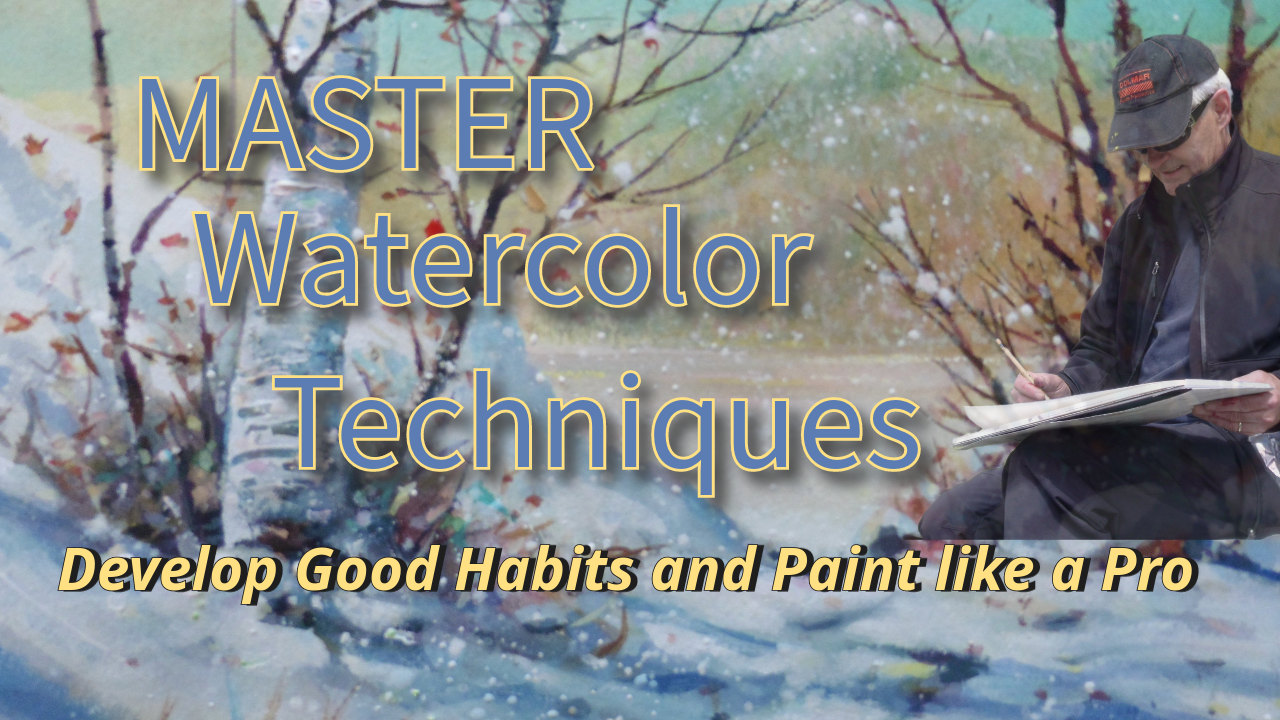
Transcripts
1. Good Habits Intro: Hi, I'm Ron. Movie and
welcome to the class. I'm going to walk you
through this class. Show you what materials you
need, what we'll be doing. I'll break it down into little segments so you can follow. And I've added some pines, gray and two brushes, a rigger brush and a flat brush. We have some exercises
that are going to really change the way you
perceive your abilities. It sometimes are bad, sometimes they're good,
and sometimes they're just habits that aren't working. Ineffective habits. This class really
changed things. It's changed the way I saw
my watercolor practice, I noticed that I was sticking to just a few brushes and wasn't experimenting. Got
to experiment. We will definitely
bring you from this level up to this
level, I guarantee it, with the two tools that I'm introducing here
and showing you how to use and how to apply
them to a landscape. Doing a birch tree and a couple of winter
scenes, doing exercises. You're going to like this and you're going to move forward. So join me inside and
let's get to work. I'm really anxious to see
close up what you're doing. So don't forget to
post your work. Let the other students
see what you're doing. Let me see what you're doing because we're a
community of artists, creatives doing their
best and moving forward.
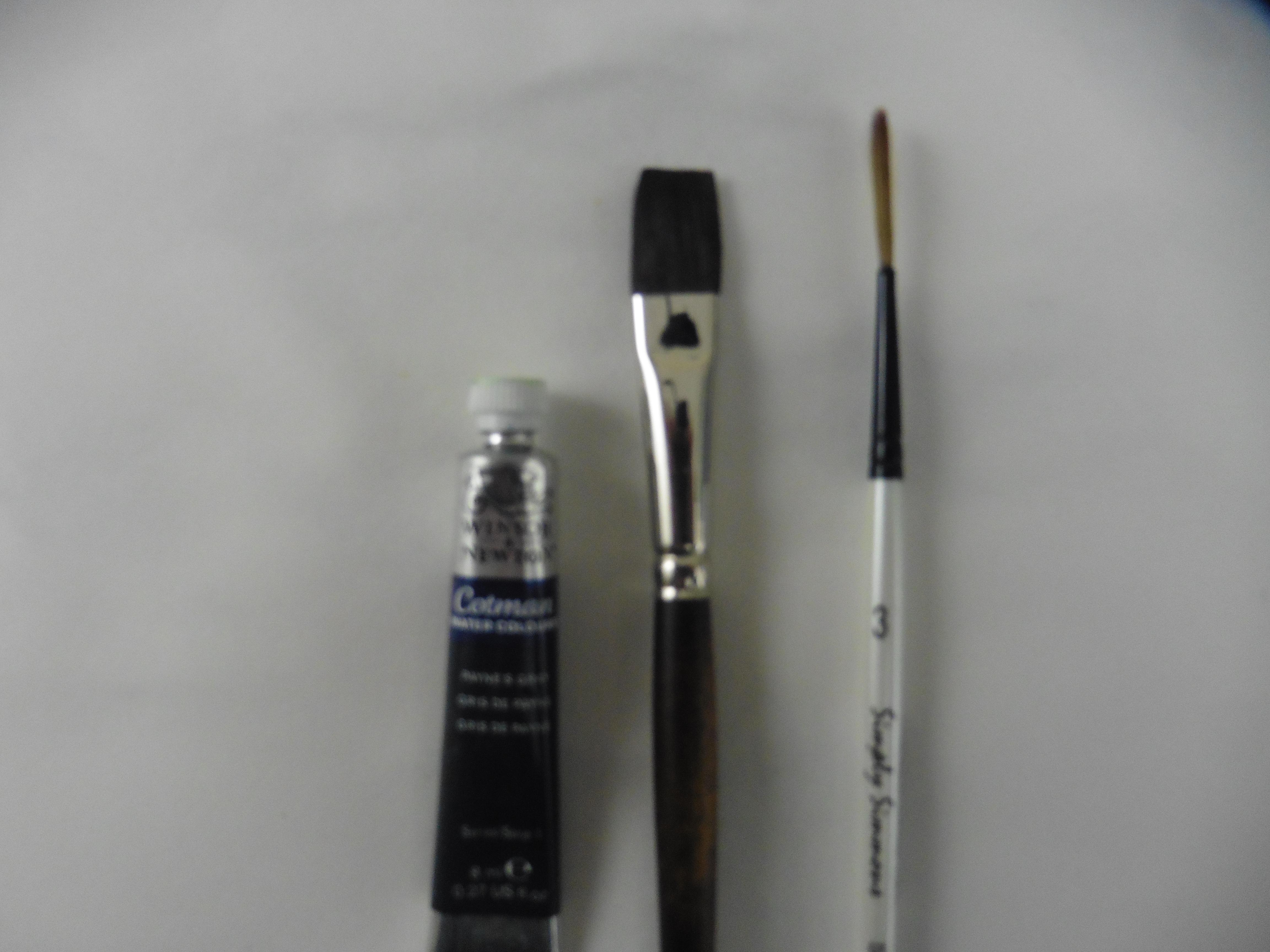
2. Good Materials Make Good Habits: A few good materials make
a lot of good habits. Let's take a look at some of the materials we're
going to be using. That's our little
cellophane secret material. These are brushes, our paints. We're going to start
with the rigger brush, sometimes called a script brush. I bought that one for like
$4 You can see how it works. It's a magical brush, there's no doubt about it. You need to have this brush to be successful in this class. You can rub it, you can do pick up paint with it,
you can wiggle it. Anything that is needing a fine line will work really
well with this brush. Second, I have my sable
brush, it's a synthetic. About $30 I'll be using that. It holds lots of paint. Since we're not painting
too big, it'll be perfect. Following that is
a half inch flat, sometimes called a
bright soft hair. This is a synthetic
squirrel hair, holds lots of paint. It also has magical properties and you'll find out in a moment. You'll also need a
permanent ink pen for maybe one project or two. Mostly will be using
straight paint. I have a whole stack
of brushes, big ones. There's a little Asian brush, This is the cartridge pen brush. It's full of water. Those are handy. What else do we need? Basically, just
those four items. You see the magic
little crinkle machine, you'll see this in one of our little episodes.
Look at that. You don't want to overdo it, but it really is quite
a good little trick. Good habits have good tricks. A spritzer always can use a
spritzer to keep things damp. You can see here in our birch tree picture near the beginning. And water copious
amounts of water, lots of clean waters. My porcelain mixing
tray $9 indispensable. You can clean it easily. It never stay pains. Gray. Credible color for
what we're going to do. A thalo blue, I'm
using Hansa yellow, which is a very strong straight yellow and of
course in a lizard. And crimson. You can use different pigments but
try and stick to these. Definitely some opaque
white or some white acrylic yellow,
ochre, burnt sienna. Those are all the paints that
you'll be needing today. Other than that you can
substitute whatever you want. Papers, Arches, one of
my favorites, Canson, very durable, and Fabriano, extremely durable, and
a nice rough texture. Those are the three papers. 123, that's all you need, and of course a paper towel. Up next is Brush Habits. Okay. I can't wait to
see you. Let's go.
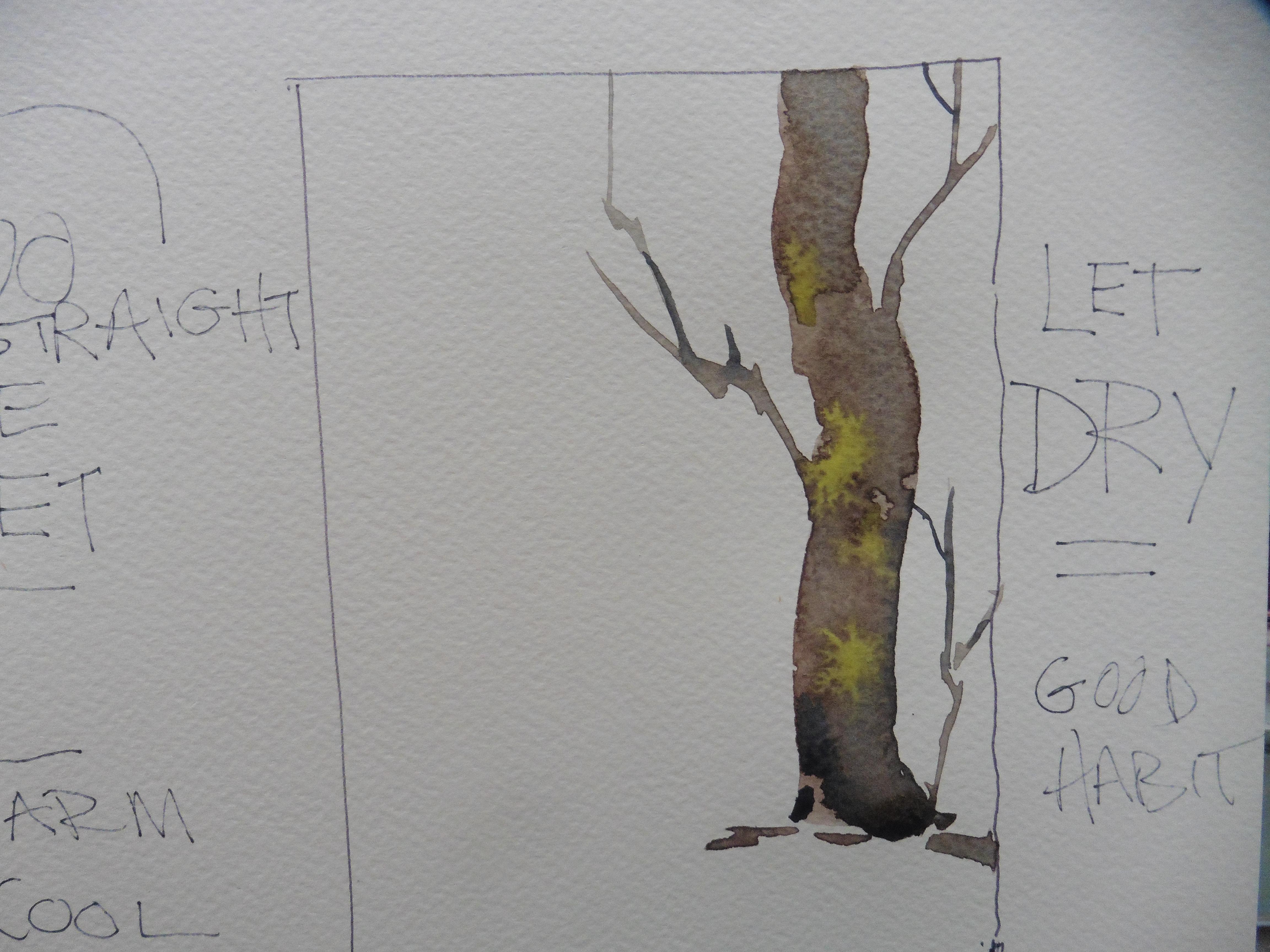
3. Good Brushes Make Good Habits: Good brushes make good habits. Let's start with
the rigger brush. And something
unconventional like the end of a pen or a pencil, or even the end of your brush. Watch how easy this is. You will want to do this a few times just to enjoy
your success. Put a little of the pines, gray maybe, warm it
up with a little red. And just put the beginning
of a little tree, like a bonsai tree. It's got two little tops. Do you take the end
of a pen or a pencil? Something blunt, not too sharp. You just flick it, you see the paint is all
puddled in the bottom. We're working on three,
Threes are good. Just keep saying 123123. Now we need a little more paint because it's not
pushing anymore. The paint is starting to
absorb into the paper. We just continue pushing up. Remember grass grows
up, trees grow up. Make your limbs go from
the bottom to the top. Now we add a little there, Just keep adding
drops of the pines gray and keep pushing up. You can experiment
with different types of pens, but look
what you can do. That took me like
5 minutes to do. I just did, my tree
scumbled green on top. And away we go. You got
yourself a really easy tree. Try a few of those. Okay. Now I'm going
to try another one. This time I'm going
with a warmer color for the trunk and tap, tap, tap, tap, tap. Putting it on an angle, this could be like
a pollard willow. They grow by the river. They have big stems or trunks. And see how I've got
my end of my brush. This time I've put it down on about a 45 degree angle
and then push it up. Push up slowly. What
could be easier? I've seen this
done with a straw. You put the puddle and blow through the straw,
but not as good. Now, here's the rigger
brush. Watch this. What I'm doing is lifting a
bit of the paint off with the rigger brush that
it looks more barky. I like that word, barky. Okay, here we go. Now,
look at that rigger brush. I'm just flicking the
brush, Flick, flick, flick. Wow. That looks like
it took so long to do, but it didn't. It only took, what, 45, maybe a minute. Now, I'm going to put
another one beside it. These are just little
exercises you can do and get confident with
just one color. You can do them in
different colors. Then you can add them to
a landscape if you wish. Or look up pollard willows, I think it's P O L L A R D, they grow in Europe and they cut them every year and
use the branches. This is really good.
This one just take some cellophane or plastic wrap. You can also use a sponge. You dip it in some paint. Away you go, make your
little spattery shape. I've got one on the left and
you make some grass with it. Sp maybe swipes a better word. Swipe it upwards, tap
it here and there. The trick is not to go too far. Don't overdo it.
Just get enough on there that you can go. There's a little spattering that gives a little
more texture. So far, I haven't
even used a brush. Now, here comes a few dots. This is pretty simple. Here, we're going to
put together the trunk using our new found tree method. The tree trunk method I
thought of for a minute there. I think I'll put
that one off center. I could have put them
on an angle too, but straight up, good. I'm going back to my big pen, the round end, just pushing it up here
and pushing it up there. I really encourage you to
try this several times. You can do it with flowers also. Many flowers have
abundant buds on the top. This is a great
little technique. There's the rigger brush. Now we're going to put the
finer little strokes in. I like the rigger brush because
it holds a lot of paint. That's a Robert Simons, maybe $4 Get yourself a few, get some longer ones. Bigger ones, Smaller ones. One of the handiest
brushes for details. I hope you're painting
along with me, or at least watching
and listening. Because if you listen
to this a few times, you'll get the idea of what
I'm doing, how simple it is. Professionals like simplicity. We don't like complicated. We do get in trouble
once in a while. But the solution
is always simple. Find a way to do something that takes the
least amount of effort. Now, of course, sometimes you're going to have
to use a lot of effort in order to
reach that state. Here we are, we're just
putting in the little leaves. Personally, I like the one on the right only
because it's done. But maybe I can get a little
landscape out of that. Look at how I've used the
rigger brush on the side. Look at the great
strokes that mix. You can go down with it, you can pull it,
you can wiggle it. The roughness of the paper
is creating texture. I'm working on dry paper. Knowing when to dry
paper and when to use rough paper is important. It's to your advantage
to know when and how. Now I'm going to pull that down. Look at that stroke. That's
my new sable synthetic brush, about $30 My last
one lasted 20 years. Then I used it for some acrylic paintings and I wrecked it. If you have watercolor brushes, just use them for
watercolor there. Look at that little picture. I think that says it. All right there, try
that little technique and let's see what
we're going to do with it in the next clip.
4. Know Your Paint Habits: Let's practice some good habits, especially with our paints. There's our three colors. A Lisarin crimson, handsome
yellow, and thalo blue. I take my half inch brush, prime it with water, take a little Alizarin crimson
and start to thin it. Thinning down your paints is the first thing you want
to get a good habit with. Now I'm going to show
you how the burnt sienna not thin down so much is
quite thick and pasty. I'm going to put some in
the tray and thin it down. But first get a
little more water. Mix enough paint so that you're not going back and having to get more better to have a little
leftover than not enough. Okay, now I've added
more water to it. I have it at the
consistency that I want. Clean my brush. Great habit.
Keep your brush clean. Take some Theo and
let's work the thalo into that grainy, burnt sienna. You'll get a greeny gray. I'm pulling the paint,
not rubbing it, pulling it, go over
to the other side, pull down the Thealocene. You'll notice we're getting some rather unattractive
looking colors. But it's not about the colors, it's about what is
the paint doing. We have a stainer paint
which is Thealocene. Have a gray paint
which is burnt sienna. Tapping the paint on notice I haven't really
rubbed the paint. I've directed it, patted it, pulled it direct, pat and
pull, but not rubbing. Okay. Now I've cleaned
my brush and I'm going with a pure thalo blue. There's a light coat
over the Fabriano paper. Just pulling it down to get a flat wash. Now we'll try it again with a
little stronger solution, less water, more paint. Another flat wash. Now
let's go a little darker, add more paint to the water. We'll see how this
comes out right beside the light one that you see it
bleeding into the wet area. You can go over it, you
can get a graded wash. Doing it this way,
pulling the paint, there's the thalo,
it's still quite thin. Now we're painting
into the wet paint. Wet into wet. Let's take some more
of that burnt sienna. Let's put that
across the bottom of the thalo and let it work
its way into the thalo. You'll notice just that little
bit of thalo has turned the burnt sienna into
more of a tawny brown, whereas the one in the middle
is the pure burnt sienna. Whenever you add one
color to another color, you're going to change it. Its purity is going
to be gone or its purity will be enhanced
depending on what you add. Pains, Gray. This is how
we get our neutral colors. It's an easy way to
get neutral colors. I'm mixing burnt
sienna with the pansy. Makes a nice warm brown. We're going to put that
beside the other patch, then you have a deep brown. Notice the bead of water
has flowed downwards. All the paint is
running together with no hard lines and no
real bleeds either. You can see the texture
of the Fabriano paper. The granular paints sink
into the little recesses. Now I'm leaving a
white line between. The paint will only
go where it's wet. If you want to stop the bead, just have a white line of dry paper between
your flowing paint. I'm going to tilt the paper now. 30 degrees is a good angle. I use my good old ink
bottle, seems to work. Now the page is
flowing downwards. Look at it, creating quite a texture there
with the Fabriano paper, back to thalo blue, we're going to put the thalo
blue into that dark brown. You'll see the green
tones coming out. Pull the end of the brush gently without
hurting the paper. Just direct the flow of paint. Now we're going with a
pure, handsome yellow. And we're going to work
that into the burnt sienna, pushing it up into it. Then down it comes. You'll
see on the left how that grayish color is bleeding
down into the wet hands. A yellow. Wherever
your paper is wet, the bead will find it. Wherever you see
those white spots on this little exercise, that's where the
paper was totally dry and we worked
the bead around it. Now I'm taking some Alizar and Crimson and we're going to see what happens when we put it over the paints, how it reacts. Now it's quite orange there because there was no other
color to infiltrate it. Now we're going to
make little channels and we're going to
play with it a bit. Going to drop some
pure a lizardin and see what happens
as it drifts down. Drifting paint is
something to watch. You never know where
it's going to go. Learning how to direct
it is a very good habit. See how I'm directing the paint around the dry white paper. This little exercise has
so many applications. I use all these techniques
when I paint because I'm aware of what the paint can do and
what I can do to the paint. Here, I'm dropping in the thalo. Now we have three
colors, actually four. We have pains, gray, thalo, Alizarin, crimson,
and the yellow. We should get some
interesting combinations of colors here. See
the bleed mark? The yellow is dry. The paper never got
very much water. When you have wet paint
coming up against dry paint, it'll bleed into it, almost like eat into it. We're going to put
some strong thalo into the wet Alizarin. Now let's drop it on
the dryer, yellow. You see it doesn't
move. It stays put. That's good to know. If
you're putting leaves over a sky there. Look at that. Disperse just mini explosions. Check the bleed at
the very top there. Now I'm working wet paint
into half dry paint. This will give you an
effect that you may not like sometimes you do
this when you want it. Don't just keep adding
paint here and there unless you know why you're doing it and for what reason
you're doing it. A good habit is to know how your paints react to each other. How they behave on the paper. What you can put with some
paints like to be together. Let's score the paper now. Let's see what happens
when the paper is wet. You score and you'll see
it leaves a darker mark. It also leaves a little puddle
of paint when you stop, which disperses into the line. Now this is what I like if
you're great for trees, but look when it
hits the dry paper, it's like instant
doesn't work anymore. But this one, watch, this
carries right through. There's enough paint now collected so that it goes
right through the dry paper. Let's do some creating now using these good habits
and have some fun.
5. Brush Works : Brushes. Really? You want to get the right brush
to do the right job. A rigger brush, a flat brush. Tilt your paper.
Water runs downhill, get some panes gray
on your flat brush. Add a little bit of either
a bird siano or orange, something to warm up the pan. Check it good. Got a nice flow. Hold the brush up straight
at about a 45 degree angle. And slowly you twist, letting the brush do the work. Taking a little more of
that nice dark brown, adding some sides to the tree branches like to attach to the tree
at different angles. 45 degrees, 90 degrees,
some even hang down. Now what I'm doing
is just adding some more paint at the
bottom to make the foot. Yes, trees have feet. That's where the root
goes into the ground, makes a gentle curve
at the bottom. You see that it almost looks
like an elephant's foot. If you don't do that, your tree will look like it's sitting
on top of the ground. Here we finish up the top
with a nice slow stroke. Go as slow as you can. Think about what you're doing. See how the paints collecting. Add another little branch
beginning. I've got three. My picture has a
nice curve to it. Perfectly straight is okay. I'm going to show
you how to do it fast. Some trees are like that. You go through the
same principles. You're going to add the foot. Then I'll be showing you
how to do this in a second. How to take that one, just
add the details to it. There's the two kinds of trees. They are either straight
or they're not. Let's get that tree so it really looks like it's
anchored in the ground. The way we do that, we take a
damp brush but not too wet, just a little damp and bring that water moisture up to
the bottom of the tree. Now we're going to
add some dark because that will really just sink into a little
bit into the tree. Giving one side of the tree dark and the other
side a little lighter, depending on which side
it's coming from the sun. Thinking is a very good habit. I agree. Here we have
two schools of thought. Some people think you
should jump in and other people like myself who have
tried jumping in for years, I think in now, once I think in then I know I can jump in. So I take the same mixture. Add a little bird, Santa. Yeah. Burn, Sienna and pines, gray are pretty friendly
towards each other. They make a good yeah. Oh, what are we doing
here? Oh, here we go. Think I'm thinking I don't want to be in the middle and
I don't want to be in the middle from the
side or the bottom. I want to be just at the three quarter
section. There we go. Nice little loose wavy
tree right to the top. Now I'm doing a little thinking. I've got to put my foot in, I already know that I have to make it look
like it's in the ground. I'm thinking what I
do. Okay, there's my little branch we
already did that. See what else is going
to happen in this one. The last tree was
a good warm up. You want to do a few of these. Music We call them chops, meaning get a few things
that you do really well and use them
when you paint. Make them into a habit, like doing thumbnail sketches. We're going to do some of those today. Tilting your paper. Here comes the rigger brush. If you've never used
a rigger brush, you have not painted
trees or ships. They used to use them
for the lines on ships. There it goes, look at
that. Almost effortless. The brush has a lot of
spring because it's long, it holds a lot of paint. They come in different sizes. Once you use them,
you'll be sold. They're one of the best water
colored tools out there. Notice I'm putting dark sections
where the branches are. If you study trees, you'll see that it's always a little
darker under the branch. Now, I'm going to add
three. Pretty soon. I'm going to look and say, hmm, let me look at those branches. Let's have a little friend
here with them. There we go. Put that near the bottom. I like how that's
flowing to the right. And we put a little bit of
a turn there that's subtle. Look at how subtle it is, but that little bit
makes the difference. I've left the white there
at the base of the tree. But right now I'm thinking
I'm going to connect them. Because connecting your shapes is very important
from a design view. Now here we have two we want. 33 works better than
two in painting. Three's company. And two doesn't work unless that's intentional. See, it's pointing
up. They don't all have to point
the same direction. Now you might ask, why don't I put leaves on my tree here? Well, that would be
just another technique. We're just getting really good
at the shape of the tree. I'm adding some cadmium
yellow in here. Actually, handsome yellow. It's going to eat into the
brown to make a mossy look. Important to do those little
exercise. Here we go. Jump in and away we go. One shot. Just let her go. Now we'll add the base. Think in goes with bold. The bold is on the left side. The think is on the right side. Jump in. Then what you
want to do is wait. Because once you've done your
big bold stroke, watch it. Don't be in a hurry
to keep being bold. Do something bold
and then watch it. Combination of the
two and jumping in. Very important, But just to
do one and not the other. You might get lucky
once in a while, but most of the time your
paintings aren't going to work. Look at that, I know it's wet, so I add a big shot of
dark and now I'm going to tilt my paper so it runs
down, water runs downhill. See that great little technique used all the time
by professionals. You can be a professional
watercolor artist. You don't have to be like making millions
of dollars at it. Lots of people play
music and they're very competent and they've
never made an album. Have fun while you're doing
this. This is learning. You're getting some skills here that can change
your attitude, give you a lot of pleasure. There's my straight tree. Okay, here we have dry. Look at how dried that green, it almost looks absolutely real. We let that one dry. Let it dry. Great habit. Let things dry
before you do anything. This one, we're
going to work this, we're going to use
wet two things. You can use two things. You can wet and dry
the first thing, so the first thing
I'm going to do is get some water and my
squirrel hair brush, and I'm going to
wet the surface of this 140 pound Fabriano paper. There we go. Now remember
I just did the tree, so it is a little damp. Now, I don't mind if
I have a little bit of pains, gray in this brush. Gray is a great color to
have as an undercoat, even if you're going
to put blue over it, see halfway, we're going to bring it down
farther than halfway. Halfway doesn't work. Two doesn't work. Three is good. 13 or two thirds of
the way down is good. Good habit is to think
in. Three is not two. Wet both sides of the paper, being very careful to
leave a white space between the tree
and the wet paper. Remember, the tree is wet. You're going to see a little
dispersion here in a second. Now I take some nice palo blue. Notice the brush I pointed
at the edge I'm painting. The tip of the brush is
pointing at the tree over here. I've got the side of
the brush pointing, look how the white
is showing up. And I'm going to pull down the blue because
the paper is wet. It'll do it good. It'll
work really well. Okay, now you can turn the
paper when you do this. Usually when I'm filming I
just twist my arm around. But if you want to make
sure you don't get into that beautiful white
area on the tree, turn your paper so you can
use the tip of the brush. Okay? Now, I'm
randomly putting in some of the pines gray. I have no idea what
I'm doing here except I'm using
the Wet principle. But as far as design, I'm not really thinking about
what's going in behind. I'm just showing you how there's a little
dispersion there. See what happens when you
apply paint in a wet manner. Look at the bead on the left. We're thinking the bead on the left to see that
nice bead of water. And there we have the
dispersion there. Wet, wet. Learn to use wet for
your advantage now. Everything's cool here.
We're going to warm it up. I'm going to take
a little bit of this very strong cadmium red. I'm going to add some
handsome yellow to it, so I can get a really
strong orange. And I'm going to be bold here. See? Wiggle, Wiggle. Here comes the big stroke. Pretty soon there, there's, I'm going to think
now I got to go. Cool. I need something
cool like maybe a green. I have my little
sable brush here, about $25 It's worth
it. It's a sable blend. So about 60% Sable here, right beside that tree, coming up, controlling it. Come beside it and wiggle it up. Now, I might be
thinking a little bit. Yeah, I think I'll
extend it over there. And here comes the
swipe. There you go. Now it's an interesting picture, but because it had no
thinking on the left, the right one still
could go somewhere and it will in a
project coming up.
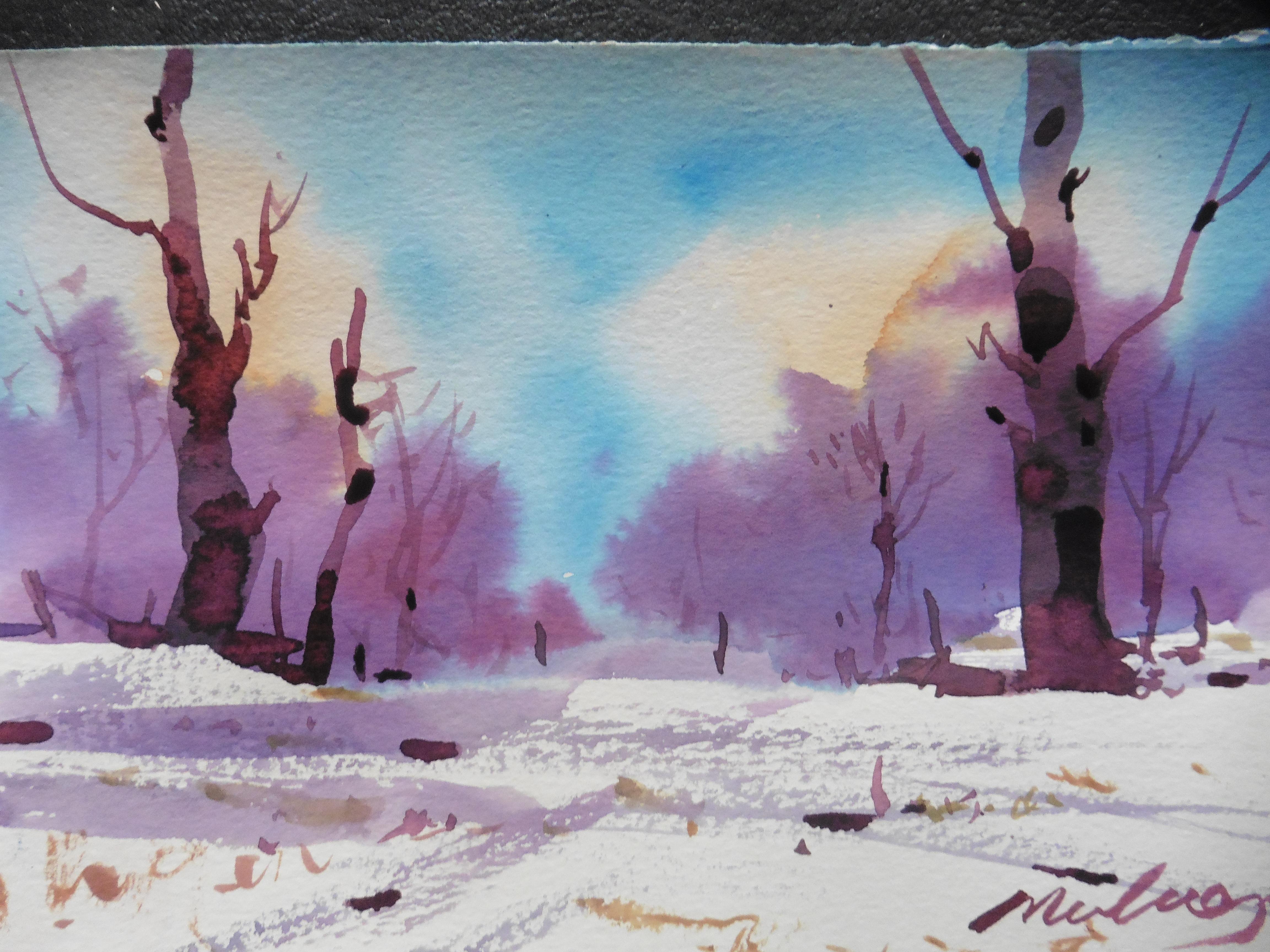
6. Winter Trees Part 1: Trees and snowfall. You're going to put all you've learned in our little
lessons to work here. We're going to be doing a sky with a little bit
of burnt sienna. I'm just using a little
Asian brush here. I'm just showing
you how easy it is to put a little bit of
paint on the paper. This is Canson
paper, very simple. A little bit of thalo
blue in the middle. Paper is totally dry and
it doesn't look very good, does it? That's the secret. If you form good habits
of putting it on, you'll see what happens here. Because I'm keeping
all the edges wet. The bead is starting to happen, meaning the paint is flowing
downward and inward. Things are moving together
and blending together. I don't have to rub all
the colors with my brush. Let the paper and the
wet in the paper, we call it water and the
paint, let them mix together. Look what's happening there. See that might give it a
little swipe through there. Papers glistening, which
means the surface is wet, but it's not
impregnated with water. Just a little bit of
water on the top, a little more blue on the side. Watching, Very important. Remember our little lesson. Jump in and watch. Or think and jump in and watch. Watch is the common denominator. That's what makes professionals always sort ahead of the game. Because you're watching
to see where it's going. Okay, I leave that sky. Although it doesn't look great. It will, it'll just
blend altogether. Now, I'm using the roughness of the paper with my flat brush to get a grainy look like you get in the winter
when there's icy snow around. The paper is small enough so
I just have to hold it with my finger. It doesn't buckle. Pushing the brush this way, that way you see
the few lines going into the picture.
Very important. Just sweep them across
with your brush. They'll get a little darker here. You know what
I'm going to do? I'm going to let
the paint disperse. The sky is wet. When I add some
strong mid tones, I know it looks dark, but it's a mid tone because
water colors dry, lighter. You put them on strong. 5 minutes later,
they're half as strong. I see I've got a little snow
bank there, a little white. I'm just going to leave that, I'm not going to get rid of it. And I'm going to add more to the trees, a little more blue. And basically mixing it right
on the paper, there we are. The one on the right is longer
than the one on the left. That's a good design principle, even if it's just a
little bit longer. Okay, papers flat. What am I thinking about? Let's see, what are
you thinking about? Going to put some little
dark swipes here and there. Now, coming up a
little higher there. See if we just touch
it. There we go. I'm using my flat brush, a very soft brush, and now it's going to run. The bead is running,
remember the bead. The bead is the
water that collects. If you can keep that flowing. See I'm flowing it to the left. It's also coming up on the top. Look how the sky has turned out. It's got some warm sections
and some cool sections. Oh, here comes the rigger
brush. See how I lay it on? Just lay it flat. Details are very interesting
in a watercolor, you can suggest details. You don't really have
to make a lot of them. Just put little dabs
here and there. Now I'm watching it,
looking at the color, going, let's see if
things are looking good. What else am I going to do here? Just thinking it out, watching, oh wow, look what's happening. The paint has done all the work.
7. Winter Trees Part 2 : Part two. This is
where we put the trees in with the flat brush
and rigger brush. The papers dried
for about an hour and I gently bend
it to flatten it. You don't have to stretch it. Just gently bend it a few times
and prepare a dark color. I'm using some Alizarin
crimson, some thalo blue. A little bit of bird sienna. Good old pains, Gray, pain. Gray is great. You don't have to spend a lot of money on it. It's black, basically, You can't get very
many bad blacks. I'm going to be adding some
more of this burnt sienna. I'm making a very dark
mixture, almost buttery. Not a lot of water, but
enough water to flow. I'm using my flat brush. Let's just have to
have the right color. I don't think it's dark enough, so I add a little more paints. Gray. There we are.
I'm going to get set. First step, take your time. Find the place, wiggle, push the brush down and move it. Just like in the exercise, I even twisted it a
little at the top. Now I add the little
hooks on the side. It's exact same tree you
did in your exercise. Now you can do many variations. Do you know what I'm
going to put in next? That's right, the foot, you're going to make that tree look like it's in the snow. The bottom of trees are
always a little bit, well you might say in the winter because of
the branches up top, it's never completely
full of snow. There will always be
something on the snow. You noticed I used
my rigger brush. I have it in one hand and I have my flat brush
in the other hand. There we are putting
in little fence posts. This is a picture you
can make anywhere. Lots of people use this
idea of some snow, some fence posts, a couple trees in the background, blue sky. We're not so concerned
of the subject matter as we are with the techniques and the habits we're forming. Here comes the darker accents. Make sure you, make sure you
mix up enough paint right, and you get that nice
curve at the bottom. Here comes the next tree. Well, we're going to
turn it upside down. Try something
different. Why not? Oh, that's a good little turn. See the side of the
brush when it goes up. Look at that lovely variation in color from the cool
bottom to the warm top. There's your little feet, I mean, your little arms. I'm going to put some at the. I'm keeping that little ledge, you see that's a good shape. Always look for good shapes. We're just adding a little
darks here and there. This is about as dark
as we're going to get. You see the papers drying there. I can get a little harder edge. I put that dark
underneath the tree limb, which I'll add in a minute. Now we need three
trees to look like, goal posts or fence posts. Where am I going to
put the third tree? This is where you think. Where is it going to go? Is it going to go beside that tree? Is it going to go
beside the other tree? Is it going to be straight big? I'm going to keep the same
curve as the tree on the left. I'm going to keep that round theme or what
we might call bent. That's as far as I
go with the trunk because I'm going to be
using my rigger brush soon. The rigger brush will do
all the fine details. Now I'm scattering some darks, a good habit, don't
be afraid to put some darks on that
brilliant white paper. They lead you into the picture. They're not just thrown down, helter skelter, They're
put in certain places. You're the judge of where
you want to put them. Okay, now we're going to
get down to some details. Now there's the rigger brush, and test it, perfect. It's loaded with dark and
we're going to be putting in little grassy fringy strokes, maybe making a little
wire there broken, that leads towards the tree. It's subtle, but after a while you just
know where to do it. Okay, here it is. There
comes the first one. That's one, there's got to
be another one somewhere. It's coming out of there. There's two, that's
a fine looking tree. I'm holding the paper
with a brush because I don't want to get my
fingers on the wet paint. Oh, it's probably
dry by now still. It's not a good idea
to put your fingers all over the painting. That little brush
is just fantastic. Here comes the next tree. Remember connecting shapes? Let's see if I remember to connect the shape with that one. Comes another one and yet another one that's
connected there. That's a good connection.
Remember, connect your shapes. You can connect them
with lines, there we go. Or you connect them
with direction. Make things point at them. Oh, there's a nice, that dark is great up there. Here it comes a little
flick. Look at that. Perfect. I think I'm having a good time
putting these trims. I think what it is, it's
the confidence of this. The rigger brush is
something you need to use. There's other things I
might have done in this, but I might do this
painting a few times. It's a good little study, it's a good little painting. Now we're going to just
touch the brush and put some of those
trees together. You see now they're connecting,
Connect the shapes. A little bit of here,
a little bit there. The distance the brush
is getting lighter, the paints getting lighter. So I can just tap in a few
things and I don't know, I'm probably just
about done here. Oh, getting some warm
accents in the grass. Took a little yellow
ochre and ochre there. Remember, cold pictures are not the best thing in the world. There we go. Just adding
a little warmth here. A little warmth there
leading into the picture. I think you could have
a lot of fun with this painting if you
did it a few times. Oh, there we go.
There's the name. I must like it if I
put my name on it. Always a few juicy
little dark accents at the end with a water color. Add some bright reds
or bright greens. Look at that beautiful tree
on the right and left. Just adding a few things. Got that little tree on the right. You're
going to connect that. You're going to what you're going to do,
you're looking at it. Let's see, There he goes. Good way to connect
is just put dark beside a dark there we go. Well done. I think
you know what, I really would like to see
your painting of this scene. I can't see how you couldn't
do a good job on it. That rigger brush,
the flat brush, using that little
tree technique. Just going after a
few little details. I'm resting the palm of my
hand on the desk sometimes, but even this righ
could just have a free flowing stroke
with your brush. Okay, I think we should make
it snow. What do you think? Get yourself some opaque paint. Even some acrylic
paint if you like. Or opaque gash there,
we're going to do it. There it is, He's doing it, looks like I'm doing
it in the morning, got my big sweater on. I'm just bouncing some
nice wet paint on there. Now, why am I doing that? Well, snow blows on angles. If you put a piece of paper there and just go straight
down the edge of the paper, it looks like the wind is
blowing the snow. Look at that. Geez, I'm glad I'm inside. On a day like that, you may want to go
over them a little. If you've got too much, you
just take your paper towel. I like the one way up on the top of the tree a little more. It's like salt and pepper. Just shake it on. Know
when to stop though, and I think that's a
good place to stop.
8. Value Study : Total studies a
habit worth getting. I'd like to start with
finding a sketch that I like going to the next
step which would be to, I draw out a little
square on a piece of just regular
sketchbook paper. Nothing fancy. I'm
going to be using a couple brushes and some pains gray for
this total study. The reason I make a square or rectangle is so that I
can contain my drawing. And we're going to be doing
the one on the right bottom. Those lines at the top,
they give me a boundary. This is a good little
study to watch because I'm going to
show you how to do the total study and also how to crop your picture
for more effect. I'm just drawing this. I've got the basic shape
down from my little sketch, and I'm looking at the top now. And I'm looking
back at my sketch and I see my sketch is
a little different. Put some bushes in at the
bottom just to anchor the tree. Nothing really definite. I'm establishing where the
shadow areas are going to be. They're going to be
on the right side, there could be some
on the left side too. But now I've added
another limit. It looks very
awkward at the top. This is why we do studies, we go think something
needs to be changed. I look back at my sketch, I see there's not
so many tops on. There's a good strong
vertical on the left. I put that in.
Notice how I leave. The other ones don't get
into erasing things, just leave the one
you don't want and learn how to do
some good cropping. This is what it's
going to look like. I crop chop the top of
that tree right off. Now I can get to work. Establishing a fine
shape, curves, all those little
curves repeated, you see, make a good shape. A good shape is really important when you're
drawing trees, See the little curve there. The curves are dominant at the bottom of the
tree and at the top. And now I pick up
some pain grays. I'm going to establish
my darks first. I take some full strength pains, gray little brush and just
wipe on a little bit of tone. That's why it's a total
study, light and dark. I'm including this in the class, so you see one of the
very fine habits, probably most
successful artists, unless you're really a
slap and artist where you just go after it with
all kinds of colors, with no real plan. If you're doing
anything realistic, you want to compose
and work on it. Get it ready. Work out
all your indecisions. Look at that limb, it's
just coming alive. Black and white is a great
way to start a painting. Okay, now we're going into
the rest of the sketch. Notice the horizon line or the foreground stops
in the bottom third. Now I'm accentuating
the curves again. Curvy bushes, curvy lines. I think when I look at
the base of the tree, I almost see somebody's
head and arms there. I didn't see that
when I was doing it. There's our little tree trick. You see a little black
marks at the bottom. Here comes the road and there, watch, I'm going to use the
tree trick, there it is. Just get used to
that little trick, it really works the
background trees. Now that little person is really looking like
it's a person. It's funny to watch
yourself paint because you see things you didn't see when
you were painting. Okay, we're going after
the background more now. Just trying a few little
things. Here comes the paints. Gray. Notice I'm
putting the darker mid ground against the
light of the tree. Balancing dark with
light. Tonal study. Dark tones, mid tones, light tones and highlights. High lights are exactly
what they mean. It's the highest light,
the lightest part. Basically, the
picture is a midtone, a mid tone, a mid tone, a light tone, and a dark
tone. Okay, here we go. Now the sky, I'm thinking, I'm just drawing in
a few rounded clouds keeping with the round theme. As we come in closer I'm going. Hmm. Okay. Where else are
we going to put that cloud? I like the mountain line because it's straight like the tree. Let's just give it a distance, a quick little coat. And here we go, we go
dark on the top right. One of my favorite
little moves is a dark at one of the
sides of the sky. I seem to do that in a
lot of my paintings. I like it notice the dark top of the tree
is not as dark as the sky. We want the tree to be
the star of the show. It's going to have
the highest light and it's going to have
the darkest dark. Look at those little
trees on the right beside the number two.
They're the mid tone. See how they stand out. And that little
swipe there gives me an idea that maybe
there's some water there. Okay. The paper is not the best, but I'm adding a little bit
of thalo blue mixed with the panes gray just to give
it a little different look. Of course, I've
sped the camera up. There we go, popping
in scattered darks, working from one
place to another, not just staying in one place. That's a little
lesson learned from the impressionistic
painters like Monet Sisley. They would pop all
over the place putting in tones.
Okay, here we go. He's got some white
paint now, see, look. Now I can gray up the clouds. Adding the white
paint to the paints. Gray, It's a great little idea. It looks like I got a
little yellow in there now. Yep, there it is. Little
blue, little yellow. And it looks like the person
that was there has gone. Now I see an old stump of
a tree. Okay, here we go. I'm just watching this
just like you are here. There's a cloud coming
right over the mountain. And rain coming down
reminds me of Mallard, Joseph Mallard
Turner's painting, Steam, Speed and Rain There. And I'm making some
little notes to myself, rain and reflections. I will be, I'm
going to be making this into a larger picture. I might use this
for the acrylic. Next class we do,
there's a total study, great habits, make
great paintings.
9. Thumbnails: The thumbnail habit. This is absolutely the
best habits you can get. Draw out 456 little thumbnails and pick out some
colors, Paint them up. Work it quick. We're starting with
red this time, or what we call crimson. This actually is
the thumbnail we're going to be using for
one of our projects. Notice how all these
little practice sessions give us two things, ideas, and they give us a total studies for
what we're going to do. We tend to make our
thumbnails very simple. Sometimes when we do
the bigger picture, it gets a little complicated. I have to say that I'm
somebody who does that. I do like details. I like either a fast
painting that happens right away like these or I like something that might take me
literally years to do where I'm painting leaves on a tree. That's therapy for me. Probably there's two
parts to my nature, that fast and bold, spontaneous. And then there's the more
serious, take your time, search while I'm painting that, take a quick peek at that little painting
up above and see how those beautiful brown on the bottom right
is coming out. How little sketch up top
has really worked out well. Okay. As I'm putting a
little blue on this now, this one, I established
my darks first. I stuck those dark trees
in with the crimson. Now I'm doing looks of green, but that could be the camera. I wouldn't purposely
use green in the sky, but it's probably
a little bit of burnt sienna with the
blue looking good. Look at that. Isn't
that nice? Nice, warm? It's warm. You got
the shadow with blue. This is a great idea
for a little painting. That's probably why we did it. There's a little shot of blue at the top. What else
is it going to? The little warmth. Oh,
remember I told you the sky reflects in the ground. I'm leaving that
little white spot where the water is in the
very middle of the painting. There's a little towel just
in case it gets out of hand. That's great. Moving on now. Okay, I'm going to
speed these up now so that you can watch
me do it really fast. Light colors first. Mid tone and the darks
should be coming up next. There's a few darks, we call
that well placed darks. It's a little road with
trees on the right side. There's some more shadow
area, more darks. What I'm doing here is
establishing a little sketch that might work out. It's got a center road. All these sketches
have something that moves into the picture. The snow scene has
that little pathway to a little picture on the right has a lake
going to the right. This one has a pathway, or an old country road
going up the middle. These are quick little
sketches that you can use. I've continued adding some more darks the
last little bit, just swiping in those
little shadow areas, you can see there's
some possibility here. I got some lovely
greens and purples. Green and purple.
Good combination. Here we go, More panes
gray and we're working on this little scene that I've played with this
idea quite a few times. Probably I'll make it into
a class at one point. Do some seascapes. Used to live by the ocean, the mountains, a great
place to live to. Most of my paintings are
oceans and mountains. We tend to paint where we live. If you live in the
city or an urban area, paint the buildings,
paint the cars. All these techniques are good habit forming
watercolor habits. Watercolor habits. What are you doing
with your watercolors? Are you messing around with
them or using good habits? That's what we're
learning in this class. Good habits, just put
in those colors fast. Well, maybe not this fast, but really we're not
concerned with too much here except principles,
dark, medium, light. Just keep saying
dark, medium, light. You got to have
lights, you got to have mediums, you
got to have darks. Notice how I put that
little dark at bottom. Now we're moving over
to the next picture. Don't be too fussy. Know when your paper is wet, where it's dry, and
act accordingly. That's what you're
going to learn. How to act accordingly. How to have good manners
with your watercolors. Don't fight with
them, and don't call them names. Treat them gently. Treat them firm. Be brave. Be bold. Look at this, go. The reason I can do this
is I've done it wrong so many times that I've
developed good habits. See how I quickly put a little paper towel there?
Now I'm moving along. I've got the bottom of the
little reflection there. Those two down strokes. Excellent. I'm not threatened
by this little drawing. This little drawings.
Lots of fun. See using my brush there. But I would use a rigger
brush in the project. Look, just dropping those in. I'm excited, just watching this. Moving into the last one. Once again, look bottom
right as the sky color. Now I'm changing
up a few colors. Here I'm doing a
violet land form. Sometimes we get stuck
in the same colors. That's not what this is, a great little snowy scene. You can see all the whites left and all those little darks. Just fine with me. Oh, I've gone back here, Look at this little
lifting here. See I have a tree on the left. I lift out a couple little
shapes with my rigger brush. That paper is still once again, this is 140 pound. Oh, what's he doing now? Oh, he's using a paper towel. Just softening the edge. Yes, 140 pound Fabriano
paper. Here, watch this. That'll give you a
wonderful little texture for the trees. There we go. Okay,
I think it's time for a really good
project. What about you? Shall we leave this fellow
alone and go and do something that uses all the good habits
we've learned so far.
10. Working The Bead: Working the bead. The bead
is that puddle of water, that water colorist love. Here comes the bead,
there's the palo. And on the right hand side, the water is running down. That's what we're going to
learn today, how to use that. I mark off my paper, I start wetting it. I leave the edges white and dry because that'll
stop it from buckling. Give a good amount of water three quarters
of the way down, and then get some thalo blue. We tilt the paper
30 degrees just using a black ink container
so I can tilt my paper. I've wet my paper three
quarters of the way down and I put on
some thalo blue. Continue across if it
starts running down. I can change that by
tilting the paper in the opposite direction and look at that lovely
flow of paint. Gently stroking with my
squirrel hair brush, synthetic by the way, you want to harm little
creatures for their tails. There we go. We're adding
some Alizarin crimson, gently letting it flow into the Alizarin flows
into the thalo. Both of these pigments are
called stainer pigments. They sit, they go into the paper rather than
granulating on top of the paper. I'll be adding some
granulating paint in a moment. But just watch that sky. Not much happening except
it's blending beautifully. A good habit is,
don't be fussing. Watch Now I'm adding the burnt sienna with
a little yellow ochre. Mostly yellow ochre. I'm going to check it out, there it is. Yellow ochre is a
granulating color. Now, this Fabriano paper has
lots of little recesses. It's going to look a little
muddy when it goes on first. But yellow ochre
is a funny color. It doesn't look that
attractive at the beginning, but it dries out very well. There we go now the
yellow ochre is mixing into the
Alizarin crimson. Notice I'm not rubbing
the paper a lot. Just directing the paint
to form the good habit of directing paint rather than trying to work it into
your paper too much. There is a time when you do work it into the paper and
there's a reason for that. But I would suggest right now, learning this habit,
which is working gently, picking up drips,
working the bead, and knowing when to stop. That's how we do a sky. Let's look at the
granulation this time. Instead of just surface
wetting the paper, we are going to soak
it from the bottom and the top that all the
fibers in the paper, this is arches paper will be completely surrounded by water. It'll be just full of water. The paper will be soaking. This is a wonderful way
to start your painting. Give it a couple
minutes to soak in. Here we go with some
handsome yellow. We put in three strokes, a little bit past the middle. Just pure color, nothing fancy. Just throw down three colors. You don't even have to know
what you're painting here. We're just learning
about soaking the paper and adding fairly wet
paint. Nothing strong yet. Notice that a lovely
brown, muted green color. I'm going on top there, almost like a little halo mixing up some strong
crimson with the yellow. Just wiggling that
brush, clean the brush. One of the best habits,
keep your colors can, two colors are great, but once you get to three, you can end up with a neutral color. We're not using neutrals, we're using straight red, yellow, and maybe a combination of the red
and yellow together. We have not used blue, only two colors yet. Look at all the
colors. Yellow, We've got pink, we have brownish. We have orange just
wiggling in the colors. Because the paper is wet, the paint is soaking
into the fibers. There goes the thalo at
the top and the bottom. This is all light tones. Light tones just get a little darker there,
but not too dark. Now we're going a
little moving along, keep adding paint, clean the
brush go from the orange. If you didn't clean it, you
wouldn't get a nice pink. There we go, pink on
the right bottom. That's what it looks like. After it dries, it's
all mixed together. Well, now you've seen
how to use the bead. These are the thumbnails. This is for our major project. I really like this project because you can go
either direction. You can leave it as a watercolor or you can go with
me a little farther, adding opaque paint and
maybe even a little acrylic. But this is our little scene. Working it out with a thumbnail is the best
habit you can have, because once you've done this, you've solved most of
the problems and all you have to do is enlarge
it. Why a thumbnail? Well, first of all, it's
about the size of your thumb. It's not very intimidating. It's encouraging because you can work small and be successful with the smaller painting
and then gradually increase your size as
your confidence builds. Here I'm establishing my
darks just using some paints. Gray, and a little bit of lizard crimson, some thalo blue. There's a little grayish
blue in the top. It looks like green,
which is fine. It'll blend in a
little yellow ochre on the side and a little
shot of blue in the top. Here is where we're heading
in the next project, we're going to start
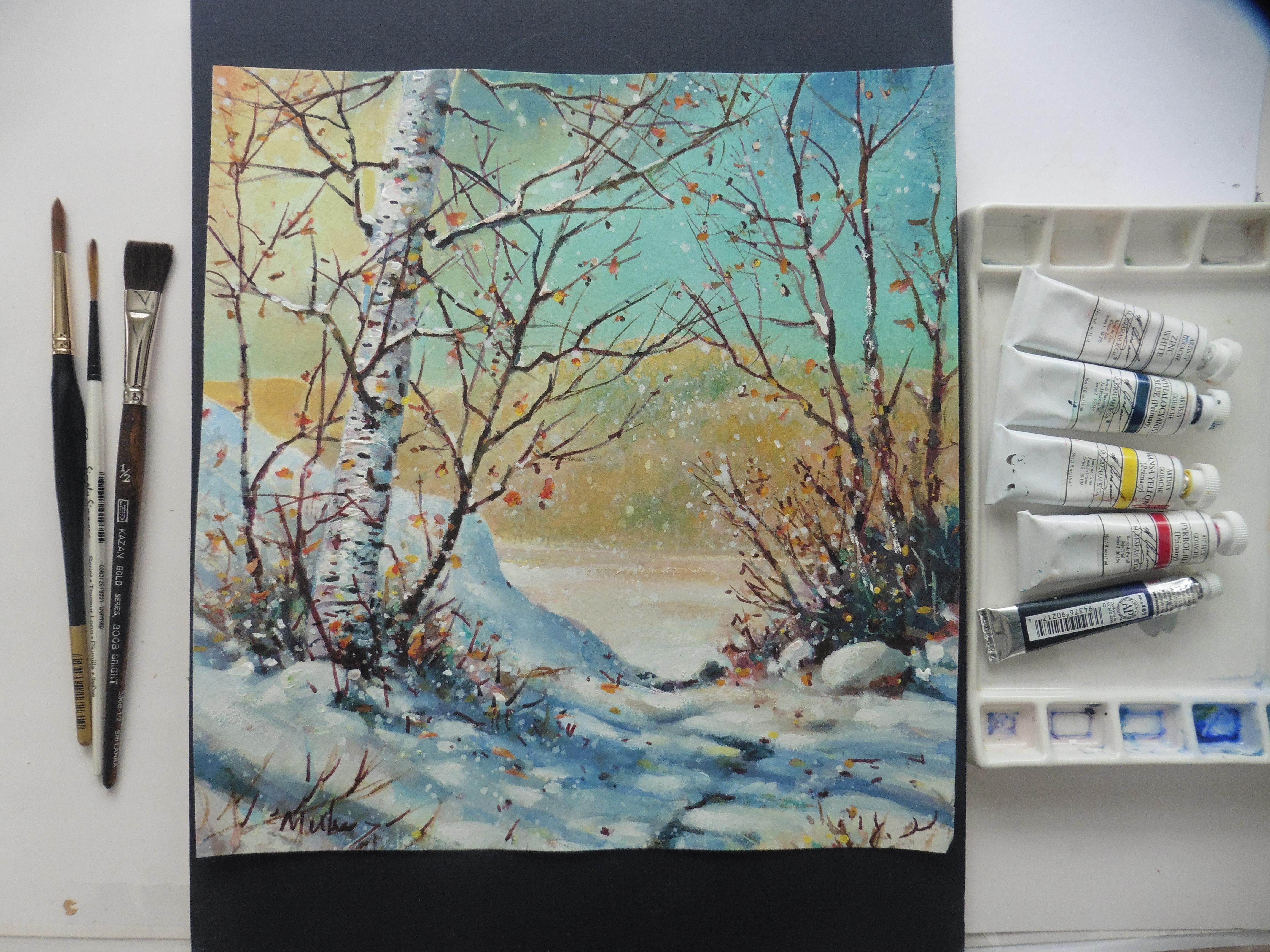
our winter birch using our rigger brush, flat brush, the bead wet paper. We're going to be using
all these great habits to successfully do a painting that you are proud of because you've
done the best you can do. So practice up all these
great habits and join me in my studio for
the winter birch.
11. Winter birch 1 Wet Lay In: Winter birch, applying the bead, lots of water is required. I have 140 pound arches
cold press paper and a soft squirrel hair brush, putting water on the top and
loading up the plexiglass underneath anything that's
water resistant works for this method,
it's a total soak. But if you want to learn about the bead, you need some water. The bead is always
about the water. Pat it off so it's
not soaking wet. And see if it's floppy. If it flops, it's ready.
Here comes the paint. It's not too thin but it's definitely
running. Water is the key. I put something under the paper, so I get a 30 degree angle because water does run downhill. There is how you're
going to make your bead. You're going to
have lots of water. You can do this on dry paper, but it's much easier to
understand the nature of water. Color is water and paper. There's the yellow,
clean my brush a bit. Now I'm going to be
adding the thalo blue. Remember, keep the
water level high. There's my water mark called arches. Now here comes the bead. Just watch it on the right. I'm just going to
catch that bead with a swipe and I'm going to
tilt my paper to the side. Tilting the paper directs
the flow of the bead. Some painters just
paint straight down all the time and end up at the bottom
of the painting. I like to move it around, clean my brush, clean brush, clean paints. Great painting. See how easy it is to
lift the paint because the paint has not
saturated into the water. It's just sitting on
top of the water. Because the paper is
saturated with water, it's all flowing down.
That's what we want. Here's our sketch. This
will keep us on track. A couple swipes in the bottom. If the sky is blue, the snow will be blue. Even the tops of rocks have a
bit of a sky color in them. There you can see the
water glistening. Next up we're going to
take some burt Siena, it's a reddish brown of course, with the palo in the brush, there's a little bit that
neutralizes it a bit. But now we add a little bit of the sky color to the brown. And more of that brown sienna. Put a couple swipes into the sky and check the warmth that
we're trying to create. Blue. And this beautiful
orange, brown burn, sienna and yellow
ochre with a bit of the handsome yellow will
make a very vibrant color. We're going to be doing
the mid ground now, but I don't want to
put it in the middle. I want to be above the
middle or below the middle. That's a good design principle. Notice the left side
comes before the middle. This side, which is horizontal,
is past the middle. Good design principle, there is actually a fairly decent design just with the colors there. A little tilt and a little flow. It's all about that
bead of paint here. The bead is not so obvious, but it's definitely a
flow balancing out, warm and cool, blue in the
sky, yellow in the sky. Put the same thing
on the ground. There's a little spatter,
a little bit of bold. Once in a while keeps you loose up here we see the violet that is
going to be going in. Next I'm going to mix
up a rich violet using the sarin and the thalo going to keep it by itself over there and just watch this
vibrant color. Notice I haven't over mixed it. That's a great idea is let the paper do
a lot of the mixing. Moving over here, look at
that tree. It's got to go up. So I've got to put the
base of the tree in place. It well wiggle and push, just like our little exercises. Notice I don't go
up into the sky. It's too wet right now. Now, consulting the sketch, I can see my shadow
goes on an angle there. It goes up the side
of the other bank. Shadows are basically just
the tree lying on the ground. You just have to picture
what it would have looked like if it was
lying on the ground. It doesn't have to be perfect. A little more spatter,
you see, look at that. A little bit of that purple into that yellow makes it a
beautiful neutral color. Neutral colors, three colors. Now a little bold here. You're starting the shape, but you're looking
at your sketch and you know where you're going. You're just duplicating where you put some of those darks, then break up the shape. Don't just leave a bunch
of shapes hanging all around the place. Connect them. Let them come out a bit. We're going for a dark now. We've got a little pain gray, a little bit of Theo and
some of the Ellzarin. Here we go. We're going to
get some darker paint on. All this paint will dry
at least 50% lighter. What happens to it?
Well, the paper eats it up and the
water dilutes it. Don't be afraid to
use some dark paints here at this point
in your lay in. This is just the lay in, it's the most exciting
part of a painting. The water in the paint are just glistening and everything's
looking great. A little later on,
it looks different. You have to evaluate where you're going to do what you're
going to do in step two. This is just step one, okay? I put the big brush down
and pick up the flat brush. Next, we're going to
control some of that out of control paint near the
middle of the foreground. This is really why
we use wet paper. I can get a soft edge
simply by lifting and wiping each time on the
rag with a damp brush. Just making it a
little less strident. Not quite so fuzzy. Fuzzy is good, but too much
fuzzy isn't very good. Okay, here comes the birch tree. I've decided I'm going
to take a bigger brush. My Robert Simons, it's more of a little bigger
than half an inch. Looks like three quarters.
I'm cleaning it off. It's damp and my favorite is an old shirt that'll just
give it the last little dry. We're looking at the tree there. This is really interesting because there's no
paint on the brush. But I use the same
principle that we learned in our
exercises there. It goes up to the top. I clean it off, use the side
this time, Look at that. Paints coming right off, but there's enough of
it underneath to create a beautiful warm glow
on the birch tree. Later on, you'll notice how
vibrant the birch tree is. Because of that, enough yellow has sunk into the paper
place curve there. There's the brushes pulled
off the paint or lifted it. Each time I give it
a wipe on the paper, I wipe it on the towel. Keep the brush clean,
keep it on the side. Here we are, just getting a little bit of a
branch coming out, forming a little
bit of the tree. And we'll put another
one on the other side. At this point, it's so easy
to lift paint off, mind you. It will more or
less sink back in, but if you're conscientious, you can lift a lot off. See where we are now. We have some dark
areas to deal with. I take that dark mixture
of paints, gray, I place it in some strategic places because
I'm coming to the end of my lay in just by putting in a few darks and
saying to myself, time to let it dry and get ready for the next
stage of the painting. I am, however, going to clean up the bottom of the mid ground
where the mountain is. I'm going to be lifting it with my Robert Simon's
34 inch flat brush. You can see these dark areas. They look really dark, but they're going
to dry 50% lighter. Here we are, lifting the bottom. It's very interesting here
because when you lift it, the reflection of that mountain immediately is in the water. Also, I wanted it a
little bit higher. It was too close to the middle. As far as design goes, it makes a better design. It leads me that lovely
little red hue down below, which is going to get softer. Everything is going to
be softer and lighter. In a moment, I'm going to show you what it looks
like, bone dry. Then we're going to continue to the next part
of the painting, which is on dry paper. That good old the rig. It's going to do most
of the work for us. I'm pretty excited because
I know how this is going to end and I know you're going to follow me to the
end, let it dry. That's what it's
going to look like in probably about an hour. Then we'll get back to work on this in the second
part of the painting. Thanks for coming this
far. We'll see you then.
12. Winter Birch 2 Working Dry: Habits that bring success. Have your spritzer bottle ready, because the paper is very dry. I'm going to be taking
some Alizarin Crimson. Add a little handsy
yellow to it. Gives a beautiful
little orange color. A brownie orange. This is the land form
in the mid distance. I'm just doing a mountain shape, especially if you take the
Alizarin and mix it into the existing brown
or light orange. Watch out for that birch tree, thalo blue into the sky. Do you have to
have enough water? The bead is not
really flowing here. We're more or less putting on a flat wash and I've decided to leave a little higher shape
for the mountain. Extend it right to
the other side. The great thing about
the yellow in the sky is with the right amount of blue and the right
amount of yellow, you'll get a
beautiful, warm blue. Now because I've
wet the paper with a whole wash of the blue, the Alizarin crimson will dissipate or disperse
into the wet blue. Now I'm touching up the
edge of the shape I put in. It almost looks like
snow on the top. Just getting rid
of the hard edge. I'm using my
squirrel hair brush. Just pulling the paint
down into the shape. Now add a few swipes. I love swiping in color. There's a little
purple going in. I'm getting a dark
side on the right. There's a swipe of thalo blue. Look how you can turn
that squirrel hair brush. You can get a fine tip on it. And we finish off with
a little texture with the paper towel back to the top of the sky with a
little bit of a lizard. You can see the paper
is still wet and now I'm directing the swipes
towards the tree. The sky gives the
tree more attention. Everything's
pointing to the star of the show, which
is the birch tree. Now those will go into the paper and you
won't even notice it. I'm using some old paper. That top right corner, you can see where the
paper was marked. I'll be putting a tree in there, so I'm not worried about that. Just hate to throw
out a good piece of arches just because one
side has been used. Okay. So we don't want the clouds
to stop at the tree, we continue through
to the other side. Don't let things in
the foreground stop you from putting
things behind them. I like that nice shape that's drying on the right
side of the mountain. We're getting a little bit of a bleed there which is great. Okay, we're back over
to the hands of yellow. We're going to intensify
the color on the mountain. In the winter,
things turn golden. The greens are even more intense depending on the sun
and the atmosphere. Don't be afraid to up your color values for
your winter pictures. Don't let them stay cold. Keep them warm. Tap in a few trees. We're going to be moving
to the foreground. Next we've done
the background sky at the midground mountain. I'm working my way forward. A lot of water colorists
work their way forward in a painting
to the foreground. There's where the
spritz bottle comes in, you spray it on, let it sit in, and then just tap it off
with a paper towel, there's no puddles on top. The paper is just damp. Take some paints, gray, I'll take some burnt sienna. And I'm going to be mixing
up a fairly dark solution. So that I can
deepen some values. So far I have the light values, the mid tones, say on the purples on the right side of the foreground and the
left side of the tree. But now I want some
really good darks. I've let the paper absorb some of the water.
Check my sketch. There it is, See the darks? We're going to establish
some very good darks. Tapping it into the wet paper. Let the paper do the mixing. You see it's starting to disperse on the left
hand side of the tree. Just do a few places,
put some darks in. All darks can be modified later. You can lift them, you
can change the shape, but you've got to
get some bold darks in somewhere in the second
stage of the painting. Don't be afraid to
scatter and spatter. We're breaking up the shapes. Oh, there's the rigger brush. Here comes the first
tree, the bush. Every time that brush stops, you get a little
node on the tree. That's how trees grow. They grow, they stop. That's how you want to
handle your rigger brush. Make it go, let it stop. And then a little
flick at the end. I'm always thinking of
3357, use odd numbers. Now we're putting some
little calligraphy strokes here and there around the edges. The edges don't look like big black spots.
See another one. Over here, you can see
the advantage of doing the trees in the
exercise session because in those sessions you
learn how to use the brush, you feel confident with it, you start looking at nature. You'll see this rigger brush imitates those
branches perfectly. There go the branches, The bottom of the
picture was spritzer. It's dispersing. You can see it's all
clouding out right there, you can see that
dispersion there. I'll be trimming that back with a paper towel in a moment. Sometimes it's a good
habit not to break the flow of your painting there. You see we're
pointing it out now. It's one of the things
I'll do when I'm finished laying in some
of these dark branches. Okay, We're going to work
on the star of the show, which is the birch tree. Usually birch branches come
out around 30 degrees, sometimes 45, but the ends of the branches
are really ragged. A messy. The rigger brush
is perfect for that. To keep loading that brush, you get lots of flow in it. Little black spots, very
characteristic of a white birch. There goes the paper towel. Just trimming back
that little spread there which will
be darkened later. We're going to make that
branch connect to the tree. I added a little bit more
burnt sienna to the tho, the gray paints gray and now
we're fringing the branches. Little flicks of
the rigger brush. Here we're putting that tree up through the paper
where it was scored. Okay, here we are expanding the dark areas and now we're
doing the pitter patter. Salt and pepper scattered very rarely is the
snow perfectly white. It's usually has all kinds
of debris from the trees, from the wind, the animals. So take a little
more burnt sienna added to the red way we go, we're moving along with
this picture quickly. Even though I've sped it up, I'm still painting fairly surely and with a certain
amount of speed and confidence. There's that wiggle stroke. You can wiggle these brushes. They're great for spreading
paint. See how that spreads? Yeah, it's a great brush. I really enjoyed using it. Now I'm just scoring the dark paint with a
little wooden spoon. One of the little tricks
we learned in our lessons, attaching the branch again
with some good solid darks, extending a few of
those branches, so warm darks. Now take a look at the picture. As I scroll down, you see that big dark area. That'll be just wonderful
when it's finished. Moving along all
the little details, I call it calegraphy because you're not really trying to make it into anything. Here comes the shadow. Nice violet color, makes a beautiful shadow
on the snowbank. Soften it with my 12
inch straight brush, right down the right side of the tree with a thin
wash of the violet. We don't want a hard edge. We tap out the edge
with a damp brush. We're getting to the
point where you could almost take this as a
water color the way it is. But I'm going to add some
very juicy warm color tones, some reds and yellows
and oranges and greens. Just going to place
them here and there, because the paper is wet, they're going to sink
right into the paper. Look at that beautiful red. There don't make cold pictures. If you're doing a winter
scene, keep them warm. See the yellow on the right
hand side? Little leaves. There's the trick we learned
the end of our brush, breaking up the edge, little dab with the fowl. Now we're going to my little
sable brush and adding some beautiful warm accents
into the wet paint. Look at that birch tree
positively glowing. We've done very little to it. You can see the
initial sky color is underneath as we
go up. Look at it. You could stop right here. So I'll keep going. You can follow me and see what else I can
do to this painting, but it's fine right now.
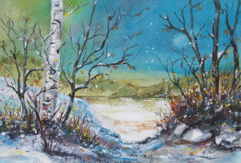
13. Winter Birch 3 Adding Opaque: Well, here we go. Habits
that make a great finish, get some acrylic or white
guash and water it down. And I'm going to show
you how to make it snow. Putting this all over
your painting will give it a very wintry effect. I've added a little
acrylic on the trees. I'm going to show you how to add a little gach to them.
You can mix the two. You just take it right
out of the tube and just lay it on the
branches to start with. Always make sure you mix a little water
with opaque paint. You can see how
that little bit of snow brings that
branch right out. Now we add a little
shine to the birch tree, just tapping in a little white at the end of
a very fine brush. Snow likes to fall on different things.
That's its nature. Put some little dots of white here and there
on your painting. I'm going to add something at
the bottom there. See that? I've added the branches at the bottom of the tree
to break up that line. As you add things
to your painting, make sure you know why
you're adding them. I'm going to now cool down
the snow behind the tree. The tree is warm. The leaves that are left on
the tree are warm. Putting cool next to warm
is a great contrast. Cool and warm. Rough and smooth. Long and short.
Straight and crooked. See just laying
very thin layers of that thalo blue with a
little bit of white. Now I've added some warm
yellow to the white paint. I've also done little dabs
with orange and white, light green and white. Just put colors all
over your painting. Keep it warm. You really do have to know why
you're doing it. I like an overall
pattern in my painting, so I might have
spattered a little more and add a
little color here. There's that brush
going into the blue, we're going to be adding
some very nice tasty greens. There's all kinds of things
you can do to your painting if you have good habits
and good thoughts. See warming up the branch
with a little bit of green. There's always moss on a birch
tree even in the winter. Just accent those little
things and warm them up. Take some pure white with a tiny bit of
water on that brush. Always use a damp brush. Don't put the paint on, just right out of the tube
without any water. That creates almost
an icy effect. Could be a frozen lake. Let your imagination
take the better of you. At this point, you're doing
all the little trimmings. Putting the icing on the cake. I do like that rock. This is where you're finishing up and you're about ready
to abandon the painting. You've done all you can to it, you've pushed as far as you can go and you're satisfied
with the distance. Like I say, you could have
left it as a watercolor. It would have been just fine. This is just pushing
the limit a little bit and going a little
deeper into it. It's not necessarily better, it's just a little different. I really like how those
leaves are hanging down. That orange winter can be such a bleak time of
the year unless you get out in the sunshine and then you see
all these colors. Congratulations if
you've made it this far, even if you've just watched it. I've had a good time
teaching this class. I've learned a lot,
and I ended up with a very decent painting
I probably could sell till we meet again, keep painting and stay
in touch and don't forget to post your
painting so I can see it. Mr. Mulvey, you're back at it. Well, there's always a little
something you can add to your painting just before you frame it and
find a home for it.
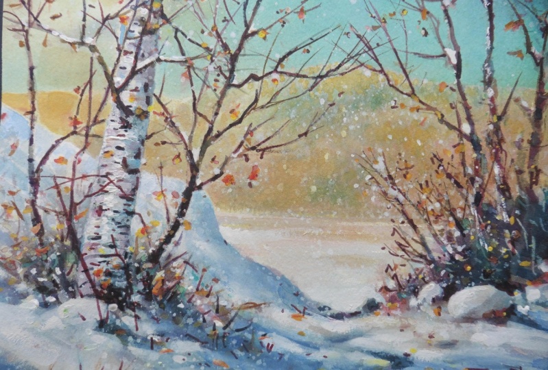
14. Winter Birch 4 Let It Snow!: Here's how I take that
lovely little watercolor, get some opaque white paint. I use a little bit of opaque handsome
yellow and a touch of opaque red in this little video
with some opaque the low. But I thin the colors. The white is the one that stays a little
bit on the thick side. Creamy. Just enough to cover. Well, that's all
I'm going to say. I want you to just
sit back and enjoy this video and watch some
good habits at work. And we'll see you at
the end of the video. Well, here are the last
touches in opaque watercolor. This is where you can stop again or you can continue and see what I
do in the last video. For the winter birch, it's
only about 3 minutes long. Also, follow me, See what
happens, let's make it snow. Let's have an optional
ending if you want.
15. Moving Forward What's Next: Well, thanks for joining
today and do post your work. I'd love to see it.
It helps us all. We're a community of artists and we help each other
by seeing what we're doing and giving advice like
I do. Giving some tips. And also I really stay sharp because I have to really
analyze what I'm doing and say, what is it that I'm doing? Is this going to
help me? And most of all, is it going to help you? So we'll see you
in the next class and thank you for sharing. Post your work. And I'm off
to doing another class. I'm thinking maybe mountains
would be a good one and rocks stuff that's hard
but not hard to do. Okay, let me know what
your preferences are. Always willing to
follow the trail. See in the next class.
 Ron Mulvey✏️, Artist / Art Teacher