Transcripts
1. Introduction: When I started filling up this little mole skin sketchbook with masking code experiments. I had loads of comments and questions asking what
my secrets were. As many just couldn't get
their masking fluid to behave. Using masking fluid. Has your paper torn, your colors smudged or
you ruined your brushes? So you've given up
after a few attempts, please give masking fluid another chance before you
abandon it completely. I love using masking
fluid and have done since my college days and always had a great
relationship with it. Having a jar of it in my outbox gives me
options as once it's dry, it can be peeled off, revealing the untouched
white paper underneath. It's a bit like magic. That white really gives an extra pop of contrast
in my watercolors. I, I roma. I'm a sketch book artist, illustrator and top
teacher on Skillshare. My work has appeared
on home decor, books and brand packaging
all over the world. And I've had the
pleasure of working with major brands from Marks
and Spencer's to unicef. In this class, there are
ten demos starting with some fun warm ups to build up your practical
knowledge and patients, followed by some really
fun projects covering plurals, landscapes and food. Think beyond the brush
to achieve an array of different textures and
effects using masking fluid, you will consider which
papers work best, the different drying stages
we have to be mindful of. And the all-important
successful removal of masking fluid
after it's dried. This class is for everyone who's new to using this medium. Unsuccessfully
tried masking fluid in the past or anyone seeking to find fun ways of incorporating it into
their watercolor practice. Using masking fluid might
take a little planning, but it's totally worth it. Did I mentioned it
was going to be fun. I am so excited to
share my top tips. So please join me.
2. Class Project: For some of you,
masking fluid could be a totally new medium and
you want to find success. However, in order to
get to that stage, it is really important to
undertake a few explorations. We have some new tools before actually trying them
out on a painting. Your project is complete
two days a warm ups, observe and make notes about your results so you can
refer back to them. Then use the
following eight days for more masking fluid studies. I would love to see
what you create after you watch this class.
So please share. Make sure you're
using Skillshare on a web browser
rather than the app, because the Projects tab
doesn't show up on the app. Upload your projects here under projects and resources tab to receive full
feedback from me. And please support
each other with comments and hearts for
your fellow students. Please upload your
day one test sheet using masking fluid to test the different brands of
watercolor paper to see how they perform the day to
abstract warmer, and at least two
other projects from the rest of the demos
I've presented, such as the oranges
or Daisy meadow. You can upload the first
two or three days and click Edit Project to
add further pieces. It would be really
helpful for me if you could include a
couple of sentences. Level of experience with masking fluid before taking this class. And also the brand of
watercolor paper and masking fluid you've
used for the majority of your projects and what you enjoyed most about
this ten day process, as well as your favorite
piece that you produced. If you have any questions about the processes that you've
seen in this class, please feel free
to reach out to me using the discussions section. I urge you not to skip
those first two days. I know it's so tempting to jump straight into the
shiny pretty projects. But I've built in those two days specifically so
that you can gather your own information about your particular materials
like your nibs, paper or applicators, which is going to be
so much more valuable for you than simply watching me think of it as an informal
ten day challenge. The audio, the video
lessons should help with your understanding
of this medium. I feel the project start
off pretty straightforward, but gradually they get a
little bit more involved. But it's not anything
you can't handle as your confidence
is going to grow, as well as your knowledge. Having information about how
your own materials work. First, we'll give you
better results later. And you'll realize
there are actually many choices available to you. This class is all about
being curious and open to the weird little
quirks of masking fluid. And of course, watercolors, which is not
predictable, sometimes, feel free to follow
along with me or interpret the subject
matter how you wish. So make mistakes, make a mess, but overall have fun and find the ways
that works for you. Let's start by taking a
closer look at this medium.
3. What Is Masking Fluid & When Do You Use It: Masking fluid goes by many
names including brisket, drawing gum or liquid mask. It's basically latex or rubber base medium
that can be applied to dry watercolor paper. The masking fluid will stick to the paper and once it's dry, it can be painted over
in watercolor or ink. It's purpose is to
preserve specific areas of white paper where you want to
prevent pigment absorption. Once the whole painting is dry, the latex film can be
carefully peeled off, leaving the white surface of the paper underneath untouched. As you can see, it comes
in a few different forms, from liquid in jars and bottles to pre-filled
applicators and pens, which I will show you in
more detail in later videos. Masking fluid is an
incredibly useful medium once you learn how to use it, it's perfect for
creating highlights. Protecting small areas,
too delicate to avoid with your brush and for creating sharp lines and
color separations. One of the challenges of watercolor is you can't
cover up mistakes as you could painting with other mediums such as
acrylics or goulash. As watercolor is translucent, It's extremely important
to preserve your whites. In some cases, you can just
paint around the shapes, but when it comes to more complex or very small
areas, it's almost impossible. This is where masking
fluid comes in. Sometimes it's a good idea to
protect parts of your paper as once the pigment touches
the paper and is absorbed, there's no way to recover
that pristine white. Again, these are some of the advantages of
using masking fluid. It's really helpful
when you want to create a fair number of white shapes against
a darker background, you can create detailed
shapes or images without having to care to
paint around everything. And masking fluid can
harness the brightness of the paper to preserve that
luminosity that will, colors are known for even the most intricate details will remain a brilliant white. Although masking fluid is not necessary to create great
watercolor paintings, it's a wonderful tool
to have in our art box. In the next video,
I'm going to show you some of my very early work with masking fluid for
client projects and a more recent
Sketchbook Project.
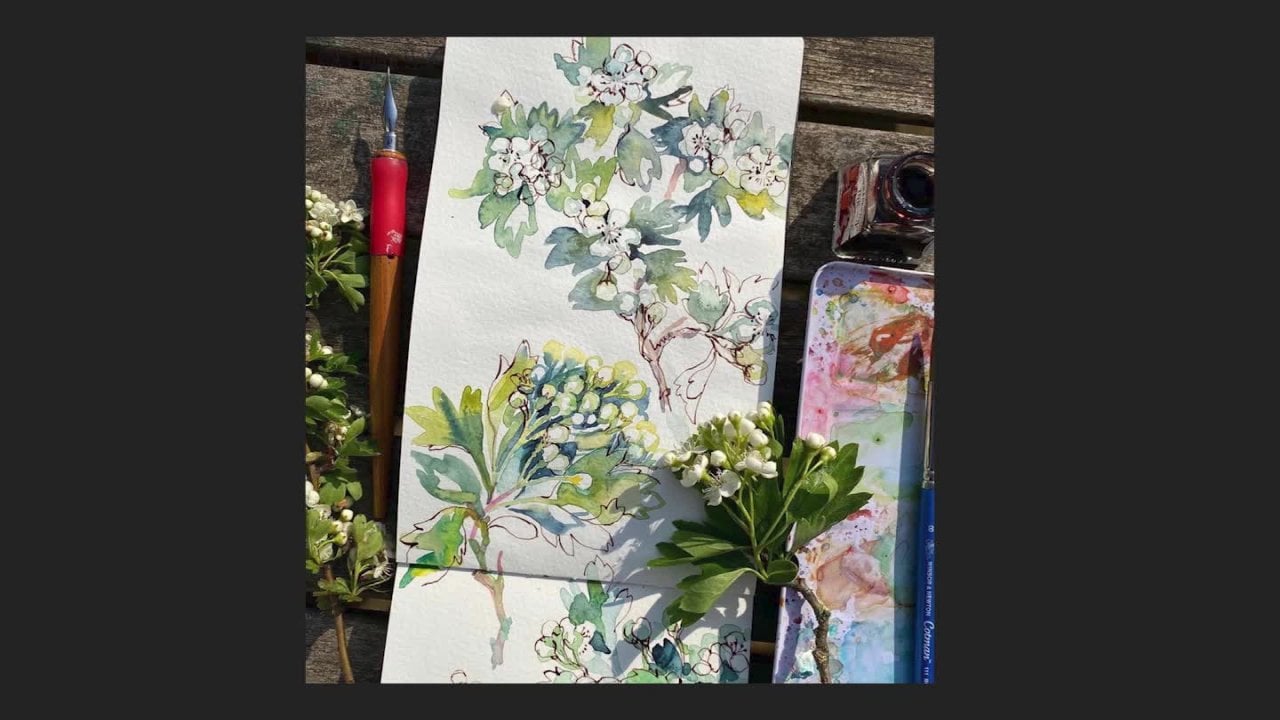
4. Older & Recent Work Using Masking Fluid: I thought it would be
really interesting for you to see a few bits of my old pieces of work
when I was using masking fluid back in the day. I'm afraid. I don't have any examples
from my college days, but what I do have
our examples from my portfolio that I used as
an editorial illustrator. The first example
I want to show you is what is his
dance floor style? And to give you some context, it was the Britpop era
towards the end of the 990s. And this was actually painted in ink because I didn't know
how to use watercolors. Then you can see
where I've applied the masking fluid along the
lines of their trousers and the Azure their
clothes also to define a part of the
elbow and arm here. And also in the sneakers or all trainers as
we say in the UK. This one is called
cringe couples, and I've pretty much done the
same here along the edge of their clothes also
highlights in their hair. And these two pieces, me, work for years and years and years because it
was of that era. They appeared in magazines
like smash hits, if you remember that, and also Team books. It says an example of more
editorial work where I used a bit of market fluid in just black and white
illustrations, again, to define the
edges of arms and add movement in trousers
and bit more dynamic. Now I'm going to move on
to a few pieces that are created are for I got back from my travels in India
and the Far East. This was created using
masking fluid and wax resist. And you can see the line work I would have probably
applied with a dip pen in his mustache and in his turban and in some of the arches here, you'll see that in this block of pattern here it would have
been some sort of a screen. I've applied it using
a brush and you can see it's left quite
textural marks there. Now, for this rice paddy scene, you can see that
I have picked out individual strands
of the rice plant that it is very fine. I think I probably
used a mapping pen, dip pen because it's so thin. And also applied the masking
fluid along the edges here just so that it
contrasts against the paddy field behind it. Again, these are Ink because I did not know
how to use watercolors. This example, it
looks like I flicked masking fluid in certain
areas, especially here. And also the other examples
where I've put masking fluid along the edges of these potatoes and I
don't know what they are. Pomerleau is maybe
bits of the banana. It's really just picking
out certain details, especially the
highlights just to make the piece pop a
little bit better. This version, you can tell I
created this in my twenties. I'm picking out the
highlights of some of the bottle tops here
along these edges. Something else I want to
point out is I probably apply masking fluid on some of the hand lettering
just to help it along. And if you look very closely, you'll see that I had a
pencil outline to guide me. Now, for this orchid is
a much larger piece. And you can see here along the edges where I stretch
the paper because what I was using was actually heavy
duty cartridge paper or general purpose art
paper because this is actually mixed media is a
mixture of goulash and ink. Probably what I've
done is pick out the background pattern in it's kind of a batik
inspired pattern. And I apply the masking fluid
to that background first, and then I painted over it and this became a greetings card. And also this became a greetings card and this
was a greetings card. And in fact, what happened
was the art buyer of Asda, which is the US
version of Walmart, bought a version of this
because she liked all the wax resist and masking fluid
techniques that I've included. Now I want to move on to this really cute little
mole skin sketchbook, which I started in 2012, 20. And this is part of a 30
day project and I love creating in here because
there's no fixed agenda. This first read is really moody. They're just imaginary
scenes set at night because I was really playing
around with the contrast. And so the lighthouse and the moon really stands out
against that background. And there's obviously
lots of splatters there, which I was hoping would
add to that Moody effect. And on this next page, we are playing with a
lot of verticals here. It's just me just
trying to have fun, trying to work out a few ideas. If you look at the whiteness of the trees against
the background, I think that works really well. For this page. I actually had to
cross-reference my Instagram because I
didn't know what type of masking fluid pen I was
using for these two waves. And they are certain
applicator pens which I will talk about later. I'm not sure what was happening here because as you can see, the pen that I used
that day was not adhering to the paper and the watercolor
was able to seep underneath the masking fluid. That's the sort of things
that we are trying to find out and we can note
down during a warm ups, these are really cute as well. And they gave me a few ideas
for creating this class. These lanterns are actually some of my favorites to create, and I really loved
layering the colors on and working some of the
details in ink line. I think they work
really well because of that light, dark relationship. I think one of the best things about this little
sketch book was learning a lot more
about contrast. You'll see some of the
projects in this class are variations of what I started
in this normal skin.
5. Tools & Materials : Paint & Miscellaneous : Let's start with a
really simple stuff before we move on to
the rest of materials. First of all, you will
need a watercolor set. I'll be using my Winsor and
Newton professional set. I do recommend a
student grade set. And then we will need
some watercolor brushes. I would recommend to fairly large ones
for applying washes. Then slightly
smaller brushes for applying the details like these. You also need some
washing up liquid, as we say in the UK,
or liquid detergent. I think even hand soap
would work. With that. You're going to
have to pop some on a plate or a little egg cup, which I've used in the past. And I'll show you why
we do that later. So you need a selection
of fine liners. It doesn't really matter. Different colors or just
black is absolutely fine. And also a pencil
basic as you like, a bit of kitchen roll for
mopping up any accidents. And two jars of water, one for washing your
watercolor brushes, and one for washing your
masking fluid brush. You also need some masking tape, doesn't matter which
color you have, long as it does
all this business.
6. Tools & Materials : Types of Masking Fluid: Before we start looking at
all the different materials, I want to clearly state I'm not endorsing any product
over another. As you can see,
masking fluid comes in both bottled form and also
these applicator pens. Here's a selection
of masking fluid in bottles that are easily available in UK
online art stores. And you might be able to get hold of different brands
wherever you are. Starting with a
Winsor and Newton. This is the brand that
I used as a student. A little goes a long way
because it's quite runny, which also means it dries pretty quickly and
you only have to wait a few minutes
before we can begin painting over it if you've
applied it properly. This is the heavier liquid
Latex masking fluid. It was gifted to me by fellow Skillshare
teacher Jen Dixon, along with some rural pens, which I'll show you later. I would say this is even more runny than
the Winsor and Newton. And of course the
advantage of it being slightly blue as you can see
where it's been applied. This SAA artists blue masking fluid is one that
I've never tried before, but I thought I would buy it for this particular
class. They looked runny. So I'm going to try
this out later. This Jackson's masking
fluid came with a set along with a little
plastic applicator bottle, which I can talk about in a bit. It dries almost colorless, and I would say it's probably the thickest out of
this little group. As you can see with
this particular Jackson's masking fluid, there is a really
gunky film on top and that is what happens when
the seal was an airtight. I haven't used this
jarring quite awhile, so I was a little
surprised to see this, but it's good to show you. There's two pieces of advice that is really important to
know about masking fluid. First of all, is do not
shake it vigorously. Apparently the best
way to make sure that it is smooth inside is just twirl it like
this to make sure that it's fully amalgamated inside. And the second one is to decant it into a smaller
bottles such as these. Exposing your masking
fluid to air will cause the fluid to go bad
or dry out faster. You will probably have masking fluid that will deteriorate. Is your enemy. What I do now is to decant my
liquid into a smaller jaw. Unlike this one. That means that my larger one will keep fresh air for longer. Now, let's move on to these
really fancy versions. First of all, let's take
a look at this one. We take a close look at this
masking fine liner by frisk, by taking this lid off. And you'll see that it has this very fine
needle-like applicator. And this will help you
make very fine lines. It says 0.5 mm
pinpoint application. I show you the inside of it. It's got this. And in theory, it's designed to prevent clogs with airtight seal supposedly, let's try and pop it back in. The wire fits inside
the nib to clear out any leftover masking fluid. And as I've said, it is a theory because
some people have reported clogs inside this and sometimes
it can be tricky to use. I will show you the
type of line that this fine line of producers. And I said earlier that Jackson's actually have
their own version. And it came with, you can actually buy it
with the masking fluid. So exactly the same. Little bit shorter. And I suppose the best
way to decant it. They're masking fluid
into the bottle is to use like a syringe, like the ones that you get in children's medicine bottles. Let's take a look at these
pen like applicators. We have molar tau
and Goya, heavier. And also this new
one by shaming key. It's not actually a pen as such, but it's another one of
those applicator says all marked up there,
applicator systems. And you'll see we
have all of these. It's pretty much
like a marker pen. Again, this is, I
will be talking about the advantages and
disadvantages of using these. If my lid, these, you will see that this
is what they look like. And you'll see that all
three of these are blue, which will make it easier for you to see once
you've applied it. I want to run through a few
pros and cons about using masking fluid that
comes in jars and also the pre-filled
masking pens. I think the fluid that
comes in jars lets you use a wider variety of techniques along with
different application tools. But it does mean you have
to practice a little bit more depending on the tools that you use to apply the fluid, the resulting marks can be
very varied and expressive. Whereas the pre-filled
masking pens will probably have a very uniform
and consistent line. When you apply masking
fluid with a brush, it will eventually ruin it. So you're going to need quite
a few old or cheap brushes with the mask and pens. I think the nozzles or the pen nibs are prone to clogging and as
it's liquid rubber, it will set when exposed to air. One of the great things about
using masking fluid from jars is you can use
different sized brushes. And if you use a large brush, you can cover a much
larger area of paper. With masking pens, they are probably applications
over smaller areas. There is definite odor when
you open a masking fluid jar. I think when you use a pen, the odor is less, but you may still
detect a little bit. Also with the fine
liner masking fluid. It can come out in an
uncontrolled manner. It can come out too
fast and not be even. It is convenient to use. You can carry it
around with you if you want to use it on location. If you're urban
sketching or something. Please don't think that you need everything that I'm showing you and you need all the
tools and materials. There are always alternatives
and there are ways to swap and change items so that you
can achieve similar results. With each project, I
will try to give you substitutes and you can
get creative yourself.
7. Tools & Materials : Applicators : I use a load of different
tools to apply masking fluid to paper depending on what effects that
I want to achieve. So we're going to take a look at a myriad of ways we can
apply masking fluid. Or most of you may
have seen or tried applying masking fluid with
a brush and ruined many. I know I have loads
of ruin brushes. So I'm going to show
you the best way that I found to make your brushes
last a little longer. In the second half
of this video, I'm going to try
alternatives to the brush. Yes. There are many different
applicators which you probably haven't considered from
Q-tips to rolled-up paper. It's gonna be so fun looking
at all these choices. So please keep an open mind. You might have heard that masking fluid is where
brushes go to die. As you can see from
these examples, they are glued on, gunky, irregular, and they have no painting
life left in them. I would always recommend
using old brushes that are not best for
watercolors or whatever goulash, you are going to ruin
them eventually. So you can either use
old brushes or you can buy a set of cheap plastic
brushes like this. I probably got these for $2 and they will
fall apart anyway, so I don't mind them getting completely busted
like these here. To preserve the bristles on
even cheap brushes like this, it is advisable to wet
them and then coat it in some liquid soap or
washing up detergent. And this will protect the
bristles to some extent. So let's give it a go. What I like to do is
to dip it in water and then dab off the excess. And I've got the washing
up liquid in here. And then I dab it into
that and make sure that the bristles
are nicely coated. I'm going to dip it
into my masking fluid, play around with it a
little bit on paper, pretend I'm creating
something marvelous, then it's probably
best to wash it off immediately after
you've finished doing that. And you can see it has
preserved it very nicely. So jolly good in Scotland, bit more life and it left. I want to show you
this one on the right. I do remember dipping it
in, washing up liquid, but I let it dry on too
much and as you can see, no amount of washing up
liquid is going to get that off and I just wasn't
able to retrieve it. So that's another major point. Try to wash it off as
soon as you've finished. Otherwise, you're going to end up with another crappy brush. I want to show you this
frisk masking fluid brush. It came in a set of three, but this is the
only one I've got left and I took
it as face value, my simply dip into
Maschine fluid without doing any of
the liquid detergent. I'm afraid it
didn't really work. As you can see, it's not
something I would recommend. I would literally just go down the cheapo plastic brushes. Now, it's time to think
beyond the brush. Let's take a look
at some of these. Now these wonderful items
are called Silicon shapers. And I actually saw
another artist apply masking fluid with this. I wanted to give it a go. They're also used by most
filmmakers and sculptors. So if you Google silicone
carving or model making tool, you'll probably see
something like this. I thought they were
relatively cheap. Apparently all you need to do to clean them is to let them dry and the masking fluid
will magically peel off. If you've seen my other classes, you'll know I love the dip pen, and this is actually how
I started using it in college and it might
not be something that you have considered. Let's dip it into
the masking fluid. It has to go past
that reservoir there. Let's just draw it on there. And you can see you can
create quite fine lines depending on the nib
that you're using. I've got this version here where I let the masking fluid dry on. And one of the
concerns that people tell me is how do we get it off? And all I do is peel it off. It's actually really satisfying. Take it off like that
is absolutely fine. You can use it with
ink afterwards. You don't have to reserve
it just for masking fluid. Alternatively, they're still wet masking
fluid on your dip pen. You just wipe it off on a kitchen roll and it will
come off pretty easily. Now, this nifty contraption
is called a ruling pen, is quite an old fashioned tool. I received to as gifts from
top teacher Jen Dixon. And essentially the paint, ink or other wet medium
is inserted into the space between two metal
arms or the ruling pen, which are tapered to a point. Here we go, you can see the masking fluid
within those two metal arms. Another thing worth having in the masking fluid toolbox
or old toothbrushes? I used to use these all the
time at college as you saw. Just going to dip it in there and I will flick it
across the paper. We are going to test
these out properly later. I tried to wash off the masking
fluid just now in my jar. And you can see that
there's a bit of a residue. So if you want, you could probably dip
it into washing up liquid to try and preserve
it that little bit longer, but I have plenty of old
toothbrushes at home. Other items I use quite
often are common Q-tips. Its kind you can pick
up at the supermarket. You can see this one
is where I've let it dry on and I just wanted to
see what effects it makes. I think the best use of this is to make
little round dots. Again, when we do the tests, you'll be able to see
this a lot better. Also, you might like
to consider to fix. Can't wait to try these
out a little bit more. Also, you might like to
consider paperclips. Obviously this one, I
have unraveled a little bit and it pretty
much works like this. Finally, something you may
have not considered is paper, just an old shopping list? And if I just make it
into a point like this, make it really, really tight. This can actually
become an applicator. And you can get all
different effects depending on how sick leave you have made that tip
using a piece of paper.
8. Tools & Materials : Paper: Paper is the other area that is a major pain point
for masking fluid. Many say it will often rip or tear when they peel
off the masking fluid. So this is why we have
to test masking fluid on a few different papers before committing to a more considered
watercolor painting. I receive so many DMs and comments related to paper
tearing than anything else. So we have to work out which papers and under what
conditions could lead to tears or mar the
surface of our paper when we start removing
that dried masking fluid. Paper surveys greatly affects the performance of the mask. Student grade papers are
usually made out of cellulose, which is wood pulp
rather than cotton. And cellulose is weaker, and so it may tear more
easily than cotton paper. Watercolor paper is traditionally
sized with gelatin, so the paint doesn't
soak in straight away. Lightly. Science papers are great for drawing
on and mixed media, but they're not gonna
be strong enough to handle masking fluid. And handmade papers are
often too lightly sized and are probably going to tear when masking fluid
is lifted off. Cold press services
will work quite well. However, rough
papers may be really tricky is because the texture of the bumps and crevices provides that extra surface for the
masking fluid to grab onto. And so it might make it a
lot more difficult to remove without harming the paper and
it will cause it to tear. Having said that, there
are other factors such as the drying in-between applications and even how you remove the masking
fluid once it's dry, can play a huge role in determining if
the paper will tear. And I will cover this
in later videos. These are the papers that I'm going to be trying
out just to show you. I don't know what papers
you'll have, but ideally, I do think you should try at least two or three
watercolor papers for your test sheets. As it is better to
have more choices and then you can
choose a favorite. First off is this
Winsor and Newton. It is 300 years or 140 g. I believe it is 25%
cotton and cold pressed. And if you look closely, you'll see that it's
quite a smooth surface, but there is a lot of
indentations in it. So that is going to have
some bearing on our tests. The next one is Arches. It is again 300 GSM, 140 g, and it is 100%
cotton cold pressed. If we look carefully,
there is texture, I actually find archers
a little bit tricky to work with because it
isn't overly smooth. But we're going to see how this affects our testing sheets. Next step is the honeymoon, color harmony and it is hot press 300 years
M. I believe there is a little bit of
cotton in there and it does say that it is
good for masking fluid. If I feel the paper, it is incredibly smooth
and we'll see if that has a bearing on the
performance of our test sheets. And lastly, I'm going to
try out masking fluid on this 100% cotton handmade
watercolor paper. It's 150 GSM. I have had people
asking me about handmade papers and they
have difficulty with it. This is a close-up of it. It is relatively rough. I'm gonna be really
interested to see what happens when I apply some of the masking fluid with
a brush or a dip pen. I do suggest for the
test sheets and also for your projects to cut up your piece of paper
into smaller size. This is a five, which is six by 8 ". This is what I'll
be working with. And if you saw my sketchbook, you'll see that I was
working quite small in it. There is a reason
for that is because you can fill up the space much quicker and it won't
be so overwhelming. And I know for some of you won't feel that you've wasted
some of these papers, especially if it goes
a bit pear-shaped. Just let you know I
have mucked up a load preparing for this
class and I'm going to talk about this
right at the end.
9. Drying and Patience: In this video, I'd
like to go over the all-important dry rules to remember when working
with masking fluid. Drying one is the masking fluid. It sounds really obvious, but it's so important to
allow the masking fluid to dry completely before
painting over it. There are several factors
you have to be mindful of. How thick did you spread
the masking fluid. Is the room or
environment you're painting in, humid or dry. And how long has the
masking fluid being left on since you
first applied it? The thicker the
fluid is applied, the longer it will take to dry. You might have to
leave it longer in a more humid conditions. To know if the
masking fluid is dry, touch it lightly with your
finger and if the liquid sticks to your finger in any
way than leave it alone. Also, if you're masking
fluid is squishy, it hasn't thoroughly dried. So again, leave it alone to
dry for a little longer. Resist the urge to use
a hairdryer to speed up the drying process as the masking fluid is
basically liquid rubber, the extra heat could cause it to become more attached
to the paper. And it could make it
almost impossible to remove it without
damaging the paper, which is not what you want. If you were to paint over the masking fluid sections
before they're fully dry, you are unlikely to ruin
another good brush. Drying time two is
letting the paint dry. Once you've painted over the masked areas
with watercolor, you must let this dry
completely as well. Don't just hope it's dry. You have to be totally certain. I find the best way
to test for dryness is to feel or touch that
area you've painted. Any unpainted sections will feel warm or at least at
room temperature. Whereas areas you've painted will actually feel
a little cooler, which means there is still
some dampness there. Another thing to be mindful
of is the paper might be dry, but there could actually be tiny beads of wet paint
sitting on top of the masking fluid as
it's less poorest and the paper and these little
beads will take longer to dry. So if you start to try rubbing
off the masking fluid, it will likely smudge that watercolor paint into the white areas that
you've reserved. So again, patients is
called for drying three, it's the time that you
leave the masking fluid on. It should never be left
on for longer than 48 h. The longer your masking
fluid stays on your paper, the harder it will be to remove. The masking fluid will sink
in too much and you have difficulty getting it off
and likely tear the paper. So let's just go over those three main
points about timing. Apply the masking fluid
and letting it dry. When you apply the
art masking fluid, you will have to wait
for it to dry thoroughly before you begin
to use watercolor. Step to applying the watercolor and letting it dry
those watercolors be totally bone dry before you start to remove
the masking fluid. And 0.3 never leave the masking fluid on
for longer than 48 h. Progress and success with
masking fluid will take patients due to all
the stages when you have to let it
dry and you need to be prepared for the
waiting at each stage. I'm afraid these stages will
take as long as it takes, so we have to be flexible. The alternative is
tearing the paper or running a piece that we
have so carefully set up. We do live in a
fast-paced world now. And I think in patients is
often linked to expectations. You often expect
something to happen quicker than it's
happening in reality. In Instagram Reels, e.g. it appears that I complete
a sketch book page in thirty-seconds when
the reality is probably a span of several hours and waiting for those
layers to dry in-between. So please please,
please be patient and compassionate with yourself
over the ten days. Especially if you are
not used to this medium. It might be that you have
to sit around for hours or a day with an
unfinished piece of art. I know for some of you, this will cause some discomfort. It's part of the process
when we are trying to achieve long-term
learning outcomes. Let patients be your secret
weapon with masking fluid.
10. Tools & Materials: Removing Masking Fluid: When it comes to
removing masking fluid, you either love it or hate it if you've used
this medium before. For me, when removing masking
fluid is my favorite part. It's like magic. The big reveal when
you pull it off and you see what has occurred. In this lesson, I'm going to
go over several methods and tips for fluid removal
once it's dry, each method has its
advantages and disadvantages. The removal aspect will also
be part of our tests sheets. So make a note of which methods you tried
and which you like best. Whatever method of
removal you use, always take it slowly and be gentle to avoid
the paper tearing. The first method that I use for many years was to
use your fingers. Start off by rubbing gently at one of the edges
until it starts to lift. Once it starts to come away, gently, pull it off
slowly and carefully. It will stretch and snap, but just keep working away at
it until it's all removed. However, one thing
you must remember when using this method
is to wash your hands thoroughly and dry them
before rubbing away at the masking fluid
because you risk leaving small traces of oil
from your fingers behind. And this can ultimately affect the watercolor
application afterwards. The most popular method that
you've probably seen for removal of dried masking
fluid is a eraser. I'd recommend one
that's neutral in color rather than red or blue, as you may have to deal with it leaving residue on your paper, which isn't what you want. This frisk masking
fluid removal block is something that is
completely new to me. I've only tried it recently. It's made out of firm
natural crepe rubber and it picks up dried masking fluid without
leaving crumbs behind like typical erasers, although it's quite thin, it's easy to manipulate and it's sharp corners are great for
fine lines and details. Without rubbing the
surrounding artwork. I have found I really love
using this and it also prevents you from pulling too hard and tearing at your paper. If it's quite a large area, make gentle circular movements rather than trying
anything to vigorous.
11. Day 1: Warm up Test sheets Part 1: As we'll see in later videos, planning your work
with are considered approach will help
you stay focused. On day one, we will start
by creating test sheets. We will apply masking fluid, did different brands of paper
using different applicators and make notes about the outcomes and any
insights along the way. We will be looking
at four variables within our test sheets. Paper, the type of
masking fluid you use, the applicator and the
time it takes to dry. I know it's tempting to walk straight into the fun projects, but you might not
be a successful if you don't have the
basics under your belt, it's so important
that you don't skip the first two warm-up days
as they're actually vitally important in order
for you to understand which methods and materials
will work best for you. Here are my papers that I am going to be testing out for
this section of the class. I've caught them
to smaller size. We got the arches handle, Lula, Winsor and Newton and
I've got two of each. Just because I
bought a variety of masking fluids I want
to be testing out. Please don't think that
you need to go out and buy all of these in it because I'm the
teacher and I want you guys to know
what is available. Don't think you have to
go and find these pens. As long as you've got a
jar of masking fluid, you're probably
going to be fine. And moving on, I've got all my different
applicators lined up. Even if you've only got a
brush to apply it with, I'm sure you can
find some Q-tips, paperclip and cocktail
sticks and also, of course, roll-up that paper. I also wanted to point
out these brushes here. These are my grotty brushes or the busted brushes where I've
left the masking fluid on. So it's completely dried. I've used these over and over. So it's created
this really gunky, but you can still apply
masking fluid with it. And I'm going to show you
how this can be useful. Before we start on the
experiment proper, I'm just going to note down the brand of masking
fluid I'm gonna be using. I'll probably use PBO
on this upper section, and I'll probably start
with section for the brush. Go on to a dip pen here and
the silicon applicator, and then maybe the Q tip
and cocktail stick here. Let's pick up my brush and dab a bit into the liquid detergent. And I've got my little
bottle of perio. This is the larger of the two brushes I've
got lined up for this. And we're just going to
make a series of marks. Oh, now that's a strange
mark already because I think that may be caused the amount of washing
up liquid on my brush. So that already is
something to be mindful of. I'm going to put a little bit
less on this smaller brush. Take my dip pen and just do
a line or to wash that out, I'll take my silicon marker. I don't know why I'm
calling it a marker. Silicon applicators I can brush. So if you look at this one, it's kind of like a chisel tip. So I can apply it this
way or this way around. I'm going to try both. Oh, that that line is
very nice, isn't it? Oh, I can have fun with that. Wash that one off. Let's get the Q tips out. Oh, I find I'm having
to press quite hard. You can see they're
quite uniform in size. Let's see if I can make
slightly smaller ones. Okay, so if I press lighter, gets slightly smaller ones, but I think the
cotton in the Q tip is absorbing a lot of
that masking fluid. That's good to know. And now the cocktail stick, I forgot to leave room
for the paperclip. Oh, that's not really
showing up very much. Kept that unfurled paperclip. Now, on this lower section, I'm going to try a
different masking fluid. I think. Let's try the Jacksons and we're just
going to do the same again. I completely forgot to
add was a bit flicking. Might do that
somewhere along here. I must remember not to put too much washing up
liquid on this brush. Now, this might be
difficult for you to see because the masking fluid
is that little bit neutral. Before I forget, I must
write down what I used. Because I will forget. One thing that I'm
already noticing about the Jacksons is it's very
thick compared to the PBO. Let's try the silicon
applicator with this. Not sure about that. It might be due to
the thickness of it. Moving on to Q tip, that comes out that is actually easier to apply
than the other one. Lovely cocktail stick version. It's trying to apply
it using the side. You can make some different
shapes with that. I suppose. One last thing
was the whole dampness. Move this over a tiny
bit, is the brush. Now we're going to let
this one dry and I'm going to move on to my other sheets. For my second test. A sheet I've got the hot
pressed Hannah medulla, and I thought it
might be fun to try out these masking fluid pens. If you haven't got any, Don't worry about it. Just watch. I'm interested to see
what happens as well. So let's start off
using the Min Q1. I'm squeezing hard and
nothing's coming out. As we discussed in
a previous video, this is one of the disadvantages
of these pre-made. Cannot try to unblock this
little tube in there. I don't know if I if
I'm gonna be able to manage it using a
cocktail stick, see if this now flows. Oh, yes, it does. Right? I'm not going to leave that there because
that's going to take forever to dry and lead
to have kitchen roll. Okay, Let's squeeze very
gently then this time, it's a little bit probably
which I wasn't expecting. Let's just try to create
some lines and circles. Okay, So that's a little bit tricky to control
how much comes out. Before I forget, I must write
down what this referred to. Next one, we're going
to try this heavier. It says you shake it up and
down and then press down. I'm not really flowing. This is a big gunk top. Sure. If it's worth
continuing with this one. Right? No, not quite. I was expecting I'm going
to give up on this one. Next up is the molar
towel pump marker. Same again is shake it. Oh, oh, now that
was a bit faster. I'm not sure how this
is going to perform. Let's try to cover a
bit of an area. Here. The nib is a little
bit dunk top, but I'm not too bad. And the last one is the Goya masking
market says it's fine. Shape and push down. Okay. I'm not sure how much
is really coming through. Yeah. Maybe maybe I should have
done that a little bit more. Right? Again, I'm going to wipe that up because I'm
going to be waiting around forever for
that otherwise. And this is only a test sheet. And I'm just going to quickly
write everything down. And this was the, the PBO, which just didn't work at
all for me this time round. You might find that it
works for you though. That's why it's
good to do a test. I wanted to try out masking fluid pens again on the
Winsor and Newton paper. One thing I didn't test out
was the frisk masking liner. And now normally this
works out well for me. And it isn't It is
not coming out. Oh my gosh. Right. Let's see if this
is going to help. It might not seem it, but I'm actually
quite pleased to show you that I had
this issue with the masking fine
liner because this is a problem that many
people report to me. What I did was took just a
dressmakers pin and I poked it around and I managed to free the masking fluid
eventually, Victory. What a relief.
First thing that I notice straight away is raised. It is, it is not flat compared to applying
it with a brush, e.g. filled up the rest of
the sheet of paper using masking fluid
applicator pens, even though I had used them with different
brands of paper, it's always good to compare and contrast and to
really understand how your materials work and
under what conditions that they will work best or
possibly not work at all. Oh, I was just saying I couldn't remember
to squeeze gently, but even squeeze and gently
there's there's a blob. Let's see. Once it dries, it might
behave in a different way. I will reserve judgment. The final sheet of
paper that I tested out was the handmade paper. The top row was the
SAA masking fluid. And I used a mixture
of rolled-up paper, silicon brush, paintbrush, and also toothbrush that
suppose splattered. The row underneath was
Jackson's masking fluid. And I use the same implements. I did find that this particular paper really
soaked up the masking fluid. And I was already thinking, how is this going to come out? We've got the Winsor
and Newton paper with the Winsor and Newton
masking fluid and the Arches paper with the
PBO and some Jackson's. And they've dried quite
flat apart from this one, I think that's where I use the silicon applicator
and the Q tip. Now that they're dry,
we're just going to paint over it using the one color. I'm just going to mix up a green and apply it over all of these. And that's the dip pen section, the silicone section,
the cocktail stick. And just in case
it isn't obvious, I want you to know that
I am doing a lot of test sheets just so
that I can show you. You absolutely do not need to do five or six like I'm doing here. Now for the Winsor
and Newton paper, I'm just going to use a indigo. Just stick to your
two or three and you will still be able to find out a lot of information about all the different
varieties of paper, how it affects your
masking fluid. It will be really helpful
if you made mental notes or notes on that
sheet of paper to let you know at a later
date how everything behaved so that you can
come back to it and make informed choices later.
12. Day 1: Warm up Test sheets Part 2: Here are the various
pieces of paper, different brands, different
masking fluid that I created and they are now dry. I know it seems like
a lot of trouble to go to in order to understand
our masking fluid. But if you are new
to this medium, it really will help you. First piece of paper that I
tested out was the arches. This is my preferred method
of removing masking fluid. See how easily or
tricky comes off. First of all, what
is left behind? I'm making mental notes. I do think is advisable. After we've done
all this to write down little notes so that
you can refer to them. This is the silicone applicator. Oh, that's a very solid line. Very surprising. The Q-tip. Not sure why that is occurring. I don't know whether that
was the masking fluid or the paint. That's something that I
definitely need to note down. Let's take the rest of this off. That was using the
cocktail stick, even though I didn't think
that was going to work out. And you can see it's
created quite a fine line. Moving onto the lower half, which was the Jacksons
masking fluid. This is the section
applied with a brush. And remember I said this particular masking
fluid just seem to be a little bit
thicker than the PBO. One thing that I do notice
when I'm using masking fluid myself is when there
is a very raised area. This, the watercolor will collect in the space
in the crevice almost. And it will create these
effects which can be useful, but it's also
something else that need to take into account. This is what we've got so far. It's good comparison. I would say that they do behave quite similarly even though there were
different thicknesses, viscosity, Let's say I can't see much of a
difference personally. Starting off, it's the pinky. You can see where
it's, the watercolor has collected inside that area where it was raised and I'm not sure what
was happening here, but let's take it off and see. It looks like it hasn't
the masking fluid hasn't completely
adhered to the paper. And that's why you've
got this kind of effect. This was the PBO, which
just was not flowing. Oh gosh, this is very tricky. This is the hand of morula
paper which is very smooth. And this in particular is having difficulty finding rick Almost. This is the molar tau. I know it's difficult to
see the blue on the blue. Again, this is very, very, very tricky to take off. I'm going to quickly move
on to this one because it's the same pens and also
this frisk liner here. And this is the
shrinkage version, but this is the
Winsor and Newton. And this is why it's
important to test the papers because
I am not enjoying taking off the masking fluid from this particular
smooth Halloween ruler. So I'm just going to
quickly compare it. That came off very easily. Masking fluid coming off easily is definitely going to help you. All. That's much better,
much, much better. I think with this Winsor and Newton has a bit
more texture to it. It's still relatively smooth, but it's definitely
an improvement in my personal opinion. So what's this last
one down here? This is the shimming key. So that's the shimming key
on the handle, medulla, that's the binky on
the Winsor and Newton, that's not too bad, came off very easily. That's the last section here. Just using my finger there. That's not too bad. Okay,
That's good to know. Now we've got the
handmade paper here with the SAA and the
Jacksons masking fluid. I've never put masking fluid on handmade paper and I'll be interested to
see what happens. I'm alright. I'm not sure if I just tore
a little bit there or if there really was a bit
of masking fluid there. Let's just carry on. I'm going to slow down how quickly I'm trying
to remove this because I do think the
papers coming off. I think it is coming off. The lines are okay. I've got a feeling. Maybe this area
it's going to tear. I can see there
was a little tear and I do think that was
a terror over here. I'm going to carry on
with this section here. It was the Jacksons. There we go. It
took right there. I might just use my
finger very gently, trying to be as
gentle as possible, but I can see that I'm around the edges of some of
these that it is tearing. If this was on a piece
of an actual artwork that you had spent
a lot of time over. I can see how that could
be incredibly upsetting. All my fingers are not happy. Um, yeah, I can feel
the paper texture coming off with that bit
of masking fluid there. Let's try here. Oh, that was just
completely torn off. Okay. That's not a good look. I think that the
bigger the surface area that you've applied
the masking fluid to, the more that it
is just tearing. So this is the that's the SAA. And here was SAA and I wrote
Windsor and Newton on top. And again, I'm just
going to use my finger. And that's not tearing is coming off quite easily in fact. And that is so
important to know. I think it's so important
to see for yourself and to experience for
yourself, to compare. And that's the whole
reasoning behind this beginning
part of the class. As you can see, I
did absolutely loads and loads of test sheets in
preparation for this class. So I have learned
a lot about how masking fluid behaves
on different papers. This is just one aspect of
the masking fluid challenge, but it's a really,
really important aspect. So I want you to make a
decision about what papers or paper you would like to use
for the next few projects. The paper I'm going
to be using for all my projects is the
Winsor and Newton, I think it gives me
the best results. And I'm able to take off the
masking fluid pretty easily. I would love to see
your test sheets. So please upload them as part of your class project and share
your findings with me. Let me know which
brand of masking fluid and watercolor
paper you've decided to use for the
rest of the nine days.
13. Negative and Positive Space: Now we know the very basics of how to apply masking fluid. Let's talk a little
bit more about negative and positive space before we move on to
the projects proper. In simple terms, positive
space refers to the subject or areas of interest within
a piece of artwork, such as a person's face. The objects in a
still-life painting or trees in a landscape. Negative space is the
background or the space around an in-between
your subject. I'm going to quickly demonstrate
using simple FY icon. In this example, I'm
applying masking it to the positive space or the
actual shape of the object. In this case, it is the apple. Then once that
masking area is dry, we paint the negative space
around it using watercolor. And then when we remove
the masking fluid, underneath is left white. The other version is applying masking fluid to
the negative space. It is the area around the apple. It's almost like the background
surrounding the apple. So when we paint the watercolor, pigment finds the paper
that isn't masked. When we peel that muscle rid
of the background is white. It's really important to have a basic understanding of this. So I hope that's been useful. Once you get your head
around the concept of using masking fluid in a
positive or negative space, it will become incredibly
useful for the water colorist.
14. Day 2 : Abstract: Today we are going to take
what we've learned from the previous day and
create an abstract piece. We are going to
fill our paper with more random marks,
shapes, and lines. Within this abstract piece, we will create negative
and positive shapes. The idea is you'll have a
basic practical application of the negative positive
concept before moving on to the start of the
project on day 3.4, you can feel your
sheet of paper with any number of abstract shapes. I'm going to try for a basic geometric shape
that intersects and overlaps and fill them with all manner of marks using all the different
tools I've got here. It's meant to be fun and
simple exploratory exercise. So there's no need to overthink
this exercise at all. Yesterday, tried out
different implements, different tools to apply
our masking fluid. And today we're going to
take it just a little bit step further so that we understand potentially
how it can be applied for different projects. We're gonna be
creating an abstract and I'm going to carry on using the blue PBO gum because
it will show up better. But I urge you to use whatever
masking fluid you prefer. And there's gonna be no
massive thought behind this. We're just going to create
as many of our tools. So let's get this open. Actually, I think I'm
going to create a circle. That doesn't work very well. I think I'm trying to
put too much on there. Let's use a brush
instead actually. And what we're trying to create is different sections where we can add different textures using all different implements. There's obviously many,
many different ways. As we've seen, that
you can make marks. And that's the beauty
of masking fluid do not be limited by your brush. Just trying to create some intersecting
shapes and whatnot. So to divide up at
my piece of paper, and within each of
these sections, I am going to just fill it with different marks using
different implements. While I've got the
brush in my hand, let's say I'm filling this
section with stripes, this one, random
marks like that. Now let's move things along. Now, I've got my busted brush. If I roll it around
in this section here, dab it on like that. That could be interesting, didn't want to use it for,
but it's interesting. Cocktail stick. See how random it is. I did have another class
about perfectionism, where I use masking fluid. A student said she was trying
to apply masking fluid perfectly using a brush and you realized it
wasn't possible, which is a good realization. And I might fill up
this space with Q-tips. I would really love
you to just pick up all the tools and use
as many as possible. The toothbrushes,
toothpaste, paperclips, rolled-up paper, the side
of the brush, flat brush. It's a way to really explore
go of the need for outcomes. Because you can't always
control masking fluid. But sometimes what you
get are happy accidents. And that's part of what
we're trying to embrace here. Now this is dry. We are going to feel
each section with a different color that makes
up any old colors really. I'm going to do this section
in a bit of a cobalt, turquoise, I think it is. And maybe this section here, following the contours that
we created using the edge of the masking fluid
and maybe a purple. It's not meant to
be a masterpiece. We're still in a test mode. Maybe this section here, It's really just to see how many different ways we
can apply masking fluid because it's great to
have a brush at hand, but it's also great to see what a paperclip could do for you. What's next? Maybe a green that it's merging
with the purple. That's not to worry. What elsewhere, elsewhere
else, maybe here. Finally in this
corner, I reckon. I'm just going to go around and pick any color and fill it in. I just wanted to say there's no right or wrong
way to do this. Don't think, Oh, I've got
to go right up to the line. Just punk you paint on
as quickly as you can. Just see what happens. Get your confidence
up doing this, and then worry about it later. As you can see, there's a lot of standing wash on this
particular project. This is a really good
exercise for us going forward because we
have to be so patient. We have to let this dry fully before we can move on
to the next stage. It's now drive through. You can see where some
of the colors have merged in to one another, but that's absolutely fine. Let's see how it
all comes through. As you can see, I'm
using the freeze mask away block to remove my
drive masking fluid. And this is now my
preferred method, which you'll see me use throughout the rest
of this class. Although I've sped up the video, I am being careful about
removing this masking fluid because the masking
fluid is a little bit stickier than I'm used to. I finally managed
to get it all off. There was quite a
lot of masking fluid in all these different areas. One of the things that
I've noticed is I was pretty heavy handed in
this area here and also here. So I covered up a lot of the paper and I don't necessarily
always want to do that. I think I rather prefer
the effects like this where I apply
the thin line. I think it was a paperclip. So it's things like this
that you should be aware of. One last thing I'd like to
say is this is just a test. It's not meant to look like a work of art that
you can hang up. It's just for you to work out. And I've missed a bit
down here to work out. Going onto the next stage, how different applicators
that you use, the results, what were you get? You might apply masking fluid or a paperclip
differently to me. So it's really
important that you make little notes and take a good
look at the results you get. Hopefully, it will all
make sense once we all come to creating the projects. I would love to see
your abstract piece. So please upload them as part of your class project and share which tools you enjoyed
using the most. And key takeaways.
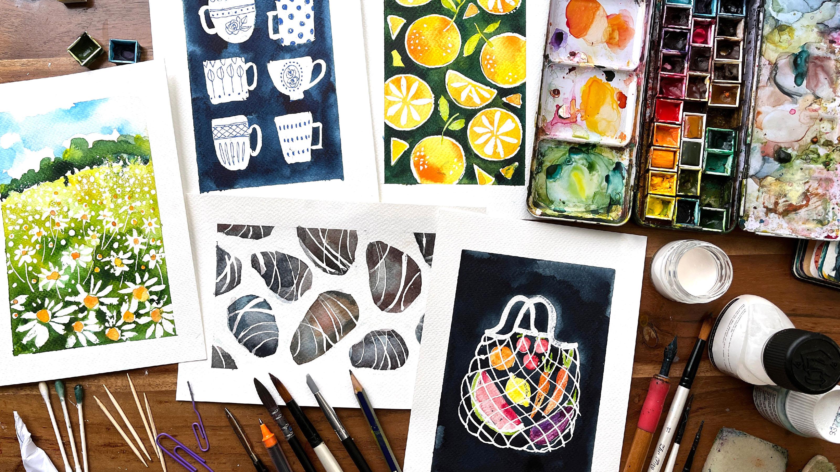
15. Day 3: Tea Cups: This was the original idea
in my little mole skin. As you can see, it is
just flat, simple shapes. And let the whole thing dry. And then you paint
over it in a dark blue or whatever color
you want to choose. Then we take that dried
masking fluid off. And then we add on these little decorative lines using a pen, simple as that. But in order for you to fully understand all the
negative and positive, I thought we might
start by just sketching out a rough plan so that you understand what
I'm talking about. I'm going to be using the slightly blue
tinted PBO masking fluid so that it can
show up on camera a little bit better so that you know where
I'm going to apply it. I'm going to use this blue pen
to show you exactly what I mean Before we start off
on the project proper. So there's your sheet of
paper and we are going to apply masking
fluid in these areas. You see there in blue. You get that. And you only need
really basic shapes. Kind of a rectangle. Everybody knows what
tea cups or mugs alike, where I'm using the blue pen is where you'll be putting
that masking fluid. This is just a rough plan offering apply the masking
fluid and we let it dry. And then we're going to
apply the background here, which is an indigo. So let's get started
on anything. The shapes are pretty basic, so I'm not going to be
drawing an outline in pencil. You might want to. What I would say is do leave
a little bit of space for these handles because I
didn't when I first did it. Let's dip our brush in that kitchen detergent
or washing up liquid. I don't know what you
call it in the states. Just going to rub that in, open up our masking fluid. So the first one has a
slightly rounded base. I just wanted to let you
know that it is incredibly hot in my living room
where I'm filming this. I'm having to work
a little bit faster than I would normally like to. This masking fluid is
going to dry so fast. I would slow down
and filming a class. But if I do, I'm not going to get the effects that I want. You might find that the
masking fluid starts drying on the brush even though you've got washing
up liquid on it. And that is something
to be mindful of if it's incredibly
hot where you are. I know it looks a
little bit lumpy, but I just want to make sure
that I've not left any gaps. You can see I'm not really
deliberating over this at all. It's not meant to be
highly finished piece, we're just testing it out. And especially if you are
new to using this medium, please don't stress out over it. And the handle is going to
be a little bit Angular. There we go. On the plus side being so hot the shared
drive very quickly. So I'm going to leave
it there for now. Now this is dry. Even this section here where I've applied a
little bit thicker, I'm just making sure that
nothing's gonna go pear-shaped. So I'm going to mix up indigo, which is this one here. Let me see if I
just took it out. It doesn't have to be
overly pigment it but it has to be quite deep
because we want it to contrast against those cups. And what we're gonna do is
just paint over it like that. So I'm using a fairly big brush. One thing to remember is watercolors will dry
a little bit lighter. So you might want to mix
up a much darker indigo. Again, having to work very fast. It is so hot in here. But it also means this will
dry very fast as well. I think I want it to be just
that little bit deeper. I might add a tiny bit
of Payne's gray as well. While we're at it. Just to help it along. We go. So we have to wait
for that to dry. And then we shall be able to peel off that masking fluid and see what
happens underneath. Now it is the moment
of truth and start. On this corner here. Some of the paint seems
to have come through. Now, I think that is
because I had a bit of the washing up
liquid on the brush, but I don't mind
that effect at all. It's very nice. It is very sticky. I've got a feeling. It's because the temperature is still very high in the
room. I'm working in. Getting they're getting
they're fabulous. I'm not going to do now is
get our fine liner pen. It doesn't have to be blue. It can be black or whatever. And start making a
few decorative marks on these tea cups. I think first of all, this, this top one here, too little bit of
a garland here. I'm just making
this up by the way, I'm not really looking
at any reference. If we rose happening, I think maybe a bad,
It's more like a leaf. It doesn't matter. Maybe little dots in there. Oh, that's very pretty. It's a little bit hit
all the people deep. This one in my original, I painted it in and I didn't think it went with
the vibe or the p. So I'm just going to use my fine liner to make
these polka dots. Well done for getting
to this stage. It's only our first proper
project within our challenge, so please take it
easy on yourself. Don't have to do
anything elaborate. Just stick two stripes or polka dots if you
want to progress. And success with
masking fluid does take a lot of patients
as you are finding out. I think in patients is often
linked to expectations. Maybe you wanted this
time a little bit faster, but it's taking as
long as it takes. And this is going to be a reoccurring theme
throughout this challenge. Now, let's take the
masking tape off. Let's take a closer
look at this. You can see the edges
are not perfect. They have picked
up the brush marks where it hasn't quite
caught the paper properly. And in this part here, I haven't put the masking
fluid properly on that. And so when I painted it over in the indigo,
it's come through. But I really don't mind
some of these effects I really think it adds to
the viable this piece. I do wonder if I had chosen maybe like a pink or a gray pen to add some of the line work that would have
made a really nice palette. But overall, I'm really pleased. I can't wait to see yours.
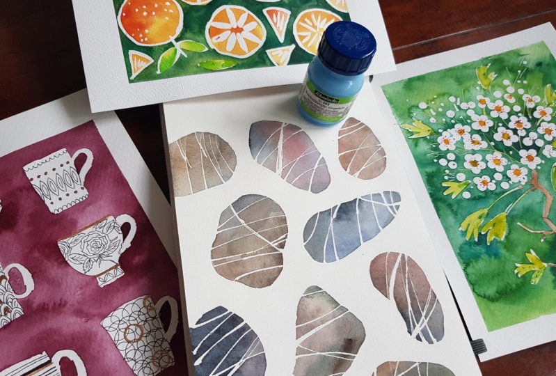
16. Day 4: Oranges : I'm going to show you
the original idea, the OG, for what we're going to attempt
in this video lesson. It started off with lemons and people did go a
little bit of Gaga because I was using this
masking fine liner. And as I showed you
a little earlier, they had this needle point. Then researching for this class, I decided to use something
a little bit different. Did this version, and I
thought it was just a little bit too
lumpy, bumpy for me. So I went back to
using the fine liner, but I know many of you
probably don't have it. So I've come up with
a different version. This one, where I've
used a dip pen and ink. I want to show you, you don't have to create some of these lines
using a dip pen. So let's get started. In this instance,
what might be worth doing as we are
dealing with outline, is to draw very faintly. We have our pencil where
we are going to be including these outlines,
half slice there. And you don't have to do
the same layout as me. You don't have to do oranges, you might want to do
lemons. It's up to you. We've got a whole orange
here and I liked having a stalk with leaves
coming off it because I liked
the pop of green. I'm using a mixture
of whole oranges, sliced oranges,
quartered oranges, and little segments
just to fill up this space in a really
balanced pattern, almost masking fluid,
washing up liquid. I'm going to try and show you a few different ways
of applying the line. When I first started
using the dip pen, I thought it was
my favorite way. But I don't want you to
feel that limited by that. So I'll just start off
by using the dip pen. I'm going to leave the
leaves because I'm actually going to use
a brush for that. I'm just going to do this last orange outline
and then I'm going to try and switch over to
some other applicators. See what happens. I'm just going to add
some little dots. Pencil, pencil,
sharpener, paperclip. That's not too bad, but I don't have
very much control, as much control as obviously
holding a dip pen set. But that looks nice. What I will do is use
a very thin brush. Then here, that's pretty good. I think this is a really
good alternative. It really is up to you what
applicator you want to use. You can use the frisk
fine liner if you have that or you can have a
small brush dip pen, you might want to swap and change like you've
seen me doing here, depending on how you feel. Okay, so that's
the outlines done. I do want to add the leaves now. These and these,
and also I want to fill in the inside
of the slices. Now in my original, I just did them as outlines, but I just wanted to
play around a bit more with my brush. I just wanted to make a series
of strokes. Not too many. It's probably a
little bit too much, but just so that I'm it looks like little tool
indications of segments on what I'm doing is going from the inside out and pressing
a little bit harder, going out towards the outer rim. Don't want to touch
that outline. That's what I did in
one of the tests and I didn't think it
looked as nice. I'm filling up the
negative space. So the space around, or the orange pieces with
tiny segments of orange. This has now dried very nicely. Just double-check everything. And you can see the line work is slightly different
where I applied it with a dip pen and where I applied
it with a very small brush. The next stage,
we're going to paint all of this in a yellowy, orange and red colors
I recommend for that. Or cadmium yellow
and cadmium orange. Just really roughly. So let's just get
started on this. So I'm i'll, I'll
show you what I mean. So there's a bit
of orange there, and next to that. It's gonna be a bit of yellow. Maybe I'll even add a bit of the Winsor yellow
or a lemon yellow. And we do want to keep
it very, very vibrant. Don't water down
your watercolors too much because we want
these oranges to really seeing what I want to do to add a bit of
dimensionality to some of my whole oranges is just to dab a bit more orange pigment to maybe some of
the outside areas. And because it's
dam pit will keep spreading like that. Which one? It's going to look fabulous and the worry too much about
filling it beautifully. And that is all we're
gonna do for now. We just have to let it dry. And then I will show
you the next stage. Now this initial
orange wash has dried. We want to add a green wash in the negative space around
all the orange pieces. I'll show you what I mean. What I need to mix up is a dark green and I'm using
the radiant here, tiny bit of Payne's
gray just to deepen it. And also some sap green. You want to avoid going inside
the masking fluid lines? I know I keep saying it, but do be mindful of the weather conditions when
you are painting this, I, I'm finding I'm
having to work a lot, lot faster in order because I do like it when the
pigments merge together. And in order to achieve that, I'm having to just really get my skates on
so that I can, um, I'm gonna show you in a
minute if I was to pick up, just to emphasize my point, if I was just to pick
up a sap green on my brush and add it here. Because I want it to merge with the sum of the
viridian already on here. I have to introduce it fast before the pigment
start drying and then it won't produce some of
the lovely effects that I love to cultivate. Now, we have to let
this green layer dry before we have
our big reveal. And I'm sure it is going
to be totally worth it. Just going to check
certain areas are dry because if they're not wind up spreading watercolor over my painting
and I don't want that. I am satisfied that
it is fully dry, so I'm Let's make a start. So this orange was one that
I applied with a brush. And I remember this orange was one that I applied
with a dip pen. And I noticed when I was applying the green
wash in particular, it was easier to go around the lines applied
with a dip pen. So that's something worth
noting for future reference. And overall, I don't
think that there is very much difference in quality. Masking tape off. There is just one
last thing we need to do and that is to fill in the storks and the leaves and the various
quarter slice as well. So first of all, I'm going
to mix up a bright green. I think I'm going to use a
little bit of Winsor yellow or just a cadmium yellow as a base and add a
drop of sap green. And that should be enough. And you can see how it does contrasts nicely against
that dark background. So I'm glad we did go
in as dark as we did. Here's the finished piece. Few of the bits
are still drying, but you get an overall feel for how it's going to turn out. And I'm really thrilled with
it is a very jolly piece. I love the contrast between the dark green background and the light green of the
stems and the leaves. I just want to pause here between these two whole oranges, the one on the left and
the one on the right. They were outlined using
a dip pen on the brush. If you may remember, there are advantages and
disadvantages for using them. I think one of the things that I learned was with the dip pen, it was easier to paint around it when I was applying
that green background. However, I really love
that quality of line. So it's really up to you and dependent on what
tools you have.
17. Day 5: Pebbles : I'd actually been wanting to create pebbles like
this using masking fluid for a long time
because I've got quite a collection of
pebbles like these. I pick them up from North Devon. I think it's probably
granted with halts veining. Although this might be calcite, it just looks a bit different. That's the geology
nerd coming through. So if I show you
my tester version, I actually created
to this one and this one using masking fluid on the background here and within the stones here and then painting
in the background. But I've decided for
this video lesson, we're going to go with
this one just so that you are clear about where we're going to be putting
the masking fluid. I'm just going to draw
you a quick diagram of what I intend to do. I'm just going to draw
some quick shapes. You might like to do
this with a pencil when it comes to the actual
watercolor paper. But I'm just doing
this to demonstrate. So you can make your pebbles
look a lot nicer than that. What we're gonna do is
apply masking fluid to the background here
where I'm using blue pen. That will leave us with
the white paper sharing. In these areas here. Those areas, we will be adding bluish beige,
brown, watercolor. And also to create these veins, we're going to use
either a dip pen or paperclip or something
to create this veining. And that will mask
off the white paper. And that is what is
showing through so brilliantly in this example. That is a basic plan of
what we're going to do. I hope that makes sense. I'm going to start by drawing just using the faintest
or pencil outlines, really irregular pebble shapes. And they can be long and
thin or very rounded. Um, also, I like to have a
few coming off the page. Just as irregular
as you like really. Maybe they look too
much like potatoes. Okay, right, I'm going
to start graphing. Let's dip my
paintbrush in there, get some of that excess
washing up liquid off, start on the background trying to do this
fairly accurately, but it doesn't matter if you
go over some of the lines. I think it will probably add to that slightly irregular quality. Just fill this in as quickly as we can and then I can move on to the veining where we can
have a little bit more fun. I picked up a bit
too much there. I don't want it
to be too blobby. Try to apply relatively evenly. Again, I'm having to
do this ever so fast because it's absolutely
boiling in my living room. Okay, let's give this
brush, wash immediately. Get my other instruments. These are the different
tools that I am going to apply masking fluid to represent the veining
of those pebbles. We've got here the dip pen, that silicon shaper,
a busted brush, where I've allowed
the masking fluid to stick on it too fresh
and also a paperclip. I think it'd be
interesting to see how the different lines look. First off, let's try
this paperclip and you can have this vein in going in all
different directions. Has nice and I do want
different thicknesses, so I'm going to
pick up something different in a little bit, maybe going there to know if that last one could
be a little bit thicker. Yeah. Does that too. I don't know
if that's a bit obvious. Anyway, doesn't matter. We'll see. Now, let's
use the silicon shape. Like this. It looks like I can't
hold very much on that. Maybe I'll go back to
using the paperclip. I wanted something intersecting. May be about there. Granite is actually igneous
rock walls by lava many, many, many millions
of years ago. It's formed granite
under a lot of pressure. I'm sure you didn't
need to know that, but you learn something
new every day, don't you? I want something
intersecting here. Maybe I think that'd be nice. And you can see that I'm
using all the different tools here just to see,
I'm always curious. I don't think that I think this particular toothbrushes
a little bit too pointy. So I'm just going
to break a bit off. Yes, that's much better. Might be a bit thick
that one. Never mind. Never mind. One thing I haven't
used as the tip pen. Let's do a line that goes here. Dip pen line here, when the granite is pushed
up onto the surface, it gets weathered down. These are found on the beach
so it's been rounded off by the actions of the waves. Yeah. I don't want
an OH down here. Almost missed him. To the dip pen. Do that and that. Let's let this dry now. Give this a little touch
and make sure it's all dry. Some of these lines were just
that little bit thicker, so I'm just satisfied
that they are fully dry. As I mentioned before, these rocks are granite and they are varying shades
of Louis brownish color. I've got this
leftover ultramarine. Now it wasn't indigo
from the cup, so I'm going to mix
up some of that, which is a good base. And to that I'm going to
add a little bit of brown, or that's already a good one. Tiny bit warmer, maybe
a bit of maroon. Anyway, let's just
start applying a bit. So I'm going to do
this on random stones. And maybe this one here
and pick it up again. Drop of Payne's gray now. And maybe this stone is
going to be more blue. And I'm just going to
vary like that really. We do still have to think a
little bit about contrast. I want the stains
to be a little bit darker compared to
that background. And whilst they're wet, we can still play
around with it. Payne's gray, maybe
this one and this one. More of the burnt sienna. Some of these, I think I am going to have to
bump up the contrast. So it means adding a
bit more concentrated pigment quickly before it starts drying too much in this very unseasonable
heat wave in the UK. Well, that one looks
good, that looks good. That's the kind of effect I'm after because I really want, just want the pigments
to mix on the page rather than create
anything that's flat. Well, that's my
intention anyway. I mean, you can do, do your
pebbles however you want to prove that one could
be nice. Very nice. Maybe a bit of that color coming into this pebble here and here. And you can see just here
where it's overlapping. Don't don't worry too much about it because you've
marked that off. It's not going to show up. We got the great
reveal afterwards. Just want to bump
up a few parts with added pigment. Hold on. I'm just going to add a
touch more blue there. I think that's it, right?
I'm gonna stop laughing. Otherwise, I'm going
to be overworking it. That's all we need to do. These things have dried beautifully with a
fair bit of texture, although I probably
overworked some of them and the texture hasn't quite
developed as I hoped, but never mind that. Start taking it off. All we can see the
veins coming through. Wow. Oh my gosh. Isn't that one
really, really effective? This is really hard, right? I think I found a
technique that works well. It's little dabei movement. I would say take it off slowly. But for some reason this
dabbing movement is a lot more effective at taking
off the masking fluid. You can hear me puffing
whilst doing this. Oh my gosh. I'm absolutely thrilled. You can leave your
piece just as it is. But if you want to add just an extra layer
of dimensionality, we can add a shadow in the
same area for each day. And I'm just going to
mix up her leftovers of what I've got here and
a tiny bit of that maroon. Um, let's say the light
is coming from up here. So all the shadows
will hit it over here. So I'm just going to add a wash and just add it to
the same side of the stone. I'm absolutely thrilled with how these pebbles have turned out it being such good fun. I would really love to
do a variation where the stones are maybe
a little bit more blue or a little bit more pink. There's loads of scope
for continuing this.
18. Day 6: Hawthorn Blossom: Today we have this
Hawthorne's rig originally in my little
book of experiments. And here's another
version that I created in order to try and work out and what tools we could
use because I did use a dip pen to recreate
some of the stems here. I think we could probably use a paperclip, maybe a toothpick. So let's try using a few different tools here
and let's see what happens. Hawthorn, I don't want to be penciling in every
single blossom or leaf. So what I'm gonna do is basically indicate
a rough area where the majority of the
Hawthorne xy is kind of an oval or round oval. And we've got a bit
of a stalk happening here, something like that. And there's a little
grouping of Hawthorne's. This is something
that I picked up in a local walk
earlier this year. And so what we're
gonna do is use a Q-tip again to create
the individual blossoms. I'm going to show
you what I mean. It's a very basic
petal formation, 12345, not the best shaped one. Hold on. Let me do
another one here. And then we fill in the middle. We want to leave a little
bit of space in-between. Nothing regular. They won't be perfect, but they will look really
cute. I promise you. Now that we're getting
towards the outer edges where the blossoms will start
sort of being seen on the side and there's a bit
of foreshortening happening. I'm just going to start using just single tips of the Q tip. And then we're going to add
another few fancy things. Okay, There's a few
more down here. Maybe there's only
about 45 whole ones. So I'll show you what
I started doing. And then I'm going to show you some alternatives
to using a dip pen. If you don't have one or if
you don't fancy using one. So the stems are basically,
they're very delicate. Mean Hawthorne's come
out in the spring, so I was adding them
in the background. And there also Hawthorne leaves in amongst
some of these areas. And so the stems are literally, if you can imagine that coming off a central stem and they're just going up through here. Like so. If you don't
have a dip pen, I reckon you could
use a toothpick. Ten that's going up to a leaf. I'll paint it in, in a minute. They're going to
look really nice. What else could I use? I had an idea. It was this silicon brush. Let's see how that
looks bad either. Yeah, I want to make sure
that there's enough stems, teeny-weeny, delicate
stems going up. So it tells the story. And also towards the edges
with all the foreshortening, there were little buds as well, so I'm just going to add a
series of dots there. I think. Tell you walked there was, I think it's the stamens, the little Tufty bits that
come out of the flower. I gave my piece sort
of suggestions. The smell lovely in the
springtime when I go out for a walk and the birds love
the berries in the autumn. Go back to using my brush at these little
tufts a lot faster. But I hope I've given
you enough choices. That pencil outline
that you saw me draw. It's only a guide. I'm going to go outside of it just because I can see it gives you that sort of scattered
sprig like feel, right? And now we're going to fill in the actual twig and all
the stems grow off. So I'm going back to
using the silicon. I just, um, I think
I used a brush originally to apply it, but I just wanted to see
what this instrument does. I'm just gonna go over
and swap to a brush. Let's make sure that I've got it dipped in washing up liquid. It just gives a bit more
of a variety of line that this area here is just a
little bit too regular for me. These particular
hawthorn bushes are very narrowly like the kind of
old and twisted, right? So moving on to the leaves
that Oswald's next, I'm just gonna do a basic, some basic strokes and Hawthorne leaves a little bit
more involved in this, but I'm just doing
three strokes. And again, I've gone
back to my brush. I'm coming from the
stem working outwards. I'm just trying to
fill up a bit of negative space
around here as well. And maybe few more leaves up here just to
balance it out a bit. There is a bit of a space
here which I'm not keen on. So I'm going to
fill that with just dabbling a few more little areas of masking fluid just to
break up some of that space. This is nice and dry now, to give you a little test, even these slightly blobby
ones are absolutely fine now. So we are going to paint in the background
quite a deep green, but we're gonna be mixing
up a few different green. It's gonna be a, a sap green. Again, we're going to have
to use quantile lot of pigment because we
want the contrast against the creaminess of the
blossom also have viridian. I don't want to be
overworking it because I personally like seeing all
the textures. That's just me. It's up to you how you want
to produce the background. I want to preserve some of the weird textures
that are gonna be created because I'm
adding all different types of greens and maybe
a bit of yellow at, while I'm at it in amongst where the majority
of the blossoms are, I do want it to be just
that little bit more darker so that it really contrasts and they'll
show up so much better. I might just add a
little a 3D in here. Tiny bit of ultramarine. Perfect. I think that's
where I'm going to leave it. I was really, really careful
about this one because there was an area here and here which was just taking
forever to dry. So I've been very patient. But now it's time for
my favorite part. Fantastic. Now I am finding
that removing the masking fluid today is much easier because it's
a little bit cooler. So I'm I'm thankful for that. Oh, it's really picked up on all those little marks
and the brushstrokes, the little stems as well. I'm going to add the, the middle part of the blossoms. It was a pale yellowy
orange colors. Just in the middle
of a few of them. Bit too much. That's going
to take ages to dry. I don't want I
don't want to wait. I'm impatient. That's making such a
difference already, really is. And some down here as well, Let's pick up a tiny bit more. Now, we are going to mix up a slightly lighter
green almost here. That's for the leaves
and the stems. We want it to be quite
a bright green, yellow. So I'm mixing up some of
the sap green with a yellow and just adding it to
some of the leaves. I mean, some parts
of the leaves, I'm going to leave
some of it white, just the very tips there. I'm going to add some of
this yellow to the leaves just to echo that slight warmth. We are going to fill in
those stems in just a bit. Alright, stems. We only need to use the
tip of our brush and just basically fill
in the white areas. Don't be too heavy handed. Because if you apply
too much watercolor, they will start reacting
with the background, which we don't want. Just a few over here. And that's just enough
green that green is perfect just for picking
out against the background. And now for a tiny bit of brown, for the twig, all that's
too much water that down. That's better. Slight dabbing illness,
extra pigment just there. And that will diffuse,
um, very nicely. There were tiny little dots. I don't know what you call it
at the end of the stamens. Once I start doing it, you understand what
I'm trying to say? So I'm not trying to create a perfect circle around these. I'm using an orange unit ball in one of my original versions, 0 and this tan leaf mold
on must fill that in. Okay, Now I'm happy. I used brown but I felt
that made it look. I'm knocked back a bit. So I wanted to add that extra super-duper
pot with some orange. And I think I personally
think it works much better, but you might like to try Brown. I just suddenly thought
what would have been nice if I splattered a bit of masking fluid using a toothbrush in this area
here just to break it up. Never mind, I might do. That might be
something for you to consider as you
watch this class. If you do, please post
it in the gallery. All right, Let's take
this section off. Let's see how it's framed it. Wow, just wow. I am absolutely
thrilled with this. It's so pretty, really
pretty and I think the use of orange has really pulled that the
blossoms forward. So overall, I think
that's a fantastic one. There's something really
magical about it. It's like a part of a
enchanted Hawthorne Sprague. It looks like it
should be able to open a door or something. I'm going off on one there. But I hope you do enjoy creating new version and please
upload it to your project.
19. Day 7: Whale Shark: Today we're going
to look at whales. This is the two that created
in my little sketch book, way back in 2020. And I think for us, it will be easiest to
attempt to do this one because it basically
is just a series of dots being applied onto the
back of this whale shark. It has really
distinctive markings. And I did another
version in order to work on a methodology that would be as easy as possible
for you guys to follow. I'm going to show you how I
created some of these dots. And this was just a
warm-up for me as well. And I realized that some of the dots weren't
small enough. So I've come up with few ways
that we can look at this. You saw that whale shark, it was overhead angle and it makes for a very
distinctive silhouette defined just to kind
of a vague S shape. Let's pretend y,
That's basically the line of this
whale shark spine. And we're just going
to draw around that. So first of all, will be the tip of its
head and it's very large. When I was trying to sketch
out various versions of it, it's like, oh my goodness, it's quiet, quiet a beast. And it is one of my dreams
to swim with a whale shark, possibly in Maldives,
Philippines, or even off the coast
of Burma one day. Because we've drawn that slight
S and we can just kind of follow it to create this wave, want to create something really dynamic so that
you get the idea. It's moving, gliding
through open water, okay, and now the fins, they start about here and here. Doesn't know if they
stick out a bit too much. Yeah, I think that's a
better angle actually. Alright, I got to stop fracking. Now, what we're
gonna do first is apply these
distinctive markings. And as I said, I did this test version. Basically the markings go across the majority of
its body like this, apart from in the tail and the fins and the
front of his head, where it gets a lot smaller, which I've neglected to do here. So this is what something
that I must try to incorporate in
this version here. What I'm going to use our Q-tips deep in
there, not too much. I don't want it kinda dripping
off the press quite hard. In order to create
the round shape. I'm not gonna go into
its fin just yet. It's coming up. As we come into the tail, I think we're going to have to switch to a different tool. One of my busted brushes, dots like that,
that's much better. If I can find my paperclip, I can make the tiniest
little dots with that. Perhaps. Now I can start
thinking about the thin, the smaller dots go
on the outsides. Looking at the head
of this whale shark can think it just a
little bit to Stout. I need to extend it just a tiny bit further
because fortunately, I'm not sure if
that's quite right. Just a suggestion
of a tail as well. They're not evenly spaced. It's very irregular. Let's go back in with a Q-Tip on fill that
remaining space. Getting a little
bit more irregular. Only touching that
surface of the paper, the Q tip to try and create
slightly smaller dots. I do want to take a look
at this tale though. In my initial version
there is a suggestion of a tail that kind of just
fades into the depths. Right? I think I'm just going to add a suggestion of
a tail like that. Sorry, I'm bit of a nerd. When it comes to sea life, maybe it's that x
scuba diver in me. We're going to let this dry
now and come back to it. I'll show you what to do next. If I refer back to this initial
little test that I did, we aren't gonna be applying
watercolor into layers. First of all, we're
going to wash to the inside of the whale
so it makes his body. Then we have to let it dry. And then we're gonna do
some negative painting so that it will pick out
the body and they'll contrast against the much
lighter skin of his body. Two layers dry, and then we will remove the masking fluid. So I'm going to use turquoise. Lets just a light wash. You can use any sort
of blue, really. We're going to keep
it fairly light, but not too light, so it doesn't contrast
against the white of the paper once we take off that masking fluid and you
can go over the lines. Because remember I
said we're going to be negative painting it in. You'll make more sense
later on. Trust me. So there's that initial wash. I know it looks like an
absolute mess at the moment, but it will come good. And then I'm going to
add a little bit of Payne's gray to that. And I'm going to
use this to create a slightly darker shade on
the left side of its body. Just following it around. I can just see the
pencil line under this. Now that our first layer of wash on the body of
the whale is dry, we can add the background. So what we're talking about
is the actual Deep Blue Sea. And for that we
are going to need something that is
much, much darker. So you can use a
indigo, Payne's gray. We do need to have a
fair whack mixed up. First of all, I'm
gonna get right up close to the body of the whale. And you can see it didn't
really matter where you had gone over the lines. And I can't work out what
I'll do with this fin. Looks like I decided to
bring it up to here. I'm not going to go round and outline the whole lot just yet. We concentrate on this side, just try and get in bulk
of color in amongst here. Oh, the other thing
you might have noticed was what's happened
to the masking tape. I decided that I quite liked
the free flow pattern of it. I didn't want it
constrained in a box. Now I'm going to turn it
upside down so that I can do this side of the body
without consulting myself. Rest really, really
quickly because I'm, as I keep referring to
the climatic conditions, it is very, very hot
and I still want the paint to behave
in a certain way. So that while I love that, the textures that we will
be able to achieve, right? And now it just going to
fill in as much of this surrounding see as we can before the watercolor
completely dries and I won't be able
to create any sort of Kali flowering affects the area immediately next to the skin. I want to just really darken up. I'm just going to do the same on this side because there's not gonna be enough contrast to really make this whale pop. So it gives a better
indication of the sun hitting
this whale's back, filtering through the water. And it's silhouetted against the Indian Ocean or something. I'm taking a look at my
whale from a certain angle. If you get down
really, really close, almost to the level
of the table top, you can see like this blob of watercolor
which hasn't dried. I'm going to have to be really patient and let
that dry properly. Because if we start trying to
rub off the masking fluid, it is going to start merging. Finally, that part of
the tail has dried. I have triple checked
it because I don't want anything smearing across here. Let's start off taking
the masking fluid dots. Well, that looks absolutely fab not fair for Q-tips
and whatever it was, the tail does look
rather fab I'm glad I waited until I don't know
quite what's happening here. I think, you know,
what did happen? I change my mind about
the shape of the shark so it looks like I've
gone over the thin, but that can be
easily rectified, makes up a bit more
of that Payne's gray and I really love it. I really love it and there's
nothing much more that I can do to it because I'm
going to just admire it. Now. If we look really carefully, you can see there is a bit
of a faint pencil line, but I do not have a
problem with that. There's a lovely,
lovely movement. I really hope you enjoy
creating your version. Please don't forget to upload
it as part of your project. I look forward to seeing them.
20. Day 8: Spaghetti : This pan of pasta. I did not draw that
circle freehand. I actually just drew around
the base of a mug here. So that's the first thing
that we're gonna do. If I took all the
pens out of it first, we need to leave a little
bit of space for the handle. I think I'm going to position
it about here. We go. That'll do. And always coming off at an
angle like a skillet handle. Now, we're going to
do a rough indication of a sprig of basil
and cherry tomatoes. They're not massive tomato. I'm not going to be drawing in the actual lines of spaghetti. When I did my original pasta, I used a dip pen, but I think we could very
likely use a monkey brush. Sorry, I keep coming up
with different ways of saying dilapidated old brush. Let's just see how
the lines look. They're not too bad. And when you start
drawing in the lines, you just want them to
be contouring around. I'm sure many of you have seen spaghetti and the way sort
of weaves in and out. Let's see what else we can do. What about the paperclip? Very handy so far. Now you see the masking fluid is obviously running
out towards the end. So maybe I won't
continue with that. This silicon brush. I'm going to move back
to my monkey brush. I really love this part. It's almost like mindfulness
for me where I'm just creating these
curved lines. It might be something
that you're not used to. So please be patient and
compassionate with yourself. I'm going to paint masking fluid over the basil and the tomatoes because I don't want
any of the beige of the spaghetti
ending up on there. Just taking my brush, dipping it in that
washing up liquid, pop it in here. When these are dry, it will make a bit more sense. Now you're probably
wondering, ah, there is always a
method to my madness. Oh, I've missed out a
bit of spaghetti here. You can see if I can just
using the tip of my brush. Now, the last thing to do is
the very edge of the pan. And it's up to you how you
want to mask this area. I'm just going to use my
slightly dodgy brush. Just following that pencil line where I drew around the mug. We are going to start
painting in the pasta. So we're going to need, I would say, oh, Corey yellow. I had a tiny bit
of gold to that. Okay. Um, let's see how this goes on. That's probably a
little bit too much. Just water that down a bit. And we can pretty much go
over the whole thing in this. Then we will add a little
few areas of contrast. There were still a little bit of blue left on that thrush. Hopefully, it will
still read as pasta, where you see the pasta
weaving in and out. I'm just going to add
a little bit of brown just to help the
viewer understand that it was doing all
that weaving in and out. This will help
deliver that message. Not everywhere,
just a few places, a bit more burnt sienna maybe
just to help things along. So that's that bit. And now we need to paint in
the background of the pan. Oh no, that's the wrong gold. That's a gold brown. A bit
with the Van **** brown. Just be mindful not to go
over that masking fluid line. At this stage, we
will fill that in, but not just yet. You can see that
I've just gone over the handle and
we're going to let dry initially and then we're
going to go over it again. I know it sounds a
little bit involved, but I think the results
would be worth it. If we take a look
at it right now, I know it looks like
a absolute hot mess. But once it's dry and we are able to put
on another layer, I promise it will
look so much better. We have this and assuming it looks like a
bowl of pasta at the moment, but it will soon going to
become a pan of pasta. Let's take off that
masking fluid line and see what we've got
happening underneath. Oh, look at that. Oh, you know what I've done? I started rubbing out
outline of that pan out. I didn't mean to do that, so be mindful of that. It's not quite time
to start rubbing out the masking fluid
you've got around the pan. So when I'm painting that bit, I'm going to have
to be really super mindful. Just take it easy. I think I was so enthusiastic about removing is like I just, I just wanted to see
what was underneath. I have to curve my enthusiasm. I am going to admire
the pasta's strands. They have worked
very effectively. I feel so. I'm jolly pleased about that. In terms of adding the tomatoes, Let's start off with
just a light red wash. I can just see the edge
of that basil leaf, so I don't want to go over that. I'm going to add
a dab of yellow. We're going to have to
let this dry a tiny bit. But we're going to be doing a few other things
in the meantime, while we wait for
this tomato to dry, we don't want to add the
green of the basil just yet. Otherwise it's just
going to merge and our hard work would
have been spoilt. We also have to add
the handle of the pan. If I show you my
test version also, the pan is very dark, so we want to add
that dark interior. And that's why I said don't rub out masking line that
is around the PAM. We going to mix up
the darkest brown. You can just go into
the edge of the pasta. I know there are areas
where I did rub it out. So I have to be
very careful there. I think by now, you would have noticed that the actual painting
doesn't take that long. It's waiting for
everything to dry. And it's almost like an
exercise in meditation. Just being present for all the little quirks of working
with this medium, right? It's here. It is, just here where I accidentally pulled
off the masking fluid. Right. I'm happier with that. Right.
I've got to stop fluffing. The handle comes next. I can just see it here. I'm just literally
following the outline. It's not that hard. I'm trying to I'm rushing
too much and too excited. Handle it looks a bit odd. I'm just not quite balanced. I don't know if it's
quite in the middle. If it isn't, isn't there's
not much I can do. Now. Payne's gray to this. Just hear a shadow just
along this edge here. Right? I completely forgot I haven't
gotten the masking fluid there and I just when
I read, it's fine. It's fine. It's fine. Loosen that up by adding
a bit more water. I think that's it. And in the meantime, our tomatoes have
dried very nicely, so we can go back
to them now with a much brighter, vibrant red. So that's kinda like the outer edge of the tomato
and it does this business. So I'm just going to go ahead
and paint in the basil now. The basil is just a
lovely, vibrant green. I'm going to be very
mindful not to let it touch the red
that's still wet. Otherwise, it's not gonna
be a vibrant green. It's dropping a bit more
sap green because there's just not quite enough contrast. That's better, That
is much, much better. I think that one needs to be
a little bit more pointy. We're going to let
that dry again. And final thing would peel
off is that outer rim. Here we have the
dry pan of pasta. And as I mentioned just before, I want to rub off this rim, the edge of the pasta pen. If I go very carefully, I have learned my lesson
throughout this project. Can you see the
wonderful line that is starting to show through? And that's why I
was a little bit annoyed at myself
that I removed it. This is a really good
example where you could not achieve that level of whiteness
if you painted on white. I think overall, it works
really, really well. I know there were a lot
of stages and I lost my patients in a
fit of enthusiasm. But I'm gonna be able
to live with this.
21. Day 9: Daisy Meadow: This is the closest
thing I have, the closest equivalent
to what I want to achieve with this next project. It's daisies in a field, but I want it to go
back into the distance. And I'm going to draw you a little diagram of what I mean. This is based on a walk. I took a photo of the landscape
and it was so pretty, I want to divide this into kind of quarters,
I think are thirds. So this section here, the daisies or the nearest us, will be the largest. We shall use a large
brush for that. The daisies in this section
of our landscape will be a little bit smaller and we shall use a slightly smaller
brush for that. And as we go off
into the distance, the daisies are obviously
will be getting smaller. I'm thinking Q-tips, applying the masking fluid
with a toothbrush, even getting to
this section here, I'm going to change to a pencil
because I don't want you getting mixed up with
what I'm intending. The landscape stops about here. There was a grove of trees and I can just fill
that in with watercolor. And then this section
here was skies. Take my large brush
detergent on it. First of all, I think
what I need to do is decide where the
daisies are going to be by just mapping it out using the middle of each daisy as a guard just
quite randomly like that. I'm gonna be creating the
petals going around like that. Starting from the middle. If you've ever seen in a
field of daisies, they, they are just pretty dense
and they're all over the place and nature isn't neat. Necessarily. The ones at the front in particular will have to be very
dense and then they, they may appear to be thinning
out as your eyes travel. So now I'm going to have the daisies a little
bit further apart. And you may be able
to see a few stems. And let's pick up the
smaller brush now and do the same but obviously,
slightly smaller scale. Must rinse out my brushes. Just want to add a few
hints of stem here. Just all at different
angles really. And then I'm going to add
the rest of the daisies. I've just had this idea. How about if I use a
Q-tip now at the middles? Now how that would look? Um, hold on. Let me think. Alright, Just
a few more stems I think. Because we're coming
up to the middle mark where I want to start having the Daisy's going off
into the distance. Just feel these bits
in and then I'm going to add the petals
using my small brush. I'm just going to draw in where I think the tree
line should start. Maybe that's a little
bit too high up. Yeah, I think that's
a bit too high up. Stay the treeline about here. So the trees will extend roughly two here and
then the rest is sky. So I'm going to fill up
to the pencil line here. We've just Q tip. When you're using your Q-tip, don't try to fill up
the spaces evenly, do it really random. And there's a few
negative spaces in-between the
daisies at the front, so fill those up as well. Oh gosh, how did that
fit this in there? When you're using a toothbrush, it can be very, very random. I think the best thing
is to go over it several times to really get a
good splatter effect. Now we have to let
the whole lot dry before we continue
onto the next stage. It should be fairly
straightforward to fill in the green section, which is the background pretty
much apart from the sky, which will be in
this section here. And this will be
a line of trees, the green, we'll start
off quite a dark. We have a lot of pigment
and then it will slowly become lighter as we
reach the treeline here. So let's mix up some greens, a bit of the sap green, and some of my viridian. Starting down here. I don't want it to be flat, so I'm just applying it pretty quickly
and I'm going to add a little bit of yellow now
just to this section here. And then we're gonna go
a little bit lighter again as we reach that treeline. And while this
green is still wet, I'm going to add a
few other greens, maybe a gold green, maybe the Winsor green. Because I like a bit of variety. I think that will do. I don't want to overwork it. Right. So now I'm going to
deal with the trees which when I observed
them were pretty dark and mixup that radian
and the sap green again, it was quite dark
against that field. I think that's it for now. We're going to let this
dry and see how it looks. Just looking carefully at my
daisy field and there are two patches of watercolor
which are still drawing off. I must make sure that
I don't start doing any peeling off while the
watercolor is still drawing. Otherwise I'm going
to really mess it up. This is looking really great. I like how the larger petals have taken up so much
space in the foreground. And now we're moving on to the slightly smaller
daisies behind them. Look, the stems
worked really well. That was the dip pen. This is getting into the
distance and I really love that. The sparkly effect here, I think that's gorgeous. Just rub anything
else that might be in that tree line? Great. Oh, that looks marvelous. I really am ever say pleased. This is very similar to
what I imagined in my head, which is always a bonus. The next step, I think is to fill the yellow
centers of each Daisy. So that's pretty simple. I'm just going to use a
little bit of cadmium yellow and just start here. That's really made such
a difference already. I think I will add a touch of cadmium orange just to give a little bit
of dimensionality. Obviously they're going
to start getting a bit smaller as you go off
into the distance r. This has made such a
difference, hasn't it? Just adding these centers looks absolutely
gorgeous, marvelous. Or you could just leave
that skies it is, but I think I will
add a touch of blue. Just going to wet that
using just plain, plain water and bit
of the Winsor blue. I think that'll do. Really pleased with that. Done, let's just
finish that off there. Wonderful. Wow, this has turned out
better than I imagined. I'm so thrilled with the sparkly effect of
the toothbrush there. And overall, I think it
really does remind me of that walk I took along that from
isfield a few months back.
22. Day 10: Fruit and Vegetables in Mesh Bag: These are the two most
successful versions of this project that I created. I had a lot of issues trying to work out how to get
the effect that I wanted the string bag with the fruit inside it and
I finally worked it out. It is a little bit more complex. I'm going to draw you a
little diagram first. So the first stage is applying the mesh
section of the mesh bag. So I'm gonna be
doing some handles. And the mesh bag is roughly like this diamond type shapes. Well, we can do
your own version, but it's going to
look roughly like this when we apply
the masking fluid. Then we wait for that
masking fluid to dry. And then within all the sections we will apply watercolors. So pretend this is melon, oranges or lemons, carrots, whatever we decide,
and then we have to wait for the watercolor to dry. Once that's happened, we go back to the masking
fluid and we are going to apply the masking
fluid over the watercolors. Sounds really complicated, but I think the results are
going to be worth it. And then we go over the
whole lot once it's all dry in black or brown or
whatever color you wish, and the results should
be similar to this. The first thing we're going
to paint on the handles. And I shall be using
a brush for that. And then I will change to
a dip pen to create these. But you can carry on
using a small brush, whatever your preference is. Let's dip this in here. I must be mindful to rinse
it out straight away. I realized that I hadn't
rinsed out two of my brushes, so I'm a little bit annoyed with myself because they
are now unusable. I wanted to do to sort of loops. Will be the one in the front. And then I think that needs to extend
a little bit further. And on this side,
the handle back. And I'm sort of a bar
across there like that. Okay. Rinse it out. Must keep remembering to rinse out my brushes
straight afterwards. I think I'm going to need
a bit of a pencil outline to just help me with the
positioning of the bag. Again, it's gonna be
a little bit skew with this is just a
guide so that I know where to put my dip pen lines to the extent starting about here. Another one needs to go. There is no exact if you feel like you need to add some pencil lines
before you start this part of the process
then by all means, do so. Okay, and now we've got
to go the other way. And it's going to make kind
of a diamond shape, right? The last thing that I'm
going to do is just outline the edge of the bag. And I'm going to create
these little sort of, it's not a straight line. I'm joining up where
the ends of the line meet because I have a mesh bag and it
looks similar to this. So it gives a better impression that it's a certain type of bag. Now this has dried wonderfully. I'm going to just give
the pencil outline of my fruit and veg
inside my mesh bag. You can do what ever
fruit and veg you want. And you can just do a bag
of lemons or carrots, even bread and
wine or something. Obviously as a food illustrator, and I like my fruit and veg. So maybe that's a bit of melon, doesn't have to be exact. It mean it's going to
be a very easy version. Here. I think it's gonna
be an orange, lemon. They don't have to be to
scale as long as they're recognizable,
lemon, um, carrots. And in this space here, I think there's room for
an OB gene or eggplant. I've got some space up here, so probably do some tomatoes
just to fill up that space. Should be little bits of green coming up the Cara, I think. Now I'm just going to mix up some basic colors
to pop in there. Obviously, read the watermelon
slice that I've got there. You do want them to
be pretty vibrant, but don't forget
that you can mix. Pigments upon the page. So I'm just going to
leave a little gap there for the green of the rind. Add a tiny drop of
the gender there. So I'm just using a Winsor red. First of all, I shall add the the green when I include the
greens of the carrot tops, I think, Oh, while I'm at it, I should do the red
of the tomatoes. They were here. And you can see
as applying them. In theory, the
pigment can not go where we've already added
masking fluid line. This is the orange. Just mixing up a bit more
red for the terrorists. All that's probably a bit
too much now, lemon left. We're just looking
at flat shapes. I'm not trying to do
anything elaborate here. So the OB gene is gonna be
like a purply, purplish red. Now, I said I was going to
add some green sections. Let's do all in one go now. Dropping a tiny bit
of the Winsor yellow, just to make it a tiny
bit more vibrant. The green is going on too. Rind of the watermelon, the carrot tops, and also the stalk of the overseen
storks to the tomatoes. Now told do. Now the fruit areas have
fully dry and I can paint over them using
the masking fluid. Let me just make sure
my brush is primed. I have to go right
to the edge of each of the fruit so it
covers it completely. Don't forget the
green areas as well. I can see there's a tiny
space that are left in there. Must be mindful that because it again,
it's dreadfully hot. India. It's drying very fast. So I'm going to have to
speed up my application. So now we have to let
this dry completely. The masking fluid on top of the watercolor
vegetables has dried. We can now add the
background color, which is going to be a very, very dark blue for me, a Payne's gray, It's
one of my favorites. You can use black or dark brown or dark green,
whatever you wish. This is a daunting
moment I have to say to make sure that you add a lot of
pigment to your wash. Because we really want
a dark background in order for our
fruit and vegetables. And the pattern or
the mesh to really show up against that
dark background. It will make such a difference
and give lots of impact. Finally dried and I am
hoping for the best. Removing this section
of the watermelon. I can see that I didn't
quite cover it up. Just tiny sections there. But I can live with that. Let's see what else is revealed. For the orange. Looks good. Here's the lemon. There's a few streets in there. The tomatoes. They look quite good. This overseen. All that's coming
out very nicely. Lovely. I must admit initially, when I started taking
off the masking fluid, I saw these streaks of
Payne's gray where obviously I hadn't gone over it properly with the masking
fluid and I felt. But what I really think it
adds to the quirkiness, to the idiosyncrasies
of masking fluid. It is not a perfect medium. This particular project does
have a lot more processes, which means more patients, but I really do think the results are going
to be totally worth it. So please consider uploading your version to the
project gallery.
23. Final Thoughts: I know I have taken you through
a very lengthy series of projects from the
humble test sheets to quite complex projects. I'm hoping now you can
get past any masking fluid challenges and start exploring under your own steam. Perhaps like me, you
will soon fall in love with a unique
marks and textures you can create using this medium and inspire a whole
world of possibilities. Please don't forget to upload your projects to
the class gallery. You can upload a few
at a time if you like, and I will try and
give you feedback. It would be really helpful for me to hear how you felt about the process and the outcomes
throughout the ten days. I am so excited to
see all of them. I want to show you the original
version of the mesh bag. It started off as
a bag of lemons, but it didn't quite look right. And I tried so many
different variations to get the order of the masking fluid right before we
settled on this one. And as you can see, I have to go through
many, many phases. So if you mess up your piece, please don't worry, because
this is the reality. This is only half of all the different
versions that I tried out in the creation
of this class. Some of them are really messy. So please go easy. If you are new to masking fluid and you think
you've messed it up. Please don't forget to
follow me on Skillshare to receive updates and other
exciting opportunities. You can also tag me on Instagram and I hope you have lots of fun with these these
oranges to really sing. I was a bit too vigorous with my brush there, which is fine. Nothing untoward happened
and it's dry it off. That's how cheap these brushes. That's it. But the thing that we're
gonna get through that
 Ohn Mar Win, Illustrator Artist Educator