Transcripts
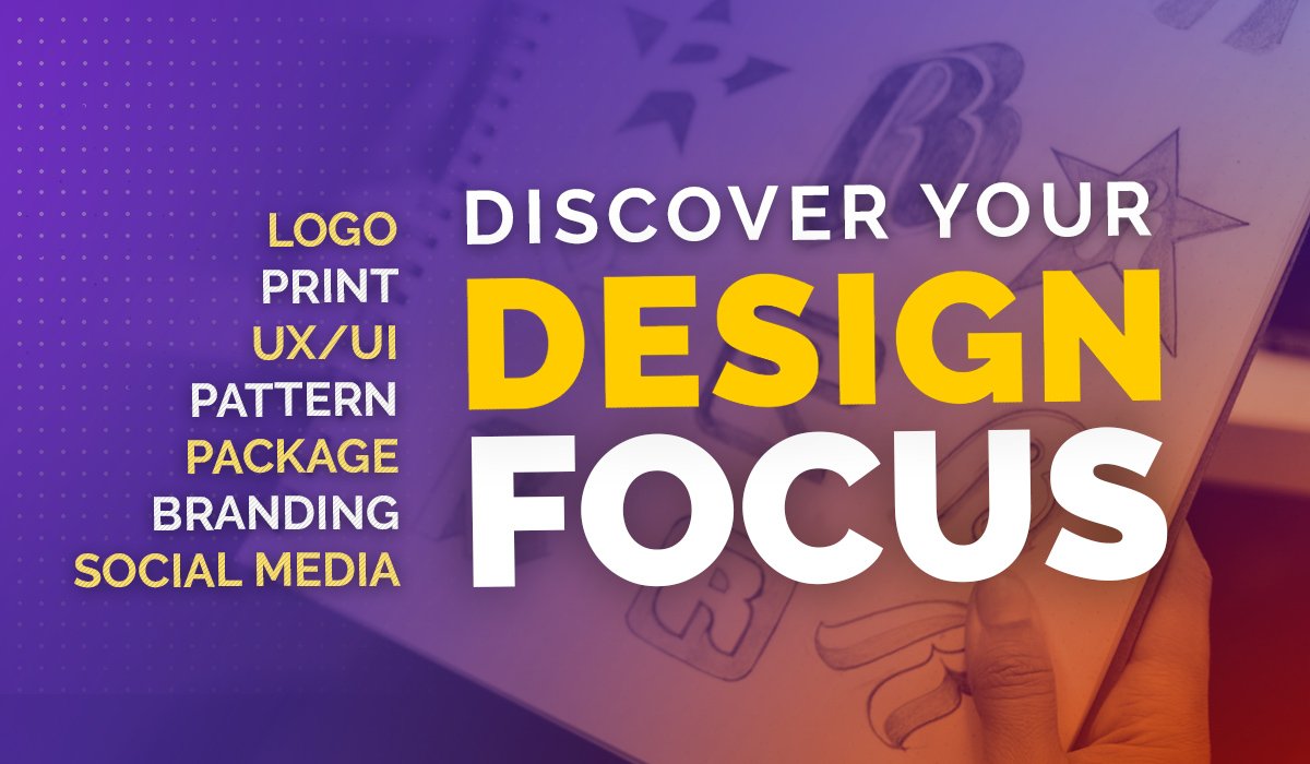
1. Course Preview: do you like to learn by doing practical real world projects? This project based courses extensive starting at beginner level and moving all the way to advanced level design projects. With over 10 hours of video based project learning, this course was created to appeal to graphic design students of any level. It can help expose students to the most popular graphic design projects while learning software and design principles. We master all aspects of design, including theory, layout, color, exporting and preparing files for print, working with digital and print files and, of course, mastering the Adobe software, including Adobe Illustrator, Photo Shop and in Design. We will walk through the step by step creation, off badges and seal graphics. Local Design, a complete package designed for a food product including the front back labels and prep preparation way, will cover book covered sign As we conquer three different types of book covers, including a romance novel, a nonfiction book and an illustrated Children's book cover. We talk about what makes a solid book cover and follow basic layout principles, using grids, working with typography and learning how to create concepts that pop using examples as our guide, we will conquer digital projects as well, including going over what makes a compelling YouTube cover photo and will create a dynamic one together way. Even talk about creating digital art as we create an eclectic modern album are covered. Then we master editorial design as we create a dynamic cover for a home cooking magazine as well as a full article spread. We talk about how to work with larger blocks of text, fought pairing and headlines, and had a maximize both Photoshopped and End, designed to maximize our impact. Last but certainly not least will have a four hour advanced section for those looking for more detailed real world projects will create from scratch the entire branding package for a conference, including the local design branding, lanyards, posters advertising a digital marketing campaign, large format, welcome banners and even a postcard. This extensive section is perfect for those looking toe. Learn how to export and work with files of all types how to export, prepare and save them for professional print or the press. This section goes into an entire new level of detail that will satisfy those curious on how to take on riel large scale rapid design projects for clients. This course is perfect for those who prefer a project based hands on learning approach. And for those who love to see all types of different projects being created, this course is great for those wanting to learn and maximize. Adobe Photoshopped, illustrator in and design and learn tons and tons of new tools along the way that could speed up your This course is great for beginners, advanced designers and everyone in between. There's something for everyone. So let's master bracket designed by creating some fantastic and professional level projects together.
2. Course Guide: first of all, welcome to the course, and I'm glad he decided to join me for this project filled design journey. And I hope this course provides you with all the knowledge you need to feel confident in graphic design, practical application and creating real world design projects. The core central you watch was a great overview all the different sections in the class. But I wanted to break everything down and guide you through the sections so you could know the best way to go through the course. The first section starts with beginner level design projects, and it slowly builds up to more intermediate, advanced projects. I want you to start at the project that fits best with your skill level. I recommend starting at the beginning and working your way through each project to find that starting point for you. The earlier projects focus heavily on tools and tips. Why later Projects focuses more on producing a final product, exporting files and design theory and a little bit less on individual tools. It could be that your best starting point for your skill level is the beginning package design project or that you're starting port will be the book cover project some of you may want to skip to the advanced project. The key here is to take this course at your own pace, as all of you will have different skill levels, and most of you will want to start earlier in on the course to maximize your time in the course you will see attached to this lesson in the course are two very important files. One file will provide a full list of external resource is used during the class like free photos, fonts, blogged articles and graphic assets. There's also a second larger ZIP file that contains all of the internal resource is used throughout the class, including helpful templates. Guides and project files during the course will be challenged to create a few student projects. I would love to see these projects and give feedback when I can. Also, there is a student Facebook group exclusive for you guys of all my courses, where you can post projects and get feedback and also personally message me you conjoined by typing in learn design, go freelance and the Facebook search bar. We also hold monthly design challenges there. Why I challenge you to create a different design project each month, and each student project is reviewed during a live video stream. If you're not on Facebook, don't worry. I have a YouTube channel where I also post the design challenges so you can still participate. You can reach my YouTube channel at youtube dot com slash Lindsay Marsh. You can reach out to me anytime with questions and feel free to post in the Q and a section of this course along the way. And now that she have your files were ready to start the first project section, I'll see you there.
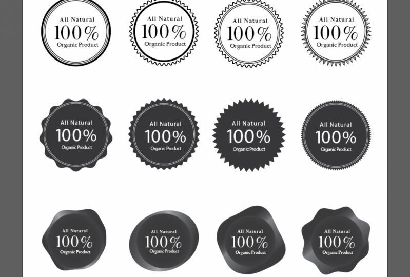
3. Creating Badges Part 1: when it comes to doing graphic design projects, it really helps to know how to do badges. So badges could be stand alone logos or that could be stickers on products or package designs were gonna create a couple of badges for this right here. Good to see a little example of what we're gonna end up creating. I'm going to show you all the different varieties in different ways. We could do badges and borders and shapes. Ah, so that you can know how to do these really easily for a lot of different things. You can put this on a flyer. He could put this on package designs. Just so nice to know how to do a wide variety of badges. So we're in Adobe Illustrator, and we're gonna go ahead and get started. This is our basic text. 100% organic. We're gonna have 100% in the middle, being a little bit larger. We're going to some circular text around the badge. So let's find out all the different borders we can create. We can create your typical circle just like this, and then switch that to a stroke and we have a simple circle badge that we can fill in. But what if we want to copy this and I'm just gonna hold down option and then drags? I could easily copy it. So let's say we want to add a little bit of style to a border. We can go ahead and select our object, go to effect, go down to distort and transform, and let's try zigzag at first and you'll recognize this pattern right away. Were to go and click on preview, and you're going to be able to create a wide variety of badge textures here. You could change the amount of ridges around by increasing these bottom section. So you create a very tight, almost a re see peanut butter cup. Look just like that, where you can make it a lot tighter and less ridges so you can kind of see can do quite a wide variety of one's. This way, if we click on the smooth, it's gonna do a nice, rounded corner for each of those. So it's not a sharp edge, so I'm gonna go ahead and just repeat that. Go ahead and create our clean circle. I want you guys to do this just to practice a few times we're gonna goto effect destroyed, just distort and transform Go down to zigzag And let's do maybe a sharp corner Maybe not as many with this one we could see for sale badges and kind of attention grabbing badges that she can use on advertisements. That zigzag, Let's try a different method. We're gonna go back up to effect distorted transform. And let's try one that's called Pucker and Balut. We're gonna go and click on preview, and we're gonna increase the bloat just a little bit. If you do it too much, it will be a little bit dramatic. We're just gonna do a little bit of a pucker and bloating kind of almost see a flower badge developing. We can increase the pucker to do almost a diamond shape. It's a lot of different things we can do here with creating different bad shapes. So I'm continuing to use the distort and transform zigzag option to create a wide variety of different options. So with badges, you could go ahead and flip this to a Phil and weaken drag in our text on top and white, and that could look just fine are. Sometimes you can add a little more detail to a seal or a badge to kind of get a little more complexity, a little bit more authenticity. Looks a little bit more vintage. We're gonna do just that was going to draw a typical circle. Let's try this one. For now, we're gonna go ahead and zoom in and focus on this one. I was creating a little border on the inside and all A lot of times, instead of having the same stroke with on both of those, I'll usually lighten the stroke on the inside border so it doesn't have too many strong lines competing with each other. Some just in my stroke panel. Go ahead, bring that out and just reduce that just a little bit so that you have kind of a nice border there. So some people add multiple warders and and different things going on and depends on what you're gonna put in your badge. You could even have multiple ones. And let's say I want to make sure the spacing between these two lines with same I can highlight both of those. I'm gonna go up to my align options and I'm doing all the center alignment. So horizontal align center. I'm gonna do a vertical align center, just doing all the center ones. And this is a little neat trick. If you want to have everything be perfectly aligned all the way around in the center, you could do the same thing. I could select all of these lines, go up to a line click on all the align centers. And now I know there's the same spacing between all of these elements. I could even have different contrast between my lines to make it more dynamic, just like that, to add kind of a dynamic pop to my badges. And sometimes you want to replicate the same border twice to create a little bit of a stroke effect that you see here. There's one way we could do it is we could just simply add a stroke to this object right here. So we're gonna go back. This is the same shape. What we could do is have a fill. You have that as a pill, and they could just take a stroke and then go ahead and apply a stroke to this. Let's make it a different colors. You could kind of see what is going on here. And then you have this nice border here just like that, we're gonna go ahead and bring our text in. And this is where we're going to really kind of play around with typography and how to fit this in a seal like badge So we could try to fit everything like this. We could do a center, align them, disappear in my line, panel to center, aligning everything we could find a way to make it stacked just like this. And we could, of course, mess around with the typeface to make it nice and have contrast with our typeface. Maybe make this bold, make that light, and we could probably make this work. We could even put some spacing here. So let's do some spacings. You can have contrast with your spacing in your typography, so it's gonna do to to To spacing. Of course, this is the tracking right here in the character panel. You go ahead and press enter. That means I can make this a little bit smaller and notice how that breaks up. The difference between this top on their bottom kind of helps this stretch a little bit further across without having to be so much bigger than this topic kind of provides a little bit more balance. So let me go ahead and add double that. Let's do that four for four and bring that down. So now I can talk about foreign choices, and this is kind of your typical badge where you kind of have the type kind of center aligned in here. But we're going to really kind of make this a little bit more custom, and we're gonna have some texts that go around in a type on path of circular type on path. I think it's gonna look a lot more polished, but it's kind of determine some type that would look really good here. Would I like to do is the most important factor of this badge is 100% so we would probably want to make that the boldest typeface or the boldest. Wait, let's go ahead and find what I think would be great typeface pairings. So this will be a little bit more of a traditional packages for or an organic brand, and I know Sarah fonts are a little bit more popular now with organic brands. So let's try to find a Sarah tight face. Let's go ahead and see what we have here. And a Brill Fat faces, A really great choice to have that really bold serif typeface. I think this works really good here. A lot of times I have to tighten the spacing just a little bit so I could make it big enough to really pop out some is. Go select this. Go up to my character. I'm going to be going to my character panel a lot when working with typography. And I'm gonna change that tracking or spacing between the characters a little bit. We're actually gonna do a little bit of a negative one. You don't want it too tight or it starts or run into each other. You do not want that, but just enough. We're kind of tightens it a little bit. It kind of helps it feel more together. Course it depends on the type face you're working with, how much you have to do that. So let's do let's instead of doing. I could do the same type face here, but as you'll see, there seems to be a lot of competition. It's all the same. There's not a lot of different contrast going on with my different type choices, so I want to have a little bit of contrast. So I have this nice, beautiful Sarah ifs the little tails at the end. It looks beautiful. It's a detailed typeface. Let's do something more simplistic for the other information that's not quite as important , but relates to the whole phrase. So let's find a really good, typical San Serif typeface. We could do Helvetica. We could do Gil Sands. I mean, there's a lot of different options, one that if you've taken a lot of my classes before, you know I really love railway. One of the reasons why I, like Railway is it's free on Google fonts. It's It's an open source typeface that she can use but also like it, cause it has a lot of different weights to it, so it gives you a lot of variety. Let's go ahead and do a semi bold and kind of see how that works, And it could be when we start to really craft this in its right place that we may need to take change the weight a little bit to have contrast further with this 100% and organic, and we may need to make the organic a little bit bolder to pop out so you can start to see I'll just doing a little bit of contrast with the typeface. Kind of makes it a little bit more interesting. Of course, you don't want a pair too many different bonds together. I usually like to stick with two, two or three. This kind of depends, but you don't want to overwhelm people with too many different farm choices. So let's craft this and make this a little bit better. Let's go ahead and move this out of the way and we're gonna do a circular type on path tool to go ahead and put this inside the circle.
4. Creating Badges Part 2: and we're gonna use the type on path tool to have the type kind of go in a circular direction. We already know how to do this. Great. Go ahead and skip by the section. But for those who really want a lesson how this works, let's go ahead and grab a circle. And this is gonna be where the type is going to lie So eager to just flip that two stroke making a little bit skinnier. And this is gonna be where the type will go along the stroke or the path you're gonna go and click and hold down on her type tool and we're gonna have this special type on path tool Gonna go ahead and click on that. We're gonna click anywhere we want, but we usually want toe start where we want the type to begin. So we want to have 100% go across the top. So let's go and click somewhere around here. So now it's got a copy of 100%. Go ahead and paste it in here. Let's go ahead and add a little bit more spacing here so it kind of stretches a little bit more across the seal. I don't want to make it bigger and have it stretched because obviously it's getting way too crowded. So a lot of times my fix for that is to add a little bit more of that, tracking our spacing between the character. So let's go ahead and add 200 and leave it at that. We could also spin this so we can get it tow line up. Sometimes I like to grab a rectangle tool and just kind of make sure they line up properly . So I'm seeing right here. I needed to spin that just ever so slightly to get that to match on either side, right? So how do we do it the opposite way? This is a little tricky for those who don't know how to do it. If you already know how to do it, great, you're ahead of the game. But this could be a little bit tricky. So what I want to do is, and I've done a lot of client work where I've done seal work and logos where the we have text on the top and text on the bottom, and a lot of times at first I would just spin it around and then half a type, but no one wants to have upside down type. I could tell you that much. They want to be able to read it correctly. So a trick to do that to get it to be on the inside of the line instead of on the outside of the line or the path we're gonna go ahead and look for a special symbol here. So we're gonna move all the way down here to the right till you see a little icon. This is always a little bit tricky to get it to happen. But if you just kind of slowly move your arrow over, it's usually towards the right of the type. You're gonna see that little hero see the arrow with the line. We're gonna click that and hold, and there's gonna keep holding until it goes on the inside of the line and we're going to release. And so now we have type that is readable. It's not upside down, and it could fit nicely on the bottom. We may need to make it a little bit bigger. So now let's go. And copy and paste or organic type and spin it around to where we need to have it. We just do a quick check and make sure it lines up good. The O and the C lineup. We don't want to have it be uneven. And now we're gonna need toe kind of noodle around with this to kind of get the sizing right and maybe add some design elements to make it look a little bit more polished. So a lot of times I like to look for empty white spaces that might be a little bit too big . So in this case, this is a pretty open gap with not a lot going on visually and same here. So what can we do to kind of add something visually interesting to tie everything together so you don't have these big, wide, empty gaps? A lot of times I like to use dividing lines. It's really thin dividing lines. I don't like to make him too thick because it then it becomes too strong of an element and takes away from the most important part of this, which is your type. And you always got to remind yourself what's the most important part of any design that's what needs to stand out. If anything else is competing with it, make it smaller, make it a different low contrast color. Find ways to always make sure the focal point stays the focal point in this case 100%. I would like to make it kind of short. Just just a little element. Little design, um, element that we can add to kind of put something in that area kind of breaks up all that white text. That's why dividing lines air so useful in layout design. And when you're working with large blocks of type, as you could see here, these little dividing lines has really kind of help that piece kind of break up, break it up a little bit so we can always make sure we're centered aligned. So I'm gonna select all of these objects and select all of our type. We could just drag and select everything at this point because you want everything to be nice and center aligned, so it's gonna go up to my line area and go ahead and do a horizontal line center. And so now I know everything is aligned properly, so now we can change a few things. I think this might be getting really close to the edge, and also this is a really thick outline. We could just reduce that just a little bit, so that thick outline does not compete with 100%. So now what I want to do is just kind of make this a little bit smaller. I don't want to have it get too close to the edge, because then it starts to look a little. Makes people anxious when type is too close to an edge or there's not enough margin. They didn't want the viewer to be anxious. So another thing we could do is we can add even more dramatic spacing here and the 100% so we could even do a 500 maybe across. This is where you really have to experiment and see what works. So just reduce the size. Don't be afraid to change. The size of the type is facing the orientation. So spending just two or three more minutes kind of fine tuning the type. You could see how where I where I waas and where I ended up, and he noticed I did have to make the 100% a little bit smaller, to be able to get everything with the Summerlee. Nice spacing. So now that we have that taken care of, let's go ahead and get rid of the one that we were refining and this is the one we want to work with. We could start to reverse things out. We could have the badge be like, just like this. If we wanna have it be a bright sticker on a package design, for example, or product or a flyer, we can go ahead and reverse this out. Those good cuts kind of switched that and make that Phil and then take everything and make it kind of a white color. So this is where we can use color to our benefit. We can make these lines a little bit of a different color. We could make that bright green or whatever would go along with the product or where you're placing the badge. You could even make the 100% really pop out by also making that a different color. Or you can experiment with doing the top a different color or you can even have different colors within here, you know, So it's all kind of kind of experimenting with the color and contrast to make something as dynamic as possible. Course we can also add borders, borders always help when you're putting it on something to stand out. So it's gonna replicate this. You could always do a stroke just like we showed you before. It's gonna go ahead and put that in. It's gonna increase the stroke. Come on, the stroke panel and we're gonna change the color here and make that a little bit shorter and, you know, just strokes kind of help things staying out. Sometimes you have toe split, the difference to in size. I'm gonna type in 1.5 and you know gonna have something like that. We can also this is with having different varieties of badges really helps. You could have another little border inside here kind of capital that off. It's doing a white stroke very thin. We don't want it to compete with everything else we have going on. You could make that green and dinner. Just add a little bit of complexity to that. We could even go a step further and cap off this text right here and This will eliminate really the need for these dividing bars because we're having another design element that's closer to the center. This is another option that you could do, and you may just need to adjust. You're type a little bit to make it work, even make that a little bit lighter and wait and more dramatic spacing. It's always tricky when you have type on path Tool. Is this kind of in its own circle? It's not gonna match perfectly with the two different circle. What's here? So sometimes you just have toe, expand it out and just make sure that it has a nice arc. Little Arc death years Make sure that arc matches your circles. Between here, you don't want to have it be too small and then the arc just doesn't quite match. That does not have a really professional look. Just make sure you continue to expand that circle or contracted to make sure it kind of has even spacing here, here and then here. And that just might take a little bit of noodling and a little bit of eyeballing. It's kind of making sure it looks good and has the same spacing throughout So this is another option. We don't even need a border. Sometimes when it comes to this, they could do all a stroke. Flip that. So you can even just have that without the little details there, we could go back to what we had. Make this outside one just a little bit thicker. There we go. See? Notice how, like before, the lines were a little bit too thin. And when you zoom out on something, those thin lines tend to disappear. So a lot of times I will thicken it up a little bit. Just so when I do the zoom test, make sure all the elements are intact. So sometimes thickening up your lines is not always a bad thing.
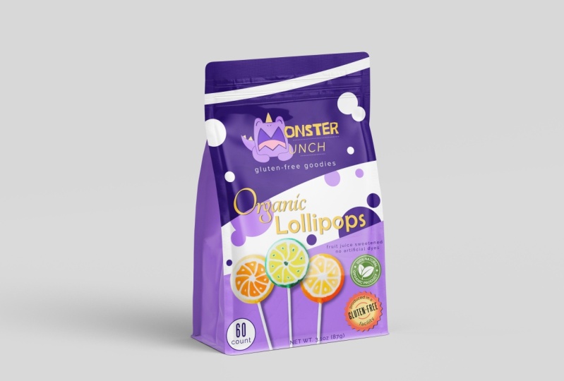
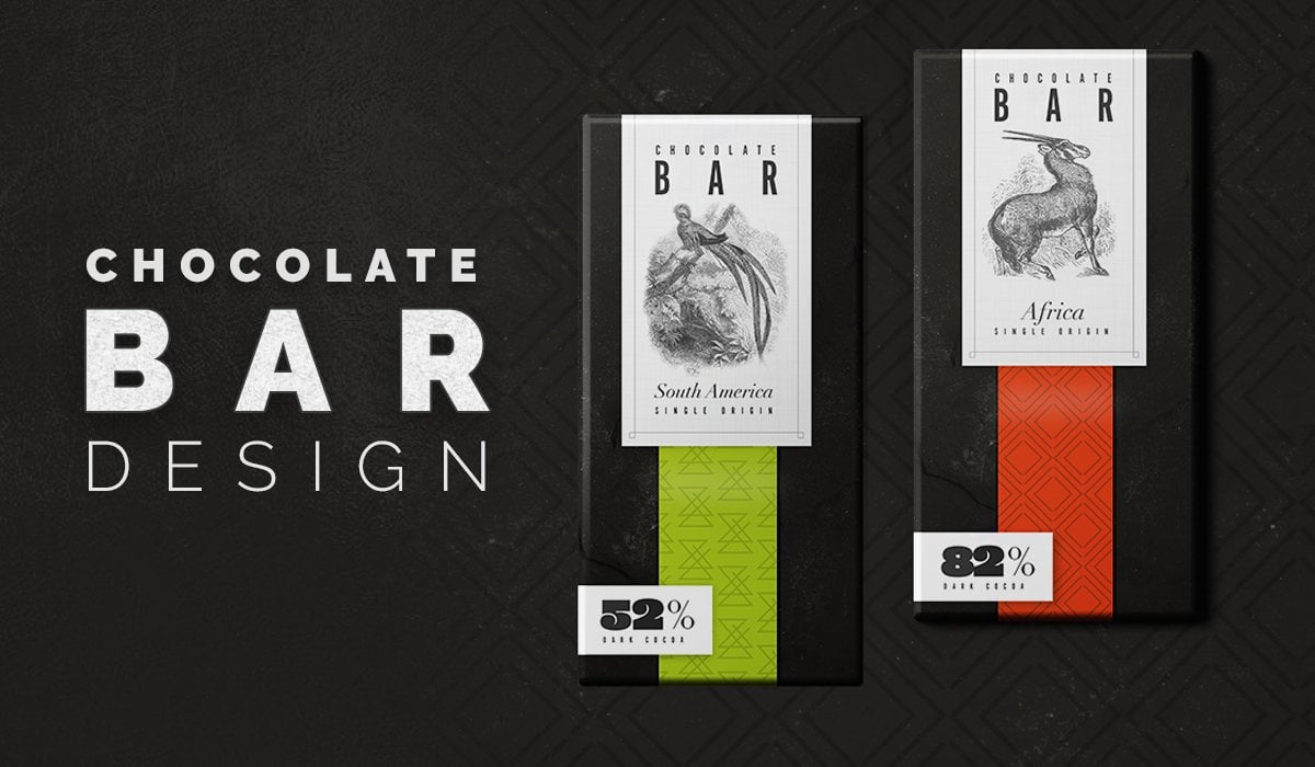
5. Creating Badges Part 3: As you could see, there's so many different methods of attacking this so many different ways. Toe lay this badge out. Borders to borders, no borders at all. Ah, lot of different ways to do badges. So I just wanted to kind of go through this and walk through this process. We're gonna use a badge. We're gonna basically use an outline of one of these. We're gonna find out what works best on her package designed. We're gonna be doing a package of chocolate chip mint chocolate chip cookie pack design, and we're gonna need to put this as a badge on the front of the product so we could create the product together in the class, and then we'll find out which one of these versions will work out best. Of course, the colors will totally change. This is just an example. We're gonna have a different color scheme, but we have something already that we cannot know how to design and know how to apply to a real product. And there's also other ways to divide type up and elements up. So we have these little divider lines which were actually to make a little bit smaller here because we already have so many other lines happening in this particular one. But you can also take the pin tool and just kind of do a little bit of a dividing line. Here, make that a stroke. Make that the same thickness was taking the eyedropper tool. And you can copy and paste. Have this item right here. I want to reflect it so I can put it on the other side. So I'm just gonna go to object, transform anger to reflect just like that. Go and click on. OK. And now I know they're gonna be perfect. I could take these two and I'm always using my line panel. They could do a vertical line top, so I'm gonna be aligning everything to the top. You know, stretch this type a little bit further across. Just like that. It does kind of help to divide everything up just a little bit more. Could make the angle a little bit different on these kind of match. There's all sorts of ways you can use lines and circles and shapes to kind of help you further breakdown information and easily digestible little elements. So now, before we had it just like this. I'm just gonna copy and paste it before we had it like this and the lines kind of ran together. This is a little bit more divided. You could even draw with pen tool. Or even better yet, I have an idea. I'd like to make that a different color. A different feel color to really highlight the word organic, since that's equally valuable. So let's go ahead and duplicate this. We're gonna do a little trick. I'm going to show you the shape builder tool in action. So what I'm gonna do is I want to cut that out. Well, how do I do that? When all these air, different elements, I could take the pin tool and hand drawl all of that, and just kind of draw a little shape and then fill it in and then I'm done or could do it. And even easier way with shape, builder tool, which is right down there. We're gonna use that a lot throughout this class, so don't worry if you don't know it quite yet. So what we want to do is we want to be able to create the shape is a fill so I could drag it over there and have that as a different kind of con high contrast background. So what we're gonna do to accomplish as the shape polar tool one of the first things I need to do if I'm using strokes. So these air strokes right here. I need to outline those strokes so they're no longer edit herbal, and they're treated just like a shape. So how do we do that? We're gonna go upto object, but at the path. And we're gonna do outline stroke if you already know how to do this. Great. We've outlined the stroke, So you noticed. Now, instead of a line in the center, I can no longer change the thickness of the stroke. It's now its own independent object. It's going to make it a lot easier to use thes shape, color tool. We're gonna go and click on the shape filter were to use this a lot throughout the class. So if you don't understand how to use it now, don't worry. They'll be lots of opportunities. So now you'll notice I'll have an opportunity to punch out certain shapes. So I want to have this shape so I'm gonna go ahead and hold down the option key. Hold down the option. Kenya knows there's a subtract sign. It's gonna click on that object and subtract all of those elements eventually. Sometimes you have to really work with it. I have a shape here. Sometimes you have to find Tunis. Doesn't always cut out perfectly. That's okay. Get are direct selection tool and clean up our selection. I have a showing a lot of basic tools by doing this, his first couple projects, which is kind of the point. So we'll get to more complex projects. We don't have to go over a lot of the tools so much we could just focus on the design. The fun part. I'm just sending this to the back. We're gonna make it that green color. We help it pop out, and so that is an option as well. We can fill in the circle with green. I mean, so many different combinations. What I want you to do is I'm gonna task you with a student project that's going to be and I'm gonna go ahead and give you this as a downloadable resource. So you have some of these shapes available. You have some of these already available toe. Look at to kind of see how I have everything laid out. I think that's important. I got feedback from a lot of students who appreciate more downloadable files, so this class is gonna be full of those. So go ahead, download this. I want you to create your own badge. I want you to create a series of badges, all with different variations. Use of color, different stroke lines, different thickness. Ones with borders. Ones without borders are willing to try some with dividing line, some without some with circular text and some that are not circular text. You could just do straight text inside the badge, play around with the edges. You could do the re C cup jacket style. You could do a smooth style. You could just do a plane circle. I want you to create several different badges and also experiment with color. We're gonna do that a lot in this class. High contrast worked really well when you put it on a product or you really want to stand out or it's gonna be a sale badge. You really want to have this high impact colors. So let me see what you got. You could post it in the student Facebook group, get reviews, or it could poster right here in the classroom with you. And I look forward to seeing him.
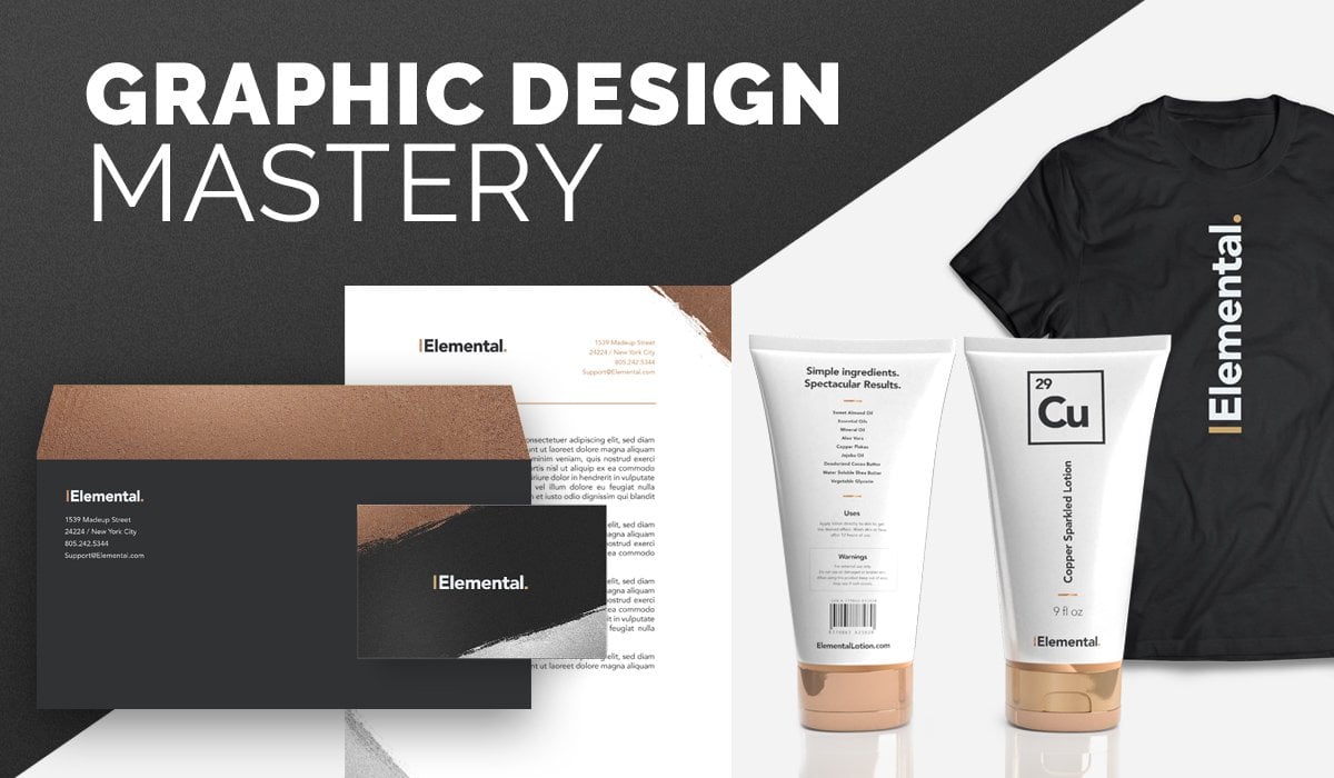
6. Logo Design for Our Package Design Project: Another quick fund project we're going to do is a logo design project. We're gonna be doing the package design. We've already kind of done a seal or batch graphic for that. But now we need a mock company to be the company that produces are fake package design cookie product. So it's farm to table Food company and we're get a pretty much a whip this up. I'm fairly quickly, just a have an idea or just have a local to use on our mock product. So this will be a good chance to practice some of those basic illustrator tools. Some of you guys air coming at this at the very beginning level. Some of you guys already have a little bit of experience. So as we move through the class, things are gonna get way more advanced. So hang tight if you kind of already know some of these familiar tools. So the first thing we want to do is we want to recreate this fork, and so we can just grab the pin tool and create a fork. If for really good illustration, we can do that. But if that's not really our strong suit, sometimes we need some inspiration photos to go on. So I'm on Google and I just Googled Fork and we're just gonna uses as inspiration when I could copy the fork, Where is going to trace the fork And at her own unique flair to the fork, we're just gonna be creating a silhouette. A very simple version that we can use for the logo. Let's go and find a fork that we think would match an organic farm brand or farm to table brand is could it be not a fancy fork, but kind of a basic fork. So that looks like a pretty basic work. So we're gonna use that. Make sure we credit everybody that we use here. We're not gonna be copying the photo. We're just gonna be taken a quick little screens shot so we can get ah, little inspiration from the photo. Just just the shape. We're really just looking for a shapes. They could pick any fork right here. That seems like a nice farm style forks. We're gonna grab our pin tool here. We get to practice or pinto a little bit. Hopefully, guys are already kind of aware of the very basics of the pin tool. So when it comes to things that are symmetrical, so things they're gonna be basically a reflection from left to right. I like to draw half of the fort and then just copy, reflect and join the objects together. So in this case, I don't have to draw the entire fork. I'm just good role half of it. So I'm gonna start right here in the center point, make sure pretty close to the center It's gonna click and hold and make sure have everything And I'm just gonna go to view I'm gonna take off Snapped a pixel, snap to grid. Just gonna remove all those Because sometimes I can get in the way when you're doing really fine work, We're gonna do a nice around it area here. So what I can do is I can grab the curvature tool. I love the curvature tool. So I'm gonna click in the middle and its drag up to get a nice round a top there, switch back to the pin tool and let's keep going down the fork, click in the middle and create a point and then click back once again I could do the same thing. What I'm doing, I'm gonna flip the strokes. I can see my stroke a little bit better. Reduce the stroke size, grab that curvature tool and add a little bit of a soft point there to the work that can also go back with the curvature tool and kind of softening the edges. You can also get the direct selection tool and soften it were at a new curvature to a point and soften it that way. So just kind of a combination of curvature, tool and pin tool to get more natural curves. We're gonna add her own unique flair to this fork once we're done sketching the first half of it. Still about the halfway point and let's go back to our original point. So now we have made a complete half of a fork, and we want to make sure everything is how we like it. We could start to add bends and curves here before we replicate it or duplicate the side and reflect it. Let's take our coverage tool. Maybe add a little bit in here, get a little bit more contoured. It's adding her own unique shape here. Okay, so now let's remove the original fork to see if we like it. So I got a copy and paste and we're gonna reflect, So I'm going to object, transform and just gonna do a quick reflect and do a preview to make sure reflects properly . I just saved us a lot of time. We could do it manually and trace the whole thing and be done. Or we could just kind of cheat a little bit and have our little fork. So once we're happy, we can go ahead and join the shapes together, cause right now they're two separate objects trying to select all of them. I'm gonna grab that shape builder tool and you would click on that. And I'm just gonna click and drag and select both elements and boom. Now they refused as one object and have a nice, sexy looking fork, but I could use for our logo. Now I have kind of a logo fork and let's do some simple typography work. We're not going to spend a whole lot of time with this logo design. Have a logo design mastery course. If you really want to dive super deep into logo design, it's its own beast. So we're gonna bring in some of these type we're gonna need farm to table and then food company. So a couple things we can do here go and start to lay this out. So farm to table in a lot of times when I have a word that's not ask super important. And we have a pretty long company name here. A lot of times I like to make the less important words just a little bit smaller just to kind of have given a little bit more balance. Then we have food companies, so this needs to be in a different typeface, because if I do that, that's all. It's all the same. And so it all reads, Is one big block and food company really is kind of. It's like think it's kind of its own little thing. It's farm to table food company, so we want to make this a different type face. Let's go. Let's stick with what we've been using. Let's do a typical railway. We'll get to a railway light or just a regular railway. Let's make this a little bit different from up top. First of all, let's make it smaller. And then we could go to character. And we could wind the spacing here a little bit, maybe do more dramatic spacing and make it a little bit smaller. So you notice how, having a little bit of contrast that kind of starts to help break down type in the logo? Another thing we could do to studying kind of rustic, vintage kind of looks. I noticed that kind of treat company a little bit different, and I actually just got a copy and paste this on its own layer. And I've noticed sometimes will make it a little bit smaller. Kind of stick it out here and put a little dividing line underneath. I just thought that looked really nice, kind of a ode to the rustic style that you see. And I might need to make that a little bit thicker so it stands closer to the same weight as food and company. So now this looks a little long and awkward with the fork. So let's find a way to put the two up here and tuck table right under there to make it more of a concise condensed logo. We could make this work here on the side make all this the same color. Maybe like a lighter. Grey can look kind of neat and rustic instead of a very stark black. So let's do some similar treatment. This too. This too. Do some dividing lines Here is adding a little vintage player little dividing elements to make it look really good. Eso a couple things we could do is make sure everything is aligned evenly. Here. We could always pop into the grid and make sure things are aligned up or just for the sake of this kind of quick project weaken, Just eyeball it. And also another thing we could make sure the f So right now if we align the F to the F on the top, it can look a little strange. Even though this f this is all a line down here, it just seems like this empty space. Kind of just make sure it's makes it look a little uneven. So this is when you do have to do some of your own adjustments and you have to just manually put it under the teeth. And then now I'm making sure the O on the right is matched up and I could probably just tighten that just a little bit right there. So now that looks a little bit better, I think is you kind of embracing that gap instead of trying to fight against the gap where it was over here, Just just a little small thing. And since we have a little extra space here, we could have that to kind of tuck in there a little bit. Kind of has a nice little space carved out for the two. And there we go. So that's just a quick little logo. I think maybe the spacing here is a little too tight. So I'm just gonna kind of bring this down just a little bit, giving that a little more breathing room and bringing the bottom of the fork to align with the bottom of the F Just little small things we could do to make it good. Another thing we can do is we can add a little more spacing to This is well so we could make food just a little bit smaller. So I go over a lot more logo design stuff in my liver design mastery course, which is a great deep dive in the logo design. But for what we're doing now, we're doing lots of different projects. I want this to be part of a much bigger project I think will be happy with what we have here. So let's say we want to add a little rustic flair to this. There's a couple things we can do. We can soften the type face a little bit, and what we need to do is we need to right click, and we have to create outlines on our type. So when we create outlines in our type, it's gonna outline it. So now will be able to edit all the fine little corners so right clicked. We created outlines. So now we're to just grab select farm. I'm gonna grab the direct selection tool, and I'm gonna be able to soften and round the corners just a little bit so you could do it a lot or a little bit. But it's good to just do a little. Rounding of the corners just helps to soften the type, and I'll show you what it looks like before. So this is before you have very sharp edges, and this is a very organic vintage brand. So let's just soften it just a tad and notice the difference. I think it looks a lot better this way, softening all the corners and the type. Nothing dramatic here, little tiny, softly of the corners. I think that adds little softness to it. And now we're gonna add a little bit of texture to the love of design. We could even around the edges, with this little item here dividing line. See, that just looks a little more polished, doesn't it? Compared to this, and sometimes you want to use sharp edges. It depends on the brand and the company or you're doing, but this one needs nice, soft, rounded items. Picture that lines properly and always pop it on the grid and do that. We'll do lots of grid work a little bit later in the class when it comes to lay out design . But for right now, I think that's fine. I'm gonna put a little bit of a texture to it, putting a raster texture when we can always do it a vector texture. But for right now we're school. Do a quick little raster texture. I have this resource, and I'll put the link in here for you guys to have its spoon graphics washed and warned textures. I think these look really cool. We're gonna bring these in. I'm gonna bring in number six. I'm just bringing in number six and you can use any texture that you want that I was gonna pasted in here. Of course it's gigantic. Make it a lot smaller and work it up. Basically apply a layering mask to this. So we're just gonna bring the tech what we want to do when a group all that together, bring this in front worker to select everything more Good apply are layering mask. So to apply a layering mass, where to get our transparency panel out. And I know we're going over a lot of tools and some of you guys know these already Some of you guys have never seen these before. They're gonna try to go toe at a moderate pace when I go through all these tools. So I have everything selected, and I'm going to click on make a mask so this could be making a transparency mask is going to apply the texture on top of it. You can invert it to do the opposite. If you want to put this on a dark background or unclip invert mask, I think it'll look really good right here on the white background. If you ever wanted to release it, you just click on release and then it's back to normal. Or we can click make masks. So that's how you do apply textures. You could also do that with vector textures as well you don't have to use. This isn't just a J peg, so if you scale this to a large poster, it might blur a little bit, so you can always do the same thing. You would grab a vector, graphic or vector grunge texture and do the same thing. It will work just the same with Vector. I do find vector textures, do slow down computers quite a bit. So that's why I used a simple J peg. In this case, there's a there's our logo, you know, looks a little different than the one I did before. That's okay. Um, this one. I kind of shifted over a little bit, kind of broke that left alignment and shifted it to the right. And I was able to kind of have more of an opportunity to put the two there. So that looks good to kind of have this night space there. That kind of helps this fork breathe a little bit. Or, you know, you can kind of do the straight alignment I did there. So just kind of mocking up some logos. We also need to have a horizontal logo. If that works better on the package design, we don't know it's for the work. Best on the package of nine. So can always do this. Release the clipping mask and try to create a version of the logo that will work horizontally matter of just rotating this fork 90 degrees on having something kind of like this when this is done quickly. But, you know, you never know if you need to have horizontal version. We can put the fork between the two elements. We may not need the dividing lines. There depends on what we're looking for here, but the quick horizontal version I think we have what we need. We have a badge, we have a logo. Now we're gonna kind of hop into that package design. We're going to start to really start from scratch and do some of the photo shop work and editing so we can make that a reality. And then once we put that together, we already have some of these elements put together. So is this a matter of doing some layout design?
7. Package Design Getting Started: I'm gonna introduce you to our next project. We're going to do a package design. We're gonna go through the entire process and detail, including sizing, exporting final files. How to apply it on. Um, aka for you to use a couple of different methods to do that, we have two different kind of options here we could explore. We may even have time to do a backside as well. I want this to be pleat projects that can learn a lot as we move through. This is one of the first things we want to do to complete this pack design as find a great product photo. And there are a lot of great resource is and free photo websites you go to to download lots of different product photos. I had a hard time finding the perfect chocolate chip cookie one, but I did find a photo. I'll put that in. The resource guide has all the links to all the photos you'll need in the class so you can find those. But please feel free to use your own product. It could be a cracker. It could be something else for your own product design. I wanted to be a little bit different than mine, or you can replicate and move through mine if you want to really go step by step and learn the process. One of the first things we do for any package design is edit and finalize our product photo . So our product is gonna be a chocolate ship. It's gonna be a mint chocolate chip. So I downloaded mint leaves. So I'm gonna cop into Adobe photo shop workers start out in photo shop because we're gonna really focus on that editing. I have this stack of chocolate chip cookies and this bunch of mint, which we're gonna find a way toe, isolate and select the mint leaves we think would be good, because that's a lot of meant leave. So here's what we want to do is we want to focus. The product is a meant chocolate chip cookie, so you want to have a little sprig of meant to show that this product is a little bit special and not just a regular plain chocolate chip cookie. So let's first cut out our photo. There's lots of different ways to cut things out in photo shop, so we'll get to that in a minute. If you take in my photo shop editing and manipulation masterclass, you'll be right at home. You can go ahead and skip through some of these different ways to cut objects out. If you're not familiar with all the different ways, I would approach cutting this out. Um, hang tight. We're gonna go over that. We're gonna go and double click, unlock her a little layer here. So now we can go ahead and be able to cut this out. So I have a newer version of Photoshopped the photo shop 2019. So I have a nice, handy new tool I could do up here in the select portion I'm gonna go down to select. I'm gonna go down to subject matter, and so it's gonna automatically use an algorithm to find the subject matter. And sometimes this works, and sometimes it doesn't. But I always try at first because look at that. It's not too bad off selection, really not bad. We're gonna go ahead and zoom in. We're gonna have to find tune this even further. There's another method. You can use that. If I didn't if it didn't select it really good. The next tool I would rely on is my magnetic lasso tool. I would click kind of go around. This seems to actually be making a little bit better of a selection. And sometimes when you have a blurry background, so you notice it's a little blurry right there where the photo was taken. Because the way the lens is being used there, it makes a little bit harder to cut out, uh, items, because the computer is not knowing where the background ends and the cookie begins. So a lot of times, when I look for photos, I'll try to avoid the ones that have a lot of blurring on the edges. And in some case, in this case, I just couldn't find a really great free to use chocolate chip cookie photo. So I had to make do with this one. But that's okay. We're gonna be able to sharpen those selections and a little bit. So I went ahead and use this method, and now we're going to be able to find tune our selection. So let's go ahead and take a couple things we can do here. So sometimes you use the magnetic lasso tool and he had that little bit of a blurry background. It is hard to kind of get the computer to do that for you A lot of times, Al. Then if I have a lot of curves, I'll use the pen tool to make my selection. I love the pin tool. I use it a lot of the Doobie illustrator. I'm already very comfortable with it. So let's go ahead and zoom in here and use the pin tool. I'm gonna go ahead and click, and then I'm gonna click again and hold and make kind of a little bit of a curve shape, click and hold. And I'm gonna go ahead and complete my shape. I'm gonna add to that selection. So what we want to do is when we complete a shape with the pencil, we're gonna right click, and we're gonna go down to make a selection. And here's the key here. We don't want to make a new selection because then it'll ignore the selection we already have. We want to add to the selection, click on OK, and it just added it right there. A nice, smooth curve that would be almost impossible to do with a polygon lasso or the lasso tools so you could take the polygon lasso tools. Another way to add you wanna adds who and add to our selection that's gonna be addition to our selection, and this is gonna be subtraction. So some of us may be basic for you, But just for those who do not know, I'm just gonna go over kind of the basic tools at first and then not do that as much. We could do this as well. It's gonna make a little bit more of a sharper edge. There's like that. But that's why I like the pin tool a little bit better, because I can smooth out my selection so I could go back down to the pin tool. So many different ways to cut things out. There's not really a wrong way. There's usually just easier ways, so there's a little dip there, so I'm gonna get that nice curve there. And instead of adding to the selection, I want to subtract it right because I don't want to add that to it. I want to subtract that right in there, so I got a right click and just do the same thing. Go down to make a selection and we're going to subtract from the selection. Click OK, and there it subtracted it. Let's do this a couple more times for practice. It's going to subtract of that out right there. Just that little bit. Start going a little bit faster and subtract, Boom! I just love the pin tool for cutting out objects. I feel like it's way more accurate. Um, if some of the other tools don't work for you like selection selects subject, this is clicking and holding. We'll get to use the pinto a lot Adobe illustrator to get this works the same way in adobe Photo shop Go down to make a selection Subtract except remember, if you want a subtract er ad that's the only key to all this nice, smooth selections We want to add that time so make a selection and then add to the selection Boom. So I'm gonna continue to do this. I think we've kind of done enough examples to show you I'm gonna go ahead and finish doing the rest of this making a nice, smooth selection, especially these little blurry areas of the photo. If we don't make a nice, smooth selection. It looks really fake, and it looks like it was cut out a little too rough. We want to make a nice, smooth, natural selection. So I'm pretty happy with that selection on a copy. You did you command, see short cut and command the copy, Or you can go up to edit and do it manually. Copy and paste. So now I have my separately are gonna go ahead, delete, or at least make it not visible anymore. So I can really focus on this. I can always see how good my selection is by creating a new layer. I usually like to use a red as long as the photo doesn't have a lot of red in it. And I'm just gonna drag this as a lower layer. Kind of see how my selection was. It's It's not bad. It's not bad. There's little things you can always go in and do and take the eraser tool and fine tune that selection. But I'm pretty happy with it. There is some blurring that happened that had to crop out kind of some sharp edges out of those blurred lines. But I think because the photo was fairly blurry. It did a pretty good job. It's gonna go down here and look at little details. This looks a little unnatural, so I could be to take the pin two and cut that off. Arkan, take the eraser tool and kind of do just a little bit of trimming and softening of the edges. This is being picky because when you have a package design, you got to be a little bit picky because it's gonna be pretty big on the product. Do you want to spend a lot of time really making it nice? Because that photo is gonna be the main attraction of this package design. We'll make sure it doesn't look fake, are not cut out very well. So we gotta be very good about making sure everything looks pretty good. Any sharp edges are smoothed out, softening that, reducing the size of the eraser tool, and he's going into softly just a little bit. I don't want to soften so much that it doesn't match the rest of the cut out, just little things. So when I'm happy with that, I'm gonna go ahead and zoom out and have that as our cookie. And so now what we need to do is add a little sprig of mint. So how are we going to do that? We have this meant photo here. He couldn't use any minute photo you want. You don't have to use this one. So what we want as we just want a sprig of mint? We don't want this big bunch. What we're gonna do is agree. Be cutting out isolating a section of this meant so that we could put it on top of the cookie.
8. Package Design - Photo Editing: so there's no way we can use our little cheat sheets and use the magnetic tool or go to select and find subject because we need to isolate all this. So we need to do some selection on our own. And I thought, maybe this sprig kind of stand alone I can isolate this pretty good, and there won't be any leaves that are covered up. So this is a little sprig of mint I'm gonna isolate, So there's a couple ways I can cut this out. I could just use the magnetic lasso tool, but a lot of times with the magnetic lasso tool and you have a lot of the same color. It has a hard time defining where there's little edges are This is really not doing too bad of a job, but let's go back to our handy pen tool. I just think I just have a lot more control using the pin tool when making a selection, so I'm gonna zoom in quite a bit. Just go over these edges and gonna click and hold drag. Click back on that anchor point click again and drag. It does take a while to master the pin tool. It's going to zoom out because I think we can probably cut across this. Get rid of that stem. We'll do that in a bit and then cut around. And this doesn't have to be perfect cause it's already a cutout background. Just very nice to have. Zoom in here and make sure the selection looks nice and smooth. Click and finish our shape. So now that we have our shape finish, we're gonna right click Make a selection, and we are going to have a new selection because we have a selection yet. Let's go ahead and copy and paste this. Let's get rid of all the excess that we have and let's go ahead and bring it in over our cookie graphic. So here's our little sprig of mint. Let's go and make our cookie photo just a little bit smaller. I'd rather make instead of making the meant photo bigger and stretching a photo, I'd rather make another photo smaller instead of stretching it, cause when you make it smaller, doesn't pixel ate when you make it bigger at pixel eights? This is already a super high resolution photo, so I'm not super concerned. I'm just gonna go ahead and to scale it down to match the size here so I don't have to scale that up. I might skill it up just a tiny bit. Try to avoid that when I can. So now we need angle this so it looks like it's a nice sprig that set nicely atop or right near the cookies. I'm just gonna go ahead and kind of arranges and what I think would be a pleasing manner, because that looks like it's almost upside down. So I just want to kind of angle that all we're doing it's placing. We're going to a little photo editing here in a minute. So now we ever springing meant. I ended up coming out one little leaf and a little bit of a leftover stem that was in the background just to make it look like it was just the leaves. And if we're happy with the selections, we don't need to test how that looks on a different color background. We can always change this, maybe to a light gray to kind of make more appealing background to work with. There's make that a little bit of a dark ray and there we go and let's make that a little bit lighter. And now what we need to do is we have some dull photography. It was professionally edited, edited, and it looked great on the photo, but now we really wanted to stand alone on its own. We also want to make sure both of these totally different photos, taken with totally different lighting look like they belong in the same photograph. This is where some photo editing capabilities will really come in handy. So now that we have the arrangement as we need, let's go ahead and get the Dodge and Burn Tool. We're gonna add some highlights and some shadows. We're also going to use the adjustments panel or the adjustments options in Photoshopped to be able to add a punch of color. So let's do some overall editing first, and then we'll come in and do the highlights and shadows and details last. So what we want to do is select her image. Go ahead and scroll over here so you go over to image adjustments and we're gonna be doing a couple of different things in this adjustment panel. Want to kind of make it a little bit brighter. Ah, one of the biggest things you could do to make a photo a lot brighter is go to exposure. This has a dramatic effect on the photo so you don't need to use a lot is going up this just a little bit. Noticed the change in difference between that and that with product photography, especially in a package design, We really want to make sure all the details of the cook your seen there's not. It doesn't come out printed dark. That's a big problem with printing is you look it out on the screen. You look at it on the screen and it looks great. But then, when you get it printed on a product, it looks a little darker than you expected. It's always like the lighten things up quite a bit. We don't want to do anything like this and have it be over processed that looks over processed. This looks just right. Just a nudge higher, and the offset brings out the shadows a little bit. So I'm reducing the offset. If you were to increase the offset, it makes it a little bit more faded. But I'm just these air really subtle changes you're noticing. This was before, and this is after so just a little bit bringing out those shadows. We're also bringing out the highlights and making it brighter. It's a very, very small changes gonna click on OK, but we're already seeing such a difference. Gonna do command Z and go back so you can see the difference that was before, and that is after a lot, lot better. We could also go to hue and saturation. We can kind of mess with the overall color a little bit with a cookie. When add warmth to it. You want to really bring out those kind of warmer colors. We don't want to have our food look green, so we can always just mess with you. But usually that isn't a a little bit too, too much. We can reduce saturation if we wanted to, or we can increase saturation and notice that's before, and this is after so adds a little richness to the cookie dough, so just adding a little saturation. You can always go to color balance and edit individual color, so if we want to reduce any green, we can actually see this would add green to it. So you notice how unappealing Marine looks on a food product. We actually go the opposite way. Go toward magenta at a little warmth to it. You can always make adjustments in your color. Balance is well, but I don't think we need that for this. Particular photo is kind of going down the list and doing ones I think would be very helpful. We can always do selective color. If there's one particular color, we want to either bring down or highlight Mawr. So once again, very small adjustments because the photo was already professional photo. If this was not a professional photo, you have to do a whole lot more color correction if it's a raw photo that you're working with from a camera. Okay, so I don't think we need to do too much there. I think we do need to bring out a little more highlights here, and we're really gonna have to work on that meant leave because it looks very flat. Let's do the cookie first. We're gonna go to Dodge and burn tools where you could be right here on your panel. If you know how to use these great. We're gonna use these. Redo the Dodge Tool, which is good ad highlights in the burn tool, adds shadows or brings out shadows. Reader The Dodge Tool. What I like to do is go up here to range, and I like to go ahead and start with mid tones, and these have a different effect. So this will bring out the highlights more. This will bring out the shadows. Mawr. This will be right there in the middle. I like to kind of see what kind of effect I have to see what I need to do. So I like to start out with mid tones and let's do a nice, soft round brush. Ah, hard round brush. If we did this, it just be a mascots. Look out, it's not. It's not softened, its not feathered. So let's do this nice, feathered soft round brush and let's add some highlights onto the product. We want to be very careful not to add too much. That would be too much. That looks really obvious that I added highlights. So a lot of times I need to bring down my exposure just a little bit and do you just kind of a click or two. This is where art artist side of design comes out where you don't want to overdo it, make you always go back in your history or do command Z if you just need to go back and and correct something. So I just wanted we're gonna bring out the chocolate chips. So what we're doing here is we're bringing out the highlights more, and we also want to let me go back. Just one more stage. I think I might have then a little bit too much in that 1st 1 That's okay. When you go back, it's trial on air. What you think would look the most appealing. And then now we want to bring out the shadows. We're gonna go down here and select the burn tool reduced exposure a little bit. So it's not so strong or to start out with mid tones and see what effect that has make it a nice big brush. We do what, 348 pixels. Maybe a little bit bigger by 400 or so. So now we're just gonna do little just bringing out the shadows. Now we're making the highlights more bright in the shadows a little bit more intense. And sometimes if you change the size of your brush if you want to bring out the shadows there in the shadows between the cookies. Sometimes I like to do the edges, especially when you cut something out from a light background. There may not be enough shadow there, so I'm gonna show what it looks like before it looks like it almost blends. And if we're ever gonna put this on a light or white background, which is very possible, it kind of just stopped suddenly. But when he had a little bit of shadow kind of makes it look like it was cut out a little better, gives it a little bit more shape and dimension. Just a little tip there. You have to cut out photos that aren't necessarily perfect for this type of work. Sometimes you just have to work with what you have to work with. So I think we're pretty good with the cookie. I can go back in my history. We'll see my history panels. I can always go back into a window and call up my history panel. Let's see what we had before So this is what we had before. Let's go ahead and do when we change the background. That's what we had before. And this is what we have after. Do you notice that it's a lot more vivid? I might even tone down the shot of the highlights just a little bit more if I were to go back and do this again. So now this looks really don't. So let's brightness up quite a bit. Let's do the same process. Let's go upto adjustments. Let's go to exposure first of See if we can't make this a little bit brighter, a little bit brighter. Maybe reduce the offset. See how it added quite a bit of richness. This was before, and then it kind of adds quite a bit of richness. There more contrast and then gamma that brightens it up a little bit. Look OK and we can go to color balance, you saturation. We can either add a meant. We really want this to pop out on. The package meant it's supposed to be enticing and bright, and right now this is a little bit of the dull green, so let's brighten that up quite a bit. we can add a little saturation to it. Not too much. You don't want it to look a little too crazy. Just a little saturation. We could go to color balance and see if we can't add maybe a little more yellow, looking a little more vibrant. So I'm just going to my highlights shadows and mid tones for tone balance Just adding a little yellow for a pop. And now we want to add the same highlights and shadows we did through the cookie is right Now we have that looks like the highlights or right here. So we have a light source that's coming from the top and coming toward the middle of the cookie. So this is where the light source is coming. So we want to emulate a light source. Very similar, even though the light the photo was not taken with that light source, we're gonna try to bring it out. So it looks like, um, it's from that light source. So we're gonna do the same thing. Let's start off with the Dodge. I usually like to start with highlights and end with, um shadows, but you could do it. How we'd like Let's go ahead and add a little pop of highlights right around here. So the shed, the we need to have highlights here. You need to have a kind of toward the middle top of this because kind of a top down directional light, and then we can change this. Highlights are gonna bring out more highlights is gonna be a lot stronger. OK, And now let's add a little bit of shadow so we can add shadow to things that are already gonna be shady anyway, especially down here in the bottom of the light source is coming down would be a little bit more shadowy down here.
9. Package Design - Photo Editing part 2: so I wanted to show you the difference between these two. The bottom is what we were doing. And I did some more research on meant and realized that mint has a little blue little green in it, and this looked a little bit too much like a regular outside plant or grass, so we needed to add a little bit of that blue to it. So what I did is I took this image. I went up to color balance, suggests adjustments and went to color balance. And I just added a little hint of blue to the highlights and shadows on Did some adjustments there, so I can kind of get a little bit more of, ah, color of meant that I'm happy with. We've got to be picky here. We've got to make it a very enticing photo. So right now I'm happy with the lighting and the way it's cut out. But they still feel like this meant doesn't belong with the cookie, and that's because it's not casting any shadows on the cookie right now. It's a slat, so let's we're gonna draw some custom shadows, so we're gonna have the mint leaves casting a shadow on top of the cookie, so it looks like they're taken as one photograph. So to draw custom shadows are going to do it on its own layer. So I can have maximum control over how the shadows do it instead of drawing the shadows by using the dodge and burn tool that I just still have as much control over shadows. If I do it on the actual image. So I'm gonna create a layer that's gonna be between the mint and go ahead title this meant and then the cookie. This is gonna be our shadow layer. So this is when we're gonna drawl using the paint brush tool. So have the paint brush tool right here. We're gonna make it not quite as big, just just enough to draw a nice, feathered, soft, round brush shadow. So we're gonna go ahead and select black. We can always lighten this at another time. This will really help us know where the shadows are. So let's zoom in. Where is this gonna be cast? We have some light that's coming down to the left. So it's on this cooking. It's on here. So the shadows air probably most likely gonna be behind them at Leaf right around here. Go ahead. Drawl the shadows. And we may need to reduce the brush size so it could get a little bit of a shadow here. It doesn't have to be perfect, cause we're gonna use the eraser Racer tool and fine tune our shadow selection. There might be a little shadow down here, maybe just a little bit of one. And there's also gonna be some shadowing that's gonna be cast from the leaf itself and notice how it's not casting very far, just like that. We could do deeper shadows that cast further out if we wanted to. But the further you cast a shadow, the more it looks like it's floating and we don't want it to look like it's floating. We want it to look like it's arresting on the table or wherever its at. So you notice I'm just doing a little bit of a shadow there. Okay, so let's go ahead and erase some of the steep stuff. I gotta go and use the opacity over here in my layers panel right here. And I'm just gonna reduce the opacity of the shadow layer just a little bit. We don't want it to be too strong. That's way too strong of a shadow. The key to shadows and make is making them look light and subtle just a little bit like that. And now we can use our eraser tool and kind of fine tuner selection by erasing some of this excess shadows. We're not gonna have shadows cast there. We're gonna have it. Just cast a little bit here. You had it there, but let's just took that in a little bit. And we don't. That shadow right here well, extends a little too far outside is gonna shave it just a little bit shaving it out. It could even reduce the opacity of your brush so you can kind of feather out your shadows . So this is 50% brush to fade that out. So there we go. Just adding a little highlight and shadow. We also need to add shadow on the cookie and go ahead and create a new layer if I want to. So I'm gonna create a new layer, and this is gonna be for the cookie. I'm just gonna draw. So we have a kind of a diagonal casting shadow. So we're gonna have a shadow that's going to be looking make it a little bit bigger on this side, going to make sure that layers under the cookie and it's gonna be cast about there. And we can reduce the opacity of that shadow and make it lighter and then take our eraser tool. And right now, I still have it at a 50% opacity. Start shaving it, trimming it, and we have our shadows. That looks a lot better than before. So I'm gonna, um, take away the visibility of the two shadow layers we have. So that was before it looks very static. It looks like it was just put together, but it's adding a little richness with shadows. It helps a lot and bringing these two photos together. So we're ready to move out of photo shop and end to Adobe Illustrator to do our layout design and package design. So let's go ahead and export this file. We do not need a background, so I'm just gonna make sure that layer is no longer visible and just to save on space, because sometimes large large canvases take up a lot of ah space on your computer. I'm just gonna go ahead and crop this to the right size and I'm just gonna save this as a Photoshopped file. Save it as a photo shop. I'll not export as a P and G. I feel like Photoshopped files are a lot better to have on hand when you bring them into Adobe Illustrator. So now I'm ready to hop into Adobe Illustrator. I'm gonna go ahead and size up my document. I'm gonna try to research what I think would be a great standard package design for the type of package design that you see here on the screen is going to try to find some sizes so that we can have a size that super duper close to the final thing So we don't have to do a whole lot Edits when we get those final specs our final sizes from our client or the printer who is going to be printing and manufacturing the bags
10. Getting started in Illustrator : Now we're in Adobe Illustrator, and we're gonna open up a new document. So what size do I do? This package design. We wanted to be a standard bag format and you can go on lots of manufacturers. Websites are those who would produce this type of package to find out some sample specs. You can email your client and ask them if they know the specs. Or you can talk to who ever is gonna be your manufacturer and get the specs directly through them. Ah, by a phone call or an email. As a graphic designer, it's up to you to guesstimate the size and then finalize it at the end with the right specs . But you can't always come up. You're not expected to magically come up with the sizes. You have to get them from somewhere. You have to get them. Ah, from the person who actually will be applying this designed to a riel package so usually contacting the manufacturer will do good if you don't know who that is yet, you can always take a great guests. In this case, we're going to do four inches by 10 inches. I think that will be a good custom size first of all, if it's really good on the mock ups that we're gonna be using. So that's kind of how I'm basing the size on. So we're just gonna do a 10 and height was due 10 and height and a four in width and see how that works. You know what's great about getting at least the dimensions right is you can always scale it bigger or smaller, especially now that we're working in a vector illustrator environment. So it's not gonna be a big deal if we have to add 1/2 an inch later on. It's not totally change or design too much. We're gonna make sure we have a design that's flexible. That's not totally dependent on having the perfect size already. Okay, we're not gonna worry about bleed. In some cases, when it comes to package design, sometimes you need bleed. Sometimes you don't need lead, usually with bags that kind of wrap around a product. Sometimes most of the case I, they have not required bleed a lot of things that's printed on paper. So let's say, a rapper usually do require bleed, but something about bags and printing on cans. Usually I found that they don't need bleed because you can't really Trey McCann, like you can trim paper on a printed paper products. So that might be why. So we're not gonna have any bleed. We're gonna go and create the document, and that's a little bit to toll. So actually, I want to change the sizes. I kind of did this on purpose just to kind of show you how I quickly edit again a dimension of size after I've already opened it. So if I want to change and tweak the size, I'm gonna go to file documents set up and go to edit art boards, and I'm gonna go ahead and change this so that it is a 10 hype are a 14 height and a 10 with that looks more like it. That is a great size for the front of the package design. And we will be doing a back a little bit later as kind of some bonus kind of lessons. But right now we're going to focus on the front. That's okay. If we were gonna get this printed on a bag printer usually requires the front and the back to be together in one big pdf document, so we'll get to that a little bit later. So here's the front. We need to go ahead and bring in all over elements that the client is requiring us to have on there. I'm gonna go ahead and bring those on and I'll be right back. So I opened up the starter pack illustrator file. I have that as a downloadable resource so that you can have everything you need to kind of get started with this project. I have the logo on there. I have the cookies cut out, Hopefully will be able to go through that yourself and bring in your own. But if you were just wanting to hop right into the layout, this is a very helpful starter. Remember when we did the badges? We did the badges not long ago. We have lots of different options to choose from for badges, because that also needs to be put on this product. We have the logo. We did that in a separate project and we did the photo in a separate kind of projects. We have all of these elements coming together for one final package design so layout. This is the hardest part of graphic design. Everything else was very straightforward. We're doing a logo. We're working with this, But with layout, you're working with all these elements together to create one cohesive package, and that could be the most challenging part of design finding the right color palettes and find the right balance between all of the elements. So we're gonna do that right here. So what I'm gonna do is I'm gonna start to block. So when you block out a design, you're making certain elements the size they need to be. The most prominent items need to be bigger. The smallest detail items need to be smaller. So the title's gonna be fairly large, right? So I could have a pretty large. This is the product name title. The photo of any product needs to be large. It doesn't need to take up the entire graphic cause. And it's like you don't have any room to put any of those really important text. But it needs to be big enough where it does become the main focal point of the layout. We're gonna make that fairly large farm fresh ingredients is kind of an extra little banner that we're gonna have. So this doesn't need to be quite a large, but still important. We have all the package details that don't need to be as large, so it could make that a little bit smaller. Put that on the bottom. For now, you know, we might find a better place for it, but for right now, there's probably need to be about that size. You start to get an idea. That's gonna be a banner. This is gonna be some kind of cookie area. We have a badge here. We're not quite sure where to put the badge yet, and it does probably need to be a bit bigger, but we don't know where we're gonna put it If we're gonna angle it, we're just gonna kind of group this together and just keep it right there for now. And we need to have a logo. So we don't know if we're gonna put this on a dark background or a light background. We haven't experimented with that yet, so we're gonna put these off to the side and let's start off with a light background. Because why not? We're gonna use our darker logo. The logo needs to be big, but the logo should never overtake the product name. If you look at products on store shelves, especially cookies and crackers, you'll see Nabisco or Oreo are you'll see the manufacturer. But you'll see the name product like Oreo a lot bigger than the manufacturer like Nabisco. So you always see kind of the manufacturer or the overall company name smaller than the product. The product is the most important part of this piece, so now we can kind of sense were blocking. We could continually make things bigger and smaller to our liking. So now we need to start thinking about our typography and what kind of final type choices we wanna have So we could play off the logo and use the same type face. Or we can apply a different type of type so we don't fight with the logo, so we need to find something that's very bold and chunky. When you're talking about package designs, you really need to stand out on the store shelves and go look at your store shelves and see how many times you see really super thin thoughts are font weights being used. You almost always see these big, bold, chunky typefaces or fonts, and you also see them outlined with a border to stand out even more. So you talk about these dramatic, thick, chunky type, so that's easy to read from a distance, and that's all. There's a reason for that. So I'm gonna keep that in mind when I'm doing this title. I could make other things in. This may be a thinner weight, but I really want to make the product nice, chunky, and I can see it from a distance. Let's find a nice, chunky, bold typeface that we can use. So this is the same type face that we use for the logo, and this could work. This is really not bad. That could definitely work for the product. Well, let's see what else is out there. We have this beautiful Sarah fart. It kind of adds a rustic little look to it meant chocolate chip cookies, and I think that could work well, good as well. So this is a brill fat face, which we have used in the prior badge, um, project. And I think that could work really well to add kind of this soft, organic feeling to this farm to table company, so that could be an option. And I'm looking at bold, chunky ones. Only that could work. But I think the problem here is it's chunky and it's got these slabs. Arabs is big, chunky Sarah ifs, and I think it makes it almost looked too clunky. Um, so we're wanting something a little bit mawr smooth. So this is just kind of the process I go through when I'm looking at different options. See health in that IHS. See how when you zoom out, that product doesn't really stand out to me because the weight is too thin. So you know there's certain ones that I just automatically ignore or Markoff. So I did find one that could work really well. It's called fieldwork. Geo Black. It's nice and chunky. It doesn't have lots of Big Sarah apps on it. It just looks really clean to me. I love the spacing, the natural spacing between the type. It just looks really nice and clean, and I think we could definitely use this. So now that we kind of chose in that tight face, let's kind of Charest this headline and make it a little bit more differentiated. So one thing we could do is we have a little bit of an issue here because we need to have the ah, nice big headline. But we also have this very toll product photo. So sometimes it's hard. If I were to do this, put the product here. It seems very it seems stacked, but it also seems kind of tight, like I don't have a whole lot of breathing room. So I think what we need to do is find a way to incorporate this next to each other so they can feel connected. So we're gonna do just that. This is where can make certain words bigger and tuck things in like a little puzzle piece. So the typography feels like it runs together, and it whole fits together like that puzzle piece. First of all, we could maybe make meant a little bit smaller and notice this natural space That's kind of between the L in the age. Gonna take advantage of that and maybe put it right here. I like to leave a little breathing room or space. I don't want it to be too far apart. where they seem disconnected. But I definitely don't want to blood it up too close. That's too tight. It causes anxiety for the viewer. So I want to have it be right about here. You can usually find the same spacing between here on the left and right sides. You can try to have the same spacing here just to have some kind of ah, way to find that perfect spacing. Okay, so let's find a way to do Chip a lot of times, especially with big, chunky typefaces. I like to find opportunities to continue a word down below. So in this case, I'm not putting them together like this because that starts toe be a readability issue. I can't read that very well. So if I put a little space in here, but it just kind of has this natural flow from the bottom of the H down to the age on the top, so just kind of seems to fit together like that puzzle piece. Notice how the eye is tucked in this white space. It just looks really nice that way. We try to have cookie to the same thing. But see, there seems to be this huge kind of gap right there just doesn't seem very good. So I could maybe have the K come up here, and that could have a nice kind of see how everything's connecting like a puzzle piece. Another thing I like to do, especially when you have such tight spacing. Sometimes I like to turn things Ah, a little bit vertically, so just kinda twist things. I guess you say diagonally just a little bit. This adds a little bit of a dynamic pop to your headline. I'm gonna go ahead and do that right now, and I love and I know this is really popular now is to kind of overlap the type. So the cookies coming over kind of layered over the type and see how it's layered over the i. R. The E. We could find opportunities to maybe make cookie a little smaller so that we can read the entire word just like that, but have have the cookie come over. The S just helps add a little bit of a layered look, which could look nice
11. Layout and Design: So now I kind of fiddled around with this a little bit. Tried to find the right space, and year will kind of notice. A few changes had to make cookies a little bit smaller because that's such a wide, long word. It wasn't quite fitting with everything there, but I still have some things covered up in that layered look. Just had to make cookies a little bit smaller. Off course, there's always opportunities to find. Alignment with type always makes it a little better. You don't have to do it every single time, just little things that you're looking out for. Okay, so overall very happy with that, we could start to add a little color to the headline. Once again, it's gonna depend on if we're gonna have a white light background or a dark, rich background. So they were good. Explore both kinds, and it's going to depend. The color's gonna change depending on the what background we use. But let's say at first we just stick with a plain white background to show I'd like to change all of this to a chocolate color, and what I like to do is take the eyedropper tool and sample something from a photo nearby . I like to do that, said it. Just trying to find a chocolate color myself. Go take it right from the chocolate chip here and I wanted to be dark. I went dark chocolate. There we go. There's a nice dark chocolate is really go pop out against the white. You wanna have a lot of high contrast stuff what he have a package design that means you have something light next to something very dark. That is contrast. So another thing is meant meant so meant is meant. It's it's green. Doesn't really need to be chocolate colored. So this is all this is a lot of different, um, the same color, a lot of different typography and the same color. So let's break that up a little bit. Add to that contrast by bringing out like a meant color just like that. So notice how that really broke up the headline and it feels more readable. It feels more digestible. It's got two different colors now. It looks great. So just kind of a little hint. There. We can always double click this color and maybe, you know, lighten it just a tad, and a little bit of that meant labour to it. So now we have that together and we could go ahead. And since this logo go ahead and have a plane logo without texture for now, just to keep it easy, let's make this logo match with the chocolate kind of bring that in as a thematic themed color. And so now we might have an opportunity to bring this a little higher and make it a little bigger. So now we have a couple things we need to have here. We need to have this badge, which we already spent some time on, and now we kind of have some better colors here. Ah, lot of times with badges. Once I feel like I'm happy with the type, I like to kind of angle him a little bit and you'll notice we already have an angle here with our headline. So let's just keep with that angle trend. Kind of at makes it look like it's a sticker that's placed on there, and it wasn't placed on even like a a real sticker that was placed. You make that a little bit bigger. We don't have too much white space here, we wouldn't be able to tuck a little element. And there we can, right Click this and we can change the colors here to make it match with what we have so far. So we could try, you know, a mentor color here and make all of this like a chocolate color, maybe a white color. You know, that's that's an opportunity. We could make this the chocolate color and bring that 100% out and maybe the bars as well dividing bars and make that green the mint green we have. You know, there's a lot of ways to add contrast here. So now that we have the badge and kind of the color, I just kind of highlighted the little divider bars and kept everything white. And now we can kind of focus on this little banner that's gonna be across the bottom. We could just draw a quick little banner. What I'm gonna do is I'm going to destroy a rectangle. I'm gonna go ahead and put the type over to the side. Wanted to make like, a little waved banner. It's not gonna be a straight boring banner. There's gonna be submit movements and curves to this banner. This drawing what I think would be a good size for it I'm gonna go up to effect could go down to a warp and I'm gonna click on the flag right here. That's gonna add a little bit of curve for us. We don't have to do it manually. Of course, we can always grab the pin tool or the curvature tool and manually add curves. But this just doesn't like a nice even distributions. It is doing a little curve, a little curve to our banner, so it's not straight across and boring. And now we want to apply the same effect to our type. Let's go ahead and get our type figured out. I love that nice Sarah fun. What was that? A Brill fat face. I think that looked really good, and I think since it's a Sarah font, it'll pair well with all this. That's Sarah far. It'll pair very well with all the sand Saref on. It's nice if you use a lot of one type of font. Let's say you're using a lot of the Sand Saref. It's nice to throw in a Serra font for a little bit of variety. So we're gonna do that course, we could make this white so it can kind of see a little better, and we're gonna apply the same flag effect, so I'm just gonna go up to effect. We're going apply the same one, and this is when you have to kind of mess with it a little bit. It's not always gonna do it perfectly, and that's okay. Another thing I want to do is add a little bit of ornaments to the side, kind of make it more of a flag on the edges. So what I'm gonna do is I'm just gonna add an anchor point, just have the pin tool adding an anchor point. They're gonna take the curvature tool, and that's gonna collect the select this one anchor and bring it in. And then you do the same thing over here could add a new anchor point right there in the middle, get that coverage or tool and just bring it in where I can use the direct selection tool. So now I added a little bit of a wave effect and kind of some hedges, so I thought that looked a little nicer might just need to rotate this just a little bit. So now, in terms of color, and also, I could around this. So what I need to do is this has the warp effect to it, so it's gonna always have this war. Perfect. So what I want to do is outline this object so it doesn't have this affect any war, so I could edit all of the ankle points. So what I'm gonna do is I'm gonna goto object, and I'm going to go down to expand appearance. And so any time you do kind of anything from the effect like warp and destroy, just distort transform. Sometimes you have to go toe object, expand appearance and you'll notice. There we go. So now if I do the direct selection tool, I have access to all of the anchor points here. And the reason I did that as I wanted to soften the edges of this flag. So I'm just gonna soften the edge of the flag. I think it kind of makes gives it more of a polished look. So let's zoom out, talk about color because right now we have a lot of brown and we need to have better contrast here. So here's what I'm going to do. This is a great layout, but it's missing something. It has the all the whole background is the same. It's just a big white background, and we need to change that. We need to break this up somehow. So I have an idea. Let me go ahead and just do some last week's here. Okay, so now I want to be able to divide this to add kind of a lighter top in a darker bottom to break it up quite a bit. So what I'm gonna do is I'm gonna take the rectangle tool, and I'm gonna split it where I think would be a great halfway dividing point. And it doesn't have to be exactly halfway. And I'm gonna make this brown or could make it green. And here's what I'm gonna do. I'm gonna add a little bit of curve to this, because right now this looks great and dividing it up and I can even make this diagonal across something like that to kind of play along the diagonal look, and I think that looks fine. But I think for this I'd like to add kind of go along these curves here, and I'm gonna take the curvature tool and I'm going to take it's gonna be clicking right here, click clicking down And then I'm gonna click over here and click up. I'm just creating a little bit of a wave. Just a little bit of a wave Action here and this badge can kind of sit nicely on top of that, maybe kind of halfway there. It's also gives us an opportunity to play around with color a little bit. What kind of reverse this out? And maybe make this the men color. And we could also take an opportunity to take this banner and make it a different color. Because if I make it brown, I can't make it Brown. If I make it green, there's just way too much green happening there. So it's all about high contrast with package designs, so let's try a totally different color that's different than our color palette. To really bring this banner out, we're actually gonna try a yellow orange, maybe add a little bit of a darker orange color to it, bringing it down and help it pop out And of course, I think black might work a little bit better for that course. This down here needs to be switched to White, a little information. So I think that works to kind of help break up the package design a little bit more, and I still think something's missing. I still think we need to continue to work with this a little bit more to get something I'd be happy with. So let's let me take a few moments to kind of process this. We make that brown so that looks more together. I think we need to have a little bit more cohesiveness. We have a lot of extra space happening here, so let me take a few minutes. I will be right back.
12. Finishing Up: so I had a chance to revisit this. I did keep the bottom there as well, and I wanted to make sure that everything was a little bit more tight and looking at the package design. We're gonna need to relieve some room at the top for the zipper, the zipper part of the package. So I was able to condense everything, and that kind of helped a little bit with bringing everything a little bit tighter together without feeling too tight. So this is kind of an example of a light background I think could work. I think we have a little contrast here with green and the white. If we were to remove this bottom different color, look how everything just kind of fights for your attention. But when we add a little bit of that background contrast, it kind of brings and breaks everything into two different kind of areas, and it really helps your I break everything down. So this is so important to kind of add, there's different background elements, and then we course who made this kind of a yellow high contrast color and noticed little little changes. I put the little mint leaf kind of over the banner just to add that layered look just kind of thinking about How can I make this look as dynamic as possible? And I think we're there. So let's try a different version of this. Let's keep everything the same layout, but let's reverse everything out. Let's make this even more high. Contrast. We're gonna create a dark, rich chocolate background with a mint background as well. So let's reverse this out. So what we're going to do is we're going to make the top portion portion green. I was glad and get a box here instead of the stark white we're gonna do Green, we're gonna make everything reversed out. So over the men, we could make it a lot lighter. Make that stand out. Gonna make all this white. I'm going to take our dark or bottom here and make that dark course. Our badge needs to stand out now. Now that's blending into the bottom, and that's where strokes can really come in handy and extra borders. So let's go ahead and add a stroke here. I want to take that the same green up top. Gonna go ahead and double click that I got a copy, this hex code, and then I'm gonna be able to apply that right down here on my swatch unders pasting. That's watch Code in so I can match that green. Go, go over to my stroke panel on. That's gonna increase the size of that. So that can stand out against that other darker meant. Here we go. Then. We need to do the logo as well. Gonna make sure that is white, but not brown. And there we have it. The only issue here is the Let's go ahead. Make that brown. That looks good. That looks together. The only issue I see is the meant not being quite as readable. And there's several things we can do. We can always separate this as a separate layer. I was cutting that out, and I'm gonna paste it in its own layer sums here in my layers panel. This is more about file preparation for printing. Create a new layer and call this a spot layer and I'm just gonna paste in place sums going to edit paste in place, announced on its own layer. So now it's all by itself so I can isolate it What I can do is talk to the printer about how to add a metallic ink or a spot finish on that to make it a little shiny er to make have something having helped stand out over the plastic packaging because I do want to keep it a different color. And I don't want to make it orange, because when you have a word that's meant, you want to keep it. That color meant you don't want to do it a different color because if I do it orange, it's stands out. It looks great, but it doesn't make sense. It's meant it's supposed to be green, so that's one thing we could do to get around that issue. We could also do a little bit of a drop shadow to make sure this type stands out a little bit more so I can go to affect style eyes and to be adding a drop shadow. I don't like to add a lot of drop shadow, so when I do drop shadow, I just do a little bit like maybe even 9% just enough and they tighten the distance, almost make it zero distance and so you just have a little bit of blurring there. Maybe make it 12. There's adds enough to keep that going. And one thing I've noticed that I want to do is this hat this is this cookie is over the p . But there's no shadow, so it just looks like it's floating. So let's add a little bit of a shadow right here in Adobe. Illustrator, get the pen tool. I'm gonna draw my shadow. That's a little bit of shadow over here over the P. I'm gonna send that backwards in the layering system. I'm using command left bracket My little shortcut for that if you take in my classes and I'm gonna blur this quite a bit So I'm gonna go up to effect Blur Gaussian Blur. I know I'm using a lot of tools, but feel free toe go back and you don't know these tools very well. Go back and watch it again. You make this dark black. It was like that and reduce the transparency a lot. So we're just getting a little bit of a drop shadow over the P. If we're doing this in photo shop would probably be a lot easier. So there is our package design. I feel very happy about this version. We can, of course, use the light version if you want to. There's a light version, and then there's kind of the dark version, so there's a few things we could do. We could add a little bit of texture to this as well. We can just draw little pattern and have a little pattern over top. We could bring in a texture as well. We want to do that and it with package designs. Sometimes it's nice to keep a nice, solid color because you already have the texture of the plastic bag that's also gonna be on their butts. A very shiny plastic bags. Sometimes that's enough, and sometimes adding a texture can take away from that, so I might keep it a solid color. We could put a texture there, but May will do that for another project. So now I'm ready to kind of see if this concept is gonna look good on a bag. We're gonna put it on a mock up, we're gonna hop into adobe dimensions, and I just got to see how it looks. This is just for seeing how we like it on the bag, and if we need to go back and make tweaks, we can. It's also be good for getting approval from the client, so once they like the front, we can continue the theme and do our back, and then we can get it ready for the printer.
13. Working with Adobe Dimensions : We're in a program called Adobe Dimensions, and it's free for anybody who has an adobe creative cloud subscription. And it could even be free if you don't have one of not 100% sure. Adobe can change that rule at any time, but it's a great way to create mock ups and toe work in a three D environment and kind of see how your package design looks in real life. If you don't have adobe dimension, some people don't have a computer that has enough ram or memory to run adobe dimensions. If that's the case, you can head on over to graphic burger dot com or anywhere that has a photo shop mock up where you could do the same thing that we're doing right now. But using a Photoshopped mock up instead, that is okay. But right now we're gonna use Adobe dimensions for this class. If you've taken my graphic design mastery class where we kind of go over or something similar, we do a whole branding project. Together, we create a lotion bottle design. We do the same thing in that class that we're going to do here is we're gonna go ahead and create a new document. And here's kind of what it looks like. I'm not gonna go over all the basics of adobe dimensions, but I'll kind of get you started. Yours kind of some free assets that come with adobe dimensions. We're gonna use the one right here. You can do cans, lotions, coffee cups. It's great if you want to apply a lot of your designs, flat designs and illustrator and make them a reality. So we're gonna use the food pouch. That's kind of how I design this. How I got inspired for this cookie bag is this particular three D model that comes and adobe dimensions. Something's going to drag it over to the environment. And here it is. This is where it can get a little bit hard to learn, like, had a position and turn it. But mostly the controls down here are gonna show are gonna be able to control the camera view, and the ones that heat up here actually rotate the product. So the select and rotate tool we're gonna go ahead and select that it's gonna give us three different arenas to kind of rotate this on an ex a y and Z axes. And where is gonna turn that over right here? And that's actually positioned really good already if it was not positioned. Really good. This is kind of your camera angles. Hey, can pan the camera in the view. You can click on this and zoom in and out, and then you consume down and kind of zoom in on it and this will rotate the product so great. So now we're ready to apply or flat J peg image. We're gonna go to Adobe Illustrator right here, and I'm gonna export this as just a simple JPEG. So I'm gonna go to file export export as I'm gonna click on usar boards. That's very important, because it's gonna export all sorts of things around your art boards. If you don't click on that number, is gonna do a simple J. Paige. It's going export that we want to have a nice high resolution, if possible. Go ahead and replace that big already did this once before. So now we're gonna apply it on the bag itself. We're gonna go over here of food pouch. This is over here on your scene. You have environment, camera and food pouch. We want to apply the graphic on the food patch itself. So I'm gonna go ahead and click on this little arrow and I'm gonna It's gonna be able to go into a new menu. So this is a food pouch. What we want to do is we want to go down here to this area and click on place Graphic on model. So this is on the food pouch, and we're gonna bring in the J peg that we just loaded. This could take a little while to load. Let's say we want to select it and move it around So we have the graphic layer selected. We're gonna click up over here to the move selected Move, tool, and it's going to give us some dimensions. So we want to scale dimensionally. So if I just clicked without holding shift, it kind of scales it and mix it all distorted. We don't want that. We want to click on the move tool, click on the graphic and we want to hold down shift and scale. It'll scale it dimensionally. What's gonna keep scaling until we get the right fit that goes across the entire package? Could be right here. There we go. We haven't applied to the product. Now we have to worry about lighting and getting the light right Lighting for this. There's a couple things we can do. We can go to what's called Environment, and we can change a lot of the lighting. So one thing I find it has a big changes the rotation. So this will change the rotation of the lighting up here. So I'm gonna click and drag and you'll see how it rotates the lighting and the highlights around. So this is behind. Now the light is behind the package, and then the light is moving in front of the package. So what I like to do is I don't wanna have I like to have highlights because it makes it look real. But I don't want to have the highlights cover up the type like right. There would probably be a bad place to put your highlights for lead shifted over to the right a little bit so it could have a little bit of the highlights there, and we could always change the intensity, make it brighter. You can also add sunlight as well. If you want to add kind of a sunlight. Look, I just kind of clicked on the sunlight to play around with these settings will change the intensity. You know, cloudiness. It'll soften the shadows, can change the height, and they could change the rotation. Chris, you can always had a background we're gonna scroll down in her assets panel. Moores, keep scrolling down until you get the backgrounds here. Some backgrounds, you can always import your own. So let's go ahead to this table. One were just dragging a background anywhere in the background. It's gonna load this table and it's gonna automatically place it on here. And we could always move this product down. So we're right here in the move tool. We're just gonna click that It fits really nicely on the table. So now how do we get this? Export it out. Let me actually bring this a little bit further down on the tables. It's bringing a little further down. There we go. So let's export this patch design. I'm gonna go to render clicking up here to render, and this could take a while depending on your computer. If I got a pretty good computer and it still takes a while to render, so I'm gonna keep it at medium high will take forever. So you click on medium used type test and I like to have both a voter shop and a PNG exported and I'm gonna click on render. What it's going to do is go to slowly render the three D model. It's going to get more crisp and more crisp as it starts to render. You're gonna be able to get a photo shop document, but also a J peg. And you can send us to your client to have a nice, polished look at your design. You can also do it on the light colored backgrounds you could see here how I have both of them. I rendered both of those J pegs. Um, and I have two different options to present to the client, and I usually don't like to do a back design until I have some kind of approval for a theme on the front, because the back theme is going to spill over to the front or the front theme is gonna spill over to the back. So I don't want to get, you know, the client having a lot of changes to the color, and then I have to go back and totally rethink the back. So I'd like to get kind of a front approved, and then I could start to work on the back. So this is what we have after maybe 5 to 10 minutes of rendering. We have a really nice Polish piece for a portfolio. Or if this was for client work, we have something we can send to our client. So now we have one more thing to do, and we're done with this project. We're gonna do a back, lay out really quickly using some sample items.
14. Backside Design: so now it's time to move to the back. So when it comes to doing a package design similar to this going get rid of some all this extras. What you do is you have the front side, and then you'll have the backside connected to it in the same document because the way they're going to print this is gonna print this all in one big plastic sheet and then they're gonna fold it together to create the package designed. This is how a lot of boxes work, too. You won't have separate files, you won't have a separate file for the back, and the side will all be one file that folds together after they printed. So they're gonna print it on one item and then fold and glue everything together. So we're gonna make it easy on everybody. We're gonna go to file documents set up. We're gonna double the size of her art board. We're going to double it. So if let's say it's 10 inches and with let's do 20 inches and with okay and so we already have this down the middle. So now we know this is a down the middle side, so I'm just gonna do a little indication of where that is with a nice read line. So now I know where the front ends and the back begins. So this is exactly how you'll send the file force. You'll get rid of this little red mark. That's just for me personally, and you'll export this as one final PdF, which will go through all the steps of properly exporting a file for print. So what we want to do is we won't extend the background all the way to the side, and here's where it gets a little bit challenging. We can either have this end, which is totally fine because we have a front and back. That's no, you don't really have a side on this particular package design, so it's OK if it abruptly ends. If you had maybe a box that might be need to continue that over to the other side, and you can always duplicate this transformer, just reflecting it, just doing a simple reflect and you can always do something like that to kind of continue it onward. But we're going to see what the back entails first, and so this top portion and This is just for me. I don't want to send this to the printer, but I'm just doing a special marking to indicate where on the package. I need to leave blank because this is gonna be where the package seals. So I can't put any design elements there because that's where you have a little zipper, the seal for the package. So I'm just doing a very light color here. Just a kindness is just for me to help me out. A little guide. So a lot of times, manufacturers will send you a template, and that's fantastic. You want them to send you a template? You don't have to set all this up yourself. You put the design on there and you're done, but sometimes you have to do set up yourself. So we're gonna do that in this case. Okay, So the back we're gonna need two main elements and these air elements. Thankfully, you don't have to design these air things that manufacturer or the client will have to send you. The 1st 1 is good. Be nutrition, fax. And I have this little file I found for free online, and I'll give you the link to be able to find that in the resource guide. So you don't have to sit there and create one from scratch you. As a graphic designer, you're never responsible for creating the nutritional fax that is something that is supplied. And it's something that's required by law to be in a certain way. So you do not have to worry about that. That will be provided to you by a client. So don't worry. That's a lot you'd have to design. So thank goodness. And another thing is the barcode. Once again, you do not have to design the barcode. The client will send you a barcode when they receive that. So that's another thing you don't have to worry about. I'm just gonna grab. This is another file I have on the resource guy. Just a link to it. But you can use any barcode that you find for free on line. So there's a barcode. So these are things that are just gonna be required to be on the back, no matter what. So what I want to do is we could do a couple things here. We can either extend the green over where we can have a white back. It's just gonna depend. I kind of like extending the color over. So maybe we can find a way to make some of this white down here on the bottom. And maybe we take this. We reflected again and make this white. You know, it all depends really want that barcode to be illegible. I like to put barcodes on white. It's not required, but I really like to have, um, that available so Well, I don't really like how that looks right now, but we'll get to that later. Let's go ahead and remove this little drop shadow here. Not a big fan of that. You get rid of that. So nutrition facts usually, you know, you can kind of see it on the side, going down the middle course. This is the area that I can't put information on, so maybe right here. We also need an ingredients list, and we also need a little bit of a product description. So I'm gonna go ahead and write that up so you can have that. So I think we could do something a little bit different with the back. I have a couple headlines We want to have in here have a little bit of a description of the product that I want to have in here as well. I'm gonna go ahead and pace that in here. I have it right here. Just got a copy. What I like to do is create a rectangle tool and I like to go ahead and select the type Are area type tool? What this will do is this paste. I'm gonna do it right here in the corner. Go ahead to copy and paste that what's great about this instead of having to do manual line breaks and go and have a paragraph that works just like in design kind of nice for controlling copies. So all I did was made a square, and then I did the Thai area type tool on the top left corner and just pasted in my information, there's one more thing I need to add and that's gonna be ingredients. Let me go ahead and add that right here, right underneath. Tuck ingredients right underneath the nutrition facts. And here's where we could maybe use a photo to further tell our story because it's having on a green background. Is done seem to be working. Let's also apply some similar type work here and meant flavor in every bite. We could even borrow some of this ribbon and do something very similar here. Got down below. Let's use railway. It's nice. This is a nice, typical fought to use for body copy. Just nice and easy. And years we're gonna talk about layout and paragraphs a little bit later in the class and further layout projects. But what I like to do is I like to add a little spacing between the lines, so I'm gonna increase right here. The leading who could increase that a little bit to add a little breathing room. I'm gonna make that white. I'm also gonna tighten this a little bit. Tighten those lines. We could even make that brown, but I don't think that's looking too good at this point. So here's kind of the basic elements in the back, but I feel like it's missing something and need some kind of photo or something to draw me in. So I went ahead. There's a website called on Splash, which is another great place to find free photos and loved. Add another chocolate chip cookie photo on the back to really add something there, so I have a few here. Let's first try this one and let's see how it looks on the entire document, sending it to back and then bringing it forward. I think this could look really good. I wonder if we change the blending mode a little bit, not really feeling that's going to keep it normal. This might be a situation where we need to open it in photo shop and do a little editing. But I really like this. I am worried about the barcode not showing up, but that's okay, because we can just take this and make it white. You always want that barcode to be very, very readable. Be very shame would be a shame if the barcode, for some reason, could not be scanned after you printed thousands of these. That would be such a shame. So there's a little practicality and everything, so let's kind of lineup this curve. Let's not worry about it so much continuing, continuing over just because it doesn't have a spine or aside, it just harshly ends. Bring that down and have that be there. So what we could do is we can make this particular background. We could even make this brown, make it a nice chocolate color instead of green and take this photo and somehow play with the blending modes like overlay luminosity. Reduce the opacity a little bit. Just so you have subtle hints of that cookie, right? There's a little chocolate chip cookie, and then we want to make sure this is the same size. Is this body copy and maybe make ingredients a little bit bolder? There we go. See how we made that boulder. It kind of chops everything up a little bit, and this might need to be a thicker weight because it's now has to be over a photo. Let's make that semi bowl and increase the spacing. And with package design, sometimes it's harder to get away with a lower sized typeface. So let's increase the size to 14 and expand it down a little bit, and sometimes a drop shadow is required as well. So I'm gonna go ahead and do that. I'm gonna shift this overseeing its see what I'm doing. I am going to go to stylized and just adding a drop shadow just for readability, Really? Not necessarily for styling or anything. Okay, so just add a little drop shadow. I think this is coming along. Let's do another little dividing line here. I love dividing lines. Really helps to break up the headline in the copy. There. What I'd love to do is incorporate the meant somehow what if we took fresh and we adapted that, um, color we want to bring in. That meant color somehow. And it could be that we reverse this out, and we have this, And White are in black are actually better. Brown so meant flavor in every bite or brown. And then add this as meant just like that. A lot of trial and error of finding out what works with spacing. Okay, so we need to make sure we have enough margin on the edges. There's something called a safety. And this this like a border around the document that the printer does not want you to put any active text on our any really important photos on. So make sure you have a certain margin that's clear all the way around, and we may need to shift this up a little bit. Just make sure we have enough margin all the way around both the back and the front. You gotta kind of think of these as independent sides because they're gonna be viewed independently. You see the front, they're gonna flip it over and see the back, and so there's not gonna be really a spine, so that's is gonna be a sharp transition to the back. So you could even line up this little curve here with this if he really wanted to. So there. Well, we have it. Let's go ahead and eliminate this and it looks like need to extend that all the way up to the top. That's gonna be part of the package design. Is the photo up here where we can feather this if we wanted to? So we're gonna go to effect stylized, and we're gonna feather this just a little bit, so it blends in naturally to the top. Great. Feeling pretty good about that. I think there's always room for improvement, but I think for this demonstration I think we have something here. I think the logo also needs to be on the back as well. That could be a requirement. So farm to table logo will fit right there in that little space. I think that will probably be important to see. So let's do the same thing we did before. Let's go ahead and export this as a JPEG and a lot of things. This is kind of how you prepare it for print. So let's go ahead and eliminate this. We don't need that anymore because that was just for me or for us. And we just want to go around and just make sure everything lines up. We don't want any elements from the back spilling over to the front, since there's not a consistent look across the panels. Just make sure they end perfectly sinless, using the direct selection tool and lining everything up perfectly. Okay, it's going up the side and making sure nothing crosses over. It's one of the first things I check. That looks good. Make sure there's margins all the way around both sides. That's good. Check also might not need to make that as big, so it's going to get a little bit smaller, just little final tweaks, and then right when I feel like I'm done with the layout, one thing I want to do is I want to create outlines on all the type because right now, some of these are edible and we don't want the printer toe have tohave the thoughts installed for him to open up your pdf. So we're gonna create outlines and everything, so I'm going to select all the selective so easy way to select everything. We're gonna go to type, go all the way down to create outlines. Just go to create outlines on all the type. If you're using stroke anywhere, so there's a little stroke around there. You also want to outline your strokes, so I'm gonna select all I'm gonna go. I know this is a lot. We can always pause. Rewind. We're gonna go down two paths, outline stroke. So we outlined the type, and now we're outlining the stroke, which we only had one stroke, I believe so. What I'd like to do is select all again and just make sure all the type is outlined and you can tell when you see all these little outlines and then I can no longer edit the type. Which is fine, because I just approved the document myself. I don't need to go back and change anything, so I know I can't edit it. It's all outline. That's great. It's perfect exactly what we need. So let's go ahead and zoom out one last time. We also want to make sure we're in a c m Y que environment Just want to select all. Make sure the way you check is gonna file document color mode and make sure it's on C M Y K . If you're doing any kind of professional print work, we're gonna make sure it's set on that mode you ever need. Teoh convert anything to see him like a good edit, Edit colors and go down to convert. Seem like a I just threw a lot at you, so please feel free to re watch these last couple minutes to get an idea. And sometimes if you designed, you always need to start a document and see him like a because you can already have the colors in the right mode. But for let's say you did this, let's say you had an RGB and you just ah, you started a new document, an RGB mode, which happens by accident a lot, and to create a print document. Well, that print document needs to be converted to see him like a which we just did. But sometimes when you do that conversion, the colors can get a little dole so you can see how the meant color. And anytime we use that light meant color it. It doled it out all the other colors air fine. So all we have to do is go in and manually adjust thes back to what we think would be a nice bright color for see him like a. It's all we have to do kind of Brighton those up a little bit and see him like a Does not. You'll notice. A big difference between C M. Y Que Options and RGB RGB seems to be much more vivid and bright because its fourth screen and see him white colors seem to be more dull, so you just have to kind of work with that. Print colors are never as exciting, and it's bright as the RGB counterpart colors. That's always the challenge doing print design
15. Exporting and Print Prep: So we have our exporting for print checklist. We created outlines. We outlined All the paths are strokes, I should say, and we make sure it's and see him like a mode and then corrected the colors. We made sure there was enough margin or safety around the document we made sure, wherever it's gonna fold, there's nothing coming over from the other side by accident, So nothing kind of crossing over. So we made sure everything is center aligned. Everything is great and ready to go. We made sure the top has enough room for the zipper or the package wherever it seals were ready to export. So what we're gonna do is we're gonna file save as and we're gonna export as a PdF and we're gonna click on it's taken final and save. And so there's some default ones. There's one cold press quality which I believe is a default one. So going Click on press quality. We're going toe un select preserve illustrator editing capabilities because that will add a lot to the file size and the printer does not need to edit it. Once you have everything final and ready for pre press, there's not a lot for them to do. So go ahead and unclip preserve illustrator editing capabilities. And that is OK, we're gonna go down the compression. We're gonna make sure we have 300 b p p I for both of those. And that's by default. So you don't even have to change anything marks and bleed If you wanna have trim marks. Great. But we don't have any bleed for this because it was not required for this type of package design. So we're gonna leave this completely alone. But this is where you would add your trim marks and add any bleed marks as well. And we'll definitely be doing that later on in the course out port output. Go ahead, make their sure that C N y c m y que. And I never hardly worry about security or summary. So there we all were ready to go. We're gonna go ahead and say, PdF Now we send that to the printer. Let's take a quick look at what it looks like. There it is. There's our item here. We can always kind of find, too in the back. We don't feel like client likes it or if he wants to continue that. That green look over there. I kind of like the change and color there from front to back, kind of changes it up a little bit, but they may want to have a green, but I think that's a good start. It's going close that down. We're gonna do something really quickly. I'm gonna go to file and we're all done. So this is just for show. This is just for building a portfolio piece. We're gonna bring this back into a mock up. We're gonna go back into adobe dimensions and I'm gonna take what we have on the front. But I'm gonna duplicate it and put have a backside so we can have we could show off our entire product and one nice, beautiful mock up shot. So we need to export. This is to separate J pegs now one for the front, which we already did. And we need one for the Bacca's adobe dimensions. Does not stretch things across products very well from front to back. So I'll show you how to do that. We're gonna edit our boards. I just need the back. We already have the front done just going to do that and export that as a J peg and go back into adobe dimensions. So now we're back in adobe dimensions. If you need to do this in a photo shop mock up, Just copy and paste your front and apply the same, uh, JPEG to your to the back so you can have a front in the back. Look, So what we're gonna do in adobe Dimensions, we're gonna take this front that we already did. We're gonna copy and paste it. We're gonna go ahead and move this out, and then toward the back, just like this. We're also gonna be rotating the product, so I need to change the camera. So gonna go right here to this area kind of change the camera angle a little bit here so you could see both. We'll see if I can't rotate this back one, let's rotate it so I could see the back of the package, which I think it's the same as the fraught sidled. Think it matters too much. We're gonna go to this food. Paltrow's just now gonna be the back. We're gonna delete the old material, and we're going to place on a new back J peg. So this is our back. We'll do the same thing, and this is already rotated a little bit. This package said I have to kind of rotate this a little bit to match it, and that's OK. It's kind of an extra step I have to do since it's already angled. And so give us a good idea of how the back looks cause I want you to see it Plain and Adobe Illustrator is a flat design. Sometimes it lacks a certain possess. But see, looking at it on a real three D product makes it look a lot better than it did. And Adobe illustrator make that just a little bit bigger. Here we go. There it is. So there is our package design. We can move. This is gonna get this dolly tool and kind of mover camera There it ISS. So there's are back there's our front. We're gonna go to render, and I'm gonna export this final two and render so as that renders, we could take a look at how that looks. We did the front and back. We have a nice presentation. We exported the file to the printer. So we know how to kind of go through that file Proper gonna do that several times was with different layout projects. And the next couple projects last hopefully have enjoyed this. You don't have to use adobe dimensions if you don't want to. Just wanted to kind of introduce that as a new tool. This is very similar to the graphic design mastery class. I did. Well, we did that lotion, design products hopefully learned something new. Even if you did take that horse Now we're gonna move to the next project. I'm not sure what that is yet. I'm gonna go back to the drawing board and plan an awesome project for you, and I'll see you there in the next section. Don't.
16. Book Cover Design - Discovering Your Concept: Welcome to Adobe Photo Shop, where we're gonna create this book cover. You see right here the Garden of Secrets, which is really a romance novel. So we're going to three different book covers throughout this entire section on they're all gonna be very different types. One's gonna be this very romantic kind of novel, and the other one is going to be a business health care kind of more of a modern contemporary cover. And lastly, we're gonna try our hand at adapting some of custom illustrations we do in procreate and digitizing those so that we can create a book cover that has a little bit more of Ah ah, relaxed, illustrative feel. So we're gonna do three totally different covers. And the reason for this is I want you to get used to doing different project types because you're never gonna get assigned or have a client project or client work. That's gonna be the same each time. They're always gonna request a totally different style. And as a designer, you need to be prepared for any type of style they request. So we're gonna do three totally different styles. We're going to start off with this one. First we're going to do our romance novel. It's gonna actually be almost entirely in photo shop is gonna be a lot of photo editing and manipulation with this one, and we're gonna learn a lot of tricks and tools along the way. First things first. We need to go ahead and find the right size for our romance novel, and I'm gonna go ahead and post and the Resource Guide, which you should have been able to download in the first lesson of the course. Just in case you have that, we'll have links to everything we're using throughout the course in terms of photos. But there's a really great block article that I'm gonna be able to post and has some standard book sizes. Of course, this is for the United States. So if you're in Europe, that might be a little bit different. You might have to google this, but the standard novella kind of romance novel size is five by eight. So that's exactly what we're gonna do as our test size. Of course, the publisher you work with will supply you with the final sizing where the client will supply you with the final sizing in a real project. So for this, we're going to five by age. So we're just gonna open up a new document and do a simple five by eight size. We're gonna switch this down two inches since that. Sizes in inches. We could do five by eight were do a vertical orientation or portrait size, and we're going to make sure we're at 300 resolution. That's incredibly appoint important. Don't do 72. That's for digital stuff. 300 is for print. We want to keep that at 300 or higher, and let's go ahead. Go to color mode. We're gonna have this in C M Y que color mode. Since it's going to be printed professionally, we always want to have it in C N y que An RGB will be great for digital, so white background with his keep it white. We have some advanced options that is totally fine. That's a great profile to use, and we're off to the races. So here's our basic size. We need to go and hunt down a photo for our romance novel, which will be about a secret garden. Ah, so we need to find garden photos, flower photos and a lot of times when I'm looking for photos, I like to feature Pete people. But sometimes when a character is not the main ah function of a book cover, you kind of want to find a photo that could be a little bit enticing. And so when it comes to book cover designs, the concept is everything. So you really want to take some time to think about a strong concept, because when you look at a book cover, what draws people in is the photo and how you have chosen the photo and the people that are in it. And these front cover images are chosen with a large amount of intentionality. There's a reason behind these photo choices, and it's all about a strong concept that will draw the viewer into reading your book. And there's hence about the book. You got to really know the book, read the book, or at least ask the client what is inside the book to kind of get to know the characters. What's the unique story here? How can I bring that to the front without giving away any really good? Hence that that the author doesn't want to give away. So I'm going to show you lots of different examples. I went to my local bookstore and I took photos of what I thought were really strong covers that really drew me in from among all the other covers. And here's an example. The ungrateful refugee. I love how we're gonna be doing this in this project. I love how this photo interacts with the typography. It looks very strong. Um, and I'm also able to clearly read the type. And I'm very interested in why the roots of this flowers exposed. It's very unique and interesting. Ah, the ungrateful refugee. So I just kind of wonder what that means. And I want to kind of read a little bit more. It seems intriguing. Ah, this photo. But photos can be bright and colorful, so the limitless mind learned lead and live without barriers. So this is kind of talking about how how much you could expand your knowledge and how you know how your mind is more powerful than you think. And think of this huge thing exploding of color in how you think about creativity with this huge explosion of color. So this absolutely drew me, and I love the colors used here. I love the simple typography. It spice and clean. There's wonderful type hierarchy. So you have this nice, bold headline. You have the sub line and then you have a very clear author name. And when it comes to author names, we'll get to that in a little bit. It needs to be pretty prominent. That's the big part of the book, is who the author is. So here's another one that uses a little bit of some illustration. It's not just a photo they kind of hand drew. Some of these little twine are. I guess you would call them something that makes this parade and see how it goes through the and behind the age. It just seems like it's really interacting with the typography, and it's nice, simple and clean. And we're gonna do that in our third book cover. We're going to be illustrating a little bit to kind of emulate something very similar to this, and there's all sorts of effects you can apply to book covers. This is a bevel effect, so kind of devils out. You can actually feel it with your finger When you run your hand across the book, you could feel the texture of the bevel. And this also has a little bit of gold foil stamping on it. So it has a shine to it, so it actually shines the ink itself. Ah, so that's something we're gonna probably apply to one of our books. Maybe our romance novel can have some gold bevel typography that also has a tactile feeling to it. And it has this gold gold foil stamping. This is also had this object was separated an illustrator or whoever you know, whatever program they used to illustrate this book or put this book cover together, this was done as a separate layer and carved out cause you could tell there's a bevel effect and so you need to isolate that layer. So the printer knows where to apply all these Bev ALS, and so we'll get to that a little bit later, and this one uses illustration as well on. I thought this was really interesting. You have this woman, you have a building there kind of setting the scene for the book itself with the cover. So they're kind of knowing that she lives in the building. She's introspective, She's sad. She's thinking about something. You know, there's something not quite right with her. She's kind of doesn't seem super happy. So you're kind of setting up the novel here. And I like how they did that with this really clean look. It's not super detailed. Is this a nice illustration? And once again, that gold foil stamping has applied here on these little lines, all these little lines that wrap around this type has his gold shine actually has a gold foil stamping to it. And it really stands out at the bookstore when you see all these flat designs and then you see something shining from the light lights above and the story kind of see that gold shining. This has a really nice effect. These effects are expensive, so it's going to depend on how much you could spend when you do your book cover. But they do add a lot to the costs. They just have to think about that. All these little extra bubbles and then bossing and all these little effects do cost money . I thought this was interesting. The hive mind. You actually kind of have this busy repeat pattern going on. But it adds a lot because think about the hive mind. It's there's a lot going on in the mind. So they're kind of communicating a sense of dizziness, but also a sense of order. So busy nous with a sense of order. They really had a strong concept here. They're really kind of explaining with the books about with their use of illustration here . And here's the use of photo. So we haven't seen a lot that use just pure photos this one. Once again, this is a big theme. Is the type of or the title of the book. Interacting with the type are with the photo so the photo and type are kind of weaving in and out. You see how her face is kind of covering over the A, and it's interacting in this wonderful layer format. It doesn't interfere with me reading the book title Girls with sharp sticks. I have no problem reading it, even though part of the letters are covered. So that's important. You have a very strong author name here that's a different color than the title, so there's contrast there. They don't all blend together and this one was kind of my inspiration for the second health care book that we're gonna be doing together with a pill. But I like the way they use photography. They used flat lay photography, which is top down photography. So they have cut of the the the table here as kind of what you're looking at. And then the pills scattered about once again, you're seeing that same theme of the photo overtaking the type and looking like they're one thing. And I thought this was a wonderful use of custom made typography. They didn't use a computerized font choice. They actually hand drew some illustrations and brought that in and digitized it to be able to put on the book. I thought this was a wonderful, custom raw kind of type that looks really good and really custom and hand drawn. And I really like this one. So this is a simple, you know, photo. This is kind of a very traditional, tenable cover, you know? So you have kind of your type. Here you have this extra big sky, which, of course, they probably photoshopped a little bit of that, cause photography almost never goes. That wide. So just like a little photo shop here to get that to extend out but wonderful type usage. Here, you have a nice title. You have kind of the best seller in a different color out here. See how that contract works. Really nice. Have a nice, big, um, author name here that goes right here in this nice space. I think overall, this this works dicey have this character here, but they're not so big that it's interfering with the the name. And lastly, this one disappearing earth. I thought this was neat because it kind of had this entire photo that took over the book cover. And he had these little characters here. They're just small enough for you to wonder who they are, what they're doing. Why are they in this big mountain? What's happening here? I'm intrigued. So, brain maker, this is a clever kind of approach. So you're taking what looks like a brain shaped but getting this broccoli and shaping it up . And they either took a photo of this or they took a real broccoli, ended some photo shop work where I'm not quite sure which way they did it. It looks like a real photo, but you could do a lot and Photoshopped to make that look like the shape of a brain. But I thought this was a very clever, simple way to do it. They have this nice white typeface over the photo, which contrasts against all the black type elsewhere. And I thought this was another kind of clever approach. So the man who couldn't stop well, they repeated over and over and over the man who couldn't stop the man. So it kind of talks about the whole book with how they did their typography. And I thought this was very clever. And since it repeats itself, it sure stuck out to me and that sharp yellow highlighter color. I had to grab this book and and see what it was about. So it's talks about O C. D, which is, uh, you know, kind of you repeat things over and over. And they repeated that on the book Super duper thoughtful. This was a very thoughtful book cover, and I thought this was great kind of a design system or when you have multiple books, toe have a similar theme, so I can tell these belong together in the same Siri's, but yet they're different because of the different color usage. But I thought this was great to show you what a design system looks like, Which is how you apply things. Two different versions or different books. Ah, but have the same system. So it looks like they belong together. They look branded, they look thematic, and this is just a highly illustrative one. And this is for those who really love to illustrate. I have a lot of students who are very talented and illustration. I personally am not. I'm not illustrator. I probably hire someone to work with me to create a book quite like this. But I think this was this really good and just kind of showing off some of those high, highly illustrated options he could do for books. So this is another really good example of how to use photography and book cover design and how to interlaced the headline with it as well. So I like how they use the book spines, and they were able to stack the entire title and even the author within the books. I thought it was a really clever way to mix that headline or title and photography. I thought this was really neat because of the simplicity of it. It's not complex, and it's a very simple illustration and illustration. You could probably even do with Vector or an adobe illustrator. You don't have to have to be this amazing illustrator to do something like this. This is very simple shapes. You can totally do this. You have all the tools and skills to do an illustrated cover like this, even if you don't feel like you're an illustrator. I thought the use of texture here was brilliant. Um, it's just this very strong, intriguing texture. And it goes, Ah Tana French faithful place. So just there's something about this texture and the color that really drew me into this this book. It was kind of sitting along other books that were just all white. And to have this colored subtle background texture, it definitely maybe want to pick it up and kind of touch it and flip it over and read more about it. So there we go. That's kind of my little dive into book covers and kind of what to think about when you're thinking about the concepts we're gonna be thinking about a concept for our 1st 1 So now that we're able to see great ideas from riel examples, I thought we die right into our first book right now.
17. Book Cover Design - Romance Novel - Cover Ideas: so the title for a book cover is the Garden of Secrets. So when you're talking about the Garden of Secrets, you're talking about secrecy. There's lots of things going on between couples. It's kind of this romance type novel that's based in maybe the 19th century. So a little bit in the past, when people really have these big gardens and big homes. So you want to do this big kind of grand garden. So I thought about doing a wide shot where you got to see in a big garden out there. But I thought, you know, that's been done before. This is about secrets. It's about getting close to somebody's ear and whispering. So I thought, What if we did this really close, intimate shot of some flowers in a garden? And then we darkened everything around it to look like you know it's night time, and it's worth telling secrets. So trying to play with the theme of the book with the photo itself. So that's what we're That's how kind of I came up with this concept. So I found this photo. You can have a link to it. It's frump exel's dot com. I get a lot of my photos there. But please, if you can't find this one or it gets taken off remove. Sometimes that happens. But it's there right now. Please feel free to use a very similar photo to work alongside me. And when you do your own book cover, definitely, you know, do something different. Find a different photo to work with. But if you want to go step by, step with me, feel free to get this photo. So have this photo. So what we're gonna do and I have our, um, size the size that we went ahead and set up. I'm gonna go and take this and drag it in. It's gonna already be zoomed in quite a bit because this is a pretty high resolution photo . So now it's all about cropping. So I'm gonna zoom out, try to find what I think is the right cropping for this. What I thought would be really neat is to put the title just like we saw with all those examples having the title interact with a photo. So maybe having a little bit of the flower petals going over the words kind of like a secret were hiding something. So I thought if we hit a few of the letters, that might further make our concept stronger. So I'd like to maybe position this where I can put the title somewhere up here in the top half and have it be covered by one of the flowers. So I'm just kind of trying to get the right cropping here. And we're gonna be using the brush tool to dark in a lot of this photo because right now it's a little too bright. There's a lot going on here. I settled for this kind of cropping of a photo because I thought this could be a great it's right there in the middle. We could put the title, maybe sandwich somewhere right around here. It can kind of go behind this flower and maybe go a little bit behind this flower. And then we can have plenty of nice open space to put the author where Newton good need to put the author somewhere. So one thing we can do is go ahead and add our headline in so we can know how best toe kind of put the photo and headline together. We're just gonna get the type tool right down here and get our type tool. We're gonna type in the and I'm gonna go over to character. And I'm just making sure all caps are turned off. That was on from another project. So the just couldn't duplicate the layer and then just type in all our whole title all on separate text boxes. All right, so here's our main title. Now. We need to kind of work this in to where we need to have it. Go ahead and make these a little bit larger and the end of our not very important words. So we're naturally gonna make those smaller. So now that gives us a chance to make our main title words a little bit bigger. And now let's go ahead and find some really good fought choices. And then we can start to figure out how to make these interact with the photo. So terms of font choices We have a very feminine romance novel. 19th century. So it's back in the 18 hundreds, you know, let's do kind of a traditional typeface, and serif typefaces tend to be very traditional, so let's see what we can do when finding one. So let's see what we have here with type. Gonna go ahead and maybe ship. This oversight can come see the live type loading. So let's see, We have a couple of sand, Sarah. See, this would just be you know, that's not a horrible choice, but it's almost two sixties. Ah, little bit to mid century for 20th century. Um, this kind of has a sixties looks. We gotta be very careful. It's go super duper traditional with our font choices. You know, we have this, but that's kind of more of the twenties. So it's great to kind of know the history of type and kind of No, you know what style was in? This is the block kind of, um, slabs era kind of Sarah. And that was really popular, like the twenties and the thirties. So that would be a little bit after the time of this book. You push that. That would look way to modern, right? That doesn't That doesn't work. I think there's one I already have in mind, which is a brill fat face. So if you can't find it, uh, foreigners type it in here. You kind of know the name. There it is. Ah, Brill. Fat face regular. I thought this was a wonderful type choice because it's thick, you know. So as we saw with all those examples of book covers, a lot of the type was thick, so it can be easily seen on the bookshelf. So it's nice, thick and chunky, and it's got these little details that are very nice and very traditional yet chalky. So what I want to do is I want to close the spacing a little bit between, uh, the lettering. So it's gonna go like this anytime I want to do any kind of edits to typography. I want to go down here to my character panel, and I'm gonna make sure I change the item right here. It looks like it was set to 25. Let's go and set it to negative 10. I think that looks a little bit better, just a little bit tighter together. It's not touching, but it's tight enough to make him feel more together. So what I'm gonna do is I'm gonna go ahead and elite secrets. This will be easier to just duplicate this type, and I'm holding down option instead of having to go up here and duplicate the layer, he's a little short cut. I'm gonna hold down the option key and it selected hold down the option key and drag down. And I could go ahead and duplicate my layer. I could do that really quickly. Do do do just like that and I'm gonna go ahead and do secret. So now I don't have to change the type for the spacing on this one. So great. I feel happy with kind of how this is looking, but this type needs to change. So we have this kind of Sarah tight face. This is gonna be a little bit of fought pairing. So let's do a different, more traditional script font to kind of get that nice 19th century 18 hundreds kind of look to it. So let's find a nice script typeface. Let's see what we confined here. So we have this one, which is very, very traditional. No, that would be definitely time, period focus and actually really like that Quite a bit. So that's an option. This is a ah adorn palm ender. Sure, I know how to pronounce that. Always an option. This artifact is when I've used in the past. This is more of a casual script, which could be good if this is all secret stuff. We're writing things very fast, right? Were writing letters fast. This is not something we have time to do. This is things were secrets and things we got to do quickly. Let's do a nice casual script, so let's stick with this one. I speak a little bit smaller, and you noticed how the is kind of parked nicely in this little natural space here. I thought that was kind of interesting. So let's do that with this one artifact and with script type, you want to make sure the leading are the spacing here, the not the letting. The tracking is set to zero with all script type. You don't want to add spacing with script tight. It's not. Not a good idea, because it looks like the characters are not joined together with one swoop with that a little bit bigger, so great in terms of size. Let's go ahead and zoom out here and kind of get an idea of size. So this is a really small book cover title from a distance. I'm not gonna be able to see that. So let's see if we can't make this a bit bigger and put it right about here. Of course we're gonna have author name. Let's go ahead and duplicate that. I'm holding down option dragging and we're gonna do the author name will just do me for now . Although I did not write the book, but I did do the book cover. Put that down below. All right, so now let's find ways to have this book interact with the photo. So right now, we need to kind of isolate some of these objects when you take a couple of these flowers and I select the objects and pasted on top so that we can kind of hide these we canoes layering mass to do some of this work. But I thought it might be easier to just go ahead and cut out a layer on top and put it on top of the words. So that's what we're gonna do. We have the main photo here, and I'm just gonna hide the type so I could just see the flower. What we're gonna do is we're gonna select and isolate this one flour and paste it on top of a new layer that's gonna be on top of the type players. Let's go ahead and select. Let's see, with a couple ways we could do this. I always like to try the magnetic lasso tool first, cause I do find that a little bit easier for selecting, especially since there's a lot of contrast between the red and the green background. So the magnetic lasso tool is a great candidate when you have, um, colors that are so different that you're selecting said Look how easy this is to select. This is very, very easy, and we can select, um, some of the leaves as well. But I'm just going to the flower for now and join it. And let's a little mistake here is gonna do the subtract, which is right up here, subtract from selection, and I'm just subtracting that little bit right there. And I guess I could go back to add appear up top and I'm gonna hold down shift. You know, so little plus sign. I'm just adding to my selection just like that. Okay, so we have a rough cut out one that I think would just hide the text. Really? Good. So what I'm gonna do is I'm gonna copy it, copy my selection, and I'm going to do paste special paste in place so it's gonna paste it in the exact spot that I copied it from just like that. So now we have our new flower layer that's gonna be here. Okay, let's call it on top Flower. Okay, We're gonna drag this above our text layers, so it's gonna be on top of our tax text. All right, let's cut out the next one. I thought this flower would be really nice flower to cover up the G and garden. Just take the polygon lasso tool. Just make sure I add the selection all the way to the edge. And I think that's a pretty good selection. For now, it's gonna copy. Go back to my layer copy and paste, and let's go ahead and do a paste in place. And there's actually a little keyboard shortcut that you could always memorize to do that as well. Drag that on the top and this will be on top flower, too. Great. So let's go ahead and bring in our type again, Just making there's all visible and let's find ways that already looks really good. How it's set. Let's find ways to tuck the letters so they're still readable. So we don't want to do that. We want to make sure that all the letters air readable find a way. I'm gonna try to see if I can get that f the tale of the f to tuck in between that nice space here just thinking of ways like if I do that, that doesn't seem like a puzzle piece being put together nicely. But that does kind of using that space. Just look for this old spaces when you're working with typography. I like the way that s is covered, and I like the way the bottom of secrets is covered. But it's not enough for me. I met. Still think it's readable? I think secrets is still readable. Maybe we can bring everything up. Just a hair, just a hair sickness. Kind of see a little bit more than he. So there it is, the garden, the secrets. I feel like a The garden is hiding something. That's the whole point of this concept, so I like the colors, but the photo needs a lot of work, and we want to make sure it looks like nighttime and secret. So we wouldn't really want to darken some of the rest of the photo and keep these two flowers really brightened, vibrant and everything else a little darkened. So you really focus on the title and you focus on the flowers. So what we're gonna do is we're gonna add a new layer, and this layer is gonna be right after the type. Or let's do it right before the type because we don't want toe dark in any of these flowers of the type. So let's do it right here. A new layer above our base background photo. We're just gonna call this black dark. Whatever you wanna call it, we're gonna grab our brush tool, which is gonna be right here. You get to get a simple brush. We're gonna go up and make it a nice, soft round brush, so it's gonna be feathered. It's gonna be We don't want a hard round brushing with a soft, round brush and let's make it rather big. It's gonna be pretty big. Let's keep making it bigger. Maybe not quite that big, maybe 1000 pixels and see how that looks
18. Book Cover Design - Romance Novel - Photo Editing: and we're gonna make this brush black just about as black as you can get gonna make it plaque. And we're going to just start to slowly, dark and everything. And right now, let's go up to a pass ity for a brush. If we did, 100% would be quite dramatic, but you could see the effect we're trying to go for really trying to focus on the title. But I still want you to see the rest of the photo. So what I might do is reduce the not the flow. I'm over the flow. Ah, the opacity. We're gonna want to reduce the opacity so that we can go back through a brush and still show hints of everything else. Let's go ahead and zoom out. Let's start to kind of dark in this. And of course you gets trial on air. So as you see it, you may want increase the the opacity of it, and it could always go back through and do it again. And it will continue to darken it in order to keep those two flowers the same. And you could even take your brush. Let's go ahead and go back and make it smaller so it can do kind of some smaller darkening might even increase the opacity a little bit more. I don't want to take completely away the background, so I'm just changing my brush size and changing the opacity to kind of get a nice blended effect. And of course, you can always sense this is its own layer. You can always toggle it on and off and start over if you're not happy, or you can take the eraser tool and do the same thing we just did with painting. But you could do it with erasing. So I have a soft round brush. If I want to go back and say, Well, I overdid it there, I could just take my eraser tool and bring back certain objects. So between the brush tool in the eraser tool, I kind of find it ways to kind of dark, dark in certain areas. But this is gonna look a lot better once we kind of edit the photo. We can always go back. We have our separate layer here. We could go back and erase certain points to make it look a little better. So what we need to do is we need to do some serious photo editing. I think these flowers in the photo look a little dull, so let's really add vibrant reds and deep greens into this. Make it look like a lush garden. So we're going to do just that. We're gonna go ahead, and I'm just selecting these top two layers. Let's do this first. I want to maybe sharpen them a little bit. So I'm just gonna go up in Sharpen is going down the filter sharpen, and I just like to do a little sharpening on a lot of photos, especially they look a little blurry, so I'm just gonna go back and sharpen those two. And let's also select both of these and go. We're going to several adjustments and let's see what we could do here for hue and saturation. Be at a little bit more saturation. Let's also do contrast. So what we're doing is we're in brightness contrast, having a little more contrast bringing that flower out and let's go to color balance. I want to add more vibrant red there, some in mid tones, under seeing what I can do here, bring out the shadows of the red, maybe the highlights. You see if I could do the same thing with the other one, so those are already looking a little bit better. So let's do the overall background photo the same thing. We'll see if we could go back. We have our item here. Let's see if we can't do some color balance. I kind of see what would look a little more vibrant. Adding A little blue kind of helped his trial and error. I mean, after a while, you kind of get used to what works. What doesn't work? The adding a little blue kind of added a lot of deep richness, toothy home, the green there go to shadow and highlights. And this will add a huge impact to how it looks. By decreasing the tone, The radius see, adding mid tones really brought out a lot of that color. So after doing some color adjustments, this is one thing we probably need to talk about. So I was an RG bar. I'm and see and white came out when doing this, and you do have limitations and photo shop with your photo editing when you're and seem like a color mode, which is great for printing. And that's what we want to end up exporting our file as. But sometimes when you're working with photo manipulations and book covers like this, you really want to have the most vibrant colors available and see him like a limits you to some of that eso, as you could see when I go up to adjustments. I have several of these things great out exposure vibrance black and white. And that's because we are in seeing why came out. So if you ever see those options great out and you really want to use those options, you cannot and see him like a So one thing I like to do is just temporarily switched this toe rgb to do kind of the photo work. And then at the very end, we're gonna make sure we export and convert it to seem like a and hopefully the colors don't shift too much, and we're gonna be happy with it. So let's go ahead and go to image RGB mode. When we go and do that against you could see that I could go to image mode and we're switching the mode. We could also do grayscale fee Want to rgb And this could ask you bunch of questions and just say, Don't flatten because that will flatten it all into one image. We don't want that. So everything has been converted back to RGB and we're gonna eventually make sure we export as seeing why can The only reason we're doing this is we really wanna have Max control over color correction and editing, and then eventually we will export as it seemed like a for printing because they're gonna need it in that mood. So now we're gonna have a little bit more options when editing our photo. I'm actually gonna toggle off our little blackened, dark areas, so I can kinda see how the photos were gonna be affected when I do the adjustments. So here, let's try this again. Let's go ahead and select the big background photo, and now we have exposure available, which is very helpful and really bringing out some of this color. So let's see if we get a decreased exposure. Increase it. Well, let's maybe reduce offset. Look at that. So, when I reduced the offset look at how all those rich colors the dark shadow colors really come out Gamma. I like that. Look how much shiny I'm gonna go back. This is how it waas and let's go ahead and see what it was after. So just a little bit more contrast there. Let's also do vibrance. We can also add a little vibrance, which is kind of like saturation. It's a little bit different than saturation, but it acts a little bit the same. So if I reduce the vibrance and then increase the vibrance, you could see how the how dramatic that effect can be. Course increasing saturation will add that rich red to it. And I'm gonna do the same thing that we just did for these individual flowers. So I'm gonna decrease that offset. Notice that Look at that. Look at that dramatic contrast there that's been developed. Because of that, we don't want to over saturate because then it starts to look all one color. We want to keep this highlights and shadows together, so we're not gonna do saturation on that one. Wow, what a difference. What a difference. What I'd like to do is make these leaves mawr. They look a little more meant. I'd like to make him kind of more green grass kind of color. We'll see what we could do here. There's something called selective color, which could be very helpful for drawing just specific colors out. So we're gonna go to adjustment. Selective color and, of course, is this will select all the reds in the photo, and it'll add at all these different ink colors to it. So with the Reds, we can, ah, increase blue or reduce it. You know, we can go through each color and see the effect, and it could be quite dramatic kind of what you could pull out. So we want to pull out either yellows or greens. We gotta figure out what color that is. It's not exactly green, so it could be the yellows or greens where we're gonna be able to affect it. So let's try Green, trying to see the effect you're not going to know until you try. And then another thing we could do is a lot of times. There's a lot of whites and grays and photos. They may look alike. Color. They may look like color, but there's a lot of neutrals. Let's try the neutrals and see, though, there it is. Okay, so we found. So there's actually a lot of gray and those leaves. So what we're gonna do is we're taking all the greys. We're gonna add a little bit of Scion. Look at that. Look at the difference. Oh, that is so much better. Oh, that's even better. You know, when we don't want to have blue right here. So let's produce that. See all that vibrant green that's coming out? Yes, that's what I want. And it's not affecting the red flowers because we're just selecting the gray and there's not a lot of gray in the flowers. So let's do the same thing for blacks. So it could even make make our photo overall little Darfur that way. Notice how just a little bit of change makes such a big difference of this photo. They're gonna go and click and Okay, so that was after that's before. So look how dull there was a lot of gray and those leaves and look at that much, much better. I feel very happy with that. We'll go back and add our little dark effect, and I may need to kind of tweak that quite a bit. Um, I actually might redo that to make it a little more fresh. So now what we need to do is one more thing. In terms of photo editing, we need to bring out pops of highlights and shadows. And what we're gonna do is we're gonna use our dodge and burn tools. Next. We're gonna do that in the next lesson.
19. Book Cover Design - Romance Novel - Non-Destructive Editing: and so the Dodge and burn tools so we can use the Dodge and burn tools directly on our photo. But they call this what's called destructive editing. So if I were to add a little highlights on to the actual background photo and at highlights , that looks great. But I'm stuck. If I ever want to go back and I'm further it down on the project, I can't go back and change it. So we're gonna do something called nondestructive editing. And if you already know how to do this Great, go ahead and skip the next three minutes we're gonna do nondestructive edit where we're going to create a new layer on top, and we're gonna do all our dodge and burn on that layer so we don't actually destroy this photo layer. We're just doing a layer on top. So what we're gonna do is we're gonna create a new layer that will go above the photo. We want to add the highlights and shadows, too. We're gonna call this dodge and burn. It could be a dodge and burn layer. And here's the trick. You just have to memorize this. You're gonna go up. We're gonna fill it with a 50% gray, and you're gonna understand kind of what's gonna happen in a little bit. So we're gonna go up to edit, go down to this little option that says Phil, and where there's gonna be a selection and the contents, it's gonna be called 50% gray, and it's gonna add a 50% gray over the whole layer. You're just gonna click on OK, and there's our 50% gray. Let's go ahead. Bring this over the flowers as well, cause I think I want to edit the flowers as well. So now that it's the top layer dodge and burn, so that doesn't make sense. How is that gonna help me? What we need to do is we need to change the blending mode on this layer, and we'll talk about blending modes a lot later on. But blending modes could be accessed in your layers panel, and here's all the different blending modes is gonna let certain light in certain pixels through. So we're gonna do the overlay and you're just gonna have toe memorize this. They can pause this rewind. It kind of go through this process a few times So he made a 50% Phil layer, and then we went to the overlay blending mode, which is right here in your layers panel, and now you don't see any effect. So what this does is now I'm able to do dot We're not going to do the Dutch and burn tools . We could do something a little different to get the same effect. We're actually gonna use the traditional brush tools. And right now we have pure black selected not gonna show you, kind of what's gonna happen to do 100% opacity. So you could see. So this is the dodge and burn. I'm on the Dodge and burn layer. I'm brushing on with the brush tool black, and I'm gonna be able to add shadows using black, just like it have the same effect as dodge and burn now. But what's great about this is let's actually do highlight. So I'm switching this to pure white. So white is highlights, and black is shadows. So now I'm painting with white, and it's gonna add highlights just like it would with the Dodge tool. So I'm able to add this, but what's great? Let's say I overdo it. Woops accident. Now I can toggle this layer off and I still have my original photo layer untouched. So this is called nondestructive editing. Because you're not destroying any of the photo on top. You're just adding a new layer in editing the photo that way through a layer on top. So let me go ahead and kind of go back in time. Here is cold in command Z and going back in history. And let's take it serious. Let's do some highlights. But let's maybe reduce the opacity and kind of produced the brush size. Now we're gonna pay, not a little. Bring out little highlights here. It's really gonna make the photo pop. So it is bringing out these highlights and you gotta always either have your history panel ready or your command z go back and go back. One step ready, cause sometimes you'll overdo it and the U S Do command z and you just go back and try again. And once again, you know, make sure you mess with capacity. I was bringing out highlights of certain leaves that I want to bring attention to and also flip this to black if you want to add shadows. So this will be just like using the Dodge Tool. If I want to add shadows to anything and then any time. If I'm not happy, I can toggle it off or can use the eraser tool race. It's just over much better, more efficient way, toe toe ad highlights and shadows and use the Dodge and burn. Not actually using the Dodgers burn tool, but you're getting the same effect by using the brush tool and having this 50% gray layer. So make sure you save your document. We haven't even saved it in the last 30 minutes. So definitely save it, cause Photoshopped crashes even on the best of computers. Just a little reminder to me that So I went ahead and added another just paint brush tool was paid in black over certain areas. Added that back in I'm feeling kind of happy with how things are looking. You could see how the photo looked like before, and you could see kind of some of the edits that we made to it. So now we're gonna do, like, little fine tune, little small stuff that's really gonna help. So now this is on another layer. A little flower here, and you may need this dodge and burn layer you may need. Teoh, go ahead and lock that. So you wanna lock this dodge and burn layer so that we don't accidentally touch it? So we're gonna lock that Susan the lock so that doesn't get accidentally selected. We're trying to do all this work, So I'm gonna take this floating flower here. We're gonna add a little drop shadow to it to add a little bit of pop and dimension to our photo. So it's gonna go down the drop shadow. We're gonna increase the opacity quite a bit. We're gonna increase the distance. We also want increase the angle. So look how it's casting a do a nice distance. It's casting south. We want to cast up here on the type so it's gonna go down here to the angle, go all the way down to do the opposite of where the angle is. So the shadows air to be now cast up top. So now let's size. Let's increases basically size feathers. So we're gonna feather that. We're gonna reduce the distance and reduce the opacity. So it just adds a little bit of shadowing to the type, so it looks like the flower is on top of secrets. It gives a little more dimension, just kind of adjusting certain layers quick. Okay, we're gonna do the same thing to the second flower, do a little drop shadow. And it remembered all the settings from previous. So that looks great. So once again, adding a little dimension, a little pop, let's add even more dimension to our type. So right now we have flat type. There's no bevel and bossing. There's nothing fancy going on here. I think with a very traditional book, we can get away with more traditional treatments, maybe some golds and beveling, some fancy type. So we're gonna work with layering styles next, or layer styles and layer styles could be super powerful if you know how to use the tools effectively. So we're gonna start with garden. We're gonna go ahead to get layer styles. We're gonna double click this little extra area to the right of garden stubble. Click it. We have our layer styles panel here, and you're gonna be able to see all the dramatic effects we can apply. So what we want to do is we won at a little bit of the devil to it. So go to click on bevel on the boss. So what we're gonna do is we're gonna changes technique from smooth to chisel hard. We're gonna have chisel hard, and that's going to make a big difference. So once again reduced that soften and increase the size, it couldn't see how it kind of adds a really cool effect here. So let's increase that to 40. And that looks fantastic. Let's do 700 the very traditional looking and almost looks three d in some ways. So we're gonna go ahead and we need to kind of adjust the color cause it's a little dark right now, I'm going to shading and I'm not gonna change any of these settings. But I'm just gonna change this white highlight. Its gonna change it to like a gold and also just kind of let you know these settings or something called Gloss Contour. And right now, this is kind of a straight traditional contour. You could actually change this. It'll actually have quite a big effect on how the lighting kind of hits the bevel. So it's really about lighting and kind of how it how It's kind of reacting. So there could be one here that you like more than another. So there's where it waas and this kind of has a little. I think this has better lighting. I think you know, just just kind of go cycle through these. Find out which one you think would have the best lighting. So it's between that and that. I think that could have better lighting. We'll see. You could change the opacity on that as well. So that's bevel in. Ah, Boss, kind of look at these settings. If you wanna replicate those settings, you could take a screenshot. But we're gonna go down to a couple things another way we could change. Color is going to Grady in overlay, and we can add kind of a golden Grady into this to give it more dynamic color. So we're gonna take kind of this is a default radiant. You can load your Grady INTs by default. There's on the tax medals won, So I'm just going over to this hole settings icon and calling up our medals. I think that's the same thing, so I could take this orange kind of color and I'm gonna double click this Grady int and we're gonna be changing this. I don't like this yellow. I kind of like more of a dull gold. So I'm just gonna make some changes to some of these colors. All right, so it kind of tweak the grainy it and made it lowliest, less yellow. And I'm still not happy with how this color is coming to fruition. So let's go back to our bevel in, Boss and let's take a look at our highlight mode and shadow. Let's changes back Toe White. I think I needed to change the Shadow Boat instead. So we're gonna click on Shadow, and I'm just gonna be putting in kind of a gold color and that helps quite a bit. So I'm gonna continue to mess with this little section to see who can get the right color. Increasing that shadow tends to really help quite a bit, so that will add kind of that white highlight to see that added more of the white highlights. And when I reduced the shadow, it reduces the shadows. So let's continue to tweet this. Okay, let's add a little bit of drop shadows. So we're just going to drop shadow and we're gonna just increase the distance. Or maybe feather it out, which is the size and increasing capacity. So I'm happy with that. So let's go ahead and click on, OK, And let's say I want to save that layering style S o. I don't wanna have toe do that over and over to secrets. I have to do the same. I want to do the same thing to secrets. I'm gonna double click this again. Call out, are layering style, and we're gonna save it. See this whole thing called New Style where you click on new style, we're gonna title it gold type. We're gonna include layering effects. Uh, don't have to do blending modes because we didn't use any and add to my current library click. OK, so now how do I call this up? So I'm gonna go down the secrets and I'm gonna apply everything we just did with our little style we saved. So there's something called styles. There's a style panel and he could go up to a window and find it that way, or I already haven't pulled up right here. So we're gonna go ahead and recall the one we just saved, which is right here. And look how quickly I was able to call that out. So now that we have this nice gold kind of effect, let's do a little something different. So I'm gonna put strokes over here and let's see if we can make this type white because the orange was just there by default. That wasn't really anything we wanted to do intentionally. Let's also do a drop shadow to This is, well, just a little one. And then the same thing with this. Let's make this white. I had a tiny drop shadow to this as well. So here we have it. We're getting pretty close here, So let's zoom out and let's say I want to apply the same effect to my name. I could just go down the styles, click on the gold and voila! I have the drop shadow applied to. I don't have to do anything. I'm already done with that. It's let's do Mountain, get an idea of what we think about the book cover so far. This is kind of what I feel like would be a final, you could do little tweaks. Like we could maybe nudge this up just a little bit. If we didn't want so much of the type covered, we could slide it in and out, just depending on what we think would be a good cover. So there we have it. So that's the front cover. We still actually have a lot to do. We need to do the spine, and we need to see if we could maybe do a back and see how we would export this to a printer if this was a real project.
20. Book Cover Design - Romance Novel - Spine, Bleed and Exporting: way we need to add a spine. And just like we did with the package design usually go to the left when it comes toe things that are printed and folded around a product. So with the book, it's the same way the cover will be on the right. The spine will be in the middle and the back will be on the left side. So we're gonna expand our, um, art board here. A lot of times I'd like to set this up in Adobe illustrator and worker to be doing this with the next to book covers. But with this one, I'm just gonna stay in photo shopped for getting the file ready because there's gonna be a lot more photo editing we're gonna have to do for the spine. So I'm gonna go ahead and expand the canvas size we're going to image, and this isn't go to expand the canvas size. So here's what we need to think about. How thick is the spine gonna be? This is not something you're gonna know right away. The publisher or whoever is writing the book, they're gonna need to know how many pages there are in here. So This is something that you're not gonna have to come up with. Its gonna be something that they're gonna send you. They're going to say it's gonna be two inches wide is gonna be happened half an inch wide. So we're gonna try to do a one inch maybe a 1.5 inch wide spine. So let's just do the spine and then we'll we'll expand the campus again and then we'll add the back, Um, or we can add them both at the same time. I'm trying to think out. Think through what would be easier to kind of show you. Let's add both of them and at the same time, So right now we have a width of five. So right now, the back would also have a width of five. So to add the back, we would make double it and make it 10 to 5 inches for the front five inches for the back. But we also want to have a 1.5 inch spine. So let's add five, which would be 10. And let's add our spine, which will be another 1.5 at it. So 11.5 we're gonna go ahead and click, OK, What we're gonna do this is where it expands. So if you do appear, it's could expand the canvas. That way we're gonna click over to this right center box because we wanted to expand out that way where the arrow was found the opposite of what you would think. But it's going click on this right box, Click OK, And there we go. We have a spine added, and we have the back have it. So this is gonna be your spine, and we're gonna put a little indication that's gonna indicate where the spine is. You can always open a new document. If let's say I didn't have this nice indication of where the spine waas I could go to new and I can create a 1.5 by 10 inch document. Just give me 1.5 inches and I can add any color. So this is just helps me with sizing. So this is an exact 1.5 inches, so that would probably where my spine is. You could just create a new this a lot easier to do an illustrator setting this up, but we're gonna be in photo shop for this particular book. So I'm going to do 55 is hell. Um Why the back is five inches. So we're just dragging this over, and that would be our back. So there's kind of line up just like that. So that's a pretty thick spine. Probably don't need to have a spine. Why? It is thick, but we're just gonna go ahead and roll with it. All right? So I'm just gonna go ahead and change this so that we know that is the spine changing it different colors. This is how you would send the pdf to the printer course. There could be bleed that will need to be added to, which is very common with book covers. Is adding a little bit of extra around. That'll be trimmed off. You won't even see it. But the preacher needs to have it. Let's go ahead and add that in before we get too deep into this and we're gonna go back into campus size. We're gonna add a little bleak. An illustrator. It's even easier to add, But a photo shop we're just gonna add bleed all around both sides. Let's say we want a traditional 1/8 bleed around all the sides. So what we're gonna do is with you, could actually double that. So instead of 18 it's going to be 1/4 of an inch. And of course, it's a decimal. So instead of 1/4 it doesn't use fractions. Ah, fourth of an inch is 0.25 and decimals. We're gonna be adding 0.25 to this. So instead of 11.5 and wit, we're gonna add 0.75 That's gonna add an eighth of an inch to the left and an eighth of an inch to the right, which is 0.25 inches and decimal and 0.25 inches and decimal on the right could be a bit confusing. It took me years to learn this. We're gonna do this over and over in the course, so don't feel like you have to get it right away. Same thing here. Good at 0.25 that allowed eighth of an inch to the top eighth. Eventually, bottom Want to equally go out across the canvas, We're gonna click on OK, it's good. A kind of add a little bit of that lead and I'm gonna put a little indication for me to know where that bleed is. That's gonna be trimmed off. Anything outside of that line is gonna be trimmed off, so it's not gonna be anything too exciting. So I'm just gonna do read is a nice indication line. Were basically setting up her own template here. Where a book. So that's all gonna be extra. So we need to need to extend everything out to that edge. It needs to be nice and streamlined, and that will be easy for some of the other things we haven't done yet. So yeah, let's go up to bleed. Toggle that on and off. Anything outside of that red line is gonna be cut, so I'm gonna keep it on. So the red is bleed. That's the spine. This is the back. So let's do the spine. We're gonna spine in the next video. So for the spine, we could do a couple things. We can continue the same flowers over, you know, and maybe fade this photo out or I was thinking of just doing an all black. It's getting a little eyedropper tool and let's go ahead and copy is copping or title on this. Bring it all the way to the top layer and let's go ahead and rotate this So I'm just going to edit transform. We're going to rotate, We want to rotate it clockwise. We're gonna make a little bit smaller and all we're doing is we're gonna have our title going down the spine just like this. This is a very thick book. You may not have a whole lot of room on your spine. I think with the test, I do all my designs before I doing with you guys. I do em all ahead of time. Just kind of get an idea of the direction I want to go in. So you could see how I made the spine a little bit smaller on my first version. But we're just gonna have an extra big spine with this one. Kind of line it up a little bit an illustrator. It makes it even easier. We can use guides as well to help you and to get guides to work, we need to have our ruler set up, which is really nice when we're working with sizes right now. So let's go to view and we're gonna make sure our rulers are set toe on. And so now we have a rulers we could tell the width of everything, which is really helpful. And here's how you get guides to come up, Make ahead, get all the set up here. So to get guys to come up, you're just gonna grab the ruler. You're gonna click and hold, and there's gonna be this little guide. It's a little line that's gonna come out that's gonna kind of help us gauge where things are. So now we know that that's the spine, and it could pull down this side. It could even do where the bleed is, which is kind of nice. You know, I'm gonna bring it out. This is very helpful in setting a lot of things, especially with digital website design guides. Air incredibly helpful. So I have to do is make sure your rulers air on and then you just drag and you're you're done with guides. Of course, you toggle your guides off, you could just go to show, and then you talked him off, but I kind of like him. So believe them on. And we could We don't not need this little red indication anymore. That's already kind of been decided here for us. Go and extend that out past the bleed. So what we want to do is add something interesting to the spine, like just a little hint of what's to come in the book. So I thought I would take this flower. We could duplicate that and bring it on the spines. Let's go ahead and bring it up a little bit and just have, like, a little hint of a flower. And maybe it even covers up part of the title, like, maybe discovers up the S right there just kind of happened there. So we need to go ahead and crop this because we don't want the flower to come over to the front.
21. Book Cover Design - Romance Novel - Exporting: So to add a layering mask, I'm gonna go right down here. This little icon, you go ahead and click. Add layering mask And there you go. There we have it. What's great about layering masses? I haven't cropped, but I can always delete my layering mask and get my original photo back. And so that's why I like using wearing masks. So all I had to do is this is how you add a Larry Mass will do that several times here in the future. So when it hadn't changed the position of flour a little bit so it didn't kind of but up to this one. Exactly. So we have our spine. We have our author name, you ever title. We basically have our template completely set up. And now we need to do the back. So we're not gonna do a complete designed for the back. We're just gonna kind of emulate it. So it's gonna make that black. You could start to add everything in here type. A lot of times I like to do blocked paragraphs of type. I like to do that an illustrator, but in this case, we already have everything set up we, of course, bring a character in. We could bring all this kind of thing a little bit about the author. A little idea about the book, and we're gonna definitely be doing this in the future. But let's kind of keep it that we have two other great book covers that we want to design, but we have all the set up perfectly. So now if we ever have to do a book of the size, we already have it set up course we're gonna do it An illustrator next time so I could show you how to do it. And another program. So there we have it. So what we're gonna do is we're gonna be able to The guides are not gonna be exported, so we don't have to worry about getting rid of those. So let's do this. Let's go to view. We're gonna take off the guides. So we're just gonna go take off the guides and there's a little shortcut you could do. And now we're gonna go around and make sure everything looks okay. There's nothing jumping from the cover to the spine like this little area right here is We need to make sure that we cover that up little areas. It always toggle or guides if you want to know exactly where the bleed is. So that looks good. I think we're ready to export this. It has bleed already. Added to it, we're gonna go to file, save as we're gonna save it as a PdF. There it is. Photoshopped pdf and exported. So one thing we're gonna have to do and this kind of reminds me is we did all the checks that we needed to Ah, we need to convert this back toe, see him like a So we're gonna do that right now. We're gonna go toe mode and there's gonna be some slight color changes. So just be aware. So we're just going to mod and we're switching back into C and y que mode. That's the mode. They're gonna request to have the book cover in. We can go ahead and flatten because we're done. Um, but I'm not gonna flatten just just in case. Click on. OK, so you could see how there's been significant color changes to the point where it kind of ruins the book. So we're gonna go back to where we were before we converted. So that's where we were. There's something we can do to avoid some of that. So we're going to try to convert it back to see him like a We're to try flattening it, and sometimes that helps. So we flattened it, basically taking all the layers and bringing it into one flat image. That's basically what you're doing. Now we just have one image, which is fine because we're getting ready to export this. So that preserved a lot of our colors. It converted a lot better when we flattened it. So that's just like a little trick. If you convert it back to seeing like a and you're very unhappy with the colors, you could flatten it. Okay, so now we're going to do our save as pdf again. And let's see what happens. Okay. The settings you chose and save Okay, that's okay. So we're gonna go down to press quality. That's gonna be a default option. And we're gonna unclip preserve voter shop editing capabilities, cause I'll make the size super the file size super big compression 300. That's great. Maximum quality output. That is great. That c m Y came. Oh, that's all that all this is default pretty much ready to go. We don't need to add bleed because we already have it. Let's say PdF So it's saving it. It's gonna take a while. It's a pretty big document. It's kind of see what it looks like here. Let's see what our Pdf looks like there's or pdf. We'd send that the printer shouldn't have any problem. You let him know there's already bleed that has been added. If there is believe that's required. So here we are, our final book cover exported in pdf form, and we have kind of a final design here. We have a spine will eventually, you know, we could do the back later on if we have extra time. But I definitely want to get on to kind of doing the other two but covers. But you kind of know the basics of how it's set up, how we export, how to add lead, how to think about color, how to think about doing some of the concept of the cover and thinking about how to do type and layer styles. So we've learned a lot in this, and we're gonna move into Adobe Photo Show our adobe illustrator. Sorry for the next book cover. We're gonna do kind of a more clean contemporary book cover. We are gonna spend just a few minutes and photo shop. But other than that, we're gonna do it completely different. Set up in Illustrator. I personally prefer doing any print project in Illustrator. We kept it in photo shop just because this was so photo editing. Head heavy of a project. We decided to keep it in photo shop. But I do prefer illustrator when it comes to more simple book designs and getting type and in the back, that kind of stuff done, we're gonna head over to Adobe Illustrator and we're gonna do this new contemporary business Health care book. I'll see you there.
22. Non-Fiction Book Cover - Getting Started: Welcome back to Adobe Illustrator. We're gonna do this second book. I'm almost entirely in Adobe Illustrator, which is going to spend a little bit of time A photo shop. We're gonna recreate this cover. Where to do? Two different versions. A lighter version, of course, is darker blue version. And we're gonna create this all from scratch using no photos. So this will be just illustrating the pill and then doing everything else with the typography work. So here we go. We need to figure out a size for our fiction book. And I'm back to that blawg article that I had available previously confined the link to it in a resource guide. And here's some great fiction trim. Size is I want to have a big, bold hardback cover and kind of a standard size for hardback covers, at least in the United States is six by nine. Let's do a nice, big big one. This time we're gonna go back and start a new document and do a five by nine or a six by nine. So we're gonna go two inches were always an inch is here in the United States. Of course you might be in millimeter centimeters where you're at. But we're going to stew six by nine years. Go do one aren't bored right now. We're gonna worry about bleed later. I don't worry about it. When I'm in the concept days, go ahead and create. Here's a brand new fresh document. So I took the time to write out everything that needs to be on this cover. So we have the title. We have the author name we have, maybe us. It's kind of a sub line or a byline description which may end up on the back, working to kind of see we're gonna do a full back and spine on this book, and we have kind of a little testimonial recommendation from another author. So I need to figure out the best way to lay all this stuff out and have proper type hierarchy and proper type hierarchy means we have different things that are larger and more prominent, and other things that are smaller and less important. So are most important thing here, and this is all about blocking and getting getting our ideas together in a nice layout. This is all part of trying to figure out how to do proper layout design. Eso Let's kind of think of a concept here. This is about pharmaceuticals. This is about drugs and pills and prescription medication. So we want to kind of play off the idea of the pill. We could do that other book cover we saw and have pills scattered, um, kind of around, but we want to do something a little bit different. What's really focus on a pill I thought would be really neat. Teoh illustrate a pill I'm using illustrator and adding texture and photo shop and then putting the title over top the pill. So we're gonna do just like that, You already kind of seeing a little preview of what we're gonna be doing. So let's do that. So what we're gonna do is we're draw pill. And once we get the Pill, Illustrated will be able to take the illustration and all of our type and really find the best combination of where to put everything. So we're gonna grab a the rectangle tools gonna make a simple pill, go ahead and just do what we think would be a good thickness and length of a pill. And we're taking our handy dandy curvature tool. And we're gonna take a little point in the middle here and just bring it up. We're gonna be ableto add a nice, rounded pill shape and do the same thing on the bottom. So now we have a nice pill shape. Of course we can collapse that make it maybe a little bit shorter. So now we want to cut it in half because most pills have a two tone look, they have another half a different color. So let's do that. We're gonna use the shape builder tool to cut this in half, so I'm just gonna take a shape. This will just be the shape we use to cut things in half. Okay, I'm gonna select both of these. If I feel like I want to just it. Go ahead and adjust it. I'm selecting both and taking that shape. Builder tool will be holding down the option key so I could switch her from addition to subtraction. And I'm just gonna subtract the bottom one. I just want to serve track that part. There we go. Now we're left with essentially two halves that we could make different colors. So let's make the top a really high contrast color. So let's keep the bottom black. And what's Ah, high contrast color to black was something that's very vivid and bright. Let's do yellow and we're gonna It could take some time to find the right yellow. I thought it had a little orange to it, so it doesn't doesn't look too processed, so just a little orange to dark in it just a little bit. I think it'll help when we start to add shadows and highlights to this so adding highlights and shadows, it's You can definitely do it by maybe using the mesh tool. Let me go ahead and you could do the mesh tool, maybe click on here and create effects and shadows this way so I can kind of double click using the direct selection tool. I can double click some of these and make him kind of darker points on here. We could do that and just kind of showing you how to do the mesh tool. If you wanted to stay completely vector and if you wanted to stay in illustrator, you could see how I kind of added a little bit of effects with the great measure. Let's let's continue to work with this. And then I'll show you kind of how to do it in Photoshopped as well, because this is actually looking pretty good, just kind of using darker versions of the same yellow Jack Rada at effect of shadow or a sense of shadow, even though there's no. Three D at all in this. But we are emulating it and maybe even make this bright, almost almost white, but still have a little yellow. I'm just kind of creating a sense of three D, and all I did was I took the great mesh tool. You can create as many points as you want. So if I wanted to create even more kind of complex points to edit, I can. And I'm just taking the direct selection tool to be able to select one particular anchor point. And I might need to add another little layer here. So adding another line and what that will do it will give you more points to edit Here at a little bit of three D Behind there's the light is coming directly toward the pill. We could always take this direct selection tool, and this move some of these points around a change kind of how the the lighting is cast and you could do the grading it. Meshal with anything you can create pretty realistic three D effects on an apple, for example, and kind of use Ah, the sense of shadows, darker reds and lighter reds to create a sense of three d. So we're gonna continue to work on this. I can also do the bottom as well. Just take the Grady it mesh tools, create a couple of points, and then I'll be able to make these even darker. That will kind of create the sense of shadowing. I like this because it isn't the vector format. I mean, as long. I love staying in Vector if I can. Sometimes Photoshopped gives you a little bit more illustrated kind of look, cause you can add textures and working with textures is really hard and illustrator because it's just not a raster program. It's not really meant to work with photos and or anything, so any kind of photo worker textures. Sometimes I like to handle that photo shop, so I'm just darkening the outside and give it a sense of three D and let's see if I can't add another point here. Maybe right about maybe right there. Let's get the direct selection tool to selecting that anchor point. I'm gonna make it bright to give it a sense of three d. You could see how we added that we could probably keep going up here at the top. So there we go. There's a kind of realistic kind of look there we might be able to add for being picky at one more here and just add Ah, highlight. Here we go. There's a highlight, kind of moving down the pill of one more little point to do. Let's make that a little brighter. So have our highlight going down or shadows around the edges. We kind of created a realistic looking pill, and one thing we can do is add curvature. So right now we have this curved pill shaped it looks three D, but we have the straight across shape. Well, what we want to do is be able to round that a little bit, so it looks like it's actually three D because it's not just gonna be straight across. There's gonna be a curved to that we're gonna add that next. Here's a little limitation with Grady. It meshes. I wanted to bring up. So let's say I wanted to add Just take the curvature tool and bring that down So it has a nice curve. Well, when I take the coverage or tool, I'm not able to really edit this shape because Grady, it meshes, are hard to edit. You can't really do a lot with, um, you can't use the shape builder tool with, um they're just kind of stuck as this meshes. So it's something when to do at the very end, which may not be what we want. So this will be a good idea, A good way to show you had another way to accomplish this. So with great measures, there is one thing you can do. If you want to edit this shape, further is I mean, you can take the direct selection tool and kind of hand do this, but you're not gonna get that smooth look like you're gonna get with the curvature tool. So let's go back in time here a little bit. We're gonna go back to a previous state. Before we added the Grady, it measures the great measures is really cool. I want to show that off because that's a great way to add that three d effect. So here we are. Let's go back and do it the other way. We're gonna take the curvature tool. We're gonna add a little curve right here to the pill. Would you even bring this up just a little bit to make it more half in half? And there's a little pill. It's got more of that rounded look to it. So we're gonna bring this in the photo shop and use the Dodge and burn pool dodge and burn tools and be able to add highlights and shadows that way.
23. Non-Fiction Book Cover - Pill Image: So I'm in Adobe Photo Shop when we want to get a nice high resolution photo cause it's better to be high resolution, especially if it's gonna be an illustration on a book cover. We're going to a nice 300 DP I we're gonna make it almost the same size as the book, and we'll click on Create. We're gonna go ahead and draggin. That's the great thing about Adobe Illustrator and Photoshopped as they work so well together. I could simply drag this object and to Adobe Photo Shop, and it becomes and remains a vector smart object. So this is still vector. I could still kind of manipulated, and it won't be. Rast arise and won't be pixel ized. Even though I'm in Adobe Photo Shop, it still remains in Vector, which is always nice. We're gonna start to add some shadowing and highlight effects this way, and we wanna have it be more of a an artistic rendition before it looked victory rised. It's fine, but for one, add a sense of depth and texture, almost like someone sat and drew this. So that's why Photoshopped might be a little more handy in this case, so What we're gonna do is we're gonna need to rast arise this object because we want to be able to do the Dodge and burn tool. And, sure, we could do nondestructive editing and do our 50% Phil Layer like we did with the last book . And I did try that, but I think this is gonna be a little bit better cause we're gonna be able to paint on and add more depth with the Dodger burn tool this way. So we're going to rast. Arise were to right click here to go down to Rast Arise layer So now it's no longer a vector object and now will be able to apply any tool I'd like to an adobe photo shop because when it's vector, it limits some of the tools that you can use on the object. So let's go ahead and take the Dodge and burn. We're gonna apply it directly to the object. This time, we could start off with shadows for sometimes I like to start with shadows. I was gonna make it a nice, soft round, large brush, and we're just gonna paint on all the way around is gonna be direct lighting on the front, so there's gonna be a little bit of shadowing all the way around the pill, just like we did before. So I'm just taking the burn tool going all the way around and you'll notice there's not a big effect on the yellow. So we may need to change the exposure, and we also may need to go and change, so it brings out the shadows. So it's really working well on the black. He could see that right there, but it's really struggling toe work well on the yellow. So let's continue to see. There we go. Highlights. That seems to kind of bring it out a little bit more. We're just gonna slowly do the pill shape all the way around to give it a sense of three D and depth, but not overdo it. You don't want it to look fake, either smell. It's apply. A sense of highlights were Do the Dodge Tool. Let's start out with Midtown's kind of see what the effect is gonna be. Looks like it's pretty great on that black that's gonna make life easy on us, and then let's see how it could apply that to the yellow, see if highlights work, and let's finally see if shadows work. That might be a point where we need to kind of changes color a little bit or change the contrast. So pagoda, um, adjustments and we go down to brightness. Contrast. Let's see if we can't increase the contrast here and bring out more than highlights and shadows. Looks like reducing the brightness. Making it more orange will help. And that could be something we can do as bring out a little more orange that might make it a little easier to add it and then drag it and to do the same thing. So whatever you need to do to kind of get that effect, we could even paint on white using the brush tool and paint on our highlights. That way, you know it's not. Having the Dodger burn is not having the effect you need. Then, you know, created yourself on a new layer. That's the great thing about Photoshopped. So now we want to add a sense of depth here. So we have the two pills that come together, and sometimes one pill, one side overlaps another. That's how pills or put together because they hold the medicine inside. So let's add a sense of drop shadow right here. So it looks like the yellow part of the capsule overlays the black part of the capsule. So I just have our layer selected. I'm gonna get the magic wand tool, See if that's gonna make life easy for us. I'm just gonna kind of select everything here. So have that bottom layer selected. I'm just gonna take the burn tool, make a really small, smaller shadow skull the way down. And if I need to change it, toe shadows, I need to change share. We go there. There it is. Shadows that worked out. We don't want it to be cast too far cause it's not a big overlap. Just a little one. That's the little one. It's trying to make this realistic. So there we go. So now it looks like the top capsule was over the bottom there. So let's paint on some shadows, because right now it's a floating pill in the middle of nowhere. It doesn't have a sense of place, So let's paint on some shadows. So we're gonna create a new layer that's going to your shadow layer, and let's make sure it's below everything's let's put it at the bottom. And where does painting on with black? Just a black brush painting. On some shadows, we can have the shadow be cast on one side, but if you think about it, we have a direct light source in the center. We probably need to cast evenly a shadow all the way around, since it's coming toward the front. It was really nice to study shadows. Just look at how shadows are cast by objects, just kind of study that in the real world, you kind of get a better sense of how shadows and light work so you could effectively do these kind of things. So there's kind of a shadow we painted. We can even take, uh, let's go ahead and select all of this top warn Yellow, and we'll see if I can't kind of change that coloring on that a little bit. So we have are a little pill illustrated here, and I feel like it has a little bit of a three D realistic element to it. But I would love to make it look illustrated, maybe by adding texture. So there's a couple ways we can do this. We confined a texture online, put it over top and do a blending mode in our layers panel and blend that texture on top. That's an option, but I'm gonna do something a little different. I'm just get add a little graininess to it, so you'll see a lot of illustrators do this to kind of add a sense of texture. So we're gonna just go simply up to you to go up to filter. We're gonna add a little noise. We're going to filter add noise. Is this gonna add a little bit of graininess? And it's very easy to overdo this. Look at the preview. Um, you definitely don't want that, but you just want very little bit. Usually I do under 10% most of the time, but it just adds a little bit of that grittiness texture to it. What we could do is before we bring all this in, let's not put the shadows together. But I think there's like a little highlight layer here. Oh, just make sure you have it where you like it. Go ahead and combine layers. It's going to use the command E understand merging layers, Justice Command E with the universal. That's kind of a quick shortcut to merge layers. I just put those together and we're gonna get ready to kind of export this. So we're gonna go And I could even reduce the shadowing a little bit on this as well, so it's not quite a strong, and we're going to just toggle off the background because we don't want to bring in a white background. We just want to bring in the pill in the shadow. We're going to save this as a Photoshopped document. Let's go ahead and save as okay, so we have that is a Photoshopped document. We're gonna bring that into Adobe Illustrator. So all I did was open it up in a new document. Cem's gonna drag Are Photoshopped document in here? We're going to flatten all the layers to a single image. That's fine. We don't need to take in the individual images out, and I just pasted it right into there and you could see the difference between these two. So that was before, and that was after. So we added quite a bit of dimension to this. We're going to put that aside, you never know when we might need that. And now we have our first main part of our book design as we have our little pill. So now we're gonna do the important part which is integrating the typography with this illustration and trying to make a cohesive design.
24. Non-Fiction Book Cover - Typography and the Title: so I haven't used grids yet in this class, and that's okay. I think rids were a great help, especially when it comes to editorial design and layout and magazine design layout. But when it comes a certain creative things and illustration type things like a book cover , I do find it helpful, But don't ever feel like you have to use guides. They just really kind of help you, Ah, find right places for things. But there's other ways to make sure things are relying properly. But I just wanted to bring it up because I know you guys are like she's not using grids. Something's wrong, but sometimes they can hinder creativity. Sometimes, like I got to make sure it works on the grid. Don't worry about the grid. It helps at the end of the creation process. Sometimes it helps when you have a lot of information and typography to work with. But when you have some simple items like this, I do find it. It can hinder that creativity. But if you're interested in grids, you could go ahead and go to view. You can show your grids. There's actually a short cut right there, short kind to be toddling that on and off. So just if you just kind of see it magically come on it off I my grids look a little different. They have old thoughts on him so you can change how grids look at any point by going upto illustrator preferences and going to the the guides and grids. And, you know, you got to think about what What kind of guides will help you the most. What kind of grades will help me the most? Sometimes dots tend to be less obtrusive, so sometimes I like to switch it to dots. Sometimes you have, um, bigger subdivisions. So maybe reducing that, it'll actually reduce the amount of spacing between the dots. I mean, you could pretty much customize anything you want with grids. You could do the lines, the traditional lines if you want, and you could do a grid line every inch. Or you could do a grid line every half an inch, and he could change the color as well. So it doesn't get in the way so that a lot of things we could do with the grids to kind of help us out. Ah, lot of times you'll notice grids. This one actually works perfectly. But sometimes if the art board is not aligned properly with the grid, you could just change the art board. So I'm just going to document set up editing art boards will go over all these tools over and over, so don't feel like you have to get them all memorized right now. And you can adapt the art board to the grid if you feel like you're grid is not lining up how you'd like to have it on your document. So there it is. Grids. I'm gonna tuggle off grades well, might bring that up at the very end to help us with blocking. But right now we're just getting a concept together. So let's get the sizing right on this document and bring everything in. So the century of Big Farm I love to start with the title. That is the big point of this whole book is about the century of big Pharma to the century of big Farm. So I like the idea of keeping of rather small and let's try to find some right typography. I like the idea of putting it on the pill because if we try to put the title appear and divide the title, that could work. But it's too, too divided, and I definitely want the pill to be the central part of the book and illustration. So I think integrating the type on top of the illustration could work. It's not a big, long title. I think we can get this to work course. We need to start changing some of this so that we have a little bit of a higher contrast. Unless add that drop shadow back in, there's adding a little bit of drop shadow. We're gonna make it very tight. It's not gonna be a big distance. And let's change the Blur's It's not so big and what's reduced the opacity. So it's not so dark is getting a little DARPA just a little shadowing to help that pop out over the black. So font pairing. Let's kind of see what we can do here to find the right pairing. Let's go and select these two. I'm gonna leave of out of it cause I think I'm gonna make that a different typeface. Maybe a tallix just kind of break up the title, so we have our font choices Here, let me move this so you can see how the different font choices look. So we got to start thinking about the book. It's a fiction book. It's a business book and it's a health care book. So I gotta think of something traditional. Let's kind of think about our book title. What would look really good do that looks excellent. No, but Nobel. That looks really good. And let's try to find a nice fought pairing. This was a total accident. This is not even planned. I found this, and what I like about it is it's got its thick. And so it's gonna work really well over this, uh, this pill illustration. It's really gonna stand out. If we used a thin weight, it would disappear, and you wouldn't see the be able to read the book cover from a seven or eight foot distance , so I kind of like how it's thick and chunky. So let's keep that in mind. Let's find a nice font pairing here. I thought about make that white and let's do that drop shadow by the same drop shadow that we did before and was trying to find a nice serif typeface, so that will be different from the Sand Saref. So we're trying to find contrast within our type to be a little different. And I'd love to find a traditional metallic because this is nonmetallic. I'd love to find something totally different so metallic smaller and also a serif typeface . So I'm trying to find something totally different. So it looks offset from the rest breaks up that title. Okay, so I found this typeface. This is bad. Oni. I use this a lot as a nice go to Sarah tight face. I think it's really beautiful in traditional. I love the way theater. Tallix, Look on Bondo t. This is bad Oni, I guess. But not Bondo Knee. There is no end. But Dhoni But Dhoni, 72. So there we go. I think that looks great to break up the title, we could even bring the title down just a smidge And bring that up. And this is when grids really come in handy. And you could find out the distance between the top of the T and the F. And really make sure you're lining everything up with the right spacing. So at any time you can top others grids on. Okay, so let's keep working with the title. Will grit everything out and get sizing done. When we're getting toward the end of the concept days, it's what we could do is thus really not quite as important a century. So let's make it a little smaller. And let's make this the same size and, of course, make it white again. So that kind of helps further break up the headline. And we could always make sure all these airlines, because take all of these objects center align, panel over its gonna center, a line, everything. Let's bring our little quote in. We have a little quote that goes up at the top. Let's make all of that same color. We also have a author. Would you bring in? It will just be me for now and then we also have this other item. It's kind of a description of the book, 100 year indictment of the prescription epidemic, So this could definitely be something we could fit on back. If we also want to put the quote or we can switch it around and put the quote on the back. This is something you may need to talk with the client or the author with what would they rather have? Because I think putting all this on one side is gonna be too busy. So with the typography choice for this top quote, it's gonna be in quotations. It's gonna be a quote, I thought. Wouldn't it be neat to do it in a doctor writing a script like they're writing a script for Prescription? And it would play off the whole theme, an idea of the prescription pill? So this is kind of where your font choices may go back to helping you boost the theme and the concept of the book and not just be a pretty font choice, but one that is done with purpose and intention. So let's try to find a doctor scribble kind of script font that I think would work really well here. We don't want to do to traditional. We want to do writing on a pad. You know, maybe artifact might be a good choice. There's one called Beyond Infinity. That could work really well. And any time I have a script fun, I just make sure I have the tracking set. Zero. Don't wanna have anything to messed up there. Let's have a very traditional tight face for the author. We already have a typeface chosen that's traditional, so let's not have too many fought choices happening here. And let's reduce that and make it black. So a book I would definitely prescribe and I don't think a lot of script type faces don't have good quotation marks, but this one actually does. And I'm just gonna manually place those. Sometimes it's easier to have a separate layer and manually place these. So let's make that we want to make sure we always have clear margin on both sides. We don't want to ever have any problems with printing, so I'm always very generous with my margins. So everything is center aligns. So far, we have a very We have a commitment to a nice center alignment all the way down the book, so it makes sense that we stick with that. So for these two items, I'm just gonna kind of a line those centered and we're just committing to that nice center alignment, so that will be easy for my author name. And keep that so we are using three different typefaces. We have kind of a chunky title traditional Saref, and we have a script. So let's not try to add 1/4 1 to the mix. So for our name, let's go ahead and adapt one of these and lower case And I my students do this all the time , and I try to kind of warned them to avoid doing it. But with lower case lettering, wide spacing between lower case lettering makes it look immature or just makes it look just a little unpolished. So what I like to do is I d like to close the gap and just have zero, or I can make it all caps. And I get to keep the spacing because all caps are very strong and they usually have the same X height. So X hype is the different is the top and the bottom line. The difference between the top on the bottom there the same there. Even so, that since seems to be more symmetrical and stronger, and I can afford to have wider spacing between upper case and lower case doesn't have that so just kind of my please avoid using white spacing between lower case letters. I mean, you could put a little spacing, but just try not to have big spacing. So there's the name. I can even reduce the spacing toe 50 and make the author name a little bigger. And what's great, what's going Pop into grids. Let me go ahead and mess with my grids for a little bit. And let's talk home on doing a little shortcut. I could talk them all on and off. And this is where grids are helpful to kind of help you find some of that final spacing. So right now I have three blocks to the left and I want to have three blocks to the right. So I'm just gonna size my text to make sure it's even and also three blocks on the bottom. So we have three blocks all the way around. That's a really nice spacing for that particular item. So the same thing for here We would have the same space between the left and the right so we would have won. Let's go ahead and see if they're pill a center. We have How many do we have? 1234 Of course you can increase the amount of boxes you have seen will have so many. Let's do that was going up to grids and guides and I'm editing my option here. It has doubled that it was point to this did a grid line every 0.4, and that kind of helps. You don't have as many boxes to count. Okay, so we have 1234512345 with just one box remaining that seems to be almost perfectly center from school to go ahead and nudge that over just a tad. And also we want to make sure p and all that has the same distance. So that looks like it's got three and 1/3 and that has three. And let's kind of extend that out to make it 3 1/3 I'm just going to do that throughout. It can also center line and do some other things to help you with spacing. We could also do this. This is one block and then the quote can extend all the way out on that line across. This is where grids air helpful. It grids for finding ideas and blocking is great when you have tons of copy and tons of paragraphs. But when it comes to something like this, it's really great for just aligning everything and making sure it looks good. Tuggle it off command quotation mark toggle ing that off. So there's the basic blocking of her book and make sure we save this and we still have a back in the spine to do. I still think having a just a plain white background may not draw the viewer in enough. So I thought of having something a little interesting to draw that viewer in, and we're gonna use the path offset tool next to create something a little more dynamic.
25. Non-Fiction Book Cover - The Background: So remember the pill we created that we saved way up here? Let's go ahead and use him and I'm just gonna take the shape older tool. And I'm just combining him into one shape. So now we have our pill shape beginning to make him a little thinking that make it a little fatter, so mismatching this shape distorts to regular shape we create in the beginning. What I want to do is I want to use the path offset tool to create this kind of varied background that you see right here. It's kind of a stepping background that slowly Grady eights out to the end. So an easy way to do that is doing the path offset tool. Because if I were just a make it bigger and bring this to the back and make it a lighter color, it doesn't evenly distribute around. The pill made it bigger, but it's taller on the top and a little bit shorter on the bottom. It's not gonna get the same effect. That's why we have to use the path offset tool because it will extend it out evenly on all the edges. So to use the path offset till we're gonna go to object, go down to simply path and there's something called offset paths. We're gonna be selecting this one offset path. But you're an offset path, and we can either do a negative and make a negative selection or a positive selection. So if I were to put a subtraction sign right here and did preview, it would actually go inside and select, create a shape that's just a little bit smaller, but we want to do a positive. We won't extend it into the back just like that. But we want to have it be a little bigger. So let's see what two inches looks like. Let's try five. I want to make that really big. Just like that. Or maybe even a little bit bigger. We're gonna click on OK, And now we have this perfectly created shape that we could select and bring back and make it really light gray. I really like Gray and we're gonna keep going. So we're gonna take the new object we created, and we're gonna do the same offset path. Click OK, make this gradually darker. Just like that path offset pathways do it again and then continue to make it, Grady ated darker. I think we have to just do it two more times. Maybe the last time was going make this bigger, so I don't have to do another one. And there we go, and let's go ahead and make this the darkest we have. So that looks pretty cool. We can always if you ever want to see what things look like outside. With all the art board trimmed off, you can always go toe window. You could always go to view, go down to presentation mode and it's got a kind of show. You what it looks like, kind of all cropped. It looks great. I think that definitely drawls the eye into the center of the book, which is where the title is. This adds kind of a more of a dynamic background, something interesting, and it really accentuates the pill shape and really drawls everything into fruition and really makes the concept stronger. So now we have issues off color, and how do we make sure that type doesn't disappear? We may need to thicken. This is well, because it's really getting lost. Is we're gonna talk about color. Next we don't necessarily have to leave it boring gray. We can add a pop of color here and make it a dark background as well. So the yellow and the pill in the title could really pop out. So let's say I don't feel like changing each one of these to another grated color. There's a little cheat where I can change all of these to another color. I'm selecting all of them and I'm going up to at it edit colors. I know I'm doing lots of different tools, but don't worry. That's what Rewind and positive force it. Don't be afraid to use those. So edit colors. We're gonna go to a just balance click on preview, and I mean, I'm able to change all these colors all at once by doing this, adjust colors and we're gonna go ahead and convert. We can change all of them. I don't to sit there and select each one, and, you know, I gotta find out a color that would really pop out. And what is a nice contrast color to yellow, and I know kind of a cooler color would definitely be a nice contrast, perhaps even a blue from continuing to find what I think would be a good shade. It's going click on. OK, so now we're gonna need to make some adjustments from all this. Needs to probably be reversed toe white to stand out enough and add a little drop shadow to help here. We can always screen all of this back, so it's not a strong or we go back to color balance and adjust it that way. But one of the problems here is the script type is a little bit hard to read. But that's not a problem. I have a trick. So what I'm gonna do is I'm gonna add a stroke around this type to make it a little thicker . So what I'm gonna do is I'm down here. My stroke panel. I'm just making it the same color. And I'm just thickening up that stroke. I want to get my stroke panel out. I can decrease the weight. I can even do half you do a decimal de around kind of rounded, softer joint joining Zeer. I don't need to really thinking it up that much just enough, right? So that looks a little bit better, I think, and we can still add our little drop shadow to help with it to pop out. So let's do a drop shadow. Let's do subtle drop shadows. Let's not do anything too strong, too crazy. Maybe even just 22% opacity. Just enough for it to be brought out among the background and same thing with the title applying the same drop shadow. Nothing crazy. Nothing crazy at all. So this is what we have. I think maybe it needs to be toned down a little bit, the background great for drawing in the eye, but it's also taking over. Let's make a little bit settle of, ah, background here we can at a background. That's that dark blue color. I'm still sending this to the back, so I'm sending this to the back layer arranged to sending to back. Now I can take all of these. I can reduce the transparency on these and have it kind of blend into that background. It will just kind of tone it down a little bit, just toning it down. I can always draw, but this is just something I do to help me adobe and design has this great feature where you hold the w button and it hides the art board kind of trims it for you, but I haven't found that in Adobe Illustrator. So if you know of a way to do this without having to draw your own stroke, please let me know I am drawing a stroke. I'm just trying to hide everything so I can crop it in my mind. So I'm just creating a big, thick stroke. It's creating white. And then I'm gonna go to my stroke panel and I'm just going to align the stroke to the outside, make it sick, and that kind of helps me trim the book. In my mind, just just I can't even just draw boxes to kind of block it out. It's all I'm trying to do, so we can continue to tweet color. I'm gonna select that very back layer. You can even put that on its own layer to kind of so you don't have to sit there and arrange all these layers. The last object below there was that color that we have there that we could tweak. I'm gonna cut that out just to make life easy and kind of show. You had a better organize your files. I'm in the layering system. I can add a new layer. I could paste it in, and now I could select it on its own layer. Put that on the bottom. And now I don't have to sit there and go through all those layers. Try to find that bottom layer. I could just lock that and then I can select it. Okay, so we could tweet the color here, Maybe at green. I mean, I just don't know what would look the best. This is when it's kind of the creative tough part of being a designer is finding out what color combinations might work. We could even go back to here and select all of these layers, and I might group the so I don't have to sit there and click him over and over again. It's gonna group those together, and I can go set them to a blending mode. Once again, we're talking about blending modes. Were do that a lot of this class. So it's grab our transparency window, put our layers over here. I like to drag windows out. It's better than having to move all the way over to the right. So transparency mode. We can try a few to see kind of how it blends together. New screen. Look at that. It looks pretty good. It really adds A vivid pot doesn't go with that is quite a swell. No, the green. This is not now the color choice. I'm trying to go for just kind of testing these out. I love and Photoshopped the updated photo shop. Who? That purple? Yeah, what do you guys think? Adding will. Purple, purple and yellow are complementary colors on the color wheel, so that's probably why this seems very complimentary. I'm so let's stick with this. You know what I think would be lovely is adding a little bit of that grain texture to the background as well, so we could do that with a texture we find online. Or we could just do it to our background here that we have that we added, you can add a grain and illustrator. It's not as good, though, because it is a raster effect in a vector program. But if you go down to effect, there's something called texture and you can add a grain here in illustrator. But I just never been kind of super happy with how it looks. Right. Click. OK, it did have the grain. You noticed that I had a little texture to it. I think it looks a little better and photo shop. So if I had the bring all this whole background in the photo shop, it wouldn't be the worst thing in the world And add the grain there or I can go online and five to texture, I think would work really good there. So the only issue I have now is with the readability of the black type that goes over the purple. You know, I worry about that a little bit. Course there's things you could do, like adding a stroke. But I find that to be kind of cheesy looking, a little cheap looking. We can always duplicate the type and make it white and bring it behind it and offset it a little bit like this and then bring it behind the type. No, that's an option. But if we're not gonna do that with all of, um, then let's not do it with any of them. You know what's not to single out that one? So we could have to go back in and just brighten the background just a tad, just isolating that, getting that background layer. And, of course, with font choices, this is not necessarily our final font choice. We just found it very abruptly so we can continue to search for what I think would be the perfect typeface for the this right here. So we're gonna continue to see what other options there are.
26. Non-Fiction Book Cover - Spine and Back: So this is when creating different iterations of different variations really helps. You kind of finish up your concept because you may start with thinking this color works and when you try other things, you go. That might actually be better for readability or better for displaying your concept. So I have this version, which is what we were starting out with. I started to explore different type options. This one uses a more traditional typeface. This is actually minion bearable concept. So it does change the mood and tone of the book. You have more contemporary, you have more traditional, you have more professional and then you have more, you know, modern. So they do take on a totally different feeling when you change the typeface. And that's why it really helps to explore what those changes due to the overall design. And if they're positive changes and helps boost your concept or if they're negative changes and they helped they take away from your concept, so continuing to explore it further, I tried more of a black cover with a much more traditional tight face, big calcium medium of a Daido type face, which is definitely more traditional with the thin waits, thinner weights and contrast between the weights of the Sarah ifs and this one, which is lighter and brighter and wanted to kind of see if a lighter version worked with a even Mawr modern typeface. That was, um, definitely maybe mid century. So, yeah, lots options here, and I can continue to find out what would work better, but in the end read abilities an issue. So I think that that black and the purple I love the purple. I love how it looks. But I need to find a better way to get the at the CE and the are in the light to read better. It could be an outer glow it could be in. It's really hard to do an outer glow and have it look good, But there's there's gonna be some things that could explore to see if that's gonna work, cause I really like this more modern typeface. I think it brings the book into the 21st century. Mom, I think it's gonna be better for readers of the younger generation, so I'm gonna try to see if I can stick with that tight face. I'm glad I explored this and some of you guys may go. I like that one better. But readability is definitely issue with this contrast ing background in the yellow trying to get that. That's my only concern. So I'm gonna continue to go with what we had, but I'm glad I decided to explore these other typeface I think of. I don't like I told you what this one was that, um, abolition. Just if you're curious to see what typeface I use there, So now we need to do the spine in the back, and I just need to figure out a solution to make that century little readable. Other than that, I'm very happy with the cover. So we're gonna do the spine in the back next after I find a solution for that and I'll be right back. So I found a little solution to be able to brighten up that black text. What I did is I have a layer here and all I did was I rast arise the text layer and I did a little Gaussian blur just blurred a little bit and put it behind it to give it a nice glow . Just just enough to make it pop out against everything. So I feel pretty good about the cover. Let's do the spine and the back. Next, we no longer need this little Yes, we could slide that out. You don't really need that anymore. So what we're gonna do is we're gonna add the spine in the back. There's gonna be a lot easier and Adobe Illustrator go to go to documents, set up edit part boards, and we're gonna extend the art board out. We're gonna double the whip. It was gonna be 12 inches, but we also need the add add the spines. Let's do a lot shorter of a spine. Let's just do, um, 1/2 of interest find, See how big that is. So we're gonna add 1/2 an inch so you're standing half inch to the double of her wit size, which will be 12.5. The Haifa will remain the same, so I'm gonna do is make the slide. I know this is perfectly sized already, cause we had it going all the way out to our document, and we need to make sure we have the spine there as well. So let's go ahead and select. I think we had something here. Ah, last object below. We have this. We know that's the right size. I'm just using this as a guide to know how big the back will be. And we now know the spine is going to be rather skinny, so this will be a challenge. But that's okay. We're up for a challenge, right? That will be the back. And that will be the front. I thought it'd be neat to extend everything out a little bit here so that the front and the back are kind of connected, and we could do that. So what we want to do is we probably want to send or bring this all the way to the front, so that covers everything that's gonna cover up all this extra stuff. And I thought, Well, we do is bring this background that we have here and double it and bring it on the back just like that. But let's also not have a pill. Maybe we just have the texture. Or, you know, we could figure out a way to do this. That's a little bit different. So it's not the same thing repeated just little hints of a change there. Just adding a little bit of a texture and designs extend all that all the way out. There we go. They would get to see the roundness of the pill turning right down there. So just adding a little interesting thing to the back and interesting flair. We want to add the spine. This will be the spine, and we want to make sure let's make it a different color. For now, I think that will be worked really well. Of contrast, we could make it purple. It's gonna see how everything comes together. But this is when, um adding bleed and guides are very helpful. So we're going to the same thing. We didn't adobe Photoshopped We're gonna go to view rulers and show Rulers. So now we've got our rulers again. We could add guides in a similar way so we can go ahead and get dragged or guide here so we know where the spine is gonna be. And so now we know where the spine is, So even if we decide to move that we know where it's gonna be We also want to add bleed. We're gonna goto file documents set up. We're just adding bleed or right here to this section. We're just getting add. A nice words could click it up once it's gonna do a nice default eighth of an inch on all sides and you'll notice you have so much you have more bleed options and it's easier to add and change Bleedin adobe illustrator over Adobe Photo Shop. And that's why I prefer Adobe Illustrator with complex print projects that require bleed because I just think it's more powerful and helping you at all that. So there it is. Bleed is added. We could extend this background out, so that extends past the bleed. You'll notice how will do that right here and zoom in so you could see it just extending everything outside of the bleed, knowing that all that is going to be trimmed off someday. So let's think about the spine here. So do we want to continue it, be purple, or do we want to have it be a high contrast white? So we got to think of the book on the bookshelves. What's gonna pop out? It's the purple gonna pop out. Is the white gonna pop out? We don't know. Um, that's something we could talk to the publisher about what they would prefer, but let's maybe continue it to be purple. Let's see how that works. We're extending that out over here. Okay, so now we have a purple spine. We're gonna have to repeat the title. So we're just copying and pasting and we're going to rotate it. Rotate 90. There we go. Make it a lot smaller. Let's make it all white because we don't have the pill toe to make that high Contrast enough. So let's make the smaller sums gonna zoom in to kind of see what I'm doing the century. Oh, but I might need to go ahead and reduce the shadow on that because it's a lot stronger than everything else. Must keep all this similar sizes. We might need to make big the same sizes farm. Where's weaken? Line all this up and make it right. So I'm just gonna line all this up in my line. Panel is aligning everything in the center. So those air aligned properly, I was gonna bring this over to her spine. We don't have a lot of room. We're not gonna be able to make it very big in our spine doesn't have to be this small. We could make it a little bit. That's pretty small book, but you want to change the spine. It's got a document set up instead of to 12.5. Let's at another quarter inch to our spine. That's to be Israel ist ic as possible. Course we would have to change your sizing a little bit. It's OK. I just added 1/4 inch to my spine and kind of use the rulers to kind of adjust it. So that's now six inches, and that is points of 3/4 of an inch. And then that's the remaining. So now that I have everything sized, we have a little more room here to get this headline right. We're going to put the author on here as well, and also maybe a publisher logo when I could be doing a publisher logo quite in this one. But you do have to think about that. Um, usually fairly small. You don't worry too much about them taking up a lot of room, and we can think about adding color as well. I mean, we have this yellow I mean, it's not gonna be against anything to add yellow to any of this. So let's think about maybe the title name or my author name. It's bringing in some of that pop of yellow or maybe even making of yellow, See how it breaks up, Maybe even the see how it's breaking up that long, white boring title. You know, that could work. So now we need to have either We could bring in what we were gonna bring in this little description of what the book is about. Let's see if we can use that same. You have a lot of room here. What if we made of the same? It's here. Could even do a little couple whores on the lines here can help with dividing everything out. It's kind of thinking out loud here. I might have to separate that with a separate object so I can align it man away, trying to find ways to get all that right. I'm gonna do center alignment here and we could do another photo. We could do a little description. I might need to go right. A little description here for the book. I'll be right back
27. Non-Fiction Book Cover - The Back and Exporting: So I wrote a little bit of a synopsis of the book and I'm going just gonna go ahead and do the rectangle tool and I'm gonna be doing the area type tool. And I'm just clicking in the upper left corner. I'm just gonna be pasting everything that I did there. And I'm going to be, of course, reducing the size quite a bit. I'm gonna make all of this available and a downloadable resource. We get all of the text so you can work along side me to create this. So there it all is. Let's make it nice and white so it could see what's going on when it comes to point size. We want to make sure, and I'm not sure why. There's this must be from a word document could have some mess ups there. I'm gonna go ahead and collapse that we need to make this a little bit bigger because right now it's at 10 points, which is great, um, typeface size for inside of a book. But the outside of the book you're gonna wanna would encourage you to make it's kind of type a little bit bigger so that people it's easy on people's eyes. If you have an elder T elderly audience or people over the age of 50 you have to think about the readability as an issue. It doesn't hurt if you have room to make your type just a little bit larger. Uh, just to be practical. So let's pick a better type base here. Let's actually take are bigger typeface. What is this here? What is this called? Noble. Let's see. This may not work. Let's see. Noble, bold condensed. I got a couple of different weights here. Let's try, um, bold italic. And let's try a left justification of the paragraph. Copy. You can always put a picture of the doctor. Lyndsey. Marshal, I'm not really a doctor, and none of this is true. This is all fictitious. For the sake of this, let me find a picture of a doctor so they can integrate here. We could figure out how best toe have this copy and a fogo. So I have this picture. This is of course, not me or a doctor, but this is kind of the best I could find. It could not find a really good female doctor photo on some of the free website free photo websites they visit. But let's find a clever way to crop this. A lot of times you can do just the rectangle rectangle tool or around it rectangle tool and crop it. We can always find other ways to prop it as well. So we're just selecting. Both of these were selecting the shape. We're selecting the picture behind it. Not sure if we've gone over this yet, but I'm gonna simply right click, and I'm just gonna make a clipping mask. So it's a kind of a way to make a clipping mask. And if you want to release that, you right, click and just do release clipping mask and you got your original photo back and you can try again if I want to edit the position after I've made the clipping mask, you get the direct selection tool and select the photo and kind of position it that way and switch it back to see if you can get um, or likable cropping. Was that a little drop shadow to this photo? Very light drop shadow. Let's try to figure out how are we going to draw people in here? There's a few things we can do. We could even make this high contrast and even add a little yellow in here somewhere. Um, send that to the back. Under student command. Left bracket. See what that looks like? I have no clue. Um, just kind of testing the waters. You know, it looked really good. See if I can spring that up. This may be the yellow on the spine. You could make all this black. That is an option. It's pretty good. No, there's not no miss, several different things that can look good. There's never just one perfect way. There's a lot of different things that could look good. So that has a wonderful contrast, is it breaks it up. You have a lot of purple here. Soto have that contrast in color. I think that is definitely the way to go. I think that really was too much of the same color. You never want to have too much of any one color. It's nice to break that up with a different shaded in contrast color. So I think that actually works better. We could even make this purple set of black. I mean, there's a lot of different varieties of things we could do. Just like that. Um, course, these colors can change. We don't have to stick with purple, But this is a you know, female doctor. You know, it's not the worst color choice in the world who want to remain a little feminine. So we're gonna try a different body copy here cause I just have bold italic for this weight and I really don't wanna have it all be bold because look, this is salata. There's no way to divide all this text up with different fought weights. All they have is bold. So we're going to stick to a typical railway. Why do have numbers? Let's see. Let me do something even more basic. Let's break out Helvetica. We're just doing Helvetica regular and there we go in. There's something So right now you have Ah, nice left justification. But you have the color ragged, so this is a ragged alignment. It's kind of ragged. It's not streamlined, its not aligned. I like to if I have ah, bigger paragraph of the copy. I like to make it more editorial by having a nice left and right alignment and not having any ragged alignment. So I gotta go up to my paragraph and there's an option right here. Justify with last line a line left. If I click that, it'll justify it all. I like to uncle a hyphen, it hyphenate, cause I don't really like hyphens too much. I have a lot of clients who hate heightens, so I've just gotten used to doing that. So now we could make it more like an editorial kind of layout and so we could put other testimonials down here. We could actually put copy and paste this one and just pretend Now we have another one Just for the sake of time, This would be a great opportunity to have you no longer testimonial here. You know, we can always highlight words that are really, really critical. So in this case, epidemic is kind of a strong word. It kind of grabs you, so I'm making that yellow to help that pop out a little bit more. I'm gonna make this a little bit skinnier, so it doesn't overwhelm that block of copy. So I'm just making those line skinnier and doing a center line and what I love to do with big blocks of copy is change some things up. So we have some contrast between all of the type, so it just doesn't look like one big block of the same type treatment. So there's a ways of making this a little bit bigger. So let's bring in. We could even bring in, See this book dives into the long history. OK, so that's one big lines. This could be a little long, but let's see what this looks like. If I change it up to our serif typeface, Do left justification. So that might be a little too skinny. Do bold. See how that looks. So notice how that really breaks up that entire paragraph Instead of being all the same type treatment, It kind of breaks it up further, wants to collapse that spacing and maybe make it a tiny bit smaller. They can always bold things like 20 year career is pretty important. So you know you can bold that, um, I have found this is a quote so we can make that a talek, right, cause that's a quote and I feel pretty good. I think we're taking a lot of time on this one, so we need to hurry up and move onto the next one. We got so many projects to complete together, so many new things to learn, lots of opportunity to do some of this at a later date. The picture does seem kind of like it's some kind of floating, So I wonder if we anchor it to the left. If that will help, anchor it a little bit better. Okay, so there is our little book and we're ready. Every called everything is extended out above the bleed now, and I'm ready to export this. It's so much easier to do this and illustrator than it is in photo shop. So we got to go through our quick checklist of everything we need to do to get it ready. First of all, I'm gonna save it. So I have this on file course. This looks so much different than the one that I planned on doing a planned on doing this version right here and also a light version. So just I went in this totally different direction. I almost think these colors air a sports team, but, you know, this is kind of what we ended up with and It's something different each time you try something. That's the great thing about design. Let's go through our checklist. Let's make sure we have our bleed and it's extended. Great. We want to outline all of the type circuit of select all go down to type and create outlines. So we're creating outlines. We don't have any path, so don't know, have toe out, outline any strokes or pass. And we want to make sure we're in C m. Y que so just double checking to make sure we're in there. We can also do a test print to see how we like. The color is a too vivid. Is it gonna work? Um, but once we feel like we're ready and we're at a point where we just need to get this thing going with the file, save as I was gonna do, pdf. Just like last time. And we're going to go to press quality, which is what we did in photo shop. Once again, we're gonna unchecked preserve editing capabilities to keep the file size low, just making sure we're in 300 d. P. I. And for marks and bleed what I usually like to do is I will put on trim marks, registration marks, color bars, page information. I usually find trim marks is what the printers like to have the most. And I'm gonna use the document bleed settings. We already set that up. So we're just checking on remarks and checking on document believed settings. We're gonna go ahead and click on Save. We're gonna see what a final file looks like. And we may I think it's a let's a little bright And I think when we convert it to see him like a little dull it out a little bit. So I think there's some things I can change to make this a much better cover. We could even do a white cover to change it up. So many things we could do. But see these little crop marks are added cause we just clicked on that and the export pdf settings. So we're good to go there. We could always what I love to do what I export. It's like to zoom in, and I look at mistakes. So in this case, I'm seeing some kind of action going on here that might be the texture spilling over. So you just like to go back and correct moving that back over and be able to re export and maybe find little things you can correct, like just removing that drop shadow and could take a little trial and error to get rid of everything. So I might even change his color a little bit. But that's for a whole. Another lesson. We have to move on. We have another book worker to do we're going to do, um, and more illustrative cover. We're gonna combine illustrative techniques. I'm gonna be creating some things and procreate and figuring out how to combine that with traditional type that we just created here and sometimes of book covers. You'll notice they have a jacket that flips on the inside of the book toe. Hold it, and that will be on the template that hopefully the printer will supply to you. But if not, for whatever reason, kind of show you had to set that up was going to document set up and let's say it's a four inch wrap around to the other side. All you would do is this. Add an additional four inches on each side, so that wraps around the front of the book into the inside and wraps out to the back, and all you would do is is simply extend out your bank and then extend out your ink and sometimes their stuff on the inside of a jacket as well. So let's say there was more of detail about the author on the back. You would find out where that four inches started and you would do the same thing, and you would go ahead and put the inside jacket information, which would probably most likely be on the front cover jacket spread right here. This is where the book would be trimmed and be the end of the book, and then it would go keep going and flip on the inside when he opened a book, you'll see a little bit of that jacket, so it just wanted to kind of show you how you would add that jacket if it's required. Um, you know, just if we really want to go into official details about how this would work as a book
28. Children's Book Cover - The Title: So for her last and final book design project, we're gonna do something really different. We're going to an illustrative cover, and it's gonna be for a Children's book and the Children's book. It's a fictitious one that kind of came up with, but it's about New York City and a magical ribbon that goes through New York City and shows the Children everything about New York City through this magical ribbon that floats through the air. So we have to figure out the best way to get that illustrated on here. One of the first things I want to do is a graphic designer is make a plan for my typography . The first thing I want to do in this is lay out my typography, get everything final, and then we can have opportunities to either show the illustrator or in this case, we're gonna illustrated ourselves what space we have available for the illustration and maybe find some ways toe work, the type in with the illustration as well. So it's kind of getting a basic overall plan. That's what we're going to do right now with our type. So when thinking about a concept for this book, I'm thinking we need to probably have the skyline of New York City represented. And I thought, well, a skyline would fit really nicely here, kind of in this bottom area. And we could even kind of take the brush tool and distraught, very crude. Raw, um, little skyline here to represent where illustration would dio that has created a new layer . We can kind of put it at the bottom here. Well, I'm just kind of have a little city background happening here. This is not gonna be final. This is just kind of giving us an idea of where all the elements are gonna be. So there could be some city skyline. We can have a red ribbon flowing through all the buildings, and so it could have this little ribbon get the brush tool. Just have that ribbon wrapping around some buildings, you know, kind of going in and out and then have the ribbon some somewhere like that. I mean, nothing too exciting there, but that will give us this whole kind of area to have our book cover. And I thought wouldn't it be neat to have a nighttime sky? We could put a moon we could put some stars We can really kind of paint on Have ah more textured feel are illustrated field to our sky If we did Ah, night, sky So what I'm gonna do is I'm gonna make the background a kind of blew that I'd like to have for a night sky I'm just going to cut of a dark navy blue and that will help us with our type because now we know we need to have a lighter type. So I'm just gonna switch all of this toe white, all of these two white so you can see her a little blocking and playing the start coming together. Now, we could do some typography work knowing that we want to have at least this much for the illustration of one. At least have a moon over here. Maybe a couple stars darted around and have all this be black ricotta are starting to have our plan. So let's work with typography and hierarchy. This ages six plus just needs to be smaller and maybe to the upper left or upper right corner. The is not quite as important and in it's not quite as important. So both of those could be made smaller, and that will help with the typography. So the ribbon, the ribbon is a pretty important word in this book. It's all about the ribbon. So let's make that as big as possible. Tuck that in here. And then maybe New York needs to be fairly big. We're starting to get a nice sketch plan. What I'm already seeing here is maybe a building can kind of go over. Maybe one or two buildings could go over the words York to make it to pull in the illustration with with the book title and bring those together just like we saw with all those book examples. That was a very common theme we saw. So maybe finding a way we can draw building that will sketch over that. So let's do so type pairing. This is all the same. Font weight and font type will switch things up a little bit. I thought we could do more traditional typeface for New York. Since New York is a classy place, we could use a very traditional font. I thought about using Badani again, just kind of use some familiar fonts so you can start to get used to some. There's been only 72 so we can choose a particular thickness. We could try book for now and see if we need to think in that up. I have a lot of different weights of Bignone. We'll see how bold looks because they're now. We could just delete this one holdout option and just duplicate that instead of having toe select that one as well. But I think maybe since I'm gonna keep ribbon pretty thick, So I thought, Well, let's pair this with a thinner type so we could have a nice, thick ribbon, a little bit of a dinner in New York. So let me go back to book. Maybe put some spacing between those characters. So let me see if I can find my character panel here and add a little spacing. So I think New York probably does need to be a bit bigger. So these are little things little things you find out in each week. Okay, so in, and that could be different. So let's try to find a different type face, but that I don't want those to be too thin because we already have New York, then so we don't want to lose thes words. So let's try to find an alternate typeface, maybe another serif typeface. So here's what I found. It's called Blini Black and what I like about this one, it's very playful. And this is the kind of those few times where you can get away with these really playful typefaces because we're doing a Children's book. So what I'm gonna do is I'm just gonna replicate that and then typing in, that'll have to sit there and do that one either. So what I would love to do since the ribbon. And I guess we could stick with this typeface until I can find something else for that one . But what we want to do is incorporate the theme and to our type choices. So right now we have this ribbon that kind of goes curves around the cityscape. So what I'd like to do is do the same thing with my type and maybe add some curves to my typography cause right now it's all straight across. It's very formal. Let's have some bends and curves and our type to match the flow of our illustration. So I'm just gonna add a nice curve to this ribbon and then maybe curve that the as well. So we're going to go to type. We're gonna go down to a warp text. This is very somewhere to illustrator, but this is how you do it in a doobie photo shop type warp text. We're just gonna warp it a little bit. I think would be the best One would be the arch cause it's gonna evenly create that arch for us. And we don't want to have a big one. We just want to have a little character a little been just like that. Maybe even a little bit more. We have lots of room to make ribbon bigger. We're just gonna have the sky in the top. So let's make sure we have enough spacing between all the type. We're gonna be bringing this into procreate, so we know exactly where to do our illustrations. It's gonna were gonna know where type is gonna be. So we know how toe best illustrate. Let's change at ages to the same type face as this. It looks a little more traditional, but Tony, let's do that with making italic and throw us off a little bit. Let's also do the same thing with the name. I'm just gonna drag this down and retyped my name. And we're using the same tight face as New York. Even though it's a different treatment, it's italicized. So there would be the illustrator author, whatever would go that would all be black, so that would remain in white. So now we gotta think about color, So that'll be black. That'll be white. So what are these colors gonna be? Well, the rivet is red. That moves through New York. We already know that by looking at the book and the illustrations, let's make a ribbon red, maybe add a little pink to it just to give it a little bit of a character. So we have that is red. And what we could do is apply some layering styles to this, similar to what we created for the first book. So it's going to double click this so it can call a per layer style. Let's see what we can do to add a little bevel within bossing to this. Just add some character to our type. All I did was increased the size. I have chisel hard on, we could change the death and soften it. So it's not so harsh to see how harsh that is. We just want a little character to our type. We can go to our gloss contour to see kind of how the lighting is gonna hit, even change our shadows and highlights. And I thought that since this is a ribbon and I'm gonna go and double click and show you what I ended up with I just did a bevel in boss chisel hard and these were kind of some of the settings I came up with to get that effect. But what I want to do is I want a rast Arise the layer because I want to add a little character to this type. So once I'm very happy with everything and sometimes I can even duplicate my layer just so I have that original edible layer available If I want to you go back down to my original. I'm just gonna rast arise right click rast arised type and I'm also going to rast arise layer styles announced just one flat little image I thought it would be need to cut out make it almost looked like a ribbon. So it's going to take the polygon lasso tool and just cut out a little section here of the type to make it look like the corners of ribbon. I was trying to integrate the whole style of the book or the theme of the book within the design in the typography. So another thing we need to think about and we may not be able to finish this until we know what that background texture and sky's gonna look like. But we probably want to add a little drop shadow to make it stand out. So just adding a little time to drop shadow to most of my type. And also what pairs really well, with this dark navy and this red what's something that would look really good? And it's classy when I thought I'd do is apply that same gold lettering styles that we used in the first book to the New York, because it's very classy. It just looks really finished. So we're gonna go over to our styles panel, and we already saved this from the first book. We're just gonna be calling it back out again. This little gold swatch, I'm gonna click on that once, and it already adds a drop shadow for us. How nice. We're just gonna be adding all that back into our type. We may need to go into each one, and we can always tweak that If we want to change the thickness of the bevel to make it customize for each type. I think that might be a little thick for the smaller ones. We're just reducing the size of the bevel a little bit. And also, I'd love to apply the same text warped to the So let's do that real quick. So what we do? We went to type warp text, go down to arch and just apply one that would match one blow just a little bit of a curve. So we have the basic set up for typography and all of the type that needs to be on the front cover. Now we're ready to illustrate. That's the only thing left is the entire background is gonna be illustrated. We're gonna do that and procreate. I'm gonna be exporting this as a PNG. I just need the type because we're gonna be drawing all of this. This is just for us toe help us play on the typography. So I'm gonna toggle off that background. So gonna be transparent. I'm gonna toggle off our city escape. We're gonna be able to draw that in procreate. So all I have left is the type, and I'm bringing in the type. So I know how to weave in the in the illustration in the best way possible. So it's gonna have this as a transparent PNG Cem's gonna save as a P and G, and then I'm just gonna bring this and open this and to procreate. You don't have to use procreate. You news any digital sketching and drawing up for this, you can even use traditional mediums and paint just, you know, not digitally. And the only downside to that is being able to take a picture of that and bring it in digitally is a little harder because you have to get rid of any background in a any shine from your photo. So that takes a little extra work. So that's why I love staying digital. There's so much changes in the digital drawing space, things were getting more realistic looking. So I'm gonna be hopping and procreate for this particular project. I'll see you there in one minute
29. Children's Book Cover - Drawing and Sketching: I am in the procreate app right now. So what I did is I just brought in that p and G and to procreate and a habit right here has a transparent background. And so I just have the typography. And I love procreate because has this layering system just like Photoshopped. And so I'm gonna add a new layer here, and I'm not gonna go through all the details of procreate, but it's kind of show. You were just kind of doing a demonstration to show you how you can use a digital drawing app to create this illustration. So I'm trying to pick out a nice color for the sky, you know, kind of a purple, maybe blue color. Just similar to what we emulated and Photoshopped. And so now I need to pick a really good brush. And so I'm here in my brush library. I'm in the artistic brushes. I find this turpentine really good, because as you brush over it, it kind of changes. It gives you, emulates real turpentine brush and and kind of makes it look kind of watery, almost like a watercolor. So I'm gonna pick this turpentine brush and kind of see what kind of effect we have here. Course he could change the brush sizes and making bigger or smaller, And it could also change that. Change the transparency on that bottom slider. So let's go ahead and give this a try and see how it looks. Who was painting it on course. You can always click on the back button if you don't like how it looks, and then we can increase that breast size, maybe even darken it a little bit because it was a little light. You kind of see how it brushes on. So I'm gonna be brushing it on here, and they're gonna be noticing how When I continue to brush over what's already been brushed , it gets a little darker. It kind of adds this layered rich look to it, and you get to see those nice big brush strokes with, which is exactly what I was wanting to accomplish. So just continuing to layer this and a man, it even bringing another brush and put it on top and kind of see how all these brushes layer together to create that unique brushstroke and textures, some just trying out some different brushes here And so right now you can create a new layer, and you can discontinue to lay or different Russia's on top of each other until you get kind of the texture that you're going for. So I'm gonna do a little bit of a darker purple, and I'm really, like in the way Those brush strokes are more noticeable on this particular brush. And if you brush it on too much or it's a little too strong, I'm gonna show you a way. How you can open up your layers panel and lighten it, just like you wouldn't photo shop. You have control of each one of your layers, so I have the layer that I just the new layer. It is created with a new brush, and I can click on the little in and you have all these options just like layering style that can reduce the opacity of it. So it's not so strong. But there's also blending modes lightened Contrast a lot of similar things that you'll notice in photo shop you'll notice and the procreate app, so there's a lot of control you have over each one of your layers. So right now it's time to do our city escape, and I'm trying to find the right brush to paint that in. I want to kind of have a dry brush. So I'm just kind of going through some of my brushes to kind of see what kind of texture would look really good for the buildings. I want to have a little bit more detail on the buildings. I want to have a smaller brush or brush. That would look good there. So I'm just kind of trying to find that perfect brush. And I think eventually I end up doing the dry ink brush, which is in my thinking category. I thought that would probably work really well. So I'm gonna go ahead and select the dry ink, going to see how that looks as I start to create the buildings. And what I'm gonna do is I'm pulling up on Google several photos of New York skyline so I can do some very distinct buildings. And for this example, I have another example. That's more detail that I spend spend about our on. But for this example, I'm showing you where I'm filming live. I'm gonna do a lot more simplistic of building structures. Then I did for my final. But I'm just kind of sketching, kind of getting an idea of the New York skyline. What kind of buildings there are. It's always great to use a reference photo and under strong little antennas and this little things to help give the building some characteristics. But I'm still trying to keep a loose illustration style. I don't want to be too formal or to exact. I want to kind of have a B childlike and a little playful the way I draw the lines. So just continuing to sketch the skyline here with our dry brush and eventually I'm gonna be filling all this in increasing the brush size and filling all the sense. So I'm just going back over the outlines of everything, making sure I'm filling any holes in that I made in my original sketches. So now I'm increasing my brush size and I'm gonna be painting on a filling. Everything in everything down below is gonna be black, so it can have a nice contrast with our nice light blue sky and are very dark buildings below Look of the whole piece. A nice division. We have a little bit of a lighter topping, darker box background that was filling in everything. And it's gonna take a little while so I may end up speeding this up for you guys. But just painting with the brush and changing the brush size, trying to get that texture nice. I like the little natural holes this brush gives me. It gives it more of that kind of paintbrush, authentic feel to it. It's not perfectly filled in like you would do in photo shop where you just fill in the hole layer. It's got this little nice holes in it that give it character. I could spend quite a bit of time, and I have another version that's a little bit more complete that I'm just gonna use. But that's kind of kind of the general idea what we're doing. We also want to do the ribbon. I'm gonna be creating a new layer for the ribbon, and we want to make it the same color as this. I'm just gonna kind of hold my thumb or my pointer finger here and release, and I'm able to kind of grab that same color. So now we want to get a more fine tune pin, maybe a studio pin, and we're gonna decrease the size and see how that looks nor is gonna draw a rough sketch over cut of the ribbon coming in and out Where do the edge of the ribbon. Here. I was gonna have the ribbon go around. You could wrap around. This is just trying to figure out where the ribbon's gotta go. Doesn't have to be perfect. Just determining whether it goes in and we're out. Have the ribbon wrapped around New York City just like this. I could go around and that could just end right here. You know, each time I do this, it ends up being a little bit different. So this is kind of your rough outline. What I'm gonna do is reduce the transparency on this. That's just a guide for me. That's not a final sketch. What I'm gonna do is I'm gonna add a new layer. Could see how many layers really come into play here. I'm gonna put that at the bottom. Now I'm gonna be ableto have my guide. So now I can be a little bit more picky about exactly how this is illustrated now, that's just the guide. What I'm gonna do is I'm gonna paint over buildings. So if I have a building going behind one I'm gonna paint a little bit over times, could take the eraser tool and be able to erase what goes over the building if it's gonna be going around it. So I'm just gonna go through and trace all of this. I already have another sample I'm gonna use for final, but I'm just kind of showing you how go about doing this. So now could be pickier and I can delete the layer that was gonna help me, and that just gets a little bit more finding to keep doing this until you get that final ribbon that you're happy with. So I didn't have a plan that if I didn't know kind of where to go. It's harder to do a final illustration when you don't have that plan where the ribbon's gotta go because you're trying to think about where the ribbons gonna go and you're also trying toe illustrated. So I'm not gonna finish that for the sake of time already. Have one we're gonna be bringing into Photoshopped. That's complete. I want to show you kind of how to do the sky. It's gonna be the same thing we've done before. We're gonna add a little moon Could add a little light yellow to this could draw little quick noon. Here we have the same color that we had before just doing a moon. We could even use the same techniques that we used for the same brush we used for the city . So I'm gonna go down and hit the city, or it would have dry it. Just draw ourselves a man. We could draw stars as well. From you feel that you can I don't like keeping the texture there. And then we could do stars so we could do a white color. And, of course, the theme of this is creating a new layer just doodle stars. We could make the skinny star making of different sizes Summer big. Some are small, kind of sprinkling them about in a random order if you mess ups go back. And also, if you mess up, you could just take the eraser tool on Just erase it. I love digital lapse. This is so much fun. And I feel like Bob Ross teaching. You had a paint. Be happy little stars. Really kind of fun and fun process. I wish I was a better illustrator. I wish I could do this full time. I would, But graphic design is more my game. So I'm gonna finish the ribbon wrapping that around. What I would do is I would take their racer tool maker really small brush size. I go around and I merged, erasing those areas to go back to the ribbon layer. And I'm just erasing those areas of the ribbon just like that, so they look like a smooth transition around the buildings. So this is definitely rough. I have another version I'm gonna bring in. But what I'm gonna do is I'm going to We don't need the text layer anymore. We have that in photo shop already and will complete that later. But let's say this is a complete one. We're just gonna go ahead and export this. We're gonna go to share, and I like to do a photo shop file and there's a good reason for that. It's gonna export in layers for us. It's gonna keep our layers. We're going to need to use that to intertwine our type and are illustration together. So I'm saving as a, uh, a Photoshopped file are gonna bring in the yeller. Other illustration That's complete already, and I'll see you back in photo shop.
30. Children's Book Cover - Exporting: So here we are. I just kind of copied all the layers from the photo shop file that I brought in from procreate. This is the other version I did. You could see how I did some clouds behind in the new layer. It's kind of adding, helping those background or helping the blue background pop out against the dark skylines. I just added a little clouds, which is too simple brush. And now I'm gonna try to integrate all of this onto the cover. So I'm going to make this a little bit smaller and see how it can best and a great the illustration go and press enter. We can go ahead and bring our author back up, and some of our type is well, so let's put all of this illustration on the bottom. It's dragging all these new layers down below and their week. Of course, we can changes as well and already did it with this one. But you can go this background all these air separate layers now that we exported it as a Photoshopped file. So this is a separate layer, this background texture, the building's air separate and even the ribbon this separate so we could do whatever we normally do with photography. We can do it with, um, are illustrations. So dodge and burn bringing out highlights. I did that with this background photo. What I did is I brought in the burn tool and I dark in the bottom here, stark in the bottom, and I light in the top to kind of add more dynamic lighting with our illustration that we made. And what's great also about having this is layers, as I can put this building on top of the lettering and we've that in and out. If I felt like doing that as well, cause all this is just a separate layer from everything else. It's separate from the sky so I can move that around us Well, so it's very easy to kind of incorporate procreate Photoshopped files in here. Of course, we can add more drop shadow here, then do some tweaks. So there you go were able to add a little bit of a custom illustration and combine it with our graphic design skills to create something fairly unique. I wanted this project to be a little bit quicker because we have lots of great projects to move on to are gonna start doing some more digital projects and a lot more quick, smaller projects because we just did a couple of very large projects together. Thank you for sticking with me. It was a couple hours of commitment on your part. You already did. A couple hours of a package design process is a lot of work, but it's gonna get more, find more quick. We're gonna cover less less and less tools and just focus on the fun part which is putting things together in the best way possible.
31. Youtube Thumbnail : So we're going to do a quick project in Photoshopped. It's gonna be a YouTube thumbnail. I've gotten a lot of requests from students wanting to learn how to make an effective YouTube thumbnail. And we're gonna do that today. We're gonna go over some examples of what I think are strong YouTube thumbnails. We're gonna open it up in the right size and we're gonna create this colorful, high impact Ah thumbnail today. So, YouTube The males are not very big. The original size is 12 80 by 7 20 But when they're displayed in the YouTube feed, their much smaller than that size. So you've got to be able to be able to look at your design at this size and be happy with it. You can read any text that's on there. You can really understand the concept of what the video is about, and it communicates all of that at this very, very tiny thumbnail image. So in this case, this is actually one of my design lessons that I have on my YouTube channel. But you could see how I have the product and have a nice, clear high contrast lettering. I can read this very well. We're gonna move on and show you some other examples. This is another one by Danske, which is another great graph of design instructor. And this is one for Puppet Warp. And he has kind of this two toned division where kind of shows his whole concept of what's a video about its high impact? There's people in it. We always connect with people better than objects and nice, clear typography. I could read it. There's an icon that tells me it's a photo shop tutorial, and it's very clear. The next one uses iconography and very simple solid boxes to communicate a nice, clean, clear thumbnail. So this works really well for illustrating some kind of vector. Leinart, in this case, the little video in the background. And then you have the kind of the scion blue bar that runs across with nice, clear, high contrast white typography. You noticed all the typography. You don't see a lot of thin waited typography. You see a lot of bold type because think of how small this is is a very small image, and you got to be able to read it from a distance because not everybody reads your title. Sometimes they look at the thumbnail first. This is another one of mine have kind of used diagonal line to kind of divide the image up a little bit. So you kind of have this green and then you have a white background, so they really pair well together and nice, clear typography. I'm not trying to put the whole headline on my YouTube thumbnail. You just can't do that. You put a very abbreviated, shorter version of your video title on the cover. And also, if using any software, put the software logo on there so people know right away what you're using and this is four if you're doing client work, if you're doing thumbnail work for a client who maybe might be a YouTube personality or someone who produces a lot of videos, you're gonna need to create this, create these images very fast and very quickly because sometimes they need one every single day. So the example we're gonna do in the class we're gonna try to do it in under 20 minutes. I'm gonna try to do in under 20 minutes to practice trying to do a thumbnail as quick as possible. But also making a nice high impact one as well. But with Here's an example of one I did a while back just kind of showing a product design that I show how to do in the video on YouTube. And I tried to use kind of this fading into black so that the type can really be readable. And to be honest, I can even remove the smaller type on the thumbnail of It's gonna be viewed very small. So a lot of people, when they designed YouTube, them nails, they look at it at this size. But when you designed sometimes it's actually kind of nice to zoom out a little bit so you can kind of get that final perspective of what that size is really gonna be. So I like to zoom out a lot and get that perspective and get an idea of how small this thumbnail really is gonna be shown on the YouTube platform. Here's another example of the diagonal action going on. It's not just kind of, ah, straight down division it's got is this diagonal line that cuts it all the way down. It kind of brings both sides together and high impact, high contrast type on a white background and, of course, kind of a duo tone purple image on the top. And here's another one. Just making sure for using any software. That logo is nice and big, so people understand right away with the video and concept is about. I use this background image. It's not overtaking the type. It's just a background image, but it helps communicate what the video is about. So let's create a YouTube thumbnail in under 20 minutes. We're gonna create the one you see here. Let's go and open up a new document and it's gonna be that 12 80 by 7 20 We're gonna make it a 300 dp I, although that's not required for you to platform. They just require a 72 d p I resolution, but I like to do it in 300. They can downsize it. That's fine, but I like to have a high resolution version. If I ever want to adapt it to something else, we're gonna make sure we're RGB color mode. This is a pure digital project. We're gonna keep it in RGB. So here we are. Here's our document. I have a couple of photos I'm gonna be working with. You can find that in the resource guide. I got them from pixels dot com and unspool ash dot com where I find free photos. But you can use whatever you want for this. You can do whatever concept you want for your YouTube thumbnail. So this is the YouTube creator. This is the person who is the face of the YouTube channel. We will be designing this four. So I like to put the YouTube creators on the front with a nice, big profile shot because it's all about them. It's all about them in front of the camera and she teaches travel hacks. So this is gonna be a travel hack YouTube thumbnail kind of an introduction video to her travel hacking. So let's go ahead and cut her out courses several ways we can cut her out. First of all, I like to cheat a little bit and put my layers paint on here cause we're gonna using her layers panel a lot in this project. I like to go to select and subject of a newer version of photo shop. So I have this handy tool available and this gonna go ahead and select it for me. I like to do that just to get a general start. And it does. Okay, job. There's definitely some things I'll need to find, tune and select out here. And there's lots of different tools we can use. What do I like to usually use first? Sometimes I like to get my magnetic lasso tool. And let's say I need to probably de select and kind of choose where her hair goes here. So I'm just going to either add or subtract. I'm gonna go ahead and subtract and kind of see what kind of it helps me do here. That might need to go in with the pen tool to make better selections. So let's do that. Have the pin tool. And I am just going to make this a smoother selection. And I love the pin tool. When you have lots of little curves like this, it just makes a more natural cut out to complete the shape. Right click. Make a selection and I am going to subtract from this election. There we go. I'm gonna go ahead and do that throughout. We already did this in a previous book design cover project, so I'm gonna continue to cut this out. She's already cut out really well in the body. So I just need to kind of cut this out, and then we can go back and remove any of the gray there that we see smooth out the top of her head, cause that's elections a little jagged. So just adding to that selection, I'm ready to go. You go ahead and copy her and paste her into our blank file. So here she is. So let's go ahead and zoom out 50%. So it kind of really see what this thumbnails gonna look like. What's of course maker? Smaller. But I wanted to be kind of the main highlight of the thumbnail cause. So she's the YouTube creator here. Of course, this is all just stock photo made up, but for this case, she is the YouTube creator. We want to kind of have her be out, and I want her hands to be shown crossing cause if you do that, it just looks a little strange, like she's floating around. But if you show her crossed arms, she looks like she's more in action. We're gonna choose right about here and always make her bigger a little bit later. So there she is. We're gonna go ahead and zoom in it again, back in, and we're going to start getting our type laid out first. I like to do my type and then the main focal point, and then I could do all the background stuff a little bit later. So I'm gonna go ahead and load in that type. Just loading in our three lines is runs Three separate lines are three separate objects or layers and photo shop, so I can have Max control over where all this is. And let's take a look at the typography here. This is railway. So we're just using kind of a very typical part that I use quite often. It's nice, big and thick. So what else who did is I just went to my background layer, just did a cover over late is doing a quick little nice ah, high contrast Blue. I thought I'll also incorporate another high crap contrast color to blue, which is yellow. So I thought maybe we could make one of these words yellow to really bring it out, We're gonna make secrets. Yellow. Nice, bright, vivid, yellow. Not a whole lot of green, but that's perfect. So you notice how that's really popping out. That's really clean. Travel hacks, secrets. I totally get it. So let's go ahead and integrate her somehow within the type we could put travel behind her . So the l kind of gets lost a little bit behind her head, so she looks like she's kind of interacting with the type. She's not just a floating woman out there in the middle of nowhere. The type and her are interacting. I thought, Okay, traveling. What do we need to put when we have traveling? So let's kind of get a background going here. And I thought I'd like to divide this a little bit. We could put some duo tone images or do some blending modes and put the Eiffel Tower and maybe the Statue of Liberty here. But I'd like to maybe have a couple of different colors going on here, or some kind of way to divide this big kind of background up. So I'm just gonna draw a little diagonal line, just a little corner. There's gonna pick a nice high contrast color to everything here. Go ahead, slide that behind everything. We'll see if that is going to be working or not. We could probably adjust the color a little bit. What kind of see how all that goes? But let's start integrating some of our travel photos in here is well, and then we can finish off some fine touch. Fine tune touches on the topography. So let's do this. Go ahead and bring in the Eiffel Tower. I just have this image here. There's better ones out there that you can get, but this is what we have just pasting that in there. It's making a little bit smaller. Let's bring it to the back behind the woman. I kind of see how it can best integrate this. I want to make sure we show most of the tower because it's not really recognizable from the tip. You kind of have to frame it in a really nice way right on a right shoulder. And this is where we can really kind of experiment with blending modes, so blending modes are gonna be right here in your panel and I love the new version of photo shop where it gives you a live preview and you don't have to sit there and select each one to find out what it's gonna look like. You get the live preview. That's pretty. Nate listed luminosity, and I want to go ahead and blend this in so it doesn't have this big background and they're so little. Use some layering masks, so I'm gonna add a layering mask, which could be right down here in your layers panel. So I'm just adding a layering mask, and you can select the main image. Or you can select your layer. Naso have the layering mask selected on this layer, and I'm just getting the Grady int tool. And I have the default black toe white, radiant selected, and I am going to go ahead and draw radiant and fade this out. So with blending modes, if you paint with the color, let's say we paid with the color black, so I just have a black brush. Let's go and get a nice soft round brush. It's not too big, so I'm on my layering mask area, So if I paint with black, it's going to delete. Let's go ahead and do full capacity. It's gonna delete anything in your leg or mass, so it's a great way to cut certain objects out. If I were to paint with white, I can add what has been deleted back in. So white adds things back into your land mass and black deletes them.
32. Youtube Thumbnail - part 2: so I'm gonna change this image a little bit. I no longer have the layering mass elected. I now have the main image. I'm gonna go up to image. I'm just gonna do some adjustments to it. It's gonna go to exposure and see if I can't reduce the offset adult bring out a little bit . More of those darker colors are shadows. So I don't want it to be too bright and overtake the image because the focal point is the type and the woman that is our main focal point. If we start having other competing items in the background, it starts to develop a second focal point. And we don't want that. We want to have one single place where the eye focuses on and everything else is background . So we don't want our background images to ever overtake our foreground main focal point. So let's go and bring in our other one here and, you know, it would be nice. Let's add some clouds, because why not? We're practicing with layering. Mass was going to bring in some clouds so you can grab cloud photos anywhere, so get him on pixels. You get among Google, we're just going to use the very little tip of this I was going to use. Let's say we want the clouds to kind of come right around this area. Go ahead and press enter. We're gonna integrate the clouds into the sky toe, make it pop a little bit. I'm gonna use layering mass. I'm gonna go down here and press my layering mass. I could paint on and get rid of some of these clouds by using black and white paint brush. So to get rid of things, I'm gonna paint with black s. I'm just kind of slowly blending this in and I'm gonna make it a little bit smaller as I go up the tower just gonna slowly the Eiffel Tower all the way up to the top And I could blend these in so it matches that purple. So I'm just doing the blending modes back on this original cloud layer and if ever did too much or I want to go clean that up, you just take the white and then you're able to bring back what you just erased. That's what I love about layering. Mass is such a great way to cut things out, And if you ever want to delete to delete it, you just right click. You delete your layer mask and you're back to normal. All right, so let's go and blend this cloud layer in so it doesn't look like it's blue and the purple together. It's not really going well together. Let's do a couple of these to find out what works out. Best screen is nice because it brings out the purple in the clouds or soft light or good old luminosity, which will adapt the background color. Let's reduce the opacity on that, so just adding some clouds to make that picture look a little bit more enticing. Here's our Statue of Liberty. Bring that into this photo and we're trying to make. This is quickly trying to do with this in under 20 minutes, trying to move quickly so I'm gonna use layering mask again. So I'm just getting my layering mask and I'm getting the grating it tool and you'll notice this is black and white. So it's just like painting with a paintbrush. But I'm doing a Grady int, and I'm just gonna blend it out and they're gonna put them in the background here, and I'm also going to see if I can't use that luminosity blending mode to bring out some of that background color. So now we can start to really position or type. What I thought would be neat is to have a little bit of this, the points from the Statue of Liberty's hat coming over secrets. So one thing we could do, we could do this in several different ways and let me take the layering mask here. And I'm just painting on with black to clean up this top selection a little bit right here . What was cut? Just cleaning that up, blending that in nicely. Okay, so now we're going. We could do this a couple ways. We can position her on top and then cut out of secrets. Or we could use a layering mask on secrets. So I'm applying on the type on my type player, another layering mass or really practicing layering mask in this lesson. And I am going to see if I can't select some of this and be ableto cut that out of the secrets. So first I need to find my selection. So let's go ahead and bring this just temporarily, it's gonna bring this on top. Or what I can do is I could maybe toggle off secrets. There we go. That that that's a little bit better. But I'm just gonna select our statue here. Just a little spikes. And I just had the polygon lasso tool. Probably do a better selection with the pin tool. But for time and the fact that no one's gonna get this close to the image Probably not gonna matter too much. And sometimes when you're doing design work and you're working all day and you have a lot of projects, sometimes you just have to take a few shortcuts for the sake of time. As long as it still looks good in its final form, it's all that matters. Okay, so I'm gonna talk along secrets. And now that I have that selected, I can I Mom secrets and I have my layering mass selected on secrets. And, of course, with layering mask, if I want to remove something I painted on with black or I use the black color, so I'm just gonna get rid of that. And there we go. There he Ah, the Statue of Liberty is now looking like it's on top of secrets. But yet the background is still in the back, so it's kind of a nice shortcut there. So just trying to find ways to make this look layered, I could add a little drop shadow on her so she doesn't look like she's floating in the middle of everything. It was adding a little drop shadow to her layer. Let's reduce the distance a little bit and the size and I like how adds a little drop shadow there on the L. It kind of gives like she's casting a shadow on the ill, which is kind of nice. We don't want a super strong shadow. We don't want to look super obvious. So now it could do some tweaks. We can add a little a few things here. We can select secrets, and we can add a little texture to it. So I'm just double clicking secrets. I'm opening up my layer styles panel. Let's see if we can't click over here on bevel on the Boss. If we can't click on texture, we're gonna scale this just like a little diagonal line texture here. Nothing. Nothing too exciting and then we could even add that down here to our little pink area, which it may not stay pink forever. Sad annual texture. So you noticed that kind of integrates a little bit, just ill, adding a little bit that diagonal lines there we can keep that or not. It still depends. We could add drop shadow to our travel hacks secrets, but I think it looks pretty clean as it is. I think it looks very readable, so I don't feel like we need to add drop shadow because I think it's fine, you know, as is, and we can adjust this Eiffel Tower a little bit and the cloud so I could just take my layering mask. Maybe we don't need clouds at the bottom there and then just adjusting our layers course. We can always changes away from pink. We can even add a Grady into it. Instead of just the colors. We can add a little papa graded here of this orange in pink. Or we could just have it be a color just doesn't matter. Whatever we think would be most high impact, I think that'd be pretty impact high impact. So let's zoom out on this, I'm gonna zoom out to 50%. This is how it's probably gonna be seen. So we need to make sure it's very readable here that we can kind of see all the elements that there's nothing unnecessary that we really like it. And one thing I think we could do is we have a lot of color. So we have this blue. We have this yellow, we have this pink and we have her skin tone. And what a lot of times you'll see with thumbnails on YouTube, especially when they put the presenter on there. And they have really high impact colors. Ah, lot of times they'll make themselves black and white. So we're going to do that. In this case, it's gonna go up. I'm going down to adjustments, and I'm going down to the black and white option. This is a really good way to convert color images to black and white. It's better than just making him gray scale so we could go ahead and adjust our reds just to make sure that she doesn't look too dark. When she's made black and white course, we could always go to exposure and adjusted as well. Okay, click on. Okay. And let's brighten her up just a little bit. It's adding a little exposure, brightening her up. What's also sharpen her sword. It is sharpened more. That's a little too sharp. So we're just gonna do just one. Sharpen they together. Just adds a little crispness to her. We could even do that to our little New York statue here. Statue of Liberty Sharpening. I could probably do that to the Eiffel Tower. Might look a little more crisp. Here we go. That looks great. We're gonna even add a little drop, Shadow. Two secrets we wanted to just to kind of make it pop out over her now that she's black and white. But I'm not. I don't think I can do Plum drop shadow over every single type. Just is just enough. So I'm feeling happy with this. I think we're ready. I think that was about 20 minutes or so. Maybe 18 minutes. We were able to create this high impact YouTube thumbnail. Once again, let's go ahead and zoom out a little bit different than the original one. I did. And that's okay. They're gonna always thes projects always come out just a little bit different when we do, um, when I do it again. So there we go. We're ready to export this. How do you best export a YouTube thumbnail? There's a couple things we can do. We can export it as a quick P and G. We could do a safer web, which is usually great when you're worried about file size. But we're not really worried about file size here because you tube will just downgraded to whatever it needs to. So I'm gonna save it in the best highest resolution size possible. I'm just doing a save ass and I'm gonna do a J peg. You go to desktop and save it, and I'm going to do the largest file possible because they they don't really have a limitation on size. I mean, they do, but you're not gonna be creating anything that's gonna be 20 megabytes, so you're gonna be OK. So I like to have a large file because now we have a 300 dp I high resolution image now. So if I wanted to adapt this to instagram or something, that's gonna have a bigger sighs footprint, I'm gonna have no problems because everything that's raster is gonna be in a higher resolution than if I created this in 72 DP I So now we have a little bit of a higher resolution image. We exported it. If I was worried about size, I would make sure I would probably downgrade this to 72 d p. I, which, if you wanted to do that, you go to image, go to image size, and you would be able to change the resolution down to 72. And it would do that for you. Um, but in this case, it doesn't matter because they don't have these very low file size restrictions. They kind of downgraded for you. So I'm ready to go. I have my J peg. I might upload it to YouTube, and we're done. So hopefully you enjoy this. Quick died into YouTube thumbnails, gotten a lot of requests for him, and I think there's something that there's a lot of work out there for. Those who know how to do really good to come, nails that have a high impact and grab people's attention
33. Album Art Cover : today we're going to do a quick, fun project. This is gonna be an album cover artwork. So this is going to be more artistic, more creative, a little bit less on selling something but more on being creative and just kind of expressing what the album is about with a creative illustrated cover. So we're gonna go ahead and do this kind of desert theme, and I'm gonna show you how I kind of add a little bit of texture and how I used the Dodge and burn tools. And and it'll be Photoshopped to kind of add a little richness. Ah, little almost hand illustrated. Kind of look to it. So we're in Adobe Illustrator. What I like to do is work with vector art here, so creating the basic shapes in vector and then just dragging those into photo shop and starting to apply that more artistic look to it. But we're gonna be starting off with these nice geometric lines. I want it to be very geometric in style. So we're gonna go ahead and get started. I just have the pin tool. There's a couple things we could do. We're gonna do some pyramids and Those are pretty geometric triangle shapes. What could be very helpful here is turning on our grid. So I'm just gonna do command quotation mark and pull up my grids. So now they have my grids. Aiken, start to kind of get an idea of the album cover. What I want to do is I'm just gonna draw Most album covers are perfect squares. So we're gonna draw a perfect square to kind of get an idea of the outline of her album. But this will be the outline of her album. Well, we could start to draw some mountains or some desert peak seconds. You could say so. Now I'm gonna be taking the pin tool and this using the script to help create those geometric shapes. And when I'm creating this pyramids, I could extend outside of the art board with ease. So, for example, is gonna click here on the outside and create our first peek. I'm gonna go ahead and complete my shape. This is the first side of the first peak, and I want to create another peak that comes down here. Just using my grids is a guide to help me with spacing. I'll have to use grids. This is more geometric in nature. So I think grids work really well here. And let's do another peak appear at the top. I was completing my shapes. They'll eventually be solid shapes. You can do this anyway you want. You don't have to do the mountains that I do. And that's just on the outside. So that doesn't have to be perfect. Great. So I have some basic kind of pyramid shapes. I'm going to kind of adjust. He's a little bit like this. A little fatter. Just taking the direct selection tool and adjusting these Now that we have our peaks developed that Let's create a little sun times getting the Ellipse tool. I'm gonna make a little sun here. We don't have to adapt this to the grid. The grid is really to help me with this geometric shapes. Someone's gonna talk all that off command quotation and can make the sun a little bit bigger. We could position it anywhere. We gotta think about the album cover name. So the title. So we're gonna have the name of the title be the desert trail so would have three different words. We need to work in here. And I thought we could have the desert. And I thought trail could somehow be enveloped into the mountains somehow kind of a really neat way to incorporate that typography and the actual illustration. So I need it be kind of planning and thinking about type and how that's gonna go in here. But I'm thinking it's definitely going to kind of be in this kind of chunk right there in the middle and Inter lapping a little bit over there. So I'm just kind of planning out where that's gonna be when I'm kind of doing these roll illustrations. But I'm gonna do the illustration first and then work in the typography, since I kind of have an idea of where it might be going. So we're gonna bring this into photo shop. We just have the very basic kind of outlines here. There's a couple things I want to do. So you notice these little sharp edges at the end? It doesn't look very nice. It's kind of sharpen pointing. We can fix that. We're gonna highlight all of these, and we're gonna go to my stroke panel and we're going to do rounded cap and then around joins. When I do around a joint is going to soften those sharp edges adjusted around, joined on my stroke panel and that helps. So now what I'm gonna do is I'm gonna flip this to a Phil, and I'm gonna correct any kind of overlaps here. So I'm just taking the direct selection tool, making sure there's not any gaps or spaces that we don't want. We could do this any way you want to. You conduce. This is kind of the way I did this particular one. This is more just the idea showing how to be creative with album cover art. So let's do some shading year. So we want to kind of have his peachy sand color look. So let's see if we can't locate kind of a sand colored look here but a little bit PCI because it's kind of a sunset. So there's one side. So this is when we got to talk about highlights and shadows. So let's say the sun waas the sun is going to be over here. Let's see if we wanna have it here. This is gonna be a lighter shade. This is gonna be a darker side. So let's go ahead and take the eyedropper tool and then this double clickers watch and just make it slightly darker. And same thing with here. This plane is the same as this plane, so we're going to adapt the same color shade. And this plane of the mountain is the same as that one. So that's gonna adapt the same shade. This one is gonna be the same as this one and so forth. So just kind of getting an idea of realistic shadows and that shadow senses in the back. It could just be a little darker. So now we're adding depth with our use of color and shading. All we did was used to shades, But look how it really starts to come to life with three D dimension. So with the sun, we're going to the same thing kind of the evening sun. Maybe have a little pink in it. Not quite sure. Exactly the color. We can always tweak that in photo shop, but we have that we're ready to bring this into Photoshopped. Those pop over to photo shop album cover artwork. How big should it be? Why did some research on this and the recommended sizes. Size is 3000 by 3000 pixels at 300 dp I. So we're to do the recommended size because there's one thing we need to think about. If we do a physical CD cover art, they could want to do it in a vinyl large album. Art. So you need to be thinking about vinyl and upsizing this size because a jewel case or a CD case is only so big and that vinyl cover is at least three times the size. So if we're doing a lot of raster work and we're working with photography, it's better to make this CD case bigger and downsize it. Then it is to make it smaller and then have a hard time upsizing it if we ever want to do larger album cover art. So I gotta be thinking about that so better to make it bigger and size it down, then make it too small and then have problems with your raster photos. Demonstrations. Okay, so 3000 by 3000 300 dp I Let's do this. We're gonna keep it, um, eventually, we're going to need to have it and seem like a if we're gonna be sending this to the printer. But this is gonna be There's also digital cover album art, which is more popular than the physical printed part. And you probably gonna need both if you're doing this for a client project. But for this sake, we're just gonna do the front cover and we're gonna do the digital cover. So let's keep it as RGB. But we're gonna keep in mind those ideas of of needing to convert it someday. I never could do the print version to seem like a so we're gonna rgb we're gonna have this digital album. Artwork 3000 by 3000 will be plenty big to adapt it to a print size if we ever need to convert it to see him like a and do a print size. So all the boring stuff is done with Let's have fun. We're gonna just dragged. The Senate's gonna become a smart object. Make sure we're not gonna drive. We don't need the line anymore. We just need the mountains, our guest, the desert peaks, sand news pyramids. So I'm gonna try to size that, So it's a nice size. We need to make room for the album cover type and then we have our son. This is where just creativity comes into play, and we need to kind of have fun with us. So, sky, let's add a nice blue sky without a whole lot of clouds. It's the desert. You're not gonna get a lot of rain. You're not gonna get a lot of clouds, But let's have a nice blue sky to contrast with the deep sand color. So what I did, I created a fugue radiance. Um, and a couple other lessons where we used the radiant mesh tool to create kind of a wide variety of the school. Miss looks like it. So I made. This is kind of a sunset radiant, and I use this color palette Essam inspirations to draw from when I created all my ingredient points. So just kind of showing you where I got this resource. I can even give it to you as a downloadable resource, but have some other ones that I was creating as well hide the stroke panel and I kind of used this. I got this on adobe dot color dot com or color dot adobe dot com just got a little color palette, inspiration and use that to create kind of some Grady it mesh backgrounds. But I like this because it has some dynamic a color here. It's not just solid colors. They kind of blend in with each other. You can see all the different points of color, so I'm just gonna drag this into photo shop. We're gonna use this as her sky course. It's pink right now, and that's okay because we can easily change that to sky blue. But I just love kind of how the colors move into each other. It's more kind of natural sky patches. It's not just big blocks of color, so I'm dragging. This is my lower layer. I gotta go ahead and Rast arise this layer because I'm gonna do some editing work to it. I'm just gonna diss saturate. Just do a quick to saturation and I got to see what I can do with color. Add a little bit of that blue to it. I'm just in color balance, and I'm just trying to add what I think would be a good sky color, maybe keeping a little red in there because it is sunset. So maybe almost a purple are almost kind of Ah, a sky blue, but with hints of of that sunset. Okay, think I'm happy with that color. So what's great about this is I can kind of do the Dodge and burn tools and add shadows and highlights and kind of make that more dynamic.
34. Album Art Cover - Highlights and Shadows: So now everything's pretty flat, solid colors. So let's add a little bit of dimension. By adding texture, we're gonna be adding some green effects to some of these items. So let's try out the sun first. I'm just gonna go down the stylized I'm gonna add a little noise, The noise grain kind of interchangeable. So I don't want to add too much. I just want to add the right amount. And if I have any kind of cover overlay, it's good to ignore all the effects. If I ever have a color overlay on my layers panel, so just always kind of right click you can Rast arise the layer style and you don't have to worry about it. Now I can go up here and add that effect. So usually I like to just do stay under 10%. But since this is more artistic, maybe I could make it dramatic. Gonna try a seven, see how that looks. And I'm also gonna apply that to this background as well. Does adding notice how that really changed? It added a huge amount of character and texture There. You can really see it when I do it to the mountains, so just really added that nice texture ring to it. So now what we could do is we can add shadows and highlights to our background layer. We could do the nondestructive editing technique where we create a new layer and do 50% gray Phil and and then paint on with the black and white and do that, we can do that. But I'm actually gonna do it directly on the layer. Just because I'm creating artwork. I wanted to be final. You know, I wanted to be almost like a painting. Um, so I'm gonna very commit to the Dodge and Burn Tool since getting the burn tools doing things a little different than I normally would. That's okay. And I'm just gonna create lots of shadows here. And also, I can have control of her shadows and highlights. If I do it this way, it's adding dimension, switching between Midtown's and get a bigger brush and kind of make a darker in certain areas. And then, of course, at highlights by using the Dodge tool just kind of adding pops of who that's a little too extreme. It's adding pops of highlights. I could do the same thing to the mountains and I'm probably gonna have to right Click and Rast arise that layer so I can have access to it. So I gotta commit to that final size here, and there's one thing we could do to kind of really make this look cool. So I'm gonna go ahead and zoom in here, move my layers panel over, so I'm just gonna get the polygon lasso tool and I'm going to select some of these to make some highlights. So all I'm doing is selecting down here. I'm just gonna be selecting this mountain. This one side are one plane of the mountain, so that'll give me control over adding highlights and shadows without intersecting the other areas. But I'm just doing the Dodge tool in adding some dynamic pops of shadow on that corner. So now when I release, it looks really shaded. It has the highlights and the shadows, and it really creates another layer of kind of three D dimension or do the same thing with this plane and maybe getting our highlights and adding some extreme highlights at the top, maybe starting somewhere in the middle and kind of moving up where it really gets bright at the very tip top. Maybe there are some shadows down here at the very bottom of the base. So it is adding mawr of that, that realism to do the same thing throughout switching between the dodge and burn tools, adding highlights and shadows. It takes a little practice to figure out went where highlights go where shadows go. I was kind of figuring out where lights being casted. And here's another thing we could do instead of just staying within the planes that we created, this this mountain is gonna cast a shadow on this one. So if they're close enough together. So I thought about creating a little bit of shadowing here to emulate that. What I can do is I can have this fade. So instead of this being one solid kind of shade, I can fade this Let me see what works better highlights or shadows was kind of figuring that out real quick. Okay, let's do shadows. An increase exposure. So what I can do is, instead of just doing one big, solid one, I'm gonna start at the top and do it very strong and have it fade, so starting at the top and then fading down. Seeing how that looks, that kind of gives it a cast of shadow. But see how it fades like that. Kind of looks like the shadow is losing. It's kind of, you know, long shadows. So it's kind of got a more natural look to it. Okay, let's do these top two. This is just pure fine. I just love doing these type of projects, adding highlights to the very top of that mountain because it's gonna be very bright at that tiptop can. One more to do doing this last one. I'm gonna do the same thing I did before. I'm gonna fade the shadow a little bit, so I'm gonna start pretty strong at the top and then fade it and then go back again. That'll probably the darkest shadow. So you notice how that fades and it looks really nice. All right, let's zoom out and see what we have when you go ahead and save my artwork. We can always color correct this a little bit. Looks like I missed the plane. Will just do this one real quick. Maximize our three D. Look here. I could do the same thing I was doing before. And a nice big brush kind of faded here with a little dimension. Little pop. Bring out that ship. Shadows down here, That little corner. Great. So there is our mountains. They look a lot more three D than they did before. So now let's kind of work with the sky a little bit. And let's make this son really turn a little bit more three D than it is right now. All right, so for this son, let's do what we did before. Let's add some shadows and highlights to give it that three d look. So I'm just gonna be doing the Dodge and burn tools. We could start off with shadows if we wanted to. First, I'm just going around the bottom rim, going back around and continuing to press. You do the same thing with the Dodge. I need to just highlights. I need to do that. That added a quick little three D pop to that image. So one thing we can do with the sun is sometimes when you have that desert sun, you get kind of a mirage kind of a little effect that goes across the sky. So let's duplicate this, um, son, let's duplicate this son and I'm going to go do a blur effect. So I'm gonna go to Blur. And I was gonna go to Gaussian, blur Gaussian Blur and see how that kind of looks. So I'm gonna drag this below, So you notice how it creates kind of a haze, so just kind of creating a little bit of pays by putting that in the background. And I thought, Hey, let's go ahead and add since we did grain on everything, this is fallible but noise to that, and we can duplicate that layer because this is already a 100% opacity. So I'm gonna duplicate that hazy Gaussian Blur layer and then maybe back it off a notch, not as strong. I could even go back and do, ah, motion blur and do kind of a horizontal blur. With that, I wanted to just kind of using all the tools in my tool belt to create kind of the effect I want to go for. I think we could probably make the sun, mawr, yellow or orange. They're just going to brightness contrast, see if I can't make that pop or fade out a little bit more. We can add more contrast. Okay, so let's zoom out and see what we have. 25% I thought. Let's go ahead and incorporate or type so you can kind of see how the best bring that in. I can also take the mountains and do some color correcting if I wanted to. So if I wanted Teoh kind of bring down the brown I can by going to hue and saturation and just maybe just de saturating, de saturating it just a little bit to make it a little bit more of the sand brown color. So let's get our type located in here. I'm pretty sure I want to use white type was going type in our three words. It's already spent some time researching some tight faces, and I wanted to do a nice, thin contemporary typeface. We've used a lot of bold typefaces in this course, and I really wanted to use a really light, then delicate typeface for this desert album cover. Since it's very soft, it's very creative. Let's kind of stick with that, not do anything to bold but nice and soft a pair very well with the illustration. So I have his bins and Sands Let me double click it and kind of show you bit Benton Sands wide. That's the typeface I'm using here, and I'm using the light. Wait, So let's kind of size everything up. Thus not is important, but the desert trail Isett listens kind of size everything up to what I think would be a good final size. Let's kind of find out a creative way to kind of put this type on here.
35. Album Art Cover - Exporting: So we have our typography here, actually put it on a negative 25 spacing there just to kind of tighten the words a little bit, since I wanted to kind of keep them together. So let's find a creative way to integrate this. What? I thought it. It would be neat to create the layered effect. So have trail, be here in the front and have desert kind of be hiding behind the first peak. Let's drag this below or mountain layer. So no desert is behind the peak, and then trail is right around here without it being need to intersect the bottom of the tea with kind of the pivot of the mountains or the kind of apex of the mountains. So now I'm just trying to make sure I have read ability with the are and then bringing that the end somewhere. So one thing I want to do, we have a pretty light background. It's a pretty light text. Let's add just a little, little small drop shadow. To these, it's adding a little bit. What I'm doing is I took a sample of the sky and I made it a little darker, so that the shadow that's being cast is the same color as the background. So instead of just doing a dark shadow, I'm actually bringing out a darker version of the sky. So it kind of cast a more realistic shadow. So I'm gonna do this with all these. Already have these loaded in there. You could see the very small difference it makes. Let's do this one a very small difference, but it does help the type kind of stand out a little bit more. So what I thought would be neat. It's going and bring this down. Zoom in, tighten up our view on here. You bring that up slightly. Bring that over. Let's try to make this trail really integrate into this when I thought would be neat as make it look like it's in the sand, like, almost like the trail is on the sand resting on it. So one thing we can do here because we can add a layering mask. Of course, we can paint on with black to remove and white to add, so we want to do black. You take her paintbrush year, and you could just kind of emulate. It's sitting on sand by slowly fading it just like that, it looks like it's a resting on the sand. Kind of gives it a really cool effect. We could do that with the soft round brush, but I thought I'd be need to add kind of a textured brush to make it look not so perfectly round and smooth that maybe something a little harder. So I just have kind of a hard brush. You can get these anywhere, and I'm just going to kind of chip away at this a little bit. This gives it a more rough cut out instead of smooth, feathered look makes it look more like it's resting on sand. We can go back and still do the feathered round brush to clean up anything else. And if we ever overdo something, we have a layering mass. Cons. We just goto white, and then we can go back and reclaim something if we feel like we didn't want to do the ill . It's a great thing about layering mask. It makes going back and making changes a lot easier. So this is really coming along. Let's zoom out and look at our entire album so we can get an idea of the structure of it. So it's very bottom heavy. That's not horrible. But it would be need to add something to draw the the users I, our the viewer's eye in, was gonna move our sun up here up to the top. So moving the sun will help. But what if I did some kind of reflection in the sky of the mountains or made the look look like there's Mawr Mountains in the background, like this is not just a little small thing of desert mountains, but it keeps going and going and going kind of infinity mountains. So what I could do is I can take this right here. I'm duplicating our mountains or our desert peaks here, and I'm gonna reverse this. I'm gonna have it being exact reflection, and I'm gonna have it be a little little wider and you're gonna think that looks really weird, but I'm not gonna actually keep the mountains like this. I'm just using this to get an idea of the shape. So what I'm gonna do is I'm gonna trace this tracing. This doesn't have to be exact. We're just getting rough shapes. So I have that traced, and I could reverse this out. I'm just inverse ing it. So now I have ah, inverse selection. I don't need that anymore. I just want to get an idea for that. And I can even take the move tool. So now that I have this selected, I'm gonna go down to our blue kind of sky background, and I am going to duplicate the layer so I can still keep that original layer. And what I'm gonna do is I'm gonna be going around the edges to create kind of effect of a mountain behind it. So I'm just kind of going down here and just doing the edges. You can go back and fine tune some of this, make it darker, and now I'm gonna de select. And now you have this kind of effect that there's mountains in the background that they keep on going off course we have. This is a duplicate layer. If we wanted to kind of put a layering mask on and get rid of that bottom part. And now we're Frito. Move this higher and lower. Maybe right about here. I don't want it to inter fic intersect with the type may be right there. Kind of makes the point of the second mountain set right where the ISS. I'm going to shift this over where the point goes right down to the H. In the middle of the age, Just kind of little things toe help it come together so I can tweak kind of the colors on this a little bit more, especially the mountain colors. I'm just gonna go in. We could do hue and saturation with vibrance. There's a lot of ways we kind of tweak these colors here, kind of make a more final seat. Reducing the vibrance really adds that sand desert Look to it, doesn't it kind of makes a little more washed out, which is kind of a look we're going for Is that washed out look So just reducing the vibrance and maybe even the saturation, But just a little were really one in the washed out look, which is kind of faded and not a saturated. So let's add another layer of type here, and it will especially help because we have this nice open spot of Pierre. This is going to be called the Sand Album, and I thought we'd have a little contrast here with her type and add more spacing with this one. Maybe this one will look good with bigger spacing. Maybe 300. Let's make it smaller. We don't want it to take away from the main title. We could even make this a Tallis eyes toe have bigger contrast maybe a little bit thicker and maybe italicized so that kind of draws the user for the viewer up to that blank area. So the sand album we could even dark in the sky a little bit and tweak that Maybe add a little bit of that read to it just a tweak a red and add that sunset Look be at yellow not red, more yellow. Now this little tweaks you're doing toe make it the artwork You want to make it. We're gonna even at a photo filter to this to really add that orange pop kind of like how that looks. Notice how it only did it on this layer. This background layer, it didn't do it on this one. So you kind of have a cool fade effect where you have the pure blue sky, and then you have kind of a fading orange because this is orange and that's blue. And that kind of coming together since this is faded right here, now we need to move our son because now that we have mountains there, that looks cool. But you don't want. I mean, the sun is gonna be way past the mountains. So you want to kind of put it here, maybe have this be a tiny bit smaller. It's trying to find the right position for that son. What I can do is I can get the burn tools if I can't do it with a big brush to see if I can't kind of naturally dark in that a little bit more snow to side that really brought out the type. Just kind of darkening it a little bit. We can even add a little orange to that as well. See if we can't do that photo filter again. There we go. Something that looks good. Kind of matching that. Okay, so we're done tweaking this. This is kind of our album cover. I'm gonna go ahead and show you what the final one looked like. And I'm gonna show you the one that I created as a test before I filmed this lesson of the course because see, the differences have when you're creating art, you can't always recreate the same thing. Different things happen each time. So I enjoy doing this quick little album cover. I think it's been what, about 30 40 minutes? Definitely, maybe kind of under 40 minutes. It will create this really kind of work with that artistic side of graphic design. And I want to do something really fun and exploratory something a little different than just doing work for businesses. So anyway, hopefully hopefully you enjoyed this. We're gonna move on to the next project. But it was a lot of fun creating this, and I hope to do more of these projects just to keep our creative excitement levels up. So I want to come back and show you how to properly export that. For those who are really curious on how to export this, if this was digital, all you'd have to do is just do a save as and then just do a J peg. It's already 300 d p. I and you would just maximize the amount usually if they have file requirements for whoever is gonna be selling your album, they'll let you know the file size limitations. So if we were gonna make this a print version, it's already 300 b p I, which is great. So we do would want to eventually convert this to seem like a We also want to add the spine , which we would add to the left. Here. We also want to add a back cover and same thing for vinyls of vinyl. We did make this a pretty large size, so it should upscale to a vinyl larger format very easily. So you just kind of scale that up, Hopefully wouldn't have to scale it up too much. In all the raster images will remain non pixelated and they won't get blurry. But did you do a spine and then do a back? You can either bring this cover into illustrator and set up the template, or you can keep it here and photo shop and just go to image canvas size, and you would just expand it out so you would have a width. You would add whatever the spine would be of a jewel case, which can always look that up. I think it's probably less than a maybe like 1/4 inch to 1/2 an inch, maybe even less than that. It's pretty skinny, and they would add the backside, which would be double what this is would be 20 plus your spine, just like we did with the book and be very similar. You would add bleed. There could be an inside information and a whole jacket that you can create on along with it. What I would do is I would expand this out and continue the mountains and everything on the spine and onto the back, so it would be one continuous mountain scene, and I would need to go back and kind of think of that concept. If I was gonna do a print version of this and do the back side, I would have to think about that before you start the design and do a whole kind of panorama scene that you could wrap around the front in the back. So that's kind of what I would do if I would take this project to the next step for the next level. But for this case, is was a digital version, and all you have to do is export is a J peg and you're good to go
36. Magazine Article Spread: Now it's time to conquer one of my favorite types of projects. And that's an editorial design layout. We're gonna do a editorial layout, and also as a bonus, we're gonna be doing the front cover of a magazine. So when it comes to proper layout design, there's a lot of things to think about. We're gonna go through those things as we work through this project together. So this is the article we're gonna be creating. We're going to kind of a left photo introduction to the article and then a right two column layout with kind of a small article that will spill over to another page. So we're gonna go ahead and get these photos available. I have, um, you can download them in the resource guide, But if you cannot find those photos or you want to try something different, this is an intermediate level project. I encourage you to find your own or write your own article and kind of do your own layout with different photos, using this as a guide. But if you want to follow along with this exact project, you can download the photos. So let me go ahead and download all of these. We need workers. Start from scratch. Actually did some editing on each of the ones you see here, and we're gonna get this copy as well. So let's start with a fresh new document. I'm here and Adobe in design is our first project in design. And I just created a new document, and this is gonna be I switched it down two inches. It's just a standard 8.5 by 11. For now, we don't have the final magazine size, but we're to go do it. And 1/2 by 11 which is fairly standard in the American magazine industry. Of course, in Europe they have taller size is a little more slender, so you might just need to it make some adjustments depending on where you live. I did, uh, you could do six pages. We're just gonna do a front cover and one spread. So as long as you have three or more pages, we'll have what we need. Make sure that facing pages is selected because we are gonna do a front cover. We wanna have a spread. So we wanna have facing pages selected and with margins. Default margins are I believe 1/2 an inch. But I like to reduce my margins to 1/4 of an inch because I feel like they're a little bit too big by default and I want to have some margins I really want to stick by, so I'm just reducing it 2.25 inches all the way around, or about half with the original sizes if you're working with other sizes and, of course, we want to have a bleed. So I added, on 1/8 of an inch bleed all around, which is very standard in the magazine industry, and I created a document. So here we are. Let's get started. So we're gonna do what's called blocking. So we're gonna block out basic elements, knowing what we need to have on the page. So we know we have an article that's gonna be about two columns, maybe 300 words, or so I'm nothing really too lengthy, but we need to have an area for a block of copy, an area for a headline and maybe an area for a quote. So let's block it out. I'm just gonna grab the rectangle tool, and I'm gonna go over and I have. This is a newer version of Adobe in design, so I have a properties panel. If you don't see a Properties panel, it means you probably have an older version, and that's okay, because you'll be able to access all of this and different windows. We go up to window, you can call out all of them. What they did is they combined about five different main panels into one panel and the newest version. So if you have something different, don't panic. You'll still be able to access everything I'm accessing right here in the Properties panel . So for now, I'm just gonna select a light gray just for blocking and getting that rectangle tool. I'm just kind of figuring out where my photos gotta go. So when it comes to a layout design, sometimes it's nice to push things over to other panels, especially when you're doing spreads. It's kind of nice to be able to push the envelope. We can have it go across the page just a little bit. I think it just connects those two pages better. You could even have kind of some circles here and cut it out. You can make any kind of frame for your photo, but we're gonna kind of just have it spill over to the other page just a little bit. So it gives our photo Ah, lot of attention because we're also gonna put her title there as well. So let's go ahead and create our blocks of type. I just have the type tool. And if we ever need to fill our type with information instead of having to go to the Internet and find random information, I'm just gonna go up to type fill with placeholder text. So it's just gonna automatically fill with a bunch text so I don't have to mess with it. So what I'm gonna do is I'm good. A copy this over to make a second column will come show you how to do. This is intermediate level lessons to hopefully have a little bit of experience and Adobe illustrator. But for those who are still struggling a little bit sometimes when you collapse a text box and there's extra text that's still there, that would be there if you un collapsed it. There's this little plus sign icon. I'm gonna click on that and any spillover type could be put in a separate box. And we're just doing that was creating two columns. And what I like to do is finesse or type a little bit. So let me copy and paste. I need a little more lengthier to article. This is just gobbledygook. It's not a riel particle, so you can always collapse and they're all connected. So whenever I collapsed this all that extra type will spill over to the other paragraphs. They're all connected. Very nice when you're doing multiple page layouts. Okay, so I'm gonna make sure these are the same column length, just making sure that the same length and they have some nice spacing. So I want to make sure the spacing on the left and the right of the same. What I'm gonna do is I'm gonna toggle. I'm just gonna press the letter key. W some just pressing W and I'm toggle ing on my margins and my bleed. It's all gonna be there. So you could now see my bleeding can see my margins. So I'm just gonna make sure just using that as a guide and a toggle it often on. I do that a lot when I'm doing layout designs talking that on, Sometimes it could be distracting the lines when you really want to kind of assess what it looks like. So with columns. So one thing I want to do is I want to go over to my properties panel and I want to select my type and have some new options that automatically appear in my properties panel. I'd like to do a left justification with last line a line left. So you have all these different paragraph options we could do. Centre left, right? What I love is a flush to look on the left and right side. We did this in the previous book project right here. Justify with last line A line left. I think that just looks very editorial, very professional to have that right side be nice and even. And also with hyphens. I'm not a huge fan of hyphens. Um, I I like hyphens when you have a very tight column. So if you had a very tight column like that, I think hyphens air necessary or you get too much spacing between the words, but with a normal width column. I like toe uncheck hyphens impossible. So I'm gonna select my type and go down to hyphenate Just gonna unclipped hyphenate. It just looks a little better without all those hyphens. So I'm talk going w again to kind of see what it looks like. So let's go ahead and add a title. This will not necessarily be This will be a title for this page, but there'll be a main article title to the left over the photo. But this is just kind of something to help introduce. You never want to just have type You never would have a paragraph floating by itself. You always have one have a header for everything or a subtitle So I guess this would really kind of be a subtitle And the main title would be here so we could do sub So its subtitle will be there and then type here You never want to leave body copy hanging out without any kind of anchor or any kind of ah headline or guide. So this this will be a guiding line to help you get started with reading that type and also what I like to do when I have longer type And let's add a couple more paragraphs to this. So a lot of times, what I like to do is break up to longer columns. And this isn't too long. Ah, with a quote, because right now you have two blocks of copy. There's nothing that's breaking these this big, large block, a copy up. So it's not making it very enticing for me to read. But if we were to isolate a little something, so maybe a little quote about this length who was copying and pasting into a new and we make it made it a little bit bigger. So let's make it or 18 size now I might have to adjust the columns here, you to find a good spacing right in the middle to put our quote and so I could make manual spacing there and drag it here. Or I could do a text rap, and I got to go here to the letting down here, and I'm just kind of collapse in the spacing a little bit because I don't like to super duper white spacing between my lines and less. It's intentional. So there is a nice, tighter look and let's maybe make it a tiny bit smaller. Let's see how 16 looks. Maybe 15. I want to have it on three lines. There we go. So there's a little quote so we could make the manual spacing there, which can kind of be frustrating when you have to move it around or we could do a text rap , and any time we drag this in, it'll automatically add the spacing. Soto, add a text rap. I'm gonna go here to my text wrap panel. If you don't see this in your panel system, you go up and call it out up here. So I have my text rap. I'm going to put on a wraparound object shape so anything, anytime I drag, the Senate's gonna wrap around just like that. So now this makes it a lot easier at quotes because that could shift this around in an automatically, add spacing, which is kind of neat. So I just did a text rap, and I want to make sure that matches the same size so we can finesse the type choice and all of that a little bit later in this process. But this one had find a good place for a quote, so that will be a pull quote subtitle We have our photo. I thought since this is a white background, I felt let's find some photography That's flat lay, which is a top down view, and I'll show you what that looks like. So it looks like we have food resting here when we may be having item down here to kind of really fill in the top parts and help to tell the story of the main photo. So right now we're gonna have a photo of this gonna be about pant pancakes. So I found a perfect photo of someone pouring honey over pancakes. It's very mouth watering. It's very it's well edited. It's a great photo, really great drawing. Drawing in your eye photo. We're gonna put that here on the left, and what I want to do is I want to tell a story and help complement the photo with the secondary photos. So we want to have one main focal point. That will be the photo and the title, and the other photos will play second fiddle. They will not be main primary. They will help boost the story that the main photo is telling. So let's think about a title here, but how to make the perfect pancake. So we're gonna break this down, and then perfect pancake, I thought would be a little bit bigger. So I'm just gonna put that on the separate line. Perfect. We have a little title. We're not gonna be able to do much with the title until we find the photo and incorporate that in there. So there's our basic blocking. Get toggle on W make sure everything looks OK. There's not a ton of type that's gonna go on here. We also want to make sure we have a page number. Let's make that a little bit smaller. You don't have a super large page number and put that on the bottom of ketagalan. W This is why I love margins. Just gonna double click that bottom corner and it's gonna adapt it to the size and then to shifting it to that bottom right corner of the margin kind of helps helps guide me. We have page numbers. I'm trying to think of any other type that will need to go on here. This is probably gonna be it. So let's go ahead and get our photos loaded in here and can really start to finesse this layout
37. Magazine Article Spread - Working with photos: So we have three photos we're gonna use were one of the top one on the bottom and one on the left. But I like to do is go ahead and create a container for this top photo, even though I'm not quite sure how I'm gonna crop it. I'm still going to have a box here is gonna really help us drag it in and loaded in. So just creating some separate boxes for these bottom photos, making sure I have enough breathing room between the types. It's gonna screw that up there. Let's quit. Drag all of these in. First of all we have are made title photo, and so it's gonna load it in pretty zoomed in. But we're gonna right click. They have a new option. Now, in the latest version of in design called Content Aware Fit is going to use an algorithm that's gonna automatically size it up properly. It's gonna find the subject matter and do it properly. If you don't have that, you can always do feel fame proportionately and manually do it. But I'm gonna do content aware fit. It's gonna automatically find the right cropping on you. Leave it there for now, it's going dragging. The other ones have this top one selected. Is there a flat lay photography? We're gonna do the same thing. Content Aware Fits could kind of locate the main items. We're gonna have to just that later. And let's drag in some eggs what I thought I wanted to do. It's not the perfect photo, but I think it will work for now. What I wanted to do is find an in process photo, so that means I have kind of a final product, which is the pancake, and we have kind of it laid out another final product shot. But I wanted to have a process photo someone actually making pancakes, cooking pancakes, the raw ingredients so that you just don't see final pancakes put together. But you see kind of the process of making pancakes, and I wanted to find a cook actually on a griddle, But I couldn't find a photo that would work really good with this white background that was for free. So I decided to kind of stick with these eggs, but just kind of going through what I think about when I'm trying to tell a story I want to have different photos, so this is more satiating. It's it zoomed in its It's a tight shot. It's very, you know, makes you hungry. And this one's mawr you setting the tone. You're setting the table, and it's a little bit of a different zoomed out view of the whole table. And, of course, this one is a tighter shot of not a pancake, but a raw ingredient of a pancake. So they have different features to them. They're not a photo that is three photos of a pancake that's finished that has syrup on it . They're different parts of the process. So just thinking of that as you're trying to tell a story with your editorial and not just have a bunch of photos that look good, but they all lead to one another in terms of helping tell that story. Okay, so let's adjust this a little bit. Let's get are direct selection tool and select this so we can start to adjust the photo in the frame. I'm just kind of scaling this up, get a tighter shot. I want to see the hand and the honey boring on, and I want to try to center This so I'm gonna zoom out and really try toe. Get a nice cropping for this. I also want to make sure all my photos have enough to go over to the bleeds. Are going to talk along W and make sure I have everything go out to the red area cause I don't want Ignore bleed. And then I have toe readjust a photo because I forgot about that little bit of believe. Just miniature every. The photo at least extends to the red mark Tata going off W. So I think that might be a good framing. I could even zoom it out a little bit more honestly to make sure I get the direct selection tool and you'll notice it's red when they use the direct selection tool. And that's how it won't change the container. It will change the image inside of it. It's trying to properly frame it. So now we could work on the titles. Let's do the title, then we'll kind of move over to the right, so this will obviously all need to probably start off is white. So I'm just going to color and just making these white and now we gotta do sizing. So with everything, there's less important words. And there's more important words. So how to make the perfect pancake so perfect Pancake would definitely be bigger and a little bit more prominent is perfect is a strong word, and pancake is the whole part of the article. So just getting under, selecting my text and just adapting the same. But there we go. I like to double click that bottom right corner toe automatically frame for me, just adapting the same size. So what I thought would be neat because we have this really wonderful photo and I don't wanna mess with it too much. I want to work with it. I wanna have the type play with the dropping honey down here. So how can we make this playful? I thought we would split it from a left to right so that this little drip falls between the title we have. How to let's separate this into a second text box and reduce this. He's doing some typography work here with the most important things about being a graphic designer is trying to figure out proper layouts just like that, a little bit bigger, so how to make the perfect pancake, and this could probably be just a touch smaller. So I thought splitting it in half, kind of make made it in a little interesting. And it frames that nice is right there in the center, and we could even add color to this is well, but first, we really need to find the right fought pairing for this. So what I'd like to do is have how to make the in a different type face and perfect pancake . I would love to explore a more detailed typeface, maybe a more decorative typeface that could really stand really strong on this nice gray background. Just got a little personality to it. Not just a boring, typical fought, but something a little more specialized. So I'm gonna go ahead and scroll through my character here and my character payroll and try to find something like this is lust display? It's quite lovely. Has got a lot of personality to it. Look, a look at the treatment to the F and how it this is very exaggerated. Scott, these thin look at the f here. See kind of this little skinny part here and kind of have a fat here fat part here. Let me just got a high contrast between the strokes and it just has a very lovely artistic effect to it. And this is lust display. So I really like that tight face, but we're gonna continue toe, keep finding one. Although that really looks great. It's got a lot of personality. It could really hold on its own. And this is probably the hardest part of being a graphic designer is finding the right font choice because you have thousands of choices. I like to find my fonts on Google fonts. I use Theodore B subscription. So I have access to the adobe fonts, which we're seeing a lot of here now. A script type could work, but it's not super strong, and it's a little bit hard to read, so I'm gonna keep moving on. Although I like the character of it. The Victor script. Now this is a little bit better. It's a lot more readable. I could definitely there's death. There's definition between each character. I can read each one. It's definitely got a little punch of personality are really like this one. That's Vic Victor script. I'm gonna keep going. I'm gonna find one. Settle on one and I'll be right back. Okay, So I'm back, and I decided to stick with the victor script typeface. I thought it was readable and it was thicker and had personality. So it checked up, all checked off all my boxes, and I also paired it with an italicized fought because I thought the italicize had a very classy look and it worked very well with the slanted script. So you notice how this has a little bit of a slant and this has a little bit of a slant, so it kind of works well together. And this is just something we've been using a lot this but Dhoni So that Spadoni 72 book metallic so just kind of arranging that in that way, I also decided to pull out a color in the photo, which is a very common great thing to do because it helps tie in the photo with the type. And so what I did is I just selected both of these. I got my eyedropper tool and I took some time to sample the golden Brown because I wanted to bring out the wheat and the flower and the cooked golden brown butter buttery goodness of wheat to kind of bring in that there's let you drool a little bit and get enticed by the food. So I found one right in this area just kind of clicked around till I found one that was bright enough to be seen on the dark gray, but not but still have that wheat cooked wheat color. So there is that and one thing I want to do. And this is a really great feature in in design and any adobe product how they're all connected. I I want to bring this into photo shop. But instead of having to open up photo shop and drag it into Photoshopped, I can edit it right from here. So I'm still gonna be opening Photoshopped. I'm gonna click this image right here. I wanna It's got a lot of warm tones in it. I want to add a few cooler tones in it to the pancake just to kind of make it a little bit of a modern editing. So I'm gonna right click my photo here, go down to edit with, and I could edit with photo shop so of the 2019 version, you're gonna click on that. It's gonna automatically open this an adobe Photoshopped, so that's really awesome. So now it could make edits and save it, and it automatically updates. And in design, I don't have to drag it back in, which is super nice. So let's do just some small editing to this. I just wanted to bring some cooler tones to this photo, so I'm just gonna go to adjustments. So let's try color balance and just bring out a little bit of cooler tones. Not a lot, just a little bit of blue. So you noticed that was before. It's a fine photo. It looks fantastic when I add a little bit of blue. Just kind of adds a modern kind of filter to It just kind of really brings out some richness to it, adding a little bit. It wasn't a lot wasn't a lot, but you notice modern photos have a lot more cooler tones. Gray tones, um, then they do super duper warm tones
38. Magazine Article Spread - inside spread: Yeah, So I can even sharpen this while I'm here in the editing process, I'm gonna sharpen it just a little bit. All right? So I'm just gonna save it as a J peg. When I save it as a J peg, it should automatically update when I go to in design. So you notice how the colors just changed a little bit from warmer to cooler. So I thought it helped also complement the golden perfect pancake as well. So just doing some small editing there. Let's move on to the right side of the page. Let's try to frame this a little bit. We want the plate to come down to go and drag us all the way down. I'm just gonna arrange send this to the back and try to find a really good cropping for this so we don't need to show the whole slate with the blueberries in the strawberries. We just want to show the plate. So let's make it a little bit bigger. Just a little peek at that plate. What I also thought would be neat is if we maybe put the title or the subtitle here in this little area kind of fit everything together like it was supposed to belong together like a puzzle. And there's a couple things we could do with this plate as well. So we can drag this plate a little bit lower or make it bigger. And we can even do a text wraps So that this this tight, this block raps a little bit around the plate and kind of plays with it a little bit. So what we need to do is we need to feather this because right now there's a very harsh edge there. So that's feather this photo. So it looks like it blends naturally into the white background. So I gotta go to my effects panel, and if you don't have this, you can call it up in your window. I'm gonna click over here effects and I'm gonna do what's called directional feather because we just wanted to feather in one direction, and that's at the bottom. So I'm over here at the bottom of just feathering this just a tad, do you? Maybe a couple inches. It has a nice feather. I don't want it to feather the plate, so that's probably perfect right there. So it blends in nicely. So well, we will kind of work with the title here or the subtitle A little bit. When we find out the right type choice for this, it'll probably go somewhere sandwiched here. So let's go and do our textract before we do our bottom photo. So if I want to do a text rap on a photo, but I want to do a specific shape, I'm gonna go ahead and do a little bit of a trick, so I'm gonna draw a shape of the plate. This is where I want the text to wrap right about there, and I'm gonna apply text rap to the shape. So let's go to my text wrap options and let's apply what we've been doing, which is the wraparound objects. And so you notice it's beginning to add one, and I can add a little bit more spacing to that. So just adding all spacing. So now what I can do is I can make this transparent, some going to my colors and I'm going instead of gray. I'm gonna go here, which is gonna be none. So you have no colors, and so I get the same effect as I would a text wrap if it was an actual circle shape on the photo. So just a little trick. So now I can select this at any time, move this circle around to do the text rap. But I'm gonna keep it right here on the plate just to add a little character, little interaction between the photo and the tight below. And also, if we wanted to add this is also a warm photo. So if we wanted to kind of update this one and that some cooler tones here we can, but just going at it original or edit with and go to photo shop and do the same thing we did before. Add a little color balance and just add some cooler tones. Nothing dramatic. We don't want to make it look blue, which want to bring out those blacks a little bit. All right, go to save it, automatically update for me in and design. Perfect. So let's do this bottom egg photo. So what I'm gonna do and zoom out you to find what I think would be a good cropping for this striking out my container and that's send it to the back, and we could probably reduce this in size. We don't want to overtake the type. Just wanna have a little basket of eggs down there in the bottom. Let's do the same thing and do a directional feather. But this time on the top. Directional feather and let's do it on the top. Let's make a nice blend. There we go blends nicely. You also go in photo shop and cut specific objects out. You could just right click and cut that out and then put it back in here. You could do it that way. If you have a different colored background, that's not just get a blend nicely and toe white. So here's one thing. Let's look at her photos. We have a lot going on here. We have a lot of colors, so we have reds. We have pancake colors, we have eggs and they all have different shades and tones, and they're all fighting with each other. So one thing we can do is we can maybe make one of these photos black and white. So I thought about the eggs. The eggs were just really an extra background storytelling photo. So what I want to do is I want a right click and edit this with Photoshopped. Let's just grayscale this so I'm just gonna go toe adjustments Good. A black and white and just kind of gray. Scale it, that's all. I'm gonna do it to save it. I love how adobe you could go back and forth without having to drag anything around and it gets automatically updated. I love that. So now it's black and white, so that's one less color that's fighting with the perfect pancake color instance were already using. But Dhoni, over here on the title Let's see how it looks on her body copy. So we're gonna do the same. But, Dhoni, we're do padonia book on. What I'm also gonna do is I'm gonna make sure the type size is good. So a nice, readable type sizes around 10 to 12 for editorial. You could even get away with nine every once in a while, but I would never really go under eight unless it's a very small print kind of thing. But I would try to keep it between 10 to 12. So I'm gonna do 11 for right now. I'm gonna add just a little bit of space in between the, uh the lines just going up here and adding some letting kind of helps it breathe a little bit, and one thing I want to do has changed the color. So right now it's just black. It's 100% black, but watch when I add and reduce it down to maybe 80 80% gray. So where is that 100% of school do? 80%. It helps to soften the type a little bit. See how it's softened that a little bit kind of at adds a professional punch to it. And same thing with her quote, we'll have to figure out a quote. So let's go ahead and adds Emmanuel, line breaks. Paragraphs are good to have. You don't have big one big, long tight box. You can have some breathing room with your type by adding paragraphs. All right, so we have a little quote here, so let's find a good typeface for our quote. Let's go ahead and stick with this Bondo knee. I'm actually going to take the eyedropper tool on sample this and just reduce the size three lines would be great. Maybe I've been tighten the leading. So select this and tighten a leading Let's see how italics love putting quotes in italics because thes air, not a tallix and these are italics. And so there's that contrast between the different type. There's some differentiation going on and another thing we could do You can add a little more space in here. So this is a text wraps all have to do his increases facing it will automatically do everything for us. Don't have a little bit of breathing room. Doesn't that help? Quite a bit to add some breathing room to that type. And what I thought would add an extra little punch. A little division is to add a line here out of line all the way across, and I'm gonna make it orange. Bring our little pancake color in there and I'm making sure it's a stroke. And I'm just gonna go to my stroke panel and I'm gonna make this dotted just adding a little dotted line here that might need to make the dots a little bigger. Sums could do 1.3 and I'm just gonna hold down option and create another one. What this does really helps to block out the area here where the quote is. It brings a little bit more attention to it, and it further breaks down all this types. And now this type doesn't seem so arduous to read. It's like more fun dory, cause there's things happening. There's quotes, there's natural breaks and the type so two more things we can do to break this down further . We can take the first sentence of this and make it a little bit bigger and offset it a little bit and make it a different color because it'll help because you could do a drop cap , which is where you make this. When you click over here on your paragraph panel, make it bigger. Just called a drop cap. We could do that. It's very formal, and it looks good for certain articles. But since this is kind of a youthful, fun article, I thought maybe sticking with the first paragraph and making it a little bit bigger than making it that orange color. So let's say I want to adapt this orange color right here. When I could do is I'm gonna double click this orange palette color and I'm gonna add to swatches. So if I add just watches, I'll be able to recall this color whenever I need it, some adding just watches. So now I get to go down to my swatches panel and I have it right here. Seconds looked select on anything, and it'll automatically apply it once a highlight text. So there's that exact color and it's a little bit light, and that's okay. We can always customize it a little bit, making a little darker, just a little darker, not anything dramatic. We want to keep it in the same color family, but just enough to read a little bit better. What I thought we would do is connect these two pages more. So we have this wonderful tight face here, and I think the color changed a little bit on this. So what I want to do is I really want to connect these two panels so we've done so with color. We've done so with photos, but let's do so with typography. So we have this really fun, strong, creative, decorative script type. I thought we would adapt this and use it one time, at least one time over on this panel. So Let's see what happens when we use it here. So I'm just taken eyedropper tool. But it reduces quite a bit of size What I want to do. So I want to align this tea with the paragraphs. I might need a nudge it over just a little bit more to kind of create a sense of alignment . But notice how I have a little bit of spacing over here. It's going past the margin a little bit or not. The margin but moving over to the left a little bit and indentation. It just kind of creates a nice smooth ride instead of just being, everything is on the left alignment. There's just one that's off, and then one that is in alignment kind of adds a little bit of character to it. Let's bring this type out a little more. I'm going to make that same color and a little bit larger, so I'm gonna make this 13 and then put a little spacing here. Really want that type to stand out? Let's make it the same color that we've been using the darker version of that gold, so its able to can reduce that you never want toe, Have a pop out. Highlight blind be too long. So if that was multiple sentences, it would be too overwhelming. So just having one little sentence, it almost acts like a sub line. And this acts kind of like a headline. And this is your main headline. You kind of have this sense of type hierarchy. Yeah, this is the main focal point. This is kind of your secondary title that helps kick off the page. And then you have this little third kind of highlight, and then you go into the body copy. Then you have kind of something that breaks it all up with a quote, and then you're done. And what I wanted to do is I wanted to bring we have gold gold, and we didn't have any gold on the right side of the page. So I wanted to add a little gold side has changed eg quality to gold and kept the rest of this, um, a little bit more of a readable black or grey type. We have our page numbers, which all he did was bring in that gold once again and made the page number gold. And it works really well on this left side, having the gold type. So there we are. There is the final. I'm happy with this layout. I just wanted to check off a few boxes when it comes to having a strong layout that we have a photo that is the main focal point. And the headline is the largest type, and that's the case. So there is one main focal point is to the left of the page, and the right photos don't fight or take away from the main picture there a little bit smaller, and they're offset. And they helped to tell the story to make the bottom photo better. I would find a process photo or somebody baking cooking. If I had a chance to find that perfect photo that would work really well. There, I would. So you want to tell the story of actually cooking the pancakes as well as showing the finish pancakes or so into the process. The beginning. In the end, courses will probably have another two pages. Do it with a recipe, and, you know, maybe someday we'll do that together. But we want to do the cover. Another thing is the columns air not too wide. They're nice and broken down into nice. Two column layout. Three columns would be too tight and one column would be too wide across the page and make it hard to read. So I feel like there's a readability here. I could read the very fancy script, which I usually hesitate when I use fancy script. But I can read it really well from a distance just doing the distance tests Starting off right away. How to make the perfect pancake. I could even read the quote, so there's a readability check that's being checked off of readability check box. So I feel very good about the colors. I think I added cool colors, toe all of them. So they do feel like they go together. They both have that little bit of blue added to him. And I feel good about the crispness of the photos and the photography. I feel like I made some good choices. So here is our layout or editorial layout. Did that probably in what, about 40 minutes or so, What we're gonna do next as we're gonna work on the front cover. So this is gonna be the pancake issue So we're going to do one based on this article that's gonna be an entire new magazine were coming up with. We're gonna be able to do the editing on the photo. We're gonna be able to integrate the type of the magazine in here as well and do some other little articles to work on the front to further practice our editorial layout skills.
39. Magazine Front Cover: So now it's time to do a front cover of a magazine. And I love doing these because it's a little bit different than thes spreads or the editorial layouts, because you're really trying to draw people's attention with a really high impact photo, and the type has to be very readable. It's a little bit harder to do covers. And so I really wanted toe to do. This is kind of a bonus extra, uh, challenging ourselves a little bit. So we're gonna be creating the front cover that you see here, and I like to show you what the final looks like ahead of time so that she can kind of see where I'm going during the process. You kind of know what I'm doing instead of you being surprised at what it looks like in the end. So this is exactly what we're gonna create. So I'm gonna be here in Adobe in design, and I'm up here. This was the spread that we just completed together and scrolling back up. And this is going to be the front pages, very top page. So they go to pages. It's number one. So let's bring in our photo I've taken a lot of time to find a photo that would work really well on the front cover. And I'm gonna go ahead and bring that in. What I can do is do our container first. It's doing a rectangle tool bringing that in and making sure we have enough room for bleeds . I'm just toggle ing on W and making sure everything goes out to the red line and then getting our image loaded in and let's do the right click fitting and we could do any of these. But that content aware fit just works so well. So now what we need to do is start to plan our cover. So we're going to have we're gonna block this out just like we did before. So we're gonna have kind of a magazine name right here. We're gonna probably have some kind of little tag that has the date. Who could have 32 different articles. We're gonna have an article that goes down here that's gonna have a number. And we wanna have the want the article that we just completed, how to make the perfect pancake and what I thought I would do is there some natural shadows cast by this photo. Why not take advantage of that to put type on there? It's gonna be a little bit more readable if I really take advantage of the shadows. I don't have to add in the artificial shadowing or do a whole lot of photo editing. So let's take the assets of this photo and utilize. Um, so we're gonna put another article, that perfect pancake article, maybe across the bottom here and this is gonna be the pancake issue. So we're gonna want to put that And that's gonna be the main focal point of this magazine is the pancake issue. And I thought we put it right on top of the pancakes right there. Just doing some blocking. Of course, The boring part. We're gonna need to have some kind of barcode area so we don't want to touch this area, so it's gonna make it white and leave it alone. Lbr Barak barcode. So I think we have all the information we need to have on our type. It's a little bit left heavy, so that's why I'm putting the date here on the right and the barcode on the right to kind of balance the heaviness of the left. And if we maketh e zoom in a little bit more on the pancakes and make the pancake issue more of a focal point, maybe that will help to center everything and make these two articles not seem so left heavy. So there's lots of ways we can balance everything out to make it look nice. So what I want to do is maybe make these transparent Justin effects of just gonna make it a little transparent. So when I do scale the image or are zoom in on it and kind of know where the pancakes gonna fall? Let me zoom in on this kind of crop this little bit better, really bringing focus on that plate of food and making sure we have room for all of our items in our article, I think that's a much tighter cropping which really entices me mawr now that the product is right in front of me. So here's the pancake issue here. Let's cut a ship this over the right. We need a little bit born room on that left side to put our article, make sure we have enough room and in the pancake issue could go there and then are other article girl right here and that we could put our magazine. We could somehow incorporate this honey drop and maybe put it in front of the type to make you see this a lot in magazine design. If you look at a magazine front cover, you see that the main subject is sometimes covering the magazine title Enough where you know what magazine it is, but sometimes entire letters or covered up. And it's OK because you know that it's that particular magazine because you just know that's what it is. So it's OK to cover up certain type with objects on a magazine front cover. Just make sure it remains readable. Now that we have an idea we have a plan we can go into, ah, photo shop and be ableto edit this a little bit. Edit this front, cover an ad, our magazine type. So I got a right click our main pancake we're gonna edit with photo shop. There it is. We're not gonna worry about cropping it. We already have that crop in adobe in design. And let's add our magazine title somewhere right here where we planned, on added, adding, It was gonna be called homemade magazine. Tighten the spacing a little bit on that make that bigger and then magazine, which is going to be smaller. Homemade is the most important part, and magazine is least important, right? So let's take homemade. Let's find a really good typeface. Maybe a serif typeface that has a little character has really nice Sarasa, very traditional. Look for this. Let's go ahead and find one. I already started spending a ton of time going through them. I went ahead and settled on a Brill fat face. I thought this was a very nice traditional typeface had beautiful, thin serifis. I thought it looked really good with this type of homemade Kraft Food magazine. We're gonna have it right here in the middle. I could eventually have that line of Golden Honey come over top of it. Let's think about colors. Let's see if we can't find some inspiration and the photo itself. What I thought would be nice, as have a two tone so homemade the kind of it's one word, but it's gonna read is to homemade. So I thought it would be really neat to have kind of a two tone look to this. I thought it helped break down the type a little more, so it kind of settled for this. I actually brought out the raspberry color and then kind of did kind of a golden orange color for here. I thought that looked really good. And let's do magazine. Let's make this a lot smaller. It's not quite as important as of a word. Let's have it stretch across a little bit. Let's add some spacing. It's going my character panel and add a little bit of spacing. Let's add quite a bit at a nice modern flair to this with the white spacing. And this is railway. So you notice I'm doing some classic fought pairing. I have a serif typeface paired with a sans serif typeface. It's a very classic font pairing, you see, and let's instead of making it a harsh black always like to soften my blacks, maybe do a dark gray. I also want to position the type work really fully interacts with the honey. So I brought this magazine down a little bit so that a could be covered up by the honey and a little bit of the Z, but it's not gonna totally cover up the letter. And I could even have the honey take a layering mask and bring out that that right there. So let's put let's go ahead and cut. We're gonna isolate this pancake so it can paste it on top of the A and Z. We just need to have this cut out and pasted on top. So what I might do is cheat a little bit and do my select subject and see if it can automatically select the pancake for me would just need the top selected. That's good enough that covers up the A in the Z. Just got a copy and paste that and move that layer above the type and then voila, it's already covered up. So what are we gonna do with this type up here? What we can do is we're gonna take a layering mask, was adding a layering mask, and I'm going to paint this on. Let's do a nice small brush, maybe about the switch of the honey droplet. Let's zoom in and just kind of make it disappear just like that's. Make sure your flow and you rapacity is at 100%. I think it just makes it look a little bit more natural than cutting it out with a straight edge. Who's kind of feathered a little bit. You may need to go back and make the brush just a tiny bit smaller or even a hard round. See what a hard ground looks like? Be pretty precise with this. What don't you? Sometimes it helps to make it a little transparent. You can cut a see where it overlaps, maybe do a combination of hard and then go back and do a nice soft just right there just to soften that edge. Okay, so let's go ahead and make it fully transparent so you can see it's going zoom out so it loaded into in design automatically. It kind of naturally fit what we planned on for where the title would go. So we don't need that anymore. Let's go ahead and do our little side tag here with the date so there's gonna corporate this. What I want to do is I want to make it a color that really pops out. But if I made it orange, it's gonna compete with the maid. But if I make it the color on the opposite side, I think it will help compete a little bit less. So we're just gonna make it that kind of raspberry or blackberry kind of color. So now it's gonna add some type. Put October and let's make this. Let's kind of not have too many typeface is going on with magazine covers. You could be more liberal with font choices in terms of how many you can have on one single page, but we want to have some consistency throughout. So let's see if we could keep this a Brill fat face, which is what we use for homemade. Let's go ahead and rotate it. It's gonna rotate it to 90 degrees, shifted over there and make it white. Let's make it a little bit smaller. The You notice how when you look at magazines, sometimes you have to hunt for the date. It's not super big and obvious to doesn't have to be super large. And also let's soften that by making it lower case, so that softens the overall appearance of that, which is what we kind of the look we're going for here. Let's also soften the edges of these corners. So these air sharp corners was this. Soften the edges by rounding him a little bit. I'm just over here in my appearance panel and I'm just gonna click over to round it. And I'm not gonna have a very large round because sometimes that can start to look a little dated. We're gonna do a very small round. So instead of 0.1, I could viewpoint 06 just wanting a little round this on the corner. Nothing too dramatic. So let's do our articles. So the first articles gonna be over here is gonna be 13 baking mistakes and ways to solve them. So I'm gonna go ahead and load that type, and then we're gonna work on our typography for that article.
40. Magazine Front Cover - Working with Titles: So we have our type loaded here. Let's go ahead. And Fidesz is quite a bit. Let's stick with that a Brill fat face to keep our theme with our type. Let's make this big because when you look at a lot of magazine covers, any time there's articles that have the top 10 or five favorite things, that number is always very prominent. So we're gonna make that a little bit bigger to be our draw for the article. And we have this baking mistake type. Let's break this up and make it a little thicker. This is a railway. I'm just gonna make it a nice we could try semi bold, but let's do medium and see how that looks. We're gonna break this up on two lines. We're just gonna be stacking this so we're gonna make mistakes a little bit smaller so that it's flush on the left and right sides. Almost is. Everything is in a box format, kind of keeps it more concise and then have solved them. Could go right under here. And this is but Dhoni. So you're seeing some familiar tight faces over and over. You're not seeing a lot of brand new ones. So let's kind of find the right spacing for this. So we'll zoom out, grab our entire entire article and just kind of just using the directional tools. Kind of got a hug. The pancake. We need to have lots of margin on the right. We could even toggle or w make sure we're not gonna exceed the margin and then talk all the W again. So there we go. One thing that could help is some color changes here, So let's make that 13. Let's bring out once again that purple color and then make baking mistakes. Keep that orange and one thing we could do is have a little contrast with their weights, so baking is a little bit bigger. What if we change the weight on that two semi bold with a little bit of weight changes there, and another thing we could do is bring in some lines, so dividing lines always helps further breakdown information. So instead of being four lines of type, we can use some lines to really break it up so we could cheat a little bit because we already have some nice dotted lines with the right coloring in our article. So I'm just gonna copy and paste those lines we created earlier and adapt him right on here . And we want to make sure we have lots of space in here. So everything Kenbrell I'm gonna tightness and then maybe loosen the spacing between that line in the bottom, just adding that spacing that we need at a little spacing. There's nothing wrong with a little breathing room. So there's the final. I made 13 just a little bit larger to be more of an anchor for that particular article piece. So now we're gonna go and move down to this bottom one, which will be the perfect pancake, which we did the article spread for. So this will be very easy to incorporate, So I'm gonna go ahead and just borrow it right from the title. We already crafted some nice tight pairing here, and let's introduce that and keep that same script typeface toe, have consistency with the magazine. So now I'm using this natural shadow that's cast by the pancakes to really have this tight , be able to show up a little bit bit better without having to add a ton of drop shadow So let's go ahead and make this one line of type. So how to make that's nice and readable, even though it's over for a photo. So now let's try to put perfect pancake kind of together. I thought I'd be need to overlap of just a little bit, maybe like this, and have a nice kind of angle going on here. So instead of having a straight uh, although that looks really good right there. But instead of having a straight on top of each other, where does taking these little space opportunities this little space here to cut a tuck in that P just like we've been doing a lot in this class, maybe overlapping just a little bit. They both have drop shadows on him, so it kind of makes it look like their scripted together. And let's get a idea per sizing. Maybe make that just a little smaller. And if we need to accentuate the drop shadows more, we can, Right? So one thing I noticed when I was putting this together is how to make That was very long compared to the T and perfect. So there's the just kind of hung out there and created this awkward space. So what I did is I'm just gonna delete the and I just copy Put the that over here in that script typeface. And so let's talk a lot w and make sure nothing's going past Our margin could always make that margin a little bit bigger, too. And one thing we could do for ah, we can keep this the same color. Or we could make this white and see how that looks for contrast. So for readability, that really pops out making them two toned. So, you know, we can't stick with that for now and see, so we get out of the bar clued last. But we have one more thing to do, which is our main focal point is the pancake issues. So that's gonna go right here. I'm gonna go ahead and add in that type. So it is added ence of generic apparel fat face, which we've been using, and we could do some font pairing to really break this up because this looks OK as is, but it needs something to really stand out on that pancake. So, first of all, those not as important of a word So let's make that smaller. And let's do some fought pairing here cause I don't think these two are really going well together. Let's let's do something more flowy and script for the on a nice character, high character script type. There's one called Lucky Turns and let's go ahead and click on that one. And what I want to do is I wanna angle this a little bit because it has a little bit of an angles and just dangling it, make it a little bit bigger and tuck it in this nice natural area created between the P and the K. So the pancake, I think those pair very well together. Let's stick with something. What's instead of doing all these air? All these are both very detailed typefaces. So for this bottom one, let's do a very simple, bold sans serif. So we've been using railway a lot, so let's stick with our Sand Saref we've been using and we use Railway up in the title is well, so let's do a nice, bold but not super bold. Let's do a semi bold, and maybe we need to make it one step bigger. Let's try bold there we go Think that has a nice contrast to add further contrast to this? I think we need to bring out a color, so we need to figure out a good color to bring out. I think this kind of pumpkin color, this kind of darker color is not going to look good on the pancake is it's a similar color , but perhaps our gold would go really well and we have that saved in our swatches. Cem's gonna go down and select are lighter gold. I think that looks pretty good. The pancake issue. We can start to align this a little bit more. Kind of selective, says a group just kind of try to position this on the pancake the nice even way. So if I bring it too far to the top, it's gonna be too close to this article. If I bring it too far down to the bottom, it's gonna feel disconnected from the pancake. So it's kind of an obvious choice to kind of stick with this middle ground. So you're, I reads. If you look at the magazine as a total, your eye starts here at the main title, the Nakata goes down in this article down to the main pancake issue down to this article. So it's got this nice downward. It doesn't jerk over the right jerk over the left as his nice movement of your eye down the page. So if you had article here, an article here would dart across, so it just has that nice, smooth kind of viewing movement as you move down the page.
41. Magazine Front Cover - Exporting: So now that we have a basic concept, we can send this to somebody who matters who will be approving this a client yourself. If it's a personal project, it kind of just make sure you're happy with the overall layout. And once you're happy with the layout and he got some approval, we could start to prepare this for the rial printing process. So one of the first things I do is I'm gonna talk along W. And I'm gonna make sure there's nothing past my margins. Course your margins. Maybe greater. And I do like thick margins, especially on the cover, because all sorts of printing mistakes can happen, and it's nice to have, ah lot of margin there. So when I do this, I just like to shift things over just a little bit, so that those a little close for comfort, just shifting it over just a tad to make sure there's nice pacing in the margin I did at a bar code. You can Google and find a bar code you can add in there. It's just a simple bar code I found online just to kind of emulate a real barcode. You probably would put a price and all that as well on the bar code, so just making sure that has enough margin is going around the edges. This would be a problem right here this little October. We just need to make sure that is within the margin, which is the peak are the pink line. And that means we made it. Need to thicken this far just a little bit and toggle off W to see how it looks good to have nice margins. And another thing we could do is make sure our photo goes all the way to the bleed. So in this case, I just need to drag it over and drag it over because that bleed will be required by the printer is preparing our document. We also want to go down to our article and make sure everything is off to the bleed, which it looks like it is. All the photos go off to. The bleed is going down looking at everything. This looks like there's nothing there. There's like some. I think that's what I faded. The photo. That's not a big deal. I can fix that in a box there, making sure my bleed looks consistent to sending it to the back. So yeah, there we go. Now it's bleed all the way around, making sure everything is within the margin. Also, this is where the magazine is going to fold. So I don't want to make the make it this e too close to where it folds. Okay, so just doing some final checks. You also want to go in and make sure there's the same Spacey between this column in the end , are right where you're bleed is ending right there. So I wanna make sure that's the same size as that. And you want to make sure there's nice even spacing in your margins. It's really, really important. OK, so if I feel like I'm ready to export, we can go ahead and get this exported as a print ready. PdF. So there's one thing we want to make sure before we export any magazine or anything that we do in end design. You want to go down here to this area. It's little green thing that says no errors. Sometimes there's errors, such as missing typefaces and fonts and missing photos that are not properly linked up. If you go up here. Toe links. Let's go over here. Links Here's links. This is all of the photos that are linked in here. And sometimes if you delete a photo or if you move a photo on your desktop and it was linked, sometimes these could get unlinked and you have to right click and re link them. But that error will appear here, so make sure you don't have any errors in your pre flight panel. So what I'm gonna do is I'm gonna click on this little arrow and I just went to preflight panel and I'm just making sure there's no errors. There's nothing to worry about. So I'm just gonna go ahead and click off of preflight. I'm gonna export this. Okay, so we're gonna do print you're not gonna do interactive. That will probably save it an RGB mode. We want to do print and then export. So with here, there should be a default. What we've been doing with most of them is press quality. We're gonna click out press quality, and we're going to make sure that pages are selected. So when you do an export, a magazine and its multiple pages do not do spreads. Spreads are great for looking at it and reviewing it and correcting it. But in terms of the printer, the printer is gonna want to see it in single pages. That's how they like it. It's how they require you to submit multiple page magazines, booklets, catalogues, etcetera. This make sure pages is selected. We're just making sure everything looks good in terms of resolution. Usually the press quality defaults are great. Okay, with marks and bleed, we definitely want to add crop marks. We went at her crop marks sometimes sometimes magazine printers, either Light crop marks are they? Don't just ask him. Sometimes I include crop marks. Sometimes I don't but definitely bleed. We want to have our believe marks on there. And since we already added bleed when we opened the document, all we have to do is click on use bleed settings, and it will do it. So sometimes they like this checked. Sometimes they don't. So just kind of asked him what they like to have exported in the pdf output. We want to make sure see him. Why K selected. That is a great color profile to be on when you're printing and that's it. We're ready to go. We could even save this preset if we don't have to do all the same settings again if we're gonna do something very similar in the future. So let's go ahead and export. So one thing I want to talk about is let's say I want to hand this off to another designer . I want to sell this layout. I want to be able to give an edit herbal file to the printer. There's a lot of reasons why you want to give an edit herbal file to somebody, and so I'm gonna show you a way to package files. This is the best way to send around Ah, file and design file that you want other people to be able to fully edit. So if I were to say this, it's just a regular and design file. So I'm gonna go ahead and do this, and there it is, right here is just a nen design file. If I were to send this in design files, somebody, they wouldn't have any of the fonts, they wouldn't have any of the photos that we embedded in there. They would just have everything blocked out, but they wouldn't have a linked up photos and files. They wouldn't have any of this in your links. And so everything would be disconnected. They wouldn't be able to edit it. So what we need to do is create an in design package. I'm gonna go up to file and go down to something called Package and this you get a package thean design file along with all the fonts used, as well as all of the linked up photos. So this is all the fonts are going to be exported. So there's certain protected fonts, fonts that you may not have a license for and all of these I have a license for. So it's all protected. There is one type face that is protected. So if I were to export this victor script, I would not be able to package it up because I don't I just have a demo. I don't have the full license for this type face so you can outline the type on here or you can purchase that license and then we'll have the protection or find another tight face. That's not that doesn't have a license that's not protected It's just our script type, so we can just go in changes to another script type that we do have a license for. You know, that's not my favorite one, but, you know, just kind of showing you how to just address that issue. So now I'm gonna go back up to package, and now everything is going to be Now that I got rid of vicar, everything. All the fonts will be exported properly. So I'm just going back and just double checking things, making sure all these photos look good. But most the time I just go ahead and package. I feel like everything is good to go. All right, So let's go ahead and package. We must save its Let's go ahead and say that since we made a change. So this will be a packaged and design for our magazine. So we're gonna want to copy the fonts because they may not have the fonts installed on the computer. Copy the link graphics, which will be the photos update. The graphic links in the package All that by default is great. So let's go ahead and package it up. So that's why it's great to have a font subscription I have of the Adobe Creative Cloud subscription. So I get access to all these fonts. So if there's one that I run across that's licensed, I can always swap it out with one that is licensed. Okay, so here's the package. It's gonna be a folder, so get a double click it, and you could zip this folder up and send it to anybody you want, including the printer, if they require it. But have all my lengths of all these photos that we edited and used, it's going to have the original in design file. It's going to have a PdF so you can double check so when ahead and exported our pdf. And it also gives us all of the document fonts that we have licenses Force not include any we don't have the license for. So if you package it up, they'll be be able to open it up just like you did and your computer and take over take over the project. So if you ever wanted to produce a magazine design and sell it online, this is kind of how you would sell it or if you wanted to hand it off to another designer or ad agency or hand it off to your client. This is a great way to do it, so I want to kind of show you that another. It's a little tedious, a little boring, but it's essential to really understand how to maximize in design because it's our first our only project that we're gonna be doing in design, and I really wanted to review it. So here's our final magazine. I'm pretty happy with kind of how it looks and feels. There's always tweaks. He could do a little things you could do with the layout, but overall, for this example for the 45 minutes that we had to create the cover, unhappy with it also the spread. I'm happy with how everything seems thematic. Everything seems connected with the front cover and the inside spread. You could tell the same person put it together, and they're thinking about similar fought choices. But it's not too matchy matchy, either. There's there's a little bit of distinct quality to the article as opposed to the front cover, so I hope you enjoy this project. It's our big editorial project of its class. I hope you liked it and lay out. Design is one of the most difficult parts of learning. Graphic sign. Because you're dealing with so many elements, it is like putting together a puzzle piece, but just taking some of the foundations of fundamentals you have learned throughout this class, with fought pairing and type hierarchy and just ways to balance out your design, I think you could go really far and helping you create more professional, polished layout pieces.
42. Conference Branding - Getting Started: Welcome to Adobe Illustrator. We're gonna do something really special. Next couple hours, we're gonna dedicate thes hours to developing an entire branding package for a conference. It's gonna be a made up conference. It's gonna be based on the kind of conference design branding I did for over 10 years. And I love conference branding because it touches on so many different areas it touches in the digital realm. When you're doing Facebook ads and Facebook cover photos and instagram posts, it also is sign it. So there's a lot of large format printing, large banners, welcome signs. All these things need to be done in large format, which is a totally different design. And also there's traditional things like logos and badges and lanyards. And there's so many different materials that you need. Even power point slides have to be designed for conferences. And I love doing conference branding because when you land a conference client, ah, they need all this stuff and it's great to be able to be a designer who could do it all for them because that could be a lot of projects and a lot of money for you. If you're able to do all 15 2030 different items they need. So the three main types of projects were gonna work through is first the logo design and branding and also the traditional materials that every conference needs. Like lanyards, advertising posters, flyers and more were also even gonna be doing power point slides as well. And we're also gonna talk about the large format. Printings were going to several signs. We're going to a welcome sign and a couple of welcome banners as well to direct people when they're actually at the conference. And lastly, we're gonna do some digital work. We're gonna be doing a digital ad campaign for this very conference record of a span Twitter instagram. We're even going to do Facebook's. We're going to do a couple of digital assets as well, So this will touch on everything in the graphic design world, digital large format and traditional print mediums. So when it comes to conference branding, one of things were going to do, and we're not gonna spend quite a much time on the concept side since we've already done lots of great concept work in prior classes were gonna really focus on the execution and how to get things ready for print and how to design a design system. So what is a design system? So a design system is what you see here, where you see a lot of different assets and the design system helps us dictate when we re size or do a different format, what elements and what position and what type bases and what colors do we use. It's our system that we haven't placed. So when we develop other assets, things go really smoothly and they look consistent across all channels. So it's kind of like branding standards, but it's specifically a design system. So when you adapt it to other things, there's there's consistency with the look and the style and the little assets you use. So this is more than just typography. It's about how we use color when we use color. When do we use Ah, full color background? When do we use a divided color background? When do we use little special shapes or background faded in photos? That's kind of the design system we're gonna be thinking about, and I want to design a very loose design system. So a very tight design system would be very limited. You can only use this color. When this happens. You can only use this symbol. When this happens, we're gonna have a very loose one. Which means we're going to be very flexible on all of our stuff is gonna look like it belongs together. There's gonna be that brand consistency, but there's going to be enough little tweaks and unique qualities of each one where they can look a little different and be a little bit special. So not everything looks like a cookie cutter, But you can still say it's from the same brand. So it just provides this really neat, rainbow colored kind of presentation where you don't feel like you're stuck. What I have to use the shape. Then it's a very loose design style. Wouldn't be more flexible when when we use certain things. So I would consider this an advanced project intermediate, late, intermediate to advanced projects. So this is great for those have already been doing design work already. Feel very comfortable with the tools and illustrator. So you're coming at this already Kind of done a few projects before you're ready for something more complicated. This is about as complex as it gets. This is really world stuff. This is emulating what I've done for a living for 10 years, doing specifically conference branding for 10 years. I've done graphic design work longer than that, But this is exactly the type of projects I would send to my clients. I'm gonna show you exactly how I send them as well, so you can offer that service and start making some money. This is advanced course. So if you feel like you're still learning those tools, the very basic tools, you could go watch our their classes and other lessons and feel caught up. But if you're in the projects based course and you've moved right through the course, you'll be ready. So let's do this. So this is what we have. It's called the Graphic Design Conference, and the client already suggested they wanna have initials. They want to be known as the GDC Conference, and this is a very special year. It's 2020 so it's a very rounded year. So we want to do something special with a year, and it's their first annual one. They've not done this conference before. So is the graphic Design conference 2020. They really want to do something special to integrate the year into the materials. We're gonna keep that in mind. And this is the three colors that we've chosen Weaken, Tweak this a little bit. But these air kind of colors that are a little bit based in kind of the graphic design world is very different and kind of representing warm colors and cool colors. And everything in between is kind of a nice, wide, varied color palette which we can adjust but will kind of see how that goes. So these are the basic elements we need to work with, and we need to find type choices we need to find sizing. What we gonna do with this logo? Exactly. This is for a graphic design conference. So we're thinking about our target audience. This is for fellow graphic designers. I thought this would be a fun conference to do together because most you guys are aspiring or current graphic designer, so you kind of be the target audience here. So it's very easy to kind of come up with something if you were to try to create your own concept for this. So graphic design. I'm thinking, you know, we have colors. We have nice bowl typography. Let's kind of see what we could do with their typography. So I don't think 2020 needs to overtake GDC, so it's gonna naturally make that a little bit smaller. And let's try to find the right type face right now it is on. Let's see what we're on here. Acumen, variable concept. So Ah, this is kind of a default typeface I randomly chose when I kind of liked it out. Let's find a geo metric type base, which is gonna be more conformed to a circle. Ah, that's kind of your classic Geo metric Sand Saref. And I think we should stick with the San Serif because it's very modern. We want this to be very martyred and bright and edgy. So let's see what we could do in terms of finding a right typeface and scoot. This oversee can kind of see the selection process in action. So we've been using as of Sands a lot, and I do use that a lot. Another lessons. But when you zoom in and if this is gonna be big initials, we really want to fine tune or type. We might even do some custom work on each letter, but just kind of not liking kind of how this doesn't align properly. This isn't the DNC look great, but the sea or the G just doesn't quite have that nice aligned everything aligned perfectly to the grid, which I think graphic designers would appreciate. So they're trying to figure out what would be a good typeface and showing you reasons why certain typefaces might not work. This is very traditional. I think of this is ah, museum, maybe an art museum, but not something for a modern, trendy conference. And we could do kind of this ultramodern, skinny typeface So avenir and let's do light so you could do this kind of very skinny typeface. This could work. I'll kind of like how the G is a little bit better in terms of its alignment from the top all the way to the tip, some kind of appreciating the type here. But when you zoom out, then type, it doesn't have a strong presence, and I really want to have a strong presence because this is going to be seeing far away on large format banners. So we really I'd like to kind of stick with something thicker. This could be very obvious from distances. It doesn't mean you can't use thinner typefaces, but we're gonna maybe do that for Sub header, but not for the main initial. So I'm starting to kind of narrow down the kind of typeface that I'd like to use for this or some of them are definitely not going to work. So we've used this typeface and prior projects before. This is called noble, and it is a geo metric type face. So just like a geo Sands would be a geometric typeface, or the typeface that you see on the Google logo is geo metric. Everything conforms to this nice, perfect circle shape. So the end of this G go nice and smooth right to the tip of that Jesus has. It's nice. Everything is aligned to the circle, and I really like how this looks. It's very clean. I don't feel like I have to modify this typeface a bunch to be able to make it work well with this conference. So this once again is called noble, and I think we're going to stick with that for our main typeface. So we have different colors we can use here. And we have this name or this year we have to incorporate so we could do what we typically see. Kind of tuck it right here on the bottom. Right. But this makes the logo very right heavy. We could center align it. But it's kind of week. We'd have to put some kind of bars or something in this white space so that this bottom area is not so weak. Same thing when we do a left alignment. It brings almost fighting against reading the G d and then reading the year. And we don't want that. So let's find other creative ways to integrate this. We can maybe put it small and kind of tuck it on top of the G like this. No, this is just concept ing and experimenting. And when I feel like I liken idea, I want to go ahead and duplicate it sits holding down option duplicating, and we're just gonna come out, come up with a couple different ideas, and I do this a lot in other classes, but we're gonna do this a lot quicker than some of those more beginner level classes. So let's try maybe tucking it in this nice kind of open area and the sea and that could work. We meet may need to go use the grid and later on and find the right spacing there. But the ideas there Okay, we could flip this vertically and try something in the D. But the only problem when I zoom out, this is probably the Ah, good amount to zoom out. I can read the 2020 in the center, but I can't read it on the top of the bottom, so it doesn't really pass the distance test or the visual test. So just have to keep that in mind. You got to think practically when you're doing a brand, because I've developed brands and put them on so many different assets and struggled with certain logo so much that I've learned what not to do with the logo because I've struggled with having to make the logo be easier to read. And maybe I didn't even do the logo. And so I just all these struggles go through my head when I'm doing the logo so I can prevent having to deal with all those issues. Ah, flexibility and adaptability. Later, down the road
43. Conference Branding - Logo Design: great. So let's just start eliminating options and continuing to work with concepts that we like or that work. So I wonder if we could duplicate this and find a way to incorporate color so we could do color as a solid color. Isolate the 20 and do it a different color and let me bring my swatches a little bit tighter, so I don't have to go all the way over there. Okay, So just trying to replicate this and find ideas with color, we can even make each one a different color and make this may be a light gray. You know, I'm kind of liking the different colors and starting to get some ideas generated with how I can overlap each character. So we continue to play around with how we can adapt color. And one of these gave me an idea. And this is exactly how the concept process goes is one thing leads to another, and I'm gonna keep my black and white. I don't like how that looks when you keep the black. I had an idea of overlapping the type because this reminds me a lot of kind of how a been diagram looks with overlapping circles and how you have this color created when you have the overlapping circle of the two colors mixing together. And I thought, Hey, the color wheel color theory. This is very much in the graphic design vein. Let's let's really accentuate the concept that this is a graphic design conference by sticking with something that's traditionally associative graphics sign. What if we over laid the characters and had that same overlapping pattern? So what I can do is I'm gonna select all these. Go to my transparency panel, which I need to call back up. I reset my dashboard here and I am going to do Let's see an overlay. And so it's gonna naturally do this over here, and we can't keep the overlay when we adapt the logo. But we'll find ways to get this to do well without having to use a blending mode, and we'll get to that later. But for right now, when we're doing a concept, let's just get the concept going. So that is kind of a need overlap, so kind of getting a little bit of the overlap we could, and we're just keep copying and finding out and refining this, we could even do a stacked presentation. So instead of this boring left to right, what if we added another level here and what I love about this typefaces? It's nice and thick, and it's the same thickness on each character, So I can have the tip. Are the edges of the d match perfectly with the edges of the sea? So it kind of has this nice overlap here, and I could do the same thing with this one that might need a little bit of customization and tweaking, and I can also just align these to the top and tweak it down. So there's another presentation we could put 2020. Continue to put that at sea. Um, we can overlap these in a different way. It is copying. This is exactly how this process goes. Is copying and creating different iterations, different iterations, different versions and see if that overlaps further. What if I really want all three toe overlap? So I really want to create a mixing of all colors? That would be neat. So what if the's matched right here? We might need outline these eventually and tweak it with the direct selection tool. Oh, that goes together good. That's exactly the kind of crossing over effect I wanted to create, where there's colors, their secondary colors, and there's like another color even being mixed in there. So that's really neat. Did you make that a tiny bit smaller? So it's not screaming at you, so that's that's coming together. We can always put that on the grid. Later, when we finalize the level that looks a lot better than this. So anything, I don't like her. I don't think you gotta work. Let's shift it over. So let's continue to work on tweaking this and finding the right position. And so that looks a little right heavy with the sea being a little bit longer and lengthen the D and also the 2020 coming outward. So I almost wonder if the year should be tucked right here on the bottom, and then it kind of commits to this nice center alignment with the G. So the G in the 2020 kind of anchor the logo a little bit that way, and that is the spelled out graphic design conference that would be eventually required for the logo so that will also need to be into logo. Somehow we need to start thinking about getting the full type as well on the logo, not just just the initials. That's great for some versions, but they're gonna wanna version with the full thing. So now that we have that, I'm starting to see issues with the 2020 it's we have too many stacks. We have this stack that stack that stacked on that. So it's just almost a big, long sandwich. It doesn't have a very appealing It looks start to look a little busy, so let's find a way to incorporate this 2020. And what's so great about 2020? Is it symmetrical when you divide it in half? So let's divide it in half and separate it, See if we can't put it in both sides to balance it out a little more. We also may need to make it a little bit smaller to fit in the D that we might need to make the D wider week. It might be able to do that with anchor points a little bit later, but just getting the idea and the concept there so now than when we took this in. We'll find the right spacing later. That, um that could possibly work because it's more balanced. And it doesn't have that all those different stacks and layers, it doesn't look too long. And we could even incorporate some of this new color that's introduced. We don't have any reds, you know, we have warm colors, but we don't have any reds. And we also don't have any greens. Eso we could incorporate green. We can incorporate red somehow in the 2020. So we kind of have this fourth color kind of being introduced, which I like. So what I'm gonna do is I'm replicating the swatch, and I'm just gonna add that to our palette. So continuing to refine this just kind of bringing out different colors here, kind of making the school miss, like, very bright, very, very vivid. And one thing I want to do here as I want to take this what I took what I did with this final one, you could see how I softened a few of the corners here in the G. We're gonna do just that. So I'm gonna go ahead and create outlines on this type and I'm just gonna soften some of these sharp edges to make it look a little polished. But not much, so I'm just doing the direct selection tool. I do this a lot on my logo design course. It's kind of softening the edges. I think it just really adds just a little polish, a little custom ability to it. It's not just the typeface left alone. It's got a little bit of a character to it, adding a little s curve and I might need to adjust that curved to match. So what I could do is just isolate this one curve that is double clicked it. It's not let me do that. But I could just take the curvature tool and bring that right back in line because it needs to kind of bump up to that. We don't want to lose that. So just added a little bit of softness to each one of those, and you could see in the final how I have that added. Okay, so now we feel like we're getting pretty close to this and we confined, Uh, as we start to adapt this logo to other concepts and other actual things like posters and banners. We're gonna find now how this logo works because sometimes you can't finalize a logo until you start to apply it to real world applications. So instead of just presenting the client with a logo, we're gonna present them with a logo. But also a poster and another asset and some lanyards as well, so that they can see not only the logo concept in its final stage, but also have it. See it applied to a real situation, and it helps us know how. Okay, what do we do when the local has to be smaller? Has to be in a dark background. We'll be able to find ways to get the logo to be is flexible as possible and also keep in mind you're never done picking a typeface until you're done. And we're still in that concept raw, putting together concept bays. So I decided to check out other geometric typefaces and this is why so to the left, you see Goff in Boulder to the right, you see the one that we've been working on, which is noble. So the problem with noble and I apply this to the grid and it could display up on the grid any time you want. But when I did kind of apply this to the grid, I'll just do that really quickly. Maybe do the C in the D. On one side, I noticed that the D and the C R different wits. So this one is comes all the way to that. And let's make this a different color, and the sea goes all the way. Here is when I make these different colors and overlap them, you'll notice that there's a little bit of difference in the width of C in the D, and I want them to me more even. I want this to really be kind of an even typeface. And when you zoom out, let me talk aloft breads. And when you zoom out when I go ahead, make that a little bit bigger. To compare you Notice is 20 feels very tight, but this 20 this 20 over here seems very loose. So I experimented with different geometric typefaces and I found golfing bold, which is still in the geometric typeface family, and I thought it gave a lot more room for the 20 and gave even spacing, so I switched it to golf in Bold and we're still in the concept phase. That's totally fine. Go back and absolutely change what you were doing. And I do notice differences with the G. So we got to talk about typeface characteristics and how it's changing the look. And we gotta talk about that. So these G's air very different, and I can isolate thes so ones noble. The one on the right is noble. The one on the left is Gotham bold. So these take on very different characteristics. This goes up a lot higher and kind of has more of a slab kind of syrup. It's not really a Sarah, but it's just kind of got this nice chunky even with throughout, and this has the same, but it's a lot lower, and it jets out a lot more. So what kind of has more of a modern appeal? Well, this g kind of look at the Google logo you kind of see that a little bit more kind of has this longer appeal And if we do a matches with a perfect circle, this is why this is an advanced kind of project, cause we are kind of getting toe lots of details here. So I'm just putting this in a perfect circle. They're both geometric typefaces. And this is the key characteristic of a geometric typeface, isn't it? Adapts perfectly within that circle environment. So this is where you can see you have this gap here created by the G. And what's great about the one on the right is it kind of has a smooth upward momentum, and it kind of aligns with that circle all the way into the end. And this one doesn't. It has a straight kind of empty space. So this is when you conduce anything you want, so you don't have to stick with the same type face. If they're in the same family, you can switch them up. How you'd like just as long as it looks consistent in the brand. So as much as I love the spacing with the D in the sea with Gotham, I really like this g of the Nobel or noble a lot better, So I'm actually going to copy and paste, and this is different than the original design it came up with. So we're gonna kind of blaze a new trail here and I'm gonna put that on the top. Think that works really well, I'm gonna bring that into the front, and we can play with the blending modes a little bit better. So now that we're really fine tuning this, let me actually eliminate that. We're sticking with two typefaces we have the Nobel and then Gotham, bold at the bottom. But I think since they're all geometric typefaces, they work very well together. I could even get the C in the G toe overlap to make sure they're gonna be close enough. And if they're not, we can adapt it so that they are. So there's some slight differences they're going to because they're two different typefaces . But we can just outline this when they're both outlined. And I could take the direct selection tool and the curvature tools and just slowly adapt this so that it does have more of a match with it. Stick in the curvature tool and getting that too adapt. And the direct selection tool
44. Conference Branding - Colors: So now we have this kind of finished. We have the G and the sea kind of has the same Kercher's. We're just trying to really get into the nitty gritty details because this is gonna be for a conference, and this thing is gonna be super large. So we want to make sure everything has the same curves and angles and everything is really perfect before we move forward and I have this Chicago on the grids and we're going to adapt this to the grid to see what we could do is spacing. So I'm just gonna line this d and just trying to make it smaller understa lining this into the box right about there. So the end of the sea and the end of the deer together we want to make sure there's same spacing here. So there should be about two and 2/3 and about are one and 1/3 and then one block and then one on 1/3 so that that matches pretty good. And of course, the the angles here have to match, too. So that's priority in the angles here match. They butt up to each other and then with our typeface. We need to figure out good spacing here, and we can keep with the grid and have a one block spacing and go down here and then have maybe put a little bit of spacing here. So that's on that block, kind of providing a little bit of a sense of spacing. And I am seeing maybe how there's a little bit of us fight. The sea dips down a little bit, so it's not a big deal. We have the top alignment, which is good, but let me just kind of align this a little bit better to the top. This is where the grids are gonna help us identify this issue. We didn't have the grids. We wouldn't be able to identify these issues so we can bring the G down on the sea up. It'll change the angles just a little bit, so have to go back and fix that. But overall, it's adapting pretty good. Just doing something quick. I'd spend another hour or so gritting it, but for the sake of this example, we have an entire conference to brand, so I like the spacing. There's enough spacing between the main icon and symbol and the spelled out conference name . And we also need to talk about the 2020. We need to make sure that there's kind of consistency. I'm just gonna make sure all these air aligned, So just get a line them all see, that wasn't aligned properly. So I'm glad I caught that. And there's gonna be the same spacing here. So we want to make sure there's the same spacing between that, so I can simply draw just a little guide here to help sandwich that in. And then I'm just gonna move that ever so slightly over. Can't match that up just just so there's enough spacing there. We also want to make sure there's the same spacing between here, and we can adapt a smaller grid to this. We can make our grid smaller and do the same thing we just did here. But we could even move the 20 over there to match the same spacing as what's on the right here. See, grids are very helpful, and sometimes you'll grid. So I greeted this and there's the same spacing here than there is here. But there the sea extends out and has this gap so there is a little bit of a right gap here that you don't have on the d. So just because it's a line perfectly, it doesn't mean it has to stay there. You need toe optically adjustment, adjust this manually and just tweak it over. Maybe just a little bit to provide some balance, even though technically, it's not the same spacing. But to make up for that extra openness and gap, I am gonna ship that over just a little bit. Maybe not as much as I just did. But so not the grids air helpful. But they're not always gonna be perfect for making it feel balanced because that's all about your I. Even though things might be aligned properly, it still might not see seem balance to the eye. And that's all that matters, is how a person perceives the logo. So I'm getting happy with this, and we need to kind of make this logo work on a lot of different backgrounds. So we have this logo looks great on White, and let's adapt it to a black background or a colorful background whatever you want to do. But it's gotta work on both so we have blending modes on. That is how we are able to have this overlapping kind of texture on It is we have the transparency overlay on and it gives it that cool look. But the problem with that is, if you put it on a white background, we put on a black background. Those transparency zehr gonna let light in through that dark layer and it's gonna look like this mess. So what we need to do is we need to create solid 100% normal layers. We don't want to have any blending modes on because that's gonna mess everything up when we go to get this printed when we get it embroidered. We don't want to have blending modes on a logo. We want to be able to have this not have blending modes. So how do we do that? How do we get this overlapping effect? So I'm gonna show you a little trick next. So we're gonna use our Pathfinder panel or Pathfinder tool today To do this, we're gonna go ahead and duplicate this so we can keep our original type how it is we always like to duplicate. You never know when you need to go back to an original look or certain state into the in the design process. So what we need to do is we need to make these, uh, individual layers. We need to divide all these. So what we can do is we have all the type outlined already. We've already outlined the type, so it's all edit herbal layers. It's not live, and we're going to do the divide. Tool is gonna divide all of this up into individual units, so I'm gonna divide them all up. And here's the issue. We have all these divided up. What's on group it. That's great. So what I need to do is go back and input the solid colors in here to get the same effect. So a little trick I'm gonna do is I'm gonna take a screenshot of our colors and bring that into illustrator. We can always adjust these colors later, but I'm going to select each one adapting each layer that we just divided. We use uses that we used the Pathfinder tool divide tool to do this, and that should be it. Voila. You can't even tell the difference. So the great thing about this is there is no blending mode on. All of these layers are normal. They're solid in colors, so that will make this incredibly adaptable to all sorts of things. We don't have to worry about this silly blending mode looking weird on different backgrounds. So now when we apply it to a black swatch, Michael had closed down Pathfinder, and it will be full color. Yea, so now we just need to make tweaks and how it looks so we can make tweaks and color to make sure it looks good on certain backgrounds and so we can adjust what kind of background it's placed on. And that's all part of the branding standards, all part of your design system. What background can this even be on? Are there certain backgrounds? You're not going to allow the logo on because it's a pretty full color logo. It might be hard to adjust all of that, so some of these colors look great. Some of them are a little bit light so we can select all of these colors and maybe Brighton that see if it'll look good on both black and white. So I'm just gonna try to lighten this just a little bit. Just lightning it. But I really like that dark Richard color. And this is where it is, okay, to modify a color on a black background as long as it doesn't deviate. Ah, large amount from the original blue. So I'm gonna lighten this blue color cause I feel like it might be a little too dark on this background. So I'm just going in and lightning just the black background and same thing for this purple . I'm just lightning in a little bit. I'm not changing the color. I am changing the color, but enlightening it, but keeping it in the same color family. So when I do change the color on here, I'm not moving it over. I'm moving it up, but making a brighter. But I'm not changing and adding gray to it. I'm just moving it up this way on the axis, it is okay to change and adjust these colors as long as you're not deviating huge from the original concept because we may not have it on a black background. This may not even be a problem, but you want to have a logo that can work on all backgrounds. All states you don't you don't wanna have or have any limitations with your logo. It should look good everywhere, so that comes to the next issue. So we have a white. We have a black think pretty happy with both of those. Let's make sure we save our document Now is the issue of orientation in size. So we have this. We almost have, like a postal stamp size, so kind of the square size, which can work really well. It's almost a seal circular type shape that can easily adapt because it's not too tall and it's not too wide. But when you have certain website space problems, any time you work with digital, you almost always need to have a horizontal logo. Because as you try to fit a logo like this, especially a vertical logo fitting it on the top header of a website, especially a mobile site, is always an issue. So we need to create a horizontal version of both of these. So we're just gonna do this one for now, and it could be fairly simple. I do. That's a lot of my other classes, but we gotta go. We've got to try different ideas out. That's how that could work on horizontal. So that makes it a little bit more heart Horizontal was continued to experiment with different layouts, could make this much bigger and make this even smaller. We could even change eyes here so that this is a little bit smaller. And make sure you talk along grids so that you can be able to properly size all these up and have some kind of method reason behind your sizing. So let me actually adjust this to the right and maybe do two blocks of spacing. And I would like to align. I wanna line this in the center. So let's go ahead and take draw line is a help. Make it a stroke. So that's gonna be the center is gonna be halfway between this, so it will be right here. So let's do 22 up, two spaces up and two spaces down and not take up any more space and weaken toggle off grids to see how that really looks. And get rid of this. We feel like yours where kind of that is perfectly aligned to the grid. So this graphic design conference has the same spacing on the top than the bottom, so that's perfectly aligned to the grid. But what kind of problem do you see here? So when we zoom out, I see a problem with balance. This looks off because you have such a heavy D. C on the bottom that the G is lighter on the top that it makes graphic design conference seem like it's floating too high. So this is where okay, we can apply something to the grid, but it doesn't always have to be that way. We can ship this down just a little bit and eyeball it to get a good idea on spacing, because that seems I brought it down so it balances more with that heavier D C. And it seems like a better balance. The same thing with the spacing, I feel like adding a little spacing would really help, and we could even try divider line. So, as you could see, I tried. I tried to use grids, but you also have to try to use your own I and two to really think about the balance of the logo. Is it too heavy on one side? You really want to avoid that, But I'm gonna do the same Color is this? We're not introducing another color just doing a stroke and I'm gonna go to my stroke panel . I'm just softening the edges by using the round cap in the round join. So now has kind of a pill top pill shaped kind of makes it more modern. Same thing with grids. You can get this on to get some kind of idea going with spacing. But don't feel like you're stuck using exactly what the grid tells you. It's about what looks good and even there. I think we need some more spacing, so there's kind of an idea of a horizontal presentation, and we can compare that to shifting this higher. Where the grid was telling us that's where the grid was telling us, and the top is what we decided to go with. But what I decided to go with, which one do you think it looks? Looks better. There's a horizontal version, and let's really get final on these colors before we do too much. So let's let's take a look at this gray color were using, and right now it's using in the sea and why came out anyway? It's using a mix of inks. What I'd like to do is kind of switch this to a Swatch. Let's do what's do kind of a a little bit of a lighter swatch, or we could do the darker one or something in between. I'm not gonna make this the same. I think I used this watch. It's using the same colors throughout, weaken DoubleClick, all of these watches and see for happy with how it lays. So I always like to look at the sea and like a color mix I usually don't like. I like to see zero. I don't like to see one or two or 3% Inc. Because a lot of times when you have that little bit of ink sometimes when he used the CME like a printing press, that little two or 3% Inc plate going down kind of could make it look a little brown or muddy. So sometimes when I see like a two for C, I'll just bring it down to zero because there's only 2% sigh in. Why even just have one or two just go ahead and reduce it down to zero If you have seven or eight, then yeah, leave that in. That might be an important part of that color makeup, but when it just has one or two, you don't want to use the whole Inc plate just to put 1% ink on there. So you know it's already zero, so we're pretty happy with that. Those are just small tweaks I do to really get good colors and have good print print production. So you see this blue color is science 68. Magenta is 28. That's pretty get. It's a good mix, just going around, making sure there's not any that have 1% of a color. They all look pretty good. So I'm very happy with all these colors ago. Look at all these other colors. So happy with the colors. I can even make a new Swatch. I'm gonna go ahead and make a new Swatch panel. I'll be right back
45. Conference Branding - Final Logo: So we developed a primary color palette, which would be the G, the D, the sea and the kind of red color we have or the pinkish red. We also developed a secondary color palette, which will be all the colors that exist overlapping in the G, D and C. So that's where your secondary colors that we can bring out in our projects. But primary colors always come first, so those will probably be the ones that we're gonna use mostly for backgrounds, another kind of design elements. When we do the poster and other assets, we have a horizontal version, and we've adjusted the type here. This now is Gotham Bold, which is the same that we used for the G or for the DNC. And then the Nobel is also used. So we're only using two typefaces, and we also use that in the G, D and C, So there's consistency with tight based choices. Although they are mixed. That's okay. I know I'm It's mixing, too Sand Saref together, which sometimes I tell you not to do. But in this case they're very close. I think they work well together because of the weights that I needed to use. So we're just defining our type. Were defining or orientation both vertical horizontal. We have one on a dark background. We have one on a light background. We have our colors established. There's one other thing I'd like to ads as extra is How can we adapt this logo? It's a very colorful logo. Is there a way I can place it on things, colorful backgrounds and photos without it being washed out looking. So if you will replace this logo right on a photo, it might be hard because it's a very colorful logo. So is there a way to maintain that white background and have it be a part of the logo? So it feels like it's a part of the logo, and it's not put on a white background because that's the only way it looks good. So what I thought I would do is take this version and try to find a shape, some kind of emblem or shield that we can put this on so we could be this nice contain logo with a white background, and this is example of kind of what I'm talking about. We could place a logo somewhere on a white background, but yet it feels a part of the logo. So it's We could try a circle, place it on a circle, and I'm gonna do a drop shadow just so we know where that shape is and what doesn't have to be quite a extensive. You can screen that back quite just trying to get an idea of how it looks on a background. We could do a circle, and that looks really good. We can even try one of these interesting shapes, which is a strange shape for how round. So you notice how this is putting your eye to the top corners, But yet this is a very geometric circular logo, so we almost need to either stay with a circle, are stay with something that's symmetrical all around. So there's another shape we can explore a polygon, which is very geo metric in nature and also associated with graphic design and modernism. So that's an idea, and we have this geometric shape. What if I turned it? I believe 90 degrees. Let's see what 90 degrees does there it is kind of make a really cool honey comb shape and make sure there's enough padding between the logo and the element we don't want have it too tight on the edge. And what if I soften? Since we've been softening corners, let's continue that theme and soften this just a little bit to kind of get a softened honey comb. Look, So we have options here that could both work, and we can continue to have both of these in our presentation so that we can show the client you know, there are choices and there is flexibility with this logo the weekend determine as we're not gonna know right away. We have to do some projects first to know what we need to develop with this logo. It's hard to do in isolation. It's hard to do without doing real projects. So we're gonna do that right now. We have this great start with the logo. We have what we need to get started. We're starting to develop a design system. We have color palettes, we have type choices. We have a lot. We have everything determined that we need to go ahead. Start with our first project, which is gonna be a poster design and census is an advanced course and lessons. At this point, I'm gonna get into all these details, but we're not going to stay here long. We are gonna get to the poster, but I'm back to this debate on whether to use Nobel are coughing bold and there's pluses and minuses took both as we talked about One thing you can do if you're not happy. If you want to kind of create a happy medium between the two, you can customize a typeface quite extensively and even redraw it your own to make it kind of the perfect blend between the two. So I'm gonna walk through kind of how they do that very briefly. So we had this issue of the stem. So the problem with using the Nobel was the stem was really low. So you see that low stem and what it does is it fights with the sea and the D and makes it feel a little unbalanced. But if we were to raise that stem and shorten it, perhaps that balance would be corrected. So I tried another version where I a dat adapted it to the two circles and I move the stem higher, so I'm just gonna show you really quickly how I did that. So this is the original. So let me go ahead and duplicate this over here, and I'm just trying to move the stem higher. And this is already an outline typeface. So what I'm gonna do is I'm gonna take the direct selection tool, and I'm just gonna highlight just the end because I want a short in the stem a little bit. So I'm just selecting the endpoints. I'm going to use my right arrow key on my keyboard. I was gonna tuck it in just like that. So you kind of customize and shortened things very easily that way. Also, for this I this will be a little bit more complicated, but that is OK. I'll just show you kind of briefly how I did it. We got a lot to get to, so we just kind of show you. So I'm just gonna draw circles so we can get it perfect in terms of the curve, cause we gonna need toe raise the stem Now, I was creating two circles, One for the outside, one for the inside, and I'm going to select both of those circles. I'm just going to align and doing all center alignment. So I know that those circles are even relative to each other. I might need to adjust the size of this too. So now what I'm gonna do is I'm gonna try to isolate this or at least move it over so I can adapt it to that curve. And I can simply take the direct selection tool and just start to customize the curves here . And don't forget to use that curvature tool. I find that a lot better with adjusting curves. It always double click a point. When you're doing the curvature tool to convert it to A instead of having it be circular, you can double click it and turn it to a sharp edge. Do not forget to use that curvature tool when trying to adapt to curves. And then also the stem needs to be thickened right here. So I just need to go in and kind of thinking it to match the d. So I can go in with my circles, find the thickness here and then adapt that. So that's take time and do all that. So what we're gonna do is we're gonna stick with. So we don't have analysis paralysis, and we're stuck trying to figure out what's this perfect way to do it. We're gonna move on and go ahead and stick with what we had with the lower stim. Um, and we're gonna go and create all of our materials. And this is always up for debate. Which one worked better? Better Gotham or Noble. And that will be the debate of the century. But firms gonna go and stick with this. Since we have the palate ready to go, we're gonna create or poster.
46. Conference Branding - Color Matching: So let's do a poster size. So we're gonna do American standard sizes for things throughout this class. Course, you can always look up the European sizes if you need that or if you're in another country . But we're going to stick with American sizes, but can always convert that to different sizes. So we're gonna stick with inches and for a poster. So this isn't gonna be a flyer. This isn't gonna be a and half by 11. This could be a poster, a pre advertising poster to sign up for the conference. So usually the standard is to buy three feet, which is 24 inches by 36 inches. So we're gonna just go ahead and type that in. So 24 wit and 36 height. That's to buy three. And we're gonna do a vertical orientation, and we're gonna add bleed. And with poster designs, 1/8 of an inch is standard. But sometimes when you start to get beyond a foot or two and you start to get to the poster realm, I find that printers like you to double the standard bleed. So I'm gonna actually do instead of 18 I'm going to do 1/4 just it's better to have a little too much bleed than to not have enough. And sometimes with those large format printers, they need more room on the gripper of the printer. So they need to usually double the bleed. And this will be in C and y que color mode, because this is gonna be a pure print project. We're going to be doing both digital and print. So we developed our logo and everything in C an RGB. So we're gonna need to kind of figure out how our logos go look and see him like a and we'll do that while we do this project. So we have our posts were designed, so a couple things we need to think about is blocking and layout and concept. So we have our logo. We're definitely going to be using that. We're gonna grab ah, couple different instances of logos and I'm also gonna get this color palette to, So I'm basically gonna grab everything here only just grab everything and bring that in and put that to the side kind of grab or color palette here and let's bring in our little I like this honey comb shape. I think this could really be the cornerstone layout. And so we gotta think about the conference for a little bit. And we do have to just the colors because you notice how they got a little dull when we converted them to see him. Why? K So now we need to find the best matches possible for the RGB and see him like a And this is where it gets really complicated. So this is why this is an advanced lesson. So we are going to try to match. We're gonna have our spring shot here we can look at. So I spent a good 20 minutes trying to color match as best as I can. Just manually looking at the image to the right and double clicking and trying to find bring in certain colors to help color match. Also adjusting my seem like a levels to see if I can get the best color available. And you have to kind of do this manually because it already converted it for us in it. And we saw what that looked like that wasn't even close. So I feel like I got a step closer. I feel happy about how the orange looks. It looks pretty close. The blue looks lighter, but it's still pretty close. The only thing I'm disappointed on is I couldn't quite find that vibrant purple pink color on the right. It looks a little dull and seemed like a and that's a reality of converting something a very bright logo like this, where you have his amazingly vivid colors and trying to get that on print. It doesn't always translate. So we're gonna do the best we can with the colors that I kind of chose here, just mainly going through this for a good 10 minutes. And I was trying to with this purple bring in mawr kind of this brighter color. But as you can see on the color pickle picker, this is this is gonna be picking. Seemed like a colors. We're gonna say, Hey, that's closer to one. I want maybe bring in a little purple That's pretty close. We click on OK, but it's it's going to translate to see him like a and, um, or dull color. So just keep that in mind. It could be a little frustrating. You're gonna have to make some concessions and just do the best you can to get close. Most logos that you work with are not gonna be quite as vibrant. So you don't. You may not have any issues with color conversion for both, so we're gonna have to color palettes. And that's why when you see branding standard manuals, you'll see RGB and you'll see C n y que as we found out there was a good reason for that. So all we're gonna do is we're gonna take our color palette and we're gonna make this and see him. Why? Color palette by bringing out our colors and our primary is on the outside. So we have a blue which I was pretty happy with, How that converted happy with the orange and not so happy with purple. And then we had a just my pinkish red color and add a little more red to it, cause when it converted to see him like a it looked a little too pink. Okay, so this is a seem like a color palette. So now we can bring this end to our previous board over here, and this is why you see numbers next to it instead of just the color swatch so that she could get the numbers. So we're going to do that a little bit later. This will be rgb just kind of keeping track of this master file here because we're gonna be referring to this file a lot to grab elements depending on what environments we have. R, B, G, c and y que. And we're gonna put all the numbers in there too. But we'll do that another time. So we have kind of a color palette developed. We're gonna have to really some of these colors got a little bit more dole eso A solution to this would to be find a Pantone color that has that bright, vibrant color that you like. But Pantone colors were treated like separate inks. So you have seemed like a printing, which will be four printing plates, scion, magenta, black and yellow that will be created for your project. And they'll put that little screen on there and put each ink on there to create a combination of all the colors. You see, when you do a Pantone color, it's treated as a different plate or a different color and they charge you for each Pantone color use. So if you decide to use eight Pantone colors, you're gonna get charged for eight different print plates, and that could be very costly. But some bigger companies that are getting large amount of items printed it. Sometimes that extra cost is is not not so bad if you really want the colors toe to be a certain way. A lot of times you could do those metallic inks as well to add extra gloss and shine. And some of those air are Pantone colors. So anyway, let's get started with the idea of our poster. So scoot all this over here, so let's think about the concept.
47. Conference Branding - Poster Design: So this poster is the first annual event of this conference. This conference is not known worldwide. It's never been done before. So one thing we want to do is we're gonna put the logo on the forefront and the name a little bit bigger than we normally would, because it's not a well known conference. So part of the education that we want to provide the viewer is the name of the conference and a little bit about it. So that's why the logo really needs to maintain a prominent position in the document. So these are things you need to think about when coming up with your concept. What is priority? What should be the biggest? What is the most important? This is definitely an information flyer. We want to give them all the information and details about the conference, and we also want have some photos to help tell the story. So we're gonna use, um, stock photography because we haven't had a prior conference before. So I went on pixels dot com, and I located a lot of different photos that I thought would really tell the story, and I created a photo story board just kind of these air. Oldest individual photos. What I did is I converted all of these photos toe black and white or gray scale and photo shop and brought them into Adobe Illustrator. And the reason why. And I'm thinking about the concept. We have these really bright, vivid colors, so we don't want to have all these full color photos getting in the way of really bringing out that color and bringing out important information highlighting that in a different color. So that's why I decided to stick with black and white photography. And I have this right here. This is one of the photos I have in my storyboard. No, go ahead and show you how I converted that. The best way to do a black and white image is to go down and I am in photo shop, and I'm just going to mod and doing grayscale. So you're gonna go ahead and discard your color information, and then you can say that and import it back into, um, illustrator. I find converting it to gray skills, a lot better method to convert black and white images, and you can always adjust the color as well. So you're a lot of different photos. I think using all of them could be a good idea. But here is the problem with using too many photos is you're telling a story with multiple photos, but you can also overwhelm. And there's not one main focal point photo, either. So we need to be selective and the type of photos that we choose. So you notice I have a variety of different photos. So I have some of people sitting around at the table, a group of people. We have a close, tight shot, which is very different than the group of people we have, not a non person shot. We're really focusing on the keyboard and the computer. And we have this audience shot, which might be a good background photo, a very different photo, because people are not looking at you. They're looking away from you, and we have to action shots where we have people actually drawing and sketching and icons. So the great way to have tell a great story is to tell a story through a different variety of photo types. So we have ones that are close up, some that are people, some that are processed. Some that air telling the story. So you don't want to use three close up shots of people or you don't want to use three. If use too many of these images, you're not connecting with anything, but in combination with a close up shot, it can really start to come together to tell the story. That's kind of how I think about and choose photos. I got all of these from pixels dot com. So let me pick a few of these to kind of let me bring all of these in because we're not gonna be sure which ones are gonna fit the best until we incorporate those. I have her little story here. So now we need to figure out what is a good layout. We can keep this grid layout. Kind of put our logo there, and I figured, Let's go and block this out. I thought we're gonna have some contact information and event information. We're gonna need to have that. Let me go ahead and make this a bright color. We're gonna need to have that somewhere. So we need to block out that information. We have tickets. We have the date so we could put that up here. Or we could put that on the bottom and also weaken switch into grids as well. So I'm gonna talk along my grids to get an idea of maybe if that can help us with layout and where to place photos, so we don't keep everything and we're gonna try a couple of different methods here, just kind of brainstorming so we can take a few of these and make him different sizes. I find if you make all the photos the same size, you don't have a focal point and that could be a detriment. So let's kind of do a combination of different photo sizes and we're gonna stay within the grid. We're gonna do kind of Ah, nice, right angles. We're not gonna do any kind of curves or anything, although we can definitely try one with that later. So just kind of spacing these out, and we already have kind of we don't have a computer shop. We have some great tight shots. So let me take this photo. Don't think we're gonna need We have too many computer shots, so let's get rid of those. I really do a tight shot of this. Let's create a square and just kind of creating a little bit of a grid here. Crop this so like both of those and make it clipping mask and bring that behind. So toggle off grid kind of see what we have here. We're just kind of gritting putting some things on there. Let's try to keep that as a square, since everything is kind of going in that direction. But let's do a tighter shot and crop that. So we're really grabbing the most important part of the shot, which is gonna be these people right here. Some of this stuff doesn't matter and adds too much detail to everything. Now we need to find appropriate spot for this photo, not really finding a super good place for that. That's okay. This is part of the brain storm process of how we locate and find proper balance with everything that is shifting everything around. We can crop it later, but just getting an idea popped back into our grids and get an idea of had a grid this out . So there's all sorts of combinations of layout of photos that could work, and this I was starting to develop a little bit of a layout. Little bit of a grid. Of course, we can align all this up later, but we're just getting ideas of what could work. We're gonna stick with this for now. We can always change its layout later if we wanted to, but let's kind of get some some of our main information in here Next. So we're gonna need to get date information. I'm gonna go ahead and write that up and load that in here and I'll be right back. All right? So I have some information loaded, and I already started to kind of craft this a little bit and break it down. So before it was just a list of information and what I tried to do was to break this down. So there's 18 breakout sessions, eight expert Panelists and three amazing days. So I wanted to really highlight that a little bit and then also use bringing some of that color. Since we are using black and white images, I thought everything else could be high impact color. So your eyes drawn down to the bottom. But there's a lot of different ways we can lay this out. This is all the required information so we can arrange us is in any way we'd like. But what I want to do is start to add some angles here. So right now, everything's pretty straight. And I thought I'd be really need to add some angles because we have kind of some angles here. We have a lot of curves to what it would be neat to bring out the curves from the brand or from the logo and bring that out in the materials because right now they're disjointed. You have the straight edges, but you have all this roundness going on in the logo. So let's see what we can do here. And this is all brand new stuff. This is different than the plan I originally intended. But what if we take the shape here that we created made it a different color to kind of contain our information, but we made it really big C to see some of the shapes. I do like how that comes together, and I almost wonder if we could do some of the photography in the shape, too. So maybe this audience shot or maybe we can screen back this audience shot over this So it's not just a big plane, solid shaped object. And this is a great opportunity to share with you the complexities of blending modes and in the seem like a environment, but also to be able to talk about the differences between applying one on black and white photo and a full color photo. So we had black and white cause we're gonna displayed up here. So I used her black and white image. I wanted to kind of have this really neat blending mode of fact on this, where it adapted the purple color underneath and it kind of screened it back a little bit. So when I went through and cycled through and this happens all the time, a kind of predicted this would happen. And it doesn't quite work with black and white photos, and that's because it lets certain colors and pixels through. That's what blending modes are. So when you have a black and white photo, it's not doing a whole lot. I kind of have a little bit of the effect I'm going for there. That would be really cool, but I'm really wanting it to be brighter and a little bit more vivid, and I'm not getting that. So what I'm gonna do is I'm gonna delete this color photo. Are this black and white photo and with color. Now we have more of those color pixels for those blending modes to act on. So now we're gonna do this same thing with a color photo, and we're gonna cycle through some of our blending modes. We have luminosity, which really has the effect I'm going for. And what I also want to do is blend or feather the edges here. So I'm just gonna apply a feather. So now everything's a little softer. So it kind of wanted to go for that effect right here. Coursers other ones overlay. Now that has a really cool effect, really modern. Let's go back to luminosity. And I can also screen that back just a little. So doesn't overwhelm, and I can adapt the similar shape and crop it for I apply a clipping mask. So I'm just doubling over that shape and selecting our photo and making a clipping mask and sending this backwards in our layering system. And we can always take her direct selection tool after we crops, something to continue to find the right placement. Who does added a little something to that empty space. So let's think about kind of the shape moving forward in terms of cropping or photos. So let's take this photo right here and crop it within the shape. I'm just are doing a clipping mask and let's continue to use the shape, find the right cropping and then make a clipping mask. And remember, we wanna have different sized photos kind of going around here so we don't want to have the same photo size. So we're gonna experiment with different photo sizes. We're gonna have these overlap. We can have them come together and, like a grid format, I want to make sure this is even. So I'm just toggle ing. What unease E way to do this. This is all one shape the group that together, I'm gonna get a boxier, and I'm just making sure that's aligned with the overall peace
48. Conference Branding - Editing Images: continuing to work in those repetitive shapes to continue to expand the brand in the logo and the roundness that you see there. I just added some black border, so I can kind of crop it in my mind if I were to remove it and kind of see things extending outside of the art board. But that just helps me kind of see what a final cropped version would look like. So clients do this all the time. They love to throw in extra information after they've already given you what you thought was the final information. So we're gonna throw in kind of a realistic client situation they want to add and feature too. Graphic design instructors that are gonna be teaching at this conference now break out and they're very well known, So we need to kind of put them on the materials. So we're gonna have these to a woman and a man, Tommy Johnson and Tanya Smith, and I have kind of a a title to So we're gonna mess with this typography. This is using Gotham Bolds of Gotham and Nobel, or the two typefaces we can kind of use interchangeably throughout the materials So we're going to maybe make the titles a lot smaller. And I wonder if we can do kind of an all caps for the title and we're gonna be using my cassettes. Avenir. That's okay. Let's kind of switch. That to our nobel is pretty thick. So let me see if I can't use a thinner weight of Gotham. So now we're using Gotham and then Nobel for the top to kind of making those lots making the name a lot bigger. Of course, we would have been a featuring tag somewhere, so I thought, How could we incorporate Thies to people they don't need to take up the whole thing. But we do want a feature them. So one person is maybe a little bit more well known than the other. We're gonna kind of crop this person into the shape. So just making a clipping mask, and there he is. And we also have our little lady here. We want to get her worked in as well crop as we like would get there. So there's a few things we can do. We can un crop this, are released the clipping mass and grab that original shape and I believe I had that as kind of this vivid orange we can see if a blending mode might kind of spicy is images up. Let's see, it's moving this in the background that dark orange. And let's see what kind of a luminosity what these kind of blending modes do. This is a color image, so we're gonna have better results than if we were to use a black and white, so multiply looks pretty cool. So let's see how multiply looks with her. Let's go ahead and duplicate her shape. Get that background back. Got one, was blue. She looks a little washed out. Let's do luminosity. Yeah, and I wish luminosity looked a little better for him. But it just it's so much whiteness. It's not working out quite with his background. Of course, we can always isolate and cut out the background and just have his photo there, and that would help bring out better billing votes for him. But, you know, that's for another day. So what we could do is we could select both of these, put a little drop shadow effect here and maybe put a big distance here so it looks like these air really popping out in, like, three D kind of a creek that layered effect, but kind of create a sense of depth so lots of tweaking can do. Maybe I could bring those in a photo shop and get a better effect on those and bring them back into illustrator. That is OK. If you have to do that, you don't have to do all your blending modes and color work in Adobe Illustrator. If you want to do some more photo effects that are, you have more options. You can bring this photo into photo shop and put them, make it maybe even make it a duo tone and then do that in photo shop and bring it back into illustrator to get kind of a better effect. And that's definitely okay to do so. I think I'm going to do that with these profiles. I'm gonna bring them into photo shop and just do a Dua tone effect. Now would be a great kind of lesson for you guys as well. So I have these photos already. Let me go ahead and open up this one and let's do a duo tone effects. I think that's gonna look. Let's go ahead and switch this to do a duo tone and photo shop. You always have to have it in grayscale. First, we're gonna wipe the slate clean and put it to gray scale, and then we're gonna do our due tone. We want to kind of do kind of a deep orange effect, so let's just do it. See what happens if we just do a monitor. See what happens if we do kind of an orange, so we need a little more depth. So that's why having avid adding a second darker, deeper color might work out a little better matter. And then we can save that and bring it in. It's gonna just look a lot better. So the same thing with her. Let's convert her trick or a scale. And then let's put her into duo tone, and you look at that color that looks pretty good. Kind of like that orange color would see if I can't make that brighter. It's adding it always helps to add like a rich color and then add a different, lighter color. Did you get those shadows really brought out when you have the darker color. So the duo tone effect I was able to add kind of more consistent color than having to stick with the blending modes and illustrator. So that's always an option for you to use that photo shop to your advantage when doing any kind of photo editing our work. So now we need to incorporate kind of the featuring kind of type. We could do this anyway. We want so featuring we can have this in a line we can even do. This is a diagonal presentation. That would mean maybe we change this up a little bit or make that a different color. We can still arrange these in different positions. I don't think I need that anymore. So now we could do kind of a featuring tag. Then we can make that a bright, vivid color and put featuring, and we're getting close and there's all sorts of tweaks we can continue to make. But it is after the little featuring tag right there in the middle and kept it rounded to keep with the kind of theme that we have. And I also wanted to do something with the name, so I kind of did kind of a very traditional layout, so it'll be easy to read. I tried to kind of stack it, but was such a busy background. I wanted to kind of keep things a little more simple. So let's go ahead and zoom out. Kind of Look at what we have here. We have a lot going on. I do worry. That's a little busy, but maybe we could make some tweaks to simplify this a little more. So one thing I want to do is there's not enough breathing room for the type, so let's make this a lot bigger. That will kind of simplify the design a little bit. Maybe center that with the logo, and then we can bring this photo down a little bit, just like that. That kind of simplified the shapes a little bit, trying to have some intersecting shapes there in the background and almost wonder if I could incorporate a little bit of that orange somewhere. It's gonna help spill in that extra gap back there. We can't even bring these behind the photos because the photos are a little bit more important in this case, is trying to make more simple intersections and lines and trying to crop this as best as I can. So when we're finding this layout and I'm trying to simplify as much as possible, making certain images bigger, just reducing the overall amount of lines, although sometimes this complexity is on purpose to kind of show a collision of color and graphic design. So there's some instances where a little bit of business might be a good thing. So what I did here is just kind of simplifying this or in Jerry here. What it is is I brought in this photo. This is the original photo, and I brought her in. I didn't modify, are kept her in color, and I just did. And I just did a blending mode to kind of blunder into that orange some time trying to do a combination of oranges, purples and blues to kind of equally distribute the colors. So now not one color is used more than another one. So I'm feeling pretty happy with this layout. It is dramatically different than what I planned. This is what I planned originally for the class is this kind of geometric layout, where we kind of had angles and cropping and I do. Kind of like how that looks. I think that takes a different geometric look. Doesn't quite have the smooth edges as our new one does and doesn't expand on the shape that we created for logo. So instead of doing this horizontal presentation, we can flip everything a little bit and kind of keep a center alignment so that could be optioned. Kind of maybe adjusting those drop shadows and kind of tweaking that a little bit. But I kind of like how that looks. We'll have to compare both of them to see which one we like better. But I think in the end, because we're gonna be doing so many different sizes will probably use a combination of both of these. And what works great about having different arrangements is there's gonna be is different situations that are gonna call for this more center aligned version and then some that are the bars we're gonna work really well with. So this is the great thing about having a loose design system is you can have a different ways to display information. It doesn't have to be the same. Its act away every time, as long as your design system allows for it. And that's what we've done for this whole poster project as we've developed a design system that we can adapt to all the different things we're gonna be creating. So the lanyards, we're gonna be next. We have power points. We have all these things. We need to adapt this too. But we have an idea of layout that we can work with, and we can use a combination of the shape and photos and different ways to display the information. Um, and it doesn't have to be cookie cutter. It can adapt to the different environment in the best way it can. So that's what we're gonna do. We're gonna adapt this toe lanyards next. You can see kind of the idea I had that I was going to do with you guys, and then the idea that we ended up kind of being inspired to do, and you can decide which one you like better, But we at least have some ideas for different elements that we can use to start creating everything in having everything be, ah, branded theme and adapting everything to this nice design system that could easily be applied to everything and make our jobs go a lot quicker.
49. Conference Branding - Lanyards: So now it's time to expand our design system to see how we can apply it to a lot of different situations and create our first set of lanyards. We're gonna create several different lanyards for the event. These were the things that people wear on their shirt. Teoh, identify them as a staff member and instructor, just a 10 d. So we're gonna have these three different definitions and we're gonna do something very similar to what you see here. But you never know how it's gonna be different when we do it together. Since we have a little bit of a different branding, then I originally plan to have so we have our poster and this will set the tone for everything that we do from here on out. And so we haven't sent the branding package to the client yet, so because we're still testing out the logo to see Do we like the colors? How is it adapting? This is all part of the branding process and figuring out how to expand it out until we get some client approval so we can show them how the logo evolves and how it can be adapted to a poster and two different things. So I figured a lanyard Ah, poster and a logo design will be just enough. What? We need to get decline approval so we can do everything else in the project. So I have a land, your template, and you can download this in the class. This is actually from a real lanyard I did for a wine summit conference I did a few years ago. So I decided to adapt the template so you could have a real template that I used in a real project. So you can have kind of some proper sizing and some things they think about. So this little hole here, we need to leave. I think about that. It's gonna be punched out. That's gonna be where the lanyard connects and attach is around somebody's neck, a little rope. So I got to keep that in mind, and we're gonna prepare everything for print at the end of each section of this advanced course. But this is the cut line. This is the safety line. We don't have any graphics or text that goes in between this area. We also this is bleed, so that'll be trimmed up, but we do need to extend all images outside of That's a very standard template that we have here. What I did is I went ahead and I drew an outline. I have two layers here, and I'm just gonna toggle this off. This is just a outline. So we're not gonna be worried as much with bleed. We just really wanted to get an idea of the shape and the size so and get the concept going and adapt our design system. So here's what we have. We could start to adapt some of the logo. Uh, we need to keep it in seeing why? Case, we're gonna continue to use the colors from our poster. So this is a requirement. Have a logo on pretty much everything To be consistent doesn't have to be in the shape, though we can figure out what works with colors. So these are all of the different definitions that we need to have on their. We have an instructor and attendee and a staff, So let's start with instructor first. That's the long one. So that probably easier to start with that one so we can know how to incorporate that incorporate shorter names as well. And this is gonna be a series of three. So we're going to the 1st 1 and then treat them like a Siri's So we can even do different colors just like I showed you prior, which could work out really well. So what we could do is we could start to play around with colors. We can have instructor be orange, purple, blue. Maybe we'll start off with the orange lock in that layer so I can work on the top player without disturbing anything. We might need to reverse this toe. White already kind of have a drop shadow in there, and I already have kind of a name. All of this is in similar type faces to be consistent. I'm not using any new typefaces other than Gothic and noble. And so we have all of this. And now we're like, You know, I'd love to tell a story with photos, just like we did and the other work we did in the poster. Let's zoom out and see Instructor. So what would be a really good one for instructor? We can take this one of drawing release the clipping mask and bring this in and it could require that I get the full color version or could require that I do this in Duo Tone and Photoshopped, So I might not quite get this blending mode. Kinda have that same issue with black and white photos. Open it up in photo shop, and we're going to kind of do some do of tone effects. It's already in gray scale. So now I can go to do a town, and this is gonna be orange, just like we did before. We try to find a really nice, vibrant orange color and the great thing about doing photo shop. Working, saving as a J peg or PNG is when you do go to the print process, it makes it a lot easier to reproduce this color image. A peg as opposed to blending modes can can have can yield different results when it comes to printing. Now let's see how this looks. Then we can also crop. This is well, So what I did is I applied a little bit of a blending mode or he can perfect this color and Photoshopped someone has taken the shape and then gonna be cropping this image just so I could get an idea of what it will look like. In the end, we try to avoid blending mode, so I need to go back and kind of reduce the brightness a little bit and also increase the contrast just so we can kind of see all the stuff on the lanyard a little bit better. So we have edited our photo to the right colors and went and brought that in. And let me just add a little feather to this so that we could kind of soften that bottom. What's also cools creates kind of a darker color and lighter color as well. On what we could also do is take this core layer and we can add a grating. It mesh to it, and this is a newer tool on the Grady. It measures in the new a newer tool. But this is this right here, which is the freeform Grady Int tool, and we could create even more dynamic effects with her orange because let's do a distance deaths, because this is helping the lanyard will actually be seen. We do need to Nate make the name a little bigger, but here's the thing with lanyards. So with names you're probably gonna want unless you want to do all the attendees names in a separate file, what's probably gonna happen is you'll send this file to the printer and they'll do what's called variable Printing. They'll take an Excel spreadsheet of all the attendees, and they will use the computer to pop in the new name. So a lot of times you can omit than the name when you export the file. But you want to show them the typeface and the size that you want each one to be in and the placement. But it's also good to think about length of names, so I have this kind of pretty short name, especially a short last name. But you have people that have incredibly long names, people that have middle names. So it's really good to think about that and make sure you leave room for really long names , so we gotta find some kind of creative way, so this would probably leave some room for longer names, and we probably need to make it a little bit thicker so that we can maybe make it a little smaller. So make it thicker will be readable at smaller levels. We're gonna try to stay with our design system and stay consistent with what we've been producing with our poster. So in terms of the logo, we can make it maybe a little bit smaller. But there at the conference, we just need a kind of a reminder that there, there and we could add some dynamic background pop here. So we have kind of this angle on. Let's revisit our poster and see if there's anything we can borrow here. So we have kind of the shape, and we're kind of crossing over with different shapes and photos. Let's try to do something similar with their lanyard. And let's take this shape. We might need to expand the shape so that the corners don't expand with us and make it a little bit bigger. Maybe bring out this darker orange and have it cross over somehow. You can also crop this so can see how that looks. You can even add a little bit of a texture to right now, we just kind of have a flat kind of photo and kind of flat texture. So what we could do, we could add another photo and kind of screening back. Is that start sticking a little bit busy. Ah, one thing we can do is add that texture. So I thought, you know, we have this kind of little crop marker crop line here that we have little plus sign that we created. I wonder if we can make a pattern out of that. So I have to do is go up here is gonna make a pattern. People at White So have our little plus sign A crop mark or whatever you want to really call that. And we're going to make a pattern so you don't go down the object pattern make. I'm going to choose a random color for now so I can see what the pattern looks like instead of having a white on white. So I gotta go upto object pattern and make a pattern it. So let's put some spacing here. We can also do a brick. We could do a hex, which would be kind of cool because we have this whole hexagon kind of pattern that we use in our logo. Let's put some nice spacing here between these elements, and I think that looks about right. So I'm gonna go ahead and save that click on done. And now I have it saved in my swatches right here. And if I want to modify it, I just double click it. And now I can convert it to white because I want to kind of put this pattern on a colorful background. All right, so we have that created now we can go over here and apply it so I could apply it on this shape, some just duplicating the shape. And I'm gonna add our pattern. So there's our pattern. I'm gonna bring it right back down to the bottom here and put that back in the layering system and see how that looks and weaken Screen this back as well. Just kind of reducing the transparency we could do an overlay overlay Looks pretty good. So it just adds a little bit of pop and texture. And what's great about this is we are developing new things in our design system that we can apply to other things. So if we like how that looks and I might even make that bigger, which is no problem, cause I'll double click my Swatch. This is really tiny. They're usually not this difficult to do. It's making a little bigger. And let's add some more spacing. There we go. So we have a little more spacing there. Between our pattern, I think it looks a little better. So just adds a little texture. A little something to that kind of brings that little plus sign out. We could even go back to our poster, since nothing's really been established yet and add the pattern somewhere else is, well, we could even add the pattern here. That's what's great about doing multiple branding items at the same times you go back and forth and really refined the system because you're not sure until you try a lot of different things and you try to extend this brand, you're not gonna know what what's gonna look good until you start really adapting this. So there there's our little cross pattern added. We can even add it to the blue, but just kind of bringing out tying all these things together with our cohesive design. So back to the lanyard, kind of like how that looks. Maybe we could even do something at the top. A swell. Solid color orange is to add a little bit on the edge there, that would be course crop that eventually will need to add that to our bleed. So now I'm just gonna tweak some of this a little bit. Orange is probably be our toughest color to work with, and the other colors are usually a little bit easier. Orange is a tough color. We could even make this a little bit bigger and expand down. One thing we want to do we're not gonna quite prepare this for print yet. Maybe we can find some ways to but that up against the shape. But one thing I wanted to do is be able to make sure we're within the safety lines. So what we could do is go back to our layers, bring out our safety lines and bring that layer up to the top. So we want to make sure there's no text or anything that's going to be in this little dotted line that's a little bit hard to see with the orange, and then eventually we're gonna want extend everything out to bleed and then export this as a PdF. So we'll get to that a little bit later, but we just want to make sure we're within the confines of the bleed. So there's one. There's the first in our series and we can adapt that as we start to develop this more. Let's create the 2nd 1 in the series. Understood. Plicating This and what we're gonna do is the same thing. But we're gonna do different color swatches here. So now we're going to do purple.
50. Conference Branding - Lanyards - part 2: So now we have the purple. I just did the same thing I did with the orange. Did a do a tone and photo shop and bringing this photo ends, I'd like to feather it a little bit and then crop it, making a clipping mask. Need to make sure my shape is on top and gonna find a way to bring this in. I'm just trying to get a theme here. Let me kind of brighten up these purple colors a little bit. What I can do is I can screen this photo back a little bit and maybe crop it a little better. Okay? And so this would be for the staff. Make that a little more bright, vibrant. We can even bring in do the same thing we did above and do ingredient Do the Grady in tool to the freeform Grady int and bring in some of these purple colors. Let's get a double click and bring out the purple, but also bring out like a lighter purple. Just add a little more dynamic pop with that radiant and bring in that texture. So we're starting to get that design system really put together. You can always find a different photo. If we feel like that photos not working very well, that might just need to do that. I'll be right back and we'll do our blue one. It will be done with their lanyards will be almost ready to present our work to the client . And here's our lanyard, Siri's. I adapted the blue and did the same repeat process so I can have all the main colors of the logo be represented in each different type of lanyard. So we have a lot of things in our design system that is carrying over from her poster. So everything is seeming consistent with type with using those shapes and using some similar photos. I would definitely maybe change that staff photo. I don't think that's a very exciting photo, so it probably put a person space. There may be a crowd if we had a little time, but what else do we need to do with the lanyard? We have these little items. We also want to make sure that the the whole that's punched and the lanyard and when we adapt this to the template and export, it will be able to know where that little lanyard hole goes. So it could be that we might need to shift these down to make room for that little hole that goes down in there. So there's all sorts of things we could do to tweak this Teoh. Make sure it adapts a little bit better, but we'll get to that in a minute. We're just getting ideas together. Let's do the lanyard that actually goes around your neck. A little thing that goes around. We're gonna do that next, and that's gonna be a little bit easier to set up. So to set that up right now, we're just doing a concept. We're just gonna do kind of a thick line here and we haven't adapt. There's actually a template. You can adapt. Adapt this, too. But we're not. To do that right now is getting the ideas together. So just doing a thin stroke about the thickness of a typical lander. They're pretty Stine. They're pretty skinny. Ah, some home could be thicker than others, depending on the type of Lehner, but they'll give you those specs. Whoever is printing these for you, we'll give you the thickness that you need to adapt. This tube. So here is what we need. We need to get that horizontal logo. Remember the horizontal did logo we did a while ago? Let's go ahead and bring that in. We need to do a C and y que version of that. I'm gonna adapt that, and it can have this version. But I'm have a feeling we may need to adapt this logo further for the lanyard, and that's okay. We're gonna have lots of different adaptations of our logo because this is a very skinny size is gonna take us a while or take us. Ah, some creativity to Gara logo on here where it's stacked like that. So I'll show you some tricks on how to get this to work. So here's what we're good I have to do. I took our little C and y que logo here. Here's what we're gonna have to do where there's no way this logo is ever gonna be readable at that size on the lander. Do you know how fickle and your string is? It's never gonna fit on there. We're gonna have to adapt this quite a bit. So let's do that right now. Let's go ahead and ungroomed this. I guess it's already in grouped. One thing we can do is do a different orientation of this logo. And we may need this for other abduct ations. So we need to go back to the drawing board, cause remember how we kind of cut that up and we have that all a separate layers. It's gonna be hard toe Move that around. We need to go back to our original concept. Okay, there it is. Before we outlined everything and let me go ahead and get this, the reason we need it this way would have to adapt all the colors at some point because we're gonna need to have a different orientation. So what we're gonna do is we're gonna have a very similar logo, but we're gonna do a horizontal look to it. More have very similar characteristics with how it overlaps. Knows how the G goes over the d. Maybe put that one on top and the C goes over. The are the D goes over the sea, and we're gonna do this in gray to simplify it for the lanyard. And what we could do is even put this in the same line to the spacing is gonna be even so 2020. We could even make it this Well, we'll keep it. Well, I will keep a gray and then we can bring in our type. And then now we have a horizontal local. Of course, you have to do the same thing we did before where? Right now this is on overlay and what we're gonna need to do. Let's see if I can bring this backward. We're gonna take a screenshot so I could be able to grab these colors. We're gonna need to do the same thing. We don't want to leave it on overlay blending Moby one Have it be solid colors. So we already did that with that other logo will just kind of roll with this for now. And, you know, I have to go through that process a little bit later so we could even add a little dividing line between these two or get the pin tool so we can do a nice pill shape on our stroke, have a little bit of a dividing line to separate those two, or we can keep him together. So whatever we think would look best without the dividing line or without it. So let's do it without it and bring it up. We still need to fine tune those colors, but this is just kind of getting an idea of how to do a lanyard. What we're do got to do is we're gonna copy and paste this all the way down. I'm gonna leave a little space here, So if you ever look at the neck of a lanyard, you'll kind of see what I'm doing here. And no, give me a template of ah length and you'll just repeat it and make sure there's the same spacing throughout. So what I can do is I can group all these logos together, so group that one and to select all of these, make him a little bit smaller. Drag this to the end and we're just gonna dio a distribute center, horizontal distribute center. And it's gonna put the same spacing between everything. So that's exactly how you would prepare a lanyard is you kind of do it just like this. It would actually be repeated twice. Once around the left side of the neck, another time around the right side of the neck and export as a PdF. And we'll do that in a little bit later. And I still need to adjust those color so it matches the logo here. But there's are lanyard. There's our whole set. I'm pretty happy with how kind of this color is really bright colors. You're really coming to fruition. I just need to tweak photos and tweet colors and all that stuff. But that takes time, and I'm just gonna kind of show you the basics. So now that we have a lanyard, we have a poster created, we have a logo, and now lots of different variations were kind of ready to the present. This to somebody Whoever will be approving this and see if the direction and overall design system is gonna work, because we're gonna apply this to many, many other things. So a couple we're going to a couple other print items next, and we're gonna do that after we get approval from the client. So let's say we got approval from the client and we're ready to adapt this to everything else or go to several more print projects. We're gonna do some social media posts. We're gonna continue maybe even do a T shirt as well. We're gonna do everything that I would normally do for a conference in real life we're going to do in this advance section of the course.
51. Conference Branding - Client Presentation : we're ready to send this to the client. So we need to get our presentation all buttoned up and have a really nice Polish presentation. We're gonna do just that. We have our lanyards, a poster and a logo design with our color palettes. We're gonna present this in the most professional way possible to increase the chances of approval so we can go ahead and do the direct mailer. We could do the sign edge we could do the power point slides. So we had kind of a difference with color. We had a c m y que color and we had an RGB color, and we designed it rgb with these beautifully bright colors. And then we had to make concessions when we converted it to see him like a And a lot of designers will start and see him like a and I do that a lot as well, but I wanted to kind of since its more we could have a lot of digital assets. I just wanted to see if I can have these brighter colors and rgb. And then it translated better and see him like a and I think we need to have one color palette for both. We don't wanna have a different color swatches for RGB. Then we do seem like a we need in the in both color profiles so we can have this perfectly consistent look across all channels, even though we do have to dull down our colors because we're gonna be using those seem like a colors as her main color palette. So I combined are color palette. This this is the color palette I got from the sea and, like a, um, category. And I found RGB matches for those. So this is all I did was bring in my seemed like a that we developed and brought these colors in and found out what the rgb swatch waas and put them all in here. If you ever want to know that double click on your swatch down here and you can find out RGB So RGB is zero red 1 85 green and 2 40 b and you're seeing like a inks were gonna be listed there. And your hex code, which is what we're gonna use when you do digital websites and mobile APS is going to be right down there. So this is how I put him in through commas people. That's pretty universal way to display it. You can download this template when we're done. You can download this file so you can have a template for your own logo design presentation . So now we have one unified color palette. I feel very happy with that. Once we send this to the client and they approved the colors were committed to these colors because once you start doing 10 15 20 different items, it's gonna be nearly impossible to easily change any particular color. So this is where we have to say, This is what we're committing to. There's no going back. So you have to be final. When you send this to the client, make sure that will be No. I might need to change the blue because it's not working on this background. You have to make that decision right now and we can have multiple pages. So I'm just gonna go to documents set up and create a nart board, some editing art boards, and I'm going to add a new one, and you can add one of the same size you draw your own or you could add one of the same size, but just going up here and pressing Newark board. So now we can kind of breathe a little bit with our presentation, and we can export this as ah, multiple page Pdf. So what I want to do when I worked with ad agencies and we were doing logo concepts and presentations a lot of times, what we did is we present the logo in isolation. So instead of having all this junk on one page, it's hard for people to digest. So it's really good to put the logo on a plain white background on a single page and take the other page to explain a little bit more about why you chose the colors and a little bit like that. So what we're gonna do is we're gonna clean this up, move this over here, and we're just gonna present the logo in a very clean manner. Just nice. Big are not too big, but lots of white space. We're gonna leave lots of white space, and I go over this a little bit. My local design mastery courses might be review for some of you guys, and we're gonna expand this out and make that a solid color, so we're gonna show them it could look good on both black and white in its clean. They can print this off on the page. Most clients print this off on a page and take a look at it around a table with other people to kind of see how they like it printed. So we want to have a nice, easy to print page. There's nothing going on in terms off, uh, dizziness. There's no other elements but the logo itself. And this is exactly how we presented things when I worked with ad agencies, and this is the way clients preferred it, and sometimes they requested it like this. And if you have multiple concepts, still, you could do one concept on one page, your next concept under UN entire different page. Try not to put different concepts on the same page. It's very tempting to do that, but it's hard for people to isolate that concept if you put it with another one. So now I could explain the color palette next. It's the most critical part of the logo, and we could put that right here, along with maybe a sample of it. So let's bring our logo right over here so that they can kind of see where the colors are derived. And so let's do different presentation. So we have a horizontal presentation, which they can also identify the typefaces used for the logo design. And we have different assets in different ways. We can present the logo, so we have kind of a circle or hexagon, and this is pretty much it. This is a very simple logo presentation. This isn't a big branding standards male manual where we're showing different ways to apply the logo. This is just to get this approved so we can move on to the next stage of doing the materials. So there's a very simple client presentation of very quick to do. One thing we could do is just add a little dividing line here just to kind of divide this kind of elements up. So just adding a light gray dividing line just helps break up that big white page. I'm a big fan of dividing lines, just not very thick, heavy ones, really nice. Subtle ones do, so we could isolate that. We have other presentations of the logo that we've developed, like the one for the lanyard, which was horizontal. But, you know, we'll get to that as we get approval and we'll go to the next stage where we'll do a branding standards manual who might not do that in this class because we have so much to cover. But you can download this if you need to have it. Um, and we can even have a little label here. Local presentation. It could be concept one. If you have multiple concepts, you can have concept to whatever you would like to have be the header. I'm gonna go and have this as a downloadable file in this lesson so that you could be able to develop your own ideas. So I'm going to go to file and export this going to do save as were to do a pdf and this is kind of what I like to do. So with when you save a pdf and see him like a an A client views it on iPad or on iPhone or a digital device that could only read RGB. The colors could sometimes be skewed. So we're gonna actually save this in a RGB mode and what I would like to do is go down to smallest file size. This got to be a default. Smallest file size. We're gonna unclip preserve l illustrator editing capabilities because we don't want the file to be super big for the client. We're going to compression, and this is important. We're gonna make sure it's at 300 all the way down. We want to have a high resolution digital RGB version. We don't need crop marks or bleed, so we're gonna go ahead and save it. We're gonna take a look at it because a lot of car and some clients print it out, and that's OK because they're not gonna have see him like a printer's. You don't have to worry about saving this and seem like a when it presented an RG because they're mostly likely get a print it with a home office printer, which is going to use RGB, or they're gonna look at it on their screen. So that's important not to send Seemed like a files to them because they're gonna see distorted colors if they don't have the right software to view it in. So that's kind of important cause I've done that and they come back and say, Wow, that greens awful looking. I'm like it looks pretty good. And then I realized that their computer wasn't reading the file correctly cause it was a sea of my K file. So there's Concept one, which they can easily print out and concept to that could see on the computer and zoom in. This is why I don't do J pegs, because if you do a J peg, it gets pixelated when they zoom in. And a lot of times, clients really like to zoom in and take a look at details of the logo. So you want to be able to give them that environment by saving it as a PdF. So we're done with a client presentation, so let's send our other two things along with it. We have a poster. We have a little poster here, and right now it's a pretty high resolution Posters. A pretty could be a pretty big file if we were to export this as a PdF. So what I'm gonna do to present this is I'm gonna put it on a J peg. So I know this is complicated, but if I send this on a pdf, it's already full size. It's two by three feet. So it be this mega big file, it would just be a little too much for them. They just want to get an idea of what it looks like. So we just want to go ahead and remove that black object we want to go to document set up. We're removing bleed because we're just saving This is a as a pia, but RGB pdf or ah j pay. Excuse me and there's a couple things will be okay, So we need to go file export export as, and we're gonna do a J peg. And we're gonna click on Use art board so it crops it for us. We're gonna export as RGB client presentation, and we want to make sure it's 300 peopie I So that's exporting. And there's which one modification we need to make. We'll see how big this thing is gonna be. The poster J. Peg is 12 megabytes. That's a little bit too big descend to a client, especially via email. So we're just gonna size us down and try to keep all the components together. It's gonna go to image size and we're gonna bring this down. Let's try 2000 pixels pretty reasonable size, and then that will save it. The save it is high resolution is possible. And let's see what it converted down to three megabytes. That's reasonable. Let's take a look at it great. And we can go the extra mile by applying that on a poster mock up. And we could do that a little bit later in the course, but you go to graphic burger. Apply this to a mock up as another way to put it, to present this in a polished way. So we have the poster. Now we'd like to do the lanyards, and I kind of like this presentation how it is right here. So it could just be a matter of exporting this as a part of the package. So let's go to our client presentation. Let's add another layer here, adding a new third art board. This would be nice to put as part of our logo presentation, so feel free to jazz up this page a little bit and have a little nice presentation for them for these lanyards. So have the lanyards as a set so they can really see all those and how the logo adapts to other items also have the lanyard item here. So now we just need to export this again. That's OK. Ah, we can have three pages present all that. Have the poster. We can even put the poster on the fourth page and I'm doing this. You can kind of see the process of how I'm thinking about the best way to present it. Sometimes you don't know until you get all your items together. So now we already have this nice J peg saved high resolution. You can present that right here, too steep poster and we could add a drop shadow. We could put this on a photo shop, mock up to kind of make it look a little snazzy. And we could do that if we wanted to. So we can just export all of this and then we have a presentation pretty much ready. We don't have to send another document. I kind of like I like that a lot better. So let's go ahead and do that. So we're going to a Vaz. Pdf we already have our settings saved custom, and we just need to make sure we're exporting a nice high resolution. We want to have a nice hi res version to present to them. This is the final presentation, and I hope it goes well. I hope we get approved. And once we do, we'll be ableto get all these ready for print. And then we could start really cranking out a lot of great projects where to start with a direct mail, a direct mail campaign, basically a front back postcard. We're gonna talk about mailing requirements that you have to adapt to. We're also going to do power points and digital assets as well, so I'll see you in the next lesson.
52. Conference Branding - File Prep: So we heard back from the client and they love the logo. They love the colors. They had some tweaks they wanted to do on a few things, but nothing major. So that's great news. We just have to make our tweaks, and they're already ready for some of these files to be printed. So we need to get these ready to go and press ready printable format for the professional printer. There was just a few modifications the client wanted to make, and all of them were very agreeable. Sometimes they're not agreeable, but you have to do him anyway because they're your client. They wanted a combination of both this horizontal presentation of the numbers, but they also liked the boxes of the colorful boxes to put the dates they didn't like. The thin stroked outline version they wanted kind of combine the two different versions. We had to create something like this. So I just kind of put everything in the box is also wanted. They wanted to bring out this curve. They really wanted the honey comb curve shape to be on all things. So I just went in and added some curves to some of these boxes. So we didn't have any straight edges, Just kind of softening everything to extend the brand a little bit. And they really like this little plus pattern, I guess. Crop mark pattern or something. They really love this pattern. They definitely wanted to incorporate a pattern somewhere. It is pretty popular to have a pattern these days, so just extending that pattern a little bit further into the peace, but also bringing that out by putting it as kind of a topper for names, which we did on the lanyard. So they wanted to do what they had on the lanyards on here. So just some small tweaks we need to do our final print prep checklist. So one thing we want to do is we want to make sure everything is on the grid and everything's good. So we're gonna go view and we're gonna put on our ruler. So we're gonna show rulers. So now we have a rulers here if we want to bring out guides, we could do that to help us with sizing. We could drag or guides out here and just were just is just for us. It's not gonna actually be sent to the printer this way, but just helps us get a idea for size and spacing. Just kind of making sure everything is a line of strong a box from one edge to the other and just kind of making sure we already did this before. But I was just making sure it also just make sure the edge of our numbers here looks good. Anyways, we can line all of this up the best way we can. Okay, so we're gonna remove our border here and make sure everything extends out to the bleed. So it looks like we have our bleed covered. There's just a little area here that might need to be adjusted. So I'm just gonna bring I'm gonna probably have to make that picture a little bigger. Just that little bit. That's not in the bleed. I'm just gonna drag that down. Let's make sure that is covered up. Make sure there's proper spacing here. Like a lot of times like to do this manually instead of breaking out the grids. Sometimes I like to do that and then rotate that. Make sure the spacing of the same. There's little things to make sure it's consistent. That's pretty darn close. Okay, so there's a couple things we can do now that everything is extended out to the bleed. We can make sure it's and seemed like a mode. And it is. Yea, we don't have to worry about any color problems. There's a trick. You can go up to a view and go down to proof colors, and this is gonna help you see what the colors might look like printed. Of course, it's not perfect, but sometimes I like to go improve colors and make sure nothing looks funky or too dark or too light. I'm ready to kind of get this prepared, so I'm gonna select all and I'm gonna create outlines. I gotta create outlines on everything you export to the printer. They don't want to have any live type that they have to mess with and worry about having installed on their computer in any path sequence. Select all and let's do paths outlined strokes on any paths. We don't want to have toe make this bigger or smaller. And then those past our live. We don't want to have live paths either. So he did all of our checklist everything's good to go. Let's go ahead and export this as a PdF. We're going to do hi quality print, which is the default setting. We do not want preserve editing capabilities on. Let's make sure we have bleed settings on Let's do trim marks and that should be about it. Just make sure is 300 or higher p p I. And that's it. Save it and we are ready. This get a print? Beautifully. I think it always do a test print before they print 10,000 of these. Well, let's see how it looks. I like to zoom in when I look at these and just make sure there's not any mistakes in the errors and then zoom out and kind of do a layout test. So I think that looks pretty good. Let's do 20%. Everything's extending nicely out to the bleed, so that will be trimmed. All so there we go. That's how we prepared that for print. And a lot of the other items, like the direct mailing campaign, will be prepared in the same exact way with bleed C M. Y que creating outlines and exporting as a press ready. Pdf. So Let's do the lanyards. We have a little template. This is the land your template that you can download. And we have our lander Dhere. We, uh, crop. This are we created clipping mass so we could have a nice presentation for the client. But we don't need that anymore, because we need all that to extend out to the bleed. So I'm just right clicking and just releasing those clipping masks. So let's drag this into our template right about there and just we're gonna make sure everything extends out to the belief. So let's go to our layers. Just make sure you go to your do not print layer, which is gonna have all of our guides. Just make sure that's on top so you could be able to see how everything looks and put your design on the bottom. Okay, so let everything extends out to the bleed. Let's take this item. What's extend that all the way out extending that background out so that looks good. There's no type that is in this little safety line and the bleed, and this is where it's gonna be Trend, that bleed line. And this is where your bleed starts, that'll be triggered as well. And everything looks good. And with we need to make sure that little circle where the lander is gonna go in is not too close to the type. And we're good to go with that. And one thing we wouldn't want to do if they're doing variable printing for this is we want to make sure we removed the type, but keep the little plus sign there and then give him a screenshot. So just take a screenshot with the type so they can know what size and what typeface it is . Sometimes you might even need to say that in the email I'm using What point is this? We're using Avenir Black 17 points to just make sure that they know that. So then when they do the variable printing and they print all the hundreds of different names on here using an Excel spreadsheet from the client, they'll be able to do that because you don't want to have that are every single one, not everybody's name, Jonathan Smith. So just leave that plane and then they'll put that in for you. So we're gonna leave that plane. We have everything ready to go on our pdf. And here's what I like to do with ease. This is gonna be a little bit of a little bit different. We have this layer here. I like to keep this layer on for them to know, you know, kind of how it looks. So what we're gonna do is we're going to save this course. We need to do everything like, create outlines and then we're ready to save. We're gonna save it as a pdf, same thing press quality. And and this is gonna be a little different. Everything is gonna be the same 300 DP I We don't need marks and believe because it's already on a template, so we don't need to add that. But I'm gonna preserve illustrator editing capabilities. And that is because I want them to go in and have access to the layers and then toggle this off because we don't want to print the pink layers so they'll go in and on toggle it. But we can at least show him how it's bidding on the template. So I'm gonna keep preserved editor capabilities on and save it. This is how I did. They get it. 50. Land your designs for a conference not long ago, and this is kind of the acceptable format for the printer. So how do we dio different concepts? We have the orange in the purple. We do the same thing when we'd save it on a pdf. We can even duplicate this and do art boards. If you have a recent version of Illustrator, you have our boards. You could move this over, and sometimes things happen. Toe shift over when you do that, and you could copy this template year, copy this layer and do the same thing over and over. You can keep it as a single file, export all the PDFs and then send him a separate pdf's. But sometimes I like you to send it as ones you can always double click. I'm in a acrobat pro, and you could just take PdF's and ad pages. You'd add the orange and had the purple. Or if you don't have that ability to send him a separate PdF's one for orange, one for purple, one for blue. And that should be okay and they'll be happy with that. And that's it for lanyards. That's it for the poster we've already done. We're gonna have to do local design exporting files, but we're gonna do that a little bit later. In the course, I have a logo export file guy that you could download to easily get all this file formats ready for them. So now it's time to get some stuff done. We're gonna do a direct mailing campaign next.
53. Conference Branding - Postcard: Now it's time for the postcard direct mailer, and I grabbed this template from 48 hour print dot com, which is a large online printer does. This is a pretty standard size. Once again, we're sticking with American sizes. So if you have European sizes, aeration sizes, you'll just have to look that up or find a printer where you can download a template to kind of give you a guide on all the different postal regulations, because I wish I could do all your postal regulations for the whole world. But that would be a little much, but was getting the idea of how to put this together. So this is just a J. Peg, so we're gonna have to create this document ourselves. It's a six by nine and it looks like there's a 0.25 bleed, so we'll add that in. Here we go and we're actually gonna create two of these because we're gonna have a back. We're gonna have a back in a front. Let's put some spacing between these are boards, just in case there's elements that get away so we have a front and back, and let's bring in our template we're gonna try to match us up as best as we can so we can get an idea of postal regulations. So what I can do is I can just kind of draw where we can't put anything. So we have the stamp, Can't put anything where the stamp is. It has to be white, so we're gonna have that be white. But let's make it a little bit of an off color for right now, so you can kind of see it. And let's see, we have mailing address only that needs to be totally white. We're gonna have a box for that. And this is just being extra safe. But there's a barcode that will need to go here when it runs through the MIT postage system . And there it is. We don't need this anymore. We kind of have some guides, is gonna be for the back. So it could got a ship that over here, I forgot that was gonna be the back. And that's gonna be the front. So we'll worry about the back of the postal regulations after we get the front done. We need to think of an idea for a front. How do you do? Effective direct mailing campaigns? Well, the thing that makes this a little bit different is there's two sides and a lot of people feel like they have to cram everything into the front side of a postcard, and it makes it look really busy and overwhelms the viewer. So we want to have one simple message. One simple focal point. One simple called action to get them to turn over and see all the details. So we have our poster, and this is what we can start to borrow from and their state. Certain things we want to have on the postcard in certain things we don't. So for the front, what's the most important? The logo. And we could put the logo on the right member. We have our design system. We kind of have an idea. We can look at our lanyards as ideas of kind of how we present things. We could borrow things because we already have something established. It's part of our design system. So borrow things from already previously created items, and that's we're going what we're pretty much going to do for the rest of the remaining time. So we can probably feature on the back the detailed information like who is gonna be the speaker unless it's a nationally known speaker. It's probably best to put the speaker on the back, and we need to put at least the date and the register today could be a call to action, but could also be on the back. The cost could be on the back. So we're just gonna really have some photos and maybe some kind of headline and this headline we can use on the campaigns as well. And sometimes you're not responsible for the headlines. Sometimes the client will give you one. So sometimes you're responsible for writing that. And sometimes they don't expect you to be a copywriter, which could be a good thing. So another thing from the poster weakened borrow is this little item right here. What's going to bring these in? See what we can incorporate on the front and see what we can incorporate on the back. Let's bring this in because we need to have all this information somewhere. So what? I thought this could be the headline itself. 18 breakout sessions. Eight. Expert Panelists. Three amazing days. That's kind of a headline in itself that could really, really work here and work well so we could put this right here. We can find a different place for that. We need to have some kind of date because it's pointless if you can't attend the date. So that's kind of something for conferences that specifically need to have registered today and the 89 a person condemn it. We maybe be shifted. We could have that be on the same. If it's not overwhelming, we'll see how that works. We don't want to have too much on the front, so anything we can shift to the back would be good. But I wouldn't put anything else on here. I kind of like having some text as well. My challenge yourself for something like that. So let's ship this over. This more detailed register today could be on the back. We have the date which doesn't have to be super large, but as long as it's on there shifting elements around, it's trying to find the best arrangement for all of this. Let's bring in some of our photography to present this and similar way, so I can even move some of these object. This could be on the back, head shots and the people. That will be something we need to put on the back. I was bringing in her elements and assigning them to a specific position. So here's all over stuff from the poster. We don't have to do cookie cutter. We have a pretty loose design system. So as long as we have some elements and here will be OK so we could start to kind of bring in certain objects is gonna be different than our poster good. So here's our front. Just trying to incorporate what we did with the poster, and he noticed there are some differences or some color differences as well. It doesn't have to be cookie cutter. We have a loose design system. So for this postcard, we want to do a born background and purple is prominent and Lee blue for the black for the back we can. That's what's so great about having a flexible design system. You're like you don't always have to use blue for the background for photos. You don't always have to have these colors as long as there's elements that remain consistent with the brand with colors and we're using our texture and we're using a logo in the same format, and we're keeping with the same tight base. I think as long as you do that, you can create something that looks really neat when you put everything together, doesn't look like the same template over and over and over. There is a unique quality about each one. It takes on a unique characteristics, so that's kind of part of my design system for this, and that's what we're gonna do. So just basically, we've already done the poster. We've already gotten our idea and core shapes and photos that we're gonna use. So it's really just finding that arrangement that's good work and finding out what belongs on the front so we could go to the clients say we can keep this or we put on the back and have a headline saying, Come to this best conference ever. Of course I'm not a copywriter, but you would have some kind of line of headline here instead of that. So that's something you can go the client. As a graphic designer, you're not responsible for coming up with all of that. That copyrighting Sometimes you are, sometimes you aren't. So it's great to go to the client. Say, what do they prefer to You wanna lead with a line? Do you have a certain phrase that we want to use for the the conference, Especially when you get to social Media, we're gonna need some copy. We're gonna need some headlines written. We're gonna need some body copy. So those are all things we could incorporate at a later date, but just kind of get an idea for the design. I'm just making sure everything goes to the bleed that I'm doing that now because I don't have to go back and have to stretch an image. So everything go extends out to the bleed. It is have so black border to help me crop it in my mind that will eventually be removed. So now we have the backside. So what can we do with the back here? We have a few limitations with printing, and we can't really put any ink in these areas. So we have the stamp, we have the address and we have some kind of barcode. So we definitely need to have future our main people here I thought it'd be neat to do a little bit of a shape coming down here. Since I cant have ink here, I can at least bring in a shape. So let's bring in our shape here. Course we'd like to have the logo replicated, but a lot of times when you have the logo in this horizontal format and we have to make it smaller, it's not gonna look super good or super big. But that's why we did a horizontal version of the logo at the horizontal version of the logo and bring it in and see how that looks. That might look a little bit better in the upper right area, and we could bring in our shape here, and we could make this a different background, just getting ideas here. And we haven't used blue yet on the front. Ah, we used some of the other colors not really blew, so let's see if we can incorporate blue so we could bring out all the brand colors equally . Let's see if I could do a shape that doesn't interfere with the other areas and kind of put our people here. What are people there and I'm gonna need to change the drop shadows on those guys. Those air from the poster. Let's make him less dramatic. And some of her curves might need to be adjusted because when we made it smaller, they get adjusted one way toe to get away from that is just expand your objects. If they have curves, just go down to expand appearance. And so when you size it down, it doesn't affect it. So, for example, I have this right here and I'm gonna bring it in. This is really big, so when I make it smaller, those curves adjust. But all I have to do is go up to here, expand appearance, and then now I could safely make it smaller without it changing this little trick there for you if that ever frustrates you, so we're gonna probably need to have some bit of copy that explains what the conference is . We already have kind of some dates and times and how much it costs. Appears we have kind of a registered. Now we're gonna have to do is we're gonna have to incorporate these main items, and the call to action for this postcard is to register that's the whole point of them. Doing all this is to register, so this needs to be as high impact as possible Register. Now that needs to be what we lead with. So we could make this Ah, high impact color. And we also need to get some copies. So I'm gonna write a little bit of copy, cause you have to explain yourself what the conferences about Just a couple sentences and I'll be right back.
54. Conference Branding - Postcard Back: So I have some copy that the client is going to need to have on here Kind of a leading text here, so lets us reduce this in size. Right now, this is 12 points. This is kind of relieving line or headlines. So let's make that about 11. And these are gonna be all the different breakout topics. So let's see how we can maybe shift these guys over here. We're gonna have to do what we already have featuring, so that will be OK. And we're gonna have to have some kind of call to action down here, and that'll leave space for our copy. Maybe we can angle this a little bit, because why not? We have a flexible design system for a horizontal logo. Weaken angle this and it won't take up so much space because space is of the essence on this back. So we'll be able to bring that up. Bring this over. Make that white. What I want to do is I like the blue. It's not quite strong enough to really see white text, and it's not quite strong enough to re black text. So what we may need to do is have another bubble that's blue on this side and then make this one so that kind of contain our information for our people. And I'm gonna need to rotate this just like we did before with the logo and maybe have it right here. So that will contain the people. Because I think blue looks good there. And let's make this Ah, better readable color. We try orange, that looks very high impact. We could also bring in the texture that we have over here somewhere on the back. So it might be too busy to have over here is gonna fight with the text. But I think over the blue it might work just fine, finding a way to incorporate that system in here, that design system and being consistent concepts. All right, well, that'll work for now, and it's not perfect. Okay, so let's flush this out a little bit. What we could do is we could probably take this and put it on its own line. And let's break it up. We have eight. So it be perfect to split this up into two halves four and then for and we need to make this a bit smaller, maybe 10 as long as we don't make it smaller than eight. Eight is pretty small. Unless you're doing fine print copy. So let's find a way. This is Nobel. We also have Gotham Bold we can use, and we can even make this a smaller size. Make this a bit bigger. Stop breaking up a little bit, just like we did with their editorial magazine. What have kind of ah, header and then a sub header. Let's see if Nobel has a lighter version. Might need to go with a I need a less a regular weight, and I don't have a regular weight Nobel or Gotham. So in that case, I've been using Avenir seven year. Just want to use a book or maybe a medium that Tim I just needed a regular wait. I can always download the regular weight of golf from are noble, but in this case, I think this will work. Let's make this the same type face as the headline and then make it smaller. Always tighten the spacing we needed just a little bit more condensed look, as long as it doesn't affect the readability. So this is where lines dividing lines, bullet points. These all really come in handy. So let's put a little more spacing here. So those Kenbrell a little letting, but those breathe a little bit? How would we have lots of room? Let's do some lines from dividing lines. Just kind of divide everything up, put some spacing and notice how this is fitting really nicely in this orange space. Kind of how this dips down and it just happens to fit nicely with the bullet points. There's not a whole lot of big gaps left over. Everything kind of hugs with each other and kind of flows will nicely together. So let's do some bullet points and you know what we could do. Instead of a boring bullet point, we have something in her design system that could work. We have our little plus sign thing or crop mark or whatever you wanna call it. And that can actually be white because I don't think that orange looks very good over the blue. And let's bring this in these convertible appoints because that would be consistent with their brand, wouldn't it? Instead of just using a regular bullet point finding ways to incorporate our branding and everything just went up and did a horizontal distribute center to make sure their spacing is all the same. And we'll make this a different color because we don't want that to affect the readability and look like a tea. So let's bring out the blue or the purple. There we go. There's Purple Ryan. Make all of these a lot smaller, too, and we could scream back a photo back here just to kind of spice up this background. There's a couple things we could do with color. Contrast was right now there's a lot of white and it all blends in together, which is not always a good thing. What if we tried another color here? Let's try this purple, just to add kind of kick it up a little bit, doesn't really break it down, even Mawr, and kind of adds a richness to it. So I think I got to keep that and see what we could do down here, and then we'll kind of explore whether a background photo will be too much or not. So register today. We need to have some kind of line here that's more than just register today. So limited, limited seating or limited time. Or we need to have some kind of call to action that has some kind of time limit to really in court. Courage them to register quickly. That's always more effective. That's been proven time after time. If you put some kind of limit on the time of when they registered, always encourages more people to register. So I have registered today limited tickets, some kind of limitation. I'm setting on them, and I want to be able to put the website right nearby or in the same line. And then this is not quite as important the how much it is per person. But I wanted to extend this out of the shape to kind of give it more of this layered look. So you have things protruding out from the shape on. But I just have to work on some of this. Here we go. I think that extends out nicely. Um, I think there's enough margin here. I just need to make sure everything is aligned to the left and there's enough margin on the left side. We definitely have room to move this over. If we wanted to feel like we can add a little more margin to the left side, so just bring that over just a tad. And as long as we don't go into the grey area with our shape will be OK. Yes, I think the back is coming along nicely. We have everything we need to kind of grab their attention and give him all the information they need to register for the conference registered. A. There's a website. Let's look at the front and the back together. Zoom out. Okay, so that's right in the back together and we incorporating the blue. We have everything kind of consistent with their shape and and see what our audience looks like back there adds a little bit of spice there. We have to end up doing a clipping mask, but the color burn cycling through these. This adds a little something. So that's what it was before. And that's after so just adds some people shots in there. So all this need to duplicate this shape and then just add a clipping mask so I can make sure there's not a picture of part of the picture that goes down there. Okay, so front and back I'm happy. Let's go ahead and get this ready to send. We could descend it as J pegs are pdf's to the client for approval on Let's say we have approval. Let's go ahead and get this ready for print. So I'm gonna save it first and I'll be right back. So the process for this will be just like our poster. I'm gonna make sure everything extends out to bleed, which it does everywhere. We're gonna want to make all these gray areas that need to be white or untouched. We need to just go ahead and flip that toe white and just leave that there so that they can have room for all the postal regulations. So that's done. We have to make sure everything was aligned properly. Just need to go ahead and create outlines the quick proof color. Make sure the colors are gonna look good and then we're ready to export. So I'm gonna go save as pdf, and I could do the same thing. We do a press quality. We're going unchecked preserve editor capabilities because the printer is not gonna need to go in and change anything. Marcus and Bleed. Let's do trim marks and let's use our bleed settings that we already set up when we open the document and that's it. It's insane. Why came over ready to go? It's gonna say both sides as to pdf pages and one PdF, which is how the printer likes it. Here's or postcard. Here's the front with crop marks and there's the back with crop marks are ready to send this to the printer to see if there's any issues with with colors or anything or yea, we have a postcard. We have a poster. We have a logo design. We have a lanyard. Next up, we're gonna do Ah, signage a welcome sign and some sign ege to put at the conference. If this could be large format printing, so everything is gonna be super duper large, and I'll teach you kind of how to deal with such large files. There's actually a few tricks to kind of bring that file size down and to make it more manageable, we're going to do that, and then we're gonna move on to digital items
55. Conference Branding - Large Banner: are you ready to do a large format banner were to do that right now. I'm on this to print dot com, which is a great large online printer that sells all sorts of signage and trade show displays. So I wanted to do this to get a 90 up for sizing because, as you can see, there's tons of different size banners that weaken Dio, and what I really wanted to do is a large welcome banner that will be hanging from the ceiling at the conference. We could have several of them all in a row to welcome people to the conference, so I thought I four by eight might fit really good, just kind of compares it, toe the persons who could see how large it is. And I wanted to also show you what grommets are. So it's gonna ask you if you want to add grommets and grommets. Are these little holes where you can put a string on and you can hang it from the ceiling? You could see right here house hanging from the ceiling so we're gonna also have toe create are designed to make sure that nothing gets in the way of this grommets and there toward the end, so it shouldn't be a big deal. So let's do horizontal for by eight. We're gonna wanna have grommets. We wanna have it. The indoor it's gonna be inside a conference banner reinforcement that never hurts risk getting We're gonna get several of these, but we're just gonna get the template for right now. This is product specs that's clicked over to product specs over here and just trying to get an idea for sizes here. So we have the four by eight indoor. This is gonna be the document trim size, and that's gonna be the full bleed side. So they actually do this and centimeters instead of inches. So we just have to keep that in mind when we're working with this document. So to 43 by 1 29 So we're want to do it in the trim size, and then we can add the bleed later, So let's go ahead and do the document Trim size to 43.8 says this kind of where it gets a little complicated. This is why it's an advanced class. At this point, we're gonna open up a new document. I'm in Adobe Illustrator, and we're gonna use centimeters where to put that in for with and then your 2nd 1 is hype and we're gonna do this and see him like a and this is gonna be the difference here. No, let's add and bleed. So let's see how much bleed there is. What's the difference between the trim and the bleed? It looks like if I'm if I could just take calculator here. And sometimes you got to do a little math when your graphic designer. But we have our little calculator here. Let's take our bleed size for with which is to 44.5 and let's subtract are trim size 243.8 and we're gonna have a 0.7 bleed on that one side, and let's just make sure it's the same. I think it's the same on the other one as well. So if there's a 10.7 bleed 0.7 centimeter bleed on when it will be easy to add, we're just gonna do that all the way around, and it's better to have too much bleed that not enough so we can always bring it down if we need to, but we have this as our trimmer size, So let's go ahead and create. So here's our bleed and there's our trim size. You could see there's not a lot of lead required. That's okay. And we might have to do some numbers to subtract. I think there might be a little bit more of a difference here between those. But you just break out your calculator and find out what the difference between the bleed and the trim size to find how much bleed you need to add. Or you could just do it full bleed size and just make sure you add in an indication of where the bleed is, so we could do it either way, you'd like if you don't feel like doing math. Okay, so what we need to do, which is gonna be a little different than the regular stuff we've been doing. We've been doing 300 peopie I, which is a nice print resolution, but with large banners, 300 p. P. I is really, really hard to work with because it's so high resolution. We're talking about a four foot by eight foot banner that's huge, and if we were to try to do 300 p. P. I. The file size would be gigabytes big if we tried to have everything at 300 that's a photos , even comment, that resolution, which would they would have to be 10,000 by 10,000 pixels. So a lot of times with high format, anything that's going and to pass the two by three foot range you know, I did the poster. Anything beyond that that's bigger than that. I usually like to do medium because it's gonna bring the file size down, and it's overkill to do 300 at such a big size, we're gonna do 1 50 that's gonna really help us out a lot creating the document. And here it is here, their banner. So we wanted to a welcome banner. I got to gather some photos. We already have a vertical presentation with our poster, so we already have some things done with their poster, and we have a horizontal with our postcards. We have two different kind of methods or things we can use to make this welcome banner. So I'm gonna start to take some of these elements from both of these two craft what I think would be a great welcome message. So I'm taking the postcard, and you're good to kind of see when I put it on here, how big this is. So this is the postcard, right? See how big that is compared to the super large banner. So we have all sorts of drop shadows and raster effects that it might be good to go ahead and remove, because it really slows down your computer when you have these drop shadows, his feathers. All these things really slow down your computer when you scale this large. And this is the big thing about large format printing. You got to keep that in mind. So I'm just gonna remove all these little drop shadows and our properties panel just to kind of simplify. So everything's in I solid shape or just a simple photo. I'm gonna go ahead and do that, gather some more elements together, and I think we'll have what we need to put together a very quick welcome banner. So I removed all the drop shadows and effects from everything. So when I scale things up, it's not going to slow down my computer Everything is very simple and flat. And with the welcome banner, we just need to say welcome. And I thought it would be need to have the year in their 2020. And since there's gonna be multiple ones of these going across the hallway or the B big main area, I thought it We need to do a color coded one similar to what we did with our lanyards. So kind of using our lanyards, as are kind of our design guide to do these as well. So I thought I'd be need to kind of do that vertical welcome that we did on the Landers as well. So we kind of have some consistency and have the 2020 somehow somehow down here and just bringing in all of our shapes, I thought Wouldn't it be neat to have this kind of overlapping in some way have our blue photo from the lander that we can use once you have a design system in place, You know, it gets a lot easier each time you do something like I know exactly what I need to do. Have already done something very similar to that. You know, we have these other photos we can use and we can make. It might be a little busy if we do that, cause there's gonna be seen from the ceiling. And you know how big conferences are this big places were. You could have 40 foot ceilings, so we really don't want to have anything too complicated, so we can save that for the next one. We really want the logo to be big, because this is the whole reason there here's for this conference. We don't have to make that background orange. We can kind of keep it with the dark blue do like a screen. Well, we could do the orange, which kind of had a dynamic pop going on here. So you can really arrange this. However we feel like would be, I might need to create outlines because now we're getting so big that our type doesn't get bigger than 1200 font size. When I try to make it bigger, it literally snaps back. He noticed that so that's a unique quality and high format or big format printing. It's now I need to create outlines to be able to make that bigger, so there's limitations and Adobe illustrator when you get to certain sizes and some people even reduce the canvas size by half when they end up having issues with the size. When you start to get 12 feet by 12 feet, you're gonna actually create as six foot by six foot banner instead of 12 by 12. Because Illustrator doesn't even create that big of of art board. So sometimes you have to cut it in half and then do 300 DP I. So when you do do a 12 by 12 it's 150 dp I So there's a little bit of math involved with. This could be a little complicated, so that would be neat to maybe restless at the bottom. We can even make this a color. So now it's just a matter of playing around with layout to see what we think would look of the best. Now we have very simple elements here. Let's go spend a couple minutes trying to find the right layout in colors, and once we get that this done, weaken do kind of some of the other colors so we can have all three of our banners and different colors. Well welcoming people
56. Conference Branding - Large Banner Exporting: So here's the banner so far, just kind of continuing to use those same shapes, corners flipping at 90 degrees, finding different angles that come together to create something really interesting and also using the combination haven't overlay. Here's what kind of kind of see it blending through kind of see the different angles here and just making sure that repeat pattern has shown. And also the client wanted to have a sign in. So all I did was create a stroke here and just went to my stroke and did a soft around captain around join to skits. Um, nice soft angles to continue that rounded soft look So there's a sign in There's the welcome This is everything we need for a banner. We're gonna do a series We're going to an orange and a purple so they're gonna all be stacked Kind of pushing you toward the sign in area So it's gonna be a welcome sign, but also it's gonna be guiding you to the sign in area at the back of the conference. So how we prepare this for print, I'll do the other two colors, but let's figure out how to prepare this so that was just for me to kind of get an idea of how it will crop. Everything is extended out to the bleed. And if it's not, we need to extend it to this little corner here. You need to make sure that extends out through the bleed. And once we have that, we can go ahead and create outlines just like we would with any other normal project, select all we're gonna create outlines. There's a path and that little arrow that we need to outline go down the path, an outline stroke. And we could also go to prove colors. Make sure color color's will look good, especially when we have any kind of blending mode. Your overlay. We really want to make sure that's gonna print. Okay, so we're just looking at all of her stuff. Another test we can do is make sure images are gonna be high resolution enough so we can click on the individual image and it's gonna give us a PP. I up here and this P p i. For this image, it says it's 17. That's really low. But for a big banner background image, it's faded back. It might not be a big deal, and one thing I can do is this comes in a bigger resolution image, so I can go back to the original and apply the same duo tone effect to it and bring it in. I do have a higher resolution, so I like to always check every image to make sure, usually 50 or higher. I aim for 100 to 150 d p i. But with some images, it's just not realistic to get anything north of 150 dp i or P P I. It's almost impossible because, uh, this is such a large banner, and original high resolution photos don't even stretch that big. But anything under 50 does raise a red flag with me, and I just need to make sure I have a higher resolution version for that. And so this one's 82. That is acceptable, especially since it's a background image. It's not gonna be full color. It's not gonna be the main focal point of the banner. But even if it was even 82 deep EI, that's pretty close to 100. That's not not horrible. So just checking my images that something different I do with high format or high large format printing that I normally don't have to worry about as much with smaller stuff because usually those air high resolution, because they're a lot smaller don't need to stretch them this big. So we're ready to go so eager to go ahead and save us a pdf, just like with everything. A lot of things we've been doing press quality gonna uncheck that. That's gonna make it a mega big file. If we leave that checked making sure everything's 300 or 150 d p. I is fine and, uh, go ahead and use our document bleed settings. I need to double check the bleed. I'll just have to go back when I have some time and make sure I have the right believe, because I might need to divide that in half. Um, let's go ahead when I do banners for online website. So the vista print Sometimes they don't like you to have the marks and trim. They just want you to use the bleed at the bleed, but that that's it, because this usually is an issue for them. So with online printers, I usually don't have trim marks shown. I will definitely use the bleed, though, so that's saving. And I have myself a pdf Cisco be super biggest, only six gig, six megabytes, which is really not that big, because we're not using a whole lot of photos. We have two photos, and this one's kind of low resolution will have to replace that one, but just kind of double checking everything here. It looks like I might need to pull that down. This is why I always opened the Pdf to make sure there's not in the errors, and I just need to go down here and just pull that down below the bleed. See, that's not extended all the way down. No big deal. Now it ISS and then I can re export and be happy with it. And you'll notice this. It doesn't have any bleed or crop marks on it on the pdf, and that's okay because it's an online printer and a lot of times that usually messes with everything. So we we fixed that issue down there when we re export it, and now I'm gonna do the other two. Just got to show you what the whole Siri's would look like I just swapped out color swapped out photos, keeping kind of the same design that you see these stacked hanging down from the ceiling all the way back. I thought it would have kind of a neat look, keeping with their lanyards that are also color themed as well. We each have their own color, and they're all pointing people toward the sign in and welcoming him. So that's large format printing or large format signage. Everything has to be, you know, you have to kind of take those drop shadows out. You have to take all those special feather effects and kind of do more simplistic stuff. Because when you get this size, especially if you have older computer things really get slow. Things crash. You have to really think about your sizes and sometimes working in a size that's half, um, the final size and do that at 300 d. P. I. P. Ever have an issue? We have a 12 by 12 or something really large, and it's not able to open an illustrator because it's so big. Cut it in half and just do 300 g p. I and double your DP I so I know that's a little complicated, but it takes a while to get used to a large format printing by definitely wanted to introduce this to you guys. So now that we've done a couple of print projects, I thought we'd moving and do a few digital products. I thought we'd start off with maybe some power point slides and then do a social media campaign completely. Facebook cover photo and a bunch of other smaller social media, maybe even do some digital are some mobile kind of advertising to kind of see how that looks, So we'll get to that next. So we're done with the print section. We exported everything we have. Everything ready to go with Klein approval. Let's do some digital work.
57. Conference Branding - Facebook Ads: So welcome back to Photoshopped. This is where we're gonna create a lot of our digital assets and social media campaign graphics. I have this set up here. I'm using the art board system and Adobe Photo Shop to be able to create lots of different sizes for Facebook campaign and one nice, easy to have file. If you have an older version of photo shop, you will not have the art board tool available. You would just create a new file for each one that we do together. I'm gonna show you a little bit how the art board system works. So if you are interested in having this easy to use system, you could do and also this file is going to be available for download. So here's how the are board system works. They're going to click on the move tool. There's gonna be a little thing called art port tool. So you to select the art board tool and they're gonna be able to add different sizes and eager to go ahead and put in whatever size it would be to 1200 by 6 28 is your standard Facebook ad size was gonna click on Add new art board. Click anywhere on here, it's gonna add a new one. Of course, you could shift this anywhere around. And if you want to change the name, you go to your layering system. You just double click, and you can change the name right there. You can add as men and many as you want. You can even do instagram ads and Facebook ads all in the same file. And when you export them is J pegs, it will export them all. A separate J pegs saving you a ton of time than having to have an end of individual file for each size. If you want to delete one, you just go ahead and press the delete button. After you highlight the name and you're ready to go. I just want to kind of show you how I set this up with a lot quicker to do all these campaigns that sometimes require 20 different sizes. So let's go ahead and get started with the 1st 1 We're gonna start with the smallest and get a little bit bigger. So the 1st 1 is the Facebook profile pic, So that's gonna be our simple logo we're gonna be using Illustrator Everything we've done an illustrator and dragging and dropping vector smart objects in to photo shop. And one more thing I wanted to bring up because I think this is pretty important. When I created a new document, I just created kind of the first size and then added the art boards. I did do a 300 resolution and you may think, Wow, 300 just for print. That's overkill. Well, the great thing about social media platforms is they don't limit your sizes. So Facebook instagram all of those will downgrade it to whatever they need for their server . So I usually like to design them at a higher resolution and just have them downgraded. I just kind of feel like I wanna have something that's higher than a 72 d p I, especially for those who have those retina high resolution displays, which are pretty much everywhere on mobile phones. Now it's hard to buy one without really high resolution screen, so I'd like to keep up with that. The only limitation is when we create display ads for different websites. They do have size limitations, so I do create those in 72 dp I because they have this requirements. But anything done for a big platform where you upload the photo yourself and they don't have those limitations? I like to do high resolution sides. So it's a little trick of kind of how I've survived the upgrade of everybody's high resolution screens. I kind of create my digital ads in ah, high 300 dp I resolution. So let's do this Facebook profile pic. We have our logo here, and it's already in what we need to have it in RGB. So we're gonna go ahead and just drag this over and when I drag it over becomes a vector smart object. So it continues to remain vector so I can resize it without any issue. If I ever wanted to Rast arise this and to be able to do a bunch of photo editing on this particular graphic, I can go to my vector smart object here, right click and I could be able to rast arise, and then it will be like any other raster photo. I gotta keep it vector, cause I'm not quite sure if I want to keep it exactly where it is we're gonna line that up . I love the guide, the smart guides in photo shop. That's why I like doing all my digital assets and photo shop. If I have this little smart guides and nothing I've done social media campaigns and Adobe Illustrator. And that's fine because you get to keep it in vector and move things around. It's really easy to do it and illustrator as well. The thing I love about Photo Shop is that has a lot better exporting options when it comes to reducing file size. So I kind of like the exporting options of photo shop a little bit better than illustrator when it comes to digital assets. And that's why you see a lot of people use Photoshopped. But I've used illustrated before to do social media campaigns. So the Facebook profile pic is done and we can move on to be the easiest One is gonna get a little bit harder, so this will be a Facebook cover photo for their business page. So this will be the main business page. Where people can like it and get updates is not gonna be the event page, but their business page, and I'm gonna make sure I drag things here. This will Orange box is the mobile safe area that I've added. You can download this template if you want, and I'm gonna go ahead and save this. I can give you the original template. This orange area means whenever you see it on mobile view, the left and right sides do get cropped out. So we got to avoid the use of anything important on the white areas so that when it does get crop for mobile view, you don't have issues. So I'm gonna keep that in mind when I create this. So this is when we need to go back and figure out we have all these things we've created for the class. We have horizontal orientation. We have a banner. What do we think is gonna be the most effective to kind of borrow from for this particular page? So I'm kind of thinking this is more simple and clean, but doesn't quite have the same personality, is the postcard. And then the poster is a different orientation. So we can use that for other digital ads, especially skyscraper display ads. So let's kind of be thinking maybe a combination. You know, we have this loose design system. We can kind of do a combination of things. So first things first. I like the logo on the white honey comb. Place that front and center and let's also see let's separate all this out. We already have this save so we could destroy this as much as we'd like. I like the idea of bringing this in. And another thing I like with working with the art board system and Photoshopped, as opposed to Illustrator, is when I havent asset that pours over to the next art board. It doesn't show an illustrator does show, and you're always having overlapping elements and you're different art boards interacting. And I love the way Photoshopped teach a totally independent on its own layer. Okay, so I'm just gonna cut a position. That's where I think would be cut. A neat to have intercepting lines and let's see what else we can drag over and all these air really, really big because it's a print document. So perhaps I could scale the stamp before I bring it in, and that could help with the time it takes tow to bring it in I might take too long if I make it high resolution. But if I make it smaller first it'll be imported in a lot quicker. We apply that listening mode on there, so that screens back. It looks like that has a drop shadow that was brought in. So any time you have a drop shadow that you don't want to bring in, it's gonna go to my properties panel. Or I think in this case I need to un group it, and it's bringing in without it. Just so it has a more clean look, and I can always add a drop shadow in photo shop and add that a little better. So as I'm trying to arrange and find the best way for to fit with this particular orientation, I am also thinking about the kind of type we need to have on this. So this is a cover photo for a business Facebook page. So what? The most important thing to advertise for this conference is the date. So wanna be, I wanna be able to bring in the date, and I believe our poster had kind of a lot of this information that we can have here. So it's gonna grab this area are this item and see how we can incorporate this. And so we would put it here because this is a nice, empty area. But if you'll notice if I toggle on that mobile safe area and let me go ahead and bring this up to the front, it's gonna get cut off. So I have to be careful to keep the type within this mobile safe area, or the type will get cut off in mobile, so that will limit us a little bit and how we can display this information. So it's good to keep that in mind. I might meet may need to make the logo a little bit smaller. In this case, musical Pink Lines really give us an indication of alignment as well. So if I drag this over, I get a little pink line in the center. I know it's center aligned to the Total Art Board, which is very handy about the art board system. If I feel like okay, that's okay, but let me try a more simple arrangement. I can just add a new one next to it and see if I can't do a better version. What's great about this is I can kind of copy this over. Pop it on this art board. Let's give another try and let's maybe do a more simplistic layout, perhaps one that is inspired by the billboard are the big poster. I like the idea of keeping the 2020 there as well, so this could be a decision for a client, which one they prefer. You know this kind of arrangement or the other arrangement and we can always switch around things here is to provide kind of a different perspective for the client just trying to find different combinations of shapes that could look good. So let's move down to the ads the ads gonna be something could have to spend a little bit more time on. We're thinking about advertising to the public and doing paid advertising and with ads, Facebook, or really limits the amount of text you can put on them. So if you could do anything is just limit the total amount of type that you put on here, you really just need the date because everything else you could say in the copy or the description below the image So really, this is about being visual and about having the logo on there. And it's a little bit less about telling them everything about it, because that's going. All those details are gonna be put in the ads and think about that. When you're doing ads, ads could get rejected by Facebook. If they have too much type on there, we're gonna bring in our essential elements. We already have these together. So let's just duplicate is holding down option and dragging into my Facebook ad. We want to make this big enough so they really see the conference name. And I thought we could do something very, very similar to the postcard, and this would probably be all the type that we wanna have on it is thes two items any more than that it would risk getting rejected so we could have a headline or can have kind of this eight breakout item. Let me make sure I have all the type brought in there. Yes, so this might be it. So we just need to work around this and kind of do visual stuff for the rest of the ad. So I already think this arrangement is strongest, and it's also a very similar size. So I'm gonna make this a lot smaller and bring it in, because if I bring it in a large size, it's gonna be way too big for the small A lad, so just kind of helps me bring it in faster.
58. Conference Branding - Facebook Ads part 2: and sometimes you have to bring them in as separate elements, which I had to do here. Because then it's not the perfect postcard size. It is a little bit different. So is able to kind of take the individual elements and be able to have the same layout as the postcard. But I had to make some adjustments, so I have. These is kind of individual layers that I'm able to drag around so another thing about it and add size, it might be really good to work in the date somewhere, and we could work in the date going down here. Or we could talk to the client to see what would be the best way to work in the date or if the dates gonna be required, or if the dates more important than our header. But I think this little header item is the big selling point of the conference is kind of tells everything that is, that is in the conference, and it works really great alongside the logo in telling the story so you can see so far how everything looks a little different. Not everything is cookie cutter, so we have that loose designed system happening. Something's air blue, Something's Air Purple something's lead with orange. And I think it makes a really decorated, beautiful, authentic campaign, especially when people are seeing it multiple times on different platforms. They're not seeing the same layout, same photos every time. There's maybe a different background color, But there's some consistency. You, comptel, all these air unified. They all are part of the same campaign. Yet they have their own unique qualities, and I think that is the future of advertising is having that loose design system and playing around with different arrangements to make something that is more custom and more authentic. Okay, so the event cover photos could be your biggest one in our last one. So this will be for the event that we're gonna create for the Facebook page to get people to sign up and register and kind of see how many people are gonna be coming to this event. We have a lot of these things already so it can start like dragging things from our other art boards over instead of having to drag from photo shops. Let's get our logo over here, make that fairly big. So the event name is already gonna be on the event page, so we don't need to necessarily spell out everything's This is more of a visual aid more than actually displaying information. We're gonna bring down some of the elements we have on everything which this little purple thing is. So with this one, I thought the date would be pretty important. So let's bring the date in right there. So this is where people gonna be kind of signing up and talking with people who are gonna be coming to the event. Always got to check this in mobile view to make sure everything looks good. We can bring in this texture that we have here. Maybe we can make it a box I'm bringing in that way. It always do in overlay mode. With this there that goes, we can always I'm adding a layering mask here, and I'm just gonna fade this a little bit, cause it's a pretty overwhelming. But I thought what if I faded it? I thought were the event cover photo there already registered or they're getting ready to register. I thought I'd be need to go ahead and bring in our guest speakers because this is such a much larger, more forgiving space I thought would be need to can incorporate that because it's really hard to incorporate that in the ad. If we were to put that on the add, it would be too much text and stuff going on. It was already busy enough as it ISS, and also I screened these back so that it kind of adapts the purple underneath and noticed I switched it up. So up here we have purple down there and up here we have purple appear. And then I decided to bring in the orange to have something a little bit different. The darker orange just trying new things. If you zoom out and kind of see this colorful tapestry were making with all this, some things are blue, something's or purple, but everything is very consistent with the type and everything. So I decided to put that on a clean background because we have lots of readable type that does not need to be interrupted with the pattern. So I kept that nice and clean, so we created our kind of Facebook basic graphics. We haven't ad. We have cover photos. We have profile all these air kind of the basic event, conference driven items that you're gonna need for Facebook and next we're going to We're gonna eventually do a lot of things, but we're gonna do power point slides next. His PowerPoint slides are really important. To have a conference is to be consistent with everything at the actual conference. So we're advertising conference, but we need to have the same look when people arrive at the conference. So we have nice match sign Ege. We have posters that are matching with lanyards that are matching. And now when they sit down to watch the power point presentations, clients will be able to customize Ah, the photo shop graphics to adapt to the conference. Let's export or Facebook campaign first. So what we're gonna do is we're gonna go file export as and this has changed a lot in the couple last versions, a photo shop, we could cycle through all of our art boards. We could even just export one aren't board if we don't want to export the whole set again. But we're gonna export All of them were gonna do them as J pegs. And we're gonna make sure they're RGB and that's it. We're gonna go ahead and export all of these. Let's take a look at what we have appear. We can go ahead and take a look at these, make sure they look good and they do simple J pegs. We could do a test. We could do a test upload to make sure they look good, but I think we got it. Okay, so now we're gonna move on to power points.
59. Conference Branding - Powerpoint Slides: so we're gonna do power points today. So we're going to a couple of in a series so a client can have a J peg that they could put is their background and be able to add everything they need for their slide. So we're basically creating background templates for them to use in their power point presentations. So the average size for a power point is 12 80 by 7 20 So I just opened up a 12 80 by 7 20 document, and I also made it 300 dp I because I believe you never know if a screen that is displaying at the conference is a high resolution monitor where high resolution projector So I always do things in 300 DP eyes digital and less file size is a problem as you're seeing. So let's do the power point. Slides were going to a couple of different ones, and we could just do our art board system and create lots of different ones here. So I'm just gonna click on this edition sign and we're going to three different types. What's great is we've already kind of have some set up here, but we're going to do this a little bit differently. So with power points lies, they need to be incredibly simple because there's gonna be a lot of type displayed on the screen, so we're gonna need to have a splash image. So this is this is the image that shown before the power point starts. Maybe there's 20 minutes before the the presentation starts, and you just want to have a splash logo on. There were going to do something really simple. And maybe we could go back to our poster this time were you just start dragon and some elements we're gonna need. We want the logo front and center because that's, you know, kind of the conference there at. So the logo is gonna be nice. Big front and center. This is the splash page. There's not gonna be a lot of other type on here. I think we can also incorporate the date. That's also something you'd want to have on the Splash page. It's kind of where they're at and the date, but we don't want it to overwhelm the logo, either. The logo is the number one important thing for the splash page, and so background weaken do any type of background here, and we can even switch around back to her postcard or we could sort around or something even more simple, like this one right here. I think this would probably be a more simple arrangement. So I'm gonna drag in these elements one at a time so I can have maximum control over their locations. So bringing in all these elements and realizing I may need to do some modifications. And so what's great about our loose design systems? We could do whatever we want as long as it's consistent with the brand. Some may be bringing this 2020 over here, maybe changing it to normal, where over late is trying to find a really cool presentation for the to run photo shop. We went at kind of update some of these colors. This is gonna be displayed in digital via a projector. So we can really add more color and contrast to our photos, maybe even sharpen that a little bit. There we go to simplifying the background a little bit more. I feel pretty happy with this kind of page here. Maybe screen back at 2020 a little bit. We can kind of play around with the coloring on that, but that's just a simple splash page. They don't need to add anything to this. It will just be what's displayed. If they want to have a version without the date, you can basically do as many art boards as you need to and export them. I like to give clients a lot of variety. So I would do that. I would send one without the dates and one with the date, just so they can have maximum flexibility with how they create their templates. Okay, so the next couple ones, we're gonna be background images where they're gonna be able to put power point presentation slides, bullet points. So these need to be incredibly basic. So it could just be a matter of dragon this down and then dis creating a solid color in the background has to be incredibly basic, and we would have a watermark for a logo, and what we might need to do is get a horizontal version of the logo because we can bring this down is a watermark and bring it down. Probably about that size. You don't want to take up too much of the power point and we can have. This is a watermark, but I'm not really seeing it quite as well. It's not quite as readable, so we might need to get a different arrangement for logo. Well, thank goodness we already created that. We have it right here. And we also have a version for our postcard that we use that already has, like, this white kind of background on it, so it could just shipped this down, bring this over as a shape and think the horizontal version will lend itself a little bit better in this tighter space. We have to worry about bleeder edges. This is a digital document. So what you see is what their good to see, just kind of. It's kind of refreshing, so that doesn't take a whole lot of space, will always have the watermark there. And we could switch out the color so we could do one That's orange one. That's red so they can have Max flexibility on the presentation if they have a certain breakout speaker and they want to do color coded. So this breakout speakers orange, then you know they could have an orange background so it can replicate this and do orange and do all the different colors. But notice how simple this is, and I might even need to screen this back a little bit. And you might want to put type on top to see how readable it is just to do a test, because what we may have to do is reduce the opacity on the background. So it's even more subtle and in a little bit less of an issue. But once against simplicity rules when it comes to power point presentation, especially the ones that are meant for type on top. So it's always nice to do a variety of background images where type can go because they may want to switch it up. So, baby, not only just changing the colors but having a slightly different arrangement, and we have some things here we can borrow. It's always nice to have kind of a high impact one. So if they want to denounce lunch, are they wanted to put the schedule? They kind of have this two toned look where they could put things here that could put things here, and this is something you have to go back and forth the client and see what specific background images they would like to have, but just kind of providing as many as you can as many colors as you can if it's a colorful kind of theme, just to give them everything they need to be able to use, they don't have to come back to you and say, I need this and this you kind of giving them You know, usually anywhere from 10 to 15 different backgrounds is kind of the average I do for a conference, and this is really easy. Power points are great because their digital and you don't have to worry about bleed or creating outlines. It's gonna just be a simple save, as you don't have to worry about restrictions with file sizes. So we're going to do a export export. As so this will export all the art boards individually. And if you don't have the art board system because you have an older version of photo shop , that's okay. You just gonna have to export each individual photo shop. Are each individual PowerPoint slide as a separate shape? Eggs. We all probably 10 different power point slides in 10 different files. That's why the art board system is so helpful. One of the reasons why it's worth upgrading sometimes, especially for doing this professionally toe upgrade to the latest software. So I'm just doing a J peg and we're skipping everything as is We're gonna go ahead and export all and we're gonna have all three of them ready to go. And so we have a social media Facebook campaign. We have some power point graphics were really starting to get some of our digital assets together. What's gonna make it make it a lot easier for us to do instagram and display ads and all of this these other digital assets were eventually gonna need.
60. Conference Branding - Display Ads: What's a digital marketing campaign without a few display ads? So display ads are necessary evils, especially when you have a nationally announced campaign or a conference in our case. And I've done lots of display ads in my days a graphic designer, especially for a high end mall that I used to. I always do some statewide or even regional wide display graphics on a couple of major websites there in the local area, so you can't ignore display ads, although there being less and less used. Some are very, very effective. And I found this really incredible blogged that I have on the resource guide. Make sure you download that resource guide and take a look at this section. I have some really great blawg articles I recommend on sizes, and this one actually recommended or had did a study on what are the most effective add sizes. And so I that's what we're gonna create today are the top five most effective ad sizes, and I threw in an extra Why not just some of these air ones? I've used a lot, and some of them are from research just how helping you do what is the most effective add sizes because there are hundreds of different display at sizes and some are more often used than others. And these are the very more frequently used ones. So this process should go very, very quick. We've already done lots of digital assets we can borrow from what we've done before. So this square ad and with these these will link to a landing page that will have all sorts of things about the conference. So we need to be very brief and only have one or two different items, and we need to have a called action button somewhere register. Now find out Mawr. This This is where there's cold action. Buttons are important because in social media, those air already put in there for us by Facebook and instagram. But this we have to create our own called action Click now button. So we're gonna be doing that in a moment. So square add, you have to remember how small these are. So this is 250 pixels by 250 pixels. That is incredibly tiny. We have to keep that in mind. We have to zoom out, do a zoom out test when we designed some of these so we can make sure we see them at the size that the viewers going to see them So we avoid putting too much detail in there. So one thing that's important is, of course, the date. But let's do our call to Action Button. And we already have kind of some buttons shapes from previous things we've done right here . Registered register today, limited tickets. So we're gonna be borrowing this. We might need a copy and paste live text if we need to adapt it. But this is our cold action. We have to have one on every display because they're not gonna have one for us. There's not gonna be any other buttons but our image. So we need to add that So we can maybe make this up in the corner and have our date and have a registered today Pretty big, as big as we can allow it without looking too much like a sore thumb. Just trying to find the right arrangement here. You're not going to know it right away. It's gonna take some experimentation. So we'd like to have some kind of grabbing image we could probably just use one in this case. So I need to go to our power point. We can get that The audience is not that enticing. But I think one of these art pieces will be So what if I were to grab this woman because that's talking about the photo editing and that's a part of this conference and dragon in and bring it down. Just kind of thinking out loud here. This wasn't preplanned as a lot of things I like to leave, not plans. You can kind of see what I'm how figuring things out and it might be, we need Teoh to rearrange this logo. So what we're gonna do is I'm gonna isolate this so that we have the logo all by itself, and then we can kind of arrange this a little bit better. So it's dragging the logo without the white background in here and then dragging it with that little honey comb shape bringing this in so we don't have any name recognition now. So this is another thing where mobile ads really need a lot of customization. So it could be that we make this even bigger and it could be that we have to separate this graphic design conference and do this even further, drag this in as a separate element and then have because I don't think that's really readable. And people don't know what GDC is because they've never seen it before. So we almost have to have the name really big because remember, this is only 250 pixels wide. We need to make sure their name recognition is the number one thing about this ad. So that's why I'm having to separate this and make the name bigger. For that reason we have so much going on, we're gonna have to have an incredibly simple background now. And we're gonna have to screen in that woman. We might even need to bring in a different photo. That's okay, Let's bring this one in. And photos were not gonna be the main highlight here because we have so much going on with our information. It can't be so it's just gonna have to be screened back. Very simple, solid shape. Those are the concessions you have to make when doing digital ads. Let's create a very dark, solid color. Let's get that purple we've been using Let's use that and screen it back. Do luminosity. Maybe we're could I probably need to change this unless we decide to put on a white background. But let's do make that white and let's get our little honey comb shape. Just make sure our logo is placed on there. Now we have that as a separate layer. Here's what I'm gonna do in the separate despite think the two bubbles butting up against each other is too busy. But that's okay, because we can do this and create a new box and make it maybe that deep orange color and so you can see what the final looks like. I've had to make a lot of adjustments and concessions to make sure this is an effective ad . First of all, the biggest notable change from everything else we've done is because of the size we need to make the court. We had to separate the graph of design conference and make that the mainstay of the ad because GDC doesn't really. It's not a well known conference yet, so the type in the text is gonna be important on such a small size, so that's a major concession. We have to make. We have to make sure that's a big, readable conference. They can see it's a graphic design conference right away, and they can also see this nice A Red Register today. Limited tickets notice how I put register in a Boulder italic so that register really pops out so registered at a limited tickets. And then there's the date and nothing else, and even this is a lot. I would love to remove the date, but I think the date is important because if you can't make it to the date, there's no point in registering. So it's a very important part of conference branding. We had to make concessions and had to put this on a white background, lots of little things and tweaks and have just one simple image. The photos have to play a second fiddle or they can't be as strong as the other stuff because we just don't have the space. So type and text is the most important part of display ads. So now are in line rectangle, which is just a little bit bigger in size. It's 300 by 2 50 so we get a little bit of horizontal space. These are gonna be a lot easier because we're just gonna borrow everything and adapt it because we kind of like this format, how it ISS so that will be very easy one. And we got even more space to show her hand, which is great. We could make this slightly bigger, but since we don't have any more vertical space, we can't make it that much bigger because we don't want this to look too cramped. So we could even change up colors if we wanted to to really kind of shake it up from one advertising space to another. So we want to do instead of purple. We want to try something different to really grab people's attention. We can do the orange. We could do the blue. You do the dark blue kind of shake it up a little bit very consistent, but just has a little bit of a different color profile. And this has more room to kind of display our logo, so that little bit of extra space was very helpful. Okay, so the next one is Let's do the large skyscraper, half page, these air. Very effective because they are much larger than what we have. It's pretty much double the size from 300 to 600 we're gonna have to have a different arrangement for this once again. But we're gonna have a lot more flexibility. So let's drag us to the blue one. Kind of like how the blue looks with the orange I was dragging that end is held down option and duplicated it. So now we get to have our logo front and center right here, and we might even be able to put our graphic design underneath. But I still like it separated because it's still pretty small. Let's have a logo part a little bit bigger now. It can pull this and make it a little bit bigger at the bottom, and they're registered a limited tickets. Since we have more space, let's really bring this down a bit. So that's make this two lines, center it and make it a lot bigger, a lot more space to breathe a little bit. We can even do a two tone background with this able to make this bigger. That's why I like starting off with small, harder sizes and then working up to the bigger sizes because then I just have already done the hard part register today. This can all kind of shift toward the bottom. Maybe the date could go right below. And the put the register now here. And we need to put this register now and ah, highlighted box just like we did here. So let's bring this over when we might be able to straighten that out. My my look a little bit better here. In this case, each one could be just a little different because it needs to adapt to a different size. And that is OK, I have this image be bigger, kind of hard to make out what that image is, so we could have to adjust the background color. The purple really pops out there. That looks great. And something else we could do that could be more dynamic. You can bring out some of these photos or since we kind of already have an action shot, I know what weaken Dio. We can bring out this a group of people right here. So I had to do things a little bit differently, but it still sticks with the branding and design system, so I have the same kind of diagonal line that you see represented in to the shape the honey cone shape we've been using. I divided everything up. So we have the conference. Does it? Graphic design conference is connected with the dates of those were connected and we have some space in here, and then we have a register register today, limited tickets. So we have things kind of divided. We don't have everything grouped in the same group or would be a little overwhelming, especially if we did this And had that shifted down, that's just too much. They're just having a little spacing, treating them as separate elements I think really works and trying to make sure we have high impact colors. That helps with looking at the photos. We just have a few more left and we'll be done with this entire conference branding. We have leaderboard ads and banner ads. There's gonna be at the top, so this is very difficult because look at the size, the size is going to be 7 28 by 90 and that's really hard to work with. 90 pixels and hype. These air, always one of the more challenging ones because we have to Do we have to really think horizontal and what's already great about some of the things we've done is we already have some of these elements together, so just borrowing from our power point slides.
61. Conference Branding - Display Ads - Part 2: so barring former power point slides are horizontal logo and weaken disbar of this little honey comb shape to put it in the background. And now it could just put some of our more essential items, which is gonna be our date and register now, which we're gonna wanna have in a little bubble because this is not gonna quite be the same . Arrangements are gonna have to have this and then we're gonna bring back the bubble we had . So you noticed. With each size, we have to do something totally different to make it work, and that's part of the challenge. But also kind of the joy of doing digital ads is you get to shake it up quite a bit. Yes, let's bring in this dark background See how that looks. Just trying to figure out what photo would work the best here. Or I like that action shot of them drawing cause that really draws people in as opposed to a boring, uh, audience shot, just dragging things down in the layering system. Let's get this color all the way out all the way out, and we have this honey comb shape which we might be able to bring out a little bit. So that's part of our branding. And there's one thing I wish we can incorporate, which is the 18 breakout eight expert Panelists option. And perhaps we could do a be split testing with the client. And that's when we try out to different ad layouts, and we figure out which ones more effective in getting the most clicks. And it could be that is more effective putting that there. Or it could be that just having the crop of design conference is the most effective, and we're limited in space, so we can't put everything as much as we think it's gonna work and be good. So I'm very happy with that horizontal arrangement. We could do the same thing with the banner ad. We can dis borrow it, borrow Oliver elements and bring it down, holding down option and bringing him in. Well, you have to make it smaller, and this is where it's going to be challenging, and we're getting mawr and more limited with our options, because this banner ad is only for 68 by 60. So are getting smaller and smaller, but we're still making it work and we just continue to simplify and remove elements. So this is the final one. The mobile ad. This is one of more effective ads, but it's also the most limiting add to design for think about the bottom of your phone and how small that ISS this is 320 by 50 pixels and hike. So what on earth can we fit on that? And it's not gonna be a lot, so we need to simplify this further. Of course, the logo always takes priority, so gonna bring the logo in. But then we're very limited. Let's go ahead and make that even smaller. We can only fit. And what one thing do we want to put the date or register now called Actions always win. So let's do the colder action just for now, limited tickets. And we might have to rearrange this so he might need to take this one over here instead of having the bubble. Let's take that live text. We have have it on two lines, and then let's do a very high impact color for the background. Let's borrow this orange again. There we go. It's high impact as possible, which is such a small side, so they'll see graphic design conference and look oh, what is that? And they'll find out more information later by clicking into the landing page on the website. But that's about as much as you can do with a mobile ad. Don't feel like you have to put a whole lot on there. This is it. You have one thing to say and the logo, and that's it. So just pick out what you think is the most important thing, and that's usually the called action and photos would just not really pick up on such a small size. So it's not even worth putting a photo. So here we are. Here's all of our digital ads or display ads and notice how they all take on a different characteristic. As I got smaller and smaller and smaller, they were able to adjust. But thank goodness we developed a very flexible design system and a very flexible brand. Most of the stuff was not a big issue, and we were able to work through it very quickly. In an hour, we created PowerPoint slides, display ads and all of our Facebook ads, all that within an hour. That's very, very quick. I could charge quite a bit for doing all this, you know, at least 20 or $30 per one. That adds up. So if I could do all this in an hour and charge what I would normally get for five or six hours of work, you could see how profitable this could be. So here we are. We're gonna export it the same way could export export as we do all of these as J pegs. And this is where sometimes you have some file size limitations, so I'm gonna look. And a lot of times it's 80 kilobytes for most display ads. Depends on the website. You put them on every website or every news outlet is gonna have different size requirements. But I find as long as they're under 100 or 80 kilobytes, you might be okay. And sometimes mobile has more severe limitations. But look at these numbers. These are very low. I'm not very concerned about it. So I'm gonna go ahead and export all of these, and I have my display ads I have. Let's go ahead and zoom out. I have all of my Facebook items and I have all of my power point slides. Of course, I could probably make 20 different power point backgrounds, all different colors, and I'll get, you know, now I can do that at another time. It's amazing what we created in a couple hours together, we create an entire brand. We created all of the prints, stuff, all of the banners, all of the digital stuff. The next step would be to do ah website design or a mobile app for the conference or landing page for the conference, using very similar tactics and elements. And, you know, maybe someday that could be a bonus section. But I do teach aux you I design class, where we use Adobe X'd toe layout website designs so that we can send those off to the developer for them to coat it. So that's if you want to explore kind of Web design, and it kind of going to the next step of this process. You could take that class. I walk you through how to do kind of Web development, but we're going to stop here. We've done a lot to in this class. We've done a lot in this advanced section. I'm so glad you decided to join me. I offer tons of other classes and lots of different topics like logo design, another and design theory. And of course, that you ex you I class. If you want to do Web design and mobile app design, feel free to take those or contact me to see what class might be a next step for you. Um, I hope you enjoy the project based class. Let me know what projects you want me to add in the future as bonus content. And it's been a pleasure. Thank you so much for joining me.
 Lindsay Marsh, Over 600,000 Design Students & Counting!