Transcripts
1. Introduction: Hello and welcome to
my Skillshare class. My name is colorism and I'm a mixed media artist in the
Midwestern United States. Today we're gonna go
on a magical journey that ends in a spooky
haunted mansion, are vehicles for getting. There will be this
elegant writer pen. What's special about this
pen is on the surface. It looks like an ordinary
black calligraphy pen. But when you activate
the ink with water, that's when the magic happens. No prior experience
is required for this class and it's suitable
for artists at all levels. Meet me in the next video, where we'll talk more about what we'll be creating together.
2. Your Final Project: For our final project, we will be making a
spooky haunted mansion in water activated
elegant writer. In the next video, you'll learn about the
elegant writer pen and the other materials we'll use
to complete this project. After that, we'll work on smaller practice pieces so you can get a feel for
how the ink behaves. This way you can work confidently
on your final project. Before we dive in, I wanted to call it some
important information to access the projects
and resources tab, where you'll find the
reference images, my sketches, and a
detailed supply list. You need to be working
in an Internet browser, either on your computer
or on your mobile device, not in the Skillshare app. This is also where you'll upload your practice pieces
and your final project. When you upload
your final project, you can either use a scanner
to create the file of your artwork or you can
take a photo of your piece. You can also add some text
to describe your approach to this project and share anything else that came up for you
while you were working on it. Once you've uploaded
your project, I'll share my feedback with you. I encourage you to also take a look at others final projects. This is a great opportunity
to inspire and be inspired by all the great artists here and our
Skillshare community. Meet me in the next
lesson where you'll learn about the materials we'll
be using in this class.
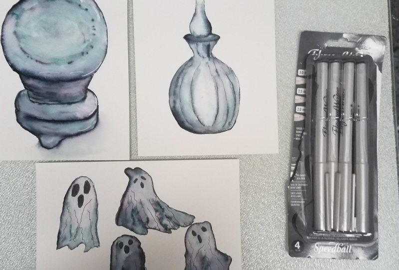
3. Materials: Before we get started, let's go over the
materials we'll need. First, you'll need paper with a smooth finish that
can stand up to water. I like to use hot press
watercolor paper, but you can also use
mixed media paper. You will also need pencils. A gum, eraser, black,
elegant writer, calligraphy pens, heat brushes. I'm using a foreground, a six round and a one-inch flat. Two jars, one for clean water
and one for rinse water. Paper towel or a soft rag. Waterproof fine liners. I'm using sicker micron and 05.08 for the finishing
touches and embellishments. You can also use posca pens, iridescent or
metallic watercolor, and a spray bottle
to activate it. And any other medium
that you like to use. In the class resources section, you'll also find
reference images, my sketches, and my handout on how to use the grid method
to make your sketch. In the next video, I'll
show you how to transfer your sketches from plain
paper to watercolor paper. So meet me there and
let's get started.
4. Transferring Sketches: Before we begin, let's
go over why and how will transfer our sketches from plain paper to watercolor paper. We want to draw our sketch on plain paper first because we don't want eraser marks
on our watercolor paper. The first thing I'm gonna do is take my sketch and turn it over. Then I'm going to take a
softer graphite pencil. I'm using a six B and go over the back of your
sketch with graphite, making sure to cover the
full area of your sketch. You can use graphite paper, but I find the
graphite is so loosely deposited on the paper that
it causes a lot of smearing, which can muddy your image. As an alternative
to graphite paper. You can transfer
your sketch from scratch paper to
watercolor paper very quickly and with
less mass to clean up afterwards using
graphite pencils, I made this sketch pretty dark. So it's easy for me to see where the lines are even with
the paper turned over. This allows me to cover only
the area where my lines are and reduces the chance that the graphite will smudge
on my watercolor paper. Ideally, you use two of them. One with softer
graphite like a six B, and one with harder
graphite like a to H. But any pencil you have
on hand will do the trick. If you've got a larger image or a more detailed image
like our haunted mansion, you'll want to cover
the entire area of the paper that
contains the sketch. Once you're finished laying down your graphite on the
back of your sketch, you can turn it over
and tape it in place on top of your watercolor paper using artist's tape
or painter's tape, and then go over your sketch. For this, I like to use a
harder graphite pencil. I'm using it to h, and I'm just going to
make my way around the sketch and go over my lines until I've
gone over them all. I like to pull up one side of the paper and check to see
that I've got every line. If I haven't, I can
just lay it back in place and continue
my transfer. Once you've gone
over your sketch completely and the
transfer is finished, you can take a gum eraser
and use it to pick up any stray graphite that may
have smudge on your paper. I also like to lighten my
transferred sketch just a bit, especially if I'm going
to use it for watercolor. In this instance, we'll be using a pigment that
is pretty dark. So it's not necessary to make the transferred
image very faint. But I'm gonna do that here so
you can see how it's done. I'm just taking my
kneaded eraser and lightly pressing it on top
of the watercolor paper, rather than rubbing
it back and forth, which could damage the paper. Now you're ready to apply
the elegant writer ink, activate it, and then strengthen your lines with a
permanent fine liner. Take a few minutes to transfer your sketches for the
practice lessons, as well as your haunted
mansion onto watercolor paper. And then meet me
in the next video, where we'll get started with
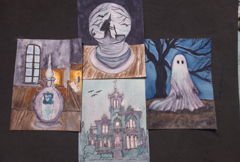
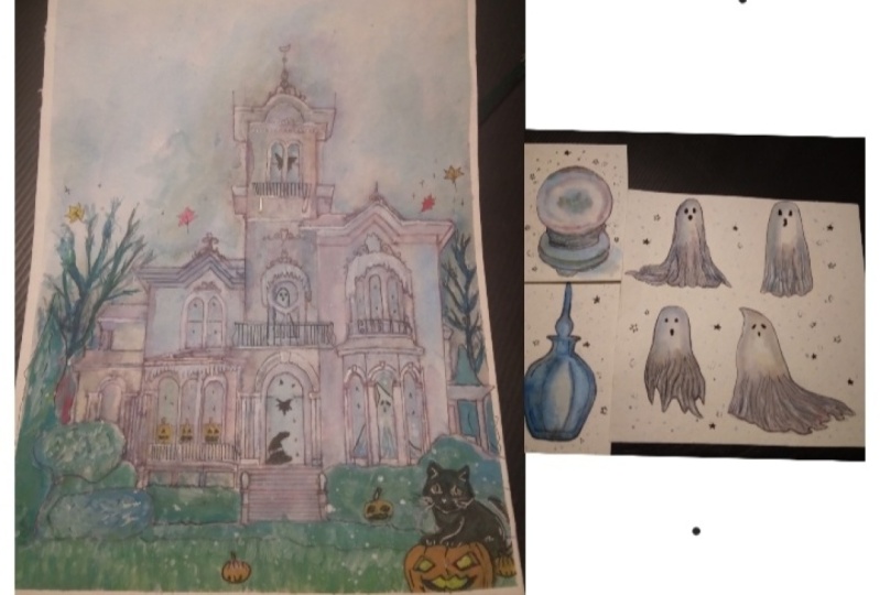
our first practice exercise. This potion bottle
5. Practice 1 - Potion Bottle: Before we begin, let's take a
look at our reference photo and identify the lightest to
darkest values in the image. This will tell us how to vary our line weight when we
go over our sketch with the elegant writer ink
and help us translate these light and dark values to our painting when
we activate it. First of all, lay
down a thin line of ink on the entire sketch. For that, we'll use a
2.0 nib elegant writer. Next we'll switch to
the 2.5 nib elegant writer to lay down the additional ink on areas
with the darkest values, the lower-left corner
of the bottle, the upper-right edge
of the bottleneck, and the top of the
sphere and the stopper. We're going to activate the areas that will
be the darkest. First. We'll begin by
placing small puddles of clean water between
our line work in the whitespace where we want
the values to be lighter. Next, we'll run the brush along the bottom left
corner of the bottle, activating the ink
and then pulling it into the areas where
we have made puddles. We'll lay down quite
a bit of water and the areas we
want to keep light, the ink and water consistency should be similar to
that of a weak tea, will significantly
decrease the amount of water on our brush when we go over the areas that will remain darker in value. So the pigment will
be less diluted. We want to work quickly and
continuously so we can blend the dark and light areas in smoothly before hard edges form. With the body of the
bottle activated. Let's take a moment
to blot the belly where we want to keep the
value of the lightest. Then we'll continue blending. Drag the tip of your brush
along the thicker lines in the bottom-left
corner to pick up any ink that has yet
to be activated, blend it into the lighter
area of the bottle. We can use a brush that's
damped with clean water to lift the pigment in the
areas we want to keep lighter, like the belly of the bottle and the left side of the
neck of the bottle. If we keep the active area of R P sweat at all
times will be able to blend and block the
ink and time to keep the transition between light
and dark areas smooth. We'll keep pushing the
pigment around and blending until we achieve a
smooth transition. Now let's move to
the bottle stopper. We're going to again
put a puddle of clean water in the
center of the sphere and along the very top
of the bottle stop or where we want the
value to remain lighter, will pull the pigment from the lines into the clean water, pushing the pigment
toward that puddle. Keep adding clean water to the bottom of the sphere
to keep that area light. And begin to blend
in the pigment around the lip of the bottle. Continue blending and bleeding
until you've achieved a smooth transition between the lighter and darker values
on the bottle stopper. Once you're happy
with the values and transitions you've achieved, will use a fine liner to clean up and strengthen our line work. But first, you have to
let your paper dry. You can either let
it dry naturally for several hours or use a
hairdryer to speed things up. Let's strengthen our lines. Will start by pulling the
lighter lines forward a bit. I'm using my sucker micron O5 to lightly go over
the finer detail lines. Now that the lighter
weight lines are complete, Let's strengthen the
heavier line work on the outside of the
bottle and the stopper. I'm using my sucker micron
08 for this line work. Now your potion
bottle is complete. You can add some fun
details using past the pens as I've done
here if you wish, and then meet me in
the next lesson, where we'll work with
a more detailed image and enchanted crystal ball
6. Practice 2 - Crystal Ball: Just as we did with
the potion bottle, will review our reference
image before we begin so we can identify the areas of
lightest and darkest value. Again, we'll use a 2.0 nib, elegant writer and lay down a fine line of ink throughout
the entire sketch. I'm using faint dotted and
dashed lines on the areas within the crystal ball that demarcate the lightest
and darkest values. Next we'll switch
to the 2.5 nib, elegant writer and put down a heavier line of ink in
the areas where we want a darker value at the top of the crystal ball to
suggest the shadow there. At the bottom of
the crystal ball. Both to suggest a shadow
there and to achieve a dark value in the cradle of the base where the
crystal ball is resting. We'll also go over
some of the lines on the left side of the
crystal ball cradle. And on the left and
center edges of the base. We'll start with the cradle
of the crystal ball. First, we'll lay down
some clear water in the white spaces
between the lines, just as we did in
the bottle image. And we'll pull the ink in from the edges into those
puddles of water. We're going to make sure we
add a lot of clean water to the right side of
the cradle because that area is lighter in value. When we get toward the left
side of the Cradle will decrease the amount of
water we have on our brush, keeping the consistency of the ink and water rather thick. Moving to the crystal
ball will place a big puddle of water in
the center of the ball and start depositing some of the extra ink and the darkest
portions of the cradle. We'll just tap it into the puddle cleaner brushes off and blend the ink and
a swirling motion. This will add dimension to
the crystal ball and render a mystical foggy appearance
inside the crystal ball. Continue pulling the Incan from the dotted lines and blending
in a swirling motion. Move to the top of
the crystal ball and with a moderate
amount of water, activate the ink at the
top of the crystal ball. Will continue pulling some
of the ink from this area into the center to enhance
the foggy appearance with it. Now move down to the bottom
of the crystal ball with a large amount of water
to activate that ink. We want to keep this
area, a little lighter, areas around the edges
of the ball to lighten them and then blend them out
with a damp, clean brush. Continue blending and bleeding
until you're happy with the values you have achieved and your transitions are smooth. Now, moving down to the
base of the standard will again lay down a large
puddle of water in the areas between the
lines and begin pulling the ink and towards that
water. To activate it. We're using more water on
the right side of the base since that area is
lighter in value, again, keeping the entire
area wet and working continuously so we can achieve smooth transitions and
avoid harsh edges. Begin plotting the right
side of the stand to lighten that area and then blend
with a damp, clean brush. Next, with a nearly dry brush, work your way toward the foot of the stand and activate that. And finally, laid down a puddle beneath a crystal ball in the
bottom-right corner and begin pulling water in from the edge of the base
to create our shadow. Just pull and blend, adding water to
blend out the edges, and lifting excess pigment
with a clean dry brush. Take care of any blending
that remains to be done. And then either allow
your paper to air dry for several hours
or use a hairdryer. Next, we'll use a
waterproof fine liner to strengthen our line work. I'm using my 05 sacra
fine liner to go over the grooves in the cradle
of the crystal ball base. And then I'm switching
to my 08 sicker or a fine liner to strengthen
the remaining lines. You finished your crystal ball. You can use posca pens
and other media to add visual interest as I've
done here, if you wish. Meet me in the next video, where we'll work on an
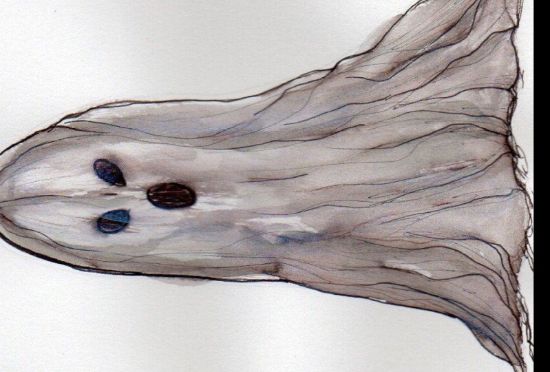
even more detailed image. A cute little ghost
7. Practice 3 - Ghost: We don't have a reference
image for Argos, so we'll have to think about
where the light source is, where the shadows would
occur in the folds of his sheet and where the light would
reflect off his sheet. We'll begin with our two-point
own IP elegant writer. It's important to note that
we will not be placing elegant writer ink on
every line in this sketch. We're going to avoid are ghosts, eyes and nose, as well as the smaller folds and
the bottom of the sheet. We will only be placing ink on the outer edges of the ghost. And then the major fold lines
of the bottom of his sheet. I'm even breaking my lines up at the bottom of his
sheets so that I'm only really laying down ink in and under the folds where
there would be shadow. I'm also using a dotted line at the top right of
my ghost because I'm imagining my light source coming from the
top right corner. And I want this area to
remain very light in value. I'm switching to my 2.5 nib, elegant writer to place a thicker line only at the
top-left of our ghost. Because again, I'm imagining
the light source coming from the top-right and
landing on his face, leaving the back of
his head and shadow. Laid down a generous
puddle of water and the large open space
where our ghost faces in front of his body, as well as in-between the lines that indicate the
folds of his sheep. Once you've done that, began pulling the ink and from the bottom-left corner
and bringing it up the left side of the
ghost where it will meet the large puddle we have
placed near his face. Continue working
your way, right? Working from the bottom up, pulling the ink into the
puddle of water we've created and keeping a lot of water up at the
top near his face. So the value remains there. We can pull additional ink
up from the lines we created along the folds of his sheep to indicate the shadow there. And then using clean water
lifts some more ink from the ghost face and blood again to keep that
area very light. We're going to keep
blending this out using a clean damp brush. Once you're happy with your
values and transitions, allow your paper to air
dry or use a hairdryer to speed up the drying process so that we can
strengthen our lines. We will begin with an L5
sacra fine liner and start bringing forward the details of the folds and our goal sheet. We'll strengthen both the lines where we had the elegant writer, as well as the lines from
our sketch that we left bare to bring forth the
detail in our ghost. Once we're happy with the
level of detail in the folds, we'll switch to our 08
sicker or a fine liner and strengthen the lines on
the outside of the goats. Last but certainly not least, let's darken his eyes and mouth. Now he is all done and you can embellish him using
Posca markers, gel pens, or any other media you have on hand as I've
done here if you wish. Next step on our journey will
begin the haunted mansion. Meet me in the next lesson
and we'll get started.
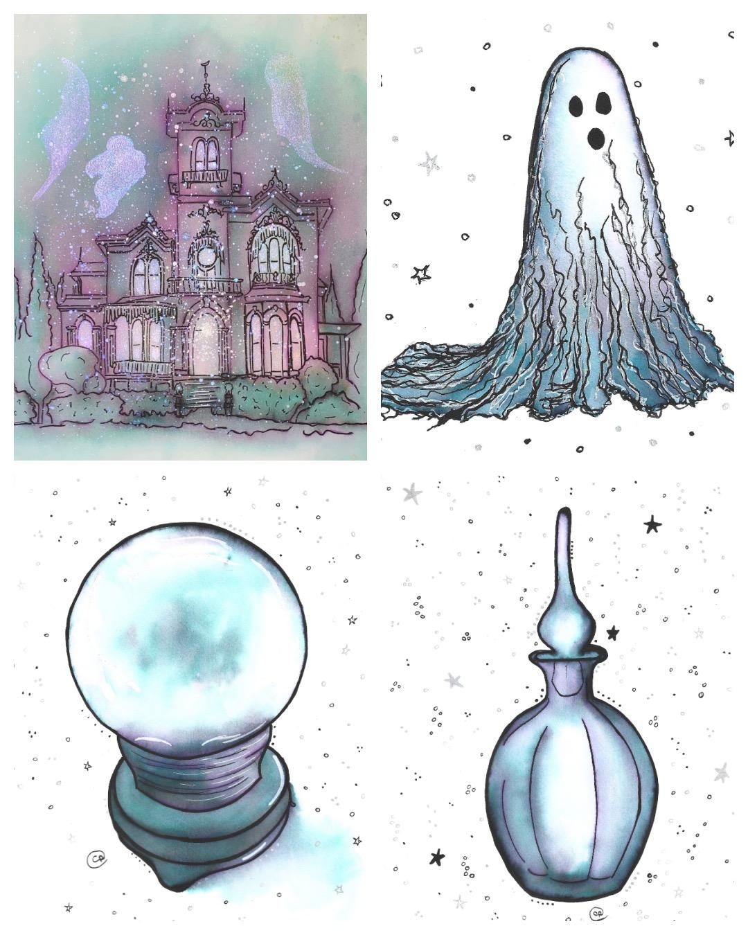
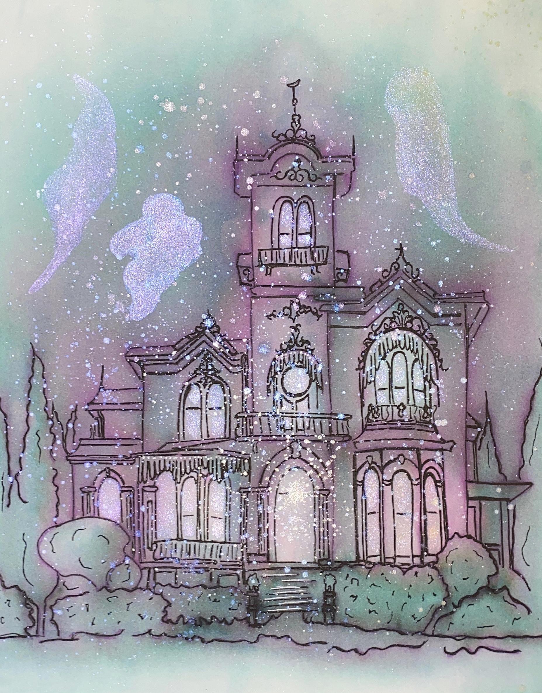
8. Haunted Mansion Elegant Writer Ink Application: Our haunted mansion,
we're going to use our reference image to inform only the structure
of our Mansion. As you can see, the
reference image is of a lovely pink Victorian mansion with beautiful landscaping. We're going to take
inspiration from the Manchus design and let our creativity take it from
there to make it spooky. Or imagined light
source is going to be the moon in the sky,
just out of frame. So the top of the sky
will get lighter as we move up and away
from the mansion, the wealth of the mansion will reflect some of the moonlight, but we'll also have shadow
where the corners meet. We will also leave
the windows very light to suggest that
someone is home, as we did with
their ghost leaves. Some of our detailed lines bear. We will avoid the decorative
wrought iron details, the balcony metalwork,
the shutters, the windows, and the lions on the columns at the bottom of the stairs will define
all of those details. When we go over our peace
with waterproof, fine liners, we will only use our 2.0 nibs are good writers since
there are so many details. This is so the piece doesn't become too dark once
the ink is activated. Using our 2.0 elegant writer, we will place a fine line
of ink on the trees and bushes and all of the main
structural lines of the house, leaving all the
decorative details I mentioned earlier, bear. We'll work from the top down. Once our initial
outline is complete, we'll go over the lines where the trim meets the
walls of the house, as well as the rooftops
once more to darken them. That way, when we
activate the ink, we can have a nice dark sky and we can also create shadows where they would fall under the trim and in the
corners of the mansion. Meet me in the next video, where we'll activate
the elegant writer ink
9. Haunted Mansion Elegant Writer Ink Activation: To activate the
elegant writer ink, we're going to
start with the sky. Firstly down a
generous puddle of clean water covering
the entire sky area. I'm using a wide flat brush to help me cover more area quickly, which will help me
keep the paper from drying before I'm finished
activating the EQ. I'm going to switch
to my round brush. This time I'm using a
slightly larger one. It doesn't have a size on it, but it looks to
me somewhere 6-8. I'm going to bring my brush
carefully between the trees and start pulling the ink
upward to make my sky. And I'm going to
work left to right, moving toward the sides and
rooftops of the mansions. Pulling that into our wet
paper to make the dark sky. I'm going to switch back
to my large flat brush for a moment to help me pull
any excess ink from the thicker lines we made at the top of the
roof and the sides of the house into the wet paper that will make up our sky. I'm also making
swirling motions with the ink to create the appearance of clouds in the night sky. Now I'm going to block the
very outer edges of the sky. Those will be later, remember
because our moon light is shining from above just
out of frame of the image. After we blot,
we're going to use our round brush to blend
away any hard edges. Switching to my round
number four brush, I'm going to start activating the mansion one
section at a time. I'll lay down a
puddle of water on the whitespace between my lines, then pull the ink toward
that water to activate it. We want to make sure we use a lot of water where the windows will be unblocked them to
keep those values liked. As you add water and blot, make sure to use a damp, clean brush to keep
blending those edges out. Continue this process
throughout the entire mansion, taking it section by section, remembering to use a lot of
water on the windows and then block them to keep
those areas lightened value. We also want to make
sure that we're using a lot of water
and blotting and the areas where our
wrought iron details and balconies are to
ensure that we'll be able to see them
when it's time to use our fine liners
to sharpen our lines. Keep coming back to
the sky as you work, making sure to keep it
damp and keep up with your blending so there are no hard edges, only
smooth transitions. Now let's activate the
ink and the trees. We're going to blot the top
of some of the bushes to indicate the moon light
reflecting off the top of them. Makes sure the outer edges
of this guy are very light and any harsh edges
are blended and wow. Now we're going to
activate the lines at the very bottom of the
bushes to create the lawn. Lawn will be darker
as it gets close to the house and lighter near
the bottom of the page, the part of the lawn that's closest to the house
will be in shadow. But as the lawn moves
away from the house, it will start reflecting
moonlight from up in the sky. Now that the whole
piece is activated, let's go back over the
windows and the details. We did not line an
elegant writer ink with clean water and make sure
that they remain light. Making sure to blend
out your edges. Once you're finished
activating and blending until all of your transitions are
smooth with no hard edges, it's time to let
your mansion dry. You can either use a
hairdryer or let it air dry. Meet me in the next video, where we will use posca
pens and other media to accentuate the
details of our Mansion.
10. Haunted Mansion Embellishment: Once your mansion is dry, you'll want to go over
it with your fine liner. I used a sucker o5 to go over all the details of dimensions
such as the windows, the wrought iron work, the shutters, and other
decorative elements of the house. Then I switch to my
08 fine liner to strengthen the lines on
the outside of the house, as well as the landscaping. Once you've completed this step, we can pick up our posca pens, gel pens, and watercolor paints to add embellishments
to our haunted mansion. For my finishing touches, I'm going to use silver
and black posca pens and some iridescent
watercolor paint. First, I'm going to
take my fine tip black Posca pen and go
over all of my lines, both interior and exterior so that they're more saturated
and they stand out. Then I'm going to
take my silver posca pen and I'm going to use that to bring out the
small decorative circles above the window shutters. I'm also going to run my
silver posca pen over the stairs to indicate the moon light
reflecting off of them. Finally, I'm going to take my iridescent watercolor paint and make a few friendly goats. I'm also going to use this iridescent watercolor paint on each of the windows
to give them a glow, suggesting light coming
from within the mansion. I'll also add a little gold
light on the front door. Finally, I'm going to use
the iridescent paint to make some splatters on
the painting to give it an eerie, supernatural vibe.
11. Conclusion: I hope you enjoyed
our adventure. Together, we learned how
to apply and activate elegant writer so that we
can use it to create light, shadow, depth, and
beautiful smooth blends. I hope you'll make sure
to upload your work to the project section
of this class. I'll take a look at them
all, answer any questions. You may have an
offer some feedback. If you've completed
the projects, you can use your new skills
to create stunning portraits, still lives, wildlife, landscapes or anything
really that fascinates you. Take the elegant
writer with you on your adventures and capture
all the magic you find. If you'd like to keep
in touch with me, you can find links to
my social media and websites below in
the description
 Carla Riseman, Dreamy Art for Friendly Humans