Transcripts
1. Course Trailer: Hi, my name is Cory Kensinger. In this class I'm going to show you how to create complex shaped designs using Adobe Illustrator. In this class, you'll learn everything you need to know to make mesmerizing artwork, taking basic shapes, and turning them into stand alone designs that you can place on real-world products. From wall art, to apparel, or any physical product you'd like. You'll be building and designing your own custom shape and learn a special effect inside illustrator, I use the term my own vector shapes into complex illustrations in no time. This is really a quick class, easier to take in one setting and it's perfect for anyone even if you're just starting out. I'll take you through step-by-step and show you how I create complex shaped designs. Learning the trick that I'll show you in this class is sure to be a time-saving technique to produce attractive designs in a matter of minutes. If you're ready, let's start on our project and jump inside illustrator.
2. Setting Up Artboards: The first thing that we're going to do is open up Adobe Illustrator. If my illustrator opening screen looks different than yours, that's because I've customized it so that when I open up, it actually just shows a workspace here instead of showing like I create new document space. But that's okay because we're going to be on the same page. All we need to do is go to "File", "New", and we're going to create three art boards, 1000 by 1000 pixels each. We're going to go to "Width and Height", here I'm putting 1000 by 1000. Then we're going to go over to the art boards tab here and click it up to three. The last thing that we need to do is go to more settings. We need to make sure that the spacing between each art board is a 100 pixels so that we have enough space to just keep everything looking good. Then we want to make sure that we have three columns, so they all line up side-by-side. We're just going to name this. We can hit "Create Document" now. Now we have three art boards lined up side-by-side. What we're going to do first is go to the "Layers" panel here. Actually, I should mention too, if your workspace looks different than mine, just go up to "Essentials" and then reset essentials here. Then that will get you back to where you need to be. What we're going to do first, is go to Layers. We're going to name this first Layer, Guides. We want to set up guides first. We're just going to double-click on this square here and make it medium blue. I keep all my like basic default layers medium blue, is just a preference thing. Now to bring up guides, we want going to do Command R and we're just going to drag the first one out here and drop it anywhere. Now, what we need is the aligned panels. We're going to go to "Window" and then "Align". It's going to open up the bottom here. We're just going to drag it out. All we need from this panel is Align panel, so we'll drag that panel out and then close out the other panels. Now we can dock this Align panel right here on the side at the bottom. We're just going to go to "Menu Options", "Show options". In order to align our guide, what we need to do is just make sure that first our guides are unlock, so we're going to go up to "View" and then "Guides". It looks like they are locked because you have the option to unlock them. We're just going to tap "Unlock". As you saw up here, the keyboard shortcut which I use all the time is option command, semicolon. With our guides unlocked, we're going to tap once on our art boards so that Illustrator knows that's the document that we're working with first. Then, we're going to tap the "Guide" itself and then go over to the Align panel. Make sure it's set to your aligned to art board. Then, we can select "Horizontal Align Center". Perfect. I'm just going to click on this "Guide" and hold down option and drag. It's going to give us a copy over here. Then we're going to tap once on this art board, tap again on the guide line and "Horizontal Align Center". Do this one more time. Option, drag, drop it anywhere. Tap once on the art board, and then once on the guide and "Horizontal Align Center". Now we just need to create two more guide lines so that we know the spacing for each of our shapes. We're just going to drag a guide line down from the top, drag again to roughly the 200 marker over here, and we're going to hold "Shift" to contain it so that it pops into the 200 pixel y-axis. That looks pretty good, but I'm going to double-check. I'm going to go to the "Properties panel". The Properties panel is where you can check all of your dimensions and sizing and fill and stroke and all these different things. But we're just going to look at the y-axis right now. We can see that the guide line is perfectly at 200 pixels. What we'll do is drag one more guide line out, hold "Shift" and then try to get it around the 800 marker here. As you can see on the y-axis, that's where it landed at a 100 pixels. What we can do now is just lock our guide lines and remember the keyboard shortcut is option command, semi-colon. Now, if we try to move any of these guides, we can't, it's locked. Cool. We're going to go back to the "Layers panel" and we're going to lock this because that's our guide layer. We can turn this on and off as we want. Also, to the keyboard shortcut to hide them is command semicolon. You can quickly get rid of them or bring them backup for reference. Our guide layer is set, so we're going to go to the create new Layer button here. We're going to name this, Background. Double-click because this is one of our default layers, we'll just make it Medium Blue. Now, we're going to go to the "Rectangle Tool", and this is M on your keyboard. Now we need to make sure that smart guides are set up so that we can see the indication of intersection and get a perfect square. If you're not seeing the intersect indication at the top left corner of your first art board, just go to View and then Smart Guides in here under the View panel and that's just command you. That's the quick keyboard shortcut that I'll be using. We can click "Away" and once we see that intersect indication, we can just click, drag out. Then, when we see intersect on the bottom corner here and we can just let go. We have a rectangle made, and the color that we're going to make this rectangle is a gray color and it's just 202020. Super easy, and hit "Okay". Now, I'll just go back to the direct selection tool, and that's V on your keyboard. We're going to click on the "Square". Then, option drag and then hold shift to constrain it so we can add it to our second art board and then let go. Do that one more time. Option drag, shift, to constrain it. Then, once we see intersect, let it go. Great. We're going to go ahead and hide our guide lines now just command semicolon. I'm going to go back to the Layers panel, lock that layer. Then, we're going to create three more layers. We're just going to name them the shapes that we're going to make them. The first shape that we'll be making is a pentagon. The second shape we'll make is a decagon. Then the third and final shape that we're going to make is a triangle. We're going to double-click on these layers to color them. I'm just going to go ahead and color these different colors so that we can distinguish the three of them. So I'm going make this one a light blue, I'm going to make this decagon an orange color, and then I'm going to make the triangle a pink color. Looks great. Our documents set up now.
3. Making the Shapes: We're going to go ahead and select this first art board and just command zero. That just brings us into fit that one art board into our entire screen. I just want to bring up a note that I made on my Mac here with our project colors because we're going to make our first shape now. Our first shape is going to be a pentagon and the main color is going to be blue, so what we're going to do is switch our fill to a stroke here. Then I'm going to bring that back up here as well. In the blue color that we're using is this bright light blue. I'm going to copy this hex code Command C, then I'm going to click on the ''Stroke'', double-click on it and paste this into the color picker, so Command V then Okay. Cool, now we're going to bring up our guides, so Commands semicolon. Like I said, the first shape that we're going to make is the pentagon. I'm going to click on this shape panel over here and go to the polygon tool. Now, if I start from the center as smart guides is telling us right now and I click and drag out, you'll see that I have a hexagon. To get it to be a pentagon, all you do is hit the down arrow on your keyboard. Hold Shift to keep it constrained and straight. Then I'm going to drag until it hits the top point of the guide right there. Then I'll just let go. We need a size this out a little bit, so I'm going to jump back to the arrow tool, which is V. I'm just going to click and drag while holding Shift and Alt, so it stays centered and wait for the bottom to hit the bottom guideline there and then let go. I'm just going to close this color panel out. Actually I'm going to dock it over here, otherwise, it'll keep popping up when we choose our colors. We'll just leave it right there and close out these other panels. Now I'm going to click down on the edge here, Shift until it pops into place. Mine locked into place with that guideline then I'm going to let go. The shape is the exact size that we needed. I'm just going to bump up the stroke here a little bit to maybe four or five points. Now with the pentagon selected still, we're gonna go to our Align panel again, horizontal align center then our first shape is made. We're going to command minus to zoom out here and then move over to our next art board. Just select the art board commands zero to fit on window, then the next color for our pentagon is going to be this bright orange color. Copy this color. Go back to the color picker, double-click on the ''Stroke'' and then paste that code in there. For the decagon shape, we're going to go back to the same tool. Go to the center of our document, click drag out and then press the arrow key to get it to bump up. Then we'll hold shift to constrain it, then wait til it aligns with our guidelines here. Then let go. I just want to go to the arrow tool, your V on the keyboard to drag this up and make sure that it's locked in a place with our guidelines, so just holding Shift and dragging out on the corners. Yeah, pops into place, good. Now that that is set, we're going to horizontal align center, this one. It just moved a slight bit. Let's move over to our last and final airport here. Our last shape is going to be a triangle. The main color that we're using for that is a bright green color. I'm going to copy this hex code. Then we're going to go back to the polygon tool and go to the center of our last art board. Click and drag out, then you see it says that decagon that we made, so we're going to hit the down arrow until we get the triangle. Hold Shift to keep it straight way for it to hit the top guideline here. Let go. Go back to the arrow tool. Click and drag on the bottom corner, Shift to keep it straight. Wait for it's a pop into the bottom guideline there. Horizontally aligned center, good. We're going to zoom out and just take a look at our shapes. Now that we have our basic shapes created, we're going to go ahead and move on to applying the store in transform effect.
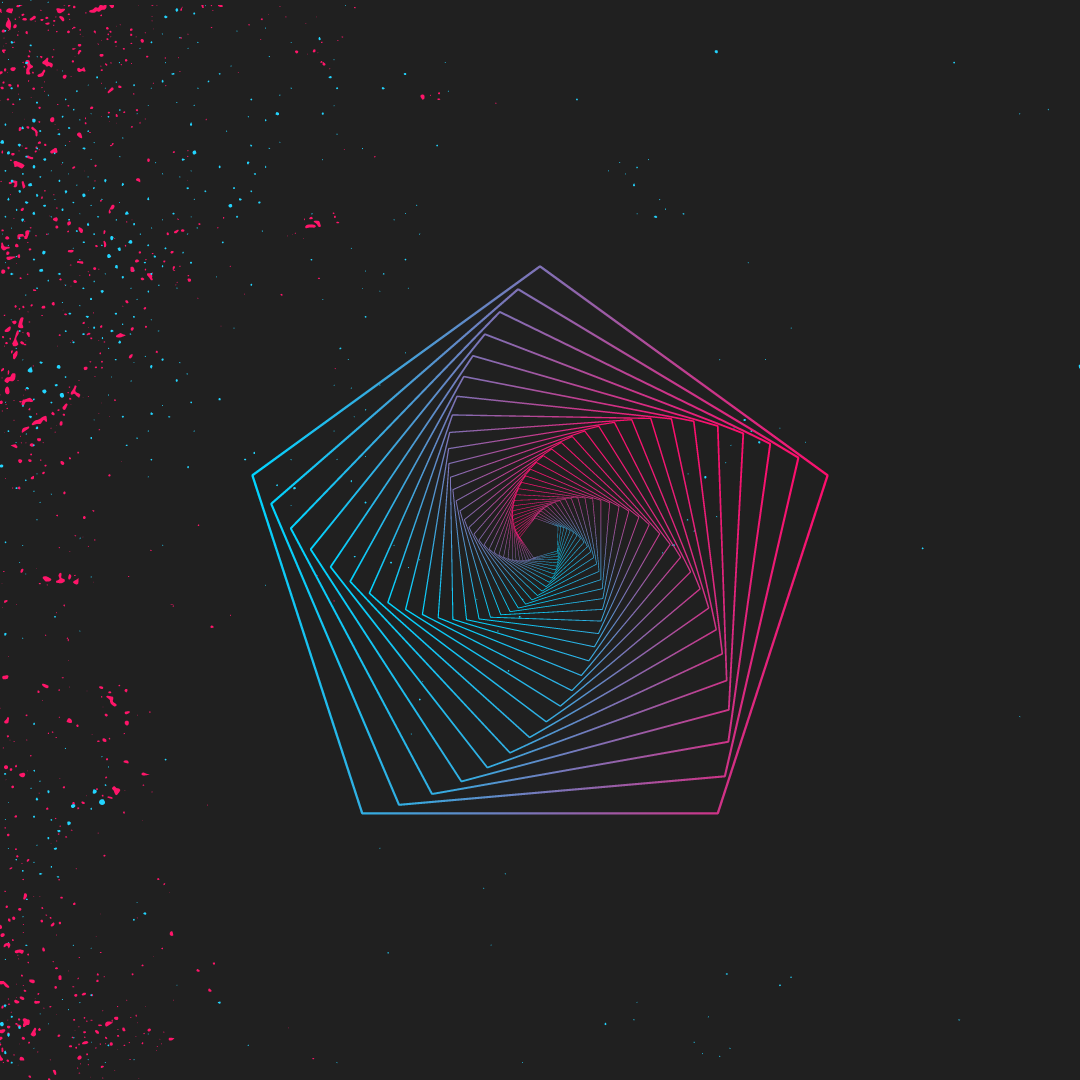
4. Applying the Special Effect: Now, that we have our basic shapes created, we're just going to go ahead and hide our guidelines. Command; and we're going to zoom into our first art board. Just select it and the command zero, and this effect is cool. It is easy and it's really fun. We're just going to start by selecting the pentagon and we're actually going to go back up to the layers panel. Because I realized that I didn't put these individual shapes on their own layers. But it looks like the pentagon ended up on its own there. But I'm quickly going to go through and just place these other shapes on their own layer. I'm going to select this decagon here and put it on its decagon layer, and then do the same thing with the last one. Select the triangle shape here, and then place that on its own layer. We'll just select the other ones for now, and we're going to go back up to the pentagon. It's command zero, select that layer. To apply this effect, what you do is you just select the shape and you go to the effect panel up here, and then it's distort and transform, and then underneath that what you select is transform. We get this transform effect panel, and really there's four values that you need to pay attention to in order to get this effect perfectly right. Those values are the horizontal value, the vertical value, the rotation value, the angle of which you put the effect at, and then how many copies of the effect that you replicate so that it can get this really spiraled effect look. The first thing that we're going to do is, we're going to adjust this pentagon to be at a set value of 92 percent. When I tab down to the vertical value input in 92 as well. For the angle of this shape, we're going to put it at a degree of five to get the look that we're going for. The last thing was, we're going to make 32 copies. Now, that all four values of our shape are set, we're just going to hit this little preview icon to see what it does to our shape. Voila, there is our distortion and transformation effect. Now, a few things to know about this effect. You can adjust how the spiral looks if you play around with this angle, and let's just drop it maybe around nine degrees. You'll see that as you go higher in value, it's going to actually put the spiral outside of your shape. Really you want to keep it somewhere between two to five degrees with this shape in particular. Because as you see if you do it too high, you get just a straight effect, which it can look cool if that's what you want to go forward to. But because this is more of a spiral effect that we're going for, we're just going to play with some values here. I want to put in two degrees and see what that gives us, and it just gives us a slight spiral. Then if we do three degrees, it's even more. If we go up to six, you'll see that it starts to push the boundaries and almost put the spiral effect outside of the shape so I left it at five. But you can really customize this however you want. Now, if you do something really crazy, like let's just do, I don't know, let's do 50 degrees and just see what that gives us. You'll see that you get this really erratic effect and this can be good for texturing if you wanted to add it to one of your pieces and put it in the background and duplicate it and rotate it. But if you want it to be a standalone design, I recommend keeping it at a lower value. I'm just going to put this back to five and our affect is created for the pentagon. We'll just say,okay, on this effect to save those changes and deselect. Looks good. We're going to move over to the decagon now. Just command zero to bring this all into the Window. The first thing that we need to do is just lock our pentagon there and unlock our decagon there. We're going to select the shape and do the same exact thing again. We're going to go to the effect panel, the store and transform, and then transform. For this shape's values, the vertical and the horizontal values are exactly the same, they're at 92 percent. Then for the angle, I found that six percent works just right and I left the copies is the same as well. 32 copies, click the "Preview Button", and then there's our effect. Just going to hit okay on that shape. It looks good. We're going to move over to our final shape here, which is the triangle. Going to lock the decagon layer and unlock the triangle layer, command zero to fit it in. Now, I wanted to show you this example because I want to show you that you don't have to have so many sides in order to complete this effect. You can do this with even a circle if you wanted to. It doesn't have to have any sides at all. But just to show you that you can do with even less angles or less sides, I'm going to show you how to do on a triangle. I'm going to select the triangle here, go back to effect, distort and transform, and then transform. Now, because with this triangle, there's a lot less sides, the values are going to be a little bit different. For the horizontal and vertical values, I'm going to put in 88 percent. For the angle, it's going to be a little bit less. It's going to be set to three. For copies we're going to do a little bit less as well, it's going to be 24. We'll click the "Preview Button" here and there we go, we have the distort and transform effect on the triangle. We're just going to hit okay to save those changes, lock that layer. Let's zoom out here. This is the distort and transform effect applied to all of our basic shapes. As they stand right now they look really good. You could apply this to wall art, a t-shirt design, a poster design, whatever you wanted. Maybe add some texture to the back or other things to your illustration. But as they stand, they look really good. This effect is just, it's mesmerizing, has a geometric look to it, it's very sharp and it's got this intricacy that is attractive to it. But we can take this even further. I'm going to go ahead and show you some cool effects you can make to these shapes.
5. Color Splashing & Bonus Effects: To apply some pizzazz to these shapes, what we're going to do is unlock the pentagon layer first and just select it. Now, you'll notice if you wanted to get back into customizing the transform effect, if you go back to the Effect menu and then to Distort and Transform, and then Transform. If you pull it up again, it's going to apply it as if it's a brand new effect because you see that all the values for our pentagon aren't there anymore. What you need to do is just cancel out, and the way to get back into the first effect that you applied to all of your shapes is go to Window, Appearance. Just pull this panel over to dock it on the side, and then you can get into the Transform effect by selecting the shape and then it shows up over here on the right-hand side under Transform. If you click that, you'll see all the settings that you made for that effect and you can adjust it from there. Now the first thing that I want to show you how to apply to each of these shapes is the scale, strokes, and effects. Now what this is going to do, it's going to give it a cascaded look because as it goes down the spiral you'll see that the width of the stroke changes. If we hit Preview here, it gives it a whole different look in dimension of styles. We're just going to hit Okay and zoom in a little bit here so we can see it better. What it's done is it's taken that effect and for each copy it's made the stroke a little bit smaller, giving it a crescendoed look to it. It looks so nice. It brings a lot of depth and dimension to our original shape. We'll go ahead and apply this to all the rest of them. Let's go over to this second art board here, lockup the pentagon, unlock the decagon, and select the shape. Put a transform here and then just check box the scale, strokes, and effects. Then preview, there we go. Move over to our last shape here, select it, go in to the Transform effect, scale, strokes, and effects, preview. It just looks so much better. Let's zoom out here. Now that our effect is refined, what we're going to do is actually add some more pizzazz to it by adding color and in the form of a linear gradient. Let's select the first shape over here again, the pentagon, and in order to apply this styling, what we need to do is select the gradient tool. We'll just double-click on that. Let's pull it up here a little bit, and in order to apply a gradient, all I have to do is click on the gradient scale here. You'll notice that it took away our colors and that's okay because we still have our project colors saved in our note here. What we're going to do is take this blue, copy it, go back to Illustrator. If you try and double-click on this and change the color, you'll notice that it's only got black and white and then all these gray options. What we need to do is go to the menu options within the gradient slider here, and then change it to RGB. Then we can paste that code back into our linear gradient, and then our blue pops back in there and then the other color that we're going to use is a bright pink. Double-click on this gradient swatch and then menu option's RGB. Select it, paste it in and then we got our pink. Now you can also customize how much of a gradient blend you get with this top slider here, and as you adjust it, you'll notice where the color falls a little bit differently, dragging it across, then back and forth. You can also drag these individual swatches inward, too. If you wanted to see more pink and then adjust the slider, you'll see that it's dominating more of the shape now and you can even adjust this top slider here to show the blend. I think I'm going to drag this back a little bit. I'm going to play around with this until I find something I like. I like that. It looks good. I'm going to leave it there. Cool. What we're going to do is actually just dock this panel over here next to the appearance panel, and we're going to work on the next shape. I've selected the shape from the layer and then I can go to linear, and as you can see it apply the same coloring scheme as the last one, but that's okay. We're just going to pull the project colors back up here, and for this we need is bright orange and bright pink. Really all we need to do is adjust the blue color to orange, double-click on that gradient, and it's already got the RGB saved. We'll just paste that in there. Click away, and now that orange color is there. Now this one it's looking a little bit thin, it's not as thick as our pentagon because there's more sides to our shapes. What I'm going to do is I'm actually going to bump up the stroke a little bit and make this a higher point. Let's do, five looks pretty good. I think I'm going to leave it at six. I like six there. Then if we select the shape again, go back to the gradient panel that we docked. We can further adjust the blend of our gradient effect. I'm just going to play around with these sliders until I find something that I like, and I think it looks good right about there. For the last and final shape, the triangle, I'm going to select it, the layers panel, go back to gradient and then under type, we're just going to make sure it's set on linear. Let's go back to our note and get that final color here, which is a green. Double-click the swatch, paste it into the color picker, and like I did with the last one, I think I'm going to bump up the stroke here a little bit. I'll just select the shape and then change the point. That looks pretty good. We'll go back to the gradient now and just adjust these colors a little bit. Actually I think I want the green to be on the other side here. You'll notice if you drag this top slider too close to one of the swatches, you get this defined line, that really just makes the blend less of a blend and makes it more of a stark contrast. I don't really like that, so I'm going to pull this top slider back a little bit so that it starts to blend in more. I think I like the settings right there. Yeah, that looks pretty good. We'll just de-select everything and there we go. This is the effect fully applied. Let's just zoom in here just to see our shapes at a close up. I really like how the pentagon turned out. I love that bright blue and bright pink. Decagon looks pretty cool too, and then of course we've got our triangle. Here we have it. We have the distort and transform effect carried out to its full potential. There's like a lot more you can really do with this. I'm just going to open up another document here to show you the other possibilities of what you can do, and here's just a couple of other examples of things you can do. Like I was saying earlier, you can actually apply this effect to shapes that don't even have sides, like a circle here. This almost has like a hippie lifesaver look to it. It's cool looking. You can even apply it to more common shapes like stars and give it a 3D edge look to it. I really liked how this one turned out, and then we also have this really cool hexagon shape that almost looks like a seashell formation. Almost has that divine aspect ratio look to it. It just looks really cool. As you can see, there's so many ways you can apply this effect and really, you can apply it to any shape you want. If you want to see just an example of something that I did with my pentagon shape, because it was the shape that I really liked most doing this project. I just went ahead and threw a couple of textures on the background here, and it just gave it this really refined and gritty look that I love to incorporate in my illustrations. Putting the pink and the blue as a texture in the background really just brought out this effect in its full form in this shape. It just looks really good and I just love how it turned out. Now the final thing is, if you wanted to export any one of your shapes, you can just select the art board Command 0 and now we're going to go to File, Export and then Save for Web. Now here, just like any export settings, you can change the width and the scale, and since it's a vector shape, it can just scale up without any distortion, which is something that I love about Illustrator. You can make this a huge document. Do any size you want. I'm just going to leave it at 1000 by 1000 and usually for export I choose PNG-24 because it's a lossless file type, you're not going to have any degradation of your quality. Then I'll just save this out to my desktop and I'll name this Complex Pentagon. Just hit "Save." Now that document is on my desktop. Then if we double-click our illustration, there is our full shape in its glory and form.
6. Putting Your Artwork on Physical Product: To top off this class I actually wanted to show you how to take your digital art that you've made inside illustrator and apply it to physical products. What I have here is a shape that I've made using the trick I showed you in this class and I've just added some texture, these are just vector textures that I found online and I have actually purchased some on my own. You have to take a look and add those yourself. Everything else I made in this design, this hexagon has been made with the techniques that I've shown you in this class. So what we're going to do is I actually found this template online. I think it was [inaudible]. I've went in and tweaked it a little bit, so it's just this jewel CD case here. I'm going to go and open it up right now and show you the physical product. This is what it looks like just by itself. It's a very boring cover and then the CD-R inside is just as boring. What we're going to do is take digital art that I've made inside illustrator, this hexagon shape, and also this blue pattern that I've made inside Illustrator and we're going to apply it directly to this physical product mock-up. This is really just to give you a feel of what it's like to take your vector artwork and apply it to a case of real-world usage. What we're going to do first is just open up this template. Even though the CD case looks super boring right now we're about to bring some life to it. What we're going to do first is just kind of take a look at this file and just taking a look at this file and the way they have it set up in the layers here, it's actually pretty brilliant the way they've constructed it. They have the top layer here, which is directly for your design and I'll show you how to add your Illustrator artwork to it in a second. But I just wanted to show you these photo filters that they've included to quickly customize and edit your picture with. Just add as a few different touches to your mock-up. I don't usually use those filters, but they're there if you ever need them when you finally get use for them. Then they also have all these controls for lighting. We're talking about like reflection on the CD cover, just the highlights, the shadow that you see in the ground here. You really can have a lot of control over this mock-up. It's a pretty done good one. We're going to go and add our illustrator artwork to it and the way you do is you just right-click on the CD edit layer and then you also do the same thing for the cover layer. We're going to go and do this CD first and add that blue texture to it, that blue pattern. We're going to right-click this, edit me layer, and then go to edit contents, right here. It's going to pop us into this other window and we're going to just basically overlay our illustrator artwork on this document. We're going to go back to illustrator, and we're just going to go over to the layer here and then select the [inaudible] for that layer to select all the elements on it, and then command C to copy. Then we'll go back to Photoshop and then command V to paste it. Then we're going to paste this as smart objects so that if we need to resize it inside Photoshop, we can and then so keep all of our lines really nice and crisp. It'll end up pretty good there. I don't think we need to make any changes to it. We're just going to hit this check-mark in the menu bar here. Then we'll Command S to save this and then hit okay. Now if we go back to the template, you'll see that the CD updated with our digital artwork that we made in Illustrator, which is awesome. We're going to go and do the same thing for the CD cover. Just right-click, edit contents and then we'll do the same thing here. Let's go back to illustrator now. Go to the orange hexagon document. I'm just going to click and drag all this stuff instead. Command C. Go back into Photoshop. Command V. Hit okay. This one we're going to have to resize a little bit. We're just going to click on a corner and then hold shift to constrain. Then do the same thing for the other corner, shift to constrain. It looks pretty yellow [inaudible] the check-mark there. Actually that didn't do it perfectly. I'm going to go undo that step. Just go a step backwards under edit menu. Then we're just going to repaste it, command V. [inaudible] this a little better this time. That looks good. Check-mark. Yeah, that's better. Now we're going to save this one and we'll go back to the CD case template. [inaudible] , look at that. This is a real world usage for your digital artwork. There's so many ways you can take what you make inside illustrator and apply it to physical products and just things that people we'll actually want to buy and not to mention so much client work that you can do with a digital art that you make inside illustrator. Anyways guys, thanks for taking this class. I hope you get a lot of useful tips and tricks on creating your own digital artwork and just see all the possibilities that you can take with making digital artwork inside Illustrator and apply it towards your own artwork, towards client work, towards businesses in general, artists, and just all the possibilities of making your own designs and then applying it to real-world products and usage.
 Cory Posts