Transcripts
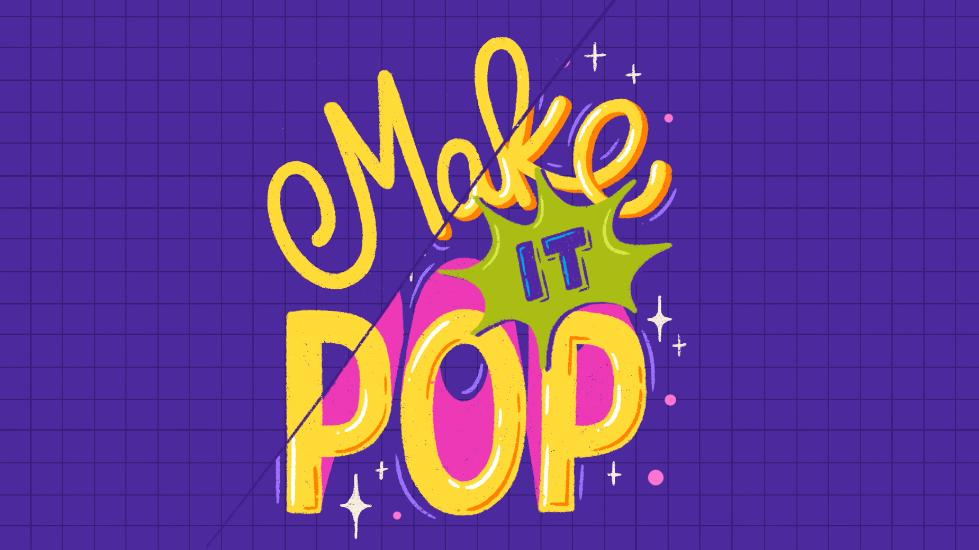
1. Trailer: Sometimes a little bit of depth is all you need to
make your lettering pop. I rely on three D
effects quite often in my procreate
lettering to add depth, dimension, and a little
extra m to my work, and they're easier to
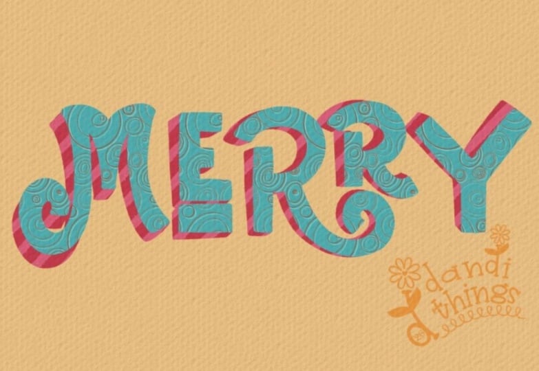
create than you think. What if I told you that all of these different three D
lettering effects are built using the same simple three
step process on procrade. And that's exactly
what I'm going to break down for
you in this class. I'm Vinitha Merman,
a lettering artist, illustrator, an educator, and a top teacher
here on Skillshare. I've been playing with
dimensional lettering in both traditional and
digital mediums for years, and I'm excited to share one of my favorite
techniques with you. We'll start with an analysis of what makes something
apure three D on a flat surface and
then take that idea straight into Procreate to
build the effect step by step. And once you understand
the basic technique, that's where it gets really fun. By playing around with just one of the steps in the process, you can create all kinds of completely different
three D effects from the exact same lettering. All you need to take this
class is the Procreate app, an iPad that supports it, and a stylus like
the Apple Pencil. This class is perfect for you if you already enjoy
creating lettering and Procreate and you want a simple new way to add more depth and visual
interest to your work. You don't need any previous experience with
three D lettering, just a basic understanding
of Procreate. And if you don't have
a piece of lettering ready to use, I've
got you covered. I've included the
flat lettering from my demo as a free
class resource, so you can jump straight
into the fun part. By the end of this short class, you'll have a simple go to workflow to create a variety of three D lettering
effects on Procreate and be fully equipped to
add your own spin on them. Ready to give your lettering
a third dimension, and make it pop with me.
2. Overview & Class Project: Welcome to Make it Pop.
I'm so glad you're here, and I'm super thrilled to show
you how I take a piece of flat to the left wing and give it a whole new
dimension Itrocret. Here's how the class
is going to work. We'll start by taking
a quick look at the visual principle behind
creating the illusion of three D so you
understand what's actually happening rather than blindly following
a set of steps. Then I'll walk you through my Procreate process step by step, first with a single letter
and then with a full word. Once you've got the
basic technique down, we'll have some fun
changing how we build the depth and
see how we can achieve different three D effects using the exact same lettering
and the exact same process. As for your class project, all you need to do
is take a piece of flat two dimensional
lettering, one word will do. And transform it into three B in trocred using the workflow,
I teach you in this class. You can absolutely use your
own lettering for this. And if you don't have
something ready to go, or you just want to follow along with exactly
what I'm using, I've included the
flat lettering from my demo as a
downloadable resource, which you can find in the
projects and resources section. You're welcome to use it
to follow along with me. Just remember that the original lettering artwork
still belongs to me, and I'm just sharing
it with you as a learning resource
for your practice. Once you've created
your three D lettering, I'd love for you to share it in the project gallery
of this class. I'm super excited to see
what you come up with. If you like some
feedback from me, just let me know in your
project description, and I'll be happy to
take a closer look. But don't stop there. Take some time to browse through your fellow students projects, leave a little encouragement
and show some love. One of my favorite things about Skillshare is that we have this global community of artists and creatives learning
alongside each other. So make the most of it. You never know what
another student's project might inspire you to try. I cannot wait to see
what you create, so let's get started by
taking a closer look at understanding the simple
visual principle behind creating three D illusion
in the next lesson. Oh
3. Understanding the 3D Illusion: Before we jump into
the three D lettering workflow on Procreate, I want to just take you through
the fundamentals behind what makes something look
three D on a two D surface. When we're drawing on
the iPad or on paper, for that matter,
we're drawing on a two dimensional
surface, right? And when we're drawing
something three D, like three D lettering, it's not actually
three D, right? We're trying to
make it look three dimensional on a two
dimensional surface. Yeah. So we're creating an
illusion of a three D object. And I'm going to use an
actual three D object, this sharpener here to show you what the essentials
are that illusion. So if you just look
at it like this, straight from above, right? It just looks like a pill shape. It does not look
like a sharpener. It's not obvious that it
has other dimensions to it. So now, for it to look like
a three D shape from above, it needs to be at a
slight angle, right? So when you just tilt
it a little bit, you can see that this is a three dimensional
object because you can see the surfaces. It feels like I'm stating
the obvious but we need to see some of the other surfaces for it to look three D, right? If you look at this,
we have a front face. We have a back face, and then we have the side face which connects the front
and the back surface. We're all pretty familiar
with how to draw a basic three D shape
like a cube, right? So how do we draw a cube? We draw a square
like this, right? So, this would be
our front surface, and then we want to
create the back surface. So we have the information. We have all the
information we need to connect the front and the back and therefore get
the side surfaces. So now to create the back
surface, what do we do? We draw an identical square at an offset from
the front square. Right? So now we have the front surface and
the back surface. Okay. Let's say this
is our front surface. This is the back
surface, and now we connect the respective points
on the front and the back. And that's how we draw a
simple keyboid on paper. Yeah. Now in Procreate,
with digital drawing, the concept is the
same, but it's a bit easier because we
have some advantages. If this is our front surface, we don't need to redraw
an identical square. We can just duplicate
it and move it around. So we can move it to
wherever we want to. And then we can make
the connections. That simplifies it
for us quite a bit. Here, it may not
seem like a big deal because it saved you
from drawing one square. But you'll see when it comes to more complex shapes
like lettering, it really helps to have
that ability to just duplicate your front surface and position it
wherever you like. So we saw how to turn a
square into a cuboid. What if it's a letter instead of the square? The
process is the same. We're drawing the letter E. So this is our front surface now. Instead of the square, we have the letter E. So again, we duplicate that, offset it to a different position
wherever you want to keep it. Let's say I want to put it here. Okay. And then we connect all the corresponding
points just like that. I'm just filling in
the front surface. Three D E. So that's how we take our
E from two D to three D, and that's our core
concept on how to convert any two dimensional shape into something that looks three
dimensional on Procreate. That's the bare bones of it. It's essentially that
very same concept and that very same process that we're all familiar with when creating simple geometric
three D shapes. We're just going to adapt
that for Procreate lettering, taking full advantage of the flexibility that
digital drawing offers. There's lots you can do with it, and I'm very excited to dive deep into all
of that with you. So the next lesson,
let's jump right into my Procreate workflow
for three D lettering.
4. Make a Letter Pop: We've seen the concept.
Now we're going to see the workflow step by
step on Procreate. I'm going to first demonstrate
the steps that I follow on Procreate using
just a single letter. This is so that you
can see an overview of the process on Procreate. And later on, we'll do a
full word together. Okay? We have the letter R here. I have it here on a separate
layer from the background. Okay? So this is our
front surface, right? So this surface. Now, in order to create
the side surfaces, we need the back surface. Only then we can
connect the front and the back to get our
side surfaces, right? So we're going to make
a copy of this layer. So swipe and duplicate. So we have a copy of this layer. Now, I'm going to select
the bottom layer, and if we move it around, we cannot appreciate it because
it's in the same color. So so I'm just going to change the color
of that back layer. You can't see it because it's directly beneath
the front surface. Now I'm going to pick it up
using this selection tool, and then I'm going to move it. Okay? So this is
our second step. First step is duplicating. Second step is offsetting
the back surface. Now you can decide where you
want to place it, right? Say, I'm going to place
it somewhere here. On this side. Next thing we want to do is add
connections, right? Connect the front and
the back surfaces, using the corresponding points. So this corner of the front
to this corner of the back. So just like that. And then whatever space remains,
we're going to fill it in. Okay? So like that, we're going to connect
all the end points here. We connect this, and
then we fill this shape. Similarly, we connect this. Just go like that. When it
comes to curved surfaces, also, we connect them with a straight line
like this and then just sort of blend
it in with this. That's it. This is our
three D lettering. Now, you can either
leave it like this, which is what I
mostly end up doing. It also depends on
the specific piece. Sometimes I might add
some highlights and shadows or some other
decorative elements. So you can leave
it just like this, or you can take it to
wherever you want to. You can add shading
or highlights to emphasize that
three D effect. You can do gradients
or you can color the surfaces that face a particular direction
in a different color. Lots of possibilities based on your personal style and the
end use of your lettering. But this is how you create the most simplified version of three D lettering
on Procreate. I know there were
some steps I did like changing
color, for example, that I did not quite
get into the details of because there's
different ways to change the color of
something on Procreate, and I wanted to focus on the actual three D
lettering steps first. I'll show you my exact steps in more detail in
the next lesson. But for now, I just want to reinforce our Procreate
three D lettering steps. Let's go over them once again. Step one is to duplicate our front surface and change the color so
we can see it better. Step two is to offset
it to a new position. And step three is to connect
the respective points on the front and back
surfaces and fill in the gaps so that we
have our side surfaces. So duplicate, offset,
connect, right? That's it. In the next lesson, we'll apply this
to an entire word, and I'd love for you to
follow along with me there.
5. Make a Word Pop: You've seen an overview
of the steps I follow for three defying lettering on Procreate with a single letter. And now we're going to extend that exact same process
to an entire word. I believe it'll be
really beneficial for you to actually
do these steps alongside me to
really get a feel of the process and
reinforce it for you. I recommend watching through
the entire lesson first and then replaying it while you follow along with
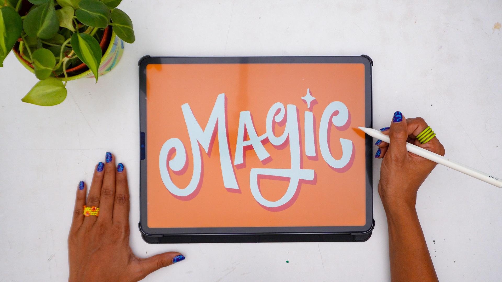
me the next time. I already have my flat
lettering ready to go, and we'll be taking this from two D to three D in this lesson. So this will be my
starting point. You're welcome to use one of your own existing
lettering pieces on Procreate as a
starting point. Or I also have my lettering
that I'm using for this demo as a downloadable file for you in the projects
and resources section. You can download it and use
it to follow along with me. Just make sure you're using
it only for practice. Yeah. Cool. So go ahead and find your starting point and come make that word pop with me. If you're using my file, you can open it up
directly on Procreate. And when you open up
this layers panel, there's just one layer
with the lettering in it. It's called Vinitha
ti lettering. What I would do first is to
swipe left and duplicate it. Okay, so we have that
layer just as it is, and we have a copy of it
that you can work with. So right off the
back, I will show you something that you will
see me using a lot. So I'll just explain
that, which is to change the color of
everything in a layer. So right now our lettering
is in one layer. Nothing else is in that layer. Now, if I want to change this from this black color
to any other color, first, let's try that
for the background. So I'm going to
open a new layer, a new empty layer, and we're going to change
the background color. What would we do, typically? So say I want to
go with an orange. Okay? You can either
color drop it like that. That's one way to change the
color of an entire layer, and another way to add color to an entire layer is
to tap on that layer. These options come up
and then do fill layer. Whatever color you've selected here fills up the entire layer. Okay. Now, when it comes to a layer with
some artwork on it, like this layer with
the lettering on it, pick a different color.
I'm going to pick white. Okay? I want the lettering to be white against the
orange background. Now, if we go into this layer, and tap on fill layer. The entire layer is just
going to be white, right? So that's not what
we want. We want only the lettering to be white. So what we're going to do is
we're going to tap on it, and we will click on Alpha ok. So what it does is it locks all the other
pixels in the layer, except the ones that have
the lettering in it. Okay? And then, once again, open up this menu and
then tap fill layer. So the entire layer, all of the lettering in that
layer becomes white now. So this is how I
change the color as and when I want to and you
will see me do this a lot, which is why I wanted to
explain that right away. You can go ahead and use
whatever colors you'd like to, or you're welcome to just leave it black, if that's
what you prefer. Totally up to you.
Okay? So let's get on with our
three D lettering. So we have our front
face. Of lettering. Okay. Okay, this is
equivalent to this, right? Now, the next step for us is to create the
back surface, right? For that, we're going
to duplicate this. So again, swipe, duplicate. So we have two copies
of the same lettering. We're going to select the copy
that's at the back. Right? Now, we already have
alpha lock on in this layer because we turned it on to change this into white. So when we duplicated
that layer, this layer also
has alpha lock on. So now we can just
change the color. If I don't change the color, if I just move it, you don't
know what's happening. You don't know which
is the front, which is the back because they're
both the same color. So I want to change the
color of the back surface. I'm going to go with a red. Okay, so I've picked
the red color. Alpha lock is already on. Now
I just need to fill there. Again, you can't
see it here because it's directly beneath the
front surface at this point, but now when we move it, see? We have a copy of the whole
layer in a different color. Okay? Now we're just going
to place it where we want to offset it, right? That looks about good to me. So I'm going to keep
it there. And now it just looks like a shadow. It doesn't look three D
because these connections, these side surfaces
are not there yet. We have the front surface,
which is the white lettering, we have the back surface,
which is the red lettering. And now we need the side
surfaces connecting the two. So that's what we'll do. Okay. But now if
I try to draw on this layer because it's alpha
locked, I cannot do that. So I'm going to go
into this layer and uncheck Alpha lock. Okay? Now I can draw, right? So gonna go ahead and just
connect it like that. Okay? We'll connect
the two surfaces. So when it comes to
curved surfaces, just go in and just let
it disappear into that. Okay? Okay, do that. Connect, fill. Okay. These two also
need to be filled. Connect. And just keep doing that to our entire
lettering. Just like that. And we're connecting the
corresponding points. We're not connecting
this to this. Okay? We're connecting this to this, the
corresponding points. So just pay attention to
that and just connect away. So that's our two D lettering converted to three
D. So that's it. We have our three D
lettering. Easy PC, right? Like I said, you can
have it just like this, or you can add shading shadows, highlights, make it more
realistic, more colorful, all of that depending on your style and your
specific use case. But this is basically
how you create a simplified three D
illusion tro create. Dob. So now, yes,
it's your turn. Go ahead and three D fy a two
D lettering piece with me. All you have to remember is
duplicate, offset, connect. Cool. I cannot wait to see
how you approach this. So don't forget to upload your three D lettering results
to our project gallery. I'm gonna be keeping
an eye out for it. The next lesson, we're
going to play with some more possibilities
and see how we can follow this exact
same workflow to create different three D
effects with just a few tweaks.
6. Play With Possibilities: Alright, so now
we're confident with our three step three
D lettering process on Procreate, right? Next, let's take that
simple process we learned, and let's play around
with it a little bit. I promise you it's still going to be the same simple process. But now you'll see
that you can achieve different kinds of
three D effects by making some variations to what we do with
the back surface. So where you place
the back surface and how you place it, basically, how you transform
the back surface is what determines what your
three D effect looks like. Let me show you some examples. So earlier we moved
our lettering. We offset it to something
like this, right? Now you can move a lot
more if you want to. You can move it to
the other side. You can move it to this
side or this side. You can move it
just a little bit, or you can move it a lot. Each of these
decisions will give you a slightly different
result, right? So for example, let's
see what it will look like if I
offset it this much. Gonna make the connections So you have to think
and pay attention a little bit more
in this scenario. Okay. Now here, we're going to connect these two,
just like that. And then fill in this. You can either fill it in like this or you can color drop. But if you just color
drop like that, it's going to fill
the entire lay because I'm just
going to remove this. It's an open shape here, right? So what you can do
instead is to just draw like that. Close the shape. Now, we have a closed
shape here, right? And then fill it in. Again, we're going
to close this shape. See, this is a closed shape now, and then fill it in. You don't need to remove
the top layer each time. I just did that to
demonstrate to you. You can just close it like
that and then drop color. Okay? Or you can always
just fill it in also. My instinct kind of made
me want to do that, but that would be wrong, right? We're connecting
corresponding points. So like this. Okay?
That's the M done. Now, all of this needs
to be filled in. I'm just going to connect
this to this and then drop color there.
Similarly this. Actually this and this need to be connected too, so
I'm just filling that in. Similarly, these two surfaces. So, you know, as
you move it away, you'll see the concept. The idea is the same. Now you have to pay
more attention to where the corresponding surface is
or where that point ends. Now, if it's not really
clear where the point ends, you can also just reduce the
opacity of the top layer. So you can see exactly where
the black layer is, right? That can be helpful. I can
also make it confusing. So use it only if
it's really required. Okay? I'm going to turn
the opacity of this back. Okay, this entire thing. I'm just going to close
that loop, fill it. Similarly, this entire thing. So just like that. Again, it will help us to reduce the
opacity of this so we can see where the corresponding
points are then fill it in. Okay. That's it. So by varying the position, by extending that
offset a bit more, this is what our three D
lettering now looks like. See how that one change affected the final look
of our three D lettering? That's just by varying the
position of the back surface. Another thing you can do is vary the size of
the back surface. So right now the
front surface and the back surface are
the exact same size. We're going to select
just the back surface. So I'm going to reduce the
size of the back surface. And then I'm going
to re center it. Okay? And now do the same thing. Make connections between, again, the corresponding points. So in some cases,
because it's smaller, you can't see the back
surfaces in some parts. So just skip that. Since you can't see it,
it's not a problem, out of sight, out of mind. So that's another effect
that you can get by varying the size or the
scale of the back surface. We end up with something
that looks more dynamic. But sort of a popping out
or a zooming out feel, right? Let's try another one. We keep the position
and the size the same, but we change the angle. Okay? So just use this
rotation handle and just rotate it in the exact same
place in the exact same size, but we're just
rotating it, right? So, something like
that. And then do the same thing.
Make connections. There we go. So the result of
rotating the back surface. Pretty cool, right?
I love doing this. It's such a fun twist, like literally a twist. It makes a lettering
look twisted, right, which I really like. I think it's a
really fun effect. It might be one of
my favorite kinds of three D effects
to play around with. You can also do a
combination of these. You can vary the
position and scale, or you can vary scale and angle. Or you can vary
position and angle, or you can do all three. Create different
permutations and combinations of these to create
different effects, like, for example, so let's try wearing the scale as
well as the position. Let's move the
position here and see. So yeah, another variation by combining scale and
position offsets. Let's try one more. Let's try playing with the
scale and the angle. Okay, we're going
to make it smaller. We're going to centralize it. And we're going to rotate it.
And then do the same thing. A There you go. That's another one, right? So just like that, by varying what you do
with the back surface, you're able to arrive at so
many different variations. Same starting point. We're using the same lettering. So the same front
surface, same process. Just by changing how you're transforming
the back surface, you end up with
different results, which is pretty exciting
because this now makes you equipped with everything you need to make it your own, to put your own twist to it, to really play around
with it and come up with fun and exciting stuff that I may never
have come up with. Right? So now, I want
you to play with it, mess around with the
position, the scale, the angle, combinations of them, and see where it takes you, and show us where it takes you. We're very excited to see. So make sure you
upload the results of these experiments as well
in your class project, and maybe even pen down a little bit about
what you explored, how you ended up where you did, and what you learned
along the way. Yeah. I'll see you in the next lesson with
some final thoughts.
7. Final Thoughts: And and just like that, we've reached the
end of the class, and you've come out with some shiny new tricks
up your sleeve. We've gone over what
makes something look three D on a flat surface, and we've taken
that visual concept and used it to convert our two dimensional
left wing into three D using a simple
three step process, which, in short, is duplicate,
offset, connect, right? And we've also seen how
you can play around with that offset step and create
endless three D effects. If there's one takeaway I want you to hold onto
from this class, it's that you don't have to overcomplicate
three D left wing. Once you understand
the basic idea, you can play with
it, experiment, create so many different looks, and really make it your own.
And not just with lettering. You can apply these steps to
convert basically any shape to something that looks three D ontcret. How cool is that? I'm beyond thrilled to
see your class projects. If somehow you were
not able to follow alongside me and try your
hand at the project yet, I want to really
encourage you to take a few minutes
to actually do it. It's one thing to
watch me do it, but it's a whole other
level of the process actually sinking in when
you get hands on with it. So definitely give it a try. I promise you,
it'll be worth it. Both the basic process, as well as your exploration of different variations
of the three D styles. And again, don't forget to share your brand new three D
light wing pieces from this class in the
project gallery and show some love to other
projects in there, too. If you have any questions or need further clarification
on anything, please use a
discussion section of this class to reach out
to me. I'm here to help. And don't forget to
follow me here on Skillshare to be notified right away when I
publish a new class. In the meantime, I have
an entire portfolio of classes that you can check
out here on Skillshare. There are other fun procreate classes for all skill levels, lettering classes,
illustration classes, watercolor lettering, and even
creative business skills. I also share new work as
well as behind the scenes, process videos and
tutorials on my Instagram. So if you want to be in on what I'm up to, that
would be the place. If you enjoy this class, please take a moment
to review it. Reviews are one of
the biggest ways students discover
classes on Skillshare. So if this class was helpful, I'd really appreciate you sharing your experience
in a quick review. I'm so proud of you for taking the time and the effort
to invest in new skills. I hope you've had as much fun learning with me as
I've had teaching you. Thank you so much for going on this little three D
lightening adventure with me. Until next time. Bye
bye in Happy Creating.