Transcripts
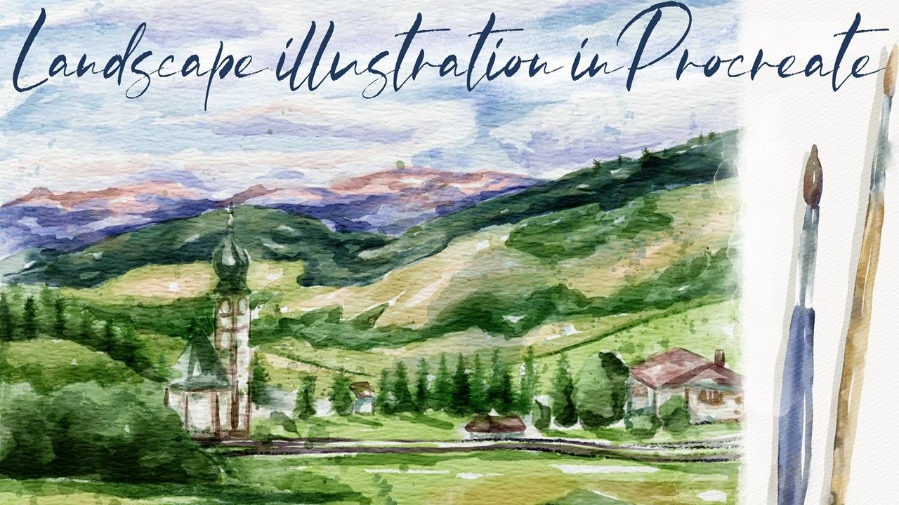
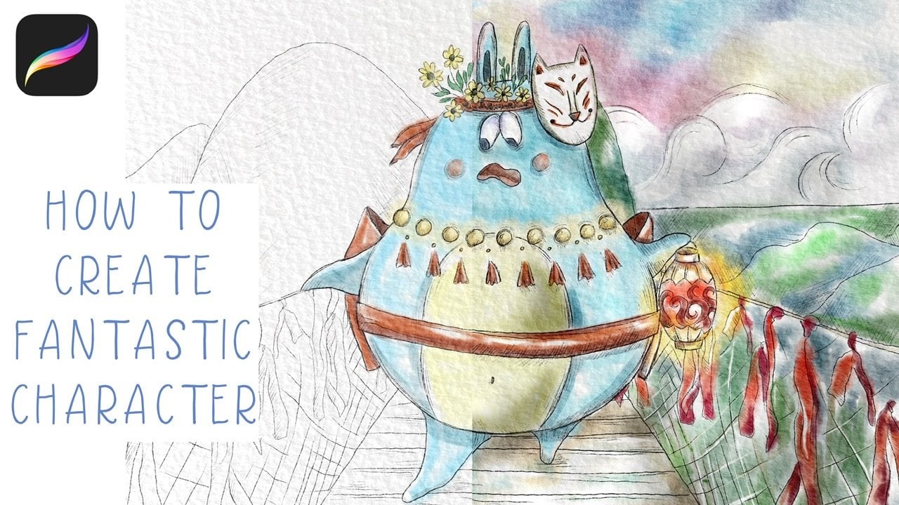
1. Introduction: Hi guys. Hello everyone. Welcome back to my class. They're in mind today's tutorial, I will teach you how to paint lovely illustration LA, LA landscape in vertical style, in Procreate. And in the end of my class, no one will tell you that is actually digital painting. Guys, I prepared for you a lots of custom brushes along these watercolor brushes, stem brushes, texture, paper, watercolor, palette, and my own sketch and my pictures that I drew for free to use them for your own art projects. And the guys, I would be very thankful if you could share with me your own art projects. It will be so cool to give them my own feedback. And guys, if you're ready, prep your iPad, Apple Pencil, LS fan together. Hi guys, I'm in their freelance illustrator and welcome back to my class. And let's dive into landscape illustration and paint altogether beautiful composition, these buildings and nature in watercolor style. At the end of my class, you will learn more about Procreate and composition, especially how to use layers, the leap and mask Alpha Lock Selection tool, and how to add texture, volume, and color variation to your picture. And most importantly, you will learn how to paint watercolor illustration in a simple way and new painting technique. You can use the illustration you'll create for question and Instagram editor portfolio or sell it on Etsy camera and so on. Or just share it with someone whom you really like. I am sure Zai, you'll be so happy to get an illustration that is created by your. Today. I want to show you said watercolor is so simple and it's a real fun. And in the end of my class, you can see it. Today. I will teach you how to create texture paper. How do your sketches, waters conversation, how to create traditional watercolor illustrations in Procreate. How to draw different kinds of Threes. How the band picture from reference picture, how to use my end default Procreate brushes for watercolor painting. How to apply my new watercolor technique? What as a nuances, you need to know if you want to create watercolor illustration, how to use Alpha Lock and clipping mask. How to add texture to your artwork. I will also show you how to add shades and highlights. I will show you my whole process from start to finish. And as a bonus, I will share with you my texture, paper, pastel, watercolor brushes, color palette, sketch that I created. I will also add file of my pictures that I drew. Feel free to use it for your own art projects. This class is created for intermediate level, also can be useful for beginners. If you watched my previous classes and experienced artists, probably here, you can find an inspiration. New ways how the payment landscape illustration, your class projects will be next. Paint a landscape composition with trees and buildings using say, TBS and brushes that I gave you today. I will use Procreate for this class needs iPad and Apple Pencil. So if you have it or some other drawing pads who are just regular watercolor paper and pains, please join our class and good luck.
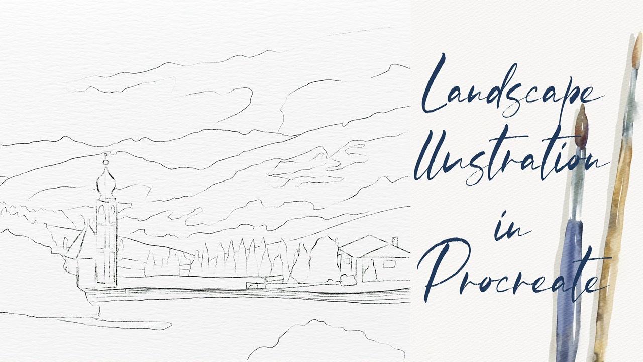
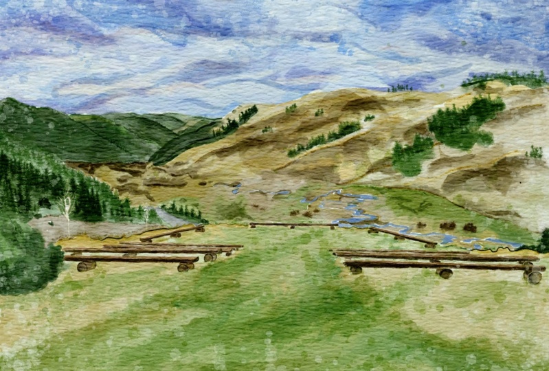
2. Creating paper: So I think we're ready to start guys. And first of all, you're going to create extra paper. And they'll load all our freebies froms a website. So and now I'm going to tell you how to. First of all, we're going to open Procreate. And after sad, in order to create some new canvas, tab class and tap plastic cap, I've decided I need to switch from pixels into inches. And the right 9, 11 inches. And guys, keep in mind, we need to have 300 DPI resolution. And maximum layers that we might have is 56. I've decided tab Create. So it's our canvas. Now we need the expert textured paper. And guys, for Dave, you're going to paint in watercolor style. So if you have watercolor paper, once again, if I now go to Layers, replicates it a few times and advice, now I'm going to explain you how to export and where to find our freebies. So we need to open my class in browser, an open set in Skillshare app, because in this way, my freebies might not be visible. And after zed in projects, in sources section in the right corner, and is a headline resources. You might find all my freebies. So when you download all the freebies fill in downloads folder, you might go to Files app in downloads folder. So this active set we need to go and tap action button that add tab, insert the file. And after in downloads folder you go there and insert our watercolor paper into the program. Neck thin, either rotates a paper. And now I will press fit to screen. And now you see it's perfect for the size of our canvas. Says our texture paper Via Veneto gets it authentic watercolor texture. For xhat, we need to change the blending mode. I will duplicate the layers two times, moved to Linear Burn and counterpart. Next, I will duplicate Linear Burn layer two times. And after merge together, hired replicate color burn and merged set together. Have to set lovers sat by city TO 67 percent in linear burn mode and Color Burn. I don't do anything services layer. After that, I select two layers and I will press crew. Next, rename. Now guys, keep in mind, we need to paint underneath our paper layers group. Don't draw on a top. Dawn draw here, because if you tow said, you will not get this authentic watercolor look. I'll show you an example. And for example, when I draw, you see I don't have this watercolor Luke, because you don't see is at watercolor paper is blend into the color. So bad. If you move our layer on the nice, you see simultaneously risk targeted have in our watercolor texture. So guys, please bear tension and paint on the paper layer group. So let's move on and now I am ready to show you how kind of PAD says font has called Landscape. And speaking about what about our brushes? I have where your lats are, watercolor brushes today. I have the stem brushes, sad, I created recently as, as, as part of my, which is called watercolor and ink stems here. So I decided to grab some most essential ones. So it might be useful. Also you have, you have a few more facts. So also, I have pine tree brushes. This time. Pine tree brushes that will help us to create pie increase. Hexes. Oriental try brush reaches very, very cool for add in some kind of shades and strokes. If you want to make it more saturated, just all x's. While secant except for one of my favorite brushes. So just some maize and for feelings area, we sound particular colors or watercolor background. Amazing for aid in shades, combos crop is also great if you want to add watercolor texture to your p.sit. And was bikers. Also amaze and final touch to our painting. So you have plenty of brushes, so you might choose the ones that you like most after switch to another one. So if we have options, so I guess we already have sketch, and now let's open our reference picture. So we need to go and grab action button, tap Canvas, and tap reference. So this once again, how can you export our reference picture into its appropriate? So as this picture you can find in my freebies in projects and sources section. After when you download, all the files are in downloads folder. I need to go there and open our picture and save it to the camera roll. After that you open our reference picture, you need to tap image. And after tap image can, and he will go automatically to our camera roll. And 10 is our latest pictures is your saved pictures as one. So you just need to tap it and it will be imported into the procreate. And brown. That's it. Also guys, you've seen the picture is slightly wide, so I assume that a little bit. So our illustration of us likes his. Because if it's too wide, if you would put lots of details, this is not a good idea because our eyes should catch some important parts in our illustration. And here we have charge for her also one more building, and I think this is our main focus, our main elements of our composition also be painting bush here. I added one more push here for composition, because if you don't add it here, this bar will be, will be pretty empty. And I don't want to have sad after they had to be, have some kind of mound dance here we have clouds and also this part is part of field and some kind of trees. And as you see here we have today we have lots of pine trees. That's why I added our pine tree brushes to our today's said. I hope you already and once again, I will explain you what we'll do during our today's class. So we already have this catch. Once again, you can pains change by yourself. You can create some other sketches. You might go to their website, unsplash.com or Pexels.com. Those type landscapes or landscapes and fields, landscapes, mountains, sky, and go and select pictures that you like most after. So it saves that picture and expertise in as appropriate. And you can pay and create a sketch. And our next step, we're going to add colors to our sketch, to our composition. And our next, next step we'll be, we're going to add more shades and highlights. Set will help us to create my brand picture. And our final, final, final details. People to add stem brushes, said might help us to add sauce, authentic watercolor look. So that's our plan for today's class. I hope you already have. So grab your iPad, Apple pencil, and let's move to the first part where we're going to add some cars.
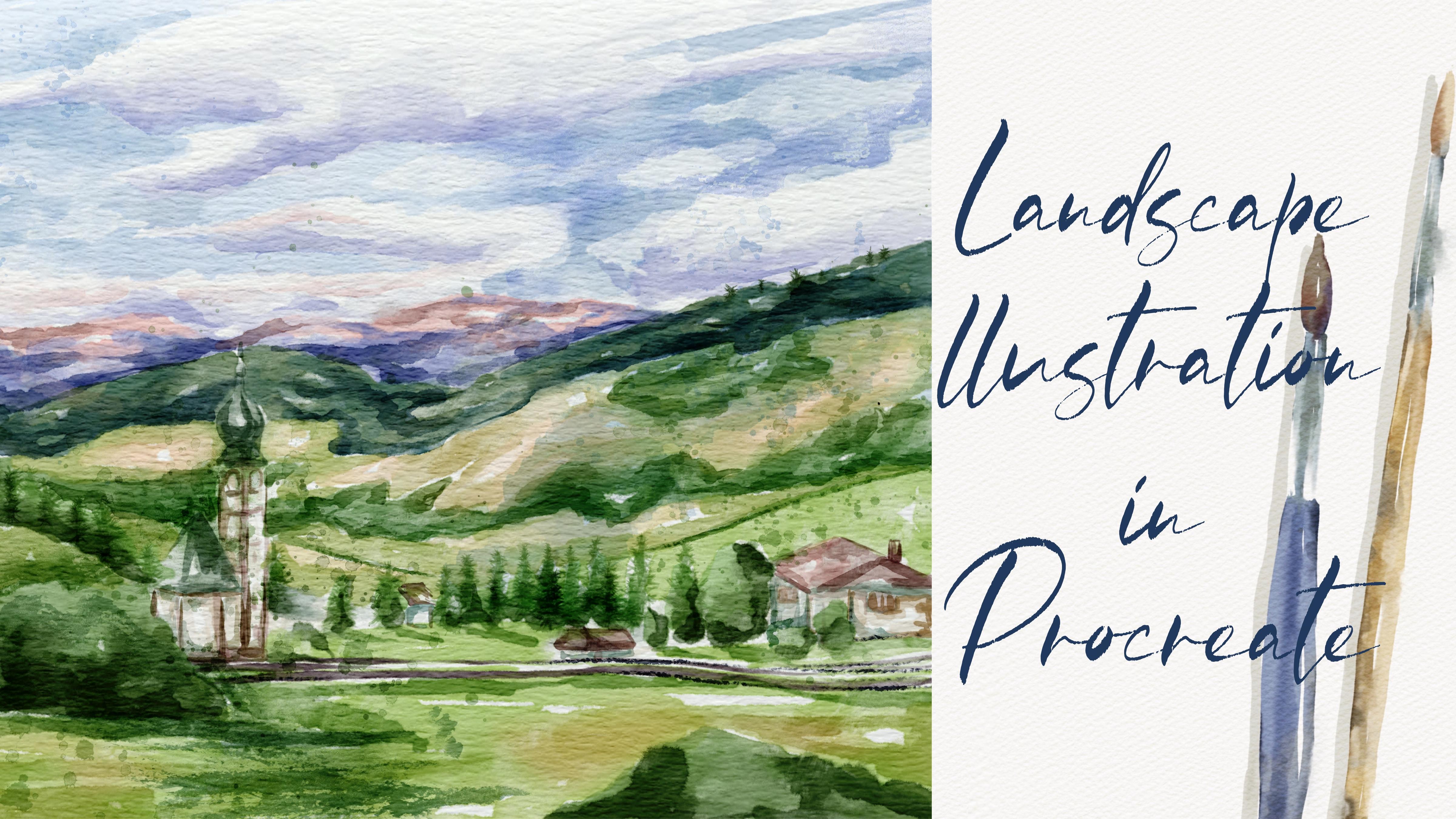
3. Adding colors: First part is fun. And keep in mind as we have our sketching layer, it's here for your lover sad passage. And in order to prevent pain tenancies layer, we need to lock it. So it means that now when we tried to paint, you can do it because this layer is locked. And we need to create layer set as our paper layer group. Don't forget about it. And let's keep adding more colors. Let's just feel sick paintings and picture B, some particular class. Once again, we have our color palette. For this one. Here I wanted to start with the sky. I grabbed pool or paella brash. France again. And let's just feels this area is Polish cut 1000 between blue and purple. Now has grown grip, preach, pride, coat color. I don't worry later I'm going to blend aid all so it's fine. Nearly white color. Because once again, we need to show us his beautiful endless SKY. As an eraser. We're going to use Terrell aircraft. Once again, turn my brush. This is native procreate brush. It's very useful to use it as a blender, as an eraser. Okay, so what I wanted to tell you, for example, we decided to choose terrible airbrush has paint on the brush, and you also want to use it as a blender. So what you need to do each us along Tab. And after you sit Terrell eyebrows, this is a process that you are using. Next, if you want to use parallel brush as an eraser, same on tab. And Terrell airbrush you are using has an eraser. Once again, you're going to go and grab above. Now let's kinda crabs this purplish color. And I went to create some kind of shades for our clouds. You see at the bottom of our clouds will be in the shadow. So I'm going to add this purplish color all around. Just a little bit. Next we're going to go on PrEP, predict pride color. It's slightly lighters and purple. At the same time, is this not solid white color? Because once again, I want the creates his fame or Mencius. I wanted to show us at our clouds. Xj has a shape. And now let's kinda go double-tap and we have clear why the car. So let's just fill this area. So rest. Raised, white color. I will lend all the shades in end of our paint. Next, less might just go froms at top feels about him. And next we're going to have our mountains and look at the colors. So beautiful. It's little bit like pinkish and here we have purple color. So if you've gotta go and grab this pink color, of course not, don't put it like every Raf. Now purplish color. I'm gonna go and grab says preachy, light, purple color. Later I'm going to add more shades. Now let's go and go and grab a darker shade. If you don't want to have it said pride to slower zapped by city office abroad. Yeah, because it's mountane so you don't actually have like the solid color in some parts, have more purple color in some as a parse more pinkish color like this later who are going to blend that as well? I will move bags up until 100%. Now they have green color. And here I will go and grabs is pretty warm green color. So just, just fun now. I still leave some gaps because I want to add. And Nancy shade. Just pick careful control with your painting. I can now go and move. You might see a little bit bluish color here. So now our shade will be slightly darker. And I'm going to add some shade on his part. So as you might say, I'm trying to mix a few colors together. I don't like to choose to Swan color. I like to add some combination of pillars of shades. Here. I mix two different shades of green color. So warm and sad. Cold ones. Okay, Dan, with this part. Now let's move further. And here we have also, you might see you have some kind of plans. I will go and return to pretty bright green color. And you see now it's different. Tried to be careful and see you where you need those green shades. I think this part. Later you're going to add more pine trees, like some kind of details. Thanks to suppress it. I'm going to add it in our next class. So be careful you can zoom it a lethal bed. And look at the pine trees behind. Says You see, I decided to change the proportions a little bit. Because on a picture says church and build an ask slightly smaller. Mad, I realized this is not a good idea because if they're too small, we will not vote loss of attention. And this part, this via decided to make it slightly bigger. Okay, cool. Now let's move to this part. And here we have very bright green color, sometimes even yellow. So I'm going to leave some quiet gaps. While later I will add yellowish color. So as you see, the Sun is a PSAP is a light source, is from the left side. So you see here we have very bright part. Here right in the center. You have very bright yellow color. Because of what is good about this brush, because you can paint on top of asic colors. Okay, Daniel is this part as well. Now let's be careful and see what is the next tab of our illustration. So here we also have this pride, pretty bright, yellowish color. And this part is also pretty bright. Now let's go and go and green and grab green color. I like to paint landscape because this is so peaceful. And you can experiment with colors. So you have some kind of freedom while you are painting landscapes. So as you see, they have loss of shades, loss of shades of color, variations of green color. In our today's illustration. Here we have built in of a building here. And the same bright color he is in front of our painting. So remember I told you that tried to add different shades. And here I'll show you an option. How can you add different shades without changing color? Box? A brash tried to add tiny shapes in this area because this is a friends. Yeah. They have some green shade. This part here. Now I'm going to go in the crack, darker shade member about some bush here. This is a middle color. Now it's kinda cool and grab the darker shades is I still have a darker shade. Very, very dark. Now let's kinda coin, grab pri to pride. And don't forget to, as a shade here. If it's too dark. So I'm going to use this WACC and k and on. Now is this part slightly different? I'm going to go and grabs his cream color. Now, our next step is let's feel safe area with the colors. Lot. Next part value when implanted and add more shades and variation. So speaking about built-ins to veto halves this page color. This is perfect for let's make it less saturated. So I loggers have passive smoke per push. But I still wanted to add some kind of shades to this part. Again. Now that's going to go and add some shades to this part. Now it's gonna go and grab some ice cream color. And a shows a shaded area. This roof is pretty interesting, is from who would say I'm going to go and crabs, pinkish color, just tiny Beat. Have to be careful. I'll go and grab a reddish color. Here Alex has and here he has a part from board. This wacky. Now it's a fence is from port as well. So I will mix up a citadel 100%. Now I will go and grab probably even a reddish color. So this part is very dark. If you need to paint everything in details, just shows a basic lines. Play through. We're going to have more shades and color variations. Going to use another precious. Okay, Wonderful. More shades in this part. This part, this part. Here we can chose a shade. Problems. So as VO2max part where you're going to mix some colors, make it more natural. And let's move to next part where we're going to add more shades and highlights.
4. Adding shades and highlights: Okay. Court once again. Now if you need to blend everything and my situation, it can lower set positive our sketch layer even more. Now let's return to our layer. And let's all not crab, Terrell airbrush as I've gotten older and carefully planned. Some sharp lines. But my suggestion don't blend everything for you can even turn off the sketch layer for now because we need to be careful in see clearly what you're doing. So remember you can template chair, What is it? So this is just field and the remembers adhere to the sunbeams. I'd like to spend everything onto the same layer because it's crazy field enzyme. It's actually one illustration like authentic realistic illustration. So be careful of is this part here we have field and here it's very easy to push size, not so much. And try to make triads stick. Controls ambassador. But then some sharp lines. So as you see, I don't blend tillage is very, very important part. Okay. Now this keep painting so done with blend in part. Now guys, my suggestion, what else we might start on our sketch layer? My suggestion if you need to remove the transparency, this very important because if you don't those at when we tried to add shades in a clip and Mask mode or when you use Alpha Lock mode, our shades by not be said pride. I replicated. So layer, one of the layers, I moved south positive 3, 2%. You see it just a little bit brighter. And after I will merge together the same one more time. And go to lower layer. Go to Adjustments, press hue, saturation and brightness, and press by ear and turns a pride is 20 maximum to 100%. Was a slave. He is white. I duplicate this layer and I immerse it together. And after I will merge that together, obese our original layer. So perfect. Now our painting, he's not transparent because to be replicated cell layers and we can add more shades and highlights. So how to choose Add. And I created another layer on top. And after that, I went to add pine trees. I'm going crab pine tree brush again. And let's go and grab this green color. Let's look at our illustration by addr. We have pine trees. Hey, let's bands act. Also one more suggestion. Move to multiply Glenda layer mode. I know it can be a little bit too bright. But later religious law herself positive oxalate. We care of horses, brush is precious. So my situation glide. Tpp and after just press triangular. Happens. Thanks, it's going to go to this part. Here. We also have fine trees. So as pine trees, I want to create one more layer and I go move to multiply. Brendan TO. Now here we will return to this layer, grab blending tool and blends is part of the pine trees. If you want them to be more saturated. You see for now it looks wonderful. But if you under one, if you don't want to have some said Bride. So my suggestion you might go to a darker color, grab Rococo. And it just feels this part. Is a shade. Now let's keep ahead and shades. And once again, Jose site created a new layer, say swan. And guys, our today's class will be slightly different comparing to my previous classes. Because what I think if you wanted to paint landscape, urinate, took the SAT like accurate. You need to add by artistic Shays. And you're going to blend glass. This is my, my Hobbesian plexus. So once again, try what styles. You might also experiment. Now let's move to this push is also pretty charities to Kwan. And this part is, you might see on the picture, has more shades. Salmons is carry out Patsy, she'd go cannot set dark. Be careful, finish pain cocktails, and you have the shape and spacebar. Now have the shade here. It says a shade froms a bush. And we also have some shades from fans in his part. So you can also shot here. Yeah. Okay, Wonderful. Let's keep painting some and add some shades and category. So tried to be careful. Unlike picture, landscape illustration is more artistic. And I wanted to add some colors here. So remember is a live site is here. So you might have some kind of shades. It's bark. Yeah. And shade froms a big peak. Church may still need our sketches layer in some parts because we need to be sure that we are doing everything right. Now. Let's go to our church. I think it's time. And I wanted to add more shades for this part. Once again, this is blending layer mode. Let's Move tool, Irish color, yellow and some kind of brown. If you want to add a slightly darker shade. So the church looks wonderful. You're going to add more shades, does its part. I think we can do it, try it out. And I went to add yes, slightly page color to say scarier shade in this part. Here. Grab some darker color and add some shading this bar. Again, wonderful. I like how it looks for now let's move to next part. And you're going to have say, Oh, yeah, this house, this one. Let's keep it in chains. So as an area under a roof will be in a shadow for short. Maybe area around Windows has found. Now let's grab this pre took pride page color. Now let's move to reddish color. In this part of a row field, the dark charm. Same as this part. A chimney. Now we can go and grab a little bit different shade. You can also show some kind of shades in this part and this part as well. So we also have tiny houses here. Here. I think it's also good idea to add some colors to this part, to spout. In this part of the shadow. Very, very dark. Be careful tongue, grab a green color because everything is clean around us. You can grab greenish color. So tried to keep very good color combination. A house here is fine. This part I want to show henry still have this part is parts. So I like to give evidence as tiny details please help I lead our studios is still multiply blending layer mode. And you see it's important to ask those kind of artistic strokes. Create one more layer, set it to multiply. I create new layer in case if I wanted to make it lighter or brighter, something like that. So we have pine trees here around. I'm just going to show it fuses shaped. So you might change the opacity and said can help you to add from a different shade. Played Terry fewer think it's too sharp or you want to blend some parts here, we can simply do it. Yeah, shows differences between two different fields here all around. Okay. Now I want to go and grab purple color. The show some kind of shades.
5. Adding color variations: Thanks. Now slightly darker color. And as you see, if our object is far away from us, if you think it's too pride to saturate at the catalog or SAP positive two toes it, I decided I select attributes, a selection ptosis area. Nafta said, I will go to hue, saturation and brightness. And I went to her surprise witness situation here. And you can make it lighter or darker. So I decided to make it a little bit darker, just tiny bit, because I think it might look very beautiful. But I don't want to have it said pride because I think our picture should have some specific color palette. Thanks for that. Now I like how that looks. Now I wanted to add more blue color, possess part, there's a scarier is CNN one to separate this area and show, since this part is so dark. And is very important because as I told you, watercolor illustration is all about contrast. So you need to show contrast. You need to show this combination of light and shadow. Quote, quote, quote. Now he can turn off our sketch layer reader needs of the animal. It looks wonderful. I want to add some shades tools as Ty said, almost set at. So I will go and grab this purplish color. And I want to show CSI thought, does it blending tool and just blend it. Maybe you get a bit creative, beautiful, pinkish color. Like sad. Just show tiny bead sound here. And I wanted to show bluish color. I'll create one more layer. Well, at two multiplies, it's an important something like SAT and ACT or SAT create one more layer on the top. Move to white color, bowl of 0 brash. And I increase his size. Yeah. And on top, I can just put some tiny beat of colors. Okay. Unlike hat. So this keep like says, And guys find out and tails, I think they need to add some kind of stamps so they don't need our picture anymore. Have a turn off our reference picture. That looks wonderful. And I'm going to go and march together this part and merge together. Let me think, says all of it, flex hat. So now they have pollen is creation. I'll create one more layer on a Saturday as a multiply. Now if you're going to add some stems and such obese the end of our paint.
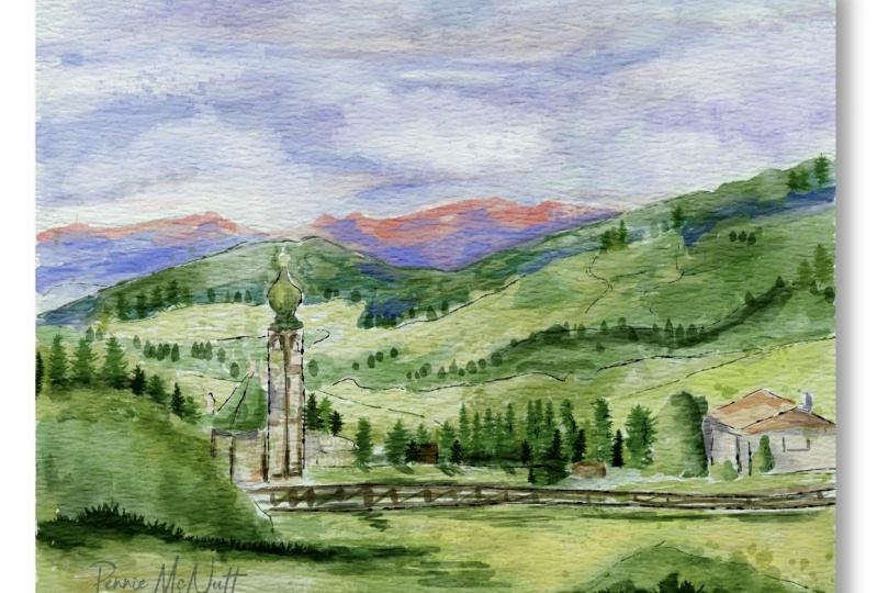
6. Filal details: Wow, So find out via DDoS, I'm going to create my new layer, set that as a multiply, grab this light green color, the Gradebook oriental tripod. And I just wanted to show so lines, mainlands. Yes, separated fields one from another. Craps is color and I want to show, like I told you, is a fence. Okay, cool. I want to add some stems. Are Mertz had to cancel, create one more layer has cited as a multiply. And I'm going to go and grab house ten brushes. I'll graph protocol step 25. And now we might think where we can put it. Free form. We can change the size. Hobbes, his stack. Maybe like something like sad, too low. And now I alerts are positive. So now this is not set pride and we still have our town, which looks amazing. If you want, you can change the color, go through each Jasmine's press hue, saturation and brightness, and think about the color. I think this color looks wonderful. You might saturate it, make it brighter or darker. For me, this has predefined. I'll create one more layer. I will crap political Sam, surgery three, momentum multiplied. Don't forget. Now you might think caret, you want to place It's a stamp. As for me, I think I want to put that summary here, shows a shape and space area and create some kind of volume. I'll create one more layer. Set it as Go to slide, the yellowish color. Lexus and the water coast 10, 20. And I went though, flip horizontal. And I want to put it here yes, separates this part Mon from another. Yeah, like it says, create one more layer, multiply led, think where we can pull it says same stem. And I just wanted to go to Adjustments, Hue, Saturation and Brightness. I want to make it slightly bluish plexus. Okay, cool. Marks it together as well. Unless you remember, I told you that, I will teach you how to change color if we saw a change in ZBrush. So now I'll show you how to try to go to the selection tool press pre hand. Maybe you want to choose this part and tap Add, then you want to choose his part to have ADD. And after said phasor, 11 percent saturation and brightness tap layer. And now you can change the color. I think make slightly orange would be perfect if you want to add some color to our sky. So let's create one more hair. Multiply, multiply, multiply here. And let's grab bluish color. Same stem, brash. Yeah, excess. And think where you want to put it. I think here would be perfect. If you don't like something, just blend that. Blended likes us. Yeah. We now guys, final, final touch, I want to add some splashes. So this is always our stem. This is with our stem and a leaf stem says, get work, it looks more saturated. If you want to condemn, locate it. For me one time was fine. I'll create one more layer. Grab a greenish color mode to Multiply final thatch watercolor splatters. Yep, and now let's move to polish color. And you might add a little bit. So splatters here. And I think now it looks Perfect. I came guys. Now we can call this piece finished. I hope you enjoyed my today's tutorial. And let's see ch as in next time and the S in our next tutorial, I'm going to teach you how to paint watercolor portrayed. And we will do it all together. And I will show it as is so simple. But this is end of our class. And now you know how the landscape illustration, watercolor style in the same way. Nice. I wish you luck with your own art projects and lead SIGCHI as a and a new retail Bye-bye.
7. Bonus: In this lesson.
 Inga Yoon, Digital illustrator and teacher