Transcripts
1. Intro: Hi, and welcome. I'm Julia Henze an urban sketcher and art
teacher from the Netherlands, and also the founder
of Bey Broch Studio a wonderful online community for artists and urban sketchers. I've been sketching and
teaching for many years, and one of my greatest joys
is helping people discover that sketching can be both playful and structured
at the same time. In this workshop, I'll
show you my approach that I like to call loose
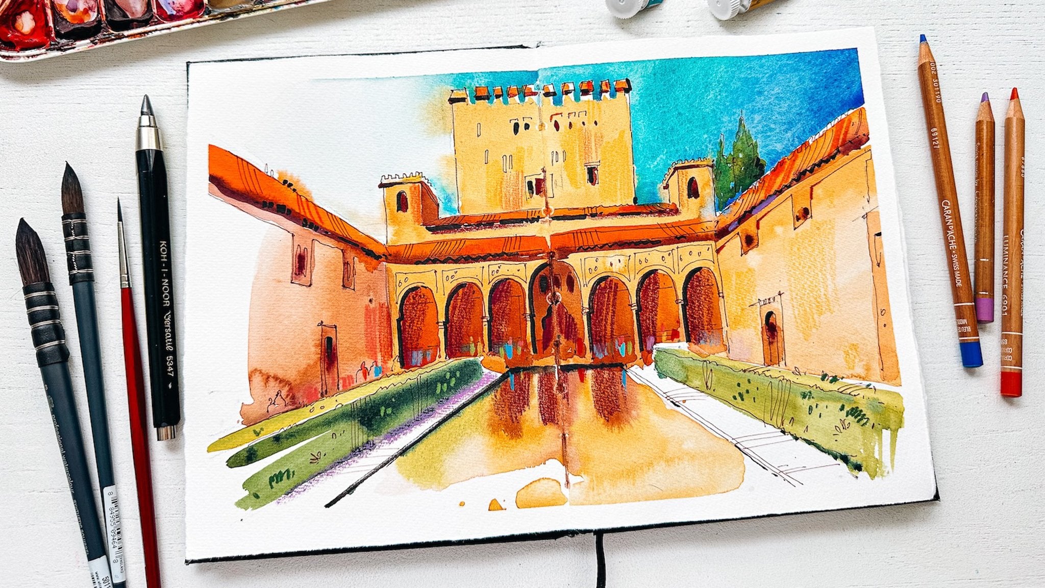
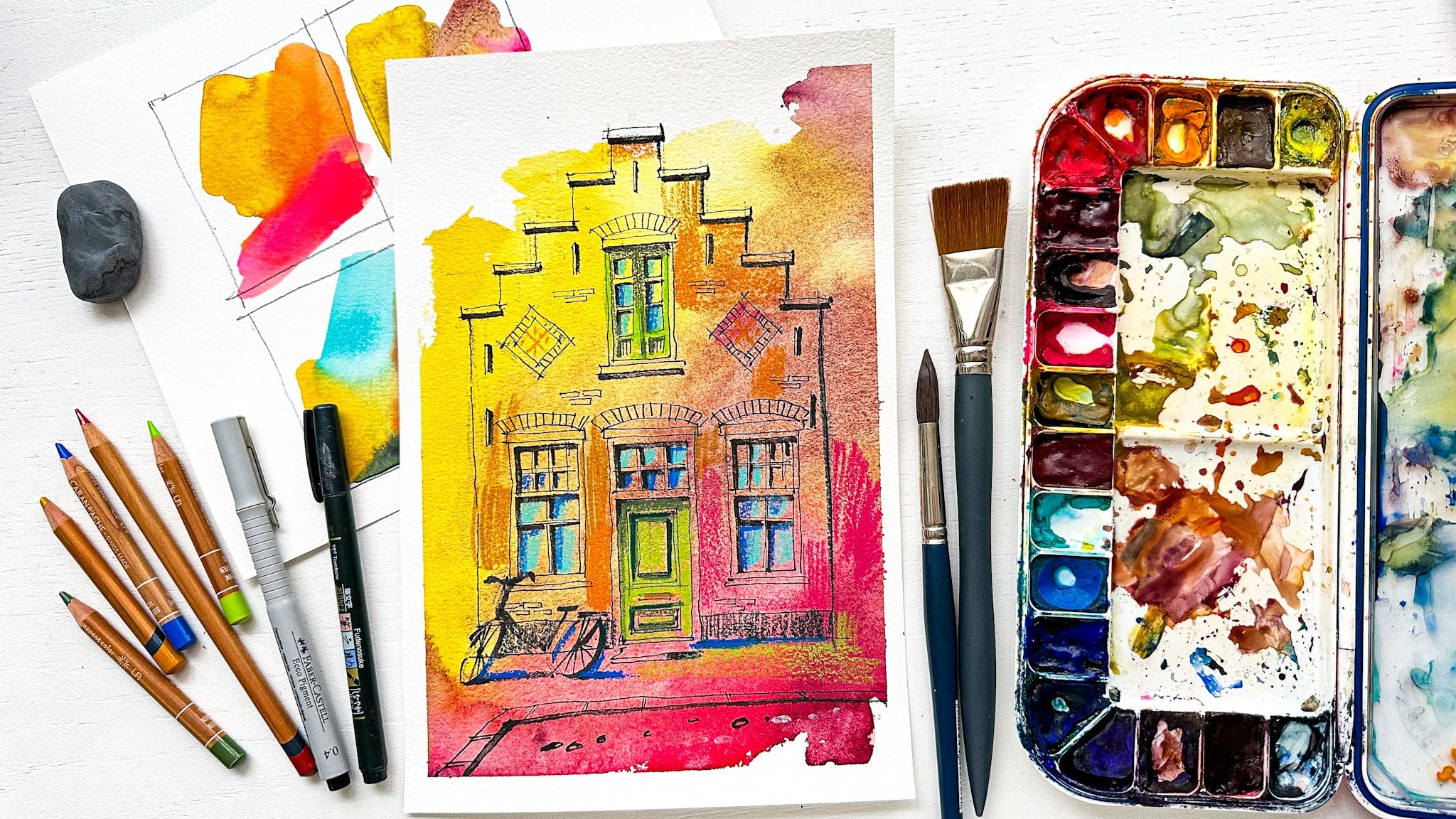
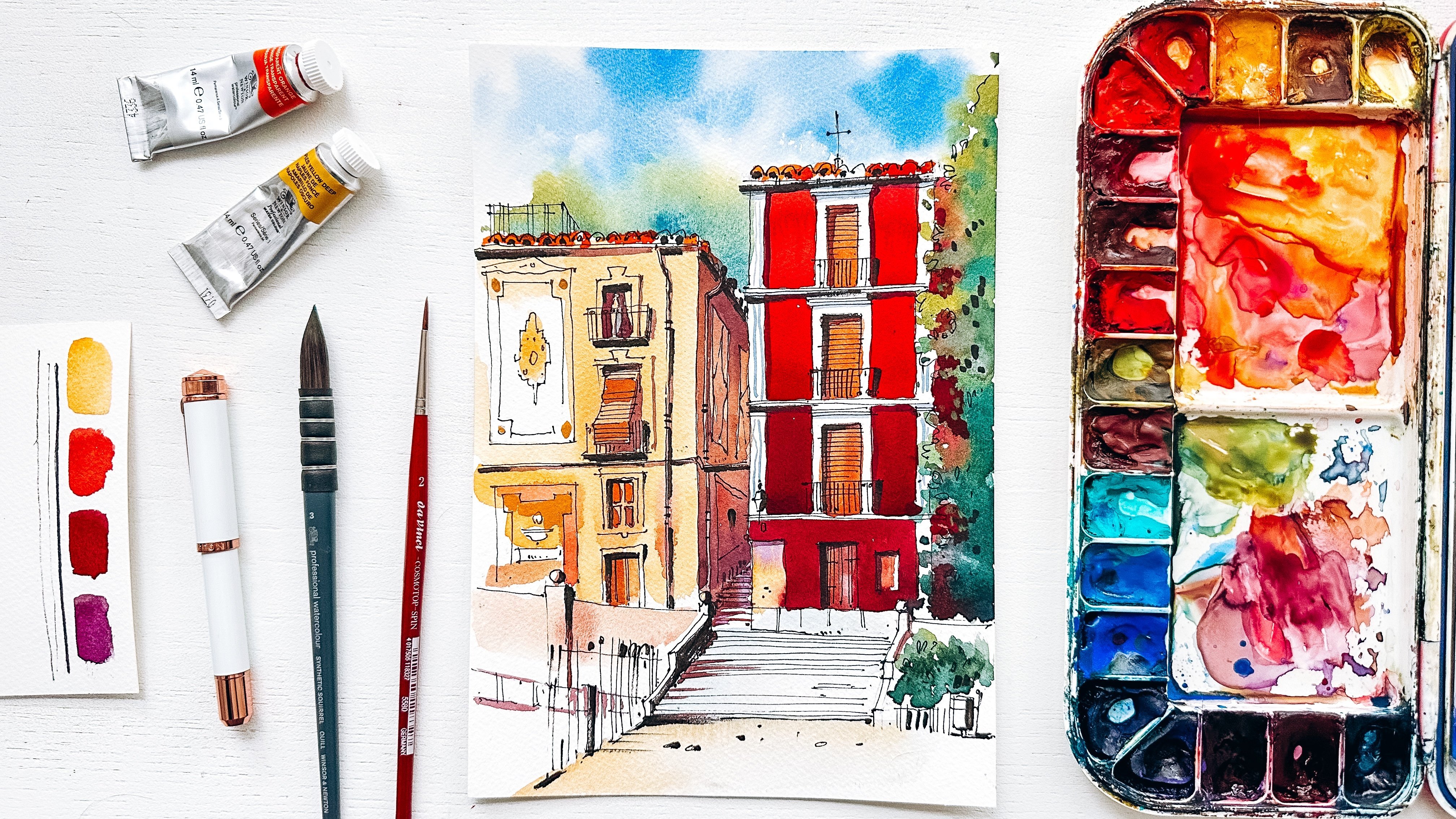
but intentional. We'll begin with bold, expressive watercolor blobs, without pressure, without rules. This is a part where
you'll need some bravery, then we'll build it up
step by step with pencil, fine liner, brush pen,
and colored pencils. Once the watercolor
layer is done, you have much more
control over the sketch, sharpen it into
something lively, colorful, and full of energy, but also sharp and clear. This method is perfect
if you want to loosen up your style while still
feeling in control. It's free, it's fun. I think you'll enjoy the
process as much as the result. So gather your materials, get comfortable and
let's sketch together.
2. Materials: Before we start, just
a few words about the materials that I'm going
to use in this workshop, if you have other materials, if you don't have the
same colors as I do. No worries. Grab
your own colors, grab your own materials
and enjoy them. I'm going to use
watercolor sketchbook. You will need watercolor paper because we're going
to paint with watercolor and it's important
to use watercolor paper. This is my sketchbook. I like to use masking
tape to tape down my sketches to create this beautiful frame
because otherwise, the paper will curl up and it's not very
beautiful for a sketch. We will need a kneaded
eraser, a graphite pencil. I prefer to use a
mechanical one. It's not very important. The fine liner, this one
is 0.30 0.5 is also fine. A brush pen, if you
don't have any, it's also good to use
a thick or fine liner. A brush, I'm going
to use just one. We need a very large one. This is one of my favorites
a quill brush size three. If you don't have a quill brush, the size will probably
around, I don't know, maybe 14 or 16. Then we will need
some watercolor, of course, and some
bright colors wb fine. And last but not least, we will need some
colored pencils and I have a bunch
of these cues here. It's important that they are bright and beautiful.
That's all. Okay?
3. Step 1 | Step 1: Start Loose with Watercolor: Okay, so let's get started. Maybe you know that focusing on fear doesn't help to
get rid of the fear. So we need a different
focus and on this stage, we will focus on the
beauty of colors. So if you have some colors on your palette that you think, they are so beautiful, I really want to use them
here in this sketch. I would suggest
using them even if they don't really suit the
colors of the reference photo. So if your favorite
color is purple, for example, and you
want to use it for coloring the house,
go ahead and do that. Just grab your favorite purple and enjoy the beauty of it. The most important thing here is that you have fun
and forget your fear. I will start with the
roof and it's a play. It's really we need to create a very nice page full of color. And let's do it like this. So I just grab my brush and maybe add some
different color like this. Then we have some yellow or at least I think
it looks like yellow. It's not the real yellow
color, but for me, it's the perfect color for creating a suggestion
or what I see because it's not we're not trying to create a
very realistic painting. We are trying to create an impression
of what we see. That's the most important
thing with sketching, I think, but also
with art in general. Okay, so something like this. And then one of my favorite
colors is transparent orange. When Winson Newton, it's a very bright color,
very beautiful color. So I will definitely
use it here, and you can see
that I don't care about the colors flowing
into each other. It's very good thing. It's what we are enjoying here. And actually, I also I don't care about
these parts as well. So let's do it like this, maybe something like this here. I don't know. Some spots
here for these windows. I also love the
turquoise for sky. It's absolutely my
favorite color for sky. I know here is the sky gray, not turquoise, but I
don't care that much. I love turquoise, so my
sky will be turquoise. If you love a different color, go ahead and use that color. Um we all different. We are artists with
our own preferences. I add a little bit
of Cobal blue also my favorite color maybe make the spots a
little bit looser, a little bit more like this. If I want to make some
spots even brighter, I can, of course, add some more color
to some parts. Like this. While it's drying, we can
change a lot of things. And I don't know, maybe here. So these are all just spots. The green part, I think, Oh, let's paint the houses
next to this main house. First, let's use bron colour, like burnt sienna, for example. But I think we will need
some other color like maybe some orange to create a more interesting
color, brighter color. So everything in my
sketches is quite bright, so this would also
be a bright color. And as you can see,
I don't worry about the like the colors here, I just paint over
the Over the sky. No worries about that
maybe at something, I don't know, in the background,
something like that. It's even I don't know,
very wake something. Okay, let's paint the
greenery and as you can see, I don't you don't you can see, I don't have a green
color on my palette. I always use a mixture
of yellow with blue. It's because you can create more interesting greenery
with a combination. So I just mix the colors. I will mix it here like this. And you will see that
this color is very, very beautiful, very,
very fresh, like this. A just a little bit of
ultramine blue to make it. To make it look more
like green color. And here we have
this very, very, very light green,
and next to it, you will want to make it darker, like here, for example, we have some darker greenery. We can, of course,
add it as well. Maybe some other shades
of green here and there, and I don't know. It's um, it's not
our main focus. Greenery, so we don't
care that much about all these spots maybe
make this part. Smoother. Okay, let's add
some some spots here. To make it a little
bit more cohesive, I add some turquoise
here as well. So it creates a better and
more interesting picture with the sky. Last. I will add only I don't know. It's not very necessary. We can also add it
with called pencils, but maybe just a few
spots of orange here. I don't know, my paper is
not dry yet, but it's okay. Here, maybe if you here for
this ornament. I don't know. I just like to add them before I go over
to the next stage.
4. Step 2 | Add a Light Pencil Sketch: Okay, now, the scariest
part is behind us. From now on, we will have all the control
about our sketch. So we will start the sketch
with the graphite pencil, and we will draw just
a few basic shapes that we need here to create
a suggestion of what we see. Okay, so we start with
the main house and let's draw it like
only the global shape. We don't need any details here. We will only refine a little bit our main
shapes like this. We know that goes like this. Here, it's important to draw
the shapes for the windows. Otherwise, it would be
just quite difficult to to draw the right
shapes, maybe. If you don't need
these pencil lines, you can just throw without the pencil and
start with a fine liner. There are a lot of people
who just can't do that. Okay, so my lines are pretty the same as as the shapes of houses, for example, but not all of them. And
that's a good thing. Of course, as I
said, we don't want to have everything
perfectly painted. We want our sketch to be
loose and Interesting. Impressive. Okay,
so here we have a window and a door with a balcony in the
middle of the sketch. I have this line
here in the middle, so it's easier for
me to draw it. And here we just look
at what we see in our reference and try
to get it on our paper. Like the E, some
distances between the window and the door
are not exactly perfect. It's all good. No
worries about that. Greenery, that's a very
scary thing maybe. You see a lot of
green stuff here, all these bushes, I don't know, flowers, we don't need
to draw them all. What we do is actually
creating a suggestion, again, suggestion of
what we see here, so we will throw
something here and again, basic shapes are like the ovals, the circles. So here in the middle
of this whole thing, we see two vases with
some flowers in them. They are of course, they were very interesting
and also authentic. I don't know, it's
part of this picture, but it's also not
very important. They are not important enough
to throw them all out. It's all about creating
an impression.
5. Step 3 | Refine the Sketch with Fineliner: Okay, so now we actually
have everything we need, maybe a window here and here, and I don't know. Let's store a house here. This hose. There is no color. This will only a pen. Okay, let's just draw a few
lines for the steps here, and then we have enough. Okay. Now we can go
over to our fine liners and draw it a little bit more precisely,
but not too much. So we don't need to draw
everything in detail, but we can now refind
the lines of the pencil. Okay, so now we can draw all the lines that
we need to have here, don't worry if they
are not very straight. It's still a loose sketch. We don't need any
perfection here. We need an impression. Mm. What is important here is that you notice that sometimes we have just
one line somewhere. But often we also see thicknesses of the
roof of the house, for example, or
something like that, something that makes our
sketches look more interesting. Different ornaments
make the sketches look more interesting
details like that. So you don't need to
focus on all the details. You focus on the details
that are really interesting. The details that you think would impress the viewer
of your sketch. And if they are not interesting
and not impressive, why would you spend your
energy on them? Don't do that. So also suggestion of a
house knot or of a tree, I mean, also of a
house like here, where do a very, very simple suggestion of
a house in the background. So we don't need to draw
all the windows there or bricks or anything like that. It's not important at all. Maybe we can add a few
lines for I don't even know what it exactly
is in the background. So that's more than enough. Okay, here we have some something that might
be important to show. The steps are always interesting to show in our nova sketches. Here I had some suggestions
of kind of leaves, um but not exactly. It's all just to create
the shapes that are recognizable so
that you think it's not one large spot of grenory. There are some shapes, and I see that it looks
like bushes, some greenery. As you can see, I don't really
have an order here I just throw around my sketch, trying to get everything together and working on the whole sketch
at the same time, it's just if you prefer to do it in a certain
order, it's all good. But for me, it's much
easier to do it like that. I just enjoy different
parts of the sketch. Suggestions everywhere. I hear, for example, we don't need
to throw all the four rows. We draw as many as
we as we want to. Oh, that's not the right part. It's here. No worries
about that. We can always. That's the of this technique. We can always hide our mistakes. I prefer to draw
roofs like this. Don't look too much on the
real textures on the roofs, because I think it's already clear there was
something happening, and it's enough to to create
a suggestion of that. Okay, so here we have this tree. And I actually think that we have everything we
need here. So far. Oh, maybe the chimneys. Chimneys are also important. Very very interesting detail. I don't know what this is also. Let's add it just because it makes more a more interesting
picture, I think.
6. Step 4 | Add shadows with a brush pen: Okay, let's erase
the pencil lines. Now we can add some
brush pen shadows. It's clouded in the
reference photo, so we don't really see
the clear shadows. So we need to decide on our
imaginary light source. And in this tutorial, I would prefer to put
it on the top left. So all the shadows will
be on the opposite side. And in this case,
sometimes I make conscious choice because
it looks better, works better for a
certain picture. But in this case, it's
just my favorite site. It's not about, it works better for this picture because it's pretty
much symmetrical. It doesn't really matter. But for me, it's easier
to put it on top left. And I try to add shadows, the main shadows for the
windows, for example, don't really see them that much, but it's something that would be there if we
had more sunshine. Okay, so here would be a
dark shadow under the roof. Always, we always have a
shadow under the roof. Okay, here. We can add some some darkness, some shadows, also
maybe some textures for the for the greenery. And I think maybe here very, very subtle though it's
important to have it there. Okay, the balcony, I don't want to draw to spend too much time on drawing
every single detail here. So it's very suggestive. And we can add
some some shadows. Some more shadows
to different parts. Okay. Okay, okay. Okay. I think we are already
to do or maybe just some
7. Step 5 | Final Touches with Colored Pencils: Some more darkness. Okay, so I think we're ready to draw with colored pencils, and I have here some bright
colors. Not too many. Okay, so I start with adding some more color to some
parts of the house, and I use colors like
maybe some pink. A little bit less
here. Some pink, some let's add
pink here as well. So orange, so bright colors. That will make our
sketch really shine. Okay, let's use. Maybe I want to add. No, let's add some yellow color. Maybe a bright one. Okay, something
like this, maybe. But also change. Colors just create
more interest. Yeah, I think that
already looks quite nice. And these are not the
real colors, of course, that we see in our reference, but we are creating
an impression. And we are now adding
especially shadows, more shadows than
we already did with our brush pen and more textures. So it's a combination of both. Well, let's hear maybe
add more defined texture. And if you have a
white pencil, you can, of course, add some light parts. If you don't have
a white pencil, you can use yellow, for example. H this technique adds more more interest
to our sketches. And I think it's also very, very fun to do because you use different
different materials to emphasize color to to make it look even more
interesting than it. Would be if you use only
watercolor, for example. Here are some shadows. I use blue color. The shadows are
cool, blue is cool. It's the perfect combination. Okay, we can here. Add more, more color. And for the windows, I really love to use turquoise. It's one of my favorite
colors anyway. So it's always for me, it's always a good idea to
add turquois to the windows. If you don't have turquois or you don't like
to use turquois, you can of course, use a different
color, I don't know, maybe a blue color, but just don't use
anything like I don't know, black or Gree. I think it makes our sketches boring when we use
colors like that. Okay. So also here we add some shadows in
the windows to create this interest to create
this depth in the windows. And you can see it starts to look like very impressive,
very impressive sketch. Okay, I think we need a gray
color like this for for, for example, maybe a
little bit of white. I don't know. And we can of course use some white for the lighter
parts, but not too much. I don't think too much white
would make it look better. See adding some
highlights to the sketch. No more than that. Okay.
I think this is done. The house looks
pretty nice to me. Maybe just a few details here. And now let's add just a few colors to the steps. And then we actually
only need to add some shadows on the trees. I also add highlights
or just create some more difference
between colors, add more More shadows
and more textures. This is why we use
colored pencils. And maybe some I don't
know. Something like this. I forgot to draw the vases. They're very simple.
They're very simple. And at the shadow. And for this tree in the middle, I would also create a suggestion of I would create a suggestion of a tree rather
than draw the whole tree. So and here I think maybe
at just a few leaves here, but also not too detailed, not too too too many leaves
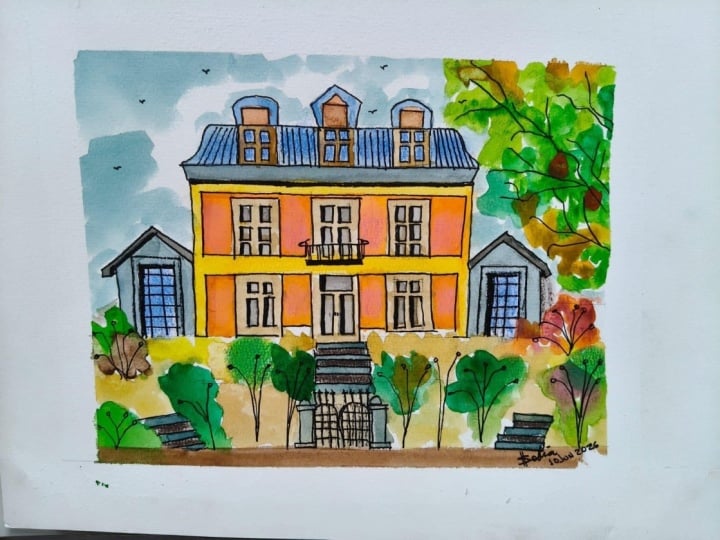
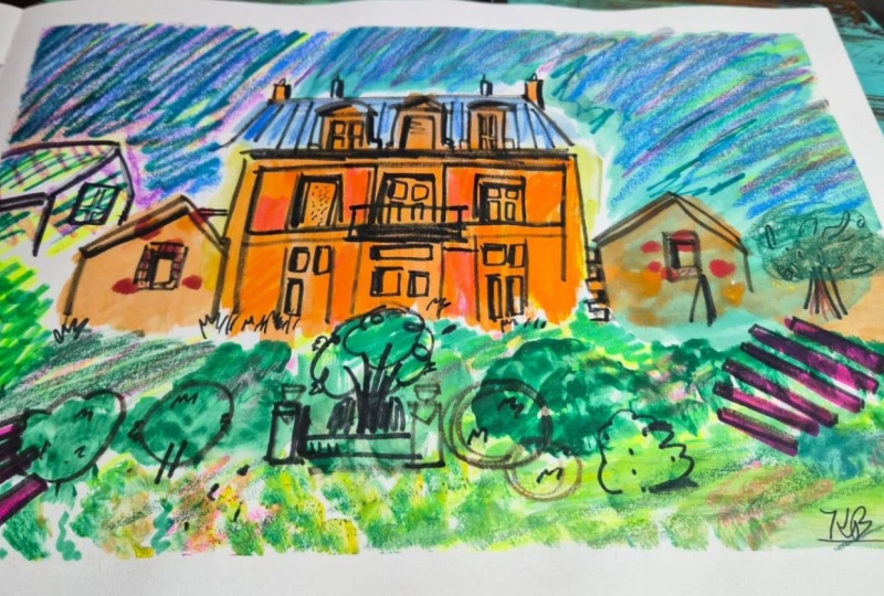
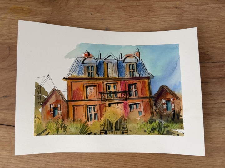
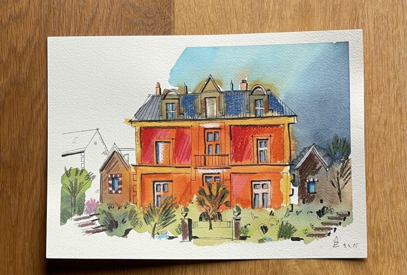
or something like that. So that's our sketch, and I think it turned
out really nice, really bright and
really impressive.
8. Final thoughts: And that's it. Always
sketch is finished. I hope you enjoyed the process of working loose and bold with color and then gradually
building structure and focus. Remember, you don't always have to start with a perfect drawing. Often the best energy comes from letting go of
control it first and then trusting that
you can bring it back later with your tools, your lines, and your
own creative choices. Be proud of what you
have created today. It's your personal
take on the reference, and there is no right or
wrong way to do that. I'd love to see your result. Show your sketch in the sketching retreat
Facebook group or tag me on Instagram at
Julia Underscore Hansen, so I can cheer you on and maybe even feature your artwork. And if you enjoy this
workshop, let's stay in touch. I have a free resource
waiting for you. Just click the link below
the video to download it and get more inspiration
and my sketching tips. Thanks again for joining
me today. Happy sketching.
 Julia Henze, Artist | Teacher | Urban Sketching Lover