Transcripts
1. Introduction: This short, playful class, we're going to explore how to create atmospheric
mini landscapes in a loose watercolor
technique with a touch of detail added
with colored pencils. Hi, I'm Julia, a nature
sketcher and illustrator. And in this class, you'll
learn how to create playful, simple landscapes
without fussing too much or spending hours on a painting and to create stunning luminous effects with
just a few brush strokes. We'll start with loose
wet on wet washes, and we'll learn more about how the pigments in your palette
interact and how you can create stunning light
effects by combining colors and letting them
flow together naturally. Sunrise, fog or back
light can create a unique mood and atmosphere with beautiful
color combinations, and we'll explore
how you can capture this luminosity directly on the paper in a playful approach. You'll learn how to create these effects without
overworking your sketch or creating muddy colors with just a minimal palette
and a round brush. In a second step, we'll adjust the base layer with more
loose watercolor washes, and we'll finish with a
bit of colored pencil for texture and to pull it all together and add a few details. At the end of this short and
beginner friendly class, you'll have a unique mini
landscape that captures a special mood with lots
of light and atmosphere. So I hope you'll join
me for this fun class, and let's dive right in.
2. Your project: Your project is to create a mini landscape painting
with the techniques shown in this class and you can use a minimal palette and then add accents with
colored pencils. It's best to do a small warm up before creating a project
to learn more about the mixing capabilities
of your palette and learn how to create those
pleasing color combinations. I'll walk you through
all of these steps for the warm up and then
for the landscapes. You can follow along with me or use your own images
for the landscape. I will paint three
different types of landscapes in this class. I have added some
references to help you get started in a PDF file in
the resources section. Then in the project section, upload a photo of
your small landscape and your mixing warm
up if you like, and also you could mention the pigments you use or anything you learned or found insightful during the painting process.
3. Tools You Need: Let's take a quick look at the tools you're going
to need for this class. It's just very basic watercolor supplies,
nothing fancy here. I have this watercolor palette with just
some basic colors. I use no more than nine
pigments for this class. Let's go through
them very quickly. I have my warm yellow, then cool pink or
cool red, warm red, then a light blue and
slightly darker blue, cerulean and cobalt blue. I have ultramreen violet, then my sap green, a yellow ochre and burnt sienna a two earth
colors, and this is really all. I have added a PDF with the exact pigments that I use
in the reference section. You don't need the
exact same colors. This is just to give
you an idea for what a minimal balance
pallet would look like that works well for
landscape sketching. Then I will use a
big round brush that holds a lot of water. I like these mop
brushes that can also form a very fine tip. This is actually the biggest mop brush
that you could bring. I thought because we were painting quite a
small landscapes, it would be fine to
use the smaller brush. If you don't have a mop brush, you could also just
use any kind of slightly bigger
round brush bed will form a nice tip at the end. I have cut these pieces of cold pressed watercolor paper in a landscape format that makes
it nice for landscapes. Cold press is also good for a bit more prominent texturing
of your watercolor washes, you will get these really interesting granulation
effects when the pigment settles into the creases of the
cold press paper. But really any
watercolor paper that you have will do also
use a sketchbook. And then I have a few colored
pencils in my selection. It doesn't really matter
which brand you use. For this class, I will use non water soluble
pencils so that I can create lines that will not disappear when I add
watercolor on top of them. This is optional. I use
washi tape or artist tape to tape down the
edges of my paper and this will give you
nice clean edges and create a natural framing
for the landscape sketch. I find this is a
very nice effect. It doesn't always
work with every tape, so you can see the paint
seeps through a bit here, but I actually find
this quite charming and this natural frame
is still in place.
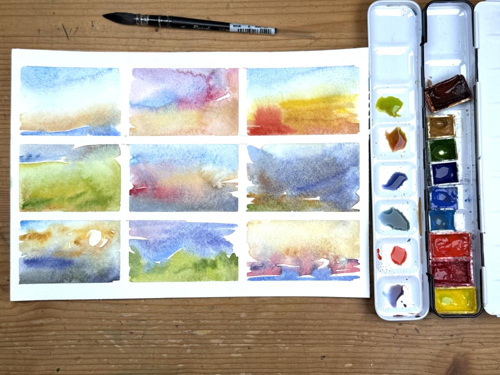
4. Warm Up & Key Concepts: So let's jump directly
into our warm up exercise. I am preparing my paper with washy tape here so that I
can get nice clean edges and these sort of
rectangles that I can use for my different
colors for the warm up. This step is entirely optional. You can do this in
any way you want, but I like the look of this, so I take the time to create
these rectangles with tape. Now, I spray down my
palette with a bit of water so that I can pick up the pigments a
bit more easily. Now, I have nine nice
rectangles for my warm up, and what I want
you to focus on in this exercise is to get
a little bit familiar with the pigments
in your palette to explore mixes and different
color combinations that you can do and also ways to
create an interesting wet on wet effect and see how the different pigments react
and combine with each other. So I've started with
my cerulean blue here with quite the watery light mix, and I'm adding in a bit of
yellow and yellow ochre, a bit stronger at the bottom. And then I'm also introducing
some cobalt blue. And I'm careful not to let these touch too much
because as you can see, the colors like to flow into each other as long as
there is some water. We're going to let them do that. This is an exercise this is to study for how the
pigments react. So from the color
selection that I used, you could say this is a
very simple landscape, a blue sky with some
yellow at the bottom, which if you look
at morning skies, this is often the
color distribution. And then we have a blue
hill in the background. So this is just a very
loose exploration of what such a simple
landscape could look like. Now I've mixed up some
violet here with my pink, my cool red, and then blue. I'm introducing a bit more blue, and so this could
be an interesting. I don't know a sunset
or a sun rise. I'm also introducing a
little bit of yellow ochre, some warmth at the bottom. This is just for
playing around and seeing how the
colors can interact and trying to let the paint do its thing and dropping in
pigment here and there. This is why I find it's really beneficial that you
limit the amount of pigments of colors that
you have in your palette because you can study the
effects a little bit better. You can see I'm almost
always starting with the blue at the top because
this is given in a landscape, and then I'm going for a bit
more warmth at the bottom. Trying out what happens
when I introduce this strong red color here. Burnt sienna at the bottom, this could be a field
or something like that, and make it a little bit
stronger with my warm red. What happens if I drop in this really concentrated
red pigment, so I'm just trying out different
concentrations of paint, different amounts of water
in different places. And I don't want to add
too much manipulation. I don't want to go back in with my brush and lift out
pigment and then drop in additional pigment because this will quite
likely end up muddy. You can see for this
little rectangle, I'm adding the water first, and I'm exploring what happens if I add the
pigment afterwards. So it flows nicely. I spreads everywhere
where there's water, and we have this nice
yellowish green here, yellow ochre and my sap
green. These could be hills. And then I'm thinking
of some kind of sky. This is maybe even a cloudy, darker sky with a bit of a
neutral gray, a bit of blue. So again, I'm trying
to not let these touch too much because then the colors will just
flow into each other, like you can see here with the green accents at the bottom. And for the next one,
I'm thinking maybe I can introduce a slightly darker,
more dramatic color. So I'm starting with my cobalt blue, slightly
darker blue, and I'm adding a bit of water to create more breathing space for the pigment to spread into. And from time to time, you'll
want to clean your palette, especially if you have
minimal mixing space on it. So I'm just exploring. You can already see a
little bit how the color will turn out in
your mixing area. So I'm going for this very
intense warm red here. And I want to make
this darker somehow. So I'm mixing cobalt blue and burnt sienna for
this really dark foreground. And you can see this pushes
the rest of the pigment into the sky into the blue area. And I find it really creates a really interesting dramatic
effect to have this red, yellow ochre and the dark
area in the foreground. So um, yeah, I'm not sure how any of these will look
when they're dry. We'll take a look at that later. But it's these kind of
color explorations that I find to be really interesting,
really fascinating. So I'm continuing the trend with slightly darker,
more dramatic colors. These could be maybe clouds. So I have this dark blue. I have added more burnt sienna. Now my yellow ochre
wants to join the brush and run off with it. So I have these
really dark clouds, maybe clouds over a field. I'm introducing a little bit
of green in the foreground, and then I'm trying to add water at the top
to see what this will look like when there's
more water when this dries. So if you want add notes to
these little explorations, because very likely you
will not remember what kind of pigments of paints you used when you
look at this later. Again, here I'm adding a bit of water before
I add pigment, and I'm starting with a
slightly warmed up yellow. So my warm yellow then a little bit of
yellow ochre around that. Makes it even more luminous. And for the foreground, I think a complimentary contrast
would work fine. Yellow and violet are
really nice together, and of course, this is a
slightly subdued version. The mix is quite watery, so I'm mixing up a slightly
darker version of it, and then I just drop in a
big fat blob of pigment. So our watercolor always
dries a bit lighter. Then what you can see when
you put down the pigment. So don't be afraid to
put down a lot of it. This is also what this
exercise is for to study how different the paint can
look when you put it down, when it's still wet
versus when it has dried. I think I'm experimenting, too. I'm putting down a
little bit of red, and then I decide I
don't really like that and carefully lift out
the pigment again, which you can absolutely
do as long as it's wet. Don't do this too often. So usually you can see when you've manipulated the
paint layer too much, and this takes away
a little bit of the spontaneity and of
the fun of doing this. So here we have
another combination, this sort of violet
sky at the top, and then there nice warm green, maybe a hillside,
something like that, and I just let the
pigments mingle, drop in a few additional
darker greens here and there for some
foreground elements. I have no idea how this
will turn out later, but that's the fun of it. This is just what I want
to encourage you to do just try to create
different light effects. You can use the references I
have added in the PDF here, so you don't have to invent any lighting situations or
landscapes from scratch. You can absolutely use these
references. I did this too. And so for the last one, I think I'll return to these
kind of interesting sunset or sunrise lightings with this warm golden
light at the top. And then maybe some red, some oranges, these
really beautiful, intense sunset tones
that make these kind of lighting situations so interesting and a bit
of neutralization, a bit of blue with a
touch of violet here. And again, don't
focus on any details. Don't fiddle too much
with your brush. Just let the pigments
flow, let it dry, and then see later what you like about it and what you maybe want to approach
differently next time. So here's our finished
warmup page when it's dry, and some of these already look
like small landscapes and only maybe need a few touches here and there with
colored pencil. Some of these look a bit
too colorful to my liking. But that's fine. We experiment
and explore at this stage. So I really enjoy some
of the neutrals that have developed here on their own just by letting the
colors flow together. And now I find some of these effects really
interesting and pleasing, and I see how I can recreate them in my bigger
landscape sketches.
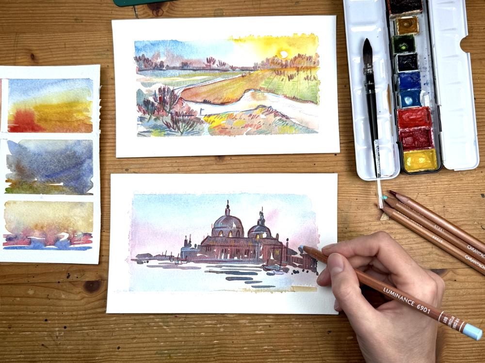
5. Demo 01 Cityscape: So for my first landscape, I want to try out
something rather simple. I've chosen this lovely
view of a city at dawn, I believe this is Venice. So what I liked
during the warm ups was this combination
of light blue sky, and then these light
effects like this, soft pink, soft
yellows and oranges. And yeah, it can take a bit of practice to get these
rosy colors right. I'm using a lot of water here. I'm also using more blue
at the bottom here. You can see there are
reflections in the water. So this is something that works really well for the
wet and wet technique. So I can just drop in a little bit more pigment,
slightly more pink. And then let the
watercolor do its thing. Now I'm thinking about how
I can introduce an accent, maybe in the lower right. So I just want to give
this a bit more stability. And I think the yellow
ochre will be a nice touch. Just this edge of the painting, and it can even be
reflected in some of the areas where we have
those pink light effects. So these sunset or
sunrise colors, sometimes you can't
really tell them apart. These create these interesting
atmospheric effects where you have a lot of sky, a lot of red in the sky in the otherwise blue
or grayish sky. You can see now it has dried, it has spread around a little bit at the edges,
which I don't mind. It's rather charming, I think. You can see how much of the intensity has
really gone away, but I rather like this very
soft and muted effect. This will be our backdrop, and now we can think
about what kind of color this cityscape needs. I want to keep it really loose. I don't want to add
too much detail. I'm using this big brush that
I use for everything here. And I'm going for this
quite neutral color. So blue and warm red here. With a cobalt blue,
you can mix up all kinds of interesting
combinations. Cobalt blue, vermilion, and
yellow ochre can make for a really nice
versatile neutral mix. You can see I'm starting
here with the mix leaning more into red and I'm just adding those little
areas in the background, and now I'm painting in those big buildings
in the foreground. I'm not thinking about any
individual buildings here, but rather about the silhouette, the entire shape of
all of the buildings. Of course, I need to include the round dome of
the cathedral here. And as I paint in
those big shapes, I'm sort of switching up my color mix here,
my neutron mix. So I'm introducing a bit
more blue, a bit more red, just depending on what
I feel might look nice. You don't even have
to do this based on any light effects you can see, but you can certainly
include this. So if there are color
hints in your reference, then absolutely pick them up. But don't focus on
any details here. Just maybe squint a little at your reference and
then go from there. So there's the
second smaller dome. And you can see I can put down
fine lines with my brush, but this bigger brush forces me to really stay with
the big shapes here. And I can add in a little bit of light from some
of the windows, have reflections, and
I can add this by just leaving out a bit of color. And on the right, I
don't want to continue this silhouette that I
can see in the reference, but rather have it sort of
peter out a little bit. Then we can also see some
reflections on the water. I just adding a few of those to indicate that indeed there's water in the lower
third of my sketch. And now, this is my detail
stage with a brush here. So I'm adding and refining
a few of the edges, and I'm adding in a few of those little dots,
those little touches. And with all of
these brush strokes, I try to keep them
loose and spontaneous. I don't want them to look too labored or
forced or anything. So I think this is enough before I start overdoing things. I'm going to leave this to dry, and then we'll come back
and add some details. Now it's time to get out
the colored pencils. And I've chosen this
dark violet here, which I think complements the existing colors very nicely. So we have the background
with this soft sky effect. Then we have our dark neutral, which is quite dark, actually. I thought it would dry
a little bit lighter, but nothing to worry about. We can adapt this
and fix this a bit. And now I can bring out the
windows of the cathedral and some of the contrasty lines of the buildings
in the foreground. Nothing too detailed. We still want this to look
very fresh and spontaneous. So we don't want
to spend hours on the window sills in
the front buildings. This is not what this
painting is about. It's supposed to be about
this light situation, about this interesting
atmospheric effect. So I'm just adding a few
interesting lines and dots here and there that might help to bring a little bit
more visual interest, some boats in the foreground. And yeah, you don't have to
spend too much time on this. And then maybe some boats
on the right side too. And then I'm switching my color. I need to make this a
little bit lighter. And for this, colored
pencils are really great because if your
watercolor layer is dry, so you need to let
it thoroughly dry, and then you can work with the textures of the
colored pencil. I'm using this light pink here, this kind of rosy
pink to reinforce the soft pink light that I
can see in the reflections. You can actually see this on the very right side of
the reference image. There's a little bit of this sunrise rosy color
reflected in the buildings, and I'm exaggerating
this a little bit on the rest of my
silhouette here. And just to introduce a little
bit more of this light, I'm also using this very light blue colored pencil
to bring back a bit of the luminosity
that I think was lost in the very dark
watercolor silhouette. So I'm not even spending too much time looking
at my reference here. I'm trying to think
about where I can really use those accents. And then because this is sunlight and also
has some yellows, I'm also using this warm yellow here and add a few
accents with that. So this is a playful
process, not a science. So yeah, try to enjoy this, try to experiment and
explore where you can place those little colorful
accents and where they will actually help to bring out the intricacies of the light
situation that you have. And as you can see, it
doesn't have to be much. You don't have to overdo it. This will preserve, so to speak, the freshness and the
spontaneity of the painting. And I think this is it.
So this is our first sketch our lovely
cityscape at sunrise. And I think this turned
out quite charming with the slightly fuzzy edges
and this beautiful, soft atmosphere and light.
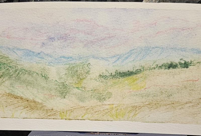
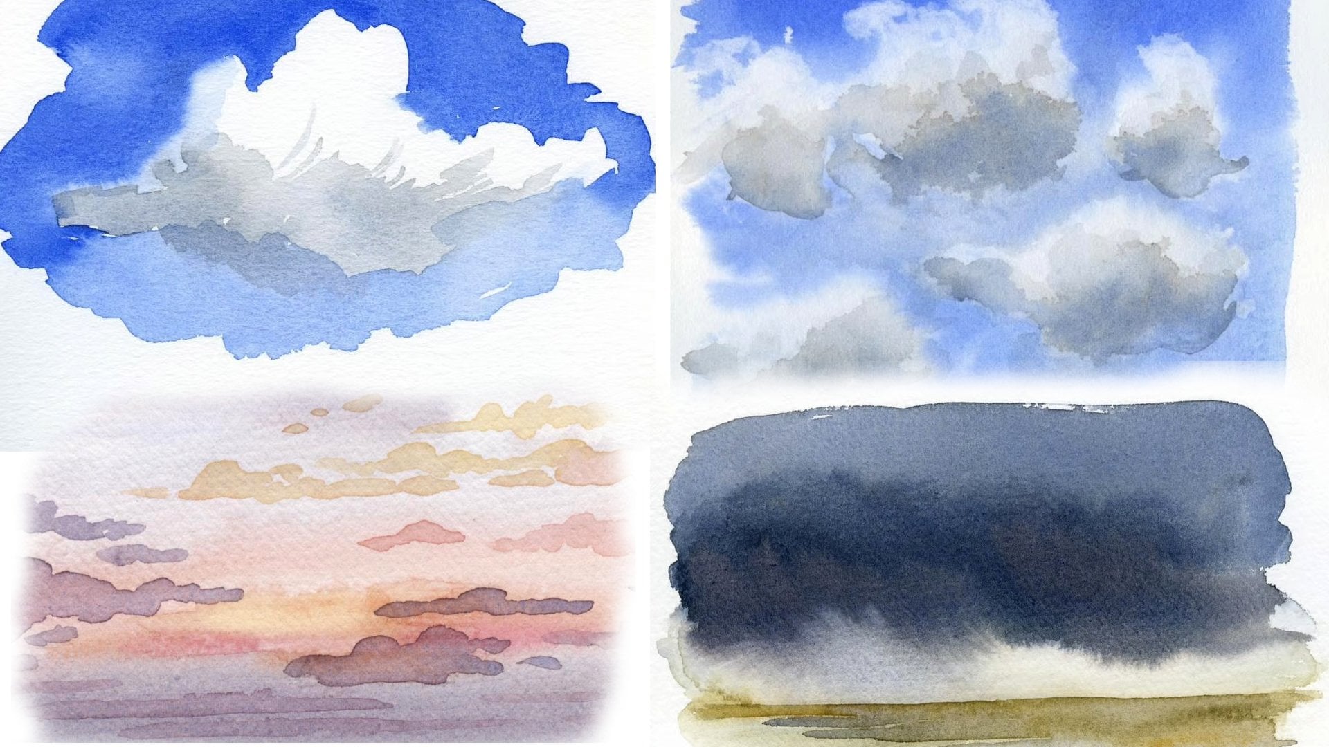
6. Demo 02 Hills in Fog: For the next landscape, I want to sketch some hills with a lot of fog and
atmospheric effects, and I'm going to be using two different
references for this. Don't be afraid to combine several reference
images into one. And in this case, I want to use sort of the big shapes from the first reference
that you can see here, but I found it a bit
lacking in color, so I'm going to sort of pull the color from
another photo that I have. I'm just concentrating on those interesting
overlapping shapes here. These add a lot of depth, a lot of a sense of distance
to my sketch already. I'm just trying to figure
out how I can create some interesting overlaps
and layers in my sketch. I'm also trying to already add some little details
to this sketch. Although I have to
restrain myself. I want to reserve this
step for the last stage. So for this kind of
preliminary line work, you can play around
with the colors. Think about what happens to
the intensity of the color. If it recedes in the back, it usually is lighter,
has less contrast. So now you can see I've chosen this nice photo of the alps
for my color reference, and I intend not to
follow it too closely, which is maybe bad for
this demonstration, but maybe it's also a good thing because I've decided to
treat this rather loosely. So uh, we have gray in the sky, and we have also these
kinds of blues and muted violets in the back of
the mountain range there, and I've decided I want to incorporate both of these colors and bring them out
a little bit more. So still subtle enough. You can see I'm adding
lots of water here. I'm also adding a
slight bit of red. So my vermilion red, then cerulean blue and a bit of cobalt blue
and a bit of my violet. And now I'm mixing up
a nice soft blue green with my sap green
and the cerulean, and I'm just putting
in some brush strokes. So I'm not even thinking about filling everything up
with pigment with wash, but I'm just dropping in a
pigment into a few areas. Here, I'm leaving lots of
white space in between. And this gives this watercolor
wash a nice loose quality. So you don't always have to fill up everything with paint. You don't have to paint everything that's defined
by a line or by a shape, and I'm even lifting
out some of the pigment I just put down with
my painting rack. So I found there it was a
little bit too dense for me. And I'm trying to
think about how I can intensify the areas
in the front. So I'm adding in more pigment and try to let this
flow into each other. So preserving this loose spontaneous quality
of the sketch. And I think this is a
good place to let it dry. And you can see now that we already have a
little landscape here. So we have our loose lines. Maybe I'll reinforce
some of them now in the second or third stage, and we have our colors in place. And this is really from a watercolor perspective,
all that we need. And now I want to try and
add in some of those clouds. I didn't try to define
them with my watercolors because I felt this
would have led to a lot of overworking brush work. And this was really my attempt to keep it loose
with watercolors in the sky, and then I can go back in with my colored pencils and add some of the
details that I want. So I feel some of
the outlines of the hills are not
really clear enough, and obviously, they need to be a bit stronger
in the foreground. So this is one of the effects you can often
see with landscape, this atmospheric perspective
where you can see more contrast and more
details in the foreground, and then it's sort
of fading into the distance into
less contrasty areas, less color in the background. And this is what we can sort of replicate
in our little sketch. Also reaching for these
kind of cool colors there for the background to add some interesting
contrast to my red. And now I think it's
a good time to think about some textural details
for those front hills. So in my reference,
there's a lot of grass. I don't want to draw in
every single grass blade and every single leaf of
the trees that I can see, but I want to give an impression of these textures
and these details. And I'm taking a lot of
liberties with this, so I'm not even following
the reference very closely. And as with my minimal
palette of watercolors, this limited selection of
colored pencils will force me to go into the abstract a little bit
more to really adapt what I see and not
follow it too closely. If that makes any sense at all. So I still want to show some of the dark trees that
I have in my reference, but I'm not interested in drawing in meticulously all
of the shapes that I can see. And instead, I take
some color cues from all of the colors in the meadow I can
see in the foreground. So some of the golden
yellow, dark red, and I add those interesting
little scribbles here and there in the
hope that this will be visually interesting
for the viewer. Little bit of this muted pink. It's also an interesting color
contrast with the green. So I'm more thinking
about the visual quality of the sketch that I want to achieve and not so much
about this reference, which is, if you want to follow the reference more closely,
that's totally cool. That makes a lot of sense, especially if you're
just starting with this, but you don't need to do
it if you don't want to. Just try to enjoy
this process and have a little bit of fun with
the tools that you have. And I'm also introducing the same color in different
areas of my sketch. So like this light
yellow and the blue, try to repeat a few
of those colors throughout this sketch to pull it together a
little bit more. Yeah, I'm actually not too
sure about all of these lines, these textures there
in the middle ground. I think there is a bit later
where I remove some of them. I actually erase them and take a bit of
the definition back. So this is also something
that you can experiment with. So how defined does a landscape really need
to be in the background? I think, especially
in the middle there, it's become a bit busy,
but that's just me. And usually with landscapes and this effect of
atmospheric perspective, you will go from warm colors in the foreground to cooler
colors in the background. This is usually
what it looks like. You can see this in
the reference, too. So we have these
beautiful warm greens and yellows and reds are more
prominent in the foreground, and then due to these particles
in the air you will see more blues and violets and these cooler greens
in the background. There, you can see me erase
a part of these lines. I thought they were
interfering with the clouds that I drew earlier. So I'm restating one
of my outlines a bit and then adding a little
bit of this violet here. Back in to define the
hills a bit more. So overall, I'm quite pleased
with how this turned out. I like the color contrast and the amount of details
in the foreground. And now I'm also ready
to remove the tape. This is always a very
satisfying moment. And here is our finished
sketch of our Hills.
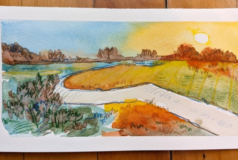
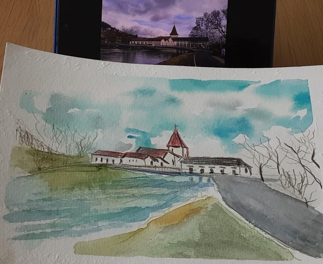
7. Demo 03 River at Dawn: For this sketch, I want to explore something a
bit more colorful. We have this beautiful
morning scene here with a river meandering through the landscape and a
little bit of fog and lots of interesting light
effects, very atmospheric. Yeah, very interesting to do. And you might think that
there's a lot of gray, muddy, undefined color in
this reference image, but we will try to get to introduce a little bit more
color into this very soon. Again, I'm defining a few
of the outlines here. I'm spending a little bit
of time with the shape of the river and also a few of
those background trees here. This doesn't have to
be the first step, so I could easily leave it at that and then come back
to the trees later. But I felt this was a good opportunity to define
some of the shapes here. Uh, yeah, you could also start
with the watercolor stage or just leave it at those few outlines
maybe for the river. And I'm using this interesting
muted dark red here. I think this has a
beautiful component. It has some of the red that
I can see in my reference, but it's also not too bright and doesn't take away from the colors that
I'm about to introduce. So I think this is good
for our sketching stage, and I'm really eager to get started with
my watercolors now. So let's see. I have to mix a beautiful light
color for the sky, so I don't want to
make this too dark. Just a little bit of cerulean
blue dropped in here. And since we have
the sun rising on the red side of the photo, I want to leave it at that and then rather paint in that light
effect of the rising sun. So I don't want. The blue and the yellow shouldn't mingle too much because then they
will turn green. I'm painting around the sun. Because this is the
brightest area of my sketch. You can see I just introduced
some yellow ochre. It was a bit too
much on my brush. So I dialed it down a bit. And now I'm just
adding a lot of water. I want to spread
out the pigment. I want to create this sort
of glowing light effect. And back there, where
the horizon line is, I can see this muted purple. So where I defined those trees, I introduce a little bit of red, and I put down a bit of pigment, adding more burnt sienna, a little bit of blue to create this neutral color for
the background there. For this sketch, I think I
really want to try and push it and find out how much
color I can get away with. I'm introducing quite
the bright red here, even though it's the
background and it should probably be
a bit more muted, but we have all of
those interesting sunrise light effects
going on there. I'm also adding a little bit
of my sap green to the mix, now there's very
light warm green. I'm imagining as
the sun comes up, it falls onto those fields
onto the grassland, and there's there are different colors interacting
with each other, the red and yellow from the
sunlight and then the green, which is the actual
color of the area. And I'm painting
around the river because that's another
area that's very light, so I don't want to overpaint it. And with all of that, I'm
also trying to keep it loose, not to just slap
paint everywhere. And admittedly,
that's a bit hard for these kind of more
complex scenes like this. So I need to make
sure that I actually define where the river
is and where the sun is. And yeah, I still want to preserve a little
bit of the looseness, and you can see that I actually left a few
highlights there in my image. I'm defining the roundness, the round orb of the
sun, just touch more. And I think this is actually
a good place to leave it with the watercolor washes. Maybe just a touch. I'm not sure what I will do with the river because just like now, it's a little bit too light. So I'm introducing this very
light red in a few places. You can see the existing
wash Watercolor will just flow into it, and I think this gives a few,
very interesting effects. So with this all in place, I think it looks really wild. And yeah, I'm really interested to see what this
looks like when it has dried. Obviously, it will
be a bit more muted, but very interesting
color combinations here. Okay, this is dry, and I'm actually going for a second watercolor layer here. We haven't had this yet. I'm mixing up a little
bit of this red blue mix again for the trees
in the background because I think they
should be quite soft, and I can achieve
this better with my brush than with
the colored pencil. So I already have those
outlines in place, and I can just go over this with my red and slight bit
of blue added in. And the further I am
away from the sunlight, the more neutral those
tree outlines can be. And since we want to keep this
all cohesive and together, we can use the same mix for those trees those tree
silhouettes in the foreground. So I'm just dabbing in paint. I'm following the outlines
that I already have. I'm not trying to
think too much about the actual outlines that I
can see in my reference. I'm trying to make sense of this within the sketch
that I'm painting. And this red that I just added, it's maybe a little
bit too intense, but yeah, let's
see what happens. Sometimes you have to do these experiments on
paper in your sketch, and sometimes they succeed
and sometimes they fail. So I'm going back to
my colored pencil here to redefine the outlines
of the river a bit more. I think this will
really help with the overall structure
of the sketch. And then I think we
have to let this dry first before I add
more colored pencil. This is always very
important step. You have to let this a watercolor layer
thoroughly dry because otherwise you won't have
enough how shall I put it, gripping strength, or the
pencil will just glide over the moist watercolor
paper if it's not really dry. You won't get these
textural effects. So now I'm redefining a few of the elements in the
middle ground there. I want to bring out
the rays of the sun, so I'm adding those
interesting lines that could be from fields or
maybe just the sunlight, and I'm using those
warmer colors here. So warm yellow, this rose pink, and then also slightly lighter yellow to reinforce this yellow, this sunshine that's slowly coming up on this
beautiful landscape. And I think this
bright green also matches the atmosphere
really well. It goes with what is already there from the watercolor wash. Again, you don't have to follow the
reference too closely, but it makes sense
to take a good look and see what this light effects, how it affects the
colors around it, how it changes the landscape. And in the foreground
here you can see there is less sunlight, so we have a few shadows. Those can be a bit
cooler and darker. So I try finding that will match the overall
quality of light, if that makes any sense and that will complement
each other nicely. And sometimes you will also want a little bit of contrast. So maybe put a red and a green together or a yellow
and a purple. So make use of these complimentary colors and these contrast if you like. And in the foreground, I can see a lot of texture
in my reference, and I want to reflect
that in my sketch. So I'm adding all kinds of interesting and fun
little textures here, different colors because,
you know, why not? The sketch is already
quite colorful, so I think it can't hurt to just introduce all of
these colors that I already have in there to those
other areas of the sketch. And it should be fun to do. I really enjoyed drawing
and painting this. So I hope you can see this reflected somehow
in my approach. Yeah, I think, at this
point, I'm basically done. I don't want to overdo it. It's always difficult
to stop, but, yeah, I think we can remove the tape and enjoy our beautiful
morning scene with the river. This is the finished sketch. I'm really pleased with how this turned out. And
8. Final thoughts: I hope you've gotten
some helpful ideas for creating loose and luminous watercolor landscapes
with lots of atmosphere and also how
you can play around with the different
pigments to combine them to achieve light effects. For me, the combination of colored pencil and watercolor
gives a good balance between precision and
loose brush strokes so that I can get a landscape down on paper quite
quickly without spending endless hours
rendering details. So I hope you've enjoyed
this combination of playing with wet
on wet techniques and learning about
how the pigments in your palette interact to create those stunning
light effects. Let me know what you thought of the class, leave a short review. And, of course, I'd love to see your luminous landscapes
in the project section. So thank you for
taking this class, and I'll see you very soon. Bye.
 Julia Bausenhardt, Nature Sketching & Illustration