Transcripts
1. Introduction: For as long as I can remember, I've always been inspired by old printed things. The way the colors overlap, the way the colors are so simple and often really bright. The texture of the paper, it's warm and human and doesn't look purely digital. In terms of working today in Photoshop, it also doesn't look totally retro. There's something fresh and now about it, but also timeless about it. That's what I love about printmaking as an inspiration to the work that I do. Hi, my name is Tom Froese. I'm an illustrator and a top feature here on Skillshare, where I've helped tens of thousands of students unlock the world of commercial illustration. I've worked for a whole bunch of amazing clients, including Airbnb, Yahoo!, The Wall Street Journal, just to name a few. My style is very lively and buoyant. I use bright colors and keep it on the chipper side. This class is called Printmaking-inspired Illustrations in Photoshop. I just want to share with you guys how I create my illustrations from sketch to fully finished piece and just show exactly what I do. Show you what I mean by printmaking and how that's influenced my work, and how I do that in Photoshop in a way that looks temporary. I made this class for anyone who's looking to bring just a warmer, more analog look to their digital illustration process. I think it's also great for anyone who wants to learn about the power of Photoshop as an illustration tool. You're going to learn how to use digital brushes and add texture and details to an illustration. You're going to learn how to use the pen tool to create bold shapes with crisp edges and various technical pro tips and tricks as we go along the way. At the end of this session, you should be able to complete the provided sketch using my exact tools and techniques. But just so you know, this class was recorded live, so you'll notice that I will be interacting with the audience. All right, let's get going.
2. Learning From Printmaking: My name is Tiffany Chow. I work on Skillshare's Community team. I get to play host for today's live class with Tom Froze. Tom, obviously, we're very excited to have you here today. Why don't you tell us a little bit about what we're going to do in today's live class? Today, basically, I'm going to show you exactly how I work. I'm going to show you how the sausage is made. Specifically, that entails using Photoshop and using tools like the Pen tool, and I think very importantly, is using digital brushes as a way of achieving texture and warmth so that we have the control of digital, but the warmth that you might get out of analog textures or techniques, and it's the best of both of those worlds. I think coming out of this class, you'll definitely know how my illustrations are made. My hope is that you'll be able to build on these, this is just one of many techniques that are out there. Of course, I don't want to make a bunch of clones or anything like that and nobody wants to be a clone of me. I think you guys want to learn how to do things where you do, and my belief is that by learning a technique and how it's done and really getting a feel for that, you'll have new ideas about how to incorporate that in your own practice. That's really what I hope that people will get from this class. When you talk about that print-making-inspired or analog-style, what would you say are some of the main characteristics of that style in your mind? I mean, this is something I did a long time ago. If you guys can see that, this is actually the basis of my first Skillshare class. It's a letterpress printed card. Letterpress printing is, when I think of printmaking this is like the technique that I think about where you have shapes made with solid colors and you have just the texture of the paper shining through. Now the thing about printmaking is that you're really working with limited colors because basically, traditional printmaking is taking an image that's raised somehow, think of a stamp, putting ink on it, and pressing that down onto paper. That's what printmaking really is traditionally. You didn't have the ability to do gradients and soft feathery transitions and stuff like that and you also have very limited numbers of colors. All those things combined create a very specific aesthetic or look and limits the shapes and forms you can use in your art to create your images. That's what I'm inspired by in printmaking techniques. Now, of course, we're using Photoshop. You can do anything you want in Photoshop. The keyword in this technique that we're going to be doing today is that it's inspired. We do take some liberties that digital affords us, and so we do stretch that. We're not emulating printmaking, we're just being influenced by it. I love that. How would you say you landed on this as part of your signature style? It's hard to trace back, but I think I've always been inspired and have loved retro illustration, even things like matchbook covers and weird ephemera, random stuff. I've always loved going to thrift stores and just looking at old things. I think that's probably where it comes from. Then I think once I started thinking about wanting to be a designer and then an illustrator, early on I came across some influences like Paul Rand and Saul Bass and a few others. Just by learning the techniques that they used, I discovered printmaking as a thing. I'd probably also really didn't hurt that my education was at an art school about how to huge printmaking program, and so there was a lot of exposure and influence there too.
3. Class Materials: To get started, I'll walk you through the setup and materials we'll need to complete the project. If you're watching the Zoom call, presumably it's on a computer. So you have that. This is like a computer, either on a laptop, Mac book or a desktop, iMac, that kind of thing with actual Photoshop on it, obviously we need that. Then some kind of a tablet is really important because you need that control of using your hand for the brush. So whether that's a working tablet or using your iPad as a graphics tablet, that's important. I use Astropad and I have a PDF that are included in the class resources that describes that. Basically it's an app that installs on your computer and on your iPad. Once those are up and running, they find each other. If you have a connection like USB connection or Wi-Fi connection and so it works like magic, and just trying to think if I missed anything about Astropad. It is something you need to purchase. I use Astropad Studio and that's a subscription. Now the good news is studio is available for a 30 day free trial and I thinks it's, like why not? Give it a try. Again, I've included a sheet specifics about this setup. I wish we had time to go through setting and open everything together today. We probably don't, but I did include a document that should help you after the class or if you're really quick during the class. As an alternative to Astropad, you can use Sidecar, which is Apple's built-in answer to Astropad really. Again, more information about that in the PDF. For this class we'll be using brushes from adobe.com as well as RetroSupply Company. In the class resources section, I've included a PDF, a document that you can download from there, and I'll just show you how to get those brushes onto your computer. One resource I didn't mention yet that's included is of course the sketch file. The file that we're working with is called alpine.psd. This is the sketch we're going to be illustrating over. Why don't I just start off by showing you each brush, just demoing each brush. I'm going to hide the sketch just so we can look at the brushes more purely. First brush up is Kyle's Paintbox Gouache G Blair. This is the main brush should I use to make my texture. Let me make that big so you guys can see that. What I like about this is that it's very versatile. You can fill it in and you get this nice, peppery or salty texture. Even though it's a gouache brush, it's meant to emulate painting medium. It to me feels a bit printy if that makes sense. So that's what I love about this brush. In terms of being versatile, if you press lighter, you can use it also to make nice wispy forums, which we'll definitely be doing in this demo. The next step is Kyle's Paint Box-Gouache Detail. Again, this is nice for certain details, but I also like doing lettering in it. So if I wanted to do lettering like this, it creates nice shapes. I'm being super hurried here, but if I was taking my time, I'd be able to get some nice shapes out of that for my lettering. Now in terms of the others, there's Kyle's Pencil Box- Animated Pencil. This just really emulates pencil, which I use a lot for a little details in my illustrations. We have the first of the RetroSupply brushes. These are great, very grainy this one is called Godfather of Grain. So depending on how light you push, you can get a nice controlled amount of speckle. Then with the Kitchen Sink, it's basically like the previous brush but a little bit more intense, almost like you're painting with a sponge. This is really great for you if you want to add that printmaking based texture in a more controlled, trolled way. It's distinct from the gouache brush that I showed earlier. Then this is a watercolor based brush which I like. What I'm doing here is I'm just drawing but not lifting my stylus and if I go light, it lightens up and if I push hard, it interacts with my pressure almost as though it's real media, I should say. It's interesting in that sense but really what I use this for is just sometimes I might need to do a flower or some kind of a squiggle and it's just something a little different to add to what the other textures are doing and having a little bit of variety, breaks up the monotony a bit. Then I have one more pencil. It's just a nice fine detail that I like using, this one's actually really good for adding line work details like separations between fingers or even eyes and things like that or a mouth. Lastly, is this one called Da Doo Ron Ron. I feel like Kyle has a lot of fun naming his brushes. But I always feel a little bit silly naming them. This emulates to me like an inky nib pen or something like that. Again, this just a nice thing that you might be able to use for details and line work and stuff like that. So those are the brushes will be using. Those are the basic properties. Now, I'll just delete that layer in the art file. In the layers panel is a folder that I have, invisible, made invisible for now, but it's called resources. You're going to see all the brushes that I just went through here with all their properties and their names. Then I have, of course, the original art that we're going to be making together. This is like if you're putting together a puzzle the image that you're going to build, as puzzles on the front of the box. This is the front of the box. So today, this is what we're going to be making together. Something funny happened down right here. We can ignore that for now. But anyway, this is the image that we'll be creating. Now, of course, what I wanted to show you was just from the sketch forwards. When I start an illustration, obviously, I always start with a sketch. I think it's good to show how that sketch looks and then what decisions I make over top of that sketch to bring it home. My sketches I consider to be fairly close to my final illustrations. Like they're not super abstract. I think what you saw on that final image I just showed you. What you see here it's the exact same composition. I'll just show you the original art again and I'll bring down the opacity. You can see that I stuck to my sketch very closely. That's just how I sketch. This is the point from which I begin illustrating. Without further ado, let's start illustrating. I've got a couple of questions from the audience. One that came up from a few folks was they were curious if you could explain a little bit about your preference for Photoshop as compared to maybe something like Illustrator or Procreate. Maybe you could talk a little bit about that. Yeah, absolutely. I've been working in Photoshop since, I don't know, 2008 for illustrating, it's been a long time. I think more than anything, it comes down to that I'm just used to it. But I'm familiar with Illustrator, I'm familiar with Procreate, they're both really great at what they do. Illustrator is amazing if you want to do really crisp, clean vector graphics without any textures. Procreate is really great if you don't need crisp edges like what the Pen tool can give you. Photoshop is the best between those worlds where you get the Pen tool. So you have a vector components. Photoshop, just has the best of both worlds. Illustrator is terrible at handling real raster-based textures. It just gets really clunky. I've tried it and I don't like it. Photoshop, I find it gracely handles the way I illustrate very well and it's very powerful. Before you jump in, do you happen to know if the brushes can be imported into Photoshop CC 2018? I have tried it on 2019 and I don't see why they wouldn't unless Photoshop changed. I do know that there was a change in how brushes were loaded and specifically how Kyle's brushes were designed. They used to be designed as tool presets and now they're actual brush files. That's my limited understanding of it. There was a time in the last few iterations of Photoshop where they changed something. Even honestly I still work in Photoshop 2019 because there was a change in 2020 I think, where some of the brushes I use they look the same in my panel here and they're named the same, but they don't look the same when I use them. Something is change and I don't know. Even some of the brushes I'm showing you now, like I'm working in 2021, and they don't do exactly what I do when I'm using 2019. This is a good question.
4. Setting Up in Photoshop: Next I'll show how to set everything up in Photoshop. I talked about this in all my classes, whenever I'm creating a finished illustration, but I'd never have this resources layer, that's just something I made for this class. But I always have a sketch layer or this layered group and an art layer group. In the sketch layer group, I have obviously my sketch, and then in the art, this is where will we creating the art together. I don't always create art together with you in Photoshop every day, but this is where I create the art. One thing just to observe is that the art layer group has multiplier set to it. That's just important to have so that anything I do within this layer over the sketch, the sketch is still showing through and that's why I have the art layer group multiplied and we'll see how that works as we go. If any of you have taken my new class, the style class, you'll recognize this image as one from my own project for the class that I use as the demo. In my project, my images are the eight by 10 aspect ratio, where I have the art in a perfect square portion at the top, and then at the bottom I have some lettering. The first thing I just want to do is make sure that all my art is going to be happening in that top square. I already have a guide there. If you want to activate your guides in Mac, it's command, I guess, semicolon and you could go View and Show, Guides to show and hide your guides. I want all my art to be contained in a square. So the first thing I'm going to do is make a new layer group. I'm now in my layers panel here. I'm going to create a new layer group. Mine's just shown up as group 18. I'm just going to rename that to illustration. That's going to contain the actual illustration, not the lettering, and I'm going to get a rectangle tool. Here, rectangle tool, or you can hit "U". I'm just going to create a rectangle. Doesn't really matter that it goes beyond the edges at the top and sides, but on the bottom, just line it up with that bottom guide. That should create a new path. You just want to make sure in your paths panel that you see work path there. Using the direct select tool, this one right here, Paths Select Tool. Maybe I went through that too fast. You can hit "A", it's just down here. I'm going to cut that with Command X. Then making sure illustration is selected in my layers panel, I'm going to paste that. This just creates a mask in which all my art, the mountain scene here, is going to be contained and that keeps the space below as just a white rectangle where the lettering will go. That's the very first thing. Now we're about to start adding color. Now, in the Resources folder, I've given you guys a layer called Color. Because I know you guys won't to have my specific colors loaded up in your swatches, I just wanted to leave those there and we can use the eyedropper tool to load up those colors as we go. If you use the color picker tool here, I'll just quickly show you the colors I'll be using. I have this darker navy blue. I have this pink, this red, this green, and this yellow. As you can see, I have them each on separate layers and set the blending mode for each layer is on multiply. The reason I'm showing you that is that even though I'm using limited colors, I like layering them using this multiply blending mode because you get these extra colors out of that. They all harmonize with each other because they're based, like for instance, this brown color between this red and this green, it's based on those two colors, so this brown automatically harmonizes with them. That's how I achieve getting more colors out of a few. All your secondary colors, so to speak, are based on your primary colors. Those are the colors we'll be using. Now I'm going to get us back into the illustration here.
5. Creating Big Shapes: To start, I'm going to show you how to use the pen tool and layer masks to create bold shapes with crisp edges. When I started the illustration, I'd just try something that's obvious to me, something that feels like that's a good starting point. So for me, the most obvious thing that I see is this mountain here. I'm using my pen tool, it's just right here in the tool menu and you can also just hit P for pen tool. The pen tool is one of the most pivotal parts of my illustration process and probably one of the things if you're not used to it, that will take the biggest learning curve. I don't know if you can see those lines, but using the pen tool, I guess click and drag to make those curves. I'm just going to do that one more time just to show you guys. I'm pushing and dragging without lifting my pen, push and drag. I'm dragging more or less horizontally and only in the maxima and minima of this wave if T is kind of math terms. I'm going to do it one more time. By doing that, we get just a nice even smooth sinus line that my mountain is supposed to be following there. Now, I'm just closing up the shape. It doesn't matter what's beyond the border of this image. I'm being very brief about what I'm doing around the sides. The important thing is just what's in the actual balance of the image. I've even gone below my line at the bottom, I'll show you why that's okay in a sec. I'm going to just cut that. I can see that in my path, this is open, my new work path. I'm going to cut that with command x. Then in the illustration layer group here, I'm creating a new layer that's within the illustration layer group. I am going to just paste that path that I just made and it creates a layer mask. One of the things that I use a lot of in my art, and we're going to be doing this step over and over again in different ways today is the idea of these layer masks or these clipping masks. I'll show you once I've done that, what I do next. I want to make that background mountain, this dark navy color so I'm just going to go and use my eyedropper and select that color. I'm going to use that first texture brush I showed you. Because it has a Layer mask, you can see that it stays within that shape really nicely. It has a nice crisp edge. It's going to take me a long time to color that in, so I can just hit ''Control'' and click anywhere in the Canvas there. That gives me some options for the brush. I'm going to just make that bigger. Be 500 pix. Don't want to make it too big because it'll lag a lot, especially if you have an older machine with less memory. But here I am just coloring with my stylus in that shape. You can see that it's almost solidly filled, but then there's a bit of that nice texture coming through. I'm just going to delete that and I'll show you something. As I am painting this on, I'm holding my brush, my stylus at a 45-degree angle. If I hold it directly vertical, like perpendicular to my screen, it really goes on thick and there's almost no texture, so there's almost no point in using a brush like this. I don't want to do that. I want to hold it at that angle. That's where I got that nice varied sense of texture and that's what we're going for. This particular brush is great because no matter what size you make it, you always get the exact same pattern of texture on the bottom. That basically means whether it's 500 pixels or 89 pixels or whatever, it always matches up, it's almost like there's real paper behind there and the pattern of paper going behind there is always the same. This is just a quick little note about this particular brush. Not all brushes do that. Some scale the texture that they're based on while you're using them. I'll definitely have a chance to show you what I mean by that in a sec. Here's my first mountain, my first shape. I'm going to go and keep doing this with more of the overlapping shapes. I'm still in my illustration layer group here. I'm adding a new layer and I'm going to do the same thing. I'm going to use my pen tool and come in and create that new shape. Again, the only part of this shape that really I'm concerned about controlling is the part that's in the canvas. Everything else I can be sloppy about. The reason I start outside, beyond the canvas is it gives me a nicer curve versus if I were to just start close into here for some reason. It depends on the shape, but I find that starting out further beyond the canvas edge is helpful in creating a feeling of that line flowing into the canvas. Let's make that shape and we should see that in paths, in work path. I'm going to again ''Command X'', cut that and make sure that my next layer that I just created is selected in the Layers panel, and I'm going to paste that. The color I want to use for that will be green. This is an alpine meadow and I'm going to color, just started doing that same thing, painting in that texture. I'll make the texture back to a bigger pixel size using an angle with my Apple Pencil so that I get a bit more of that texture. You can see that even though I'm coloring over that dark blue, the texture is lining up. The texture of this green fill is lining up with the texture of the blue fill behind it. Sometimes I actually don't like how that looks. I want a bit of that blue to interact with the green a bit more. One thing I could do is I could shift it somehow or I could just slightly change the properties of the brush so that texture doesn't line up. What you can do is go to Brush settings, it's another panel that you can find through Window, and there's a setting called Texture. You can change a percentage of that texture a bit. Suddenly it doesn't line up, so that's one way of varying the texture of it. I don't want to vary that texture too much because I want there to be a uniformity in the size of that texture. So if I make it too small, I might start losing some of that uniformity. I'll just keep going along, where somewhere the shapes, maybe the mid-ground in here. I'm just going to show you with this one an extra step that I often use just to have a little bit more control of my layers. I can still do the exact same thing that I've already done, make this shape using the Pen tool, this right here. What's happening right here is an example of why I like to go beyond the edge of the border. It just helps me flow this curve in a more natural way than if I were to stop it here. So I've made my path just like I've been doing already, but I want to do one extra step that will give me more control. So I'm going to cut that, and now instead of just pasting it directly on this layer like this, like I have been, instead I'm going to put this in its own group and put that layer mask on the group instead of the layer itself. I'll show you why that works. What color will I make that? Probably, I'm just going to look at my original art here, okay. The layer that I just made, it's not in that group yet, so I'm just going to put it in there. There we go. I was saying that one way of making that texture, so it doesn't line up like you're seeing right now, the texture little bits are lining up too perfectly, which I feel looks a little unnatural. If I fill this in a little bit but then shift this layer that I've just filled in a little bit, it then allows some of that blue to come through. This is different from what I did on the layer above, this one right here. This one, I just changed the actual texture, percentage size in the brush settings up here, but with this one, I've kept the same brush size, texture size as everything else. Again, with the brush settings, it's 138 percent. So I've maintained that, but instead of changing that in the Settings, I'm just offsetting the altogether bit of texture that I'm filling in. That's just another way of allowing a bit more of that blue behind to come through. Now, I want this shape that I've just made, I want it to be a different color than the green meadow in the front. What I'm going to do is Multiply. That automatically gives me an extra color that I didn't have already in my palette. One of the qualities of Letterpress in printmaking is that when you layer one ink color over another, you get this third color, and so that's what's happening here in this particular piece. The next thing I'm going to do is just complete the background mountain. The background mountain up here is going to be on a layer that's under all the other layers in my Layers panel. So I'll just go to this here, use my Pen tool, and even though I can't see that mountain coming up, that mountain peak right here, I'm still making it because it lets the next curve down feel more natural. Again, I'll just fill this in behind, I'm going to fix this curve a bit because it's a bit wonky. Now here I'm just using these control points to make these adjustments, and holding Shift actually keeps these control points perfectly at, we'll say level, at zero degrees. If I don't hold Shift, I can do this, but if I hold Shift it constraints what I'm doing there. That just helps add a little bit of uniformity to the piece. So just doing the same thing, I'm cutting and I'm going to do that layer group thing that I did before. Just to show you, I'm going to create a layer group here and then paste that path over onto as a Layer Mask, and now I'll fill that in. Now, those background mountains, I'm just going to cheat here and see what I did the last time. I think those were in the blue also. Some of you may have already guessed how I'm going to get that to be a distinct color from the bigger mountain.
6. Layering Colors: Next, I'll show you how to layer different shapes to create an overprint lux. That's multiplying one solid color over another to get a third bonus color. This alpine scene is supposed to be at sunset. So the colors are going to take on more reddish, pinkish, yellowish tone. That's sky in the background. I'll just start making some sun setty colors as a wash in the background. Normally what I would do is I would go and use this brush here. It's called carls paint box flash detail. Just crank it right out to like a nice juicy size, like 300 dpi. Now, I had mentioned at the outset of this class that in different versions of Photoshop, these brushes are behaving differently than I'm used to. One of the things that happens if this one is that it's quite like it. You can just make it a darker hue here so you can see what I'm talking about. It's quite like digital looking, which I don't know why it's doing that but some of these brushes just have different properties in this later version of Photoshop. This is normally the brush I would use. But it's not really giving me that texture that I want. Just for the sake of time, I'm going to go with it. But I may do some modifications to it just to give it a bit more of an analogue feeling later on. But the important thing here right now is just that I'm using this brush to create the sun setty strips of color at the top looking at the original image. I have red overlapping yellow a bit, going back to red, going back to yellow. That will create the background color. You can see in Photoshop 2019, I was able to use that same brush to get these nice chunky bits of texture that don't look too digital. This one is like, yeah, I don't know what's going on. Moving on, I'm going to just create a new layer that's yellow. You can just use your eyedropper and just select that yellow and create a nice new layer of sky. Now of course, I want these colors to interact a bit more. Using the multiply, that's where you got those nice extra colors to create a more sun setty look. Yeah, I'll just do one more layer of the red. Same way and you can actually see that red peeking behind all those weight dots below. It's just nice, it adds a bit of color harmony to the overall piece. Again, we're going to multiply that over the yellow. We can adjust where to set. If you want a little bit more subtle overlaps. Then, in this case, just troubleshooting on the fly. If I want to get a bit more of a printing texture to those strips of sky. What I can do is there's this little icon at the bottom of the layers panel. This creates a vector mask or a layer mask. What we can do is take our original brush that we're using which has the texture that we do like, and use that to modify this color strip with a bit of texture. Again, I'm just going to show you one more time. On the layer that I want to effect. I just hit this little icon down here, create some mask. Then I get this white box, making sure the white box is highlighted down there with the little corners highlighted. I have my brush setting here to create this. I'm basically drawing on texture. Now, I don't want it to be this way. I want it to be that red. What I would do is I would actually invert this mask. I can hit "Command I" and that creates a black mask there which makes the whole layer disappear. But I can actually paint that back on. That allows me to control and bring back some texture there. Now, as I'm doing this, you might ask why not just use this brush that I'm using a layer mask for to bring it in. I think that's a valid thing to do. I'm just thinking of a way. How can I preserve that edge down at the bottom that I had that's rough? Just preserve that but either bit more texture to it and just bring some control. This is just one technique that I often use to bring texture to an otherwise solid feeling layer. I'm just doing that. One more time I'm selecting this layer here, putting a mask on it. I'm inverting it by going Command I. Just kind of painting that on. For now, I'm not going to worry too much about filling all the way down, maybe just down to about here. Now we're getting like this, nice sun setty look. Now, one of the things we want to do is of course make those background mountains feel different than the bigger mountains closer up in the field of view. What we can do there is just select these mountains here and just multiply. Then you get that nice and natural color harmony by just layering and blending those two layers.
7. Adding Background Details: Now that we have the background elements established, it's time now to add some of the details and add a little bit more richness and depth to the color. So I'll start with the cloud. I'm using my mean textured brush for the clouds. Just using a little bit of varying pen pressure to just make that feel a little bit like some of the color in the background is coming through. You can refer back to the original as you need. You can see it. What I want is to just have this nice soft edge and just to feel softer and not super crisp because it's a cloud. It looks as though I made those ones previously in pink. Maybe for this one, I'll make them sort than a pink. So if I want to quickly just change that color, I like the way those brush strokes are looking but I just want to change a color. One thing that I can do on the layer is just double-click on the layer and that gives me this menu. I can just do a color overlay of any of my other pallet colors. So I'm liking how that looks. Let's add some of the snow on the caps of the mountains. So I'm back up in the middle mountains there. What I want do is actually I want to have this be one of those layer groups instead of just a layer and have that mask applied to the entire group. So I'm going to create a group from this layer. Then I'm taking this mask and I'm just going to drag it to the entire group. What happened there obviously is my painting texture wasn't actually in the group, so I'm just going to move that in. There it goes. What I want do is just add some snow. So I'm going to just create a new layer, add some snow. Then I could probably just drag and drop that and just copy it over here. So I do that. I just have my snowy layer there and if I hit V for the select tool and then hold option while I'm dragging, it just allows me to copy and paste that on then. I do a lot of copy and pasting. You're going see that when we do the trees, the last thing I want do on this middle mountain is add a tinge of pink. So it's feeling like that blue in the snow is picking up a bit of the sunsety hues. So I'm going create a new layer and I can use my light pink. This is where we're going to use one of the retro supply brushes. I think the kitchen sink might be nice and grainy for this. Yeah, I think that's going to be nice. I'm going to just multiply that layer just to show you how it's trying work. I'm going to focus down at the bottom of the mountain here first. It's okay that this fill isn't totally perfectly filled in and that's what you want. You want a bit of that textures overlapping and interacting. Now at the top of the mountains, I'm lightening up. I'm holding my brush very lightly just to get a more feathered effect at the very top there. So that ultimately you end up just with a white peak at the top, which gives a bit of dimension. So I'll just hide my sketch here and we can take a look. What's happening as I'm working, I'll often hide and make visible the sketch depending on whether I want to see just the colors and how they're overlapping without distracting the sketch beneath. So fill on it a bit. But I like how at the top of the mountain there's a bit of a gradient of that texture. Again, that color has been multiplied over and that's how I get a little bit of a richer color depth and more color harmony. What I'm seeing down here at the bottom is some obvious like in this middle, what we made green and then multiplied over the blue mountain. I didn't bring any of that pink colored texture below here and you can see that coming through. So I'm just going to add a bit more that texture down there, just so there's a bit more uniformity in that background.
8. Drawing the Trees: Next we can draw the trees to fill out our landscape. I'm going to find this layer here. This is what we'll call the middle alpine layer. Then I'm going to make a new layer just above that and this is where I'm going to start drawing some trees. I'm going to make my trees green and I'm going to again use my first textuary gouache brush that we've been using a lot of. I want to make it smaller. I think maybe we'll try 60 pixels. Somewhere between 60 and 80 pixels will probably do for this. I'll just start my first tree. So for this, I'm holding Shift and that just creates a nice straight shaft or I guess trunk. For the branches, the way I've sketched them, they're very straight. But I think the way I want to illustrate them, I want them to be more swoopy like this. Now, if you want to add a little bit of extra control into how your shapes go, there's a feature called smoothing in more recent versions of Photoshop. So smoothing basically, it's like Streamline and Procreate. It allows you to have much more graceful curves. If you're bit shaking your hand like I am, sometimes that's nice to give a little bit more control to your brush strokes. So here what I'm doing is just adding some wispy branches to my tree. We're smoothing on. I'm not worried exactly about the text too much because what I'm going to do is I'm going to use my Eraser tool. If you hit E, that gives you your Eraser tool, and you can adjust the size and properties of your Eraser tool by the same way you would do for brushes, which is right-clicking with your mouse. I think I'm going to go with brush size of seven pixels. This is for my eraser. I think my eraser brush is just a basic brush. Maybe like hard round. It doesn't really matter for this level of detail. What I want to do is just clean up some of those ends of the tree so that they are a bit more pointy, and this is something I talk a little bit about in my style class, is that you don't want to always accept exactly what the preset brush that you're using gives you. Because if you think about it, millions of people could be using the same brush because it's available on Adobe. So a good way of getting control of those brushes and making them more you is to do little things like this where you're deciding what that end is going to look like rather than just accepting what the end looks like out of the box, so to speak. So a tree like this, I would have no problem copying and pasting. Just getting a bit of that branch trunk. I would have no problem cutting and pasting this a few times just to get a sense of repetition, which I think adds a sense of play as well as some harmony in your composition. I would just maybe do one or two additional unique trees in the same way. So you have repetition, but also a little bit of variation. You can do the same thing where you modify the properties of the ends and stuff. I'll blaze through this here for the sake of time. On the bottoms, I don't want like a crisp cutoff like shaking my brush a bit just to give it a bit of a rougher edge. Then again, I'm just copying some of the trees like this. Now because I'm copying and pasting, I'm going to end up getting a lot of layers here in my Layers panel. I want to make sure those are a little bit more organized. So I'm just going to select all those layers that I just duplicated a bunch of times. Selecting them all, I hit "Control G". Now they're all in the layer group and easy to just keep gathered without losing track of where everything is. Now what I like to do sometimes is make a few these multiply over everything else, and that just gives a little bit more sense of depth. Some of them are receding into the background, and this is where you can have a lot of fun just using your own sensibility to create a bit more texture without doing a whole lot of extra work. I think one of the things I want to add in the background is in my sketch. Let me just find the artwork for a second. I would call these like really background trees. This is just simple triangles. I'm going to bring back the art layer there. I'm going to go behind everything. I'm finding a layer that's between the bigger mountain and the background green meadow down here, and I'm just going to create using the Pen tool. I can barely see that sketch in the background. So I'm going to just go to my sketch, make that a little bit more opaque. That's better. You can see those regulations now. Back on my layer that I made, basically zigzags. I'm just hitting one time up at the top, down at the bottom to get these sharp zigzag effect, and that's my background forest. Cutting pasting, I'll just set the layer to multiply, go back to my brush. I'm going to use the reddish orange here, and that will create a nice background to go behind everything else. Right now my aim is to just create a little bit of, if it's a forest, you want it to feel thick and not too sparse. So adding just some texture behind all the more defined trees that we have in the foreground gives it that more thick forest feeling, and my styles vary like non-literal. Obviously, this is not what a force looks like. It's just suggesting that idea. I see one thing that I don't like. I'm going to bring that sketch back down a bit. I don't want that red to go over the darker meadow there. So I'm going to go to that meadow and there it is. I'm using the direct Select tool. I'm pressing A and hitting that, and then I'm going to press Command C to copy that path. Then I'm going to go to the red spiky things that I just made. Basically I want to cut out just that cheap from the bottom so that it's not red there. I'm going to actually put this in its own group by hitting Command G, and then I'm going to paste that shape. The opposite of what I want to happen, just happened. So when I pasted that, it created a shape showing only the bottom part, but I want to show the top part. What I can do is go up here and this changes what this [inaudible]. Is at masking the positive or the negative? So this is subtract the front shape, and then suddenly I get the red is popping up back there, but not interfering the color down here. So a quick shortcut to do that is to hit Plus and Minus while the path is selected, and that will change from a positive shape to a negative shape. So that's a little bit of an extra trick there. I think one of the fun parts of this, of course, will be adding the flowers in the front. So let's just get into that.
9. Adding Foreground Details: Now, we can add the flowers and some other fun details to finish the illustration off. Let's go to the top layer where we have this green meadow and I'm going to just create a layer over top that just a new layer and maybe to start all fill in using my mean texture brush here, a bit of a snow. The last through means of snow in the spring or summer or early summer. You'd be surprised how long snow lingers around up at the tops of mountains, I'm going to be less fussy about that. Let's see. These are the little details that I'll probably spend way too long in a project. I'm like, that's not quite right. I'm going to leave it and move on to some of the little grassy bits. This is where we're going to start using some of the different brushes. I'm going to create a new layer and I'm going to use, I'm going to say the animator pencil and use yellow as my color for the grass and just create these shapes of grass like that. Now, I think what I want to do is just turn smoothing on a little bit, just to have those shapes be a little bit more controlled. To make those ends less abrupt, I really come off it gradually like I push hard coming in and then gradually lift my hand just like you would with a natural media. Now, I don't want to draw every blade of grass here, guys. So what I often do is I copy and paste and of course I'm going to do something to make sure that it doesn't look too obvious that I did that. I just create a new layer, just like we did with the trees, I create maybe just one additional bit to augment the pattern. What you don't want to do is, is focus too much on every small detail in this style where it's very stylized and if you focus too much on creating every blade of grass, it becomes a bit distracting. Everything needs to remain at a notional level. The next thing I'm going to do is just add some flowers. I've added one more layer and I'm going to use white and I can just keep using this animator pencil just to pepper in the idea of little clusters of different species of wildflowers. I don't want to be too even as I'm distributing these little dots of flower clusters. What I find is if there's red flowers that grow in a clump and then white flowers grow on a clump and then there's some more general scattering of other colors and that's what I want to reflect in this. Because it is somewhat random, it's okay to be a bit random here in this illustration, what I mean is the way flowers grow is a bit random, I'm imitating that a little bit here. I'm going to just keep adding more colors being very suggestive here and if I wanted to, I could just make a layer of a few dots and just copy and paste it. I think as long as I do things to make sure it's not totally obvious that I've done that, I think I can get away with it and this is where I'll change up my brush a bit. I think I'll do some pink and use the amazing watercolor brush. Let's see how that works, this is a bit big. I'm going to turn this size of the watercolor brush down to 80 and I see that some of the flowers are coming over top the grass. I'm not sure how I feel about that or if I want the grass to be a layer over top these, I can figure that out later. Now, I'm finding that I'm being too even in how I'm distributing these, I want these flowers to be a little bit more clustered like that and I would just keep doing that and build up my sense of flowers. In some cases, I might even go into details about it like, do I want even to have a few actual little flower shapes just to add a bit of character? Things like that. Now, my theme for my project, that this image came from was actually try running. I think I should probably put a trail in here and you can see that in the original art, I have a trail back here, just in the blue and I'll just go back there and I'm back over this layer here, the middle, the background out the middle I should say. Going back to that navy, I'm using my gouache, my first gouache brush and just trying to add that in as subtlety as possible wanted to suggest a path without being too fuzzy looking. Then the front foreground, I'm dark selected on this most foreground meadow, I'm going to create one more layer and use yellow and using a very low angle, holding my pencil I'm holding at maybe a 20 or 30 degree angle, I get very just wispy texture. I don't want it to be too strong there, just to suggest that maybe there's a bit of a path cut through the grasses there and I can just use my eraser to get rid of a bit of that yellow that's over there. The other part and maybe just to the few finishing details, we're going to add a bit of grass in the back here using my yellow, I'm going to use my animator pencil again and create a few tufts of grass. This is just a little gimmick that I use a lot in my illustrations. It started when I was doing more Illustrated map, I needed to depict that there's like a park, your grass and then I was just like, I like how it looks just as an element when I'm creating backgrounds. I could add a few more of those in the front. Here, it could get a little bit obvious about my copying, this may be going too far with it. I would probably take measures to make that less obvious and more varied in a more final version and lastly, I'm going to go let's just say to the very top of all the layers, we're going to add some birds. I have made one layer, I'm going to go back and use my darkest blue there. I'm going to use the dedoe round run brush and just draw in those birds and then if I multiply those, creates a nice dark silhouette of those birds. Let's take off the sketch for a second and just appreciate the masterpiece.
10. Adding the Lettering: Finally, I'll give you a quick demonstration of how I'll add lettering to this piece. I often do my lettering, either by ink on paper, and bring it in or I do it in Procreate. But I can show you how I also do it in Photoshop, which pretty much has the same effect. At the very top in the art layer, we want this not to be inside this box. Want it to be below. Make sure that it's not contained in this mask. Created a new art layer down there. I pointed at this before. A good brush for lettering in this particular set would be the gouache detail brush. You might think, I'll just trace, I can just trace the letters using this brush. But what I'd like to do is actually like working larger, and shrinking down as much as possible. What I do is I'll turn on the grid just by hitting command. I guess it's a POC apostrophe command. You can actually just go to View, Show Grid. The grid just helps me measure the baseline, and top line of my letters. I want this brush to be a little bit bigger. I'm going to even go as big as 80 pixels for this. This is, again, the gouache detail, and I'm going to set smoothing to maybe 80, maybe even 90. Now pro-tip for setting smoothing is if you hit option, and a number while the brush tool is selected. If you see here, I'm just using my keyboard to actually set smoothing. I'm going to hit command 8 for 80 percent smoothing, and now my smoothing is nice and controlled. I'm going to start with the a. I use a downstroke for most of my vertical and diagonal parts of letters. I try to have an even stroke width by pushing down the same pressure the whole time, and then for things like the bowl of the letter p coming like this. Now there's a bit of a funny shape happening there. So I'll just come back and correct that. You can see evidence of me doing that in almost all my lettering where you can see that I've added a stroke. This is like a cork that I light in. I'm letting the top and bottom of my strokes go above and below my baseline. This here is my baseline, and this here is my topline. I'm letting the tips go below and above and I'll show you why. I guess I'll just add the E here, and I guess now's a good time to point out the fact that I do my horizontal strokes in their own separate paths. I do them last. Now I'm going to use my eraser tool to just cut back these letters. Now I'm trying this eraser too sharp. I want the eraser to be a little bit more rough and the edge. Let's do this one, whatever it's called. I want to use that as an eraser. I can hit Tilda, which is the key that looks like that. It's just under escape on your Mac keyboard. If I hit Tilda, it goes eraser mode for the current brush, and that just gives a less harsh cut of our brush stroke. I might even make that brush smaller, and then again I'm using Tilda in eraser mode. This is why I extend my strokes, is because it gives me something that I can cut off, and end up with a nice square terminal of those lines or end, so on and so forth. I would obviously keep doing that for the rest of the word, but I'll show you what I do next just with the letters I completed. I'm going to just remove those in. For now, this is going to say Alpi. Next thing I want to do is turn this into a smart object. I turn this into a smart object by right-clicking, and then finding that in the menu that flies out. I can turn off my grid command apostrophe, and now I'm going to just scale this down to get the size that I intended in my sketch. That's the basis of my lettering. I would spend a little bit more time clearing out some of those details, and making them a little less chunky like that. But what I want to do is add texture to this. How do I do that? I create one layer above it. Then if you right-click, there's a flyer menu, and you can go create clipping mask. I'll show you what this does. I want that lettering to be read, and I wanted to use that same text reviews everywhere else. So I can just start coloring over, and I'm being super sloppy and coloring all over the place. But it's only clipping to the layer below, and that's basically how I do lettering. If I don't have that as a clipping mask, of course you can see what I actually drew, and then if you reactivate that clipping mask, and my keyboard shortcut for that is option command G. That just puts that texture over the blue lettering, and I want that lettering beneath to be blue. So there's a bit of like two tones happening now, which I like. Now I could, let's just say I wanted that background tone about lettering to be a different color. I could go in here, change the color of this using the color overlay. Let's just say wanted it to be yellow. I can save this smart object. It takes me back to the art, and the mean art file, and then my background is a different color. Again, I just double-click into that smart object and change things. Make sure I saved them before going back and that applies here. That's how I do the lettering.
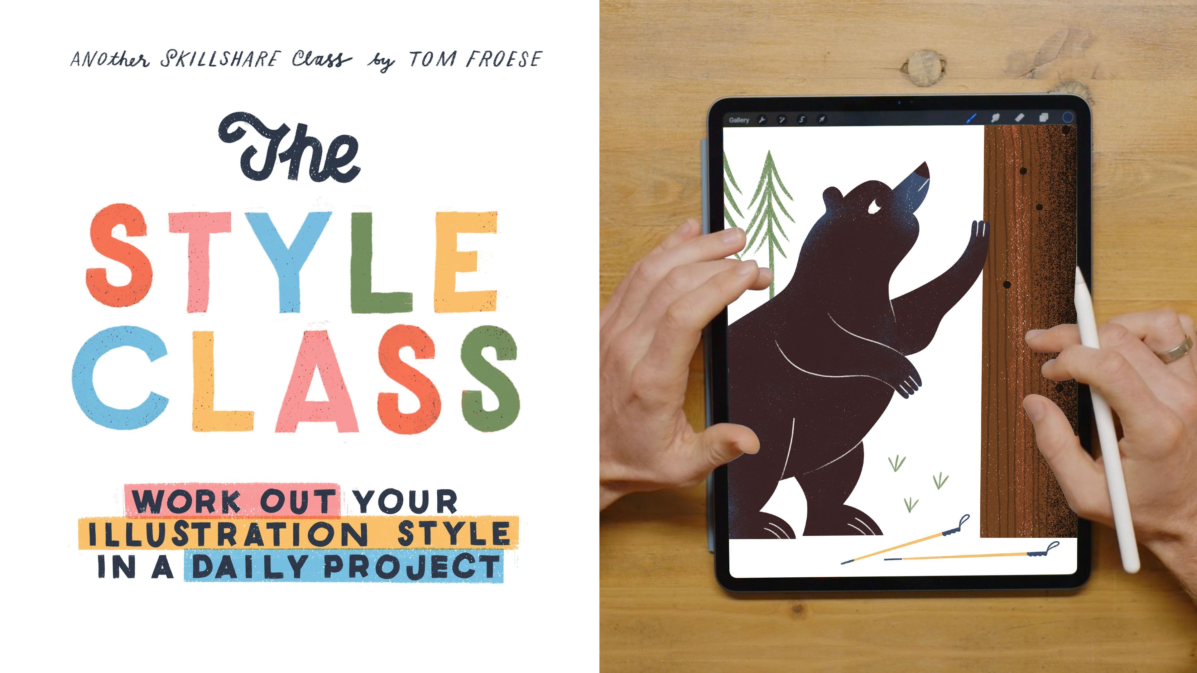
11. Final Thoughts: All right, guys. That's everything for today. I really hope you guys got a lot out of it. I hope you are able to use these techniques in your own work in new and inspiring ways moving forward. My hope is that you'll be able to take these techniques and just incorporate them into your own process. This is a point of honesty, I feel vulnerable when I share things like this because this is literally how I work and I'm letting you guys know. I'll tell you why even though I feel a little bit vulnerable, why I do that. First of all, I feel like everybody needs to start somewhere, and by someone just showing them a technique is the biggest leg-up you can get. That's what happened for me as an illustrator. I was working as an intern and somebody just showed me. A professional illustrator working for Conde Nast and the New York Times, they showed me how they did stuff and I still use those things today. I'm more than happy to share and pay it forward. But I think just as importantly, I believe in myself enough to share a technique and not feel like my career is going to be ended by people copying. If people copy what I do and I see work out there that looks exactly like what I make, that's a challenge to me to evolve. I have a whole spiel about this in the power of sharing, which is a talk that I did at Skillshare HQ. It's available as a video or a class here on Skillshare. It sounds like I'm being self-congratulatory, but really I'm saying we all have that, we all have a unique perspective and I don't think we should be too fixated on safeguarding our secret sources or our techniques because we're more than that. It's our creativity and our ability to think. That's our true value to our art and technique is just a way of being able to do that efficiently, but we should always be growing anyway. I just encourage you to play around and explore and have fun. Of course, guys, don't forget to share your projects on the projects page here in the class. That's where you get a chance for everyone to take a look at what you've done and to get feedback, of course. If you post anything on Instagram, you can tag me @mrtomfroese and I just love seeing what you guys do out in the wild and especially here on Skillshare on the class page. As deep as we went today in my Photoshop techniques, I feel like I really blazed through some other things like using the pen tool. I have a little class called Pen Tool Wizard that goes more into depth with that, just in terms of how I use pen tool to make layer masks and working with different groups and nested groups and all that kind of thing, that will walk you through that a little bit more slowly than we went through in this class. Of course, don't forget to check out the style class, my most recent class, where we take on the topic of finding your style. Thanks again so much, guys, for joining. Don't forget to check out my other classes on my Skillshare profile page, it's a growing catalog of classes and I can't wait to see what you guys do next.
 Tom Froese, Illustrator and Teacher