Transcripts
1. Intro: Coloring pages can be a really fun and meaningful way to invite people to
engage with your art, and they're relatively easy
to make once you know how. Hi, I'm Sarah Holliday. I'm an artist, illustrator, and children's book author, as well as a talk teacher
here on Skillshare. Although I love creating
colorful textured artwork, I also really enjoy
stripping back to basics and just
working with line. In this class, I'm going to guide you through
my top tips and tricks to strengthen
your line art skills while creating your
own coloring sheet. We'll start off by
warming up with some exercises to increase your confidence at
working with line, talking about line weight and style and how to achieve smooth, straight length and curves. And then we'll go straight into creating our very
own coloring page. We'll be working with
a pre made sketch. So make sure you have
a sketchbook handy filled with your own ideas, or you can also create your own sketch from
scratch for this project. I'll be using Procreate to
demonstrate this class, but you are absolutely free
to use any drawing software you like or even traditional
pen and ink on paper. By the end of this class, you'll have a lovely
finish coloring page which you can share with friends
and family and beyond, as well as hopefully
having picked up some new skills to
improve your linework. So if that all sounds good and you're ready to get inking, then I'll see you in
the first lesson.
2. Line Weight and Tangents: Before we get started on
our practical exercises, I want to just
define a couple of terms that you're going to hear me use throughout the class. Those being line
weight and tangents. Line weight just refers to how thick or thin your line is with thinner lines having
a lighter line weight and thicker lines having
a heavier line weight. You can definitely just use
one consistent line weight throughout an illustration if you want more of
an even flat look. But I personally think it's really nice to vary
your line weight, even if it's just subtle. Bear in mind that our
eyes will be drawn towards thicker lines
before thinner ones. So thicker lines can be used to highlight the most important
elements within your image, while thinner lines with
a lighter line weight can be used to add details
and background elements. We can also use line
weight to help us create a sense of depth by
using thicker lines for elements that you want
to appear closer within an image and thinner lines for elements that you want
to appear further away. You can also use thicker
lines in areas where you want to add a shadow and give
a hint of lighting, and that just adds even more
depth and form to your line drawing where we don't necessarily have color
or lighting to rely on. And the second term I want
to cover is tangents. So a tangent occurs when two or more lines or
elements overlap, touch, or interact with each
other in a confusing, unintended way that makes our image less easy
to read at a glance. We can fix tangents by moving elements either
closer together or further apart or by
redrawing the lines in a way that looks more natural and avoids weird intersections. It also helps to consider the overall silhouettes
of your shape, as well as the negative space within your scene so that you keep your elements all readable and clear within
your composition. So these are the main
aspects of line art that I always try to keep in mind when I'm working
solely with line. So I just wanted to clear
those up and define those terms before we get
into our practical exercises. So with all that
said, let's meet in the next lesson
where we can start practicing with
some line warm ups.
3. Line Warm-ups: In this lesson, we're
going to dive straight in and get started with
some line warm ups. So if you go to the
project resources, you'll be able to download this line warm ups
worksheet that I made. And you can then
import that into Procreate or whatever
software you're using, or you can even print this off to practice traditional
inking with. And the purpose of
this exercise is to practice creating different
lines and line styles, to test out using
different brushes, and generally to just gain more confidence and control
with our inking methods. So first of all,
let's select a brush. I really like to
use my own brush, which is called
Sarah's Inky liner. Which is available for free by signing up to my newsletter, which I will link in
the class description. But there are also some
really great brushes for inking and doing linework that come
with Procreate already if you're using
Procreate like me. If you're on the
classic library, you can click the
little arrow next to the library name and
select back to libraries. And if you go into the
appropriate library, here in either the pen
section or the ink section, you'll find some really
great options which you can play around with and see
which brush you like best. So before we start playing
around with the brushes, we're going to head
to our layers, and you'll see that we
have our line warmups worksheet on one layer. We're going to then add
a new layer to practice our linework on top and just use this
worksheet as a guide. So we can lower the opacity of this warm up sheet layer by just clicking on the and sliding that slider down to
somewhere around 50%. I'm just going to
rename that layer quickly and call that linework. So if we just turn off the
worksheet for a second, I will demonstrate some
of these brushes for you. So we can just play around
with some of these brushes and test out different
line weights and styles. If I press very lightly
with my pencil, you can see that gives me a much lighter and more textured line. And then if I press quite
hard with my Apple pencil, the same brush comes
out much thicker. So you can start off
the line, for example, with a soft pressure
and then press harder, and that will give you a nice variation in your line weight. Now I'm going to try
a different brush. So some brushes are more
pressure sensitive than others, so that's something
to be aware of. Some brushes will
be more controlled, and some will be smoother. Others might feel more
free flowing to work with, and some might have
quite a rough texture, which can be quite
nice to work with. And also the speed that you use your brush will affect
the line quality. So you can practice
making fast strokes versus slow strokes and
just have a scribble, have a play without any of the line warm
ups to start with, and try out some
different brushes, and you might have
your own brushes that you've purchased or you've made, and those can be really
fun to try out, as well. So once you've played with
a few different brushes, then maybe choose one or two to practice
this exercise with, or you can mix and match
brushes as we go along. So let's go back
to our layers now, and let's clear
this linework layer so we have a fresh canvas
to work with again. So make sure, again, you have the opacity of that line
warm ups layer lowered. And then I am going
to use my ink brush. I'm just searching for it
quickly in the search bar. And I already have the size that I like
preset in this brush. And then I can zoom in on
any of these lines and just start to follow along these pre made guidelines with
my Apple pencil. And to start with, I'm just
taking it slow and easy, just tracing along
the guidelines from the layer below and
getting my hand warmed up. And we're basically
practicing creating smooth lines that still feel like they have
character to them. So I think it's quite nice to create variation in your lines. You don't want them
to look too sterile, which is why I really
like this brush because you can see it's got
a little bit of texture, but it still gives us
a crisp, clean line. So with these warm
ups, we are practicing creating nice smooth
curved lines, as well as nice smooth, straight lines and just gaining confidence at creating
different types of lines. So you can try creating
a line without taking your hand off the page and
see how you feel about that. Something else you can
do to help achieve some more awkward shapes and curves is to angle the canvas, and then your arm will be at a much more natural angle to achieve some of these curves. And another good
tip for linework, especially creating
curved lines, is to try and not move
your wrist too much, but to move your
whole arm instead. And that will give
you much more control and will feel less
tight for your wrist. So try and keep
your wrist smooth and then feel that
movement from your elbow. And if you need to pause
during the middle of a line, especially if there is a change
of direction in the line, then I encourage you to go with whatever movement
feels natural for you. And for straight lines, I like to do that same thing, kind of lead from the elbow. So instead of just thinking
about the hand movement, think about the whole
forearm moving. So you can see here with
these straight lines, they are not actually
all perfectly straight, but that adds to the
character of the linework, which I think
creates more charm, and it gives more of
a hand drawn feeling, which is becoming ever
more important in art, especially in digital art, I still want to maintain a hand drawn feeling
even if it is digital, because it still
is drawn by hand. So once you've tried creating
a few controlled lines, you can also try speeding up
your lines and see how that affects your line quality and
try varying the pressure. So if I lean very
lightly on the canvas, you can see that creates
very faint and thin lines, compared to when I'm
leaning a little bit more evenly and a little
bit more heavily. And then for this row
of diagonal lines, because they're at an angle, it feels more natural for
me to twist the canvas. And then maybe this time, I can try drawing some really fast lines and see how that affects
the line quality. And occasionally
we can go back to the layers and
just toggle on and off the guidelines so that you can actually see how
your linework appears. So you don't need
to exactly copy my style and my way of
creating lines here. This worksheet is just a chance for you to practice trying out different things and trying out different brushes
and line styles. And then maybe I will
change my brush now to something from the inks
or the Pens library. Something textured
could be quite fun. So textured brushes can
be quite interesting to use because they add even
more character to the piece. And something else you could try is to zoom out and see how that affects your work
when you don't have as much area on the
canvas to work with. Remember here that
this is a warm up. There's no right way to do it. You're just trying out
things and seeing what feels good and gaining
confidence with your linework. So maybe some lines, you just want to start
off leaning really heavily or leaning
lightly and then heavily. So just playing with
the line pressure. And then maybe with
some of the lines, you want to go quite quickly and then see how
that affects the line. And you can also get a sense
for how different it feels drawing straight lines compared
to drawing curved lines. And drawing loops is quite
interesting because it's a little trickier to maintain
control over the line. So if you do feel like you mess up and you want to
try something again, just tap with two
fingers on Procreate, and that will undo
the previous line. And if you want to bring
the line back again, you can then tap
with three fingers, and that'll bring it back again. So if I want to undo that, I'll tap with two fingers, and then maybe I can
try looping again. So I'm having fun testing out
different brushes here and playing with how softly or heavily I'm leaning
on the canvas. So if you feel like it's too
awkward for your hand to finish a loop in one go,
that's totally fine. You can just take a
break where you need to and then start off
from where you left off. So I'm going to change my brush again just
to try some more out. And you can also play with
the size of your brush. So sometimes you
might want to create quite thin lines compared
to thicker lines. So you can see that
this brush I'm using now is quite textured
and is giving me quite varied and
unpredictable results compared to the brushes
I've used previously, which can also be really fun to use to create some
unexpected results. And then here I'm
practicing drawing different types of broken lines. And then next we have
some bigger curves. So if you have
really big curves, just feel free to zoom in. Maybe it feels easier for
you to pivot and again, pivoting from the
elbow can often feel much more controlled than
pivoting from the wrist, which can feel a little
bit awkward sometimes. But I think it just
takes practice, and I don't really think
about whether I'm moving my wrist or my elbow when
I'm inking or drawing, but it is just
something that you will gain more
confidence with in time. And then, even with
the smaller curves, I'm still trying to lead from the elbow to maintain
that control. So you see here I'm
moving my whole arm, which gives me much
more controlled curves compared to if I was
just moving my wrist, which feels a
little bit awkward. So, feel free to practice this exercise as many
times as you like, and just get confident
with using lines in a way that feels natural
and comfortable to you. And also, you can see that I haven't bothered about staying exactly true to the guidelines underneath because
they're just that. They're just guidelines. So you don't need to
follow them to the letter, and it can be quite nice to
veer off from them naturally because that just shows
that you're creating a line with natural
imperfections, which I think can come
across as quite charming and visually more interesting
than a perfect line. So again, I can toggle off
that line warm ups and look back at these
different lines and see all the variation
that I've created. So here I have practiced using different line weights,
different speeds, different brushes with
different textures and different types of curves, shapes, and straight lines. So feel free to practice
that as much as you like. And also, you can just
practice scribbling with all the different brushes and
see what feels good to you. So if you want to
share these warm ups in the project gallery, you can head to the
spanner symbol in the top left hand corner
and select share, and then you can share
as a JPEG or PNG. So I'll select JPEG. And then I can save the image, and that'll save to my
photo gallery on the iPad, and then I can upload that as a project to the
project gallery. Okay, so now let's move on
to the next lesson where we can choose a sketch and start
creating our coloring page.
4. Choose a Sketch: Oh Okay, so I am now going to have a
look through my sketchbook and choose a drawing
that I think would look quite nice as a coloring
page or at least use a drawing to
prompt an idea for a coloring page because
my sketchbook is usually my go to
place for ideas and scribbles that I
can then expand on. So I think that this
little scene with this character could work
quite well as a coloring page. I also have some of
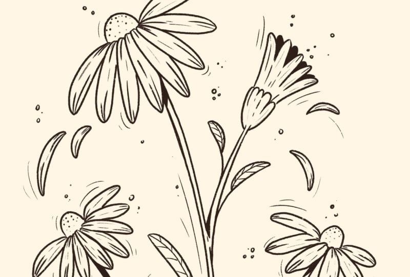
these little scenes of flowers and mushrooms that I
think could work quite well. I have some more flowers
here which I could also incorporate that are
already quite neatly lined. Something like a little
witch on a broomstick could also look really cute
or making a portion. So, have a look through
your own sketchbook, whether that's digital or
traditional. It doesn't matter. Just try and look at some
of your past ideas and see if you want to turn any of those ideas into
a coloring page. So if you want to try
out a totally new idea, that is absolutely fine. You can create something
completely new, but we're not going to focus
too much on coming up with an idea because any idea can
work for a coloring page. There can be so many different
things like something like a little cart with
flowers could be really cute or some houses. I really like drawing
flowers, obviously. Also, characters
are always great. And you can also think of
illustrating a whole scene or maybe just a character by themselves and have empty space around the rest of the page. And you can also consider how detailed you want
your piece to be. Do you want it to
be quite simple, if it's for young children, or do you want it to
be more detailed, if it's for older children
or adults who maybe want to spend more time coloring something
quite intricate. And do you want to
include characters or do you want to make your
piece into more of a scene? You could illustrate
the interior of a shop, maybe a Witch's potion shop or an elf in a toy workshop could
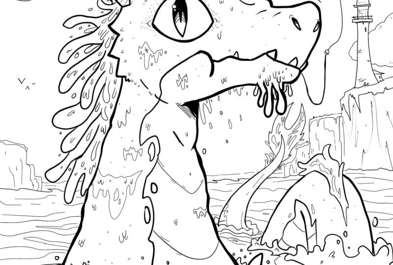
be fun for a festive idea. I also really like this dragon, which I think would translate well into a coloring
page because this shape could fit
quite nicely into the space of a portrait
orientated page. So I think I have some pretty
good ideas to choose from. So let's put this sketchbook
to the side for now, and I'm going to
start a new canvas. So I'll press the plus button. I'll probably go for A four because that is quite a
standard printing size. So whatever size you want to print your coloring page
will work just fine. So I'm going to use A four, but I'm just going to slide
to the left and click Edit, just to check that this
resolution is 300 DPI, which is what I want for printing if I want
to print this page. So if you want to print
your coloring page, make sure you have at
least 300 DPI selected. And the color profile
doesn't really matter because we're going to be
just using black and white, so I'm just going to
keep that as RGB. But if you have CMYK selected, that's totally fine as well. So then I'll select the tech to confirm and use
that A four Canvas. So I'm now going to
take some pictures of those sketches
in my sketchbook. So now I can go to
the banner icon and select Add and then
select Take a photo. And then I can take some photos directly on the
iPad in Procreate. And that is just so much quicker than scanning
anything in. Of course, if you're using a software other than Procreate, you can take photos from
your phone and import them into whatever software you're using or if you're
working on paper, you can just redraw
your sketch directly on paper at the size you
want your final piece to be. So I'm just going
to quickly take some pictures of a few
different sketches, so I'm just doing the
same thing each time, going to actions, take a photo, and then I'm going to just
take some pictures of any more sketches that I think have coloring page potential. Uh Okay, so I have taken some
photos of my sketchbook, and what I can do on each image is go to
the Magic One tool, then to hue
saturation brightness and lower the
saturation to zero. So creating a completely
grayscale image. Then I can head to the
Magic One tool again, select curves, and then
I can adjust the curves. So I'm sliding the
top node along to the left slightly to
brighten the whites, and then I'm sliding
the bottom node along to the right slightly
to darken the blacks. So we're just increasing
the contrast so that I'm left with only the linework. And then I'm going to use the selection tool,
select free hand, and then just draw the selection around the
image that I want to use. And then I can copy and
paste the selection, and that will create
a new layer called from selection with
my selected image. And with the image below, I can just slide that to the left and press delete
to keep my layers all tidy. So I'm going to do the same
thing now with a few of the other sketches and then see which one I like best to
turn into a coloring page. And I quite like any of these
flowers on this page here. So I'm, first of all, heading to hue saturation brightness, lowering the saturation,
heading to curves, increasing the contrast
between black and white. And then using the
selection tool to select any images that I want and copy and pasting
them onto a new layer. And then I'm repeating that for each image that I want
to play around with. And this is just a lot
quicker than using a scanner for me anyway, because when I'm just
playing with ideas, I don't really care
too much about the image quality because this is just going to
be the under sketch, and then we're going
to do a higher quality sketch on top. So I'm just repeating
those actions as many times as I need to. So lowering the saturation to zero, increasing the contrast, using the curves tool, and using the selection tool to select any drawings that I
particularly like. Yeah. Okay, so now you can see I have collected
my favorite drawings, each on a separate layer, and I'm just going
to move these around a little bit so I can see
what I have to work with. And I'm resizing any
of them that need it. So I actually think any of these could be quite cool ideas. I'm going to try the
dragon just by itself. So I have held
down in that layer just to isolate that layer, enlarging it to the size of the image just to
see if that works, which I think could
make quite a nice image because it does take
up the whole page, which is really nice. So let's leave that as an idea, and I'll just name
that idea one. And this little explorer
guy I really like, I think that the
only issue I have is that he's quite
small on the page, which is not too
big of a problem, but I think I would quite like there to be something
framing him and something to take
up these big bits of empty space we have
on the page here. So I've brought in a few of
these botanical elements, so I could use some of
those to frame him, which I'll just try out here. I could also surround him with some more botanical elements
like some mushrooms. And I could also, if I
just use my six B pencil, which is my favorite
sketching pencil, then I could either have this
grass as one closed shape, and that gives us a sort
of border of white space, or I could turn this into a scene that takes
up the whole page, so I could add some grass and then some other stuff
coming from the side. Obviously, I need to spend a
little bit more time making that look more detailed and
pretty, but you get the idea. And I'll just set that
layer to multiply so that I can see some of the sketches
behind coming through. And I'll just group those layers now to keep
them all organized. So that could be another idea, although I need to work
on it a little bit more. And then we have this
little witch girl, which I think could look
really, really cute. I don't think I would put any
background behind because I think that I could just add a little bit more
details to her costume, and she could be the main
focus of the coloring page. So let's leave that
as idea three, and then we have this
other witchy girl. I would definitely
shorten the broomstick, and then I feel like
the character needs to be more centered on the page. I quite like the
idea of this one, but I think the composition looks a little bit unbalanced. We might need something
like a scarf trailing behind just so that there's not a weird amount of empty space, and then maybe some
clouds surrounding the character to fill up some
of the empty space here. I don't think this is my
favorite idea of the lot, but it could have potential. So I've just drawn some
really rough clouds, and then we could
draw maybe some stars just to add a little
bit of extra detail. So that could be my fourth idea. And then we have more
botanical elements. So even something like just a flower can also
look really nice. But often I like
to add a character in just to give the scene
a bit more interest. So I could have a sort of Tumbelina esque character
going about her day, and that plays with
the sense of scale and gives more of a feeling
of wonder to the piece. So I can also try to bring in another botanical sketch and see how that works with
this little character. So I don't think this
is my favorite image. It's not really standing
out to me today, but it's good to have tried it. So we have the dragon. That could be quite
nice and simple. It's just one thing to focus on, which I think works well. So if you are struggling with creating a really
elaborate scene, try and find just one
thing to focus on, whether that's a character
or a flower or an object. And don't worry about
creating an elaborate scene, especially if you're not
comfortable with composition. Just try to center one subject
in the middle of the page. So this explorer
character is definitely a more elaborate composition because we're using
the whole page, and there are quite a lot of elements working
together here, which can definitely be
fun for a coloring page, but also has the potential
to be overwhelming. So actually, now that I've got rid of those two
bigger elements, the scene feels more
focused and cam, and I still would maybe add
somewhat of a border of grass and foliage and maybe even some little flowers
coming down the outside. But allowing there to be
some white base around the character really focuses this sketch and makes
it much stronger. So this piece is a contender. And then Ida three is my little witch girl
stirring up a portion. This one I like,
but not for today. So now I'm going to go ahead and choose a favorite out
of these ideas and get rid of the ideas I don't
like and save any ideas that I do like as a JPEG so that I can come
back to them later, as I think all of these have potential for
future development. And then I'll just quickly
edit this explorer character a bit by getting rid of those
two other botanical doodles, which I think distract
from the character. And then I'm adding more
of a botanical border. And then I'll export that
idea as a JPEG image as well. So I'm just saving all
these images as a JPEG, and then let's meet in the next lesson with
our chosen sketch to refine a bit more before we take it on
to final line art.
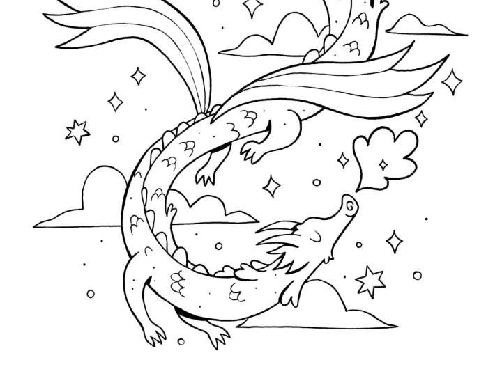
5. Refined Sketch: Si. So I have decided to go with a dragon
sketch for my final piece. So I just opened up a new
Canvas at A 4300 DPI, and I brought in
the dragon image. So I'll keep that on
the bottom layer, and then I can
start a new layer. And on this layer, we're
going to refine the sketch. So I have my idea and
my composition defined, which I'm mainly
going to stick with. But I want to expand a bit
on this sketch and define all of my details before I
start on the final linework. And that's so that when I
come to do the linework, I have all my design
decisions made, so I can purely focus on the line quality rather
than the drawing. So to begin with, I can
turn down the opacity of the original sketch
so that I can still see it and use it
to help guide me. If you have a really
neat sketch and you just want to go
straight into the linework, then do feel free
to skip this stage. But I always like to have all
of my design decisions made before I go and finalize the linework when I'm
making a coloring page. That just keeps
the whole process streamlined and much less
overwhelming for me. Also, I'm using
the six B pencil, which can be found in the sketching folder in the
classic library on Procreate. That's just my favorite
pencil to sketch with, but you can use whichever brush you prefer to sketch with here. And I'm going to just go into my sketch and start by
defining my shapes, and then I also
might change or add more details to this drawing
wherever I feel it's needed. So to begin with,
I'm just outlining the main shape of this
dragon, which I really like. And then I want to add
a lot more details and areas of interest
on top of the dragon. So I might add more details to the wings and areas like that. And if you need to go and gather more
reference to this stage, then please go ahead. I might go and look
at some references of dragons just to inspire
me and see what other people have done
with this subject now that I have this base pose
and composition. So as you can see,
I'm just defining the main outline of
the sketch before I start to add more shapes and details like the spikes
around the head area. So for the feet, I'm kind of undecided on how
I want those to look. So if I want to go and search for some inspiration for that, I can just open up Pinterest and then search for dragon and see if there are any
little details that could be quite fun to
add to my own dragon. But I'm also bearing in mind, I don't want to copy any of
these references directly. I just want to take some
inspiration from them. So I quite like the idea of adding some spiky
bits to my dragon. And then for the wings, I don't want to complicate
the wings too much because I quite like how
simple they are here. So I think I will try
to draw them first, and then I'll see if
there's anything I want to expand on with these wings. And you also want to
make sure you have enough shapes and
different areas in your image that will
be fun for people to color because if
you don't have enough, and if you just maybe
have one shape to color, it's going to get a bit boring. But if you have a lot
of different elements and different sizes of shapes, maybe some shapes are bigger
and some shapes are smaller, then it keeps things fun and interesting for the colorist. So I'm just erasing
some parts of my line if it interferes with the shape that I've added and just continuing
to add details. So if you're making a
coloring page for an adult, you might want to add
a lot more details and more shapes to color. And if you're making
a coloring page for someone of a
young age group, you'll want to add less details while still making the image
look fun and engaging. So actually, I'm not changing
the design here too much. So in a lot of these images, they've given the dragon
some claws for the feet, which I think works quite well. So I'm going to try
to incorporate that, but in my own style and try to simplify so that they work
within my overall design. And I'm trying to make
these claws look a bit more on the cute side
rather than scary. So I'm using more
rounded curves and being mindful not to make the
claws too large or spiky. So for the tail, I'm not sure
about this diamond shape. I think it could work, but I want to try some
other ideas as well. So some of these references have sort of wing effect
at the end of the tail, and some tails have a kind
of wispy thing going on, which I think looks quite cool. So now that I have looked
at plenty of references, I'm going to get rid of those references because I don't want to rely
on them too much, especially when it's
other people's art. It can be quite
easy to fall into the trap of copying
somebody else's art, especially if you think
something looks really cool and you want to
make it your own, but you don't quite
know how to do that, then it's easy to
fall into that trap. So just be mindful about putting your own spin on things and not relying too heavily
on reference. If you do want to
rely on reference, try and source
images that you can stylize, or even better. Why not use your own photos? But it's harder to do that
when it is a fantasy creature. So in that case, taking
inspiration from lots of sources instead of just
one source is my advice. So I'm going to try a sort of wispy tale and see
how that looks. And I quite like that for now. So I have defined the
overall dragon shape. I'm going to turn off
the original sketch, and then I can see how
everything's looking so far. So I think that
all works so far. And I do see some gaps which could just have a few more
details like these scales. So I'm just drawing
in a few more scales to give a more even spread of this scale pattern within the main dragon shape. And then some little
dots can also be quite nice to give the
illusion of texture. Adding either little dots or little lines to your
work can just give the linework a bit
more charm and style without actually having to do too much
work to get there. And it really gives the illusion of a lot more detail
going on here. Okay, now I am going to draw in the clouds
in the background. And I quite like how I
sketched them initially. It was a very rough sketch, but I don't really need
to change them too much. Maybe I'll just make
them a little smoother but still try to retain
some of the hand drawn quality by not worrying
about making the line super straight and encouraging
a bit of wonkiness, which just helps to retain a little bit of
hand drawn charm. And just having some elements surrounding your
main focus can be really nice to add extra atmosphere without
overwhelming the piece. And then I love sparkles, so I'm just adding some
sparkles everywhere. They were in my original sketch, and I really like how they look, so I'm definitely
keeping those in and I might add a few more clouds
just to add extra detail, just some smaller ones, and then even more
sparkles and some stars. And I think it's quite nice
to include the moon in there, as well as it gives
even more things for the colorist to
color in and adds a bit more magic to the scene. Then I'm going to add
some little extra dots and circles to add even more shininess and detail without too
much extra effort. So let's turn off
the original sketch, and I think that is
looking pretty nice. So it's a fine balance between adding simple details
but not going overboard. And I think I can even
add some more detail to the tail and maybe even define this line down
the back of the dragon. And I might try adding some little shapes coming
off of the dragon, which add a tiny
bit more interest and variation to the dragon
silhouette, as well. I think that has helped
to kind of break up the very snakelike
image and just add more interest to the
overall shape of the dragon. And maybe I'll add
a little bit of hair on the dragon's head
and see how that looks. So that gives a kind
of fluffy effect. Something else I can
do is go to actions, Canvas, and then
flip horizontal. And that just gives me a
different view of the piece. And then I can switch between my original sketch and
the new refined sketch. So you can see I
just expanded on the original sketch by adding
lots of different details. So I'm always trying
to find a balance between simplicity and interest. And I actually prefer the
original diamond shaped tail, but it was cool to try
out the other tail. I might still bring
in a tiny bit of a fancy end to the tail. So I'm trying out another
different option, which I also think works quite nicely because it looks a
little bit like a flower bud, but I do still want to incorporate that
diamond shape somehow. So I'm going to
redraw that diamond, which I think probably
works the best. And then I'm also going to
bring in another foot here, which I think works quite well. But I will maybe just use the selection to move
it over very slightly. So you want to make sure that all your shapes are
clearly defined, that there's still
interest in your piece, and that even without color, you can see what's
going on in your piece. You also want to make sure that you make use
of the whole page. That doesn't mean filling
every part of the page, but it means making
sure there are no really weird empty spaces that aren't helping
the composition. Empty spaces can be really
nice as a breathing space, but only if it's intentional. So try to make sure you use
the width of your page. And also if you need to, if you want to make a landscape
oriented illustration, that is absolutely
fine, as well, because you can just
print the page landscape. So it doesn't need to
be portrait orientation like I'm doing here. And then I'm going to
flip the moon because I want it facing in the same
direction as the dragon. And then I'm going to bring forward this arm a
little, as well. So feel free to play
with your sketch. Take your time. There's no
rush. Have fun with it. And if you find yourself
feeling overwhelmed, just try and simplify
and also try and find reference and try to keep
your subject simple. So now that I have
refined the sketch, if we go back to the
original sketch, you can see this was
a lot more messy. It would have been much
more difficult for me to create my final
linework straightaway. But now that I have
refined the sketch and defined all of my
design decisions, it's going to be much
easier for me to just trace over the lines
and focus purely on my linework than it
would have been if I was to go straight to the
final linework just from the original sketch. So now that we have the
refined sketch all defined, let's go ahead and start on our final linework
in the next lesson.
6. Final Linework: Okay, so now I'm going
to go ahead and start a new layer and I'm going
to start on my linework. So I'm keeping the original
sketch turned off completely, and I'm going to use my refined
sketch as my guide now. So I have my new layer, which I've named linework, and I'm going to lower the
opacity of my refined sketch. And then I'm going to change
the brush to my inky liner, which is my favorite
inking brush, which, as I've mentioned,
you can download for free by signing
up to my newsletter. Then you can zoom in and just do a little test first of the brush size that
you want to use. I have mine set to 1%, which is a preset size that
comes with this brush. So you can start anywhere. I'll start with the face,
but anywhere is spine, and I'm really just
tracing along the lines. And as we practiced in
the warm up session, I'm using my whole hand
to create smooth curves, and I am rotating the
canvas and zooming in so that I can create really
smooth curves and lines. I'm keeping quite an
even pressure right now. I do want to vary my pressure and line
thickness eventually, but it's up to you
how much variation you want to create
with your line weight. So I'm just outlining
my dragon to start with and taking it
easy, I'm not rushing. I am enjoying the process, and I find doing linework
can be quite relaxing, especially when all of
the design decisions have already been made, which I was doing in the previous lesson with
the refined sketch. So I actually don't have
to think too hard anymore, and I can just focus on the process of creating
nice smooth lines. And they don't need
to be 100% smooth. I still want to retain a hand
drawn quality and retain some charm while making this feel quite professional
and nice to look at. And if you want to use
a more textured brush, that is totally up
to you, as well. But I love how smooth
this brush can be. And then sometimes if
you want a thicker line, you can just go over
the line twice, and that'll give you a thicker
line without overdoing it. So you can see I'm constantly
turning the canvas so that what I'm drawing follows the natural pivot
of my hand and arm. And this wing is
a good example of the main shape having
a thicker outline. And then for these lines
inside of that main shape, I might want to
use less pressure with a lighter touch and create a thinner line so that it communicates that these lines are part of that main shape, and it creates a hierarchy of importance
between these lines. So if we turn off
the refined sketch and we compare this
wing to my other wing, this one on the left kind of looks like three
separate shapes, whereas my wing on the right looks like one main shape
with a thicker line, and then it's divided in two with the slightly
thinner lines, which I think is
much more effective. So I'm going to
erase these lines on the other wing and redraw
them with a lighter pressure. So if you want to
periodically turn on and off your refined sketch to see how your lines are looking
without any distractions, then I encourage you to do that. And then I always want to
make sure that my shapes are closed by not
leaving any gaps. You do get coloring pages
that have some gaps in them, but I think it's a
bit more confusing as to what the shape
to be colored is. So it's quite nice
to close all of the shapes that you think could be colored in a different color. And that will just
make things less confusing and less
overwhelming for the colorist. So it's very tempting
to focus on one area of the image at once and get
all the details drawn in. But I do encourage you to try to get all of the big
shapes blocked out first and then go in
with your details because then your piece will look much more
consistent overall. And you can see
that I'm focusing on my main subject first, which is, of course, the dragon, before I even touch
the background, because I want to get my
main focus right first. The background is just there to complement the focal point. So I have most of my main
shape blocked in now. There is a little bit
of inconsistency. I think the line weight
is thicker around this middle area and not so much down near the face
where I've started. So I'm just going to go along some of those
lines and thicken them slightly just to make
that more consistent and make this shape stand out
before we go in with details. And I'll thicken this tail a
little on the outside here, but not too much just slightly. And I think that looks good. So now I'm just
going to go in and add in these scales
on the dragon. And again, I'm using
a lighter touch, so just leaning
less heavily with the Apple pencil
on my iPad screen. So notice I'm not changing
the size of the brush, but just how much
pressure I'm applying. So if I turn off that
undersketch now, you can see it's subtle, but the scales are not quite as thick as the outline
of the dragon, and that's what we want because
otherwise they would take attension away from the overall
silhouette of the dragon. So I'm just going to
continue drawing in these scales using
quite a light pressure. And also, be careful to
watch out for tangents. So a tangent is when two lines meet and intersect
in a confusing way. And this is a tangent here. These scales meet at the
same intersection where the line of this foot
meets with dragon's body, and it's not really clear which line corresponds
to which shape. So I'm going to just move these scales a
little bit so that those line intersections
don't get in the way of each other
and cause confusion. And with the scale
texture, if I wanted, I could have put
this texture across the whole shape of the
dragon without any gaps. That would be quite
overwhelming to color because it would be
quite a lot of shapes. There are a lot of
coloring pages like that with really elaborate
and intricate patterns, and that is absolutely fine because some people
love coloring in something very
detailed and intricate, but that's not my style. That's a bit too
detailed for me. And I think if you're
designing a page that you want to appeal to
many different age groups, then try not to make your
design too overwhelming. Here is the main
linework for the dragon, and I'm really happy with that. Something else you can do if you want to give a
suggestion of lighting, for example, we have
these two limbs, which are on the other
side of the body. We could just add
a little bit of a shadow by adding a
thicker black line here. So you can see that it just adds a little bit more dimension
because we don't really have the option
to add shading if we want to keep our image
black and white and line only. So that just helps add
a bit more dimension and depth by only
working with line. And it can actually
be very effective. And I actually really
like how that looks. So I'm going to use
that technique in other places where I
think there should be a little bit more dimension. So, for example, these
little flaps coming off the side of the body and
also on the tail here. So that's totally optional. I think that my dragon looked
good without that effect, as well, but I do just
really like how that looks. So that is more of an
advanced technique, and just be aware of using that technique sparingly if
you are going to try it. So now I can work
on the background because I really like how
this has all come together, and I might actually
start a new layer for the background just to give
me some more flexibility, but it's not essential
to start a new layer. So again, I'm doing the
same thing with just using the refined sketch underneath as a guideline and just
following those lines. And I'm trying to
keep the weight of the line lighter than
the main subject. So I'm starting with my
biggest shapes first, and then I'll go in with
the smaller details. Okay. Okay, so if I just turn
off the under sketch now, you can see that is my
background all inked in, and I think that is going
to print really nicely, and it's going to be really
fun to color in as well. So I'm going to just make maybe a couple of last
minute adjustments. So I've just moved
this cloud very slightly to clarify
those shapes a bit more. And then I'm adding some
very tiny last details and making very
subtle adjustments to the line weight where needed. So I'm really happy with how
my dragon has turned out, and I think this is going to make a really cute
coloring page. So you can see, I've played
with the line weight. I've used thicker
and thinner lines. I've also added
some thicker lines to suggest shadows
in certain areas, and that just adds a tiny
bit of depth to the piece. And I have used thinner
lines for areas such as details and
background elements, which I want to appear
farther in the distance. And I've tried to keep
my lines quite smooth while also maintaining
a hand drawn effect. So there are subtle
imperfections, but I actually really
like the feeling of that. So if you want to
share your artwork, we can then go to Actions, Share and then select
JPEG and then save image. And that will save your image to your photo gallery on the iPad, and you can then
upload your piece to the project gallery
here on Skillshare, or you can share your
piece on social media. And then, of course, you
can print out your page and color it or you can
color it digitally. And finally, in the next lesson, I'll show you a really
quick and easy way to test how your coloring page will look when it's colored in.
7. Bonus - Colouring with the Reference Tool: This is a quick bonus lesson to show you how you can test out your coloring page by
coloring it really quickly using the reference
tool in Procreate. So I'm going to, first of all, head to my layers and then merge those two linework layers, the background and
the main character, so that everything
is on one layer. And then if you tap to the left of the layer and
select reference, you'll see that
this reference tag will appear underneath
the layer name. And then if we create
a new layer and go to our color tab and select
any color we want, we can then drag that color with your empty layer selected, and that will use
the linework layer as a reference and only insert those colors within the boundaries of those shapes
of the reference layer. And that can be a
really effective way to test your piece
without spending too much time so that you can see what your drawing looks
like when it's colored. So I will just quickly fill in all these different shapes now just with some random colors. So this can be something
really, really fun, and it's quite quick
to do as well, especially if you have a
nice color palette on hand. And just be aware this will only work if you have
properly closed each of your shapes with the
linework so that there aren't any gaps for the
color to leak out of. So there you go.
That's obviously a very quickly colored image, but that can be a
really fun way to test out your piece using
the reference tool. So that's the end of the lesson. So if you want to take this
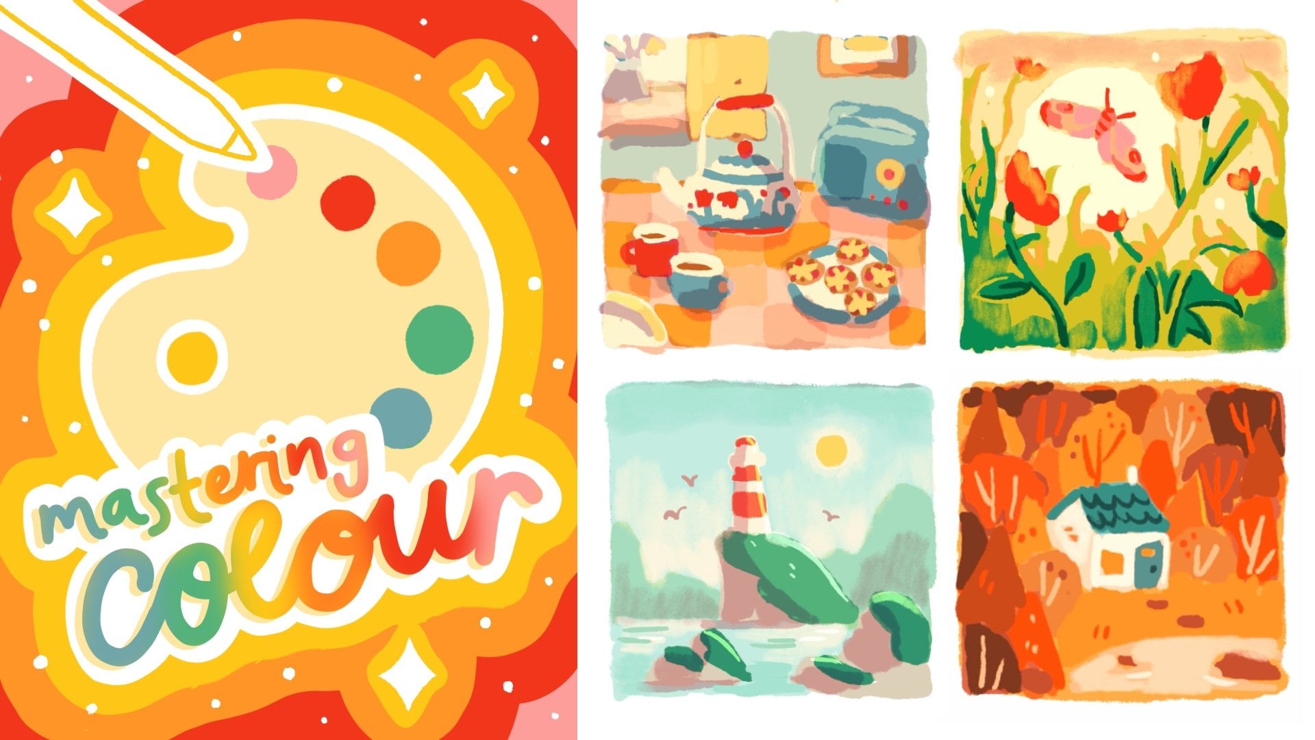
further and actually color your piece more thoughtfully and learn about color theory, then I recommend you take my very highly reviewed class Mastering
color in Procreate. You might also want
to put your name and some branding on the
corner of the page if you're giving this
away to friends or as a newsletter freebie,
but that's up to you. And, of course, please
feel free to share your work in the
project gallery below. I can't wait to
see what you make.
8. Thank You!: Thank you so much for
taking this class. I hope you've enjoyed it and
picked up a lot of tips and tricks for creating your own
coloring page Inpro Create. I always love seeing
student projects. So if you'd like to share, you can post your work in
the Project Gallery or also on Instagram where you
can tag me at Sarah Holliday. To stay updated
with new classes, you can follow me here on Skillshare on Instagram
at Sarah Holliday, and you can also sign
up to my newsletter, which I'll link in the
class description. If you enjoyed this class, I would be so grateful
if you could leave me review and help other
students know what to expect. If you want to take
your learning further, be sure to check out my other
classes here on Skillshare. I have classes about color
theory, character design, environment design,
and several more, and would love to see what you create in those classes, too. And if there's something
I haven't made a class about yet that you would
love to learn from me, then I'm always open
to suggestions. Feel free to post any ideas in the class discussion section. And if you have any questions
about this class or beyond, you can leave a post in the class discussion
section as well, and I'll get back to you
as soon as possible. Thanks again for
taking this class, and I hope to see
you again soon.
 Sarah Holliday, Illustrator