Transcripts
1. Lesson 01 Introduction and Overview: Well, hello there. I'm Alex. I'll be your instructor for this class. I have a BFA from Northern Michigan University and about 20 years of professional art experience. I've done all kinds of work, ranging from being elite studio artists in a studio to freelance work as a comic book artist, children's book illustrator, graphic design, logo design, lots of different things. But for the past seven years, I've been an art instructor, teaching a huge range of ability levels all the way from absolute beginner to college-level coursework to just professionals that want to hone their skills a little bit. So today we're gonna talk about taking your line drawings to another level. Taking your line drawings from kind of static and flat to adding value and depth and form so that your line drawings or quite a bit more dynamic and give the viewer some more visual information. Okay, so we're going to discuss quite a few techniques to do that on how to do that from hatching, crosshatching, stippling, and just the best way that they can be used. Alright, well, let's get to it.
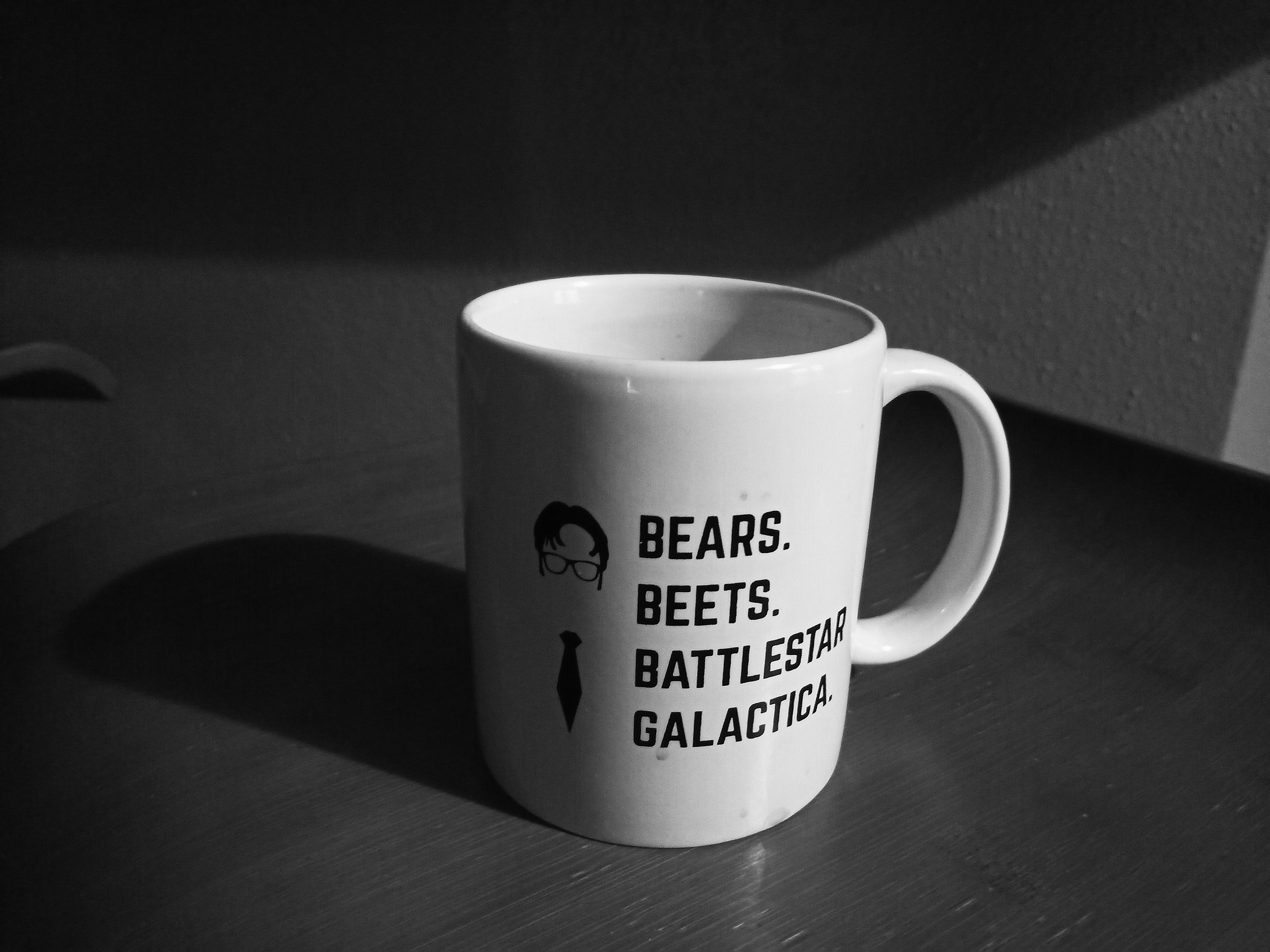
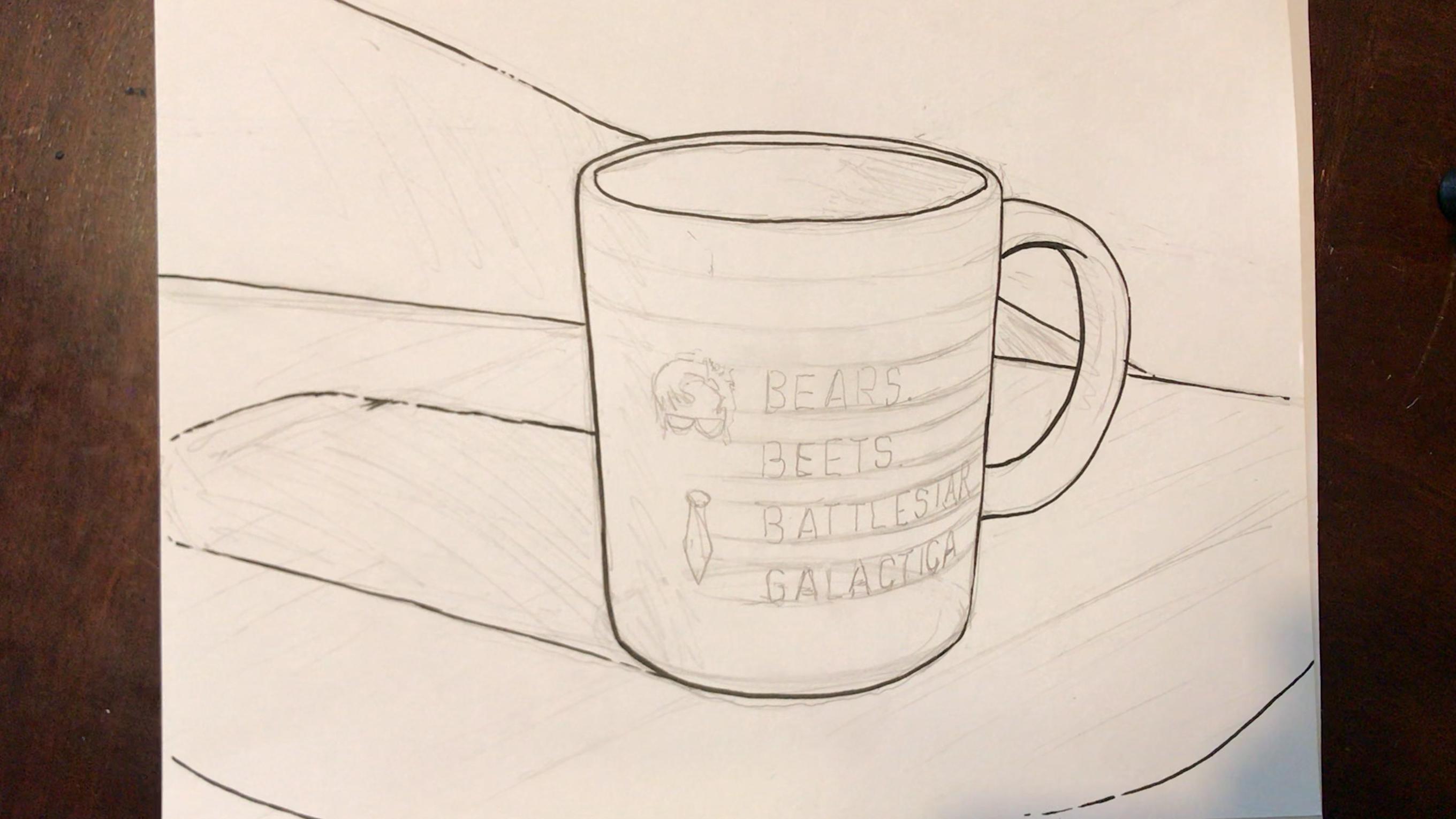
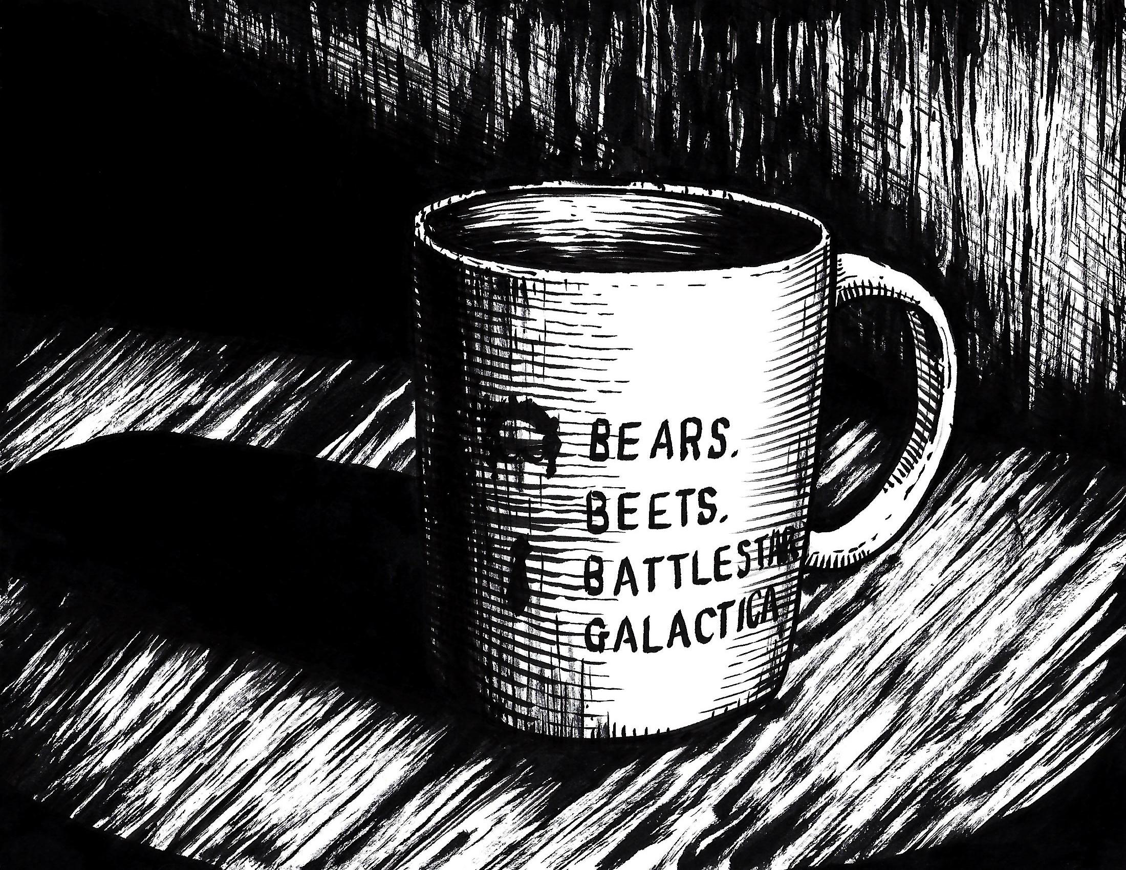
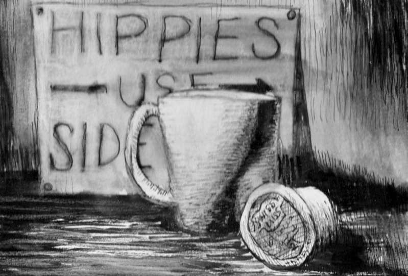
2. Lesson 02 Project Introduction: Okay guys, let's take a really quick overview of the project. So this is called the morning routine for this project, but you're gonna do, is you're going to draw an object that best represents your morning routine. So for me, that's coffee. I have to have coffee. I used the same coffee mug every single morning. That's why I pick the coffee mug that I did. I went ahead and I did a drawing that included hatching, crosshatching, some variations in line weight, all to best represent value and depth in my line drawing. So what can you choose? Well, you can choose anything you really want to as long as it's going to be something that represents your morning routine. Well, if you look in the project guidelines, it'll tell you, you know, some really good questions that might help you pick your item. Once you pick your item, you're gonna create a reference photo of the biggest takeaways from this are a single light source. If you take a look at my photo here, you can tell there's not a bunch of delight sources all over the place. There's one single light source coming in from this side. You can see the cast shadow on this other side over here, form shadow happening right through here. And then it's turned black and white. It's amazing how much difference it will make and how much easier it will be for you to pick the different values and the kinds of mid tones that you should be able to extrapolate from your reference photo as long as you have a black and white reference mode. The other thing is change up the angle, change up how much you're zoomed in, change out how far away you are. Try spinning the object around and take a bunch of different shot. A lot of times the, the shot that you've really end up using that you really like a lot is not going to be the first one night which took, once you have this reference photo, you've turned a black and white, you really like it. You're going to move on and you're going to do a pencil sketch. Now this is really hard to see, but this was a pencil sketch and I just went ahead and did a really rough, quick outline of the main contour line, my object. And then I went through an outline where the major shadows where, where all of this is going to be really heavy black once you have that and you're ready to go and move on from your pencil drawing, then you're gonna start applying all of these techniques that we're going to talk about. So you're going to have some form hatching. You might have some cross hatching. I'm going to have a variation in your line weight. If you want to use stippling, you go right ahead. You're going to create visual interests, create DEP, have your drawing me the most exciting that it can possibly get even with the mundane kind of object like that you see every more or I know a lot of times people are confused as to why, you know, I would recommend that they pick an object that can be boring. But honestly, when you're focusing on techniques and you're trying to learn new techniques, it is much easier if you're not worried about doing anything else. If you have a simple object, it's much easier to focus on the technique and not be so concerned about the drawing itself. Okay, hopefully that makes sense. Let's move on to talking about terminology.
3. Lesson 03 Terminology: Okay, so let's go over very quickly some terminology and define some terms that we're going to use throughout the lesson today, we are going to be looking at creating form. Creating form is done through the use of value. So value is just the lightness or darkness of an object. So value as a function of light, however much light your object is receiving, those areas are brighter. If it's receiving only a little bit of light, those areas or a middle tone, or if it's not receiving light at all, or it's receiving very little light than then areas in shadow. And that shadow is on top of the form itself, the object itself, then it's considered form shadow. Gradation is the slow, gradual change from dark to light or from light to dark. The areas that are receiving the most light, a highlight, areas that are receiving some that are middle tone. They're called them midtone. And then the areas that are receiving very little light reform shadow. And then if this is a smooth transition from light to dark or dark to light, that's called a gradation or gradient. And then this down here, there's areas that are not receiving light at all because they're being blocked by the form. Those are cast shadows. Now, all of this, all of these things as value and gradation work together to create depth. And depth is the illusion of three dimensions on a two-dimensional surface. Without value, it's very difficult to create convincing depth that real actual illusion of 3-dimensions, right? Without value and gradation, what you have here is a circle that looks like a circle. Whereas when you start adding these highlights, these mid tones form shadows, cast shadows. Disc circle can start to look like an actual sphere. Okay, so how do we do that in a line drawing? While there are several ways and the ways that we're going to talk about today are varying up your line weight. Line weight is just your line thickness. So if you're using varying line widths in your drawing, and that's going to be one of the ways we can suggest value hatching. Parallel lines denote a midtone area, sometimes following the forms and does not cross hatching, which is two sets of hatching that are perpendicular to each other, or stippling. And stippling is just a set of dots, are points that are really close together and they can create a gradient by slowly getting further and further apart. I know these are simple and I know you've probably heard all of these terms before. I just wanted to make sure that if you hadn't, we covered this kind of thing. So if you are an absolute beginner and you haven't seen any of these things before. Know that I'm gonna go through and explain the actual use of these terms and show you guys these techniques in action and how you'd use them in your own drone.
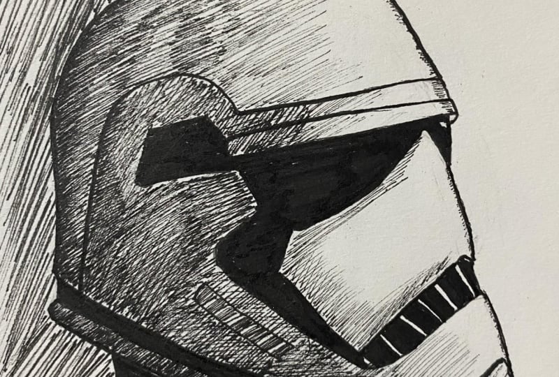
4. Lesson 04 Art Showcase of Techniques: Now I'm going to show you guys some examples of work that I did a line our line drawings that I did for October, this past October. So just some quick examples and how I used line and how you can use line. So if you take a look at this drawing, there are no real uniform lines that are all exactly the same with some of these lines back here or thicker and darker. And some of these really light lines that gives you an idea that the light source is coming from above. If you look at this area right underneath his helmet, you see this whole big area that's completely encased in midtone. And that would be done just with a bunch of hatching lines. If you notice to follow the form on a lot of these areas of hatching that kinda break up. So you get a little bit more of a highlight right here, but, but these lines follow the form. So you get an idea that some of these areas are rounded and especially like right here, some of these areas around it, some of these areas are more flat, like this area back here. But it still gives you the idea that this is a midtone. Whereas a lot of these areas are really bright like they would be highlight, or that some of these shadows are not completely black. They have areas of midtone right outside the shadow. The shadow kind of fades instead of just being a harsh black shadow. And then right back in here you have some areas that are just completely midtone as a shadowed area and it kind of fades back in. So you can get the the idea that this is part of his arm and it's a little bit more of a rounded area. Okay. So there's another good example. This one has a little bit less hatching, but the hatching does follow the form. Especially like if you look down here, this blanket, whatever this is supposed to be, was a blanket whenever I had a reference of it. Or if you look in his handkerchief, you can tell that it doesn't just go completely flat. It does go from dark to light with the hatching lines and they're following the form of his handkerchief. Some of these areas are really just shadow. And the shadow itself has a transitional area from this light area to the shadow area that's really dark. And then the hatching just gives you an idea and it kinda rounds. So you can see really where the folds of his clothing, you know, shirt, those folds are actually starting to roll over and abandoned. And everything doesn't just look as flat. As opposed to something like this. The area of this face where are the brim has had as a obscuring the light. All of that is in Midtown. Another good thing to point out really quickly is these are really thick lines and the lines on the figure or a lot thicker everywhere, you know, these lines around are much thicker. And this line in the lines in the background, or these lines back here where the clouds are. That gives you atmospheric perspective. And if you don't know what atmospheric perspective is, it's just the thought that Things that are further and further away from you, something gets the less contrast and the less detail. And really the last saturation in color that you're going to see in those objects. So these things have a lot less detail than something that's really close. The figures are really close, so he has a lot more detail contrast. Then these clouds in the background that are really just very, very thin lines. So with your line weight variation, you can really start to get depth just by changing up the thickness of the line from something that's way back here, or something that's more in the middle ground, or something that's in the foreground like them. The figure is here. Alright, really quickly. Here's another example of that atmospheric perspective. It's probably a little bit easier to see in something like this. So the foreground has a ton of contrast and some really thick lines and some really dark areas. Then as it starts to fade back into the distance, you know, all of these little mountain, the areas that are pretty close to the viewer there more in the middle ground. They have a bunch of medium lines. They have a little bit of contrast as it starts to fade into the distance. This little mountain or hill has a little bit than our lines than, than this one. Then this one that's much further in the background. The lines are really thin and there's a lot less detail. So really when you look, you know, this mountain, this mountain, this been there's not a lot of hatching or anything else going on other than just thinning the lines as it goes back into space. And you get a good amount of depth, literally just from doing that. Alright, and then I have to throw in a Star Wars wind just because I'm such Star Wars fan, you know, Adam will act bar. I went ahead and included this one just because this is almost completely done with no hatching line weight variation, just a, a huge amount of differences in the thickness of the line gives you the idea that light sources coming from this side. You're getting some of the folds underneath is his journals and things going on right here. You're seeing that there's heavy shadow. There's just a slight bit of fade from that shadow in, but you're really getting a good idea about how his his scan is. Just fold it over on itself a bunch of different times and you get a little bit of formatting right in here. So you get the idea that this is more rounded or that follows this direction. Same sort of thing. Excellent. And last one. So this is almost all exclusively hatching and crosshatching. But you can really get an idea about where this light source is coming from because of all of these little tiny hatching lines going on in the phase here. So let's see. This side of his face is heavily in shadow, but you can still see they're darker areas, they're lighter areas, lighter midtone areas. The side of his nose is casting a shadow, but it's not a heavy shadow. It's more of a midtone brow lines casting shadow into his eye sockets. You know, some of this area of hair back here is heavier shadow, then some of the areas of hair appear. Really kind of get an idea about what's going on with the texture of this firm that he has draped on his shoulders. And you can see the light source coming in hitting here, still having a few areas that are getting cast shadows. Still having a few over here, they're getting cast shadows. But you can really see the difference between some of these heavily shadowed areas, some of these lightly shadowed areas, all hatching and you know, just really thin hatching, taking your time to figure out where it is, you want to place those midtown. Some of this is done completely as just a, a base tone, a base value. Alright, hopefully you guys kinda, kinda understand that. I just wanted to show you a few examples.
5. Lesson 05 Materials Information: Okay, let's talk about materials. So really quickly. I just wanted to give you guys kind of a little bit of a warning here. So if you go to the art supply store and you want to, you want to buy drawing supports. Make sure that you're checking. Because I had a lot of students throughout the year, especially very beginner students. They don't pay attention a lot of times to what it is that they're buying. So something like this as a sketchbook, you know, this thing is wonderful. But only for dry media, right? So if you were to try to draw on some of these pages in ink, the ink is going to bleed all over the place, going to really annoy you when you get to the point where you're trying to draw and you're drawing really beautiful lines and through no fault of your own, you will. Lines are bleeding all over the place. So save herself the headache. If you're gonna buy a sketch book, make sure it's specifically designed for wet media or for all media. If you don't have a sketchbook, you guys use something like this. This is just printer paper. It has a nice smooth surface. It takes ink really well. And you know, it doesn't bleed a lot. It's fine. If you want to upgrade it just a little bit. This is burst. The more good a bit thicker. Takes ANC really beautifully. You can use Bristol board for anything from drawing, ink, drawing, even some light painting because it's got a little bit of have to, it's a little bit thicker. It comes in a variety of sizes. And you combine them, pads you can ride and blocks, you know, like this is overstep more PAD $16, I think I got it at the big art supply store, 11 by 17 and some really nice surface, really nice surface to work on. Okay. I'm just going to use one of these sheets. So you just have regular black ink pens or ballpoint pens. Give you a decent line quality, consistent. Can you use that? Absolutely. There's all you got to work with what you got. You might have some of this kinda thing laying around. You might have thin sharpie, thick Sharpie, regular marker, give him all ago and and just see what kind of line you get. Sharpies agood option. You have a couple of those later on. They work as well. Now if you're going to the art supply store, you options that you might have. These are called microns. Well, these are, these are no name knockoffs, but same sort of, same sort of pen. This is an actual micron. So what this gives you the advantage that this gives you is it gives you one nice, solid line quality. Now they come in to a lot of different thicknesses from the one I just showed you to this kind of thin line or even a much thinner line. They give you even solid uniform lines at all times. Now, is that a good thing or a bad thing? Well, you know, for some areas of redrawing that might be a great thing. Like I might use this if I'm drawing details or if I have an area of hatching that I want to be exactly the same line quality and line thickness all the way through. But for the most part, this kind of line being so uniform and mechanical looking doesn't give you that organic feel. Just because there's no variation at all over the course of an entire drawing starts to look boring, starts to be less visually interesting. Other good option or pens like these, these are brush tip pens. I think this is made by a company called Tambo. They haven't brushed tip, brush tip, kinda nib. If you do a tiny bit of pressure, you can get a really fine line. If you put a significant amount of pressure, you get a really thick line. Or if you vary the pressure, you can go from thick to thin. Just like that. That works really well for hatching. And with a lot of times, you're going to want to go from thick to thin. If you had something like the micron pen, can you do it? Absolutely. You just have to sit here and go over the surface with that pen until you end up getting the same kind of quality. Well, that took me ten strokes to do. This took me one stroke to do. But the same result. Well, you know, over the course of a drawing that's has a 1000 of these strokes. You know, you're really, really speeding up the process. If you have a pen like this and you can control it. Our other option, same me, same basic idea. This is another brush tip pen, but this is much softer and much thicker at one end and much thinner at the other end. So I can do a really, really, really thin line with a tiny bit a pressure, or I can do a super thick line. And it gives you the most change in line quality in line thickness. But it's also the trade-off for that is, this is a whole lot harder to control. Your other option. Last option then I'm gonna go through, there are plenty of other ways to applying to the surface, but bottle of India ink, pit brush. This can do all of the same things that these other pens can do. Differences. It's messier, it's harder to control is probably the hardest thing to control is the brush. But basic level course. I would go buy a pack of combos if, if you're going to the art supply store, buy yourself a couple of these little better Bristol board. And you're set.
6. Lesson 06 Value Scales Walkthrough: Okay, so let's talk about how you're going to use Agile. What you're trying to do is create different values, right? Or a gradient from dark to light. So, so this is a value scale or a set of value scales. Value scale is just an area that shows a transition from the darkest value that you can possibly make to the white of the paper normally are all white in general. So if you look at this upper example here, and I did just a couple of minutes ago. These are all the same width line, but they go from really, really close together, touching even to create a black area. And then slowly they get further and further apart as it goes down this rectangle. So you can see that if you can get a transition from dark to light pretty easily, this one, this hatching number two, is just what would happen if you started out with thicker lines and you kind of have them pretty similar distance part but but you're going from thick to thin line. And then you can do a combination of the two like this third one, which is it goes from, from thick to then and also gets further away pretty quickly. So you can have a, a transition that happens really, really quickly. Transition that is sort of in the middle. And then you have a transition that happens really slowly. And that all just depends on what it is that you're trying to accomplish. If you want a larger area of midtone between your shadow and your highlight, or if you want a really quick transition, like something that just has an area from shadow that you need a, a softer transition back to the light area of the figure. You can use cross-matching as well. I just have these, these hatching lines that slowly fade and get further apart from each other. And then another set that do exactly the same thing. And you can see that you can get even more of a smooth gradation as you're going from dark to light, the more lines that you use. And then this last one is just stippling. So you're using dots, whether they're, you know, ton of dots and a small location like a whole lot of dots so that it ends up looking black. Or as you can, as you can see, it just slowly fades to where there's less dots and further and further apart as it goes down the list here, it goes down the line and you end up with no dots. So you still have that transition from dark to light. And it just depends on how many dots you want to put in, how smooth you want that transition of B would just be how slowly you go from, you know, a massive amount of dots to smaller, smaller, smaller, and as it goes down the list and further and further apart. All right.
7. Lesson 07 Techniques Walkthrough: Let's talk about how do you create value in a line drawing, all you have is an implement that gives you black or you have the white of the paper. So seemingly you only have the option of black or the white of the paper. Well, that's not really the case. You can have a whole lot of different values and gradients even in your liner. So what do I mean by that? Well, if you end up, if you have a, a drawing like this cube, let's say I'm going to draw a really quick little cube. Okay? So I have this cube. Now, there's a little bit of variation because I use a brush tip pen, but for the most part, I can't tell where there's more, there's going to be shadows. I can't set where light sources coming from. I don't know anything about the texture of this cube. Just looks like flat surfaces. And then I'm gonna go ahead and draw in a plane here so that it looks like it's kind of sitting on top of something. First thing I would do with something like this as you want to vary your line weight. So what does that mean? That means you want to have thicker than our lines. You want to have a huge variety of those anytime that you're, you're working. So first thing I need to determine as my light source. So I'm gonna go ahead and say light is coming in from this upper surface from way up here, you know, more of a spotlight. So let's just pretend like that's a let's just pretend that that's a well drawn lamp here. You know, it's a really a terribly drawn or lamp, but we're pretending, right? Okay. So light's coming in from above. It's going to hit this surface. This is going to be in heavy shadow. And this is going to be kind of a midtone. So first thing I'll do is there's gonna be a cast shadow somewhere down here. Let's say that that's absolutely perfectly from that side. So this cast shadow, it's going to be really, really dark. The darkest thing in your entire image. The dark is value that you have been. Okay? So now that you have a cast shadow, you have more information. Well, this line, this line, and this line should be much heavier, right? Thicker the line. Denote shadow. That would make this line. And this line, this line, just a little bit more thick. Now you have a really thin line on top, medium thickness on this midtone and really thick on the area that's heavily shadowed. Line weight variation can do a whole lot. Having cast shadows can do a whole lot. It can indicate to the viewer where those shadows are being cast and where that light is coming from. But it doesn't really give you a full visualization of the type of texture, how heavily those areas are shadowed. For that, you're going to need something like either stippling, crosshatching are hatching. Let's go ahead and start with hatching. I'm gonna go ahead and do a really quick take all these straight parallel lines. And we're going to cover this entire section in the bag. So that gives an indication that that's darker. So now I'm gonna go through, and I'm gonna do, this is a midtone. Well, now that I have all of those parallel lines in there, now you're looking at and you're like, well, this looks the same as this, right? So now you can see that this is lighter. These are both midtone and that's a really dark shadow. Ery, well, what can we do then? We can either have this be thinner lines or we can have these lines be much thicker or closer together. Or a combination of the two. To give you the idea that this area is darker. And I'm just doing this really quite thoroughly fast and I don't have my glasses on. But regardless, you can tell now that now you have four values, right? You have a highlight, you have a midtone. Yeah, my shadow. And then you have a cast shadow that's if you vary up the thickness of your line, this thick lines closer together, that looks much darker than thin lines. At the same distance apart. You could have a middle that's not so thick and not, are not so close together. That still looks darker, that that's a middle tone. And then you can have if you have a really light area, but it's still kinda gray. You do the same thing just within our lines. Okay. I think you kinda understand that your other option in terms of this would be you can come through and do crosshatching. So you're just gonna go and have parallel lines going the opposite direction, perpendicular to your original. And that gives a really dark area. Alright. So now let's talk about how you would show the form in a drawing and with hatching. So what I'm gonna do just really quickly, you know, if you guys haven't done anything similar to this, if you take your knuckle and a lot of people, you know, students would always tell me, I don't have a comp is I don't have a compass. You don't really need a compass. You can just take that knuckle, place it on the paper, hold your pen in one position, and spin your paper. Be very careful, takes a little bit of practice. And you can get a really nice circle that way. I mean, that's not perfect, but you get the idea. I'm actually going to draw it this way so that I can use that. Alright. So I'm gonna go ahead and drop plane so that it has something that it's sitting on. And we're gonna say that that's actually a sphere. I'm going to make a cast shadow. I'm going to fill that in. So now we have gas shadow, which denotes that the light is coming again from this direction. So from there, I'm going to say the darkest area of this sphere would be somewhere like that. Right? This area is going to all be midtone. And then this is gonna kinda be highlighted. So if I'm going to use hatching, but I want it to still continue to show the viewer what the form, what I would do is I will take this same. First thing I'm gonna do is come in here. And it's not completely black, but it's very dark. I'm gonna go ahead and, and fill this in, leaving a few little flecks of the light coming forward. Showing through, I should say. Alright. So it's very dark, not quite black, but very dark. And then what I'll do is I'm gonna go ahead and start going thick to thin with ageing. Following the form of this feeder, where it's going to be curved outward. The ED is right here. It kinda looks like it would be flat. But that's just because it's facing you. And you'll notice I'm going all the way through my heavy shadow, kind of giving the moving my hand around a little bit, shaking it so that it gives me a little bit of variation, more organic texture to the line. That's just my preference. You don't have to do that. And I'm starting to do curves again because that's where the sphere starts to curve again. So now I'm getting a really good idea about where the highlight is hitting. Light, hitting right in that area. Actually pull these a little bit closer to the top. Like that, really thin. All this a little bit closer to the top. But really then dark in that layer and a little bit more. Okay? So we have lines following the form of this fear going thick to thin. So now we have shadow, cast shadow, we have formed shadow, and then we have a midtone areas. Now, to me, I think it needs more of a gradient going from this form shadow into this midtone areas. So how would we do that? I would do that with crosshatching. So I would take my pen and I would say, well, I went this way with this set of hatching. I'm gonna go ahead and follow the form again with the rest of this hatching, this cross hatching, but just go the opposite direction. So these are also gonna go thick to thin and follow the form. So at the bottom they're thicker and as they come up, become more and more thin. And I'm still following what I think is the form of the sphere. And you can always add more lines so you don't have to worry about not putting in enough. Some of these are kind of falling apart, becoming. Dotted and dashed, and that's okay. That kind of gives you an even more of an indication of what's happening. And I'm going to try and make this perfect. I'm just, this gives you a really good indication of how where the highlight hits. As it comes down here, it begins to get received less light, so it gets a little bit darker and more midtone. And then it starts to get really dark. And then this is the dark is that it is. And then the gas shadow is receiving no light at all. So it's really dark. Black is that you have that makes sense, hopefully that makes sense to you. Now, this works for any curved surface. So if you were doing a cylinder, darker on here, so say light was coming from this way. All you're doing is following the surface and it gives you that curve. And then you can come through down here, go across the form, and there you go. So much more information that you're giving the viewer about the surface that you're trying to draw. If you're able to follow the form whenever you're doing your hatching. Okay. Because honestly, if you had a circle or you had a sphere that you were going to draw. And you did a cast shadow. And you didn't follow the form with your hatching. Even if you have crosshatching, does it work? Well to a certain extent, it kinda does. It gives you the information of where the light source is coming from. But it does tend to flatten out. So it becomes, it looks more like a circle, then like a sphere. This is far more spherical than this. This tends to flatten out your drawing. Now that maybe you're going for it. And it'll sometimes people really want that. But a lot of times you're not doing that on purpose. You're just flattening it out without realizing that you're flattening it out. Let's go back to our cube. Let's say we have this nice pretty cube or this moderately terribly wrong Q, one R. We have cast shadow. This is the darkest area and that's going to happen. This is completely black. We can all just pretend that this is completely black. Okay? So light source coming from here. So you're going to want to do the same thing. You're going to have really heavy, thicker lines, medium lines, and then thinner lines. And pretend that that's happened. And you had very lively. So if you were going to come through and take and do stippling, you're just gonna take dots closer together. You put them, the darker, the mid tone that you're creating will be further apart. You put them in the smaller the dots. Well, the opposite, you end up with a lighter tone. They used to use this in newspapers. Have to own pattern that used to use this in comic books. Have don't patterns. It's really, really effective. And come back over here and we just do further apart or smaller dots or both. And this will give you a really good idea about the value structure that you're dealing with. Okay? So now you can tell is darker than this. This gives you those same four values. So cast shadow, form, shadow, midtone, I lie.
8. Lesson 08 Project Completion and Recap: Okay. So I wanted to leave you guys with a sped-up version of me finishing up the project that you guys are going to also work on. So after I have my line, my contour drawing, I just went ahead and follow the lines around the outside of the object. You're just a simple line drawing. And I darkened in all of my cast shadows. You're using one of those pens that I showed you guys earlier. So it takes a little bit of time and had quite a lot of ink to fill in this much surface, completely black. But after that, I went through and I the side of my, my brush tip pen and I started adding a little bit of texture. I wanted to make everything look like it was wood texture, wood grain. And then I started adding in a lot of small lines and a lot of line variation so that you could see some hatching in the background, all very flat, all very parallel. And then started with the form shadows. And the the form hatching on the side of the cup that a little bit across hatching here and there. And then added in some, some lines following the form and the cup itself and the handle of the cup also. And then just thickened up some of my my lettering and and there we are. And this is a little bit more than I would ever do in a real drawing. It's a little bit chaotic to me, but I did want to show you guys all the techniques so you can pick and choose from whichever ones you like. And you can see that I did the project as well. Alright, so I hope you enjoyed this lesson. If you have any questions, comments, concerns, leaving for me, I'll happily addressing. Other than that, I can't wait to see your projects. I'm going to go in and make sure that a comment on each one individually post them. I know it might be daunting at first when you're first starting to learn art. But you guys can do this. Just take your time, enjoy yourself. That is the goal. To enjoy yourself. Get a little bit better each time. That's really all you have to do. Alright, thank you very much. Hope to see you next time.
 Alexander Viguerie, Illustrator/ Designer/ Instructor