Transcripts
1. Intro: Hey guys, my name is
alpha-beta and I'm a full-time one
line Illustrator. I also happen to be an
absolute animal lover. I've owned pets all my life
and I say pads because they have ranged from Cute puppies
all the way to Toronto us. As a one-line Illustrator, you can probably
imagine how much I love doing illustrations
of animals as well. Fortunately for me, pet illustration
commissions are one of the most frequent commissions I get on my day-to-day work. When doing this commissions, I've had to play around
with different brush types. One line art
techniques and tricks depending on what result
I need to achieve. Animals come in all
shapes and sizes. Some are rough textures, some are smooth, and other
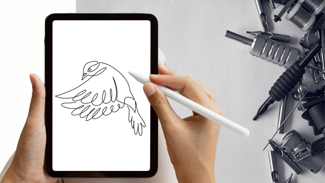
ones are spiky or even Harry. In this class, I will be using the app
Procreate to teach you how I approach drawing all
sorts of different animals. I will get really specific about the process I go
through when drawing certain types of appearances and textures and what brushes
go best with each one. We're going to get started with the key details to consider when looking at a
reference photo. The decisions you have to make before you even start drawing. Then as an exercise, we will learn how to draw the five most common
types of house pets. Dogs, cats, fish,
birds, and bunnies. Hopefully by the
end of this class, you'll come out with not only better one line art skills that help you decode any
animal you want to try. But also leaving you with a nice library of animal
related tricks and tips for you to come to
whenever you're feeling stuck. Thanks for joining my class
and let's get right to it.
2. Project: For the first part of
our class project, we will produce 51
line illustrations. Each illustration, we'll explore the particularities of five
different animal types. We will start with dogs and how to choose a good
reference photo, what brushes to use
based on their fur, and how to approach
drawing their snout. Then we will move on to
cats and how to draw the cat ears when cats are very versus when
they have short hair. We will then move on to fish and how to draw eyes that
stick out over the head, like in the case of
a goldfish versus the eyes that are part
of the head structure. Next, we will look at different
kinds of birds and beaks, and with it explore color
added to one line art. Finally, we will
explore bunnies, emotion versus their
fluffy chubby stamps. This class structure will
be a little different than all my other classes
because since all animals, animals are different,
I want to continue adding animal lessons to
the class as time goes by. To make it fun though, I will only add animals
suggested by people who have taken the course and share a project
with the rest of us. If you want me to
adolescent teaching how to approach a cow,
one-line drawings, e.g. Take this lesson, share
one or all your tries with the animals that are
already in the course and suggest your own
for me to record next. The project is made so
that both beginners and intermediate can take advantage of this
class to the fullest. Before you get started
with the class, make sure you have the app Procreate and hand
with the latest update. So procreate
five-point to download the images we will be working with from
the class materials. And let's get started.
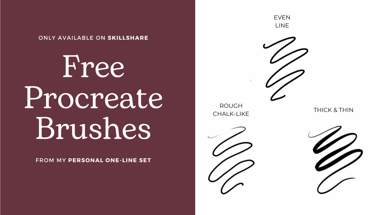
3. To consider: Consider these three items
before you start drawing. Number one, how good is
your reference photo? Choosing the right
reference photo can make or break your
one-line drawing. Choosing a photo with little
to no depth will make it harder to draw details
like fur or whiskers. Choosing photos in
which your animals are on their profile or
slightly tilted to the side is a foolproof way of setting yourself up for one-line
animals success. Number two, your brush, good for your purpose. Is your animal's soft, is it puffy or spiky? Your brush will help you
give texture to your animal. Choose a brush that
will let you convey the animal's texture in the
most fitting way possible. Number three, which lines will prove to be the
most challenging? If you have tried one
line art already, you know that it can get
really crowded with lines. Really quickly. Plan your line route
visually before you start. You don't have to stick
to a religiously but visualizing what do you
imagine your lines will go, will help you approach the drawing with more
preparation and planning. As long as you have
those three items down, we can get started with
our first animal, the DOM.
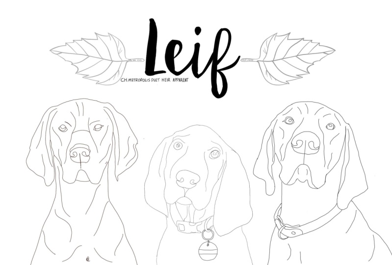
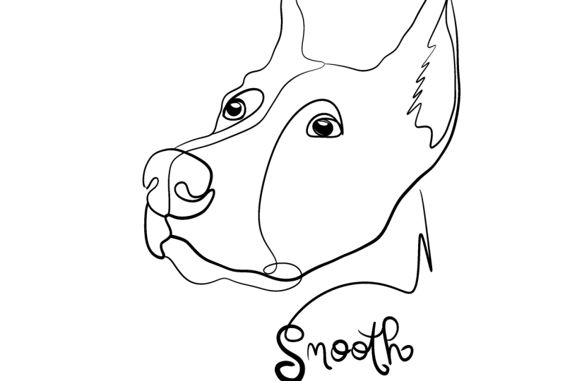
4. Dogs: Alright guys, so let's get
started with the dogs. First of all, I opened
my Procreate app, open a blank document, and I am going to insert
our first dark photo. So remember that
all the photos are available in the
materials section. In this section, materials
for the lesson for the class. As you can see, I
already have my dog. Can I want to explain
why this photo, this reference photo
is a good photo first. First of all, I'm going to
open a new a new layer. And I'm going to
explain which things, which parts make this a
good reference photo. So first of all, the snout
is outside of the body. And by this, I mean that you
can see there's a good chunk of the phases snout that is that is not
on top of the body. As opposed to a photo
from a front facing dog, where the snout will be
connected to their next somehow. The farther the
snout is from the, from the body, the better. So you have this
lines to work with. You have this lines
to work with. Again, you have this
lines to work with. So there's a lot of
nice lines here. Also. I left I think this
is a Doberman. Correct me if I'm
wrong, but I love this dog because of
the ears pointing out, again, there's a lot of
contour to work with. As you can see, there's a lot of contour on this side too. So this dog has a very nice, very nice profile to work with. And it's just the
position that helps you draw it on the Draw the dog the easiest way possible
if you know what I mean. So let's get right to it. Remember, photos facing
towards the side on full profile or three-fourths
profile are great. So I'm going to
open a new layer. I'm going to make the
transparency quite low, end up going to choose my brush. Now, this is another
important fact. Choosing a brush is really important because you want to work with that texture. As you can see, this dog's hair, this takfir is very
short and smooth. You can see the shine
almost through it. So I'm gonna go ahead
and use my brush. Well, not my zero. I'm going to use my version. So my brushes, so my
version of the zero brush. And if you don't know what
brushes best for you, I recommend that you check out my course here on
Skillshare, on brushes. Alright, let's get started. I would begin no, sorry. Here. Yes. I want it to be a
black line. Of course. I would begin with the neck. And you can see that here, there's a little fuss. I'm just going to zoom in. There's little foss
of the ducts for, and I want to imitate
that too with this brush. One of the things
I liked the most about drawing animals is that the animals don't
have to be as realistic. They don't have to be absolutely perfect because I
think they look even cuter when they are when they are when they look a
little bit caricature, they look a little
bit like a cartoon. So I'm gonna go here. Remember that you want the
lines that are less important, at least in this tile. The lines that are
less important to be thinner than the lines
that are very similar, that are very important, and the same with the
depth of the drawing. So this year is quite marked. I marked it pretty
significantly. And then, but then this one is gonna be quite with a thin line because I want it
to be farther away, less significant,
less visual visible. So I'm going to just
make sure that it's a thinner line than the one
I did on the other side. So he has some cute eyelashes. They're more like eyelashes,
more like eyebrows. Okay. So here we go, Mr. snout. Make sure that's now it's
nice and pronounced. I love drawing snouts
is like little hearts. Okay. Now I'm gonna go into
the detail of the face. And this has to be done in
a way that's not so much. So I would do my lines. I'll be careful
not to do them too thick because they can
take over the face. If we don't if we don't
do them carefully, if we don't do them thin. Okay. I think this is too smooth. There's some hair texture here. I'm gonna go ahead
and erase that. This is too smooth.
I want to do. As you guys can see, I'm
going to zoom in here. There's some like
hair texture here. And then there's just
some like hair texture here for the eyebrow. And as you can see,
it's so smooth here. It's nice and smooth, but I want to Alright, let's see how that came out. Guys, ready for the reveal? Here we go. It looks like a girl. I feel like my lines around the eyes are way too
dark and make the dog, otherwise very masculine,
look a little feminine. So I'm gonna go back here
and redo the I know. Then I'm gonna go back
here and redo the i2. Just going to fix this line. And I'm gonna go back here. So I want these lines
to be a similar. Okay, So here we go. We have one, the other one going to do that one again. Okay. So as you can see, it's a bit more
masculine, but then I discovered another problem. Here. There are some obvious
lines I'm not following, so I'm missing lines here. And I'm missing lines here. Which means I have to go
back in here to my line. And I would go here, e.g. break this line, union here. And no, too big. Here we go. Let's see how this looks now. I like him. Make his eyes a little dark. I like to do the I feeling
on a separate layer just because I'm gonna go here. Here. I'm going to respect those white reflections, those bits of light
on the dog's eyes. Because they make the dog
look just more realistic. Doesn't make it look like they have just no
life in their eyes. Oh, there you go. Okay. So we have our first dog. He's Mr. smooth, and he's done. Another thing I noticed is
that his whiskers and not as as long as they are
on the example photo. He looks a bit more like a cat. So I'm just gonna go
there before I move on. Sorry guys, I'm a bit too
much of a perfectionist. I don't want to go
on to their layer. And I'm going to see if
you guys noticed this whiskers are facing down
and they're quite small. So I want to make sure they're quite
short is what I meant. I'm wanna make sure that
they not, not so long. So we'll make this three
and this one in this one, I'm going to go
back into the lungs and back to my eraser. And they're too much just to make sure that the
tapering is more natural. Okay. I think I'm more
satisfied as it is. Now. We have a first dog for some reason this line erased.
Just going to fix it. Alright, That's our smooth dog. Now how would I
approach a fluffy dog? Let's get this, this
beautiful golden retriever. I'm going to turn
off these layers just for a bit and
I'm gonna make Mr. Golden Retriever here. So much fluff, so
much beautifulness. So much Matt, just
majestic mess. So when dogs are so
hairy like this one, you do want to have
brush that can help you with very thin lines and
very smooth looking lines. So this is not a fluffy dog, is just a long-haired dog. The lines are still very smooth. There's a lot of nice curves. There's a lot of fluff in
general, lots of hair. So I'm going to opt
for the same brush, but I'm going to be doing
lines that are more curved and longer as
opposed to spiky, short ones like we did
on the last drawing. I'm going to again create a new layer and
make my second dog. Make my second dog
a bit transparent. Guys, if you notice with
this reference photo, the dog's snout is very
close to the body. I'm gonna go back to my if you guys noticed this
notice in the front is here and that's directly
on top of the body. It's not on the side. I want it to do this
version to show you what the difficult
version would look like. I don't recommend that you
start your dog drawings. Get started with your dog
drawing experience by using photos where the snout is
directly in front of the face. Because they are more
difficult to draw. You have to choose your
lines very carefully. Because I have to choose
my lines very carefully. I am going to be working
this flip of hair, but I will trick it
in a way that this, this amount of hair That's right below the snout is not
going to be there. Well it will, but not as prominent as all
these hair here. I'm going to use
all these hair here to represent how fluffy
that the dog is. But this one, I'm
going to turn down a bit because it's
going to compete a lot with my lines that I
have to use on the snout. I know that sounds
a little confusing, but you guys are going to see
what I mean as I dropped. So let's get to it. Again. I'm gonna
take my syrup brush. This is my version of
the syrup dry brush. I call it thick and thin. I adapted it and
changed it as I wished, as I wanted to because it's the way that works
the best for my hand. But if you don't want to get into adapting
the brush for yourself, you can always just take syrup, which is in inking. Syrup. So this one comes with
Procreate and it's good enough. It's, it's similar to
the one I'm using. So let's get to it. Okay. Okay guys, I'm gonna do that again just so you
guys see what I mean. Oh, no, no, no, no, no, I have a wrong curve here. Sorry, you have to
go back to this. So if you notice I went
I'm gonna go back. You see if you notice
I went out too much here when the curve
goes here and that matters. So I'm going to just
erase this side. That's why it's important
to not only zoom out when you, when you're drawing, but also watch out where you back to the nose. Okay. And the snout. So whatever part of
the snout is closest, which is the top of the snout, I'm going to make the thickest and the
part that is further, I'm going to make short just to mark that
this now this there, as you can see,
top is very thick. Bottom is thinner, especially
bottom center is thinner. So he has some to make the other right. But I don't want thick
lines because then it looks like it has makeup unless that's a
feature of the dog. And I'm going to mark
that center line. I don't know if you can see
if you guys can see it. Let me clean this
mess I have here. So here are all here. And just make sure
you clean your lines. I'm going to go
back to let's tiny, tiny, tiny eraser, making
sure my lines are clean. Okay, so as you guys can see, there's the line here
in the middle, right? So I'm just going to take
advantage of that line. Before I go to the
rest of the face. This eye is too big. The dogs IN like here. So I want to go back to those features and makes
sure that I have them right. So that's seems about right. Again, fix your lines. Now I'm going to take the fluff. Remember what I told you guys. I'm going to make that fluff lot longer
because I don't want it to interfere with the face. So I'm going to pretend like
instead of having two flops, this one and this one, he has just one long one
or she, I don't know. Long and pointy thin and thick. Long and pointy thin and thick. For Harry dogs. Okay, let's see how this
fluff or boy looks like. Pretty good. I'm going to do the same
I did with the other dog. I'm going to create another layer for the
inside of the eyes. Notice how I always put
the layer for the eye, for the irises under
the drawing of the dog, so that I don't get out of it, so I don't get out
of the circle lines. Remember you want to keep
that white reflection? Because that's how it
looks like it's alive. Okay, so these weights are too big to get rid of them a bit. And let's see. I think it looks good enough. Now let's see the difference. I want you guys to
see the difference. In this one, I used
mostly thin lines. Only use thick lines to accentuate whether a
line is significant, like in the snout
or whether or not something is close versus
as opposed to far. Notice how I'm gonna go back to my guidance, explanation,
lights, lines. So notice how this part
this part is thicker than this part because this one is closer and this one is further. Same here. Close, far. Now, not only do you use thick lines versus thin
lines for close or far, or how close or how
far you're drawing it. But also for important
features like the snout. I want people to
focus or view here. And here I'm using the thick and thin lines to give movement to
the hair so you can see how much it looks like the wind is hitting
those luscious locks. So here are our dogs. Moving on to cats.
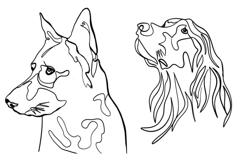
5. Cat: Okay guys, Now that
we've finished our dogs, we're going to move
on to our cats. For that, I'm going
to use a new canvas. I'm going to import our
first photo of a cat. Cut number one. Here you are. It seems like we're
going to start with Mr. fluorophores here. This cat is also in
a good position. It's a good reference photo. For the same reasons we've
talked about before. Even though this face, I'm going to make a new layer just to
show you what I mean. Even though the face in this direction is
slightly different than the other dog that
we drew the government. Because even though it's three-fourths to,
towards the left, it's still very much the cats snout is very
much on top of the body. So this is more or less a mix between our first dog
and our second dog. What makes this cat
special though? It's not as position. It's the amount of
For I would call it, or hair strands that are
outside of the drawing. This is extremely
complicated to draw, not only because you
have a lot of lines, but also because you have some sort of 3D
attributes to it. So you're going to
have to fake it. You're going to have to
trick it in order to make this friend as similar as possible to the reference photo without messing up your drawing, I'm gonna go back to
thin, thin and thick. And I'm gonna make my the size of my of my brush much smaller. Let me explain why. So whenever I have a brush like this one that can be
thin without pressure, but with more pressure
can be thicker. If the, if the
brushes so big size, it can still be thin, but then the pressure makes
it thicker, so to speak. So you want it to be thin no matter how much
pressure you apply. So here I'm applying, applying all the pressure and it
still shows up lines. So that's way too much. So I'm gonna go, say halfway. I am at 3% and then see
the line is still thin. But it's much more, much, more dark,
much darker than the than the thin one that
looks like a strand of hair. So whenever I do here, I'm going to use this
sort of pressure. Whenever I do contouring lines, I'm going to use this
amount of pressure. So let's get right to it. Okay, so when we
get to this part, you have to make
sure the level of pressure is as
minimal as possible. So let us still use
some thick lines here. Then I'm going to move
on to the whiskers. So that's the one to go here. Hey, let's try
that one more time just because it is
a bit too messy. So I make the planter
and then I go right into the whiskers
as thin as possible. I don't have to do the
whiskers one-to-one. I don't know if
you've noticed here. I did this one a little lower. This one a little lower in
this one a little lower. And also I'm not going to do
as many as there are here. I just wanted to represent
the width in a loose manner. I don't want it to be perfectly identical because I don't want it I don't want the whiskers
to take over the drawing. Then I'm going to do
the same thing I did on the on the Labrador. I'm going with a golden
retriever. Sorry. I'm going to use long and spiky spiky
lines for the hair. But in this case
I'm not going to use thin or thick
because I don't want it to fly with the wind like the same in the same way that the, that it did with the with
the golden retriever. I'm just going to
do that lightly. All the lines as thin
as possible so that it looks like fluff like
that hair of the cat. So as you can see
here, I made a mess. I did not follow that to the t, so I'm just going to go in and use my pressure as
deep as possible. Okay guys. So I go back in
and fix my lines. You could see, I like to always do this towards
the end and go through my drawing and see if there's
any lines that don't match like this to see this one is too thick and this
one's too thin. So I need to correct
my continuity here so I can either do that with
my brush or with my eraser. I like to go with the eraser
because it's just easier. So here, just to make
sure everything's neat, can properly matched up. So here it's missing
some colors, so it is neither if I
do this, okay, now. Okay. So as you guys can see, these are very thin. These are super thin. I know I sped up
most of my drawing, but the secret to this drawing
really is to make sure that whenever you are using hair that doesn't
have any weight to it, then you want that those lines
to be all thin, just thin. Similar thickness. Just think I mean, just then to make my second
layer like I told, like I did on the
drawings before. I'm going to make sure
those pupils look good. In the case of colored eyes, like in the case of this cat. I want to use the black
only where is present. And then I want to make the white reflection detail with a black outline on it so I can see
there's some white Here. Yeah, Let's see how
I can turn them. Mr. fluorophores,
again, very thin lines. If you want to represent hair
that is light and fluffy, not heavy and abundant. So moving on to our next. Let's turn off this layer
and go on to insert a photo. And we're going to
have the second cat. The second half cat
doesn't have as much hair. He's not as fluffy. So I'm going to go ahead and use a different
brush for this one. This cat has a lot of
hair and it's very short. But it's not short in the
way our Doberman hair was the double months hair or if our first dog and I want to
show you this on the photos, maybe I want to quickly insert the photo of this so that you guys
see the difference. Okay, So this, both these
animals have short hair, but the cat has hair that's
a bit more fluffy looking at those ends like the line is
not as smooth as on the, on the, in the case of the dog. The dog has hair that
sticks together. It's short, but it
sticks together and then create some sort
of smooth surface. Whereas the cat has short hair, but it's shortening spiky. So you want to portray that difference with the
one-liner that you're creating. So I'm gonna delete this. And I'm going to be using
rough and chocolate, which is another
one of my brushes, but I did it based on
the dry ink brush. So if you don't have my brush, you can always just go into inking and go to dry ink. Okay? So I'm going to
open a new layer. And I'm going to make this reference photo
semi-transparent. And I'm gonna get to
this cat right away. There is not so
much that's special about this, this
reference model. The position is really
similar to our first cat. But the important
part here is to follow the fluffiness
of his body. This is quite
important with cats. Cats tend to have firm that has some sort of
pattern in them. So as you can see, this cat has a white mark
here on, on his forehead. It has a white mark
here under the eye. And this marks, these
markings are very good for deciding whether you want
to place your line there. Very good because it tells
you more or less how you can cross the lines on the face. So this cat has a very,
very pretty eyes. He's almost caricature like if you can, as you can notice. And taking advantage of
this cat's markings on the face in order to make his the lines across her face. Just what's out with
this brush, guys. Whenever you use this brush, is important that whenever
you erase something, you go through the edge again so that you don't lose the quality
of the brush because the, the eraser will take
that quality off. The same way I'm doing whiskers. Whiskers on the other cat, I'm going to be doing
whiskers on this one. So I'm going to use
this fluff that's here. I'm going to cheat the
whiskers on this side a bit because I didn't do them when I should've and I don't want
to go back into their own. You can always do that. And I want to make sure
that I use very thin lines, very light light lines on
this side of the face because it's the one that's farthest from the from the camera, sorry. So from here. Alright. So let's
toggle the visibility. Here's our cat number one, Here's our cat number two. And he's nice. So I'm going to move cat number two a
little bit this way. I'm going to make
them a little smaller just so that we have an idea. No, no. What happened? That's what happened. Okay. I moved the eyes of our second can see the difference please. Please, with the brush. This is a cat that has a fluffy appearance,
whereas this cast, this cat has a more of
a light for appearance. Yeah. Moving on to fish.
6. Fish: Hi guys. Now we're
going to start working with fish as we did before. We're going to add, insert a photo, and we're
going to insert our fish. Let's start with this one. This fish are a kind of goldfish that can turn
from black to gold. They usually don't.
Golden, they're healthier and when
they're older, they're usually black
at the beginning, I chose this one because they have particularly bulgy eyes. You guys can see in our
other reference photo, which I'm going to insert
right now instead of later, just for the sake of comparison. We have this one as our next second fish that
we're going to be drawing. This fish has eyes that
are stuck to the sides of his face as opposed
like this one, as opposed to the other fish that has eyes that are
sticking out of his fish head. So let's start with Mr. Puppy eyes. And we're going
to open our next layer. We're going to make sure
that our fish layer is more transparent for us
to see what we're doing. We're going to change the Black. Going to be using my tick
thick and thin brush. Remember that this brush for
you guys would be syrup. And that you can find
it by going to inking. And it's right here among
more or less than the center. But I'm going to be using my version that is already
adapted to my hand. Alright, let's get started. So as you guys can see, this, fins are really soft. They almost look like hair
blowing in the wind, right? So we're going to use the
same technique that we use for our golden retriever, so thick and thin. Want to start again, remember
that you want those lines at the end to be really
nice and pointy. I'm gonna go back there. If you guys notice I'm not here. I'm going all the
way to the bottom. But here in this area you
guys can see that it is very much more solid. So I don't want to
create the hair where you can already see
a solid piece of the fish. I want to, I want to keep that
same kind of view on the, on the, on the real photo of the fish that we
using as reference. Remember to press
down as you are making thicker lines and press and release that
pressure when you want the line to be somehow. So I'm going to show
you guys can see I have a dilemma here because I see some thick areas on
the tail as well. I'm just going to ignore that
because then it wouldn't be wouldn't feel consistent when you have the drawing
in one line. So I'm just going to continue going as if it was as
if it was transparent. You guys have to understand that you're
going to have to take some liberties
with your drawing, sometimes in order for it to
make sense under this style. So you try to mimic one-to-one
as much as you can. But when you cannot,
then that's okay. You can take some
creative liberties. Creative freedom. Okay,
we got that tail. Now we're going to start
with the solid parts. As you guys can see. Drawing all the scales
in that fish would be counterproductive to this style because there's just
too many lines. You want to create. Kind of like a contour drawing,
which is what one line, one line art is without going into too
much into the details. So I'm going to use this curves
and follow these curves. Remember that you don't want to make thick lines in the
areas that are not relevant. So I'm just going to use the areas that are
not so relevant like e.g. here, guys, by the way, when 1 s I have a little dots. I didn't mean to draw there. Remember to clean your lines. I know I say that all the time, but I'm going to
continue saying it. Remember to clean your lines. I'm a mom. Remember to
clean your bedrooms. Okay. So here oh, sorry. I just got to. Die off, distracting. So pretty. I do want the line to be as similar
as my source drawings. I'm just going to go in here and erase that line and I'm
going to make it as similar as possible to the
belly of my fish. And at this point, I don't want to take advantage
of that break I made. And I'm going to add
some depth to this line. So at some moment in
some parts of the line, I'm going to make some, some accents by making the
line a little thicker. And then it's going to
go back to the thin. Make sure you taper that line graciously that
it doesn't go from fat, too thin, abrupt, abrupt sleep. So my line is here and I
need to draw this area. What I am going to do
is that I'm going to make sure that I have
this part of the fish. Okay guys, another
creative freedom. So if I decided to make, to make this fin that is on the other side and the
back wall in the background. It would be very confusing for someone who's
looking at this line art because this line will
get confused with this line and the contour
wouldn't, wouldn't be clear. So I'm going to
leave it at that. And it's still going
to look like the fish. It's just that the second thing is not going to be visible. If I would have drawn that
second fish, it would look, it would lose all
the shape of a fish. And I will show you why how
that looks if I did it right, I'm just going to
add another layer. And another layer. I will just, let's see if I continue
this line from here and decided to do
the line there. Just for just for
clarity purposes, just for educational purposes. Let's say I decided to
make that fin here. So let's say I decided
to make that fin there. Look at the fish now. Doesn't look like he has
a fin here in a fin here, can you tell whether tail
starts and where it ends? It doesn't. You can't tell by
looking at it now. Fish, fish with
something on his belly. So sometimes you do have to
take these considerations, these problems
into consideration and sold them accordingly. So I'm gonna delete that. That's not necessary. Now, we are going to, we have our first fish. Here we go, Mr. googly eyes. And then we're going
to be painting this beautiful beta, beta fish. So I'm going to
create another layer. I'm going to make sure
that my layer is opaque. And for this one, there is nothing that I would
have to explain again outside the fact that the
eyes are inside and that you don't want to
get out of your, of your, of your contour when creating the
eyes for this dude. Also the same issue here. I am not going to
create that back. Tail fin because it just doesn't allow my drawing
to be understood. So I'm going to do drawing just to mark this for you guys. I'm going to be
drawing this fin, this fin and this Finn. And of course, the
shape of the fish. And let's see how that looks. Okay. Okay guys. So I also
added some streaks of even thicker lines in order to make the effect a bit more. Wowing. The more
dramatic the difference between your lines here, the more the more it feels
like a fin because you have enough fit in offend you have those membranes that
are a bit thicker than the other ones and then there's other branches that come
out of that membrane, makes them sort of branch, the branch out from
those membranes. So we have a tail. Now, you guys see that I
took my line out of there. So I'm just going to put that down a bit and I'm going
to start with my fish. Okay, guys, so we
have our second fish. This is how he looks. So you do give out the same
impression, I believe, without having the mess of lines that you
would have if you mix mix two different objects that are overlapping
in your drawing. So you don't want the fan to
overlap with the backfill, and therefore you
just don't throw it. People will still
understand that you have a fish that
looks like this. I think one solution
would be to make a fin that's similar to
this one on the other side, but that goes down so
that they don't overlap. But that would be a
bit more difficult. So for the purposes
of this class, if you're starting
out drawing fish, especially fish
with a lot of fins, long fins and Lucius feeling
fins such as beta fish. I suggest that you try not
to overlap things at all. So remember to watch where
you're things overlap. Watch where your where
your reference photo has parts that can be a
problem when it comes to one line art and take decisions, take artistic
liberties accordingly. These are fish less. Move on to our next animals.
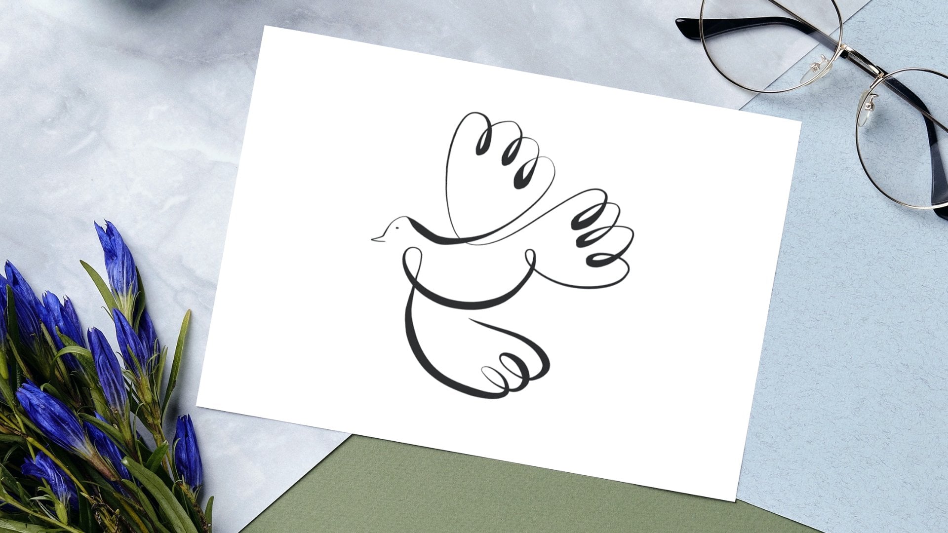
7. Birds: Okay guys, so now we're
moving on to birds and we are going to be drawing two
different kinds of birds. So what is going to
be a fluffy dog? Because dogs are cute
and they are birds. And we're going to
be also drawing a parakeet because
they're so cool. And we're going to be
talking about their beaks. And as you can see, I've chosen to Prof.
reference photos that obviously have the animals on
the three fourths position. So they're not completely
on their profile, they're not completely
facing forward. What? That is the best position to
draw anything in one line. Yeah. We can get started
with our parakeet. I'm going to be adding my layer. As always. I'm going to just
move him a little bit here. Okay. There you go. As you can see this, Mr. or Mrs. they're very cute, will go into the playing around some color because I feel like birds have such
bright colors and they make up so much
of their beauty that they are just
a good opportunity to play around with color. So we're going to play around
with color in this class. I'm going to go ahead and choose a pencil that will help me show the fluff in their feathers. In this case, a parakeet. Parakeets have like, I
don't know if you can see that they have like really jaggedy I'm going to take the
transparency of they have a really jaggedy outline when
it comes to their feathers. Same here. So I'm just
going to play around with the rough chalk brush. In your case, it
would be inking. It will be driving
the same on inking, really where the where
the syrup brushes, That's where the ink
dry ink brushes. Because I do want that jaggedy, kind of uneven
line on this bird. So I'm just gonna go like this. Let's make it nice and excuse can see I'm like playing around a lot
with the stroke of my pen. So my drawing is really light. My pen is not rested in the, in the glass is
just gliding along. And every time I
finished my my stroke, I do want it to be
I don't want it to be picked up at the end because I don't want
any lines to look heavy. I want the lines to look
just like the parakeets, head feathers. So okay. I think we have our guy. Okay. I think I don't
want to make his chest. Yes, I don't want
to make his chest. I do maybe one to
do the part that separates that
separates his neck. So this one. Only because of a
color perspective, I really want to work
on the color now. So the way that I approach color when it comes to one line art isn't
too different ways. So we have this dude,
oh, by the way, let me color his eye because that's going to make
it look even better. You guys know the way
that eye color is xy and that's going
to be all black. But remember to
leave some white for reflections to show
that they are alive. Okay, so as you can see, I did the eye filling in another
layer under the layer of my drawing just so that the drawing itself
works as a contour, as a limit for my I drawing. It does look like
that parakeet, right? Beautiful. So now what I'm
going to do is that I'm going to go under all my
drawing layers. And I'm going to put up
the opacity for my bird. I'm going to be
stealing those colors. So I want to work with
the orange first. And as you guys can see, this brush we have is just too intense for
the color that I want. So I want to be able to use
some sort of like water, kind of like a, like a, like a watercolor
Well, idea here. So I'm just going to
go to with the wash. And I'm going to turn
off the opacity here. And in this layer,
I'm just going to slightly play around
with this brush here. Too much. I'll make it smaller. And I'm just going to too much just going to slightly
kind of put that color there. And I'm going to
see how that looks. That's too dark. I took the color on a place
that it was too dark. So I'm just going
to go back in here and I'm going to say
it wasn't right. I went to the red. I
don't want that red. I want it where it's
a bit more orange. So play around until
you find the color. You want all these oranges, nice notes, still too dark. Come on. This one is nice enough. Okay. So let's see. Orange. Okay. This one's okay. I'm going to get fresco. Painting. Fresco. I like that one a lot. So again, I'm going
to make my bird transparent just so I can see the color that I'm
putting together. The nice thing about the Fresco is that it has some
texture to it. So it's going to make those,
that flap kind of those. It's going to make
that spikiness of the, of the feathers look cool. So I'm just going to do that. Then I'm going to take the yellow from the
bird, the Press here. And I want this
bright yellow green. And I'm going to do
it in another layer that's gonna be
under that orange. And I'm going to go ahead and don't lift your pencil because this tends to make
the color a bit too bright. So let's see. Okay, I'm going to
do that one again. Because now I can see the
whole bird one more time. It doesn't have to be perfect. This just so that you
guys can see the, the, the brightness of the colors or the
idea of the bird. So I'm gonna get some gray
for the color of the chest. This this is like a blue-gray. Let's see. Yeah. I'm going to here another color and I'm going to be putting that
gray at the bottom. I need something bigger than something smaller just because it has a little bit
of gray here in the back. Okay, guys. So we have a parakeet. What do you guys think? Now, moving on to the dark. The dark, I'm going
to just group all these parakeet
layer so I can turn them on and
off simultaneously. So I have my
parakeet packet off. Now we're going to do Mr. Duck. Duck is so cute, but he's
much smoother than parakeet. His feathers are
super put together. Soup. It's almost
as if the duck was bald because it's
so, so perfect. So we're going to go to brushes. You are going to be using
thick and thin again, because like I said, the feathers are
super smooth and you want to portray that
into your drawing. So I'm just going to put the opacity down and I'm going
to quickly make our duck. I forgot to open my layer. I'm still on gray. Okay, guys, so as you can see, this is a very simple
drawing of a dog. Dogs don't have this dark in particular doesn't
have many lines. You can see whether winks, its wings start or end. But I'm here for the color. So I'm going to again
make my bottom layer, makes sure that my ducky has some nice eyes. And we're going to be
going into the color. So I'm going to be
increasing the opacity. We're going to be using
the same technique. Or no, Let's use my
second technique. My second technique
technique for coloring is using a loose
representation of what the color should be and using
a solid color in the back that off a bit away from
the line, the lines. So I'm going to
take this orange. Let's say it's this orange. And I'm going to open a new layer under all my drawing layers and I'm going to select my evil line. Brush that for you guys
is going to be mono line, I believe from Inking,
not inking, drawing. Second. Okay. Calligraphy, mono line. So this is a brush I made
on the base of mono line. My, one of my favorite brushes. But I'm going to take even
line and I'm going to create a new layer that
I am going to go to, the new layer that I've created. And I'm going to be
making the shape. That's that part
has but loosely. So I'm going to just go ahead and change the
opacity on my bird. And go ahead and make some sort of shape of where I want the
duck beak to be colored. I'm going to fill that up, makes sure that your drawing is closed so that
when you fill it up, it doesn't go into
the full drawing, into the full canvas. And then I'm gonna go
back to my full color, my full color of my
reference photo. I'm going to choose
the photo from the feathers that
I liked the most. I like this. Kind of
like more whitish of white for the body. I'm going to make another layer. We're going to do
exactly the same thing. So I'm going to go around
this baby and here. Kind of just go around the
line without touching it. Just just going around it. Going around it where
the line should go and making sure that I close
that and I have that there. Now, let's see. I turn this off. You should have the duck. Oh, I'm missing the past. So I'm gonna do the
same exact process where I'm going to
choose the color. I'm going to open a new layer. I'm going to do the same thing. So this is how Mr. Duck looks using a solid color, loosely placed behind
your one-line drawing. And this is how weight
limit and this is how Mr. parakeet using watercolor under your
one line art effect. I'm just going to take
my duck and making bit bigger so that we can see the similarities
or the differences. But yeah, I hope
you guys like it. Let's move on to our final
animal, which is the rabbit.
8. Bunnies: Okay guys, Now we're going to continue with our final animal, which is the rabbit. I'm going to insert our two rabbit photos because I need them to explain to
you guys why the rabbit. Rabbits are super
agile. Super agile. They can be really
fluffy, really chunky, and they can look like they
are not very light animals, but they are super agile, they're super fast and
they can jump really high. So we're going to be working
on this lesson on how to portray that as you
are doing your life, as you are working your line. So first thing we're going to do is that we're going to
work with Mr. chunks here. And we're going to be using our thick and thin brush
because right now I don't want to focus too much
on the fluffiness of this. Mr. Here. I want to
focused on choppiness. And I want to show you guys
how to use your brush so that you can portrait the curves as much as
possible in order for it, in order to make your drawing
more adorable, so to speak. So I'm gonna go
straight into it. I'm going to lower the opacity
of my Mr. Junkers here. I'm going to open a new layer and I am
going to get started. I'm going to start with here. I'm not going to be
drawing the whole rabbit. I'm going to be drawing
his head, his head, because he's phase is the most important thing
for me right now. All the lines that are not for the hair are going to be
as round as possible. If you guys notice, I'm going to clean here like I always do, but not even my spikes
are very spiky. They're just round. Same here. Very nice
and round edge. Same here. Very nice and round edge. Okay guys, so we have
Mr. Junkers here. This is our first
drawing of the mouse. There's a lot of
unnecessary of the rabbit. There's a lot of nice curves. He looks dangerous. He doesn't look
dangerous at all. He doesn't look menacing. I'm going to group
those two layers. We can turn them
on and off easily. And I am going to
open another layer. For our second rabbit. Or second rabbit is
jumping or leaping. And you want these lines
to be long, straight. You want to use sharp
edges as much as possible, just so that you can portray the power that this animal has. So I'm going to get straight into it and you're
going to notice that I'm going to be using
sharp lines as much as I can so that I can
take advantage of this of this rabbits
agility, pretty much. Okay, so we have two
different rabbits here. I'm gonna make this one
slightly bigger for comparison. As you guys can see, this
one is more delicate. This one has rounder,
rounder edges. It's just pretty much soft,
bushy, fluffy rabbit. It looks nice. This one looks like the rabbit. That's like a superhero
rabbit that is agile. And it's just because
this one has more curves and this one has
more sharp edges. It's as simple as that.
9. Conclusion: Considering the three concepts we worked with
throughout this class, before you approach any
one-line animal drawing of your own will make it easier for you to decode any animal you have
not drawn before. These tools will allow you to continue to grow
your one-line. Our expertise, whether that animal was
covered in this class are not. Making a one-line
animal drawings is a great way to make some
extra income as an artist. Many known artists seller
one-line drawings of animals and draw animals as a
commission service as well. Playing around with new animals, new brushes and new techniques
will always give you insight on how to best draw the animals
you'll want to draw. So don't be afraid to try
out new fun ways to do this. Even when the triangle
leads to failure. In the end, success means you grow and failure
means you learn. So it is definitely a
win-win in any case. I hope to see you soon in
any of my other classes. But for now, goodbye.
 Attabeira German, One-Line Illustrator