Transcripts
1. Lightroom Mobile | What You Will Learn: What's up guys? My name is Dale McManus. I'm a professional photographer, videographer, and award winning YouTuber. In this class, I'm going to be going through everything that you need in order to edit your photos like a professional using just your phone. You're not going to need your computer. This is how I edit all my photos on the go and we're going to be doing this through Lightroom Mobile, which is the most powerful photo editing app out there. We're going to be going through everything from importing and organizing your photos to basic, intermediate, and advanced editing techniques, as well as exporting and watermarking your photos and more. This course is designed for anyone that wants to edit their photos like a professional without the hassle of the computer, or wants to greatly up their photo quality on Instagram, Facebook, or other social media or wants to develop their own signature style in their photography, or just become a better photo editor and photographer as a whole. Because by the end of this course, you'll be able to organize your photos in Lightroom like a professional. You'll be able to fix exposure and color, as well as edit individual colors by themselves. You'll be able to apply lighting and color masks in order to touch up specific areas of photos, as well as fix any unwanted areas or imperfections in a photo with a single click. You'll be able to develop your own style and create presets that you can apply to all your photos to get a signature look and you'll be able to watermark your photos and export them to the correct file format for whether you want to put them on social media or print. Whenever you are ready to get started, let's jump in.
2. Downloading Lightroom and Importing Your Photos: So in this lesson, we're going to start simple by downloading the Lightroom app as well as importing some of our photos. I'm going to be doing this on my iPhone, but if you have an Android, it's okay, it's all the same process. So let's go ahead and get started. Let's go ahead and download Lightroom. So I'm going to go up and click on the app store and if you're an Android user, then you can just go ahead and click on Google Play. Then I'm going to go down to the search function down here and just type in Lightroom and then I'm just going to click on the top one, Lightroom. Then you'll see it right here If you just scroll down, Adobe Lightroom photo editing and just go ahead and download that. Now you can see I've already downloaded it before. So I've got this little cloud symbol, but if not, it'll just say for you to download. So I'm going to go ahead and do that and give that a minute. Okay, and now just go ahead and open it. So upon opening, you're probably going to get this little welcome screen. I'm just going to go ahead and skip through this. Then it's going to ask you to sign in and if you don't already have an account, then you'll have to create one. So I'm just going to go ahead and click on continue with Adobe. Let's just say that you do not have an account, so I'm going to go ahead and click on create an account right here and then put in my e-mail, first name, last name, and a password. Then just scroll down and put in your date of birth and then just select your country and click on create account. From here, you're going to have to give Lightroom access to your photo album. So I'm going to go ahead and click on okay for this, otherwise you wouldn't be able to import them. From here it's going to ask you to import some of your photos. Now, you can select one at a time just by clicking on each one and then you can start editing it or if we hit the back arrow up here at the top left, we'll go back to that same menu and you can select multiple at once. So if you go up to the three dots up at the top right and click on that. Then you can just go to select mode and then you can tap on as many of these as you want and import all of them. So I'm just going to tap on a bunch of these and then just say add down here at the bottom right and there we go. Now we just imported all 15 of those photos.
3. How to Organize Your Photos: Now that we've got a few photos imported, let's talk about organizing them. This is going to be done using albums and folders. As you can see through these photos, I've got a little bit in nature, I've got a little bit in nature ones with me standing in them, some motorcycle, is just a little bit of a mix. We're going to go ahead and organize these. In order to do this, we should click on the back arrow up at the top left. We're going to create a new album. Where you see albums, there's a little plus button, you should go ahead and click on that. Just go ahead and click on create new album. We're just going to give it a name. I'm going to start with nature, the ones of just nature without me in them. I'm just going to click on "Okay". I'm going to go back to all photos. I'm just going to grab the ones that have just nature in them. First what I'm going to do is, just click on the little three dots up at the top right. I'm going to click on "Select". I'm just going to select those photos. All the ones of just nature. Once those are selected, there's a little button down at the bottom that says Add to. Should go ahead and click on that. I'm just going to click on the nature album and then just select," Add". All of those were added to that nature album. Let's go ahead and check on that. Just go up to the back arrow, up at the top left. If we click on nature, there are all of our nature photos. Let's go ahead and click on the back arrow again. I'm going to add a new album. I'm just going to click on that plus arrow one more time. I'm going to say new album. I'm going to add maybe something like nature selfies. I don't really quite know what it's like, what it's called, I mean, when I'm standing out in nature, but I'm just going to call it that. I've got nature selfies done. I'm going to go back to all photos. I'm just going to go up to the three dots again, up at the top right. Do select when we're done. I'm going to select all the ones of me standing out in nature like that. I'm just going to go to add to one more time, and then nature selfies. Just click on "Add". Once that's done, once you've got multiple albums, maybe you have some albums that are all within the same category and you want to organize them with folders. Let's go ahead and click on the back arrow up at the top left. You can see, I've got nature and nature selfies. Let's go ahead and add a folder. I'm going to click on the little plus button right there, and then click on the folder. I'm just going to call this travel because all of these kind of fall into the travel photos that I have. I'm just going to click on "OK". Once that's created, I'm just going to go ahead and click on the three dots for the nature album. I'm going to go to move to. I'm going to click on "travel". Just select Move. Same with nature selfies, I'm should click on the little three dots, then go to move to, and then click on travel ant then just select Move. If I open up that folder, you can see that I've got both of those albums inside of it. That way when you're trying to grow your Instagram feed or your portfolio, whatever it might be, it's a lot easier to go back through these albums and find the photos that you're looking for right away. Instead of scrolling through your photo album aimlessly until you find the correct photo.
4. Editing Basics | Light: Now we can move on to Editing Basics, which is basically manipulating light and color in your photo, as well as effects in detail, which is pretty much the texture of your photo. Anyone can drag a slider around in Lightroom and see what it does to the photo. But understanding how and why this is happening to your photo, will make you a much better photo editor. I'm going to pull up Lightroom and let's dive in. What I'm going to is just pull up one of my photos and walk you through this step-by-step. First I'm just going to go to my Travel album and I'll just go to Nature selfies. I'm just going to pick any photo, so I can show you what's happening. First off, everything that you need to edit your photo in Lightroom, is going to be down here in this menu at the bottom. What you're going to see is Selective in Healing, these are some upgraded features which I will get into a little bit later. Really the first one that we're going to start with is Crop. If you hit that, you can, a: crop the photo by clicking and dragging and you can select different aspect ratios, so you've got three by four if you click on that. You can do a square like that, five by four, you can change the ratio of what you want to crop, or if you just do custom, you can drag each individual side to wherever you want, which is pretty cool. Then if you touch this little wheel down here below it, that will adjust the horizon line. Let's say your photo comes out like that and you're like, "Man, I need to straighten it." You can just pull it like that and just line it up with the grid and get it nice and straight. But I like the way that this photo is cropped and the way that it is centered. I'm just going to go ahead and hit the X down at the bottom left. Next you've got Profiles. But I'm going to cover this later in the presets lecture because it has a little bit more to do with that. I'm going to skip that for now and move on to Auto. As you can see, if I hit the Auto button, it's going to automatically correct some of the Light and Color in my photo, but it's pretty minimal, so I never even really touched that. If you want to undo anything in Lightroom, this is just a quick tip, you can just hit this little undo button up at the very top and it'll say Undo Auto Settings, which is pretty cool. Now moving into the meat and potatoes of this, you've got Light, Color and Effects and we're going to start with Light. I'm going to click on Light and let's go ahead and start with Exposure. Exposure is basically just how much light is reaching your camera's sensor. But to put it simply, it's just how light or how dark your image is. If your image comes out real bright like this, then you would want to bring the exposure down to even it out. But if you're exposure comes out really dark like that, you'd want to bring it up. It just depends how the photo comes out of the camera and imported into Lightroom. The exposure in this photo is already pretty good, I could maybe bring it up just a little bit like that. I think it looks a little bit better. Moving on to contrast, this is basically the range of difference between the light and dark tones in your image. If I were to bring that way up, it's going to bring the darks a little bit darker and the whites a little bit whiter. It's going to create this really big range of difference. If I bring it all the way down, the image gets a lot more neutral, "Washed out" is the terminology that photographers use. Now we've got Highlights. Highlights are the brightest area of a photo. If you want to boost the brightest areas, you would just drag the highlights slider up and as you can see, that's making the sky and the light in the mountains a bit brighter. Let's say that it was too bright and you wanted to bring it down. Well, you could just go the opposite way and that will bring out some more of the blue in the sky. It's getting rid of some of that white color up and those really bright areas of the image. I actually like the way that looks. I'm going to leave it somewhere around and negative 70. Then you've got Shadows, which is basically the darkest areas of your photo. If you want to bring out some more detail in the shadows, as you can see, if I were to zoom in on the trees, this is more of a darker area of the image. If I were to bring those shadows up, it's going to bring out a lot more detail in those trees as you can see, or if you go the other way, you can really bring them down. But I like bringing out a little bit of detail. I'm going to zoom out so we can see what we're doing. I like a little bit of detail, so I'm going to say it around plus 32. Then you've got whites and blacks. For all intents and purposes, this is just an added extra boost to your Highlights and Shadows adjustments. To be honest, I really don't touch them a whole lot unless my photo comes out real bright or really dark. Before we move on to color, I just want to show you a quick tip. If I drag this little menu down here, we can look at our photo. If I just hold my finger on the screen, that will put it back to where it was before and then you can see that the edits that we applied. As you can see, we definitely fixed some of the light in this photo and made it a little bit brighter and brought some details out in those trees, which looks really nice.
5. Editing Basics | Color: Now we can move on to color. Let's open that up. First, we've got temperature, and temperature is used to adjust the white balance in a photo. White balance is just how warm or how cold your photo is once it's taken. White balance is measured in Kelvins on a temperature chart, which I will put up an example on the screen right now so you can see, and the lower the Kelvin temperature, the warmer the image is going to be. The higher the Kelvin temperature, the colder the image is going to be. Now, you don't really need to know these values. All you need to know is that if your image comes out too cold like this, you would want to add some warmth in it to bring it back to neutral. If your photo comes out a little too warm like that, you would want to add some cold to bring it back to neutral. Then underneath that we've got tint. Tint is just a minor adjustment to the color balance in a photo. Sometimes gas emission, lighting or other a typical type of lighting setups, can cause a green or pink tint. You can just use this slider to correct for it. But to be honest, I really don't touch it a whole lot because I don't really like the way it makes my photo look and I rarely had the problem with my lighting conditions that would cause me to have to use it. Next up, we've got vibrance. But in order to explain vibrance, I first need to start with saturation. Saturation boosts the intensity of all the colors in the photo. As you can see, if I drag that up, my photo is super colorful now. If I bring it way down, you can actually bring it all the way to black and white. Or you can do something in between and do this moody, desaturated look to it, which is actually cool. But it's going to boost up all the colors no matter what. Vibrance is just a smart form of saturation. Vibrance is only going to bring up the colors that need to be brought up and it's going to leave all the other ones alone. As you can see, the blue in the water and the sky is going to get boosted. But the color around the mountains, like the warmer tones around the mountains, aren't going to be brought up nearly as much as they were with saturation. Vibrance is just a smart form of saturation. I tend to use vibrance more often than saturation. I'm just going to bring this down to somewhere like that.
6. Editing Basics | Effects & Detail: Now let's move on to effects. I'm just going to go ahead and click on that. The first thing we've got is texture. Texture brings out some of the contrast in the finer details of your photo. It's going to give it a little bit more of a sharper look, like that. Or if you bring it the other way, you can definitely soften things up. But I actually don't use texture nearly as much as clarity. Clarity basically does the same thing. It's going to harden or soften your photo to give it more of a chiseled look. But it's going to adjust the light and dark tones a little bit better. I always say just a little bit of clarity can give your photo a nice, sharp look. But let's say that you want more of the dreamlike look, then you can just drag this back and get really soft edges, which also looks pretty good. But I like the chiseled look, so I'm going to put it back to the way it was. Next you've got dehaze. If you had any haze on your photo, let's say you live near a city or something like that, and there's some haze in the air. You can actually get rid of it by bringing it up. Or you can actually add haze by bringing it back. But if there's no haze in my photo, I never even touch this. Then you've got ''Vignette.'' Vignette is going to add these dark, faded corners to your photo. If I bring that back, you can see it's going to draw your eye a little bit more towards the center, which is actually a really cool tool. I like to add a little bit of vignette. You can even add white vignette corners if you bring it up like this. But I don't really see that very often for a reason. Vignette works well if you have a subject right in the middle of your photo, just like this one. Underneath vignette, you've got ''Midpoint'', which if you drag that up or down, you can bring that focus in and out like that. Then you've got ''Feather.'' If I were to bring the feather all the way back like this, you can see there's a really hard line. Or you can fade it out the more you bring it up. Next you've got ''Roundness.'' But in order to show you roundness, I'm actually going to bring the feather down. Roundness, if I were to bring that all the way to the right, it's going to create more of a circular effect. If I bring it more to the left, it's going to create more of a square and just round those corners a little bit. If I just wanted to corners like that, I could bring the feather up and just do like that and give it an edged photo look. But once again, I'm going to leave it just the way it was. I'm going to bring that roundness back to the middle and bring the feather back to the middle. Next up you've got ''Grain.'' In order to explain grain, I'm just going to zoom in all the way to the top and get real close. Now, if I bring the grain up, what it's going do is, add a lot of noise to the photo. All those little tiny dots and all that, that's all called noise. This is basically just visual distortion. It happened a lot in film photographs back before digital. It can still happen in digital all the time, especially if your camera doesn't have a very good sensor or good processor. But if you wanted to achieve that old timey look to it, you can actually add some grain by using the slider. Then underneath you've got some adjustments for that, such as the ''Size'' and the ''Roughness.'' I'm going to zoom in and show you. I can bring the size up and it's going to blur them a little bit. Or down, it's going to be really sharp. Then as well as the roughness, it's going to give it a bit more texture. There's really not a huge difference, I never actually even add grain to my photos. But again, if you wanted to achieve that look, you could actually add some grain with the correct preset, which I'll talk about later and get a really cool vintage, old looking photo. But I'm going to reset the grain back to zero. Now, let's move on to ''Detail.'' I'm just going to go ahead and click on that. You've got ''Sharpening.'' Let's say that you took this photo and the focus was just a little bit off. Well, you could drag the ''Sharpening'' up and that's going to sharpen the edges. If I zoom in, I can show you, that's the way the photo is right out of the camera, and that is going to sharpen my edges. Now, this is obviously dragged all the way up for the sake of showing you the before and after. But yeah, you can fix your focus a little bit. I'm going to pull that back up. I'd like to add a little bit of sharpness, but not a whole lot, maybe somewhere around at a 50. Then you've got some fine tuning underneath. If I zoom back in again and I bring the sharpening all the way up just to show you, you've got ''Radius'' which is going to clean up some of those distorted edges on your photo. If I bring that up, it's going to clean them up a little bit. It's going to soften them. Then ''Detail'' is going to add a little bit more of a texture to the edges of your photo. But I'm not personally a fan, so I'm going to bring that back. Then ''Masking'' once again has some really extra fine tuning. But you're really not going to notice a difference. I don't even touch ''Masking.'' Once again, I'm going to bring this back down to around a 50. Now, we can move on to ''Noise Reduction.'' ''Noise reduction'' is actually the opposite of ''Grain.'' It's going to get rid of the noise and grain that's already embedded in a photo when you take it. Let me show you an example. This is the exact same photo, but I've actually added some grain. If I zoom in, you can see I've added some grain and then re-import it, it back into lightroom. Now, if I were to bring that noise reduction slider all the way up, it's going to soften out some of that noise and grain and make the photo a little bit clear. Once again, I'll zoom in so you can see the difference. Once I do, undo all that noise and grain comes back. Cool. Now moving down, you've got ''Color Noise Reduction.'' This is basically the exact same thing, but it's actually when the noise and grain has some colored pixels to it. I'll show you an example on screen just so you can see what I'm talking about. If you were to apply the color noise reduction to this photo, it would then fix some of that color and bring the photo back to what it should look like through the viewer's eye.
7. Intermediate Editing | Curves Adjustments: All right, so now we can move on to some intermediate editing skills. So we're going to be talking about curves adjustments, as well as color mix, which is editing individual colors by themselves. It's one of my favorite things to do, I use it all the time with Lightroom. We're also going to be talking about split toning. So let's go ahead and jump in. Okay, let's go ahead and start with curves. So what I'm going to do is click on this very first image and then I'm just going to click on light right here. Then I'm just going to click on curve. So what curves is in a nutshell, is a more powerful way to adjust brightness and contrast in your image. Let me explain; this line that's going out at a 45 degree angle allows you to adjust your highlights, your mid tones and your shadows. So anything in the middle is going to be your mid tones, anything on the right, up at the top right is going to be your highlights and then anything at the bottom left is going to be your shadows. So if I overall just wanted to make the image a little bit brighter, I would just add a point right here in the middle and just drag up and the whole image is going to get a bit brighter. As well if I drag it down, the whole image is going to get a bit darker. I'm in the mid tones area so the image as a whole is going to be adjusted. So now if you wanted to create a higher contrast image, what you could do is bring this dot over into your highlights and bring that up just a little bit, then add a second down here in your shadows and pull it down a little bit. Now you've got this slight S curve that's created more of a high contrast image. Now if you reverse these dots, it will do the opposite. It will make a really flat image. So I'm going to bring the shadows up and the highlights down and now we've got a very flat image. So all in all curves allows you to get a lot more accurate with your exposure and your contrast. If I wanted to adjust the highlights by themselves, I could add another point up here and bring that up or down to adjust the widest points of my image or I can adjust the shadows by coming down here and bringing this point down or up. You can see that on the hillside, those dark shadows can be altered by themselves. If anyone is interested in black and white photography, I highly suggest getting used to using curves to adjust the exposure in your image. It's really great for black and white. With curves, you can also adjust individual colors. So we've got the red, which you can bring these up or down. This will bring all the red out of the image if you bring it down or it will add more red into the image if you bring it up. Or you can even get sort of a vintage look if you add a second to create an S-curve. So now you're taking your shadows and bringing all the reds out of them and then you're adding reds to your highlights. It's going to give you this weird vintage look to it. Or you can reverse them and you can bring all the reds out of your highlights and add some reds to your shadows and you've got kind of like a 1960s, 70s look. You can do the same thing with the greens as well as the blues. Then if you go over to this little button over here at the bottom right, this allows you to adjust your tones without clipping or crushing your blacks or whites. So it allows you to not go too far. It's going to set a constraint if you pull up or down, it's going to adjust them in the correct areas. It's a smart feature. So as you're getting used to curves, I recommend using this little button.
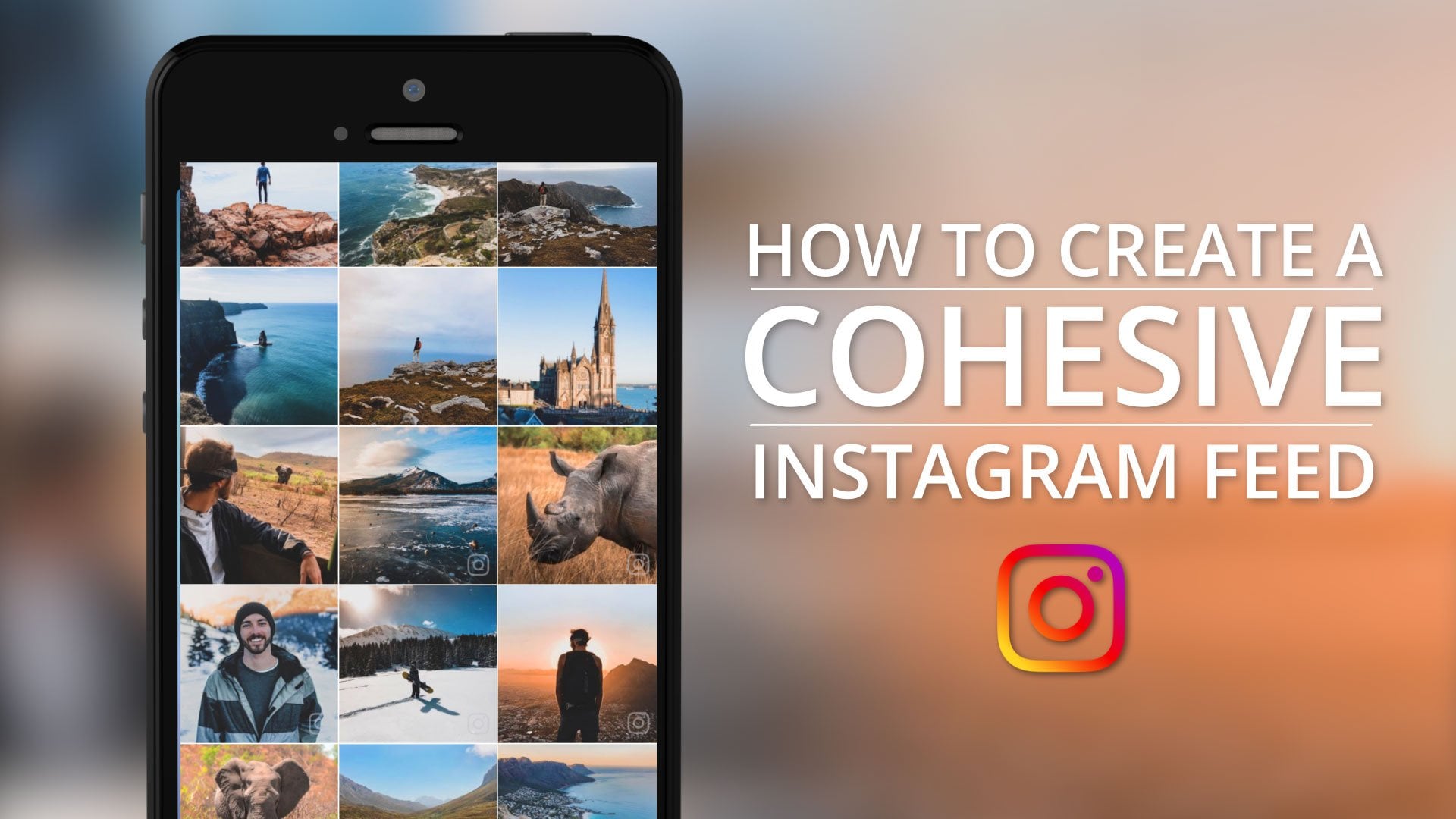
8. Intermediate Editing | How to Edit Individual Colors: Now let's talk about my favorite feature in Lightroom, which is individual color editing using the mix tab. In order to get to it, just go over to Color down here, and then just click on "Mix" right here. This allows you to edit all of the individual colors by themselves. Let me show you. If I were to click on blue, I can then pull the hue to the left a little bit, and create more of a cyan color blue. That's only affecting the sky and the water mainly. But all the other colors by themselves are not affected like the orange, and the green, they're unaffected. Or I can bring the hue over to the right and create more of a purple effect, which looks a little crazy, but you get the idea. If I wanted, I could bring the saturation of just that color up or down. Just the blues, I could bring them really blue if I wanted, or I can desaturate them, and create somewhat of a black and white image in parts of the image. I'm just bringing down the blues, but the oranges, the greens, the purples, everything else is going to stay. As well as the luminance. The luminance is basically how bright or how dark that color is. If I bring it up, the blues are going to get really bright or they'll get really dark, which you can see is going to start distorting our image. We're starting to break it right there. You don't really want to bring the luminance down too much. I don't really mess with it much more than about 25 in each direction. Let me click on another one. I'll do the oranges. I'm going to click on "Orange" and I can bring them to be more yellow, or to be a lot more red. You can see in my sky up here, as well as down in my rock, let's move this out of the way, down in this rock down here, you'll be able to see that as well, as I drag this slider back and forth. On my Instagram, I tend to do more of a reddish orange. Then again, I can bring the saturation up on those, or bring it down and desaturate them completely, as well as the luminance. Again, too far you'll start to break your image. This mix tab is what I use to edit my Instagram to be this one nice cohesive feed. I've got lots of oranges and blues on my Instagram, and this mix tab comes in serious handy for getting that done. Later on I'll show you how to create presets with these colors already pre-edited, so you can just throw them onto all of your photos. In case you're interested, I have a whole another course called, how to create a cohesive Instagram feed, which you can find on my skill share page. Here's another example. With this image, let's say that I wanted to make it more of a deep forest green. What I do is select the greens and then just pull the hue over to the right, and then I would grab the yellows, which are the closest color to it, and then pull those hues over to be green as well. Now the whole image is a lot more of a deep green. Or if I wanted this photo to look a little bit moodier, I could go back to the greens and then I can just pull the saturation down. Just like that, it's got a whole different look to it.
9. Intermediate Editing | Split Toning: Now let's talk about split toning. Split toning is basically just a quick, easy way to apply colors to both your highlights in your shadows, and these will be individual colors. In order to do this, just go over to Effects and then just click on split toning. From here you can see we've got our highlights and our shadows. For the highlights, let's say I wanted those to be nice and warm. I'm going to drag this up into the red a little bit and as you can see, as I move it up, these saturation increases and if I move it left or right, the hue increases to a different value. I 'm going to be somewhere warm and I'll bring it down to say like that. Now my highlights are nice and warm. Now to contrast this, I could do some pretty cool shadows, cool as in temperature cool. I'm going to bring these over to blue and bring him up a little bit, maybe somewhere around there. You can even increase the highlights a little more to give it an even bigger contrast. It's going to give your photo a real distinctive look. Now you can also reverse these and do some cold highlights, which I think look really cool. Then some nice warm shadows. That's going to again give you this cool 1960s, '70s vibe to your photos that I've been talking about. I personally don't use split toning a whole lot every once in awhile, I might want my highlights to be a little bit warmer, but that's about the most I use it for. But it's definitely a good feature to know how to use.
10. Advanced Editing | Selective Masking: I want to take a moment and show you some advanced editing techniques. This is going to be selective masking as well as healing. Now, we've been working with a free version of Lightroom throughout this whole class. But these features are only available in the upgraded version of Lightroom, which is about $5 a month, but there is a free trial if you want to try it out. But these features are awesome and I'm not going to stick an affiliate link or anything in here for you, because I'm not trying to make any extra money on them. I just purely use these tools all the time, so it's definitely worth it. But if you know you want to stick with the free version of Lightroom, then you can go ahead and skip over to the next lesson. Let's get started. Let's talk about some advanced editing. In order to get these features, just click on ''Selective'' down at the bottom left, and then just go ahead and click on ''Continue'' and it's going to ask you to start your free trial, which is going to last seven days, and then it's about five bucks a month after that. Again, it's super worth it. I use these features all the time. I'm just going to say start free trial to subscribe, and then you just go ahead and click on ''Confirm''. Once you do that, you can go back to Lightroom, and now you should see Selective and Healing are both available. I'm going to go ahead and start with Selective. With Selective, you have a few different options. If you click on this little plus button up here, the one I'll start with is just a gradient mask, which is going to be this one right here. I'm going to go ahead and click on that. What this does is you can apply a fade that you can edit however you want. If I click on the left side of the screen and then drag over to the right, it's going to create this faded mask. I'm going to put it to where it's going straight over onto her face, and you can see it's indicated in red so that you can see what you're doing. Then you can edit the light, color, effects, detail and everything for just this one red area. If I go to Light, I can open it up and I can increase the exposure so it looks like more light is coming in through the window, or I can bring it darker like that, which I think looks pretty good. You can adjust everything that we talked about earlier, highlight shadows and so on, and even the color. If I wanted to make it warm, I can bring the temperature way up, or I can make it colder by bringing the temperature down. As well as Effects, I can adjust the clarity, make it a lot sharper or a lot softer. Then whenever you are ready to apply all these, you would just go ahead and click on the check mark. Now, let's go back to Selective again, and then click on the plus button, and you can do a radial mask. If you click on the little circle in the middle, I'm going to click on her face, and drag out like this, and you can create a circular mask. Again, you can edit that all the same way by clicking and dragging. You can make her face a lot brighter, which I think looks pretty good. Then you would just click on the little check mark at the bottom right to apply. The last type of selective mask is one that you can draw with. Just go back to Selective, and then the plus button again, and then describe the little paintbrush. Using just my finger I could select everything that I want to apply this to. I would just say her entire face and shoulders. Then again, you can edit it just the same way. It's really cool.
11. Advanced Editing | Healing: The next one is healing. Healing is basically going to be able to clean up any imperfections in the photo and erase them. What I'm going to do is click on healing. Then what you do is you can click on this button over here on the left and that's going to change the size of your brush. I'm going to do something like that somewhere around 77 and then underneath this button right here, it's going to change the amount of feather. If you bring it up, it's going to be really feathered or it's going to be really solid. I'm going to do somewhere in the middle, maybe like that. Then all you do is just zoom in and let's say that we want to get rid of these little freckles. I personally like freckles, but for the sake of this lesson, I'm going to show you. All you're going to do is just tap. It's going to select an area that it finds is similar and it's going to erase it. Or you can actually click on this circle right here if you want to pull from a different area. I'm going to say something like that. Then that just cleaned it up. Using two fingers, I'm going to scroll down to these. Let's say I want to get rid of this one. I'll tap and it's going to pull from right there. Same with this one over here and boom, just like that one finger tap. Sometimes it doesn't quite work and you can see right here, we're getting a little bit of craziness. I'm just going to undo that one just like that. Then whenever you are ready to apply, just click on the little check mark. Now if I were to hold my finger on the screen, you can see that's what it was before and that's what it is after.
12. How to Create Presets: Now, let's move on to one of my favorite parts which is creating presets. Presets are amazing. It's basically just editing your photo with all the light color and effects settings that you want, taking all those settings and then saving them into one preset that you can apply to all of your photos moving forward and this is great for anyone that wants a really consistent and cohesive style throughout every single one of their photos. Let me show you how to make them. Let's talk about presets. Lightroom actually has a huge variety of already pre-made presets for you. If I just open up any photo and I scroll all the way to the right, you'll see presets right here. Just go ahead and click on that, and then if you click on "Color" right here, you've got all different categories like creative, black and white and so on. Underneath color, you've got a few options here which will subtly apply some effects to your photos. Then if I go into creative, you've got a little bit more drastic ones here. But I actually do recommend if you're going to create your own signature style to start with one of these and alter it the way that you want. What I did was I went to Color and then I went down to Matte and this was the signature style I wanted but it didn't quite have my colors. If I want to create a preset that I can apply to all my photos, what I'm going to do is just hit the check mark and you don't actually have to start with one of those presets. I just chose to because it makes it a little bit easier. In order to create a new one, a custom one, what I'm going to do is just edit this photo however I want. I'm going to add some blue and some orange in there. I'm going to go to Color and then go over to Mix and. I'm just going to take the yellows and I'm going to crank those to the left and bring them up, same with the oranges. I'm going to bring those over a little bit and bring them up. The greens, I'll do that. I'll make them orange, bring them up. Then the blues, I'm going to make a little bit more cyan color like that and bring those up as well as maybe the luminance. Cool. Now, once you've done that, you can edit the rest of the settings, like give it a little bit more vibrance. You can edit the light, so the exposure, the contrast and so on which I showed you all earlier. But I like the photo just the way it is. Actually, maybe I'll bring the shadows up a little bit and those highlights, I'll bring down a little bit like that. Now, once you have your photo set to the way that you want, you can now save out all these settings as a preset. To do that, just click on the three dots up at the top right, and then just go over to create preset, and then let's just give it a name. I'm just going to call this Dale's preset just to keep things real simple. Then from here, just make sure that all of these pre-check boxes are checked, and then just click on the check mark up at the top right. Cool. Now, ''Dale's Preset'' was added to the ''User Presets''. Now, if I want to apply the same preset to all my other photos, all you got to do is hit the ''Back'' button and then just go to any photo that I want to apply it to. I will go to this road one and then all I'd have to do is just go over to Presets right here and then click on ''Color,'' and then go down to ''User Presets''. Now, we've got this whole other category here and you can see we've got one item in it. I'm going to go to ''User Presets'' and then click on ''Dale's Preset.'' Just like that my photo change to look like that new signature style. You can also go in and edit individually. This one looks like it's a little harsh. Maybe I want to bring down these oranges. Well, I just click on ''Color,'' go to Mix, go to Orange and then I would just bring those oranges down a little bit. Maybe they just seem a little too harsh. There you go, they're brought down a little bit. Then you can move on to the next photo. I'll apply this to another one, let's say this one. Again, all the way to the bottom right, Presets, ''Dale's Preset'', boom. The photo looks like the new preset that I made. Pretty much every time I apply a preset, I always like to go through and make a few minor adjustments depending on each individual image. Applying these presets to your photos will allow your portfolio to have one big signature cohesive style to it.
13. How to Export Your Photos: Now let's dive into exporting and watermarking your photos. With exporting, I'm going to show you how to save out your new edited photos onto your phone so that you can post them. I'll also show you how to watermark these photos in case you're taking photos for a client and you don't want anyone to steal your content, whatever the reason maybe. Let's go ahead and start with exporting. To export a photo in light room, what you have to do is first just select the photo and then you'll see this little box with an arrow coming out of it up at the top. Go ahead and click on that. Then the option that I find the easiest, typically because I'm posting these photos to social media accounts is to click on "Export to camera roll". Then just like that, it's instantly going to send that over to your photo album. Now there is another way to export that actually has some specific uses to it. Again, I'm going to click on the little box with the arrow on it. Then, you can go to export as all the way down at the bottom. From here, you're going to be asked to choose the file type. It's automatically set to JPEG. JPEG files can be read by almost anything, computers, phones, literally everything can read a JPEG because it's the go-to format for online photos. Now the only downside is there is a slight drop in quality, but if you're viewing it on a phone, I guarantee you will not even notice. It's totally okay to save in JPEGs. But if you open this up, you've got a few other options. You can choose to save out the original, but this isn't going to save any of your edits, so I really don't recommend that. Then you've also got a TIF file. TIF files are not compressed, meaning that they're going to be a lot larger file and they're typically used for print and graphic needs. If you know that you're going to want to save this photo and send it to a printing company to maybe get a canvas on your wall or what it might be, a TIF file is a good way to go. Then you've got a DNG, which is also known as a digital negative. This is developed by Adobe, which actually made Lightroom. It's going to basically save out a really high-quality image that's uncompressed and raw. It's going to keep your edits in there. It's also going to save out some metadata with it. The main reason for this is if you're going to want to open this file on another Adobe program, like Photoshop for instance, it's going to be a lot easier with the DNG and you're going to maintain high quality. But when in doubt, JPEG is a good way to go. If you wanted to export this way, you would just hit the check mark. Then it's going to ask you what to do with it. From here, I'm just going to scroll down and I could just say save image, which is just going to save it to my camera roll.
14. How to Watermark Your Photos: Cool. Now let's talk about watermarking. In order to create a watermark what we're going to do is just hit the back button, and then I'm just going to go back one more time and then go up to the little settings wheel up here at the top right, and then just go down to watermarking, and then it's going to ask you to create your watermark. Right up here you can change the name. Mine just says, copyright at my name, which I'm just going to leave it. But you could do, your initials slash photography, things like that. You can get creative with it, whatever your brand is, and then just go ahead and scroll down and you can see a little preview. You can see my name right there at the bottom left corner. If you click on the size and drag that up, you can change the size, so you can make it huge. You could also change the opacity down here. If I bring the opacity down, it's going to be a little bit see through like that. If you wanted it to be a little bit more subtle or you can do both, you could bring the size down like that. Maybe bring the opacity up just a little bit, something like that, and then you can also offset it just by clicking and dragging and placing it somewhere else. Or if you just click on any of these dots, it will add the watermark on those dots. You can put it up at the top, at the bottom, whatever it might be. I kind of like the bottom, so I'm going to go ahead and leave that. Then you can also change the type. If you hit the B, that's going to bold it, you can italicize it, or you can even turn it sideways. If I turned it sideways, I could put it in the corner like that. But I kind of like it straight up right at the bottom, cool. Once that's done, I'm just going to click on the back button and then hit the X, and then I'm just going to go back to my photos and I'm just going to click on the photo that I want to add that watermark to. Then to export it with a watermark, just go up to the same Export button that we went to before and then just go to Export as. You can only apply a watermark to a JPEG, so you have to keep JPEG selected. Then the image quality, if it's not already at 100 make sure that you set that at 100. Then go to more options and then you can include the watermark right here. You might have it off like that, just go ahead and enable it, and then just go back and then just click on the check, and then just save it wherever you want to save it. In this case, I'm just going to put it in my photo album. Boom, there is the photo in my photo album with the watermark down at the bottom which is pretty cool.
15. Thanks For Watching!: All right guys, so that's a wrap for the Lightroom Mobile class. Thank you so much for watching. I really appreciate it and I hope you learned a lot. Feel free to check out my instructor page for other classes. I've got a whole course on iPhone photography, which will teach you how to take professional photos using just your iPhone and I've got a cinematography course that will show you how to shoot professional video with almost any camera. I've got a course on how to create a cohesive Instagram feed and lots more. All right guys. Thanks again for watching. My name's Dale McManus and I'll see you on the next one.
 Dale McManus, Photography, Cinematography, Music