Transcripts
1. Welcome to this Course!: Hi, my name is Tim Wilson. I'm a senior trainer
at Red Rocket Studio. I would love to
help you to create beautiful professional
work in new Adobe Express. Not only if I
trained for some of the world's leading
companies including Disney, Nissen, BBC, NHS, the times. But I've also spent
many years as a lecturer in graphic
design at the university. We'll start at the
very beginning and I'll take you through
everything step by step. You're not left on your own. I'll be there all the time
to answer your questions. I've crafted this course as a series of projects
by the end of it. Not only will you be an
Adobe Express master, but you also have nearly
20 separate projects that you will have created. These are some of the real
world projects that we'll be working through in the three
levels of this course. Social media documents,
flyers documents, print and screen
slow animated posts, video posts,
multimedia documents, infographics, and so more. I'll be showing you tons of pro tips and tricks as well as some basic graphic
design principles to help you create really
beautiful, professional work. Start right now, I can't wait to help you to learn
new Adobe Express.
2. Introduction to Create an Instagram Reel: This is such a cool one. We're going to be
taking a letter and we're going to
get Adobe to actually make the flowers on the G for us using its built
in AI feature. There's so many things
we can do with that. I'm doing flowers because I've got a ballet dancer
in there as well, but you can do
whatever you like. We're also going to be
taking a piece of video and cutting the video out so the ballet dancer is
actually a cutout. And Express has done the
cutout for us really easily. And then we'll obviously add
some sound in there as well. But it's a lovely one and
I'm sure you'll enjoy it.
3. Make a Letter with a Text Effect: Let's do an Instagram reel. I'm going to go to video, and of course down to
Instagram reel over here. And we're going to
create something obviously from scratch. Now the first thing
that I want to do is to put in a background color. I can click on the
background over here and I can choose
a color in here. I'm going to go to my custom colors and I'm going to choose something which is slightly
off white in there. I found white by itself is
a little bit too harsh. Then I'm going to bring
in a letter in here. The one that I'm
doing at the moment, as you've seen from
the intro video, is a letter G, which is full of flowers because the company
is called Flora G. I'm going to go along
and put in some text, but I'm not going to
use the add your text. I'm going to go down
here to Text Effects, click on Text Effects, Go and find something
that I like in here. There's some flowery ones there. I think I rather like that one with all those
little flowers. I'm going to click on that. You can see it puts in a Word
and it's rendering that. Now I can actually change
that, so I can select that. I'm just going to do a G in there and I'm going
to make it bigger. So because that's going
to go up in the middle. You'll notice now that there's also some options that
I've got over here. So if I didn't like
those flowers, I could start working
my way through these ones and trying
them out as well. I can load some more. Sometimes they are faster
than others to come in. Well, while I'm
waiting for that, I'll just try this
one over here. That's rather nice.
Let's click on that one. Well, they're honestly pretty much of a muchness to be honest. So I'm going to go with
this one over here. Now that I've done that,
I'd like to actually put a slight shadow underneath
it, very subtle. So I'm going to go
to text effects and just go back again to my normal text
with the selected. I'm going to go down to
shadow and put a shadow on. Now you'll notice
that when you get a shadow, it looks nasty. This classic shadow is
absolutely horrible. So I'm going to go a little bit further with that
and customize it. So click on Custom. The blurring over here can stay for the moment,
the distance. I'm going to move it back
to the shape itself. Let's make it a little
bit less distant, but it's still a
very harsh shape. I'm going to go
along to my color. I'm going to choose
the background color, so I'm going to sample
the background color, go to custom and then just darken it down
slightly from there. You can see if I
darken it down a lot, then I can just control that shadow slightly
with that color. Quite like that actually.
You can even do glows like that as
well. Which look? But I'm just going to
go with a little bit of a shadow slightly
darker over there. Then of course, I
can change the blur depending on how much
blur I want from that. Have a bit of a go get
the letter up over here. Just use a very simple
letter in there. Remember, you can
always change it. It is still editable. I can double click and change it to anything else that I want, and you've just got
to wait and it will eventually update with
that effect for you. There we are. But I'm
going to go back to the G because it was
a rather nice shape.
4. Cut Out and Edit Video: I'm going to add my dancer in. So what I'm going to do with
that is I'm going to go to media video and I'm going
to search for a dancer. In fact, I'm going to
search for ballet. This one works quite nicely. I have tried that before, and that one works
well if you are on the paid for version, but if you're on
the free version, there's a little dancer and
a little girl down here, and I'm going to
actually use them. So I'm going to take
them and scale them up. Then what I want to do is I want to remove the background. So I just want the dancer, so I'm going to choose
a remove background. And then you just sit and wait. Now I have cut that bit down. It was longer than
it appeared for you. If yours does take a while, don't worry about it.
That's the way it is. I want to have the dancer,
but I don't want this, this little girl in there. You'll see if I play this. We've got the dancer who jumps like that and then the
little girl jumps as well. But I'm interested in the adult. What I'm going to do is I'm
going to double click on the video that takes
me into crop mode, so I can actually crop it down. And I'm going to use
a free form crop, which will then allow me
to drag this in and just adjust it to the bit that I want I'm really interested in. You can see how the little
girl disappears out there. I'm interested in this section over here until she
comes to a stop. That's the bit that
I want over there. So I'm going to
shorten the video down over to there
so we can play that. And let's have a little look. She's going to jump like
so, and that's what I want. Now when I click off
of it and play it, you can see some of that hand is missing right
at the beginning. I might have to juggle
this around a little bit. I'll double click
and maybe make it a little bit bigger over here. She's going to go in
the middle anyway. So I just need to be aware of what's
coming and what's going. Now, I did something
very silly there, and I'd love to say
that I did it to show you what you shouldn't
do, but I didn't. It was a genuine mistake. I moved this, which
moved the video inside that crop to move
the whole thing around. If you click out, you can then move everything around like, so you're going to have
to just fiddle around with this until you
get what you want. So I want something
like that over there, but if I double click, I don't want the child in there. Let's move that over
just a little bit. Let's see how that, how that goes. She's going to do that. We're actually going to stop
the video about there now. I don't want to stop everything, I just want to stop the video. I'm going to click the Sal Show Layer Timing
button at the bottom. Now what this allows me to
do is to actually say, well, for the video I want the video to be whatever
length I want to be, but the bottom can be pulled
out as much as I need. The video will just be
this section in there. Let me play that and
have a quick look. She's going to do that and
come to a halt over there. Now the next thing is I also want to get her
to fade in and fade out. She's a bit sudden, comes in there very quickly
and disappears quickly. I'm going to click on the video
layer, or the video here. I'm going to go over
to the video options, scroll down to the bottom, and there's an animation
option down there. Click animation in
the animation area, I'm going to choose fade out. I'm going to fade using those two buttons
in and out. Fading in. What will happen now
is when she comes in, she'll fade in quite gently. She moves into the right
position and she fades out. I've still got the
child coming in, so I'm going to have to
look into that and see what I can do.
I'll double click. Let's see if I can try and
change that a little bit more. I'm just going to move
it in ever so slightly. I think that works.
Let's find out. She'll jump over there, come to a stop, and fades
out. That's perfect. I also want to fade
G in once again. I'm going to click on
it in the text options, I'm going to go
down to Animation, choose in and Fade, and we'll fade it out
as well as I'll click on Out and fade. Let's have a look
at how this works. Now over there,
they both fade in. The dancer comes in and jumps. In fact, I'm going
to take the dancer, I don't want her to come
in to start immediately. I'm going to move the whole
clip over a little bit. There'll be a bit of a gap before she comes in once again. Let's play that. Look at
the timing she comes in, she jumps at this stage, we'll bring in some
text in a moment, but do have a go with that. Try it out. You might
have to fiddle around a little bit with your video
to get everything right. If you've got this video, by all means, have a
bit of a go with that. If you're on a paid for
version, try this one. It's also quite an
interesting one as well, and you can just get rid of
the background with those.
5. Add Text & Sound: Now this cutting out video
tool is such an amazing tool, It really is very good.
It's not perfect. And you might have noticed
when you tried that out, that there are still
funny little bits. So over here, as her arm
gets close to her dress, a little bit of the
background still comes in because of the color. It's very, very similar
to the color in there. It's just unfortunately, one of those things you're going
to have to look out for. I don't think anybody will notice that because
it's very quick. As this fades out, I want to then start
to bring in some text. Anyway, at this stage here, as she's fading out, I'm
going to go across to text. I'm going to find
some text in there. So I'll just add my text and this will be
the name of the business, which is going to
be Flora in there. And I'm going to make
it a little bit larger. Move it down, so that's
going to kind of come in over there where she is now. You can see it's
there all the time. I only wanted to start
where she is fading out, so I'll drag this
along to there. Remember, if you don't
see these options, make sure that you're
actually showing your layer timing in this, that you can see what you're
doing with that timing. Same with the last
video as well. Feel free to try different
type faces for that. I'm going to find a
typeface that works based on the colors that are
in the document already. Because this is all
about a florist, I'm going to go and
pick a color which would be appropriate
for a florist. Maybe something a
little bit green here. Let's see if that darkish green
works on that background, yet it actually works really nicely and it matches
that over that. And then I need to bring in
some more text over here. So I'm going to add
some more text in. And this is going to
be your flower needs. For all your flower needs. Same. Again, select that. That's quite harsh, that text because it's very bold and yes, maybe it is their brand, but we need to take
it down a little bit. So I'm going to go
and choose something which is a little
bit less harsh, like that one over there. Move that down to here. In fact, I'm going
to put that over two lines and let's have a
look at this over two lines. So I'm going to move along, just do a return on there. Maybe select that. Go into my settings over here. I'm going to change the
distances between the lines. I can move that closer together. That's the tag line for all your flower needs is right in there. Of course, I don't
like that being green. With that being green,
I'd like to use one of these other
colors in here. Same as before. I'm going to
go to my color for the use the Eyedropper
tool and just pick a different color that I
think might work in there. Let's go with the pinkish color. I think that seems to work. Now we're almost
there with this, but we of course, need
a little bit of sound. I'm going to go and find
some sound by going to media in the audio. I'm going to go for appropriate
sound and I'm going to search for some ballet
sound and see what I can find. I think that one
works quite well. I'm going to click to put it in, and let's have a look at
the whole process now. I've just realized that all your flower needs is
there all the time. I only want to appear
after fluorig has come in. Florigene needs to come in first, then that
needs to come in. So I'm going to click on that. Once again, I'm showing
my layer timing, so I can move that
across to there. Remember with these
bits of text, we can go and we can go down to our animation and just in, and fade them in to make sure that fluorig
is fading in as well. Fade, Let's have a look at the whole thing
and see if it works. I'll click on that to hide that, so we can see the whole process. Lastly, I think I'd like
to fade that out as well. So once again to Ed a timeline. Let's click on that and we'll go down and
use the same thing, Animation, to fade it out. Let's get the other one,
all your flower needs, that's going to
fade out as well. Same go down animation. Fade out, but I want that to
fade out before the floor. A G fades out, so I'm
going to pull that in like so one last time to see the
timing of the whole thing. Experiment with some
different designs. Try cutting out
various bits of video. See how you get on, and then of course, don't
forget download. And we're downloading
this as an MP four, so hopefully this one
shouldn't take too long.
6. Introduction to Make a Poster for Professional Printing: For this project,
we're going to make something which
is press ready I. It's ready to go for
commercial printing. Now, Express is not
ready made for that, but I want to show
you how to do it. We're going to have to
use some extra features which are not really made
specifically for printing. What I'm going to do is I'm
going to show you how to make a bleed in Express. Also, how to take
it out and convert the RGB document into CMYK
which one needs for printing. We'll do that by using acrobat. Or if you don't have acrobat, there are some
online websites that will do it for you
and if the word bleed and CMYK and RGB just went whoosh over
behead, don't worry about it. It's not something that comes up in normal, everyday life, and I'll explain as we
go along how to do it.
7. Create a Document With a Bleed (see notes for new updated bleed option): For the poster we're
going to make, I'm going to go across
to marketing and down to poster and I'm going
to say Create from scratch. Now we need to figure
out what size to use. And you can see
there's a little re size button over there. If you click it, that takes
you into the size over here. And I can see this
is 11 by 17 ". Now I want this to be a three. So I'm going to be
sending to a printer. The printers told me three. What's the size of three? Well, if you're not sure I
like to work in millimeters, what I would normally do is just have a quick
look on the web. I'm just going to type in
size three in millimeters. There's my size over there, 297 by 42297 by 420. However, when you're creating
something for print, the printers also require you to have a little bit of
extra space around the document so that
when they print it and they cut it up
with the guillotine, they just chop off the extras if they've only printed it to the exact size of the document. When you use the guillotine, you might end up with
a tiny little bit of white down the edge. We have an extra area on a document and this
is known as a bleed. Now, most printers will
usually ask you for a three millimeter
bleed on each side. I'm going to add 6
millimeters to my width, which will take me to 6
millimeters will be 33, 6 millimeters over
here to my 420, which is going to take
me to 426 in there. Now I've got the extra space
so I can tell the printers, well actually I've
made a bleed in there. It needs to be printed to three. Have to go and create your
document and get it to the right size over there
with the bleed in it.
8. Colour Overlay Blends: Now that we've got the
document to the right size, I'm going to put a picture
into the background. So I'm just going to go
and search for something. The poster that I'm doing, as you've seen from
the original one, is to do with gears and
oiling the gears of industry. Or lubing the gears of industry. I've done a search for gears
and I'm just going to go and find something
appropriate in here. I'm going to choose one of
these black and white ones, because I want something
which looks black and white. However, if you find an
image and you think, wow, that's just what I
wanted in there, I'll just click on it in here, I will just set that
as a background. You can of course, go into your effects and just choose gray scale to make something black
and white as well. I didn't want that picture. I'm going to go back and I'm going to choose
a different one. So I'll go to media. I rather liked this
one over here, which looks quite interesting. Or there's another one very similar further down,
that one over there. Now you can see as
I'm doing this, it's just putting them in. Every time I click on them, I'm going to go and remove them. I'll get rid of that one there. This one I'm going to
make my background. I'll say replace
background over here. Now I also want this to
be the other way round. So I'm going to go and rotate it or flip it using this
little button over there. So I kind of get the
gears down at the bottom. You can flip things
left and right as well. And the color looks quite good, but I'm also going to experiment with some other color on that. Just go to the effects
and see how to look with gray scale, It's okay. What about with this orangy yellow tint that
looks really good? Actually, it looks
very similar to the original where I can colorize
it with a different color. And you can see, I can just
flick this little button here allows me to just flick
through different colors. I'm actually going
to either use the original or this tint over here. I like that tint. The
gold looks great. Now the second thing I want to do is I want to make this a
little bit more graphical. To do that, I'm going
to use some shapes. Now I'd like to show you on the web how these colors
are used quite often. I'm going to go in here
and I'm going to type in best brochure designs. Now of course, you might get different results if you
tried this yourself. But generally, if
you go to images, what you'll find is that there's a lot of designs in here, and a lot of those
images have got pictures with color
on top of them. Here's a perfect example
where we've got the red, dark red with a black
and white picture. Underneath. This technique that I'm going to show you is
used a lot. There we go. We've got another image
with a dark picture behind, another dark picture
behind there. In a photo on the top, you'll see we've got another
one here, another one there. It just keeps going on and on. And you'd be amazed how
easy that is to do. What I'm going to do now is
I'm going to go along and I'm going to go to my elements. I'm just going to
use a rectangle and I'm going to make that
rectangle a lot bigger. Oops, let's try that again over there. Maybe bigger still. I'm going to rotate it and I'm going to place it over
my document like that. And then I'm going to
fill that rectangle with the color that I want. And I want to use
red because I think it'll go really nice
here with the gold. So I'm going to go
to custom color. Pick the color that I like, I want to a deep red, something like that in there. I think that's perfect.
Finally, to get that result, I'm going to go down
here to my blends. And I'm going to
change the blend from normal into multiply. And that gives you that
lovely effect over there. I'll just move it along
a little bit like that, so it's not quite
touching that edge. Of course, I want
another one down here, so I'm going to hold down the Alt or the option
key dependent, or the Mac or PC and just drag a copy of that down to there. You can see when we look at
those best brochion designs, that's pretty much how
some of these are done. Look at this one over here. It's got the red on top, black and white underneath, and the red over there
at a nice angle. It's such a useful technique
and so quick to do. I can still go back to my
background picture over here. If I thought it might look
better with black and white. I can try by going
to the effects and having a look in black
and white over there. To be honest, I like the original or that
tint over there. Have a bit of a go get yourself a background picture
and then just use some shapes to get this
lovely color effect going on.
9. Add Some Text: Let's put some text in here. So I'm going to go to my text, I'm going to add some
text at the top. So this will be glue the gears. Now I want to look a little
bit more interesting. So I'm going to pull this up a little bit and go
down in my text. If I just click on the text, I'm going to go down
here and I'm going to choose the dynamic
text over there. When I do pull this down, you'll see I can
get that to go over a few lines like that. No lube, that doesn't work
for me. Lube the gears. I like that. So I'm just
going to pull that out like so I can then go and try some other type
faces in here and see, well, what Adobe recommends. I'm going to just
select all this type, and I've clicked a few
times to select it. Have a look at some
other options in here. Now I like to click on View. All that way you can see the recommended
type faces down here. The downside is that
sometimes they do take a little while before they
actually appear in here. So I'm looking for something
fairly simple that will do want anything which looks like it's
actually rusted and old. We're talking about
loubing the gears. I'm going to go with
something like that. So fairly straightforward. And I'm going to move
that up a little bit. I've just moved
just to the edge. Pop that up to top. Then down here we're going
to have some more text. This is going to be
pretty straightforward. I'm going to add my text in, make it a whole lot smaller. And this is going to be all
about the course, the lube, the gears online course
that I'm promoting in here. Now I'm not going to
get you to watch me put all the text in because this
is very straightforward. Just add your text in. If you want to
click in your text, you can then go in here, choose a font over there,
whatever that might be. And then pop in some more
details down the bottom, whatever you want to put
in with your poster. And I'll be back showing you
my final result in a moment.
10. Line Spacing: I put all my text in. As you can see, I've
changed the font in here. I didn't like the last one, and I've also
corrected my spelling, just in case you were
wondering about that. The font that I'm using at the moment, if
I just click in, it, is something called
Poster Gothic con ATF. But that doesn't really matter. Whatever works for you, I put a little bit
more text in here. So this is another
little text frame and I want to move this
up close to that there. And I'd also like lube the and gears to be really
close together as well. On this text frame or text box, I'm going to go over
to my text options. Click this little
button and this allows me to change the
spacing between the lines. Now I've got to
be really careful because I'm on the wrong one. Make sure I'll click
on that over there. So I've selected Load the gears. And then let's do
that down here. And the line spacing, I can just move that closer
together or further apart. You can also change your letter
spacing in here as well. I want this to be
fairly close together, so it looks like
it's got that gears feeling about it with lots
of bits close together. I'm going to move that into
the right position and move this one up a
little bit like so. Now be really careful when you're putting
text near the edge, because remember
there's 3 millimeters all the way around this
document That's probably going to be cut off when
the printer prints this out and uses the guillotine
on it over here. I'm also going to go along to this text and just check
that I'm not too close.
11. CMYK: Now this a little
bit of text here. I've also moved that
closer together using the same option in there. I'm having a little
bit of trouble reading the word
business and our free, I could probably get
away with it like that, but I want to make
it a little bit more readable on that bit of text. I'm also going to go down here to my shadows and
I'm going to add a little shadow behind the text. Now, I just want a nice soft
shadow and I could try that. I could try the
hazy one classic. I'll just go with a
classic shadow in there. As you can see, it just lifts
that text up a little bit. It's not enough to really
see the shadow much, but it just pulls it
from the background. Now, I'm going to go
and download this. I'm downloading this as a PDS. I'm going to click on Doop here. My download is starting and
it'll take a few moments and then we're going to have a look and see what
we can do with that because it's still not
quite ready for the printer. When you have a
document in here, the document itself is an RGB file and the printer
needs a and YK file. Let me show you
this very quickly. I've just got an example here
you can see anything which goes on screen needs to be RGB, which is red, green, and blue. Because that's the
way that screens work if you're
sending anything for print printing tends to work with sine magenta,
yellow and black. And why K? Now you're
probably thinking, why is it K if it's black? Well, it's because it was
called the key color. If you're printing, you
print on a white background. If you're seeing
anything on screen, it's almost always on a black background
because there's no light. This is about light
and that's about ink. Now that I've made
that into a document, I need to convert it into CMYK. And that's something that
Express just doesn't do. Now, you can do it on your
own by basically going in and using either acrobat
or an online converter. Here's my document. I'm going
to open it up in acrobat. In acrobat, if you have it, you can go to file and
go down to save As. And then we're going to
save as a press ready PDF. Now when you're in here, you can also click on
the settings over there. We're on PDF X. Click
on the settings and if the printer tells you to
use a specific PDF X file, you can choose it in there. If the printer tells you
about a specific profile, these are called profiles. You can choose it
from here as well. Now, once you click Okay, this will then save that
out as a CMYK document, and also some of
them will convert the images into CMYK as well. The other way that you can do
it is to just do it online. I'm not going to give you any
specific website to go to, but I would just suggest
that you go in to the web, just Google online,
CMYK converter, and a lot of them
will appear in here. Just pick one to do a conversion that should be ready to send
to the printers. The printer needs two things. It needs to make sure that
your document is in CMYK and also that it has the bleed
around the outside edge. You'll have a happy printer.
Have a look at that.
12. Introduction to Generative Fill - (Now Called Insert Object): You're going to love this one. It's so easy to do and
it's so effective. We're going to open up
a, one of the templates. But what we're going
to do to the picture, we'll have a look
on the side here. You can see I'm going
to show you how easy it is to change images
using Express.
14. Change a Photo with Generative Fill: Let's have a look
at changing images. And we're going
to do this on CV, and we're going to use one
of the pre made CVs as well. What I'm going to do
is I'm going to go along to document over here. I'm going to look at
education or personal. Either way I'm looking
for a resume or a CV. Now I'm going to say,
Browse from Template. And I'm going to look through these templates here
to find a template. Now I'm just looking for a specific one to
demonstrate on. And I'm going to find one that is not in the
premium version so that those of you who are in the standard version can
follow along as well. This one here, I'm just going
to click on that one now, I want to make a few
changes to this because it is a template and
a free template. I can go and do
that fairly easily. So for example, I can
click on the shapes, I can change the
colors over here, and I'm just going to
update the color on there. And these ones I'm
going to select them, I'm using the shift key, so I can select all
three shapes together. And then once again I'm going to change
the color of that, but I'm going to adjust the opacity so they're
a bit lighter as well. And let's go to the top here. And change these around as well. So once again I'm going
to go to my Phil, pick a color that orange
looks a bit too much. I'm going to actually just
change it to black or gray. Yeah, I'm happy with that. Now, the big problem with
this and once I've done this, is I might be looking at the
the picture of that person. I'm thinking to myself,
do you know what, since that picture was
taken, he's shaved. He hasn't had a beard
for a number of years. I want to update that. I want to make him look a little bit more friendly as well. Let's zoom in a bit over here. What I'm going to
do is I'm going to go along and I'm going to use a tool that will allow
me to change his face. This is known as
generative fill. We've got a generative fill tool here. I've clicked on him. I'm going to go to my generator
fill tool and click it. Then first of all,
it says brush size. So I need to take a brush and I'm going to paint the
area that I want to change. Now, I want to change
where his beard is over there and his mouth,
that section around. Then I'll just
paint it right in. Let's have a look and
see what we can do. So I'm going to
say remove beard, give him a smile spells correctly. Let's click on Generate
and see what happens. And it's going to give us
a few options over here. And if we don't
like the options, we can continue on to have a
look at some other options. We'll find out what
happens sometimes. You've just got to wait
for a little while. I'm going to click on
this one here and you can see it's removed his
beard. Let's try that one. A bit of a beard there.
That one's okay, but he's now got a double chin. I'm going to load some
more and I can just keep going with as many
of these as I want. Just keep reloading
them and trying out until I get the
one that I like. So we look at that, that's
a little bit better. He doesn't look quite so, so serious anymore and it still looks like him
just without the beard. So this is a great
tool too to work with, just taking out the
bits that you want. I'm going to do one
more over here, so I'm going to
select the top of his head over there
and I'm going to say make him hold, hope. Let's try that again. If he's had his
head shaved since that picture was
taken, generate that. Sometimes it takes longer
to do this than others. Once you've had a go and
you've tried sensible ones, look at that, that's amazing. Once you've tried sensible ones, you can then just
go wild over here. I'm going to just do a
really silly one now let's that I saw some
really weird hair sticking out from
the top of that. I'm going to replace his head. Replace head with a
frog, frog's face. Let's see what happens now. These are a little bit
weird over the top, but you get the idea
with how they work. Anyway, he probably
won't get a job as a plumber with that
picture in there, So I'd better stop. But anyway, do have a
bit of a go with that. The serious part of this is that you can take
one of these templates, especially the CV ones
or the resume ones, and just adjust them to
how you want it to be. But the second part of this tutorial is that we can then go and adjust
pictures as well, not just in CV's, but any picture at all. Just choose a picture, paint
the area that you want to change and tell it what you
want. It's as simple as that.
15. Introduction to Creating Menus: Two projects this time. One's going to be easier
than the other one, but they're both going
to be really cool. We're going to be making menus. Obviously, you can adapt this
to anything you like real. But as you can see, we've got a simple one to
start off with and then a two page one after
that. Let's get started.
16. Create a Simple Menu: Now we're going
to create a menu. I'm going to go to Documents. This is for a
business. I'm going to go across to business. And I'm just going
to go over here and find the menu option. All it does is gives
me a preset size so you don't have to use this. You can create your own
size and your own document. But, uh, uh, there's my menu. I'm going to say
create from scratch. And if I go in here, you can see with Re size, I've got five, 7 " in there. But I can change the
size to anything I like. Now what I want to do is I
want to bring in a background. So I'm going to go
and find an image, and I'm just going to
search for jungle birds because I want a sort of
a jungle theme to this. Nothing too scary, just very
gentle birds in a jungle. Looking at some of these
pictures over here. They're great, but they don't
make a good background. So the other way that I could do this is I could go along to my elements and where we've
got design and shapes. I'm going to go to backgrounds and I'm
going to search for jungle birds in here as well. Sorry about my slow typing. I'm going to press Enter. And there we go. I've
got some lovely ones. That's a really interesting
picture over there, but that's not what I want. This is the type of
thing that I'm after. Now, once again, this is
one of the premium images, but there's lots and lots of
free ones in here as well. If you don't have
the full version and you want to try it out. I've got my background in there. The next thing I want to do
is to bring in some text. I've got some text
and I've got it here in a Word document. This is the menu that
I'm going to be using. I'm going to start off by
taking the whole of the menu, with the exception of
the bits at the top. Copying that I want to go
in here, do some text. I'm going to go
to add your text, and I'm going to paste
the text in there. Now as you can see, it is huge. I'm going to pull this up a bit. Keep going, oh my word, this is really, really big. That's better. And
let's pull this out a little bit over there. It's going to go in like that. But I'm going to
select all the text. I use command A, or control command and a control LPC to
select all the text. And then over here I'm going
to change the color of my text to white so it
can be visible on there. I'm going to go and find a font which will work quite
nicely on there. Now I'm going to have
a look and see what they actually recommend
before I try my own. So let's select some of
this text over here, and I'll say View All. Now I'm looking for
something fairly delicate. This is a real nice
font for a menu. I think that might
work quite well. I'm going to pull
that in over there. But you can see the
problem straight away. Nobody's going to
be able to read the menu on that background. I'm going to do something else. I'm going to go
once again back to my elements, into my shapes. And I'm going to put
a shape in here. This shape, I'm going to just rotate it around
a little bit like so hoops want to go 90 degrees and I will put
that over the background. Let's move it over
there and there. And then I'm going to
take it, I'm going to drag the layer below the text. So now we can actually
view the text on the menu. But it does look a little
bit too dark and dreary. If I click on that
black background, I can then go in and change
the capacity on that so we can have some of the birds
coming through underneath. And that gives us a much more classier look to
the whole thing. The last thing I'm going
to do in here is to bring in the bit of
text at the top. So same again. I'll just go back to Word, copy this little bit of text and paste it
straight in there. So I need to go to text, first of all, add some
text, paste that text in. It's a bit on the large side. I'm going to take it down a bit. I think I'll move it right
up to the top over there. This bit of text might have
to come down a little bit. You can sit and fiddle
with yours as you go. And when you try it out, by the way, the menu, there's nothing special here. I just went online
and found a menu and copied it into a Word
document to show you. Of course, we can
always pull that out to get a few more
bits coming through. Right, I'm going
to go to this one and once again change
the type face. The typeface I was using
here was bt small. I'm going to go
along to that one and choose the same thing
when I click in here, it should be one of the top ones which says in use
if I click on that. And then we can just
increase the size of that a little bit. That's done. All I've got to do now
is go to download. And depend on where
I want to save it out to a PNG best
for images in there. I could save it as a J Peg or a PDF if I'm going to be e
mailing it around to people. Do have a little bit
of a go with that. It's a really nice,
easy one for this. Really, the whole
thing of this was to show you about copy
and pasting text in from other documents
and also just using these backgrounds to won't be able to see
your text on them. If you wish, you
could actually change your text color and I'm going to make my
text color black. And then I could go
to my background and I could make that white
and do the reverse. Same again on that background. Just adjust the capacity to whatever allows you to
read the text properly. I prefer it on black, so I'm
going to just undo that. I'm using command and z or
control and zed on a PC. Have a bit of a
go with that one. Nice and easy, and quick.
17. Add 2 Pages & Cut Out Images: Let's do a second menu now,
a little bit more complex. This one, I'm going
to go to Document. And I'm going to
choose the menu. I'm creating this
one from scratch. Just going to check my sizes. So if I go to resize
over there, once again, I don't like five by seven, so I'm going to go all the
way down to the bottom. And we've got all sorts of other pre made sizes I could
do is a flyer or a poster. 11 by eight, a two. I think that's
quite a nice size. So I'm going to choose that
and resize it like so. But unfortunately you can see
it's the wrong way round. So what it actually needs
eight, a two by 11, which would be the flyer
size. Let's resize that. Now, I'm going to be bringing in a picture over here and
I'm cutting it out. This is going to be the
main dish for the cover. This is a two page brochure. So I'm going to go along to my, once again the media. I'm going to say
upload from device. Now, I provided this
picture for you in the assets, so
you can use it. It comes from unsplash, so it is copyright free. Go along to unsplash this, loads of pictures
on there that you can download without
having to worry about paying for the copyright all above board, it's
absolutely fine. They make their money
by having some of the pictures as it's called, unsplash plus pictures and
you have to pay for those, but otherwise the other
ones are royalty free. I'm going to choose
this one here. Melissa Walker Horn. Click on open and it's
bringing in a picture that I want to use for the
cover of my brochure, or my menu, shall I say. It's not really a
brochure. It's a menu. It's going to be two pages, so I want to have this
plate on the cover, but I don't want the
table all the rest of it. So I'm actually going
to double click on it to have double
clicked on the picture. And in here I can
choose to crop it to any size that I like or
any shape that I like. From these shapes,
I'm going to choose shape in there and
I'm going to go and move the edge or
the circle until I can get that absolutely spot on on that plate because it
is a very round plate. When I'm happy with that, I click on the page and
it's now cut out. Now there are some ways
of cutting out there. The other way to cut out is
if you got your add ons. There's an add on in here which will allow you to do
other cut out shapes. This is it, it's
called clipping mask. I'll click on that and you
can see we've got some pre made shapes in here that
you can actually use now. If you want more shapes, you can then pay to use
the full upgraded version. But there's just some,
a few basic ones down there. I don't
want to use that. I'm going to close it down
and just go back to this. But the other thing
that I'd like to do is I'd like to bring in
the knife and fork. So I'm going to use a
different method for that. Again, back to my images
upload from device. Bring the same picture in. Again, I'm just
going to resize it to roughly the same
size over there. This time I'm going to use
the removed background. With the removed background, it will try and get rid of all the stuff that it
doesn't think is right. As you can see, you
can't really do this for the plate
itself because, well, it's made a bit
of a mess of the plate. But it has written nicely
cut out the knife and fork. So I can just crop
that out over there. And I've got my
knife and fork here, which I'm going
to rotate around. I just want it to be dropped just over there
underneath the plate. If I move the layer below
that one, here it is. Now this is very stark on
this white background. I'm going to go to
my background color. I'm going to use
my sampling tool to sample a color
from the plate. Maybe I can click on Custom
and then either make it darker or lighter
than the plate. I think that looks
really quite classy, actually. I'm happy with that. You can move this if you like. If you want it on the
plate, that's fine too. Do a bit of a cut out, do a remove background over
there and have a look at the add ons if you want to
go in and lasted Again, there it is, clipping mask pro.
18. Add In the Text: I want some text in here. This menus is for a little restaurant
called Quick Bite Cafe. So I'm going to go
and do the usual over to text, add my text in. I'm just going to
put in the word bite and make that quite large. Maybe that's a
little bit too big. In fact, I want it
to be all in caps, so I'm going to type
it all in caps. And I want quite a heavy
duty typeface for that. So I'll quickly check
my recommended ones and see if there's anything
in here that jumps out at me. Mm, not really. So I'm going to just go
back in here and go into my dropdown menu And find
something in here that works. That's the sort of
thing that I'm looking for that looks tacky. It doesn't work for me anyway. So once again, I'm just
going to keep going down until I can find
something like that. Right. I've got that little
bit of text in here. Just move it into
the right position. I think that that seems to
be just about in the middle. I want the word
quick at the top. That'll be a lot easier to do. Once again, add
in a bit of text. I'm going to change this font to something a little bit
less in your face. I'm going to go and find
something else in here. Once again, either
there all from the recommended options,
so to be quick. And then we're going to
have cafe in there as well. Rather than me typing it again. I'm just going to take
this bit of text, hold down the Alt
to the option key, and copy it across me. Do that again now. Sometimes you have
to deselect it, then hold down the Alt key or the option key and then
drag it to get the copy. I'm going to place
that one over there, maybe make this a
little bit smaller. I'm just looking
for balance here. We've got this one at
the top over there and that one down there,
which is balanced. Now the other thing that
I could do as well, which works sometimes, is
actually make this one smaller and put it on
top of that bit of text. And then change the color. I'm going to change the color of this text so it almost looks
like it's cut out of the. I'll go to my fill sample,
the background color, and that will then give me the quick a negative inside there. It's up to you that you can
just keep fiddling for ages. I'll make that a little bit
smaller so it just fits on the end of the E like that. You don't have to just use text like this if you've
got big chunky text, why not take a
shape to extend it? If I move that quick
out of the way for now, I'll just put it over there. I'm going to go across
to my elements. I'm going to just make
a shape element here. The shape, I'm going
to make white. So I'll go to my
fill, choose white. And then I can go and
place that over there. So I'm just going to put it
on the bottom of the E there. I'd like to zoom
right in for this. I'm using the command
and plus, or control. And plus to zoom right in. That bit is going to go on the
bottom of that text there. And this bit is going
to go over here. And then I can pull that, and to look like the E is elongated, if I can get hold of it,
these things are on the way. It's going to pull that in
a little bit like that. By the way, if you
close those down, you can just go back
up to here again to show them as well. There we go. I've got my super long and
I'll go put my quick in there. Now the quick has disappeared because it's behind that shape, so I'm going to pull it above it and let's make it
a little bit larger. But of course it's not going
to say quick there, is it? It's going to say cafe. So, I should change that. I think that will,
that'll do quite nicely. We just move that along
to the edge like, so let's get a bit more text in here and I just want a
little bit more text there which says street
food with style. So I'm going to once again hold down the
alter the option key, make a copy of that,
change the text, and I'm going to get the text
to be left aligned and Yes, I know I've misspelt
that, haven't I? Let's try and get an H in his All right. Now, color
wise, it's quite bland, and I really want to
brighten it up a little bit, so I'm going to select
this bit of text. I'm going to go once again
to my colors for the text, And I'm going to try and sample a color off of the document. And I quite like this
orange color over there. So I've then got the
street food in orange, which is great, but it
doesn't balance the top. Maybe the quit should also
be in that same orange. Always look for balance
in your document. So if you've got one
color heavily on one side or at the bottom, think how it would actually
work on the other side. So I'm just going to sample
that color from there. Get it right in the middle. So I've got the
quick over there. And maybe even the cafe. Although I was going
for a negative effect, I think it would look a
lot better if I actually chose that orange color. There we are for that. Anyway, do have a bit
of a go with that. Put in a bit of text,
play with a text. Use shapes to make your text look a little bit different
or more logo like. Remember about balance. Always balancing colors
throughout the document. Don't try not to use
too many colors. Keep them nice and
simple and have fun. That's the most important
part. Try it out.
19. Duplicate for Page 2: Let's do the second page now. I'm going to click
on the Add button, and I'm going to
add another page. What I'm going to do
is I'm actually going to duplicate this page. I've then got the Quick
Bite Cafe all ready to go. I can take all of these
bits and just delete them. I'm not going to delete
the street food text, I'm just going to
keep it on the side. But I will get rid
of those two bits in there because
we're going to use this text in a little while
elsewhere for the title. Now I want to bring
in another picture on the bottom, same as before. I'm going to go
back to my media. I'm going to say upload
from device and I'm going to bring in this other
little image over here. Once again, I will
just select that and resize it appropriately. I think that works okay. May be a little bit
smaller in there, so we have the whole
plate. That will be fine. Now the other thing I could
do at this stage is I could actually change my background to match this background here. If I click on the
background up there, use the eye dropper tool and
move onto that dark area. And click that, I can then get the rest of my background
to match the photo. Now that might be fine for
this particular document, but of course, don't forget that you've got two
pages in there. Does it work when you've
got that gray there and you've got a darker
color in there in this case? Yes, I feel that it does. Now, I'm going to bring
in some more text. I'm going to go along to Word. This document has been provided for you or
you can make your own. It's absolutely fine. And I'm going to just select
my menu items in there. Going to copy them over here. I'm going to go and
add some text Add. Now I'm going to make this text bit smaller before I go any further and just paste
the menu in there. Now the menu itself is
going to be left aligned, so I'm going to
choose left aligned. Over here, I think shrimp cocktail and crispy
duck should be on another row. I'm going to zoom right in. That should be on
another line like that. In fact, the crispy duck is actually going
to be over here. Let me sort this out. Now, I'm going to just get it
to the right size. Now as you can see,
my text is all bold. I'm going to take it back
so it's normal, non bold. And I'm going to
hold down the alt to the option key and make
a copy over there. This one here. I'm
going to remove shrimp cocktail up to pea soup. This one here, I'm going
to remove shrimp cocktail. But they are getting
my two areas. Then of course, I might want some prices in there as well. If I hold down the Alt to the option key and
just pull that over, I can then remove all of this text and just start
putting in some prices. So this is going to be 1022. For that 12 fish in
the day is going to be 21 and the Av
is going to be eight. I can then move that
into the right position, all lined up for the
exactly the same. I can then hold down the
alter the option key. Move a copy all the way to here. And then go and change
the numbers for that. That's going to be
seven pea soup. Caesar salad will keep at 12. The chicken is
going to be 18 and the shrimp cocktail
will be So ten in that. Have a bit of a go putting in your text and just
split it right up. And then once you've
done that, you've got some text over here. So we can just change this
little bit of text and call it food of the week or anything
you like to be fair. I'm just going to place that right in the middle down there. And then take all of these. So I'm just going to
select all those bits of text and move them
down quite a lot. Now, there's lots
of space over here, over my picture, so
that's absolutely fine. Let's move that one into the right position
like so we're going, then we'll put in some lines on this and a few other
little minor bits as well.
20. Add Lines: Now there's a lot
of yellow in this. So I'm actually going to go
to the text for the menu. And I'm going to change it and I'm going to make it white. So I think I'll choose white
for that and white for this. And I think that will
look a little bit better with a nice balance of
yellows and whites. But as is always the case when you're
working on something, somebody says, oh,
could you just go and change whatever it is? And I'm going to do
that to you as well. I'm going to say, we don't
want food of the week, we want to have
brunch and lunch. And then we need to
split it up somehow, so it's obvious
which one is which. We're going to do
that with some lines. So I'm going to take food of the week and I'm going
to change it to brunch. Let's just pull that in
a little bit like so. And that's going to go
over here above that one, you see all my little
helpful lines that pop up. And I'm going to hold
down the old key and make another do this, it's just de selected first. Hold down the alter
the option key, drag it to make another copy
over there. There we go. I know that's perfectly lined up and this one is
going to be lunch. Now, I need some lines
to break this all up. I'm going to go along
to my elements. I'm going to go to
Shapes down here. I'm going to go and
choose the lines. Now they are in here
somewhere. There we go. Lines and arrows.
Click View All. And I want to use
this straight line over there. Here's my line. I'm going to click
on it in the border. I can then go and
choose the colors. I'm just going to sample
the color right off the yellow text over here. We can go and change the
thickness of that line. So I just want a line that's
going to run from here, maybe up to about there. Then another one, Hold down
the Alt to the option key. Hold down the Alt
to the option key, and drag a copy of that across
for the other side there. Actually, this could be done with moving
over a little bit, maybe that could move up to
there. Then exactly the same. Again, we're going to hold
the alter the option key, drag another copy of that, spin it around to 90 degrees, and that's going to go
between these over here, you can see it shows me the
distance between those two. I can then pull this up
until it meets that, and pull this down until it
meets the top of that text.
21. PDF & JPG Saving: I'm done with this, I
want to save it out. And I'm going to
save it in two ways. One way is I'm going to save it because I'm going
to be sending it to the cafe and they are going to be printing it
out on their own printer. I'm going to go to
download for that. I'm going to save it as a PDF. They can also upload
this to the website, can be downloaded by people. I'll just choose a
download from there. Then once again, when
I'm finished with that, I can also go to download
and I would download maybe a J peg for their
website over here. I'm going to go to all pages. I didn't check that
when I did the PDF. You might have caught me out
there all pages over there. And once again download
the J Peg as well. I'd better do the
PDF just in case. Make sure I'm on the
PDF all pages and I will just re
download that again. It's all done and ready
to be passed on to the client or uploaded to the web or wherever
you want to put it. I'll just double
click to open it up. Over here you can see the
whole thing in a PDF document. So there's one and there's
page number two over there. And really, I should actually go through and check all
my spelling on here. Sometimes when I'm talking, I'm not watching my spelling. So if you see weird words, that's probably why have to go with that and do
that two page document. Then try other ones as well
using the same techniques.
22. Introduction to Create a Brochure and a Flipbook: This is one of my
favorite projects. It's quite a big one. We're going to make a
brochure with multiple pages, and I'm going to show
you how to lay them out, how to make copies from
one page to the next. Then in the end,
we're going to take that brochure and we're going
to save it out as a PDF. And we're going to also save it out using something called slow. What this does is it allows
us to publish it online, but actually have
pages which animate. When you click the button, it's really, really good, and I'm sure you'll love
it. Let's get started.
23. Create a Cover Page: Let's make a really cool
multi page brochure. Now I'm going to go
along to Document. I'm going to click
on Brochure and I'm going to be creating a
brochure from scratch. I will check my size first. I'm going to go to Resize. And 11 by 8.5 I think that'll
be absolutely perfect. This particular brochure is
not going to be printed out, it's going to be on screen and we're going to do some
really cool stuff with it at the end. So I'm happy with that. And what I'm going to do
now is to start bringing in a background picture
for this first page. So we'll start building
the first page and they will copy some of
the pages as we go. Now I want to do this
brochure about Cyprus. I've got a soft spot for Cyprus. You can do yours about any place which makes you happy or anything
that makes you happy. It really doesn't matter, but I'm going to go
along and find an image. So I'm just going to
search for my photos. I'm going to search for Cyprus. No, not cyber punk or cyber. Let's go Cyprus. There we go. Lots of Cypress pictures. And I'm looking for one as my cover picture because
this is my cover page. Really like that one in there. And what I'll do
now is just click it and make that the background. I'll set that as a background, and that looks
really, really good. Now I want to bring some text in here and I
want to have some lines, just some little key lines, which will really make
it look a little bit. Well, I mark it for
want of a better word. I mean, it already looks great, So let me do my text first. So I'm going to go
to the text tool. I'm going to add my text. I'm going to put in Cyprus, and I'm actually looking for a typeface or a font which we, it'll have that nice sort of friendly feeling to it because it is a lovely,
friendly island. So I'm just going to
view all and see if I can find something which works. I'm looking for more of a
hand drawn feel to this. That one's okay, but I
might change it shortly. So I'll just go back
from recommended and have a look in here and see if there's
anything that jumps out. I'm not going to spend too
long looking for these. That's what I wanted. Something nice and
friendly like that. Then I want to change
the color of the text. I'm going to go along
to my text color. I want to choose a color
based on the documents. I'm going to go
to my sample tool and I'm going to go
and try and find a goldish color in there, But that's not really gold, so I'm going to go
over to custom and see if I can find something
a little bit better. Maybe something along that line there might have to
be a bit darker. Once again, this is
something we can tweak as we go along. Now a quick trick that I do is if you're looking for
something like for example, I'm looking for gold there, what I do to find
a color is I'll actually go and search
for a gold item and then sample from that item. If I go over here
and let's say gold, there's so many different
colors of gold, you can see I've got an
interesting gold over there, so I can just put the gold in. This gives me an idea of what color I'm
really looking for. I wasn't too bad. I was fairly close in. Let me go to fill again. I'm going to just sample
now off of that and find a nice yellowy
color in there. Let's pretty good, we'll just pop that
into the sky like so. Then I want two
lines, two key lines. So I'm going to go
along to my elements. Going down to the shapes, it's going to find
the lines and arrows. And the lines over there, it is popped in a quick line. And once again, I can
just choose a color. In here, I'll be showing you a little bit
more about colors and how you can create your own branding colors later in the course. But I'm just going to sample this gold that
I've got in there. I might have to make the
line a little bit and I'm going to move it across
the top over there. Let's pull that to
the other side. I'm going to hold
out my option key and just drag that down, so I'll get a second
version near the bottom. And that just kind of gives
a really upmarket feel. As I said before, I'm still not entirely happy with the
text that I've got in here. I might go and change it. I might even sample an experiment with White and
see if White works there. No, that doesn't either. But I'll have a play with that while you get
to this stage, and I'll tell you which typeface
I ended up with as well.
24. Duplicate and Panoramic Image: Let's add a second page. I'm going to go along to add, I'm just going to add
a copy of this page. I'm going to say duplicate. I'm going to go and first of all get rid of the picture
in the background. I'm going to say detached page background and delete that. You can say I've got my
Cypress word in there. I'm going to change the
color of that so we can read it in here. And I will use the fill
and just sample that gold. Once again, I've got my
Island of Dreams in there. Now I'm going to actually go
along to these little lines and I'm going to pull one of them across to that side there. I'm going to take this one and pull it across
to that side there. Then I'm just going to
put a little bit of text next to each of those. I'm going to have Island
of Dreams up there. I'm just lining it up with that. And then I'm going to
hold down the option or the old key. Make
a copy of that. Then this one here
will just say Cypress. You can see I changed
my tight face over here and I'm now using something
called Adore you, which gives me that really nice flowy lines
that I was looking for. I'm going to pop that
down over there and I'm going to change this
word to something else, which is going to be
appropriate for the picture, and that's going to be romance. I want to have a picture
along the top and then some text about
the island down here. Why am I sort of breaking
this into these weird bits? Well, I think it will, just having one huge page. I like to sort of have bits
of text and then larger words just to give people the idea of what's happening
on this page here. So a huge romance in there. They can see the
romantic picture and then there's a little
bit of text about it. Anyway, let me go
and get a picture. I'm going to go to Media. I'm still on Cyprus in there, so I'm going to go and find a picture which will be
appropriate for romance. Obviously need
some people in it. I presume that one looks
absolutely spot on. And I'm going to
take this picture, and I'm going to put it
over my document like that, We get this really
lovely panoramic type of feel to the image. Now remember, you can always double click it and you can move it around if you want. I don't think we actually need
to really see their legs. Let's just move that
down so we can see a little bit of sunset sky, not the sunset, the
sky in there as well. That looks lovely. I'm going
to go and get some text. I'll use the text tool. I'm going to add my text in, and I'm going to
choose a typeface for this text rather than that
little bit of text in there. I'm going to go and
choose something. Now, I want this to be very
readable and I'm not going to be using one of these two main typefaces that
I was working from. I just want something
which is going to be very simple and readable. I'm going to try
this one over here. I'm going to make my
text a lot smaller. I'll just go in here and just
reduce it there or put it in like so I've copied some texts so you can
just get wherever you like, whether it's from an e mail, from a website, from
a Word document. I'm just going to paste my text into there that I've
already copied. I think we'll make that a
little bit smaller as well, a little bit text like that. I'm going to go and align it using the alignment
here to the left. It does look very,
very harsh, that text. I might either go in here and see if there is a
lighter version of it. When I click in there,
it's a light version, which still looks good. But I'm also going to change
the color from black. Now normally you
have black text, but I'm going to
go to custom and just pull that up so
until it becomes gray. And once again goes on with a very delicate feel that I'm going for in this
particular brochure. Romance is looking
a little bit large, so we'll size that down, pop it in the middle over there. And these can be moved around to wherever you want them to go. Anyway, do making your
second page here. But remember, make
it by, first of all, going up to the ad and
making a duplicate. Duplicate. Making a duplicate, so that you've got those lines in the same position
as the first page. So when I do that,
they will be in the same position as
that one over there.
25. New Picture Layout: Now I'd like to actually, just before we make
the next page, change the color of
these two bits of text. That one and that one. Once again, I'm going to use
the gold because I think they'll look a little bit
more market that way. There we go. That
looks so much better. Now I want another page which is going to be very
similar to this. So I'm going to go along
and add another page. Duplicate this one, this time. I'm going to get rid
of that over there. My text, I'll just move that
out the way for the moment. And this one is going
to go up there. I'm going to go and do
a page about adventure. I'd like to have some divers, I think over here. So I'm going to go
into my media and let's do Cyprus shipwreck. We've got some really
nice pictures, diving pictures in there. I'm going to start off with this one over here.
Bring that in. I'm going to pull
that out to about halfway over the page. Something like that there. Then I'm going to
do another one. Let's bring in another
image. There we go. That's rather a nice
one there. Same again. I'm going to do that on this side and pull
that over like, so I've just got
these two images which are roughly overlapping. I'm looking at this distance there and trying to
get it the same. On that side, we've got
these lovely blues, which are going very
nicely with the gold. Now I'm going to put
the text in over here, but I've got some new texts. I'm going to select
that over there. Paste in my new bit
of text into there. I think that's all the
text fits in perfectly, and my page is done.
How quick was that? If you find that that is a
little bit on the large side, you might take it down
just a little bit. Don't take it down too much.
Otherwise, you'll notice the difference as you
go from page to page. Have to go with your adventure
page. Pop that together.
26. Shuffle Pages: Now for my next page. I don't want to use this lout. I'm going to click
on this button here to go back to the previous lout. And I'm going to make
another copy of this page. I'm going to click the ad button up there and say
duplicate this page. I'm going to change this around a little bit so I'm
going to have the text, I think on the right hand side, this is going to be on
the left hand side. I'm just going to say
blue sky, blue skies. I've got some text. I'm going to replace that bit of
text. They all selected. You'll notice when I'm
clicking on my text, click a few times
until it selects. If you just a couple of
times it'll select a word. But if you keep clicking, you'll eventually get to
select all of the text. I'm going to paste in my
new bit of text in there. I need to now change this picture because we
don't need this one anymore. And I'm going to go to my media. Let's say Cypress. I'm looking for, once again, a picture which has got a
really nice blue sky in there. Something quite gentle.
That's rather nice. I want to make sure that it's
the same size as that one. I'm actually going to pull
that out to that size. Get rid of the big picture
in the background, and then just pull this out. Like I think I'm going to double click and pull that down so we don't even see
those beach things, we just see the sky over there. That was quick,
worked really well. This page now comes
before that one in there. If we go up to this
little button here, you can see it says
this, four pages. I can view all my pages. I'll click on that
and it'll show me the pages that
I've got so far. I can take page number
four and I can drag it to the left of page number three and
just re order my pages. Now that makes more sense. 1234, that's looking
a whole lot better. Once again, try that
out to get out of here. By the way, you can just
go and double click on one of your pages
to jump back to it as well have a go
get another page in.
27. Add 2 Photo Page: Let's create another page. It's going to be a
copy of this one, so I'm going to click Add. Duplicate it over there. I'm going to have two
pictures in here. I've got some text all about
fresh food from Cypress. I'll just select this. Paste my new bit
of text in there. You can see by pasting
over the last text, it always picks up the same font and color that we had in there. And this is going
to say seafood. Then I just want two
seafood pictures over here. Once again, I'm going to keep
that one there so I can, then I'll just do seafood. I can find the pictures and
get them to the right size. Let's see if we can find something that
looks rather good. I'm going to place it
over there, pull it out, and then I can get rid
of the bottom one like So let's have another
seafood picture in here. That one will do nicely. Once again, up to
the same height, pull it out until
they both match. That was a really quick one. If you'd like to do any
more pages yourself, by all means add
a few more pages. We've just got the back
page to do after this one. But can I suggest that your
total number of pages is not more than ten for
this particular example? Because when we
do the flip book, the free version has a
maximum of ten pages in it. If you pay for it, you
can have more anyway, do another page like this.
28. Exporting to Flow Paper: Now for the last page, I actually want to go back and use the first page up here. Because I want those lines
going across top and bottom. I'm going to just click on that. Let's click a
picture by mistake. I'm going to
duplicate this page. I'm going to create a duplicate
of it on my duplicate. I'm going to get rid
of this back picture that I've got in here. So I'm going to say detached
background picture. Delete it. This little bit of text, It's going
to go in the middle. I'll get rid of that cypress in white and I will
just change it to gold. Let's go to Phil and
use this gold up here. Once again, that's it. I have to put in a little bit in here about the
freedom of speech. I'm going to do the same
thing again with some text. Now to do my text, if I go into my text, click on the text, add the text, and you can see it's
so big in there. I'm going to just undo that. I'm going to go to another
page where I've got some text on already. Hold down the option key
and make a copy of that. Select all the text in there and paste my new text into that one. So now I can copy this
text frame O, copy that. Or cut it, to be honest. Probably better
if I just cut it. Go back to this page and
paste it in over there. So this bit of text, I think really should actually, because it's going
right in the middle, be center aligned like. So just a little bit of text about their freedom
of speech act. So I'm going to change this
over there to Freedom. And I think the Cypress logo
I'm just going to make very small and pop in the
corner like sir. Now of course we go back to our pages and this is
in the wrong position, so I'm going to drag it down, drop it after page six, so that now becomes my
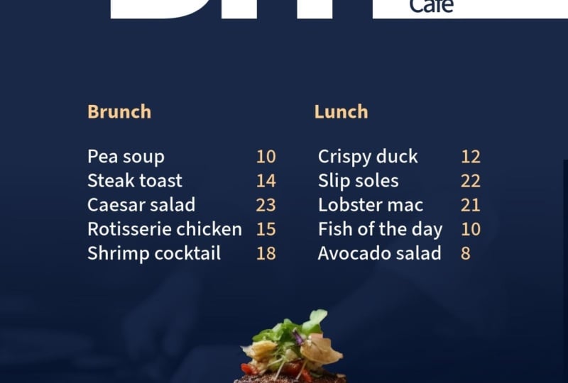
end page over here. That's page six there, 54321. All ready to go Now,
this is the fun part. I'm going to go back
to the document, I'm going to go along to the
add ons and I'm going to find a little add on
in here which will allow me to make this
into a document which has got pages that will flip in a sort of
a three D manner. Of course, if you
don't want to do that, you can just go straight to download and download
it as a PDF. That's absolutely fine,
but I'm going to use the flow paper and you can
see mine is installed. If it's not installed,
you might have to click the install button over here. It just shows you
a preview of it. Now in the past, I have had a few problems with the
preview not happening. And I've actually had to restart Express to just get it to work. So if it doesn't appear in
there, don't worry too much. You can just get to restart. Or you can actually go to flow papers website and take your PDF and do it directly within flow paper itself.
But I've got that. I'm going to say
export to flow paper. It just takes a
moment to export it. What it'll do then is
take us into an area where we can actually adjust
how the three D thing works. And there's different
ways in flow paper that you can get it to work, right? Well, now it's done. I'm going to click Explore Flow Paper. And that will open up a new tap and it's importing it via
Adobe Express into Flow paper. You can see the website is
Flow Paper.com over there. It's just going
through all my pages, optimizing them, and
then bring it in. Now this is flow paper and there's so many
things that you can do, but I'm going to leave
it on the default. But let's have a look
at how this works. If I go over here and click
from one page to the next, you can see how it just opens this document
beautifully like that. You can have a maximum
of ten pages in here in the trial
version over there. If you want more, you can
of course upgrade in there. But I'm going to
publish this now. I'm going to go over to
the top right hand corner. I'm going to click the
published button and I'm going to do cloud hosted for there. I'll just start the upload. It's now publishing it online. Then when it's
done, it'll give me a little link over here. This is the link I could send. I'll just copy that
link in there. And I can get rid of this. I can send that link now
to anybody that I like. Here's the link over there and this is
what they will see. They'll see the document
there when they click on it, they'll get this lovely
page flow like so.
29. N8 web page: Let's create a quick
and simple web page, which is going to be a supporting
page for our document. I'm going to click
the plus button. I'm going to scroll all the
way down to the bottom, and then up a little bit
until I get to web page. Now this takes us
into a new area. You can see over here, we've got this big
gray area there. That's where I can put
in my hero picture. Now for my main
document I use Cyprus. I'm going to click
on Photo and then go and find Cyprus
pictures in here. Do bear in mind though that these pictures
change all the time. Adobe keeps updating them, adding more, subtracting some. Yours might not always be
exactly like mine are. I've found the same one
that I've used there. I'm going to click on that and add that one in to
the background. Now it really is a bit
fuzzy and out of focus. It will update soon. It's just updating itself. You can see the little thing
going round and round. I'm going to add
some text in here. I'm going to add a
subtitle as well. Then we've just got
to sit and wait for that background
to update itself. Let's go scroll
down a little bit. What we're going to
do on the next bit down is we're going to
add some more content. I'm going to add a split layout. You can see on the left
here it says as your image. I'll click on that, and once
again I'll choose Cyprus. I think I'm going
to go with that. It's a bit different, but
it looks really good. Then on the right hand
side, I click on the Plus. And then I can choose
either to have another photo there
or text a button, a gift, or a video. Well, I'm going to put
some text in there. I've copied a bit of text, so I'm going to paste that
text straight in there. Let's move down again. I'm going to click on the Plus. This time I'm going
to put in a video. I'm going to choose
a video in there. I'm going to go a copy the RL. Go back, paste the URL in there, and click on Save there. We've got the video
in the document. We can just keep going. I can click over here and I
can add all sorts of things. We've got things like photo grids where you can have
multiple photos in there, a glide show where the images
will slide over each other. You can just experiment
with various parts of this. Now I'm going to go along to the top and have a quick look at one of
these little buttons. There's like a little
magic wand over here. Now this is for themes. You can see I've
got a certain theme going on there with
that particular text. If I click on the theme option, it gives me more themes in
here that I can choose from. If I thought something a bit
more heavy duty might work, I click on that
theme over there. Personally, I don't like
that dark background. I'm going to go with
the crisp over there. It's a bit more modern with the white background behind it. There are ways where you can actually create your own theme. If you click on
Create a New Theme, you can make a full
theme in here with H1h2, your headers and your paragraph text styles in there as well. Just click on them. Go in and you can change them in here, including the color
of the text as well. I'm going to just
click back again. Over here you'll
notice that it does say head and foot to
customization is coming soon. This will be something
else that they'll add in. I'm going to cancel that
and go back to my document. Now, finally, I
want to share this. I'm going to click
on the Share button. This will then allow me
to publish it to the web. I click Publish the Web, and I can give it
a title if I want. I'm going to call it
Island of Dreams in there, putting credits if I wish. And I'm going to
click on Create Link. Now this is publishing
my project, and it will give me a URL link. So I can then send
that to somebody else. Let me just copy
that over there. We could also publish it
onto Facebook, linked in, et cetera, but I've copied
that link in there. Let's go and have
a look at that. And this will be live. Now, I'll just make a
new browser window, paste it in, press return. Here is my website.
Absolutely live. And I can then just scroll up and you can see the
whole thing works, including the video
that will then play. Let's just go back
again over that. Do try that out. Don't
forget to click on the Share button and add
a URL link in there.
30. Well Done & Thank You!: You got to the end of the intermediate level,
that is fantastic. I'm sure you're creating
incredible work now. But go on to the next level and we've got some really good
stuff for you in there. But don't forget, leave
us a review because it helps us to help you
with better courses.
 Tim Wilson, Adobe Certified Instructor and Expert