Transcripts
1. Introduction: Hi. I'm Louise Fili. I'm an Italian-American Italophile and we're here in my studio today in Manhattan. I've been fascinated with Type from a very early age when I would surreptitiously carve letterforms into the wall above my bed at night. When I was 16, I sent away for a pen that I saw advertised on the back of the New Yorker magazine and I taught myself calligraphy. Soon I would be making illuminated manuscripts of Bob Dylan lyrics to sell to classmates. At the same time, I bought my first Dover book and I set about to copy a different style of initial every day. This is the book that I still routinely use. I went on to major in art at Skidmore College, where if you couldn't paint, they would tell you that you were graphically oriented. That's when it all came together for me and I realized that all the things that I loved, lettering, letterpress, making books, collecting labels, and packages, it was all something called graphic design. I came to New York and worked for the legendary, Herb Lubalin, and then I became Art Director of Pantheon Books, where for 11 years I had the luxury of being able to experiment with the different period of Type history on a daily basis. This was a time when there were no books on design history. I had to assemble my own archive, collected from frequent trips to Europe, mostly Italy and France. This is how I developed my style, which I further refined when I started my own studio, where I decided to focus on the only three things I'm interested in; food, Type, and all things Italian. This was also a time when there were no role models for women. None. As a result, I've made a point throughout my career of mentoring young female students and designers. An important part of being a designer is knowing how to deal with clients, understanding their needs, understanding their businesses, and how to translate that into design. In this class, we're going to look at work that I've done over the years that will illustrate how I've achieved that.
2. Inspiration: Italy is my greatest source of inspiration, both typographic and gastronomic. I've spent decades combing flea markets and documenting signage, which has had a great influence on my work and my life. Well, I was Art Director of Pantheon Books. All art directors in the industry were so poorly paid that we all freelanced for one another. So, when I started my business, I already had a significant client list and didn't have to look for work. The book jacket work was enough to keep me and an assistant busy. But this is when I learned two important lessons of having a studio: never depend on any one type of work or client, and never sit and wait for the phone to ring with the perfect job, because there is no perfect job. Every designer needs to develop personal projects in order to find a unique voice. I started my studio with one assistant and a revolving door of interns, which made me realize that it would be better to just hire a second assistant. I've maintained the same formula for 28 years. I've never wanted to go bigger or smaller than two people working for me. The scope of work that I do is constantly evolving. I started out with book jackets and book interiors. Then, I added restaurants, then food packaging. All along, I would always be working on at least one of my own projects: a book, a product, or a font, which is a recent exploration. By keeping my studio small, I've been able to focus on my very specific interests. My work is often described as elegant, sensual, European-inspired, and tactile. Rather than simply borrowing from the past, I try to add my own perspective or personality to what inspires me. The typography is a reinterpretation of the historical references that pay homage and build upon those aesthetics. My work is influenced by all of the reference that I've been collecting for as long as I've been a designer, maybe even longer. My sources are flea markets, secondhand bookstores, and Italian eBay. Lots of sources are free. I'm always photographing signs or scavenging orange wrappers that are fallen to the ground in produce markets. Anything with Italian or French type on it has always been magical to me. My studio is a walk-in archive of all the restaurant menus, business cards, matchbooks, and specialty food packages that I have designed or collected. I keep a lot of the materials and binders on my bookshelves so that just by spinning around in my chair, I can come face to face with endless inspiration that I never get tired of, that I will use directly or indirectly as reference. I tend to plan my trips to Italy around flea market schedules, which are very complicated. It took me a long time to navigate that system. But there was one time when I took a trip to Bologna, and I was there for seven days. I used that as my base. In seven days, I went to eight flea markets. Surrounded by objects that I treasure: perfume labels, button cards, biscotti tins, I am routinely transported to Europe. My life and my work are inextricably combined, which is just the way I like it. My style has evolved over the years, mostly due to circumstance. At Pantheon and in the early years of my studio, I designed without a computer. Once we embraced the technology and as the programs became more and more sophisticated, it became easier to make the work look more vintage-inspired, more authentic. Ironically, we go to great pains and photoshop to make things look like they were not designed on a computer.
3. Louise's Studio: The scope of work at my studio is roughly one-third new work, one-third existing clients, and one-third self-generated projects. As soon as I started my studio, I looked for my own projects to create and I began with what was closest to my heart, Italian Art Deco. This evolved into a series of books on European Deco Graphic Design for Chronicle that I did with my husband Steven Heller. For each of these books, I had two rules. Always put a woman on the cover and always create a font exclusively for the book based on a type treatment of one of the images in the book. Steve and I have done close to 20 books together. At one point, we inadvertently started the S Series, Scripts, Shadow Type, Stencil Type, and Slab Serif, drawing on all of the reference materials that we've collected. For years, I've been obsessively photographing shop and restaurant signage in Europe, particularly in France and Italy. Whenever I travel, I make a point of going to a city I've never visited before just to document the signs. I keep the photographs arranged by city in binders on a dedicated shelf in my studio where they serve as frequent source of inspiration. These images were always intended for reference only. Reproduction was never my goal. But as many of these signs started to vanish one after the other and as the quality of digital photography got better and better, I felt a sense of urgency to record as much of the beautiful street typography as possible before it was too late. I went back and rephotographed whatever I could. For the rest, there was Photoshop. At this point, I have written, photographed, and designed three books on signage, Italy, Paris, and Barcelona. The signs continue to influence my work and now can inspire other designers as well. In the meantime, I've written and designed a monograph of my work Elegantissima, a guide to artisan shops of Florence, and a book about all the things that we love and sometimes love to hate about Italy. For a line of gift products produced by Princeton Architectural Press, my collection of vintage Italian pencil boxes inspired a set of double-sided red and black pencils in the classic 1930s cursive. This was soon followed by Tutti Frutti colored pencils and Brillante metallic colored pencils. Designing fonts is my latest exploration. For years, I was interested in designing only the characters I needed for a logo or a book and nothing more. But now, I've reached the point where I would like to share these letterforms with others. The first is Mardell, which was made both digitally and in wood based on Italian futurist letterforms. Then, Montecatini based on hand-lettered Italian posters from the Art Nouveau period or Stile Liberty as it's called in Italy. On my first trip to Montecatini, I came back with a poster. It was a reproduction of a poster done in the early 1900s that simply said Montecatini and there was a little bit of other type on it. But I love the letterforms so much and it was something that was an inspiration to me for years and years, and I finally decided to research those letters further into other posters from that period. That was the inspiration for the font which is distinctive especially because it has a lot of special ligatures that were very commonly used at that point in history. There are so many fonts out there right now for the world to enjoy that it's difficult to choose a font that I want to spend months working on. This one that we used for Montecatini was unique enough especially because of the ligatures and because of its history. It also goes back to my days of working with Herb Lubalin who, when he designed the typeface Avant Garde, used many ligatures which ended up being misused. That was something I had to be very careful about as well, but I think it was the right choice. As wonderful as the Stile Liberty or Art Nouveau style of Italy was, it made room later in the '20s and '30s for Art Deco which is another distinctive period in type history that I'm very, very fond of. I love French and Italian Deco mostly because the letterforms are very bold and sexy and beautiful, and I never get tired of using them. Italian design today, there are a lot of good things going on. It's not as unique as it was in the Stile Liberty or the Art Deco periods, but there are always some great surprises to be found.
4. Personal Projects: This is my own private office in my studio, where just behind my chair, I can spin around and look at all of this reference that I've accumulated over many, many years mostly from flea markets and other sources. So, up here, all of my orange wrappers and lemon wrappers that I've been picking up off of the ground from produce markets. I have so many of them that I actually arranged them by subject. So, we have sexy women, and cute babies, and charming animals here. So, these are always helpful to look at just for fun. Then, I have a lot of Italian and French labels that are up here that I've mostly collected from flea markets. So, these are soap labels, perfume labels, wine labels. Then, down here are the signed photographs that I took for so many years before I started shooting digitally. So this, for example, is Viareggio, which is one of my favorite places with beach signage that was done in the early deco era. Some have better typography than others, but it gives me a lot of pleasure to leaf through this and wish that I were there. This one is actually a pencil card that I got many years ago from a store in Rome that was so old, that he still had the pencils that he was selling on display and this card that he would normally find in a flea market, and it was marked this before the Euro. So, it was marked like 1,500. No, I think it was 500 Lira per pencil. So I said, "Well, can I buy the whole card?" and he said, "Well, I'd have to charge you 1,500 Lira for the three pencils," and I said, "Well, I think I could handle that." So, when I'm going through flea markets, it's just whatever catches my eye, which usually tends to be beautiful typography. If it doesn't get type on it, there's no interest at all, but it's usually not hard to find something with great typography. I also collect a lot of tins. There was one dealer who I used to see at the Medina Flea Market, and I managed to get his schedule. So, I used to chase him around to all these little towns wherever he was, but he had really great tins. Look, here are all my type books and most of them tend to be old. These are two French type books that I particularly love and love to look at. This is a Schriften Atlas, a German type book that I love to look at, and I have the old photo lettering books that I used when I first started designing when, of course, we used them to order type from typographers. Here is the de Brity Penyo series, which are really beautiful. de Brity Penyo was a foundry, and these were their type books that have all the typefaces that other typesetters could order from, including the ornaments and things like that. These are French deco. These are little tourist souvenirs. They're just envelopes that have miniature postcards inside that are of black and white photographs from different cities. But, I think what's the best about this is the typography. One is just better than the next. There are also a lot of things that are on my shelf that whenever Steven and I are working on a new book, like me, working on the stencil book, I kept saying, "I don't think I have enough images to fill up a book," and then I would just turn around in my chair and see this clock. This was in my kitchen until it broke, but it has these great stencil numerals and a beautiful deco style. So, we photographed it and used it in the book. Here are all of the pencil boxes that I've been collecting for many, many years, mostly from flea markets in Italy, and that's where I got the idea of doing the two-toned pencils. But there are all kinds of inventive ways that they package pencils and did the typography. Like this one, this is one of my favorites. Then, of course, one of the biggest pencil companies was called Fila, which is almost my name. So, that's why I was really happy to put my own name on the pencils that we did for Princeton Architectural Press and interspersed with all of the vintage collections that I have is my own work. That's the way I like my work to live in the studio, so you can't really tell one from the other which is the way it should be.
5. Working With Clients: A lot of the work I do is for restaurants and specialty food packaging although occasionally we'll work for something other than that. But when I get a call about a new job, before I set up a meeting I ask two critical questions; the first is who are the decision makers? This is essential. If they tell me that one of the decision makers is too busy to come to a kick off meaning, I tell them that I am too busy too. No decision makers, no meeting. The last thing you want to deal with is someone trying to second guess their boss, that is when things go very, very wrong. The next question if appropriate, have you owned a restaurant before? If the answer is no, I won't work with them. I've designed restaurants for seasoned professionals and they have still gone under. In New York City where restaurants are the number one business most likely to fail, there is no reason to take a risk with a newcomer. Since I work with small companies, I'm rarely given a brief. There are no focus groups. Before the meeting, I'll do my own research into the company and whoever will be attending the meeting. If it is a restaurant, I'll visit other restaurants they might already own and read up about the chef. Chefs want to you to be well-informed especially on the subject of themselves. At the first meeting I'll listen to what the clients have to say, otherwise, if they need some direction, I'll ask them my standard list of 20 questions. I think of it as a warm up exercise to get the conversation going and generate some enthusiasm. I usually start with about 15 questions and it always leads to at least five more. The first two we've already discussed. Number three, have you done a trademark search of your name? This is very, very important. You don't want to design the best logo you've ever done and then find out that the name is not available. The only time I didn't ask this question was when I was working with a very highly respected restaurateur, I didn't want to insult him after all. After the logo was approved, we found out that they couldn't use the name. What were they thinking? Four, how will the logo be used? Make a list. If you were designing a logo for say a book publisher, you need to know that 90 percent of its usage will be stamped in foil on the spines of hardcover books. That means that there cannot be a lot of detail. It will have to be read clearly at a very small size. Five, who is your competition? Look at the logos to see how yours can be better and be sure not to inadvertently borrow from one of them. Six, what sets you apart from the competition? You need to make the most of the restaurant's strengths. Artisanal is a French bistro specializing in cheese, an important concept to convey in the logo. Seven, who is your market? Eight, what are 10 adjectives that describe your business? This could make the client uncomfortable at first but they'll usually rise to the occasion and provide more than 10 in the end. I'll usually started off with a few suggestions, say authentic, elegant, fun, it's a safe bet to get the conversation going. Nine, where do you want this business to be in 10 years? A lot of clients never think that far ahead. Now, on to a restaurant specific questions. Ten, what restaurants do you like? Why? Eleven, what restaurants don't you like and why? Twelve, what business cards, matchbooks and menus have you saved? Why? Thirteen, what do you want the dining experience to feel like? For Claudette, the answer was a private home in the south of France. I even contributed some French cookbooks to the bookcases in the main dining room. This is an important way to understand the intended mood of this base. Fourteen, have you hired an architect or interior designer? Hopefully the answer is yes. One cue from an architect can offer invaluable design inspiration. In the case of Specchio, as soon as I saw the restaurant plan for a twisted metal staircase with it embedded colored glass beads, I knew that we had our motif for the logo. This was actually the maquette for the logo. The idea was that we would have the same craftsmen fabricate the stairway at the same time as the logo. But as restaurants often do, they ran out of money. So, the maquette became the logo. Fifteen, are their mood boards? Elevation drawings? It's ideal to have these in hand before working on the logo, but the too often happens simultaneously. Sixteen, what does the facade look like? The facade can drive the design of a logo since especially in New York City, the available space for a sign is limited. There may only be a space for a hanging sign for example in which case the logo cannot be too long or too tall. Seventeen, is this a landmarked building? This is very important to know as it can also impact on everything you can or can't do with the sign which will have an effect on the logo for sure. Eighteen, what business was in your space before you took it over? If it wasn't a restaurant before, they have a lot of work ahead, another reason not to go with a newbie. Nineteen, when do you expect to open? You should not necessarily believe them, but as a professional you have to let them know that you can meet whatever improbable deadline they come up with. Twenty is the final question which I save for later. If the client has come to talk to me about a makeover, the conversation will differ somewhat. With someone like Sarabeth, who when I started working with her had been in business for 25 years, I sat down with her and her husband Bill and they told me everything about the company. Just one look at Sarabeth jar told me that the printer who had been designing the label, it simply reeked of Microsoft Word. Why else with the tag line spread the word, the italicised underscored and set in quotes and it means nothing. Sarabeth was understandably apprehensive about the financial investment, not only for the design but also for reprinting front and back labels for a hefty inventory of 14 products in four different sizes. I told her what I tell everyone who is considering a makeover, you can change a lot as long as you keep one or two key elements and rather than losing her customers, she will gain a new market. I showed them before and after examples of many of the successful makeovers that we have done which usually puts a client somewhat at ease. A lot of the work that we do for food packaging involves makeovers because very often after a client has been in business for five or 20 or 25 years, they'll come to a point where they realize that the quality of their graphics doesn't measure up to the quality of the products and that's when they call me. I love doing makeovers because it gives me an enormous satisfaction to clean up after someone else's mess. As you can see here we kept the same form of the iconic mason jar although we eventually had a custom jar created with Sarabeth's name embossed on it and I recommended changing the generic printed gold lid to plain silver. We kept the same oval shape of the label so the same dye could be used, but we improve the paper stock. A more opaque brighter stock made an enormous difference. From there, everything else was just upgraded. More elegant typography, border and illustration. Sarahbeth went through each and every letter of her name with me to get the logo just right. The result was subtly yet strikingly different so that when many customers would keep reaching for the jar on the grocery shelf without noticing the change they suddenly had a higher perception of the product. Like a good facelift, that is the goal of a makeover. The design was adapted to an array of other products; coffee, hot chocolate, cookies, pancake, and waffle mixes and gift boxes. After the question and answer session, I'll explain to the clients how I work. I'll have a lengthy discussion with all the decision makers at this initial meeting where I want to hear everything they can tell me about the project. I don't end the meeting until I'm sure I have enough to work with. At the next meeting, usually about a month later, I'll present two to three completely different finished looking logo options that no one will have to use too bunch imagination to decipher. The client will choose one direction for round or two every five minutes at which time we will address the color palette unless we have already done that in the first round which often happens. I don't always like to introduce color in the first presentation since it can run the risk of being rejected based solely on the client's likes or dislikes. But I also think that the logo and color can be more convincing than just black and white. If the logo requires an illustration, I'll use a placeholder image and then hire an illustrator once I get approval from the client. At this meeting, I might also talk about general directions that the logo might take, so no one will be unpleasantly surprised later on. If the client is a wine importer for example, I might suggest that we try to make the logo look like a wine label or a grape leaf or a red wax seal, then I'll show examples from my archive to illustrate. This is another reason why I prefer to meet at my studio where I have all of these materials on hand. At an initial meeting for Bedford Post, a restaurant in north of New York City, I met with the owners, actor Richard Gere and his wife Carrie Lowell. I had noticed early on that the property was located on the historic Old Post Road, once the mail delivery route between New York and Boston. So, I was very happy to finally have the opportunity to design a logo like a postage stamp. I brought along printouts of classic postage stamp designs with interesting type and border treatments and showed them at the meeting. They were sold on the concept, so we began to talk about imagery. Richard Gere responded immediately, "I have a wonderful photograph of my grandfather standing in a wheat field" he said and he jumped to his feet to act it out. Everyone in the room was completely transfixed except for his wife who rolled her eyes and she said, "Do you really know where that photo is?" And he said, "Yes I know exactly where it is." Sure enough I got it the next day and it was exactly what I expected. A small gray blurry snapshot, but this is why we have illustrator's. This is an example of giving enough reference at the meeting to set the project on a path. As a result, we focused on this one direction, designing the stamp and both square and rectangular formats. It was still very labor intensive but we all understood the final product that we were working towards which is key. Gelato Fiasco is another makeover. Although the name was purely laughable, I couldn't talk the client out of it. This happened to be excellent quality Gelato made in Maine and a rather sophomoric package. The one thing that they were getting right however was packaging it in clear plastic to allow the beautiful colors of the product to show through. At the first meeting, I literally took their Gelato and scooped it into another container just to show how much difference that could make. They were convinced. I also made certain to use a shaped label to reveal the maximum amount of product. Designing products to be sold in a freezer case is challenging. A lot of designers don't realize that the consumer has to make a choice before the door is opened. So, the package has to convey the product very clearly. Therefore we redesigned color coded strips to go on the list to readily identify each flavor. Gelato Fiasco illustrates two things that I have learned about designing logos for food packaging that I never thought I would say. First, a good package design can actually make a product taste better and second, a bad name can seem less bad when the logo is good. When New Canaan farms came to see me from dripping Springs Texas with this label, I said to her, "By any chance was this designed by someone who has never done food packaging before?" She said, "Why? Yes. How did you know?" How did I know? The logo was at the bottom of the label, dropping out of black and it's not even a logo, it's a font called Giddyup. To make things worse, each category of product use the same two stock photos and the same band of color for the flavor name, making it impossible to differentiate one saucer or jam from the other. I couldn't wait to get rid of all that black and those stock photos. We did extensive research to find images for all of the different fruits, vegetables, and herbs that were needed. The use of white brightened up the labels and a hand letter script takes Giddyup and gives it a new life and a refined identity.
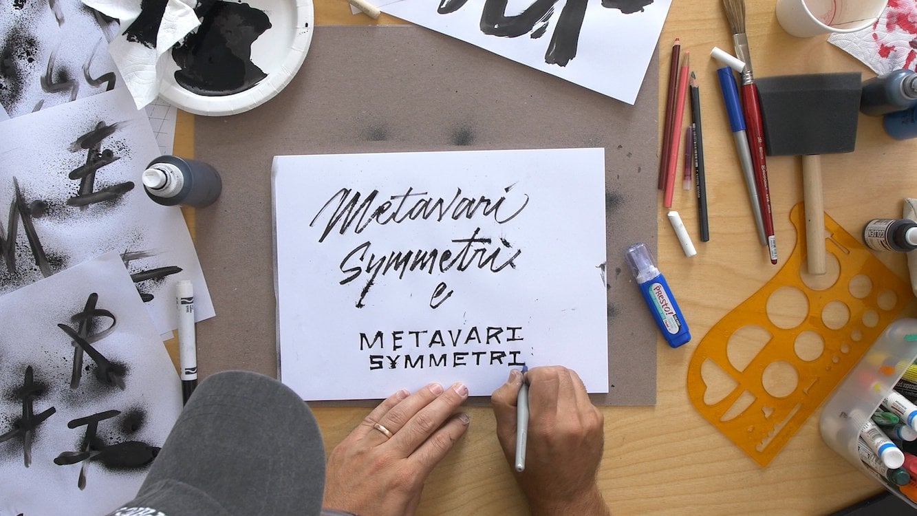
6. Creating Identities: Even though I am always excited to start the sketching stage, there is a crucial first step of the design process which a lot of designers often forget. That is research. No matter how well you think you might know the subject, research adds a depth of intelligence to the logo. For a Sicilian restaurant named Monzu, I was already familiar with the Trinacria, the symbol of Sicily, and Medusa head with three legs sprouting from it. But I had not been aware that it referred to Sicily's triangular shape. This made me very happy since I'm always looking for an excuse to tape or type to a point. I based the design on an image from my collection which I later had redrawn by an Illustrator. For this meeting, I took the preferred option and mounted it onto a heavy cover stock, and then cut it out with a photographer's paper cutter to give it a deckle edge. After decades in the logo business, I have come to the realization that every client wants to be taught just a little something, not a lot, mind you, just a little. At the presentation, I gave the clients the card and I shared the story about the Trinacria, which they devoured. Naturally, this is the option that was approved. As I left the meeting, I overheard one of the partners as he showed the card to his assistant explaining, and that's because Sicily's is a triangular island. Next, choose the all important pencil sketch stage. You can't design a good logo without it. As I've always said to my students, if you are designing something that will ultimately be printed on paper, hopefully, you need to start the process on a piece of paper. Going back to my publishing days, I have a formula that has become second nature to me. When I designed the book jackets, I would begin, of course, by reading the book, then I would sit down with a tracing pad and a pencil and draw a five and a half by eight and a half rectangle, take the title of the book and write it over and over and over again, page after page, letting the words speak to be within that rectangle. Pages and pages later, the title will have gone from an amorphous jumble of letters to a more precise design. It was usually a typeface that did exist, and I would have to figure out how to create it. Without even realizing it, this exercise prepared me for logo design. All the logos that we do in the studio are hand-lettered, which is part of what makes them unique. Setting a word in a font does not, I repeat not, make it a logo. Anyone with a computer can do that, and they do. When I start sketching a logo, I'm also making a lot of quick decisions that are automatic. The name itself impacts on the design immediately. Let's say it's one long word. You can hyphenate it. So, you probably have to use a condensed letter form as I did with Italian or take artisanal, a French bistro specializing in cheese. I had wanted the logo to look like a cheese label. Although most cheese labels are rounded, this name was too long to fit comfortably around a circle. So I changed it to an oval. This gives you an idea of how finished looking the logos will be when I present them. You see that I had to use a condensed type treatment for the two circular options. For the oval version, I used a placeholder image and later hired an Illustrator, Christopher Wormell, who did a wood engraving for the finish. You can also see that the client changed the spelling of the name halfway through the process. This is also a good example of how I like to use imagery within a logo. If you are working with an illustration, be sure to combine it with the type so that you have a cohesive unit to work with. As you've already seen with logos like Bedford Post and Monzu, you do not want to have the type in images to disembodied elements. This will not be a strong logo, and I guarantee that some restaurant manager or web developer will just love to pull it apart and make it spin and dance. Imagine that the name is three words, each of a different length, like Crawford Doyle Booksellers. I would almost automatically put that in a circle. That isn't the only way to treat it, but it's a good place to start. Of course, you will still have to find something to put inside that circle. Speaking of which the clients had just moved back to New York from Japan and first wanted a dragon fly as their image for a bookstore, in the meantime, I was pushing for the image of a woman reading a book which I have co-opted from a book jacket that I had just done with Illustrator, Anthony Russo, but they wanted to see Japanese iconography. So, to avoid dragging this out any further, I took the logo, I cut out a hole, and I used that as a window to try out different options using yet another Doyle book. Fortunately, they agreed on my image after all. For Metro Grill, the client didn't offer much to work with at all. So I started with the type to see what the possibilities were. Well, each word had five letters, that was a start, and there was one shared letter. That certainly had possibilities, but a little too cute. Having both words of equal length allowed me to oblique that type backward and forward, but this really wasn't enough for a logo. This restaurant is located in the Hotel Metro in the Garment District. So, first, I did this design to look like a dress label, then I had it actually made into a stitched fabric label, minimum quantity 5,000. So we needed to find other uses for it on the menus for one using remnants of the upholstery fabric from the banquettes. If the logo is a makeover, I'll first make a decision on what are the two salvageable elements, and then I'll work on improving everything else. In some cases, there is no reason to save anything from the original logo, and I will start from scratch, but I'll make the client aware of this. American Spoon have been making artisan preserves for over 25 years, and it was in need of a new identity. Located in northern Michigan, this family business was all about the fruit. I was impressed by the personal relationships the owners maintain with their growers. If the black raspberry crop wasn't good in a given year, they simply wouldn't produce the jam. The existing logo was somewhat generic. I wanted the new identity to communicate the concept of human interaction. So I again commissioned Christopher Wormell to illustrate a figure shaking apples out of a tree into a basket. Then onto the label design, both the type and illustrations on the labels needed to have a clean, beautiful, and timeless look to match the quality of the product. The client was initially resistant to the label design that I proposed, which used English botanical illustrations as placeholders. Even though I showed the illustrator's portfolio, it was hard for them to make a leap of faith. Finally, I suggested that we hire the Illustrator Charlotte Knox to create one sample illustration which I presented in the context of the label. Fortunately, it won the client over. Ironically, it took two British Illustrators to convey an appropriate look for this very American company. When I met the Sicilian owner of the L'Arte del Gelato, I told him that I would never walk into a Gelato there with a logo like this. Even though this Gelato made only with the finest seasonal ingredients is as the taglines claims, Foresco only journal made fresh every day, and is as good as any that I've had in Italy. The company's logo, however, did not reflect that. I sat down with the owner and I showed him samples from my collection of pasticceria papers that I had found in Italy, and explained that for me, nothing is more blissful or timeless than Gelato. My goal was to capture that carefree mood in the logo and graphics. I drew upon a number of upright Italian script samples from the 1920s. I made sketches gravitating to the triangular shape, but also trying it in a rectangle, which we sometimes use as an alternate version on the sides of bags and on the carts, for example. You can see in my sketches that I make notes for reference to look at, the Carly sign for the type of script I was looking for, et cetera. Using an ice cream color palette, the logo was translated to business cards, cups, bags, uniforms, and even a series of very charming carts found on the high line at the Lincoln Center. My favorite is the logo I drew in Fiat Cinquecento, which was imported from Sicily. Pearl was the original Oyster Bar in New York City. But for 15 years, the restaurant didn't have a logo. The owner had given her mother a very old speedball lettering handbook to a sign painter and pointed to Stunt Roman. The hanging sign became her logo by default. I decided to keep the logo in a similar size and proportion, and keep it in black and white. The logo would be designed to look like it had been done by a better than average sign painter. I presented two options, both scripts. One based on a Gelato, their sign from Venice, which is in my book, "Grafica della Strada", and the other, an amalgam of styles from my scripts book. The sign was made in Silverleaf, and the logo is also applied to other components, business cards, glasses, take-out bags, and gift certificates. Before I present to a client, I'll let the logo design sit for a day or two and then take another look. A pair of fresh eyes will let you see your logos as your client will. There is usually always something about one of the designs that makes me wince slightly or that I know will make the client wince. I make sure that the type is absolutely readable. Unreliability can be a big turnoff. I also check the spelling. We've had some close calls. With the Txikito logo, only hours before presenting, I thought I had better take one more look. Apparently, when I was sketching early on, I had started that with the correct spelling, but after a few rounds, I had inadvertently transposed two letters. Note to self, when you are sketching in a language that you are not familiar with, be very careful. I also have a tendency to choose my favorite option and do something additional with it. Show it as business card, as I did with Monzu, or even the menu just to help shepherd it through. For Bolivar, I presented the logo and then said, "Look how great it looks, blowing up to the size of a menu." After all, it did.
7. Presenting Final Work: Depending on a client, I may show the logo options printed and mounted individually on foam core, or if it is a small enough group, I'll show a PDF on a laptop at my conference table. But more importantly, I schedule the meeting to be held in my studio in the afternoon, and I serve gelato from my client Latte Del Gelato before I present. It never fails to put everyone in an extremely good humor. When I present, I usually start by summarizing the previous meeting and restating the brief, even though there was no brief. I will present each design and explain how we arrive there and why it's a good solution, sometimes showing reference or an application. When I'm finished with the presentation, we have a discussion about all the options. Some clients like to start by removing the options that they don't like. Then we discuss the merits of each of the remaining options. In the best case scenario, we reach a decision while we are all still at the table. Only once did I have to say that no one could leave the room until we had a consensus. It worked. If I'm presenting a makeover, I will show a side by side comparison so that the client can fully appreciate how much better the package design looks, even though the changes can sometimes be somewhat subtle. If I am presenting out of the office, usually to a larger group, I will show a PDF, and I always make sure to arrive well ahead of time to test it out. In some cases, I will bring along an extra keepsake like these booklets I did for Good Housekeeping when I presented their redesign of the seal of approval for their 100th anniversary. I came up with this idea because at the first meeting, I had brought some copies of a limited edition promo book that I had done called Logos A to Z, printed in letterpress. I had designed a logo for every letter of the alphabet, almost. Before the meeting, I had asked for a headcount, and I was told that there would be six women. It turned out to be eight, but I had only brought six books. So, I waited until the end of the meeting when everyone was leaving and I very quietly said, "If anyone is interested I have some promo books." Of course, everybody was interested and got quite excited about them, which is when I decided that when I went back to present, I would make a keepsake booklet for the occasion, not in letterpress. As the presentation included many nuanced options, it was good to have this book so that everyone could follow along with the PDF. I was actually the second design firm to be hired for this redesign, and I'm glad I was. The first firm took the design too far, which was exactly what Good Housekeeping thought they had wanted. When they saw it, they realized it wasn't what they wanted or needed, and then they called me. If I had been the first to be hired and I presented what I ended up presenting, they would have been underwhelmed and wondered what it could have looked like if I had gone further. This way, they saw what it was and it cleared the path for me. Chef Jody Williams found me through Instagram where I was posting photos of Italian signs, and she contacted me about a new restaurant called Via Carota. Although that translates as carrot street, neither Jody nor her partner, Rita, were interested in seeing a carrot or a street sign in their logo. I agreed about the carrot, but I hated to lose this opportunity to reference an Italian street sign. At the initial meeting at my studio, the three of us went through a lot of reference material. We talked about a possible monogram, a crown, and an unusual shape for the business card. It was clear that Rita's taste was more minimal than Jodie's. I kept that in mind as I chose these directions to work with. Even though this was meant to be a presentation for the logo only, I myself was curious about how these would follow through to other components. So, we showed a variety of menu designs using the different logos, and we took the circular logo option and pasted it on a tray since it fits so well. These types of teaser items judiciously added to the presentation can generate excitement about the logos. Finally, I threw in the fork options since it is a conceit that I've been trying to use for years. Nothing wrong with recycling as long as it's not the same client. This is the logo that was chosen, and we had all agreed on chocolate brown for the color, although Rita still had some concerns about the curls in the lettering. So, we did a few versions with tamer curls. This last one is the one that was accepted. From there, we designed the matches, menus, coasters, and Website. The menu had grown since we had first talked about it, and in the meantime, Jody and Rita had ordered chapel chairs from England with a pocket in the back, originally intended for a Bible, which fit the menu perfectly. The clients for Mermaid Inn described their new project to me as a seafood shop that you would stumble upon while walking along a New England beach, except that you are in the east village of New York. Although I always stand by my old mantra from my book jacket days, never illustrate the title, every rule has its exception. In fact, this logo broke several rules and yet managed to be memorable. Not only is mermaid expressed twice in both type and image, but the word is hyphenated rather awkwardly. But it had the right dose of whimsy for the restaurant. The ultimate challenge was the check presenter. To capture the quirkiness of the locale. I opted for an empty sardine can with a fortune telling fish inside. They were both a big hit, although only the fish now remain and some diners couldn't help themselves from playing with the pull tab of the sardine can. Mermaid Oyster Bar opened a few years later which called for a brand extension. The Mermaid was flipped and a pearl choker added around her neck. Last year, the uptown Mermaid Inn moved to a larger space next door, and they decided to put a pizza idea into the original space. This was trickier than changing from a Mermaid Inn into a Mermaid Oyster Bar, and it was a longer name which didn't necessarily want to be hyphenated twice. I also didn't want people to think that this was a place making seafood pizzas. I thought I had the perfect solution, make the logo into a tomato can label. This allowed the type to be on one line, no hyphenations, in a banner, and we were finally able to introduce the second color. I loved this direction, but the clients did not. So, we went back to something closer to the original logo. However, since Sirenetta means little mermaid, we had to be sure to cover her breasts. An apron and a rolling pin did the job. Claudette is a French provincial restaurant in the village, I had started exploring various hand-lettered French scripts when suddenly the client said that he wanted to do a wrought iron sign. When does that ever happen? For the hundreds of restaurants I've worked on, I have done exactly one enamel sign and two neon signs, but never a wrought iron. As a result, we had to work backwards to design the logo with the material in mind. Like Via Carota, we had to relax the curl in the sea, and in each of these cases, I will admit that I've learned to like the final version better. I deliver presentations on my own in my studio. I bring out gelato first to set the mood. I want to make it an enjoyable and memorable experience for everyone. If there is pushback, which is thankfully rare, that's when I resort to the 20th question from my list. I don't always ask this question, only when we get to a point where it is necessary, and I would rarely ask it at the first meeting. It usually comes up when the client seems to be uncomfortable in making a decision at the presentation or else has buyer's remorse after approval of the logo. The question is very simple, "What are you afraid of?" What's interesting is that they never don't answer the question. No one ever says, "Why are you asking a question like that?" or "I'm not afraid of anything." Their answer is usually an irrational but totally understandable fear, anything from, "I'm afraid I'll lose my customer base." to "I worry that this logo won't look good on a fax." A fax? I take whatever time is needed to coax them off the ledge. I'll show them case studies and more examples of make overs if appropriate, and eventually, we're on our way. This is an important step that will hopefully earn your client's trust. I think it's essential to present the logo options in different contexts as I do to help the client visualize it better. If they do have certain suggestions, I'll talk them through trying to keep an open mind, and explain why those options may or may not work. If one of the suggestions is feasible, I will address it in the refinement stage. Like the Curly's Season, Claudette and Via Carota, those misgivings are not likely to go away. They cannot be ignored. Some clients think that they need to tell you what to do to fix a design. My standard answer for that is to say as nicely as possible, "You don't have to tell us how to change the design. Just tell me what you don't like about it, and we will figure out how to change it." Every designer should stand by their work, but you should save the drama for a worthwhile occasion. I was art director at Pantheon for 11 years and held my ground with every jacket design I showed to an editor. But one thing I knew was that I could only threaten to quit once. So, I saved it for the one time I brought in a book I wanted them to publish. It was Mouse by Art Spiegelman. I simply said to the editorial director, "Publish this or I walk." I'm happy to say that it worked. When I designed the business card for Artisanal, I found the perfect color paid for stock, but it was only 80 pound as much colored stocks are, which was too flimsy. So, I recommended duplexing the cards using two sheets glued together. The client didn't think it was worth the extra cost. I knew that it was. The client had spent tens of thousands of dollars having floor tiles flown in from France but was ready to go with a flimsy card to save a few bucks? I took out the $300 in question and I put it on the table and I said, "I'll pay the extra fee myself to get it done right." He gave in, and thankfully did not take my money.
8. Conclusion: As a designer, the best thing you can do for yourself is to act like a professional. Be extremely prepared for the meetings. If you're doing a restaurant or a food package for the first time, good luck. You have a lot to catch up on. Don't expect to get a tutorial from your client. You need to know what you don't know. I cannot stress enough how important it is for you to put yourself in your client's shoes. After all, imagine that you were renovating your house. You hire a highly recommended architect who seems to be a nice person, who comes back to you with a fee that is twice what you expected and the floor plans are incomprehensible. The architect will say, trust me it's going to be great. Your relationship with your client is about trust and you need to understand how to earn that. Listen carefully so you can give them what they need not necessarily what they think they need. Be patient. I've rarely done a job that didn't have a few hiccups along the way. Just be professional and take it in stride. Never take anything personally. You'll eventually find a resolution. Be willing to admit that you were wrong, try not to repeat yourself. Be open to new directions. Finally, have fun. Your logos should make you and your clients deliriously happy. If you're not enjoying the logo process, you're just not doing it right.
 Louise Fili, Designer