Transcripts
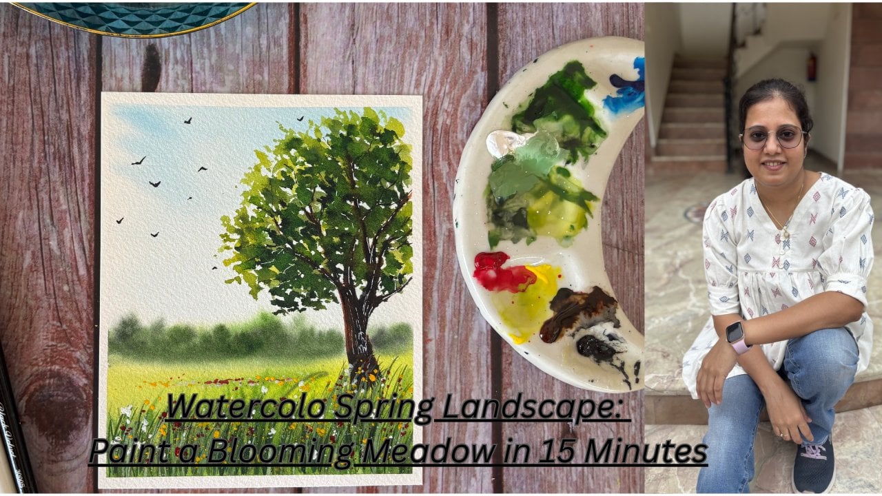
1. Introduction: Landscapes that combine
skies and meadows often create visually
striking and serene scenes. The sky provides the backdrop
and mood of the landscape. The meadow adds color, texture, and a sense of
intimacy to the landscape. Combining these elements
in your artwork can create a compelling
and harmonious that captures the
beauty and interplay between the expansive
sky and the meadow. And this is exactly the theme of today's class. Hi, everyone. I am Shalika, a
watercolor artist, and a vivid landscape lover. I love painting dramatic
skies and rich meadows, and I'm here to walk you through the process of
painting one today. In this class, we will
split the process into two, process of painting skies
with multiple layers, then we will set to
paint the meadow and final touches with
birds and flowers. So gather all the materials discussed in the
next section and hop on to the journey of painting these two
beautiful landscapes.
2. Materials Required: Let's go through the materials that we need for this class. First is the paper. I have used Saunders Waterford
brand of paper. I have this big block of
100% cotton, 300 GSM, which I've cut into
eight by eight inch size paper for this class. You can use any brand of paper, but I would suggest
to at least have 100% cotton and 300 GSM paper. Next for brushes, I
have used five brushes. First is a silver
velvet hake brush which I've used to apply water. Next is Brostro mop brush size four and silver velvet brush size six
medium size brushes, these two, which I've used to apply my colors and
paint skies and meadows. For detailing purpose,
I've used the size two and size four Princeton
brushes for details. For the colors, I'll be using different brands of
artist create colors. You can start with any
brand of colors that you have and for the details
on the specific shades, you can watch the
colors watching video. Next I have is a pencil, two jars of water. A palette to mix colors. I'm using this ceramic
tray for the same. Next is this board, where I taped down the paper
using the masking tape. And last is a tissue or cloth. Gather all the
materials that you have and let's jump into
painting the landscapes.
3. Landscape 1 - Colors: Let's start with the colors
that we need for this class, especially for the
landscape one. Starting with serine blue. This is from the brand
Miglo Mission Gold. Next is Calilar yellow. This is from the brand Snelar. Next, I would be using yellow permanent deep, again
from Mgilomiion. This is a shade between
yellow and orange. Next is yellow orange,
again from Mgilomion. Then we have Indian gold. This is from white Knights. Next is indigo from
the brand cellar. Then we have bright clear
violet from gilumi. Next is PWC leaf green
from Shin hen watercolors. The other green shades are
sap three from Mgilumion. Next is hookers green,
again, from Mgilum. Then we have red
brown from Mgilumon. If you don't have this color, you can mix indigo
to burnt sienna. Next is neutral
tint from Shinhan. A alternate color
is paints gray. This is the hookers green
shade that I had swatched, and the last that
we need would be white quash or white gelpin.
4. Landscape 1 - Sketch : I have my paper here. Let's start with our
first landscape. Let's tape down the
paper on the board. I am using masking tape on all the four sides
and making sure the paper is firmly
taped down and there is no gap between
the tape and the paper. For the sketch, somewhere
around more than half of the page from top would
be the Horizon line, drawing another line
below this with some gap. Let's sketch the shed now. Highlighting the hill sort of shape touching the
bottom of the shed. With the eraser, I'll just make the graphite marks lighter. Now, the sketch is ready. Let's move to the next
section and paint the sky.
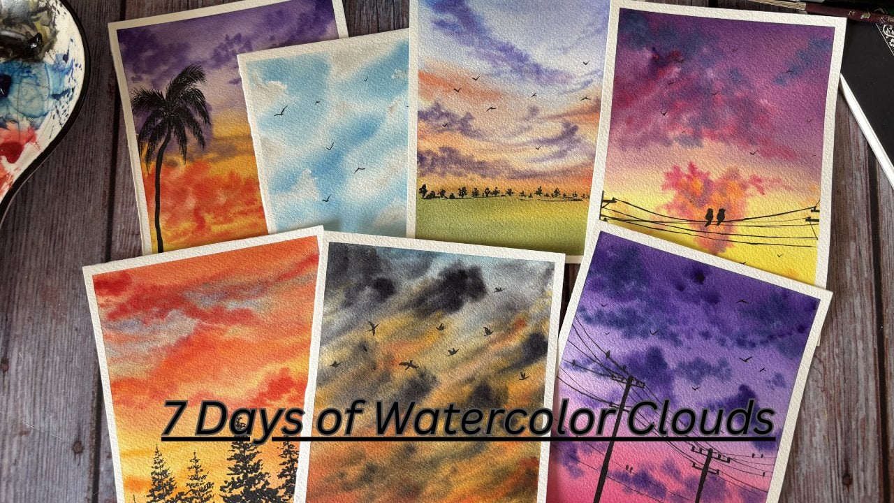
5. Landscape 1 - Sky: Let's paint the sky now. I have removed all the colors
needed onto my palette. Using my Hake brush, I'll apply even coat of
water onto the sky area. Try to avoid applying water to the shed
section of the sky. Apply multiple layers of water to make sure your paper
is wet throughout. Run your brush
across the whole of the paper to avoid any
water puddle on the paper. Now, let's start
painting the sky. We will start with serlein blue. Apply very light
strokes of blue, leaving white gaps in between, cover mostly the top
section of the sky. Now, aching in yellow, apply strokes towards the bottom of the sky and in
between the blue ones. Painting wet on wet, you just have to
apply the strokes and let the water do its magic, adding in some denser yellow
to the bottom of the sky. Now taking in violet, let's apply strokes
from the top. This is like depicting the purplish clouds
we see over the sky. Look at the intensity
of the color strokes. Always start out painting with light strokes and build
on the intensity slowly. In watercolors, it's
easier to build the tone, but very difficult to bring
down the tone of colors. Using denser intensity of
yellow and detailed brush, add in the clouds like strokes. We will add them
to the bottom of the sky and some
places in the middle. Switching to my silver
velvet medium size brush. It's easier for me to
make clouds with this. You can continue with
a detailed brush or switch to your
medium size brush. Now, with yellow orange, I'll mix it with some yellow dab of excess water
will build the sky. You can see the strokes
are like C shaped and just adding them together like a cluster to give
shape of a cloud. You can drag them
little towards the end to depict the lines and
tails of the clouds. At some white spaces
between the blue sky, let's add the yellow
orange shade clouds. The color tone of these would be slightly lighter than
that of the billow ones. We will not add a
lot of strokes to the blue sky because
yellow mixed with blue will give us
green shade and orange mixed with blue will
give us muddy brown shade. Taking some Indian gold now and painting on top of the
yellow orange clouds. This helps in building
the depth in painting. Bit by bit, you can see we are building the tone or
intensity of the shade. You can see the strokes are not very detailed. It's
all scribbled. As it's wet on wet, the colors will flow and give a natural look
to the clouds. Next, with darker shade of blue, we will paint in
the blue clouds. The top of the sky will be mostly painted in
blue and violet. Switching between the two shades to build the top of the sky. You can see I am
more focused with blue and purple clouds at only the top
section of the sky. The yellow from the bottom meets the blue clouds somewhere
in the middle of the sky, where we have the mix
of both the colours. Lifting of some colors
to give a shadow effect. Basically, clean up your brush, dab off excess water, make sure your brush is dried, and then lift off colors. You will see the
whiteness of the paper shining through where you
have just lifted the colors. Building in more of yellow orange streaks in
the bottom of the sky. For this, I'll switch to the detail brush to get
those thin streaks of cloud. Now, my paper has
started to dry and I want to build in more
depth to the bottom sky. I will apply an even
coat of water again on top of the sky and
continue painting on it. Remember to just apply a very thin and soft layer of water without applying
a lot of pressure. Now again, continuing
with the sky, starting with yellow orange and building on the cloud
tone or intensity. Uh Again, lifting up the color to let the blue shine through
between the yellow streaks. The middle of the sky
looks a little empty with the clouds blending out after we applied another
layer of water. Let me just add in some
clouds with yellow orange. Next, with Indian gold, we'll try to build the same. Oops, it has a lot of water. That's why my stroke is not coming clean and
getting blurred. I am removing excess water and then we'll work
on the strokes. Okay, so now I am done. I like the subtle
sky at the top and the dense sunset effect
in the bottom of the sky. Now, let's wait for this to dry before we start to
work on the meadows.
6. Landscape 1 - Meadows Part 1: Now the paper has dried and
let's paint the meadows. Use hake brush or any other large size brush and apply an even at of water
to the bottom part, the meadow section of the paper. I am here leaving out the
space near the horizon line. We'll add in the color
strokes directly. Wipe off the excess
part with the tissue. Using my medium size
brush and yellow, we'll start to build the
strokes for the meadows. Again, starting with
very diluted version. Now using leaf green to build
up on the color diversity. If you do not have this color, you can mix lemon yellow to your sap green and
get the shade. Be very careful while
painting near the horizon. These are all simple
horizontal strokes. Apply sap cream and build the hill or the uneven
bump like structure. Adding sap green to the
grass near the horizon. Using leaf green, blend it out evenly with
the background. Just play around in the meadow to give it some highs and lows. Use the yellow or
leaf green shade to create a smooth blend of the darker green
with the background. Adding in strokes with
a slight dark green. Again, here I have added a tinge of blue
to the sap cream. Blending it out using
the leaf green. Using sap cream, making
another pump at the flood. Okay. I think this
has become too dark, blending this out
with yellow and making this shade
little lighter. Making this little more evident with another
layer of saprene. Okay. So we're done with this. Let the base layer dry, and then we will work on
building up the meadows.
7. Landscape 1 - Meadows Part 2: U so the base layer
has not dried. Switching to the retail brush, mix the green with
Indian gold or burn sienna to get olive green
shade and using that, let's paint the distant
bushes around the horizon. Add in a tinge of blue to make slight darker shade and add
that to the bushes, as well. Painting different shades of green makes it look a
little more natural. Just scribble uneven surface that looks like bush entries. Similarly, painting
trees and bushes with different shades of
green near the shed as well. Use sap green, olive green, dark green that is sap
green mixed with indigo or blue to give different tones to the
trees and the bushes. Using the burn Siena, add trunk like
structure on the tree. Okay, so we are done
with the bushes. Now using red brown
or borne sienna, let's paint the shed. To get to darker shade, mix the base color
with pains gray and apply it at the corner to give
the effect of the shadow. Taking in the same color and applying it to the
other side of the shed. Same process of applying
the color and then adding dark shade to
get the shadow effect. Okay, D. Now let's wait for this to dry before you paint
the top of the shed. Okay, so this is now dried. Using a mix of indigo and
sap green, a very dark mix. Let's paint the
roof of the shed. So here I have mixed
in the shades, dabbing of excess water, just painting the roof. This is going to be a very
dark wash on the roof. Okay, we are done. Now while we wait
for the roof to dry, we can start painting
the meadow or the grass. Switch into my detail or small size brush with the dark green that I
already have on my palette. You can again use hookers green or mix indigo or
paint's gray with sap green. We will paint grass
like strokes. They can vary in shape, size, and color tone as well. So don't worry if you use
different shade of green because we will be working with different shades to
give a natural effect. Continue making these strokes. Okay, so we are done
with the first layer. We will continue painting
this in the next section.
8. Landscape 1 - Meadows Part 3: Okay, so to continue painting the meadow using
the detailed brush, we will add another tinge
of pains gray or indigo to the previous dark
shade and we'll add more grass strokes to bring
some depth to the meadow. So basically, every layer, you can keep on adding
a little more of pains gray or indigo
and darken your green. Okay, I think these many grass strokes
are enough for now. Using cadmium yellow, and Indian gold mix to get an opaque, yellow, orange shade, we
will paint the flowers. Add these dot like strokes to depict
flowers on the grass. Using the same shade, we will paint some flowers depecting far away
from our eyes. We might not see the
stems of these plants, but from distance,
we can see bed of flowers with a
yellow orange shade. Keep on adding a bunch of
them in different places. Now, we'll add another layer of grass strokes with
more dark green. You can see I have added more of ta and indigo to our
existing mixture, and using detailed brush,
I'm adding the strokes. Till now, we have gone dark bit by bit
from our sap green. Now mixing in some white
quash and sap green, we are going to go shade lighter and add these light
green strokes. Now with watercolors,
we could have just diluted sap green to
get lighter shade. But as we are painting
these strokes on top of already existing green
and the darker green shades, the strokes with diluted
green would not be visible. Hence, we mixed white uh
to lighten the shade, as well as to get
the opacity so that the strokes are visible on top of the previous
green strokes. For the flowers as well, we will add in another shade. This time, we will just use cadmium yellow and
brighten up our artwork. Okay. So now the flowers at
the distance between those, we might see some stems. You know, the ones which
do not have a flower. So just using green, adding some dots in between the yellows to
depict those stems. The yellow and yellow orange had become little dominant with
the yellow orange sky, grass, and the flowers. Let's add in some white flowers to bring in another
color element. Add them to at some places only. Now cover up your
sky wet tissue. We'll sprinkle some yellow
and white from the brush. This will give some
natural effect of different sizes of
flowers in the meadow. I think that's all.
We'll just need to add some finishing touches in the next section for
our first landscape.
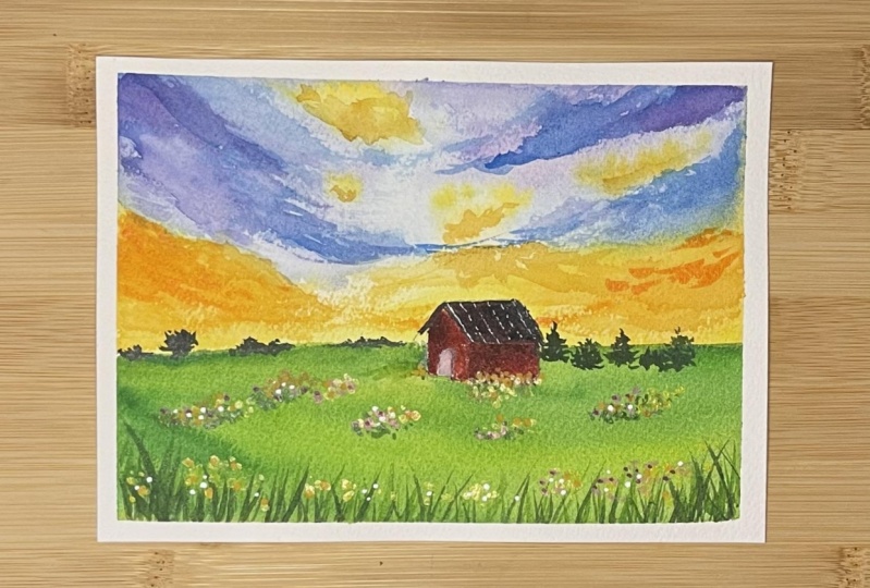
9. Landscape 1 - Final Touches: Okay, so for the final touches, let's start with the shed. Use white shell pen
or white quash with detail brush to add in the
highlights at some places. Okay, so the flowers are
still wet because of which I am unable to add
in these highlights. Let us meanwhile
paint the words. Using detail brush and
black color or paints gray, we will add in the birds. Work very slowly on this and
paint as many as you want. I love painting birds, so I will add a lot of them. If you want to paint only few, please go ahead and paint them. It doesn't need to be in exact
count and shape like mine. Okay, so I think these
many are enough. Now again, using white her pin will continue with adding
highlights to the shed. Let's add few highlights to
the bigger words as well. Now, before we close
on this project, I will just add slight
darker layer of paints gray to the door of the
shed. It looks very light. Okay, so the painting
is now done. Let us remove the masking tape. Here is the final painting. This looks so serene and
beautiful, isn't it?
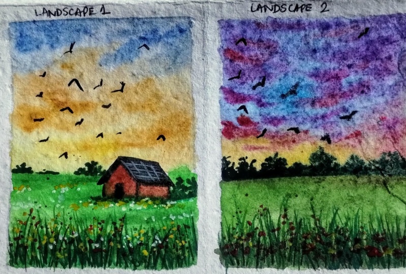
10. Landscape 2 - Colors: For this class project, we would leverage most of the colors from the
previous project itself. We'll just have an addition
of quincridon permanent rose. You can also use crimson red as an alternate color to this. Gather all the
materials and colors, and let's paint the
second landscape.
11. Landscape 2 - Sky: U so the base layer
has not dried. Switching to the retail brush, mix the green with
Indian gold or burn sienna to get olive green
shade and using that, let's paint the distant
bushes around the horizon. Add in a tinge of blue to make slight darker shade and add
that to the bushes, as well. Painting different shades of green makes it look a
little more natural. Just scribble uneven surface that looks like bush entries. Similarly, painting
trees and bushes with different shades of
green near the shed as well. Use sap green, olive green, dark green that is sap
green mixed with indigo or blue to give different tones to the
trees and the bushes. Using the burn Siena, add trunk like
structure on the tree. Okay, so we are done
with the bushes. Now using red brown
or borne sienna, let's paint the shed. To get to darker shade, mix the base color
with pains gray and apply it at the corner to give
the effect of the shadow. Taking in the same color and applying it to the
other side of the shed. Same process of applying
the color and then adding dark shade to
get the shadow effect. Okay, D. Now let's wait for this to dry before you paint
the top of the shed. Okay, so this is now dried. Using a mix of indigo and
sap green, a very dark mix. Let's paint the
roof of the shed. So here I have mixed
in the shades, dabbing of excess water, just painting the roof. This is going to be a very
dark wash on the roof. Okay, we are done. Now while we wait
for the roof to dry, we can start painting
the meadow or the grass. Switch into my detail or small size brush with the dark green that I
already have on my palette. You can again use hookers green or mix indigo or
paint's gray with sap green. We will paint grass
like strokes. They can vary in shape, size, and color tone as well. So don't worry if you use
different shade of green because we will be working with different shades to
give a natural effect. Continue making these strokes. Okay, so we are done
with the first layer. We will continue painting
this in the next section.
12. Landscape 2 - Meadows: For the bushes at the horizon, we will apply sap green and mix of sap green
plus pains green. This would be a simple wash of color with different
shades of green. Just add in a tinge of darker green that
is sap creen plus pains gray and drop that on the bottom of the bushes
to blend it with the rest. Now we'll apply an even coat of water to the area
below the horizon. I will use my hake
brush for the same. You can use any
brush that you have, but be very careful
around the horizon. We have just painted the bushes. I am, in fact, as you can see, not applying any
water over there. Now, using my medium size brush, we'll start painting the meadow. For the start, we
will use sap tree. Being very careful
near the horizon. Now you can leave little more white space than
what I have here. Let us add now quin
rose or crimson red. Quin and green when mixed
gives muddy brown color, but this works as
an advantage for us as it gives more earthy
tone to our meadow. Now we'll add in green, a shade darker than sap green. You can add a tinge
of paints gray or indigo to your sap green
to get this shade. Here I have used Hooker's
green from Mglo Mision gold. Okay, let's wait for
this to dry slightly. We don't want the paper
to dry completely. I will just wipe off
the excess water from the corners to avoid getting
the cauliflower effect. Now in this landscape, we will paint the
grasses in two layers. One, wet on wet, which
is what you can see. So take in your
detail brush with sap green and add
grass like strokes. Keep on adding them. The grass can vary in shape and size. You can also add grass with
Hooker's green shade as well. I am adding lots of grass. You can stop if you feel
it's getting a lot. So the second way of
painting the grass will be when this layer
has completely dried off, and then we add
in these strokes. For the first layer,
this looks good. We will add more in
the next section. Mm.
13. Landscape 2 - Final Touches: Now, the first layer has dried. Using a tone darker
than sap green, let's paint grass again. I have added a tinge of paint's gray or indigo to
my hooker's green. You can add the same
to sap green to get a shade darker than
the one we already have. You can see I am adding a
lot of grass strokes again. Keep on building
the green layers by adding more of
indigo or paint screen. I think these many are enough. Let's add flowers
to these grass. Using quin rose or crimson red, I am adding the flowers. Add them in varied sizes. Now, we will cover the sky wet tissue and add
splatters of quin rose. Now, the grass seems to
have become too dark. What we will do is
add white quash to sap green and get a lighter
green opaque shade. This will be visible
when we apply on top of the dark green grass that
we have already painted. Adding the strokes in the
similar way as before. You can add in broken lines covering up the
dark green grass. Anything is fine.
Now, for flowers too, we will add in a
lighter version. Using white quash and
quin rose or crimson red, we'll add in lighter
flowers as well. Again, we'll cover the sky with tissue and splatter the color. Okay, so the spatters
are not coming in. Let me just add little water, and this will make
the splatters easily. So we are done with the meadow. Now using detailed brush and black color, we will
paint the birds. Work very slowly on this and paint as many
birds as you want. As you would have
already known by now, I love birds, so I'll
just add them a lot. Oh. Okay, so we are done with this painting. The painting has dried as well. Let's peel off the masking tape. This is the final look. Love
how vibrant this one looks. That's the end of the class
projects for this class.
14. Conclusion: So here we are at the
end of this class. I hope you enjoyed painting these two landscapes and learn some techniques to paint
skies and meadows. It would be great to
see your projects, so please upload them
into the project section. Also, do share your
feedback about the class. It will help me to plan better. Till then, bye bye.
Happy painting.
 Shalika Gupta, Watercolor Artist