Transcripts
1. Welcome to Class: Hello skillshare. Let's talk about color. I love color. My home is full of color, different shades of pink, green, turquoise, blue,
and pops of yellow. I also love to include a whole lot of color into
my illustrations and patterns and make
them come alive in my eyes and hopefully gain
the interest from buyers too. Color is really important. It can change the mood
of an artwork from sophisticated and
subdued to wild and fun. You can convey different seasons with specific color palettes and you can breathe
new life into a design with just a
few color adjustments. In this class, I will be taking
you on a color journey so that you can confidently create color palettes
and procreate. I will be sharing my process of finding a signature
color palette, as well as choosing
mini color palettes for each of my collection. I will also quickly cover
an overview of why color is so important and the difference
between RGB and CMYK. Finally, I will take you through the process of the
class project, which is to create
a CMYK friendly palette and procreate
and recolor your artwork so that you don't ever have
any huge color surprises when converting to a print
friendly CMYK format one. I'm Christina Houchens,
an illustrator and surface designer
from Maria Fett, Sweden. I've been working full time
as an illustrator since 2010. And I've worked with
big clients such as Hobby Lobby, American Greetings, Paintbrush studio
fabrics to name a few, and welcome to my
Cheery Pink Studio. This class is great for
anyone who loves working in procreate and would love to gain a lot more
color inspiration. Color confidence, learn
why color is so important, and also wants to make
their lives easier when converting from RGB to
CMYK. So let's get started.
2. Supplies and Class Project: The supplies that you'll
need for this class if you'd like to follow
along exactly how I am doing would be an ipad with the Apple pencil
with the app procreate. I will also be using Photoshop. It's good to have and that's it. You can use all the
digital brushes of your choice and
things like that. We won't be focusing so much
on drawing this time around, but mainly on color. The class project for
this class is to create a CMYK friendly color
palette in procreate, and you can recolor some of your artworks using this color palette For
the class project, I can't wait to see what
you come up with in class.
3. Intro to Color: All right, now it's
time to talk about why color is so important. In this class, I really want
to inspire you about how color can really show your
style and what you love. But you can also play with
color to make different moods. And color is also so
important when you are designed for certain seasons or certain holidays because
color matters so quickly. I just want to go over the differences
between CMYK and RGB. If you didn't know,
I'm not going to go into major detail
because honestly, I don't have a clue
other than the basics. Cmyk stands for Cyan, magenta, yellow, And K stands for black
for whatever reason. And that's the
standard color system when you're printing. So if you remember if
you have a regular, like ink jet printer at home, you put in those colors. You put in a yellow and a magenta and a black
into your printer. And those colors combine to print your artwork or print your other
documents, you know. And it's the same
kind of system, but a lot more advanced and amazing at traditional
printhuses. Those are the colors
that you can create with just those three
colors or four colors. I guess you can say to
create all the colors. R GB, on the other hand, is red, green, blue. I don't know why
it's called that, and that is our color system on the computer there you have the ability of
every single color that you can come up with. It shows vibrantly
on your screen. But you might have
noticed that when you convert to print to CMYK, your colors out,
they're not as vibrant, they're not as exciting
and beautiful. But, which can be a bummer, this class I'm going to
help you along so you don't get too shocked when
converting from RGB to CMYK. There are certain colors that you're never going to be able to get in CMYK and you're just going to have
to deal with it I guess. But there are other options. If you are printing, you
can print with pan tones, but that's a whole other story and I don't really
want to get into that. Instead, let's jump into the
computer and I'm going to present to you
some artworks from my own portfolio to showcase Y, color is so important. All right, so welcome
to my computer. I'll be up here on the little corner over
there. You can see me. Yeah. I want to talk to you about why color is so important. I have picked out a
couple of my collections from my portfolio
to share with you. That wasn't proper English
to share this with you. The first collections
are going to show off my color loves,
these are my colors. I love pink, I love turquoise, I love blue, I love yellow, I love pops of white. But that's like I were to choose every single color palette that I
wanted to work with. This would be, I love that
bright poppy, I don't know. It's cheerful and it's happy. And those are just the colors that I am personally drawn to, as you can see, by what I wear and what
I have in behind me. It's just really I'm a pink
girl and I can't deny it. Yeah. That's just it's nice to have colors that you're comfortable with and
you love personally. Maybe you can't always work
with them and that's okay. Here's another collection that I've created recently
that also has the blue, yellow and pink thing, because those are my favorite colors. It's a vibrant and this is really shows
off what I like to do, it's really important
to find your thing. Here's another collection, Even though this isn't like
a floral collection, it still works
with these colors. This is Mother's Day collection. My color palette
works really good for that occasion because it's happy and cheery and
things like that. If my favorite colors were
dark purples and muddy brown, maybe it wouldn't be the happy
Mother's Day collection. Just things you have
to think about. Also, I can't because I
am working illustrator and not just creating
art for myself that I sell to my clients. Like if you have your own online store or something like that, then you can choose
whatever colors you want and put as much as you want. But if you're going to
be working with clients, sometimes you have to adapt your color choices so
that you sell more or that you appeal to a different
client base, et cetera. Sometimes I do test out
different color palettes here. It still feels really me. Because there's still
lots of pinks and yellows and just a little bit of blue in this one.
It's mainly green. But I toned down
my color palette, made it a little
bit more subtle, a little bit softer. It's fun to play with
that kinds of things too. I felt like I created this
during the spring time. Spring colors are a little
softer and you're just like getting into the new season. It's fun to test
out something else, but you can still
feel like it's me. Even though it's a variation
of my favorite colors. The there's still that nice pink in there and there's
still that nice blue, but it's just fun to
test as something else. This is a completely different departure
from what I usually do. I don't usually go
to the dark side, but it's fun to do that as well. Here is a really deep and
moody floral collection. It's quite Goth,
it's a lot of black. I usually don't use black
in my artwork very much. But again, it's fun to test
it out, this collection, because it is the dark colors, it gives it a completely
different mood. If I were to recolor this into my bright and
cheery palette, that would be appealing
to some clients as well, because I deliberately chose
a really dark palette, becomes really sultry, and you can think about
different clients to choose. If I recolor this,
I would maybe have to send it to a whole
different kind of client. I also adapt some here. This needs to be, um, in, in here we go, I adapt my color
palette to appeal to a different group of people. Maybe other people
don't always like pink. I was thinking like
with nature collection, people who are outdoorsy, you can love pink and be outdoorsy. That's
not what I'm saying. I made something a little
bit more nature colored with like Beijing
browns and pinks. Like what is this like a burnt orange instead
of my usual pinks. That's fun to do
too because I was feeling more the nature vibes. Yes, I just remember that you
can have a signature thing, which you can play with it
to suit a different theme, to have fun, all kinds
of different reasons. Here's another collection that I created and I wanted to also have that soothing spa,
like color palette. It wouldn't be
soothing if I had hot, hot, like super neon
yellow in here. It would be a totally
different thing. Again, that would be fun and
cool, it'd be a little wild. But this is like calm and
feels soft and quiet. And I felt like it
matched the line work. And what I wanted
to go with this, I wanted to be a
little bit more chill, You think about that
with the color mood. What mood are you going for for this collection or artwork? I have a really good example of a collection that I
completely recolored. I sent this into my agent and she was happy
with the artwork, but she thought the color
palette was off Birthday. Birthday usually has
more primary colors so that it appeals to anyone. So you can send the
card to your grandma, your neighbor, your
little sister, your dog, you know, anybody? This one, even though
it was supposed to be floral and feminine, it was leaning to Va***tine's Day with
the red and pink thing, there is like color. We understand color sometimes for certain things like red and green will
always be Christmas, Red and pink is really
Va***tine's Day, et cetera. After I got those comments, I did the color palette
to wrong language, to still be feminine and pretty. But I made it brighter and happier and more happy birthday. With here I went back
to my usual palette. I think the other one
I was trying too hard, it just became a lot more cheery and still has
that feminine look. I like it so much more and I think it will be
more appealing to clients. That's something
to keep in mind. Back to Va***tine's
Day theme here. I did the pink and
the red because I wanted to feel
really romantic. And I don't like sultry or
just like just romantic. I did quotes like, You are loved and
you were the one. If this was a different
color palette, no pinks at all,
It was all blue. It would feel cold. Not the same vibe at all. If everything was blue, can you imagine It
would just feel icy? You loved, it doesn't
have that warmth. Thing to consider. Again, again, like I mentioned here, seasons and occasions
have colors that are correspond to those
seasons and occasions. Here's Easter,
Easter collection, and I made sure to not
only use the eggs and the tulips and things that we think about when we
think about Easter, but I made sure to use
the pastel colors Again, if I did this in red and
pink or red and green, you'd be like, this is a weird Christmas
Easter collection. Or if I did everything in black
would be very depressing. Easter collection, you know? It's not like you can do
tons of black things for maybe Halloween or
something else. But yeah, just like you have to think about
sometimes using the traditional colors
when you're selling to clients who are going to
be having things in stores. People like the comfort of
things that are traditional, like the pastels in spring, and then bright
colors in summer, and then the orange and burnt reds and things in
the fall with browns. And then winters a lot of
red and green for Christmas, but also the blues
and silver and gold for holidays or just
wintertime in general. Here's a collection
for fall with the burnt oranges
and reds and greens. I have a little dusty blue
in here just to liven it up. So everything
wasn't just orange. But yeah, you can really, this feels like a
fall harvest look. I really liked working
in this color palette, even though there's like a
touch of dusty pink in here. Otherwise, a totally different thing than my signature
color palette. But still again, I'm
inspired by this. And then again, here's the
traditional Christmas palette. It is red and green. You almost always have to have red and green in a
Christmas collection, otherwise clients get confused. I've gotten comments before when I've done something a
little bit to pink, pink, and mint Christmas. And it was just
like, I don't know, a card, at least for
traditional clients. I make sure to use the traditional red and green
in a Christmas collection. For this collection,
I tried to push it a little bit by going
more in the winter zone. Even though this is a
Christmas collection, I did the Blues, the reds and the gold. Just switch it up because sometimes maybe we
don't always have to have, we don't always have to follow the Christmas or all
the color rules. Yeah. That's my presentation of my color and how I go
about working with color. I hope that that was
a good introduction to why color is important and things for you
to think about. In the next section, I'm
going to be helping you figure out your own
personal color path.
4. Your Signature Color Palette: All right, now we have
learned all about why color is so important
and can affect your work. In this section, I want to
show you how I have gone about creating my
signature palette. Like a really large
palette of colors that I choose from when I am
creating my smaller palettes. So let's get started on that. All right, so now
we're in Pinterest. My favorite place on Earth. I don't know what I would
do if Pinterest went away, because I've saved what feels like my entire
creative life here. There's so much inspiration. I've already done this
exercise several years ago, but I still feel like my
color tastes haven't changed. This is the kinds of colors and images that I am drawn
to in this section. To create your color palette, I want you to create a color Pinterest board and
save photographs of things, interior items,
just random stuff. Color is you're
drawn to the color. Don't save other people's
artworks, really. I think it's mainly
about color moves. I think especially interiors is a good thing to
pull inspiration from so that you're not
pulling inspiration accidentally from
another fellow artist. I've gone in and saved tons
of images with lots of pinks and pops of yellow and blues and sometimes pops of
red and things like that. Maybe you'll get a little surprised what you're
really drawn to, what you really like. I think I definitely
was certain colors. I really, at the moment, I love this vibrant
purple in that rug there. It's like a purply
magenta, pinkish red. That's really cool.
There's so many colors that you can draw from. Just to continue here, you compress more ideas. Once you have saved a couple of images into a pints board, you have the option
of more ideas and that will pull
similar images. We can pin things like this. Definitely with the yellows
I'm drawn to that. What else? I like these, the peach, this I'm drawn to
with the yellows, with lots of white, and then like small
pops of color, you just go ahead and you maybe need like 50 colors or so. Oh my god, look, this
is like my dream rug. Just go in and choose colors from images
that you are drawn to. Here's another
amazing rug design with tons of my favorite colors. I think I've pinned
a similar image. But yeah, that light blue with yellow is
definitely my thing, knowing that it goes
black when you choose it. Now you can't really see
what I'm choosing here. This pink and yellow
combination feels really me. Just go through
your Pinterest and choose lots of images that stand out to you
in the color sense. Maybe it has nothing
to do with the design. Like maybe you think this
chair is super ugly. Doesn't matter, you're
thinking just about color. I'll choose this one, and this one too. And then we'll go back. See what color palette looks like right
now. It looks like this. Again, these are the
colors that I am drawn to. And I don't want to think that these are the
colors that you need to be drawn to too,
just it's personal. If you like more
greens and browns, it's totally up to
you what you like. But like I told you in
my other presentation, maybe you'll have
to adapt some of your designs that aren't
like your signature thing. If you're going to
do Christmas or Easter or Spring collection, then you might have to
adapt your color palette. But for this section, we're going to have fun and just go all out with what we love. Next step, we want to bring
this color inspiration into procreate so that we
can gather images. Right now I'm in my computer. I'm going to switch over
to my ipad instead, so that we can pick and
choose colors from this. Let me just do that real quick. All right, now we're
on my ipad instead. It's a little bit bigger images. I'm going to let see default. I'm going to do
compact smaller images so I get more of the color look. I'm going to take a
couple of screenshots of my Pinterest boards so that I can easily bring those into procreate
and pick colors. I'm going to screenshot that, then I'm going to
scroll a little bit The screenshot, this then. Well, here's some nice, nice blues and purples. I'll screenshot that so that we don't get
too overwhelmed. I think maybe three
screenshots is good enough, because otherwise we don't
want to pick 1,000 colors. I'm just going to use a screen
size canvas in procreate, Just so we know that our screen size canvas is
an RGB mode in procreate. We're just going to double check that we go into the wrench. We're going to press canvas, we're going to press
canvas information and then color profile. Then here we can see it
is at display P three. I'm pretty dang sure that that
is procreate RGB profile, you can see underneath,
it's all the other R, G, B color profiles, but I keep it at
display P three. I found that that's really
vibrant and nice and I haven't noticed anything weird
with that color profile. If you are curious, if you want to create
another size canvas and you wanted to
create your other, you just press the plus sign. You decide what size
you want it to be. Then the color profile. Here you can choose RGB or CMYK. And here you can test out for yourself the CMYK
settings if you want to, but I always go for RGB. Yeah, then press Create
if you wanted to, but I'm just going to
cancel that back in here. We're going to press the wrench and add the, insert a photo. And we're going to
insert these three then. I'm just going to make
them smaller wrench again. Insert a photo and then
do the second one again. Make that one a
little bit smaller. It doesn't matter that
they're overlapping. Then the third one. No, not take a photo. The third one, we have
that one down here. There we go. I'm going to
just turn off the last two, create a new layer, pressing the plus, using absolutely any brush you
want does not matter. Just make sure it's quite big. We're going to go in and create our color palette
here on the side. To do that at the beginning, we're just going to choose the colors that we're drawn to. Color pick, you can have this
set up in different ways. I have it set up so when I
touch my screen color picks, but sometimes touching square over here also is
your color pickers. You cook that and then make sure you're
on that new layer. And I'm just going to
start picking out colors. I like that peach, I like that orange. This lilac is amazing. Hot pinks. I like one of
these coral pinks in here. No, not that I like that orange. See, not quite. Sometimes it can be difficult
picking out of color. You might instead, like this wasn't at all as
vibrant as I had considered. So you could just go in
and color pick the color that you were inspired
by, something more like. That is what I was going for. Let's see, I'm going to go in and pick all
the fun colors first. Here's a really
neon yellow, Fun. But I also like this, I do
regular cadmium yellow. I want this purple over here so it can
keep them in sections. Is blue, we haven't done. Dusty blue is nice. Oh, I definitely like
this like minty color. I also am drawn to these weird, funky, burnt yellowy in colors. That's neat. This purple
again, right now, like I said, we're
just randomly, we're not thinking, oh, we're picking 50 colors. Okay, so I always start
with the fun colors first. But then you can't always
create color palettes with just fun colors that
would be quite colorful. You need something like
to make it more neutral, we need some neutrals too. I think this like creamy
beige over here is nice. That's not really
what I was going for. That's a little bit warmer. Yeah, it was warmer.
I'm thinking more like something like that. Like a nice gray over here. Like a creamy pink was
very similar to that. So I could just like
lighten it even more. Yes. Okay. So that's
the first picture, so I'm going to just
check that one and check the next one and see if
we find some more colors. Like here's this amazing
blue that I really like. That's really nice. We don't have any pinks. Oh, that's really dusty. Again, I'm going to go
in and brighten that up. Nice. I really like this. So that's not it. Again, it's too gray. You just have to make
up your own colors. Let's see. Yeah, More of this. I love this super intense red. But that's similar to over here. That's pretty much the same
thing. We don't need that. Okay, more of this green. See, this one's better. It's nice to have some dark too. Can't forget that
we could go really dark with that blue
rich that is nice. Moby pink was nice. Very similar to the other
one that I got going on, but a little bit lighter. That's fun. Are there any other neutrals in
here that we like? I think that's pretty much
what I want to take from here. There's a lot of pinks. I only have one
traditional pink, but we can sort out later. See what our palette
needs. I'm going to uncheck that one and
do the last image. See what else we're missing. We already have
that nice purple, but we can see if
we can get even better like a sage
green is really nice. I like that too. These like peachy colors are
really beautiful then. I definitely like all these, these different
blues and purples are like this
yellow tier yellow. That whole palette right
there is stunning. Going to take that
whole thing like this intense red could be nice. Someone else in this coral
pink can go over here. I want to make that a little
bit brighter. Here we go. Those are the colors that I was drawn to the
most in these images. I'm just going to turn
off those colors. We can focus mainly on these colors and
test those out here. I think we have a lot
of bright colors. We have a couple darks, that's great, and we
have a couple of lights. When you're creating
your color palette, I forget how many boxes
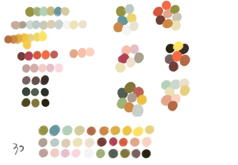
you have in here. Was at 121, 234-567-8910, 30. So you have 30 chance or 30 colors that you can
put in one color palette. And I think that's a
good amount of colors, otherwise you'll be overwhelmed. So we're going to have to break these down into just 30 colors. And then of course,
you can lighten and darken those colors afterwards. But just having like the basic colors that you
really, really like. Let's see what kind of
colors we come up with now then I'm going to
continue just picking, I definitely want one
of these yellows. I think that neon green
one is a little off. So I'm going to take
the more warmer one. I love this purple. I love this coral pink. I definitely want another
hot pink in my palette. I love this, like orangey red. I want a funky
yellowy gold color. Color pet. Okay. Maybe another, the burnt red or this like mave pink would be nice to have. I want to go in and get my
blues that I really like, the blue and the mint green. See, maybe this dusty blue is working for me and I
want to sage green as well. What other, this blue that's like in between blue and green. Very similar to these ones. Maybe that one is
just too similar. I should go for something like my light blue would
be nice to work on. Now, we have 612. We have quite a few more
colors that we can choose. We need to maybe do a little
section of my neutrals. I really like that
peachy base color. This gray, I feel like it's a
make it a little bit bluer. I think I want it even lighter. It's too close to that one, but I almost like that
one better than this. I'm going to redo that one. I think this peachy color
is really nice, neutral. I know myself and I like a
lot of pinks in my work. Maybe a very light pink
would be nice too. Then I do want something that's on the yellowy
side as well, like a cream, creamy
yellow. Maybe two. I want it a little bit more
there. Maybe that's nice. I don't know. That's
something you always have to test out with
your work as well. That one looks a little
dirty to me. Let's see. Make it a little less here. Clean that up. We'll
lighten it up. That feels better to me. A traditional off
white cream color. What else do? That one's this one you
don't have This dark purple. Can go for that. We can
start doing some dark. I have this really nice Navy. And this green I would like, I don't have any browns. And that's something
I don't often use, but it's something
that I could choose. I would want something
really rich that maybe a little bit
lighter could be nice. Let's see, 31234567. I have quite a few more
colors that we can choose for my signature
color palette. I'm going to make this section
smaller so we can add in a couple more rows.
See what we need. It was seven, we have ten, we have 123 more sections
that we can add in sometimes. Yeah, it's difficult
to figure out what is it that I'm
going to be needing for certain artworks
for right now? Have to wing it. Just think about the things
that you like to draw. I do a lot of florals. What colors would I want? I want a lot of the nice bright pinks and
things like that. I don't have any bobble gum. Maybe that's what I need. I also really like these
purple colors I had. This color, Is this one
the same? Pretty much. But I can take the lighter one because I think that's
really inspiring right now. Again, these two right
now look really similar. These ones, what can I do to make this one
slightly different? We can make that even lighter. It feels like it's different
in the color palette. That ones like a really
nice warm background color. And then the pink, I
don't have this orange. I don't usually use
orange in my work, but maybe that would
be something fun to update my palette
with like that. Nice. Yeah, it could be
nice. What else? I never use black in my work, but this navy blue is
definitely dark enough. This mint color I
showed you before, that I really like that color. Maybe I want to
choose something a little bit more vibrant as well. 12345678 910. We have quite a few colors left. You, of course, don't
have to fill up your entire color
palette, but why not? I really like this blue. It's a little bit more
brighter than that one, but we can also
brighten it even more, can make sure to have some
even more bright here. We have a light blue and a
medium blue and a dustier blue and even duster and a
dark here, the green. We have the mints and we have the really bright mint and
we have the sage color. I do like for greenery more, my olive green, so
we could try to find that ourselves
like this green. Then we have one more
row left of color. So let's see what we
can come up with here. What else do we need? All right, let's just see. I don't know what else
do I need in here. Let's do a light
green since we can. It's really pretty. I feel like I don't have enough pink in here for whatever reason. Let's do like a softer
bubblegum pink. Fun to have. And let's see something in between yellow and green.
What does that look like? You like that? Yeah, maybe this is the minue, signature color palette
that we're going to at least start with and
see how that goes. I feel like this dark blue is maybe a little
too blue or dark. I mean, I want to make it a little richer so you can tell
that it's blue or black. But it's that. I feel like we
got some fun right up here. We've got some nice neutrals
and lights down here. We have a couple of, we have one, at least super
dark that we can use. Then again, like these are just your main colors that you pick from all the time, but you can always go in, I like this green, but then create a darker version later when
you're drawing. There's so much options with
creating a color palette. Yeah, that's how I
go about creating a new big signature
color palette. It will be fun to this a couple years ago just compare to
the color palette I did. Then I have it
saved in palettes. Let's see here,
signature color palette. At that point, I couldn't
choose us 30 colors, so I did actually
do two versions. But in that one here, I still have my bright
pinks and greens. Lots of purples. I think I did a better job of
cutting it down because these purples in here similar. I didn't have this
color in my collection, but again, like this green and this green are
quite similar. Then down here, I feel
like these are all. I can't even tell
the difference. I think I did a way better job of condensing my color palette. I have a really nice bag
here that could be nice. Compare that to one of these. We'll keep it like
this. I'm happy with the new version of my color
signature color palettes. Fun that I use the
same color inspiration because I have the
same pints board, but this is just how
I came up with it. I hope that you also
are able to pick out a palette of max 30 colors
to make a color palette. Don't go ahead and procreate color palette right away, because we're going to, in the next section,
bring this image into Photoshop to switch to CMYK. I realize now that
I never mentioned why I don't use CMYK
settings in procreate. I just personally
haven't liked them. I don't like the
way it converts. I feel like it doesn't give you very vibrant colors
at all in Photoshop. At least I feel like
it's more true to CMYK and it's not as dull as
procreate CMYK settings. Maybe it's something that they
will update in the future. Maybe it's something
they've updated already and I haven't noticed. But for right now, in
my personal taste, I haven't liked the CMYK
settings in procreate. That's why I want to bring
this image into Photoshop. To do that, let's
just save our image. The swatches. Just the swatches. So I'm going to press
the Share button. I'm going to save it
as a simple J peg. And I'm going to save it
to my Dropbox so that I can easily find it somewhere.
I'll just put it here. Yeah, I realize that I'm
getting ahead of myself. Before we jump into Photoshop, I want to first talk to
you about some tapes in procreate and how I go about creating smaller
color palettes from this color palette. In the next section,
we'll do that.
5. Mini Color Palettes: Okay, so that was really fun to get into the color mood and understand what you
like personally. But using like 40, 50 colors in every collection
or every artwork you do, would be too much
and overwhelming. So every time I
create a collection, I pick a smaller color palette
of maybe 88 colors or so. Because I like the look of a more pared down color palette, it looks more sophisticated
and put together. So in this section, I'm
going to show you how I go about switching up my
signature color palette. So I'm not using the exact same colors over and over again, but they still showcase my color loves, if
that makes sense. Okay, so now we're
going to look at how we go about condensing this
really big color palette, like all of the colors that you really love
and want to work with. How do I, then when
I'm going to start a new collection
or a new artwork, how do I go about
choosing colors? Because if I choose 30 colors, always it's going to be
really messy artwork. I want to make it
look a little bit more sophisticated
and put together. Let's see, I just
do these colors. I'm going to select my color palette and
press copy paste. And then I can put, we can just focus on
the main color palette. Then I'm just going
to do another layer so that we can play with
some other color palettes. If I were to, I have
this signature color, I want to create a new
artwork for my portfolio. And I want to do like I usually love to do an every
day floral collection. I want to do lots
of happy florals. What would I choose then? I definitely, because it's
a happy floral collection, I would do some yellow. I love this purple
with that yellow. And then I would want
something to pop off of that,
something like that. Then, because it's a
floral collection, I would need some greens. Maybe that one or
one could be fun. And then we need some lights
in here and some neutral. Whoops, neutral. That's how I would start off, a mini color palette like that. Like maybe I would need, going forward, more colors
like here, there's no dark. I would maybe choose this green and make a darker
version as well. So I have something to
contrast with there. I feel like this little
mini palette is done. I don't save these
as color palettes in my palette picker here because I don't feel
like I need to. I have my signature color
palette that we will soon be converting and
putting into procreate. But for right now,
I am happy with just like picking
from my color palette and picking out items. If I was going to do a
Christmas collection, like I told you, I would always
need some red and green. I'm going to use this
coral red, I guess. Emerald green like that could be base colors for my
Christmas collection is a little bit different
than the usual, like super this red and
green, more traditional. I've tweaked it a little bit by choosing from my color palette, the red and green
that I like to use. Then after that, maybe
I'd want to put in like an icy blue and
these minty green, maybe a nice warm yellow
somewhere in there. I would want to add
maybe this gold for some small details could be fun with this really
bright turquoise somewhere. I love myself some
pink with red. Even it warms up that
Christmasy palette. This icy to go with
that blue, that one. This is the start of a
Christmas collection in my eyes that I feel like has a really fresh
color palette that shows off my color
preferences but still goes to Christmas again. While you're creating, maybe you're going to need
some other colors and it's okay to add colors that aren't in your
color palette. Maybe this red is good
for some of the details, but maybe you would
also want to adjust it so you have a darker
version as well. Same thing with that green. Maybe you want either
a lighter version to use and a darker version. That's how I go about creating a pad like that and then
figuring out later. Then you can always add
a couple more colors or a couple more tones like a lighter version of something or a darker version
of something. While you're drawing,
let's do one more. What's another occasion? I definitely have p***ty of colors for like a
Va***tine's Day collection. I really like this
section up here. I think a Va***tine's
Day collection with this purple coral and pink, that would be really cute
and fun to work with. If I wanted to do something a little bit more sophisticated, I have a lot of
these slightly tone down colors that could be used to create a really
beautiful collection. Maybe just like this would be the pop of color.
Something like that. If I wanted to do
something a little bit more sophisticated and softer. Yeah. But you can
see that there are so many variations of color palettes in here
that I really like. I love this purple, with this blue and
pink actually, and mixed with this green. And then maybe that yellow
I want to bring in there, maybe some dust also
to make it a little, not go too wild. That's something I love
just in the palette here. This burnt orange with the
Navy and this color, what. I could do a collection like
that and then just have some neutrals like this
and the peach colored one, maybe the blue to
another version. That's just an overview
of how I go about taking my full
palette of colors and then breaking it down into
being really useful to me so that I use similar colors
in many of my collections, but they have variation and I won't get sick
of these colors. Yeah, I'm pretty excited about this new version of my
signature color palette. In the next section, I'm going to give you some tips for how to set up your files and Pro creates that they're
easy to recolor.
6. Tips for Recoloring: All right, and before we get started on the class project, I just want to give you a
couple more color tips. We're going to jump
into procreate now. And I want to show you how I
set up my file so that I can recolor easier, make
my life easier. When I go back in
and maybe a client requests color changes or while
I'm creating the artwork, that I can easily
change colors to get different looks and
test things out, you know. So let's do that. All right, so let's talk about how
to set up your files in procreate so that you can easily go back and
recolor things. This is my pink light
artwork for this year, my most recent artwork. So I thought that I would
go in and here and share. I'm going to just duplicate
so I don't mess anything up by accident here. We're going to
recolor this image. If I got some feedback
that it was too, I don't know, too blue to pink. Obviously, the
background color is really easy to change right now. We don't have my
other color palette, but we can just use another
color palette. For right now. I've been using this one here. I can use Mali,
my Terra palette. I was really inspired
by her artwork lately. All right, The background
color is obviously really easy to change then. If I want to match the leaves, the leaves were done. Let's see. I just make sure that things
are on different layers. Obviously, I have this texture on these little leaves
behind the flowers. Take those away for right now. The texture on the leaves, you can just alpha lock things by swiping to the right with two fingers or
clicking on it and pressing Alpha lock there.
You see it's checked. Now I can choose a darker version of that
nice minty background. And Phil, you can see it just has
like a slight variation. And then I have my lines again, alpha lock, and then I'll take
a little bit darker there. Phil, that's been recolored. I made sure to have all of those details on
different layers. Moving on to my flowers, I have group things
depending on where they are. I don't put every single color on its own layer because that
doesn't always make sense. Sometimes a certain colors
underneath another color, I just build up my flowers or whatever object I'm
drawing as best I can, layer by layer and
make sure that there's enough layers so that I can
go back and recolor things. As you can see here, the majority of my flowers
are on the same layer, but they're different colors. You can't do the same thing of alpha locking and
recoloring everything. Because if I do that see alpha lock and I change
to red and fill, then they become all
the exact same color and that's not what we want. You can pull your color
and recolor that way, which usually works quite well, unless you're using a brush
that's really textured, That's an option, especially
if you have your settings, you see the blue
line at the top. If you have it
really low, it's not going to color
recolor very well. But if you have
it higher up now, I only had it at 60. But if you have it
more like here, up towards 96, 97, you can't go 100,
takes everything. But like 96,
something like that, it recolors really
nicely just by pulling. Then like I have
some variation here, we can choose a lighter version for the other flowers like that. What else do I have? I
have different layers. Because these flowers were
underneath this flower, I made sure that they were
on a different layer. I will use the same
red to recolor here. There we go. Now
I can go down to this one and it's alpha
locked already and I can choose the lighter peach to recolor those light
ones, the dark one. I think that looks quite nice. To make it a little
different will change something like this. There we go. And
that one change. Sometimes it so close
that it recolors, but then you can just drag
the blue line at the top there until it doesn't
affect the other one. That one was really subtle to see somewhere around
there. It worked out. But you can see here that it
has recolored everything. There's no hot pink
from before anywhere. That's one tip for making sure that you can
recolor easily as having things in layers that
even though you can have certain layers like my
lines here that you can totally refill with
a different color, then you can have these
other larger blobs of color that you can easily
pull color and fill. I use a lot of adjustment
layers and now we're getting a little bit
into advanced territory. You can take my class about adjustment layers and shadow and light to
understand this more, but it's something that I do, it's hard to explain. But adjustment layers, they
adjust your colors as you go rather than the my gosh, how do I explain this? These layers. Okay,
Let me see if I change it back to normal
adjustment layer. Right now it's on soft light, my favorite adjustment layer. If I move it back to normal, you can see that the
shadows are black. And that obviously isn't cute. But when I bring it
down to soft light, it just like darkens the color that you chose underneath.
That makes sense, right? If you notice the shadows
are going to be the same, even if I change colors to change colors all another way,
adjustment hue saturation. And here I can rest the hue. You can see those
details in the flowers. They match the color of the flower as I go and I change the colors because I used
an adjustment layer. This is another option
for changing colors. Something that I highly recommend is using
adjustment layers. It makes your life
so much easier when you are coloring
your artwork and shading because for this reason that when you do adjust colors, you can see that
these, the details follow along when
you're coloring. I don't have to go into every
single layer and recolor. This one, recolor, this one, this is the shadows. And then I did the
lines on the petals. Then some more detail lines on the flower petals as a
whole is another quick. I know that that was
really quick and maybe a little bit
difficult to understand, but I have a whole
class about that. Adjustment layers. And I
will make sure to link that in the class description
because I know I whipped. I went through that
really quickly. Let me, let's just change
this color back again. We're back to our reds. That is how I
recolored this image. In a nice way to
go over my tips. Again, I highly suggest
that you work on as many layers as you can
without being too crazy. I group things together as well. So I don't do every
individual flower in a group. I like to group. It makes my life easier. All the flowers on this
layer that I decided on, this one layer, even though
they are different colors. Yeah. And then I add details on
different layers on top of that to give you another
look at my work, We can look at this
patchwork one where, let's see, As you can see here, I created lots of shapes the patchwork are
going to sit on, they're all different colors. But I created, made my life easier by making
sure that they were all on the same layer so I can just go in
and recolor things. Then I put all the
details on top. The again, to make myself
my life really easy, I used an adjustment layer with a soft light feature
so that I could add some shading and then I didn't have
to change my brush. Everything is with
a black brush. But it gives, it just enhances all of the colors in a really nice way that
I personally like. Yeah, that is how I
recolor art works. One thing I want to mention
here in this group, I have all my details. They are overlapping
each other a lot. I could have done a lot more
layers here, but it's okay. There are certain things
that won't easily recolor, such as if I drew all of
these flowers in one clump, recoloring this could
be really difficult if I wanted to see in my here, I'm on that layer and I wanted
the pink to be that color. Procreate is pretty
smart and helps you out, but it doesn't always
do an excel***t job. Yeah, that's just another
thing to mention. In the next section,
we're going to jump into Photoshop to take a look at our signature
color palette in Y.
7. Project Convert to CMYK: All right, so it's time to get started on our class project. In this section we're
going to be taking that signature
color palette that we worked on a
couple sections ago. And we're going to bring
that into Photoshop to convert CMYK and see
what's going on there. So that's going to be fun.
Let's jump into the computer. All right, so I have opened up our swatches
that we created and procreate into Photoshop so that we can see what this is going to look like
when we convert. Also down here on the corner, I have the original RGB
color from my file form, procreate open in preview,
just so that we have this. We can see when we convert, how big of a difference
it's going to make to check that
your image was in RGB. I guess we're going to go in here and press
the color settings, and here we can see it was
RGB, blah, blah, blah. I don't know what
any of this means, but I know it says RGB here. Good. Okay. Now,
moment of truth, we're going to convert
this to CMYK and see what colors are
really changed, and see if we can update any of them to the best that we can. So we're going to go
down here and edit, convert to profile. Here, working CMYK. And here we already
get the preview. You can see, look how vibrant these purples
and pinks are. Cmyk deals everything down. This is the part where it's
just so sad and depressing, like I love these bright
colors and I wish that they printed like
that. Sometimes they do. There's some good printers, but this is the
reality that some of the really bright colors aren't
going to print as bright. We're going to press, okay, now we're going to
go in and see if there are any adjustments
that we can make. We think this yellow
is pretty good, but we can just double check that it's as
good as it can get. I'm just going to zoom in a little bit onto
our color palette here. I'm going to drop this color. It's as bright as it can be. Really, I can push it
up a little bit more, pull color up a little bit. I'm going to press
the brush and I can update that color a little
bit, little bit brighter. But we're still in CMYK. This purples are usually
really difficult to do this. What does that look
like? Yeah, this is the part that's difficult. It looks so much
brighter here than what it actually turns
out in your color picker. I just want to maybe
brighten this color. I'm not happy with that. I think I'm just going to
keep that color, This coral color, we can see if we can get that
a little bit brighter. So we'll just bring it
up a little bit more to, as bright as it can go. Short cut for the brushes that
didn't do any difference, really pink color again. We can also try to
just brighten it up by pulling it up
as much as we can. And B, that did
brighten a little bit. It a little bit more
cheery than that. Really dusty, Same thing, eye for eye dropper.
We get the color. We go in and yeah, try to get as bright
as we can in Y K rush. That didn't really do much. I think this color
looks quite the same. The colors definitely
were the same. I think this blue
looks the same. This one, this one,
all of these ones are similar to me down here. It's just these two colors
that didn't convert so well, but I like them in this slightly more subdued
color than over here. It's really bright. This lilac purple looks fine to me,
looks really beautiful. Then this blue
looks really nice. Does look really nice. We can see, if we can get to be a little
bit more turquoise, see what happens, then it
would be made it a little bit. Now it doesn't do anything. This is as good as it gets. I think we at least
made some adjustments. Not much as you could see, it didn't really want to. We get used to it. Now I'm used to this color palette
already because it's quite similar
to what I wanted. This purple is the only one that I'm most
disappointed with because I really love the vibrancy of how it looks in
the original file. This blue is also really
beautiful and vibrant, but this blue is
really nice as well. I think that this palette
is going to work for me when I convert my artwork
using this color palette. I'm not going to be surprised if you constantly make artwork
with these two colors, with the super bright, and then you bring it
into CMYK all the time, We're going to be
so disappointed. Now we have double checked
our color palette and gotten used to it or like come to the realization that
this is as good as it gets. As far as CMYK, I'm going to save this file and I'm going to bring it back into procreate so we can make
our final color palette. And we know that
it's CMYK friendly. See you back in procreate.
8. Project Final Procreate Color Palette: A. Okay. So now we've had some CMYK RGB converting
fun in Photoshop. It's time to jump back into
procreate so we can make our final color palette
so that everything's set up for being able
to use in the future. So we can always make
CMYK friendly artwork. Jump into procreate. All right, so we're back in procreate. So I'm going to just bring in that CMYK file from Photoshop, back into this file so we
can compare and contrast. I'll just turn off those
extra mini palettes. And we're going to
bring in that image, CMY K color, it's
what I called mine. Here we go. I'm going to
cut off those other images because we just want
that part here. We can compare and contrast. It's not a huge difference. There's just a couple of
things that are a little bit darker or less bright, like we noticed before. The purple. Let's see, this purple up here. This, what's that
turquoise down there? Those are ones really
dropped in color. And this blue, of
course, as well, But the rest of the colors, for the most part,
weren't affected. Now we know that when we
use this color palette, we're going to be safe and
we're going to be able to create artwork that's not
going to drastically change, which is a comfort
that you know, if you ever create artwork, if you want to print it, it's going to print out
nicely and beautifully. And you're not going
to be shocked by how different color profiles it is a lot more
complicated than this, making it really simple, but for the most part, what you see on your
screen is a little bit brighter and more vibrant than what's
going to be printed. But my hope is that
doing this process, it's going to help
you out so you won't be shocked, et cetera. That's just my thing here. We are going to make
a color palette using the updated CMYK. I'm going to turn
off the other one so we don't get confused. Now, we're going to just
make our color palette. I like how I set it up so I don't feel like I
have to reorganize. But if you want to re, organize, you could
always do that. But I'm just going to
go for how this looks. To do a new color palette. We press the color up here, we go to palettes, and you press this nice
sign, create palette. I'm going to. Yeah, you select the color and
click Select the Color. A little tedious, but
I enjoy this process. Okay, so there's that. I love how that looks and it
looks a little fresher and different from the
other palettes that I've been using lately. I'm, I'm going to say I'm
going to call it Kure. Then I know that I have made
this CMYK friendly done. Now, when I create
my artworks and I choose my colors
using this palette, I know that they are
going to look good. That process done, we have a amazing color palette
that we're really excited, at least I am excited to start using this in the next section. Let's just recolor one of our existing artworks in
this color palette and then quickly test it in Photoshop
so we can make sure that all this work we
put into actually works. It won't work okay
in the next section.
9. Project Recolor and Test: Last but not least with
our class project, it's time to recolor
artwork and test it out. In this section, we're going to recolor existing artwork that you have with your new CMYK
friendly procreate palette. We'll bring it into Photoshop
just to double check that everything looks great and then everything will
be great from there. All right, so let's find one
of our existing artworks to test out with this new
CMYK friendly palette. I'm going to go
out to my gallery. I'll go back to my
pink light artwork. I want to choose something. Let's do this simple
lemon artwork. Okay, I'm going to put to
test my layering skills. So here you can see the
lemons were all on one layer. I'm going to alpha lock that, go into my new color palette
and choose my yellow there fill, it's
slightly different. I think that I'm pretty
safe with this layer. With the lighter yellow, it doesn't look like a
much different tone. But the leaves, let's
change that for fun. The leaves, so we're going
to alpha lock those. Let's this color, Phil. The lines we need to adjust because there are
different colors. Again, I will alpha lock that. I'm going to let let's see, This lime green that we
have in my color palette. Phil, it's fun. My shadow underneath the bowl, in this adjustment layer
that I've talked about, the soft light, that's
going to adjust nicely. When I change background colors, the bowl, we can change
to different colors. Again, alpha lock. Let's make this
cool purple color. Maybe, let's see what
that looks like. Maybe the background
color we need to change. Let's change that
to a light blue. Do we like that? Not
really. This blue. Maybe like that. One of my more neutrals. I like that done. These light spots, I almost, I don't know, do they look good? Maybe. Okay, let's change
the tablecloths again. We have to Alpha lock that. We'll change that
to maybe this blue. We change that blue and then F, then we need to
change the stripes as well on that layer.
Alpha, lock it. And then we're going to
choose maybe the turquoise that's next to that blue, Phil. Sure, I don't know if this is my favorite artwork coloring
of all time, but it's fun. As you can see with
the shadow here, it adjusted nicely to match the colors so I
don't have to change that. Yeah, here is my newly
recolored artwork. We can save and bring this quickly into Photoshop
so we can just test to make sure
that it looks like we had imagined it, because
that would be fun. Share the pick, save files. Save it in drop box. Save there. Okay. All right, so I opened
up the artwork in Photoshop, It's still in RGB like
I had from procreate. So now we're just going to
convert and see what happens. Convert to profile. Okay. I didn't see any
difference to do that, just means that we did a
good job of converting our CMYK colors and that we've saved them
nicely in procreate. Yeah. That's few That is good to know and it just makes your life easier
when you go to print things. I'm happy to have shared
this with you and I'm glad if this will help you, because if you are somebody
who uses the brightest of the brights and you get disappointed every
time you print things, I don't want that
to happen for you. This is the best cheat, I guess you could
call it, or hack that I have come across to help. So that I don't pick
lots of bright colors when I'm in procreate
that I love, I just take all the
brights from the best. And then when I convert to C, Y, K, and then I'm like, oh gosh, this is the way that I don't have to go back
and adjust things later. I already know that when I'm drawing and procreate
with these colors, that it's going to
be safe and good. Yeah, that's it. In
the next section, I'll just talk about some of your next steps
that you can take.
10. Next Steps: My hope is now that you
feel a lot more confident with your color choices in
your signature color palette. And also that you've
set up colors in your procreate color Swatch panel so that when you go
to create artworks, you're not going
to be shocked by the color differences
when you go to print. I really hope that
you keep going with this color love and you
continue to work with color. Just before we go, I just
wanted to help you with a few next steps to
keep going with color. First off, if you have any
favorite color palettes saved already in procreate, I would love for you to double check them in Photoshop and convert them to
CMY K to make sure that everything is looking good. Make any updates
that you need to so that you always have
in your color panels, watches there, really
great CMYK options. Second thing that you can
do is you can go back and recolor some of your
existing artworks and collections and see if you can breathe new
life into them with a different color mood or your new color
signature color palette that you're really
excited about. Then three, I want
you to remember that your color tastes are
going to change over time. Do this exercise every year
or so because your color, you're going to start to be
obsessed with another color. Or want to maybe explore even more color in your work
or less color sometimes. Just remember that just
because you've created your signature color palette doesn't mean that this is the, these are the only
colors that you can use for the
rest of your life. You can always change your
colors and your color taste. And that's just part of being an artist and a designer and what makes this so much fun. So yeah, I hope that these
next steps will help you to know what to
do next with color.
11. Final Thoughts: Al right, so that's
it. Thanks so much for taking this class with me and
learning all about color, and geeking out with me about CMYK friendly color palettes. I really hope that you've gotten something out of this class that you feel more confident when you're going to
send artwork to print. And I can't wait to see all
of your class projects. I can't wait to see your
signature color palettes and your newly revived color, updated artworks in the
class project section. Please be brave
and upload there. It's a great way for
you to mark that you've taken in class and get
your work in front of me. I'd be happy to give you
an back if you like. Just mentioned that
in your comments that you would love
some feedback. And I'd be I'd be happy
to help you with that. If you'd like to hang out
with me outside of Scotia, you can find me on my website at Emacstina.com sometimes
on Instagram at Machst. I have a beautiful
private Facebook group where we chat all day, every day about all things illustration and service design. And I have a lot of
free content there. And then if you are
not sick of me yet and you want to learn even more
with me on a monthly basis, I have a monthly patrion
called Collection Club, where design surface design collections every month
together doing like popular surface
design themes such as Christmas collections or
everyday floral collections or fruit and florals or bugs. There's so much fun and I love it and I would love for
you to check it out. We have seven day free trial. Okay. That's enough
promo from me. I hope again that you've enjoyed this class and I can't wait
to see you in the next one. So remember to follow
me here on skill share. Bye.
 Kristina Hultkrantz, Illustrator & Surface Pattern Designer