Transcripts
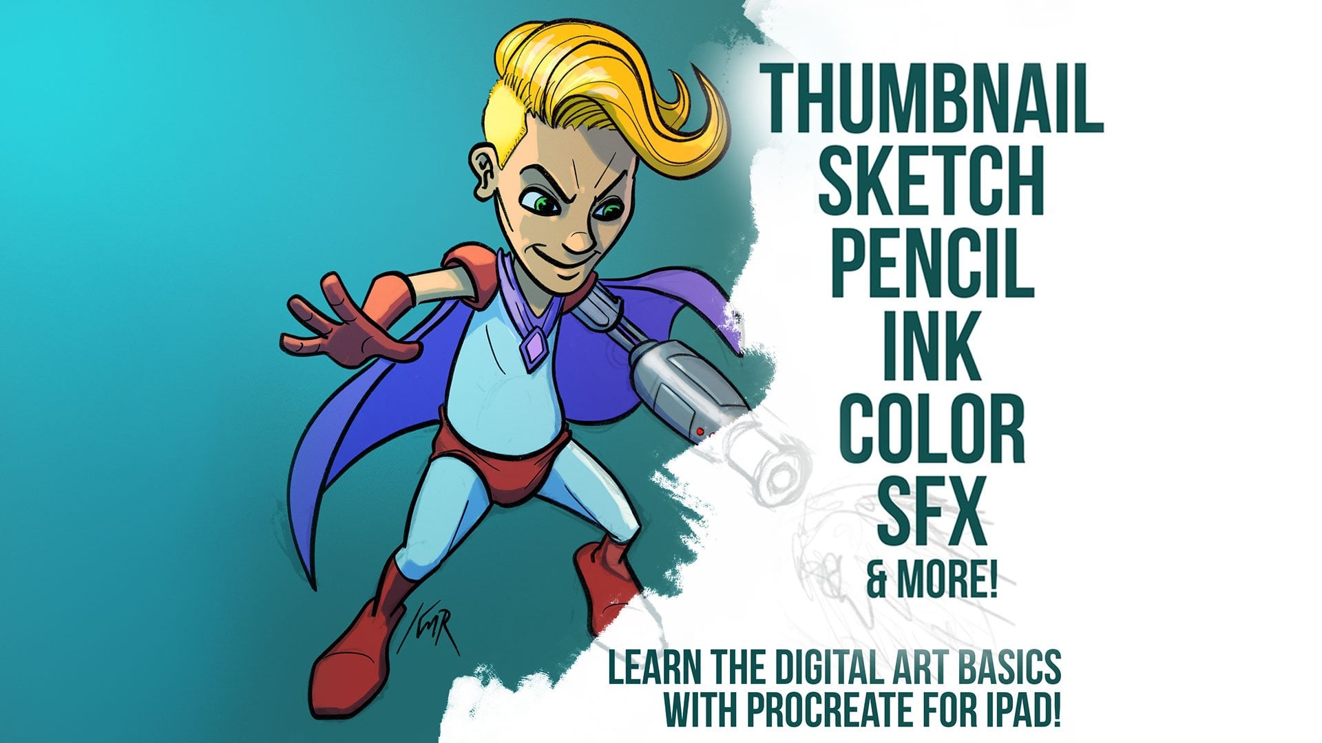
1. Introduction: All right, welcome
everyone. My name is Kurt and I am looking
forward to showing you my workflow for coloring Sequential Comics in
Procreate on the ipad. Procreate's an amazing tool. I've used it in my own
project several times. And if you have some experience, you're used to other software that's more commonly used for coloring comics like Clip
Studio or Photoshop. Procreate selection tools can leave a little bit
to be desired. So I'll show you some tricks and workarounds to make
sure you're getting the most out of it and a
little bit about me. I have been coloring
comics since 2011, professionally drawing
since birth effectively. I started teaching
coloring on line in 2013 and it's still
pretty fun for me. So a few quick disclaimers. This is going to show
you a workflow for coloring comics with procreate. And of course, you can apply
this to other types of art, but that's really what it's
going to be focused on. The other thing is, this is
not a how to draw course. This is not a color
theory course. I have not the course for that. But coloring can
be time consuming. And there are certain parts of the process that take longer than even the videos that I
can post on this website. So what I will do is I will show you the steps in
order to get started. And in some cases, I might
need to skip ahead in order to not do the entire process of an actual page in a course. Because even
professional colorists, you can take hours and
hours to do a single page. So that's something
else to keep in mind. If you're watching this
and you're thinking, well, this is going to
take a while, true? Yes, it will. It can, especially if you're
just getting started. You will get faster by the
way, if you keep practicing. And last thing, especially if you've followed
my Youtube channel, You've heard this over the
years p***ty of times. But there is no
industry standard in the way that
comics are colored. The process itself,
there's no standard, you could ask 50 color is what
their process looks like. You might get 50
different answers. So keep that in mind. This is just my own, what I believe best practices,
best way to handle this. But of course you could ask, you know, another colors and
get a different opinion. So keep that in
mind and what I've done with this course
and the first lesson, I'm calling it a
quick start lesson. I think at this point, the way it's going to work is
it's going to give you a really quick way to get
started coloring immediately. So if your drawings there
and you're like, look man, I just want to color this
like a coloring book. I've got the first lesson, we're going to talk about that. And then we're going to dig
into all of the nuts and bolts and get into more
of a technical workflow. But those of you that
are just like, hey, just want to color
something real quick, I drew a picture of my dog. I don't know what to do. We'll take care of that
in the first lesson. Procreate is an amazing app. It's one of my favorite apps. I'm looking forward
to showing you some cool stuff. So
let's get going.
2. Quick start guide: All right, for this
lesson, I'm going to call it the Quick start guide. And I want to give you
guys that just want to be able to jump in and start coloring something
pretty quickly. A way to do that, and that's
what this lessons for. After this lesson, we'll get
into all sorts of specifics and tools and tips and tricks and things and
all sorts of stuff. So let's say I've
brought this drawing or this page into the software, and right now this was
drawn outside of procreate. And so the ink and the white of the paper
is all in the same layer. So if you try to color on
this on a layer on top, it's going to cover up the ink, which obviously we don't want. And if we take this layer
hold and drag below the inks, it still doesn't show
up because the white of the paper on the inks layer is hiding that
layer two from us. So the easy thing
to do here is to go to the inks layer and
click the letter in, which will change the
b***ding mode for that layer and change
it to multiply. Changing it to
multiply will allow us to color on a
layer underneath, but it won't cover up
the black of the ink. So let's zoom up here
and say I want to color this just like
a coloring book. Well, I'm going to go
to my layers here. I'm going to make a
new layer by clicking the plus sign up
at the top right. I'm going to hold on that new
layer with one finger and drag it below the ink layer. And then you can pick
any brush I just went to the painting and chose
a flat brush there and you could start
coloring on this and the software would behave very much like it
would if it was, you know, just like a coloring
book or anything else. You can go outside the lines or inside the lines or just
like anything else. But if you're worried
about going outside the lines here and going
outside of your gutters, a couple ways to
handle that one, You can just not worry
about it until you're done and then fill all
the gutters with white. Or you could use
the selection tool. And we'll go into this in more
detail a little bit later. But if you go to the selection
tool and choose freehand, you can click on each point on each corner of the panel that we can draw a box
around that point. And I'll just fill this
with a color for now. It doesn't matter
what the color is. And you can fill it with a color by just dragging the color at the top down into the
area you want it to fill. And I'm going to do
that for each panel. Now, once I filled all of
the panels with a color, you can click that layer
and click Alpha lock. Now anything that let's
change colors here. Anything that I do on any
of these layers is going to be contained to the layers
that we've colored already. The alpha lock prevents
us from coloring outside of anything that doesn't already
have color on it. In this case, all of the
transparent areas in between, effectively areas
that we can't color. So that's a really quick, easy way to just sort of lock yourself out of
being able to do that. And if you did want to say color on a few layers
while working this way, you could also just
make a new layer on top and you don't have to click
the alpha lock each time. You can also do what's called a clipping mask like on this
new layer three here. If I choose clipping mask, that is also going to contain everything to the
pixels that are, have something on
them on layer two. In this case we'll
go into more details in masking and alpha
locking and all that later. But that's just a
few quick ways that you can control
where things go and, you know, get under
the lines properly. But if you're thinking, you
know, I want to learn about the selection tools and
the lasso and all that, that's all coming up very soon. But this is a really quick, easy way to get started coloring right now
if you want to, but let's keep rolling
on with the course.
3. How to import class resources: So in this lesson, I'm going
to show y'all how to import the course resources
into procreate. So the first thing
we're going to do is make sure
procreate is open. Okay? Because in order
for this to work, you need to have one app opens. Let's go in and
open up Procreate. So I'm going to swipe
up from the bottom and if the IOS stars align
and to keep doing it, it will open up the dock. I'm not sure what
the trick is to get that happen on the first
time because I can't do it. But I have the files app over
here on the far, far right. I'm going to grab
that and pull it up And drop it right there. And that's going to
pull up what I think IOS calls the slide
over feature, which allows you to swipe this away and swipe it back out. The way that works is there's
a little line up here at the top that you can grab. And that will allow
you to do it as a dual screen app or to pull
it out as a slide over app. It also allows you
to swipe it away. Now to swipe it back
onto the screen, you just swipe from the right. Again, I usually have
to do this twice. I don't know why blame Apple. But here are all the
resources I recommend just putting them all in
a folder on your ipad. I've got mine organized here. We'll start with
the sample pages. Go to sample comic pages. And you can just
hold on these files and drag them over
into procreate. Here's the first one again, hold for a second, and then
drag over to procreate. So now we've got both
of our sample pages there installed or imported. And there is also
a flatting brush I'm going to be
discussing later. If you want to go
ahead and import that. Now you can, same
way, just grab it, drag it into procreate, let it go. And it'll import it. You won't see anything
happen here on the gallery, but it will put it in
your imported brushes. So now that we have our
pages in here and we've got our flatting brush
installed, let's keep going.
4. Using the basic tools: So for this first
real lesson here, I want to try to show all
the main tools and show you, like, how you could color this if it were, say,
a coloring book. Like just the very simplest
possible way of coloring. And that way even after
this first lesson, if you want to jump in and
start playing around with it or if you'd like to
color just to, you know, Zen out and do this as like a meditation like then you can do this right after
this first lesson. So I want to start with some of the basic tools and then
we'll go on from there. So I'm going to start
on the right side up at the top of the screen, looking at the actual
colors tool itself, which is your color selector. Basically, I believe the
default look for this, if you go at the very bottom, you see where it says Disc Classic Harmony Value palettes. I typically keep this on classic because I'm
just used to working in that square and I'm used to measuring distance for
contrast in that square. And we'll talk about
that a little bit later. But I think the default is disc, it might look like
this to begin with. This is also a good
way to look at your colors if you want to
see the wheel in context. But for the sake of this course, for myself here, I'm going to leave this on the
classic mode now. It doesn't really matter
which one you use. You can use whatever you want. If you're a slider person and you like sliders,
you can use sliders, not a slider guy,
but whatever works for you will probably be fine. And I haven't tried this harmony stuff yet,
I don't really use it. So we're going to leave
it on classic now. Right next to the color
tool is the layers tool. And we're going to
spend a lot of time in this little window learning
a lot about how layers work. And but I do want to touch
on a few things to begin with before we jump
into this today. Now, the file that
I've given you guys was a PSD file and I've already got it
labeled here for you. But if you want to ever re
label any of these layers, you just click on the
layer and click Rename. You can change that
to whatever you want. I like to do that keeps it organized, especially
with procreate. You're limited in the number of layers you can use normally, depending on your file size. If I ever reference
a layer and you want to know name your
layer to match, then that's the quick
way to do that. But the first thing I
want to point out here in this little section is the little letter that is
over here to the right, right next to the checkbox. That little, if you click it, it will bring up this
little scrolling option of color modes here. Now we're not going
to get into all these color modes in this
particular lesson. I'll talk about
that a little bit later when you first
open up this file. And I did this on purpose, so you guys can see
the difference here. It's on the letter n, which
is just the normal mode. Okay? There's no fancy
b***ding or anything going on. It's just what you see is what
you get on a normal layer. Black is black. White is white. If I click a little plus sign up at the top right,
that makes a new layer. Now if you hold on layer two, you can drag it down
below layer one, which is that ink layer. Now if I tried a color
on this second layer, and a lot of new colorists
might try this like, well, here's my inks and here's my colors.
And here we go. And they start doing,
I'm brushing on the canvas if you can't tell
and nothing's coming out. And so they go
look at the layers and you can see the color there. Here. I'll choose
a different color, a little bit easier to see, and you can see the
colors under there, but it's not coming through. The reason for that
is this layer has the white of the paper on
it in addition to the inks, so you're not seeing
through the inks. This wasn't drawn in procreate. Okay, it was imported
and I'll get to it a whole other
lesson later on how to put this on a
transparent layer. But the way this works though, the simplest thing
to do is to go to that little letter
in on the ink layer, pull up this little section. And for whatever reason, I don't know why
procreate did this. But you have to
scroll up or down, depending on how you look at it. Pull the menu down in
order to see multiply. Multiply is the only one that is north of the selections that above the
selections on the list, everything else is below. So I don't know
why they did that, but if you'll put
it on multiply, multiply is a special mode that effectively hides white, okay? It completely hides
all the white. And so now you can see my gorgeous coloring
underneath there, okay? So if you just want to jump in and immediately start
playing around with this, that's the best way to do it. Go to your ink layer,
set it to multiply, make a new layer, stick
it underneath there. Again, just hold the
layer, drag it under, and then you can go crazy with whatever brush and whatever colors that you
would like to do. Now, in order to delete
layers, which we might do, sometimes you can swipe to the left and delete,
swipe, delete. And you can also change
the background color here since it will show
through that file. Now personally, I like to
color usually with like a grayish color most of
the time just because I don't coloring with
a white backgrounds, like looking into a light bulb. So I don't really like to color
it with white personally, but that is totally up to you. These next ones will
touch on very briefly, they are pretty simple I'm going to skip. We're
going to do this in reverse. So we're going to
skip the eraser tool and the smudge tool for a
second and go straight to the brush which
looks like a brush. And if you click on that brush, it will bring up a list of all of the brushes that are
available in procreate. I'm not going to be using any custom brushes
during this course. They're all going to be brushes that are built into the app. But you might notice
that I do have other brushes from other places, They are not included
in this course. This is only using the default brushes, which
are great, by the way. But the brush tool does exactly what it sounds
like when you use it. It brushes onto the canvas
over here on the left side. You can adjust the size. I usually keep my left hand pretty close to this
as I'm working. So you can play around with changing the size of the brush. This will show you the opacity, so you can adjust how
opaque the brush is. So if you just want
it like a glaze, you can turn it way down and
you can see how that works. And I did all of this on the
same layer with my inks. Now's a great time to talk about two finger undo and
three finger redo. So two fingers tapping on the canvas will undo
your brush strokes. I know you guys can't see
me tapping, but trust me, I'm putting two
fingers on the canvas and tapping with two fingers. Now, three fingers on the canvas will redo
bring them right back. So if you use procreate
for long enough, you will be working on a
real paper sketch book. And at some point you will
tap it with two fingers. I guarantee it'll happen,
it's happened to me. But anyway, when
you click on brush, it pulls up this brush library. There are lots and lots and
lots of options in the Sap. We'll talk about brushes
a little bit later. I'll give you guys
some tips on that, but we're just getting started. I'm also not going to get into editing brushes very
much at this point. A little too far ahead. Let's go to the next
section here which is the smudge tool, I believe is what they call it. It works well, let me
put this on a new layer, drag this back down here, and give us something to smudge. If I go to the smudge tool, you can see that it is b***ding the edges of
this into the canvas. You can make it big,
you can make it small. You can change the
opacity of it, which is which affects
the strength of this smudge tool is cool. I don't use it a ton personally, but it is an option. It smudges, you'll never
guess the same thing here. All the brushes you
can use on the brush, you can also use as a
smudge tool or the eraser. And a little pro tip here. If you'll notice right now, I've got the old beach
brush selected on the brush settings and the smudge tool is currently
set to this different tool. So if I go back to my brush, make sure it's set
to whatever I wanted to set the smudge tool to, I can hold down on the
smudge tool and now it's using the same
brush as the brush. Okay, so now I can go
to the smudge and I'm effectively smudging with the same tool that
I'm brushing with. I like how this looks
because, you know, I don't like to use a really, you know, natural looking brush. And then some like
super digital looking eraser or super digital
looking smudge tool, you can do the same
thing with the eraser. Again, just make sure you'll notice that the brush is set to old beach and the eraser is
set to a pencil right now. So again, I'm just going
to go back to my brush, make sure I have the
right brush selected. And then hold on the eraser. And now you can see the eraser
is using the same brush. And again, now
we're erasing with the same texture that
we used for brushing, which I think looks good if
you're going for like that natural media look to finger
undo a couple of times. So those are the very basic
tools that are in the app. So if you're new to
procreate and just want to kind of play around with
that practice With that, you've got enough knowledge now to set your inks to
the multiply mode, create a layer underneath,
and you're now coloring. The other quick feature
that I forgot to mention on the color
tool is the color fill. What they call, or a color drop is a technical name for it. Any color that you
have selected here, you can drag onto the canvas and that will fill the
canvas with that color. Now you can use this
in conjunction with the selection tools
to of course, limit where it goes
on your canvas. And we'll talk about more
of that in the next lesson. But you should know enough to
be dangerous at this point. Let's move on to
the next lesson.
5. Transforming and selecting: All right, so in this
lesson we'll move on to the tools that are on the
left side of the screen. Up at the top that is
the transform tool, which is the one that looks
like the arrow there. That little S are all of
these selection tools. We'll discuss that. There
are the adjustments. And if we have time,
we'll get into the actions in this lesson. If not, we'll do it
in the next one. So I'm going to go
to my layers briefly here and make sure that
I have the ink selected, just so I've got something
to manipulate here. And if I click on that arrow, it's going to pull up
the transform tool. Now there's a lot of
functionality in here. Again, I just want to kind of
hit the highlights for now. We'll do a lot of a deeper dive in this a little bit later. But this will allow
you to select and move items that are on
the canvas already. You know, things
that you've drawn, things that you've done. Not really something that we'll probably do very much
of in this course. But I did want to
show you guys how that works and this
is where you can decide if you want to uniformly change the
size of something like. You can see that it's set
to uniform right now. You also have free form
which allows you to squash and stretch this
in a different way. Again, not something we're going to do a whole lot
of in this course. There's a distort which you get these interesting
perspective effects. I use this sometimes if you have like a brick wall
or something and you want to make it
look like it fits, this is an easy way to do that. And then warp is just that. It warps again, not something
we're going to do a ton of, but it's there as a tool. I thought we would talk
about it very quickly. The rest of this is
fairly self explanatory. You can flip horizontal, you can flip vertical,
you can rotate, you can fit to canvas And this bi linear nearest
near bicubic option, those are all just
settings if you were ever resizing pages or
resizing things, which we're not really going
to do a whole lot of here. But that's what that
tool is. Right next to it is the selection tool. Now the selection tool will
actually use quite a bit. The selection tools
can be used heavily, and maybe not so heavily just depending on the
style that you're doing. But selections allow you to limit what you're doing on
the canvas to specific areas. For example, right now
it's set to the free hand, or what Photoshop Clip
Studio would call a lasso. Which is basically just
whatever I draw on the canvas is what's
going to show up. Wherever you start
your selection, you're going to see a
little circle there. If you click that circle, it will close the selection. For example, with the
freehand option here. If I draw on the canvas
that creates a selection. Now unlike a lot of apps, again if you're used
to protos Clip Studio, lifting the stylus from the canvas is not going to
close it automatically. And what this means is you
can pick it up where you left off and keep going even
if you raise your pencil. I really like this about procreate, because
a lot of apps, when you get done drawing, it immediately snaps
the selection closed. And in procreate it
doesn't do that. So just to show you guys
how a selection works, we'll draw it and we'll close it. And then we'll grab a brush. It doesn't matter what layer on, but now you can see
that my brushing is contained to that selection. So you can use this in comics. There's a style of coloring
they call cut and grad. So you can make a
selection with it, close it, and then
switch to a brush. And you can see how
these brush strokes are contained to that selection. They call that cut and grad. Selection is the cut and the grad is the gradient
from the brush. There's also an automatic
selection tool. We're going to talk
about this during the flatting portion. There's also the rectangle tool, and I actually use the
rectangle quite a bit. This is particularly
helpful for things like panels, like on this page. What we might do is just start at one
corner of the panel, draw to the other corner of it, and then I'm going to do
another for this one. And you can see it selected because there's these
little thin diagonal lines, which I don't know if you guys
can see this in the video, but there's these
little diagonal lines outside of the selection, but you don't see them
inside the selection. But I'm going to go
ahead. While this is set to the ad mode, I'm just going to select all of these panels just to show
you how I might use this. And then we'll do
this one as well. So in this example, I've
selected all of the panels. Now if you ever click off your selection accidentally
or you switch to the brush tool and or something happens and
you lose your selection. You can always hold down
on the selection button, that little symbol, it will
reload the last selection. I use that all the time, but I'm going to use the invert button down
here at the bottom. So it's going to
invert the selection. So now only the gutters in the areas between the
panels are selected. So I can go to my
colors, choose white, and use the color drop to
fill the gutters with white. It looks like I
missed a section, so go grab my brush
tool real quick and fill that in using the flatting
brush that I included. The only brush right now it's
included with this course is that flatting
the KM R Fighter 2.0 We'll talk about that later too and we'll dive in more
into the selection options. But I just wanted
to show you guys a couple of quick things
on each one of these, all of these adjustments, we're going to do a whole
lot with this stuff later. There's a lot to
be discussed here, but that's where the
adjustments are. Again, not really going to
dive into that at this point. That'll come later. The
last little section here are the actions. And there are a lot of
different options in here. In fact, I'm reaching the limits of ***gth on this lesson. So we'll talk about
that in the next one.
6. Procreate actions menu: All right, so this
next lesson we're going to talk about
the Actions menu. That's a little button
up at the top left that looks like a
little wrench there. And the ad section up
here at the top is, again, fairly self explanatory, so I'm not going to spend
whole lot of time here. You can insert other files, other procreate files, you
can insert other photos. So if I wanted to pull in reference of a fist that I
took in a different app, then I've got the ability
here to pull that in, resize it, use that
as reference point. If I wanted to. I've going
to two finger undo that a couple times and then go
back to the Actions menu. We can add text. Not really
going to be adding any text. I'm not a letter, I don't
want to be a letter. But that's where you
can go to do it if you want cut copy is there as well. I have my three finger swipe
down set to copy and paste. But that is an option that you can decide in the preferences, which we'll get to that
in a second canvas. Again, this is fairly self
explanatory, crop and resize. We're not going to be
doing a whole lot of this, but that is where
you go to do that. Page assist, animation assist. We're not really
going to be using just not things that
we're going to use as a colorist drawing guide. Again, not something we're going to really need
for this course, but the drawing guide is not something that we're really
going to use in this course. But if you do draw, and let's say you wanted some perspective
guides or something, you can click on drawing guides, the edit drawing guide, and you've got some
perspective tools here that you can use. Again, not really the
point of this course. Then this is a new little
feature in Procreate 5.2 I think if you have reference material that you want to view while you're
looking at your Canvas, then this little reference window is really good for that. By default it's just going
to show you your canvas. So it's if you're one
of those people that like me that likes to step back from the canvas very often, then this is a good way to not have to continually
zoom in and out. You know, you can also
import other images. Wow. You can map your page to your face if you
want very weird. Not that we need
any of that stuff, but that's, that's what
the reference button is. Flip horizontal
and flip vertical. Again, these are self explanatory and then
canvas information. We're going to talk about all of this stuff in a
little bit when we get into creating our
files and all that stuff. But not really something we're going to dive too much into. Here. The Share button, again, kind of self explanatory, but this, if you want to
save your layers intact, make sure you're using a
procreate file or a PSD file. Those are the two
that include layers, PDFs, Jpegs, all the rest are just going
to export a single layer. So not really what you want to do unless that's, you know, you're sending that off to
whoever you're coloring for. Video is where you adjust
the settings for procreates. Time lapse function
that's built in. If you go to time lapse replay, it'll play back everything
you've done so far. And recording is something again you can toggle off and on. If you have an old
ipad, maybe it runs a little slower or
something with that on. And then export
time lapse video, we'll give you options for that full ***gth or 30 seconds
and then the preferences. If you're one of those
people that like light interfaces,
what's wrong with you? No, I'm kidding. But I
like dark interfaces. And this switches the
interface from left to right. The right hand, the brush
cursor will decide whether or not you see the shape of the cursor while
you're working. Again, I was it I don't
remember if mine was off or on. I think it was on. I'll have to go back and watch
the video and find out. I think it was on
dynamic brush scaling. What this does is as you
zoom in on the canvas, it keeps the brush
relatively the same size for the canvas,
not the view you're in. Which I do recommend
keeping that on project canvas as
if you were sending it to like a projector.
Re not going to do that. Connect legacy status, going
to skip that section or I'm using an apple pencil And that's what I'd
recommend you use. If you use something
else, you would use this pressure in smoothing, I've got all of this stuff off. That's the way I like it. I did pressure
sensitivity slightly. If this is something
that you struggle with, how hard you're
pressing or having to press too hard or
press too lightly, you can goof around with
this curve and that will adjust that for you. Again, not really
what we're talking about in this course. It
doesn't matter that much. Then gesture controls. I pulled this up earlier. If you get a copy paste, I've got mine set to
three finger swipe. There's a lot of other
options here you can use. But the two things I have set up in this section
or Cap and Paste, or set to three finger swipe. On the Quick menu, I have
set to four finger tap. I don't do this very often, but four finger tap
pulls up this menu. And it's great for like
quickly flipping the canvas. I do that pretty often because you hit
it with four fingers, hit the canvas, flip
it back and forth. That's convenient, especially
when you're drawing. Not so much when
you're coloring. And then help is help. There's really nothing in there I think we need to talk about. But if you click on
Advanced Settings, you can see that Palm support level is something you might want
to mess around with. My hands are not
huge and for me, fine mode worked best. You can try standard, But if you notice that your palm is hitting things you
don't intend to hit, then maybe try fine mode and you can disable the
time blast from here. Everything else, I
would leave it alone. So there you go. Those are all the major
tools very quickly. Now, again, we're going to dig into some of this a
little bit later, but I wanted to at least have
everybody on the same page about what everything
is and where everything is and let's move on.
7. File specs discussion: All right, so before we get
into the actual coloring, let's talk a little
bit about some of the first things that I would
do when I get new pages in, which is to check
the size and to talk a little bit about the
technical specs on the pages. Because it's important to know this stuff if you're going to be coloring anything yourself. Now, I've already imported the first two pages here
and you can see the size, the 27, 80 by 41, 75. If your eyes work,
it's really small. But I'm going to go
ahead and click the plus sign over here
on the top right. And pull up all of the details and we'll look at
all of the specs. And you can click on this, it's that little folder icon
up at the top left, top right. I mean,
sorry about that. So I'm going to click
that and that's going to open up the custom canvas
that breaks everything down. So the first thing
is the dimension. Now to be honest, there isn't like a
single perfect template that's going to work for
every single publisher. Every artist is going
to get a set of specs. They're going to say, hey,
you need to use these specs. And it's not something
that colorists really have to worry
about very much. But a few things that I
would be sure to check, it's usually going to be at least two or 3,000 pixels
wide by three or four, or 5,000 pixels tall. It can vary quite a bit. The DPI, at least
300 at minimum, I would say 300 is a minimum. For coloring, I see
a lot of pages at 400.600 but most of the work that I do is at
three or 400 DPI. And that will have an impact on how many layers that
you get in your file, you know, whatever the size is. So keep that in mind. You know, if I change these
to different numbers, you can see that the number of maximum layers
is changing now. I've never really run up against the layer
limitations myself, but on a very large file, a very high DPI, you may find that there
are some issues with that. Just something to keep in mind. But I don't want to
get too bogged down to the specifics on this
because like I said, it will change depending
on the project. There's another book I'm
doing right now that's at 41 25 by 62, 63. And if that's at,
let's say 400 DPI, then that gives me 16 layers,
which seems like a lot. But that can run
out pretty quickly depending on what
style you're doing. That can vary, but those
are the important things. Make sure your DPI
is at least 300, you're probably
going to be fine. My apologies if this little cut in feels a little different, it's because it's happening
weeks later in the edit. So for the color profile now, this is really important, especially if you're doing
professional published work, less so if you're just messing around on the Internet and
posting stuff on Twitter. But I'm of the opinion that
you should always work as if it's going to be printed because who knows,
maybe it will. The default option, or at least it was a default
last I checked and procreate is an RGB color gamut and it's the display P
three is what it's called. And I want to talk
a little bit about color gamuts because
it's not going to do much good for me to explain this without going into
little detail about it. I will put a link
in the resources to a video I made about it
already that's on Youtube. That'll go into more detail
with some visualizations. But just very briefly enough so you know what's going
on here a little bit. Color gamut are just you could think of as your
spectrum of options, unintended there it is, the number of colors available
to you on a given canvas. And that gamut can range from, you know, billions of colors. You know, my local
theater claims they have billions of colors
on their projector. I'm sure they do better
than I have at home. But the P three color
gamut is a very lush, very intense spectrum of colors that look
great on an ipad. They are great at selling ipads. All of the images that you see in Best Buy when
they're trying to sell, you know, those
tablets with these crazy gorgeous,
you know, images. And they're really
bright and they're really saturated and
it looks amazing. But here's the catch, the CMYK color palette, which is what, you know, we use in the comic
book industry and in most print
industries is limited to, you know, like 27,000
colors or something. It's a very small print gamut. So while this first
gamut looks great, I don't recommend
working in this one. I would use the S
RGB right below it. The very next one, if you're
going to work in RGB. Now the reason this
lesson is actually cut in is my thoughts
have changed on this. I've talked to some
colorists that actually are using the default CMYK generic profile that is in procreate and turning that in and having no issues with it. So I have not
personally done this, and so I can't vouch
that, you know, if you're coloring Spider Man, that this is exactly what
Marvel needs or, you know. Dc likes very specific
profiles, you know. So this wouldn't
work for that sort of work? Not directly. What I've done in the past
when I was working in Pro Create was I was working in just a standard SRGB gamut and then exporting into
Photoshop on my desktop, creating the C, MY
K files from there. Because at the time I did
not like the output from procreate and it didn't match what I was
getting in Photoshop. And I've done some testing recently and that is
no longer how I feel. So what I would recommend, if you're going to work in print and you don't have access to another device or a Photoshop or some other app that you're going to be doing conversions in, I would go ahead and
use the CMYK profile, and that is purely if you're wanting to stay in procreate. And let's say you don't
have another device, you don't have any other apps, you're not trying to
do any converting, This is your best option. Now this will cut down on the
number of layers you get. There are b***ding modes
that will act differently. Keep that in mind, it's why
a lot of people do choose to work in RGB and then
convert in other apps. Because RGB does allow just for more choices and flexibility
on the digital side. If you have access
to other apps that can do the conversion to CMYK, then this is a
moot point anyway. So it's total
personal preference. I know colorists
that work in RGB and convert to CMYK almost
always in Photoshop, and I know artists that
work strictly in CMYK and don't convert and
don't understand why anyone would
want to work in RGB. And and so there's
just two facts, so there's just two factions there that both have
their own thoughts. It usually breaks out into
a Twitter conversation every six months or so back when Twitter was useful as
of this recording, it actually already
doesn't exist. It's called X really
dating this video. Anyway, I wanted to
step in here with this little section on the color profile
because it's honestly, it's up to you which one you
want to work in, try both. They will feel different,
especially if you're used to working in RGB CMYK, you will see some color shifts in the color picker that
you won't see an RGB because it's trying to show you the equiva***t of what you
would get, fascinating stuff. Anyway, back to the rest of this lesson time lab settings. This is whatever you want to do. Honestly, I'd like to leave
mine on the highest it'll go, because I want the quality of the video to be as high
as it possibly can be. If you have an old ipad, if you have something that
doesn't run very well, you can use one of
these other standards, really doesn't
matter. Very much. Has nothing to do with
what we're doing today, but it is in this
section, so why not? I also leave it on loss list, although you can adjust that. Hevc is just another video
codec standard, I wouldn't worry about it. Too much. Canvas properties, this is individual
to the canvas, doesn't really matter for us. I do like to keep my
default canvas as gray, just as a gray color
instead of white. But that's just me. You can leave it on white if you want. And then the
background is hidden, I think by default, or
not hidden by default. Depending on whichever one it is, it doesn't really matter. But now we've got that set. That is not really anything
you need to worry about to use the pages that I've
provided in this course. But if you wanted to
set up your own pages, that is how I would
recommend doing it. We're not going
to be starting on a new canvas in this course. I'm going to cancel
this and go back to the gallery because
we're going to use one of those pages
that I provided. And we'll start there
in the next lesson.
8. Flatting part 1: panels: For the start of this lesson,
I'm going to go ahead and open up the first sample page, which is, well, the
second sample page actually on this list
by clicking that file. And that will bring that page
up into per grade for us. Now this is the file that I have provided you guys
as part of the course. So of course, you can use this
throughout the course and I will follow along through this or you
can use your own art. Obviously, it might be better to the first time
around to at least try to follow along
with this one. And then we'll take
it from there. Now this page is already set to the multiply b***ding mode, and I would recommend
using that to begin with. But if you happen to just
start the file here, I believe it's in
normal to begin with, which we talked about
in the earlier lesson. And like I said, I would
start and multiply. That's going to let us see right through all of that paper. So anything that we color underneath it would
be easy to see. In a later lesson, I'll show you guys a different way
to set up the inks, but it's probably a little too technical for this
early in this course. So the first thing I'm
going to do is click on the plus sign in the layers window to
open up a new layer. And that's going to
create layer two. I'm going to put my finger
on that and hold it for a second and then drag
it below the inks. Now let's go ahead
and label this. I'm going to rename this
by clicking the layer, and we're going to
call it panels. And the way that I'm
going to show you guys to flat this file, which is going to
be the first kind of step in the coloring process. It's going to be specific to
how I set up my pages and how I recommend setting them up given how procreate
handles selections. Because there are
some things I do with the layers and selections
in procreate that I don't do in other apps just because of some of the
limitations a procreate has. So if you're used to
seeing my workflow in clip studio or procreates
a little bit different, still an efficient process. It's how I did several, several issues of this
book in procreate. But we're going to
start with the panels. And there's a couple
of ways to do this. There almost always are a
lot of ways to do this. But I'm going to start by
clicking on the selection tool. Clicking on that, up
there at the top. And that's going to bring
up the selection tool. And I'm going to click
the freehand option. We used the rectangle earlier, but I'm going to
use the freehand and I'm going to zoom up. And we're just going to start by basically tracing
the border of each panel and we want
to make sure that you're inside that black line
and not going outside. I'm just going to
click that corner. And then we'll zoom up
and click this one. You could also do this,
and I'm just dragging, with two fingers across
the canvas to there. And then up to this corner, and then all the way
back over to here. Now you can see that we've
selected that panel. I can go to, not my layers, make sure that I'm on my
panels layer and then go to your color. And I'm just going to
fill this with a color. I'm just going to pick
a color, it honestly doesn't matter what
color at this point. And then grab that color and drag it into that
box and let it go. And that's going to fill
up that particular panel. We can do this with the
rectangle tool as well. So I'm going to click my
little selection tool again. And this time it's
instead of free hand, I'm going to choose Rectangle and click at the top and
drag to the opposite corner. Now we fill that, I'm going to choose a slightly
different color and fill that panel.
Same as before. We're going to do that
for all of these panels. And I'm just going to use the rectangle for
now because it's probably a little bit faster
the colors at this point. I wouldn't worry about too much. It doesn't really matter. Now if you make a mistake, I don't know if I
did there or not. I may have been a little bit
outside of the line there. But you can click on Remove. Let's say that I went
outside the top and can create a rectangular
selection outside the box. And that's going to remove any selections that I may have
gone over that line again, I'm going to just
bump this to do a different color and fill it. Now to start off with, we have just our panels here. And this is going
to come in handy if we ever need to just select a panel later to
shift it a certain way. It'll be faster. We won't
have to redo all that again. Once we've got our panels done, let's go back up to layers. And swipe this
panel to the left, and you're going to see
an option to duplicate. Let's duplicate this layer. Now we have two panels, layers. I'm going to take
this first one, I'm going to rename
it, and I'm going to call it Big flats. These are my simple flats. Now this will be the first time in this video where
we're going to be making some selections that aren't perfectly horizontal
and perfectly vertical. And I want to
explain why I don't want to use the
lasso for what I'm about to do because you
guys are going to ask. If I don't, I'm going
to show you real quick. I'm going to go
to my lasso tool. I call it the lasso. It's this freehand
selection tool. It's called a lasso
in most apps. So if I zoom up on this and draw a selection and then
fill it with a color, I want you to notice
something about these edges. You see how these
edges are b***ded, like they're not
actually hard edges. This is a huge problem for
trying to use procreate to do flats and flatting is just the first stage of
separating all the colors out. This is the reason why I don't use the lasso for
flatting with procreate. Because later on
if I try to make a selection based on these
particular selections, like if I go to the
selection tool, click Automatic and
then click that. You can see that it's not
getting all of the edges. Now you can, with the
selection, click and drag. And that will sort of
start to fill in some of that stuff and eventually
you'll get all of it. But now you can see it
starting to get the white and then it's
selected the white too. So none of this is actually
very workable for, I would say a professional flatter or professional
colors for that matter. That's why instead of
using this sort of, you know, alias edge is
really what that is. We're going to use
that KMR flatter brush that I had you
guys load earlier. And what you'll notice about
this and it's not perfect. I haven't been able
to make it perfect, but what it does is it creates clean edges
on these selections. Okay. Another quick
note I want to make at this point is
for my workflow, the colors that I'm picking at this point are not
really relevant. The colors we're
putting on here now are strictly for selection
purposes later. This is totally
an optional step. If you want to go
straight to, you know, the colors you think
you'll be using, that's totally possible. You
can go ahead and do that. I'm not going to
be doing that for this particular course because I very rarely ever
work that way. Because if I'm trying to make decisions while I'm trying to create these selections,
it slows me down. If I know what I need
to have separated and broken down, I
can just do that. It doesn't really matter
what the colors are. It's going to be easy
to change those later. But let's finish up the
big flat to the next one.
9. Flatting part 2: elements: So for this little layer that
I'm calling the big flat. So we're just going to separate the page into the main elements. And this can be a good exercise because it also forces you to think about which elements you have to work
with in every panel. What things need
to come forward, what things need to
go back, you know? And when I say come forward
and go back, I mean visually, you know that we're going to
be creating focus in places. We're going to be creating areas that are simpler
and not as caching. That's all sort of
part of this process. So it's a good idea to go ahead and start working on
that at this stage. You know what's coming that way. Now, how you actually break
this up is totally up to you. What I'm going to
do is sort of do, think about it as
like a foreground, middle ground background.
That's an option. You might also just think about the focus of the panel versus the surroundings
of the panel. There's a lot of
ways to do this, but I'm going to start
by clicking the brush again to make sure that I'm
on that flatting brush. I'm going to pick a
different color again. It doesn't really matter
what it is at this stage. And I'm going to zoom up, I'm going to start drawing, I'm going to pick a color that's a very different value so
that I can see it easily. And I'm going to trace out
this little edge along here, all the way across the bottom. Now you can see that
I'm going outside the lines a little bit here
if you want to avoid that. Let me back up
here a little bit. We can go back to
our panels layer. I can choose the selection tool, make sure it's set to automatic. By clicking that color, it will choose all of
that color on that layer, which in this case
is the first layer. Now I can go back
to my big flats and not have to worry about
going outside that line. But once I've got that done, I can grab my color. Once I've got the border
done and just drop that in. Let's make sure that
that works properly. You can see there's a
couple of places where you see a few dots here, so you can drag that threshold over a little bit
before you let it go. And that'll fill that
in. Now in this panel, the focus is really about this building that's
across here in the middle. So I'm going to do that next. I've still got my
panel selected, so I'm not worrying about
going outside the lines. I'm going to grab
a different color and start selecting
this little section. Now, if you're watching this
and you're thinking, well, this seems like this would take a while, correct? It will. Even for professionals, this is a time consuming
part of the process. But again, I'm basically
just wanting to separate all of this out
from its surroundings. I'm just making sure that all of this connects all the way across so that when
I feel in a second, we don't have a bunch of
stray stuff going on here. Go down this way. I like
to turn my canvas A, People don't totally up to you. I could probably be a
little bit neater here, but we really would
be here all day and these lessons are limited
how long they can be. I'll be skipping
some of this stuff. But anyway, so now we've
got our outline again. Just drag that color
in and drop it. Now you may be thinking, well, why do this this way later on when we
start coloring this, this will make a lot more sense. But I can easily grab this foreground element,
the main element, and everything surrounding it all by using the selection tool. Now, because it sets automatic,
I can click the top. I can click the bottom. I can undo that. We can
just click the building. Just click the foreground.
This makes it very easy for us to go in and shift
these colors around later. And I'm not worried
about flatting everything at this stage, because I just want to get the big shapes
in there for now. We're going to do the details
in a second. All right. Again, switch into
a different color. I'm going to make
sure, again, this is a color really stands
out, so I can see it. If you make a mistake, again, if you go outside the lines like I just did a
little bit there, you can hold down depending
on what your settings are. I've got the color
selection set to the little button between,
I'm clicking it over here. If you can't see it on the far left side
between the two sliders, I've got that set to
click the canvas, which will set the color
that you've chosen. So I can just grab that
green and fill that back in. Then grab the white
again and keep going. As a flatting tool goes, I would say procreate
is not bad. There are probably
other tools that might make this a
little bit simpler, but it still, it's not going to speed you up too much because Whether you're doing it with a lasso or you're
doing it like this, it's all time consuming. Unfortunately, again, once you've got all
that border selected and drag that color
in and drop it, I'm not going to
do anything with this waste basket because we
can see straight through it. You can leave that or you
can color it if you want. All right, so that's
two panels down. We'll do this third one
again in this panel, the only real elements are
her in the background. That's what I'm going to select. I'm going to change the
slightly different color and start going around
all of these edges again. If you make a mistake,
just switch to the other color and
switch right back. Think about this stage
is like you're trying to build a fence all the
way around the edge. If there's any openings, we're not going to
be able to fill it properly some of this hair. It's just easier to, while you're here, just
go ahead and fill it. I accidentally draw
on the canvas. Sometimes when I'm trying
to rotate the canvas, the palm rejection is pretty
good in this software, but it's not perfect. For me personally, it's more comfortable to color vertically, to draw lines up and down, than it is side to side. Anytime I have a long run, I usually will turn my canvas up on its side, but
you don't have to. You can always go
back and change and shift this around
at any time just by clicking on this brush and going back in and
making adjustments. Now when you have an
opening like this, you want to make sure you get all the way around it selected. Otherwise, it'll just feel we don't want the little loop
of hair filled in there. All right. If I
didn't miss anything, this should stay in the lines. Yeah, so you guys get the idea here on the
big flatting section. Now what I would do, which I don't really
have time for for the sake of this lesson, but what I would do next
in this panel is to go through and select
all of her and fill it. And then pick a different color. Select him and fill it. Pick another color. Click her and fill it. You know, doing that all the way across all of
these people and doing slightly different colors so that we can grab each one. And then the entire
background would pretty much be its own section as well. And I will provide you guys with my flatted version in
the course as well, if you are familiar
with this or if it's not a part of the process
you really want to get into. I'll give you guys my flat
file with all the layers. You'll be able to
see that. I'll make sure this is all set up
before the next lesson.
10. Flatting part 3: details: All right, so now you
can see that we have all the big flats done. You can also think about, this is just the
elements on the page and I'm going to go in now and we're going to do
the detailed flats on this. And you can think of flatting, at least in how I look at it as something that
you're trying to break the page down from big
elements to small elements. We've broken down so
far with this layer, this big flat, the foreground
from the background. So what we're going
to do to use this as a launching point to do
all the rest of the flats. I'm going to go
back to the layers, window swipe left on the big
flat layer and duplicate it. I'm going to rename this big flats layer by
clicking on it. Click Rename. I'm just going to
call this flats. I'll go in on this panel here is actually one
of the simpler ones. Not the simplest,
but maybe one of the simpler ones on this
page, we'll start here. Same as before. I'm
not going to worry too much about the colors
themselves at this point. If you want to, that's fine. If you don't, that's fine. Either way, I know I'm going to be able to
change them later easily. I'm going to start with
this character here now. Again, she's all one
color right now. So you can imagine we're
just going to break down all the individual
colors on her now. So I'm going to make
sure that I have the flatter brush
still selected. Now, the other thing I want you guys to think about
as we're doing this is that I don't want you to ever trace the same separation twice. Okay? We've already separated her hair from the background, we've already separated
her from the background. We don't need to do that again. Okay. So what I'm going to
do to start off with here, just to show you what I mean, I'm going to pick a color and let's just say
that's that color. If I make my edge, let's just say this
little section here and all the way up to here, just to block off that
one little section. If I fill this with
that same color, you can see that it respects that line that we already
drew through here. Okay? It's going to contain that fill to just what
we've already got there. So what that allows us to do is to not worry about
tracing that edge again. Now the other thing we can
do to help out with this is just to hit the
selection button. And hit the automatic
selection to select her so we don't have to worry about going
outside the lines. Anyway, I'm going to go back to my brush tool and I'm going
to start this selection. All I'm really thinking about
right now is separating her hair from the
rest of her outline. As long as I make sure
that I've blocked off all the openings
here, I can fill this. And it's just going to stay on her hair without having to worry about going all the way around. Again, it's not perfect. We can come in here and clean up some of these
edges a little bit. Anything else that needs to be separated? Let's go
ahead and fill it in. Like her eyes make her eyes and teeth the same
color. No problem there. Grab a different color, fill in her lips and what
else do we have? So we've got her jacket, so let's switch this color up the separation
against her skin and her shirts and make the
separation where her arm is. I think that's all
we need to do there. Let's just fill in the rest. Again, make the selection
across separating her shirt and we're going to black her
arm off on this end. And we can fill the rest because you've already
made that selection. Once, change the color again, we'll fill in this part. Fill, whoops, fill in this part. Again, I'm just
randomly changing these colors because again, for me, it doesn't really
make that much difference. We're just going to use
these for selections later. I know if you're not familiar
with the comics process, this might seem
counterintuitive, but I promise it'll be worth it. Now, we've got all of her
separated out her eyes, skin, hair, all of her clothing. I didn't do her name tag here. We'll fill that real
quick. There we go. Now just the background
needs to be flatted on this. Again, there just aren't really any shortcuts for this
part of the process. I'm just going to grab
a different color. I'm going to also make sure that I have selected this area using the automatic selection tool so I don't have to
worry about going outside the lines making sure that I'm still
in my flat layer. I'm still using
my flatter brush. We'll keep on rolling again. Even these little elements, it's like there's lots of
little elements inside. We've got the cup
and all that stuff, but we can still start
with the big shape and break it down into
the simple shapes. Then we can go in here,
shift that color, change this and this a little bit of clean up here. And we've got these
little magnets. I guess this is, we would do that for the rest
of the background as well. We'd fill in this one, even some of these elements that are behind the character. There's a lot of
little openings in here and different things
that need to be flatted. All of that stuff would
be separated out. What I would do again, is
just select that background, select all the little pieces of it with the automatic
selection tool. And then switch
over to your brush, change the color
to something else. You can get a different color, Fill this behind the character
with different color. And I would do this around
all the little parts of that background that I
might want to fill later. Now the line art on this
is actually really clean. Another option that you have, and I'll be honest, this rarely works on any
other type of line art. It just so happens this line art is incredibly clean and sharp. The other thing you
can do here is to set your inks as a
reference layer. The little color fill will
try to respect those edges. Instead, what I mean by that, I go up to my ink layer
and click Reference. You're going to see the
little reference image or a little reference text pop up right below
the layer name. What this is going
to do is instead of filling based on what
is on this flat layer, it's going to fill based on what's on the inks
layer instead. What I mean by that is
if I pick a color here, just get a different
color and drag this down. It's going to try to stay within the lines of those ink layers. And this is significantly faster if your clays
are clean enough. Again, this is
often not the case. Okay, so I can go around this, dropping all these colors
in this is actually working again pretty well because of
how clean these lines are. But like I said, don't fall
in love with this process. You're thinking, well, Kurt, why don't you teach us this first. This would be so much faster. That's rarely is the
line art actually, I would say can enough, feasible enough for this
to even be an option. What I'm doing right
now is clean up some of these edges where you can see
that blue coming through. Because yeah, because
even this you can see it's not really
doing it perfectly. So always something to consider. But it does work
really well anytime you have perfectly straight
lines like this also. But if I was going to flat
this entire page step by step, this is what it would look like. I would then go in into all these little
elements and fill, let's say the sidewalks, the trees, the little puddles. There's a lot of stuff
on this to flat. So I'm not going to be
able to go through all of that in this lesson, but
that's how it's done.
11. More selection tricks: I want to throw in a kind of a quick tangent lesson here.
I guess you could call it. On a feature that procreate, added within the last
couple of years, which is the ability
to save selections. I've done this in the past, especially with things like skin tones that I know
I'm going to come re, select over and over. Because I might
select our skin to do shadows and then select it
later to do highlights. Or select it later to
do something else. With one of the limitations
with procreate. And I'm going to turn
off the reference on the inks here for a second. Just click on the inks
and click Reference. So if I go back to my
flats and click on the magic wand or the
automatic selection tool, You'll notice that if I click using that
tool on her face, it doesn't select her hands. You have to click those
and select those as well. This is the only app
that works that way. Photoshop, there's very other
few apps that don't allow to just select all the same
color, but procreate doesn't. And so what I would
recommend doing, or what I've done in the past, is to go in and I'm
going to select all of this skin for all of
these characters. Okay, right there, right
there, right there. All these little areas of skin. I think I got them all. I didn't get his eyebrows. Just get his eyebrows.
There we go. Now that I've got
all those selected, I can go down to save and load at the
bottom of the screen. Click save and load, and just click the plus sign. Now what that's going
to do is create a selection of just
the skin tones. And the way you can use that
then, which we'll use later, is you can click on
the selection tool, go to save and load, and just click on selection one. It will re select those
skin tones for you. And if you're wondering, why
would you want to do that? Well, if I don't have that. So let me just show
you the difference. If I want to select
all the skin tones, I can go to the selection,
click Save and load. Hit selection one, It's going
to do all the skin tones. I can start doing my
coloring on that if I want, if I don't have
that as an option. I have to go through every time that I
want to do anything to the skin and click all the places where
that skin shows up. It's not an optimal workflow
to me to do that that way. So anything like skin tones or clothing or things that you might revisit
a couple of times, it's not a bad idea to use
those save selections. The only thing that it
doesn't do right now that I wish it did is the
ability to rename. I wish I could hold that and rename it to say
skin or something. It's not an option,
unfortunately, you just have to remember that that's what you selected here. Now, another thing that
I do pretty often is the shift the entire
background to be lighter, or darker, or whatever
during the coloring process. I'll show you some
of that later. But again, I want to quickly select the
entire background, let's say in this last panel. Now if I go to the big flats layer and
click the selection tool, make sure it's on automatic.
I can click that. It's going to select the top part that's all
connected together, but it's not getting everything
that is disconnected, all of this stuff at the bottom, the floors where
the cabinets are, all that stuff
doesn't get selected. So if I want to quickly grab
that background and all I have are my big flat layers
and the main flat layer, it's going to take a while to
select it every single time I like to set up my backgrounds
on a separate layer, strictly for selection
purposes sometimes. And again, this is not
something I do every time, but I'd like to show you guys as many options as possible. So what I'm going to do, let's say I just want to
select the backgrounds. And let's just say
these last two panels. So I'm going to use that big flat layer that I
set up earlier. I'm going to go to
my selection tool, make sure it's sets automatic, and click on all of
these characters. Now I'm also going to click into the gutters because I just want to leave everything
except the background. Go to my panels. Hold down my selection to
bring that back up. I remember again, holding
down the selection will reload the selection and I want to choose the
top two panels. And now you can see that I
only have the background in panel 3.4 not selected. So what that means is I
can now just click Invert, and now I only have background selected
in panel 3.4 Okay, so just to show
you a quick way to do that, but now
that we have that, I'm going to make a new
layer and I'm going to label this background click
on the layer and fill. Now you're not going
to be able to see this because this is under our flats. But now we can use another selection trick
that procreate has, which is two finger
select is what I call it. I don't know what it's
going. But what it does is it selects the
contents of the layer. On the background layer, if I two finger hold on that it now selects just
the background in those two layers
because they're by themselves on that layer
which looks like this. And if you want to do that, you just long press on the little checkbox to view whether it's
off or on or not. This layer that
toggles everything, you can hold that and it
will isolate that layer. This actually isn't perfect. There's a few
little marks in it. I need to clean up,
but you get the idea. We can make selections
using the selection tool. We can select using the contents of the
layer like we did here. We can use those big flats in the panels layers to sort of narrow those
selections where we need to. If I come up with any
other selection tricks along the way,
I'll let you know. But that's all the ones for now. Let's move on.
12. Making line art transparent: In this lesson, I
want to show you something that I
was asked a lot, and I've made a Youtube
video about this. That is, I think, the most popular video on
my channel these days. Which is how to put the inks on a transparent layer if they are not on a transparent
layer already. If you're drawing in procreate, then you're drawing on
a transparent layer. It's not a big deal. But if you import
something like this file, then you have the ink and the white of the
paper on the same layer. That's cool, you can put it in multiply mode and
color behind it. But it limits you in some ways you can't use a clipping mask on
it, for example, because if you hit the plus
sign and put a clipping mask, all of the pixels on
the inks layer have something on them,
black and white. And so the clipping mask
just colors everywhere. You know, it doesn't
do any good, but if I had the inks
on a transparent layer, then anything I do on a clipping mask will stay
stuck to the inks themselves, which is a great way to
change the color of the inks. The lines themselves
is what I mean here. So what we're going to
do is I'm going to turn this off for a second and at me to get rid of all of that. So in order to do this, there's a couple of steps involved, and you won't remember
them all the first time, but this is how to do
it in procreate alone. Clip Studio, it's one button. In Photoshop it's two or three, and here it's a few. We're going to start by
going to the layers. Clicking on the inks
layer and click Copy. Make a new layer by
clicking the plus sign. Fill that layer with black. Now click that new layer and
put a mask on that layer. Just click mask. Next we're going to click the layer mask. Make sure it's selected. Then three finger swipe
down and click Paste. Go back to your layers. Click on the mask
again. Click Invert. Then two finger pinch the layer mask and the layer
you filled with black, that will merge them together. I can now turn off the
original ink layer, and now we can see that the
white is gone from the layer. So those inks are now
on a transparent layer. So you can see in the image
here on the top right, where the layer two is, the white no longer
appears on the image, it's only the inks. Now if we put a new layer above it and choose clipping mask, and anything I do on
that clipping mask is being contained
to the ink layer. This is a really easy way to change the color
of the lines. I didn't know exactly
where to put this trick, but now you know how to do it.
13. Base colors: All right, so now we're
through with what I feel is definitely the
most boring part of the coloring process
is the flatting process. Now, depending on how your
workflow is, you know, if you decide to set up your correct base colors
while you're flatting, which some of you may have, then you're already ready
for this next step. But if you're like me and you don't like making color
decisions while you're flatting, because I'm just trying to get through the
flatting process. Then we need to set up
our actual base colors. Okay, so the next thing
we're going to do, at least in my case,
is to start this with a neutral tone everywhere. Now I'll explain a little
bit about this because I'm afraid some people
aren't going to quite follow why I do this. So as a quick example, if I get my page
from my flatter, what I used to do
when I first started, actually, I would get
my selection tools. Okay, I want to
grab her skin tone. I'm going to click on the automatic selection
and then go up to either hue saturation
and change that color. Or maybe I go grab
another color from over here somewhere and
fill that color in. There's some ways
to do that just by changing the
colors that are here. I'm not actually a big
fan of that myself, because to me, contrast and color choice is all about
what's already on the page. And there are no
color choices that should ever be made in a vacuum. To me, this isn't starting
from a neutral position. There's a lot of
colors on the board. There's a lot of
distracting colors that I'm not going to be using. So I don't really
want to look at my flats while I'm setting
at my base colors. So this is how I do it. I'm
going to go to my layers. We're going to make a new layer. I'm going to call this
base base colors maybe. And so the base colors
are going to be the color that is on the bottom of our stack of
rendering basically. And it's the first colors
we're actually going to see that are actually going to come through
in the final product. Because the way that I work, the flats never even
show up on the page. So what I'm going
to do in this case, I want to fill all the panels
with one neutral color. So I'm just going to hold down two fingers on the
panels layer right here, and that selects the
contents of just the panels. And I'm going to
pick personally, what I'd like to do
is get about halfway down and I want a little
bit of a color in here. I don't want to go
all the way to gray, because when you're gray, you can't add or remove
saturation to gray. Okay. It's just going
to you in most apps, it's just going to stay gray. So I want to add a little
bit of color here. And I usually choose
a blue or an orange. It doesn't really matter
what color you start with, It's going to appear
to be pretty neutral. So once I've got
that color selected, the fastest thing to
do is to click on the layer and then
click Fill Layer. And that's going to fill all of the panels with a neutral color. That gives us a good
starting point. I'm going to zoom up here
to this third panel, since it's one of the simpler
ones, we'll start there. Now in this case, I want
to lighten the background. Okay, the panel where it
looks in the final product. The background is a
little bit lighter than all of the characters
in the foreground. The background being lighter and the characters being darker is a simple way to break
up your planes here. When I say planes, I'm
talking about not airplanes, but planes as in foreground, background, that kind of thing. Those are called planes. So what we really have here
are just two planes. We've got a foreground
character and the background, you know the room behind it. Now I've already
set this up earlier to have the background
selected on this layer. Okay, so all I have to
do is two finger hold on that layer and it's
going to select the contents of both of
these layers in this case. Now I could go ahead and set the background
colors for both of these because they are
going to be similar. Or if I wanted to just
work on the third panel, I could choose, say, the rectangle selection,
go to remove, and then remove
that bottom panel from the selection
if I wanted to. But I'm actually going to just
leave it because honestly, I'm going to be
using similar colors in both of these backgrounds. So in this case,
I'm just going to hold down two fingers
to grab the background. Now, there's so, so many
ways to do this part. If you want to brush in your
background with the brush, if you want to change it, let's say the hue saturation
adjustment. There's a lot of
different ways you can do this. I'll show you both. Yes. Real quick. I'm going to start with just a
big soft brush. If you go into airbrushing, the first one on the list is, sorry, the soft airbrush. Let's say I want to make
this color lighter and I could lost my selection. I'm going to hold down the
S to bring that selection back and then go to my Brush and we're
going to paint that in and that's going to fill all the background
with that color. You could also just, you could also go to
your layer stack, click on the layer and fill with that new
color. That's an option. Or if you're not sure
exactly what color you want, which I do this often is I
will open up the adjustments, which is the little sparkly
magic wand looking thing up at the top left. Which is ironic because
there is no magic one. But if I go to hue
saturation brightness, I can brighten it this way. That's three different ways. You could come in here and shift that color around if you want. We could saturate a little bit. We could gray it
out a little bit, whatever you want to
do to adjust that. But I know I want it to be lighter than the
other characters. So there we go. That's step one. But the other reason that I do this is it also
forces you very early on to think about
your planes and to think about those
breakdowns of foreground, middle ground background, what's a focus, What's
the background? All these things are
questions you're going to have to answer at
some point anyway. So to me, starting very early, getting to at least
the big shapes again, foreground, middle
ground, background. It'll do you a whole
lot of good at this stage to keep that in mind. So we've got more colors to
separate in this background. So what I'm going to do is go to my flat layer, Click on that. And then make sure that
you click Reference. And that's going to put
that little reference line there right below
the flats name. Now we can go up
to my base colors. And now when I choose
my selection tools, it's going to choose from
the reference layer, which are my flats, which
is just what I want. I'm going to click
here and here. I don't think anything else
is going to be that color. But I can go up to
hue saturation. I can adjust that a little bit, make it a little bit brighter. And I'm going to do this for all the little sections
that need to be changed. So I'm going to click all
those little magnets there. Again, go to hue saturation,
maybe we'll dark. Make sure I'm on the
base colors, by the way. Make sure you're on
the base colors. Now we're going to try to
darken this a little bit, maybe saturate
them a little bit, maybe shift the color around and do the same thing all
throughout this piece. We've got this light switch, maybe warm it up a little bit, desaturate it some of all I'm really thinking
about right now is I know I want this background to overall feel light, okay. When I zoom way out on this, even with those other
colors that I'm choosing, they're close to my
background color. They really b***d
together at this stage. Anyway, what else
do we have here? We've these things, little doorways I
guess is what that is. Again, saturation. We can shift that
around a little bit. Now it looks like
we're looking through a doorway to like
another door back there. We could actually
come in and grab all of this background here. Whoops. If you ever mess
up just two finger undo. I think I have everything in
the doorway selected again. Go back to hue saturation, maybe we darken that some
a little color to it. Getting, getting there. Let's move on to
the character here. Going to grab the selection
tool again, grab her hair. I will fill this with
rough hair color, which in this case is a brown. Go ahead and grab the skin
tones, choose a color. Now if you drop a color in here and it's not
what you expect, like in this case I
drop this in, I'm like, it's pretty close, but
it's a little dark, it's a little light, whatever. Just remember you can
always go back to your adjustments and click on like hue saturation or on
color balance or whatever. And shift that color around
even after you've put it on the page. That's
what I'm doing. Over and over here, it's
like I'm grabbing the lips, switching to the adjustment
and changing that, or either going to my
color and just drop it in however you
want to do it now. Something else you can do here, now that I think about it, is I don't think you
necessarily have to have a selection to use the color drop feature if you're using a
reference layer, like in this case, I'm
on the base colors, but my flats is
set as reference. If I grab a color and
drag it onto her jacket, it's going to fill just because the reference layer
is already established. Those edges, you don't
actually have to make a selection in order to do
that. For the rest of this. Like for her jacket there, I can describe a
different color, pull it down to here and
you can see it's filling that without actually having to have a selection of any kind. Again, you put a
color down you don't like you can always
drop another color in or choose a selection and then change the hue
saturation that way. And I would do the same thing
for all these other panels. Now obviously I'm
choosing this third one here because it's a
relatively simple panel. For the sake of time, I'm not
really going to have time to go through the
entire page like this. But just as a quick example, if you want to see
how I would do this on a background landscape
element like this, then what I would do
is go to my colors. Choose whatever
colors that I want. Again, because I've got that flat still set as a reference, I can just drop those
colors in here. This is where the flatting first and getting
it out of the way actually frees you up to only make color choices at
this point if you want, obviously, you don't
have to do that, But this is how I would do it. The other thing to
remember is at any time, if you want to use some
of those other layers, we set up like the
big flat layer to say maybe select
that building. Just remember to turn off
the reference on the flats. Now we can go up to
our selection tool and select the entirety of that building without
having to work very much. Now, something else to keep in mind with these selections, and the field tool is right now, if I select from this big flat layer and I
just touch that building, one thing you might notice is that on some of these edges
you can see how it looks a little rough around
the edges Here there's a feature that
is called threshold. If you notice that if it's
all the way down to zero, sometimes it will be a little
too sensitive and you'll get these weird after
effects like that. What you can do when you
use the selection is to click and then
drag to the right. You can see that threshold
number up at the top adjusting that will fill that out all the
way to the edge. If you keep dragging, it'll even jump outside of your selection, which you don't really want. You can find a threshold
that works for you. For me, it's usually
around 25% or so, I think. But it depends on what brush you're using and all
that kind of stuff. But I can go up to my base
colors now back to say hue saturation and change that building to be whatever
color I want it to be. Now once you've got that done, you can go back to your flats, make sure it's set as reference, and then continue on
by making selections, and then filling those
in, or using a brush. And again, you're like, wow, that seems like it
will take a while. Absolutely. It will
take hours for a professional flatter to set up all the base
colors on a page. It can easily take
several hours. And then the coloring process itself can often
take several hours. So this isn't something that can usually come
together very quickly. So keep that in mind.
If you feel slow, it's because it's
a slow process.
14. Rendering light and shadow, part 1: All right, for this
rendering lesson, I have changed the art
up a little bit here, and I apologize,
I've got a bit of a cold today on the recording, so my voice sounds
a little different. That would be a way. And what I've done here for the sake of this lesson is I took
my original rendering. Just put a copy of that
up here at the top. And then turned off all of the rendering on the
version below and so on. This new layer, which
I've labeled new, is where I'm actually
going to start my rendering on the bottom down here and you'll be
able to follow along. So next up for the
rendering stage, I want to make sure that
my flats are set as my reference layer because we're going to be making a
lot of selections. And I don't want to keep
jumping around layer to layer. So what we can do is set that
flat as a reference layer. I think I talked
about this earlier. And we'll be able to select from that layer with
our selection tools. Another thing I've set up
for this lesson is a camera. So you can see my hands. I'm going to keep
my left hand sort of resting near the top so that I can quickly get to the left side of
the screen here. Over to choose my
size on the brush, to choose the opacity
if I want to. But really what this is best for is getting to these
selections up top. You can get the selections, the move tool, the adjustments,
all of this stuff. We're going to be using
a lot of selections. And so if you're
constantly going from coloring on the canvas to clicking up here
and then doing stuff. And then it saves a little
bit of time to get, you know, one arm
chilling out up here. Handling that part
of the business. Going to zoom up a bit here. And I'm going to
start by clicking on the selection tool up
here at the top left. And make sure it's
set to automatic. Make sure it's set to add. The feather should be none. This is critical, Crucial. Make sure that's set to none. If you set this to
anything other than zero, when it makes a selection, it's going to add a little
fuzzy edge to it which you do not want. What else? I think that's really
all we need here. Automatic add selection tool. We'll start with her hair here. I'm just going to
click with the, um, with the pin
there on her hair, and you can see
that it has grabbed her entire hair there
as a selection, and I don't see any stray hairs or anything that we missed. So I'm going to directly
switch to my brush. Now, the brush that
I'm used on this book, I'm going to include
in the course, and you'll be able to just
drag and drop it here. It's this flat marker. I really like the
way it behaves. Kind has a little bit
of texture to it, but not too much. But of course, you can use whatever kind of brush
you want for this, or you can use a lasso and
a field tool or whatever. We'll get to all of that. But I'm going to
start with her hair. I'm going to start with a
brush to begin with here. And I'm going to
hold the left button here and do my color pick, which is how I've
got mind set up. You might have
your color picking set up a little bit differently. Most people you can
probably just hold, I think with a finger, I think is the default behavior.
I can't remember though. But now that I've got my color, I can decide, you know,
am I doing shadows? Am I doing highlights,
What am I doing here? So in this case,
I'm doing shadows. I'm going to get a little bit darker and warm them
up just a little bit because the hair would be
bouncing off itself and getting a little
bit more reddish. Probably that I lose
my selection. I did. So just hold the
selection tool to bring the selection back.
Then click the brush. And now I'm going to
start brushing in here. And you guys should be able
to see this coming in. And this layer is
just in normal mode. Right now, there's
nothing. This is just like painting on a canvas. You pick a color and, and that's what you're
going to end up with. Now let's say down
here in her hair, it kind of over painted this one little strip
that's coming down there. And I want to bring
a little bit of that light bag I can quickly
switch to the eraser tool. Now I'm going to make
sure my eraser is set to the same
tool as my brush. So I'm going to check my
brush is on flat marker. I'm going to hold
on the eraser now I can erase with the
current brush, so it'll have the
exact same texture. Do the same thing up here, I got a little
crazy on her hair. This is meant to be
just a rough pass, We can always tighten
this up later. But let's see a little bit here. Again, back to my brush and I really haven't
even switched color yet since that original
selection there. Something like that. At least to get started that shadows. Let's say we want to
do some highlights. Actually, let's say
at this point I decide her hair is
not saturated enough, I want it to change
the hair color. So I'm going to go down
to my colors layer. I'm just going to hold down the selection tool to
bring that selection back. And then go to saturation and brightness on my adjustments. And we can saturate
that a little bit, darken that a little bit,
something like that. Now let's say for the sharp, more like specular highlights and reflections in her hair. I don't want it to be soft around the edges
like these shadows. I want to have a
little bite to it, have it be a little
crispy in there. And this time I'm
going to switch to my selection tool.
Go to free hand. I'm going to zoom up
here a little bit, Make sure freehand, make
sure that we're on ad. And I'm just going to trace
out a little selection here that maybe this is what the
high lights do in there. Do another one here,
and it's an ad mode, so it's just going
to keep adding. This is the sort
thing that it takes a little practice to get
used to specular highlights, But observe, look for
photos of models. And look at what their
hair's doing under bright lights, it's very shiny. And you'll find these little
bands all over the place. Little bands of light anyway. So we've got a couple
of sharp selections. Now I'm going to go and
get a brighter color. Maybe something
with some orange. I don't know, Let's see, We get a big brush and start
painting some of this in and you can see how these have a little bit of
sharp edges to them. You know, a different look. This one's a little
weird over here, but hey, we're doing
this on the fly now. I can de select from that. I can switch back to
my brush if I want, and maybe we clean this up a little bit or add a few more. There's no rules here. If you
want to mix your lasso with your brushing or if you want to do all lasso type
stuff, that's fine. Just get that brown
underneath here. And just b***d all this a
little bit better than it was how healthy we want
her hair to look today. Do we want it to be super
crispy bright on the edges, so maybe we get a little bit of a real, real bright color. Just add a little
bit of that in here. And again, it's going to make her hair look even more shiny. And you could do this again. You could do this
with the lasso, you didn't want to
do it this way. We could undo that switch
back to my free hand lasso tool and follow the contours of the
hair a little bit. In that way, we switched to our brush make a little bit bigger. It's all in like what do
you want it to feel like? There's lots and lots of
ways to render things. You can see it's a
little bit different than what I did the first time. I think I've improved
a little bit since then. Maybe, maybe not.
15. Rendering light and shadow, part 2: Now we can actually, I think I originally
used a photo of someone that had
some nice shadows on their face for my lighting here. And so we can just use that
original for reference here. So I'm just going to
grab this color now. I want you to notice
something here. When we start comparing
these colors to each other. I want you to notice, I'm
not going to get into a whole huge color theory thing here because we could
be here all day. But how those colors relate
to each other, you are never, under any circumstance in art, going to pick one color. It just doesn't
really happen that color needs to work
with something, needs to work with
something else. Even something as simple as
a light and shadow on skin. There's a relationship there. If I look at the color picture here and the actual skin
tones are relevant. But if I look at
where we are here, like her base skin
tone right now is a middle light
orange type color. The next stage of highlights
are all the way bright, as bright as you can get. And I don't know about
halfway to white. That's kind of how
I think about it. It's like, well, we
didn't go all the way to white, we went halfway. And that was enough to get a pretty nice stage
of color there. What you don't want to
get in the habit of is, you know, starting with a
base and then go, okay, it's time for some
highlights and then move, you know, maybe this
could look okay. But you don't want every decision to be these
subtle little moves. You sometimes you want to make a bold highlight somewhere. You want to make
a bold decision. Don't be afraid to really
swing this around over here. There's a lot to play with
in your color choices. But the biggest advice again, is to remember that you're never picking a color in a vacuum. You can very quickly usually
figure out if a color is the right color just by comparing it to
everything that's there on the canvas already. So for example, in this case, she's in a very
clinical environment and that's kind of
part of the story. And so I did something
that I rarely do, which is use highlights and base colors that are
very close to the same hue. Okay, I didn't do a lot of shifting to make the
light yellow or cooler or anything because a
clinical setting is one setting where your light
is usually very white. It's very clear, there's
not a lot of color in it. And so I intentionally straight away from tinting the light
source very much here, which is probably the only
place in the book that I do this is to really sell
that clinical environment. So not necessarily good
advice for most environments. You know, if it's sunny, you want a little bit of
warmth in your light. If it's nighttime,
maybe cool it off. Or you know a lot
of ways to do that. But again, I'm going to start
by going to my selection. I'm going to make sure I'm in automatic mode and
click her skin. And this is a little bit
messy because I got I had to do some resizing on this earlier and it should
stay under the line, Shouldn't really
affect it too much. But if you noticed a little
bit of screw up stair, I think those are my
fault, not yours. So anyway, we'll go
ahead and get that hand, we'll get that arm to. So now we've got all the skin that we're ready to render here. I'm going to switch to my brush. And I'm still just on a
normal layer right now on top of my colors. And I could on
this normal layer, whoops, go in with the
chosen skin tone here. And you started feeling this in a normal mode and
it would look fine. But just to change things up and give you guys a different
way of doing this, I'm going to start a new layer, and this time I'm going to
use a different layer mode. I'm going to click the
layer in and you've got a couple of different modes here and I'm going to set this to, let's try hard light mode. This is my favorite
b***ding mode. It's very handy and I
think you'll see why here. So hard light mode is
very unique in that if you pick a color that is above the 50% gray point here, okay, It's above that point, it's going to lighten. Okay. And that wasn't very light. Let's go lighter, lighten. If you go below the
50% point, it darkens. It's very handy to do all of your lights and shadows on one layer if that's
what you want to do. But I even use it when I
do separate layers because it's convenient and easy
to work with for me. Let's see what this looks like. Again, this matches pretty closely with what
was there before. Right, We can go with that. Again, just to change things
up a little bit today, maybe we cool it off, start pulling it
across toward yellow, and that gives a little
bit of a different vibe. Or we could slide it toward war. A little bit warmer. So
it's a bright warmer color. It doesn't look bad either. So anyway, any light in this color range is probably
going to look pretty cool. Even if I go with like
a really cool light, you know, we get some really
strong contrast there. You know, if that's what you're going for, it's
all about the field. There's no right or
wrong answer here. But just to match up
what was there before, we'll go with something that
is probably about right. If it's too bright, just
bring it down. Bring it down. You want to save a little room for those bright highlights. The brightest highlights. So I think I like
that right there. And now I can start painting in my highlights on kind of look at what was there before we
can do something different. And I'm not worried about
splashing anywhere or going outside the lines because I've got that selection right. So even if I go crazy, I can't, I can't go
outside those lines, switch to the eraser and
clean this up a little bit. Can start adding
some harder edges on some of these shadows
under her glasses, maybe under nose, even with the eraser to an
extent still rendering, just cleaning it up
while I'm doing it. Switch back to my
brush and I'm going to leave a little room
for her shadow there. Collar bones, just a
hint of chest there. One of the cool things about working on a separate
layer like this, I just realized that
I changed that to screen at some
point by accident, maybe that's why that wasn't behaving exactly
like I intended. That's funny, yeah, a different
tone in hard light mode, but it brings me to
my point anyway, in hard light mode, we need to shift
the color again. I'm going to go to adjustments, hue, saturation, brightness. We can brighten that up. And you can see how
in hard light mode, it will brighten all
the way to white, or it'll pass
through the color we chose and then start
getting darker. So it works either way. Now again, these aren't
good shadow shapes. These are good light
shapes though. But I can do this
after the fact. Let's put it light right there. We can still shift the color, which I don't think it needs. We can saturate it.
We can desaturate it, which again, maybe we
saturate it a little bit. It's a little bit
different vibe this time. Now, here's another
trick for you, since this is on its own layer, these light shapes are on
their own layer, right? If you hold down that check box, we can isolate those. If you turn the background
off, you can see them. We can use this shape
as a selection tool. So let me turn this all back on by holding that check box over there so I'm going to two
finger hold on that layer. And what it does is it makes a selection based on
what's in that layer. Which in this case are
those light shapes. Right now, I can use
that as a selection. Now I could do this
on a new layer, or I could do this
on the same layer. I'll do it on a different layer. Let's say I want my
specular reflections to be a little cooler. Now, I can paint across here and you can see
that it's staying contained to where
my light was, right? So this is really handy
when you get around to wanting to add some
brighter highlights. So if I'm starting here with
this bright yellow color, maybe we go to here, maybe we go a little bit more yellow. And now I can paint
here very safely, staying inside that
original shape without having to worry about
going outside the lines. It's very fast and it's
a very quick way to get a lot of detail in very quickly without really feeling
like you did a whole lot.
16. Rendering light and shadow, part 3: Now, just because a lot of
you are going to be asking, what about multiply mode? What about screen mode?
Hey, those are cool. Let's talk about them.
Let's hit the plus sign. Let's change this mode. This is the only one you
have to pull down for. I don't know why they don't just start with
multiply at the top. But when you hit the letter in, you have to pull down to
see the word multiply. Now, multiply is different
from hard light. Multiply is going to always, always darken no
matter what color you choose on this multiply layer. Let me label these
just for the sake of you guys having some clarity. Hard light, normal multiply. Now, multiply is often
used for shadows. Yes, someone probably said it. So how do we choose
our shadow colors? It's a huge mystery. No one's ever been
able to figure it out. No, I'm kidding. It's
very, very easy. You're going to be surprised. So multiply mode again, no matter what color I
choose, it's going to darken. So even this really bright yellow is going to
be a dark yellow. If I choose a blue, no matter how bright I
get even a deep purple, it's going to be
darkening a little bit. That's what multiply mode does. So always remember that a very common mistake with
multiply mode is to think, well, I'm doing shadows. I need a dark color.
Here's the problem. Dark colors and multiply
mode get really, really dark very,
very quickly, okay? And often too dark for what
we're doing in comics, because you start getting into this little sea of
dark black down here. This is no man's land. Don't choose colors down here. They won't print very well. And they'll look way too
close to the inks in value. And we'll be hidden and we'll
hide the inks possibly. So I've seen the advice, oh, you just pick purple.
Purple is safe. You can always pick purple
and it always looks okay. Well, maybe the reason purple looks okay is because
it's not a strong choice. It's not really cool and
it's not really warm, so it's a very safe middle of the road option that you
will see a lot of you know, entire books that
will you be done in. All other shadows will be
one big color like this. And I'm just scribbling this on here to show you
what it looks like. It doesn't look bad,
doesn't look bad at all. That's kind of the thing.
It just doesn't look bad. And this is sort of the go to color for really
rich skin tones, because skin tones are orange, its complement is purple. That's why that works. So again, there's nothing wrong
with using this. It looks awesome,
but this is not what the lighting would look
like in this room. And I'm going for a kind
of a realistic look here. So instead of repainting all of my ugly
shadows real quick, I'm just going to go to the hue brightness
adjustment slider. And the first thing I'm going to do is I'm going to lighten them a little bit because
they're just too dark. And again, it's a great
color, it always looks good. What happens if we strip all
the color out and we just go to basically grays? Okay? If you look at this by
itself now it's just gray. Okay? Or this is
the equiva***t of, you know, painting with black. It doesn't look bad. Okay? It gives us sort of
a rich brown color. But I also think it
doesn't really seem to look right either
in this environment. Because this environment
is very cool. You couldn't really see
it without zooming out. But it's a cool environment. So what difference
does that make? Well, let's think about
this for a second. Your shadows, where did the color of the shadows
really come from? If we were going to be
realistic with this, how did they get their color? Well, a shadow is just
the absence of light. Okay. And in this case, it's an absence of
the direct light from above in this room. So if the light from the room
isn't reaching the shadows, then what light is
reaching the shadows? Because we can still see it. There has to be some
light hitting there. What sort of light is
reflecting into the shadows? Very often, it's the
color of the environment. Now, to be real technical, of course, around
her head and skin, most of that would probably
be pretty warm because her skin is reflecting off her hair and nail this,
those are the things. But the shadows are
typically filled with the average color
of what's around them and what
they're reflecting. So if this is a room that is
mostly cool, greenish blue, then if I choose cool greenish blue
colors for my shadows, it's probably going to work. I'm going to go to
my multiply layer. Gamer is going to undo
that change to gray. Go back into my adjustments and we're going to cool it off. We're going to go
this way with it. So we're going from
purple, there's green. And then we start
warming up again. You can see that the blue really just turns a
gray color right there. I would say that pretty closely matches the color of
the environment now. Maybe it's a little dark,
maybe it's a little saturated. We can play with that though. That's the cool thing about this mode and hard light mode, we can adjust all
this after the fact. And so maybe we do want some really
stripped down shadows. Maybe we want some really
rich, intense ones. If it was a very
emotional moment, but this is not an
emotional moment. Not like that, not
for this book. So I'm going to
pick a happy medium somewhere, right about there. And I think that looks good. So how can I then
paint with that color? So first off, let me get rid of my ugly shadows for a second. I'm going to isolate this
layer by holding down the checkbox and make sure
I select this color. Okay. 'cause I just slid the
slider into that color. I didn't paint that color. So I want to make sure
I've got that color. Pull down the checkbox to
bring everything else back. Let's just clear this layer. I'm going to click that
layer and hit Clear. And now if I was really
painting this using this color, again, we're in
that multiply mode. But look at how
bright this color is. Let's sort of her middle
blue, You know color, it's not really bright, but now I can paint
with this color. You can see it in her
eyes, especially. It's like eyes do a lot to reflect the color
of their environment. So that really cool blue really comes through
on the white of her eyes. And again, totally
up to you as far as like how much detail
you want to do in this. I'm just sort of having fun here and I'm not even really staying in
the lines very well. I'll switch to my eraser, we'll clean that up again, you can see like on her teeth, especially that blue coming through like that,
better than my original. It's a different vibe, a
little more realistic. I can keep that
same shadow color. Whoops, for her jacket. Let's do a selection this
time. Select your jacket. Switch to my brush and
start paying this in. That is pretty close to what I used the first time
around. Not exactly. I did a little green
reflected lighting here. We haven't got to that part yet. I'm just kind of
following these wrinkles. Rebecca Isaacs is my
favorite artist to work with because all of her
stuff just works. So you can see now why we spend that extra
time on the flats. Think about if I had to worry about all of those
selections every time. Now I will say, don't forget
that when we're doing hair. And I'm going to go
ahead and I'll paint some deep shadows in
this using that color, and it's kind of too dark. But the point I wanted to make was remember that
after the fact, you can change these
shadow colors. And different materials are going to reflect
colors differently. The hair is going to reflect with a little
bit richer color than say her jacket would, just because of
the texture of it. There's definitely,
you got to think about the material, how
reflective it is. Even the type of light
and shadow should change depending on depending on
what your stuff is made of.
17. Rendering light and shadow, part 4: One other thing I'll
do sometimes to adjust at this point is
let's say I do want to account for the
warmth of her hair in the shadows of her face because they would be warmer
around her hair. So because we did all
of those shadows on their own layer two
finger hold on, that layer will
make a selection. So I can now pick, let's
say just a gray color, which it's really just
stripping the color out of it. And you can see by brushing over that it's
starting to warm up. I didn't really change
the value that much, I just changed the
saturation level because pure gray is going to reveal more
what's underneath. So it's a nice way to get some variety without
having to work very hard. Again, I want to
talk a little bit about bounce light
and reflected light, rim lights a little bit here, just a way to dress things
up a little bit more. You know, at any point you can bail on this sort of thing. You know, it's like if you do a shadow layer and
that's it, great. If you just want to do a
layer of lights, that's it. You want to leave
it flat, Fantastic. So these are just, you know, maybe get a little bit bigger
page rate on this cover. You want to really push the
detail, what all can you do. So first thing I'll do is talk about bounce light
or reflected light. I like to call it
bounce light because to me it just makes more sense. And a really good
way to decide where your bounce light shouldn't go is to contain them
to your shadows. Because think about
it, your direct light is not bounce light. The only place the bounce
light you're really going to see if you're
splitting it up, is going to be in the shadows
from your direct light. I know that sounds like a lot, but if you really think about
it's very, very simple. So I'm going to
two finger hold on my shadows that I just
made, judge, and sorry. You can ignore all of this white that I
accidentally painted, you might see pop up on
the selection judge. But again, everything
you see there that is very dark is what is selected. Okay. So when I
switch to a brush, anything that I do is once again going to be contained to
those shadows, right? So this is just another sort
of shortcut that you can do. So let's just think about this. What color might reflect in
the shadow of her jacket? Okay, we know it's going to
be lighter than what's there, so we know it's going to
be at least that bright. So I'm going to get, let's
say again, halfway to white. The floor is white, which
I think it is here. It's probably going
to be a bright color. And so I'm not going to
shift the hue too much here. I think in the original I did it a little bit toward
green just for the sake of having it a
little bit different. So if I start adding
a little bit of that green into this area
where it would reflect, it really looks pretty cool now. Again, it's not everywhere. Maybe we get a little
bit over here, but it shouldn't just feel
every part of every shadow. That's a quick way of
making it look boring. And this is really close
to the value that's there. So I don't really have to worry
too much about specifics, but it already feels like the lights bouncing
off the floor. Right. Maybe we do some
of this up here, underside of her nose, maybe it really starts to
add a lot of dimension. I'm going to select
the hair now, I'm just using that same, just cool color and start throwing it around
on the underside of the hair and it starts to add volume to the
hair almost immediately. You know, up here, maybe we
don't want to go that cool. Maybe we want to warm it up because it's, you
know, near the skin. So maybe those reflections
are a little bit warmer. Another type of light that
I think is really fun to play with are just
really sharp rim lights. This is not really a
situation where I would probably use one, I don't think. But I will sometimes
change the vibe up, like maybe in an action
scene or something. If I accidentally
selecting things, let's say I start with a
really sharp edge there. Actually, let's do this
on the shadow side, sort of tracing down this way. I don't know how much
of her neck would actually be covered there. Let me pick a little spot
of light on her nose. Maybe right here,
maybe right there. Then I switch to the brush. Again, not really fitting for
this particular situation. It's not really
bright enough either. But yeah, if we go
like really bright, maybe change the color up, get you could see that
being useful somewhere next to a fire or something and it doesn't have to
be a solid color. Of course we could go
into this rim light, say pick that yellow,
get brighter, you know, add some light parts to it that'll make
it look even hotter. And then one last thing
I'll mention here on her skin that is usually
very, very helpful. I've talked about this
in other courses, but is spreading a
little bit of what we call subsurface scattering. Okay? And so on a layer on top of everything so far
we're working with here, I'm going to make a new layer
here and set it to overlay. Now this is a bit of a cheat,
but it's a good cheat. Overlay mode is great
for shifting the tint and the hue of things without affecting the value very much
if you know how to use it. And so on this overlay layer, I'm going to pick a big, maybe soft airbrush type brush. I should have one and I'm going to choose
the base skin tone, that's a good place to start. I'm going to start with
the base skin tone, which in this case
is kind of like, you know, a yellow, orange sort of color. That'll get you in the
ball park where you need to be overlay mode. It's sort of the opposite
of hard light mode overlay. If you want to affect the tint without affecting the
values very much, you want to choose colors
that are near the middle. Okay? Very bright colors are going to shift the
colors quite a bit. Very dark colors in
this mode will shift the colors quite a bit
in very dramatic ways. Sometimes that can be cool, but not what we're doing here. So I'm going to
get about halfway, I'm going to get about halfway, up to 50% roughly. It doesn't have to be exact. And I want to warm this
up a little bit because subsurface scattering is really about the blood under the skin, right, with my soft brush with her skin selected just
right around her eyes. And I'm just going to tap
this in a little bit. Really nose and cheeks
and all that stuff. It's very subtle, Off and on. I don't even think I did
this on the original book. It was just another
layer again, guys. And again, the color
is not exactly right. You want to shift it around? It looks a little orange to me. So maybe we go this way. That looks good. I like
that. So what color is that? Purple, of course, but
it's good for hair. If I, if I grab the selection
of her hair and again, I want to just warm
it up in places, it looks pretty good
just to warm up hair, especially like brunette
hair, blonde hair. Warm it up, looks
pretty awesome. And you're like, oh no, I
overdid it. Turn it down. Just turn the saturation down. Turning the saturation will
effectively turn it off. Or turning it up,
we'll crank it up. And you would go
through, of course, each selection and go as deep
into this as you want to get into it doesn't really change anything for
the background. Again, I would probably
use my background selection layers here to
take advantage of that. I can two finger
hold the background, it's going to select
all my backgrounds. I can choose any number
of techniques that we've talked about today to
get these shadows going. This is with a soft brush, you could use a hard
brush, totally up to you. It's a little bit
more dramatic this time and have fun with it. Just because you
chose a certain color doesn't mean everything
has to be that color. If I want to shift some
of these shadows a little bit toward green just to
make it look different, make it look a little bit more interesting,
maybe that works. It's like reflecting a lot
of green in the background. Now maybe if she was
facing the window and there were reflections coming in from
outside or something, Well, maybe these areas
reflect a little warmer color. Or maybe you leave
them where they are.
18. The "cut and grad" style in Procreate: All right, I actually want to do a quick lesson specifically on the cut and grad
method of rendering. Because I've had several, several people over the years
ask me about this method in procreate because
it's a little bit different than it
is in Photoshop. It's different than Clip Studio. And because of the limitations of the selection
tools with procreate, you sort of have to do a few work arounds in
order to use that style. And so I'm actually going to talk about
that in this lesson. Now what cut and grad means, if you don't know, is
it's an older term. Back when they called
the selections cuts. And some people still do
call these cuts, I guess. So if you have a light shape, they call that a cut. Right. And then the grad part
is a gradient cut. And grad is actually,
it's cut and gradient. And a gradient is, in this case, is typically talking about
a soft gradient from one color to another or from, you know, some color to
transparency or something. And the way I have found to
make this work can procreate, It is a little clunky compared to other
styles, to be honest. But this is what I would do if I needed to do this
for a book myself. Now what I've done here
has just turned off again, all of the rendering that is on that big group up at the top, we're on the base colors layer. At the moment my flats is
set as the reference layer. So with the selection
tool set to automatic, I'm going to select her skin. Now after I've
selected her skin, I'm going to three finger swipe down to pull up the
Copy and Paste menu. Now yours might be
different from this. I don't know exactly
what gesture is, the default gesture. But if you want to
look into that, actually, let's undo
this for a second. Let's go back to the
actions and preferences, The preference sections
up here at the top. And then gesture controls. And you'll see a bunch of
different options here. If you go to Copy and Paste, you can see I've got mine
set to a three finger swipe. Again, I'm not sure
what the default is. Quick menu is a four finger tap, which I don't think we've done any quick menu on this one. But that is that little menu which is good for
flipping things, really. That's the best use for it. Four finger tap. It's a quick way to
make a new layer also, I just never remember to use it. So anyway, sorry for the tangent there
about that setting. But anyway, we're going
to click her skin. I'm going to three finger
swipe down and duplicate. And what this does is it makes a new layer with
whatever is selected. Okay? You can see
that by itself here. What I would do then
at this point is just set this to alpha lock. Okay? Take that new layer,
set it to alpha lock. What alpha lock does,
it only lets you color on the pixels that
already have something on it. Okay, in this case, it's just her skin that's
on this layer. So that's the only thing that is being painted on right now. So what that means is we
can use that as an act of selection effectively while
making other selections. Okay, so now I can go
to my free hand tool. And I'm not going to worry
about going outside the lines. I'm just going to make
a few quick shadows. Shapes here, maybe
one over there. Remove a little
bit from her hair. Remove a little bit of
that. Something like that. Switch to my brush,
and now I've got my selection and my superhero
looking rendering there. And then I can go in and
make more selections here. Of course, we'll make
a few here real quick. It's kind of a quick
ugly selection switch to a brush. There we go. So that's a real quick, really
easy way to do a cut and grad style as long as you're
working on that one layer. Okay, if you're just working on a normal mode layer
and you're picking your colors and you're
not worried too much about editability
after the fact, this is a good way to do that. Okay, I would then just merge this down and move on
to the next thing. So let's say I get the hair, make sure I'm on the
automatic selection tool. Click the hair, three
finger swipe, duplicate. Go to the thing, alpha, lock it, switch to freehand. And now I've got
my selection here. Make a few quick ugly ones.
You get a different color. There we go. I didn't
say was pretty, but it is a quick, pretty easy way to do that
kind of cut and grad style. Again, it's not as
flexible because you do either have to merge these down or you end up with
tons and tons of layers. There are a few
workarounds for that even. I would say that
you could also save selections in
procreate for things that you might be
rendering a lot. And let's say that it
appears in a couple of different places and because we don't have a proper magic one, you might just want to save that whole selection and
not have to make it again. For example, do I
have an example here? I switched pages for this because this is a
better example. Let's say that I know I'm
going to come back and do a couple of different passes on this big blue
guy here, right? Might do some shadows, some highlights,
whatever I can go in. And I'm using the
automatic selection tool to first just select all
these different areas. Now again, this is
why this app is not great for this sort of
method, in my opinion. But you can see that I've got to select into all
of these different things. If I really wanted to
color all of them, I'm not going to worry
about it right now. But once you have
the selection made, you can go to save
and load down here on the bottom and
hit the plus sign. And what that'll do is
that'll save that selection. So let's say that I
come in here with my highlights and I do some stuff and then I work on other things
and I come back, I want to work on it
again, but oh, no, I lost my selection. Open up selection,
tool, save and load. There's that selection.
We have it loaded. And now I can go back
to what I was doing. I've done that before as well, especially for things
like skin tones. Like I said, something
like that guy probably would because you've got a lot of different parts. But if you have a
character, you know you're going to be coming back
to the primary character. You might want to make a
selection of all the clothing. Maybe on this guy, I select his head band and that
thing and that stuff. Now you can see how it's
grabbed this over here. I don't really want that
to be a part of this. So I'm going to go to freehand remove and we'll
just cut him out. And that's going to remove
him from the selection. Now I'm going to
save this selection. And now I've got his clothing
as another option there. Now, you can't rename these selections as
far as I can tell. To show you another method that you might want to
use for this that I've done before is
like in this case. And this is not a, this is not
a perfect example of this. But one trick that's
worked often for me is, especially if I
usually have my flyer, create this as just part of the regular flatting
process to split up the figures from the
background or to break up foreground,
middle ground background. Those are also good
selection tools because remember in
procreate you can hold down two fingers on a layer and it will select
the contents of that layer. Like in this case, it's all
the foreground characters. That's a really quick way. If I'm working on this guy and I want to do a
quick selection, I will go down to finger
click the foreground layer. And now I've got a selection
here that I can work with. And of course, if you
do want to do a cut and grad method and just be careful, that's also an option. You know, if you want to choose a selection tool and then
just trace the inside, you know, along the
sides where you want the light or
the shadow to be. That way you don't
have to worry about anything in particular there. But there's lots of
ways to do that. There's a couple of them there. Hopefully one of those
will work for you.
19. Special effects and line colors: All right, so we're getting
into the home stretch here. I thought I would show you guys a few special effects techniques that I think that are
easy to do and procreate. And this particular page doesn't have much in the way
of those effects. In the original file, there you can see the lights there coming
on in the bottom panel. And there's a few places where I changed the
color of the lines, and we'll talk about
both of those. So to start off with
things that are glowing in comics, very often, the biggest step
that's missed is that you need to be above
the lines when you start doing special
effects that are glows that are intended to
look like they are actually bright and
actually glowing. Now, there are certain
styles where you know, soft, glowy, digital looking
effects don't really fit. Maybe you just paint
them over the top. Again, lots of ways to do this. I won't really dictate
anything in particular there, but let's just say for
this example that she has some sci fi glowing glasses
here or something, you know. And so that'll be a
good example for us. The first thing I'm going to do, I'm going to my selection tool. And I'm going to
select the inside of the eyes and the skin. Now it's selecting all the skin, so instead I'll just zoom
up and just draw these in real quick with the
freehand selection tool. I'm staying a little bit
inside the frames here. I missed that. Try it again. I'm staying just inside the frames as if what we're seeing would cut
into the frame a little bit. Which it actually
would, I guess. And I'm going to get on a layer on top of everything here. And I'm going to use
hard light mode again. But you can use
whatever you want. You can try screen
or color dodge. Different thing is going to
give you different effects. But I'm going to
go to hard light, let's just say they're reddish. You can see now that it's
on top of the lines. The red is affecting not just the areas below
the line so to speak, but also the lines themselves
are also being tinted. Just to show you real
quick what some of the other modes look
like here, soft light, which is very, very subtle, overlay is again a subtle
effect, good for sunglasses. Maybe a lot of these are interesting for
different reasons. Like this is a different vibe, doesn't look bad, not exactly
what I'm looking for. Screen, very similar
to hard light, because hard light mode is effectively screening
and multiplying depending on what
you're choosing. So screen will often look
similar to hard light mode, but anyway, let's go
back to hard light. I do like the way it looks,
so now our glasses look red, but they don't really look
like they're glowing. Right. And so let's fix that. The first thing I'm going to do is I'm going to
make a new layer. We can use screen this time. And again, big soft brush and I don't have a
selection this time. Right? I'm just
going to paint over the top here with
a big soft brush. And you can see that
it is giving us a little bit of a fuzzy edge to this and starting
to look like the, the glasses themselves are
actually glowing a little bit. The stronger you want
that effect to be, of course, like the
brighter you could make it. So maybe if I go back
to my selection there, just reload my selection
could play around with going brighter around the edges. That's a look that's an option. They look like they're
blowing that way. And let's say we want to
make her, I don't know, we want to make her food here that she's sniffing radioactive
or something. I don't know, It's a common
book, it might happen. Get a big bright blue
color here again, because this is on
top of the lines, we're going to see all of
the little differences here over the lines that you might not catch if it was under. I don't know if this
is great lightning, but I'm just painting this
in with a texture brush. Again, we can get like
on a different layer underneath with a
different color. Maybe a soft brush and a little
bit of a glow around it, like that, really underneath it. All right, so the lightning
is hitting this thing, maybe. Let's go back that up. And now
let's say I want to change the color of the lines on this little Tupperware
bowl for some reason, like I did in the
background here. So I've already got a
layer that is clipped to my inks layer and that's what's affecting the line
colors behind her. This is called a clipping mask. Photoshop has these clips do. A lot of digital art apps have clipping mask and the way they work is actually
very simple. So remember that the inks are on their own
transparent layer, so there's no white of
the paper on that layer. So when you use a clipping mask, anything you do on that
clipping mask is going to stay contained to the layer
that it is clipped to. Okay, so I'm going to make a
new layer just above my inks here now because there's
already a clipping mask here. You can see that if I
make a new layer under, it automatically adds
that little arrow indicating that this
is a clipping mask. So if you make a layer on top and you want it to
be a clipping mask, just click it and
hit Clipping Mask. And so now I'm
going to start with my Tupperware color will
darken that a little bit. And now when I paint this on, you can see that it is changing
the color of the lines. It looks okay. It
doesn't look bad. But maybe on the food, I want it to be a
little bit darker. I could also have made a big selection here instead of the brush
and did it that way. There's a lot of
ways to do this. Quick example of that, I
could draw around her glove. Now remember I'm
not going through the center of the lines
here. I'm not flatting. I need to get all of
the total line that I want to change inside
that selection now. Because again, I'm on a
clipping mask that's going to automatically change the color of whatever's in there and
ignore everything else. These kind of techniques
are really good when you want a little less contrast
in your backgrounds. Like in this case, I really
wanted to sort of push all of that background toward
white, including the lines. You're basically
creating a plane here, you know, across the
entire background. And then there's the plane
of the characters there. And then there's the plane of the central character
here on the right side. It's a little bit darker to separate her from the
other two planes.
20. Tinting and adjusting: All right, and this lesson
I want to show you guys just a few other easy ways
to do some adjustments. And tweaking maybe
after the fact, sometimes while you're coloring, but just some quick ways to make some big changes without having
to redo a bunch of stuff. So in my layers, I have unchecked reference
on the flats for now because I'm going to be jumping around
selections a little bit. So let's say for the
sake of this example, I want to really
change the tone of this panel we've been working on and shift the colors around, maybe add some heavy
color cast or something. Right? So I'm going to go down
to my panels layer first. And with the automatic
selection tool, just select the whole panel. Okay. And in the layers, I've got all the rendering in
this one big group for now. And so anything we
do is going to be on top of that, on a new layer. So I've hit new layer here. We're on this normal
layer under the inks, but above the rest
of the rendering. Okay, I'm going to
change this to, we'll do hard light again. And I don't know, I want to change the color
scheme completely. So let's say I get
it like a deep green and I'm just going
to color drop that. It immediately starts to feel like a saw movie or
something, right? But it also, you know, it really flattened our values
out quite a bit. You know, everything is kind
of a midtone right now. And if that's hard
for you to see, if you don't really understand what I
mean when I say that, or if it's difficult
for you to see that the values are kind
of compressed. Another way you can
sort of look at this is to make a new layer, put a gray over the top of it, and set that layer
to color mode. And that will effectively give you a black and white version of your existing values here. Other than her hair being dark, most of the other values are in a very middle tone range here. But you can see if I take that green layer
off that we just made, we've got a little
bit more variety and they're a little bit
brighter. Obviously you too. You can see I'll just leave that color layer up there for us to look at later if we want. But I want to take this chance
to talk about mask again because I love using a layer mask to adjust
things like this. So let's say in this case I want to change up where that
green effect appears. Okay, so I'm going to click
on the layer and click Mask. And I'm going to
switch to my brush. And right now I've
got a black selected. I'm going to two click
on my background layer, just so I've got it selected. Now I can paint that effect away in the places
that I don't want it. So maybe I want this to
look very dramatically lit, and so I'm painting it out. And then on the character I will two finger hold
on the foreground, switch back to my brush. I'm still on my layer mask. I'm not going to be
really specific here, but maybe I paint it away
on one side of her face. And I'll do this quick
just for the sake of the lesson here. And give her like a hard
light, no unintended, but a harsh light from
a different angle here. Really quickly, it changes
the tone of the scene. It changes how it feels, it changes how dynamic it is. Again, because this
is on its own layer, we have the luxury of maybe
we get to this point and say, I don't know the
greens little much. Well, we can tone it down, we can change the saturation, We can make it more intense. You know, we can play
with the brightness. You know, there's
lots of things we can do here to adjust this. It all gives it a
slightly different sort of tone right now. Here's
another quick trick. Let's say that we're starting to get a lot of layers in
here and I don't know, maybe we're close
to running out. Are we close to running out? We've used 19. We
have 23 available. No, we're not. So, I just
wanted to check before I did all of this and
then seem really stupid when I forgot to
resize it or something. So, so we don't have to worry too much about
layer counts on this. But I'm going to two finger pinch the mask into the layer. And what that's going to do is apply the masks to the
layer is what they call it. Now we just have the
contents of the layer, in this case that
deep shadowy color that we used on the
hard light layer. But because that's
on its own layer, remember that
becomes a selection. And I'm always bringing this
up because procreate is, again, the selection tools leave a little bit
to be desired. Sometimes anytime we have something we can take
advantage of like that, I want to tell you about it. So I'm going to two finger
click on my shadows. Now I'm going to switch to maybe an interesting
bounce color that we don't see much of. Maybe an orangey color, let's say really bright. Now, using the shadows
as a selection, this is very close
to our skin tone. Let me make this a
different, let's do that. Now, if I paint on this, it again is going to
stay on the shadows. I really can't paint
into the light now, which is handy when you're doing an indirect light that is, of course, bright enough to get into the direct areas of light. Again, I'm just scribbling
this in here really quick just to give us something
interesting to look at. And again, this is really over
the top from our original. But the point is I just
wanted to give you guys some ideas of some
ways to make things dynamic and interesting
to also not get too worried about getting stuck in a particular
thing you've done. It's like in this case, I accidentally did all
of that on that layer, which I didn't really mean to, but I could still bring all
the values together and adjust that as a whole or start over because I
wasn't there very long.
21. More adjustment tips: Procreate also has adjustments here like curves
and color balance, and gradient maps and
things like that. And I haven't talked a
whole lot about that because I don't use
them a lot myself. But I wanted to give you
guys a few other kind of tricks here just so you've got some options
to choose from. And these adjustments, you know, only affect the layer
that we're talking about. So I've turned off everything
above my rendering, and I've got a couple of
mistakes up there, you can see. But I want a copy of this. I want a copy of what I'm
looking at right now. And so I'm going to go
to my actions over here. And on the ad section
up here at the top, right here at the
bottom is copy canvas. So at the top we've
got add canvas, share video, go to add
and then copy canvas. We're going to go to a new layer three finger swipe paste. And what this does is it.
22. Exporting the final product: So as we come in close
to the end here, I want to talk a little bit about exporting
the final product. So if we go to Actions
and go to Share, you will see all the
options available to you here for exporting
these files. So the first one here
is a procreate file. So this is nice if you are creating files that
you want to share with others to open
and procreate with all the functionality and all the things that's
going to come with it. That includes the video. Also, if you want to export a procreate file and you've got the video recording
and your preferences, you know, if you could
send that file to someone, they could play
that file back on their ipad, they would
see the process. Also, I guess is my point. That which you may or
may not care about. I personally wouldn't care, but that's a good reason for
using the procreate file. Psd is pretty much an
industry standard. It's the Photoshop standard.
There's 1 million of them. If you don't know what to use and you want to keep
your layers and whatnot, you use a PSD file, you got the best shot of it opening as much as
it can with the app. So for example, Clip Studio reads what
it can from Photoshop, let's say things like opacity. But Photoshop also has a fill percentage which
clip doesn't have, this doesn't have, so it wouldn't be included
in the file. But I think pretty
much everything in the procreate layer stack
will apply to a PSD file. So you know, the layers, the mask, all that clipping
mask work, all that stuff. So PSD is good all around. Safe bet. Pdf is going
to flatten it down, I believe to just one layer. I don't really do much with PDF. Personally, J Pegs are the image format of the
Internet pretty much. If you're going to be
uploading something, you know, Twitter or something, you might click Jpeg and it'll only take
a second to export. Keep in mind it's going
to be a pretty big file. It's like that's a four, almost five megabyte file
when it's in Jpeg format. So kind of a big file, I think a lot of ads will
kind of automatically, you attach that to
G mail like they're going to resize it
automatically or whatever. Tfr I skipped P
and G. That's also a format that is typically one layer and you can
also have transparency. So let's say you were
doing a logo or something and you just wanted on a transparent background
and you know, so you could see the
check boxes or whatever, then PNG is the format
to use for that. Png is also uncompressed,
I forgot to mention, which means even
this file is 18.4 megabytes is a single layer so that it doesn't
compress it at all. And then a Tiff file
that is, again, I believe it only exports
single layer Tiff files. This is pretty much the
standard for the com, book industry and a lot
of print industries. So if I were to, was going to be exporting
this to a printer when I was using procreate more
in my comment book work, I would export as a PS
D to photo shop or to affinity photo files just on the ipad to export
the CMYK Tiff files. Because when I was using it, procreate did weird things
with the Tiff files. It seems to be working now. I just tested it today, actually, right before
this recording, to make sure and it will
export a CMYK Tiff file. But the kicker is you
have to start in CMYK. Most apps you can choose after
the fact, not procreate. So if you're going to be
using this for print work, especially in the
comics industry, I can't speak for anybody else. I would go ahead and just
work in CMYK in procreate. And that way you don't
have to worry about converting or wondering if
it's going to look the same. The generic profile is
apparently pretty safe, so if it doesn't work, you can blame me, I
guess. Test it though. Test it with your
publisher before you try. Oh, and here's all the ways
we can share the layers. We were doing animated stuff, you can export to a
bunch of video formats, which we're not doing
in this course. I'm not really going
to talk about here.
23. Conclusion: All right, that about covers it. Thank you so much for watching. I hope you learned something. I hope you learned a lot. If you have questions
about anything, come find me on the discord.
I'll be happy to help. And if you enjoy this course, please check out
some of the others. I will leave some
coupon codes and discount codes in the text of this lesson or the next
lesson somewhere in here. Somewhere around me you
will see some codes. But these courses
have kept my business running for the last
couple of years. And I hope that you've learned
something about wrangling procreate into a decent
comment book coloring tool. Maybe one day they'll
give us a magic wand. I'm not holding my
breath anymore. I think it's going
to sculpt things in three D before I get
my magic wand anyway. Thank you guys again. Take care.
 Kurt Michael Russell, pro colorist & instructor