Transcripts
1. Intro: Hi, I'm Anne Butera. I'm the artist behind the website and blog, My Giant Strawberry. I'm most well-known for my water colored pictures of flowers and plants but one of my favorite things to paint, is goldfish. Goldfish are such a joy. They're a delight to watch darting through the water. Their bright colors glimmering, but they're also so much fun to paint. It's freeing to loosen up and watch the colors flow and bleed on the paper, never knowing exactly how it's going to turn out. In this class, I'll take you through painting three different color and pattern designs of goldfish. I'll show you step-by-step how I create my fish and by the end, you should be able to paint your own. I hope you'll join me in painting some water color goldfish. I'll see you in the first lesson.
2. Subjects and Inspiration: Goldfish are pure joy to me. I love the colors. I love the way they swim. They're just so much fun to watch and they're really fun to paint too. If you don't have your own fish, you can take a look at some fish books for some examples of fish, different colors and shapes. Unfortunately, a lot of the fish books that I've looked at don't have the greatest photos. But you'll get the main idea. You'll see some different colors. You'll be able to see the shape of the fish, the different colored patterns. We're going to paint some fun patterns like this calico, paint an orange fish, a red and white fish. Some fish are weird looking. Feel free to paint them if you'd like. I'm not going to show you in this class how to paint the weirder varieties. We're just going to do simple fan tail goldfish. A Google image search is also a great way to find some inspiration for your paintings. But you can paint whatever you want, whatever inspires you. Here's a calico goldfish. You can see it has an egg shaped body, a dorsal fin, the tail fin, the pectoral fin, and then the ventral fin in the back. We're going to paint all of those. I'm not going to show you in this class some sketching. If you want to sketch beforehand to get an idea of the shape, go ahead. The shape is pretty simple, but if you want to do some practice, that's okay. I love how hand-drawn and hand painted fish have such different personalities. You can do small pages. You can color them in with colored pencil if you're doing some practice, It's also fun to paint or draw them from above. We're going to do it from the side in this class, but feel free to experiment with different shapes, different orientations, whatever inspires you. In the next lesson, we'll get started to doing some color mixing. See you there.
3. Color mixing: Mixing paint is one of the most fun parts for me when I'm painting. I'm not going to spend a lot of time showing you how I do this. The colors themselves aren't really that important, so don't worry about that. My technique when using these Pan paints is to rub my brush, my wet brush against the pan, collect up the paint, and then rub the edge of my brush against my palette to pull the paint off of the brush. Then I use the brush to mix it together. I try and get off all the paint that I can wetting my brush and my big mix will be pretty wet. Mixing some oranges here, I start with some pre-mixed orange, but also I'm mixing some orange starting with red. If you have a little bit of a mess, just wipe it up, keep your paper towels tidy, add some yellow to that red then the simplest colors to create, red and yellow make orange. Sometimes you'll need to use a lot of paint to get just the right color that you're looking for. Just be patient and mix and rub, scraping your brush against the side of the palette to get as much paint off as you can. I'm not going to show you all of these mixes, but I'll show you the colors that I'm starting out with, couple oranges that are light, a couple darker reddish oranges, some yellows, there's black, gray and a couple of blues. I think those are all the colors that we're going to need. One thing, after I've mixed my colors, I like to make swatches just so that I can see how these colors are going to look on the paper. I almost never use the mix right after I've mixed it because it's really too wet for me to easily work with. These initial mixes and the swatches that I make will be a lot paler then the colors will end up being, because they're very diluted. I let my paint dry before I use it in a painting. Once it's dry, the color becomes more saturated. Just using some scraps of watercolor paper to make sure I like the way the colors look, If I don't want, I can go back and adjust them. For your own painting, choose some colors that you think will work well and then we'll get started painting some fish. See you there.
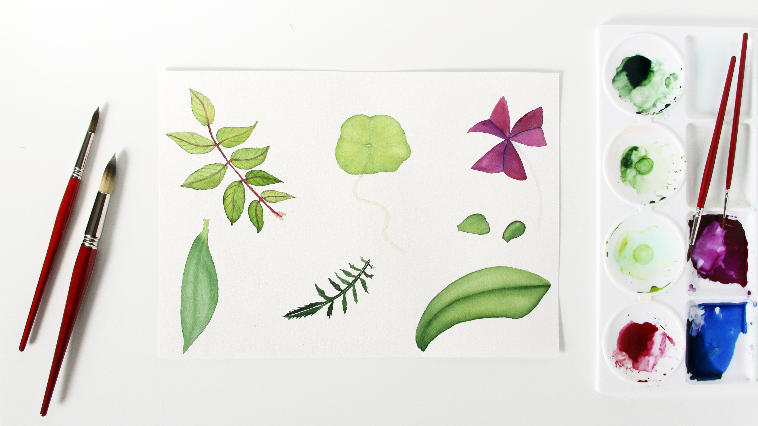
4. Materials: Just a quick word about some supplies. We're going to be using this Canson heritage paper. Cold pressed, it's 140 pounds comes for n blocks. This block is about nine inches by 12 inches and I've cut it down. You can use whatever size you like. Five by seven is nice, not too small, but if you prefer four by six, that works too. Choosing standard size like four by six or five by seven makes it nice if you want to frame your painting later because it's easy to find a frame for it to fit in. You've already seen my palette. This is a plastic pallets. I actually stole it, borrowed it from my husband and I'm not sure where he got it, I don't know what brand it is. I'll give you a link to a similar palette and brand in the handout. If you're looking for one, any kind of palette will work. Even a plate or dish, plastic or paper plate or dish will work. Got my jar of water, and some brushes. Now use whatever brushes you have on hand. These fish paintings don't need a lot of fussy details. We'll put some details on at the end. These long pointed round brushes, I have some by Princeton, this velvet touch. They are nice. They give you nice, fine point. Sometimes it's a little hard to control. Fine pointed smaller brushes or things like the spotter brushes work well too. Use what you have and don't really fret about it. I think it's time we get started.
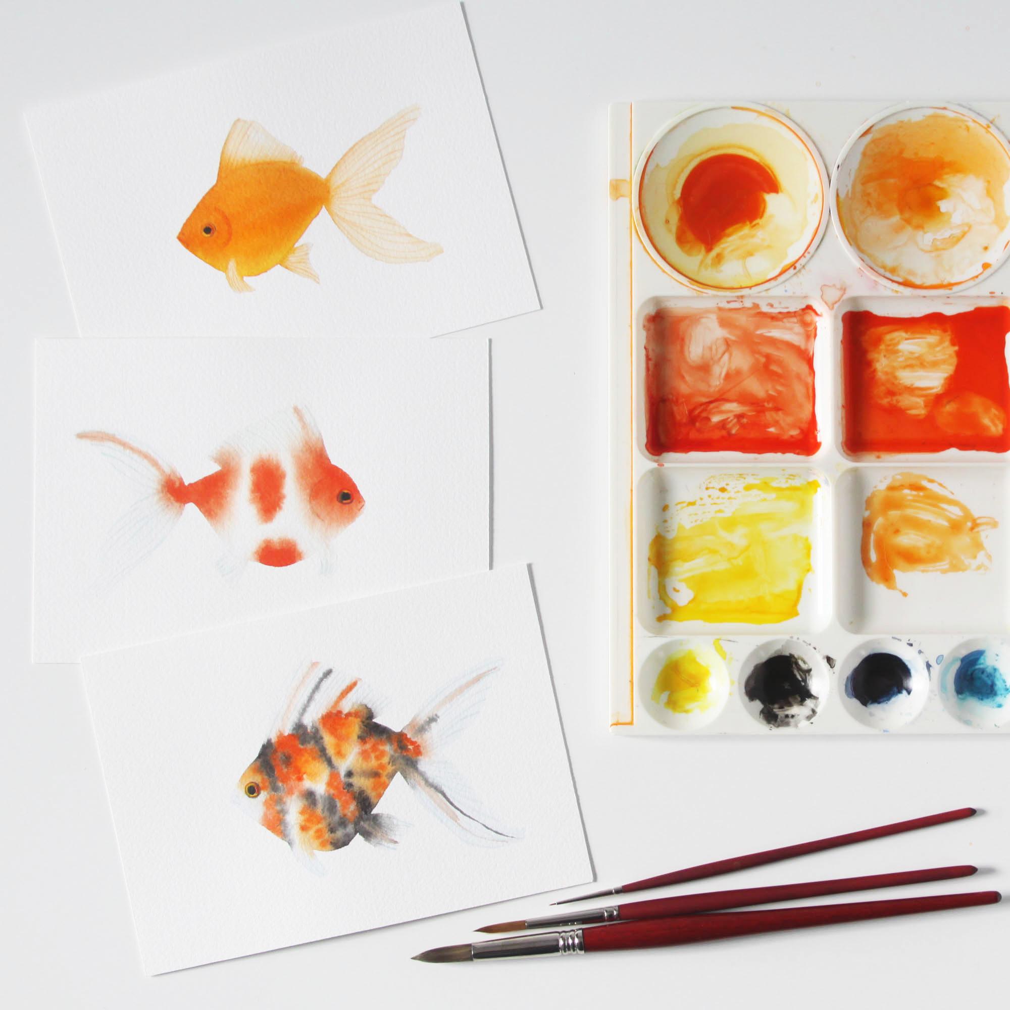
5. Orange Fish Part 1: It's going to get started painting an orange goldfish. I'm going to start all of these fish paintings the same way with some blue paint. That's going to create the shadow and shaping and also it will help define the fins because we're not going to use a lot of color in the fins. You remember from looking at the goldfish pictures, goldfish has an egg shape, body. The nice thing about painting these fish paintings is that you can easily adjust the shape as you go. We're not working from a sketch to starting out with the body and then painting the fins, and just a light wash of color. The tail. Next, you can build up the shape as you go. It's very forgiving. Make the tail a little larger as you go pulling up some color. You don't want this layer to be very dark. The pectoral fin, which is really on the side of the body, and then the back ventral fin. There's your basic fish shape. Can adjust it if you need to a little bit. Look and make sure it's not too wet before we start adding the orange. We're going to use a lighter color orange to start with, wetting my paint here, it's dried and I don't want it to be totally dry or else it's not going to spread. You can see, because the paper is wet, and we have some wet paint. It's spreading across the wet areas. I'm trying to keep the paint mostly just in the body section. But it's going to spread a little bit in the fins and that's okay. I want a fairly dark color, partly saturated for the body, and next, I'm going to add some yellow. Because the underside of goldfish shines and glows, and that's what I'm trying to do here with this yellow. I can't see the yellow very clearly, but here it is coming in on the underside. Just to give it a bit of a glow. Now I think we need a redder, darker orange for the top of the fish. It's all just going blend here. I'm dabbing the paintbrush onto the paper to release the color and spreading the color throughout the shape of the fish. Because everything is wet. It's still going to keep blending on the page. But I'm also going to blend it some myself with a push. I'm trying to get as much paint off the brushes I can because now I'm going to move the color in the fins. You could just let them do what they want to do with the color, move naturally. But I want to take up a bit of that color. The fins are a bit more even and a bit paler than the body. Using a damp brush, that has the paint removed, I'm going to pull up the paint off of the paper and this is going to take a little while, and the paint is going to continue to flow into that area. That's okay, if there's a bit of flow, but I don't want it to be super orange. Of course, there are lots of different variations on this dorsal fin. I'm just rubbing the brush along the edge, fixing the shape a little bit. The same down here. I want to remove some of the color and even out the color a bit. As this dry, that's going to be different. This pectoral fin, I want to give it the look that it is on the side of the fish and not just underneath. Just a little bit more of removing some color here. Before we let this dry. You can let it do whatever it wants to do. I'm going to experiment, play with it a few different ways, and see how it looks different if you do things differently. But I like the way this is looking. Just even up the edges a bit. While things are still wet, you can move that paint around on the paper, lighten it up a little bit, give a bit of shading. Now I'm going to just take a little bit of the paint off for the eye. I can also do this once it's dry, and we may have to do it a little bit more than but I think that looks good.
6. Orange Fish Part 2: So it's time to do some details, and I've got a variety of brushes here including this little blender brush which we'll use later, but these are all good detailed painting brushes. Starting off with my long pointed round we need just show you some practice. See how fine I can get with this brush, it's a fairly large brush, but it can paint nice fine details and then using the tiny spotter brush, I'll show you this little Princeton valid touch can paint fine details with that. It quickly runs out of paint though, because the tiny bristles can't hold much so a larger paintbrush gives you the advantage of holding more paint. You don't have to use a teeny tiny small brush, there's other small sizes that work great to pull a little more paint than the tiniest ones. So you can use what you have, play around, test it out, see what you're comfortable with. If you're already comfortable painting fine details, that's great. So here our fish has dried, and we're going to start with giving some definition to the eye with sort of a reddish orange. So mixing little red orange, and just outlining the eye. The fish dried pretty well without covering up the eye that we created by removing the paint. Now I'm going to put some yellow in the center, and just fill in the shape that we created. It's fine that there's some other colors in there, we're going to add even more later. Then we're going to work on the fins, and I'm going to use orange for the fins, you can use whichever color you would like. Using just a medium orange, you could use blue, you could use gray, you could even use white. So here testing out my brush, and then we're going to start by adding some definition along the edge of the body. See that's a lot of paint coming off the brush. Just dab that and try again. My brush was fine on the plain paper. I think the problem is that the paint wants to go to the other paint that's on the paper, it gravitates towards it and still kind of a thick line. Try this again. Maybe remove a little bit of the paint from the brush before we start. This is still slightly thick line, but will run with it. That just gives definition to the body, and separates the fin from the body. Now just paint some veining, moving upwards from that line we painted, painting parallel lines, moving pretty quickly. Don't want jerky, or shaky lines. Move at a speed that you're comfortable working at. If you need to do more practice, that's fine, and just keep working until you feel that it's a pretty even balance of veining. On the bottom here, this ventral fin, I'm going to define the body with some yellow because the bottom of our fish is glowing with that yellow that we added down there. I'll paint the veins with the orange again. Just testing out my brush again, see there's enough paint to keep going. Working in the same manner from the body outward, and just painting these veins, parallel veins, and if there's a bit of a curve in the lines you paint, that's great because it gives the fins some shape. Now this pectoral fin, we just paint around the edges to give it a definition, and then paint some veining. Moving downwards away from the body again, that's looking pretty good. We'll work on the tail, the tail is a lot blonder than it started out, but it's still nice and pale, and these veins will give it a finished look, working from top to bottom. Work however you're comfortable, and try to make sure you keep from resting your hand on any paint that might be wet. When I keep the veins fairly even from one another, following along the curve of the fin. Now work from the bottom up, and meet the lines. Just a couple more here and that looks great. You just have to finish up the eye here. Yeah, we'll use a little spotter, and paint the black center. Just do a circle, a concentric circle, for this black center of the eye. The eye is already looking pretty good, but we'll add a few more details to make it even better. This light blue, we're going to put a little line along the edge of the red that we painted, a reddish orange and that helps the eye stand out, gives it a bit of a shadow, makes it a bit more three-dimensional, and now we'll paint a little bit of red in the eye. If you look closely at an actual fish, or photographs of fish, you'll see that there's a lot of colors going around in there and lots of reflections. So paint a little bit of red in here, and then also some yellow. Make sure you get the paint off your brush, especially when you're moving from darker to a lighter color. So add a little bit more yellow over here. I apologize that my hair is getting into the shot, but you get the idea, and that looks pretty good. Add a little bit over the mouth here. This reddish orange I'm using. Again, I apologize, my hair is in the way it's just a slight line, for just a hint of a mouth, and a little nostril. Now we're going to paint the gill, and I apologize, my hair was totally in the way of that shot. So I'm showing you on a different fish. Just doing a slight curve here around the eye using some orange, and widening out that shaped with a little water. So here's our original fish again. There's that curve, just smooth it out, and then I think we're done. In the next lesson we'll start another fish, I'll see you there.
7. Red and White Fish Part 1: We're going to start this red and white gold fish in the same way we did the orange one, with a pale blue wash of the basic shape of the fish. You'll see with this fish and the next fish that I paint, how well watercolor works for portraying goldfish and how much fun it is when the colors blend and flow. There are so many different options of patterns and colors. It's really fun to experiment and see all the different fish you can create. As I said about the drawings, there is a lot of personality. That can be conveyed with these drawn and painted fish. Just in their shapes and their colors and the way they seem to have expressive faces, even though we're not adding a lot of detail to the face. Just the way the paint and paper work together makes for some personality and interest. I am just defining the shape as I go along. Defining and refining it. Enlarging the fish, the fins. That's the way I start all of the fish with this pale wash of blue. One of the nice things about using cold pressed watercolor paper for these fish, is that the texture of the paper almost gives the appearance of scales. We are not painting scales on these fish. If you really wanted to, you could. I just think that's a little too fussy. I think the natural texture of the paper gives you the hint of that without having to have you paint them on there. Again, we've got the dorsal fin, the tail, the ventral fin and the pectoral fin. Now I've got the wet outline and we're starting with the reddish orange and just dropping some color in here. Watch that spread. It's just sort of magical to see the color spread and blend on the paper. Because the blue is so pale, it's not really going to affect the color of the orange. It's not going to make it brown. Blue and orange will give you a brown. Here, I'm just going to paint a line in the fin. Because what these multi-colored fish, sometimes there's lines and splotches in the fins. I'm using paint that's not very wet. I'm trying not to have it be too wet or else it would just spread and color the entire shape of the fish. To darken the color, I'm dabbing in paint where I've already added it. I want there to be a dark orange here, not very pale. Heading a few more spots. The other thing, if your paper is too wet, even with a fairly dry paint, your paint is just going to spread everywhere, which you don't want. You want there to be some white space on the fish. For this red and white spotted fish. If your paper is too dry, all the dabbing will just stay where it is and not spread at all. If that's the look you're going for, that's fine. But I like there to be a nice bleed and spread of color. You'll get a feel for it. You'll see how the paint reacts on the paper. Okay, I think that looks pretty good. After it dries. I'll paint some details. I'll see you there.
8. Red and White Fish Part 2: I really like how this fish dried. Looks great so far. This time for our veins, I'm going to use a grayish blue. In one of the empty wells on my palette, I'm mixing gray and blue, the pale blue and the gray. Just testing it out on my swatch page here. It's a little too dark, so I'm adding water. I don't want a really dark color here, so let's try again. It's a nice pale color, and I'm going to define the edge of the body here on the bottom where the thin ventral fin is, and then defining the edge of the pectoral fin. Just painting along the edge of the fin, defining the shape. I don't want it to be a really dark line, just to have some definition. Because these fins are pale and transparent, you want to convey that with the watercolor. Painting the veins in the same way we did with the orange fish, the parallel lines painted down from the body. Now, defining the top edge of the fish where the dorsal fin meets the body and then painting our veins. I need a little more paint here. That got a little too thick and too dark. You can always dab it off. With the colors we're using, it's pretty easy to remove. This is really releasing a lot of paint, so I think I'm going to move to a smaller brush. You can see that had a little yellow on there, so we'll just mix it in, mix it more gray. I'm just painting these veins, following along with the shape of the fin. I want them to be pretty pale. Just barely touching this tiny brush to the paper for these fine lines. After I've painted some lines, I can go back and paint more. Add a little definition to the edge. You can always go back and refine headboard details, just to give it a more finished, more realistic look. You can paint from front to back, back to front, meet in the middle, however, you're comfortable working. Add a few more lines here, and I think that looks good. Now, I'm going to remove some of the paint from the spot of the eye. I didn't do that with the wet paint because I didn't want to disturb the blend of the color. This brush is the blender brush and I'm just using a damp brush to remove the paint. I'll let that spot dry and then we can paint the details of the eye. Now, I'm going to do the tail. I'm using the small spotter brush again, and painting these tail fin veins. When you paint the curve of the veins, it helps give shape to that fin. I'm going to use this larger brush, see how that'll work for us. Switching back and forth however you're comfortable, works well. It's nice to have a variation of line thickness when you're painting these veins. It gives it a more organic, natural look. You can paint as many or as few veins as you want to. I even not following along with any particular fish. This is a fish from my imagination, so it's just going to occur naturally on its own. See how the paper blends itself to the shapes and colors. I'm going to add a little bit more here. As I said, you can always go back and add more and more details, finish things up, add more definition. This blue, this grayish blue, I think really stands out nicely on the red and white fish, and makes very nice contrast. But of course, you can use any color that you'd like for these veins. An orange would be really striking also. Now, let's see. Making sure that my brush is clean here, and I'm going to paint the yellow of the eye like we did with the other fish. I'm just going to paint around where I know the black is going to go. Now with the red, orange, I'm going to paint around the eye, making this eye shape stand out from the red orange of the fish's head. While we're here, I'm just going to paint mouth and nostril. That's just how I did it with the other one which you couldn't see very clearly because my head was in the way. Now, let's finish up this eye. I'm going to paint the black center using the spotter brush like we did before. Being careful here that the black doesn't spread too much into the yellow because I think that's still a bit wet, but that's looking good. I'll wash off the brush. You don't want the black to blend into your other colors. I'm having some blue and like with the other fish, I'm going to paint just on the outside of that reddish orange line to give some three-dimensionality, to give a bit of a shadow and to make it really stand out from the fish. Now, rinsing out my brush. I'm going to use some of the dark orange here to test it out on the paper, and just painting a gill that curve with a pale bit of that red orange. Now, using some of the gray, just to help define the shape, give a hint of a shadow behind the gill. A little more yellow to this eye. That's blending a little bit with the black paint. Add a little of reddish orange here, and that's going to blend a little bit too, which I like. I think I want to pick up a little bit of that paint, so I'm going to use the blender brush, that chisel blender and just smooth it out, sort of blend it. It gives a hint of reflection and now I think we're done. In the next lesson, we'll paint one more fish. See you there.
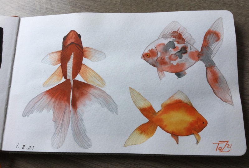
9. Calico Fish Part 1: This is the last fish I'm going to demonstrate for you, a calico goldfish, multi-colored fish. It might be my favorite, it's really fun to paint these multi-colored fish. I don't have any goldfish now. I used to have a big tank, but when we move to the last time, I gave it away; and I really missed my fish, and I think that's why I started painting goldfish because I wish that I could have a tank again. They're so soothing to watch and it's really soothing to paint them too. My calico goldfish, they're so beautiful, and it's fun to have the color spread and blend. You saw that a bit in the orange and white fish and it's going to be even more so with this one. I'm starting out in the same way we did the last two fish, painting a pale blue wash that's just defining the shape, the body, the fins, and there are different body shapes and styles of goldfish; of course, I like the fat fan tail fish. All three of these fish that I've demonstrated are that goldfish. Of course, you can paint any kind that you like. Some of the fancier fish or a long, thin, narrow fish, or even coy. Just play around and see what you like. As I said, if it's too wet when you dab in the color, then it will spread everywhere. But I think this is a good wetness. Starting out with some red orange and working in a similar way to a red and orange goldfish that I painted in the last lesson, but just doing smaller bits. Now we're painting in some black. Look at the way that's spreading. I've never quite seen it bloom like that, and it's really interesting. Look at that spread, it's so magical. It's like flowers blooming on the page. It may have been just slightly too wet when we started, but I'm just going to go with it. I think we can make this work. I'm just thinking what should we do next? I want to use a different brush because I don't want to have to wash all the black off. Paints more of this red orange and just dab it in among where I've already painted little dabs of color. Some calico goldfish have lots and lots of different colors and speckles and barely any white, and some have a lot of white. One of the most fun things is painting all these different varieties. You can just keep painting fish forever and never end up with two that look the same, and I like how the colors are blending into one another and that orange had some black in it. Just really some fun looks. Just keep adding paint. You can only do this for so long until your paper gets too dry to work with and until it gets entirely filled with color. You'll get a feel for how much longer you can keep going. If the paint stops moving, then you know you're getting towards the end. But this is still spreading and blending nicely. I have a few lines here, painting some more lines in the fins. I really like the way this is turning out so far, trying not to use too wet of paint, as I mentioned with other fish, you don't want it to spread too far. I'm going to use a lighter orange here. This one I just remixed and it's still a bit wet. Trying to tell that it spread too much. But I really like how this light orange is looking, mixing in with the dark, reddish, orange, and the black. A little more red orange can go over places that you've already gone, add some more color, and this especially with all these little dabs of color and the way it spreads, the cold press paper really makes it look like there are scales. This one is shaping up so great already, I'm getting really excited. I'll let this dry and then we can paint the details. It's going to be fun. See you there.
10. Calico Fish Part 2: The Calico fish is dry and it looks really great already, I think. But now we'll put the finishing touches on with some details and fins and the eye. I'm using a gray again on these fins. Doing some definition along the pectoral fin and our pointer round brush is leaking a lot of paint today, but we'll just roll with it. I've got some veins for that, just dab a little bit there. Define the belly of the fish here. That fin turned out really neat looking with the dark and orange and blue all mixing together. I'm just going to paint some veins on here with the gray. Of course some of them you won't see because of the dark color of the fin itself, which is just fine. The fins, I really liked the way the tail especially looks with the lines that are in there, thick ribbons. So I'm painting the definition on the top fin, the dorsal fin and now painting our veins. Just like I have shown you with the other fish, painting them from the body towards the top and having them be parallel. I'm just getting a good feel for how many you want there, how far apart they should be. There's no hard or fast rule. That's looking pretty good. Work on the tail in the same way we've done before and then we're going to follow along a bit with the colors that are already there. Just creating a bit more of a finished look. Actually, I think the tail would have even been great just as it was, but painting these veins just gives it a little bit more. You can paint as many or as few as you want when you're making your fish. Add some additional ones. If they wobble a bit, that creates interest and it's almost like the fin is folded or curved. Now with this yellow, I'm going to paint in the eye. I didn't remove any paint. I can sort of see a space where the eye just would look right. Sometimes the way the texture of the paper is, it almost gives you the sense of an eye. Here, the mouth and nose painting and the gill with the gray. I don't want it to be too obvious here. Paint a little bit of red in there too, the reddish orange, just a hint. Smooth that shape out. It's a bit thick, I'm going to dab it a bit and then come back and refine it. So just a hint. One of the fun things is just not knowing how things will exactly turn out. Heading the black center of the eye just like we've done with the other fish. It's looking so much more finished now, the eye really does it, I think. If nothing else, if you don't want to paint the veins on the fins, just be sure you paint an eye and that'll give your fish a nice finished look. Again, the reddish orange around the outside of the eye helps it really stand out. There it's already popping out more. We'll have some gray. Add a little more blue to create a bit of a shadow around the eye, really defining the edge, helping it stand out even more from the body. It's looking really great. Let's move the reddish orange to the eye. Let's give it some reflections, some depth, a bit more color, and some more yellow. It's looking really great. This fish is so fun. Let's darken the black center a bit more. You can keep your eyes as simple or as complicated as you want, however looks good to you. I think this little guy is done. In the next lesson, we'll talk about your project.
11. Your Project: Now, you should be ready to begin painting your own watercolor goldfish. You can paint single fish on small pieces of paper like we did in class or you can use a larger sheets and paint, multiple fish on one page. The choice is up to you. There's so many different color and pattern options that I can't wait to see what you create. Thank you so much for taking this class. I hope you'll share your painting in your class project section and please leave a review of my class. See you next time.
 Anne Butera, Artist. Instigating creativity and joy.