Transcripts
1. Introduction: Hi, everyone. My name
is Nia and today. I'm going to share
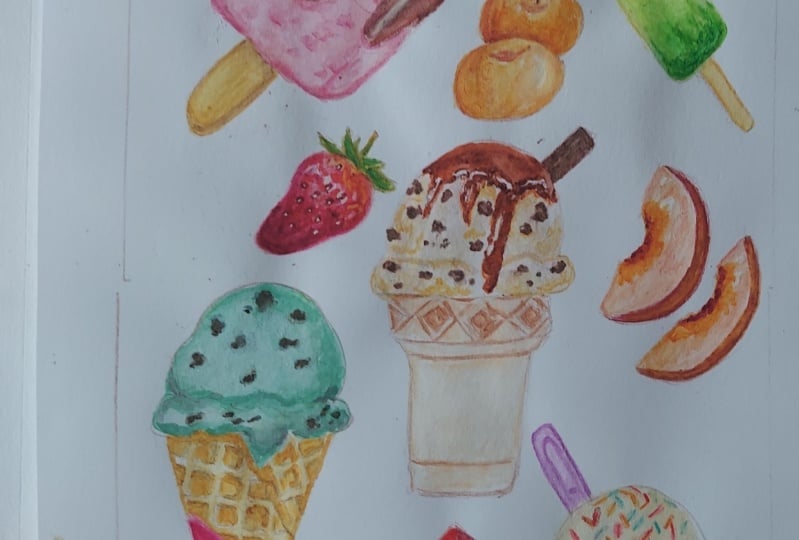
with you how I paint this colorful sweet
summer treat collection. I'm so excited to share this one with
you guys since I had so much fun painting it and combining all the different
bright colors together. Initially, I wanted this to be an ice cream collection,
but along the way, I thought that including
fresh fruits will increase the dynamic as well as the amount of different colors that I can include
in this composition. So this is what I
have come up with. I will be painting
this whole composition without any references, but I will show you the process right from the very beginning
of the ideation process. After this introduction,
I'm going to show you the supplies as well as the colors that I used
to complete this. And I'm going to show you how I created a small library of items that I can pick and choose to include in
the final composition. I'm also going to
show you how I create the thumbnail sketches
and also sketching the final composition with color variation that I'm
going to do digitally. Finally, I'm going to show
you the final outline before painting all of
the elements one by one. All this is shared
with you and hope that you will gain the freedom
to paint what you want. Instead of feeling the
limitation of painting the composition that
I share with you today in case you have
any other ideas in mind. If drawing is not your strong
suit, I will, of course, have the outline
available for you guys to download in the projects
and resources section. So that's also an option where you can get straight
to painting. For this class, I will
be painting in detail. So I would recommend
for students to have Prior experience
with watercolors. This includes things
like brush control and understanding of the wet on wet and the wet on
dry techniques. With this said, though, I will give you options
along the way, and I will also share
the technical aspects for repeated subject like
the ice cream itself. So hopefully by the end of this, you have repeated the technique
enough times for you to create your own favorite
ice cream flavors for future paintings as well. So just to be on the safe side, I would recommend this painting for intermediate students. But you can also
join in if you're a brief beginner and you're interested in
giving this a go. Just as prior knowledge
before painting along, if you've never taken any
of my classes before. I will be skipping
through parts of the painting if my
hand is off the frame, just to get the class going, and it's easier to see the progression of the
painting that way, but I will still be painting in real time despite the cuts. So just to get an understanding
of the flow of things, I would recommend
for you to watch the class or some lessons
before painting along. This way, when you are ready to paint along, you
know what to expect, and you can also pause in
between each step so you can paint at your own pace
without feeling rushed. So if this sounds
like something, you guys are
interested in trying, come join me in this
class, and let's begin.
2. Supplies: In this lesson, I'm
going to go over the supplies that I used
to complete the painting. For the paper, I use
these two sketchbooks. This small one is just for
me to swatch my colors, but I'm going to be using my A five size bow hog sketchbook. This is 300 GSM cold press, which is a medium grain, and it's 100% cotton. This painting is, of course, still doable with
hot press paper, which is what I usually use. However, the quality
of the lines will be much cleaner
and sharper if you paint on hot press compared to what I'm using here
with the cold press. This is something
that you want to paint and display, of course, you can also use a loose paper instead of
painting on a sketchbook. Now, moving along
to the brushes, I'm only going to
be using these two. This first one or the
green one is what I'm going to mainly use
for most of the painting. This is by George or, and it's a size for
synthetic round brush. As you can see since I don't
use this brush very often, it comes to a very fine point, which makes it much easier for me to paint on the details. If yours is a little bit frayed, you can also use a size zero
brush for the finer details. Also be using the smaller brush, which is a size one by tech. You can of course use any
brands you have on hand. But I'm using the smaller
brush not because of the fine point
since I can achieve those delicate lines
using my larger brush. But it's more for
the short bristles to create rounder edges, which makes it much
easier instead of using my larger one which can snap and create uneven edges when I try to create
those round circles. Next, this is the palette
that I'm going to be using. This is just a cheap
plastic palette from die. When you're using
a plastic palette, just make sure that you're
using a light color, so it's easier to see
the colors that you're mixing and be mindful that
you can also beat up. Mine is fairly new, but I've used it a few times, so it's getting a
little bit better with the way the paint
sticks to my palette. You can also use a
porcelain palette if this is something that
bothers you because it might be a little bit
difficult to control the load on your brush
if the paint beats up. This is why you really need
tissue right next to you. This is very important to have
next to you at all times, is as important as your brush. This is what helps
control the brush load, and even though sometimes
my hand is off the frame, I'm usually dubbing
off access paint almost every single time
before I apply paint on paper. Next thing you'll need is, of course, a jar
with clean water. You can use two
jars or just one. Personally, I'd like to
just use one and just change the water whenever
it gets a bit too muddy. If you're using two
jars, you can have one, which is for
cleaning your brush, and the other one is
for you to take paint. The color that
you're mixing won't look too muddy with
the dirty water. For the sketching portion, I'll just be using
my usual pencil, which is by pentel sharplet and it's loaded
with two B pencil. I'm also going to be
using my pentel eraser. Lastly, I'm going to use my hair dryer to make the
drying process much quicker, and this is optional, but I just can't be
bothered most of the time to wait for
certain areas to dry. So this is optional, but it's
definitely a time saver. In one of the lessons
I'm going to use procreate on my iPad to
try different colors. Of course, this is
not a requirement. You can always try colors
manually with paint, but I'm just going to share
my full thinking process as we go in case you would like to create your
own composition, and using procreate does make the process a little bit
easier to try colors. Speaking of colors
here are the ones that I'm going to use
for the painting. Firstly, this is compost
blue by Holbein, followed with yellow
Ochre by Holbein, CPA by Holbein, Crimson Lake by Holbein, vermilion
by Holbein. Cobalt green by Holbein, Titanium gold ocher by Sminke
Chinese white by Holbein, and the yellow light
by Daniel Smith, and permanent yellow
deep by Holbein. I'm also going to use a little
bit of bleat proof white by doctor Page Martin or you
can also use white guash. If you need, this is
also the swatches that I've made using
the colors as they are. You can take a screenshot
of this or you can download it in the projects
and resources section. Again, here's just a full
list of all of the supplies, so you can get everything
nice and organized before we start. Okay.
3. Ideation Library: Before I start painting
these sort of compositions, I always like to do a little brainstorming
to just figure out the items that I want
to include in the painting. A lot of times I just
have too many ideas in my head and sometimes it
might not go with each other. So I'd like to just write down really quickly
some of the items that I have in mind that I want to incorporate into
this composition. Want this painting to have a really fun colorful summary
and refreshing feeling. I've decided to
include fruits and ice cream or popsicles
into the composition. Since I find that I can
play a little bit more with the shapes as well as include
many different colors. Firstly, I just write down names of fruits that
I have at the top of my head that has different colors which are fairly familiar for me to paint. Firstly, I always
like to incorporate strawberries into my painting, of course, that's the first. Peaches are really
easy and fun to paint. Since they're mostly
just gradients. On the side of the writing, I'd like to just create a simplification of the
shape for those fruits. It's much easier for me to
visualize them later on. I'd like to also think about how I want to present these fruits, as a whole, as haves or
as wedges or slices. I'm fairly happy with the
choices that I have here, so I'm just going to leave
it here for the fruits and move on to the
popsicles and ice cream. But if you have more ideas that will help you with
your ideation process, feel free to just
write it down and draw out a simplification
of the fruits. Next, let's add
on the popsicles. This time, I'm going to go
straight into the shapes. I'm just thinking of
very simple shapes which will be easy to paint, but can include
different colors. Of course, shapes of popsicles will greatly differ depending
on where you're from. Feel free to maybe
include a couple which might remind you of
your childhood favorites. Drawing these out, I like to think about the colors
if they're going to be gradients or have some sort of texture depending on the
flavor they're going to be. You can also think about
things like toppings, if they're going to be
dipped in chocolate or have some peanut
crumbles and so on. Since we can't include too
many in the composition, I feel like four shapes are
enough for the popsicles. Next, let's catch out some
ideas for the ice cream. For this, I'd like to
think about the scoops, if they're going to be
scoops or soft serve. Personally, I want this to
be fairly easy to paint, so I'm not going to bother with the form
of the soft serve. So I'm just keeping
this simple and just thinking about how the scoops
are going to be presented. Is it going to be in a cup or is it going to be in a cone? And what type of cone I can incorporate into
the composition? You can even think about
homemade ice cream. It can be served in micin in
a cup or in a small bowl. Some cones can also be dipped
at the top or the bottom, and that's something
that can also play around with as you're
sketching out some ideas. You can also pile on the
scoops of ice cream. As an example, this
can be used as the focal point right in the middle or the center
of your composition. You can have a tall ice cream
with many colorful flavors. While I'm at it, I also like to think about the
pattern of the cone or the cup because
sometimes I just get a mental blank when I'm
painting them straight away. For any of the ideation process, you can always look
for references if you want some
extra inspiration. Lastly, I'm also going to play
around with the toppings, see what sort of shapes
and fun sites I can include to enhance
the presentation of the scoops of ice creams. Since I want this painting
to be bright and colorful, the flavors will play a big role because that's going to influence
the color choice. So I'm just writing
down some ideas quickly before I start
sketching the composition.
4. Composition: Okay. An important thing that I always do
before sketching out before I sketch out
minial compositions is to know the paper size as well as the aspect ratio or
dimension of the paper. This way, you can take
framing into consideration. And since I'm going to be
painting on this A five paper, this will be the aspect
ratio that I use, even when I'm just sketching out something small
at the beginning. I also want to take into
consideration the binding, which will take up a little
bit of space on top. With all the shapes that
I sketched out earlier, I'm going to simplify it
even further by not painting on or drawing on any of the
patterns or little details. I'm essentially just drawing icons to represent
certain items, and this is just
a very quick way of putting things together in a very short period of time. I always like to start with
whatever is at the center. And when I'm placing
the items around it, I like to think about the
space that I have and what sort of shapes will
go well in those space. So think about if
this space is long, wide, round, maybe a little
bit square and so on. And what sort of items will complement the space
that I have if I'm going to add another large item or
just smaller fruit items. That's just a very small
example on the left. I'm just going to quickly draw out another idea on the right. As you can see, since it takes very little
time to do this, the possibilities are endless. You can try to incorporate different fruits within different
thumbnail compositions, since it's fairly quick and see which one works
best for you. I quite like the
first one already, so I'm just going to draw out
a slightly larger version. Again, taking care of the
frame that is going to be in. And this time, I'm going to incorporate a little
bit more detail. So I'm going to sketch out
some toppings on top since. There's a little bit more space. I want to also take into consideration some
of the pattern or detail work on the cone. The upright water melon on the small thumbnail sketch
looks a little bit too static, so I'm going to add a little bit more dynamic
into the composition by putting it on
an angle and also adding some splashes
of color on the side. This, of course,
can still changes just a better view when it's
at a slightly larger scale, seeing what sort
of details I can add on to enhance the
full composition, like the smaller items of the leaves and
things like that. After adding on the details, I think I like it even more
with the extra details, and that's also a good sign. So I'm just going to think about the flavors
of these items. This way, I can avoid doubling
up certain similar colors next to each other to make the composition look more
lively and colorful. This is the composition
that I sketched out beforehand as I was
planning on this class, and the lines are drawn
very loosely and thinly, so it's much easier to erase
and move things around. I don't really put too much
care into the details. Instead, I just want to
drop down the shapes, making sure that everything
is fairly balanced. Now I'm going to
do the same thing with this new composition, and I'm just going to compare at the end to see
which one I prefer. I'm just going to
have the sketches right next to me at all times, so I can always
refer back to it. When I sketch out
this composition, I always like to
begin at the center. This way, the main
elements right in the middle and I
can then divide up the rest of the
elements surrounding it to frame the whole
composition nicely. At this stage of the drawing, I always want to sketch
out very loosely. You can see where I'm holding my pencil is quite far back. This way, I don't accidentally
put on too much pressure. I also want to simplify as I'm drawing just like how I
sketched them out before. I'm just thinking of the basic outlines for all these shapes. For the popsicle sticks
is much easier to draw a guideline right at the
center of those popsicles. This way, you can create a
continuation of the line, making sure that they're
the correct angle following those popsicles. I haven't fully made up
my mind for the toppings, but here I just sketch them
out really lightly as well, just to make sure I have enough spacing for
anything that sticks out. On the left of the cone, there's a little bit of space, so I'm going to fill it in with the wrapping that
sticks out to the left. Cup of ice cream
disappear out of nowhere, but I'll be erasing
it since it's not at the right placement
or the right size. This is why it's very
important to just draw things very
quickly and lightly. This way of mistakes were
made like what I did there, it wouldn't have
taken too much time. I always think of how
to simplify shape. For the peach slices, I created half circles and add smaller half
circles in the middle with jagged lines for the areas of where the seeds
previously were. After this, I'm just going
to add the smaller fruits to fill in the rest of the space as well as some
leaves and flowers. I'm sorry, I skipped the sketching process
though because I did this on a very cloudy
day and everything was over, but I'm sure you
get the gist of it.
5. Colour Trials: In this lesson, I'm
going to show you how I try to figure
out the colors. You can do this manually
with your paint on paper, but I find it much easier
to do it digitally, so I can just layer on different colors to see what
works best with each other. This is of course
optional and you don't have to do this
for your own paintings. But I just want to show you my full process in case
you want to create something completely on your own or even outside
of this project. What I did here was to
take a flat lay picture of my really rough
pencil drawing and I created the canvas according
to the size of my paper. Then I just distort the shape
of the paper to make sure that it fits correctly within the frame that I have
created on Procreate. This one is made
from my first sketch as my ideation process
before I created this class. You can see that I've painted this like how I've sketched
it out, which is very rough. The lines are not clean. I just want to quickly get down the colors and the
flavors of the ice cream, making sure that
they're balanced and it creates a nice flow
within the composition. This is what I
quickly painted with the composition that I sketched out with you guys in
the previous lesson. At this point, I was still unsure which composition
I like the most. I was just looking around to see which one has a better
flow in my opinion, as you can see, I also
created different layers with different colorings or different flavors of the ice cream. As an example, I really like cookies
and cream as a flavor, but the gray color just didn't sit right with all
the bright colors, so I decided to change it into this brownie ice cream
with a caramel drizzle. Okay. Now, let's go back
to the new composition. You can see that I basically
use the same flavor since I already like the color combination and the textures. I also enjoy the flavors myself. This painting is still
quite personal to me. This is why you can always customize it to your favorites. But since I've changed some of the elements in
the composition, I just move those
flavors around minus the chocolate ice cream since I don't have enough
space for another scoop. Let's just take
this as an example. I can still change
things and move things around since nothing is set
in stone at this point. But looking at this
whole painting, I can already tell that I don't like the
color of the cherry, since it's too dark compared to all the other bright colors. I personally like eating
black cherries more, but it just sadly doesn't
work with this composition. I changed it to this
Vermillion to instead. I can see just from
this small change, I like the flow of the
composition or the colors better. When I paint later,
I'm aware that I won't be able to get
the exact same colors, especially for some of the pestels and the
light vanilla color. I understand that
certain pigments just won't be as bright. But this is just a
rough guide for myself. As it helped me visualize
the color as well as the value placement and how they interact
with each other. Just because the dark cherries doesn't work with
my composition, it doesn't mean that it
won't work with yours. This will just depend on the
rest of the elements and the relationship
of colors that you decide to include in your
very own composition. In this painting, I also added different elements
for the toppings. I'm going to now go
back to my sketch and add on those toppings according to how I've
painted most of them. With the added toppings
this time, though, it might take a
little bit more space than anticipated or what
I've drawn out earlier. As an example,
because I want to add the waffle on the
right hand side of this ice cream scoop, I will have less space
for the peach slices. I'm just going to
reposition them according to the
space I now have. I want to also clean out
some of the outlines, making sure that it has a clear enough volume for all of the elements that I've
included in this painting. Looking back at my
digital painting, I decided I didn't like the position of the
cherries as well. So I decided to change
it into oranges instead. Since I also felt like painting
the orange skin texture. Here I felt like the focal point of the ice cream cone
was a bit wonky, so we decided to redraw and reposition the
whole ice cream. And this time, I
also decided that I'm going to go for the toppings that I created on the painting. So I'm going to sketch it
on this outline as well. After this, I'm going to go back to the digital painting again because I can see that compared to all of
the other objects, this popsicle on the
left looks empty, even though I added the texture. Here I made some changes and
I added a chocolate dip on top with a little bit of texture from maybe nuts or some cookies. But the pink is still
showing at the bottom, so I'm not losing the
color and on the right, you can see that I just
created an orange blob to see the interaction
between the colors from the orange instead
of the cherries. That's basically
the final outline. I'm just going to clean
it up in my own time, so the lines are
not as scratchy.
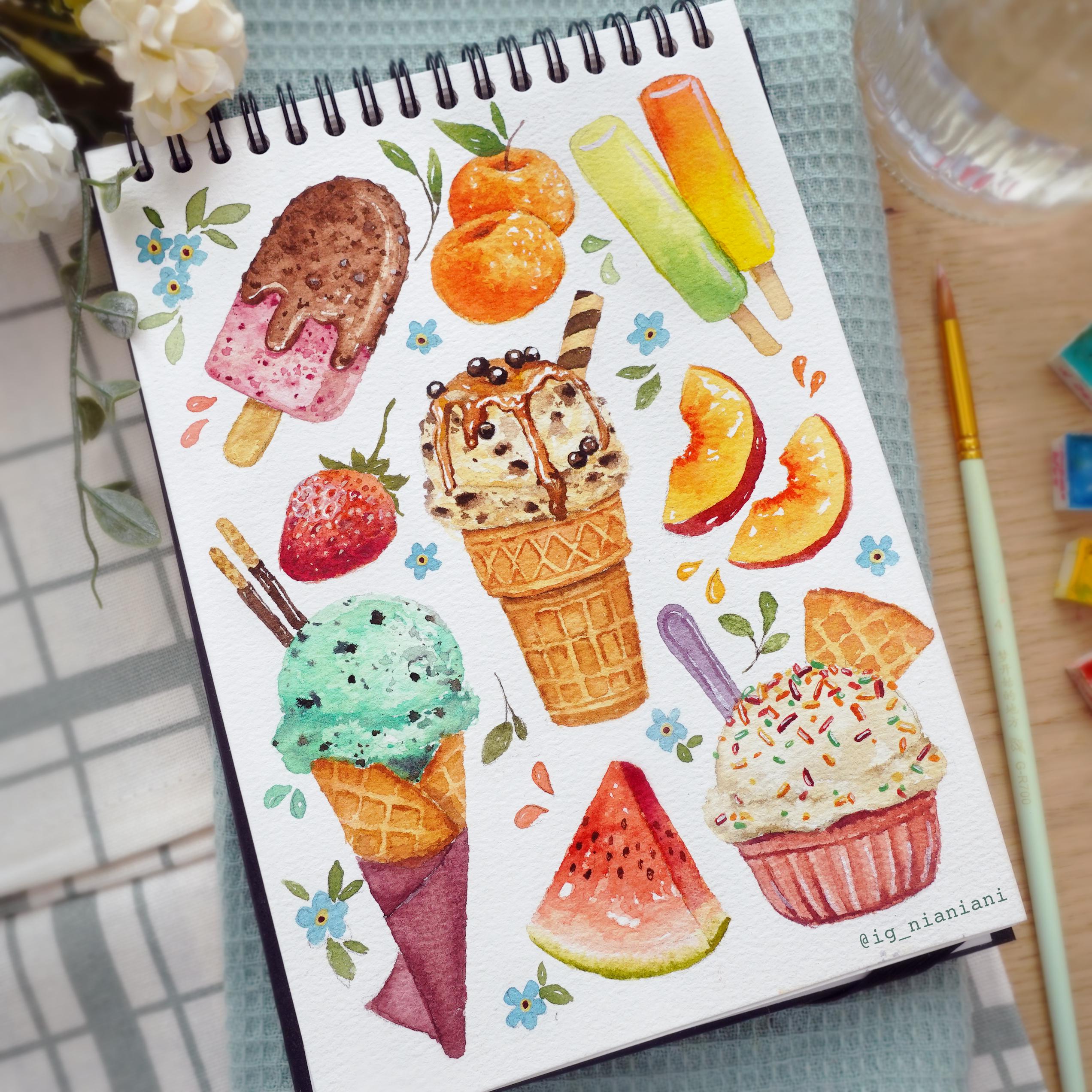
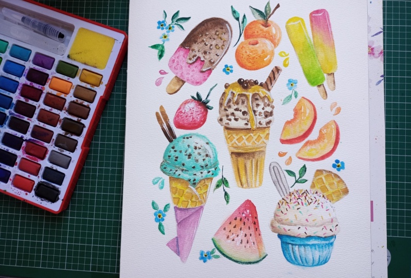
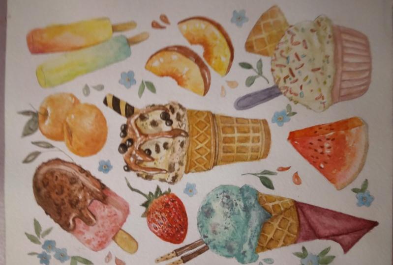
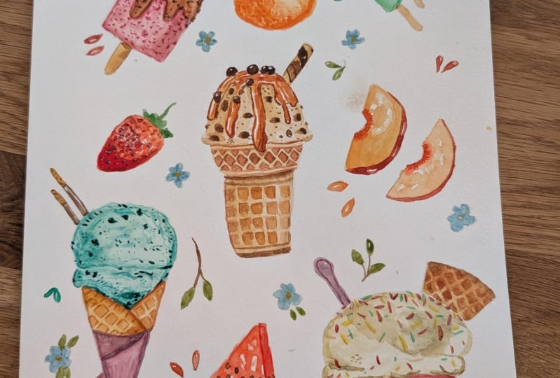
6. Strawberry Popsicle: On the outline is
nice and clean, I also added the extra
chocolate topping on the strawberry popsicle. This is also where I'm
going to start to paint. As for the main color, I'm going to use
ermlion as my main red. Then I mix a little bit of Chinese white to turn
it into a pastel tone, and I want the color
to be a bit more rosy, so I added some
crimson lake as well. Adding white pigments tend to make your paint on
the thicker side. After I applied a little
bit of paint on my paper, I decided to just clean my brush and use
the water that's on my bristles to help move the rest of the
pigment on the area. It also helps to paint
around the edges first, so it's much easier to fill
in the rest of the space. Once the paint is
evenly distributed and the surface is still
a little bit damp. I added more crimson lake
into the previous mixture, so the pink becomes
a little bit darker, and I'm placing
this at the bottom, as well as underneath
the chocolate drip. This will create
a slight shadow. And because the surface is
still a little bit damp, the paint will travel towards
the center naturally, which I'm going to take off
if it's a little bit too dark and it moves too much
with a clean dry brush. At this point, I want
the surface to just be a little bit damp and cold to the touch without
it being shiny. This way is the right dryness for me to add on some textures. I added even more vermillion
and crimson lik into the previous pink mixture to create a darker
version of the color. And with this dark color, I just.in different sizes
to create a slight texture. Just like before, if some areas are a little bit too dark, I'm going to take off
the excess pigment using a clean dry brush. Once the surface is
slightly more dry, I'm going to use the same
color and this time, I'm using the tip of
my brush to create smaller dots in random areas, and I'm going to clump them in some areas and leave
certain areas empty, which will randomize
the positions. Hopefully, you can see
from the progression of when I painted the dots
on the damp surface. The edges of my brush
strokes are much softer compared to
what I'm painting now, which is on a dry surface. The edges of the
dots are much more defined and it's no
longer spreading out. This is very important
to understand, since this technique will
create the illusion of depth through the
layers for the texture, which I'm going to repeat for other ice cream flavors as well. But going back to the colors, I use crimson lake in a thick consistency
for the dark red. Here I went back with
the mid tone pink, which I mixed earlier. Again, I'm adding more
textures on the dry surface. Even if I'm using
the same color, you can see that it
adds depth as I'm painting this on top of some
of those softer textures. Lastly, using this mid to pink, I'm going to clean
out the edges and add a light shadow underneath
the chocolate drizzle.
7. Mint Choc Chip Ice Cream: Let's move on to the next item. I'm going to paint the
Mint chock chip ice cream, and I'm going to use more or less the same
technique as before. As for the color, I'm using cobalt green as the main color. Then of course, I'm going to add some Chinese white to turn
this into a pestle tone. But since it's a
little bit too bluish, I decided to add a touch
of hands yellow light. But of course, you can
always adjust the ratio of your paint according to how you want your
jutive to look like. For the application, I'm using a medium to a
light consistency, and I tried to make
the surface look uneven since it is a
hand scooped ice cream. To achieve this, I try to play around with the
pressure of my brush, letting more pigment flow out of my bristles in certain
areas than others. I also left out some white negative space or negative line, especially between the top part of the ice cream where it's round and the bottom word slightly sticking
out and uneven. Sometimes I'd like to
apply it this way as well, which is to apply a slightly
thicker consistency, then cleaning your
brush until you get rid of all of the
pigments on your bristles. Then with a wet or damp brush, pick up the pigment that you've already
placed on paper and drag it outwards depending on the area that
you want to cover. This will create
something uneven since certain areas have
more pigments than others. Let's go back to the
ice cream painting. I'm going to enhance this
even further by painting on the damp surface using
the same color but in a thicker consistency
as slight shadow. I'm also going to apply this to the sides to
redefine the form, as well as add some
dots and random lines to add more texture. Since some areas are
more damp than others, the color that I'm applying
might have softer edges. Well, some lines
have sharper edges when I paint on a dry area. But I'm just going to embrace
this for the texture, and when I'm adding
on the lines, I'm also following
the curvature of the ice cream to help
with the round form. Like the previous ice cream, I'm going to layer
little by little, this time I added more
cobalt green in the mix, and I'm wiggling my brush around creating different
weights for the lines. Notice that when I'm painting, my bristles always have a sharp point and it's not
puddling or overloaded. This is why I can layer on more colors without waiting
too long in between, since I'm not using too
much water to begin with. To do this, just take full
advantage of your tissue to take the excess water off
before applying your paint, making sure that your
brush won't be overloaded. I'm going to keep layering on
using an even darker green. This time, I didn't use any Chinese white in
the mix, instead, I added some crimson la into the cobalt green with
hands a yellow light. Now I'm going to start adding on some of the chocolate
chip textures, and I'm using the
same mix as before, but you can see that I'm using a thicker
consistency this time. I also added more
crimson lake into the ratio to make the
color slightly darker. Just like before I'm using
the tip of my brush to create different sizes for
the dots and the textures. You can see that
some of the edges are softer and some are sharper. Since we are using a fairly dark color compared
to the base, though, you want to make sure that
the base is only cold to the touch and
not shiny or damp. If it is too shiny, it means that the surface is too wet and the dark paint
is just going to travel too fast
and it's going to make the whole ice
cream look too muddy. You can see the circle on the
right is more puddling wet. Even though I'm only creating really tiny dots with
the tip of my brush, the paint travels quite far. I'm going to make another
circle that's really dry and you will see
the effect here. All the paint stays in place and the edges are
nice and sharp, and I can also make
really small dots since the paint won't travel. If you ever feel unsure about
the dampness of the paper. I would suggest for you to paint on a completely
dry surface instead using either a
slightly lighter consistency. So it doesn't look too contrasted compared
to the base color, or like my example here, you can also soften
the blend using a clean damp brush after you've applied the
darker colors. While I'm smudging
this, please also take notice of the
circle on the left. As the paint dries, you can see that it's
traveling further and further. That's something that
you want to avoid. But anyway, going
back to the painting, for the darkest color
of the chalk chips, I just use CPA in a
thick consistency. Again, I'm just applying it by using the tip of my brush,
creating different sizes. And this time, I
did make sure that my surface is completely
dry because it is too dark, and if it's going to
spread out too much, it's just going
to create a mess. So make sure to do the darkest
color on a dry surface. And after that for a little
bit of extra texture, I'm going to go back to the
previous dark green color in a very light consistency to add on some more
texture and lines.
8. Vanilla Ice Cream: Now, let's move on to
the next ice cream. This time, I'm going to
be painting vanilla. And as for the light color, I used a mix of titanium
gold ocher with the tiniest bit of sepia just
to mute the color slightly. And to lighten it even further, I added some Chinese white. I'm going to use a light
consistency of this, so I added a lot of water into the mixture and just like the base color of the mint choi, I want to create
an uneven surface. So take notice of how I'm applying the paint
in some areas, I'm just using the
tip of my brush, and some areas, I'm using
a bit more pressure. So the area that's
touching the back of my bristles doesn't
get too much paint. Just like before, I'm going
to follow this up by using a slightlythicker consistency
of the same color mixture. In this time, I'm
going to apply it two parts off the
bottom and also the different texture
between the round area of the ice cream and
the rough bottom. Now I'm going to add the darker values using the same mixture, but it has added CPA. Here you don't add too much
because we are painting vanilla and if we accidentally
put too dark of a value, it's going to darken
the overall look of the vanilla and it might start looking like
coffee instead. Just be very careful with this. Use a really light consistency
of the darker value. And try to place it very lightly in certain areas
for the extra texture. Again, I'm painting this on
a slightly damp surface, just cold to the touch without the surface being shiny or damp. You can see some lines
are spreading out, creating a softer edge. On the dry area that I'm
painting on right now, I use an even lighter
consistency to add more texture painting
using the sides of my brush to create
the uneven surface.
9. Popsicles: Next, I'm going to paint the
tropical fruit popsicles. For this, I'm starting with
a lemon and lime flavor. For the lemon, I use a mix
of hands yellow light with a touch of titanium gold ocher to warm the
color slightly, and to lighten it, I also
added some Chinese white. I'm using medium to thick
consistency to paint this, being very careful
around the edges, and I'm just going
to paint this from the top but not all
the way down since I'm going to switch to a light green color by using the same mixture as before
with added cobalt green. I'm adding the green while the previous yellow
was still damp. I didn't really leave
any time in between. I just used the different
colors create away. This way, the bottom will
be completely green, and as it reaches upwards, there will be a mixture
of those two colors creating a gradient from
the green to the yellow. Well, the surface is
still a little bit damp. I'm going to take off some
paint on the right hand side, and I'm just going to soften the blend if there
are any rough edges. This will create a slight
highlight, but a soft one. For the next popsicle, I want it to be yellow and ermlion but I want to
separate the yellow, so I'm using permanent
yellow deep this time. I'm starting with a
medium consistency. You can see that my load is fairly watery to cover
the large space. And just like before,
I'm not going to paint it right
at the very top. Instead, I'm going to
switch to Vermillion this time and using a
medium consistency, being very careful with
the edges and letting the vermillion flow
downwards to the yellow. If the vermilion
is not traveling as fast or as much as
you would like it to, you can always help it
move with your brush. I wanted the top to be
a little bit more red, so I added a bit more pigment
on the wet surface. Okay.
10. Brownie Ice Cream: Now let's move on to
the next ice cream. I'm going to use a similar
color as the vanilla. But this time for a
slight variation, I added a touch of vermilion and also a little bit
of titanium gold ocher. Just to recap, this has
titanium gold ocher with the tiniest bit of
sepia Chinese white, and a touch of vermilion. For this ice cream, I want
it to be vanilla base, but I don't want to use
the exact same color for a bit of variation, and later on, I'm going to add some textures for
the brownie chunks. When you're painting on
a really light color, make sure that you're using a really light consistency,
and this time, I'm just adding on some color and then filling
in the rest of the space that I left out white with just water to create a
slightly textured surface. If you accidentally made the base color a
little bit too dark, you can always take off the excess pigment
using clean tissue, and it's best to do this while
the surface is still damp, so the paint hasn't had much
time to settle in the paper. Next, I'm going to add
some of the textures. This time, I'm not using a darker version of the
previous base color. Instead, I'm just using titanium gold ocher in
a light consistency. Sometimes I like to
change the hue slightly. And I also think that the previous color will be too dark if I use a
darker version of it, since it is slightly muddy compared to the titanium
gold ogre by itself. I also added a
medium consistency underneath some of the caramel drizzles as a bit of shadow. Next, let's paint on some
of the brownie chunks. I'm starting with a light
consistency mixture of CPA and ermlion to
create a reddish brown. This time, instead of
creating smaller dots, I start by creating
larger chunks for the brownies in some spaces. Then once I've distributed
a few of them randomly, I'm going to add on
smaller dots as well. Even after using a light
consistency of this brown, I find that there's too much contrast for some
of those brownie chunks. So I decided to soften some of them using a clean
damp brush and just pulling some of the
pigments to smudge parts. After this, I'm going to
use the same color in a consistency and placing a darker color on some
of the larger chunks. To add a bit more
dimension to those chunks, I'm also going to add it
around the edges as well. So it looks like some of the brownie bits are popping out. Lastly, I'm just going to enhance the shadow
for the scoop of ice cream using titanium gold ocher again in a
light consistency.
11. Cripsy Chocolate Coating: Since we've painted all of
the flavors of the ice cream, let's add on the toppings. Let's start with
the chocolate dip on the strawberry popsicle. For this, I'm using a
mix of sepia and mliion. Since I want this to
be milk chocolate, I'm not going to create too
dark of a color, instead, I'm going to take a little
bit of that titanium gold ocher mix with Chinese white
and add it to the brown. I'm going to take a
light but heavy load on my brush so I can
cover this large area. I'm painting this
carefully around the edges first to
create a barrier. I decided to leave
a bit of high light by leaving a bit of negative space following
the curvature on the side, as well as the
side of the drips. Again, I'm just outlining
the outer portion first, so it's much easier to fill
in the rest of the space. I feel like the white
is a bit too rough. So I'm just going to smudge
it using a clean dry brush. I'm going to create
a darker brown now. I using the same mix, but
I'm just going to add more man and sepia and while
the surface is still damp. Again, not puddling
wet, just a bit damp. I'm going to add on the
darker brown at the bottom of the chocolate trips as well as the sides
to find the shape. I'm also going to
clean out the sides of the highlights that I
left out and smudged, this is fine to do since the surface is still
a little bit damp. The lines that I'm making
won't be too harsh. If your paper is
completely dry though, you can always soften the edges
using a clean damp brush. After adding on the
highlights on the chocolate, I felt like the ice cream
itself looks too flat. I'm going to add a
bit of dimension by creating this
shadow on the side, using a little bit of the pink that I still have
left on my palate and just layering the side
as well as the corner at the bottom with a
very thin consistency. Now with the same dark brown, but with more sepia
and Vermillion, I'm going to add
textures as if they are cookie crumbles or nuts
underneath the chocolate. For this, I like to think
of randomized blobs, but I'm only painting an outline on the bottom left corner
of each of those blobs, so they look like
unfinished outlines. While doing this,
I want the shape and size to be
randomized as well. You can see that the edges
are also very sharp. That's because I'm painting
this on a dry surface. Just like the brownie ice cream, I also want to add
some textures on the sides as if we can see a bit of the
texture peeking through. Okay. After I have a good
amount of the larger blobs, I'm going to fill in the rest of the space with smaller ones. For the smaller ones, I don't exactly create an
outline for every single blob, but some are just small dots. I have a fairly good
distribution here, but since those shapes look a little bit
too well defined, it looks like leopard print. I'm just going to smudge
some of the larger shapes to make it a bit more subtle
using a clean damp brush. My bristles are only
slightly dampened and I'm only going to do this for some of them while leaving
the smaller ones. Since I've smudged the
larger ones a bit too much, I'm going to add
more dots on top, using the same brown while
the surface is slightly damp. But in some areas, those parts are too damp, so I'm just going
to dry it off with a hair dryer and add on
more of those tiny blobs, using a thinner consistency
of the same brown. There's a lot of going
back and forth here, and I'm only adding on thin layers on top of
the previous textures, and this subtlety will create more depth
in your painting.
12. Popsicle Sticks and Pocky Sticks: Next, I'm going to paint
the popsicle sticks. For this, I'm going to
take some yellow ocher and mix it into the titanium gold ocher that I already
had on my palette and use a light consistency
to paint the base color. Next, I'm going to create a
darker version of this color, and I just picked up the
dark brown that I used for the chocolate topping in the previous lesson and mix
it into the base color. I place the darker
color while the surface is slightly damp
underneath the popsicle, as well as the side to
create more dimension. I'm going to use the
same base color to paint the popsicle sticks on the
tropical popsicles as well. But this time since those
popsicle sticks are fairly thin compared to the
previous one we've painted, I'm only going to
add the shadow right underneath and not worry
too much about the side. While we're painting
on the sticks, I'm going to also paint
the poky sticks or the chocolate sticks
on the mint ice cream. I just added a bit
more yellow ochre into the previous
dark brown mix, and I'm going to
use this to paint the base color of
the pretzel part of the chocolate sticks. Before adding on the chocolate, I want to make sure that the base color is completely
dry for the pretzel sticks. This way, the dark brown won't bleed into the lighter brown. For the chocolate, I just use CPA in a medium consistency. Since the area is
quite small to paint, you can switch to your
small brush for this. As for me, I like to paint
the edges to outline it and create a barrier
and also leaving a bit of line on the
side as highlights. Now I'm going to mix
the dark brown and the yellow ochre together to create something in the middle. With this, I'm going
to add little dots and little ovals for the texture
of the Pressel sticks. Once I'm done, I'm
going to soften the edges using a
clean damp brush.
13. Caramel Drizzle: Now, let's paint the
caramel drizzle for this. I want a brown that is
somewhat in the mid tone and I want it to be quite
bright and orangey brown, so it looks very appetizing. For the color, I
use what's left on my palette from the CPA
and the yellow ocher and I added more vermlion and a bit of crimson lake to brighten bring a bit more saturation
and warmth to the brown. Since it's a bit too dark, I'm going to brighten it further by adding permanent yellow deep. I'm just going to swatch it
and see if I like the color. I quite like the brightness
and saturation of it, so I'm going to apply the
paint as the base color. Just like the chocolate coating, I want this to look
shiny and glossy. So I'm going to leave out
some white negative space, especially on the long drizzles. It helps to draw out
the outline around the edges and outline around
the highlighted area. So it's much easier to avoid painting at
the wrong places. I also like to do
this a section at a time so it doesn't
get too confusing. And while the surface
is little bit damp, I'm going to follow this up
with a slightly darker brown. It's basically the same mixture, but it just has more
of the darker colors like crimson lake and
touch more sepia. Since the areas that I'm
painting are quite small, feel free to use your
smaller brush if your large brush doesn't
come to a fine point. Once I'm done with
the base color and I left out a good
amount of highlights. I'm going to follow this up
with a slightly darker brown. Just like before, I added more sepia and
also crimson lake, so the dark brown
doesn't look too dull. With this dark brown, I want to very lightly place it
around the sides as well as underneath some of the
drizzles to act as enhancement for the drizzle
as well as shadows. Here some of the edges of
the highlights too harsh, so I decided to soften
it using a clean dbrush. Here, I realized that I don't like the equal length
of the drizzle, so I decided to extend the
one in the middle downwards.
14. Additional Toppings: Now, let's add the toppings
for the caramel drizzle. I'm going to start with the
wafer stick on the right. For the base color. I just added some
titanium gold ocher into the caramel mixture that I used earlier in a light consistency. Then while the surface
is still damp, I use a slightly
thicker consistency and apply it to the sides. I'm just going to dry off the base color because
I want it to be completely dry before adding
the chocolate swirl on top. For this, I just use a
medium consistency of CPA and I added these diagonal lines following the roundness
of the stick. I want the lines to be more
or less equal lengths apart, and then I'm going to fill in with the dark
brown alternatively. Next I'm going to paint
the chocolate bolls, but I realize as I
was painting it, it's maybe a little
bit too small to see. I'm just going to show you a larger version here, close up, hopefully, it's a bit
easier to see and you know how to apply the
technique to the smaller ones. I start by painting
the outline first. Just like the other objects, it's much easier to create
a barrier at first and also leaving out some space following the curvature
for the highlights. I'm doing this in a
medium consistency. I know that this looks
a little bit too light. But for the final one, I use the medium
consistency first. Wait for it to dry
before applying another layer using a
thicker consistency. So there are essentially
three tones, the highlight, which is
the white of the paper, the mid tone from the
medium consistency and the darkest tone from the thick
consistency of the brown. You can also do this
with other colors if you don't want the
topping to be chocolate. I'm just going to show you
another example with pink. I started with the medium
consistency to paint the outer outline as well as leave out some space
for the highlights. Then once it's dry,
I follow it up using a thick consistency
of the same color. Now let's apply it to
the smaller balls. It's much harder to
control the amount of water in my brush since
it is very small. So you can of course use
a smaller brush for this. The base color that I'm applying here might look a bit too dark, but I'm basically using
a medium consistency, but because the surface
is puddling wet, the wetness just
creates a darker color, but it will dry a bit lighter. Once I'm done, I'm going to dry everything off with
the hair dryer, so it's much easier to paint
on the thicker consistency. As for the color, by the way, this is just CPA
mixed with a bit of ermlion but you can see
that the color is fairly dark, so it's mostly CPA in the ratio.
15. Sprinkles: Let's move back to
the vanilla ice cream now and we're going to be
painting the sprinkles. For the first color, I'm going
to create red sprinkles, and I'm using Vermillion as the base color with a
touch of crimson lake, and this also has a little
bit of Chinese white. I've switched my
smaller brush to paint and the sprinkle since the
bristles are much shorter, so I won't accidentally
take too much water and the tip also doesn't come to a fine point like
my larger brush, so the edges or the two sides of my sprinkles won't be to pointy. I'm just creating lines
that is slightly curved, and I like to play with the
angle as well as the length. I want the sprinkles to be a bit closer together
at the top of the ice cream and a
bit more sparse and further apart as it gets
towards the bottom. As I'm doing this, I want to
create some spacing as well, not overdoing it with
one color because I want to have multi
colored sprinkles. Still using the same red, I added some
permanent yellow deep to create this orange color, and I'm going to apply the sprinkles the
same way as before. The orange looks kind of dark, so for the yellow, I want it
to be light yellow instead. So I used a mix of titanium gold ocher with some Chinese white
and has a yellow light. Let's move on to the green. For this, I'm using a mix of hands yellow light again with a bit of cobalt green
and Chinese white. Those are the hues that
I'm going to pick, but of course you can also
add other hues as well. The sprinkles look a bit flat, so I'm just going to
add touch of shadow on one side of the sprinkles
according to its colors. I'm starting with the
red, and for this, I use the same base red color with a touch more
CPA in the mixture. For the yellow, I use
permanent yellow deep, and just like the
red, I'm placing this on the sides of some
of the sprinkles. I'm going to avoid painting
on every single one of them because I don't want the sprinkles to
look to overwork. I'm only going to add shadows
for those two colors. You can also add shadows for the other hues
if you would like. But I'm going to move on
to add some highlights for some of the sprinkles
using bleedproof white. I want to show you if your brush doesn't come to a fine point. You can use a really
light load on your brush and flatten
your brush like this. So there's a sharp
point to the tip of your brush that you can
paint delicate lines with. Now, using the end of my
brussels let I flatten, I'm going to paint on somethin lines for the
highlight of the sprinkles. The white is fairly harsh, even though I'm not using a fully thick consistency,
and to avoid this, you can try softening the edges of the white areas with
a clean damp brush, but I feel like that's
a bit too much work, so I'm just going to
leave it like this and to avoid making
this too overworked. I'm just going to
paint on sp sprinkles and not every
single one of them.
16. Spoon and Waffle Cone: In this lesson, I'm going to add the sporting elements or objects for the
vanilla ice cream. I'm going to paint
the spoon first, and for this, I want the
color to be bright and fun. I use a mix of composed
blue with crimson lake and Chinese white to create
this light purple color. I'm going to use a medium
consistency and cover the base. While I wait for this
purple to completely dry, I'm going to move on
to the next item, which will be this waffle
cookie on the right. For the base color, I just
kept it simple and just use titanium gold ocher
and a medium to light consistency to
cover the whole area. Then while the surface
is still fairly damp, I'm going to add on
a darker version of this color by adding
some crimson lake and million into
the previous mix or just the titanium
gold ocher actually. I'm placing this around
the outer edges, then I'm going to soften the blend using a
clean damp brush. After this, I'm going
to follow this up again with a slightly darker
version of the color, which has a touch of sepia
and a thicker consistency, and this time I'm placing it just right at the edge
so it looks more cooked. Now, going back to the spoon, I use the same purple color
but in a thicker consistency. I'm just going to
create this outline inside or a little bit
of decorative pvel. Now that the waffle is dry,
I'm going to go back to it. This time, I'm going to use the same orange mix as before, but with added yellow
ocher and I'm going to paint squares diagonally
next to each other. I'm going to do this in a
light to medium consistency, and I'm leaving out some negative space
around each square, so you can still
see the base color. Once I'm done covering
the whole surface, I'm going to add on a bit of shadow straightaway using the darker version of the color, which has less yellow
ocher in the mix, and I'm using a
light consistency to paint the outer edges
of those squares. Since I'm painting a bit
of this golden brown, while the surface is still
a bit tab of those squares, you can see that the
lines are nice and soft.
17. Waffle Cone: Yes. Moving on to the next step, this time, I'm going
to be painting the full waffle cone for
the Min chokip ice cream. Here I'm just going to
draw it out is basically the same idea as the previous waffle cookie
that we painted. But this time the waffle cone is wrapping around each other. I want the other side to have a slightly
different direction, so they stay separated. Either way, what we're
going to do is still the same as the previous
waffle cookie, which is to create those squares diagonally and leaving a
bit of space in between, so it looks like there are
outlines from the base color. After painting on the squares, I'm going to paint the
shadow on one side, and this will create more
or less the same effect as the waffle cookie
that we painted before, which is to create that
embossed waffle texture. Now let's start to
paint. I'm going to use the same color as before. This is a thin consistency
of titanium gold ocher. I also added a touch
of yellow ochre, but it's optional,
and I'm only going to paint one side
of the cone first. This way, whatever
I'm painting on the side won't bleed
into the other side. After painting on a thin layer, I'm going to use a
thicker consistency of the same mix to paint
around the edges. Then with a clean damp brush, I'm going to pull the paint a little bit further
down this time. There's a nice soft gradation. Then of course, I'm going to
follow it up with an even darker brown by adding
vermillion crimson lake, yellow ochre and the
tiniest bit of CPA. I'm only going to paint this
around the curve off the top or the edge of the waffle
cone itself and not the side. I felt like the lighter part of the waffle cone looks
a bit too light. So while the surface
is still damp, I decided to do in more of the darker brown as
well, just very subtly. Next, I'm going to
paint the other side. You can also wait
for the left side to completely dry if you're scared of the colors
merging together, and the colors doesn't have
to be completely the same. A little bit of variation of the brown tone is
quite nice as well. After this, I'm going to paint on the pattern of
the waffle cone. But before doing this, I want
to dry it off completely. This way, when I'm painting on the pattern or the squares, they won't end up
bleeding into each other. As for the color, I'm using the browns that I already
premix on my palette, but I added a lot of water
for a very thin consistency. But I'm using a light
load on my brush, so it's much easier to
control the water flow. For the other side,
I try to make the angle slightly different
as I mentioned before, and I'm just using
the same color in the same light consistency. You can see how I've laid
out my color on my palate. Some tones are a bit
darker than others, and for the sides or the
shadow of the emboss, I'm just going to
pick up some of the darker browns that I
already had on my palate. This is basically made out
of the same mix as before, but it just has a
slightly different ratio. I'm placing the darker shadow
on one side of the squares, and I'm also going to add
on another layer with the dark brown
around the side of the cone for extra
contrast in the value. You can choose any hue you would like for the wrapping
of the cone. For me, I'm going to use a
mix of crimson lake with a bit of sepia to
darken it slightly, and I'm going to turn this into a softer pastel with a
bit of Chinese white. Since this has many sides
or different parts, I want to keep them
separated from each other, so I'm going to paint
one area at a time. I'm starting with
the base color, and I'm just going to
paint it evenly around the sides being very
careful with the edges. While the surface is still damp, I'm going to pick up a darker
version of this color, which has less Chinese white, and I'm going to place
it around the sides. Once I'm done, I'm
going to dry it off completely
with a hair dryer. Then once it's completely dry, I'm going to move
onto the other areas. This way, the paint won't
bleed into each other. You can see how that
slight gradation from the darker version of the same red helps to keep
those areas separate. I do. I do. While the surface of these two areas
are still damp, I'm going to add on
the darker version of the same red as well. The connection
between the cone and the wrapping looks a
little bit too flat. I'm just going to add a bit more shadow using the color of the cone before in a light consistency
for a Suttle shadow. I'm also going to do this
for the cone behind as well. Then for a bit more
definition for the wrapping, I used a little bit of bled proof white to paint
the top edges. Okay.
18. Wafer Cone: Yes. In this lesson, we're going to paint in
the small wafer cone. I'm going to use more or
less the same technique as the waffle coats, but this one has a
different pattern. Let me just draw it out first and hopefully it'll be easier for you guys to understand
and apply it to the painting. There are going to be two
separate sections for this, the top and the bottom. For the top part, I'm just
creating these time in shapes. Just like the previous
waffle cones, I'm going to add some
shadows to those shapes. The shadows will add more
dimension to these shapes. Some areas look like
it's protruding outwards while others look like
it's bust inwards. For the area at the bottom, I'm going to create a border at the top and at the bottom, and I'm going to divide up the rest of the space
with some rectangles. Be mindful that we are going to paint on a cylindrical shape, and when I'm drawing
out the rectangles, I want those rectangles
to skew upwards ever so slightly following the
curvature of the cylinder. Here I'm going to show you
the simplified version without leaving out the negative space in between the rectangles and once
you get a better idea, you can then try to draw out the individual rectangles while leaving out the negative space. Now, let's try to apply
everything to the painting. You don't have to
paint this free hand. By the way, you can always
throw it out beforehand. The pattern will
also be included in the outline that
you can download, so you can pick and
choose the option. You can trace it
if you would like. I'm going to paint
this per section. I'm using a thin consistency
of titanium gold ocher with probably a little bit of the previous brown that I
still had on my palette. I'm using a thin
consistency here, and while the surface
is still damp, I'm going to follow
it up with a bit of the golden brown from the
previous waffle cone. Just a recap, this
has a tiny bit of CPA vermilion and
crimson lake mix into the titanium gold ocher. I also added a
thicker consistency of the titanium gold ocher on the sides to help enhance
the round cylindrical form. After that, I want to make sure that the base color is dry. Then I'm going to
paint the pattern with a golden brown color. I use the very tip of
my brush to create the lines following the
curvature of the cylinder, and you can also do this
with your small brush. Just a reminder, make sure that the load on your
brush is very light, so your bristles can come
to a very fine point and the paint won't travel too quickly
out of your bristles. The line at the top is
a little bit messy, so I'm just going to soften
it using a clean damp brush. After this, I'm still using the same color this time and
a much thinner consistency. I'm painting on the
diamonds one by one and also filling the color. I'd like to start with the
diamond in the middle and then adding more towards
the outer parts. As I get more towards the sides, I try to make the shape
of the diamonds look more narrow to suggest
some foreshortening. I know the shapes
are not even here, but it's okay since
it's hand painted. I quite like that is
imperfect sometimes. After this, I'm
just going to fill in the rest of the space in between while leaving out the negative space or the lines. So it looks like there's a light outline from
the base color. Since the pattern
is quite intricate, I'm going to dry it off before
painting on the shadows. This is a slightly
different approach, and this is something
that you can also do to your waffle cones as well if you want a little
bit more control. I'm using a slightly
darker version of the color and a slightly
thicker consistency as well. This just has a bit
more crimson lake meli and CPA in the mix. Once I'm done, I'm
also going to enhance the other forms as well
by adding shadows, just lining the edges very lightly using the
tip of my bristles. Now, let's paint
the second section, starting with titanium
gold ocher in a very thin consistency in painting it evenly to
dampen the surface, and while the surface
is still damp, I added a slightlythicker
consistency of yellow ocher with the titanium gold
ocher at the top and the bottom for
some slight shadow. After this, I want to enhance the shadow from the
top part of the cone. This is from the
previous golden mix, but I added more
vermilion and CPA. The line looks too
sharp at the bottom, so I'm just going to soften the bottom part of the line
with a clean damp brush. I added a bit too
much water here, so I'm going to
take off the excess with tissue and dry it off. Then I'm going to start painting on the lines and the pattern. Since the browns on my
pale were a bit too dark, I added more
titanium gold ocher, and then I adjusted the value by adding some of the reddish
brown and the dark brown. I'm using a medium consistency
to paint on the lines. So the lines are cleaner
and a bit more sharp. And I'm going to use a
consistency to paint on the rectangles while leaving the negative lines
showing the base color. You can see that I
didn't divide this evenly again, but it's okay. I'm just going to keep going, painting and skewing
the rectangles upwards ever so slightly as I add
more towards the sides. M. Once I've covered the whole cone, I'm going to use a thick consistency of the
darker brown and paint on the shadows around
the top part and a little bit of the sides as if I'm outlining those areas. While doing this, I'm also using a really light load again, so it's much easier to
control the water flow. After painting the
shadow at the top, then I'm going to paint on
the shadows on the left side, only for the rectangles
on the left side, and I'm also going
to add shadows on the right side for the rectangles
on the right hand side. I'm quite happy with the form, but I feel like some lines
are a little bit too sharp. So I just such
parts of the cone, using a clean damp brush and taking off the aces with tissue. In some areas where I've
taken off too much, I can always go back in and redefine it further using
a thin consistency. And to help enhance
the cylindrical form, I want to add shadows on the left and the
right side as well. So I'm using a really
light consistency of the base color almost
like tinted water, and I'm applying a
very light layer just for the left side
and the right side.
19. Ramekin: Yes. Let's move along
and paint the ramekin. The color that I've
chosen is pink. It's up to you what hue you want to paint this with though. As for the pink, I use
vermilion and Chinese white, and I mix this with the maroon I had on my palette to
mute the color slightly. If you don't have any
of that color left, you can just add a touch of crimson lake and the
tiniest bit of CPA. For the base color, I'm using
a really light consistency. To do this, I place a light consistency
already on my paper, then I lighten it further
by adding more water and just spreading the paint
across the whole area. Well, the surface is still wet. I'm going to start
adding on the shadows, using a thicker consistency of the same color and first placing it underneath
the ice cream. I'm doing this quite
thickly because I want the shadow to
move further down, and I'm going to start adding the texture of the
Rmican still using the same consistency by adding lines following the shape of the micin that
I've drawn out. While doing this though, I felt like the lines were
too far apart, so I decided to
double up the lines. After this, I want to
quickly dry everything off. And as you can see, because the base was still really damp. The lines blur a
little bit too much. So I'm going to define it again. This time, I want to
add a rim though. So I added a line on top, then I'm going to follow it downwards with the
vertical lines. You can see that the lines
are much sharper now since I am painting on a
completely dry surface, and as for the color, I added a little bit
more Chinese white, so the pink is more pastel. Still painting on
the dry surface and using the same
color mixture. I'm going to add
shadows directly underneath the ice cream, as well as the bottom, and I'm going to use
a clean damp brush to smudge some of the lines, especially the ones on the side, the form looks more
three dimensional. Now I'm going back to
the first color mixture, which has a bit more of
that maroon mix into it. With this darker value, I'm going to add shadows
to some of the lines, especially along the sides, as well as the bottom
of those lines.
20. Strawberry: In this lesson, I'm going to show you how to paint
the strawberry. But since I haven't painted
strawberries for a while, I did make a few mistakes that I ended up fixing in
this lesson as well, and I will also show
you the correct way of painting a simplified
version of the strawberries. Anyway, for the color, I'm using a mix of vermilion
and crimson lake and I'm going to outline very lightly the area
of the highlights, then paint on the dots for the texture of
the strawberries. These dots are more like ovals and the first mistake that I made was to make it
too large of an oval, and I didn't really follow the curvature of the strawberry. So at the top here, I needed to make the
oval a little bit more diagonal to follow the curve of the
strawberry a bit more, and this will help the form. After that, I'm going
to fill in the rest of the strawberry at the
bottom with this color. Another mistake that
I made was not to leave enough highlights
or negative space. However, that's fairly easy to fix with bleed proof
white later on. Okay. For the top area, I want to change to
an orange color. For this, I just added a
touch of hansa yellow light. At the bottom, while the
surface is still damp, I added more crimson lake, so the bottom is a richer red. I'm going to dry this
off and add more of those textures and because I've already made the
ovals too large. The other ovals
that I made has to fill the same size of
the previous ovals, and I'm using the dark red here from a mix of crimson lake with a touch of spa to fill in the rest of the
strawberries with this dark red. I also added a little
bit of the dark red inside of the larger light ovals because I felt like it'll help. Then as I continue upwards, I use a slightly lighter red as the base color is
slightly more orange. I also felt like the highlights
were a bit too far apart, so I ended up using a light
consistency of firms and lake to paint really thin lines in between just to make the
highlight less glaring. I'm going to build
on the values adding the richer red at the bottom
side of the strawberries. Here I decided to add more dots, but this time a little bit smaller in between the ones that I've already painted to
lessen the empty spaces. Now, moving on to the leaves, I'm going to create a green from cobalt green and yellow ocher. Then I decided to add some crimson lake
to mute the color. This will create a brown. So I'm going to bring
up the saturation again by adding
more cobalt green, and this time, I added permanent yellow deep
for brighter yellow. Here, I'm using a
thick consistency, and I just want to paint the leaves according
to the outline. Now, for the seeds,
I'm going to use a mixture of bleed proof white, so the color is now opaque, and I added a little bit
of titanium gold ocher. I'm just going to
use the very tip of my brush to add on those
tiny little seeds. At this point, I still wasn't
happy with the strawberry, so I decided to go over the
larger ovals again using bleedproof white and try to reposition and
resize these dots. You don't have to do
this. So after this, I'm going to show you the
correct way of painting it, which will make the strawberry less complicated than this. I decided to include
this mistake in case you accidentally made the
same mistake as well, which can happen, and this will be a way of correcting it. So you can see that
I've basically erased the previous large
ovals using bleed proof white, and I just repainted it with the vermilion or
the base color again, but I made them
smaller this time. So here's a simplified way of painting the
strawberries and it will look slightly
different compared to the one that we
painted earlier. This is a looser way as well. I'm going to begin by outlining the area of the highlights
just like I did before. In terms of the color,
you can just use the exact same color as
I've mentioned earlier, and this time, I'm going to
make the ovals much smaller. I'm filling in the
area of the highlight, and I'm also thinking
about the position of those dots trying to follow the curvature
of the strawberry. After that, I'm going to fill in the base color using
the vermillion mix, as you can see, this time, I'm being a bit more
careful and leaving little negative
spaces in some areas. This time, I'm also not going
to paint all the way down. Instead, I'm going to connect it later with the richer red. However, this doesn't
matter too much. You can also use the wet on
wet technique by dotting in the darker red at the bottom while the
surface is still damp. So for this one,
another option is just to connect the darker
red at the bottom, using the crimson lake. While the surface is still damp, I also decided to.in a bit of the crimson lake in some
of the damp places, especially at the bottom
of the strawberry, where there should
be a bit of shadow. Now, for the top part,
I'm going to continue it upwards with a mix of Vermillion and hands
a yellow light. After this, I'm going
to try everything off so I can start to layer
on more textures. I'm going to use a dark red. This is from a mix
of crimson lake with a little bit of spa just like
in the previous strawberry, and I'm going to add more dots. I'm using this dark red, especially for the area at the bottom where the
base color is slightly. While doing this though, I'm still thinking about
the position of those dots and I wanted to
wrap around the strawberry. As for the dots on top
of the lighter base, I'm just using crimson lake or you can also use a thick
consistency of vermilion, so there isn't too much of
a stark contrast between the light base and the
dark value of those seeds. And that's it. You
can leave it as is. You can add a bit more
darker value at the bottom, and you can also add on
the light seeds with the bleed proof white and titanium gold ocher on
top if you would like. If however you like the look
of the previous strawberry, you have the option
to choose either one.
21. Oranges: Next in the list
are the oranges. I'm going to clean out a
section of my palette first, so I can easily mix my orange. For this, I use a
mixture of vermilion and permanent yellow deep and
you can adjust the tone by adding more yellow if you want a lighter orange
and more vermilion if you want the orange to be
richer and a bit more dark. Apply the base color, this time, I don't want to create
an even base instead, I want to look a bit textured. I like to apply the paint in random areas and then just smudge it with
a clean damp brush. Some parts are a bit
darker than others. While doing this, I also left out some white
negative space, especially on the
right hand side. The shapes are
fairly randomized is just to create
textured highlights. Okay. As for the darker areas, I want to place them on the left side and also a
little bit at the bottom. I also want to darken the
dimple on top of the oranges. What I'm doing for the
second one is applying a thick to medium consistency on the darker parts of the
orange like the left behind the previous orange
and on top of the dimple. Then I'm going to use a clean damp brush to pick
up the excess pigment and spread it to the rest
of the oranges while leaving out those negative
spaces like before. While the surface is still damp. If I need extra pigment, I will just.it in those random areas and let
the paint travel by itself. Not that I'm done
with a base color, I'm going to enhance
the darker values, especially for the
orange at the back. I just used the same mixture with more vermlion in the mix, and I'm also placing this
inside the dimple as well. As I'm painting with
the darker value with whatever is
left on my bristles, I'm going to use it to paint on extra texture on
the right hand side with the lighter base color. I'm just creating the dots
following the curvature of the orange to
enhance the form, and I also want to place some dots near the
darker values. Now I'm going to mix an
even more vermillion for an even darker value on the bottom and the left
side of the oranges. I'm fairly happy
with the texture, so I'm going to dry
it off completely, then use a dark value to
clean up some of the edges. Next, I'm going to paint
the stem of the orange. I just use sepia and I pick up some of the
pink that I had on my palette because it has some vermilion and crimson
lake mix in it as well. With the same brown, I use
the thin consistency to paint inside the dimple as
well to darken it further. I want to dry it off and
just paint the leaves. I'm sorry for painting
outside of my frame here. But for the green, I used a mix of composed blue with
permanent yellow deep. If with that mixture, you don't like how
bright the green is you can always neutralize
or make the color look a bit more
natural by adding a little bit of
brown or red. Okay.
22. Peach Slices: Yes. Moving on to
the peach slices. This is probably the easiest
part of the whole painting. I'm going to use the same
orange mixture as before. This time, I'm going to
spread it fairly evenly, but I'm also going to leave out some white negative space. I want those negative
shapes to be a little bit more
sharp and geometric in shape because I wanted to represent some gloss
on the peach slices. While the surface is still damp, I'm going to add more vermilion into the mixture for
a richer orange. Then I'm going to keep building it up while
the surface is still damp with a thicker consistency and just vermillion by itself. I'm only applying the
Vermillion on the tip, and I'm making this
slightly texture I creating the starting movement
with the tip of my bh. Then I'm going to pull some
of the vermilion outwards using a clean damp
brush following the radial shape of
the peach wedges. I'm going to repeat the same
thing on this one as well. Now, moving on to
the peach skin, I want this to be a deep red, so I used a mix of crimson lake, a little bit of
CPA and vermilion. I'm using a medium to
thick consistency, and I'm just going to paint the area of the skin
that we can see. Just like the peach flesh, I also left out some
white negative space following the curvature
of the wedge. For the droplets at the top, I'm going to use the same
orange as the base color, but I also want to leave
out white negative space. You can leave just a tiny dot for a bit of highlight
to make it look shiny.
23. Watermelon: Okay. Onto the next fruit, we're going to paint
the watermelon. This is probably my favorite
fruit on this painting. I'm going to start with
the light consistency of just vermillion to paint the
side face of the watermelon. I'm going to take this around three quarters
of the way down, and then I'm going to
switch colors by adding a bit of a yellow light
that I mix on the side of my palette here and I'm going to bring it
downwards continuing from the vermilion and soften the end with
a clean damp brush. After this, I took some crimson
and place it at the top. Then I clean my brush so I can pull the rest of
the pigment downwards. So the color of the red becomes much lighter
at the bottom. The surface is quite wet, so I'm just going to dry it off. Next, I'm going to
paint the front face using a medium consistency of ermlion I'm placing the
color first at the top. When I pull downwards, I'm running out of pigment, so the bottom is
slightly lighter. I'm also going to leave out some white negative space as
I did for the peach slices. The watermelon looks
juicy and shiny. I'm going to stop here and while the surface is still damp, I added a thick consistency of vermillion just
right at the top. As for the bottom, I used
the mix of ermlion with a bit of hands yellow light in
a really light consistency, then softening the
edges at the bottom. Next, I'm creating this
darker red by adding crimson lake into the vermlion still working on the
damp surface here, I added the darker
red at the top, and as I reach
towards the bottom, I create something that looks a bit more textured
by adding dots and then using my clean damp brush to pull some of the
paint downwards, but I don't want it to
reach all the way down. If some parts look too flat, I like to dab off the
excess paint with tissue. Once I reach closer
to the bottom, I just use a clean damp brush
again to soften everything, and this is to also dampen the surface so I can
start adding the green. For the green, I use
permanent yellow deep with cobalt green and I just
place it at the bottom, and since I am painting
this on the damp surface, the edge words touching the dam surface will
soften on its own. I'm going to follow
this up by using a slightly thicker consistency
right at the bottom. Since the surface is quite wet, I'm going to dry it off
before moving on to the side. For the slide, I'm going
to apply the same thing. I'm going to dampen
the surface and pull some of the light
color downwards. Then I'm going to place
the light yellow green. Then I'm going to
soften the edge with a clean damp brush since
this area was small, and if there are any excess, I just take it off
with a bit of tissue. For the darker green, I want to make this
one slightly darker, so I added a touch of CPA. After this, I want to
make sure everything is completely dry so I can
paint on the seeds. For the seeds, I use CPA mixed into the dark red that I
already had on my palette. So the tone of brown is consistent with the
red of the watermelon. To paint the seats, it might be easier to paint with
a smaller brush. Or another easier option is to use a pen or colored pencil, but you won't be able
to customize the color.
24. Leaves and Flowers: Now, let's add the
finishing touches and the decorative elements
like the leaves, flowers, and also
the juice droplets. I'm going to mix
up my green first. This is from a mix of compose blue and permanent yellow deep. Since that mixture creates
a really bright green, I'm going to mute slightly
with a touch of sepia. After this, I'm going to go
ahead and paint the leaves. Since those areas
are quite small, you do need a light
load on your brush. Mine was a bit too wet
here so you can see the colors puddling
up a bit too much. I decided to just take
off the axis with tissue. But be mindful of this, especially if you're painting on the right hand side
with a dark color, you might accidentally smudge it with the side of your hand. After you're painting
on the leaves, I'd like to continue it down
with CPA to paint the stems. You can switch to a
smaller brush to paint the stems or you can also
use pen or colored pencil. There's a lack of blue
in this painting, so I want to make the
small flowers all blue. And for this, I use a
mix of cops blue with a touch off crimson
lake and Chinese white. So it turns into
this pastel blue. I'm going to paint all
of the flowers fully without leaving any space or
anything like that for now. H. Okay. Since I've
scattered all the blue, I don't want to
accidentally smudge it, so I'm going to try
it off completely before painting on the leaves. For the leaves, I use the same color for every
single one of them, which is the previous color
mixture of composed blue, permanent yellow deep,
and a little bit of CPA. Now I'm going to go back
to the flowers again. I'm going to use a
medium consistency of bleed proof white and just
paint circles at the center. The blue proof white was just to create a white base
that I can paint on and I'm going to fill it
in with titanium gold op. While I wait for
the yellow to dry, I'm going to paint the
rest of the droplets, and I'm just going to
follow the color of the item that's closest
to these droplets. I'm going to paint
them the same way by leaving a bit of white space, but if it's a little bit
difficult to control, you can also paint
the whole thing flat, then use ble proof white
to add on the highlights. Lastly, I'm going to add
the center for the flowers, and for this, I'm going to use a mix of crimson lake with CPA.
25. Cleaning and Highlights: All that's left is to clean out the extra outlines
that you can see. I'm going to do some finishing
touches like cleaning out some of the edges and also add
highlights in this lesson. The sides of my popsicles
were a bit messy, so I decided to just
mix a similar color. It doesn't have to be from
the exact same color mixture, and I'm just going to fill
in those messy edges. The final adjustments will greatly depend on
the condition of your final painting and your adjustments might
not be the same as mine. Have a final look
around in your painting and decide which areas you
want to clean up or adjust. I feel like the only
adjustment that I need to do is
just a popsicles. For the rest, I just use
bleed proof white to add some extra textures as
well as highlights. Since I've already left out
a lot of negative space, I don't want to overdo this. I'm just fixing
up certain areas, and also adding tiny
little textures like on the orange skin, the gloss of the chocolate dip, the little chocolate topping, as well as parts of
the ramkin here. I also want to add
some tiny leaves next to some of the flowers, and that's basically
it. We're done.
26. Closing and Class Project: Congratulations for
completing this class. I hope you guys enjoyed watching the process right from
the beginning to the end, and hopefully you guys learned something new along the way. For the class project, I would love for you to paint along to the either exact
composition or you can also create your own
customized version as well. Once you're done
with your paintings, please don't forget to post
it in the project section. This way, other students will have access to it,
including myself. So I can look at the different variations
and customizations you made or even just the
different styles you decided to use to
create this painting. If this is a class
that you enjoy, please don't forget
to leave a review. It's always nice to hear
feedback from you guys. And it also helps me
and encourages me to grow further to create the
content that you like. If you want to see
more tutorials by me, I do have a YouTube
channel called Nian where I post weekly
watercolor tutorials. Or if you would like
to see more art by me, you can also follow me on my Instagram at IG
underscore Nani. If you guys are still here, thank you so much for staying right to the very
end of this video. I wish you the best of
luck for your projects. I can't wait to see it
in the project section, and I'll hopefully see you in
a brand new class soon. Hi.
 Nianiani, Watercolorist and Graphic Designer