Transcripts
1. Introduction: Welcome to this skill show
class on how to paint an English bulldog in Acrylic
paints. My name is Alex. I'm a pet portrait and animal artist specializing
in acrylic paints, and I've painted hundreds of pet and animal
portraits in the past, not only for fun, but
also for clients. In this class, I'll be showing
you step by step how you can create your very own
painting of an English bulldog. I'll be going over where you can find a reference photo to use. How to sketch out this
reference photo onto your drawing surface without the need for good
drawing skills, how you can prepare your
palette and mix your colors to achieve colorful browns and oranges to use
in your painting. The techniques that I use to apply paints of the canvas in thin layers to create a really vibrant painting
that is pleasing to the eye. I'll also be showing
with you some tricks and tips that you can implement
on using the color wheel. Using complimentary colors and warm and cool colors
in your painting, giving you a fundamental
techniques that you can apply not only to this painting
of an English bulldog, but also in any paintings that you wish to
create in the future. Grab a hot drink,
a coffee or tea, and feel free to watch this
class from start to finish. Alternatively, grab
your materials, your paint brushes paints and a painting surface and
paint along with me. I'm really, really
excited to get started. Without further ado, let's
talk about your class project.
2. Class Project: First up, let's talk
about your class project. I would love for
you to have a go at painting your own
English bulldog. You could use the
reference photo that I'm going to be using, which I will link down below in the projects and
resources section. Alternatively, you could find your own reference photo by photographing maybe
your own pet, or you could use
royalty free websites like Unsplash or Pixabay. Once you've had a go at painting your own English
bulldog portrait, I would love to see it, so please post a
photo down below, and I will comment and give
feedback on every single one.
3. Materials: I'm going to talk about the materials that you're going to need for this painting. If you've watched my other
skill share classes, it's going to be
very, very similar. So feel free to skip
to the next section. If you're watching one of my
classes for the first time, then I'll run through all the materials that you're
going to need. The first things that you're
going to need are ruler, a pencil and a rubber. I just use a regular
HB sketching pencil. You'll need these for doing your gridge drawing and your pencil sketch
onto your canvas. The next thing that
you'll need is a selection of brushes. So I love to use flat brushes. I also love to use
smaller round brushes for doing finer details. So if you have a selection
of different sizes, I would recommend one large, one medium, one small, and also one very, very fine round brush for doing finer details like the eye
area or the mouth area, and a fine round brush is also great for doing
individual hairs. You don't need to buy the
most expensive brushes. Just make sure that
they are labeled as suitable for acrylic paint. You also don't want
to go too cheap. And a way that you can
test this out is if you're using the brush and it's getting misshapen very easily or
there's bristles falling out, then it may be too cheap. So maybe consider investing
a little bit more. As a general rule of thumb, if you buy brushes from reputable brands like Windsor
and Newton and Dale Rowe, or Rosemary brushes are great, too, but they're
slightly more pricey. So if you buy them
from a good brand, then you know they're
going to have a bit of longevity and they're
going to work well. And next, moving on to paints. So I very rarely stick to a
specific brand of paints. And in a similar vein
to your paint brushes, as long as you're
buying acrylic paints from reputable brands, then they should
work well. I love the system three acrylic from D Lowe and also
the Galeria range from Windsor and Newton. They're slightly more
on the affordable side and they still do a
really, really good job. I will tell you all about the
different colors that I use in the next lesson on
preparing your palette. Next, moving on
to paint mediums. So the only medium that I use
in my painting other than water is the gloss
glazing liquid by golden. If you're able to get your hands on some of this,
then it is a really, really great medium,
and I use it in almost all of my paintings. Also going to need
a painting surface. For this class, I'm going to
be using a square canvas. This is actually a linen canvas. You can also use
stretched cotton, which is slightly more
affordable than the linen. You're going to need a palette to squeeze your paint onto. I love using these
tear off palettes. They're fairly inexpensive
and they're single use. You squeeze at your paints. And once they've dried out, you throw that one away
and then use another one. You can also use one of these, which is a stay wet palette. So it comes with a
cover over the top, and it keeps the paints moist and workable over a
longer period of time. This is a bit more
environmentally friendly. I also love using this. You're also going to
need a water jar. When painting with acrylics, you're going to find that you need to change your
water quite often. So don't get a pot
that's too small, get one that's this size, medium or large, and yet change your water very,
very frequently. And you also need an old rag to wipe your paint brush on because it will get saturated
with water. So something just to dry
your paint brush onto. Okay, so that's it
for our materials. Now let's move on to
finding a reference image.
4. Finding A Reference Image: Here is my reference photo
that I'm going to use. I got this one from Unsplash. Unsplash is a great
website to find royalty free photos
that you can use in your artwork or to use reference
photos for your artwork. I chose this one because I
love how clear the photo is. You want to make sure
that you can see the detail of the
eyes really nicely, and I also like it when you can see where the
light is coming from. On this one, we've got a
shadow area down here. And this area is in sunlight. So we can be able to
create some really nice, dark shadow areas down here, and then some lighter
highlights up here and also some cooler tones
and some warmer tones. If you are taking your own reference photos using
your own camera, just make sure that they
are taken in natural light. You don't want to
be using a flash, and the best place to do it is either outside
or nearer window. So you've got lots of natural
light coming through. You don't want any kind of harsh lighting like direct
sunlight or spot lights. And you also want to make sure
that your photo is clear. And as I said, that the eyes, the detail of the eyes are visible because
that is a really, really important part
of the painting. And as I said, when I was going over all the materials
that you're going to need, I chose a square canvas
because I thought that would work well with
this reference image. If you've got a reference image that's different to the one I'm using and you feel like a different shape
canvas would be better. For example, a rectangle, then please go ahead
with using that because the same principles are
going to apply no matter what size or shape canvas
you're going to use. Okay.
5. Your Pencil Sketch: So I'm now going to tell you about a method that you
could use to sketch out your reference photo onto your painting surface without the need for having
brilliant drawing skills. So for this, I printed my reference photo out
onto a four papers. This is really, really
useful to do so that you can draw your
grid onto the paper. If you don't have
access to a printer, there are some online grid drawing tools
that you can use. I will link to one down below
that I've used in the past. Now, I'm going to start drawing my grid out onto
my reference image. So first of all, I'm going
to measure the overall size. So I'm going to do
this in centimeters. Okay. So it's about 20 wide. And probably about 20
stops around there, which is probably where I
want the painting to end. So it's 20 by 20. I'm just going to make a
note of that down there. And now I'm just going to check what size of my canvas is. And the canvas that I'm using is 30.5 by 30.5 centimeters. So I just call it 30 by 30. So I will make a
note of that here. 30 CM is my canvas. So the grid that I'm
going to be drawing on my reference image is going to be in 1 centimeter squares. So I'll have 20 squares going this way and 20
squares going this way. And then going to draw the
grid onto my painting surface. And the key thing to remember
here is that you want exactly the same
number of squares on your painting surface as you
do on your reference image. So I'm also going to do 20 squares across
and 20 squares down. But the squares are obviously
going to be slightly bigger because my painting
service is 30 by 30. So I think that means
that my squares will be so 1 centimeter on
my reference image. Okay. And on my painting surface. They're going to be
1.5 centimeters. Here I'm just drawing my grid
onto my reference image. For this, I'm using
a byrow rather than a pencil because it
just shows up better. That's my 1 centimeter
grid drawn out. You then want to
number your grade starting from number
one and going across to 20 and also number one here all the way
down to number 20. Next, I'm moving on to drawing
the grid onto my canvas. For this, I'll be
using the pencil instead of the barro
for obvious reasons, don't forget if you're using a canvas larger than your reference image
to larger squares, I'll be doing mine at 1.5
centimeters by 1.5 centimeters. I've now got two
grids drawn out, one grid on the reference image and one grid on the
painting surface, and they've both got 20 squares going across and 20
squares going down. The next step is to draw out my reference photo
onto my canvas, using the corresponding
squares as a guide. The last step is to rub off your grid lines
using a rubber. I'd like to use one of
these putty rubbers. You won't be able to get all of the pencil off so
don't worry too much, but just so that the pencil
marks are a bit less noticeable and
you'll be covering them up with acrylic
pain anyway, so, don't worry too much. And here we have my finished sketch all drawn out
using the grid method.
6. Preparing Your Palette: We're now going to
prepare our palettes, so I'll start off showing you the different colors of paints that we're
going to be using. First up, we've got
Titanium white. This is a system three acrylic. I always use titanium white. It's nice and opaque. We're also going to
be using ultramarine. This is from the same brand,
ultramarine blue. Okay. Burnt umber, which
is from Golden. As I said mentioned before, in the materials lesson, I don't tend to stick
to one brand of paint. I use different brands. There's no rhyme or
reason about this. It's just what I have available. But burnt umber is
another color that I squeeze out onto my
palette every single time. We've also got Cadmium red. This is a Windsor and
Newton Galeria brand. Yellow ca Okay. I'm also going to
be using this one, which is quite hard
to see because I've squeezed so much out of it, but this is a Naples yellow. This is again from system three. The Titanium white ultramar
blue, burnt umber, Cambium red and yellow
ocher are paints that I use on nearly
all of my paintings. I always squeeze them
out onto my palette, and Naples yellow is not one that I use
every single time, but I do use it
fairly frequently. Now we're going to
squeeze all these out onto our tear off palette sheet. Okay move those to one side
and take out a palette. I'm going to start
squezing them out. You don't need a lot, especially because if you are using
these tear off sheets, your paints will dry out
between painting sessions. So if you squeeze out too
much on your palette, then you're obviously
going to be wasting paint if you
don't use it all up. I'm going to start by squeezing
a small amount like that. That's our are blue. This is our cadmium red. I always tend to squeeze out a yellow and a blue for
every single painting. Let's is our yellow ochre. Sometimes I squeeze
out two of each, so warm and cool blue, warm and cool red and a
warm and a cool yellow. Other times, I just squeeze one, maybe warm or cool or some that are warm
and some that are cool. It just depends on
the painting really. Some burnt. Naples yellow is another yellow. I've try to squeeze that. This is drying out this one. Let's get another one of those. There's our Naples yellow. Yes, I've got two yellows
in this painting. I tend to use slightly more titanium white
than the other colors. There is our palette
ready to go. I'm just going to grab some
water and my paint brushes, and then we can crack
on with the painting.
7. Your Underpainting: Okay. Okay. So I've just
grabbed my first brush. It's a medium size. It's a filbert brush,
fairly soft bristles. So yeah, this is my medium size. I'm just going to
dip into my water, which I just have
off the screen. It's just a big jar of water. The first color I'm going to
take is the burnt number. You want to make a fairly
watery consistency, similar to thick water color, I would say, we're going to make a start initially on
our underpainting. To do this, I'm just
going to go over Okay. Just grab my reference image. I'm just going to go
over the outlines that I did in pencil and just also pay particular attention to
any areas that are very, very dark or in shadow, and you want to fill those
in with the burnt umber. So just keep referring back
to your reference photo. You don't want to be filling in any of the areas that
are particularly light, any of the white
areas at this stage. It's just doing the outlines
and the dark areas as well. This is the first time I've
painted on a linen canvas. It's going to be interesting
to see the difference. I normally paint on
stretched cotton canvas. So yeah, it's going to be fun. I'm already noticing that it's not as absorbent
as the stretch cotton, where my mix is quite watery. It's resisting it quite a bit. That could be something
that I need to adapt. Although it's fine for
the underpainting, don't need to worry too
much because most of this paint is going to be
painted on top of anyway. Yeah. The eyes are. English bulldogs are really nice to paint because
they just have so much character and so
many creases and folds. So it's really nice to have so many kind of light and dark areas that
you can paint in. Makes the painting
very interesting. Okay. I might switch to my
small brush soon. Sounds quite large. Just finish filling in all the bigger areas
of darkness. Paint. Now, I would normally paint on my easel rather than
flat on the table, but I wanted to show you my palette and how I mix in the colors
and using the colors. So painting flat this time, but you might want to paint vertically so your
painting is sitting up right, otherwise it can be a bit. Of a strain on your neck to
be looking down like this, a bit more might just
make it a bit thicker, add a bit more paint
and not as much water. This bit inside the
mouth is really dark. As I'm doing this
now, I'm looking at which areas of the
painting are the darkest. It's kind of forcing your brain into thinking about where the lights and darks are. So my darkest areas are around the mouth here and the ears. Okay. This area down
here is also dark, but I don't think it's
as dark as these areas. This is how I start off mostly all of my
paintings just with this burn umber color
filling in the shadow areas, the dark areas, and all
the outlines as well, because if you were to just leave it as pencil and you
started painting over it, you'd lose all your guidelines. So just kind of find this helps. You just start
adding the layers, you can still see where those big shapes
are those outlines. I'm just dragging my brush
over the surface here, left and right fairly quickly. It's quite a dry brush. It's not got a lot of paint on around this muzzle
area because that's where he's got a lot of kind of light and
dark next to each other. So the whiskers are
obviously dark. And when you mix the whiskers in with the lighter fair behind, it creates a lot of
lights and darks. So to create the illusion
of that texture, I do this with my brush. It's called scumbling and yeah it's really good just Okay. So you don't techniques so you
don't need to paint every, you know, tiny individual hair. I'm not a realist painter. I just for me, I find
it more exciting to create that illusion of hairs and texture rather than painting all the individual little hairs on the animal. You have a lot of
patients for that. And I think I do have a
certain amount of patients, but I also just love
painting in this style. Yes, what I'm excited about
and what I'm drawn towards. So dark down. Dark under sin. It's scumbling around here. Light and dark little wise. Go back to my water again. So that's the first time
I've gone back to it since I first mixed up that
washer of burnt amber. So I think that's
showing how much the linen is
resisting the water. With the cost in Canvas, it
really really soaks in Okay. Okay. Especially if you just buy a canvas from your
art local art store, it's already in most cases, pre primed, so you can start
painting straight onto it. But if you did apply some more gesso to
the surface at home, then it would make it less absorbent basically
when you started painting. So you didn't have as much of the paint soaking
in to the surface, you'll find that if you do
just use a pre primed canvas, adding these initial
layers of paint, acts like a layer of
gesso in some ways, because you are covering the whole surface
and you're making another layer between
the additional layers of paint and surface of the
canvas if that makes sense. You're kind of priming it for adding your
colors on and Okay. Yeah, My style of painting is to use thin
transparent layers. Some artists do like to
draw out their sketch on the canvas and kind like a paint by
numbers effect, I guess. So you draw out your big
shapes and then you pre mix all your colors or mix
all your colors up and you just apply that
directly onto the canvas. And, so no layering, just putting the
paint straight on, so it has to be
fairly opaque paint. Okay. Was I like to use
a lot of transparency. I'm going to go in
with a smaller brush. I'm going in with a
smaller brush now, and I'm just going to take
some more of that burn number. I'm not going to add any water, and I want to just add a bit more definition to the eye area with
the darker color. If you do find that the
paint is not moving just to add a tiny bit
of water because it can be quite thick and dry up a little bit down there. I'm leaving the
highlights of the eye completely painted for now because I want them to
be in the lightest area. With my painting
strikes me down. Not being too precise
at this stage. Not being too
precious, you know, right up against the canvas, making sure it's correct
millimeter by millimeter. I just blocking in
those dark values. Go to do the nostrils as
well because they're very, very dark. Do those nostrils. Okay. And this line down
the center as well. That's always dark. And I just put my
finger on it there, and pull some of the paint away. File that back in because
that's very dark as well. And where else is
very dark here? Okay. Don't worry about keeping inside the
lines too much either. I mean, obviously,
you don't want to go over them too much because
you'll lose all your, you know, line
measuring measurements that you made with your pencil. But if you go over them
slightly can actually be quite beneficial
to your painting. Doesn't make it
too kind of stiff and one bit of movement
in there there. A lot of the movement in
a painting comes from the kind of brush
strokes you use as well. So you don't want them all
going in the same direction, for example, you want them
going in different directions. So I wouldn't just get my paint brush and go like
that down here and then done. I like to do that a little bit, so it does go over the
edges slightly. Okay. I added a bit of water
into it it was getting a bit dry. D dark. Doing shorter strokes
like this as well, again, it's starting to create that
illusion of hair and fur. Go up the brush roads
going down to the side. Now, with that smaller brush, I'm going to go through some
of the crevices and creases. Just making them
a bit. That will give a really nice effect
to the final painting. Here as well with his muzzle. All right, I'm going to go
back to my bigger brush, bigger brush that I
was using earlier, and just Berh around
the neck area. I'm also going to take
this time to think about where the light
is coming from. So look at your reference image, and I think the lights
coming from this direction. This side of the face is
lighter than this side. And this area down here is
probably the darkest area. So if you want to try and exaggerate that
slightly as well. Okay. So I make my shadow
areas slightly darker than how it appears
on the reference image, and my nice light areas here slightly lighter
and warmer as well. That will just make for
a really nice painting that's visually appealing. I'll talk about
that later on when I get on to painting that. I think my first layer is done, my underpainting. I'm going
to leave it to dry now. I shouldn't take too long
because we have painted in a fairly thin layer, so it should be fairly quick to dry and acritic paint is
quite quick drying anyway. I think this layer is dry now. Just give it a touch,
just double check. If your paints are
starting to dry out, then you can just sprit them, get some water and spray
bottle. I've just sprayed mine. Consider doing that.
Now we're going to apply a wash of the
yellow ocher color. I'm going to take my larger
flat brush and I just want to again create quite a
watery consistency. Then I'm just going
to take that and apply it to the whole surface. So this is why you needed that layer of burn umber to try. Because if you tried to do
this when it was still wet, it would just paint would
all mixed together and you'd be left with
a big round mess. Now the reason I do
a yellow icle wash, I do it on mostly
all of my paintings. And the reason for
that is I want to remove the entire white of the canvas because a white
canvas can skew your values. So I want to find it better
to start a value range, making the whole of my canvas into either a mid value or
a slightly darker value. Okay. This also means that I can
work from dark to light. That's how I prefer to
paint from dark to light. I think that's also how a lot
of artists refer to paint. I definitely find in
this linen Canvas is not as absorbent, which I'm quite
enjoying actually, and it's really smooth as well. The stretch cotton canvas
can be quite rough, especially if you don't
add any more layers of jets if you just use the pre
primed one you get in shops, it can feel quite rough. Okay. Again, I'm going to wait for that to
dry for 5 minutes. It's quite thin layer so it
shouldn't take too long. That's our
underpainting all done. Next, we're going to move on
to adding our next layer, which will be our darkest darks.
8. Painting Your Darkest Values: I'm going to take
my smaller brush and I'm just going to
mix up a dark brown. For that, I'm going
to use a touch of the ultramarine blue and
some of the burnt umber. I never ever use black straight from the tube
in any of my paintings. I always mix my own blacks, and this creates a really
nice dark brown slash black. To make this warmer, you
can add a bit more of the brown or even
a touch of yellow, not too much because
it will lighten it, and to make it cooler, you
just add some of the blue. I think I want slightly
cooler black actually. I'm going to make
my darker areas slightly more cooler toned
than my warmer areas. Adding a variation of cool and warm colors
in your painting, again, just makes it visually more interesting and appealing. Be conscious of that as
you're mixing up your colors. If you're a beginner painter, it's not easy at first. It's something that you
just have to practice and experiment with as well. Yeah. It's not
something that's easy. I really beneficial to
use a limited palette. And actually, even experienced artists still just use
a limited palette. You can mix so many
different colors just from having one yellow, one red, one blue, and also titanium white, so don't worry too much that you're not going
to be able to achieve the colors that you
want with one shades on your palette because you
can I've got my warm red, I've got my cool blue. And I've got my more neutral
color but leaning towards a warm brown and white
is a very cool color. It's actually cooler than
blue in a lot of cases. If you think about what
colors you've got on your palette and
take a moment to think about them in terms
of temperature. Okay. I'm just going around now
and looking to see where my darkest cool values are. Value is a really, really
great word in painting. It's the relative lightness
and darkness of a color. It's relative to what
is surrounding it. This is a dark value
relative to this area here, which is going to
be a bit lighter. But it's not as in value relative to say
this part of the eye, that's darker than this. Be mindful of that
because you don't want to paint this
as dark as this. If this is darker,
make this slightly lighter. Let's just stand. As you can see here,
I'm painting this so thinly in this area that it's very transparent and it's
showing the paint underneath. It's showing. That's a
technique that I love. I love using transparent layers. Okay. Hopefully, that's
not going in that focus. Let's set my camera
lock on my phone. And these nostrils
are very, very dark. Make a bit more of the mix up. Adding a bit of extra blue
to make it cooler. Okay. And again, I'm still not getting right up close to my canvas. I'm keeping a distance.
I'm still not worrying too much
about tiny details. I'm not like this with my
paint brush, you know, you've got no
flexibility or you know, it's too tight and control. Now, the areas here are dark, but I would say they're
slightly warmer. I'm just going to add a bit more of my burnt tuber into that mix. There these bits
up here as well. As you can see, I'm not sticking to one area of the canvas. I'm not just working
on the ear until it's completely finished and I'm
moving around. I'm scanning. I don't like to stay in the
same place for too long. It's not to say that
it's wrong if you just wanted to focus on one area, finish that and then move on. That's not a wrong
way of painting. It's just personal preference, and I'm just showing
you what I do. Sometimes there's no rhyme or reason why I jump
around so much. It's just what works for me and I don't know how
my eyes work, I guess. A bit more water. Let's work a bit more on this ear review. Again, I'm seeing this is
being slightly cooler. Okay. Again, you want to be mindful of
the texture here. So short brush strokes, different directions,
not being too precious, holding your handle further up. T's at my rag. Get my rag out to dry my brush. Okay. Just going to quickly
switch over brushes. I'm taking my
medium sized brush. I'm actually using
rosemary brushes, which I love is slightly more expensive
and cheaper brands, but they're just a great brush and they last a
really long time. So I'd highly recommend them if your budget stretched to them. Cheaper brushes do a
great job as well. I've got a lows of cheaper brushes that I've had for years, and they're still in
really great condition. Sometimes even if they're
not in good condition, then you still love them. When they get all beaten up and Brussels are sticking out. That's great for doing
things like scumbling. Okay. Let's just put the
most in the value of the nose is slightly lighter
than that of the nostrils. I'm not going to go as
dark as the nostra. I'm also going to have to
add quite a lot of detail to the nose because if you look
at the texture of the nose, it's lots of tiny shapes. I give that kind of
wet do no effect. I'll come into that later
and add that detail. Okay. This area in here is also
one of my darkest darks. Let's make that really dark. Be careful not to
lose this line here. I don't want to lose that. You can see in your
reference image, although both shapes are dark. This one is slightly lighter. The line is not lost. There is definitely
a line there. It might be quite soft, but there is differentiation
between those two areas. There is dry again already, so I might put another
layer onto there. As you build up the layers, you'll just notice they
become really rich in color. Mm. I'm going to continue just marking
out those darker areas now alternating
between cool darks, so adding more of the tramoon
blue and warmer darks by adding a bit more
of the burn umber. Sadly, I've just noticed that there is a small
tear in my canvas. I think it must have happened overnight or as I
was painting in my studio last night because it wasn't there when
I started the painting. But it's not going to be one that I'm it's not a commission, obviously, so I'm
not too worried. So please if you can see that on camera, just ignore that. Such a shame. That's
the first time one of my canvases is ripped. I'm wondering if it's because
I'm using a linen because it's the first time
I'm using a linen and coincides with the first
time the canvas is ripped. Maybe it's slightly
thinner than the cotton. I'm not sure if
it's such a shame. If this was a commission,
I'd be very upset, but because I'm not
selling it, it's okay. I'm not forgetting to do some of that scumbling as well in areas where there is a lot of texture like around
the muzzle area. Scumble. This is a fairly
soft bristled brush. If I just grab one of these
more synthetic brushes, these bristles are a lot harder. These are very soft and
it can help to scumble with a harder bristle. If
I just switch to that. Okay. Also, if you're scumbling with a
softer bristle brush, it may damage the brush
or misshape the brush, so just be mindful
of that as well. Fading a little bit too dark. Oops not to worry because we
can always paint over it. That is the beauty of acrylics and the beauty of layering. I'm just going to
scumble a little bit over that tongue because that pink of the
tongue is quite warm, so it's nice to have an
undertone of burnt umber. Continue the scumbling
up here to this area. And also on the opposite side
here. Shaking the table. And just having a look around where I ask someone
to put some of that sum this is the
darker side of his face. I'm saying presuming
it's a male bulldog. Yes, because this side is
going to be more in shadow. I'm going to scumble
a bit of burn tuber. Just go to touch more water. Don't forget if at this point, your water is looking like
soup, be mindful to change it. Nice, clean water. Again, be mindful of the
direction of the hairs and try and mimic them
with those brush strokes. Okay. And it's a bit
more dark down here. Is going to continue with
that firmer bristle. By spending a bit of time
on this under painting, it really does set
the foundations for the rest of the
painting and it just makes it so much easier. P can see how it's
shaping up already. Again, down here,
underneath his chin, I'm going to add some of the burn tuber because
that's going to be a bit. This is going to be
the lightest area, so you can see already
I'm keeping that lighter. Just go around his
tag, color tag. A bit more dark under there. This bit here is quite light. It's going to be a nice pop of light against
dark down there. So It's good to add pops of light and dark throughout the
painting, not too many. You still want to have
some one main area where you have your lightest
light and your darkest dark. But by adding small
pops elsewhere, it guides the viewer's
eye around the painting, which is really nice. Makes it more visually
appealing again. Still scanning around here. Cool dark fur going
around there. Now, this area on the neck here right at the
bottom of the screen, it's white, but it's a
very, very cool white. I might actually just
take some ultra blue. Okay. Just wash that in. It's going to look very dark. But obviously, I'm going to put some lighter white paint on top. This is a perfect
example of what I mean when you got to think about the relative lightness of
something if it's in shadow. Obviously, this patch
of white fur is light, but because it's in shadow, I need to think about making it darker than the light areas
that are in the light. Can you pull around down. And just bring some
of that here as well. Okay. Okay. The light part of this left ear is, is darker than this one. So I just added a wash of
burn umber over the top. So you can see how I'm
constantly looking at the values and not really
thinking about color. I'm thinking about
warm versus and lights versus I love the
colorings of this dog. It's just really
nice and vibrant. Right. At this
point, I'm going to squint my eyes at
my reference image. When you squint your eyes, it just simplifies down all
of the values and shapes. I'm just going to see if there's any areas I've got on
my painting that are either too light or too dark and just kind
of adjust them. Down here, this is hit to light. This again is in shadow. The lightest part
of my shadow area again is going to
be these wrinkles, so I don't want anything
else on that side of his face to be light. These ones. Then I'm
still squinting. You may be thinking
at this point that it's looking too dark, but that's actually
a good thing because it's easy to build
light on top of dark. Don't really want it
to be the other way round. Do you move? Well, in the way I paint anyway, this is obviously speaking from personal experience and
my way of painting. Yeah, it's just
easier going light. Just darkening up
these areas here. And I go there. Whoops. That was a bit too blue. Know what I
was thinking there. And don't worry if you miss bits because you can adjust
as the painting progresses. So I always miss areas. Okay. I got tear. B brown Just notice there's a thin line there. Okay, I think I am going to stop B with
the underpainting. And next, we're
going to move on to adding our more colorful
brown layer. Okay.
9. Adding A Background: The next step that I'm going to do is to add in the background. I normally choose a color that is complimentary to the
colorings of the dog. The dog's very orange and brown, so I think the color
that I'm going to choose is going to
be a bluey color. I'm not going to just put the blue straight on as
it is from the tube. I'm going to mix up a blue. I'm going to take some of
the ultramarine is my base. Just hold onto my
paper, and some white. To make it a bit
lighter and then I'm going to add some orange yellow into that just to mute the
blue down because having blue straight from the tube
can be quite a strong color, and I prefer more
of a muted blue, so I'm going to add a bit of its complimentary
which is orange. Then just going to keep adding little bits until I get the blue that
I'm looking for. I think something
similar to this. I'm just going to add a
touch of water into it. I've probably not made enough, but that's fine because
I can mix more. It doesn't matter if it's
exactly the same color because I quite like a bit of variation in the background. I don't want to all
exactly uniform. Then I'm just going to apply that all over the background. Okay. Okay. Don't worry too much if it goes
over the top of some of the edge of your painting, that can actually
look quite nice. That's a nice effect.
You don't want the lines too
straight like that, for example, going around. You want to add a
bit of interest. Just take a bit more. Maybe make your brush strokes
at right angles, like, which can make
a nice loose edge. I'm going to add a bit
more a bit more water. You probably wouldn't have
mixed to be fairly watery at this point because you want to be able to spread
it over the canvas. Okay. And this won't be the last layer I
did on the background. I'm probably going to do at
least one, if not two more. So don't worry too much if yours looks a bit
patchy like mine. Because we are still applying the paint even on the
background fairly, so it will be quite
transparent and that's just a nice way to build
up the layers as well. So as you can see, adding
that background in added a bit of the
Naples yellow in then as well as not intentional. I think it was just a instinct but I reached for a
little bit of that. Yeah, as you can see, as you're putting
your background in, if you are using
a complimentary, then it really makes the dog pop out and it's making the background recede
a bit more as well. I'm using a cool color for
the background, it's blue, and the dog has got lots
of warm tones in it from the burnt umber and the
yellow oka wash that we did. That's also creating
that illusion of the background receding and the foreground coming forwards, which can be a really,
really nice effect. So as you see, I'm not
being too precious about mixing the exact
same shade of blue. Because I said, it's quite
nice to have that variation. Sipping. I'm to put a bit of tape on that
to hold it down. I'm going to put time a bit
of the naples yellowing, so I think I quite like
the way that looked. Put that there. Okay, that's my second
background layer. I'll do another one
a bit later on. Now with that same brush
when I've still got a little bit of that same
color paint mixture on. I'm going to take
some of that color in to the face of the dog. This just helps to create a bit of harmony in the painting. I'm using some of the same
color in a few areas, mainly the lighter areas because it is quite
a light color. And bit scan over and
see a similar kind of value is in your painting, don't worry too
much because again, this is not going to
be your final layer. Around the muzzle, you can see a lot of
this kind of color. There's a lot of grays in
there and blues and browns, I'm going to scumble
some of that over there. You want your brush
to be dry for this, too much paint on it and
not too much water either. Scmle bit down his nose. Okay. And here, this highlight on his right ear
where light's hitting. It's a little bit there as well. Let's take a bit more and
he's got some whiskers. That's probably a little
bit too much paint on it. Just using my finger. Finger is a great
painting tool as well. If you put too much
paint on the surface, you can kind of rub your finger
over it and blend it in. I put on his there. Okay again be too precise. It's going to make
that a bit more than a lost edge there. Lost edge is where
the background and the foreground
blend in to each other. So it's not a hard edge
where it's very visible. Blended in. That kind of effect
we say on the other side. Sorry if my cameras wobbling quite a lot of
pressure out of the cara. Okay, just go to keep
scanning around. Just going to scambleliit of that onto the tongue as well. And a little bit onto the reflections of the eye because they're not pure white. They've got a blue
tinge to them. Bit more on the nose
around here and in there. Leaving the nostrils dark, but just doing the
outside of them. I think we'll now move
on to adding some of our colorful browns to
the face and neck area. Okay.
10. Your Orange Midtones: For this next step, I'm going to take a medium sized brush. I'm going to take a little
bit of the yellow cha, some of the white bit of water. A little bit more yellow och. Then just a touch of blue
to mute it a little bit. Okay. So I'm going to start here. And I think that this mix
is not orangey enough, but as a sort initial
orange color, I think it's going to work
quite well as a base. Just going to find those
big areas or shapes. We oranges bit I'm just going to continue with that same color all
the way around. Again, in some places, I'm just going to apply it flat. He, for example, just
lay some paint on, and in other areas, I'm going to use the
scumbling technique again it back and forth. Keeping it nice and blended.
Go over to this side. As I mentioned before, I
don't tend to stick to one area until it's completely
finished. I move around. I'm still painting quite thinly, being mindful of the fact that I'm going to be
putting more layers on top, so just keeping it thin and
then any subsequent layers I can just the values and the warmth and coolness
of the color as well. I can make this orange cooler by adding a little
bit more blue, make it warmer by adding red
or more of the yellow ca. But at the moment, I'm not too worried about the
temperature because I'm just using that same
color for all of these more orange areas. Then my next layer, I will
adjust the temperature. A bit of scumbling around here. And being careful not to paint
over the folds too much. You can go over them a
little bit because again, that adds a nice bit of
interest into the painting, but I don't want to
lose them completely. Just up a bit more yellow a
bit of the titanium white, and touch of the ultramarine
blue. Let's go here. That might be a bit
too light actually. Let's go over this
side with that color. This is the lighter side. I think I want to make my mix slightly darker on that side. I might add a bit of the
burnt umber for that. As I've just mixed
up this color, I will use it on this side. This area here is very light. I'm going to use
this same color, but I'm mindful
that I'm going to paint over that
with probably a bit more white in my mixture
to make it lighter. Thinking about which way
the hairs are going. Making my brush
stroke mimic that. And I'm not painting
in every single hair. I just want to create
that illusion of fur. Yes, my style is not
photo realistic. It's more abstract, but paints maybe the right word. Okay. Is down here. So on top of his nose here, I'm definitely seeing
some purple colors there. So I'm making a mental
note to myself in the future to mix up a
purple color for that. He's got his whiskers here, but he's got shapes. We're looking for the
big shapes rather than the individual hairs. And to do the same you side. Mm. Mm. A. Okay. Just going to squeeze
out a touch more of the yellow cha,
getting a bit low. A. So I'm just continuing
around the canvas with that same orangey color. I think here, I've
lost a fold somewhere, so I'm just going to put
that back in a little bit, I think my burn has dried out a bit, use that for a while. A bit more of that I
lost a little fold here. I'm just going to add
that back in. Okay. As, as I'm doing
this, I'm noticing some areas I need to make slightly at this
foot of the eye. Okay. I'm now going to mix up
a slightly lighter orange. I'm going to use that same
base of the yellow ca with a touch of the ultramarine blue just
to meet it a bit. I'm also going to add the Naples yellow and some white as well. More of the Naples yellow there. Now I'm going to just go round and see where those
lighter areas are. Then just pop that color in a bit more ring. A. Here. At this point, you probably
want to think where you've got your lightest areas. I think there's these folds here above the eye
and here as well. Now, there still is
an lightest coolor. We're going to add
some light orange lows of white into it. Just to do our lightest lights, which will be the
next layer we've on. Let's put a little bit
more orange in there. There. And then, likewise,
on this side, I think I need to make this
area under the eye a bit. Let's go with some of
the Bern umber for now. Okay. Now, I think at this point. I'm going to introduce some of the gloss glazing
liquid by golden. So it's quite runny. Just put a little bit onto your palette. Who. That's probably too much. W my Now, we're just going to do some
glazing over the surface. I'm going to take the burnt umber neat and then mix that
in with the glazing medium. You want to go about half
and half in equal ratio, and that just then
creates a glaze layer, and we're going to
apply this over the areas of orange that we just put on just to
tone them down slightly. Yes, the orange layer we
put on is quite bright. I just want to knock that back a touch really good way of
doing that is to use a glaze. It creates a thin
transparent layer which allows you to see
the layers underneath. Still, I just slightly
changes the color on top. You can also use that glaze in areas that you want to
be slightly darker. On this side of the dog's face, it's a bit more in shadow, so we want this side to be slightly darker
than the other side. If we take that glaze and
wash it all over the surface, just makes everything slightly. I absolutely love
using glazing medium. It wasn't something that I tried until let's say fairly recently, but it wasn't something
that I used as a beginner artist because I was always quite intimidated
by using mediums, wasn't really sure
what they were for. But as soon as I
started using this, I just fell in
love with that and now I use glaze in
all of my paintings. It's also good to put some of that glaze next to the folds. You've got the dark
area of the fold. Then as it goes out
towards the edges, that dark area becomes lighter. If you just supply a
thin glaze next to it, then it will create
that illusion of the fold lightening up. It goes away from that
very central area. Again, I'm just going to scan
over my canvas and apply that burnt umber glaze
where feel it's needed. And because this is
such a thin layer, this will dry nice and fast. And you can apply as
many glazes as you want. There's no rules about how many there has to be
as long as they're dry. I can just pop
another one on top. And you don't just have to
glaze with this color either. I may I think I probably
will glaze with an orangey color at some point, just in small patches
to make them pop out. Keep making that glaze of 50 50. I think this area is a
bit too bright here. I'm going to tone it down. That's try. Not done too much work
to the neck area, so do you need to focus on that. A little bit more to
bring it all together. Again, this area here
is a bit too light, so hopefully, you'll see that on camera just applying that
glaze justens it all up. I can really help to control
the values by using glazes. It's a really simple
way of doing that. I'm just applying a fair bit of that but I'm a
glaze down here. I want this area
around his neck under his chin to be darker
than his face. I'm just going to
darken that whole area. I think what I'm
going to do here is bring the background
in slightly. Yeah, I think you will just
improve the composition. I'm to do that soon. Put a bit of glaze
here perhaps where you've glazed and you think
you've made it too dark. You can always revisit
once it's dry, revisit with some of that
lighter orange mixture. This is why I love
the acrylic medium. If you make a mistake, it's fairly easy just to
go back and layer on top. Going to put a little bit
on the lighter cheeks here. I want these to be
slightly darker than this side because this is where we have
the light hitting. Bring that down. I'm
going to apply over the muzzle as well. Okay. I'm now going to go here. Just alter that background area slightly that I mentioned here. I want this to come
in a little bit. Okay, I think that's made it better. I might just cut in a little
bit on this side as well. So this is a great
example of how you can use the background
to your advantage. If it improves the
composition of the painting, it doesn't have to be exactly the same as the reference photo. No one's going to know. Yeah,
I think that looks easy. Okay. Okay. Next up, we're going to add
our lightest areas. So I'm going to mix
a light orange color using yellow cha
Naples and white. Then I'm going to visit
my light areas here. Maybe use your finger to blend. That's really going to make
those areas pot bit there. Okay. Okay. There's a little
highlight there as well. A little highlight there. This area down here
is also quite light, but I don't want to make it
as light as these areas. So let's just add a bit
more yellow into that. And little bit of there. Okay. Now think that I'm going to make a pinky color up for the tongue
and the ears here. For that, I will use a
really strong color, so you don't need a lot,
just a tiny, tiny touch. Make a light red. The complimentary
of red is green. I'm going to mix in a bit of
blue and a bit of yellow. Need a bit more. Now, that's making
very perfectly color. I think we need to lock it back with some yellow red color. Okay, that's looking
pretty good for a layer. Well, not first layer, but
a first shade of the pink. I'm going to put some
of that on the tongue. Again, I'm just using my
finger to smudge that over. I to be careful not to rest my hand on the
canvas where it's wet. Then put that in the
ears as well. A side. Again, in order to
I think I've made that I'm just going to remove
some of that from my brush, I'll take my rag and
just work my brush. Again, to create that harmonious
field to the painting. I'm going to apply
this pinky color in a few other
areas. Not too much. Okay. But just where you
think you can see pinky tones in the
reference photo. This is another skill that's hard initially when
you first start painting, but it's something that
becomes easier than more you practice is seeing
different tones and colors in a painting. So a lot of people would look at this
reference photo and say, well, there's no pink
in that anywhere. But you really have to
study it and Again, it also helps to squint
your eyes. With this bit. I'm just scumbling over with that pinky color coming over
the bridge of the nose. Now this is where I said
I wanted to put a purple, so I'm just going to
add a bit of blue to that and a touch of brown
to mute it down a bit. Just to create a nice
little purple color. I'm just going to scumble
over rubbing my finger. Let's just go back to that pink. Okay. And where else should we put it go over
here in these creases. Go coming out. Yeah. Touch there. Bit of scumbling just to create a few whiskers
here and there. I'm not going to pay in
every single whisker. So just add a few here
and there to create that i The tongue is
drying off a bit now and that was quite light that pink so I'm just
going to mix a darker one and add a bit of the red
a bit of the burnt umber. Then just create
a dark dark pink Burnt umber is a great
color because it really helps neutralize all colors, red, yellow and blue. It's very, very versatile. If you do find that you've
mixed up a pink and it's way to brighten
in your face, then just add a touch of the
burn umber to it and it just makes it more of a
natural ready color. I mean, you can
have a bright red, a bright pink for the
tongue if you want it is completely up to you and what star
you're going for. You might like those
bright colors. I have decided a bit of that
darker color in there and it's created more of a
dimension to that tongue. I go to use that
same color now to go in a bit of detail
onto the ears. Okay. Right now. I'm going to lighten
up this area here. At the moment, I've just got
the ultramarine on there, I'm going to create a
darker by mixing up. Some of the ultramarine
blue is a base, and then adding in a touch of the burnt umber and a bit of the ultramarine blue
again a bit too gray. I've essentially made a
gray color there, which, if you look at your
reference image is gray with a blue undertone. I'm just going to paint
that over the surface. To create that blue undertone, we've kind of already done that by using
the ultramarine blue. It's a bit lighting. Yeah. As you go towards the top, it's a bit darker there. So I'll keep that very dark. Maybe these areas a
little bit lighter. Now, why I've got this color, I'm going to use it in the nose. Nose is also gray. I add a bit more blue. I'm going to make more
of a darker gray. Then I'm just going to pick out the larger shapes of that value. It's not really dark and
it's not really light. Okay.
11. Finer Details: Okay. We're coming into
our finer details now. I need to revisit the
eyes, nose, teeth, collar. First of all, I'm going to add our third and final
layer to the background. So I'm going to mix up
that same blue shade that I did earlier with
the ultramarine blue, yellow, and the white also put a touch of the
naples yellow in there. Okay and then paint. As you will see
this third layer, will just make it really opaque. Made it a little bit lighter. But I quite like that. I think I want to light background. Actually, acrylic paint normally dries a shade or
two darker anyway, so just be mindful of that when you're
doing your background. It may dry bit might come back to me and
think, what happened? Okay, so I'm just going to speed this process up. Once again, I'm going to take that background color and add it in to the foreground
in various places. This is light here. It's great to put a little touch of that blue background into your lighter areas because that will contrast really
nicely against the orange. The lighter color is blue, and if you place it next
to your orange areas, then that's complimentari
alongside each other. When you do that, it just
makes them really stand out. Okay. Now, I'm going to move
on to the finer details. I'm going to start off by
refining the eye area. For this, I'm taking
my fine brush. I'm going to mix up
a dark black with the burn tumber once again
in the tamarin blue. Okay. Because these
are finer details, I'm going to hold my
paint brush quite close to the bristles and also get quite
close to the canvas. I'm just going to refer to
my reference photo making those areas that
need to be darker slight highlight there between the eyeball and the bit
underneath the eye. Okay. Then move onto the other side. Put that down. Okay. Now, I've been fairly fast
with my painting, which is very, very fun, but obviously if
you have more time, you can paint a bit slower. Normally it takes me around ten to 15 hours to
finish a painting. I would get to this point
and I would just spend time on the final details
and also refining my values. Revisiting my lights and my darks and just adjusting
them accordingly, so if they need to
be slightly darker, or if they need to be slightly
lighter kind of refine. I'm going to revisit
the nostrils. And this shape here got
a bit lost when I was painting the blue on top, so I just re think overall the nose is
looking a bit light here. Some dark shapes. Yeah. Okay. Make the inside of
the mouth here a bit. Also, this is too light side
a bit of that dark on top. Okay. And going to do
some line work here. Don't push too hard
with your paint brush. I just suggesting, making it to harsh,
same on the other side. Okay. Okay. Then inside the mouth here and the
underside of the lip as well. So we've got the
teeth. Then we've got a slight thin line, dark paint just underneath
where the teeth are kind of going up
into this area here. I'm going to do the
teeth in a minute. And then we have a highlight
and then it's dark here. Let's put that there. Okay. And then the highlight is
a kind of gray blue color. So I'm just going to
Okay. Mix that up. Not really, really. Just that on, like so. Next, I'm going to do the teeth. So you would think of
teeth as being white, but almost all people's
teeth are not pure white. Even these days with
all of the veneers. So I'm going to make a white with a bit of blue and orange
in it just to make it. Slightly gray, and then
just paint those teeth in. Again, you don't want
to be too precise with the teeth because that
can look a bit strange. I'm going to take some
of that same color. Add a touch to the tongue just to create a
little high light on top. I might even do a few whiskers
with that color as well. I think looks way too light. That's the beauty of
using your finger. Okay. Next up, I'm
going to do the color. The color, I think
is a dark green. So we're going to
do blue and yellow, red, It's kind of a dark greeny
brown I've made there. Again, not going
to be too precise. If you have lots of time, you can spend time doing this, but for now, I'm just
blocking in that color. I'll come back to
that once that's dry. Just going to make that
tongue, tongue nose. Bit darker. So for that, I'm going to do another glaze. I'm going to glaze
some of my dark burnt umber and omarin blue mix them with some
of the glazing medium. Then we go. We
have a dark glaze. Then I think that
the nose is dry. I didn't think that
was dark enough, so let's add a bit
more paint into it. Should hopefully
be a bit better. That's a bit better.
Just darken that. Okay. And I'm going to use that glaze. In other areas of
the painting in. Every time I mix up a color
and I use it in one place, I do scan to see if I can
use it anywhere else. A little bit too
light down here. So I put some of that.
Call under there.
12. Refining Your Painting: I want to refine the painting. As I mentioned earlier,
I'm going to just revisit my values and my cool and my warm temperatures and
just adjust everything. You can spend as long as
you like on this step, it just depends what kind
of a look you're going for. If you're going for more of
a paintedly loose style, then you may not want to
spend too long on it, whereas if you want a
really refined painting, then feel free to
spend a bit longer. Also, just if you're practicing, you might not want to spend
too long on it either. But I'm going to spend
a bit of time now. Just revisiting
everywhere until I get to a point where I'm happy with it. And then, yeah, I'll show
you the finished result. Now, I'm just going to add in some little whiskers
here and there. For this, I'm using
just some burnt umber. And he's got whiskers. Put one here. I'm just going to darken up these lines in touches, not the whole thing. And this area here needs to
be made slightly darker. Okay. Okay. I do think his name
on his color is too bright. So I'm going to make up a
glaze of burnt umber and a touch of ultra blue a
bit more glazing medium. And then just going
to go all over the surface to tone down
that blue slightly. Sorry, that white slightly. To use some of that
same glaze just to add a bit more dark
there and here at. Okay. Okay. Okay, I am pretty happy with the
progress that I've made now.
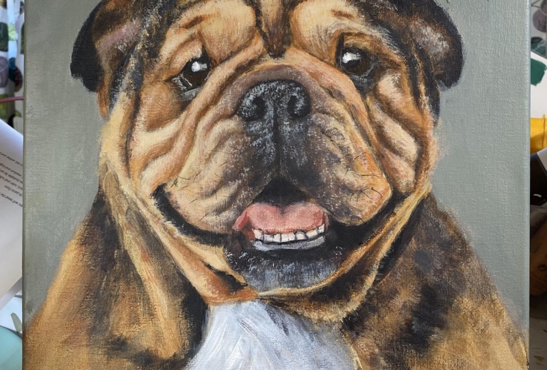
13. Closing Thoughts: Here's the point I've got
to with Kilos portrait. I'm really, really happy
with how it's turned out. I just spent about
an hour refining the painting and adding some
more of those fine details. You could obviously spend longer on your painting if you
wish, just refining it, altering those values, and those warm and dark
colors and also adding in any more fine details like whiskers and highlights. If you have had to go
at your own painting, I would love to see the results. Please post a photo down below in the projects
and resources section. Finally, I just
wanted to say thank you so much for joining
me in this class. You've learned some
lessons that you could use in any future
paintings that you create. Please go and check out my
other classes on Skillshare. You can also follow
along with me on Instagram at Alex Goddard Art, and I also have a website
www.axodardrt.com. Thank you so much
for joining me in this class and I hope
to see you soon. Okay.
 Alexandra Goddard, Pet Portrait and Animal Artist