Transcripts
1. Intro to Learning to Draw Cute Characters: Have you ever wanted
to make some heck and cute characters
for fun or profit? Then I have the class for you. We will begin the course by analyzing some of the
cutest characters of today and finding out exactly what makes
them so hacking cubed. Then, after we've done our
artistic detective work, we will set to work on creating our own
unique characters. While we sketch our
own unique characters, we will also go over a few more rules of the
cubed, so to speak. This will include things
such as head to body ratio, massaging, face design
for the maximum cute. I will also share some tips and tricks when sketching digitally, especially using
Clip Studio Paint. Though all of the sketching tips I will give will
be able to be used across a wide range of
different digital art programs. Once you have a few sketches that you would
like to work with, I will then take you into
the color planning process. After you have your
color palette chosen, We will go ahead
and bring to life your creation in full color. The end of this course, you will have one fully
realized, fully colored, absolutely adorable character
design that you can then use in your own
products in your store, or to make just stickers to
give away or what have you. You can even take
things another step further and add atmosphere and prompts to create one complete
illustration that you can then sell his prints or using your portfolio for
children's book design. The sky is the limit. And I hope you will join me
on this cuteness journey. I hope to see you
in class. Bye bye.
2. Lesson 1: The Analysis of Cute: Hello everyone and welcome to lesson one on creating
cute characters. The first lesson, we
are going to look at some art and analyze
what makes it cute. So the first thing we're
gonna wanna do is head to Google and do a little image
search for cute characters. People often forget that part of doing art is actually just looking at things and spending time enjoying
other artworks. While we scroll here, you can begin to see a
certain theme popping up. If you have note are that
the head is large and round. And you can see that in
this bunny design here, Hello Kitty two is
another prime example. Her head is huge. Here, in the case of palm, palm poorer in his
head or her head. I don't know what
gender their head is attached to the body
like moulins head is. They're just kind of
a big bean shape. The same thing goes for the SUMIF go-getter she characters down at
the bottom as well. Also of note for the
characters who have a differentiation between
their head and their body, the body is significantly
smaller than the head. You really want to play up
the largeness of that head. You may also notice
that faces on the head are compacted down into
one quadrant of the head. So let's dig a little
deeper here and get further into our
analysis of cute. For this, we are going
to go ahead and use for LACMA as this is my current fav. Let's go ahead and grab our favorite digital pencil
and start sketching and nice, rounded, relaxed most
head is Moshi shaped. Your head shape is going to be the foundation for your face, so be sure you get it correct. The next thing
we're going to take into consideration is the face. The eyes on LACMA
are wide set and his little muzzle is write-up
between his two eyes, ears, nose is actually
between his two eyes. This kind of compacted
face is very, very common in all of the
cute character designs. And the reason for this is
because large heads with small compact faces
remind us of babies, basically, babies and kittens. Kittens also have that Uber
cute face proportions. So let's go ahead and review. Relax them as face is set low on his very large
Malachi shaped head. Then his eyes are wide set, which is another big
cuteness factor. And the nose and mouth are set high and the nose will
fall between the eyes. Again, this compact
face reminds us of young cute things like kittens
and puppies and babies. So now let's do a few
experiments drawing relax. Hmo. So his face is a
little bit different. So we can really get to see exactly how the proportion
comes into play. So here for the
first not correct, relax them a drawing. I'm gonna go ahead and put
the face high on the head. We will see what
happens in this case. So right now basically relax, looks like he's looking
up and it's generally a little bit weird in
comparison to the original, relaxed my design on the page. Now let's go ahead and just copy pasta that
head that we drew. And I'm going to
paste it down below. And I'm gonna go ahead and delete the face,
erase it actually. And I'm gonna go ahead and make the eyes even more wide set. I'm going to keep the
nose up between there. But as you can see, that became not relax
them like at all. And for me, I don t think
it's quite as cute anymore. It is still cute, but it's not nearly as
cute as the original. So with these little experiment, you can begin to see now how
just taking small things and altering the measurements
just by a little bit can really change
the overall effect. In this last one, I'm gonna go ahead
and I'm going to make the eyes closer set. So as you can see, the closer set eyes are
significantly less cubed. And also centering the face makes things a little less cute. Okay, so I actually have
one more example for you. We're gonna go ahead and do an example where we
draw the head smaller. Because if you draw
the head too small, it will also lose
cuteness factor. So as we sketch
out this example, we can see that a large face on a tiny head is not nearly as
cute as the original relock. Come on. It's not as bad
as the one in the middle, um, but still, it's not perfect. So I want you to keep
all of these tips in mind whenever we
go on to lesson two, where we are going to be
designing our own characters. So with this, I will
end this lesson here. We'll pick up and we'll create our own characters
in the next lesson. But I do definitely encourage
you to go and find some of your favorite cute
characters and try to draw them and
see what happens. And I can guarantee
you'll learn a lot. So thank you for joining
me and less than one, and I hope to see you
in the next lesson. Have a great day. Bye-bye.
3. Lesson 2: Sketching Cute Characters: Hello everyone and
welcome to lesson two on creating your very own
disgusting lead cute characters. In this lesson,
we're going to begin sketching our characters
and also dig a little bit deeper into the
question of proportions. Alright, it's time to get out your favorite drawing tools. I have a tendency to prefer the darker pencil and
Clip Studio Paint. But you can choose
whatever pencil you want to and whatever program. And you can even do this. Old school, you can get
out of paper and a pencil. I also want to take
a moment to say, just get relaxed and have fun
with the sketching process. Your first sketch is
not going to be gold. Mine isn't in this lesson here. So don't feel pressured to have something perfect
right out the gate. In fact, I feel
it's even better to not have the perfect
drawing to begin with. Because if you don't, then you're going to continue to experiment and you're going to discover new things and make
something even greater. So just chill out and have
a nice time sketching. So let's take a quick look at my first sketching
experience here. I wanted to draw a
cute little fox girl. And as you can see, I keep on trying new things, deciding I don't
like it completely erasing it and trying again. And this is fine. This is how you expect a
sketching process to go. Here, I've decided my first
one isn't cute enough. So I'm trying it again. Trying different eyes. And it's kind of amusing. But even by the
second iteration, I'm not fully satisfied. So I decided to start playing around a little
more with eyes styles. You can do a lot of
different eyes styles. Just think about
Animal Crossing. And here I've really
started adjusting the eyes. And I actually adjust
the proportion a little bit to put the face
lower on the head. And I gave her different hair. And at this point, I've decided that I
like this third slash, fourth iteration if we're
including the floating head. So I go ahead and I select her, and I move her off to the side, and I give her a big checkmark next to her
to know that this is the one. However, whereas I have
the general idea down, I don't really have a drawing that I want
to work with yet. So I'm gonna go ahead and start sketching the same
character concept idea. In more of a
illustration style setup is I would like to use this idea as a art print and
possibly also some stationary in order to make things interesting
for an illustration, you've got to add
a little bit of an environment for
the character to play in and just give it
more visual interest. You can see here
though that all of the basic design
elements are still here. It's still the same Fox girls. She's just facing a
different direction. And I've given her a
little more clothing and I'm given her which had but despite all
of these trimmings, she's still the same
Fox girl character. So feel free to just let
your inspiration guide you and sketch out whatever feels
right to you at the moment. Now I realize I've
just shared with you how I do my sketching. But in the next example, we're going to dig
deeper with proportions and really get into more
of the designing elements. For my next example here, I'm going to be designing
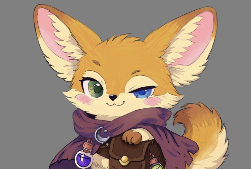
a cat character. And actually it is the same
cat character that was featured in the lesson
slide at the beginning. With my second character
head sketch here, I'm starting to go down an avenue that
I'm starting to enjoy. And I'm gonna go ahead and copy and paste the same head so I can play around
with the proportions. I wanted to share this
specifically with you guys. So you can see how to take
these little shortcuts. You don't have to
keep on redrawing the exact same thing
over and over again. You can just start really
playing around with each individual element of your drawing and it
saves a lot of time. And you're also able to get a lot more different
iterations of the same sketch in a
quicker timeframe. You will also notice that I've taken more into
consideration this time around some of the
proportion concepts that we went over
in the last lesson. That is a compact
face low on the head, making it as round as possible. And here you can
see where this is. This little character design is really starting
to come together. But I definitely wouldn't have
gotten here without having already done a bunch of mistakes and adjusted
a bunch of things. So do go ahead and
keep that in mind. And for quick little sidebar here for all of my beginners, if you're new to
Clip Studio Paint, what you're going to
want to do to transform, just like I did in the
previous sketching clip. You're going to want to choose
the Lasso marquee tool. You're going to select it. Then you're gonna go to
Edit down to transform. And then you're going to choose Free Transform or scale up, scale down, rotate, whichever is going to work for
you at the moment. So back to our sketching
real quick here. Basically, I just
finished creating the little WeChat for
this floating head hair. And the next stop is
to create a body. Again, I do a lot of playing around like I did with
the fox girls sketch. There's plenty of
things that I do that I decide that I don't actually
like it's too static. And so I just erase what
I've done and try again. Eventually however, I
copy and paste and I finally get down a design
that I'm enjoying. It has, it's still
kinda straightforward, but it's got a little
more dynamics to it with the posing and
the holding of the staff. And I decided I liked this one, so I'm gonna go with it. Now let's get back to
the proportions of Qt. So here I'm going to
go ahead and copy and paste the head
off to the side here. And you will note that the
body is two heads tall. Having a body that is only two heads tall,
it makes a shorter, more compact body and basically enhances the cute factor because
it looks more childlike. So let's talk a little bit more about acute body structures. Generally speaking, the chubby
or the body, the cuter. So I like to make them a little bit chunkier legs and have little chubby hands. I think that's very cute. And for me personally, I like tiny little feet. But I've seen people use
large, chunky chubby feet. Pretty cute effect. I definitely don't
have it down here, but I'm sure you've seen
other cartoon drawings where the people have made
cute characters with very big feet and it
can also be very cute. And then once you have
your basic forms down, then you can go in
and start adding small details to the piece that just helps
bring it to life. But adding a lot of these small details is kind
of a personal style thing. So we've looked at the two
heads tall body ratio. So now let's look at something
a little bit different. In this example, I am going to use a one-to-one
head to body ratio. This starts getting more into the realm of super
deformed characters. And the TB style. One thing I like
to do whenever I'm shrinking something
down and making it even smaller, is again, I like to try to make the
body even Like trunk here because I think it works well with the whole
head proportion. If the body is too thin, then it starts looking
like a bobble head. But if it's chunky, it all goes together nicely. And last but not least, let's briefly touch on the, I like to call them the
bean shaped characters, because they don't really have a head separate
from their body. They're just one big, amorphous shape that has animal features usually
sticking onto it. And it slowly becomes this slouch he cute
little character. I don't normally draw
this style that often. So some of my drawings
are not that awesome, but hopefully yours will
be better than mine. But basically, I just
encourage you to, if you want to play
around with this, just start drawing random
bean or egg shapes and start adding
smears onto them and make them read
a book at a tail. Just see what happens, what comes out of
your sketching here, I'm just drawing a couple
of bean shapes again. And I'm going to add some ears. And this one's
going to be a dog. So you never know what
you can come across. Just Bye having a little
doodle first on your own. And on that note, I will be ending
this lesson here. So you can spend the rest
of your time today just doodling around and sketching until you get some
characters that you like. And then in the next lesson you will bring those
sketches back. And we will start discussing colorizing them and turning
them into illustrations. So we'll see you
in the next class. Have a great day. Bye-bye.
4. Lesson3: Coloring and Finishing Your Characters: Hello everyone, and
welcome to lesson three on making your absolutely
adorable, cute characters. Here in lesson three, we're going to go
ahead and start applying color to our
character designs. Essentially are going
to have three options. You can do a simple flat color or you can actually
get into rendering it. And finally, you can do
a full illustration. So I'm going to start with my
little cat character here. One of the things that I like to do whenever I'm first
starting out with a new piece is I just like
to get my palette together. I like to just slap
on a few colors and see what's going to go well together and kind
of get an idea. I'm not doing any
fancy painting. I'm just slapping down
color to try to get an idea of what I would like the finished
result to look like. I definitely advise
that you do go through a few test palettes in
your little palette. Choosing stage, I guess
you could call it, because it'll end up saving
you a lot of time later. Because you will
know right away if your colors are not going
to harmonize together. So I'm going to break
in here very briefly about some color essentials. I wanted to share with you. I like to keep color
palettes on Pinterest. And this is a practice
you can do as well. Just anything that I
found that I really liked the color of I've saved. And that includes like ready-made palettes to
pictures and so on. Having this little repertoire
really helps out if you're a little stuck
on choosing colors. Next up for color
resources is palatine.com. I found this very useful. As you can see here. You can choose one color
and you can get a bunch of harmonizing color
selections out of it. There's also another
button where you can choose an algebraic colors, which are colors that are right next to each
other on the color wheel. And you can see here how those shift as I move
them up the wheel. And these are just
adjacent colors. The next one is the triad, which are three
different colors too, that are adjacent
and one that is not. And I think this one has also been called
accented analogy. And this is kind of my go-to color combination of having two adjacent colors and then
one bright color that pops. That's just my
personal preference. But it is a very easy
color scheme to work with. And then they also let
you try out the tetrads, which are four colors. And then you can even
customize your colors. So this can be fun
to play around with just to get a few ideas. I feel that it also
helps you get a little more accustomed to color theory. I feel like color
theory always seems like this big puzzle
piece that's really hard. But it really, actually, I don't think it
is very difficult, especially if you keep things pared down
in the beginning, like using an accented,
an algebraic. The most important point
for a beginner is to know that the color that's directly opposite
on the color wheel, like let's say red here, the very opposite
of that is green. So whenever those
two come together, they like really make each other pop out and they
vibrate a little bit. And that is the main key factor in Coda theory is how to
get your colors to pop. If you keep that basis
in mind just to start, then you'll really
start eventually being able to grasp color
theory a lot better. And I'll go ahead and leave off the color theory discussion here because it can muddy the water with
our main project. But I do want to share another
color palette resource. And this is Color Hunt. And you can go through and find any sort of palette
that you're interested in. You can see what's new, you can see what's popular. You can even choose
themes like pastels, and you can even play around with making
your own color palettes. And these are just
a few resources that I wanted to share with you before we get on with doing our full color
character designs. So back to our character
designing here. At this point, I have pretty much decided on
this color palette, which is basically the triad. Or you could probably
consider it an accented analogy because I have
three warm colors, pink, red, and yellow. And those are all next to each
other on the color wheel. And then the accent color
than would be the blue color. And also keep in mind
that neutral colors, light gray, beige, white, black, those kinds of colors. They do not count towards
your color palette. So I'm gonna go ahead and speed this up a little bit here. And as you can see, I'm using the sketch as my guideline to
flatten my colors. I'm not using line art for these character sketches
because I kind of like the flat color look
and it is very popular in children's
illustration right now. However, if you want
to use line art, by all means, go for it, use the line art. Jumping forward a bit here
you can see that I've begun to do a little bit of
rendering on this piece. Be sure that if you
wanna do any rendering, that you keep each
individual component of your design on
a separate layer. That way, you have more
freedom to play with it. Here, I've added a little bit of a quick gradient to the cloak, and I've added a little
bit of shadow to the hat just to make
things pop a little bit. But I'm not really getting extremely deep into
rendering this. I would consider very
simple rendering just enough to get
a little bit of 3D form out of a few
areas of the drawing. You can, of course, choose how much you
want to render. You don't have to do
this much rendering. As you saw with my
bare girl example. She was pretty much flat colors with just a little
bit of shading. Another detail I'd
like to mention is this cloak is fairly
desaturated in color. It's more along towards
the white and gray end. So I just like to add a
few little swatches of a brighter color here
you can see me doing a more vibrant purple
tone in there. And I will also add a little bit of a more
vibrant aqua tone as well. And this just helps make it
pop just a little bit more, but without being
too overbearing. But as I said before, your own ideas about color theory are
going to be your own. You obviously don't have to do exactly as I do
it in terms of color. Another thing I
wanted to mention is creating small details. I did put all of the
stars on the cloak. And here, as I make
these little red boots, I am going to put
on just a very, very simple little design
on these boots that will just bring out more of
the characters quality. I just feel these little touches add a little something
to the pieces, especially when they
are very simple. I just feel like this is a finishing touch and it kinda makes things look
more professional. But again, how much detail
you want to put into your drawing is
entirely up to you. Here I am adding some more
detail touches to the cloak. I'm adding the edge
trim on the cloak, which I think
really makes it pop and just look more put together. But as I've been
saying all along, it's always up to you
what you choose to do. Okay, so here's my last tip or trick for coloring
our characters. And that is that when I am pretty much done
with all the rendering, I go through, I select all the layers that have
the character on it. And then I choose
Make Selection. And that will choose, that will make the selection
of the entire character. And as you can see, it also picked up a
couple of things that I didn't want it to pick up, like the test pilot and that you may have to
tweak it a little bit. But basically, you
select all the layers, do a selection, then you can
start adding overlays on it. Here I am adding like
a rainbow overlay, a sunset overlay, a
few things like that. You can also use the
air brush just to get little dips and dabs here and there
of different colors. And I just like
this look because it kind of reminds
me of watercolor. And how when you're
layering on colors, how they work together, it creates more variation
in your colors. But also at the
same time because you have all of your
base colors chosen. It, it works nicely
with those colors. So you're not doing
anything to weigh out of the ordinary that
would mess up your, your, the way your
colors harmonize. And here at the end, I've shown you
basically my palette was yellows, reds, and blues. So that is the triad theme. And this also shows
you how much you can do with just three colors. I also wanted to
mention that you have the option to go ahead and turn your simple character
design into a full fledged illustration
like with my fox girl here. Again, notice that the color
scheme is very simple. It's mostly red and green. And those two colors dance
with each other really well. They pop wonderfully. Also, illustrations work best if you give it a little
bit of a story here, you can kind of get
the feeling that the little fox girl is interacting with
the friendly snail. And so there's a little bit
of a narrative going on here. And that's what makes
illustrations fun. And that's what attracts
people to them, is the story, the feeling
that they get from it. And so a successful
illustration, you could sell it as a print. You could put it on a card and sell it
as a greeting card. There's lots of
options for you here. And with that, the cute
character drawing class has come to an end. So I hope you've enjoyed all of the information
that I shared with you. And I hope you
will go on to make your wonderfully cute
little characters and please do share that. And when we share them with me, because I love seeing cute
characters as you can tell. So thank you for joining us and I will see you
in the next class. Have a great day. Bye bye.
 Amy Stoddard, Amy Illustrates