Transcripts
1. 1. Introduction : The fundamentals of environment design : Don't you love it when you see a piece of artwork or an illustration where the scene or the IT landscape which the characters are being portrayed in completely resonates with the emotion and the experience that the characters are helping in that moment. The landscape has a powerful ability to add to the storytelling of an image and to really help the viewer contextualize what is going on, what the mood is all about, and what they should be feeling. It also allows you to understand about the story behind the character, where they've come from, and where they might be going. Being able to capture a landscape is an essential skill as an artist and illustrator. And that's why today in this class, I'm going to be teaching you the five fundamental principles of creating and designing your own concept landscapes, which I believe are going to take your landscape paintings and the rest of your artwork and illustrations to a new level on the lavish value. I'm a freelance artist and illustrator, and I've been working in industry for almost eight years now. I have extensive experience in creating artworks which tell a story and capture a sense of narrative of what were dozens of clients and projects ranging from standalone artworks to book illustrations and murals or officers and bedrooms. My artwork is renowned for its storytelling and narrative style. A lot of my clients have decided to work with me because they like the fact that not only do I capture it characters and a beautiful narrative, but my landscapes are able to add a new layer, contacts and storytelling to the images that I create. The use of landscapes can allow your artwork to go from being a simple image of some characters to contextualize environment with a concept and a deep sense of meaning. Learning how to use these five basic principles that I'm going to teach you is going to allow you to take your landscapes and your artworks in the next level by allowing you to add a new layer of storytelling and narrative to each one of your pieces. In this class, we're going to be going over the five fundamental principles which are required to have a high level and easily understandable landscape. I'm going to walk you through these five principles and help you understand what they are, how you need to use them, and how they can change the feel and the emotions that have been captured within your landscape. And how you can use them to change the way that you're giving information about the story that you're telling with your images. After explaining these five principles, hue and ensuring that you understand their importance. And then going to be walking you through a quick demonstration of how I would create five different types of landscapes using these principles. After that, we're going to go away and you're gonna go and try and make your own the thumbnail artworks. Now for this class we're going to be working for in grayscale because it's more important to get the principles of how to create the landscapes right, rather than getting confused by color theory. And there will be a separate lesson I'm going to be creating, which is more about color theory. But for this class, the intention is to understand the fundamentals and learn how to apply them to create beautiful landscapes. So starting with grayscales, a great opportunity for you to do that. By the end of this course, you should feel confident in your ability to apply these five principles into your landscape designs. Your landscape should be looking more dynamic. You should be able to capture a sense of emotion and also be able to tell a story with your landscapes alone. So when you put your characters in that landscape, the landscape is complementing and resonating with every single thing that you want to portray without particular illustration, we'll all walk.
2. 2. What You Will Need For This Course : This course is absolutely fine to use whatever materials that you like to paint in. There's really no issue because the most important thing is that we are applying the principles that we're learning from this course into our landscape designs. You can work digitally like I will be, if you like, I'm going to be using my iPad Pro and procreate. I cannot recommend Procreate enough for those of you who do have an iPad Pro creates a really great piece of software, has amazing features. And I believe it's only nine pounds or $10, and you can use it for a lifetime access. There's no subscription fee, and it's really a fantastic piece of software. If you're working on a tablet on your lap, shock, feel free to use the software such as Photoshop. If you don't have the facility to pay for any software, then sketch repro is actually a free service that you can use and it's a really great piece of software for those who are starting off with digital painting if you don't want to have to pay. So I really recommend that. I believe you can also get the on the iPad if you don't wanna pay the nine pounds for Procreate. However, if you are preparing to work in a more traditional medium and you'd like to use watercolors, gouache, acrylic, pencil, whichever you prefer, that's absolutely fine as well. Feel free to go away and use those materials just to make sure that you're uncomfortable is you can't be. One thing I would bear in mind, however, is when I'm doing this tutorial, we'll be sometimes using layer functions within Procreate to sketch in the foreground first, and then sometimes sketch things into the background behind the foreground. Objects that I'm creating. That's not something you can really do with traditional mediums. So just bear in mind that you may have to think a little bit more about your process of how you're going to be layering up the image. So starting from the very background into the foreground and building up layers on top of your underpainting. However, for the most part, this should be pretty simple. I'm going to be doing some very basic thumbnail sketches. This course is not supposed to be creating a final finished polish base for landscape. It's supposed to be about teaching you the fundamentals that you need to go away and design your own landscapes whenever you want to. And to feel competent, your landscapes are looking good and that you know, if they're not looking good, what you might be missing that you might need to add into the next time you create a new piece of artwork. This course is really going to help you level up your skills when creating illustrations and artwork. Because a lot of the time, artwork is not just a standalone character, sitting in a whitespace. Putting them into a landscape really allows you to contextualize what the image is about and what the story is that you're, that you're portraying for the viewer. So being able to master these principles of landscapes will also apply to your principals of all the other artworks that you're going to create. And it will only level up your skills as a creative, right? So that further ado, let's get started and I will break down the five key principles of great landscape.
3. 3.0. Brief Summary of The 5 Fundamentals: The top five most important elements of designing and creating landscapes in your images are number one, perspective. Number two. Number three, number four, lighting, and number 5 form. So these five elements all play different roles in telling the viewer about your scene and about the mood, and creating a sense of storytelling. And I think once you can start to see a breakdown, these basic elements, you can really use these tools to your advantage to create interesting landscapes that really draw the viewer's eye into certain areas where you would like their attention to be taken. Or you can take them on a journey through the image based on the way that you create the forms and the shapes within your piece.
4. 3.1. Perspective: So I guess the first thing is just to go over these five elements and try and understand what it is about them that creates good landscapes, what they actually are. So the first one is perspective. Perspective is really in my opinion, the most important thing to try and get right when you are creating landscapes. So there's lots of really great techniques which I will show you later on, where you can use things like perspective grids to try and get your head around how you can understand perspective. Perspective is basically from the viewpoint of the viewer. Depending on if I'm looking at a landscape from up high or if I'm looking at a landscape from down low, what am I able to see in a three-dimensional space from my yield point, you can really see how everything that's closer to you is really, really big. And then as it moves away from you, it's getting smaller. And it's getting smaller towards something that's called a vanishing point. So prospective has a really powerful ability to change where the entire composition feels. So, for example, by choosing to have a higher perspective, You're basically allowing that most of the things that are down below will be visible within the painting or that piece of artwork. So you'll be able to include more information about the scene and what's going on if you're having a higher perspective. Whereas if you choose to take quite a low perspective, you're emitting a lot of the information and your maybe selecting more what is going to be seen to be something that's more important for your particular piece that you want to show. I also feel like you can really create an interesting dramatic change of field depending on the angle of the viewpoint that you're choosing and how big everything looks around the viewpoint and the characters that you're putting within that view point, or how small everything looks if they're coming from a spectrum and looking down, does everything look really small and faraway? And does that bring more emphasis onto the characters that are in the foreground and maybe the objects that are in the foreground to be more important because everything else is sort of in the background and is yet to come. And it really creates that sense of journey and moving forward into something else or looking over into something else, or even looking back away from an experience that is just happened potentially if the characters are facing away from the landscape down below. Another really interesting thing is if you really want to create a sense of drama and this big epic, epic journey that's about to be undertaken, maybe using a low and perspective and having a lot of interesting things going on in the foreground. And maybe something that's, maybe you're looking up into a mountain scape or up into a building or something. You, maybe you want your character and the scene to be sort of like this larger than life, epic journey than maybe you want to really emphasize how your character is within this scene. And I'm kind of looking up into it and everything's a lot bigger than you and tending towards a vanishing point where maybe there's something inferred in the background that you can't quite make out what it is and creating a sense of an immediate journey that's about to be undertaken by your characters and the story that you're portraying with your artwork.
5. 3.2. Depth : The second thing is depth. And depth is basically just how are you creating a sense of three-dimensional space on a 2D image? What tricks are you using to try and make it feel natural for the viewer that the things that are in the scene are disappearing into the background and creating a sense of depth like how do you know that something is right in front of you as opposed to something that's way, way off into the distance. And there's a few elements of this which you can tap into it. You can use your artwork. One of the things that I really love to use is atmospheric perspective. Now, atmospheric perspective is something that you have all seen before, but you probably have not given it a name or labeled it if this is your first time entering the landscape painting or illustrating wealth, atmospheric perspective is basically when you look into the distance, say if you have a mountain scapes, It's probably the most obvious one. If you were to Google mountain scape images, you would notice that the mountains that are quite close to you are in quite a highly saturated color. You're seeing the colors of the rocks, the colors of the trees, the colors, or maybe if there's snow on them, you're really seeing all of those colors and full saturation. However, the further you look into that mountain scape, the mountains disappear further and further back into the distance. You'll notice that they merge more and more into the color of the sky. So if you're skies quite blue, you'll notice that the mountains will seem slightly desaturated and they have a sort of tinge of blue that becomes deeper and deeper and they become more and more faded as you move towards the distance. And that's basically because the particles in the air and will distort the way that the light travels. And as you're looking through the air into the scene, the more air that you are looking through, the more distorted the colors of your mountain scape or your landscape will be. So at things that are further away will seem more faded and lighter, whereas things that are close up to you, I'm going to see much darker and more saturated. Another thing you can use to portray depth is size. So say if you have lots of skyscraper buildings in a scene that you're creating, buildings that are really close to you are going to be absolutely huge. And they're probably not going to be fully visible within the piece unless you're having perspective that's quite high up. And then maybe your mid-level when you're looking across the landscape in from a balcony or something. And you're seeing some of the building tops and some not so easily than the things that are closer to you are going to be really tall and really big. And as they get further away, those same shapes of the kind of rectangular, tall buildings are going to just be the same shape, but smaller and smaller. And that again is telling you I, that there is depth there and nothing is disappearing into the background. Also, overlapping things creates a good sense of depth. So you can have overlapping rocks, overlapping mountains, overlapping trees. That's obviously something in front of something else. And having that kind of overlap can really tell people it's overlapping and it's getting smaller than nothing must be behind the front object and it must be further away because it's the same shape, but it's a lot smaller and it's behind it. So these three things that you can use to start to create a bit of depth.
6. 3.3. Value: Number three is value. So values are basically your color gradient from the lightest colors to the darkest colors. I find that when you start working with values, if you've never really tried using them before, it really, really helps to just start off with grayscale. Because when you try going straight into color, when you've never read, experimented with really understanding value before, it's sometimes can be quite difficult to understand. You can have two colors such as blue and yellow, which maybe have the same value in terms of their lightness relative to each other. However, because the yellow is a brighter color than the blue, you might think that is actually a higher value than the blue. So I think it's really useful when you start experimenting with value to really just work in grayscale, just so you can get your head around. How you can use midtone grays and shadows and highlights to really create a sense of lighting and feel and understand what areas of your landscape we'll painting are going to be darker, areas are going to be lighter. How you need to use mid-tones to sort of cultivate that and make sure it's not too overly contrasted. And I really think, really guys, I would recommend that when you start trying to experiment with sketching landscapes, you start off just by doing it grayscale and just really get comfortable with understanding when something is darker or lighter and how you, how you would differentiate those different values. The right feel that in your piece. So within landscapes, values are really important because similar to in the previous section, we talked about atmospheric perspective and depth. It's really important that when things are closest to you in the foreground of your landscape, they're going to have the darkest values. The colors are going to be the most saturated. It's going to be very easy for you to see everything that's in the foreground. So having darker colors closer to the front, and generally as things disappear into the background, they are going to get lighter and they're going to be more faded. Of course, this doesn't really apply to landscape, so you're not really seeing that much so safe. I have a landscape, run. My character standing on one side of the road, and then across the ensemble, see a house. I think the value's probably aren't going to be necessarily massively different in terms of saturation and darkness from that very small distance. But certainly when you're looking at a very large landscapes, say if you're standing on a mountaintop overlooking a huge city, Diablo, you know, everything is going to get more and more grayscale, sort of level, like more mid-tones, and less saturated as you move into the distance. It really, of course, just depends on your landscape and there are exceptions to every rule. But I think that's a pretty good rule to start off with when you're just starting out designing landscapes, so your pieces. So it's really important to make sure that your value setting in the beginning of a piece is allowing you to create interesting imbalanced landscape, but generally the source of light, wherever your source of light is. If it's a daytime scene or sunset seen most of the time, your source of light is going to be coming from the sky. So your sky is going to be the lightest and value, not the absolute lightest, but it's going to be quite light in value. Whereas the foreground, like the ground and the rocks in the foreground or buildings, your characters just kind of objects which are really framing what's going on. They're probably going to be reasonably dark to you, like dark gray colors and the objects that are creating that sense of overlap and space and three-dimensional form where you're creating depth into the background, things are going to be getting lighter in value. That value isn't just about death. It's also just a way that you can create a good sense of like lighting and dynamic within your piece. And I really do think that value is everything when it comes to creating a dynamic and interesting piece of artworks. If you can understand your values, you can understand your colors. And it's very, very easy to transfer from good value setting, too, good color setting later on. But if you try and go straight in with color and you don't really have a very good understanding of value, it might end up looking like a little bit muddy, like everything's a very similar flat color. And if you can understand the value and how you use those values to create a sense of depth. You'll pieces one look flat limit for a lively and you can make them feel very emotive. And using more contrast will make us seem seeing more dramatic. Like, you know, you have a nighttime scene and you want to draw attention to potentially like a building off in the distance or a character that's got candle light in his hand and he's going through some kind of nighttime scene, then the life and the illumination from that candle are really going to create like a dramatic contrast with the rest of the scene That's quite dark.
7. 3.4. Forms & Shapes: Number 4 is form. Form is basically how are you creating shapes of in your landscape to communicate a certain mood. So, for example, if I wanted to create something that seems quite aggressive and dangerous are probably use a lot of like jagged shapes, sharp rocks, pointy buildings, just things that look very intrusive. You can create shapes that sort of coming in towards the characters and it feels quite intrusive and quite aggressive. And that kind of shape setting can really create a certain emotion in the viewer. And likewise, if you wanted to create something that's quite soft, friendly and natural, you'd have a lot of very organic free-falling forms. Soft looking rocks, ocean waves, trees, all these kinds of things that 3D. They just seemed very organic and free and they're not very restricted to having some geometry. Likewise, if you wanted to just create a cityscape scene, you're going to use a lot of shapes that very first hanging straight and measured on it's going to be very architectural. That's how you can create a sensitivity. You're in a city, maybe you're in like a lost tombs and your characters like to write a uncovering some, some secret treasure by doing some puzzles. And that's just like the architecture of my old Egyptian or Mayan mind. Tombs and temples and stuff bowl in like a futuristic city. And again, futuristic stuff you'd use even different shapes. If you're using old school buildings, you probably would have like lots of big bricks and very old looking architectural structures. Whereas if you're looking into the future, there's probably gonna be a lot of really streamline stuff. Very minimalist cars that probably don't have wheels on them and flying and the buildings are probably a little bit more space AG, and the way that they feel like very streamline and not over complicated, like you would find in some of the buildings to 300 years ago where it's, there's a lot more details and minutia, I mean, if you look back at Roman architecture, for example, there's all these absolutely tiny little details and the shapes that really tell you so much about how all of that, and you know, at least put so much attention to detail into sculpting goggles and animals and the saints into the size of buildings. And as we progress more and more into a futuristic time, these things are becoming more simple. So if you're doing something in the future, it probably would be like really simplistic forms with the cool lighting and stuff like that. The way that you create shapes can really tell someone a lot about it that's seen as aggressive, or if it's friendly, if that's seen as natural or if it's manmade, if it's futuristic or if it's old, there's so much that you can do with shape and form that really infers a lot about the time in the context of that place.
8. 3.5. Lighting : The fifth and final one is lighting. Lighting is one of the most important things to start to get your head around. And it's okay that lighting is something that does take a little while to develop and you should be having lots of time for yourself to just practice and develop your understanding of my thing. But having a light source can really create a dramatic feeling within a painting. You know, if you have a singular light source that's illuminating a set of characters like a campfire scene. If you have thoughts, just that campfire and everyone sat around it, that one light source really creates on the facial features and the characters in the scene around it. And it's really limiting what you can see. So it really draws your eye into what I was around that camp fire. And likewise, if you're lighting sources, just the sky and the sun than most things are going to be illuminated. So you're probably wanting the viewer to see most of that scene as part of the context. But there's definitely lots of cases where you can use lighting to really illuminate and highlight an interesting mood of my coziness or maybe yo, creating mood of a little bit of mystery for magic. And maybe that's like the keratin and livable woods and adopt with the light. And they just got this loading match coulombs or something. Because so many things you can do with lighting to create a sense of drama and mood. And your lighting sources are so unlimited. You can have candles, you can have signed paper lanterns or the sun or building, anything really streetlights. You can think of anything that can create a certain type of mood. And the way that, that lighting and the angle is hitting the faces, bodies, and the objects in a scene could really create a sense of drama, can also create a sense of softness depending on how you would like to paste that within a scene. So yeah, 19 is really, really important.
9. 4. The Importance of References: So before we get started, the first thing that is really important we do is to collect some reference images that we can use to inspire us for forms and colors and lighting within our landscapes that we are going to be creating from our imaginations. Every single artist and illustrator that you've ever seen has used references. And there's definitely a certain level up that you get when you are using references in your artwork, as opposed to just try and to dream things up completely out of your imagination, because very few of us harm or completely photographic memory. And it's very hard to remember the small details about what makes a landscape look like landscape. And the more you sketch and paint and creates landscape settings for your illustrations, the easier it will be for you to not have to look at a reference image because you've done it so many times that you know what these certain elements look like. You know how straw pine trees, you know how to paint, mountains, have paced cities. All of that stuff comes with time. But when you're just starting and when you're doing something that you've never done before, I really recommend collecting some references that you can use as inspiration. You're not going to copy them. You're not going to be taking a landscape. You can see in front of you exact same thing as what's in someone else's photo. But I do think it's really important to have them there. So if you do forget, what does the mountain look like? What does a rock look like? How do I, how would I think about the atmospheric perspective in this kind of scene, or the lighting or the colors, then you have a reference that you can look at that can help you get a bit of inspiration. And of course, you can have some creative license and go off and do something that maybe isn't 100% would happen in the real world. But you kind of know that it's still sort of looks realistic enough that people want look at it and be like, boom, this doesn't quite fit. Two websites that I love using to collect references are Pinterest. Of course, Pinterest is really fantastic for collecting references because they have a bucket loader. Images is that you can think of really absolutely stunning landscapes. And it's very easy to just get lost in scrolling through Pinterest and wishing that you are in all these beautiful places. So Pinterest is really great and it's free. And another one that I really love is Pexels.com. And I don't know how many people really know about Pexels.com, but it has a huge, huge library of super high-quality professional photos. And you're not going to be seeing like in Pinterest, the same photos coming up again and again and again. A lot of the time, you search a keyword like mountains or ocean or whatever, and it will come up with just V to go beautiful images are really high resolution and people have offered them for free that you can download them and you can use them as references. So it's really, really useful. I will link those two below so you guys can check them out during my tutorial that I do with you. I'll also be going through these, these two websites and collecting a few reference images for the landscapes that we are going to be creating.
10. 5. Collecting References Together : Hey guys. So I'm okay. So I'm currently on the website that I recommend that you guys earlier, Pexels.com. Another good one is Pinterest, but personally, Pexels is my go-to because they have over 3 million different stock images of literally just about anything you can dream of. People, landscapes, objects, lighting, whatever you can think of. It's all available for free. So I really recommend going to this website if you're looking for reference images for your landscapes, or four, figure drawing or whatever it is. It's really grateful of that kinda stuff. So I'm just going to use this website just to get a few stock images that we can use as reference when we're creating our artwork. So I'm going to look up some very different landscapes. So let's go for like does it, it's kinda cool. So I'm just going to save these to my photos. This is kinda cool as well. You can see just how on this picture, that really small person at this huge landscape, It's just like really interesting perspective looking down on the person. But well, the mountains are kind of, they're still quite far away in their stores seem really high up. Even though from your perspective, you're looking down on this person, which is just really showing you just how big that landscape is. See if there's any more cool desert landscape. So we could use as references. That's pretty cool. So you could use something like that. Maybe we can get some ideas for some cool rocks and stuff that we could draw. I could honestly search on this website, but ours it so the, so much, so much that you can use as reference materials, it's kinda cool. All right, Let's move on just collecting a few little bits from here and there. Let's go for woodland. Woodland, does it funny? Contradiction. Okay, so I've got some woodlands here. So you get some ideas for flex and pine trees and stuff. That's kinda cool. You can really see that atmospheric perspective here and fading into the clouds. That's kinda cool. River running through it. That's really nice as well. You could just really see how that river is like cutting into that landscape. These are US was gone us if you ever just want to come on here and just collect lots of reference images, fuel use anyway. We can create some pretty wacky landscapes and that's kinda cool. I could look up mushrooms. And we could create some kind of fantasy landscape with some giant mushrooms everywhere so we can get some cool mushroom picture images. It's kinda cool. If we can get some cool shaped ones. Is kinda cool. If you go on this website as well, if you'd like a certain image and you want to scroll down, there's going to be more similar stuff. So that's kind of an interesting, interesting shapes. We can add something like that. Maybe we could look up some mountains and mountains as reference. Make really see that on some of these images where they're really looking across the landscape, like this one here. You can really see how that atmospheric perspective is coming into play here. So everything in the foreground is reasonably saturated. But then as you go further into distance here, these mountains are really faded away and you can still see that they're there, but the colors are very distorted by the color of the atmosphere. So that's pretty cool. Reference image. See if we can find anything else. It's kinda cool. Yeah, I like, I like just getting little elements of cool things that you can throw it in there. And let's have a look finally at some clouds. Because that's definitely an important element for a lot of landscapes that will help us is kinda cool. Accidental picture. So let's look at some clouds. Clouds in respect is very cool. And yet you'll notice when you're looking at clouds, how, depending on the angle that you're looking at them, like the shadow and the underbelly of the cloud will be stronger. So I'm trying to find example for you guys so I can explain. What do I mean? Again, it's kind of interesting. So you see here there's obviously an illumination coming from the sunset below on these clouds. These clouds that are further away because the perspective is further away, you can't see as much of the underside of these clouds, so you're only getting a little bit of illumination here. Whereas this cloud is kind of more overhead. It's still far away enough that you can't totally see the bottom of the cloud, but it's close enough to you that you can't see as much of the top of it and the side of it as you can with these clouds, which are a bit further away. So you're getting a lot more illumination here on the underbelly of this cloud which is closer to you, do need any Cloud pictures. Could take a few references. That was a cool one up that I saw. That's kinda cool. It's kinda cool reference. We're not going to go into too much detail of the clouds and stuff, but just thought a good show you guys how the shadows can be cost and clouds differently depending on the perspective and how far away they offer me anymore that we want to take. That's cool. So you can see here these clouds that are just above head. You can really see like all of the understandability of them in like this cloud over here, It's obviously farther away from you, just seems really small. Highlight the bottom. So that's pretty cool. Happy that I feel like we've got some decent images that we can work with here. And maybe I might just get one more of like a, a river or something or a lake or river. Waterfall. Yeah, that's pretty cool. You can just see how great this website is. There are just so many semi great options for the kinda stuff that it can give you inspiration for it. Sometimes I just see images on here and I'll just get, get excited and patron piece I want to make. So that's kinda cool with this waterfall here. Like that. That's level changes, That's really cool. Okay, I'm pretty happy there. So for that we've got a few good reference images. So we can now move on to procreate.
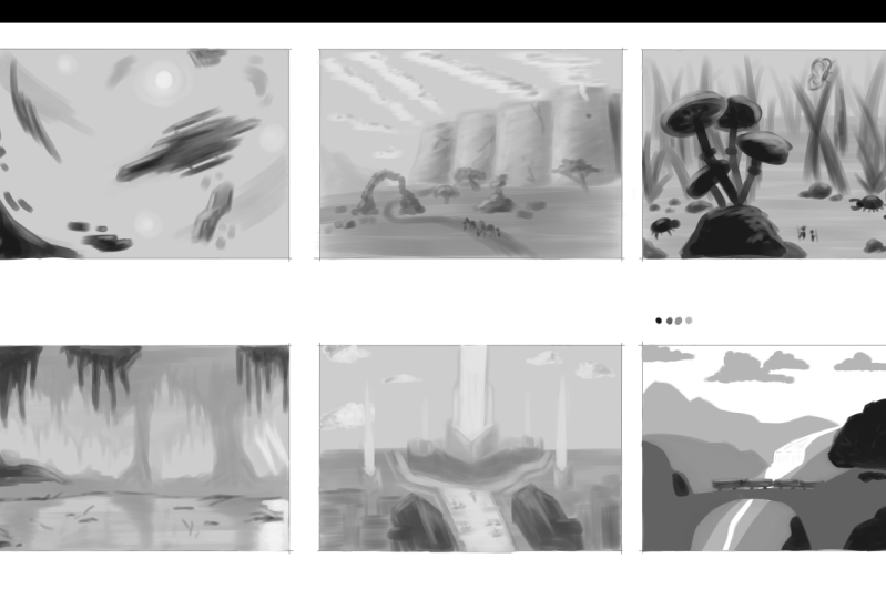
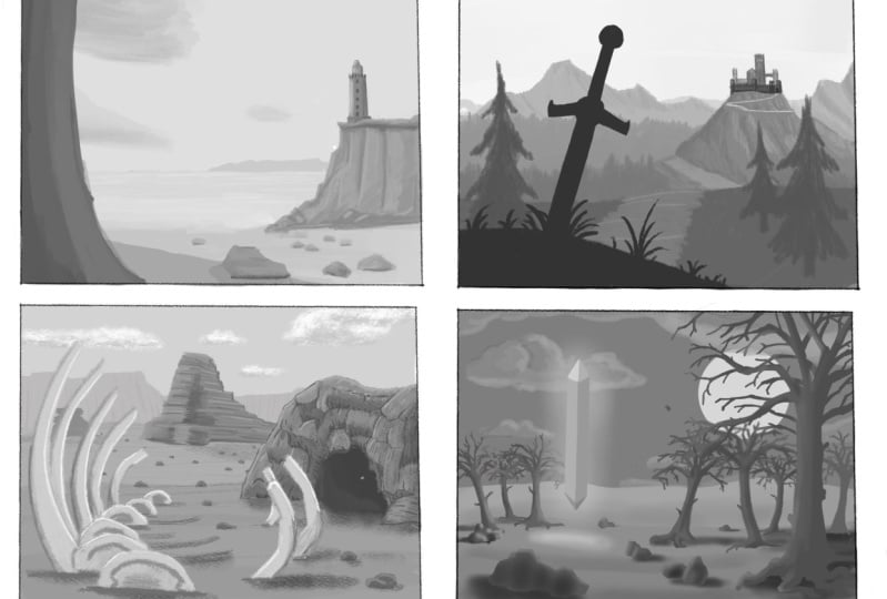
11. 6.1. Landscape A - Neutral Desert Landscape: So I've just drawn these six rectangles on my Procreate page, just so we can use them to do some really small thumbnails and practiced in landscapes. If you guys don't have Procreate, it's really not a problem that you can just do this on a piece of paper. Weakness with your your WACC calm on your laptop or something, whatever you wanna do, and it's absolutely fine. I think the most important thing is just that we are practicing doing these landscapes. And there's really no need to have any special check to practice this stuff. So it's going to start off by getting in getting it all images that we got from Pexels.com. And just gonna kinda keep these open in the background so we can use them as references throughout sketching some landscapes. So I guess the first thing that I'm going to do on this lay here, I have actually brought in all of these layers, some perspective grids just show you guys what the perspective grid looks like. So as you can see, that's the vanishing point and everything, everything around it is kind of everything is kind of stretching out from it and getting bigger as it comes closer to you. So a mate, so these grids can just be moved around so you can sort of change the perspective depending on the viewpoint that you're taking in this landscape. So I always like to use the rule of thirds, while most of the time it's a great role because it's basically just that the main subject matter or the horizon line should normally be in one of the thirds of the image. So you can place the pin, you place it down here. It could be dead on as well. There's absolutely nothing wrong with doing that. So I think for this first landscape, maybe, maybe I'll sketch it with a perspective being slightly more, slightly more sky heavy, I think. So. The first thing I'm gonna do is just make a new layer here. So I'm not going to interrupt my perspective grid and put the underneath the perspective grid so I can still see it. And I'm just going to flock in a gray scale tone, just like a mid-tone. I'm just going to block in like a grayscale tone onto this rectangle here. It's good to start with midtones because then you can kind of work in the dark tones and the light turns as you go. So I guess we're just going to start off by putting a sort of darker, mid-tone gray, sort of full landscape. Kinda blocking that in there. It doesn't have to completely match up to that horizon line there. And maybe it could, might kind of bend over slightly. So you can have some of the land minivan raise. So it's going to block in that sort of the ground is going to be darker than the sky. So this guy is going to be sort of like enlightenment turn like it is right now. So I just got this sort of thing that was bit too dark and that's kinda the right level. And now in the background, I know you just have a little play with it really wants to be sort of sort of deserty. So we can make that a slightly lighter gray, maybe similar, greater this with just a touch darker. We can see some kind of tool. You can tell that these are super tool because they're really, really quiet, big even when they're really far away. And so just using this kind of atmospheric perspective, maybe there's a couple of mountains in the background as well. This doesn't have to be a completely realistic landscaping comes Have fun with this. Just playing with shapes, seeing what you like. So you can see mountains and background, and you can see this atmospheric perspective there. These things are quite light. They're a little bit darker than the color, than the valley of the sky, but they're not much, much darker. I mean, you could either make something just touch and you can have sum is even further away. It's kind of can't really even see it, what it is that it's kind of in the background. Foreground k again. Select a sort of bending up lever of sand, the k. And then we could just start bringing in some, some more shapes for this mountain formation we've got here that we can see the nascent formation of rocks. That one is really cool. Rock shapes stacked on top of each other and that impossible position, which is called the termination of stuff that mapper is kind of blocking this in community. Simple shapes are now we're just thinking about getting that, getting some of those tricks that for the depth then say can see that this is a bit darker so you can tell that it's closer because it's darker. If you wanted to have some things maybe a little bit further away than that again, you just make it a little bit lighter. Maybe you can have some some rocks here. It's kinda large rock formations. Maybe you could have some more rocks kinda behind this one. So you've got some overlap going on here. You can tell that this thing is in front of this because of the atmospheric perspective, but also because this is darker and it's pretty eager, even though. Small object and that one is, so you're already creating a sense of depth. And then as you come into the foreground, you wanna go and quite a bit darker, like we did in some of these pitches that I showed you guys earlier, like a debugger actually saved it as a picture we saw earlier where you can really see the atmospheric perspective, kind of like this one. You can see the mountains off. A lot will fade into the background in here and it's pretty up-close and yes, love doctor, that will vibrate. So maybe we want epic landscape where the strike a character's overlooking a big journeys. But to undertake, maybe we want to build into this a little bit more. And we want to maybe make this landscape seem a little bit more dynamic. And can have maybe some mountains are kind of coming out from the background here. Natural, these Botkin. And then maybe up-close you can have like some shapes that are really framing this scene. So have some really big role K, which is just so close to you and so big that you can't really see the whole of it. To get the brushing book that I have it posted. Just using a regular flat brush here with nothing special. It's really just an exercise. This is not going to be finished piece or anything like that, although you can use this technique going in with values first and then adding in color later. If you're designing a landscape or a piece that right now we're not gonna do that in the foreground who maybe have another one which is a little bit further away, but still quite obviously in front of you and obviously a perspective you're looking up at this thing. So you see this rock formation here and see, you know, even some of the stuff that we put into the background you can't really see anymore. Sometimes when I'm painting, I'll have an under painting in some of the details will just completely disappear into the background by the time we finish drawing the foregrounds and stuff. So something like that. It's just a really simple landscape and maybe have like some more work so tiny that dog can just come behind this one. And we've got some rocks in the top of his. Just really simple, it's just like basic desert. And maybe we'll have some actually passing clouds in the sky. So the clouds that are off in the background. Now from here, you can see how they're getting. Smaller. Shapes are a bit less defined as you go further into the background. And then as you come closer to the view point, clouds are going to start to look a little bit more and see them. So the claws are really going to be the longest values here. I mean, we're going to add some shading to them as well. Even the Kazaa coming right above your head, just going to completely change shape because it's right above your head. So here we can use that perspective again to really create a sense of depth. So the class and head for the other gonna go to sea level, shattered. Underneath them you can see my name, mainly the top. And then here we get this sort of this sort of closeness. You're going to see a little bit more of the undecided the Cloud. So you can actually really start the shadow, the full name. Maybe this bit too bulky news from the little bit too light loops to see how the shutters are really forming underneath the clouds. So when you have a lot of clouds or the head, you can create quite a moody scene. See this cloud hits like completely honest Radiohead. So you're going to see a pretty much just the underside of it. And most of this section is going to be quite dark and was going to be just some little bit of like the, the highlight from the sky that you're seeing on this cloud here. Say, if you can imagine, if you had lots of clouds like this ever had, you can really create quite dramatic Docs or same. So I'm just going to rough out all of this stuff so it's not coming out with a rectangle. And then these mountains, these rock formations here, if we start to add a little bit lighter to them just to give them the good of shape. So it's just kind of using the lighting. So the light is coming from the top from the sky. So you can imagine the pulse, they're going to be highlighted there, going to be sort of the sections here. Maybe there's a little bit of a platform here on the stroke. Maybe here as well. And you just have really stopped building into it a little bit of time. But this undecided hair is going to be really, really dark because you're looking at it from below. So you're going to probably see a lot more detail here underneath and saying, Hey, can you see the side of this and cosine the undecided. Whereas in HIV, when you're looking at these rock formations who take the time That's just a tiny bit darker. Not you're probably going to see just this much shadow. You're not going to see maps and lots of shadow. But there's like some clips in this rock or something. You might see some cliffs and decide here and just start to sort of build in a bit of time. But for the most part you are going to be seeing this more side on. So I see the light's coming from above. So you just always want to remember that the shadows are going to pass downwards. Maybe there's lights coming from slight angle because this cloud is in the way. So we've got a little bit interesting highlight going on here. And maybe there's a bit of rock on the way here. It's casting a shadow on this rock back here. Maybe there's a lot of darkness in this backside is sun's not directly facing it. And go inhale this rock slightly, slightly further away than these immediate rocks prefer. Foreground. Maybe it's got some kind of interesting shapes that you want to start highlighting. So just again, think about value was bit too bright or a bit dark enough. How the light's going to be hitting these rocks. And you really like emphasizing the forms. And here the stroke is kind of low compared to you. So maybe considerably more that you can see with little ledge of the rock that's kind of been into. And then I'm going to have more shadow on the bottom here. So yeah, just really thinking about how lighting can start telling you more about the forms. And again, on this big rock here that's just in front of you, you're probably going to see like most of the highlights from the side. Maybe we need some midtones programs, the highlight so more slightly darker. Hello, my name is Brock Scott, a bit from Regina. Us with smaller rocks here for me off to the side of it. Then goes from the highlights. Just kind of highlight in that section. Clearly there's a top face can see I've just got this scene, loops. Few cosmologists and it sets just a sort of book rookie scene. And we're just using the techniques I mentioned briefly in the first half of this video. And you can really see how this landscape has a lot of depth and it's quite like a neutral landscape. There's nothing particularly medicine or threatening about it. It's just, you know, you're clearly looking up into the sky. You're looking at pastoral of these mountains and you can see how these tricks, atmospheric perspective and value making the stuff that's closer to be a lot darker and size and form to really like create the sense of depth in the piece. And it feels very, feels very much like you have your meeting through like a three-dimensional space. So if I just turn off that, just back to the grid and you still really getting a lot of that depth. I think how to save my rocks got a little bit smudge to the back there. So you're kind of losing this edge here of the foreground are probably would, probably would actually make that background, the foreground back here. And little bit lighter because it is fading into the background as well. So you can see, you can really see that there's like a strong sense of perspective. And then as you go further back, loops, as you go further back maybe to just add a few, slightly like 1910, It's to the consumer vanishing point. And maybe this bit here for a little bit darker. So you can see that difference in value, but more. So smudging my rock, mess that up a little bit, but I'd probably make this a little bit darker here. Whatever this real correlation is saying. Yeah, that's like.
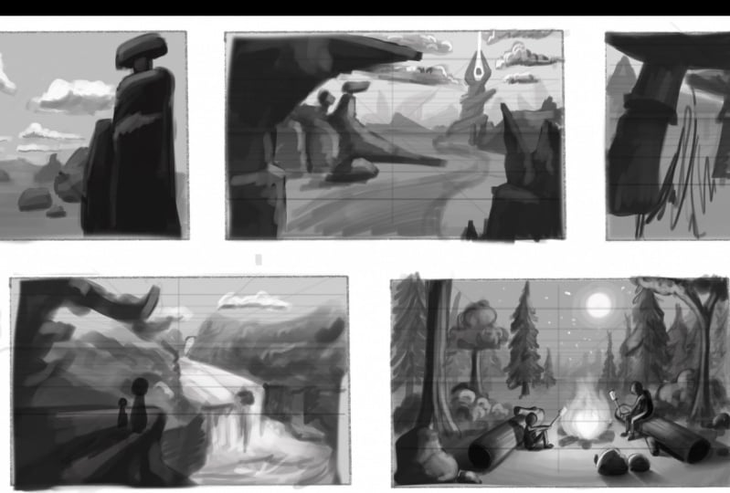
12. 6.2. Landscape B - Aggressive Desert Landscape: For this second landscape, maybe we're gonna do something a little bit more aggressive and maybe portraying sort of scary, scary place that we might be going. Maybe if we're viewing main characters or position that we're in, how the hair, maybe they're looking over into the distance to something going towards which is maybe kind of intimidating or scary in how some jaggedy mountains in the background looking quite intimidating. Second, let me mountains and not super, super dark, that just often a distance and just kind of setting the scene. It was like a non-smooth it a clef here. And then as I can, a little bit of space between here and wherever this place is going to be this kind of intimidating or carrots might be moving towards out a little bit of like a tiny mountains. And you see how the shapes are really pointy and aggressive. If you have things sort of pointing into the direction of where your viewpoint is as well, then you're naturally going to draw the eye if everything is pointing to this space. So you can see a lot of the shape's going in that direction. That's really good way of guiding the viewers eyes to that point. So maybe a little bit closer to us. We're going to have sort of the place where they're going to have an aggressive place in a mountain top two minutes. Maybe you've got a big sort of winding mountain. And maybe it's big power off that goes up there. And it's crazy. There's some crazy big shape at the top that looks very imbalanced and kinda synopsis, does it escapes or so. And then on top of that, maybe we've got this building aggressive, looking for shape on the top. Maybe you even want to move that a little bit lower down so we can do some cool stuff with the lighting. And I appreciate if you're doing this on paper, it's not as easy to just cut and pasting, so don't worry too much. And you're sort of thinking about an ugly can't see that much in it. So it kinda got this big, very pointy I think, I think even if it was sharper than this, so we're going to have it maybe a little bit more aggressive. This thing is using the flat brush. It's a little bit harder to make things. Hyporheic are aggressive and it's from super flat and square that you guys make it been appointed. And this kind of building, we don't know what it is, we don't know what's that seems a little bit aggressive. Shape. Uh, maybe maybe we've got like some clouds in the sky, like some dark, dark clouds. It's kinda of framing the scene. And even coming overhead. And you've got some that coming ahead here. You can see the head hairs and there's a lot of dark clouds in the sky and it's quite, a quite gloomy. And then maybe we've got this ray of light coming down. It's coming down. Maybe you're getting a ton of them, then you're probably going to get some highlights from that light onto the, onto the clouds on either side. These clauses public gonna have likes and pretty predict stream shadows on, on this side of themselves. Not that lightning strike. So I'm just going to get that under thundercloud. You're going to be quite dark and this one's probably going to be. The second thing. A little mistake, beds kinds committing things and say, well how much of another landscaping or wherever looking something might make that a touch lighter. Stop that, inhibit your forms new way. Now, maybe we have some other sort of jaggedy. We've got something maybe in the foreground. I'm just gonna make me laugh to understand, and it can come back concerning the BAC minus 2, you've got something in a folder of heroism maybe here or something. Maybe they've got this big jaggedy rock formation coming out into the side. And so it's really like pointing towards this thing. So maybe more sharp proclamations then I have to be this directly shop necessarily. But do you think is it definitely does create a different fill stuff, dry, neutral landscape. We were just painting it before. You have your past and kinda hear. If we're looking at. And then let's go back into the foreground, is going to do some, maybe we have like sort of path. Name is Paul. It's kinda cutting through all of this. Some sort of just thinking aloud to you guys. It doesn't have to be on path extra LA and just sort of playing around and having fun really can have some other rock formations and lay on the rocks. Hey, incidence of other folks have not been kind of, hey, let's look a little bit dark. Not say scene that's in front of this. Yeah. Lots of lots of quite large rocks be they feel a lot smaller because they're further away. Maybe head of Gottesman East, cool. Ropes that again, so a balancing of the top of each other and there's a fear them near that background that is even cause of stuff going on. So you've got this scene where obviously everything is pointing towards this thing in the background that you'll, this ominous thing that the characters might be moving towards. And here I've got, I think it's quite a dark scene and like the light's probably lies probably mostly coming from the sky. So in this section here again, I could probably going to be seeing quite, quite a small amount of light. The match these two have enough. Probably gonna be seeing quite a small amount of mountains on top of this bit here. Maybe on the size there might be some light peeking through and kind of getting into these rocks down here. And maybe I have some midtones document. It's getting enough at mobile expect to live. And like my midtone and some other mentors getting a bit of inference by the shape down here and tell me a little bit more information about the shape. Disrupts got soon. So no crevasses and it made it hasn't middle face, it comes down here, you can save it. And then again on this rock is no tone, just going to copy this one. Some sort of midtones, Midtones here. And then if a pilot on that and not enough in that highlight and semester, It's quite dark. And you got that highlight just less than lights touching on to a tiny little bit about the shape. That's rocks, but they will do. And then I'm going to be seeing a lot more shutter and this kind of undecided hair and stuff. And the light again is coming from this side, say, the basin shadow is cast on that side. And the side CAN up more of the shape and rocks, maybe. My big rock here in front of this one. So you just got to see kind of shapes forming from shut as being cost. Suddenly on this one you're going to see some shadow, maybe some shadow on the ground. Space trying to build into that a bit and using the values to form. And tell it here as it a bit more about the shapes of these rocks you can, but even some lighter highlights, but I don't know that my docket highlights. And then often your big distance, scary place that you're going to, there might be some shadows that you can see. The underside of this rock. Shadows a bit to dock the comin little bit lighter. Because that atmospheric perspective, you can see some shadows half this building we can start to vaguely may count something about it. And we can see some shadows, flatness, winding road was leading up to this thing. It's all very minimal. I've just wrote out these edges again. Got another landscape. Quite different fields between these two. I think you can see how the shape alone of all of the stuff in this scene is really quite, quite like a jacket grassy field to it. It's interesting to see how this one, which is quite neat troll is just quiet, peaceful scene. And this one's got quite immediately, I'm much more aggressive field to it. And I mean, you can make even more aggressive for having lots of stuff coming in on all the sides and being really sharp and stuff. But I think this is like subtly, subtly aggressive.
13. 6.3 Landscape C - Fun Giant Mushroom Scene: On to another one. Just kept bringing that perspective grid, just going to pop on to this layer here. And again, sort of light midtone background color. Maybe adjust this perspective grid. You can choose not to use this if you wanted to. It's not necessary to use it. And if you find it easy enough to do landscapes with it, but it's a pretty useful tool when you're just starting out, if you're trying to figure out how to get the perspective, just write on this. What would so I think maybe this one. Well, how that kind of neutral. Maybe slightly, slightly looking, looking down on the landscape. Once we get to do something a bit more friendly, little bit softer than we could do like a cool giant mushroom seen. Say, Oh doc in a sort of ground, ground shutter. Let's make that a little bit, little bit lighter. And in essence, quite dynamic. They were looking at the scene and a bit of an angle. And then go on the same layer. Takes on, it's a little bit lighter than the background, but dark in the background. We can start having some cool hills in the background. Mountains in the background, some cool hills and stuff. And see how this is really around and friendly and it's not very aggressive, ready, which isn't very organic shapes. Your table have like some mushrooms growing out in an angle. And again, we can use our references here. We got some woops, got some references earlier of some coma convulsions. I believe it was kinda cool. And we can do some mushrooms that look like this for you. So if you've got an iPad, even just use that split-screen functions here you can your references but still kind of sketching. So you've got an ice machine hair, palm rejection. America does not liking it 100% today. So many Gaza machinery kind of in the ground, he's got close to you and it doesn't make sense. Then maybe we can see something that maybe father and distance. Giant bugs or something flying up here. You can see the underside of the bay. Something as it seems, the shadow. I think it's I think it's maybe we're going to be using the same shape to share that There's lots of these mushrooms. So maybe you've got another one bit further away. This one's a bit further. Ethnicity can probably say about Moore's side and the top and staff see that kind of shape coming through. While they are still going to see a lot more if the bottom of it. Let me see another one here. And this one's a bit bigger. Still the same sort of distance bit. They are coming up that be fine with medicines. And again, getting smaller and smaller. You could, if you have an iPad, just really copy and paste the shapes to stop them slightly so they don't look exactly the same, but it's not really too important. Made up from this program here I have like a big, big rocket domain. But maybe our characters could be sitting on. And start scenes is nationalists are going to start to really see the underside of them as they get far away. Like this. Is you getting off into the distance. I guess you just have like nice the same shape just to save a seminary that level. And as men's hair and stuff to shove any drawing foreground and copy. And I mean, when you're painting avail available to painting, I always start with the background first and then work your way forwards. Normally start at the foreground first. But on digital, you can kind of get away with doing Jason kinda stuff that wouldn't normally do with real traditional paints. So maybe just have loads and loads and everywhere. Maybe this is just like a giant mushroom field. Maybe you've got some other different trait mushrooms like these ones as well. Off in the distance. Maybe you can see here slightly darker color. Open their hands around. And again, you can just use some lighting. Everything's obviously again, coming from up above. Say you can use that to sketch in where the girls had been started. I think he still wouldn't see that much of the top at the top would be certainly highlighted. Slightly highlighted. Maybe, maybe you'll get a little bit of highlight on the side here and stuff. The best part, because it's going to be shutting down here. The mid-tones finish these up. That shadow. You have some kind of ambient, ambient light, just kind of bouncing off of the floor and stuff. But it's kind of a probably mostly on this section now. And can this be It's going to be sort of under shadows, are going to be seeing. Maybe you see some shadows here. Kind of really inferring the shape. Actually even on this one That's funders are going to be more like this big rock here, rock, even though it's very close to you in this very big open kind of looking down on it. Superbly going to see some of the top there. Good to see. You can see when you start to use the value. So you can really start to build in a bit of inference this landscape, you're not looking as far away as you have been in some of the other landscapes that we've drawn. This ones, you're looking from a learner perspective. So you're not going to be able to see as much in these mushrooms head I quite far away. You can tall so you can kind of see in the gills the logos. But for the most part you're seeing them a bit more of like a side on view because I quite far away. Same as these mushrooms, hair clean, reasonably side on. So you'll see a lot of the highlight of the top. Yeah. So that kind of thing. Pretty simple.
14. 6.4. Landscape D - Hopeful Cliff Top Waterfall: Maybe you're going to have some kind of waterfall landscape like this, where maybe waterfalls going to be coming down and we can see, see the top of it, maybe 70. This landscape isn't going to stretch it quite as far and wide that we're going to see a lot of cool stuff from sort of bads idea. If so, maybe you've got some color at this one I guess, and the mountains and stuff still not of scenery guy on you can just lock everything else. We can always go back into later with lighter colors. A shave, blocking the sort of general background. Behind this one. Too dark. And I just kind of lightness. But behind this one we're going to have a fantastic, I have some more. Some peaks here maybe just repeat. They're sort of where the waterfalls coming from. The distance. Even a lighter. So it's really just learned even though the distance, socially water is gonna be kinda reflective. So maybe we can see some of the water coming here, coming down and maybe entering his caliph. Maybe the foreground you've got like, so a leftOp that you're looking at kind of darker. So it's good not to go completely blank, I think, except for the house. He kind of use that black for real contrast and highlights and stuff. It's got some rich scenery, shrubs and stuff. Maybe you got a little bit foliage kind of coming in here, maximum supply lines and stuff like that. Or maybe even wherever you're looking from this. But there's a lot of shrubbery coming in from the side here and sort of giving us a little bit of a vignette effect where you're drawing your eyes into the mountain with these plants. Was that maybe are I have hanging. You might have some sort of similar plants on the side here. And you can see from your perspective, this background lighter than this person. Many terms are in staff. Leasing shadows here. Just to add some shadows to this left side here. Gets dark down the side of the cliffs and stuff like that. Here it is. Missed that gets formed at the base and maybe have a little bit shadow. There's a couple rocks, air, they're in what form? It makes the water part kind of an interesting way. You can see serve cool hacking their needs. They have some highlights in her hair. So maybe not as much as this section here. We have some ripples at the bottom, like this image. By the way, everything. And then I guess you'd have some credits in the trees fall directly without light. A bit darker in value because they're not as reflective as the water. My even actually have some more darks. And here just to show that the underside of the trees, the tree lining around the waterfall. And then your foreground here, and you've got this kind of place that your character might be standing there. You've got a character standing here overlooking everything. He probably would have some, some highlights. Not that bright. And he ever so slightly midtone sort of colors. And this section here in the shape a little bit more. Maybe there's a few highlights on this side here. And I've seen plants and stuff that are kind of in this foreground, probably have some highlights. Already drawn these as names or anything. It's just sort of like a rough shape. But we'll highlight in the water. Maybe you have some clouds in the sky in the distance. And you want to make this mountain that tiny, tiny bit darker too, so you can see it in a bit more as well. Say again, you can see how we're using atmospheric perspective to 3D and regular perspective. Just to create a bit of depth. Maybe you can see some details and these mountains a little bit. And he may be you can even save the workforce coming from and distance. Bit of water coming through that. He knows it's really whatever your imagination wants it to be. A course. There's landscapes and then bit close to us and maybe get some hot dog but slightly darker values here for why this cliff is dropping. Case infants was when the rocks and stuff contrast that between this ledge has been shadows. Another aspect that I could work into this a bit more, get a bit more light coming through. And maybe then if you have a character, maybe you have a character standing here. And you can get a really cool effect where the shadow is going to be costs the hind limb.
15. 6.5. Landscape E - Cosy Moonlit Campfire: Okay, so now I'm just going to show you guys some simple stuff that you can do with lighting when it's not necessarily code from the sky. So we're going to make the background for this image a little bit dark. And then we have previously, because we're gonna do a night sky. So still retain that were dark midtone. Now we're going to start building in the background. So I'm just going to take a color that's a tiny bit darker than our background color. I'm just imagining that this one is going to be seen in the middle of words. Maybe a clearing where you can see the sky. So I'm just going to make a little suggestion of trees. As you can see, we're using this perspective. Again. It's try and received the trays into the distance. As you get off its fat viewpoint. I get a little bit lighter, hotter to say how to make out pine trees like the few countries. Countries often distance, training the scene, stepping and practices, you're not doing this. I've had someone normal piece paper with some paints. It's probably a good idea to get habit of building an underpainting. So you're just going to work from the background. The things that are the furthest back in your line of sight. And just slowly keep building layers and layers and layers on top of each other. Tree learning. And now we're going to start building in maybe so. Now we've got our backdrop tree lining. It's going to take some colors slightly darker than the background. I'm going to make a new layer. And I'm just going to sketch in some countries and other trace all just be pine trees or shall I have lost Chase? Just for speed, I'm going to copy and paste that thumbnail. Quick sketch in. Lighting. Practice is also a really great Falcon. You come up with ideas for compositions because you're just getting used to thinking about how are you going to setup a composition before you go in, make a big painting? So it's quite useful exercise to do even just from the premises doing a plan for painting that you're thinking about getting a goto. So at this point we're just blocking in some shapes. And later on, when we start adding in the lighter Anglican, adjust the values. Behind here a couple of further away. Maybe we've got the shapes and kinds. This side. Ghana's just build in some trees in the background, gets a nice layering going on. A tree right here. Okay? In the sky, we can have all new, which will be nice and bright. Halo around it. My sky. Now in our foreground, read at some interesting stuff here. So I'm going to using pretty much the same value, black as these trees that are really close to us head. Going to draw some logs here for our camp. System. Logs coming from this vanishing point is going to be slightly tape it in perspective towards here. So it's bigger here, it's smaller than. So. We can just have some rocks here. We're just going to be seen. Now. I'm going to use a dark gray light just to shed some sticks of crossroads when phi is going to be quite bright. So if I was going to be hottest and middle, so it's going to be the brightest in the middle. Then the slightly less bright and value dissipates. Pfizer is one of those ones paint because it's not really a solid form. And anyway, so it's a lot of artistic license here of how you would make a fire luck. Hello, reflux. About any kind of digital and otherwise, somebody just paint over it so it looks nice and consistent. You can always go back and go back and start with the darker colors again, it's especially working on today like acrylic for garage. It's really easy to do that with wash colors. Maybe a little bit more thoughtful about when you're putting down dark colors because it's more difficult to fix that later on. Fire pits. Okay, so now we start thinking about how this light is going to stop bouncing off with these objects around here and showing you the form object. So there's going to be allies of light bouncing on these logs. Running that nice warm glow. Let's talk. They actually give it darker because it's not really facing the light. Seems head. We're going to be some shutter here. The light is hitting the front face here. There's going to be a little shutter cost. And that's certainly going to be a shadow cast. On the ground behind. This log will actually pay this. Underneath. The light is coming from this way. Light is coming from this way. So that's going to add reflects back head on to the log. And then behind the log there's going to be a shutter cost. And not so shape in line with how the light's bouncing on to as appropriate innovation. And that's darker places to Iraq and becomes lighter as it gets further away from the milk. Okay. I put it in document is pointing. Notebooks are going to be a low shutter there as well. And that again, you can't because these rocks are facing us, we can't really see much of the area that's being led up. The light's coming from here. We've got that comes into place. The light's coming from here and hitting the rock on this side of the hair. So that means this whole bit back here is going to be quite dark. So we might just see a small halo of highlight on this rock. Just around the silhouette. Maybe a bit on this one because of the angle, we might see a tiny bit, but again, most of it's going to be in shadow. And then behind these rocks because they're in shutting, we're going to be seeing some shadows on the ground. And they're going to be meeting in the direction that the light is passing over that rock and casting the shadow on the ground. Satellite wants to travel to the ground. Wants to travel to this part of the ground, but the rock is blocking it. So the costumer nice long shadow, because the light's quite a low angle compared to these rocks. It's not super high up. So the shadow is going to be quite long behind there. If the light was all the way up here and it's causing a shutter down the shutter to be quite short. We can do another lesson on lighting at some point. We're just talking about lighting specifically. Again, it's getting darker near the base of the rock. Shift Enter to lock it so I can live. No blend tool then I'm still on this log. I'm going to have the same thing is going to be less up. You'll see more of the shape of these logs and the little crevices that are in those well, because they're going to be some parts of the lights were able to get into. So you can see more details. The rock's texture. That's going to be a lot darker here. And again behind the smoke, there's going to be a shadow cost. The light's coming from here. Hey, log entries that the shadow cast behind is going to be sort of like this. Spreading out and make it a bit lighter. Luck. Hello, be darkest right under the log. Because that's where the most light isn't as being blocked. Fca like commune that very little was of course, under the smoke as well and a small shadow. And then on these locks, these arcs are bit different because you can see the side of them here, so you see light being cost on them. But again, it's a large part of it, but she's not facing the fire. That will be in shadow. Now, looking at these trees around us, definitely a bit of lighting going on in these trees. The light is going to become less intense on the objects surround. The same as we may have felt away from the light. But that definitely will see some light bouncing on these trees and eliminating them. You might get a little bit of light on these trees back here. But it's going to be a lot less intense. Light from the moon as well. Come onto these trees. Nothing crazy. Just a little bit. Can you see how the US such nice cozy count 55 to now we can build some time into these trees back here, just because the main is going to be eliminating them slightly. Can have some shadows. Just you soon. The shadows to just tell you a bit more about the shape of these trees. They look like as much information as you were to daylight shining on them. But you could find out a little bit about what the shapes are, Mike. And just often our distance just going to go down a few shapes. Because it looks like it's such a nice cozy campfire scene. Now I'm going to put some characters into this just to show you how this kind of lighting can create a really nice fact. I'd like to start off just playing a character symbolism, block valleys. This is going to be very basic. Stick, stick my level just to show this person sat by the fire. Arms, leaning, meaning out of the hands one fire. So what else here? Maybe I sat down on the ground. Sat down on the ground. And you've got some kind of marshmallows or their resting, productive at higher up burn marshmallows. And the way the elimination of the faces here, the really nice, I have a nice ventilation here. Regulation on the shoulders. Really nice way of being able to tell you about the shape. These people are going to be nice and bright. And this tick under that stick is going to be nice and very right near the fires. It's going to be soups it right? So you can have a much more dramatic and extreme lighting setup when you've got this kind of light sources coming from something like a fire. Obviously there's a stick man, so it's hard to go into crazy detail and it's just probabilistic then, but you can get the idea and how nice that can be. And now that we've entered these people into the scene, there's going to be some shadows cost onto these logs by these people. So we've got to go back in the sketch in the shadows. Because I'm blocking out light. Also in disguise feel is going to be a shot icons behind his feet. On smoke. Underneath is going to spend a very shutter. Well, coming out to that log is a walking around the shape the lock. And on this axis sound, this log here. Good. Actually, we'll be able to see him in the shutter speed cost over on this side. Tolerate that. Pretty nice. Say you've got a really nice relaxing campfire scene. You can see I've moved for this is 3D, cozy and peaceful and comfortable and it's just quite nostalgic nighttime scene. And then something like this, which is like a daytime scene. The lighting is quite bright. Everything and the illumination is coming more from the sky. Okay, so I think as a whole, we've got five quite different scenes, quite different applications of the five fundamentals that I mentioned in the first part of this class. And we can see how all of these different scenes are capturing different moods. They using those five fundamental principles to create a story and tell you a little bit of something about that particular scene. So this first one here, quite neutral. Does it type of landscape? It's clearly quite bright. The light source is coming from the sky. And the perspective that you're looking at, everything from his quite a low perspective, you can see quite a lot of the sky, quite a lot of the undersides of these objects in the foreground. And it's quite a neutral landscape. It's not happy or sad, and it just isn't neutral. And then the second one here, it's got a little bit more menacing feel to it. Maybe it's a scene for some kind of adventure that's about to be embarked by some hero. We might have a hero just in the foreground here, looking back as if they've just walked away from this scene and they've, they've conquered that. Or perhaps they're going to be looking towards it as if they're walking into this big epic journey in this treacherous environment. Again, it's got kind of a desert landscape fields who inspired by the references that we've used. But it's quite a different fields of this one. This one's quite neutral, quite natural, and this one's got lots of jaggedy sharp shapes drawing your eye and your attention to this point in the background with this object or building that can be quite evil or scary and aggressive. And the general feel of this one is that it's, it's kind of subtlely, subtlely aggressive. And that's just by changing the way that we use shape and also lighting because It's quite dark, cloudy seen, there's a lot of dark clouds in the sky as opposed to, Hey, we got a lot of like nice bright clouds here. We've got a lot of dark clouds and sort of lightning strike coming from this building. So the lighting in the scene with the darkness in front also can create a different kind of feel and viewer. And then we come to this scene over here, this giant machine revealed it's quite a natural, maybe quite fun scene. It's not necessarily something that you would find aggressive or treacherous, but it's just got very like a natural organic, quite positive animal kid adventure type of filter. And it's got this super jumbo sized feel when there's motion and just larger than life. And even though you're looking from a perspective where you're looking from a little bit higher up when you can see more of the ground scene and less of the sky. These objects are so big that they're taking up so much of your peripheral vision. Anyway. Then we've got this epic. Seeing, this is quiet, it feels quite positive. Those a bit of an epic adventure. You've got these two characters standing on a ledge overlooking this beautiful waterfall landscape. Maybe that overlooking these will place that they call their home. Maybe that overlooking a beautiful place they've just come from, or a place that they finally arrived at after a long journey. And this got quite positive, happy, natural feel to it. There's not really anything intimidating or scary about this, this piece. And again, we're using the lighting and the values to create that sort of feeling. And here, again, using lighting and value and all the principles that we've spoken about to create a really cozy dynamic. Yeah, the viewpoint is quite neutral head, but you're very close to the scene. You're surrounded by this forest and the lighting source is, instead of being the sky is this fire where you've got these two characters sitting around. You've got these two characters sitting around roasting marshmallows and having quite cosy filter it. This is quite happy, quite nostalgic, quite friendly scene. And it's not really a big adventure. It's not, it doesn't feel like there's a big task going on. It just looks like you're actually a snapshot of a nice evening camping out under the stars between two friends.
16. 7. Your Class Project : All right everyone. So now that we've sat down together and we've walked through the process of applying those five key principles into creating our own environments and concepts for our illustrations and our artwork. Now as your class project, I would like you to now go away and create five to ten of your own environment designs for your characters over the stories that you might be telling. You, you need to go away and collect some references from either the websites that I mentioned earlier in this class, or feel free to go and use a website that you prefer if you have some in mind already. And then you're going to use those references on the power of your unlimited imagination to come up with five to ten different landscape designs that you would use for your artwork. So illustrations, if you'd like to put some quick inferences where characters might be and you know, people or animals within those landscapes. And please feel free to do that. Do not feel like you have to do. I've done and just kept it to the barebones landscapes for a lot of the demonstration pieces that I showed you. But just be sure that you're creating these landscapes in a thumbnail. We don't want it to be super, super detailed. You don't want to be spending loads and loads of time on this, like you saw in the demonstration. I think I probably spend about ten to 15 or 20 minutes on each of those quick thumbnails. And the exercise is not about creating a beautiful finished landscape piece. About creating a landscape using the principles that I've taught you and increasing your confidence and your skill in applying those principles to your own creative thinking and into your process. And when you're working on these things, I really want you to keep referring back to the five principles I taught you. It's so, so important that you're getting your perspective, depth, value, lighting and forms. And you're using all of those things to create the emotions that you want to create, to capture the viewpoints that you want to capture, and give the information to the viewer about what that scene is all about and what's going on and what you want that seem to be communicating. So, yes, feel free to put characters or animals, whatever you like within your scenes and you can post all of your progress in the community section of this course. And you can get feedback from myself and from your fellow classmates. Overall, I think it's really important that you are able to apply these principles to create in grayscale landscapes so that you can be really proud and confident in your ability when you're going through the process of designing a landscape. You know the steps that you need to go through. Now, all of these thumbnails are supposed to be done in grayscale. I don't think that we need to be going into color at this point because again, this task is focused on applying these principles and really understanding these fundamentals. A grayscale level before we can start moving into color. If you feel confident with your ability to use color theory, then after doing some grayscale mockups, feel free to take some ideas you've done in grayscale and turn them into colored images, but please don't worry about doing that if you're not feeling confident because I will be releasing another call shortly about how you can turn your black and white landscape ideas into a refined, beautiful, colored landscape. And how you can go through the process of doing some color experimentations and color studies so that you can determine what the best colors are. Feed, use for your landscapes before going into doing a finished piece. But that's another class in itself. And I think for now we've got to stick to the basics and really make sure that you've got these five fundamentals really, really down before we move on to using column, I've really enjoyed working on this with you guys and I'm really looking forward to seeing the kind of stuff that you're coming out with. I think you can create some really beautiful landscapes and don't, you have to stick to what I've done in creating loads of like natural landscapes. The very organic fill, if you'd like to go for more cities or tombs or futuristic kind of things. Do whatever your imagination wants you to do. It's absolutely no problem at all. I'm just really looking forward to seeing how your landscapes goals are going to level up by applying these five simple principles and seeing your thumbnail designs that you come up with, which you can then use as ideas for your final pieces that you might like to create in the future. Thank you so much everyone for watching. I'm really look forward to doing more classes with you in the future. All feedback is absolutely welcome, and I'm looking forward to seeing the designs that you create. Good luck with everything, and I'll see you in the next class. Bye.
 Olivia Chevallier, Artist, Illustrator, Product/UX Designer