Transcripts
1. Course Introduction : Digital planning continues
to grow in popularity. Apps like Good Notes, Zoo Notes, and Artful Agenda continue to capture the
hearts of creatives. People often love the
ease of use once you get through the initial
learning curve of using a digital planner. People also absolutely
love the idea of having an endless supply of digital stickers that you can
reuse over and over again. Personally, I love having
an endless supply of ideas to create digital stickers that I can use whenever
I feel inspired. And that is what this month's
class will be all about. Designing digital stickers on your ipad in affinity
designer version two. Whether you want to create
digital stickers for personal use or eventually
to sell in a digital shop, making digital stickers
doesn't have to be complicated and
it's absolutely fun. Hi everyone. Welcome to class. I'm Jen Gilson and I'll be the one guiding you through
this creative course. I am a freelance
graphic designer, illustrator and educator based out of the Midwest In a run, Bella and Sophia
Creative Studio. If you want to learn
more about me, you can find me online at Bell
Sophia Creative.com Also, check out my Youtube channel,
The Creative Studio, where you will get a
behind the scenes view of the work that I do as
a creative freelancer. And find a huge library of free tutorials
catered to those of you interested in things
like graphic design, surface pattern design programs like affinity and procreate, as well as art and illustration. If this is your first foray into my classes relating
to digital planning, I highly suggest you check out some of my previous classes. I have a variety within my course library that show you the basics of
digital planning. One of my more recent
courses dives into the process of creating your
very own digital planner. Design a digital planner in the affinity publisher
to ipad app. I'll make sure to leave it length in the
course description. Also, if you're working in a different version of the
affinity designer app, specifically version one
or the desktop version, I have a couple of
classes that will help you to do what we're
doing in this very class. But in those versions I'll
leave those linked as well. So aside from my work in graphic
design and illustration, I really enjoy planning
and designing stationery. As you saw in my How to Build
a Digital Planner course, some of my top
selling products are my digital planners and my digital stickers
in my Etsy shop. One of my top
courses is my how to design digital stickers
with the affinity version, one ipad app, as well
as the desktop version. And I wanted to do an
update to this class. Sarah lease an update to all three of the
affinity products. I wanted to take people through the sticker design process in the new version of the affinity designer app on their ipad. This is because the interfaces
are a bit different. So this course will get
you comfortable with the ipad version two
of designer creating digital stickers for
use in good notes or your other note taking apps is not nearly as
hard as you think. I wanted to share some tips, my knowledge of the ipad app, and then help you build
a digital sticker set that you can customize
to your very own needs. These sticker sets
give digital planning a bit of creativity and
a nod to the real thing. The beauty about working in affinity designer is that you don't necessarily need to have too much artistic
ability as we will be working with things like
shapes and vector tools. But you can still
definitely flex your art skills in the
app if you choose to. And I can show you a few
tips on how to do that. These are great to use
for digital planning and scrapbooking and you can reuse
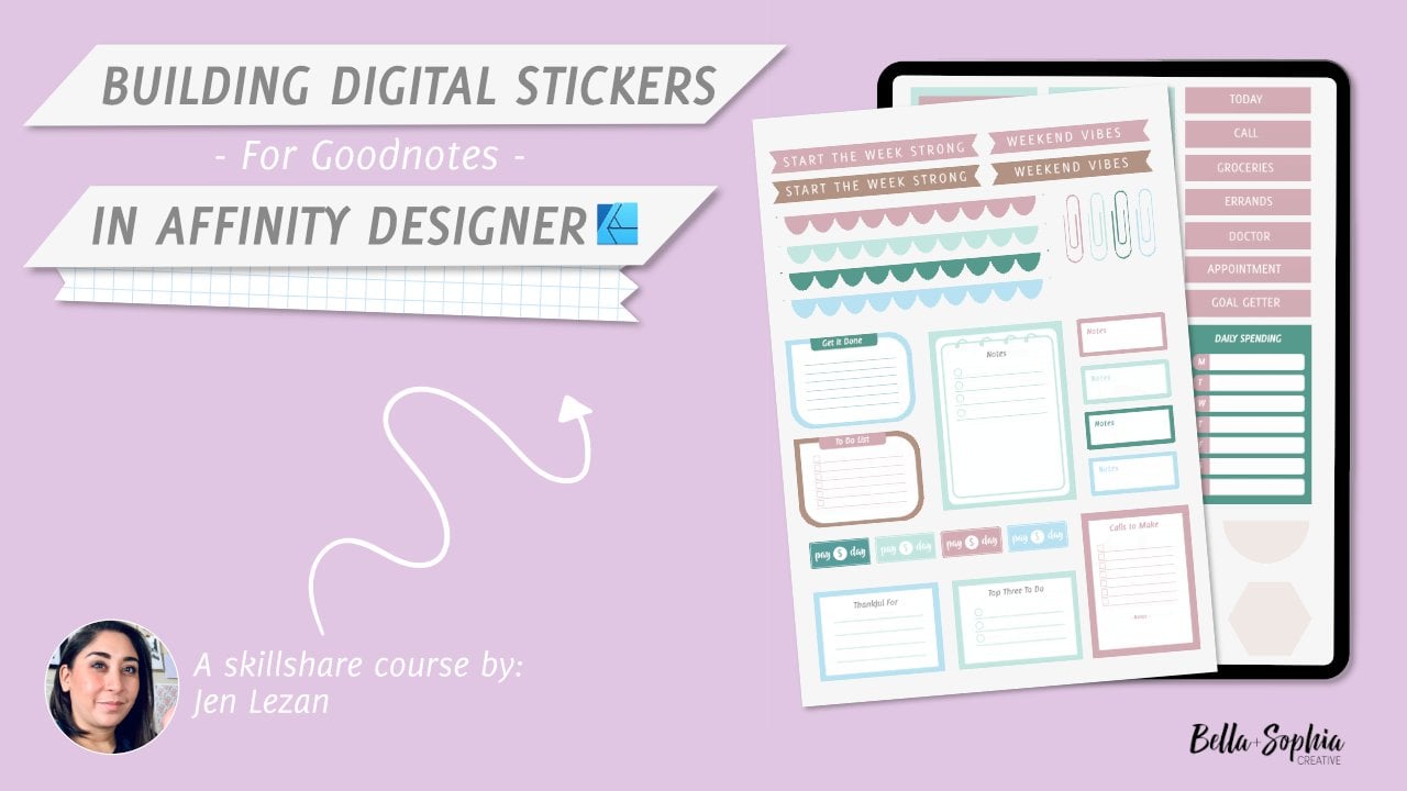
them over and over again. What is this class about? In this class, you will
learn how to create a digital sticker
set and affinity designer version
two for the ipad. This is an update to my
prior class as I received a few messages and requests
to do this class to highlight the differences
in the ipad app for affinity designer version two and to explore the interface. I really enjoy using
affinity designer on the ipad for working on projects on the go as well as for creating
digital stickers. Because it really allows you to simply and quickly
create precise shapes, align and space
items, really easily, add vector effects
to the shapes, and then export those
images as slices to PNG files without a
background very quickly. This basically allows you to prepare them for
your digital note taking app and then apply them to pages without a
white background. This course is a
fantastic class to also get comfortable using
affinity designer version two on your ipad as
you're going through the whole basic process of
creating in the program. And then you get a
tangible project that you can use
after you're done. The goal for this class is to highlight the differences in the interface of the ipad
version as well as the updates. And then you'll see a little bit more about
what's different than what you might find on the desktop version
or on version one. What are the skills
that you'll learn? You will learn how
to create your own digital planner stickers in the Affinity designer version
two app right on your ipad. We will start with the
basics of understanding the toolbars and functions in the Affinity Designer
ipad workspace. And then we'll start to
build out our sticker set. You'll learn how to design
simple functional stickers that don't really require
any artistic prowess. You'll learn about
the different types of stickers for planning. I'll share some tips
on what you can utilize if you're interested in doing a little bit
more creative, artistic, hand drawn
looking pieces as well. We'll learn about how to set up your file and prep
your artboards. You'll get an understanding of the layers functions
in the program. We will also go over how
to use the shape tools, the line tool, and how to use the move and
align functions. You will get a better
understanding of the layer effects tools
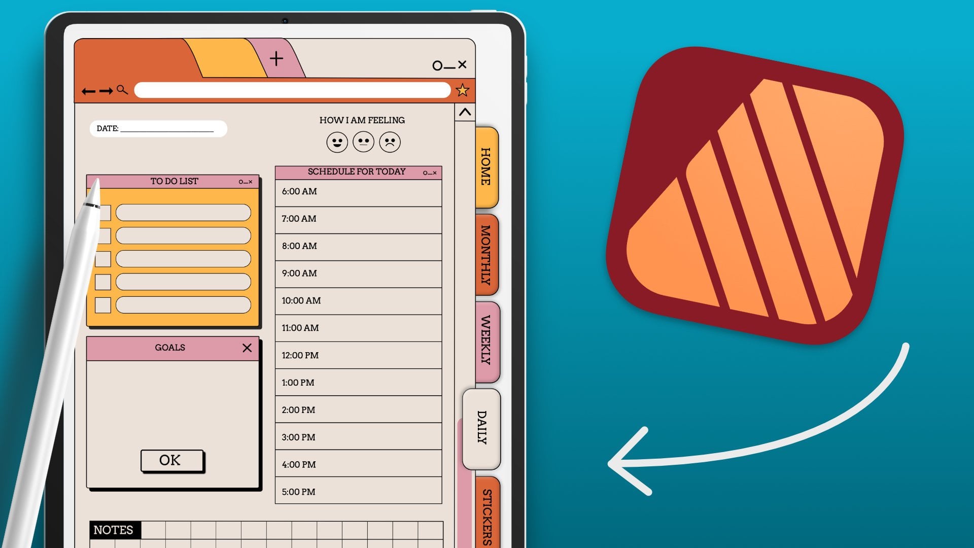
and how to add things like shadows to make your items feel a little bit more three D and realistic if you so choose to. And we will go over how to load your digital stickers into good notes and how
to place them into your layouts to make
things a little easier, I will be including the class project affinity
designer template that you can edit
and get acquainted with before you even
start your own. I will also include a file with all of the
stickers that I've created in the class for personal use and a
zip file as p andG's.
2. Tools and Class Project: When it comes to the tools that you'll need to
take this class, all you really
need is your ipad, the affinity designer
ipad app version two, and the Good Notes app or any other note taking
app that you use. But for my example of placing the stickers into the app that will be
utilizing good notes. Who is this class for? This
class is really for anyone. Artists, graphic
design enthusiasts, graphic designers,
illustrators, digital planners, digital planning beginners, and anyone creative who
wants to learn how to design their own
digital stickers in the affinity designer version two ipad app comes to the skill level that you
need to take this class. This class is geared
towards beginners. I will be walking you
through and helping you familiarize yourself with the new affinity designer
version to interface. I will also walk learners
through the process of creating your digital
stickers step by step. And I'm also reintroducing the interface due to the
updates and the changes. It's perfect for
anyone just learning, but it's also great for
anyone who might be an expert or an intermediate learner who has used affinity
designer in the past, but they're interested
in learning how to make their own
digital stickers. For your class project, you're going to create
a one page sticker set featuring functional
planner stickers. You'll learn how
to create your own digital planner stickers and the affinity designer
version to ipad app. And then your final
project will just be sharing that one page
digital sticker set. You can either export them into a PNG file set and share a link. Or you can share a screenshot
of that final sticker set. Or you can even just
share the P and G of the final sticker set as a whole as well.
When you're ready. In terms of the deliverables, just upload that final file
to the class project gallery. I'd love to see what you create. Don't forget, make
sure you download the class resources and
if you are interested, you could also share
your project on social media and tag me
at Bello Sophia Creative. I'd love to see what you've
created or even offer some insightful tips or helpful
feedback if you need it. Definitely also consider
leaving the class or review. These reviews are so helpful in ensuring teachers
get engagement, which in turn helps your
classes overall in search. I'm really looking
forward to creating with you today.
Let's get started.
3. Exploring the tools : Before we get
started and actually designing our sticker set, I want to take you
through the interface of the Affinity Designer
version two app on our ipad just
so that we can get used to some of the tools
and studios that are in the app so that you
feel a little bit more familiar as we actually work on creating the project. When you launch affinity, you'll likely have
a gallery view. Yours might be empty if this is the first time using
the ipad app for you. If not, you may be like
me and have a bunch of projects already in your system. So what we're going to do is
just set up a simple four by six sticker sheet and then we'll be
working on that with our testing as well as
into the actual project. On the left hand side
of our interface, here we have all of our options for setting
up new documents, as well as templates, sample work that you can
go through and the help, which is a fantastic
option if you're just learning about the app itself. If you tap on the help, it'll take you to the different learning portals and Quickstart guides that affinity
has, which is fantastic. You do have to be
connected to the Internet, but there are a ton
different options here that you can utilize to learn tutorials
that they share. They have a wealth
of information, I highly suggest
checking that out, and that's why it's one
of the first things that I like to share. You could also go into
your settings and adjust settings
as you need here. You can use your interface, you can adjust your great
background as needed. I have it a little bit darker so it's easier to see on screen. You can adjust the left
or right hand mode. You could also show
brush previews. There's a ton of
different options in here that we can
play around with and adjust if you're looking
for something a little bit more advanced in terms
of like printer settings. When you're done with that, you can just hit
the Done button. And then what we want
to focus on really are these options in the
upper left hand corner. So we're going to select New, and we can tap New From document to set up
a new document. Or we can also open
up files as well. You can open documents
from your file system, import documents and import
items from your photos. And I'll show you how
to work with that in a bit because I like to sketch out my stickers before I design them in the app. And I do that and procreate. So I'm going to import
my Jpeg from there. Let's tap on the new option here and we're going to
select new document. You'll have all of your
options for your dimensions, for your margins and bleeds. Since we're not printing, you won't really
need to worry about these margins and bleeds because we will be working
in a digital file. But like I said, if you opt to actually
print something out, you may want to adjust these based on the
printer settings that you get from your manufacturer or from whatever company you
might be working with. So we're going to go
into our dimensions here and we're going to update. If you don't have inches, if you go down to where it says Document Units
and you chap on it, you can change it
from whatever it currently is to inches. And then I'm going to
change my page width to 4 " and my page height to 6 ". And then I'm going
to go into DP, I'm going to keep
it at 300, but two, you can adjust as you need based on the file size limitations
that you may have. But also, like I said, if
you opt to print this, you may want to increase
your DPI from 192 or 144 to 300 or higher so that you have higher quality images when you send it to the printer. I'm going to keep
my color format, RGB because we are going to be working on a digital format. I'm going to keep my
image placement embedded, I'm going to create an artboard, and then everything
else can stay the same. And I'm going to select, okay, and that's going to
set up our file for us. Once we've done that, we'll have this art board on
the left hand side. We have our tools. On the right hand side
we have our studios. And then in the top here we have some of
our menu options. Let's look at the menu
options and then we'll jump into some of the tools
and then our studios. Before we start though,
I want to highlight something that's
really helpful if you, if you go to the lower left
hand corner of the app. If you tap on that
little question mark, what it does is that
it shows you all of the names of all of the
options within the interface. If you ever get confused
about what I'm selecting, just listen to the
word that I use and you click on this
little question mark here. It'll allow you to kind
of pull up and look at what the names are of all
of these different elements, icons on your screen. So this is a really,
really helpful tool. But first we're going to check
out some of these menus. So this is our designer persona. So if you tap where the affinity designer logo is in the upper
left hand corner, you'll get a drop down which gives you
different personas. You can work in pixel persona which allows you to use some of the affinity photo
pixel based tools if you tap on the export persona which is what we'll
be utilizing. A lot towards the
end of this class. It'll give you different ways to export the different
elements on your file. Here, you could export
the whole file, or you could actually
pinpoint and select key elements and export them separately as something
called slices. But we'll get more
into that later. Now if we go back
into our persona, we tap on designer, It'll bring us back to our designer options. Next to that is
our document menu. It looks like a hamburger
menu with three lines. If we tap on that,
you'll get all of your different document options where you can
resize your canvas, export your file print
place, any imagery. You can adjust your art boards. We can add artboards
if we wanted. If we go back into
that document men, you can select artboard. Then in the upper left
hand corner here, you can select the type of
artboard that you want to add. So say you just want to make a copy of this current artboard. You can hit the plus
icon and it'll add an artboard for you and
you'll have two to undo this. You can just take
two fingers and tap on your screen
and it'll remove it. This is really
helpful if you like working on another artboard while you have one
clean that you can experiment with and then do your final work on the other one. I find this to be
really helpful. You could also add
artboards based on the selection and then specific pre made settings
that they have as well, like ipad, ipad ten,
portrait landscape. So that's really helpful
and that's a big change. And I noticed that
some of these options where you add or
select or change have kind of switch that used to
be in the middle here and now you'll see them up
here in the menu board. So now if we go back
to that document menu, you can tap on Canvas. It'll allow you to clip to canvas or change to a
transparent canvas, which is actually what
we're going to need. I forgot to click on that while we were
setting up our file. We're going to want to
select transparent canvas. Because what we need
to do is export our final stickers
as transparent PNGs. And that means it won't have that white background
behind the element. So we want to make sure
we utilize transparency. You can select that in the set up as well when
you're setting up your file. But if you forgot,
like me, you can just go into your document menu. Select Canvas, and then change it to a transparent canvas. We can also go into
our edit menu. This is where you'll get all of your options for
duplicate, cut copy. But there are also some really great shortcuts
that we can use. If we want to use any
of those It options, we can just take the
fingers and swipe down on our screen and you'll be able to get your
duplicate copy, paste, cut, Delete
Quick Options. That's another, um,
helpful update as well. We'll go back into
that three dot menu, which is our edit menu. We could also
convert to curves if we're working with shapes
through this edit menu. Then the other thing I
would like to highlight here is the magnetics option, which is in the upper
right hand corner. It helps to align
different elements together when we have this
magnetic option to turn none. Sometimes it's
helpful to turn it off if you want to
do some fine tuning. But I find that it's helpful to keep it on as we're working. Now that we can have
an idea of these menu, we'll use some of those
options as we start to work with and play
around with our tools. On the left hand
side is our tools. The first tool I want to
highlight that we'll be using the most today is
our shaped tool. Right now it looks
like a rectangle, but if you hold it down, it'll give you all of the different shape
options that we have. So I'm just going to select
rounded rectangle to start. And I'm going to create a
rectangle on my screen here. And I'm actually
going to go into the right hand side and
select this little, it looks like a gray, white circle in the upper
right hand carter. That's my color studio.
If I tap on it, it'll fly out and then I can update the color so
it's easier to see. And then when I tap on it,
it'll pull it back in. What you'll notice is with
me creating the shape, you'll see this slider
bar next to the tool. That's another
update I notice in the app is that a lot of the edit functions for these different tools
are in the slider view. If I zoom in, you'll notice that we have these
little red dots. If we select these red dots, it'll allow us to adjust our curve mature of
our corners here. So you can go all
the way out and it'll be completely pointy, or you can bring it in
to create that curve. You can also adjust your
options here in the upper menu, you can select the different
corners that you want. If you want the rounded,
rounded, inverted, straight cut out, or non. If we tap on that shaped tool, again, you get all kinds of different options.
There's a ton. You can create stars. And what's nice is that, say
you want your star to be like a perfect proportion when
you're creating the star, all you have to do is you can do this with
any of the shapes. Add your finger, tap your
finger on the screen, and it'll create it in
perfect proportions. Again, you'll notice that you
have these little elements here that allow you
to adjust the nodes. You can adjust your inside
angle of your star. You can also go in and
adjust your inner radius. You can change the
number of points as well in this upper menu
on the upper left hand side. You can add as
many points as you want and it'll adjust
and update that. You could also adjust
your inner radius, as I mentioned here in
this menu at the top, by dragging your apple
pencil over it to the right to
increase the radius. Or drag it to the left
to decrease the radius. Or you can just use
those little points on the inside of
the shape as well. You have all of these
additional options within the shape
as you create it. Now if you notice, I'm going
to update the color of that shape by tapping on
it with my move tool, which is this black arrow tool. And I'm going to tap on it
so I know it's selected. You'll know it's selected
because it's outlined in blue. I'm going to go into my
color studio here by tapping on that colored circle. And then I'm going to update the color to like
this grayish white. And I'm going to pull it on top of my rounded rectangle here. Then I'm going to go into some of these quick options here. You, this option right next
to where it says Default. That's our arranged menu. If we tap on that,
it'll allow you to move your eyelines
forward or back. So for example, if I want to move that
starch of the front, I'm just going to tap move to front and it'll pull it
to the front of my shape. For me, the move tool is another tool that will utilize a lot, that
black arrow tool. And then I showcase the bit
how that node tool works. So I'm going to tap
on the node tool. I'm going to recolor this
star so it's easier to see. It's going to bring up these little red dots within
some of these angles, I'm going to move
this star out of the red triangle so you can
see this little better. I'm going to zoom
and you'll notice these little red dots within the angles
and towards the top. With the node tool selected, you're able to adjust those
radius options again. But you could also adjust
the points as well. You can create rounded points
as opposed to point points. And you can create more
of like flower shapes. I'm going to go back
into my rectangle tool. My shape tool, I'm
going to tap on it. I'm going to select a circle. The ellipse tool, I'm going
to create an ellipse. I'm going to drag
my apple pencil, and then I'm going to
hold my finger down so that I create a perfect circle. I'm going to go into
my color studio here, and I'm going to update
it so that it is yellow. If we want to update the color, say you have these sliders, but you want to
have more options. If we tap on the
little menu below, there's like a toggle menu. If you tap right, you can get to your color wheel
and then you can update the color here as well. Once I've done that, I'm
going to bring that so that it goes on top of
the flower here. And you'll notice that I have these red and green cross hairs because they have
magnetics turned on. It'll allow me to place the circle right in the
middle of the flower. So I'm going to select both of these by taking my apple
pencil dragging across. And then I'm going to go into my layer studio really quick. And I'm just going
to group these together so that
I can move them. Your layer studio on
the right hand side, it's right underneath
your Stroke studio. I'm just going to group
these together into a folder by tapping that
little folder icon, and then you'll get
all of these options. And I'm just going to hit Group. And it'll select
both of those and group them together so
you can move it as one. The next tool that
I want to look at with you is our pen tool. We'll utilize this
quite a bit to create line segments when we're
working on our file. If we tap on this
little pen tool, you can basically create
shapes with line segments. You can create shapes with
points and line segments. So what we need to do is turn on our stroke so that we can
see what we are creating. If you have fill turned on, it's basically going to
create like a fill, so I can show you what
that looks like first. So say I'm creating a shape
and I have fill turned on. It's just going
to create a fill. But say you want to
use line segments, what I'll need to do is change it from a
fill to a stroke. And you'll see that in
your color options, the fill is just
like a full circle. The stroke looks kind
of like a doughnut. So we'll update the color of
that stroke by tapping on it to pull it to the front and then tapping on the
color that we want. If we want to remove a color, you can just tap on
that option and then swipe up with your finger and it'll remove
the color for you. Or you can just go down to
your quick colors and select the white square
with a blue line through it and it'll
remove the color. Now that we have a stroke, I can start to create line
segments using just points. If we select our node, we can adjust the
placement and the curve of that line segment as well Using that white node tool that
I showed you earlier. We won't be creating too many
shapes with the pen tool, but it is an option. If you need a vectorized
shapes or drawing, that would be the tool
that you utilize. It just takes some
getting used to, you have to get used to creating
bezier curves with this. But the more you practice, the easier it gets. And say we didn't
want just outline, we wanted this to be filled. We can go back into
our color studio, we can add a fill, or you can go into
your stroke and just remove the stroke
and just keep the fill. The next tool I want to
highlight is the pencil tool, which is really
helpful if you don't feel comfortable with the
pen tool and you like the idea of like
tracing or following a shape in a more
traditional way, but it'll still create vector
lines for you, for example. What you can do is
select the pencil tool, Let's say you wanted to
outline a shape like this versus using the pencol
to create bezier curves. You can do so.
It'll allow you to build the shape by making
sure that sculpt is selected, which is an option here. So that it'll allow you to continue to create shapes that
connect with one another. The negative thing with is
that it creates a lot of points that you may
end up having to go back through and
delete or clean up. Whereas the pen tool, you can create
really clean shapes with just a few points, but some people just prefer
the ease of going this route. And then once you've created
the shape that you wanted, you could go in with
your node tool, that little white arrow tool. And you can go in and
fine tune and adjust the overall shape of the
work that you've done. You can go in as well and
select different node options. You can create sharp options, you can smooth out your nodes. You can utilize the
smart node as well. And then once you're done
cleaning everything up, you can go into your
options here in the top menu as I highlighted, like the sharp options, rounded. But you could also clean up
using this smoothing tool. It'll decrease the
number of nodes that you have and clean up
the shape overall. I think it's really helpful and effective to utilize that. The next too I want
to highlight is our vector flood fill tool. If you create shapes that are enclosed like
we did down here, this is a really
helpful tool too, when you're having to
color things very quickly. And you can update color with
just a tap of your pencils. You can also pick up colors with the color picker as well. Say you want colors
to be similar. You can just update the color by selecting the object
that you want to update. I'm going to update
this triangle again. I'm going to go into
my color picker tool, making sure that that
fill is selected. And then I'm going to select
my color picker tool, which looks like an eye dropper. And then I'm going to tap on the color of the other
element so that it matches. The last tool I
want to highlight really quickly is
just our delete tool. You can utilize
your quick swipe, but you could also use in
the lower left hand corner, this little trash can icon. If you tap on an element on your screen that you don't
want using your move tool, then you can just select the trash icon and it'll
delete it. All right. Now that we've
explored these tools, what I'd like to do is look at our studios really quickly
and get us familiarized, then we can jump into
creating our stickers.
4. Exploring the studios: All right, so the first thing we'll look at really quickly, just so that we're going in
order from top to bottom, is our color studio. As I highlighted this before, we'll use this to
update our colors, but there's also other
options in here. When I tap on the little
circle that is currently red, we have our fill color
and our stroke color. Fill color is the fill. I'm going to select one of these squares that I have here. I'm going to tap on
the stroke tool and then select a color. And it'll give me a
stroke around that shape. What we could also
do is below it, select the stroke
studio and you can adjust and increase or
decrease the width of that. And then say we don't want that. We can just double tap to
undo or we can just swipe up on the stroke here with our apple pencil or our finger and it'll
remove the stroke for you. We also have the color wheel. We can also tap
on these options. Here we go to the right. We have different sliders
to saturation lumina. You have your RGB sliders, your Heck sliders,
your CMYK sliders. What's nice is
that all of these, even though you can slide them, you can also tap on them and enter the numbers in manually. If we go to our hex sliders, if there are certain hex codes that you want to use
for your color story. If you go to your sliders, you could tap where
the actual hex number is and enter it there. If you have something from
like Pantone or a website, you can enter it there
and then hit okay and update the color for you. Then if you go to
your color wheel, this just allows you to
utilize the color wheel to select and create your
color stories that you need. Then also you have
the ability to adjust the opacity and
transparency of your color. Here, I'm going to make sure that my color fill is
selected and then I can adjust it will increase
or decrease the opacity. Now what I also think is helpful
is adding in swatches to my color options here so that I have a story and
everything is cohesive. If we tap on swatches, it gives you all
of these options. You have your gradient grays. There are already panton
swatches in here as well. But then you could also
create your own color story. For example, I have
recent colors. But then I could also to this little hamburger menu
right next to this pin icon. And then I can add
a document palette, or I can import a palette, or I can add current
fill to my palette. You can also change the overall view of
your color palette. Right now you'll see
squares and like swatches, but if you tap on this icon that's next to your
recent color options, it looks like a window pane. If you tap on that, it'll change it to like
a list view where you see the different
colors in a list form. And then it could also show you the RGB and
hex codes as well. If you want to add your
own document palette. So you'll go into
that hamburger menu, select Add Document palette. You'll name it. Hit Okay, and then it's going to be empty. So what you'll do is
you'll go back into that hamburger menu
and it'll give you all of the additional options to do things like add current
filter palette, add a global color, import palette, delete
palette, export palette. So I'm going to select add
current filter palette, and it'll add it to
my palette here. Okay, now that we are
done with color here, what we can go into
next is our stroke. As I mentioned, you have these options to
update your stroke. I'm going to go into
my color studio and I'm going to remove Fill here. And I'm going to change
it to just a stroke so we can work with this. If we go back into
our stroke options, you'll be able to change the
type of stroke as well as your width and
different options here. The things that will
most likely use are the type of
stroke and the width. Right now, we currently
have just a plane stroke, but if we select
this option here, it'll give us a dotted
or dashed stroke. And you could increase or
decrease the width of this. You could also increase or decrease the mitter
limit as well. Then you can change
your dash pattern. I find that I usually
do a dash and then a gap to give myself some space. You'll want the gap to be a little bit bigger
than your dash. I have this as a 1.1 0.5
where you could do a 1.2 and see how that looks and it'll increase or decrease the
distance between your dashes. You can also adjust your cap and the Join and
the Align options here. Your cap can be, if
you have it rounded. It's going to give you
more of a rounded curve. If you have it squared off, it's going to give
you more squares. If you have it with the cap meeting at beyond
the end of the point, it's going to give you more
of a rectangular look. You can also adjust the way your segments connect and join. This is more of a
flattened corner. You could also adjust
how everything aligns. This option will make it
a little bit further. The center option will bring
things a little bit closer. It'll be like on the middle
of your actual shape line. The center will be on the
inside of your shape. The last option here in your
A Align options will have the dash pattern on the
outside of your shape. The next thing I
want to look at, our layers highlighted
this earlier, but layers work in
affinity designer, similar to the way
they'll work in affinity photo or
something like Photoshop. Basically think of
seven layer cake. Things are layered on
top and whatever you put on top will likely hide
whatever is beneath it, depending on the
transparency and whatnot. For example, we want to add this little stroke outline here to this yellow square as a, as a frame that
goes on top of it. I'm going to resize it. Basically what that did was hit it because in
our layers here, that the rectangle layer with the stroke is underneath
our orange square here. If we go into our layer studio, we can tap on that rectangle
dash pattern and we can drag it so that it goes
above yellow square here. This is all really
helpful in organizing. I also think it's
important that as you create your layers that
you organize them. I like to group things
within folders. Say it's a bunch of
different elements. For one sticker I would want
to group this together. I'd select my black Arrow tool. I'd highlight by dragging
across both options, and then you'll see
they're both selected. In my Layers menu, I use my
grouping functions here. Select this little like folder looking icon, and select Group. Then I would rename this, maybe you're going
to call it yellow, red sticker, with
that group selected, I'm going to go into
this little three menu. This is my Layers options. If I tap on that, it'll give me a whole bunch
of different options. Like you could adjust
capacity here, You can lock this so that it doesn't move
or get messed up. You can turn it on or
off with the visibility. But the important thing
that I like to use here is where it says group. That's where we're
going to rename it. I'm going to tap where it
says group and it'll give me the option to rename
my layer here. Then when I'm done,
I can hit, okay, I'll go out of the layer options by tapping on that
little carrot, That's like a back carrot that's right next to where
it says layer options. Then when I'm back out
into my studio here, you'll see that my layer group has now been renamed Yellow. Some other options
we have in here is if we select this
little plus icon, you'll be able to add a
vector layer, a pixel layer. That's what's great about
this whole suite of apps. You can work in pixels
in affinity designer, just like I showed you earlier. If we tap on those personas, we can add our pixel persona
and we can work in pixels. You can add pixel layers here. Vector layers, your
masking layers. We could also merge elements and rasterize
and trim within this. So say I wanted this to become one element after
I was done with it. I don't need to
have editability. I could merge the selected
items or I can rasterize them and it'll turn it into a rasterized
pixel based shape. But keep in mind that changes it effectively and you
can no longer edit it. To undo, you're just going to tap with your
fingers to undo it. You can also get
rid of layers by selecting the trash can option
here in your layer menu. So I want to get rid of this
outline that we've made. I'm going to tap on that
curve layer and then I'm going to select the trash
can and it'll delete it. You can also adjust your
opacity here as well. So I'm going to
select this red one. You can tap on where
it says opacity. You can enter it manually, or if you take your Apple Pincil and go over the
opacity percentage, if you drag to the left,
it's going to decrease it. If you drag it to the right,
it's going to increase it. You can also change your
options here and multiply so that you can work again
with layering and additional effects within
each of these layers. For example, if we change
this option from just normal. To screen, You're not going
to see anything right now if I move this flower
so that it's on top of it. But if we layered red rectangle over the flower and we screen, it increases your
exposure so to speak. I'm going to go into my layers, Select the rounded
rectangle and then drag it so that it goes
over my flower group. Now you can see it change
the color of the flower because of the effects that we have within this specific layer. The next studio below
it is our brush studio. That's what's great
about affinity designer. They have some great
vector brushes that give you more or less like a
more traditional feel. In order to access these, we have to select our brush
tool on the left hand side. I didn't show you this
when we were going through the tools because
they work in tandem, so I want to show it together. Right underneath your pencil
tool is your brush tool. You can adjust the opacity of the brush as well as
the width of the brush. Then if you go into your
brush studios here, you can select the type
and it gives you more of a traditional effect even though you're using vector elements. What's nice is that
once you've done that, you can go in and select
your node tool and you can adjust your points here
because it's a vector element. I'm going to move
this out of the way so you can see what I'm doing. Even this water
color splatch here. I can select my No
tools and I can, because it's a vector element, it just has the effect
of a traditional medium. There's all kinds
of vector brushes. If you want to create more of a traditional sketcherly
looking element as well, you can just change from your designer options
to your pixel persona. And you can utilize the
different brushes here as well. Or you can just go back into
designer and instead of using the more water
color effects, you can go into your
brushes and change it to something like ink or pencil. And you can update
the pencil option, change your color, you can
sketch with it as well. But just keep in mind you're sketching with vector points. If you want to have more
of a traditional feel, I would suggest utilizing
the pixel persona. And then you can use your pen tools here
and it's going to create more of that
drawing effect that you might get with
something like say procreate. Personally, I tend to do
my sketches in procreate, but you can sketch in
affinity designer, in pixel persona or you can sketch in affinity
photo as well. It gives you all of these
different fun textures and this is a really great way to
flex your artistic ability. You don't necessarily only
have to create vectors, you can create more hand drawn looking stylized stickers
as well in here. But just for the sake of
ease with this class, I just wanted to highlight some easier options that
you could play around with. But show that you can do similar
things that you might do and say something like
procreate or in Photoshop, you can do that here
in affinity as well. Now that I'm done with
that, I'm going to select all of these and I'm
just going to delete them. Then I'm going to go back
into my designer persona. I want to highlight
a couple more things and then we'll jump into
creating our stickers. The next studio I want to
look at is our effect studio. I'm going to zoom into
this red rectangle that I have here and we're
going to add some effects. When we're creating
your stickers. You can opt to just keep them
flat if you like that look, but if you want to have it feel a little bit more, three D, you could also add things
like shadows and embossing. That's what we're
going to explore. Now, selecting our move
tool, that black arrow tool, I'm going to tap on my square
here and then I'm going to hit my options in my
X studio will pop up. Then what we can do is you can add different effects
to your elements. If we select Bevel Emboss, it'll give you like this, like beveled and
stamped looking effect. But the thing is we may want
to adjust how this looks. This is just like the
automatic options. But what we can do is edit the options by capping where
it says Bevel and Emboss. And then we get these sliders
on the left hand side. This is another big
change that I notice typically in affinity
designer one on the ipad app, you'll get your editable options at the bottom of your screen, Now they are to the left, you have all of these sliders. And even though
they are sliders, you can still tap and manually enter your figures as well. But we want to soften
that shadow a bit, make it a little
bit more grainy. We can utilize the
soften option. We can also adjust the
radius by going up or down. On this little screen here, you can adjust the elevation
as well and the depth. And the important thing to
note what some of these Is that you might have to tap the little icon to
change the types. You can change your
highlight opacity by tapping on the little icon, and you can go back to soften by tapping on it
again. Same with here. You can change the direction, you can change from elevation to your depth by tapping
on the little icon at the bottom of the
scroll bar and then here, or you can tap on it to
manually enter your numbers. All right, once I'm
done with that, to turn it on or off, you can just toggle
it by tapping on the little toggle and I'll take it back to
what it was before. So I'm going to turn it off now. The next thing we can do is add things like outer shadows
and Gaussian blurs. I'm going to tap where
it says outer shadow. Toggle it on, and then you'll
get your options to edit. On the left hand side, we can adjust the offset, then we can adjust
our radius and the angle of the shadow itself. And then again the
intensity and the opacity Again to change between
the options that are included in that scroll menu, you have to tap on
the little icon at the bottom of it all. Then our last two that
we'll look at, a, our type options, our type studio and
our transform studio. Now that you know
how to add effects, we can also add text
to our stickers. To do that, we'll go into our text tool on
the left hand side, it's right above
our color dropper. We tap on it, you'll
have artistic text. And then if you hold down, you can also get your frame text. I find the frame text
tool is the most helpful because it allows me to
work within parameters. To use this, what
you'll do is drag across your screen once
you've selected the tool, and then you'll
get a pop up with your keyboard and
you can add text. Then if we go into our
text studio over here, our character studio on the right hand side,
it looks like an A. It's right below our
adjustment studio. Then we can go in and
we can change it from, we can change it from
regular to bowl, to italics to strike underline. You can also adjust the
paragraph type from left align, right align,
centered, justified. You could also change
our fonts here as well. And then we can increase or decrease the size of our font. For example, if we tap
where it says ten point. If we drag to the
right, it'll increase. If we drag to the
left, it'll decrease. Also, we can just
tap on it and we can manually enter the number
we want and then hit okay. Then finally, after
we've done that, I want to look at our
transform studio. With our transform
studio, obviously, we can transform and scale
and adjust our dimensions. But this is also
where we can adjust the order of our elements. Say we want that hello on top we have the red
square selected. If we re order here and
we can send to back, it'll send the red
square to the back. We can also flip and rotate. We can adjust our width or height of our element and
the position and placement. Then finally, the last bit within here is our
alignment option. Say I want the hello to be aligned up top
with the squares. I'm going to select
both of them by tapping on my move tool,
dragging across them. I'm going to go into my
alignment options here. And then I'll be able
to align horizontally, horizontally, align vertically
and space vertically. In this case, I want to
align vertically up top. So I'm going to tap
that and it's going to align the text with the box. And this will be really
helpful as we're adding text in the
different parts of the stickers and wanting
to align things so that they're spaced precisely.
This is really helpful. Okay, That is it for our little exploration of
the tools and studios. Now that we are done with this, we can jump into designing and creating our
stickers on this file.
5. Digital sticker types: Now that we have explored the affinity designer
version two interface, let's talk a little
bit more about what functional and
decorative stickers are before we actually
start designing them. Digital planner stickers are digital electronic versions of traditional paper
planner stickers. They used to decorate
digital planner pages and mark important
events or tasks. Digital planner stickers can be created using a range
of design tools, but I personally
prefer and we will be using the affinity designer
version two app on the ipad. They're often used in tandem
with digital planners to add some personality and fun to planner pages and also to just help you
organize your content. There are two types
of stickers that you will often see
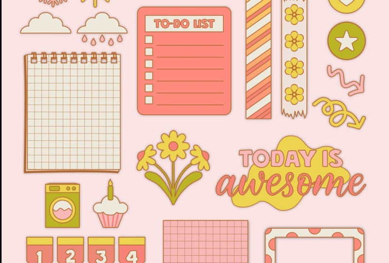
on the market. Functional and decorative. Functional stickers, which is what we're going
to be focusing on, are designed to help you stay organized and manage
your schedule and tasks. These stickers often
feature icons and symbols that represent different
types of tasks or events, such as meetings,
appointments, and deadlines. Then there are
decorative stickers. Decorative stickers
are created to add some visual interests and personality to your
planners and outlines. These stickers often feature cute or whimsical designs
that are fun or funky. Things like illustrations,
animals, flowers, or food. But there's all kinds out there. We will be focusing on the functional type of digital stickers in
this class today. But we have a few
decorative ones thrown into the layout as well when it comes to finding inspiration
for your stickers. Pinterest is a fantastic option. I have created a
Pinterest board with digital sticker and
planner inspiration. And I'm going to
leave it linked in the class description
box for the course. You can also find inspiration or even sticker sets to buy for personal use on sites like creative market design
cuts and even at C, there are a variety out there. You'll want to find what
suits you in terms of design concepts and then you can customize them to
your own needs. Now that we have a better understanding
of the sticker types, let's jump into actually
creating our own set.
6. Setting up the layers and color palette: Now that we have gone through
the Affinity Designer app, let's actually start
designing our own. What I'm going to do
is actually import a sketch that I've
created from procreate. But as I mentioned when we were going through
the interface, you can sketch in affinity
designer as well. You don't necessarily have
to sketch somewhere else. It's just I was
already working in procreate and I
worked on some ideas within the app and then
I just exported this as a J peg that I'm now going to bring into affinity designer. I'm going to go into
my Document menu and I'm going to select place and it's going
to allow me to place an image from my files. I already saved
this in my photos. What I'm going to
do to place it is basically once I've
selected the image, a hit. Okay, Then you can just drag your pencil across your screen. I designed in a four
by six page ways so it fits perfectly in that. I'm going to select my Move tool just to fine tune everything. It's okay if it's not perfect. Um, you'll be basically
drawing over this. The sketch doesn't
have to be perfect, it just has to give you an idea of what you're
planning on creating. I did a combination of some more functional stickers
like a two do list and a few decorative stickers
so that you can get used to designing some more of the creative
stickers as well. Like I have some
washi tape flower and then some other washi
tape with some other designs. All right, Now that
I've placed this in, what I want to do is set up my layers so that we
can work with this. I'm going to have this
layer at the very top, but I'm going to change its
settings to multiply so that I can see whatever I'm
creating underneath it. It creates like the
see through effect. I'm going to go into
my layer studio, I'm going to tap on my artboard, There's a little carrot to the left of the
artboard, thumbnail. I'm going to tap on
that. And then I'm going to select my
photo that I place, and I'm going to
change my settings from normal to multiply. It's not going to look
like much is done, but we'll see its effects once we add an additional layer. What I'm going to do,
add a new vector layer, but I don't want that layer above my photo, I
want it below it. Because if we add
something above, let's say we kept that layer
above and we added a shape, it's going to block out
that image below it. And we're using this as a guide, so it's helpful to
be able to see it. You can multiply
that updated layer. But I notice that it plays
around with the colors, and I want the colors to be as true to what I want as possible. Instead, I'm going to take that layer, that
new vector layer. I'm going to drag it so that it goes underneath my photo layer. And then what you'll see is
when I add in a shape, again, we go over it, we can see that outline still so we know what
we're working with. And it just makes it easier. I use the same process when
I'm drawing in procreate or coloring within
affinity as well. But it just makes it
easier to be able to see your guidelines so
that you can just like design within those parameters. All right, So I'm just
going to undo that. I'm going to tap on that layer. I'm going to go into my layer
options at three dot menu. And I'm going to tap
where it says layer one. And I'm just going to
rename this sticker layer. And then I'm going to
hit, okay, I'm going to go back out of my layer options. I'm going to go into
my photo layer. I'm going to tap on that
three dot menu again. I'm going to select lock. That way this little sketch doesn't move around and
you won't run into issues. The only thing that
you want to just remember is to make sure
that when you're working, you're working on
your sticker layer. Now that I've set that
up, I'm going to tap on my layer studio,
so it pulls back in. Then what we want to do really quickly is set up
our color story. I'm going to share a file with you all that includes
my color, Palett. But you are welcome to use whatever colors
that you'd like. There are a few websites
I'd like to visit, but in this case, I just use Pinterest to find
some color stories. I love when they create these
little color guides here with the hex codes or
the pantone codes. I saved a color
story that I really liked and it's really
just based on a drawing. I'm going to screenshot it. To screenshot, all
you have to do is press your side volume, the top button, and
your power button and it'll screenshot
the image for you. I'm going to escape
out of interest. Now I'm going to go back into my affinity
designer file here. Then I'm just going to
place that screenshot image into this file so
that we can pull the colors from it and
then we'll get rid of it. I'm going to go into
my Document menu. I'm going to select Place again, and then I'm going to
go Place From Photos. I'm going to select
that picture, hit Add, and then just place it in, but I'm going to
make sure that it's on top of my layers here. And then I'm going to delete it, so I'll just drag
it to the top so it goes above my artboard
in my layers. I'm going to zoom in so we
can see what we're doing. We're going to utilize
that Eyedropper tool that we learned about when we were first working
through the app. So I'm going to tap
on the colors that I want to create a color story. So I'm going to go
into my color studio, and then I'm going to
go down to where it says Swatches. I'm
going to tap that. And then I'm going to create a new Swatch library so
I don't get confused. So I'm going to go into my
three menu and my Swatches. And I'm going to select
Add a document palette. And then I'm just
going to name it. I'm going to hit okay,
and it's going to give me a blank palette here. Now what we'll want to do is we can select the
eyedropper tool. You can either pick it from the left hand side
towards the bottom, or you can tap on the
little eye dropper that's right next to
our current colors, then making sure that the
image is de selected. You don't want it
outlined in blue. I'm going to tap on
my black arrow tool, my move tool, and then I'm going to tap
outside of the image, so it's de selected. I'm going to go back
into my color studio, making sure I'm still
in my swatches area. I'm going to tap on my
image to pick up the color. And then you'll see that it'll pop up in the color studio here. Then what we'll
want to do is add that color to our palette. To do that, we're
going to go back into that hamburger menu and we're going to add current
fill to palette. And it'll add it to our palette. I'm going to continue
this process tapping on the colors
with my eyedropper tool, going into my swatches, Selecting the hamburger menu and select Add current
fill to palette. If you need to get
a certain color that it might feel like it's
hard or difficult to tap, you can just zoom in
to take two fingers. You swipe out with both
of them to zoom in, and then you pull in those
two fingers to zoom. I'm going to zoom in so that
I can tap this darker green. Then I'll go back into
my color palette. Go into my swatches, hamburger menu here, And then add current fill to palette. Once I've selected
all the colors in the design that I like, I now have a color palette specifically for the project
that I'm working on. You don't need to have
this many colors. If you don't want, you can
have a more limited palette, or you can go wild and pick
as many colors as you'd like. Once you're done with
that, what you can do is get rid of this image. So I'm going to go
into my layer studio. Select that photo
that I placed in, and then tap on that
little trash icon and it's going to delete it.
7. Designing the stickers part 1 (functional): Now making sure I'm
on my sticker layer, I can begin to build out
some of these stickers using my shape builder tool
as well as my line tool. Let's start here. I'm going to create this little
like title tag. This is a really simple
design actually. We can utilize rounded
rectangles to build this and use the
geometry functions to merge shapes together. I'm going to go to
my left hand side, select my rectangle tool, tap on it twice so that
I get this pop up. And then I'm going to
select rounded rectangle. And then to make sure I go into my color studio and I'm going to pick a color for this design, I'm going to start
with this dark blue, just so that it's easy to see. Then I'm going to start to pull this across
to create the shape. I want this curve to be
just a little bit tighter. So I'm going to zoom
in and adjust my curve here with that little red dot and I'm going to just
pull it out just a bit. Once I've done that, I've
created the shape that I like, then I'm going to
go in and create another that goes on top. I'm going back into
that shape tool, select round a rectangle, then I'm just going to create another rounded rectangle that will go on top of this one, making sure that my curves
match up with the side. And then pulling
this up so that I get this tag looking feel to it. Once I've done that, I can
just go to the side here and just make sure everything
lines up perfectly. And if you're having
trouble with this, you could just turn
on magnetics and your upper right hand side tap the little magnet
icon and it'll help you to like match everything up. Once I'm done with that, what
I'm going to do is utilize the geometry tool
that will allow us to merge these two
shapes together. If I tap on one, you'll
see there's one shape, I tap on the other,
there's another shape, but we want it to
be one big shape. So I'm going to select
my black arrow tool, and I'm going to
drag over both of these shapes so that
they're both selected. And then I'm going to go
into my geometry tool. It's right here in
the upper menu, in the center, right next
to our alignment tools. It looks like a square in a circle with a
plus on the circle. If we tap on that, that gives you all of our
geometry functions. What we want to
do is select Add, then it'll create
one whole shape. Now, we don't have
two shapes together, we have one that creates this nice outline
that we wanted. Now I want to add space
where I can write. I'm going to update my
color in my color studio, and I'm going to utilize this off white color
that we have here. And then again, I'm
going to go back into that shape tool. I'm going to go into my
rounded rectangle and then I'm just going to
follow the outline that I have in here and give myself a little area to write in with that magnetics
turned down. What's nice is that we can make sure that everything is
placed right in the center and you'll see you get
these little lines that help you to gauge if things
are lined up that way. I have a nice even
amount around it. Once I've done that, I don't
necessarily need to use the geometry functions to
merge the shapes together. I just want to keep
these elements in one folder. We're
going to group them. I'm going to select the
black arrow tool and I'm going to drag across both of these shapes so that they're both selected. And if you go into your layer studio on the right hand side, you'll see that both
of those layers are now in fact selected. They're highlighted in blue. Then we're going to select this little folder icon and it will give you all
these additional options. But in this case, we just
want to select Group. And it'll group
everything into a folder. Then you can rename this group by tapping
on the three menu. Tapping where it says
Group, and then hit. Okay. This is just an easy way for you to keep track
of all of the layers. Now I want to add
some text so that I know what this little
note card is for. I'm going to go into
my color studio. Select that off white again, making sure that
this is de selected. I'll tap on my black arrow tool, tap outside of the shape. And then I'm going to go into my color studio and I'm going to update my color to
that off white again. Then I'm going to go
into my text tool. My type tool utilize
the artistic text which just gives you an
ongoing line of text. Or you can use your frame
text tool which will give you like parameters that
will keep the text in. I like doing that just so
that I know where things are. I already have a font selected,
but we can update it. I'm going to see what
this looks like, but if you look at the very top, you'll see you have your
font options. You can. Right now with mine you can see it's as American Typewriter. But if you tap on it and
you can scroll down, you have all of these options
for whatever fonts are included in your app and that you have installed
on your ipad. And then you could also adjust the size of the font as well. In my case, I need
this smaller than 15. I think eight should be good. And then you can write
whatever you'd like here. I think I'm going to either
do meeting or appointment. If you notice the color is not the same as
what you selected, you can just double tap with your apple pencil on the
letter and it'll highlight it. Then you can go back
into your color studio, or you can just tap on the color options right
next to your font options. It'll be right next to
the underline selection. Right now it's black. And then
you could update it based on your recent colors or
based on your palette. You can just like scroll
through the options here. And I'm going to go to
my sticker palette. And I'm going to
select that off white, and it'll update it for me. I think this might be
a little too bold. I'm going to change this
from bold to regular. Then it looks like
it has an underline. I'm going to double tap again. I'm going to go to these
additional options right next to my color options, and I'm going to select
the underline option. Then once I've typed that in, I can see if I like
this font or not. I think it's fun. Has like
a bit of a typewriter feel. I think I'm just going
to keep that for now. And then what we
can do, we can go into our layer
studio and you can turn off your drawing so you
can see what it looks like. Now that we are
done with that one, I'm going to turn my sketch back on and then I'm
going to just go through my sticker
sketch and just continue outlining and
building based on my designs. I like having
little arrows point things out or highlight
something that is important. What's nice is that you can either use the pen
tool to create this arrow or you can just
utilize the arrow shape. If you go into your shape tool, we have an arrow option. You'll see all of the
options or all of the settings for
that arrow option at the top of our menu. To create the arrow, all
we're going to have to do is drag across. All right, as you see it's
that default double arrow. What we have to do is go up into our menu here and
tap on one side. And change it from
arrow to none. And it'll change it
into this basic arrow. Then what we can
do is rotate it. A quick trick so that
you can rotate in perfect increments is
hold your finger down. When you're rotating,
it will rotate in 15 degree increments
so that you can get to exactly 90. This isn't exactly the style of the arrow that I've drawn. I can just go in and refine. I'll select my node tool, which is that white arrow. I can adjust the nodes of the arrow here so that
it's a little bit lower. And then I can also adjust the width and the angle as well. To adjust the width, you'll have that red node on the side. Drag it out, right?
That gives me more along the lines of
what I'm looking for. And then I can just resize
it so that it fits my arrow. It's really simple and
quick way to do this, or if you want to practice
with the pen tool, you can also practice
with the pen tool. What we'll do is I'm
going to turn off the fill and just use an outline so you can see how this works. I'm going to go into
my color studio. I'm going to turn
off my color fill, and then I'm going
to tap on my stroke, and then I'm going to
update the color there. Then I'm going to use the
sketch as my guideline. I'll select the pen tool, adjust the stroke if
you want here as well. Or you can go into
your stroke studio here and adjust the
stroke here as well. All right, now what we're
going to do is just basically use line segments
to build this out. So I'm going to start within
the inside of my arrow here. I'm going to tap and then
I'm going to hold my finger down so that I get
a straight line. Then if you're noticing
your line looks strange, it's probably because
we didn't change it back from that data line. We can just go back to a
straight line by going into our stroke studio here
on the right hand side, which is underneath
our color studio. And then just changing our stroke from
that data stroke to a regular stroke and your
join is a sharp angle. Now I can continue
building this out. Once I've created
that first stroke, I'm going to tap on
the last point and then tap on my top point. And then just continue to
follow the shape that I'm building using these
line segments. And then closing it off by
tapping on that last point. Then if I go into my layers, I'm going to turn off my sketch. So you can see this is
what it looks like. We can go back into the
stroke if you want to adjust how things are joining. I think this rounded
join actually gives me a better shape for
what I'm looking for. Now that I've done
that, then I can go in and refine this
just a little bit more. I'm going to turn my sketch
back on by going into my layer studio and tapping on that little tago menu
to turn it back on. And then I'm going to
select my node tool. Then I can just
refine my nodes and adjust based on what I want
this design to look like. You can keep this as an
outline or you can fill it. If we're going to
fill it, I'm going to go back into my color studio. I'm going to remove my stroke. I'm going to tap on my fill, and I'm going to select
that color again and it'll give me the
fill that I want. If you want a thicker arrow, you can keep your stroke on as well and that'll give
you your final shape. All right, I'm going to
delete one of these. I'm going to keep my hand
drawn one because I like that it's not perfect and it's
a little bit softer. Then we'll continue on next. What I want to do is
create this to do list, these are fun to make
really simple and easy. It's just line segments, your shape tool, and some text. Then I'm going to
go into my color studio and update the color. What I think I'm going to use is the off white color again. And then I'm going to go into my shape builder,
my shape tool here. And then I'm going to select
the rounded rectangle. And then I'm just going to
start building over this. As you could tell,
my rounded edges are not as refined as
the one that I drew. All we have to do is go in and adjust and then I'm going to resize this
as well. All right. Once I've done that and I
have the shape that I like, I can go in and add my lines
and then I can add my text. I'm just going to be using my pen tool to
create these lines. We don't have to make every
single one with Nic as we can make one and then
copy and paste them. So I'm going to create
this first line and I think I'm going to have the lines be in
this kind of like burnt umber sienna,
red looking color. So I'm going to tap on one side of the line
that I have here. Hold my finger down to create a straight line,
tap on the other. And then if you notice that you don't have color or
you don't see your line or just go into your
color studio and then tap on your stroke
and then update the color. Actually, I don't like that more red looking color on this. It feels like it's
going to be to bold. So I'm just going to select like lighter brown tan kind of color. Then I'm going to adjust
the size of my line to be one point as opposed to 1.2 And then I'm going to make sure
everything is straight. If you notice, if you're having a hard time figuring out
if your shape is straight, I just go back into
my layer studio. I'll turn off the sketch and
then check it from there. In this case, my brown
line is a little lopsided. I can just tap on my node tool and I'm going to turn that sketch back on so
I can see what I'm doing. Obviously, my sketch was a
little off. That's okay. Now that I've done, I've
created that first line, I'm just going to
copy and paste it. I'm going to tap on my layer studio so it
moves out of the way. I'm going to select
three fingers, I'm going to swipe down,
then I'm going to copy. Then I'm going to select Paste. And it'll paste it right on top. I'm going to hold
my finger down on the screen so that I can drag this new line down so
that it moves straight. Once I've done that, I can then paste again and keep
adding the lines in. Once I've pasted a few, then I can just go
into my black arrow, my move tool,
select those lines. I'm group them in my layers menu by tapping
on my layer menu, going into that little folder, icon selecting group they're all together. Second,
move them as one. And then I'm just
going to duplicate that whole entire set and
fill up the rest of the page. Then I'll create that long
line on the right side, or you could do it
on the left side. I'm doing it on the right
because I'm going to use this almost like a check mark. Once I've done
that, I'm going to select my pen tool once more, Tap on that first line, hold my finger
down, and then tap on the last one to
create a straight line. Once I've done that,
I'm just going to tap on that first
group of lines, Hold my finger down,
tap on the second group of lines so that
they're both selected. And then I'm going to utilize my Align tool and
I'm going to make sure that they are aligned
right, everything is aligned. And even this looks nice, but I want to make sure
that things are lined up and even I'm going to select the straight
line that I've created. Zoom in. And then I'm just
going to pull it up so that it blends into the rest of the horizontal
ones. All right. I'm going to turn my image
back on and I'm going to use my text tool to add to
do lists at the top of this. What I could do is also
just select that meeting. Text that I added, go
in to my Edit menu, or use my three finger swipe
down and select Duplicate. And then just drag it down. I'll need to update the color. Of course, I'm going
to update it so that it matches the lines. Tap the text so that
everything is selected. I'll go into my color
studio and then I'll select that brown
and it'll update it. And then I'll just use my
move tool to drag it down. If it disappears, that's because it's probably behind this image. So I'll go into my layer
studio and then I'll drag the meeting layer
so that it goes above the two do list image. I'm going to increase the
size of my parameters around this text by tapping on the outline and
dragging it out. And then I'm going to double
tap where it says meeting. And I'm going to update
it to say to do list. I might increase the
size of this just a bit, so I'm going to select
it by double tapping. And then I'll go into my font options at the
top, in my menu here. And then I'll increase it. Then I'm going to make sure
I group this all together. This is the final design. When I tap on this final design, what we can do is double check to see what our
dimensions are with things. Always suggest
designing your stickers bigger rather than smaller
because it's always easier to scale them down in your digital note taking app versus having
to scale them up, which often will
cause pixelation. If we tap on this design now, and we can go down into
our transform studio, if we tap on that, it'll tell us exactly how big the sticker is. This is 1.17 " by 1.5 ". It's 1.5 " long by just a
little bit over an inch wide. Always increase while
you're working. Say you feel like you wanted a sticker that's a
little bit bigger. You can increase in affinity designer as we're
working because it's a vector. But once you export it, if you want it any bigger, you may not be able to do that because it'll be pixilated. I'm going to turn
my sketch back on. I'm going to start working on
some of these posted ideas. These are really
simple, just squares, making sure we are on
the correct layer. I'm going to go in and
update my colors here. I'm going to tap on
my color studio. I think I'm going to use
some of the sage green. And then I'm going to make
sure I don't have a stroke. I've created the square here and now I want to add the
little check boxes. I'm going to go back
into my color studio making sure that square is selected so we don't
change the color of that. Go back into my color studio, I'm going to select like this off gray that I have my film. I'm going to go back into my rectangle tool and I'm
just going to create some squares to go
on the side of this. Once I've created one, I can
just copy it and paste it. Just three fingers down. I'm
going to select duplicate. And then I'm going
to drag it down, and then I'm going to
do that process again. This is the power duplicate. Once you've duplicated something, and then
you've moved it, you can then just
continue to duplicate it, and it'll do the same
thing all the way down. I'm going to select all of these and adjust the placement. And then I'm going to
use my rounded rectangle to create the rest of these. Also, if you opt you don't necessarily have to
have these as fills, you could also use
an outline instead. Instead of having a fill, I can change this
to an outline two. Once I've made that rectangle, I can just do the
power duplicate again. Take three fingers, swipe
down, select duplicate. I'm going to move it
to where I'd like it. Then I'm going to
power duplicate. Just duplicating
it two more times. All right, once I
have that done, I'm going to select everything and then just fine
tune the placement. And then I'm going to zoom out, select my black arrow
tool and select across everything including
the green background. And then I'm going to go
into my layer studio here. And then I'm going to
select that folder icon. And I'm going to group it so that it's all grouped together. And then I can move
it as one thing.
8. Designing the stickers part 2 (functional): All right, now I'm
going to create a gridded paper posted note. Yeah, for this one I'm going to utilize the shape tool and then create this corner with a pen tool and then merge
the shapes together. I'm going to go into
my rectangle tool. I'm going to update the color. I'm going to have this
B that off white color, and then I'm going to have
the lighter blue grid. I've done that. I'm going to create the shape
based on my sketch here. Then I'm going to
create the corner here. To do that, I'm going
to go into my pen tool. I'm going to update the
color in my color studio. I'm going to go into
the color studio. I'm going to select
that other version of that cream color because
it's a little bit darker. And then I'm going to
select my pen pool. Then I'm going to create the shape by using line
segments and curves. I'm going to tap on one end, hold my finger down to
create a straight line, tap on the other end, and then continue to
create the shape. And then what I'm going to do, instead of adding some
additional points, I'm going to close this off, like hitting that initial point, hold my finger down, and then
drag my apple pencil out. It's going to allow me
to create this curve. It's okay if it looks
a little wonky. We can select our
node tool to adjust, then it's going to give
me the curve that I want. I'm going to go back
into my color studio, make sure that the color that I was trying to create it
with has been selected. Then in order to get rid of this point from the
original shape underneath, I'm going to use our slice
tool to select the knife tool. I'm going to select
my rectangle, and then I'm going to
select my knife tool. And I'm going to zoom
in so you can see this. I'm going to basically
cut off this corner. I'm going to use this
knife tool and it allows you to create
an intersection. And then you're able to then remove this additional piece. And I'm going to delete that
by tapping on my trash can. You can create this
curve like this simply. But I created the
additional piece to go on top because I
want to have that idea of a shadow so that it looks
a little bit more realistic. Then we can go into
our Layer studio, select that folder icon, and then select Group. It'll be all grouped together. Now we can go in and
add the lines as well. To create that grid, I'm going to turn that
sketch back on, then I'm going to utilize the pen tool once again
to create these lines. I'm going to make sure
my color is updated. I'm going to go into
my color studio. I'm going to select that
light blue and then go back into my pen tool and then
just start creating lines. Go back into my color studio, select my stroke option, tap that blue, and then
go into my stroke studio. And then I can increase or
decrease the size of the line. Once I've created
that first line, I'm going to do that power duplicate to create the
next set in the grouping. Once we get to the area
where we would be, essentially that line
would be behind the fold. We can just then stop
and then we can go in and edit the
length of that line. I'll go into my move tool by
tapping on that black arrow, tap on the line, and
then I can adjust. Also, if you're noticing
any of your lines are going off of your page. What we could also do is go into our layer studio, tap on them, or tap on the first
in the series, and then swipe right over the next one until all of
the lines are selected. We can group them using our
folder icon select group. And then we can take
that whole group and we're going to
drag it so that it goes literally on
top of that original, like white piece of paper. And it'll get housed
and cropped into this page so that the lines
aren't falling off the edge. And then you don't
have to worry about lining everything up
so close that you have to zoom in to get
the edges correct, you can just create
a clipping mass. The next thing I
want to do is add a little bit of
shadow effect here so that it feels a little
bit more three D and more realistic
with that fold. I'm going to select that curve, then I'm going to go
into our FX studio. Then I'm going to
tap on outer shadow. Then I'm going to adjust the shadow with
our sliders here. I'm going to increase the
offset just a bit to do that. Once I have this turned on, I'm going to tap on
my sliders here. I'm going to adjust
the angle first, and then we can
adjust the radius. I want the shadow
to go this way as opposed to this way for
this little fold here. I'm going to tap on the
middle slider here. And I'm going to change
it from radius to angle. Then we can adjust the angle. Then we can the offset
well at the bottom, I'm going to adjust the angle
just a little bit more. It goes directly to the left
as opposed to the right. Once I have that
little shadow outline, then I can adjust how
far offset it is. Then we can adjust the blur. I can adjust the
intensity of it. I'm going to adjust
the intensity. I'm going to tap that
center slider once more and change it
from angle to radius. Then I'm going to increase
the radius just a bit so that it blurs
it a little bit more. I'm going to go back into
angle again and adjust it so that it doesn't
anything from the outside. Now, I realize I wanted
to have more of a grid. Once I've added that
paper on, I've edited. Once I've added the
horizontal lines, then I can just add
vertical lines. By copying those
horizontal lines, I'm going to turn off
my sketch once more. So we can see this a
little bit easier. I'm going to select my group of lines and I'm going
to duplicate this. I'm going to tap on my
layer studio to pull it in. I'm going to do a three finger
swipe to select duplicate. And then I'm going to hold my finger down and
I'm going to rotate this to a 90 degree angle. Then if I need to, I can go in and adjust
these lines as well. I'm just going to select my black arrow
tool, my move tool. I'm going to double tap on the lines so that I can
get a direct selection. And then I'm just
going to adjust and move it so that they
go beyond the edge. Now we have this little
grid posted note. I'm going to go back
into my layer studio, turn on my sketch. Then we'll keep moving on
using our shape builder and our line tool to create
the rest of the stickers. What we'll do now is this
little notebook looking thing, like a ring notebook, because it's a little bit
more complicated. We're going to create our shape, then we're going to
use our pen tool to create these rounded rings. Let's select our rectangle tool. I'm going to have this that
off white color again. The lines will be more
of that darker blue. Let's first start
with our shape, and then we're going to
turn off our stroke here, update our color
to that off white. And then we're going to
create our rectangle. All right, now that we've
created the rectangle, we can add the
squares to the side, and then we'll add
a little shadow, and then we'll start working on the rings to create
the cut out here, what we're going to
do is just update the color in our color studio
so that it's easy to see. I'm going to select the blue, and then I'm going to
create squares that will go over where
the edge would be. Then I want to make sure
I have enough space between the edge of the
page and the paper. I'm going to update
this color so you can see this a
little bit better. I'm actually going to
change the color of the page to this light blue so it's a little bit
easier for us to see. All right, once I've added
that little rectangle, I'm going to then go back
into my layer studio. Turn on my sketch, so I know how many
more I wanted. I'm going to select
my move tool, tap on the little rectangle and then three
finger swipe down. I'm going to select duplicate. And then I'm going to drag it
down to where I'd like it. Then I'm going to do that
power duplicate move again. I'm going to take three fingers, drag down select duplicate. Continue to do that until I have the number of
squares that I want. Once that's done, what
I'm going to do is group all of these
squares together. I'm going to select one in
my layer studio and then drag right across the others
to select all of them. I'm going to select all of them. I'm going to group them
using that folder icon. I'm going to tap on group. Then what I want to do is
knock out this shape from the rest of the page so that
it creates paper holes. I'm going to have that
group selected and then I'm going to select the
light blue rectangle. I'll know both are selected because they're
outlined in blue. And then I'm going to go
to that geometry option and I'm going to subtract. And basically whatever is
on top of the blue page will knock out some of the color that is in the
shape of that design. I'm going to select subtract, and it'll remove that
part of the blue. You get this little paper hole. Right. Now that I've
done that, I want to add the little shadow
underneath this. I'm going to use my
Pentool actually, to create that shape, I'm
going to select my pen pool. And then I'm going to
start not exactly center, but lower center on
the left hand side. And then I'm going
to tap around to create this little
shadow effect. Once I've done that, I
can update the color. I'm going to go into
my color studio. I'm going to select
that dark blue. Then I want to make
sure that I can see it. Then I can use my No tool
to adjust this as needed. All right, now that
I've done that, I can do our little curves and then we can add our lines
to the center of the page. I'm going to select
my move tool tap outside of the shape so
that it's de selected. I'm going to go into my color
studio making sure I have that blue selected so I can
create the rings out of this. And then I'm going to
select my pen tool. Then I'm going to create
the curves with this pen. I'm going to tap on the inside. I'm going to make
sure that also within my color studio that I
have my strokes selected and no film use bezier
curves to create this shape. I'm going to tap inside
for my first point, inside of the area
that we knocked out. And then I'm going
to go to where the first curve
starts to dip down. Then I'm going to drag
my apple pencil down. Then I'm going to create one
additional point that will go behind page to create
like this little ring. And then we can go into our Stroke studio and adjust the size of
this if we'd like. Then we can go into our Node tool and adjust
the placement as well. Fine tune the overall
curvature as well. All right, once we've
fine tuned our curve, what we can do is
adjust the placement of it so that it looks
like it's behind the page. If you're finding that your
curve is in front of it, you can just pull in
with the node tool and you can do the
same concept here, so that it meets at the bottom. That way it looks like it's a ring that's completely behind. Once you've done
one, you can just copy that and paste them
into the other ones. We'll just go into our edimnul duplicate and then drag it down so that it
goes to the next one. And then we'll do the
power duplicate by just dragging three
fingers on your screen. And then select Duplicate. If you need to, though,
you could always go zoom in really close and fine tune everything by selecting
your node tool and then bringing everything down. Once you've created all of that, then we can go into
our black arrow tool, select everything, go
into your layer studio, tap on that folder,
and then select Group. It's all one element. Now we can add our line work. I'm going to turn
my sketch back on by tapping on it in
my layer studio and toggling it on so I can count to see how
many lines I had. It looks like I had
ten lines here. I'm going to turn this off
once again just so that it's easier for me to see as we're working on this
specific element. I'm going to on my black arrow to tap
off of my selection. Then I'm going to go
into my pen tool. I'm going to go into
my color studio. I want to make sure that I have my stroke selected and I'm going to use this off
white for the lines. And then I'm just going to
start creating lines that go across from one end, hold my finger down to
create a straight line. Then I can go into
my stroke studio to adjust the width
of that line. Then I can copy it
and paste it as well. I'm going to select
my black arrow tool. Tap on the line itself. Three finger swipe
down, select duplicate. And then drag it the distance
that I want it to go down. Then I'm going to do that
power duplicate by then just three fingers
down, duplicate. And then it'll move it for me. All right, once I'm done with that and I have
everything duplicated, then I can go into my
layer studio and all of those lines hold my
finger down and then tap on the blue to deselect
the page part. Then I can go into
my layer studio and select the folder icon
to group everything. Then what I did
before with the grid, I'm going to mask these
lines into this page. I'm going to select
that group of lines. And then I'm going to
drag it so that it goes right into the blue page. That way masks everything and anything that don't have color behind it.
It's masked within. And you don't see the
lines in there anymore. All right, before we move
on to the rest of these, what I want to do is add some shadows to some
of these designs. You can opt to not do this. I'm going to select,
for example, this to do list. I'm going to tap on
the entire group. Then I'm going to go
into my effect studio. And I'm going to tap
on outer shadow. I'm going to tuggle it
on by tapping on it. And then I'm going
to tap where it says outer shadow To get our
options to the left. The adjust using our sliders, then we can adjust the opacity, how dark it is. I'm going to make it
a little less dark, but you can see
if I increase it, it gets really dark. But if I decrease
it, it just gives us just an inkling of a shadow. I think this is a really nice
effect. It's really soft. We have a 42 degree angle, 4.34 0.3 pixels for our offset, we have 19% opacity. I'm going to keep these in mind, these settings and apply them to the rest of the
stickers here.
9. Designing the stickers part 3 (functional): All right, so I've updated the color of the background
so it's just a little bit easier for us to see
what these stickers look like now that
we've made them. If you can tell the
shadow is very slight, but it gives us nice effect. Now we can move on to
the rest of these. Let's go back into
our layer studio. I'm going to turn on my sketch then to figure out what
else I want to create. Once we get all
the big ones done, we can start making some of these little icons that are
a little bit more creative. I'm going to create a
polaroid shape here, just like what we did with
this little page here cutting out the shapes from inside
that original shape. We're going to do that
concept so that we have a transparency
so that you can put this little polaroid sticker on top of an image
in your planner, or maybe your scrapbooking. Using a digital scrapbook,
something like that. This is a great way to do that. I'm going to utilize
my square tool here, and polaroids are usually
like an off white, so I'm going to use that
off white color again. I'm going to create
the shape and then I'm going to tap out of
this so that it deselects. I'm going to go back into that selected darker colors
that can see what I'm doing, and then create another
square on the inside. The outside is more of a rectangular shape and then the inside will be
more of a square. Then what we'll
want to do is cut this blue out from the white so that it
gives us a transparency. I'm going to tap on that
rectangle in my layer studio, and then swipe right over the white rectangle so
that they're both selected. I'm going to go into my
geometry options here. I'm going to select
my black arrow tool. I'm going to tap on the
geometry functions. Then I'm going to subtract
and it'll knock out the blue. Keep in mind whenever
you're using subtract, it's whatever is on top is what's going to be subtracted
from the bottom shape. We can add a shadow if we want. You can add text to
this if you want. You can just like
select the two list, duplicate it and
then drag it down. Then we can go into our layers and we just
want to make sure that that is above the Polaroid. We can double tap to
select everything. And then our keyboard will come up and you can write
something like memories, or you don't even have to
write anything on this at all. I'm going to double
tap to select it. And then I'm going to decrease the size of the font just a bit. It's not so in your face. All right, once that's done, we can create these Washi tapes. I suggest using your pen tool
to create some of these, but some of them that are
really simple, like this, we can just create
using our shape tool. I'm going to select
my rectangle tool and then I'm going to create a rectangle that goes over this, making sure it's the length
and the width that I want. I'm going to update the color. Then I think I'm
going to add white stripes to the inside of this. We can use the pen
tool to create these 45 degree angle diamonds, then we can fill it with color and then just copy
and paste them. Then we can crop them in
by using that layer mask. I'm going to do that
power duplicate. So I'm just going to
make sure that is selected using the black
arrow tool. Tap on it. And then three finger
swipe down, duplicate it. And then I'm going to
drag it to the next area. And then do that multiple times until I fill the
rest. All right. Once I've done that,
what I can then do, I'm going to select all of those white angled shape and then I'm going to go
into my layer studio. I'm going to go into
my grouping options. I'm going to tap on that folder, select Group, they're all
going to be selected. And then I'm going to
take that selection and I'm going to drag it so that it goes on top of the pink
rectangle that I've made. That way it basically crops in that shape so we don't have to worry about lining things up. If I turn off my sketch, we can see how that looks. There we go. And I've created a simple angled stripe wash. Now that we've added detail to
some of these elements, we can continue to build off of the final, remaining
larger pieces. I created a little
calendar flag. You can make as many
of these as you want. You can do zero through nine so that you can
put them together to add additional numbers
or flags to your layouts. But for now, I'm just going
to walk you through creating the one and then you can make additional ones if you'd like. We're going to utilize
the rectangle tool. Usually when I see these
they're like red and white. We are going to use a white, that off white color
and then we're going to add more of that brownish to the top so that it flows with our
color story here. Once I've made the rectangle, I'm going to go back
into my color here. I'm going to remove the. Stroke. Tap on my color fill and update it to that off white. Then I'm going to go back
into my color studio. Select that like brownish red. Create another rectangle
with this color on top, making sure everything lines up. Even if it doesn't,
we can also do the masking trick
where I can take that rectangle and then
just drop it right on top the white rectangle. All right, looks
like I have it in. What I'm going to do is use the circle ellipse tool and I'm going to do
that knockout effect. Create a circle on
top of the red. Hold my finger down to that, I get a perfect
proportion circle and then resize it as needed. And then I'm going to go into my layer studio on the right. I'm going to make sure that
ellipse is selected and then drag right over the
rectangle grouping here. I'm going to go into my
geometry tools here at the top, in the center of my menu. And I'm going to
select Subtract, and it'll delete that
shape so it's more of a transparent hole that goes to the top like you might
see with a calendar. That is what that
will look like. And then we can add a
number using our text tool. I'm going to go into my artistic text tool and
I'm just going to create a letter that's similar
in size and make sure I update my text at the top
to that American typewriter. I'm going to go
into my number menu here and just type in one. And then I'm going to double tap on the one and go
into my color studio. And then update the color so it matches what is in my
color palette here. Once I complete that, then
I can go in my tools here, select my black arrow
tool, the move tool, highlight over this
entire grouping. Go into my layer studio, and then select my
little folder icon and group everything together. I'm going to do the same
process here with this heart. I'm going to use my circle tool. Start creating my shape. Pull
my finger down so that I get a perfect proportion circle. Resize it as needed. I think I like the idea of
using this pink color here. Then I'm going to use
my heart shape as well, which is at the bottom. You may need to scroll up using your apple pencil,
Select the heart, and then make sure I update the color I'm going to
use off white again. Then I'm going to create a heart that goes right on top of this. Then if you zoom in, you see
you have access to adjusting the nodes so you can adjust how deep that indent
is at the top. Once I've done that, then I'm going to go into
my layer studio. Select the heart, select the ellipse by dragging
right over it. Go into that folder
icon and select Group. We can also go in as we're creating these and
add those effects. We can go to the
right hand studio, select our effect studio, and then go down
to outer shadow. And then you can
go in and adjust your settings to give
yourself a little shadow. Do these little arrows. We can utilize our
pencil tool for this. It makes it really
simple and easy. We can update our color
in our color studio. I'm going to select
my pencil tool, and you want to make sure that your stroke is turned
on in your swatches. Then I'm going to create the arrow and then I can go
in and adjust as needed. Again, you can adjust your
cap so things are more rounded versus squared or
pointed, things like that. Using these additional
options underneath, then you can opt to
just continue to use the pencil tool to make the rest of this arrow and
then connect everything. It gives it a little
bit more of that hand drawn effect versus
it being perfect. If you use your pen tool to create more of
a vector shape, but you can still go in
and select your node tool, that white arrow tool, and
adjust your nodes as needed. Once you've done
that, then you can just select both sections of the shape in
your layer studio. Tap on one jug right over
the next to select the, tap on that little folder
icon and select Group. And then we'll do
the same process with this little
arrow here below it. I'm going to create
this little flag again. You can make as many
of these as you want. I just want to show you
how to make one and then you can opt to
make additional ones. Is basically use our
shape builder as well as our geometry functions
to create this flag shape. But you could also use your pen tool to
create the same shape. I just think it's quicker
to use the shape tool and then the geometry
bullion function. I'm going to select a rectangle. I'm going to go into
my color studio. I'm going to go into my
color studio and update it. I think I'm going to
use this light blue. Then I'm going to
create a rectangle and then I'm going
to go back into my color studio and
I'm actually going to change this to a fill. And then remove my stroke. And then I'm going to adjust the shape of my rectangle here. And then I'm going
to use a triangle to cut out this one end. I'm going to select
my move tool, tap outside of the shape
so that it deselects it. I'm going to go into
my color studio. I'm going to pick a new color so that I can see what
I'm working with. I'm going to go back into
my shape tool and then I'm going to tap on it again
and select the triangle. I'm going to select
the triangle. I'm going to create a triangle. I'm going to adjust the
size and the placement. So I'm going to go in, man, I'm going to adjust the width of this just a little bit more. Now what we want to do is
cut this triangle piece out. I'm going to select
my move tool, drag across both
of these shapes, my geometry functions, which
are right here at the top. And then I'm going to subtract and it's going to delete that. And it's going to create
the flag shape for me. Now, I can add in
type to this as well. I'm just going to
go down to where this memory is and I'm
going to duplicate it. I'm going to drag it up here. And then I'm going to go into my layers and make sure that that layer is above the new
flag that I've created. I'm going to tap on
the layer and drag it so that it goes
right above the flag. Then I'm going to update
the text to say M O, N in all caps. Then I'm going to double
tap to select the type. And then I'm going to
go into my color studio and I'm going to
update the color. All right, once I've done that, I can select it all and then I'm going to
go into my layer studio. Tap on the folder hit group. Right now we have some of
these elements on the side. I want to create
our habit tracker. First what we're going to
do is rotate or screen. Currently I have the screen
rotation turned off. What we're going to do
is go back out into our gallery and we're going
to go into our settings. And then we're going to
tap on tools toggle, allow canvas rotation in
all tools to be turned on. This will allow us to rotate our screens so
that you can hit Done, and then I'm going to go
into my project again. And then what you'll see is I can take my fingers and rotate my canvas and then be able to work on these
additional pieces on the side. We'll utilize our
rectangle tool. Once again, we're going
to use this blue. Then we're going to go into
our color studio and we're going to change it from
a fill to a stroke. So I'm going to swipe
up on that color fill, tap on my color outline, and then tap on that blue. Then I'm going to go into my stroke studio here and
adjust the size of the stroke. I don't want it too big, but
I don't want it too small. And I'm just going to create more of an outline
effect for this one. Keep in mind the
size of the stroke. I can go into my
black arrow tool, tap out of what I just created, and then tap on my pen tool. And then I'll use the pen tool to create the rest
of the line work. Then I'm going to select that Memories text again by just double tapping
until I get selected. And then I'm going to
go into my Edit menu, select Duplicate, and
then just drag it out. Then I'm going to rotate it, double tap everything
so it's all selected. And update it to
say habit tracker, making sure the habit
tracker outline and the text is selected. And then I'm going
to select the whole folder icon and
then tap on group. And it'll group it all
together we can get started on this washi
tape for this one. Similar to what we
did with the arrows, you can opt to use the
pencil tool to outline this, the shape of this, and it
gives you more of that, like torn edge effect. One of the important
things we need to make sure that is turned on while we're creating this is that our sculpt option
has been turned on. This allows you to continue to connect lines that
you're creating. Then I'm going to continue
along the straight end here, but I want to make
sure that I have a stabilizer turned on so that
I can get a straight line. Because it's harder to
get a straight line when you're using the
pencil tool because it's meant to create a
hand drawn effect in your options up here. We're going to toggle
to rope stabilizer, then we're going to start from
that last point that we've created and then just
create a straight line. Then I'm going to do
the same thing here. Zoom in, Start from that last point, create
a straight line. Hold your finger down, it'll help to create that
straight effect. And then we're going to
do the same thing here, going across and closing it by tapping on that final point. Then if you find that your
line work isn't meeting up, you can just select
your node tool, that white arrow tool, zoom in. And then bring your nodes so that they connect where
you need them to connect. And then that will
create the final shape. Then we can do is go into our color studio and then
we can remove the stroke, and then we can tap
on the fill and we can update it to a
color that we want. I'm going to use
this salmony pink. So that I have a
little bit more of that used throughout this set. And then I'm going to go and work on adding those polka dots. Now that I've created the
actual tape part itself, I'm going to go into
my shape studio and then I'm going to
select my lips tool. I'm going to tap on
my layers so that I pull that in and I can
see what I'm doing. And then I'm going to use
that off white color. Then I'm going to create
ellipses that are the size of what my sketches
are for the circle shapes. Once I've done that, I
only have to create one, then I can duplicate the rest. I'm just going to duplicate
this one and then drag it to place it
where I need to. Once I've done that,
what I'm going to do is go into my layer studio, turn off my sketch
just so that I can see how this final bit looks. All right, so what we
want to make sure we do is select these layers and
group them all together. We've pretty much made all
of the functional stickers. There are a few more that I
think we might want to make. For example, like important, remember priority.
Just little labels. So I'm just going to use
this empty space and I'm going to do something similar to what I did
with this meeting, except I'm not going
to have a tab on it. I'm going to go
into my shape tool, select my rounded rectangle, and then I'm just going to
create a rounded rectangle and I'm going to
update the color. Then I'm going to double tap where it says meeting so
that I can select that. I'm going to copy it. And then I'm going to paste it by going into my edit menu. And then I can move this up. Just remember you want to
make sure that that text is above that layer so
that we can see it. I'm going to tap
on that layer and then drag it above the red here. Then I'm going to
adjust the frame. Then I'm going to double tap the text so that
it's all selected. I'm going to increase
the size of this. Then I'm going to finish
typing in meeting details. What I think I'll do is select
this little arrow here. Make a copy of it
and then paste it. Then I'm going to resize
it and put it so that it's facing down so we'll know that whatever our
meeting details are, it's below this little label. Again, I'm going
to take this layer and drag it so that it goes above the rounded
rectangle we've created here. I'm going to resize it, holding my finger
down on the screen so that it resizes
in proportion. Then I'm going to rotate it. I'm going to bring it
so that it goes on top. And then I'm going to go
into my color studio. I'm going to update
the color so that it matches the type or the color
that I used on the type. Then once I've done
that, I'm going to select my move tool, drag over all of these pieces, go into my Layer studio. And then I'm going to go and tap that folder,
menu select, Group. And now everything
is grouped together. This is essentially how
I would create like the additional ones for
like remember or priority. Then we can add different
icons if you'd like. Now I'm going to create
these like yes, no bubbles. So I'm going to go into my shape tool and then we have these little call out ellipses that we can use. We'll just drag across, making sure that our fingers down to create a perfect shape. If you want it more wide, you can adjust this as well, using the little red dots to adjust the
placement of the tail. How wide or thin
the tail should be, How high or low the tail
should be within the bubble, then we can always just go in and make this wider
if we want as well. I'm going to update
the color of this to be lighter green and I'm
going to have that be yes. And then I'm going to
create a no as well. I'm going to select
my black arrow tool, double tap my text in
these little boxes here. I'm going to duplicate
this priority. Then I'm just going to change
it to say yes in all caps. And then making sure
that this text is above the call out layer. And then I can adjust the placement and the
size and drag it in. Once I get it in there, I can decide if I want this
to be bigger, smaller. I can just tap on
the outline here. Hold my finger down
and adjust the size of this by just pulling from the corner and should
keep it in proportion. Then I can adjust the placement
so that it's centered. I'm going to select
both of these by D with my move tool over
both the text and the shape. I'm going to group them in my layer studio by selecting that folder
icon tapping group. And then I'm going to adjust the size just a bit because
I feel like they're big. Then what I want
to do is just copy this to make the n and then I'm just going
to make it smaller.
10. Designing the Stickers Part 4 (decorative): Now that we're done with these
more functional designs, let's look at what
we have so far. I'm going to go into my layers. I'm going to turn off my sketch, and this is what we have so far. What I'd like to do is
work on creating some of the more artistic decorative
ones so that you can see you can still do that kind of thing
within affinity designer, what I want to do is create
some of these icons. First, let's start
with the snowflake. All this really is is
lines and a circle. I'm going to update my color here so that I have
that icy blue. And I'm going to
make sure that it is a stroke to start with. And then we'll adjust it to fill so that we can add
the circle to the middle. I'm going to select my pen tool, and then I'm just going to
follow the shape of this. I'm going to adjust the
width of my stroke as well, and then just essentially follow the overall
design for this. Once I've created the
outline of the snowflake, then I'm going to go
into my shape tool and I'm going to
select the ellipse, and then I'm going to create a circle that goes
over the center. And then go into my color
studio just to make sure that it's not a outline but
that it is a fill. So I'll tap on the fill,
update the color I've created, essentially a little snowflake. Then what we want to do
is select our move tool, drag across the
entirety of the shape, go into our layer studio, select that folder icon,
and then group it. Once I've made the snowflake, I'm just going to move it out
of the way so I can see it. Now. To create the rain cloud, this is essentially the sketch. What I'm going to do
is user shape tool. To create a cloud, we have a cloud shape
which is really great. I'm going to select my
rectangle shape tool and then I'm going to scroll
down to where it says cloud. Then I'm going to make sure I have my color fill turned on. I don't want to stroke Then making sure that
cloud shape is selected, I can create a cloud here. Then what's nice is you can
adjust how thin or thick the bubbles are and then you can adjust the
number of bubbles. Then once I've
created the cloud, I want it to be
one of the clouds that are flat on the bottom. Before I do that though, I
want to update my color. I don't want it to be blue, I want it to be this white. I'm going to use my
geometry functions to cut a piece out so that it creates this flat
line at the bottom. So I'm going to
select my rectangle, go into my color studio, update the color, that's
something easy to see. And then I'm just going to
create a rectangle that goes across and then I'm going to adjust it so I
have the shape that I like. Then when I have it
the way I'd like it, I'm just going to
make sure I select both the rectangle
and the cloud itself. I'm going to go into my
geometry functions at the top, and then I'm going
to select subtract, and it will delete this for me. Then it gives me that
cloud effect that I like. You could use multiples
and duplicate this and create a cloudy day. Then you can adjust the
size of this as well, or you can duplicate
the bigger one. Create it so that it looks like it's going to
be a rainy day. Now that we've
created the cloud, what we will want to then
do is add some raindrops. If we go into our shape tool, we select the tier shape, we can then create what
looks like raindrops. Then what we're going to do
is select our move tool, drag across both the raindrops
as well as the cloud. Go into our layer studio
and then group them. The last weather related icon
I want to create is a sun. And I'm just going to use my shape tool once more
as well as the pen tool. And I'm going to
create outlines. I'm going to go
into my shape tool. We could either do the donut option and then we can adjust how wide or thin the inside, or we can opt to just create a circle instead
of having a fill, have it be a stroke. I'm going to update it
to this orange color. I'm going to move the sun over. And then we're just going to add little spokes using our pentool. I'm going to tap on my pentool, making sure I have my stroke
turned on and not my fill. I'm going to go into
my color studio, remove my fill, and
turn on my stroke. And then we're just going to
create little spokes that go out of the
centerpiece of the sun. Once I'm done with
creating that, I'm just going to
select my move tool, drag over the entirety of
all of the shapes and lines, and then go into my layer
studio and then group it. Now I have a sun. Now that we've created
the weather icons, let's work on some of these
more creative pieces. Let's start with the Washi that has the floral
design in it. Again, similar to
what we did with the other wash outline
it to create the shapes. Using the pencil tool is a little bit easier because
it's not as uniform. So what we'll do is tap
on the pencil tool. I'm going to turn off rope stabilizer and then
basically just start outlining and then making sure I connect to the last
point where I started. Then we can zoom in if
we need to and make adjustments using the
Node tool as well. And it gives us a flush shape, and then we can adjust it
from being an outline. We'll remove the
outline by tapping on that white square with
a blue line through it, tap on our fill, and
then update the color. I think I'm going to
use this green again. I think I'm going to use
the darker green actually. Then I'm going to
rotate this zoom in. If you're noticing that your shapes are covering
the sketch again, just make sure that that
photo is above everything in the layers and then
you'll be able to see the sketch beneath it. It looks like I have a bunch of little hearts and flowers. And then we can outline to
create that flower shape. We don't like how that looks. You can always go in and
adjust with our nodes. We can also use our node options up
here to clean things up if we want to smooth things or if we don't want
to use the pencil tool, we can again just revert back
to using your shape tool. We can use that cloud
shape, create the flower. In this case, my flower
has five petals, so I can create a
cloud shape here. Then I can change the
number of bubbles to five. Then I can go in and adjust my inner radius so that it
gives me that flower shape. And then I can rotate it into the shape that I'm making
and adjust the size. And then I can select my
circle in my shape tool. Go into my color studio, Update it from the green
color currently to white. To add the center of the flower, hold my finger down to
create a perfect circle. Then we can use the pencil
tool to make the stem. And the leaf will go
into our color studio, update it to that light green, and making sure it's not
a fill but a stroke. And then go back to
the pencil tool and add a little leaf, in this case, removing the stroke and
having it be a fill. Then once I've made one flower, I can just select
everything with my move tool and then group
it in my layer studio. Then I can just duplicate that and add it to
the rest of this. Copy it and reuse it. I'm going to duplicate it. Turn my sketch on so I can
see what I'm doing here. Then I'm going to move this over and I'm going to flip it. I'm going to go into
my transform studio. And then in my flip and rotate, I'm just going to
flip it horizontal. Then I'm going to
duplicate the original again and pull it
back into place. Then I'm going to add
the little hearts that I've created
for this as well. I'm going to go into my
color studio and then update the color so that
it's this off white again. And then I'm going to go into my shape tool and then I'm going to select
that heart shape. Then I'm just going to
add the little hearts where I drew them. All right, And then just
make sure that you select everything and you group
it in your layer studio. Again, I'm going to use my pen tool for some of these more organic
looking shapes. I have my stroke turned on. I'm going to select my pencil tool and
then I'm just going to follow the shape
that I've created. We want to make sure
things connect. Then what I want to do is
smooth this out a bit. So I'm going to select smooth. And then I'll go into
my color studio, and then I'll turn off the stroke and then
I'll turn on my fill. It gives me this fun
like blobby shape. Then what we'll want to do is add the text on
top and the heart. I'm going to go
into my shape tool. I'm going to select
my heart tool, I'm going to update
the color to this red. And then I'm going to
create the heart here. I'm going to adjust the shape and adjust the angle for it. And then I'm going
to duplicate it once I'm done and pull it
to the other side, then I'm going to add the, doing my best you can
opt to hand draw these. Again, you can use
that pencil tool if you wanted to write. Or you can use your type
tool and want to try to keep this as simple as possible so people don't feel
intimidated with it. But if you are great
at hand lettering, absolutely, go for it. I'm going to double tap
where it says Meeting. I'm going to go
into my edit menu. I'm going to copy it and
then I'm going to paste it. Then I'm going to
move it down here. I'm going to adjust this so that I'm going to
angle my screen, my artboard so that I can see what I'm doing
and keep things level. If you don't see your text, it's probably because
it's the same color as the cloud or because
it's below that shape. You just want to go
into your layer studio and pull it to the top. We're going to update
the color to this red. Then we're going to
increase the size as well. Change it to say,
doing in all caps. If you want something
to be all caps, you just have to
hit shift twice. And then I'll give you the caps lock option on your keyboard here I'm going to write Do and then Best in a
different type pace. Once I've written doing, I'm going to duplicate
it and change it to my. Then I'm going to add Best. And I'm going to
duplicate doing again, pull it to the bottom,
change it to Best, but I'm going to select Best. And then I'm going to go into my font options in the upper
left hand area of our menu. And then I'm going to
find at that is more like hand drawn or looks more like handwriting
or calligraphy. All I think this will work. I use this font
called Photoshoot. Then I'm going to select
it with my move tool, then I can play around
with placement. All right, once I've done that, then I can select everything in this layer grouping here
in my layer studio. And then I can just group
it all together and then I can adjust the angle of
that sticker if we want. Then what's nice is if
you like something like, say for example I really like
this one, I can copy it. And then, and then make it in
a different color as well. Which is what I'm going to do
here to fill up some space. Same with this
little guy as well. I'm going to duplicate
it, pull it up here. And then I'm going to go into the layer grouping for this. And I'm going to open it up. I'm going to update
the actual background of the tape to change it color. We haven't used
the blue too much, I think I'm going to do blue. I'm to go into the
flower one here. I'm going to go into
my layer group here. And I'm going to update
the colors for this one. I'm going to change
it to blue as well, just so that I have some
additional blue ones in here. Then I can open up these flowers and update the color
of the petals as well. That way we have some variety. That is it, that's
all the stickers that will create for
this little project. We have a nice
combination of functional with a few of the more decorative creative
stickers thrown in.
11. Exporting the Stickers as Slices: Now that we're done with these, what I can do is go into my layers and we can
organize things if you want. That's why I say it's
always important to group things together and
then you can rename them. But the most important
thing that we're going to do is figure out how
to export these. What I'm going to do is make
sure my photo is turned off. And then I'm going to delete
the background that I created here because we
don't need it anymore. We want to make sure that
when we export this, these have transparent
backgrounds. What we'll do is turn
off the rectangle. You could also delete
it if you prefer that. But it's important that
everything is grouped together in its own little
individual grouping folder. So that when we slice
these and export them, it's exporting as
a single image. That's why I like
to just go through my layers here and
just make sure all of the stickers are grouped with all their elements and it
makes up one single image. All right, when I select my drop down menu,
The Little Carrot, in my layer studio
on artboard one, it'll show my sketch which
is turned off and locked. And then it'll show
my sticker layer and it'll show my background. The background should
be, the sketch should be off and you want to make sure your sticker
layer is turned on. If you tap on the lit
on the left hand side, you can basically toggle down and it'll show
all of your stickers. And they should all be
grouped together and you'll see one little
icon for each one. Then what we'll want to do is
go into our export persona. In the upper left hand menu, we're going to tap where
the designer icon is. We're going to select export. What export persona
allows us to do is basically take all of the
elements on this one page. Instead of exporting it as
one page, which you can do, you can export it as a PNG with transparency or as a J peg
with a white background. But the thing that
I find is most helpful for people who
do digital planning is that you can export
each individual element by itself in one fell swoop
with transparency, without a background, without having to do much extra work
other than selecting them. What you'll see is, what you'll see is that the art
board will be outlined. And then this new menu will pop up to the
right hand side, which is our slices menu. You can export all we do that without selecting
each individual element. It'll just export
the entirety of this artboard in one page, but it will have transparency. What we want to do
though is select all of these elements
individually so you can drag over with
our black arrow tool, which in this case is the
sliced selection tool. We'll drag over, you'll see all of our elements
are now outlined in blue. Then what we'll want to do once we've selected everything is go into our Slices Layers
menu on the right hand side. The first one is
your slices options. The second one is
the Layers menu. What we'll want to do is create a slice out of all
of these objects. We're going to tap create slice. Then you'll know your slice
has been created because it has this little header
in blue on the side. What I like to do is just go through this
individually and make sure there's no empty
bits that we don't need. Once I've created the slices, that basically means
that each of these are going to be exported
as individual files. In our case, what we
want them to be is PNG's so that they have a
transparency in their format. Before we do that
though, we want to make sure that the quality of the PNG is high enough that we don't have any
pixelation issues. That's one of the biggest
problems people tend to have. Once we get to this part, they export and then they'll say, why are my images so
blurry or pixelated? Typically it's because affinity will optimize your file
size, so smallest. But that doesn't mean that the
quality is going to be the greatest next to
where it says port. All we can tap on the
little three menu. We can change the PNG
type that we want. We can change the file
type that we want. In this case we want
PNG, but they also have PNG dithered Jpeg, best quality, high quality. What I want for this
project is a PNG. Then here you can select the quality type one
X is your standard, two X is retina, three X is the highest
quality you can go for. I'm just going to select
three X and then I'm going to go out of
my slices options. Once I've set this up fully, now what we can do is
select Export All. Then it's going
to ask you, where do you want these
files exported? I have a file already set up in my affinity designer
file on my ipad. For this specific course, I want it to export to that,
I'm going to tap on that. And then I'm going to hit open, then I'm going to hit
Export all again. It'll export all of the files. It'll export all of these
PNG's into that specific file. I'm going to go check on that. I'm going to pull up from my C, go into my file system, select the Course
33 Template Files. We will see all of these
have now been exported.
12. Trouble Shooting and Saving the File: Once you're done exporting, you can go into your file system and double check to make sure
everything is there. A quick way to just see the quality and see
what the figures look like is just to
hold on on the file. You'll get a pop up and then you'll want to
select Quick Look. You'll know that it's
transparent with no white background
because it'll just be on a black background. Now the other thing to keep in mind when you do
these quick looks, just to double check
the overall quality. If you notice that
you're having any issues with things being
blurry or pixelated, I want to quickly run through a troubleshooting
scenario that you can do. If you created your file at four by six at 192 DPI and you find that
that's too low quality. Once you export this, even with adjusting your sliced settings, like changing it to PNG, eight dithered or PNG and three X. Updating any of the formats. Here my suggestion would be, go back into your designer persona and we can
adjust this file. Remember, if we increase
things in affinity designer, it's not an issue because we are working in
a vector format. My suggestion would be to increase the overall
size of your canvas, which will then increase the
size of all the elements. This is a really
simple quick fix. What we can do is go
into our Document menu. We can select Resize. It'll give us all the options
to resize our document. We can select Size Document, then you can update it
from the left hand side. You'll get the slider bars, you can increase your DPI. Then here, these will
likely say four by 6 " and you can just
double the size. You could double it to eight by 12 instead of four by six. And then you can go up to the top and change
your DPI to 300. And change your settings
here from bilinear to bicubic because I
find that just gives you a better quality
P and G overall. And then when you're done, right here to the left of
all of these settings, you'll have an X
or a check mark. And you'll want to just
hit the check mark. And it'll save the settings
and then you can go through the process and
export your slices once more. Now that we've done that, we can exit out of our file system. We can go back out
into our gallery here. I would quickly just save
As and rename it for me. Since this is my 33rd course, I'm going to name it course 33. So I know what I'm working with. I'm going to save it,
I'm going to save it to my template file so it can share this affinity
designer file with you. And then I'm also going
to save it as a template. To do that, I'm going
to tap into my file. Go to my Document menu, select Export as template, hit Save, and I'm
going to save that in that same file
folder as well. That way you all
will have access to these digital files and explore the file itself to see how
everything is made up.
13. Using the Stickers in Goodnotes: Now that we've
exported, we saved, now we can exit out of affinity designer and what we're going to do is open
up good notes. I have an older
version of Good notes, you may have a
different digital note taking app altogether. Or you may have the more
current version of Good Notes, which is now in
subscription format. It may have a little bit
of a different interface. So I just want to preface
that section so that you know that it's just a little bit different in
terms of the interface, but the idea and the concepts
of how we're getting the stickers into the app
are relatively the same. So I'm going to
launch my good notes. Once you're in good notes, you may have stuff in
your gallery or may not. My suggestion would be just before we even open anything up, we're going to do a side by side view because
this is going to be the first way we load our
stickers into the app. I'm going to pull up from my dock and then I'm going
to go into my file system, select it from my dock,
and drag it up so that I can pull to do a
side by side view. I have the file already open, but if you don't, you can just explore through
your file system. I have mine in my
affinity designer files under my Course
33 template files. Then over on the
left side I have my good notes interface. I'm just going to
open up a notebook. If you have a notebook from good notes or from
another designer, you usually just have to swipe left to get to the
main page area. The easiest way to go
about adding stickers to your good notes app
is to just drag and slide them from your file system into your good notes interface. I like to just pull them in. What's nice is you
can resize things, you can layer stuff. I like to think of it as almost like scrap
looking in a sense. Then you can write on top. You can also use the type tool and add type on top of this. Then when you're
done, you can tap out of it and you
can move it around. That's one way to add
these stickers in. Another way that you can add it in is directly
through the interface. To remove the side by side view, I'm just going to drag
my window to the right. I'm just going to select
all of these and remove them off of my screen
by selecting them, holding my finger down, and then just selecting delete. The other way that you can
import your stickers is by using the Elements tool. In good notes, it
looks like a star at the very top of
your menu here, you'll tap on it and you'll get this pop up
with the elements that are already
included in your system. But you could also
import your own. For example, if I
tap on this set, this is my Y2k sticker set, we can import our own. What we'll want to
do is scroll down to this little menu bar and scroll left and
select the plus icon. And then we'll basically be creating a new
sticker collection. I'm just going to call this
Course 33 sticker set. You can obviously call
it whatever you'd like. And then once I've done that, then I can add elements from my file folders or from the photo albums I'm
going to import from. And I'm going to go into
my affinity designer file, go into my Course
33 tempt files, and then I'm going
to select all of the different ones from
inside this file folder. If you have a lot of stickers, it might take some
time because you do have to do this one by one. I haven't really
found a way to select multiples once
you've put them in. Once, You don't have
to re upload them when you use the elements setting, the only thing is
that it will likely increase the file load and
the size of your application. Just make sure that you have enough memory and
whatnot on your ipad. All right, that's
all the stickers. Once I've selected all of them, I'm going to create
and it'll create a collection within my elements that I can always utilize. By accessing this menu
on the pop up here, I can select the collection name that
I want to work with. And I can use and access these stickers over
and over again. Like I said, it's
always important. I know this looks really large. It's always better to create your stickers at a larger size and you can size them
down than it is to try and size them up. All right, that's how you
place all of your stickers in. You can import them
through the file side by side view or you can
import them into your Elements folder here
and create a whole set that you can always
access over and over again within the app itself. Then you can use like the last tool to select
and move things around. You can also deselect by tapping off and then
tapping on the element. And you can resize
things as well. Then like I said, you
can write on top, you can layer things, you can add a picture
underneath this, and then add a little
polaroid effect on top. It's a lot easier than
most people realize. I think you're going to have
a lot of fun with this, especially as we are
in the New Year. If you're planning and
you're already setting up your year goal setting and you're transitioning
into digital planning. Creating your own stickers
is a fantastic way to add some creativity and
fun inspiration to your layouts
and your spreads. That is it. That
is how you create your own digital stickers and affinity designer version two on your ipad and how
you can import them and use them in digital note
taking apps like Good Notes.
14. Course Outro: Thank you so much for
creating with me today. I hope that this
class helped you get comfortable with the affinity
version two interface, Gain the confidence that
you need in creating digital stickers and it's inspired you to experiment
with digital planning. Remember to make
sure you check out the class resources
for your project, template and digital sticker files that I made
for this class. Also, please share your project in the class project gallery. Or if you feel off for it, you can also share
on social media and tag me at Bello Sophia Creative. I'd love to see what
you've created or even offer some helpful tips or
insights if you need them. Finally, please consider
leaving this class a review. These reviews are so helpful and ensuring
teachers get engagement, which in turn helps our
classes overall in search. Thank you so much for
joining me today in class and I will see
you in the next one.
 Jenny Veguilla-Lezan, Latinx Designer & Illustrator