Transcripts
1. Introduction: [MUSIC] At a point, you will just need to add
space to your art. This course is part of the
class series where I'll demonstrate several
ways to do so, and in this class,
I'm going to show you how to draw objects in
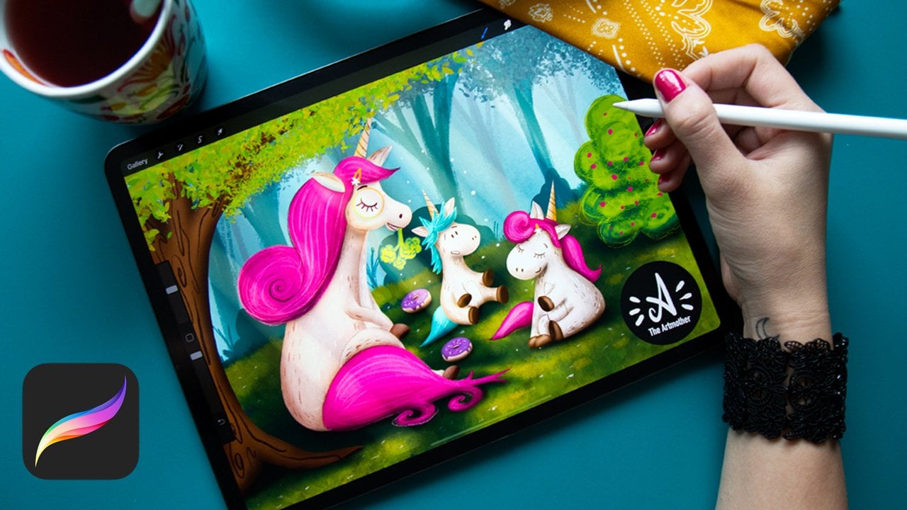
two-point perspective. Hey, my name is Alexandra,
aka The Articular. I'm a mother, an artist, an illustrator,
professional art teacher, and an online educator. My students like my
classes because they are easy to do and follow, and there are various ways
to finish the class project. Very beginners can
follow me step-by-step, and more advanced
students can have full artistic freedom within the framework of
the class project. Any experience you have, you will have space to unfold your creativity and challenge
your skills in this class. In today's class, we
are going to design a magical bunk bed hideaway
in two-point perspective. The class project will be
a really fun to create. I will be working on
an iPad and Procreate, but feel free to follow the
class in any software that you are comfortable with
using, or even traditionally. The class comes with
some cool resources. You will have
everything you need for a successful class project. By the end of this class,
you will have knowledge and practice in applying two-point
perspective to your work. You will be ready to draw
variously shaped objects in different points of views
to create magical scenes, and purposefully use
two-point perspective to define the viewpoint
of your audience. If you are ready to join me, see you inside the
class. [MUSIC]
2. The Class Project: [MUSIC] Welcome. I'm so happy that you joined
me in the class. In this video, I'm going to talk to you about
the class project. It is a usual thing to demonstrate two-point
perspective on buildings, street views, street corners. But I thought, let's do
something more interesting, more lifelike, that you would really apply into your
illustration work. Are you really
going to illustrate a street corner?
I don't think so. I really thought that in this type of illustration
that I'm teaching you, it will be more interesting
to create really a scene, an illustrative
scene where you can really practice how to apply
this two-point perspective. I was also thinking about
what can be magical scene? My childhood just popped
up in my mind with my brother we always
created bunk bed hideaways. I thought, yeah, let's do this. I think everyone
can relate to this. If not in your childhood
then as a parent. Basically what we are
going to do is to create a cuboid in
two-point perspective, and then design
it to a bunk bed, and then add some
magical elements to it. Play with light and play with some layering
and stuff like that. But that is the painting part. The most important
part and the focus of this class is the two-point
perspective itself. In the resources that you can open when you are in a browser and not in the Skillshare app, you will find a tab,
Projects and Resources. You hit that and you
will find it down below. You will find the
worksheets there that will help you to progress. I have prepared
everything in them as sketches and the things that will help you to
practice on your own. You will also find
my base sketch in the original artwork that I'm providing you for reference. Many beginners, if you're intimidated with
creating a cuboid, there will be a video
that will explain you the whole process how to
create the base cuboid. But if it doesn't work
for you for some reason, you will have the base
catch that you can modify. But I really want you to be creative and keen to practice. This is your practice. Follow me step by step, but make sure to apply something from yourself, your taste. [inaudible] students can have a little fun with this project. Later we will learn about the worm's eye view and the bird's eye view and
that will help you to set a different camera angle on the illustration and
you can play with that. That will be fun and I'll be really interested
in how you solve this problem and how you apply these different
perspective in this scenario. Take this as a challenge. First and foremost, we
need to do a little recap on perspective and then dive deep into the
brain perspective. See you next video. [MUSIC]
3. Perspective RECAP: [MUSIC] In this video,
we're going to do a little recap on
what is perspective, what are its components, and how to apply to your work in order to add space to your art. First of all, perspective is basically the placement, size, and orientation of lines
that help us to translate the three-dimensional world onto a two-dimensional surface, where we are drawing. Now, there are several
components of perspective and several types of perspectives that we
can create with them. Also, don't forget, you can also add dimension
to your work by shading. But at a point, shading
might not be enough. The first type of perspective, is that I call
linear perspective, has only a horizon line. The horizon line is
basically the line between the sky and the land, or the surface and background. This works in super
stylized landscapes, and the golden
rule applies here, things that are closer are bigger than things further away. This means if I draw something closer to
the horizon line, it will be further away
and it will be smaller, and if I draw something
further away, it will be bigger and it will appear that is closer to us. Then there is the one-point
perspective where you have a horizon line and also
one vanishing point. The vanishing point
is a point of disappearance on
the horizon line, so if we have a
more complex scene with for example buildings, the sidelines all get the direction of the
vanishing point. This works with
objects or buildings which have parallel
side facing us. Their front side is
completely facing us. We can only see one side
like for example on this 3D that we have created in a one-point
perspective class. We have the front
side facing us and this side is going into a vanishing point,
one-point perspective. Now, what about
two-point perspective? [MUSIC] Let's see what it is
about in the next lesson.
4. Two - Point Perspective: [MUSIC] Let's explore two-point
perspective in this video. Two-point perspective
is basically the same as one-point
perspective, but we have two
vanishing points now. Let me open the two-point
perspective worksheet. It applies to scenes
where we have objects which do not have the
front side facing us. It is basically
most of the time, as in nature, we do not have
things arranged perfectly, so you don't always look at things where a front
side is facing you. We can use it to
depict buildings, streets, and objects too. Let me just show you
what you can see here. Here's the horizon line, and here are the two
vanishing points. Here is our object. As you can see, we can see
the edge at the front, and all these lines are running into these
vanishing points. Every line is either totally vertical or they go into one
of the vanishing points. I will turn off in the worksheet the sides so that we
can see the back of it. As you can see,
even the back lines are running into this points. This line and this lines. We also have guides for these, and this is just a
mask so that we don't see the horizon line
behind this object. So we're going to create
this together now. I will turn off everything. I will turn off
the worksheet and keep this horizon line here. Create a new layer
and choose a color. I'm going to choose
this light magenta. Now, we are going
to draw a cuboid, not a perfect cube, so that you just get the idea of what we
are learning here, and we are not going to
place it completely to the middle between
these vanishing points. Not to the middle, but a bit to the side so that we can see really one side a bit
more than the other. What will help you when drawing these vertical lines,
this canvas guide? Hit the "Arrange" button, go to Canvas, and
hit "Drawing Guide." Then you will get these guides
that will really help you. You can edit it, Edit Drawing Guide, to make this grid bigger so you can have
a bigger grid size. For me, that worked pretty well. You can also set
the color of it, if you can have it white
and you can have it black. I love it to be
dark, almost black. The first thing is
to define this edge. I'm just going to
draw a line here. To make a straight line, just draw a line and hold
down to make it straight. This is the quick-shape
function in Procreate that I'm sure
that you already know. Now, we are going
to draw guides. If you have been with me with a one-point perspective class, you already know
that Procreate has a built-in perspective
tool where you can place several vanishing points, but I really want you to
understand how these lines go, so now we are going
to do this manually. Now, create a layer below
this layer of this edge, and choose a light gray color
or any color that you can differentiate and
connect these edges. I'm just going to connect these dots to the
vanishing point, and this one also here. Now, go back to this base and choose again this magenta color, and let's define the
length of this sides. I'm seeing this side a bit more, so this is going to be longer. I'm drawing a
vertical line here, and this is going to be a
bit shorter, like this. Now, I can define the whole, so I will just connect
these lines here. Now, I'm going to just
mask this behind it. I don't want to
erase because I want this horizon line to stay there, I just don't want to stay
it behind this object. I'm just going to
create a layer, put it below everything, and just choose the
background color and just paint over in. You don't need to do this, I
just want it to make a bit more clear so that
you can see better. Not everyone can
see in dimension. Now, we'll just create the back. I'm going to create
another layer and choose a bit darker gray for the
guidelines for the backside. Now, we are going to connect this new edges to these lines, and also these ones, as we are going to define
the backside of it. We already connected
this dot here, so we are going to connect
it to the other one , and also here. This is already also
connected to this one, so we're going to connect
it to the other one too. Now, we have two
crossing points. They might not be perfect
because we are not working with a small brush, but it is going to be okay. I will go and create a new layer and choose
a bit darker magenta. I already have it
here for the back. I will just define the backside
or the back edge of it. As you can see, we can
connect these ones. Now, we have this back side, and we can connect these ones, so that we have that side. I will turn off the
back guidelines, and now we can see for it. Can you see that? It is amazing and super simple. Now, let's just create this
side thing that I've done, it is just totally easy. I'm going to go back to this front base and
set it to reference. This will make these
colors that I'm going to drop in to a different layer, so I'm going to create a
different layer, maybe below it. I'm going to drop these
colors to this layer. But as this is sad to reference, it'll work as if I had this
outlines at this layer. I'm just going to choose a light gray and just drop it here, and I'm going to choose a darker gray and drop it
here to this shape. While we have a two-point
perspective cuboid here, this is going to be the
base for our class project, so we are going
to recreate this. But I would love to
show you how to draw different geometric shapes
in two-point perspective, and that is what we are going to practice in the next video. Now you know how to draw a cuboid in two-point
perspective, I will see you in
the next video, and practice a little
bit more. [MUSIC]
5. Practice : [MUSIC] Welcome to the practice video in
which we are going to draw different
geometrical shapes in two-point perspective. Everything starts with a cube. As you can see, I already
have a cube drawn here. I will turn on its back. We're going to start
with a cube because every other shape that we're going to add into it
will fit into this cube. I will turn off the worksheet. Everything that's on it. I created it so that you
can have a reference there. But we're going to
create a new one, so create a new layer. Choose this light magenta
or any other color that you want to work
with. Let's just start. What is the cube? In a cube, you have all sides
the same size. Again, we are not going
to create a cube from the complete front because
it will look weird. You can see in an
angle if you are not really a person who
can really see in dimension and see these
geometrical things, it will be easier for you to
understand what's going on. You can turn on this drawing
guide so that it will help you to count and make
things evenly sized. But remember, this is practice and also we
are in illustration. I don't really love to
do things too precisely. We could have worked with
tiny very straight lines also previously, but I've chosen an
illustration brush to create the horizon line too. It may create some uneven things when you are drawing, etc. I just don't want
to put pressure on you because we need
to enjoy this, we need to enjoy illustration, and we need to enjoy creating perspective as
well so it is fun. I will just create a cube. I will start with
drawing an edge again. Count three squares up, three squares down, so
you have six squares. Now I will create a
new layer below it where I'm going
to do the guides. I will just connect this edge and then make it a bit lighter so
that you can see it better. This edge like this. I will choose this
magenta again and beyond the layer of this
side are the edger. Now, if you remember
the golden rule, things that are closer to you
look bigger than things far away and when you have an object in two-point
perspective, the sides go further away. It will be not six
squares to create a cube. But maybe, I would
say the third of it. so maybe four squares. Again, you don't need
to be too precise, this is not a geometry lesson. As we can see this side more, this side will be even shorter so make it
just two squares. This will make our
cube look just right. You can connect this. We can again call it cuboid but I didn't really want
to work with a rectangle. This is going to be
quite imaginary. Let's create the back of it. Again, I will create a
new layer below it choose another gray and
connect which lines? This, this, this, and this, so I will connect it here and I will connect this here. Now, I again have
this crossing point. I will go back, create a
new layer below the base, choose a bit darker magenta, connect these dots vertically. Connect this here, this here, this here and this here. Now we have a cube. I will turn off these guides. Now, what about the
other geometric shapes? As I told you, they should fit here. Drawing a cube will be always a help for you to
create these things. Let us start with a cylinder. A cylinder has a round top, a round button and then
vertical lines for the sides. We will need to put an
ellipse to this side of it. I will create a
new layer for this and I will choose
a different color, I will make it blue. For example, if you
look from the top, the circle when fits into a
square where it touches it, at a half of every side. What you need to do now is to define the half of every side. Actually, you don't
really need to do this because we are
not going to work with these odd objects in this class project and this
class is for beginners. But it would be really
good for you to at least know how would this thing work. Again, I don't want to be
too precise and too in detail because that's not
the point of this class. I will approximately just by eye just set the
half of these sides. I will create onto a new layer, an ellipse and place it here. Then distort and
you can just make it touch all of these points. Then you can duplicate
it and place it down. I don't like the top one, I will make it a bit like this. Make sure that these
sides will be vertical, I will connect them now. Now I have a cylinder in
two-point perspective, I would just turn off the
cube so that you can see in. Here is it, I will turn
it off now everything, put back the cube. Now let's talk about a pyramid. I will choose a red
color, for example. The pyramid will have this exact same base but its top will be at the
middle of this top square. I will create a new
layer and create some guides for this point. I will connect these lines and then I will have
the middle of it. I will create a new
layer and just connect this to this base size. I will connect these sides as well and I will turn
off this top guide, I'll turn off the cube. Now I have a pyramid in
two-point perspective. Now we know how to create
a cuboid, a cylinder, a pyramid in two-point
perspective, there is a point in this because they have
sides, they have edges. We are not talking about the
sphere because it is round, it doesn't have
edges and you can create a sphere in
dimension with shading. Now, let's move into the next
video where we're going to see what happens when we play
with the placement. [MUSIC]
6. The Bird's Eye and The Worm's Eye View: [MUSIC] Until now we placed the shapes to the same position. The cube was crossing
the horizon line. Now, I would love
to play a bit and show you that placing
shapes about and below the horizon
line can create a bird's eye view and
the worm's eye view. Let's keep it simple again, and let's use a cuboid
for demonstration. As you can see, I
already done this, if you place a cube
above the horizon line, it will have the effect of a worm's eye view as if you were really small and looking up to a giant building,
for example. If you place it below
the horizon line, then, it will have an effect as if you would be
above this object. You see it from above, that's the bird's eye view. There are examples that I
will show you right now. I will turn this off, and here is the Example 1. Here's a cuboid above as
if it was a building, and here is the little
man, and some trees, and as if you were
in a helicopter, [LAUGHTER] and here's Example 1. Even if I haven't placed this whole building fully
above the horizon line, it has the effect
as if I was here, and I was looking at this object or this
building from below. You can play with this in the class project I wouldn't recommend the
bird's eye view for the hideaway that we're going to create but maybe it
would be interesting to create a cuboid in this position as if you would be a small child looking
at this hideaway. It would be a bit more amazing, a bit more pushed, and challenge your
creativity and skills. If you are more advanced, you can apply this
thing to your artwork. Let's just now try
out to simply create these things that
I have created, this cuboid so that you
can see how it works, and then you can do whatever you want in
your class project. Either turn this up,
create a new layer. Again, choose this magenta, and we had it in the center. Let's now work in the
center until now we have worked in the sides so
that you can really see the size of the objects. Now, we're going to
take a look on the top, and on the bottom
of this object. Try to find the center between these two
vanishing points. I would do three squares, approximately, this is too long. Like this. Leave out
three squares as well so that you have space to
add these sides to it. We are in the
center, center line, three squares, three
squares, three. Again, we're going to
create the guideline and doing the same exact things
in different situations. Now, I'm going to just connect these lines to these
vanishing points. We're going to draw
them all together. Let's go back to the site. Choose the light magenta. Let's define the size. Let's say two squares. Will it be? Now, we have this size
that we can connect. Now, we will have, again, need to
connect these dots. Here, we don't see the
bottom or the top, so this is finished. This is a simple side
when placed in center. This is why I didn't want
to have it completely. One side a bit longer since you can see it really in space. I will create a new layer
again for these guides. Let's make them darker. This side here, this side here, here as well. This exact same thing. I'm going back to the base, choosing the magenta, and you place these
glides be a little bit so that it does not seen. Let me just draw it like this, and draw it like this. I will turn off the gates. You have a cube in
the bird's eye view, the worm's eye view, and in a normal street view
as it is called like this. Now, you know so many things. We have finished the theory and the practice parts together. Now, we know what is
two-point perspective and how to apply to various situations. In the next part of the class, we are going to work
on the class project itself to which we will need
to get a little inspiration. See you in the next
video where we will get some ideas. [MUSIC]
7. Get Inspiration: As you already know,
we are going to create a bunk bed hideaway. The base of it is a cuboid,
something like this. We are going to design
a bunk bed into it. Again, beginners just
keep step-by-step with me more than one student
can try to work with these worm's eye view to make
it a bit more interesting. Now there are several
types of bunk beds. Somehow the shape of a house. So you can really make
a shape of a house. Don't need to just
stick to this shape, if you are intimidated,
stick with it. If you feel a bit creative, think of a solution. What we need to do now is to
go to Pinterest and Google, look for bunk beds and choose
the ones that you like, and take design
elements from it. What else we're going to do? We're going to also
choose magical elements. I am going to have a
piece of textile over it. It is going to be a
hideaway for real and some string light so we
can have a mood, etc. You can also create
a mood board with color combinations that
you like that will really help you in a second when we're going to
talk about the colors. So I will just go to
Pinterest and I will write bunk bed hideaway. Let's try it. Yeah, your bunk beds. You can just take a look
on bunk beds as you can see some have wider lower parts. Some have these stairs. Let me just write hideaway here. There's string lights. You can put pillows there into the bunk bed,
different textiles. As you can see, this simple thing is also in a two-point perspective so just imagine that
this is a bunk bed. Something like this. Go through these images
and get some ideas. Create a mood board. My mood board is ready. I had just created six
screenshots that I have found on Pinterest
that might be interesting. What I really love
is this thing, but I love it in this way so in this gray color with these
colorful glowing stars, I also love something like this. For some reason, I love
this blue color and this red combination
of these two, it looks pretty amazing. For this one, I really
love the mood of it. Maybe I will create a
background that is like this. There will be string lights
like this, textile like this. As for the bunk bed, I'm just going to go with
something like this. I forgot to put it here. Yeah, I will make it
smaller and put it here. As for the design, I love this so much
this is so simple, but still it is a bunk
bed but with this roof, I don't know how say it, my daughter had a bed like this. I'm going to put
this design into a two-point perspective and somehow implement
all these things. The next thing is to
create a sketch and I will keep this image in my
mind while I'm designing, so I may put that as
an inspiration into the file and keep this as a
reference to come back here. Now, we just move on to
the next video where we are going to create the
sketch itself. [MUSIC]
8. The Sketch: [MUSIC] Now that we
have everything, we know how to create a cuboid
in two-point perspective. We know how to create
a worm's eye view. We have our mood board. This is the time that we can
start to create or sketch. Let's just go to the line
art part on the worksheet. You can turn this off. I just create this so that
you know where to go. Actually I created a
screen-sized canvas. You are free to create any sized canvas that
you want to work on. What we need to do now is to
turn on the drawing guide. Hit the orange button, here is the drawing
guide, turn it on, edit drawing guide, and
click the perspective here. This is the built-in
perspective tool of Procreate that will be really useful for us now to create the base for
our illustration. If you hit anywhere
on the canvas, you will place one
vanishing point on the horizon right away. You can place it anywhere
on the canvas and you can place free
vanishing points because they are
free-point perspectives, but now we are at a
two-point perspective. What I want you
to know is to hit twice on the horizon
line so you will have now two points
to move around. As you can see, you can place the vanishing points
outside the canvas. This is what we are going to do. As I already mentioned
as overworld and reality cannot
fit the canvas, you need to think about
the outside space of it, so I would love you to place these vanishing
points outside the canvas. I will make it a bit
smaller at about this size. This will make more natural
scene and make sure to have the horizon line horizontal because you can create
horizon lines like this. But this is for more
complicated scenes. You don't need to place
it into the center. I would say place the horizon line a
bit lower, like this. I will make sure that
it is horizontal, so I'll play with it a bit. Wonderful. Now you can change the colors of
these lines so that you can see better what line
will go into what angle, or you can set the
color right here. I will keep it in blue and
when you hit the other ones, so select that dot, you can change the
color of that one. Amazing. Now he'd done. There is another tool and it
is called Drawing Assist. When you create a new layer
and hit Drawing Assist, every line that you draw
will be either vertical. I will draw vertical
lines, horizontal, or they will go into
those vanishing points. If they are in an angle, all these lines will go into
these vanishing points. This will be a great help to create a base for
our illustration. I will choose a
bit thicker pencil so that you can see
what I'm doing. I'm working with into sketching with a 6B
pencil and I have chosen full black to sketch. I'm in this assisted layer. I have my pencil and my color. The first thing will be again to set the edge of the bunk bed. I will place it here. I will make it a
little bit bigger above the horizon line
as it has nice effect. Now I will continue
drawing these sides of it, this side will be shorter. I will erase this one
here. It looks great. Now I don't want to over-complicate this
so in my mood board, I've chosen a design
with this top, but I started to draw previously and it became a bit
too complicated. It took me a lot more time and thinking and I realized that
this is a beginner class. I will take this part
from this bad to design. What I'm going to do is
to hold down this image. Click "Gallery". Go to my line art work and
it should import right here. Now I will just place it to this corners so that
I can reference it. This is going to be my bunk bad. Let's start drawing. What I want you now is to
keep the assisted layer here and make sure to put these main elements
into it so they are in angle. But then I want you to have this sketch sketchy so
really like an illustration. This means that you don't
need to overdo this base, just make sure that you have the main lines in the
two-point perspective. I will start with this side. This will be a bit
bigger than this one. I will not have this
above thing here. I will try to make the
wood that is made from, I will design a bigger part here so that the kids don't fall down [LAUGHTER], here as well. I had a bunk bed when
I was a child and I loved to create
hideaways in it. There will be two
things like this. Then I will erase this part and we'll add it back
here to add this wood. It can be approximate. Again, rely on your eye you
don't need to be perfect, you are not an architect
or an illustrator. I want this to be as sketchy
and painterly artwork. Doesn't look like
the original one, [LAUGHTER] doesn't lead to. The main point is that
I have reference here, like this, art is all
vertical, for some reason. I'll turn off Drawing
Assist because it is not liking eraser so I
can erase in that angle. I will erase this and redraw them and put Drawing
Assist back. You need to follow
these pink ones. This is going to be in
the street view level. Does this look good too?
I think it's great. I will add this thing here
so that I can see the wood itself here like this. I will need to at least note the back of the bag and then place
all the things inside. This is the back. This is going to be
vertical from this part. You are not an architect, you don't need to do
complicated stuff. I find this complicated
even for myself. You don't need to overdo it. This will be sketching. The next thing we
are going to do is to go to this assisted layer, lower its opacity, create
a new layer above. What I'm going to do is to
speed up the process and draw over it without
making straight lines. We draw it with my hand drawing and try not to make too many
straight lines because I want this to be catchy and
have these imperfections in it so that really
is a illustration. Then I will also add these magical elements
that I've chosen, these textiles and
the string lights. I will speed this up so that
it's not that boring to, see you when I will be finished. [MUSIC] I will turn off the back. Can you see that it looks
more illustration like. What I want from you now is to add these elements then
with the mattress into it. My idea was to add the text tie like this or
something like this. I will take decimate also. I will speed this
process up again and we'll discuss what
I've done later. [MUSIC] This is the sketch I'm
going to work with. Let's do a little recap on what we have done
in the sketching part. We have created a base cuboid. You need to make sure to have all main lines in
two-point perspective. Then we redraw the whole
with your pure hand drawing. This will make the
sketch more natural. Then we have added all the chosen elements to make the whole
illustration look fun. Now that you have a sketch, let's continue to the next video where we're going to talk about the colors that we're going
to use for this illustration.
9. Creating The Color Palette: [MUSIC] Let's talk about the
colors and we're going to analyze the thing
that we're creating. So there are no characters here. This is a static image, but I want to bring it to life. I really want to make the inside of this bunk
bed to be as calling. There will be warmth
and it isn't night. Outside will be cold
or dark as night. We are going to work
with two colors two base or main colors
or two dominant colors. There will be a
cool outside color and a warm inside color
for the bunk bed. When we have two
dominant colors, we can use complimentary colors. They will feed each other and make your illustration
look really good. We have the color
harmony tool here. I have tetradic here, so just click here and
hit complimentary colors. And now you will choose
complimentary colors. Just started back here
to the brightest. Now just go around and
choose colors that you like or would like for your
illustration. I don't know. I want to choose a warm color for the inside of
my illustration. I love this color,
this orange color. This is going to be
one color for me. You can create a new palette. I'll go to the Palettes,
create a new pallet, and set it as default. So it will open up when you
are in the different tools. So I will just add it here
and choose this blue as well. These are going to
be my base colors. Now, I will go back
to classic because I always love to choose a lighter and darker
version of a color. And then I will just
pick some other ones that we'll make these
colors pop more. So when I'm working with
complimentary colors, I don't necessarily have
to limit myself by them. You just choose these two for
being a dominant color and build a color palette or color scheme around
these colors. And when they will
be put together, they will just look great, because the main dominant
colors compliment each other. I will need a lighter color
for the lights. I guess. I will choose a color like this. I will need a
darker one as well. If you have taken any of my
shading classes, you know, if you have a color and
you want to shade it, you will choose a
color that is next to it on the color wheel
and choose dots, darker version for shading. This will look great. Let's go for the blue one. I will choose a lighter one. May be here. I will choose a
lighter again from a color that is next it. I will go ahead in darker and
choose a color like this. Maybe a bit purple color. What I love is
this dark, indigo, blue, saturated, that
will look good as well. I will choose another one here. I could use a bit of
pink, beautiful red. I will choose a cool color too. As you can see, here's the
line that defines that these are cool colors and
these are warm colors. That's color theory. And we're not going to
go into that too much. I will choose
another cool color, may be I will go for
this dark turquoise. I'll just leave it there. I'll choose five warm colors
and five cool colors, starting with a
complimentary color scheme. You can combine these
rules with your tastes. You are free to do that. Maybe I will not use every
color, will just see. Now we have the colors chosen. In the next video, let's talk
about the brushes. [MUSIC]
10. The Brushes: [MUSIC] In this video,
we're going to try out some brushes that are
built into Procreate. I haven't created a brush
set because I want you to learn how to choose brushes
based on their function. Basically, you need a
brush for creating shapes. I will just create a
new worksheet for this. I'll just create a
screen size canvas and choose black for explanation. I have a pencil,
so you will need several types of brushes. You will need the shaper. I usually create my
brush sets based on this idea so that you have
a brush for every function. I really want you to explore now and learn how to
really choose brushes, what qualities those
brushes need to have. We are going to go off
for it in a second. You need a shaper to
create the shapes. You need a shader to
create the shadows. This shader is usually
a texture brush. It will nail them both. It will create shadows and
create texture the same time and it saves a lot of time. Texture and then you
need brush for details. Basically, that's it. What qualities these
brushes need to have? The shaper has to
be a solid brush. This means that
you need to build a solid shape which is not transparent and
you can then build everything about his base shape because with the shape you'll
create the base shapes. It can have texture. Can have texture in it. It doesn't necessarily
have to be a round brush that is solid, but it can have little
textures at the edge. But the main thing
is that you need to be able to create
shapes for them. When set to smaller, you need to be able to
create a line with it. It will work also as a liner. I will show you a
brush like that. In my free illustration brushes, this is a great brush. I can create lines with it. It is a bit textured, but I can build shapes with it. This is a brush that works just fine as a
shaper and a liner. Then you need a brush
for shading and texture. Now, for example, my shade of brush is something like this. Its quality is that it
has to have a texture, it has to have transparency, and it has to be
pressure sensitive. [NOISE] For example, this shader brush,
it is transparent, and then I increase pressure
and it gets darker. This is really nice for shading. Can you see that? I can create
amazing shadows with it. You can find these two brushes
in the resources section. These are my free illustration
brushes that are my favorite and I offer them
basically, everywhere. [LAUGHTER] You can
download these for free. But I don't want
you to use those. I want you to explore the
brushes that are in here. Then you need a detail brush. A detail brush is a brush
that has again, texture. It is not just a solid line, texture and works
well when it is thin. It has a liner or create this detailed texture lines
with it, it is decorative. There you go. Let's just
explore the brush set here. We need a shaper, and I want this painting
to be painterly. I will just go
through these brushes that are here that I
actually don't really know, and just find a brush
that will work well, for example, I love this brush. This looks fine. I'll
use it as a liner. I will see how it works
for creating this hole. [LAUGHTER] It is a
Nikko Rull brush. I will duplicate it and create a new set so that I
have it in one place, and I will just add perspective. Where was it? I will
just place it up here. Let's find the shader.
This looks good. I'm going to duplicate it. I'll just place it there. It's fine. I will just place
it here so that we can see. Cool. This is too
textured, maybe cookies. Yeah, little pine works fine. I will again, duplicate it. These are the free brushes. Let's just do a little recap
on what I want from you now. There are several functions
brushes need to have. You need to be able
to create shapes, you need to be able to
create shadows and texture, and you will need a brush for details and some things that you can create
texture as well. I want you to go
through the brush sets that you have in
your brush library. They can be any brush and not necessarily the ones
that come with Procreate, but maybe you have
downloaded some from Creative Market
or different places. You need to have a solid shaper, so but it can work like a liner. [LAUGHTER] Find a
brush that is solid, has a little bit of texture, not too much and use it
for building shapes. Then you will need a
shader or textures. You need a brush
that has a texture. It just has transparency and pressure sensitivity so
that you can work with it. Then you will need a brush
for details that works really as a thin pencil
or as a thin brush. It can have texture and it
can have also transparency. It is not good if you
have too much texture, though there are
some dots around it that could be a bit too much. Take it as an experiment. I want you to go outside from your comfort zone and explore these things like you cannot miss
anything with it. Cannot lose anything with it so let's experiment together. I have never used
this brushes for illustration too.
[LAUGHTER] It will be fun. Also, I need to tell this,
don't limit yourself. I just said that you need to do this but you are not forced. If a brush doesn't
work for you when you are painting,
choose another one. I'm including my liner and
shaper in the resources. In any case, that you don't
find brushes for this, you will need to find
a detail brush tool, but you can use that liner as well if you make it
then for details. That's all. Now, we have the brushes, now, we have the sketch
and also the colors, what's left is related
to just start painting. See you in the next
video where we're going to start our
illustration. [MUSIC]
11. Painting the Bunkbed: [MUSIC] Let's do this. This is going to be exciting. What I'm going to do is
to just delete this. I will place this base
bunk-bed sketch that I have created here and you can use it. If you weren't successful with creating this
base for yourself, you can use this and
you can modify it. I will just keep this and group it and put it into worksheet. What's this line here? I will turn my sketch back
on and I will turn off the drawing guide
so that I'm free. I will keep the
composition like this, mainly because I want it to be then square size so that I
can post it on Instagram. I'm going to just
work on this one and then leave the background out. What I'm going to do is
to create a new layer. I will place this sketch to the top and make it to multiply. I'm doing this so that if
I create a layer above, I will be able to see through it and I will lower its
opacity as well. I'm in this Layer 6 again, and I will just create a base. I need to choose the nickel
round brush for my shapes and choose a color actually
for the booth of the bed. We haven't chosen
color for that. This is what I'm saying,. You need to be flexible. I would choose a brown, but I love a bit reddish
brown like this. I will just place it here. I will just start painting. I will speed this up so
that it's not that boring. When I have something to say, I'll just say it.
Just keep watching. What I wanted to say
is that I'm going to make first this front, and this I will make a different layer so I can
play with the shading layer. Also what is good is to set the eraser to the same brush that
you're working with. I will just keep my
eraser of nickel row, so it will be easier for me
to keep these main shapes. Sometimes just turn
off the background. I mean the sketch so that you can see really
what you're doing. Now I create a new layer
for this other part. Everything that I can
see from this side. This way, I can really
set the shading later, so keep it like that. On one layer you will
have everything you can see here from this side, and on the other layer you
will see these things. I will also choose a bit
darker color for that part. I will go back to this layer and just add these things here. Can you see that? It is
already in dimension, so I let this side, and this is in shadow. This will create this amazing and easy
shading right away. Just one little shade
darker as this one. Now I will add this
top part as well, and I need this one too here. This will not be the same because there will be
this little pillows. I will just keep this one and go to this darker one
and just simply add even darker one because it is really just the
top of the bed. Now I will add the
mattresses into it and then work on
some details. [MUSIC]
12. Painting the Elements: [MUSIC] So let's just
continue by adding all the elements that we have
chosen to our illustration. I'm going to speed this process up again so that
I don't bore you. I forgot this part, [LAUGHTER] we need
to go back to that. This is where I'm using
this darker color for the side of this mattress. Again, I will choose
even darker color for the side of the
mattress, that is here. I just love how
painterly this is, it is not that strictly everywhere perfect.
[LAUGHTER] I love this. The next thing I'm
going to do is to add these main elements. So I will create a skewed pillow here on top of everything. I will Alpha Lock this
layer so that I can add this in here. Let's just start to add mood. Let's go to the background
color, this one. This is my main color. I'm not sure what color
this blanket could be, maybe it's turquoise. Let's try. I will need to add shadows. [LAUGHTER] I will try
with this pillow. I will choose a darker
version of this color, I will Alpha Lock it and
make it smaller and just add bit of a shading
here and there. I don't want to over shade
this illustration actually, I love it how it has turned out, just as a rough as it is,
you know what I mean? So I will add these little
details above right now and it just looks
better. Looks cool. I will do something
with this as well. Also here are these new patterns
on this turquoise thing. I will Alpha Lock it. Go choose turquoise,
choose the darker color, then just add a bit
of texture to it. Before I continue, I
will go to this mattress too and just maybe add a bit
of shading there as well, and also to the bed. So let's just see what it does. You also need a texture. So I will Alpha Lock it and
just go through it basically. I will go live and wired and just go over
it. It looks great. Add a little texture to it. Then we'll go to this other
side and maybe try with this. I will turn off the sketch. It looks pretty nice. I will need to add some details. So the wood, I will draw
the wooden texture over it. I will choose a lighter color. It looks great. I will add this drawer
down here, I forgot that. Here comes the fun. Now I added some more details. I will turn on the
sketch and try to add this textile over it. So I will create a new layer above everything and choose, I don't know, maybe this
red or should it be gray? Or I just try it. I need to place it
above everything. When you have the solid shape, make this layer a
bit transparent. Looks fine. I will create a new layer
below it and add back textile. I forgot to add
mattress up there. [LAUGHTER] So I will
need to do that now. I will place it below
it all and make these back textile layer
a bit more transparent than the front is so that we can differentiate
between the two. I will draw this stars on it. I turn off the sketch. Looks nice. I will need
to add some of the lines to it so that it has this
effect of a textile. I'll choose this
shader brush for myself and make
it a bit smaller. I will actually create a new
layer above this so that I can play with it. Change the Blending Mode to add, and this will create
this huge effect. Wow, it looks nice, really. Incredible. I will try
it on this top as well. So I will just go and change
the Blending Mode to add and paint over it. You can see how
nice things you can find if you try an experiment. It really looks good. Add some glowing effect already. Looks pretty amazing to me. Then now let's play
with the light. [MUSIC]
13. Painting The Lights : [MUSIC] I will turn back the
sketch, create a new layer. I will choose black
for the string, and I will firstly
just draw the string. This is going to be the
front and I will add some lights inside as well. I will now go to the luminous light pen
and choose my color for the light and I'm going to
actually turn off this sketch so that I can really
add lights here. Super cool. I will
create a new layer below this dark part and
do the exact same thing. Wonderful. Now what
I want to create as a bit inner glow
of this orange color. I told you that we are going to do so let's
experiment with that. I will choose a brush, maybe this perspective brush, this hertz, and
let's just try that. I will make it big. Add an inner light to it inside. I will erase this and the top and my desk. There is this inner light. I will place it a bit
about everything. Maybe here. I will also need to add light
above the pillows. Let us work on the
background a bit. I will go here and create a layer and choose this dark
indigo and with this hertz, I will just create a floor. As for the sky, I'll create a new layer and
choose an even darker color. Looks like a see, right? I can add stars to the sky. Let's just do that. I will add a bit of light to the sides as if
it was late and I am going to use this
little paintbrush as well. So I will create a layer on
top and add lights like this. I mean, it is lit so I will just add a bit of light
here and there. I will also choose drop
shadow brush of mine. But you can do this with
simple painting brush, the round brush and
make it transparent. Now I'll just add a
little shadow here also below this thing. This is called inclusion. I choose black, or dark gray and just add a little drop
shadow below this things. Now I call it a day. I'm super happy that you were
with me in this process. I would just love to do a little recap on what I have
done in this painting part. At first, I have divided
this side and this side and placed them on different layers so that I can play with the
shading immediately. I shaded with color basically. This is going to be, or this was lighter, this was darker and we
have dimension already. Now, filling with the shaper and the main
shapes with the detail brush, I have created this
wooden texture over it. Then placed some little elements like these two pillows
and blankets and then place this textile over and played with the blending mode. We have chosen add to create
this little effects over it. Then I placed a little bit
of a transparent layer of light inside
so that it glows. We created a string lights, and then just painted a little
simple background to it. Now, it is absolutely on you. How far will you take
this illustration. This is enough for me now, but you are free
to continue and to maybe build the
world around this. Maybe you can place
characters in it as well. I don't want to limit you, so just feel free to do whatever you like.
I call it a day. This was incredibly
fun to create. I'm so excited to see
what you will create. You are always so much more creative than I am
and I'm so happy to guide you and to just show you the possibilities that
you have inside yourself. See you in the next
video where we're going to sum it all up. [MUSIC]
14. Final Thoughts: [MUSIC] Congratulations, I'm so proud of you for
finishing the class. I'm sure that your class
project looks incredible, so please make sure to share it with us in
the project gallery. Down below where you had the
resources you have to create a class project button and
make sure to put it there, and also find a few words about your experience
in the class, how you felt during the process, what were your weak moments, and why did you realize maybe to help score some
other students as well. I am always so excited to read your words and
see your whole process. Now, you are ready to apply two-point
perspective in your work. I'm so happy for you. Now, let's do a little recap on what they
have learned in this class. You have learned
that you can create two-point perspective
with the horizon line and two vanishing points. You have learned to draw
different geometric shapes in two-point perspective and also learned how to create a bird's eye view and
the worm's eye view. Then you applied all
this knowledge to a line art and learned
to choose colors for atmospheric illustration
and also how to choose your brushes with
all the functions that you need in an
illustration process. Lastly, you'll learn different painting and
lighting techniques that help you to create a beautiful illustration.
It was so much fun. I would love to ask you
to leave me a review so that I can see what you think about the class
and also other students can see what they can
expect from the class. Follow me on social media, on Instagram and Facebook, so that you stay up to date
and don't forget to follow me here on Skillshare as
well for the same reason. It is a pleasure to
have you in this class. Stay tuned for the new classes, and until then, just
check out my older ones. I'll see you in my other classes and
happy creating. [MUSIC]
 The Artmother, Professional Art Teacher and Artist