Transcripts
1. Welcome!!: Hello, lettering brand. I'm Sarah from
Ensign Insights and I am so glad you're here. I started hand lettering
in 2016 when it was a difficult time when
I needed something to help remind me how to be happy. Since then, I've gone all in on hand lettering and I've done many different things with it. But my favorite by
far is teaching you how to create hand
lettering that feels like your best self. One way that I'm going to
show you that is through a hand-lettering journal
and how modern journal is just a journal with
your lettering. In this class, you're going
to create your very own. First, you're going to
learn what you need to start your own hand
lettering journal and how to use it as a mindfulness practice while also improving
your lettering, you'll get ideas for how to stay motivated when you don't
have time or don't know what to letter will cover what supplies you need to start your own hand
lettering journal. And then I'm going to give
you a seven day challenge to actually get you started
filling up your journal. In the challenge, you'll get
seven guided prompts with simple tutorials
to help you learn and practice the basics
of hand lettering. And each day will take
less than ten minutes because I know how
busy life can get. By the end of this class, you'll have a
hand-lettering journal, wisdom Vin pages already filled. So you're creating this
beautiful lettering, writing words that you want to hear that you want to believe to be true in your life and
as your lettering them, they can become true. That's what hand-lettering
can do for you. Um, that's what I want
to help you with. As for the time commitment, you could watch all
of these videos straight through and
less than an hour. If you have only
ten minutes a day, come back each day
to work your way through a hand-lettering
a journal is a way to start being gentle with
yourself and working with this season of life that
you're in right now, don't let time b, the
thing stopping you from taking care of yourself
and your creativity. If you're ready to
start hand lettering in a way that feels
like your best self. Let's get started.
2. ✏️Supplies and Class Project: By the end of this class, you'll be completing
this class project, which is the
seven-day challenge. You will end with your hand
lettering journal that will have seven pages of
your very own lettering. We will create beautiful pages while practicing the
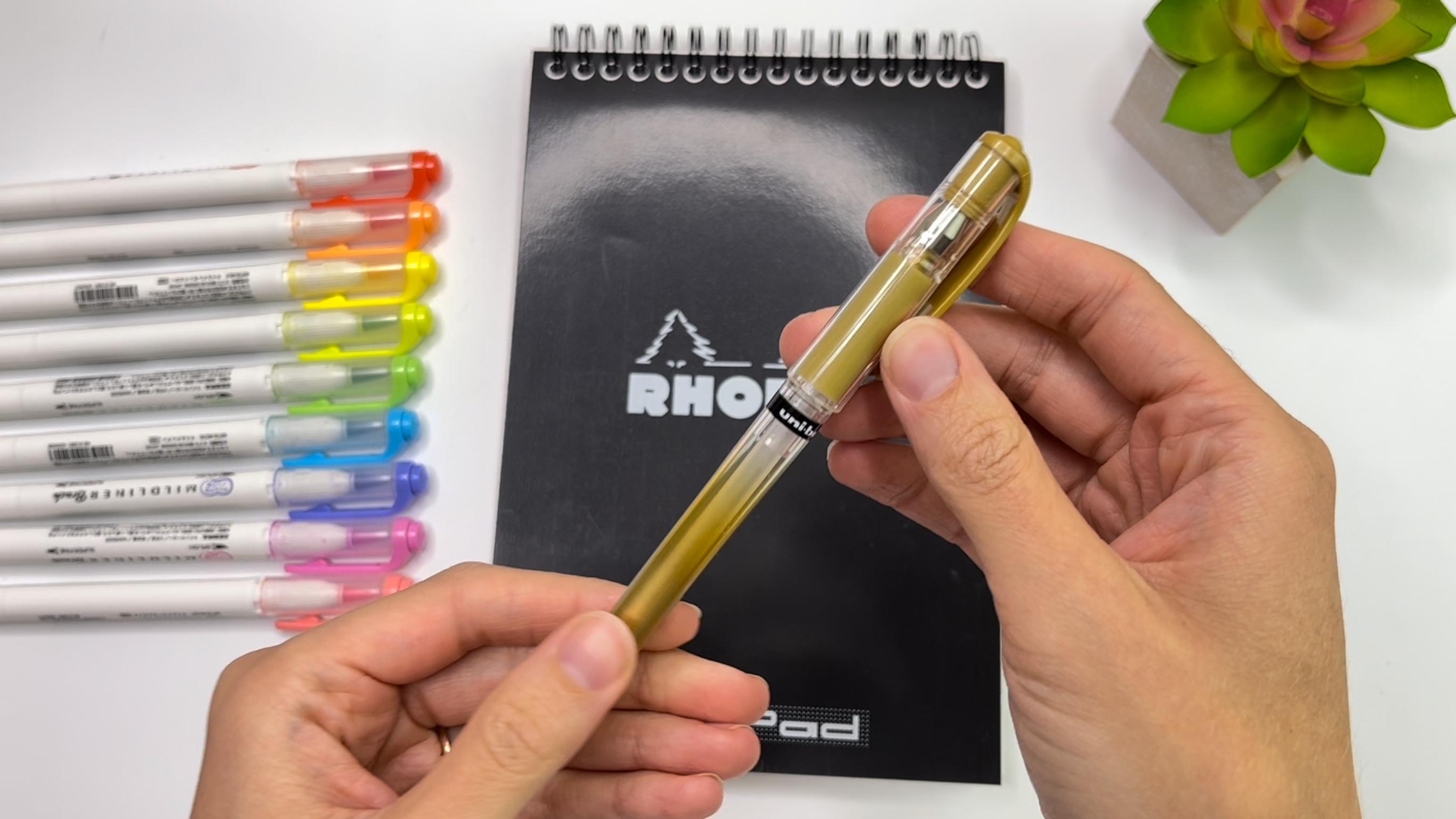
basics of hand lettering. To keep it simple, the only supplies you'll need is a journal and brush pens. I like to keep my set
of brush pens and a little pencil pouch so it's easy to take with me anywhere. You also may want a
pencil and eraser. I always have mine
with me just in case. As for brush pens, use what you have. For this class, you want
to have rainbow colors. I'll be using the zebra
mild liner brush pens. These are great. They have a large brush
tip as well as a fine tip. I will be using
both the brush tip and the fine tip in this class. Next, you'll want a journal. I recommend starting with a rodeo notepad because
the paper is so smooth, it won't fray your brush pens. And they're pretty easy to find online or at craft
and art stores. The one I'll be using has a
spiral binding at the top, but there are all types
of sizes and bindings. And here's a bonus
pen that is optional. I used it in almost every one of my pages just to add
extra little details. It's the uni-ball gel
impact gold gel pen, and this is my very
favorite gold gel pen in the resource
section of this class, you'll find this download
with the bonus worksheets. It's only available on
desktop, not on mobile. This is for if you need
a little extra practice with tracing before
getting into your journal. I printed these on
regular copy paper, so it's not going to be smooth enough to practice
with brush pens. You may want tracing
paper to be able to practice and not worry about
freeing your brush pens. Or you could also get
HP premium 32 paper. You can print on this paper and letter with brush
pens directly on it. Super smooth. If the journal you have
doesn't have smooth paper, you can use Crayola markers. If you can't get Crayola
markers where you live, any kid markers with a
squishy tip will work. You just have to be able to
give it a heavy pressure on the down-strokes and light
pressure on the upstrokes. You can use Crayola,
broad line or super tips. I also like that because
these markers are firm, you can easily get a fine line as if you were using
a fine tip pen. I hope that gives you
some good options to get started with your
hand lettering journal. And next, before getting
into the challenge, let's talk about what a
helmet and journal even is and what you need
to know to start one.
3. What is a Hand Lettering Journal?: What is hand lettering internal. So basically it's just
a notebook where you can practice your lettering with no pressure because
you can make mistakes. It's your own journal. It's all about you. It's a place to
process your emotions, keep track of your
memories, and get creative. It's a fun way to create a
book of your own lettering. It's also a tangible way to use your stationery supplies
and crafting supplies. If you have a bullet journal, if you're familiar with that. Basically this hand-lettering
journal is like that, but without the planner
and schedule portion. Here are some benefits
from homodyne journal. It helps you practice
hand-lettering daily. So you're improving
with no pressure. So you're free to make
mistakes experiment. This is how you
learn faster, right? Not only are you
practicing hand lettering, you're also practicing
mindfulness, which has so many benefits. You get to see your progress
in a beautiful book. You'll learn more
about yourself, which carries over
to feeling more confident in other
aspects of your life, helps you process your
everyday life and emotions. It's a way to remind yourself how to have fun and be happy. It helps you to be more
present and show up as the best version of yourself to more fully enjoy your life. It's a way to record memories
you want to look back on. It's definitely self-care
as you have time each day to get creative
and reflect on the day. It helps in overcoming
burnout because it's time to unwind and take
care of yourself. Next, let's talk about where the hand-lettering
journal came from.
4. My Story: Benefits of a Hand Lettering Journal: Here's the story behind where the hand-lettering
journal came from. My story in how it got started. So this is my bullet journal. I started it in 2016 during
a really difficult time. I was looking for any
way to improve my life. So I started a bullet journal. A few months later, I discovered calligraphy
and hand lettering, and my bullet journal became a place to practice
my hand lettering. I love that I have this
book because I didn't keep all of my single pages
of practice over the years, but I did keep this book. It wasn't until a few
years later that I created an actual
hand-lettering journal. There were a few
renditions in-between, like this one from 2020 where I used a
watercolor notebook. It wasn't really a journal yet. I didn't even write the dates. This was just my personal
book where I could create and I didn't
share it with anyone. Then in the following
year, 2021, I was so burnt out in
my business and in life being a stay at home work from home
mom during COVID, I needed a change. I couldn't keep doing
what I was doing. So on one of those
breakdown rough days, I found this journal
at Tuesday morning. So I took it home and I
started lettering in it with my Staedtler try
plus highlighters. It felt so good. So I decided I was
going to commit to littering one page a
day for a whole month. I ended up going
longer than a month. And even after that, I'd miss
a few days here and there, but I lettered as
often as I could. I always knew that my
journal is going to help me feel better when I was
stressed or overwhelmed. And that was the thing I needed. In the past, lettering
was always the way that I would de-stress and unwind. Now with an actual
journal of my lettering, this was a very tangible
way to make it happen. Instead of needing to choose
just the right paper and all the right supplies and which ones do I
wanna do this time? I just had my
journal and my pens. I didn't have to think
about anything else when I'm in that mode of burnout, I can't think about anything. So what really helped me was
just I've got my journal, I've got my pins and I
can create with that. I hadn't felt motivated to even let her at
all for awhile. But with this journal, I started practicing daily in a way that felt really exciting because I was filling up
this book, beautiful pages. I was creating this beautiful
thing outside of myself. And I love flipping back through the pages because I get so
many ideas, they get inspired. It's like my own personal
Pinterest that I've created. So if you want to use hand
lettering in that way, to unwind, to overcome burnout, to be your creative outlet. And literary journal is
a great way to do that. So next, let's talk about
what supplies you need.
5. Choosing Journal Supplies: What supplies do you need? So all you need is
a journal and pens, but how do you choose
what kind of journal? There are a few
things to consider. First, what kind of pens do you want to be
using in your book? For example, I wanted a
watercolor journal for this one because I was practicing a lot of
watercolor at the time. If you're gonna be
using brush pens, what kind of brush pens
do you want to use? I got this journal knowing that the paper was
a little rough. So I wouldn't be able to use me nicer brush pens since
they might fray. I thought that I was going to be using my Crayola markers in
this because they don't fray. But I ended up using my Staedtler tripods highlighters
and the entire journal. And they also don't phrase, so they're great for this. I could have also done faux calligraphy
with a regular pen. So full calligraphy is a
great option for you if you don't want to get a super
expensive book to start, if you're just kind of
dipping your feet in the water and seeing
how it feels. If you want to use
nicer brush pens, I recommend a Rodia Notepad. There are lots of options
with sizes and binding. This one that I have
is a web notebook. Alright, here are a
few other things to think about when you're
choosing a journal. How thick are the pages? If you're using a simple
composition notebook like what I started with, are you okay with skipping pages since it'll
probably bleed through. I know Archer and
all of journals are great because they're
paper is really thick, so there's hardly
any bleed through. Next, is your notebook
easy to let her in? Does it lay flat? Maybe you prefer spiral
binding so it can fold over. That's all personal preference. And next, what about the size? Do you like something really
small that you can fit in your purse and take with
you wherever you go? Or do you prefer something big? Do you want to do
really large lettering? And you may want a
larger sketchbook. And also, what do you
want on the paper? Do you want it to be
a lined notebook? Are you okay with
lettering over the lines? Do you want it to be
a dot grid so you can still have the lines
but a little more free? Or do you want it to
be completely blank? I think there's no wrong way. It just depends
on what you want. This journal has cute
designs and quotes in it, which I really enjoyed. Also consider the
coloring of the pages. The rodeo web notebook
is a cream color. You may prefer a
more bright white. My journal with acute designs has some different
colored paper throughout. You could also use
a journal width, block paper, or craft paper. There are so many options
if this feels overwhelming, here is my best advice. Start with what you have. It's okay if you don't have the perfect journal right now, you'll experiment with
different things, try it out. You're only going to discover what the
perfect journalists for you if you are
trying different things. So just get started.
6. When You Don't Have Time: 6 Tips: How do you keep up with the
journal on very little time? I think this is the
best part about a hand-lettering journal that it can fit into your schedule if you have five-minutes
or if you have two hours. So here's six things
that can help you when you don't
have time to let her, but you want to, number one, choose a journal and
pens and stick to that. I've been doing
this and it's made a huge difference because I know exactly what pens
I'm going to use. I don't have to spend the time deciding because I
already decided. Then you can read this side when you're
ready for a switch. So when you're short on time, just grab your journal
and pens and go number to keep track of the quotes that you want to let
her in the future. I always have a running
list when I hear something in a
song or in a book, I just write it down, I keep track of it. So then when I sitting
down and I'm like, oh, I don't know what to letter. I can look at my
list and choose one that feels right at the moment. Number three, just let
her something simple, whatever is on your mind. What do you need to hear today? How are you feeling? What's the song you're loving? It doesn't have to be a really long elaborate quote, every day. It could even be one word. Keep it simple. Number four, don't put pressure
on yourself to letter. If you're not filling
it, you miss a day. That's okay. Letter from a
place of being inspired, not from a place
of feeling guilty. If you don't practice, there's nothing wrong
with missing a few days. Letter for you. Number five, use a stencil or stamps to help you go faster. You can also decorate
with stickers or washi tape to fill up
your page even more. Number six, Let it be imperfect. You don't have to
have a masterpiece every single time your letter. That's not the point. That's not how you get
lettering that you love either. You have to experiment,
you have to fail. It's okay to not love
how it turned out. Don't let that stop
you from lettering. Focus more on how
it's making you feel. Even if you don't like it, you make it the next day, the more you letter, the more you're going to learn. And the more you'll
figure out that things that you like
and don't like, that's only helping
you get better. So let it be imperfect. It's better to take a
five-minutes to create something than wait until you have
two hours to letter. When you have more time. Definitely spend that time, but you don't have to
do that every day. And next, let's talk about
how, when and where.
7. How? When? Where?: How do you actually start
your hand lettering journal? So you have your
notebook and your pens. And then just open up
and start lettering, you can commit to
everyday if you want. That definitely helped
me get started. It also helped me overcome the intense burn out
that I was feeling. But you know, your schedule, you know what's going
to work for you. Think about when you want to let her do you like lettering in the morning up or would you
rather letter in the evening? I normally letter at night
right before going to bed. It's like a way to unwind
from my day and I feel so refreshed after ready to go to bed and then
start a new day. But I could also
see how it would be really effective
in the morning. But for me personally, my toddler wakes me up in
the morning and she does not appreciate I'm
entering journal. Next. Where are you going
to let her is there a special place that you have in your house
that you love? Where do you keep your pens? Do you have a desk that
you normally letter? Do you want to let her on
the couch while you're watching a show or in bed, or maybe all of the above. But it is nice to find your own little space to
have that creative time. And now, what should you let
her hear is a running list. When you don't know
what to letter words from songs you're loving. Keep a list of quotes
and look through that. How are you feeling today? What do you need to hear? What do you wish someone
would tell you right now? What is something you're loving and couldn't live without? What are you grateful for? What is inspiring you? What makes you feel
like yourself? When do you feel happiest? What do you want to
remember from today? What is something that
you're looking forward to? What's something that you're
proud of yourself for. Words from a book,
you're reading, words from a TV show or a movie, what do you want to
believe about yourself? There's just something
so beautiful about lettering words that you want
to be true for yourself. It's just that moment
of mindfulness. And in a way it can become true. There's so many things
you can let her, I hope that you make it
yours and create something unique and feel how amazing
that can be in your life. So go ahead, open your
journal and get started.
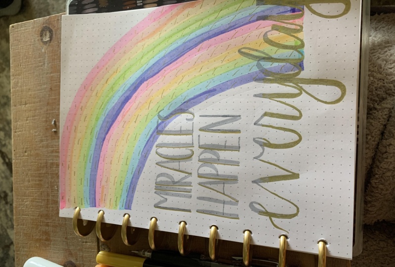
8. ✨Day 1: Basic Strokes: Welcome to day one of
our seven-day challenge. Today is all about the basic
strokes and we're going to be practicing them
with a finished piece. So this is what it's gonna
look like in the end. Let's go ahead and get started. So you will need
seven colors of pins. If you are doing rainbow colors
like me and your journal. And remember there is a page in the bonus worksheets
with basic strokes. If you want to
practice that first, once you know what the
basic strokes are, it is helpful to practice
without tracing. So for the first line, we're going to do the
upstrokes and downstrokes. And you just want to make
sure that your upstrokes are thin and your
downstrokes are thick. So you're giving your pen more pressure on the downstroke. The reason why we practice the basic strokes
is, first of all, to get more familiar with our pen because all
pens are different. Next, because when
you're hand-lettering, all of your letters are
built up with these strokes. So we're breaking
them down here, which is going to help later when we get
into the alphabet. And next we'll do the
overturn with this one. You just want to make
sure you're getting a smooth transition at the top from your thin
stroke to your thick stroke. Next we'll do the underturn. And with this one, you
just want to make sure that you are lifting
the pressure before the bottom of
the curve so that you don't get a really thick
curve at the bottom. Next we'll do the
compound curve. So this one is the underturn,
overturn together. So you just want to watch those transitions
to make sure you're getting a smooth transition
from your thick to thin. And next we're doing
the ascending loop. This one you're just
practicing moving your pen around itself as you go around that curve and watching that transition
from thin to thick. Next we'll do the
descending loop. And this one, just like
the ascending loop, you are working on. Curving around with your pen. And you want to lift your
pens pressure before you hit the very bottom to
make sure you don't get that thick bottom. Watching your transition. Next, we're gonna do
the oval with this one. You want to start on
the right side in the thin part of the
oval because it's easier to connect to a thin stroke
instead of a thick stroke. And you're just watching your transition from thin
to thick, back to them. And make sure you're lifting your pressure
before the bottom so you don't get the thick
part at the bottom. So to make this
finished journal piece, I'm going to write
my name down here. You can write whatever
word you want. But a name is a good one to
start with in your journal. So I'm going to take my gray so that it's
different from my colors. And don't worry about
your name being perfect. This is your first
page of your journal. So the point of a journal is to see where you are right now. There's no judgment. You're going to
look back on this and see how far you came. Alright, so this could
be my finished page. I am going to take it a step
further and come in with my fine tip and add a line
in between each of these. I think the lines add
just a little bit extra, making it feel like
a completed piece. Here is my finished page. I love how this turned out. It's a great way to practice
and have a finished piece. If you'd like, feel free to
share your day one project. And let's go ahead
and go to day two.
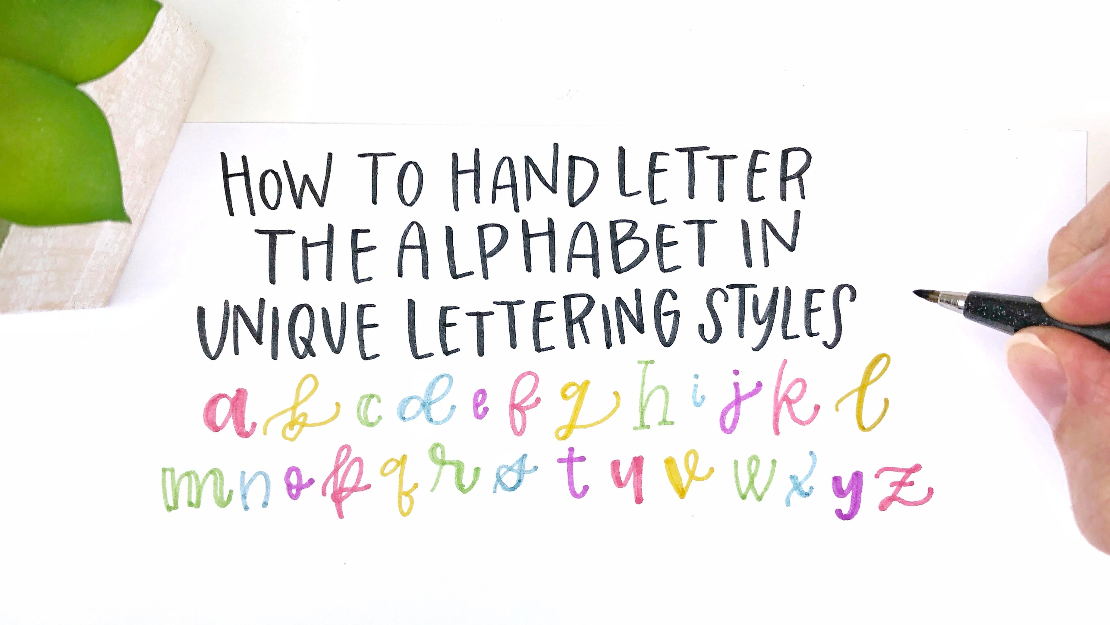
9. ✨Day 2: Alphabet: Welcome to the two. Today we're working
on the alphabet. And just a reminder,
if you would like to use the worksheets
to trace first, those are available for you
in the resource section. And remember, those are on
desktop, not on mobile. Let's get started with
your rainbow pins. So I'm just doing
the alphabet in rainbow colors and I'm connecting
each letter in between. So this is a really
helpful practice, even before you know what words you're
going to be lettering. Start by lettering the alphabet together and connecting
those letters. It will help you to see
how far you have to end your letter to be able to
connect to the next letter. Because hand-lettering is
not like cursive where you never pick up your pen in hand
lettering and calligraphy. We are picking up a pen
in-between all of the strokes. So that is really
helpful to notice. Where do you need to end your
letter so that it will be able to connect to
the next letter. So you need to extend it
out a little bit farther. And you can see
where I'm picking up my pen in all
of this alphabet. In-between strokes. This will help you to slow down, breathe between strokes as you get ready for
the next stroke. This is also in real time. So you can notice that I'm
not going really fast. This is not a race. I don't think you would
try to make it erase, but I know sometimes I have felt bad in the
past for going so slow, but actually that's
a good thing. And that's one reason why hand lettering can
be so therapeutic. Because we are slowing
down or focusing on each stroke instead of trying to get through with it
as soon as possible. It's just like in
life when we slow down and focus on the details
in this present moment, most often things are
okay in this moment. And that's what we're doing with lettering or slowing down. We're not worried about
the future or the past. We're just in this
moment with our pen on the paper focusing
on each stroke. And you can do this at any level that you're
at because it's going to change as you're
growing and changing your alphabet is going
to look different. Your style is going to change. Let yourself be
right where you are. If that's all you had
time for it today, you can stop right there, but I'm going to go
an extra step and add these gold lines
to my letters. This gold gel pen is my
uni-ball gel impact pen. It's my favorite gold
pen and I'm just doing a stripe down
the downstrokes. It's really simple
if you can just find where your downstrokes are, just add that stripe. And it's a nice way to
add a few little details. You can do this on words, on alphabets, on
whatever your lettering. It's really quick and
simple embellishment to add just a little bit
extra to your letters. Just like I said before, this is something you can do no matter what level
you're at because it's going to look
good no matter what your letters look like,
it's really simple. So I hope you'll give it a try. Here is my finished alphabet. Feel free to share yours below. And let's go ahead and
move on to day three, which is going to be
faux calligraphy.
10. ✨Day 3: Faux Calligraphy: Welcome to day three. Today is all about
faux calligraphy, which is one of my favorite
techniques in hand lettering. This is the page
you'll be making. And if you don't know
about full calligraphy, there is a little
practice page for you in the resource section, and that might be
helpful to just see how faux calligraphy works. For today's page, I'm
turning my notebook lengthwise and I'm going to start with a pencil and eraser. I am drawing out my faux
calligraphy word begin. And I recommend, especially
with a larger word like this, to trace it out with
a pencil first. And you can see
I'm erasing a law. I am changing. This really is just
a total sketch. And that is awesome because then I can see
exactly how I want it and get it where it needs to be in order to put
the pen on the paper. And one thing that I noticed
is that there was a lot of whitespace and I wanted to
add these little flourishes. And I had the ascending
stroke up here and the descending stroke of
the G to be able to do that. And then because I
was using a pencil, I could erase and draw in that flourished and get it
exactly where I wanted it. And so that is another reason to definitely start
with a pencil. And then now I'm just going
to come in with my pen and go over the pencil and
they're just guides. It doesn't have to
be exact because we're going to erase
it at the end. So don't worry as you're
going in with your pen, if it's not exactly
on your pencil. One thing about
faux calligraphy, so we are just making the
downstrokes ourselves instead of having the brush pen giving us the thicker stroke. And one thing you want to
work on as you're doing your faux calligraphy is giving the downstrokes about
the same thickness. Obviously, you're
not using a ruler and measuring it and getting
it exactly the same. I mean, I think my
e is wider than my downstrokes and that's okay. You just want to get
it about the same. You don't want to
have some really, really thick ones and
really, really thin ones. You want it to be
more consistent. And I am leaving them open Because I'm gonna do
colors on the inside. Oh, also, I have to
mention make sure it's totally dry before you
go in with your eraser, because I have messed up many pieces going in with
the eraser too soon. So now I'm just going to
fill in the downstrokes. You can add whatever patterns or designs inside the
downstrokes that you want. That is the really fun part
about faux calligraphy. I am just filling it in. I'm doing my rainbow
colors and I could use the brush
tip of my pen as well. But I'm just doing the fine tip to be able to
get the little tiny corners. And also, if you're full calligraphy word
is a lot smaller than you are not going to have this thick of a downstroke
to be able to play with. So this is a large word. It's really chunky,
thick downstrokes. And I love that contrast between the thick and
the thin strokes. And that is something
that we can control more by just doing faux calligraphy instead of using a brush pen and only being able to do however thick
the brush pen can get. Once again, I'm going in
with my gold gel pen. It's the best for
embellishments. And I'm just going to
add little dots and stars in my letters. You can do whatever
designs you want. I think the little dots
and stars are really cute and go with
any type of design. So it was just the plain
background of the colors. And then adding the
little stars and dots as just that extra little
something that it needs. And it helps it feel
like a completed piece. So here's how it turned out. I love the look of this. I can't wait to see what you come up with and
when you're ready, let's move on to day four. We're going to do a
word with shadows.
11. ✨Day 4: Word and Shadow: For day four, we are
doing a word with a shadow and filling the
page with these fun stripes. And if you want to
practice some words, I've given you a few options of words that you can do for this. I am doing the word courage. So first I'm going to
fill my page with stripes and I'm using the
brush tip on one side. And then the next stripe is
the fine tip side of the pen. And I'm just doing rainbow
colors all the way down. You don't have to
do the two sizes of stripes if you don't want to or don't have the right pens. But I think it looks really cute and adds an extra little touch. I like the look of
these kinds of stripes. And you'll notice my rodeo
notepad is a dot grid. So it helps me to be able to get these straight lines because
I can just follow the dots. It also helps me
get the thickness of the bigger stripe
with my brush pen. And also this is a great way to practice just giving your
brush pen more pressure. Now we're going to add our word. And I left just
the middle section blank so that I can
do my word here. Don't worry about
it being perfect if you need to practice that
a little bit before, or if you need to come
in with a pencil before, you can do that as well, just remember to let
yourself be where you are. You're going to
look back at this and see how far you've grown. There's nothing wrong
with being a beginner. There's nothing wrong
with being in the middle. You're exactly where
you need to be. Next, I'm going to add shadows. So the way to add shadows
is just to the right and under you just want
to think about the light is hitting your
word at a certain point. So the shadow would be on
the other side of the light. So to the right and under
is what I always say. It could be to the
left and under or above however you want, but this is just my strategy for shadows to the
right and under. And I left this open thinking that was going to be how
I wanted it finished. But it turns out I actually
decided to color it in, in the end and you will
see that in just a minute. But first I wanted to add a few little details
to my stripes just to bring in the gold in the shadow of the word
into the stripes. And I just did these
little speckle lines. I thought they turned
out really cute. You definitely don't need
that, but once again, it's just cute little way
to add something extra. And then here I am filling in the shadows because I wanted
to see more of the gold. I felt like it wasn't enough
to just leave it open. And this gold is so
shiny and you know what? Here's the thing. When
you first start out, you think that you
need all the pins to be able to make
beautiful lettering. But here I am years later with all the pens and
I've actually had to start decluttering a lot of my
pens because I find that I only use a handful of my
pens over and over again. I find the ones that I loved. And then I just use those
ones over and over. So don't feel like you
have to get all the pens, just find the ones
that you love. If you'd like gold, this is a good gold gel pen. So here's how this
one turned out. I love this look,
It's super simple, but with a lot of little
details that make it pop. You can share what
you created down below and when you're
ready, let's move on to D5. We're gonna do a short quote.
12. ✨Day 5: Short Quote Mixing Fonts: For day five will be doing a short quote and mixing fonts. It's a really simple piece. This is how it looks. And as always, if you need
some practice tracing first, you can get that in
the resource section. So to start out, I am just drawing my lines so I know exactly where
my words are going to go. And I'm doing seven dots down for the first word and six
dots down for the second word. I just came up with that. There's no rhyme
or reason for it. And then I'm coming in with a print style
uppercase for fresh. And I love the way this print style looks
with a script style. So if you only know
two font styles, these are the two to know because they look
really great together. I'm just making sure that
all of my letters match at the bottom and the top
to keep it consistent. Then as I'm doing
the word starts, it's a little more bouncy. So you can see that
not all of my letters. And on the baseline, That's how you get it
a little bit bouncy. And that's how easy a short
little two-word quote can be. Then next I'm going
to go in with my fine tip of these pens
and I'm doing the rainbow. You could do a larger rainbow if you just wanna do
it with brush pens. And I've pretty much
centered my rainbow. It's easy to know where
to start on the top and the bottom because
of the dark grid, I can see that it's
in the right spot. And then I am going in with my gold gel pen to do sun rays. So a rainbow and a sun feels
like a fresh start to me. So that's why I chose
that for this piece. I just love that all of these different pieces
that we've been making in this class are just with the same brush pens
and the same gold pen. You can do so much
with one set of pens. Next, you'll want
to erase all of your pencil marks that you made, making sure that it's dry first. And then I'm gonna go
in with the details and add a stripe in
the down-stroke. That's like what we
did in the alphabet. And then I was just going
to try something new. And so I did some polka
dots for the word starts. There are so many
different types of embellishments
that you can do. So just have fun with it
and play around with it. And here's how it turned out. It's really simple. You got that Goldstein. I can't wait to see
what you came up with. And when you're ready,
let's go to day six over. We're going to do another
variation of a short quote.
13. ✨Day 6: Short Quote and Rainbow: For day six, we're doing
another short quote and we're filling the
page with a rainbow. And for this one you can
choose any word that you want. Again, I have the few words
in the practice page. To start out, I am making
my rainbow and I'm leaving a section at
the bottom blink. So my rainbow is not going all the way
down to the bottom. That's where my word
is going to be. And I'm using the brush
tip side of my pen so that it fills in a little bit
more of the rainbow stripes. As I got to the last color, I decided I wanted even more color to fill
in more of that space. So I went in with a second
round of the rainbow colors. I just wanted it to fill in
so that when I do, I am, it can just fit right inside
the rainbow that I have. Then you're going to let
her the word of your choice and I am doing
capable right here. I'm just filling in the space
at the bottom of my page. And this is real time. So just remember that
it's okay to go slow. This is a really
easy, basic style. You don't have to do something fancy when you're
getting started. And actually even when you're
not just getting started, you never have to
do something fancy. Do what makes you feel the best. Next I am doing, I am
with the fine tip. You could also do it
with the brush tip. I just decided I wanted
to try the fine tip and then I didn't like
that it was too thin. So I went in with faux calligraphy and
added the downstrokes. I mostly just wanted it to fill that space inside the rainbow. And then the word capable
could be switched out to be whatever I'm feeling
like I need on that day. And finally to
finish this piece, I'm adding the gold stars and
polka dots to the Rainbow. If you ever have a page that
you made and you're like, this isn't quite finished. You can always add some type
of little embellishments. And as you can see, gold is my choice
of embellishments. But you can find the
type of pen that you love to add embellishments. And there are so many
different things you can do. I hope you enjoyed this piece. It's something you can do really simply with
a short amount of time and it can give you a little boost of
whatever you need today. I need to feel capable. I'm excited to see what you
created when you're ready. Let's move on. Today's seven, we're going to play with styles.
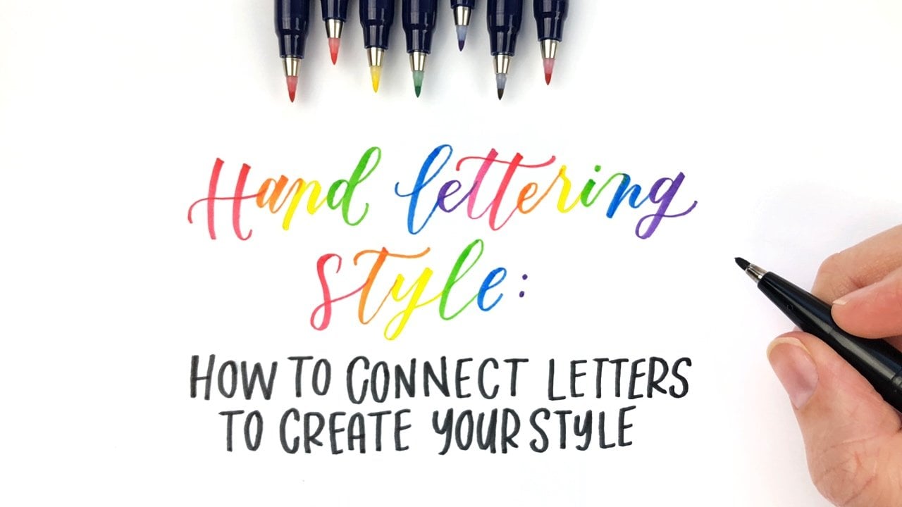
14. ✨Day 7: Exploring Lettering Styles: You made it today. Seven. I am so proud of you. Thank you for being
here with me. Today is all about exploring
different lettering styles. There is a worksheet for you to practice if you need
a little bit of help. And to get started, I am just going to draw a border on the top
and the bottom of my page. I'm doing these rainbow stripes. This is a really cute way
to just add a little color. And in my dark grid
I counted four dots so that the top and the bottom
would be the same size. And you'll see that I didn't add any gold stars on this one, but I probably could
come back in with gold stars because
That's what I do. That's how I love embellishing
and finishing up a page, but you don't have to add
embellishments to every paint. I just like to add
a lot of colors. And so that's how I am making this page
feel more colorful, which makes me happy. It makes me feel more like me. And that's the whole point of your hand lettering journal. It's about you. It's how your lettering
feels like you. When you're lettering
feels like you. It can be the most therapeutic. It can help you show up as the best version of
you in your life. And that's one reason why I love to practice unique styles. You can practice that
wherever you are right now. You don't have to have years of experience to play
with different styles. When I first started, I think I had only
been lettering for two or three months. And I already was just exploring all different types of
styles because I loved it. It can really help you
see that there isn't just one way to letter. You can make it look
good in whatever style, as long as you're intentional
with what you're creating, you can make it yours. You can make it beautiful. There are so many different
styles you can do, and not everyone likes
every single style. And the point is to
find what you love. And you might make a bunch of styles that you
really don't like. And you have to get
through those ones to be able to find
the ones that you do. Like, I love creating a piece
with all different styles. It's really fun to emphasize a certain word I
like to do it with hello in brand new journals saying hello to
this new journal. And if you want to learn
more about lettering styles, I do have a few other classes that will help you with that. So definitely check those out. And I can't wait to
see your styles. We finished day seven, but your notebook is
not completed yet. You get to discover what's
going to be on the next page.
15. Let's Wrap It Up!: Thank you so much for
taking this class. I love to see what you created
in the project section and something you made my
inspires someone else. If you liked this class, please consider
leaving a review. It helps me out and it
helps future students. If you're still looking for
more lettering resources, you can check out my
other Skillshare classes or take a look at my
lettering library. It's full of free resources. You can find that on my
website and sign insights.com. Thanks again, and I'll talk to you in the
project section.
 Sarah Ensign, Hand Letter Artist