Transcripts
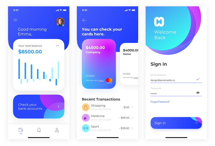
1. Introduction to the course: If you want to become a UI/UX designer, you are in the perfect place. This complete course will teach you all of the essentials with well organized and easy to follow tutorials. Hi, my name is Arash and I'm a UI/UX designer. Together, you and I are going to learn how to become a user interface designer using the software Figma. This course has been designed for people completely new to UI/UX design or let's say design in general. At first, we are going to learn about the design basics and UI elements and then we will learn about Figma and all of its hidden secrets together, then you will learn how to create a simple wireframe. From there, you will learn how to set up your style guide and how to apply your colors appropriately to your design. You will also learn about all the principles of mobile application and web design and then we will design a finance app together and I will share with you all the necessary techniques in secrets for designing a world-class application. Moreover, you will learn about both simple and advanced Micro Interactions, additionally, there is a dedicated web design section where we design a complete modern learning page together. Here you will learn the essentials of web design, such as layout grids, interactions, and so much more. We will also talk about markups and how you can create your own online portfolio without writing a single line of code. In addition, you will learn about 3D modeling and creating augmented reality scenes. Last but not least, you will learn how to start your own business and get your first client as a UI/UX designer. So during these scores, we will wireframe design and prototype a finance mobile application to develop your design skills and master all the necessary tools. Additionally, you will get access to two brand new UI kits worth more than $3,000 and you can use them in your commercial projects. I hope you're ready to learn new skills and become a user interface designer. I'll see you in class.
2. Introduction: Hi everyone. Welcome to the first chapter of this course. In this section, we are going to be talking about the differences between UI and UX design and the course structure that you can understand how the course is organized in order for you to follow it up properly. Last but not least, we are going to be talking about the tools and requirements that you need to know to proceed the course. Without further ado, let's get started. First of all, I'm going to talk about the differences between UI and UX design. Although both elements are crucial to a product and work closely together, their roles are totally different. UX design is a more technical and analytical field. However, UI design refers to graphic design with more complex responsibilities. Let me give you an example. If you consider a product like a car, the chassis is the code which gives it a clear structure. The other parts such as doors, fuel filter, et cetera represent the UX design which lets the car function properly. On the other hand, UI design represents the appearance of the car, its sensors, et cetera. In other words, UX, which stands for user experience, is about how a product should work, and UI, which stands for user interface, is about how a product should look. You, as a product designer, should know how these two terms work together and how to distinguish between them. For instance, you should know what are the responsibilities of a UX designer, and on the other hand, what are the responsibilities of a UI designer. As you can see in the pictures, we have two different screens. The left one shows us how the product should work. For example, suppose that you have a screen with two buttons and two text fields, the UX shows us how these buttons should interact with the user, and the right picture is all about user interface and it shows us how the product should look. For instance, here we have a button and a square. The UI designer decides how big this pattern should be or which color is suitable for that square. These are the UI designer responsibilities. Thank you so much for watching this video and I will see you in the next video.
3. Structure of the course: Hi, everyone. In this video, we're going to be talking about the structure of the course. As a matter of fact, you can divide the course into two main sections, the theoretical part and the practical part. The theoretical part creates 10 percent of the whole course, and the practical part forms 90 percent of the course content. Instead of focusing on theories, we will focus on practicing the skills you learn by working on different kinds of projects. In the theoretical part, you will learn about design basics, UI elements, business ideas, etc. In the practical part, we will design a complete mobile application from scratch. You will also learn about the essentials of web design by designing a modern learning page, we also talk about wire framing, 3D modeling, logo design, and so much more. If you're a complete beginner, I highly recommend to watch the theoretical part first and then proceed with the course. On the other hand, you can skip the theoretical part and jump into creating a project. All right, guys, thank you so much for watching this video and I will see you in the next video.
4. Tools: Hi everyone. In this video, we're going to be talking about the required tools for completing this course. In this course, we're going to use different graphic design tools to design world-class user interfaces together. The main software which we are going to use is called Figma, which is available for both MacOS and Windows. You can even use it on your browser without installation. Furthermore, you don't need to pay for it, it's totally free. The other tools that you will learn about are Vectary and Adobe Photoshop. We will also talk about useful websites such as Dribble, Behance, etc. If you don't have any of the above mentioned software, make sure to install them before starting the course so see you there.
5. Intro to Design Basics: Hi everyone. Welcome back to another section of the scores. In this chapter, we are going to be talking about layouts, iconography, typography, colors, composition, and so much more. If you want to become a professional and great UI, UX designer, you need to start off with design basics. Now that you know the importance of knowing design basics, let's start this chapter.
6. Layout: Hi everyone. In this video, we are going to be talking about layouts in design. When it comes to UI UX design, the way we show the information in an app or website is so important. As a matter of fact, there is not a specific right way to create your own composition. So you can easily create a layout based on your own need as long as it is consistent and understandable to users. As you can see in the pictures on the right, both screens are well-designed. Although the spacing is different, the composition is absolutely clear and consistent. You need to pay attention to consistency a lot while you're designing a user interface. No matter what kind of platforms you are designing for, the same rules apply to all of them. Now let's check these pictures out. As you can see in the left picture, the distances are quite consistent. For instance, if you look at the distance between the profile image and the top of the screen, you can realize that the value is 50 pixels, and also the distance between the same profile image and the text field right under that is again 50 pixels. As you can see, the layout of this design is quite clear, and the reason of that is because of the consistency of spacing. In the next lectures, we will also talk about spacing and the importance of that in design. Now if you look at the right picture, you can realize that the design is also clear in that layout. However, the only difference is the colors and the spacing. But as you may have noticed, the spacing is again consistent. Thank you so much for watching this video. I will see you in the next video.
7. Visual Hierarchy: Hi everyone. In this video, we are going to be talking about visual hierarchy. Visual hierarchy is about how we look at designs. Does it sound weird? Let's put it in another way. We as designers should put ourselves in users' shoes in order to realize how they see our designs. Content in any digital page layout will pursue a particular hierarchy. For instance, menus go to the top, bottom, left, or right of the screen, or a combination of these. Headers appear above by the text. In other words, hierarchy is a simple way of staying organized from most to least important. Remember that users define the hierarchy of any app or website. The item that first grabs the users' attention is at the top of the hierarchy. The visual specifications that the designer can utilize to influence users' understanding of the information are size, the larger the element, the more attention it will attract. If you're familiar with HTML and web development process, you may know that we have six kind of headers from H1 to H6. H1 is the largest header and H6 is the smallest one. When we want to get so much attention, we will use H1. For instance, suppose that we want to get the users' attention to a specific section or a specific item. In that case, we will use the larger header or on the other hand, sometimes we don't want to get so much attention to a specific section or content. In that case, we can use the smaller header, so size is so important. The next item is color. Bright colors are more noticeable than muted ones. If you do not have enough information about colors, you don't have to worry about it because in the next lessons, we will cover all the necessary information about choosing the right color in your design. The next item is alignment. An element with a different alignment of others will attract more attention. What does that mean? Suppose that you have a layout of, let's say, four different videos or four different photos. If you align only one of those videos or those photos differently, it will draw more attention to it. As a matter of fact, in that case, the user can realize that something is different. The next item is contrast. Sharply contrasting colors will catch the eye easily. Contrast is a very important topic in UI design. We will talk about contrast in next lessons deeply. The next item is proximity. Elements which are placed closely together appear more related and that's true. If you look at the pictures on the right side, you can see we have two different screens. Let's focus on the left screen. As you can see, we have two different sections, new promotions and new stories. Can you realize that elements in both sections are placed closely together so that users can easily understand that they are related together? The next item is repetition. Repeating styles can indicate that content is related. What does that mean? Let's look at the pictures on the right. Can you see that we have four squares, have three circles, so the user can easily recognize the relationship between those elements. The next item is whitespace, which is another important term in UI/UX design. More space between elements will draw more attention to them. Let's look at the pictures on the right but this time we need to distinguish between the left screen and the right screen. As you can see in the left screen, we have enough space, or let's say, enough whitespace between our elements and our sections so the users can easily walk through the user interface. However, on the right screen, you can see that all elements are very close together and there is not enough white space between all elements in that kind of layout. Thank you so much for watching this video. I hope you enjoyed it and I will see you in the next video.
8. Visual Noise: Hi everyone. In this video, we are going to be talking about visual noise in design. Visual noise, as you can guess from its title, is all about a screen or part of a digital product which has so much information and many elements on it. When you're designing an app or a website, you need to pay attention to details a lot. Because by the end of the day, we want to design a screen which is user-friendly and easy to watch through. Make sure to eliminate all the unnecessary elements or information from your screen. If you're not sure whether your design has visual noise or not, it is recommended to ask for users feedback. If you look at the pictures on the right side, you can see that we have two different screens. In the left screen, there is no visual noise, and it is great in terms of UI design. On the other hand, in the right screen, there is too much visual noise. As you can see, there are so many ticks at the top and then some items, which could be videos or photos, then again, some videos, and after that some stories, and you can recognize that there is not enough white space between those elements. Thank you so much for watching this video, I will see you in the next video.
9. Iconography: Hi. In this video, we're going to be talking about iconography in design. Iconography is a visual language used to demonstrate aspects, content, or functionality. Icons are meant to be simple and clear, visual elements that are recognizable immediately. You do not have to redesign well-known icons such as Home icon, Search icon, etc, or let's say, do not reinvent the wheel. You can get access to almost all kinds of icons on websites for free or at reasonable costs. But what if you need it to design some icons specifically for your project? In that case, you should design icons which are in harmony with your design and other icons. Keep in mind that icons need to be understood easily by users, so make sure to show consistency in your design.
10. Typography: Hi. In this video, we're going to talk about typography. What is typography? Typography transforms language into a decorated visual element. Typography is one of the most important parts of UI/UX design so it is worth your time to learn more about it. When you're designing an app or a website, limit the number of typefaces and sizes you use in order to keep your design simple. Start with two fonts at most; one for the headers and the other for the bodies. You can use free or paid fonts in your projects, but I highly recommend using free fonts. If you will like to use paid fonts, check the license carefully. You should inform your clients that they need to pay extra for using paid fonts. Now if you look at the right side of the screen, you can see that they've classified the typography foundation for you. Let's check it out step-by-step. Right at the top, we have properties. Every text line in any program has a base line, as you can see, it is indicated here with the blue line and also it has the letter spacing that you can modify it in your design. Of course, there are more properties related to typography, however, for preceding these scores, it is enough to know these two properties. Now let's focus on letter spacing comparison. On the left, you can see we have the default spacing, but on the right, I modify the spacing of those letters depending on what kind of project you're working on, you can modify the letter spacing as you wish. Now let's talk about the weight of each font. Most fonts have at least 3D print weight, but some of them have more. For instance, a font can have six different weight, as you can see on your screen, we have here from light to bold. Last but not least, the classification of fonts. As you can see, we have two different classifications for fonts: the serif, which is the left one in the picture, and the sans serif, which is the right one in the picture. What is the difference? For sure you can distinguish between them, but let me explain to you in order to memorize the rule of serif and sans serif. Actually serif fonts have some kind of flat line at the top of them and also the bottom of them or you can say they have feet. On the other hand, sans serif fonts do not have these kind of lines. Sans in English and French means without, so sans serif means without serif. You as a designer are responsible for choosing the best weight of fonts and also the best classification depending on what kind of project you are working on. Thank you so much for watching this video, I will see you in the next video.
11. Color Contrast: Hello everyone. In this video, we are going to be talking about color contrast, which is a very important topic when it comes to UI design. Applying colors effectively is a skill that everyone who works with visual compositions must have. You as a UI designer, need to know how to use colors in your projects. When it comes to applying colors, readability and legibility are the key factors. Researchers have shown that vibrant colors enable enough of contrast, helping to increase readability and legibility. Please take into consideration that too much color contrast may cause difficulty in reading. I highly recommend that designers should create a mid-level of contrast, and for highlighting elements, they can use high contrasting colors. You can also use websites to provide you with a ratio when comparing two colors to see whether there is enough contrast or not. If you look at the examples on the right, we have six different colors. As you can see, the first four are acceptable and have enough contrast, but the others are not readable. When we are designing a user interface, we need to pay attention to colors a lot because sometimes, you as a designer, want to be as creative as possible. However, creativity should come after readability and legibility.
12. Color Palette: Hi everyone. In this lesson, we are going to be talking about Color Palette. Creating a color scheme for product might seem like a hard task, especially if you are a beginner. However, in reality, it's not as complicated as many designers think. What is the color scheme? Your color scheme is a mixture of colors used in your user interface. Almost every color scheme contains the following groups of colors. Primary colors, secondary colors, accent colors, neutrons, semantic colors. What are the primary and secondary colors? Primary and secondary colors are the base colors of your user interface. The colors which are used most frequently in your UI design are called primary colors. Most designers usually choose brand colors as primary colors. As a matter of fact, it's recommended to have no more than three primary colors. Optionally, you can use secondary colors in order to distinguish your products and make more interesting UI designs. But how to choose colors properly? When you're working with colors, you should not create a combination of random colors. Because the result would not be the one you expect. In order to understand how to work with colors, first, you need to know what the color will ease and how it works. Here are important color combinations you need to know. Complimentary, which are two colors that are on opposite sides of the color wheel. The next one is monochromatic, which are three shades tones and teens are one base color. The last one is analogous, which are three colors that are side-by-side on the color wheel. If you look at the right side of the picture, you can see that we have a color wheel here. As you can see, we have monochromatic. For example, if you look at the red, we have three different shades or let's say teens of one base color, and also we have complimentary. For instance, here we have purple and yellow, which are on opposite sides of the color wheel. So the combination of these colors is great.
13. Spacing: Hi everyone. Welcome back to another lesson of this course. In this video, we are going to be talking about spacing in design. Consistency plays a key role in UI design. When you're designing, you need to measure everything and keep it consistent. As a designer, spacing is up to you, but once you set it, you need to use the same spacing patterns in your designs. For instance, if you set the spacing between the header and body takes to eight pixels, you should always use the same spacing throughout your project. As you can see in the picture, all the spacing has been measured accurately and it makes the design clearer. For instance, if you look at the picture, you can see that we have 50 pixels from the top to new pictures title and then eight pixels from new pictures to the top of subtitle and going on and on. In order to keep your design clear, make sure that you use consistent spacing patterns throughout your project.
14. Composition: Hi everyone. In this video, we are going to be talking about composition in design. What is the golden ratio? The golden ratio is a mathematical proportion between the elements of different sizes which is thought to be the most aesthetically pleasing proportion for human eyes. The golden ratio equals 1:1.618 and it's usually illustrated with seashell shaped spirals. This number was used in creating proportions for architecture, paintings, photography, design, etc. But how to use the golden ratio in your design? If you have a screen with the width of 1,200 pixels you need to divide it by 1.618 and the result will be 741.6. Now, we can say 1,200 pixels minus 741 equals to 459, so we have two sections with the width of 741 pixels and 459 pixels. As you can see on the right side of the screen here, we have a screenshot of the medium website. Can you see how it has been designed based on the golden ratio, so it can get the user's attention to the right place at the right time?
15. Design Guide: In this video, we're going to talk about Design Guide. What is a design guide? A design guide is a system that can help you to keep your design consistent. It can also accelerate your design process. The examples you're looking at are only a few components that can be used in your design guide. There are lots of things that can be included in your design guide such as UI elements, typography, iconography, sizing and spacing, color palettes, etc. Having a design guide makes your life much, much easier.
16. Consistent Fonts: Hi everyone. In this lesson, we are going to be talking about fonts in design. As a designer, you always work with different fonts, so you need to know how to use them properly. As it was mentioned in the typography section, it is recommended to work with two different fonts at most to keep your UI simple. What are the best fonts for UI design? Number 1, San Francisco, it is best for modern websites and mobile apps. Number 2, Open Sans, it is best for websites and mobile apps. Number 3, Montserrat, it is best for minimal websites and mobile apps. Number 4, Proxima Nova, it is great for modern content-centric websites and mobile apps. Last but not least, Roboto, it is best for modern websites and mobile apps as well.
17. Consistent Colors: Hey everyone. In this video, we are going to be talking about colors. Applying colors to your UI elements is one of the most crucial parts of the UI design process. Do you remember what was playing a key role in UI designing? You're right, consistency. So you need to keep your colors consistent as well. For instance, if you apply blue to titles on one page, you need to apply the same color to titles on other pages. Or if you apply a red to a precious button, you should use the same color for any other precious buttons on other pages. This is why we need a design guide and a style guide. If you look at the picture on your right, you can see that we used a specific black color for titles, and we use a specific color for our buttons, etc. So it is so important to keep your colors consistent.
18. Consistent Icons: Hello, everyone. In this video, we're going to be talking about icons in design. You may think that working with icons is an easy part of the UI design. However, if you do not pay attention to details, you will not get an appropriate result. Here are some important points that you need to take care of. Number 1, test scalability. check if your icons can still be recognized at small sizes, such as 15 by 15 pixels. Number 2, properly sized. The recommended target size for touchscreen objects is 7-10 millimeters. Also remember to add padding between icons to prevent incorrect taps. Number 3, internal consistency. Use the same color scheme for all icons and also the same styling attributes, such as the size of borders. Number 4, perfect alignment. Always try to have perfect alignment in iconography, but sometimes, because you have icons with different sizes, you need to balance them by yourself. If you look at the picture on your right, you can see that we have two different groups of icons. In the left group, you can see that we have consistent iconography because we only use outline icons. But on the other hand, we have inconsistent iconography because we use both outline and solid icons at the same time, which is not recommended.
19. Consistent UI Elements: Hi, everyone. In this video, we're going to be talking about consistency of UI elements. One of the things that you always work with while you're designing a user interface is a UI element. What are the UI elements? Buttons, cards, text fields, sliders, dialogues, charts, steps, tables, selection controls, menus, snack bars, et cetera. As you can see in the picture, I chose only some of them for you because, certainly, I could not put all of them here. However, you will learn about almost all of them in the UI elements chapter.
20. Font Resources: Hey, everyone. In this video, we're going to be talking about font resources. Sometimes choosing the right fonts for your projects, could be tricky and time-consuming, so in this part, you're going to know about the best online resources to get your fonts easily. The first website is called Google Fonts, which is so famous and you can find free fonts there. The second website is called MyFonts, and you can find free and paid fonts there. Last but not least, you can check out the Adobe Fonts website, which you can find paid fonts there. If you are having trouble with pairing fonts, you can also use Typewolf or FontPair.
21. Color Resources: Hi everyone. In this lesson, we're going to be talking about color resources. Now it's time to look for our colors in order to use them in our projects. Most of the time, finding good colors is a difficult task for UI designers, especially if you're a beginner. Here are some absolutely useful resources for finding colors. Number 1, Color Hunt, number 2, Adobe Color, which is so useful by the way, number 3, I don't know how to pronounce it, but I think it's Coolers or Coolers, number 4, WebGradients, which is another good website for finding gradients if you're looking for them. Make sure to spend enough time finding the best possible color palette for your projects.
22. Icon Resources: Hey, everyone. In this video, we are going to be talking about icon resources for your design project. As mentioned before, iconography is an essential part of the UI design process, and it is so important to know where you can find engaging, and a standard icons. Here are some useful resources for finding icons. Number 1, Flat Icon which you can find paid or free icons there. Number 2, IconFinder, which is another good website for finding icons. Last but not least, Nucleo, which is an application, and it gathers all the icons for you in one place. Remember that you should use the icons which are easy to recognize by users, so take your time, and check out all the available icons that you may want to use in your project.
23. Introduction to Figma: Hi, everyone. Welcome back to another section of this course. In this section, we're going to be talking about Figma. What is Figma? Figma is an interface design tool that runs in the browser. It gives you all the necessary tools for designing a world-class user interface. But it's actually much more than that because of the fact that Figma, in its nature, is an always online tool, it allows for live and real-time collaboration, which is a fantastic feature. Although Figma is browser-based, there are desktop versions for both Windows and Mac OS. I will show you how you could use both browser and desktop versions in the next video. Unlike other tools such as Sketch, Figma is free to use unless you need to create more than three projects. You can create unlimited pages and files in the free version. All right, guys, thank you so much for watching this video. I hope you enjoyed it and I will see you in the next video.
24. Figma Requirements: Hi, everyone. Welcome back to another video of this course. In this video, I'm going to show you how you can create an account on Figma in order to use that for our projects. As I mentioned before, Figma is free to use. However, if you want to create more than three projects you need to get the professional account which is not necessary for this course. But the good news is if you are a student and you are enrolled in a university or a school you could always create a Figma account for a student and verify your student status and use it for free. That is fantastic. But if you are not a student there is no problem. You can still use all the features of Figma with the free account and you can still create unlimited pages and files. How can you create an account? It's so simple. If you open up the Figma website which is figma.com, you can click on, "Sign Up". Here you could choose whether you want to sign up with Google account or with your email address and setting a new password to your account. It's totally up to you. You can also log into your account with your Google account or with your email and password that you set. Let me login with my Google account. There we go. As you can see, whenever you create an account you have already some projects here which is called Figma Basics, Prototyping in Figma and Wireframing in Figma. If I open up this one, you could see some simple tutorials and some basics about Figma and how you could use that. You don't need to worry about it because we're going to cover all aspects of Figma in the next series of videos. As you can see on your left you have some menus. The first one is your account or your profile. If you click on that you can see it's your name. You can change your profile image. Here there are some options, personal access tokens and we don't need to use that for now. If you want to delete your account you can use this option. The next option is Search. You can search through your projects and your files. Then you have Recent which shows you the recent projects and files that you have opened. Then we have Plugins which gives you the option of installing some plug-ins which is so important. We'll talk about it later. Then we have Drafts. You can create some drafts and also you have deleted files. You can also create a new team over there if you want to work in a team. Also you could import your sketch file. It's amazing. Figma automatically converts your sketch file to Figma file and you could use it perfectly. Right now we are using Figma on our browser. However, as I mentioned before you could always install Figma on your system. How can you do that? It's so simple. If you go ahead to figma.com/downloads or if I go ahead and log out here, is the learning page and you can see the resources and if you hover on this link you could see the downloads link over there. I'm going to click on that. Here we have the Figma downloads which lets us download some resources. The first one is desktop app. Here Here could find desktop app for macOS or desktop app for Windows. Depending on your operating system you could download it and install it. Then we have Live Device Preview. It's a great application. You could download it from App Store or Google Play and then you could preview your design instantly. Last but not least, we have font installers. What's that? When you're using Figma on your browser, Figma cannot get access to your local fonts which is not good because most of the time you need to use your local fonts. In order to fix that problem you could download the font installer for Windows or macOS then you could install it. After that, you can get access to your local fonts on your browser which is pretty awesome. Although you could get access to your local fonts by installing this font installer, I highly recommend that you use the desktop version of Figma because it really accelerates your design process. Guys, thank you so much for watching this video. I hope you enjoyed it. In the next video, I'm going to talk about the environment of Figma and how you could use it simply. See you then.
25. Figma Environment: Hi everyone. Welcome back to another video of this course. In this video, we're going to be talking about the environment of Figma. So as you can see, right now, I'm using Figma on my browser. However, I'm going to go ahead and open up the desktop version in order to accelerate my design process. So let me open up the Figma app, there we go. This is my primary account, as you can see, and this is the desktop version that we can use easily. So first of all, let's go ahead and create a new file. Here, as you can see, we can divide the Figma's environment into four different sections. The toolbar, which is right at the top, and it consists of all the necessary tools that you need for designing a world-class user interface. As you can see here you have a menu and here you have some sub-menu such as file, edit, view, object, vector, text, arrange, etc. We will cover all of those options during this course. Here you have some tools such as move tools, scale, and also the frame and slice tool. Then you have the objects or shapes tool and also the pen tool. Then we have the text and comments. Right on your left, we have the layers pane that lists all of your layers and also all of your assets respectively. As you can see, there is no component here yet because we didn't create any component so far. However, in the future lessons, we will learn how to use these sections as well. Then on your right, we have the inspector, which consists of three different parts. As you can see, we have design, prototype and code. So if I click an "A", on my keyboard, I can create an artboard for starting my design process. For instance, I can choose phone and here I'm going to choose iPhone 11 Pro or X. As you can see, you have the dimension right over there, I'm going to click on that, and here, you have your artboard and you can see the name on the layer's list. If you double-click on that, you can change it to whatever you want. For instance, let's say home, pretty good, and I can easily choose the rectangle shape, and there we go. We have another layer right under this artboard. Here on your right side in the inspector section, you have different options. For instance, in the design section, you have alignments, you have a dimension, and also the location, the positioning of your shape. You have also the constraints section, and we will dive into each section separately in the next series of videos. So don't worry if you don't understand what the constraints are or basically what they do. For example, here we have layer and you can adjust the opacity of your layer and its mode. Here you have fill for changing the color. As you can see, we have stroke, we have effects for adding some shadows, and then we have the export. For prototyping, you can go to prototype section. Here we have different options as well that we will cover in the prototyping section of this course. You have also the code section, and it's so useful if you are a developer or you want to hand over the properties of your design to your web developer or even your application developer because you can easily export your properties in code, for example, for iOS, we have variable and different properties. That's pretty cool. Last but not least, the fourth section is the Canvas, which is in the middle of Figma. Here you will place all your designs and all your artboards. You have also the share option right over there, that you can share your file or components with your team member, or even you can send it to your client for reviewing the project, etc. All right guys. Thank you so much for watching this video. I hope you enjoyed it and I will see you in the next video.
26. Shapes: Hi everyone. Welcome back to another video of this course. I hope you're doing well. In this video, we are going to be talking about the shapes. The shape tool is one of the most important tools when you're designing a user interface because no matter what kind of interface you are designing, for sure you will need to use one of these shapes. Right at the top in the toolbar, you can find the shapes. If you click on that, you can see that there are different shapes here. For instance, we have the rectangle. If I select that, I can easily create this shape by dragging and dropping. As you can see, we have created a rectangle and it's called rectangle 1. Each shape has some properties, for instance, this shape has the corner radius property, and as you can see, it's indicated with these dots. If I just click on one of them and drag the mouse a little bit like this, I can set the corner radius to 30. Alternatively, you can change the amount of corner radius, writing the inspector over there, for example, I can set it to 50 like this. If you want to change the corner radius or only one of those points or edges, you can hold "Option key" and then drag and drop like this. As you can see now we have different amount of corner radius for each point like this. As a matter of fact, you can customize your corner radius like this if you just click on "Independent Corners" on this icon, you can see there is corner smoothing, and I'm going to click on that. Here we have a slider and I'm going to set it to 60 percent. As you can see here, it's written iOS, so what does that mean? Actually in iOS, Apple uses smooth corners. If you're familiar with Sketch, we use the same term as well. As you can see, it makes our corners much smoother. Of course you can increase it, however, 60 percent makes it look great, perfect. Of course, you can change the color of your shape, as we have discussed in the previous video. However, we will cover all those features in the next series of videos, but for now, let's stick to the shapes. The next shape is called line. It's just a stroke. If I hold "Shift" and "two", you can see that Figma brings these shape to me automatically in a way that I can see it clearly, so I'm going to click on that. Here on stroke, you have different properties as well. For instance, you can change the thickness of the line or let's say this stroke like this. Let me set it to 10. If you click on these dots, you can see that we have different options here. It's called advanced stroke and we have cap and join. What does that mean? Let's take a look at it. Let me open up this menu and here we have different options. We have round that will make our line rounded for both sides. We have square, which doesn't make sense because it's kind of the same. We have line arrow like this, and we have triangle arrow like this. If I choose, for instance, "Line Arrow" and I decide to modify this shape by double-clicking on this shape and for instance, moving this point, you can see that it will change automatically, pretty good. We will cover joins in the future lessons. Now let's talk about the next shape, let me click "Undone" to finish editing. The next shape is an arrow, like this. It's again a line or let's say just stroke that we just created. However, you could create an arrow like this as well. As you can see, you have different types, round, square, line arrow, and triangle arrow. The first one, by default was mixed because we had a customized line. The next shape is the circle. I'm going to hold "Shift" in order to keep the aspect ratio like this. I'm going to drag and drop to create this circle pretty good. This circle has a new property which is called arc. Let's click on that and try to move a little bit to see what you can achieve by modifying this property like this. That's pretty awesome and especially it's so useful when you're creating a chart, awesome. The next shape is called Polygon, I'm going to create one. Let's remove this shape for now. I'm going to make it larger, pretty good. The polygon shape has two different properties. The first one is corner radius, and it works like rectangles. The second one is called count, which means the number of edges that we're using we're creating. Let me increase it by holding "Shift" and clicking on that like this. I'm going to move my mouse up and down. You can also modify it in the inspector, let's set it to eight, pretty good. I can also modify the radius obviously here, fantastic. Let me remove that and I'm going to create the star once again here, pretty good. The star shape has three different properties. The first one is corner radius, again, like this. The second one is the ratio, which is the ratio between these two edges like this. You can modify that, I'm going to set it to 40 The last one is count. That you can increase and decrease as you wish, pretty awesome. Last but not least, is the place image that you can choose an image from your system. If you drag and drop like this and make sure to hold the Shift key on your keyboard in order to keep the ratio you can place an image. You can also change the radius as well, it's so simple. Now let's talk about the dimension property right over there. Here, as you can see, you have different properties like X and Y, which refers to the position of this shape. If I set zero and zero for Y, as you can see, it moves to the left hand top corner because the zero and zero points starts from top and left corner. Now you can modify the width and height. For instance, you can set it to 300. However, as you can see, the width and height are linked. If you want to change them separately, you can easily unlink them by clicking on this icon, which is called constrained proportions, and then I can modify the width or height separately like this. Like in Sketch, you can do mathematical operations here. For instance, I can divide 300 by 2, like this and there we go, we have 150 or I can multiply 180 by 2. It's a great and useful feature when you're designing your user interface. We have the alignments where they're right at the top. For instance, if I choose this object or this shape, I can align it to the center horizontally, I can align it to the left side, align it to the right side, align it to the top, align it vertically, and align it to the bottom. But what if you want to align an object which is placed inside another object? Suppose that we are going to put this object here, I'm going to change the color to something like dark gray, like this. I'm going to make it smaller a little bit. Suppose that we are going to align this shape with our rectangle, which looks like a square right now, but how can we do that? First of all, you need to make sure that you chose both objects at the same time. You can hold "Shift key" on your keyboard and select them, or you can select them like this, with dragging and dropping. Then you will click on "Align horizontal to the center" and "Align vertical to the center" and it's done, pretty awesome. Now in this video, we have learned how to use shapes and you know the properties of each specific shape. I hope you enjoyed this video and I will see you in the next video.
27. Editing Shapes: Hi everyone and welcome back to another video of this course. In this video, we are going to be talking about editing shapes, which is a very important topic because it happens all the time that you may need to edit your shapes. First of all, I'm going to press, "A" and as you can see now I can choose my art board. Let's open up the desktop menu and here I'm going to choose, MacBook Pro, for this video it doesn't matter, but I have enough space to show you how you can edit your shapes. Then what I'm going to do is creating a new rectangle here. I'm going to hold, Shift, and drag and drop like this. Then let's increase the corner radius. By the way, if you hold Shift key on your keyboard, you can increase or decrease the corner radius by 10 units, like this, pretty good. Then I'm going to fill it with another color, so let's look for a very beautiful blue. I think it's great and then I'm going to create another rectangle here, so let's hold, Shift, again, and I'm going to show you a very great technique to choose your colors properly. If you're not sure that how you could match a good color with these blue that creates a great contrast between them, you can first choose the same color like this. Then if you just move this circle to the darker side of these color palette like this, you can easily choose a perfect match with your background color, which is amazing, isn't it? Now, how can we edit our shape? In order to edit any shape, first, we need to enter to the edit mode. To do that, you can double-click on that shape and there we go. Now we are in edit mode, and as you can see, we have four different nodes here, or let's say points that we can start editing our shape with. If I click on the circle, and try to move it a little bit. You can see that I can easily edit this shape as I wish, like this. I can even increase the radius of these corner in the inspector, something like this. You can also add more nodes on your path, like this. For example, here I can click once and there we go, I just created a new node, and I can edit it in another way like this. Let me come back to the first state of this rectangle, or let's say square like this. Now suppose that you want to create something like a curve, in that case, you can use the bend tool, which is here. You can click on that and choose one of those nodes, then you can see that handled controller appears, and we this handled controller you can easily adjust your curve like this. It's awesome, isn't it? The shortcut of bend tool is holding, Command, on your keyboard, there we go. You can easily adjust your curve in order to meet your expectations, pretty awesome. After editing your shape, you need to remember to close your editing mode. To do that you can click, "Undone" like this, so Right now we are out of editing mode. But isn't it better to create a real icon in order to show you how you could use the powerful editing mode? Let's do that. First of all, I'm going to zoom in a little bit like this, then I'm going to enter into edit mode, let's doubled click. After that I'm going to create a new node right here. I'm going to click on that, then I'm going to drag it down by holding, Shift, like this, pretty good. The next thing I'm going to do is selecting all nodes by holding, Command A or Control A, in Windows, then I'm going to increase the corner radius. Let's increase it to six maybe, that's pretty good. Now I'm going to make it a little bit taller, and the last thing I'm going to do is rotating this icon. In order to rotate anything in Figma, you can hover your mouse just outside your shape, and you can see that the rotation indicator or icon appears immediately. Then I'm going to hold, Shift, and I'm going to rotate it by 180 degrees. As you can see, you have the amount here, and there we go. What does it look like? You're right, it's like a bookmark. Can you see how amazing and powerful this editing tool is? I'm going to make some changes in order to make it better. Let me double-click on the shape, and I'm going to select these two top nodes and then increase the corner radius to 26 maybe, pretty awesome. Let me select both layers and I'm going to group them by, Command G or Control G, in Windows, and I'm going to name it, bookmark. So what else can we do? Let's go ahead and create a polygon here, I'm going to set the color to the same blue as our bookmark icon. Let's copy and paste these background as our frame. I'm going to hold, Command key or Control key, in Windows and click on these rectangle or square and copy it by, Command C, and I'm going to paste it. However, remember to move this layer outside these bookmark group. I'm going to move it a little bit like this, now let's double-click on this triangle. Here I'm going to create another node right at the bottom, like this and let me drag it a little bit, there we go. We have our GPS marker. That's pretty cool, isn't it? Let me make it smaller. Fantastic. Let me group it and I'm going to write. Let me enlarge this art board a little bit, then I'm going to show you how you can use the pen tool. Suppose that you want to create, for instance, a curved arrow, how can you do that? It's so simple. Let's start with adding a node, then you need another node like this and the last one here, that's all. First of all, I'm going to increase the stroke thickness to four maybe, then I'm going to rotate it a little bit. If I click on these dots, I can change the cap mode to line arrow like this, it's pretty cool. I can even edit it like this. Can you see how easy it is to create new shapes and edit them? Pretty awesome. All right guys, thank you so much for watching these video, I hope you enjoyed it. In the next series of videos, we will practice using these tools by creating real-world projects. So don't worry, if you do not understand all the details, I will make sure to explain everything in detail. I will see you in the next video.
28. Layers Basics: Hi everyone. Welcome back to another video of this course. In this video, we are going to be talking about the layers panel. Knowing that how you could use the layers panel properly is so important. It may seem easy to use, however, sometimes it gets a little bit tricky in terms of reordering your layers and your objects. Let's dive into these parts and I'm going to show you how you could use it efficiently. As you can see, you have the layers list on your left. Here you could see all your layers, all your groups, and also, all your frames. Whenever you create a new shape or a new object, it goes to the top of these layers list. Let's try it out. I'm going to create a rectangle here, and as you can see I have rectangle 1. For renaming this rectangle, I'm going to double-click on that and let's call it R1. Then I'm going to create another shape. Let's create a circle. Pretty good. I'm going to change the color, in order to make it more visible. Pretty awesome. I'm going to call it C1. As you can see, C1 has been placed to the top of these layers list. It appears to the front of your Canvas. This is the reason that this circle is visible here. If I move this layer below R1, it's not visible anymore. However, you could still change its properties like its color or its size. If I move it back to its previous position, you can see that it's visible again. Ordering your layers is so important. Now suppose that we are going to group our layers. Let's select these two shapes and hold Command G. As you can see, we just created group one. Whenever you want to see the layers included in this group, you can use the small arrow next to these icon, which indicates that this is a group. I'm going to click on that, and there we go. For selecting a layer, you can easily click on that. As you can see, a light blue bikes appears in order to show that this layer has been selected. If you go to Menu, and go to Preferences, you can see that you have different options here. One of them is, Highlight Layers on Hover. What does that mean? It means that if you hover your mouse on top of each layer, like for example C1, you can see on the Canvas that the blue line will appear in order to show that this is your desired layer. I'm going to select that. If you want to ungroup these layers, you can easily click on these group name and then right-click here, and you can click on "Ungroup" like that. I'm going to use Command Z or Control Z in Windows. Now, what if you want to hide some layers? It's so simple. Suppose that we are going to hide this circle, which is called C1. In order to do that, first of all, we need to hover on that specific layer like this. Then an eye icon appears immediately, next to these padlock. I'm going to click on this Eye icon and you can easily toggle this layer off and on, like this. You can also lock each layer by clicking on this padlock in order to prevent your layer from accidental edit. When you lock your layer, you cannot move your layer, you cannot interact with your layer, however, you can still change its properties. Let's try it out. I'm going to try to move this layer a little bit. As you can see, because it has been locked, I cannot move it. It's position is fixed and you can use this technique for locking your backgrounds. Sometimes it may be useful. However, now let's try to change some of its properties. For instance, I'm going to change its color. As you can see, I can still get access to its properties, although it has been locked. In order to unlock that, you can again click on this padlock, and there we go, it's unlocked. You can recognize the type of each layer on your layers list based on the icon next to its name. As you can see on the picture, we have frame, we have groups, we have components that we will talk about in the future lessons, we have instances, we have text object, we have shape, image, an animated GIF. Now, let's talk about the positioning of your layers. Once again, because I'm going to show you how you can reorder the positioning of your layers right under Canvas. Suppose that you want to bring the square or let's say rectangle to the front. In order to do that, of course you can go to Layers list and move it like this, and it's done. However, there is an alternative for that. You can easily right-click on that on Canvas, and you can choose, Bring to Front. There we go. If you're familiar with Adobe Illustrator, you know that you could use the same functionality in that software as well. Now let's go to the asset section. Here, as you can see, because we haven't created any components yet, we can't see any components here. Basically components, are parts of your design that you can reuse. We will talk about it later, and we will dive into components in the future lessons. We have another option here which is called pages. Right at the top, as you can see, here we have Page 1, and if I click on that, you can see that I have pages. It's called Page 1. You can rename that. I'm going to change it to website. You can duplicate that if you just right-click on that layer, as you can see, you can add a new page to this page list, like this. You can call it Page 2. The good news is that there is no limit for creating pages. You're free to create as many pages as you want. For instance, you could separate some parts of your design in order to make it clear when you're working in a team, or if you want to create different prototypes, it's a good idea to have different pages as well. I'm going to go to website, and that's all for this video. Thank you so much for watching this video. I hope you enjoyed it and I will see you in the next video.
29. Boolean Operations: Hello everyone. Welcome back to another video of the scores. In this video, we are going to be talking about the Boolean operations. Actually, nowadays, we use Boolean operations almost in every aspect of our life, such as art, programming, design, etc. As difficult as it may sound, actually, Boolean operations are so simple. Let's dive into it and I'm going to show you how you could use them easily. As you can see, I have created a simple project here with four different artboards, and I call them Union, Subtract, Intersect, and Exclude. These are our Boolean operators. As you can see here, we have this Menu and we have Union Selection, we have Subtract Selection, we have Intersect Selection, and we have Exclude Selection. First of all, let me choose this artboard and I'm going to hold "Shift" and two, like this, as you may guess, union means combined. If I try to overlap these shape with this circle, as you can see, they have been overlapped. If I choose the Boolean operations and I choose Union operation, you can see that we have combined these two circles into one single shape. Here you could, of course, get access to sub-layers like these circles and you can still edit it. However, we have one single shape and these operations are so useful for creating icons, and we will talk about it later. Now, let's go ahead and talk about the next operation which is Subtract. First of all, let me overlap these shape like this. I'm going to choose Subtract. As you can see, it subtracts the overlapping section from the base shape. The overlapping section is this part in the middle. When I choose Subtract, it removes these overlapping section from this base shape, which is the left circle like this. As you can see, the Subtract operation is the opposite of Union. The next operation is Intersect. Let me overlap these two layers like this. I'm going to click into "Intersect Selection" and these operation removes all the areas except the overlapping section like this. The next operation, which is the last one, it's called Exclude and it's the opposite of Intersect operation. If I overlap these two shapes like this, and I click on "Exclude Selection," you can see that it keeps all the areas except the overlapping section. So did you see how simple it is to use Boolean operations? They are so useful. Now, don't you think it's a good idea to create some icons with this knowledge? That's great. First of all, I'm going to create another artboard and I'm going to click 'A' on my keyboard. Let's drag and drop to create a new frame like this. Suppose that we want to create a search icon. What do we need? We need a circle. I'm going to create one, and I'm not going to fill it with colors. I'm going to remove the fill and add some stroke, like this. I'm going to increase the thickness of this stroke. Let me see, I think 15 is great and I'm going to create a rectangle as well with the width of 15 as well. I'm going to change the color to black like this. Let me zoom in a little bit. I'm going to move it up. Then let's select both objects and align them to the center. I'm going to choose "Union Selection" like this. Pretty good. Now I can rotate it. Awesome. Did you see how simple it is to create an icon with these Boolean operations? Pretty good. I hope you liked it. Now let's create another icon. For instance, let's create a cloud icon. I'm going to create a rectangle here, like this. Let's increase the radius. Pretty awesome. I need to create a circle as well like this. Let me overlap it. Pretty good. Then I'm going to select both of them and select "Union Selection." There we go, we have our cloud. If I change the color to black, you can see how amazing it is. You can also customize it later or even, for instance, I can remove the fill and I can add stroke like this if you prefer these styling. But remember when you are designing some icons for a specific project, you need to keep the thickness of your lines the same for each specific icon in order to be consistent in your design. All right guys. Thank you so much for watching this video. I hope you enjoyed it and I will see you in the next video.
30. Text: Hi everyone and welcome back to another video of the course. In this video, we're going to be talking about texts. We as UI UX designers use texts all the time and we need to know all the secrets behind the text tool. So in order to create a text in Figma, you can easily head over to the toolbar and click on this text icon. Or you could press T on your keyboard like this. Awesome, and if you click once, you will create an area takes layer or let's say a paragraph texts layer. Okay, so I'm going to write "Hello." We are UI UX designers. Pretty awesome, and as you can see, these kind of text line grows horizontally when you're typing, okay? Of course you can change it, however. First of all, let me show you how you can change the font size. If you head over to the text Inspector on your right side, you can change the font, you can change the font size, you can change the weight. We will talk about all these properties later. So first of all, I'm going to change it to 36. Pretty awesome. Now I'm going to select the frame and I'm going to press Shift and to our right. So as I mentioned before, this is an area text line. So what if you want to make it grow vertically? In order to do that, you can click on these dots and here you have plenty of options to change. But what we need is these resizing, as you can see, it's set as default to grow horizontally. If you want to make it grow vertically, you can change it to grow vertically here, and if I continue typing from now on, it grows vertically. I'm going to write, "Thank you for your support," like this. You can also create a fixed size text line. Or you could change it here like this. But what if you want to create a fixed size text line by yourself? It's so simple. First, you will choose the text tool, then you will click and drag like this, and in this way you will specify the dimension of your text box like this, okay? If I write anything here, like "We are talking about texts and comparing different options." Like this, and if you want to modify the dimension of these texts marks, you can easily hover on top of these blue bounding box and your cursor immediately changes to the scale icon, okay, and I can modify it like this. Pretty good, isn't it? Let me change the way to regular, all right? Sometimes it may be useful to convert a text line to a vector. So how can you do that? If I right-click here, I can go ahead and click on flatten, and there we go. Now our text is a vector, as you can see over there, and you can modify each letter separately. I'm going to zoom in and let's double-click on these H. There we go. Suppose that I am going to change something here. For instance, let's select these nodes and I'm going to increase the corner radius like this, and also for this one. Isn't it pretty cool? So converting your text line to a vector as useful, especially if you are designing a logo or a wordmark, etc, all right. Suppose that I am going to create another text line like this. Let's write H, then I'm going to duplicate that once again and once again, and let's write e and here l and here l, and we're going to duplicate that and o, okay. Let me move them a little bit, so as I mentioned before, in order to make your takes line a vector, you need to flatten your text on it. But what if you want to keep your layers as they are? For instance, here I have five different layers and I'm going to make it vector. In this case, you can right-click and instead of choosing flatten, you can choose Outline Stroke. Now you have all the letters as a vector. That's pretty awesome, isn't it? All right guys, that's all for this video. Thank you so much for watching it, and I will see you in the next video.
31. Text Inspector: Hi, everyone. I hope you're doing well and welcome back to another video of this course. In this video, we're going to be talking about the text inspector, how you can customize your text. Without further ado, let's get started with selecting these texts. In the Text Inspector, we have different options. As I mentioned before, some of them, I'm going to review them. The first option is the font that you can easily get access to your local fonts or the Figma fonts. You can easily change your fonts and now I'm going to set it back to Montserrat. The next option is the weight of your font. You can modify it to thin, light, regular, bold, and black. However, keep in mind, that these options may be different for different fonts. I'm going to set it to regular. The next property is the font size. As you can see, you can change your font size easily. I'm going to change it to 68. You can also do mathematical operations here. I'm going to divide it by two, pretty awesome. Then we have the line height, which is so important when you are designing a user interface in terms of visibility of your lines in different screen size. As you can see, it has been set to auto. Figma calculates the line height by percentage. It's based on your font size. If you want to declare your own line height in pixel, you can easily write, for example, 80 pixel. Now this value is based on pixels not percentage anymore. The next property is letter spacing, which determines the spacing between your letters. Then we have paragraph spacing. We cannot see the changes here because we have created only one paragraph. So I'm going to make this font size a little bit smaller. Let's set it to 24. I'm going to change the line height to auto. Let's add one more paragraph to it. I'm going to write, we are talking about properties. Now if you change the paragraph spacing, you can see that it changes immediately. Then we have the paragraph indentation. If I increase this, you can see that you can specify this amount and it will add some wide space before the first word of each paragraph. I'm going to undo this. Pretty good. Here we have the horizontal alignments. We have text align to left, text align to center, and text align to write. After that, we have the vertical alignment. As you can see, I can change it as well. However, keep in mind that this option is only applicable to a fixed size text layer. As you can see, we can apply these changes because we are using a fixed size text layer. But if I create another text here, hello, I am testing it. Now if I change the vertical alignment, nothing happens. You have also some advanced properties that you can get access to by clicking on these three dots. Here you have the previous section that you can preview each operation whenever you hover your mouse on top of these options. The first one is resizing, and I have explained you in the previous video, you have three different options: grow horizontally, grow vertically, and fixed size text layer. Then you have alignment like this. After that, you have decoration. As you can see, it's set to none, so we don't have any decoration. However, you can choose underline or strikethrough like this. After that, we have the letter case. You can specify which kind of letter case you want to use. For example, this one is uppercase, we have lowercase. If I choose uppercase, all of my letters become uppercase. If I choose lowercase, as you can see, the changes apply immediately. Then we have title case, we have small caps and forced small caps. Pretty awesome. We have also case-sensitive forms. However, it's not applicable for these selected text. We're going to leave it for now. Then we have numbers. We cannot see the changes here because we are not using any number in our text, but you can preview them here. You can even choose the fraction. It's totally about numbers. These are so advanced, and most of the time, we don't use them in our design process. All right, guys. That's all for this video. Thank you so much for watching it, and I will see you in the next video.
32. Text Style: Hello, everyone. I hope you're doing well and welcome back to another video of the scores. In this video, we're going to be talking about text styles. Actually styles allow you to specify a set of properties in order to reuse them across your projects and you could also share them with your team. In this video, we're going to dive into text styles and I'm going to show you how important it is to create your text style when you're designing a user interface. Suppose that you are designing a very complicated project which consists of 50 or more screens. In this case, you're using a specific font and after a while, you suddenly decide to change, for instance, the font of your header or even the font size or the weight, so wouldn't it be nice that you could make those changes once and the changes would apply to all your tags at the same time? That's fantastic. This is what text style do. Now without further ado, let's get started with inserting a new text. I'm going to add, for instance, Header 1, and I'm going to make it bold. Actually, when you are designing a website, we have six different types of headers, from H1-H6, in HTML. You don't need to know every detail about it, however, it's good to be familiar with some terms and some rules of HTML or CSS. Now, it's our Header 1 and I'm going to set the size to 80 like this and then I'm going to create my first text style. How can I do that? It's so easy. Do you see these four dots? I'm going to click on that and here there is a plus icon which lets me create a new text style and I'm going to write H1, then let's duplicate it. That's right, H2 here and here as you can see, it uses the previous text style that we just defined for Header 1. First of all, we need to detach it from its style, and then I'm going to set it to 60, pretty good and I'm going to create another text style and let's call it H2, let's duplicate that, once again, detach it from its text style, and let's set it to 30. I'm going to write Header 3, let's creates a new text style as well, H3 and that's all. Now how can we apply our text styles to our text layers? Let me create a new text. I'm going to write promotions, and as you can see, it automatically uses H3. You can easily change that by clicking on this menu, and I'm going to set it to H2, there we go. If I go to my text style here, Header 2, and I make some changes, those changes will apply to these promotions tags as well. Let's give it a try, let's go to H2 and here you have Edit style, I'm going to click on that and for instance, I'm going to make it regular, there we go. Did you see how amazing it is to use text styles? You can also change the font size, for instance, I'm going to set it to 40, and that's done. However, keep in mind that if you change the text color, it doesn't apply to the incidence of that text style, so if I for instance, change the color of this Header 2, for example, to this color, as you can see, nothing happens. Because for that, we need to create a color style which we will cover in the future's lessons. Now let me duplicate these promotions and then we can try H3 as well. All right guys, that's all for this video. I hope you enjoyed it and I will see you in the next video.
33. Constraints and Adaptive Layouts: Hi everyone. Welcome back to another video of this course. In this video, we are going to be talking about constraints and responsive layouts. What are constraints and why do we need to make our design responsive? Suppose that you are designing a web page or an application screen and you're using, for instance, this art board, MacBook Pro, then what happens when your user uses the portrait mode like this? If you didn't make your design responsive, everything would be disorganized. In this video, we're going to be talking about constraints and how you could make your pages responsive. First of all, I'm going to design a simple landing page here. Let's go ahead and add a rectangle here like this, and I'm going to change the color to dark blue. Pretty awesome. Then I'm going to add a text here. Let's write welcome to the world of UI/UX design. Let me change the color to white for now and I'm going to change the font to SF Pro text. I'm going to make it larger a little bit. Let's set it to 64. I think it's better to make it a fixed size text layer like this. Then let me align it to the center and also here, pretty good. Then what else do we need? I'm going to add some links or menus at the top. Let's write home. I'm going make it white as well. Let's make it smaller. I think 24 points is great, duplicate that, then let's write pricing. Once again, duplicate that and here, services. Once again, I'm going to duplicate that and now contact us, pretty good. That's all. First of all, let's change the spacing between them. I'm going to choose this menu in the inspector, and I'm going to click "Distribute Horizontal Spacing" like this. In this way, the spacing between my links or my menus will be equal. If you want to check the spacing between your objects, you can easily select one text or object and then hold Option key or Alt on your keyboard, and you can hover your mouse on top of the text or shape next to your previous shape. As you can see, it has been set to 25. I'm going to make it 24, like this, pretty awesome. Now let's make this text bold. I'm going to choose bold. Now it's better. Now I'm going to make it a little bit larger. Good. Let's group our menus at the top, Command G or Control G. I'm going to write menus, awesome. I aligned it vertically as well, and that's all for now. Now as you can see, we have designed this page for MacBook Pro with this dimension, 1440 by 900, and it has been designed for landscape mode. If I change it to portrait, you can see that everything will be disorganized. We need to make our page responsive. To do that, first let's select these texts. As you can see in the inspector, you have something called Constraints. We're going to use that. As you can see, the constraints are set to top and left. But we are going to change it because we need to keep these texts to the center of our screen. I'm going to change it to center. Let's keep this to top because we need to keep this distance to the top the same. Now, if I choose my frame and change it to portrait mode, we can see that it automatically changes its position, and now everything is great. The next thing we need to do is to set constrain for our menus. Let's go back to landscape mode, and now I'm going to select the menus. As you can see, the constraints are set to left and top, however, they need to set to the center and top. I'm going to change it to the center. Now if I change my frame to the portrait mode, you can see that it will change responsively like this. It's pretty cool, isn't it? However, what if I make my screen even larger like this? You can see that my background is not responsive. Now please pause the video and try to fix that issue by yourself. Then I will show you how you could do that. Guys, I'm sure that you could fix that by yourself. However, now, I'm going to show you as well in case that you had difficulties doing that. In order to make your background responsive as well, first, let's choose this rectangle, which is our background. As you can see, the constraints are set to the left and top edges. The only thing we need to change is this one. If we can change it to left and right, everything would be great. Now let's give it a try. Now, I'm going to make my frame even larger. As you can see, we have a stretchy background like this. That was easy. Guys, that's all for this video. I hope you enjoyed it and I will see you in the next video.
34. Auto Layout: Hello everyone. I hope you're doing well. In this video, we're going to be talking about the newest feature of Figma, which is called Auto Layout. The Auto Layout feature has been added to Figma recently, and it's a super powerful feature and I'm going to show you how you could use that in order to accelerate your design process and make your life much easier. Without further ado, let's get started. First of all, I'm going to go ahead and create a button. To do that, I'm going to need a rectangle. Let's create one. There we go. I'm going to set the width to 300 and the height to 70. Nice. Then let's increase the corner radius to 16. As you can see now, those little circles do not appear here because I'm far away from this button. However, if I zoom a little bit, these circles would appear. Now let's change the color to light purple, like this. Nice. Then we need a text obviously. I'm going to write login and let's change the color to white and I'm going to increase the font size to 24. Let's select both layers and align them both horizontally and vertically. Pretty good. I'm going to make it a little bit smaller. Now it's better. Let's group them and call it Login. Everything is fine now. But suppose that you create this button, you decide to duplicate that and change the text to something else. For instance, you want to change it to Get Started. Can you see what's the problem here? Our buttons are not responsive, and previously, we needed to customize our buttons separately like this. We needed to resize them manually, and again, we had to align them like this. However, now, with the help of Auto Layout, everything will be done in a second. Let me show you how you could do that. First of all, I'm going to duplicate these Login button once again. There we go. As you can see in the Inspector, a new section has been added, which is called Auto Layout. You can either click on this plus button to add Auto Layout to your button, or you could hold Shift and A, and that's all. Alternatively, you could right-click here and choose Add Auto Layout. All will work the same. As you can see, nothing has been changed here. But if you try to change this text to, for instance, Get Started, you can see that what's the difference here? Now our button is responsive. That's super cool, and you can also customize the horizontal padding, the vertical padding and a spacing between items. However, because we have only one item here, we can't use the section. You can change the mode from horizontal to vertical, but you can't see the difference here. However, if you're trying to create a list, you can use vertical. We have different options as well for the height. As you can see here, we have auto height. If I try to add some lines like this, the height size will automatically increase, but if I try to change it to fixed height and then I add some lines, you can see that it's not responsive anymore. You can easily customize the options that you have. Here, this is the horizontal padding. You can change it easily like this. If you're familiar with CSS, it works exactly the same, and also the vertical padding, that is pretty awesome. Now let's try something else. Let's create another rectangle here and I'm going to set it to 450 by 80. Nice. Let's increase the corner radius to 24 and change the color to this light purple. Let's suppose that this is our tab bar, and we are going to add some icons or just simple shapes. I'm going to create a rectangle like this, and it's going to be 45 by 45. Let's change its color to white. I'm going to zoom in a little bit and then I'm going to create another shape, such as a circle and I'm going to set it to 45 by 45 as well. Let's change the color to white. Lastly, I'm going to duplicate the square and increase the corner radius like this, and I'm going to rotate it by 45 degrees. Then let's select all our shapes and click on distribute horizontal spacing to get the same spacing between our shapes. I'm going to set it to 91. Then let's group them and select our tab bar and align it to the center, both horizontally and vertically. However, you need to remember, because we are going to make these shapes responsive, we need to ungroup them after alignment. I'm going to right-click here, ungroup them, and select the tab bar, which is our background here, like this, and once again, group them and I'm going to call it tab bar. Then let's press Shift A in order to add Auto Layout to this group, and everything is done. How can we check it out? The easiest way is to try to remove one of these shapes. I'm going to remove the circle, and there we go, our tab bar is responsive now. You could even add more objects and the size would automatically change. I'm going to duplicate it, and as you can see, it's perfectly working. That's pretty awesome. You could also change their place easily like this. That is fantastic. Now we're going to create a more complex order layout group. What do you think if we could create a responsive card, that would be nice. Let's go ahead and create a new rectangle right here and I'm going to increase the radius to 40. Let's change the dimensions to 300 by 400. Nice. I'm going to change the color to white and let's add a stroke to it with the same light purple that we have here. Then I'm going to add some details to it. Suppose that we are going to have a profile image, we need a circle here. Let's set it to 70 by 70 and I'm going to change the color to this purple. Pretty good. As you can see, the top padding is set to 30. Let's set the left padding to 30 as well. Then I'm going to add some texts. I need to have name. Let's make it smaller. I think 18 points would be nice. I'm going to change the color to this purple as well. Duplicate that, and here I am going to write surname, pretty good, and the left padding is going to be 16 pixels like this. Then I'm going to add another text, which is the description, for instance, that's right, Hello everyone. In this video, we are talking about Auto Layout in Figma. I think it's better to make it a fixed size text layer like this. I'm going to change the auto height to 24. Pretty awesome. Let's make this card a little bit smaller for now, the top padding is going to be 30, so we need to have 30 to the top for this text and 30 to the bottom. As you can see, I have 27 and I need to add three more so I can go to height, and here I'm going to write plus three. There we go. Let's make it larger a little bit. Fantastic. Now how can we make this card responsive? We need to use another technique here, because if we just group them, let me show you and press Shift and A, it's not going to work and everything is going to be disorganized. We need to use another way. In this case, we need to have two different groups with Auto Layout. First, we need to create a horizontal auto layout for this profile image placeholder and these two tags. I'm going to select them and group them. Let's name it User, and now as you can see, we have two objects here that are placed vertically. If I select my rectangle and also this user and this text and group them and call it card, now I can add Auto Layout perfectly, so I'm going to press Shift and A. As you can see, I just created a vertical auto layout. But we need to create a horizontal auto layout for our user as well. Now we need to group this name and surname as well in order to use a horizontal auto layout for these two objects as well. Now, I'm going to choose the user group and press Shift and A, and as you can see, we just created a horizontal auto layout. Then I'm going to select my main card and press Shift and A once again, and as you can see, I just created a vertical auto layout. I'm going to open it up and I'm going to set the alignment of user to the left and everything is done. Let's give it a try. I'm going to extend this text a little bit to see what's going to happen. Let's see whether it works or not and yes, as you can see, it works perfectly. Let's write, yes, it works perfectly. That's pretty cool. If you just try to add some lines, you can see that it increases the height size automatically. But what about for these auto layout group? If I try to change the name to something else, like Mike and the surname to White. As you can see, nothing happens because it's not that long, so I'm going to add some random characters here. As you can see, it works. However, my description text moves along. I need to fix that issue. In order to fix that, I'm going to select it and as you can see, it has been aligned to the center. I'm going to align it to the left, and now everything is great. Let's try something here. I'm going to copy and paste it. There we go. It works perfectly. Alright, guys. Thank you so much for watching this video. I I you enjoyed it and I will see you in the next video.
35. Images: Hello, everyone, and welcome back to another video of this course. In this video, we're going to be talking about images. As a UI UX designer, you work with images all the time. It's so important to know how you could use unique features, Figma, in order to use your images properly. Without further ado, let's get started. As you can see, I have created a simple project here with just five circles and three squares. We are going to add images to these circles and also these cards. There are plenty of ways that you could do that. The first one is to just drag and drop your images and then you will use the Mask option, which we will cover in the future lessons. However, there are better ways to do that. First, make sure to download the Assets file that I already prepared for you, and it consists of some images for these cards and some images for these circles. The first way is to go to Shapes, and here we have Place Image. If you have downloaded the Assets file, you could see that you have two different folders, Profile and Cards. In Profile folder, you can see five different images. I'm going to select all of them and click on "Open," pretty good. Right at the top, you have two options, Place All, Discard All. If you click "Place All," all of your images will be placed at once, like this. As you can see, you have all of your images. Again, you need to go ahead and use masks in order to put it on those circles. Once again, I'm going to open those images. If you click on "Discard All" here, nothing happens, you need to select once again. As you can see, there is a red badge on the top left corner of your images, which indicates the number of images that you have left, for instance, here we have five. If I click here, you can see that my first image will be inserted to the canvas, and now I have four. I can go ahead and insert all of them. Let me select them once again. In the previous way, you could place your images with their own dimensions. However, if you want to change the dimension, you can easily drag and drop like this, there we go. You can set the dimension as you want. The last time we are going to place these images in our circles, and it's so easy to do that. If you hover your mouse on top of these circles and click, you can see that it's so easy to insert your image in those circles like this and that's all. The next way you can insert an image in Figma is to use the fill section. I'm going to hold Command key and I'm going to select these card and here in fill, if I open this drop menu, you can see that you have Image option and you can choose your image like this. You can also change the exposure of your image, the contrast, the saturation, temperature, themed highlights, and shadows right here. You can even rotate it if you want. Now we are going to add images to our cards. Let's go ahead and choose Place Image. Here I'm going to open up cards, and as you can see, there are three different images here, I'm going to select all of them, click on "Open." You need to remember something. If your image is so large, Figma will resize it automatically before you could insert it to Figma, so you need to be aware of this issue as well, like this and that's done. Did you see how easy it is to use images in Figma? You could also edit these cards easily like this, there we go. Everything is responsive, that's pretty cool, isn't it? The good news is that unlike other softwares and platforms, in Figma, you could insert a GIF file as well. Let's give it a try. Now if I preview this artboard by clicking on this "Play" button, you can see that these images are static. What if I add a GIF file to one of these cards? For instance, this one, I'm going to go ahead and place an image from GIF folder, there we go. Now as you can see, it's like other normal pictures, however, if I try to preview that, you can see that it's actually different from other pictures, because it's a GIF file and it plays in Figma, which is pretty awesome. All right, guys. Thank you so much for watching this video. I hope you enjoyed it and I will see you in the next video.
36. Styling: Fill: Hi everyone. I hope you're doing well. In this video, we are going to be talking about the field section. Without further ado, let's get started with inserting a new shape here. I'm going to create a rectangle. Let's increase the corner radius like this, and on your right, in the inspector section, you can see the field section. Here you could choose your desired color for your object or even your text layer, like this. For instance, now we choose red. This red color has a value, the brightness of each color is called its value. As you can see, if we add white to this color, it gets lighter and if we add black to this color, it gets darker and darker. You can also use the eyedropper for choosing your color like this, and you can also choose your color with the Hex code here. You can set it to RGB, CSS, HSL, and HSB. But most of the time we use Hex code. Sometimes we need to change the opacity of each color, in that case, you could use the slider like this, and as you can see now it gets transparent, or you could use this percentage here, like 20 percent, pretty good. Right at the bottom, you could see your document colors. As you can see, we don't have any document colors because we haven't created one yet. However, in the future lessons, we will talk about it. Right at the top left, you could see a drop menu. If I open it, you can see that you have plenty of options. The first one is solid, and as you can see, you could only choose a single and base color. If you want to use a gradient, you could choose linear like this. For instance, I can choose the second color here. However, it's set to transparent, I can increase the opacity to 100 percent, and with these controllers, you can change the direction of your gradient like this. You could even add more colors to your gradients. If you click here, like this, I can choose this color as well, pretty awesome. The other option that you have is radial gradient. You have also angular like this. Then we have diamond like this, and image that I already talked about. However, the two most important options are solid and linear. You could also change the opacity of your color or gradient here, like this. You can hide it if you want or remove it. Here, you can change your color mode from normal to color saturation, hue, difference. We will talk about these options later. However, if you want to see what's going to happen if we change it, we need another object. I'm going to create a new rectangle like this, and let's set its color to something like this blue, and I'm going to change the color mode to color, like this. You can see the difference here. I can set it to overlay like this, screen, etc. All right, guys, that's all for this video. Thank you so much for watching it. I hope you enjoyed it and I will see you in the next video.
37. Styling: Stroke: Hi, everyone. Welcome back to another video of this course. In this video, we're going to be talking about the stroke section. First of all, let me create a new shape. This time, I'm going to choose a circle like this, and right under the fill section that we have talked about in the previous video, we have the stroke section. I'm going to click on this plus button in order to add the stroke to my shape. Here we have different properties such as color. Again, you have all those options. Like in the fill, you have the thickness of your stroke that you can change here, and you have the positioning property here as well that you can change it from inside to center and to outside. Basically, it means that this stroke applies to the outside of your shape. This one, it means that this stroke applies to the inside of your shape. Here you have the advanced option, and we already talked about it. You have Round, Square, Line Arrow, and Triangle Arrow. However, it doesn't work here because we need to have a line or a path in order to use these options. You could also make it dash. For example, I can write two comma five like this, or let's say 10. I can easily change it here, 40. That's pretty cool. Of course, you can hide it or remove it. All right, guys, thank you so much for watching this video and I will see you in the next video.
38. Styling: Effects: Hi everyone and welcome back to another video of the scores. In this video, we are going to be talking about the effects section. As a matter of fact, we use the effects section so many times when we are designing a user interface, for instance, there are times that you want to add some shadows to your object or even to your text, or probably you want to add a blur effect to your object or to your background. In these cases, we can use the effects section. Without further ado, let's get started. As you can see here, I have created a simple square and I change its color to these hex color code, 0038FF. Now, I'm going to add some drop shadow to it. Let's go to Effect section, and I'm going to click on this plus button, and here you have a drop menu. You have inner shadow, and as you can see this option will add some shadows inside of your object. If you want to modify your shadow, you can click on this sun icon, and here you have the advanced options. You have the blur amount. Now it's set to four. I'm going to change it to 100, and as you can see, changes apply immediately. You could also change the x-axis. Let's set it to 20, and this one to 10. Of course, you cannot see the changes here because it's actually inside our object. However, we will try these options for drop shadows as well. The next option you have is the color of your shadow. You can easily change it to any color you want, and the opacity is set to 25 percent by default. If you want to change it, you could of course increase it or decrease it like this. You have also the mode menus here. Pretty awesome. Let's change the type of shadow to drop shadow. Most of the time we use drop shadow when we are designing a user interface. Now, let's go and change this color to black, and I'm going to set it to 25 percent. Pretty awesome. Then let's change the blur to 40 and the x to zero and the y to 20. If you want to get a very good drop shadow, you can calculate your numbers like me. For instance, if you set the blur to 40, you could divide it by two and set that number as the y amount like here. Then I'm going to change the opacity to 20 percent like this. Pretty nice, isn't it? As you can see, it looks pretty good, however, I'm going to suggest you something. In order to make your shadow more realistic, it's a good idea to choose the same color for your shadow as your objects color like this, and then decrease the opacity to, for instance, 15 percent or even 10 percent. It's totally up to you, however, it makes more sense because actually colorful objects don't have black shadows. If I duplicate this square, and I change this color to, for example, something like this, I can change the shadow to the same color and decrease it to 10 percent or 15 percent like this. Can you see the slight difference here? It makes it more realistic. Now let's go ahead and talk about other options as well. As you can see here, you have layer blur and background blur. If I choose layer blur, as you can see, it blurs my selected layer, and I can change the amount here like this. Pretty awesome. I'm going to set it to 10 and you have the background blur as well. But as you can see when I choose that, nothing happens because I don't have anything behind this shape. If I want to see the effect of the background layer, I need to have something behind it. Let's go ahead and choose this square, and I'm going to place an image in that. Let's choose this one. Pretty good. Then I'm going to put this square on top of my image like this. Here as you can see, the background blur is selected, but you cannot see anything. Because when you're using the background blur, you need to decrease the opacity of your field in order to see the changes, not the opacity of your layer. If I change it to 50, we can see that nothing happens, but if I change the opacity of my color to 50 percent, you can see the effect. Now I'm going to change the color as well to something else like this, and let's decrease it to 30 percent. I'm going to change the blur amount to 20 percent. That is fantastic. Let me remove this layer and then add a circle here like this, make it black, and then add background blur to it, and let's decrease the opacity to 30 percent. I'm going to set the blur amount to 50, and now you can clearly see the effect. You can also add effects to the texts layers. If I create a text layer here, let's write, hello, you can see that I can add a drop shadow, the inner shadow, the layer blur, and also the background blur as well like this. Alright guys, that's all for this video. I hope you enjoyed it and I will see you in the next video.
39. Color Style: Hello everyone. Welcome back to another video of this course. In this video, we're going to be talking about the colors styles. Just like textile, you could create your own color style. First of all, let's go ahead and create a rectangle here and I'm going to increase the corner radius to 40, like this. Then, let's set the solid color to something like this blue, pretty nice, and I'm going to duplicate it. Then, let's change the opacity to 75 percent. Once again, duplicate it. This time, I'm going to change it to 50 percent and again, I'm going to duplicate it and now let's change it to 25 percent. I just created four different colors with the same base color, however, with four different values. As you can see, it gets lighter and lighter. I'm going to select them, duplicate them and here, I'm going to choose another color as well, I think this one is great. Let's copy and paste these hex color code for the others, like this. But, how can you create your own color style? It's so easy. Just like textiles, first you need to select your object or your layer and then here, you can click on these four dots and here, you can click on this plus icon which creates your color style. I'm going to write primary/purple, because it looks like a purple color. I'm going to write primary/purple, and let's click on Create style. Pretty good. Then I'm going to choose this one. Let's do the same thing for this, and this time let's write secondary/pink. For this one, I can say primary purple 75 percent, like this, and this one, primary purple 50 percent and so on. As you can see here, we have different colors styles. You have primary purple, you have secondary pink, primary purple 75 percent, and so on. How can you apply these colors styles to your shapes or your objects? It's so simple. First of all, let's create a new shape. Let's create a circle here like this. In order to apply your color style, you can click on these four dots, and here you can get access to your color styles. Here we have primary, here we have secondary. We created four different primary colors, and only one secondary. We will dive into creating your own design system in its own section in this course. Now, I can choose primary purple and that's all. I can duplicate it. Here, I can change it to secondary pink, or if you want to change some properties of these shape, you can detach it from its style by clicking on this icon like this, and you can freely change the color. Just like color styles, we can also create styles for effects or for a stroke. If you click on these four dots, you can create an effect style or a stroke style. What are the advantages of using color styles in your projects? Just like textiles, creating your colors styles is going to save you so much time. Because, if you decide to change these primary color later, you can easily head over to this color style, and then you can modify it by clicking on this Edit Style icon right here and changes will apply immediately. Guys, that's all for this video. I hope you enjoyed it, and I will see you in the next video.
40. Masks: Hello everyone and welcome back to another video of this course. In this video, we're going to be talking about masks. Actually masks allow you to show a specific portion of an image or an object. Whenever you want to use a specific section of an image, you can easily use masks. Or if you want to present only a portion of an object, you could still use masks for that. How can you use masks? As you can see here, I have created a square and I have placed an image from our assets file. If I want to use masks, first, I need to choose these layer and then I can click on Mask icon right at the top, like this. After clicking on this icon, your layers will be disappeared. Now, I can select my image from the layer's list and then I'm going to move it to the left side. As you can see now it has been clipped. You need to keep in mind that masks will apply to all layers above it. Here if I move these image layer to the bottom of my mask, you can see that nothing happens. The other way of applying a mask to your layer is to choose both layers. First, I'm going to put this image on top of my rectangle or a square. Then I'm going to choose both of them and then click on mask like this. The other important thing that you need to keep in mind is that if you are using a gradient or an effect for your rectangle and you want to use masks, you need to duplicate your shape in order to keep those effects. If I add some drop shadow here like this, I'm going to set it to 20 and the y to 10, and then I'm going to create my mask. However, now as you can see, my drop shadow color has been changed. In order to fix that issue. Before creating my mask, I can duplicate my rectangle. I'm going to put it here right below my mask layer. Then I can create my mask easily. Now, as you can see I have a mask group. If I want to put these rectangle, which is my drop shadow, into these group, I need to make sure that I place it right below my mask layer here. Because if I put it above that, this mask layer will apply to this rectangle as well. All right guys, thank you so much for watching this video. I hope you enjoyed it and I will see you in the next video.
41. Components: Hi everyone and welcome back to another video of the course. In this video, we are going to be talking about components. Basically, components are reusable elements. You can create them once and you can use them multiple times. It's pretty amazing. They are like symbols in Sketch. Without further ado, let's get started. First of all, I'm going to go ahead and create a button. I need a rectangle. I'm going to drag and drop. Let's set the width to 270 and the height to 70, like this. Then I'm going to increase the corner radius to 20. Pretty awesome. I think it's a good idea to change the color as well. I'm going to set it to this color. The code is 3562FF. Then I need a text. Let's write primary. I'm going to choose the SF Pro Text font and the weight of medium, and it's size is going to be 20 points. Then let's change the color to white in order to have a good contrast here, I'm going to select my elements, align it to the center, both vertically and horizontally. Now let's group them, and I'm going to call it button slash primary.And I think it's a good idea to add auto-layout to this button. I'm going to press Shift and a, and as you can see, the auto layout has been added to this button. The next thing we need to do is to click on this icon in order to create our component. If I click on that, it's done. I just created my first component. We can also add a description to your component here so I can write, it's the primary button like this. Now how can you reuse this button? It's so simple. Do you remember that in layers pane we had the asset section? Now if you open it up, you can see that in local components we have our created components here. If I want to use that, I can easily drag and drop it. If I hover on top of that, you can see the description that we just wrote. There we go. Because I added the auto-layout to it, I can easily change these texts. For instance, let's write, get started. Its size will dynamically change. Pretty awesome. But what if you want to change some properties of these instance. Actually, these button is an incense of this master button. We call this button the master component, and this button is an instance of this master component. If you want to change some properties of that, for instance, if you want to change the color, you can easily head over to fill section and you can change it. As you can see, nothing happens to the mass component. However, if you try to change the mass component, it will affect all of its instances. In the inspector section, you have the instance section here, and here you have a drop menu. I'm going to show you how you can use that. But if you want to go to the mass component, you can use this button, like this. Now we are in mass component. Here, if I try to change the color, you can see that its instance will change immediately. Or if I increase the corner radius here, you can see that it applies to its instances immediately. I'm going to set it back to 20. Now let's create another button. I'm going to choose this Primary 1. I'm going to duplicate it like this, and before making any changes here, we need to detach it from its instance. First, we need to click and detach instance. Now if I change it, nothing happens to the previous button. Let's change the opacity to 75 percent. This one is going to be the hover state of our previous button. I'm going to go to Layers list and let's change the name to button hover and click on "Create component," and that's done. Now if I select these Getting Started button and I go to this drop menu in the instance section, I can go-to button. Of course, you have related components here. However, because I used slash when I name them, I could put all those buttons into these Group button. Now I can change it from primary to hover. There we go. It was so simple. Now let's go ahead and add some effects to this button. I'm going to choose the master component and then click on this plus button in effect section, and here we have drop shadow. I'm going to go to the advanced section and Let's choose the same color here, and let's change its opacity to 15 percent. Very well. I'm going to change the blur amount to 20 and the y amount to 10. The x is going to be zero. It's pretty awesome. Let's create another button here as well. I'm going to duplicate it. Then I'm going to detach it from its master component. Then that's changed the opacity to 25 percent. I'm going to remove this drop shadow because it's going to be our disabled state. Now I'm going to rename it to button/disable. Pretty nice and click on "Create Component." It's done. If I just select this Getting Started button and I go to these drop menu, I can easily choose the same. It was so easy, wasn't it? You can make almost everything a component. For instance, we can go ahead and create a text field. I'm going to select the line and let's drag and drop. Pretty good. Here we have created a line. Let's choose the same color as our button. Pretty nice. I'm going to increase the thickness of our line to two. Fantastic. Let's change the width to 350 and we need a text here, so I'm going to write text field. Pretty nice. Let's change its color to this one. I'm going to set the top padding of this line to eight pixels like this. Let's move this text a little bit to the right. Pretty awesome. I think it's better to decrease the opacity of these texts to 50 percent. Fantastic. Now let's group them. I'm going to call it text field/active, and let's create a component out of this. Pretty good. However, make sure to align your text to the left like this. You could also add auto-layout to this, but for the purpose of this video, I'm going to leave it as it is. Now let's duplicate it. I'm going to detach it from its master, and then let's change the color to something like this. This one as well and it's going to be 50 percent. This one is going to be the error state so let's change its name to error and I'm going to create a component. Now if I go to Assets, in local components, MacBook Pro-1, you can see that I have text field, and here I can use it easily. Let's change it to mining. Pretty awesome. If I want to change it to the error state, I can change it here easily. There we go. You could make your card as a component, your buttons, your text fields, your sliders, every single thing, and it's so useful and powerful and it's going to accelerate your design process. Now we have created our components and we can use them locally. However, if you want to share these components with your teammates, you can easily head over to asset section and you can click on this icon Team Library. Here you have the ability to publish your current file to other team members. Then they can use all these components in other projects and other files, which is pretty cool. Keep in mind that we are going to practice all this knowledge in the futures lessons because we are going to create our own real-world projects based on this knowledge. Don't worry if you don't understand every single thing here, it's totally normal and you're going to learn it by practice. I hope you enjoyed this video. Thank you so much for watching it. I will see you in the next video.
42. Variants (NEW): Hey, welcome back. In this video, we are going to be talking about a new cool feature that has been added to Figma recently, and it's called Variants. What does this feature do? Let me show you an example. Let's suppose we have a button, so I'm going to go ahead and create a button quickly. Let me select the rectangle and just click and drag to create this rectangle. I'm going to change the height to 44 pixels and the width to 100 like this. Let me zoom in. Perfect. Then I'm going to make it rounded, so increase the corner radius to five. Fantastic. Finally, let me change the color to purple like this. Pretty good. Now for this button, we need a text layer. I'm going to press "T" on my keyboard and click to create a new text layer. Let's write button. Then I'm going to change its color to white like this. Its fun size is going to be 14. Then I'm going to select both these layers and align them horizontally and vertically. That's good. Once again, select both of them and I'm going to add the auto-layout to them. Hit "Shift and A" on your keyboard like this. Now, we've just created a simple button which is dynamic like this. As I showed you before, you can create a component out of this button like this. You could just create a component and it's totally fine. But let's suppose we have different states of this button. Let me duplicate it. Command D or Control D. I'm going to move it down. For the first one, I'm going to rename it to Button/Primary/Default like this. This second one is an instance of this component. First, I'm going to detach it. I'm going to click on this three dots icon and click on "Detach Instance." Now, I'm going to change its name to Button/Primary/Hover. This is the hover state of this button like this. Then I'm going to add another field to the field section, which is an overlay layer and I'm going to change it from Linear to Solid. It's white. That's perfect. Let me decrease the opacity from 100 percent to 10 percent. Fantastic. Remember to create a component. There we go. We have the second button and if I go to the Assets tab, you can see that we have two buttons. So far, so good. Let me create one more button and then we will jump into using Variants. I'm going to duplicate it, move it down, detach it from its master component, and I'm going to rename it to Button/Primary/Pressed. This time I'm going to change the color of our overlay feel and instead of white, I'm going to use black. Let me increase the opacity to 20 percent. Now let me create a component and we are done. Let's suppose we are working on a project and you want to use one of these buttons. You could go to the Assets tab and you could drag and drop Button/Primary. If you needed the hover state, you could swap the instance here to Hover, Pressed, and anything else. But now you could use Variants, which is a very cool way of organizing your components into a single component. Let me show you how it works. Right now we have three different components. But what if we could combine these components into a single component? It's so simple to do. Just select all your components, all these three components. In the Inspector, you could find Variants, click on "Combine as Variants". There we go. As you can see, a new frame has been created here, and we call it a component set. It is indicated with this dashed border. The cool thing is that you could customize the appearance of this component set. You could modify the color of border like this according to your brands, colors, and you could basically style it however you want. But for now, I'm going to leave it as is. Let me select my components set and on the right side, you can see under the Variants section, we have two different properties. Property 1, Property 2. The Property 1 is basically the type of our button in this case. You could name it whatever you want. But for now, I'm going to go ahead and write Type because it makes sense. But what about the second property? The second property is basically the states. I'm going to write State like this. Now, if I go to the Assets tab, you can see that we have only one component, which is button. I can drag and drop it into my canvas. On the right side, you can see that we have Type and State. For the Type, since we have only one button type, which is Primary, we don't need to change it. But for the State, we can change it to Hover. We can change it to Pressed like this. That's so simple, isn't it? This is what we call one-dimensional Variants because we have basically different components here with the same properties, however, with different values. In general, we have one-dimensional Variants and multi-dimensional Variants. I'm going to show you how you can create multi-dimensional Variants as well, so don't worry. But before jumping into multi-dimensional Variants, let me give you two more examples here. Let's suppose you want to create a switch that has actually two different states on and off. Let's go ahead and quickly create a switch together. For switch, we need to create a rectangle like this. I'm going to set the width to 60 and the height to 30 like this. Then I'm going to make it rounded completely since it's a switch. Let me change the color to white. Fantastic. Now, I'm going to duplicate it. Hit "Command D" or "Control D" on your keyboard. Then I'm going to decrease the width of this new layer, this duplicated layer to 30 so that I get 30 by 30 pixels circle. Then I'm going to move it to the right side like this. You could change its color to green. I'm going to change it to this green. Perfect. Finally, I'm going to scale it down a little bit. Hold down the "Shift and Option Key" together or "Shift and Alt Key" and try to scale it down like this until you get a 24 by 24 pixels circle. Fantastic. Let me go to Layers, and now I'm going to group them. Let me rename it to Switch/On. Then I'm going to duplicate it. Command D or Control D, move it down. I'm going to double-click on this green circle to select it, move it to the left side. Make sure to maintain the same padding here. Here we have a three pixel padding for top, right, and bottom. If you want to see the padding, you can hold down the "Option" or "Alt" key on your keyboard and hover on your element like that. Then here we have three, three, and three. That's perfect. Last but not least, we need to change the color from green to gray to indicate that this switch is turned off. Finally, let me rename it to Switch/Off. Then I'm going to select both of them. In the Toolbar, instead of clicking on this button, I'm going to click on this arrow icon to open up this drop menu and click on "Create Multiple Components". Let me show you what happens if you click on this button. If you click on this, you will create a single component, which is not correct. I'm going to hit "Command Z" or "Control Z" to undo the process. Let me create multiple components. There we go. Right now we have two different switches, Switch/On, Switch/Off. If I head over to the Assets tab, you can see that we have two different components. That's fine. But we are going to take it to another step by using Variants. What we need to do is select both of them and combine them as Variants. There we go. Now, I'm going to change the property name here to Switch. Since we used off and on in the name of these switches if we try to add an instance here, you could see that we don't have that drop menu anymore. We have this cool Switch feature like this, and it feels really good. Let me select my switch component set and try to rename this Off to, for example, Disable and this On to Enable. Now, we don't have that functionality anymore. We have this drop menu. It works perfectly. However, using this cool feature, you could make it even better. I'm going to write Off here and On here. You could use true and false as well. Also, you could modify their position like this. You could click and drag to change their position. I'm going to put on in the first place. Let me show you how you could use true and false. I'm going to rename it to false and you will get the same functionality. Perfect. Can you see how amazing these variants are? This was another one-dimensional example. I'm going to show you one more example and then we will jump into creating multi-dimensional variants. The next example is going to be a radio button. What do we need for a radio button? Obviously, we need a circle. You could press O on your keyboard as well. Hold down the "Shift" key click and drag to create a circle. I'm going to set the width and height to 30. It's totally fine right now. Let's change the color to white. Then I'm going to duplicate it. Hit "Command D" or "Control D" on your keyboard. Hold down the "Shift" and "Alt" key, or "Shift" and "Option" key, and try to scale it down like this. For the inner circle, we are going to have an 18 by 18 pixels circle like this. Now, I'm going to change the color to this purple like this. Let me head over to the "Layers" tab. I'm going to select both of them, group them, hit "Command G" or "Control G" on your keyboard. Let me rename it to Radio Button/On. I'm going to duplicate it, move it to the right side, and double-click on this inner circle, remove it, and let's rename the group to Radio Button/Off. Select both of them, create multiple components like this and then while these two components are selected, click on Combine as Variants. There we go. Now let me go to the Assets tab, drag and drop "Radio" button. We have Property 1. We didn't rename it. If you want to rename it, you should make sure to select your component set, not your component itself. Your component set, which is Radio button. Here, you can double-click on this Property 1, and let's write State. There we go. Now, we have State. It's pretty good, isn't it? Now, let's talk about multi-dimensional variants. First of all, I'm going to go ahead and create a new page here to organize our components. This is our Page 1. I'm going to rename it to One-dimensional like this. I'm going to create a new page by clicking on this plus icon, and let me write Multi-dimensional. Perfect. Let me move back to One-dimensional. I'm going to select this button component set, copy it, Command C or Control C, go to Multi-dimensional page and paste it, hit "Command V" or "Control V." What are we going to do here? First of all, I'm going to go ahead and enlarge this frame. I'm going to enlarge it like this so that we have more space to work with. Then I'm going to organize these buttons. I'm going to move it to the first row for this one as well. We have one button with three different states like this. Let me make this frame smaller. First of all, I'm going to move these components out of this component set, so we don't have variants anymore. If we go to Assets and if we go to Multi-dimensional, we have three different components which means that we are not using variants anymore. Now, we need to rename these buttons. How can we do that? I'm going to select all of them. I'm going to hit "Command R" or "Control R" on my keyboard. Here, using this window, I can rename all my layers, all my components at the same time with cool functionalities. I'm going to head over to this Rename To field and let me click on this current name button. This way, we are getting the current name of our layer, and then we can add more text to it. I'm going to write / and then without icon, perfect. Click on "Rename." There we go. We've just changed the name of all our buttons. That's amazing. Now, I'm going to duplicate them, Command D or Control D, move them down. These are the instances of our master components. As you know, we need to detach them from their master components. Once again, I'm going to go ahead and rename them. Hit "Command R" or "Control R." Here in the Match field, I'm going to write Without Icon text. Make sure to write it exactly the same way you wrote it before, it's so important. Without Icon. Then replace it with With Icon and hit "Rename." Now, we've just replaced it easily. Then here, we are going to add an icon to these buttons. How can we do that? It's so simple. I'm going to go ahead and create a star just for this example. Let me set the width and height to 16 pixels. I'm going to change the color to white, fantastic. Then move it here. Drag and drop it. As you can see, since we are using auto layout, the width has been changed automatically. This is not what we want because we want to maintain the width of our primary button. To fix that, I'm going to head over to the Auto Layout section in the inspector. For the horizontal padding, I'm going to write 16 pixels like this. That's exactly what I need. I'm going to repeat the same process for all my buttons. I'm going to select my star, hit "Command C" or "Control C," and select this button, and hit "Command V" or "Control V" to paste it. Now, I'm going to change the position of this icon from the right side to the left side. I can use the left arrow key on my keyboard to do it simply. Once again, select your button, change your horizontal padding to 16. Last but not least, I'm going to do the same thing for my last button. Everything is done. The last thing we need to do is create components. I'm going to select these three buttons and create multiple components. Perfect. Now, we have six different components, and it's time to create variants. I'm going to select all of them and click on Combine as Variants. There we go. We've just created multi-dimensional variants. On the right side, if we head over to the Variants section, we can see Property 1, I'm going to write Type. Property 2, I'm going to write State. Property 3, I'm going to write Icon. Here, we have With Icon, Without Icon. As I mentioned before, you could just rename it to On and Off to get that toggle feature. Now, I can go to the Assets, Multi-dimensional. You could drag and drop it. There we go. We have primary, we have states like this, we have icon or without icon. That's amazing. This is basically how a multi-dimensional variant works. But what if we could take it to another step by adding a new type of button here? Now, we have the primary button, but we can add a secondary button as well. How can I do that? It is so simple. First of all, I'm going to select my components set. Then I'm going to enlarge this border or, let's say, frame like this. Finally, I'm going to select all my buttons, hit "Command D" or "Control D," move them down. First of all, I'm going to select all of them, these three buttons without icon, and let me change their color. Go to "Selection Colors" and try to change the U like this. I think it's good. Make sure to grab these hex color code, copy it, and select the other three buttons, and paste the color here. We are done with their color. The only thing left is to change their names. What should we change here? We need to change the primary keyword to secondary and we are done, basically. I'm going to select all of them, hit "Command R" or "Control R" on your keyboard. Here in the Match text field, I'm going to write Primary. It means get primary. Then I'm going to replace it with Secondary like this. If I hit "Rename," they are renamed. You don't need to do anything else. Let's give it a try. I'm going to go to "Assets" and I'm going to drag and drop this button. Now, instead of primary, I'm going to choose secondary and we have other states. You could turn on an icon like this. This is how you could create different types of your button. Let's recap. First, you need to remember that we have two different types of variants: one-dimensional variants and multi-dimensional variants. The second thing you need to remember is that you can use variants or components. You should keep in mind that you need to have components if you want to use variants. The last thing you need to remember is that you should try to organize your properties very well. If I select this component set here, I have Type, State, Icon. Make sure to name them properly because later on, as your project grows, you will find it easy to work with. The last thing I'm going to mention here is that you could actually modify the order of these properties. If you order on this type right next to it, you can see that an icon appears. If I click and drag like this, I can change the order of these properties, which is so cool. Based on the level of importance, you could just modify them. But in this case, I think Type, State, and Icon make sense. All right guys, that's all for this video. I hope you enjoyed it and I'll see you in the next video. See you then.
43. Layout Grids: Hi everyone. Welcome back to another video of this course. In this video, we're going to be talking about the layout grids. Basically, layout grids will help us to design precisely, so we can understand where exactly our objects should be placed or how you could place your objects in different screen size. In order to add a layout grid, you can head over to the properties panel or inspector and right in the middle, you can see the layout grid section. I'm going to click on this Plus “Button” like this and in the advanced setting, you can set the size. For example, I can set it to eight if I'm going to use it for designing mobile applications and I can set it to 10 if I'm designing a web page. You can also modify the color like this and the opacity of course. If you want to change the type of your layout grid, you can easily head over to this drop menu. As you can see, we have three different options. The first one is grid, and this is what you can see here. The second one is columns. In this case you have more options to modify, for instance you have count, so it means the number of your columns that you want to use. If you are designing a web page, you can set it to 12, it's the most famous layout grid for designing a web page. Then you have type, width, and margin. The width is disabled because we are using the stretch type, so It basically means that it stretches all the 12 columns across our art board. If I change it to center, you can see that the width will be enabled, so I can easily set the width to 30 or even 60 like this, and it's centered. The gutter amount is the space between columns and rows and here you can set it to right, you can set it to left and stretch. When should you use center? For instance, if you are designing a web page for an ultra-wide screen, you can use this center option. You can also change it to rows, as you can see. The next important point that I'm going to mention is that layout grids do not depend on the dimension of your art board. It means that if I try to resize this art board like this, you can see that your layout grid will be intact. All right, guys, that's all for this video. I hope you enjoyed it and I will see you in the next video.
44. Plugins: Hi everyone and welcome back to another video of this course. In this video, we're going to be talking about plugins in Figma. Actually plugins are third parties scripts or applications that extend the functionality of another application. In order to do something quickly or even magically you can use plugins in your project. Now I am going to show you how we can find them, how you can install them, uninstall them and finally, how you can use them. Let's go to "Plugins" right under "Recent" section in your dashboard. This window is divided into three different sections. Featured plugins, popular and installed. In the featured plugin section, you can find all the featured plugins by Figma, as you can see here, we have Sympli Handoff, we have Vectary 3D, which we will learn about in the 3D modeling section of this course, we have Master, Arrow Auto, Clean Document, etc. There are countless plugins out there that you can use in your project. However, now I'm going to show you the most important and the most popular plugins, and we are going to learn how to use them. As you can see in the popular section, we have these plugins. The first one is called "Unsplash", which is so useful. If I click on that, you could see the description here. You can insert beautiful images from Unsplash straight into your designs. It's a great plugin and also it's a great website. You could use royalty-free images from this website. In order to install plugin, you could click on this button and that's all it's installed and if you want to uninstall a plugin, you can again, click on that and it's done. Pretty cool. You could get all the information about these plugin here, can click on "See all" you can learn about each different version. Let's go back to plugins and here, as you can see, you have unsplash in the installed section, then we have Contents Reel. It's another good plugin that gives you randomize data in order for you to design everything with real data. I'm going to install it as well. Then we have charts. You can create different charts. We don't need that for now. You have Map Maker, which is so cool. You can easily write your address in this text field and it creates you a Google Maps screen or even and a Mapbox screen. Let's install it as well. We have Isometric, it's so cool. I'm going to install it. We have Vectary 3D let's install it as well because we have a complete section about 3D modeling in this course. You could use 3D models in your design. Then you have Rename It and Themer, I'm not going to install them now. Now let's click on "Browse all plugins". Here I'm going to look for a plugin called Brandfetch. There we go. It's the second one. I'm going to install it as well. Let's look for Palette. Here we go, and that's all for now. As a matter of fact, you can go ahead and install all of them. However, in my opinion, it's better to go and check your description out, get some information that how these plugins work, and then you could decide which one is suitable for your project. Now let's create a new file. I'm going to press "A" to add an art board. I'm going to choose MacBook Pro. Then let's create a rectangle here. I'm going to increase the corner radius to make it nice. Now once my object is selected, I can head over to the menu section. Here I can open up plugins. I have all my plugins ready here. For now, I'm going to choose Unsplash and keep in mind that you can use only one plugin at a time. You cannot use two or more plugins at the same time. Now we have Unsplash plugin opened and you can easily click on "Insert random." There we go. You can get a random picture immediately. You can also choose these presets, for example, minimal or nature, colorful. Of course you can search as well. For example, let's write portrait and there we go. It's pretty awesome. You can easily choose one. Fantastic. Can you see how amazing and powerful these plugins are? Now I can create a text. Let's write name. I'm going to increase the size to 40. Then let's go to plugin section and I'm going to select Contents Reel. Now as you can see, you have different options in these plugin. For instance, you have text, you have avatars, you have icons. First of all, let's try out this text option. As you can see, I have selected my name text layer, and I'm going to click it on this "Names". There we go, you have a random name. If I click once again, we can see that I can get random names here. If I click on these dots, you can define some settings. For example, you can set whether you want a US English name, French, Spanish. If I choose French, you can click on "Apply" and there we go. You can even change the sex. For example, here we have male or female. You can specify whether you want only first name or last name like this. You could see the preview of your defined settings here. Now if you want to get a phone number, you could click on "Phone." There we go. If you want to get an address, you could click on "Address" and here is your address. You could get numbers, you could get date and time, like this. Surprisingly, you can also generate some Lorem ipsum contents like this. You can get e-mail addresses and some URLs like this. Now let's try the avatars section and icons. First we need to create a circle. Then I'm going to click on "Avatars." Here I can use male, female, male and female. I'm going to choose female. There we go. If I duplicate this circle multiple times and I select all of them, and I click on "Male and Female," you could see that I've got different pictures for each circle, which is pretty amazing. If you want to use icons, first you need to download some funds because these are not PNG icons, that you could use easily. First you need to download some special funds, and then you could use these icons. Now, let's try the Map Maker. First I need to make sure whether I installed it or not. It seems that I forgot to install it. Let's click on "Manage Plugins" and let's browse all plugins. Now we're going to look for Map Maker. Let's install it. I'm going to go to plugins, and there we go. Here let's insert an address. I don't know, let's write Harrison. There we go. You could be more specific, you could add some numbers. However, for the purpose of this tutorial, I think it's enough. You could also decide whether you want to get a Google Maps screen or a Mapbox, like this, we can also modify some properties here. For example, you can change the map type from Roadmap to Satellite to Hybrid. You could also change the zoom level. For example, I'm going to modify it to 16, like this. You can also add a marker. For example, this one, that's pretty awesome. The next plugin that we're going to talk about is Brandfetch. There are times that you may need to get a logo from a website and it's time consuming to go just search for that logo, save it, and then insert it to Figma. Instead of that, you could use these plugin. Suppose that we want to get the Apple's logo. If I just write their domain name like their website, apple.com and I click on "Get Logo." You could see the Apple logo immediately. I can scale it, can scale it down. Let's try another logo as well, Brandfetch. Let's write figma.com and there we go. It's pretty amazing, isn't it? The next plugin we're going to talk about is the Palette. If you want to create some great color Palette, but you don't know how to choose your colors. These plugin lets you create amazing color Palettes in a second, as you can see, you can change it from standard to user interface like this. You can refresh it. You can choose a photo in order to get some colors from that. You can save it. There we go. You have your color Palettes ready to use. You can get the hex color code right over there. It's pretty fantastic. In this video you have learned how to install plugins, how to uninstall that, how you can use that in your projects. I hope you really enjoyed this video. Thank you so much for watching it, and I will see you in the next video.
45. Exporting: Hi everyone and welcome back to another video of this course. In this video, we are going to be talking about exporting your files. As a UI/UX designer, you need to know how to export your files properly in order to hand them over to your developer or to your client. Suppose that you want to export these images, in order to do that, first of all, you can select one object, and then in the Property section, you have the Export section. If I click on this "Plus" icon, you can see that you can modify these settings. As you can see, by default, it's set to 1x. What does that mean? It means that if you export it as it is, you will get the same dimension of your file. However, if you are designing this for an application which requires you to have different file size, you can open up this drop menu, and you can set it to 2x or 3x. You can also write the suffix here and then you can specify the format. For example, you can set it to PNG, JPG, SVG and PDF, and then you can preview it and finally, you can click on "Export" and there we go, you can easily set a name and click on "Save". However, if you don't want to export your files and you want to just share this project with your teammates or with your client, you can head over to the Toolbar section and click on this blue button, which is called Share, and here you can invite someone to view this project or to edit this project, it's totally up to you. You can also copy the link and send it to someone else. If you want to present this project on your website, you can click on "Get embed code", and you will get an iframe code which you can grab and copy and paste it in your HTML file and you will get these projects live on your website, so if you make any changes here, it will apply to your website as well. It's pretty amazing. All right guys, thank you so much for watching this video, I hope you enjoyed it and I will see you in the next video.
46. Prototyping: Hello, everyone and welcome back to another video of this course. In this video, we're going to be talking about prototyping in Figma. As a UI UX designer, it is crucial to know about prototyping and so important to master this topic because no matter how beautiful and how amazing your designs are, at the end of the day, if you cannot present it in an amazing way, your hard work doesn't pay off, so you need to master this topic. Because of this reason, we have a complete section about prototyping in this course. In this video, I'm going to show you how prototyping works and I want to make you familiar with the concept. Without further ado, let's get started by adding two art boards. I'm going to press "A" on my keyboard and let's choose iPhone 11 Pro or X. Then I'm going to duplicate that because we need two different art boards and let's add a rectangle to this first art board like this. I'm going to increase the corner radius to 40. Pretty good. Let me align it to the center. Then I'm going to choose a picture from our assets file. For instance, let's choose this one in Cards folder, number 2. I'm going to open it and let's put it here. Pretty awesome. Then on the second art board, let's create another rectangle. Pretty good. It should fit your art board. Then I'm going to place the same image here. Fantastic. Now it's time to add interactions to our design. Let me rename it in order to refer to that easily, so I'm going to change the name to Home and the second one to Detail. Pretty good. Actually, if the user clicks on this image in our Home art board, our Detail art board should be presented in a second. Then we need to animate it. First of all, in the properties section, you can select Prototype from these three tabs like this. Then you need to select your object. As you can see, my image is selected already. As you can see, a circle appears here. So if I click on that and hold my mouse like this, I can easily connect it to the next art board. Let's drop it and there we go. Now our art boards are connected. If I want to remove this connection, I can drag and drop it in the canvas like this. Once you've created your first connection, a small blue square will appear at the top left corner of your first art board. It means that your prototype starts from this art board. If you want to change it, you can easily click on that, drag it, and drop it here like this. Now that we have created our interaction, let's preview it for a second. If I go to the toolbar and click on this Preview button, I can see my art boards here. If I click anywhere in my art board like this, we can see that it shows me that there is an interaction for this image. So this blue box is a hot spot. Now if I click on that, you can see that my second art board appears immediately. However, we don't have any animation here. Let's go back to our project file. In the Prototype section, you have Interactions section, you have Animation. Here we can choose the type of interaction. For instance, we have On Tap, On Drag, While Hovering, While Pressing, Mouse Enter, etc. We are not going to dive into these details right now because we will cover it in the prototyping section of this course. You have also the destination here. Navigate To, Open Overlay, Swap With, Back, Close Overlay, and Open URL, and here is your destination. Then we have the Animation section as well. As you can see, it's set to instant by default. If I open up this drop menu, I have plenty of options. I have Smart Animate, which is a new feature. We have Move In, Move Out, Push, Slide In, and Slide Out. Now I'm going to choose Smart Animate and here we have advanced options. For instance, I can choose Ease In, Ease Out, Ease In and Out, and Linear. These are related to Animation stuff. We will cover it in the advanced section. Here you have the time. For instance, I can set it to 400 milliseconds like this. You can also open up the prototype setting here. It is related to this window. We can modify for example, the background too white like this as you wish. You can change the model of your iPhone, for example. Here it's set to Gold. I can choose Midnight Green like this. Fantastic. Now let's check it out once again. I'm going to go to the first page and now let's click on our image. There we go. It is fantastic, isn't it? If you want to start over, you can click on this button, restart, and then you can check it out once again. Now let's go back to our project file. Here, as you can see, the name of our rectangles in these two art boards are different, so let's make them the same. I'm going to change it to Image and this one Image as well. What do you think is going to happen? Let's check it out. I'm going to go to Prototyping, let's restart that, and once again, I'm going to click on that. Fantastic. Did you see the difference here? With the help of Smart Animate, you could create these kind of animation and prototyping easily in Figma, which is pretty amazing. If you are going to dive into more complex animations and more complex prototyping in the prototyping section of this course. All right, guys. That's all for this video. I hope you enjoyed it and I will see you in the next video.
47. Multiplayer & Commenting: Hi everyone and welcome back to another video of this course. In this video, we're going to be talking about multiplayer and commenting. As a matter of fact, Figma has powerful features in order to make the collaboration of designers easy. So as I already mentioned, you can easily share your project with this blue button. If I click on that, as you can see, I already invited one person and I define the setting that he can edit this project. Then he received an email from Figma, he accepted that and from now on he can collaborate with me in order to edit this project. As you can see in the toolbar, there are two people viewing this project. The first one is me, the second one is this person, which is also me in this tutorial. Now I'm going to show you how you can use that. Let me switch to these UI design account. There we go. Suppose that I choose this layer, if I go back to my main account, you can see that it has been selected already. By who? This UI design. If I change the position of my cursor here, you can see that it will immediately change in this project as well, or let's select another object, for example, this menu and there we go. UI design is doing something with this layer. If I select the background here, this is my account and I switch to the other account, you can see this purple stroke which indicates that they chose this background. You can see these colors in the toolbar in order to recognize which person is selecting which object. It is pretty cool, isn't it? Now suppose that I want to add some comments here. In the toolbar right next to our text tool, there is another icon for commenting. If I click on that, I can place a marker here, for example, here and I can write a comment, for example, where is the CTA? Which is Call-To-Action. I can post it. I can even mention someone here like add UI design and this person will get an email about this comment and he can reply to me. Done. In this account, we can see that there is a comment. I click on that, I write, where is the CTA? I can reply, I will design it by tonight. We can also add an emoji here. Pretty cool. Reply, that's awesome and here in my account, I can see the reply immediately, which is pretty fantastic. If this problem has been solved, you can click on the Resolve button and this comment will be removed. As you can see, Figma offers you plenty of features in order to collaborate with other designers without exporting your files and sending them and all those stuff. So you can instantly cooperate with others and share your ideas about your design. All right guys, that's all for this video. I hope you enjoyed it and I will see you in the next video.
48. Keyboard Shortcuts: Hi, everyone. Welcome back to another video of this course. In this video, we're going to be talking about keyboard shortcuts in Figma. As a designer, it's so important to know the most important shortcuts of the platform you're using for designing. Because of the fact that Figma is a cross-platform software, it's too difficult to cover all those shortcuts in one video. However, instead of mentioning and discussing all those shortcuts, I'm going to show you a very great and quick way that you could find out the shortcuts you need for your workflow. Whether you're using macOS or Windows, you could use this way in both operating systems. As you can see right at the bottom right, there is a question mark icon, it's called help and resources. If I click on that, you can see there is plenty of more options here. One of them says Keyboard Shortcuts, and this is exactly what we need. Let's click on that Keyboard Shortcuts. There we go. Now we have access to all those shortcuts in one single place. As you can see, it's categorized in different sections, such as Essential, Tools, View, Zoom, Text, Shape, etc. Because I'm using macOS, for instance, here it shows me Command key, but if you're using Windows, for sure, you will see Control here. Or for instance, if I go to View, here I have Command; for you, if you're using Windows, it's Control for sure. In this way, you can easily find the shortcuts you need. But now, I'm going to mention some of the most important shortcuts you may need for this course. Let's start with copy and pasting. Like other software for copying and pasting, you can easily choose your element like this text and you can use Command C. If you want to paste it, you can use Command V in macOS. However, if you're using Windows, you can press Control C and Control V, and you will get the same result. If I want to group these layers together, for instance, these Windows and MacOS like this, I can press Command G on my keyboard. However, in Windows, you can press Control G. If you want to duplicate something, you can select your desired layer and press Command D in macOS. If you're using Windows, you can press Control D instead. For scaling something, you can either go here and choose the scale tool, or you could press K on your keyboard. It doesn't matter whether you're using macOS or Windows, because you don't need to use Command or Control keys. You just need to simply press K on your keyboard. As you can see now, the scale tool is selected. Last but not least, if you want to check the paddings and margins, you can hold Option key on your keyboard if you're using macOS like this, and hover your mouse on top of other elements near your selected elements. As you can see, now I have this number which is indicated with a red text, and this is the padding between these two elements. In Windows, you can hold Alt key on your keyboard and do the same thing. If you want to zoom out, you can hold Command key and scroll like this, zoom out and zoom in. In Windows, you can hold the Control key and do the same thing. That's all for this video. I hope you enjoyed it and I will see you in the next video.
49. Intro to UI Elements: Hi everyone. Welcome back to another section of this course. In this section, we're going to be talking about UI Elements, which are so important when you're designing a user interface. In the next series of videos, we are going to talk about text fields, buttons, sliders, cards, dialogues or even steppers and charts. If you are confused about all those elements, I suggest you're watching this section. See you in the next series of videos.
50. Text Fields: Hey, everyone, welcome back to another video of this section. In this video, we're going to be talking about text fields. As you may know, text fields are UI elements, which allow users to enter a text into a UI. They usually appear in dialogs and forms. Almost every mobile apps and also websites use at least one kind of text fields. For instance, you can use them for entering dates, names, time, etc. As a UI designer, you need to know the anatomy of a text field as described in the picture. You may find different kinds of texts fields on different platforms. So it is recommended to know about the standard UI elements that a specific operating system uses. If you look at the picture on the right, you can see that we have the anatomy of a text field. As you can see, we have label, we have the input text, we have the trailing icon, which is optional, as you can see, it's number three. Also, we have activation indicator. Sometimes you may use voice input icon or even a drop-down icon. At the end you can see that we design different states of a text field. For example, if the user enters the password incorrectly, the text field's color may change to something else, for instance, red.
51. Buttons: Hey, everyone. In this video, we're going to be talking about buttons in design. Buttons let users take actions, so whenever a user needs to do something, buttons come into play. I think now you understand how important it is to know about button designing. When you're designing a button, make sure to pay attention to the following points. Number 1, states. Design all states of the button, such as active, inactive, tapped, hover, etc. Number 2, hierarchy. Know about the hierarchy of your buttons. For instance, whether it's high emphasis, medium emphasis, or low emphasis. Number 3, placement. Multiple button types can be utilized to represent various emphasis levels. Number 4, text button. Text buttons are typically used for less pronounced actions, for example, in dialogs and cards, and last but not least, contrast. Buttons should have enough contrast to express the importance of their functionality. If you look at the picture on the right, you can see that we have different states of a button. For instance, we have active, as you can see, it has a sharp color and the opacity is 100 percent. On the other hand, we have inactive to show that this button is disabled for now, which is gray here. Also we have tapped so when the user taps that button, it changes to that specific color. As you can see, we have that's light-blue and at the end, as you can see, we have four different buttons. We have text button, also we have outline button, and then contain button, and also toggle button. You need to use them carefully when you are designing a user interface because it is so important to know the user's expectation and also in terms of user experience, it's better to use the correct type of button in your design.
52. Sliders: Hey, everyone. In this video, we are going to talk about sliders in design. Sliders allow users to make selections from a range of values. They are ideal for adjusting settings, such as brightness, volume, etc. Sliders can have icons on both sides of the bar. When you're designing a slider, made sure to pay attention to the following things. Number 1, states. Design all states of the slider, such as enable, disable, tapped, hover, etc., just like buttons. Number 2, adjusting. Sliders should only be used for choosing selections from a range of values. Number 4, quickness. Sliders should react immediately, so changes must be instantaneous, and last but not least, accessibility. Sliders should provide the whole range of choices available to the user to select from. If you look at the picture on the right side, you can see that we have two different sliders. The first one is continuous slider. As you can see in this kind of slider, you can modify it continuously and without any interruption. On the other hand, in the second type of sliders, which is discrete slider, you cannot modify it without any interruption. There are some fixed points that the user can choose from.
53. Tooltips: Hey, everyone. In this video, we're going to be talking about tooltips in design. Tooltips are for displaying informative texts when users hover over, focus on, or tap an element. When you're designing a tooltip, make sure to pay attention to the following things. Number 1, conciseness. Tooltips should only display a brief text. Don't add an image or detailed information. Number 2, pairing. Tooltips are always paired nearby the element with which they are associated. Last but not least, transitory. Tooltips appear on hover, focus, or touch, and disappear after a short duration. The recommended time is 1.5 seconds. As you can see on the right side, we have a tooltip which shows informative text. We have a shortcut for bold, and also we have additional information here, save for Confirm button. Make sure to use them properly.
54. Selection Controls: Hi everyone. In this video, we're going to be talking about selection controls. Selection controls allow users to easily select between different options. It's useful for declaring preferences such as settings. When you are designing your selection control, make sure to pay attention to the following points. Number 1, familiarity. Selection controls have been used in UI design for a long time and should be utilized as expected. Number 2, efficiency. Selection controls lead users easily compare two or more options. Last but not least, scannable. Selection controls should be appear in a way that users can recognize them at a glance. Selected items should be visually distinguishable from unselected items. As you can see on the right side of the screen, we have three different selection controls. The first one is switches. It's useful for targeting a single option on or off, and it is so popular. The next one is radio buttons. They are useful for selecting a single option from a list. The last one is checkbox, and it's useful for selecting one or multiple items from a list. Make sure to use them in a right way.
55. Chips: Hey everyone. In this video, we're going to be talking about chips. Chips allow users to make selections, trigger actions, enter information, etc. Unlike buttons which should be a consistent call-to-action, chips should appear dynamically as a group of multiple interactive elements. When you're designing a chip, make sure to pay attention to the following things. Number 1, states. Just like buttons and sliders, you need to design all states of your chips, such as enable, disable, tapped, hover, etc. Number 2, relevancy. Chips should have a helpful relationship with the content or task they represent. The last one, compactness. Chips are compact elements that represent distinct information. If you look at the picture on the right side, you can see that we have different chips. Some of them have icons or even an image. On the other hand, some of them only have a text. Make sure to use them in your UI design carefully.
56. Cards: Hey everyone. In this video, we're going to be talking about cards in user interface design. Cards are containers that display contents and actions on a single subject. They must be easy to scan and elements such as images or texts should be placed on them in a way that certainly indicates the hierarchy. When you're designing cards, make sure to pay attention to the following things. Number 1, individual, a card cannot be divided into multiple cards. You should not merge a card with another one. Number 2, independence. A card doesn't need to rely on its surrounding elements. It can stand alone. Last but not least, components. A card can optionally have rich media such as images or videos, texts, buttons, icons, and thumbnails. Nowadays most designers use cards in their UI design. So if you want to use them as well, make sure to use them carefully.
57. Dialogs: Hi everyone. In this video, we're going to be talking about dialogs. Dialogs inform users about critical information or even tasks. They also ask users to make a decision or choose between different options. For example, dialogs can be used for asking for permission or even choosing from a range of different variables on a slider and so much more. When you are designing dialogs, make sure to pay attention to the following things: number 1, hierarchy. A dialog has the highest hierarchy and it blocks the app usage until the user takes a dialog action. Number 2, visibility. A dialog must be recognizable easily. I recommend adding a dark overlay to the view and putting the dialog on top of that. Number 3, straightforward. A dialog should convey the message in an understandable and clear way. Lastly, buttons. I recommend using side-by-side buttons on a dialog, as you can see in the picture.
58. Lists: Hey, everyone. In this video, we're going to be talking about lists. Lists are a continuous group of images or texts. They are composed of items, including primary and secondary actions, which are represented by icons and text. When you are designing lists, make sure to pay attention to the following points. Number 1, consistency. Lists must present icons, tags, and actions in a consistent format. Number 2, action. Lists show content in a way that makes it easy to recognize a specific item in the collection and act on it. Last but not least, scannable. Lists should be classified in logical ways that make content easy to scan. As you can see on the right side of the screen, we have different kind of lists. For instance, here we have your contacts. As you can see, it's composed of images and tags, and also it has an icon.
59. Tables: Hey, everyone. In this video, we're going to be talking about tables. Tables are containers that show users' different records, such as products, prices, status, dates, etc. A data table contains a header row at the top that lists column names followed by rows for data. They are usually scrollable and easy to scan. If you need to populate some data, which are sortable and follow the same pattern, you can use tables. When you're designing tables, make sure to pay attention to the following things. Number 1, expandable. Rows in a table can be expandable in order to allow the user to evaluate additional information without losing its context. Number 2, pagination. Pagination works by presenting the set of numbers in a view with the ability to navigate to another set. Lastly, fixed headers. Fixing the row header while a user scrolls through a table helps the user to know about the column name.
60. Navigation: Hey everyone. In this video, we are going to be talking about navigation. Navigation is the act of moving between screens of an app to complete tasks. For instance, you can navigate from Explore page of an app to the Profile page. There are different types of navigation. Number 1, lateral, it refers to moving between screens at the same level of hierarchy. The main apps navigation component should provide access to all destinations at the top level of its hierarchy. Number 2, forward, it refers to moving between screens at consecutive levels of hierarchy. Last but not least, reverse, it refers to moving backward through screens either hierarchically within an app or chronologically within one app or across different apps.
61. Menus: Hi everyone. In this video, we are going to be talking about Menus in user interface design. A menu displays a list of choices on a provisional surface. It appears when users interact with a button, action, or other kinds of controls. Menus allow users to make a selection from multiple options. Unlike selection controls, menus are less outstanding and take less space. When you are designing menus, make sure to pay attention to the following points. Number 1, scannable; menu options should be easy to scan. Number 2, quick; menu should be easy to open, close, and interact with. Last but not least, placement; Menus appear in front of all other UI elements.
62. Charts: Hello everyone. In this video, we're going to be talking about charts. Charts help users to compare values in a visualized way. When it comes to comparing many values, it's much easier to look at charts rather than numbers in a grid. When you're designing charts, make sure to pay attention to the following things. Number 1, visibility. Visibility of a chart is so important because sometimes you have a chart with very small details. Number 2, consistency. Place your charts on a card in order to keep your design clean and consistent. Lastly, margins. Make sure that there is enough white space between your charts and other elements. Later on in this course, you will learn how to create charts and how to use them in your projects.
63. Steppers: Hi everyone. In this video, we are going to be talking about steppers. Steppers show progress through a sequence of logical and numbered steps. Sometimes you may use them for navigation. Steppers may display a temporary feedback message, after a step is saved. Using steppers could help users to avoid losing their focus, when they need to fill out forms or take some action. When you're designing steppers, make sure to pay attention to the following things. Number 1, sections. Do not embed steppers into others steppers or use multiple steppers on one page. Number 2, types. Generally, there are two types of steps, editable steps and non-editable steps. We have horizontals steppers and verticals steppers. Lastly, feedback. You can optionally design transient feedback to show the users the progression. You should only use feedback whenever there is a line latency between steps.
64. Snackbars: Hi everyone. In this video, we're going to be talking about snackbars. Snackbars provide concise feedback about an operation through a message at the bottom of the screen. They should contain a single line of text directly related to the operation performed. They may contain a button as well. When you're designing snackbars, make sure to pay attention to the following points. Number 1, it should be brief. Snackbars should only display brief information about an operation and not detailed information. Number 2, transient. Snackbars automatically time out from the screen so they should disappear quickly. Last but not least, hierarchy. If the action is important enough to block the app usage, you can use dialogues instead of snackbars. The snackbars only use one button if it's needed and not more. As you can see on the right side of the screen, we have two different examples. The first group of snackbars are designed perfectly because it doesn't have more than one button and the colors that have been used are great. However, on the other hand, the second group of our snackbars has two buttons, which is not ideal for snackbars. Also it used an icon in addition to the text.
65. What is Wireframing?: Hi, everyone. In this video, we're going to be talking about wireframing. Wireframing is a way to design an app or website services at the structural level. A wireframe is generally used to lay out content and functionalities on a page which take user needs and experiences into account. We can consider wireframing a graphical skeleton. Similar to the blueprint of a car, the wireframe determines the details of the whole project at the initial stage as the project description. Most beginners think that wireframing and prototyping are somehow the same, however, they are not. A wireframe is a low-fidelity design, so it does not illustrate the final appearance of the user interface. On the other hand, a prototype is a high-fidelity design and it's dynamic and interactive. Prototyping looks almost like the final product.
66. User Flows: Hi everyone. In this video, we're going to be talking about user flow. User flow is a path taken by a prototypical user on an app or website to complete a task. The user flow directs them from their entry point through a set of phases towards a successful outcome and final action, such as sending a message or purchasing an item. Let me give you an example of a very simplified user flow for an e-commerce app. The user starts from the Homepage. From the homepage, the user clicks onto a "Category" page. Then from the Category page, the user clicks on a "Product". Then from the Product page, the user adds an item to the cart and then from the shopping cart, the user checks out. After that, from the Checkout page, the user completes the payment and in the end, the user can get his or her receipt. This is how a user flow look like and it's very important for every project to have at least a simplified user flow.
67. Interactive Prototypes: Hi, everyone. In this video, we're going to be talking about interactive prototype. Nowadays, prototyping is playing an increasingly vital role in the design process. You as a UI/UX designer, need to know how to make a high fidelity prototype of your project in a way that it can clearly convey the message of your design and also the exact interaction you want to achieve. Not only can prototyping help you as a designer to show off your work, but also it can help developers to know how your design should be converted to code. Here are some useful tools you can use for interactive prototyping. Sketch, it can be used for simple interactive prototyping. InVision Studio, it can be used for modern and complicated interactive prototyping. Principle, it can be used for modern and detailed interactive prototyping, and so much more. For instance, you can use ProtoPie as well for advanced prototyping.
68. Wireframe tools: Hi everyone. In this video, I'm going to talk about wireframe tools. Now that you know the importance on wireframing in UI UX design, it's time to talk about the tools which are absolutely useful for preparing your wireframe. Although some designers prefer to use stand-alone software for wireframing, there are designers who prefer to use web-based tools for wireframing. No matter what way you like to choose, make sure to keep your wireframing consistent. Here are some useful tools you can use for wireframing. Number 1, MockFlow, you can use mockflow.com, and it offers a variety of free and paid services. Number 2, Figma, you can use figma.com, and it also offers free and paid services. Number 3, sketch, it's a paid application, and last but not least, Adobe XD, which is free, and you can install it on both MacOS and Windows.
69. Wireframing in Figma: Hi, everyone. Welcome back to another video of this course. In this video, we are going to be talking about wireframing in Figma. As I mentioned before in previous videos, creating a low-fidelity wireframe is an important task for a UI UX designer. In this video, I'm going to show you how you can create your own wireframe using a pre-made wireframe UI kit by Figma. First of all, I'm going to ask you to open up this URL, figma.com/templates/wireframe-kits. On this page, you can find these wireframe kits that has been designed by Figma and if you scroll down a little bit you can get a free copy of that. Click on that and then you will see something like this. This is a pre-made wireframe UI kit which has been designed by Figma and I'm going to show you how you can use this. First of all as you can see, you have three different pages. start, build your own and example. In start page, if I zoom in a little bit you can see that you have some information about all those components. For example, we have buttons and cards, we have navigation, we have here sections, we have social proof, we have features left, features right, etc. Then we have build your own and examples. Let's open up Build Your Own. Here you have a frame. I'm going to delete these component and suppose that we are going to create a wireframe for a website. First of all, we need a hero section. I can easily go to Assets. Here, I have plenty of components. I have hero, I have footer, features right, features left, CTA, etc. Let's start with hero and here I have three different options. I'm going to start with the first one. Let's drag and drop it here. I'm going to put it here and align it to the center. Perfect. As you can see, it's the hero center. I can easily go to the Instance section of the inspector. I can open up this drop menu and from here I can change it to whatever I want. For instance, I can change it to hero side image like this. I prefer this one because I have an image as well. Let's stay with this one. Then, I'm going to increase the height size of my frame. Let's increase it a little bit to have more space to work with. Perfect. After that I'm going to add some features. Let's open up Features. Pretty good. I'm going to use this one. Fantastic. Because it's a low fidelity wireframe you don't need to worry about all these information, all these colors. Keep it as simple as possible. Then I'm going to add some posts. Let's open up the posts section. From here, I can use post tail like this. Of course, you can edit these tags and all these contents if you want. After that, I'm going to add some social proof such as testimonial. Let's use this one, it looks great. After that, I need to have a CTA. Let's open up CTA and I'm going to choose CTA Center. Pretty good. I need to increase the height of my frame. Let me select it. Last but not least, I'm going to add a footer because it's necessary to have one. Let's use this Footer Full. Fantastic. That's all. As you can see, I didn't add any navigation. But it's necessary to have one, so let's go and add one navigation. I think these navigation is a great option like this. Fantastic. Now, I need to decrease my height size and that's all. Now if I preview it you can see that I have the navigation. As you can see, I have a logo, some menus at the top then I have a registration button. Here I have my hero section which consists of some tags and a CTA and also an image. Then I have my key feature like this. After that I present some pose and then I have the social proof. It could be reviews, testimonials, anything. Then I have another CTA here which is my last CTA. After that we added a footer. Here, I have all the links related to my website. Guys, did you see how easy it is to create your own wireframe in Figma? That's all for this video. I hope you enjoyed it and I will see you in the next video. See you then.
70. What is a Color Style?: Hi. Welcome back to another section of this course. In this video, we are going to be talking about the colors style. What's a color style? As a matter of fact, every brand has a set of colors that they stick to. For instance when you think of Twitter, I'm pretty sure you think blue. In this section, we are going to create our own color style, or let's say our own style guide to help us during our design process. I will see you in the next video.
71. Primary, Accent, Semantic Colors: Hi, everyone. Welcome back to another video of this course. In this video, we are going to start creating our style guide or our design system, which is very important when you want to work on a complex project. At first, it may seem that there is lots of work to do, however, it's worth it. First of all, we need an artboard. As you can see I have created a MacBook Pro artboard, and I'm going to change its name to colors. Nice. Then let's go ahead and insert a rectangle like this. I'm going to increase the corner radius to make it rounder, zoom in to make it smaller, the width is going to be five and the height is going to be 64 for now. I'm going to change the color to 41, 35, and F3. Pretty nice. Then let me move it to the left side a little bit. Here, I'm going to insert a text, and let's write colors. I'm going to use SF Pro Rounded. Pretty nice. Let's increase its size to 24 points like this and it's going to be regular. However, I'm going to change the color code to 4A, 4A, and 4A. Let me align it vertically and I'm going to make it a little bit smaller. I'm going to group that. Fantastic. Now, we need to create our sections because in colors we have different sections. For instance, we have primary colors, we have accent colors, and we have semantic colors. Of course, you can have background colors as well. However, in this tutorial, we are going to create primary, accent, and semantic colors. Now, I need a line like this. I'm going to hold Shift and I'm going to change the color to E4, E4, and E4, like this, then I need to add a text. Let's write primary colors. I'm going to choose the same color as I used for this text. Let's copy and paste this text color code. Fantastic. I'm going to align them to the left and its bottom padding is going to be eight pixels. Let's group them, and I'm going to call it, Primary Colors. Fantastic. It's pretty nice. Then I need to create a square here and let's make it rounded. Fantastic. Then we need to change the color to 41, 35, and F3. Actually, this is the color that I want to use in this tutorial. You can use different colors for your design system. Keep in mind that you can always change them. If you're not sure why and how I choose this color, it just depends on your project and it takes some time to understand how you can create your colors palette properly. But now we just want to focus on creating our design system. I'm going to show you how you can do it properly. The colors do not matter. Its top padding is going to be 16 pixels. I'm going to duplicate that with a 16-pixel left padding. Once again, duplicate that. Once again. We have four different squares. I'm going to select the second one, and I'm going to decrease its opacity to 75 percent like this. The third one, I'm going to change it to 50 percent, and the last one, let's set it to 25 percent. The reason that I changed the opacity is because sometimes we need to have different states of each color. For instance, if you're creating a button, it may have different states, such as active, [inaudible] hover, etc. For instance, if you are using this color for the active state, you can use other colors, such as this one for the hover state. It is quite necessary to have different versions of your color. Now, let's select the first square. I'm going to go ahead and click on these four dots, and then click on this plus button. Here I'm going to write Colors/Primary/Purple 100 percent and create style. Fantastic. Then the next one, Colors Primary Purple 75 percent. I'm going to copy it. Then the next one, it's going to be 50 percent and the last one is going to be 25 percent. Fantastic. Now, let's select all of them. Group them, and it's going to be primary colors. Let's hold Shift and click on this Primary Colors title. Once again group them and I'm going to name it, Primary Colors. Then I need to duplicate it like this. Let's change this name to Accent Colors. I think it's a good idea to decrease the font size a little bit. For instance, let's set it to 20. This one as well. Now, it's better. Now, let's select the first one. First, we need to detach it from its style, and the same thing for others. Now, let's select the first one and then change the color code to BE52F and 2. Pretty good. Let's copy this and I'm going to paste it for others. Fantastic. Now, we need to create the color style for these corners as well. Let's repeat the procedure. Here we need to write Colors, Accent slash, that's right, Purple 1. This one as well. Colors, Accent, Purple 2. Let's copy this. Here it is going to be Purple 3. The last one should be Purple 4. You can name them as you want, however, keep it as organized as possible. Then I'm going to rename this group to Accent Colors. Fantastic, and also this one. Once again duplicate them. Here it's going to be Semantic Colors. First, we need to detach it from its style. We don't need this last one because we are going to have only three different versions. Let's select the first one. I'm going to change the color code to FFCF and 5C. I'm going to copy this and let's paste it for others. All right. Now, let's go ahead and create our color signs. Let's write Colors, Semantic, and let's write Orange one. I'm going to copy this. The next one is going to be Orange 2, and the last one, Orange 3. Great. We need one more semantic color, so I'm going to duplicate them like this. Again, we need to detach them from their style like this. Let's select the first one. I'm going to set the color code to 00, 84, and F4. Let's copy this and paste it for others. Fantastic. Now, the last step is to create our colors sign. Let's write Colors, Semantic, Blue 1, and then Blue 2, and finally, blue 3. We are almost done. However, I'm going to show you something and we need to customize our color signs a little bit. Now, that we have created these colors styles with different amount of opacity, we will have some problems if we decide to use these colors on top of a colorful background. Now, that we are using them on a white background, we cannot understand the difference. However, I'm going to show you something. Let's create a rectangle here. I'm going to move it down right below our last group. If I move it, you can see that actually, our colors are changing because we change their opacity. But we need to do one more step, of course, for the first colors, nothing changes because the opacity of this first layer is 100 percent. How can we fix this? The best way is to choose each one. For example, this one, then go to Color Style, then Edit Style, and choose the eyedropper and click on this color, and it's done. Let's do the same thing for all of them. There we go. It's a great technique for creating your color styles because sometimes you don't have all the colors code. In this case, we can use this technique, and then you can change the colors. I'm going to do the same thing for all of them. All right. It's done. Now, if I create the same rectangle once again, like this, and I'm going to put it right below our first group, you can see that our colors are not changing. From now on, even if you use a colorful background on your design, your colors stay intact. All right, guys, that's all for this video. I hope you enjoyed it and I will see you in the next video. See you then.
72. Grey Colors & Gradients: Hi everyone. Welcome back to another video of this course. In this video, we are going to continue creating our style guide or let's say our design system together. In this video, we need to add two more sections to our design system which are gray background colors and gradient colors. To do that, first we need to increase the height size of our artboard like this. I'm going to copy and paste one of these sections. Pretty nice. Let's call it gray background colors. Nice. I don't need this blue line. Now let me detach them from their style like this. Pretty nice. I'm going to duplicate the last one because I need one more color. Fantastic. Now let's select the first one and I'm going to change the color code to 28, 37, and 4B like this. Let me create the color style. I'm going to write colors gray 1. For the second one, I'm going to copy this color code. Let's paste it here. I'm going to decrease the opacity to 75 percent. After that, let's choose the eyedropper and click on this color. In order to get the same color with 100 percent opacity. Then let's create the color style colors gray 2. I'm going to copy this and we need to copy the color code once again. Let's paste it here with 50 percent opacity. The last one with 25 percent opacity like this and let me change them. The last one once again to the eyedropper and select the same color. Fantastic. Now let's create the third color style colors gray 3. Let's copy this. The last one, colors gray and four fantastic. Now I'm going to rename the group to gray background colors. Let me copy this and paste it for other groups as well, like this. Pretty good. Once again, duplicate it. Now, I'm going to rename it to gradient colors. Let's remove the last two colors because I need only two colors here. I'm going to select the first one, detach it from the style, the second one as well. For the first one, I'm going to change the color from solid to linear. Let's select the first color. I'm going to change the color code to 41, 35, and F3. The second one, let's increase the opacity to 100 percent. I'm going to change it to 71, 68, and F6. Then I'm going to change the direction to get something like this. Pretty good. Then let's create our color style. I'm going to write colors, gradient 1. For the second one, let's change it to linear as well. The first color is going to be BE52 and F2 and the second color we need to increase the opacity to 100 percent. I'm going to change the color code to DB85 and F5, like this. Let me change the direction. Fantastic. We need to create our color style colors gradient 2. Last but not least, let's rename our group to gradient colors. For other groups as well. Fantastic. Guys, now let's try out our gradients. I'm going to create a rectangle here and let's apply our gradients. For example, this one. It's pretty fantastic. We can easily change it. Also, we can choose the background color. Pretty awesome, isn't? Guys that's all for this video. I hope you enjoyed it and I will see you in the next video.
73. Borders & Shadows: Hi everyone. Welcome back to another video of this course. In this video, we're going to add borders and shadows to our style guide. Without further ado, let's get started. First of all, we need to duplicate our art board like this, and I'm going to rename it to borders, and let's change this title to borders as well. Fantastic. I'm going to remove all of them except the first one like this, then let me zoom in. Pretty good. I'm going to change these title to borders. Now, let's detach these colors from their style one by one like this. Then, I need to add a stroke because for borders we need to have stroke. Let's click on this plus icon like this. Then I'm going to remove the fill, pretty good. Let me change the color code to BE52 and F2 like this and the second one as well, let me remove the fill, add stroke, and I'm going to change the color code to DBA5 and F5. The next one, you're going to do the same thing. The color code is going to be EEDFF and two. We don't need the last one, let's keep it simple so these three are enough. Now it's time to create the border style. Let's select the first one, and I'm going to click on these four dots. Just like creating colors styles, here I'm going to write Colors/Border/1. Let's copy this. The next one is going to be Colors/Border/2, and the last one is going to be Colors/Border/3 like this. Let's create a new shape. Pretty good. I'm going to apply the borders style to this. I can add stroke and from color styles, I can choose the border color like this one. Let's remove the fill. Fantastic. I can easily change it to the second one, and to the third one. We need to add shadows to our style guide. I think it's a good idea to add them here in these art board. I'm going to go ahead and change this title to borders and shadows. Let's change the name of art board as well, borders and shadows. Fantastic. Then, we need to rename this group to borders, these groups as well. Let me duplicate it, and let's write shadows. You're going to have four different kinds of shadows. I'm going to duplicate the last one like this. Fantastic. Let's select the first one, we need to detach them from their style. Pretty good. Let's select the first one and Here I'm going to add effects. Pretty good. Instead of stroke, let's add a solid color to it. I'm going to remove the stroke and use fill. Let's go to the advanced setting here, and I'm going to change the blur amount to 10 and the X amount to one and Y to five. Let's change the opacity to 20 percent as well. After that, we can create an effect style. Just like color styles, you can click on this plus icon here, and here let's write Shadows/1 and the second one as well. Let's add fill to it and also an effect, and then I'm going to modify the setting. Let's set the blur amount to 20 and the X amount to five and Y amount to 10 like this. Of course, let's decrease the opacity to 20 percent. Once again, we need to create our effects style. I'm going to write Shadows/2. The next one, the same process. I'm going to add effects to this. The blur amount is going to be 20, the X is going to be two, and the Y is going to be 10. Let's decrease the opacity to 10 percent, and I'm going to create a new effect style. Let's write Shadows/3. The last one, once again add fill to these and also an effect. I'm going to set the blur amount to 14, the X to one, and the Y to five. I'm going to set the opacity to 10 percent. Fantastic. Let's create our effects style Shadows/4. Pretty awesome. Then, let's rename the groups to shadows for all groups, remember that, to keep our layers as organized as possible. I'm going to show you how you can use this. Let's go ahead and create a shape, for instance, a square, and then I'm going to change the color to something like this. If I click in these four dots in the effects section, you can see that I have four different shadows. I can click on one, and there we go. I can easily change it to anything I want. It's pretty cool; isn't it? All right guys, that's all for this video. I hope you enjoyed it, and I will see you in the next video.
74. Intro to Typography Style: Hi. In this video we're going to be talking about the text style, just like what we did with our colors, we're now going to be doing with our typography, so in this section, we're going to be creating our own textile and we need to set different sizes, different weights, and also different colors to our typography style in order to use it in our project. I will see you in the next video.
75. Typography Guide - Part 1: Hi everyone, and welcome back to another video of this course. In this video, we are going to add the typography style to our style guide. Without further ado, let's get started with duplicating this artboard, and I'm going to call it Typography. Then let me zoom in a little bit and let's change this title to Typography as well. Fantastic. After that I'm going to remove these shadows and these borders as well. Let's change the title to H1, then I'm going to increase the width this line to 1,120, like this. After that, I'm going to duplicate this text like this. Pretty good. Let's change the font size to 34 points and I'm going to make it bold. Fantastic. Make sure that it is aligned to the left side like this. I'm going to change the text to Sample Text. Pretty awesome. Then we need to duplicate it. I'm going to move it to the center of this artboard. Let's align it to the center. Once again, duplicate it. Fantastic. However, now let's select this middle one. We need to align it to the center. The last one we need to align it to the right side, and now it's time to create our text style. Let's select the first one and click on these four dots. Let's click on this icon. Here I'm going to write H1/Left. Fantastic. The second one is going to be H2/Center, and the last one is going to be H1/Right. Fantastic. Now, let's rename this group to H1, and this one as well. Let me rename this group as well to typography. Now, let's duplicate this H1 group like this, and I'm going to rename the H1 title to H2. Now, let's detach these texts from its style like this, this one as well, and this one as well. Now, it's time to select all of them. I'm going to change the font size to 26 points. Fantastic. Then we need to create our text style. As you can see, I made a mistake for this one, I wrote H2. Let's go ahead and change it because we need to write H1 for this. Now, let's select this one and I'm going to create a new text style. Let's write H2/Left. I'm going to copy that. This one is going to be H2/Center and the last one is going to be H2/Right. Fantastic. Now, let's rename our group to H2 as well, then we need to duplicate that like this. Let's change the title to H3. I'm going to detach these texts from their style one by one. Now, let's select all of them and I'm going to change the font size to 16 points. Fantastic. However, now I'm not going to create the text styles because I'm going to save your time. I will do it by myself and you can download the final style guide from the resources lecture of the section. Let's rename this group H3, and once again duplicate it. It's going to be H4. Let's select all these texts and change the font size to 12 points. Fantastic, and that's all for this video. In the next video, we will add our body text here together. See you then.
76. Typography Guide - Part 2: Hello everyone and welcome back to another video of this course. In this video, we are going to add our body text to our typography style. Without further ado, let's get started by duplicating the last group, I'm going to put it here, and let's write body 1, pretty good. I'm going to select all those texts and let's change the font size to 14 points, fantastic. Now, let's select the first one, and I'm going to create a text style. Let's write body 1 left, and the next one is going to be body 1 center, and the last one is going to be body 1 right, pretty good. Now let's rename our groups. It's going to be body 1, this one as well. Then let's duplicate it and let's change the title to body 2. We need to detach these text layers from their style. Now let's select all of them and I'm going to change the font size to 13 points. However, I'm not going to create the text styles because I'm going to do that for you and you can download the final style guide from the resources lecture of this section. Once again, let's rename these groups: body 2, body 2 as well. I'm going to duplicate it for the last time. Let's rename it to body 3 and I'm going to select all these texts. Let's change the font size to 11 points. All right guys, we successfully created our topography style guide together so now let's go ahead and check it out. I'm going to create a text. Let's write title. From the text styles, I can choose whatever I want. For now, we have only three options because we didn't create the text styles for all those texts. However, if you download the final style guide, you have access to all those text styles. For now, let's choose H1 left, and there we go. If I just try to edit this H1 left, so let's go ahead and modify this, for example, from bold to regular, you can see that my title changed as well. All right guys, that's all for this video. I hope you enjoyed it and I will see you in the next video.
77. Designing a Modern Finance App: Hello, everyone and welcome back to another section of this course. In this section, we're going to design a complete mobile application called Money. It's a finance app and we are going to design 24 different screens together step by step. We're going to design all the necessary screens that this application needs. We start with designing the launch screen, then we will design a welcome page. Also, we have two different signing pages, then we will design three different sign up pages. As you can see, with different states. After that, we are going to design our OTP verification page and as you can see, we have three different screens for these. The first screen is for getting the user's number, the second screen is for when the user is entering the code, and the last screen is when the button is active. After that, we will design the profile form. As you can see here, we have two different screens: profile and profile completed. Then we will start designing our homepage together with these cards and all these components. Then we will design our hamburger menu, and then we will design our cards page. We will have two different cards: the primary card and the secondary card. Here we have the transactions. After that, we have the transactions page and also the transactions detail. Basically, when the user clicks on these card, it will slide out and we will see this screen with all these details. After that, we will design the transfer screen with these numpad and all of these elements. Then we have the confirmation page here. After that, we will go for designing our notification page with real data. Then we will design the profile page here. Last but not least, we will design three different onboarding pages together. In order to start designing this project, first, you need to download the assets file that I already prepared for you from the resources section of the assets lecture. All right, guys. That's all for this video. I will see you in the next video.
78. Launch Screen: Hi, everyone and welcome back to another video of this course. In this video, we are going to start designing our finance application, which is called Money. It's interesting, isn't it? So without further ado, let's get started by inserting a new art board to our canvas. So I'm going to press A on my keyboard and from Phone section, I'm going to choose iPhone 11 Pro or X. Then let me rename it to Launch Screen because this is our first page. After that, we are going to simply place the logo of this application that I already prepared for you. So if you've already downloaded the assets file from the assets lecture, you can see that you have four different folders: logo, illustrations, icons, and Apple iOS UI. If you're familiar with the Sketch, you may probably know that you have access to Apple iOS UI Kit in order to use all the elements that Apple uses under operating system. However, unfortunately, there is not an up-to-date Apple iOS UI Kit for Figma. But there is nothing to worry about because I already prepared for you all the necessary things that you may need during this course. So as you can see, we have bars, home indicator, and the status bar, and that's all we need. But for this video, we need to open up the logo folder. Here you can see that we have three different files. We have Colorful-Logo, Logo-White, and Mastercard Logo. Now, I'm going to choose Colorful-Logo and let's drag and drop it into my art board like this. Pretty nice, isn't it? Then the only thing we need to do is to align it both horizontally and vertically to the center like this. That's all for our Launch Screen. It was so simple, wasn't it? All right, guys, thank you so much for watching this video. I hope you enjoyed it and I will see you in the next video.
79. Sign-in & Welcome Page: Hi everyone and welcome back to another video of this section. In this video, we are going to design our sign-in pages and also our welcome page together. Without further ado, let's get started by duplicating this artboard, so I'm going to press "Command D" or "Control D". Then let's remove this logo, we don't need that anymore. After that, I'm going to go ahead and rename my artboard. Let's write sign-in. Fantastic. Actually, in the Sign-in page, we're going to put the logo at the top and also we need to have a text which says "Welcome back". Then we have the sign-in title, some text fields, and after that, the sign-in button right at the bottom. First of all, let's start with inserting a circle, so I'm going to hold "Shift" and drag and drop, and I'm going to set the width and height to 352. Then I'm going to add a linear gradient to it like this. Let's select the first color and I'm going to set the color code to 5264F9, like this. Let's select the second one, and this one is going to be 3AF9EF, like this. However, remember to increase the opacity like this, to 100 percent. After that, I'm going to change the direction, so I'm going to select the first color at the top. Let's change the direction by these handle controllers like this. Fantastic. Now, I'm going to move this circle a little bit to find a good place for that. However, because I already calculated the location, I can easily set the X and Y here. Let's set the X to minus 74, like this, and the Y to minus 84. Pretty good. All right. Now, we need to duplicate this circle like this. I'm going to move it a little bit, and let's put this layer right below our first circle. Then we need to change the gradient, so I'm going to select the first color. Let's set the color code to 2F56F8, like this. Let's select the second color. This one is going to be C630F8, like this. However, this time I'm going to decrease the opacity to zero, like this. I think it's a good idea to change the place of our colors like this. Fantastic. Let's change the direction a little bit. Pretty good. Then let's duplicate it once again, and we need to move it down right below our second circle. Let's move it to the right side. Once again, we need to change our colors, so let's select the first color, and I'm going to change the code to C72FF8. Now, I'm going to change the direction. Once again, let's change the place of our colors. Fantastic. Now, let's go ahead and set the X and Y for each circle. I'm going to select the second one, and let's set the X to minus 43 and the Y to minus 56. Great. The third circle, let's set the X to minus 12 and the Y to minus 106, like this. Pretty good. Isn't it? However, now I'm going to go ahead and select the first circle. Let's change the direction a little bit in order to make it a little bit lighter. I think now it's perfect,. Now, it's time to add our logo to this header. Let's go ahead and open up the Assets file that you have downloaded from the assets lecture of this section. I'm going to place an image. Here we have four folders. From Logo folder, I'm going to go ahead and import logo-white and just click once here. As you can see, this is an SVG logo, so if you decide to enlarge it like this, you can see that it will change. First of all, you need to select the Scale tool, like this. You can also press "K" on your keyboard to select that. After that, if I hold "Shift" on my keyboard and try to scale it, you can see that nothing changes except the dimension and size. The size is perfect, it's 60 by 59. I'm going to keep it like that. Let me zoom in a little bit. The top padding is going to be 64 pixels. If you want to see the paddings, you can easily hold Option key or Alt key on your keyboard. There we go, you have all the paddings. As you can see, the top padding of this logo is 80, so I'm going to make it 64, like this, and the left padding is going to be 52. Pretty good. After that, I'm going to insert a text. Let's press "T" and click here, and I'm going to change the font to Montserrat like this. Let's write, "Welcome back" like this, and I'm going to change the font size to 28 points. Pretty good. Let's change the color to white as well and make sure that this text layer is aligned with your logo. Obviously, its left padding is going to be 52 pixels, like our logo. The top padding is going to be 16 pixels. Pretty good. All right, we're done with the header. Now let's select all of our shapes, these three circles. I'm going to group them and let's call it Shapes, fantastic, to keep our layers organized. Now it's time to add our title. So let's insert a new text here. I'm going to write sign-in with the same font. However, this time I'm going to change the way to bold and the font size is going to be 28 points and also we need to change the color. As you can see, it's black. You can, of course, use it. However, it is recommended to use something lighter when you want to use black against the white background, it's better not to use a pure black. I'm going to change the color code to 3A3A3A. As you can see, we will get dark gray. Fantastic. Then I'm going to check the padding, the left padding is going to be 30 pixels, so let's check it out. Pretty good. The top padding to this group is going to be 39 pixels. Pretty awesome. All right. Now it's time to create our text fields. So in order to create a text field, we need a line, so I'm going to select a line from these objects. Let's hold "Shift" and drag and drop. Pretty good. Let's change the width to 315 like this. Then I'm going to align it to the center. As you can see, we will get a 30 pixel left and right padding, which is what we wanted to. Then I'm going to change the color to 2743FD, fantastic. I'm going to keep the thickness to one. Let me move it down a little bit. Then we need two text layers. So the first one is going to be email address and let's change the font to SF Pro text like this and also the weight is going to be regular and the font size should be 14 points like this. I'm going to change the fill to B9B9B9, fantastic, to see this light gray. Let me zoom in. I'm going to align it with my line and its left padding is going to be 30 pixels as well. Then let's duplicate it. I'm going to move it down. Here let's write our email. So I'm going to write design@test.com. Let's change the color to 3A3A3A, which is the same color that we used for sign in title. All right, its bottom padding is going to be eight pixels, as you can see, and the top heading is going to be 16 pixels like this. So now everything is perfect. Then the next thing we need to add is a tick icon. So let's go ahead and insert another image from our assets file and from icons. Here we have plenty of icons. I'm going to choose tick, and let's click here. There we go. Now let's group all our elements together. After that, select this tick icon, and let's align it. Let me zoom in, its bottom padding is going to be 17 pixels. As you can see, we cannot get the right padding here because we're using a group here. So if you were using a frame instead of a group, we could easily get the right padding. Right now the only right padding that we get is till the edge of this screen. However, we need to get the right padding till the end of this line. In order to make that happen, let's select our group. I'm going to rename it to email address. After that, let's right-click on that and you can choose Frame Selection. Then you will have a frame. I'm going to go ahead and copy this name, let's paste it here for this frame and if I choose these tick icon, now, if I hold the option key key my keyboard, I can see the right padding because I'm evaluating the paddings against these frame, which is what we wanted to. Let's set the right padding to 16 pixels like this, and everything is done. We successfully created our first text field. However, we need one more, so let's go ahead and duplicate it and we're going to put it down and the top padding is going to be 24 pixels like this, then let's changed the title to Password pretty good and let's rename our group and our frame as well. Let's change it to Password and a frame name as well, fantastic. Then we need to change these texts because for password, we need to have two different states, the hidden and password and the visible password. In order to create the hidden password, you could hold Option or Alt on your keyboard and press 8, like this. As you can see, it's hidden for the security. This is what we call user experience because you as a UIX designer, need to pay attention to all the details. Then we need to change this icon to an eye-icon, for letting the user to make this password visible or hidden. I'm going to remove that. Let's place another image from our assets file and here we have I like this, I'm going to insert it here and let's move it right inside our password text field. It's going to have a 16 pixel bottom padding and a 16 pixel right padding. What else do we need for the sign-in page? Of course, we need the forgot password link. Let's create it. I need a text and let's write, forgot password, a question mark, and then I'm going to change the color to 2B47FC like this and let's make it larger, so I'm going to set the font size to 16 points. Let's align it, it's left padding is going to be 30 pixels and its top heading is going to be 24 pixels, like this. Last but not least, we need to create our sign-in button. Let's go ahead and insert a rectangle here. I'm going to drag and drop, I'm going to set the width to 315 and the height to 72 like this, then let's increase the corner radius to 28. However, I need to make them smooth. I'm going to click on this icon, independent corners and these icon as well and as you can see here, I have a slider, I can increase it to 60 percent in order to get an iOS like rounded button. Then let's change the color to a gradient like this. I'm going to select the first color and let's change it to 49, 60, and F9 and let's select the second color, increase the opacity to 100 percent and change it to 1433 and double F. Then I'm going to change the direction a little bit like this are right, then we need a text, so let's write sign-in. I'm going to change the font to one set and a font size to 20 points, the weight is going to be regular, however, let's change the field to white like this. After that, we need to select both our rectangle and our sign tags in order to align them, so I'm going to click on align vertically. Then let's check the paddings. I'm going to zoom in a little bit, the top, left and bottom paddings are going to be 24 pixels like this. Then what do we need? We need a right arrow to place it here in order to indicate that by clicking on this icon, you'll be redirected to another page. Let's go ahead and place an image and from the icons, you can choose white arrow and place it here. There we go and I'm going to select the rectangle and this icon together and click on align vertically and it's right padding is going to be 24 pixels like this. Now we have created our sign-in button, however, I'm going to add more details to it in order to make it unique. Let's go ahead and create a circle like this and then I'm going to go ahead and click on this third circle like this, then right-click here. From these menu, copy paste, click and copy properties like this, and select these small circle, Right-click on that and from copy-paste, click and paste properties so that we can get the same gradient that we used for our header, then I'm going to move it down. Let's put it under our arrow like this and after that we need to create a mask, however, before doing that, we need to duplicate our rectangle because we are going to add a drop shadow after masking. Unlike sketch, if you want to have a drop shadow while using a mask, it's not going to work easily, so the best way to get that result is to duplicate it. This is the Rectangle 2, I'm going to put it down, hide it for now and then select this circle and this rectangle and click and mask like this and after that you can make your duplicated layer visible like this and you can easily move the circle around. I'm going to rotate it a little bit to get something like this, let's put it here and I think it's a good idea to make it larger. I'm going to set the width and height to 144 by 144 to get something like this. Let's duplicate it, move it to the left side, and then I'm going to copy and paste the property of the circle, this blue one, like this, to this small circle. Let's put this layer below our first circle and then I'm going to rotate it a little bit to get the best result possible. I think now it's great, it's pretty good, isn't it? The last thing we need to do is adding a drop shadow to our button. First of all, remember to choose the duplicated layer, this rectangle 2 and click on add effects like this. I'm going to change the settings. First of all, I'm going to change the color. Let's set it to 1B39 and double F like this. Then change the blur amount to 16 and a Y to eight like this, and decrease the opacity to 20 percent, it's pretty cool, isn't it? Now I'm going to select all elements here, group them and let's rename it to signing button. Now as our button is selected, let's align it to the center and as you can see, we've got a 30 pixel left and right padding and we need to get a 64 pixel bottom padding like this. The only thing left to add to this screen is a home indicator. If you open up your assets file, as you can see, you have a folder called Apple iOS UI, let's open it up and here you have different folders, bars, home indicator and keyboards. Let's open up home indicator and here you have two variants, the dark portrait and the light portrait. Actually the light here doesn't mean that it's white, it means that you can use it on top of a light background, so it's black basically. I'm going to go ahead and open it and click here, then let's align it to the center like this and it's bottom padding is going to be 0. Let's check our sign in page out. Before we put an end to this video, we need to create a welcome page. Now I'm going to go ahead and move this art-board to the right side and let's duplicate it and bring these duplicated art-board to the left side like this. I'm going to rename it to welcome and of course we don't need these elements, so let's remove them. However, keep the sign in button, and then let's choose these shapes group, let's change the width and height to 970, however keep in mind to link them first like this. Let's set the x to minus 424 and the y to minus 409 and after that I'm going to rotate it a little bit. Let's set the rotation to minus 28 degrees to get something like this, it's pretty cool, isn't it? Then let's move it to the left side a little bit. Make sure to do these steps in order because if you first rotate it, your x and y are going to be changed. In this welcome page, we are going to have one more button, the sign-up button. I'm going to go ahead and move these button up, duplicate it. Let's move it down and it's top heading is going to be 16 pixels like this, then let's change these texts to sign up. Of course, you can make it dynamic by adding auto layout to this if you want to, of course and then I'm going to go ahead and select this rectangle 2. Let's remove the fill and add a stroke to it and change the stroke color to 27, 43 and FD like this. Let's copy this color code because I'm going to need that and remove the drop shadow, we don't need that anymore and also we need to remove these circles like this. Now let's select our right arrow and change the color code to the color that we chose for our stroke. I'm going to paste it here and also I'm going to go ahead and change the color code of my texts to the same color like this. Let's check the paddings, the bottom padding is going to be 64, so I'm going to select both buttons and move them down by one pixel like this and make sure to rename your group. I'm going to change it to sign up. That's all for this video, I hope you really enjoyed it, it was so interesting. In the next video, we will continue designing our sign-in pages together. See you then.
80. Sign-up Page: Hi everyone, and welcome back to another video of this course. In this video, we are going to continue designing our sign-in pages and also our sign up pages together. Without further ado, let's go ahead and duplicate these sign-in page. I'm going to select this art board and let's duplicate it. After that, I'm going to go ahead and rename this art board to sign in dash password, because in this art board, we're going to make these password visible. Let's zoom in a little bit. Fantastic. I'm going to select these texts layer and let's write UI2020. Pretty good. Obviously we need to change this icon as well. Let's go ahead and insert new icon from our assets file. I'm going to go to Icons, and here we have Eye-Hidden, so let's select that and place it here, and I'm going to replace it with our previous icon like this. I'm going to remove this and let's put this Eye icon inside our password text field. Fantastic. That's all for this art board. Let me zoom out a little bit, and after that, we are going to create our sign-up page. It's going to be almost the same. The only thing we need to change is this title. I'm going to go ahead and select the sign-in page, then duplicate it and I'm going to rename it to sign up. Pretty good. Let's change this title to sign up as well. Remember to change your button as well. I'm going to select this texts layer and it's going to be sign-up. Fantastic. There we go. We just created our sign-up page. Now let's duplicate the sign-up page once again, and this time we're going to create another state of this text field. For instance, we are going to design an error state. let me zoom in a little bit. First, let's rename this art board to sign up Wrong Email like this. Then let's make this email wrong for example, I'm going to remove this.com like this. As you can see, it's not a complete email address, and then we need to remove this tick icon as well. When it's incorrect, it doesn't make sense to have this tick icon, so we need to remove that, and let me move the whole text field a little bit up in order to have more room for adding the error at the bottom. The first thing we need to do is changing the color of this title to a red color. I want to change the color code to FD2727, and let me copy this color code because I'm going to need that. Then let's select this horizontal line and change the color to the same red. After that, I'm going to go ahead and duplicate this text layer, move it down, like here, and let's write the email address is incomplete. Like this. However, I'm going to change the font size to 13 points. Pretty good, and let's change the color to this red as well. Then I'm going to change the weight from regular to light. Fantastic. Now it's time to check our paddings. As you can see now, our top padding is set to nine pixels. I'm going to make it eight like this. Then let's move this text into our email address group here. Pretty good, and it's bottom padding is going to be 24 pixels like this. For sure we need to move these sign-up title a little bit. I'm going to move it up to get a 42 pixel bottom padding like this. Pretty good. Now, everything looks great. Now we need one more sign-up page. Let's go ahead and select this sign-up page, this one, and I'm going to duplicate it. Let's rename it to sign up typing, because we are going to present the keyboard here in order to show the developer how these layout works when we present a keyword. Because obviously, we are going to move some elements here. I'm going to zoom in. The first thing we need to do is to select these elements and move them up like this, and then let's go ahead and place an image, and from the assets folder, Apple iOS UI, you have keywords, and let's select that, place it here. Pretty good, fantastic. Then I'm going to go ahead and select this email address text field and password text field, group them and move them up till you get a 24 pixel top padding like this. Everything is good. However, we need to add one more thing, a text input marker. Because the user is typing in this page, we need to add a text input marker here. It's so easy to create one. Let's go ahead and create a line like this. However, this time a vertical line, and I'm going to set the width to 19, like this, and I'm going to change the color to this purple, like our tick icon, fantastic. It's bottom padding is going to be eight pixels. Pretty good. Now, let's move this line inside this password group, that you can measure all the paddings correctly. As you can see now our left padding is set to four, let's make it two, and I'm going to move it down a little bit to get a visual balance. Pretty good, and everything is great. Guys, we have successfully created all our sign-in pages and also our sign up pages together. That's all for this video. I hope you enjoyed it. In the next video, we will start designing our OTP verification pages. See you then.
81. OTP Verification Screens: Hi, everyone. Welcome back to another video of this section. In this video, we're going to start designing our OTP verification pages together. Without further ado, let's get it started. First things first, we need to have a new art board. I'm going to press A, and I'm going to choose iPhone 11 Pro or X, like this. I'm going to move it here, right below my large screen in order to keep our Canvas organized. Then let's rename this art board to OTP. It's going to be our first screen because in total, we're going to have three different OTP screens, and we are going to create them step-by-step. Now, what do we need? We need a home indicator to put right at the bottom, so we can easily copy and paste it from our previous art boards. I'm going to copy this and paste it here. Pretty good. We need the status bar as well. I'm going to go ahead and place an image. Here, I have bars, status bar, I have dark and light version, and the light means that you can use it on a light background. The status bar is dark. I'm going to go ahead and open it, place it here. Now, let me align it to the center. Also it needs to stick to the top edge of this screen, like this. What else do we need? We need an illustration that I already prepared for you. Let's go ahead and place another image here. In the Assets folder, you have an illustration folder, I'm going to open it up. Here, you have OTP. Let's open this up. I'd like to mention that I downloaded these illustrations from the undraw.co website, which is a very great website that you can get access to amazing royalty free illustrations. If you want to use another illustration, make sure to check this website out. First, let's align it to the center, then I'm going to check the top padding. Actually, it's going to be 56 pixels, like this. Pretty good. Then I need a text layer. Let's write, OTP Verification, and let's change the font to Montserrat, like this. I'm going to use the bold version, and also we need to change the font size to 24 points. Pretty good. The top padding is going to be 60 pixels, like this. Then let's duplicate this text layer, move it down and change the way to regular, and I'll also change the font size to 16 points. I'm going to align it to the center. Here, let's write, "We will send you a onetime password to these mobile number." Then I'm going to resize this text layer to have a fixed size text layer, like this. Let's align it to the center. Also I'm going to change the line height. What I'm going to do is writing 16 times 1.5, and then PX, like this. It's a great formula. If you don't know how to choose your line height, you can use it. You can write your font size and multiply this by 1.5. However, remember in Figma, you need to add a PX keyword at the end. Pretty good. Now, let's select these two texts layers and let's change the text color. I'm going to set them to 3A, 3A, and 3A, like this. Pretty good. Now, let's select this text layer and duplicate it, move it down. Here, let's write, "Enter mobile number." I'm going to change the font to SF Pro Text, like this, change the way to Regular, and also the font size to 14 points, like this. I'm going to align it to the center, and I also want to change the color to B9, B9, and B9. Pretty good. Now, let's select this text layer and check the paddings. As you can see, the top padding now is 22 pixels. However, it's better to set it to 24 pixels. Then let's check the padding of these texts. Now, it's set to 33 pixels. However, let's set it to 34 pixels. Then here, we need a text field to enter the mobile number. What I'm going to do is just selecting this text field line. I'm going to copy this and paste it here, move it down, pretty good. Let's decrease the width to 233, like this. Align it to the center. Let me move it down and then duplicate this text layer, move it down, change the way too Bold. Make sure that it's aligned to the center. I'm going to change the color to 3A, 3A, and 3A, like this. Here, let's write a random number. For instance, we can write +49 111 222 333. Pretty good. The bottom padding is going to be eight pixels, like this. Select both layers, move them up, and we need to get a 24 pixel top padding, like this. Pretty good. Now, you can select these three elements, group them, and let's name it Mobile Number, pretty good. The last thing we need is a button. I'm going to go ahead and copy and paste the sign-in button. Let's paste it here. Pretty good. First of all, I'm going to rename it to, Get OTP Button. Then I need to remove this right arrow because we don't need that. After that, I'm going to align this text layer to the center. First, select this text layer and then select the rectangle, align it to the center. Let's align it to the center in the text section as well. I'm going to change it to, Get OTP. Pretty good. Also I think it's a good idea to change the place of these circles. Let's choose the blue one, and I'm going to move it to the left side, like this, and choose this one, the purple one, and move it to the bottom. Let's rotate it a little bit. Pretty good. I'm going to move this blue one a little bit down, and now I think it's great. Let me zoom out a little bit. There we go. Can you see how amazing and beautiful it is? The bottom padding of this button is going to be 64 pixels, like this. I think it's a good idea to increase the font size of our mobile number. I'm going to select that and let's change it to 18 points. Now, it's more visible. I'm going to align it to the center, move it up, and it's going to have an eight pixel bottom padding. Now, it's much better. Alright, guys. We have successfully created our first screen. Now, let's go ahead and create the other two. Let's duplicate this screen, pretty good. I'm going to change this text to Enter the OTP, send to +49 111 222 333. I'm going to select this telephone number, and I'm going to make it bold, like this. It's pretty good. Then I'm going to remove this text layer and also this telephone number. Pretty good. However, I'm going to keep this line. However, let's cut it and paste it here because we don't need that group anymore. Then I'm going to set the width to 48, like this. Pretty good. Now, let's add a text layer and let's just write a random number, for instance, seven. Let's make it regular, like this. Also the font size is going to be 24 points, like this. Move it up a little bit to get an eight pixel bottom padding, pretty good. Then let's align it with our line, like this. Group them, and let's rename it to Text Field, then duplicate it, move it to the right side. It's going to have a 24 pixel left padding, like this. Then duplicate it once again, and once again, pretty good. Select all of them, group them, and align it to the center. Then let's select the second number and change it to something else, for instance, three. I'm going to remove the other two because in this screen, the user is entering the password. We need to somehow depict this process. Then I'm going to select these two lines and change the color to B9, B9, and B9, like this, pretty good. Now, everything is done. Then let's select this group, move it up, and the top padding is going to be 58 pixels, like this. I'm going to have one more text layer. Let's duplicate this text layer and move it down. Here, we need to write, didn't you receive the OTP? Then let's write, Resend OTP, like this. I'm going to change the font to SF Pro Text, like this. Also let's change the font size to 14 points. Then let's select this part of text and change the color code to B9, B9, and B9. Also select these resend OTP section and change it to 27, 43, and FD, like this. It's top padding is going to be 40 pixels. The last thing we need to do is changing our button. Because now, we need to have a deactivated verify button. First of all, let's change this text to, Verify, great. Then I'm going to select this rectangle two layer, duplicate it, remove the drop shadow, and then move it up right above the verified text, like this. I'm going to change the color to a solid one. Let's change it to white. After that, I'm going to decrease the opacity to 40 percent, like this. Also I'm going to select these verify text. Let's decrease the opacity of the layer to 50 percent. Pretty nice. Last but not least, remember to rename your group always, verify, and that's all. As you can see, now we have a disabled button because the user didn't enter the OTP code completely. Now, let's duplicate this screen in order to design our last screen. I'm going to move it to the right side a little bit. Now, what do we need? First of all, we need to complete this code. What I'm going to do is selecting this number, copy this, paste it here, move it to the right side, and I'm going to move it right above this text line in our layers panel. Then let's write zero, pretty good. Make sure to align them to the center, like this. After that, I'm going to change the color to this one. Pretty good. Once again, duplicate it, move it to the right side. However, we need to move it in our Layers panel as well, like this. Let's change it to two. Let's change the color of our text line. Pretty good. Last but not least, now we need to enable our button. I'm going to open up this group, and let's remove the rectangle that we just created. I'm going to increase the opacity of my text to 100 percent. Alright, everybody. That's all for this video. I hope you enjoyed it and I will see you in the next video. See you then.
82. Profile Screens: Hi everyone and welcome back to another video of the section. In this video, we're going to start designing our profile screens. First things first, we need to have a new artboard, so what I'm going to do is just duplicating this OTP screen. After that, I'm going to remove all the objects and let me rename it to profile. Basically, this profile screen is going to have a background and also a profile image placeholder right at the top and some text fields and a button. First of all, let's go ahead and insert a rectangle in order to create our background like this. Make sure that it fits your screen, then change it to linear-gradient and we're going to make it fit like this. Let's select the first color, and I'm going to set the color code to 4960 and F9, like this. The second color is going to be 1937 and FE. However, make sure to increase the opacity to 100 percent like this, and also I'm going to change the direction a little bit to get a better gradient, something like this. It's pretty nice, isn't it? After that, we need to add our status bar and our home indicator. However, this time we need to get the white status bar and a white home indicator. Let's go ahead and place an image. From Apple iOS UI folder bars, say this bar, let's choose the dark one and place it here like this. Pretty good. Then let's place another image. From home indicator folder, let's choose the dark portrait and place it right at the bottom. Align it to the center, and also align it to the bottom, like this. Pretty good. So far we have created the base screen. Now it's time to add some details to it. The first thing we need is a backlink arrow right at the top-left. Let's place an icon from our icons folder, and here I'm going to choose left arrow and place it here, like this. Sometimes when you add these icons, they may be invisible. This is probably a bug of Figma, however, if you want to fix that, you can close your file and open it once again, and then you will see those icons. Now let's check the paddings. The left padding is going to be 30 pixels like this, and the top padding is going to be 24 pixels like this. The top padding is going to be against this status bar, not the edge of this artboard. Pretty good. Now let's create our profile image placeholder together. What I'm going to need is a rectangle. I'm going to insert that. Let's hold Shift add drag and drop like this. Make sure that the width and height are both set to 100 pixels. Then I'm going to set the corner radius to 36, and also I'm going to make it smooth like this. Pretty good. After that, let's change the color to white. Now I'm going to add some details to it. Let's duplicate it first, command D or control D, then let's make it a little bit larger. Let's set the height and width both to 104 pixels like this. I'm going to set the color to a light blue. Let's try it 40CE and F2. Fantastic. Now let's move this layer down right below our first rectangle. Then I'm going to align it to the center, this white one as well, and now let's select both of them and align them both horizontally and vertically. Now let's rename them. The blue one is going to be blue and the white one is going to be white, that we can recognize them easily. Now let's select the blue one, and I'm going to rotate it by minus 57 degrees like this. Then once again, let's duplicate the white one, and now let's change the color to B52FF and 8, like this. This time, let's make it 106 by 106 pixels and make sure that it's aligned to the center horizontally. I'm going to move it up like this. Let's change the name to purple move it down right below the blue one, and this time let's rotate it by minus 30 degrees. Fantastic. It's so fancy, isn't it? Then we need to place our camera icon right at the center of this white square. Let's go ahead and place an image. From icons, I'm going to choose camera and place it here, then make sure to align it with your white square, both vertically and horizontally. After that, I'm going to select all of these elements, group them, and let's call it profile image, like this. The top padding is going to be 40 pixels like this, and make sure that it's aligned to the center horizontally. Also, I am going to remove these 0.6 from the y-axis to get a 40 pixel top padding like this. Pretty good. Now it's time to create our text fields. In order to save our time, I'm going to choose this email address text field, copy this, paste it here. Pretty good. I'm going to move it up and let's change the title to username, and also the color is going to be 80E0 and FF. Let's copy this color code because we are going to need that. These text layer is going to be your username and the color code is going to be the same. Pretty good. Let's hide these tick icon, however, don't remove that because in the next screen you're going to unhide it. Let's just hide it for now, then select these text fields line and make it white, pretty good. I'm going to rename these text field to username, this group as well. Pretty good. Now it's time to duplicate that and place it with a 24 pixel top padding like this. Once again, duplicate that, and once again. Pretty good. The second one is going to be our first name. Let's write first name, and here is going to be changed to your name and a group and frame name is going to be first name here as well. Pretty good. The third one is going to be last name. Fantastic. Here needs to be your last name too. Pretty good. The last one is going to be date of birth. Fantastic. Here let's write your birthday, and I'm going to write a format for these. Let's write dd-mm-yyyy. It means that the user should enter the day and month and the year. Remember to rename your frame's name and also your group's name, so I'm going to change it to last name. This one as well, and the last one to birthday. Pretty good. Now let's select all of them by holding Shift key on your keyboard, and let's shake the top padding, it's 71.2. Let's make it 40 like this. You can group them and call it text fields, and as you can see, the right and left padding are 30 pixels. Then the last thing we need is a button. It's going to be our complete button. I'm going to choose these verify button, copy this, paste it here. Let's remove these circles, we don't need them. Also, I'm going to change the color to a solid white. Make sure to select the rectangle 2 not rectangle 1 because this is our mask and I'm going to change the color to solid white. Pretty good. The text colors should be C8, C8, and C8 like this. Let's change it to complete. The last thing we need to add to this button is a tick icon. Let me copy and paste these tick icon from our sign-in page, and I'm going to paste it here. Let's choose the same color for these tick icon as well. I'm going to align it with my text vertically, pretty good, and make sure to move this layer inside your button group. It's going to be here and the left padding is going to be a pixels. The reason that we chose a light gray color for these elements is that this button is inactive in this screen, because the user didn't complete this form yet. Now let's rename it to complete. Fantastic. Now everything is done. Now let's go ahead and design our profile completed page. I'm going to duplicate this screen like this, and then first let's fill these text fields together. The first one is going to be Emma underline Ashley, you can choose whatever you want, it doesn't matter. I'm going to make it white. The first name is going to be Emma, white as well, last name should be Ashley. Let's make it white, pretty good. The date of birth is going to be 20 of December 1990. Let's make it white. Pretty good. Now, as I mentioned before, we are going to unhide our T icon. Let's go ahead and unhide them like this. Fantastic. The color of our complete texts should be changed to 2B47 and FC. Let's copy this because I'm going to change the color of this T icon as well, paste here. Pretty good. Now, this button is active. Now let's go ahead and change our profile placeholder. We're going to add an image to this. First of all, we need to remove this camera icon like this, then let's choose these white square. Now I'm going to choose a plugin. I'm going to use the contents real plug-in that I already showed you how you can use. I'm going to click on this content here, and let's go to avatars, choose female, and let's refresh it till you get a great picture. I think it's pretty good, fantastic. Also, I'm going to add a drop shadow to these square, so let's add effects to this. I'm going to change the setting, so let's set the blur to 22 and the white to eight and decrease the opacity to 20 percent. Fantastic. After that, I'm going to select these blue and purple squares, move them out of our profile image group. Let's scale them a little bit like this. I'm going to choose the blue one first, double-click, on that to enter the edit mode. After that, I'm going to add a node right in the middle, like this, and then I'm going to move it to the right side till I get a shape like this. Pretty good. Let's move it to the right, click on "Done," and let's do the same thing to this purple square as well. I'm going to add a node here and move it like this. Pretty good. Move it to the top. Let's rotate it a little bit like this. However, I'm going to scale it to make it larger, a little bit more. Let's scale this blue one as well, let's rotate it a little bit. Pretty good. I'm going to move it to the right till I get the best location possible. Now let's select both of them. I'm going to move them down right below our profile image and also our status bar, which is this line. Pretty good. Move them up and that's all. It's pretty good, isn't it? The only thing that I noticed is that we didn't align these complete text layer to the center. Let's go ahead and select these complete text and these tick icon, group them and align it to the center. I'm going to do the same thing to these elements as well. I'm going to select them, group them, select the rectangle, and align them to the center. Now everything is done. Can you see how beautiful it is? It's pretty interesting, isn't it? Guys, that's all for this video. I hope you enjoyed it. In the next video, we will design our homepage together. So see you then.
83. Homepage: Hello everyone. Welcome back to another video of this course. In this video, we are going to design our homepage together. Without further ado, let's get started by duplicating this profile completed artboard like this, then I'm going to remove almost everything except the background. Let's try to remove all these elements, this left arrow as well because I don't need that anymore, and also this home indicator. Then let's use this Rectangle 4 layer, which is our background, and I'm going to change the height to 278, like this. After that, I'm going to double-click on that. Now I'm in edit mode. Then let's select these two bottom nodes. I'm going to choose the first one and hold Shift, and choose the second one, and let set the corner radius to 66 like this, done. Make sure to use corner smoothing to get smooth corners like this. Fantastic. The next thing we need is the hamburger menu icon right at the top. Let's go ahead and place an image. From the icons, you You choose Hamburger Menu, place it here. Now let's check the paddings. Now let's set the top heading to 27, like this, and a left padding is going to be 30. Fantastic. Then I need this profile image to put right at the top of this header. Let's go ahead and copy and paste it here like this. Then I'm going to scale it down. Let's use the Scale tool. Let's get it down to 50 by 50, like this. I'm going to set it to 50 by 50 like this. Let's put it right over there. Then I need to add a status indicator to this profile image to indicate whether this user is online or not. Let's add a circle like this. I'm going to set it to 10 by 10, and let's change the color to 20C968 like this, and I need a stroke. Let's add a stroke and change the color to white. Fantastic. After that, I'm going to align it to the right side. Let's move it up a little bit like this. As you can see, this indicator is aligned perfectly with the edges of this profile image. Then let's put this circle inside this profile image group, and that's all. After that, we need to check the paddings. The top padding is going to be 24 pixels, like this, and the right right should be 30. Pretty good. The next thing we need is a text. Let's add a text layer and write "Good morning Emma." Then, I'm going to change the font to Montserrat like this, make it regular and the font size should be 24 points and the color obviously white. Now let's check the paddings. The left padding should be 60 pixels, like this, and a top padding should be 80. Fantastic. Now what do we need? Here, I'm going to place a card, which consists of a bar chart that shows the available balance of this specific user. I need to add a rectangle, like this. For now, let's set the width and height to 315, like this, align it to the center and increase the corner radius to 40. Also make sure that you have smooth corners like this. Then I'm going to change the color to white. Fantastic. Now let's add a drop shadow to this. I'm going to add effects and let's change the settings. The blur is going to be 50, the X is going to be zero, and the Y should be nine in this case. Let's decrease the opacity to 10 percent. Pretty good. I'm going to set the top padding of this card to 16 pixels like this. So far so good. Then we need the text layer here, I'm going to write your total balance. Pretty good. Let me decrease the font size to 16 points like this. Its top heading is going to be 32 pixels, the left padding 32 pixels as well, duplicate it. Now I'm going to change the way to bold and a font size to 30 points. Here let's write the amount. For instance, let's write $8,500 like this, and I'm going to change the color to 2D99FF, like this. It's top padding is going to be eight eight like now. The next thing we need is a More icon. Let's go ahead and place an image. Here we have the More icon, I'm going to place it here. As you can see, now it's invisible. As I mentioned before, it's a bug. In order to fix this, you can easily close your file and open it once again like this, and now it's visible. Let's use this icon. I'm going to move it to the right side. Now let's align it with our text. Let's choose this smaller icon, and this text layer and click on "Align vertically". Pretty good. The right padding is going to be 32 pixels as well. However, remember to change the color of this text layer. I'm going to set it to 3A3A3A. Pretty good. Now it's time to create our bar chart together. First of all, we need a rectangle to create our bars. I'm going to drag and drop like this. Let's set the width to nine and the height to 122, like this. I'm going to double-click on that and let's select these two top nodes because I'm going to increase the corner radius of them till I get a completely rounded bar like this. Then let's choose this. I'm going to choose the eye dropper and choose the same blue as our amount text, like this. I'm going to move it down a little bit, then duplicate it, move it to the right side. I'm going to decrease its height like this. Let's set it to 32 pixels. Pretty good. Then, I'm going to right-click on that, and let's choose Flip Vertical. As you can see, it's flipped. I'm going to move it down and let's check the paddings. The left padding should be four pixels like this. The last thing we need to do is changing the color. I'm going to set it to A5F3FF. Pretty good. Let's group them. I'm going to call it Column 1, duplicate it, and let's set the left padding to 16 pixels like this. Now I'm going to change the height of these bars. Let's select this bar. I'm going to set it to 100, like this. Now it's time to decrease the height of this bar as well. Let's add it to 23. Pretty good. Then let's duplicate it once again. Place it with a 16 pixel left padding. I'm going to decrease the height to 89, like this, and for this one, let's decrease it to 15, pretty good. Let's duplicate it once again. Let's set the height to 61, and let's decrease the height size of this smaller one as well to seven. Then let's duplicate it once again. This time, we need to change the place of these two bars. First of all, let's right-click and choose Flip Vertical. I'm going to move it down like this. After that, let's decrease it's height to 44. Pretty good, and choose this one as well. Click on "Flip vertical" move it up, and now let's increase its height to 27, like this. Let's duplicate it. I'm going to decrease this one to 15, like this. Let's increase the second one to 70. Finally, the last one, I'm going to duplicate it and decrease this bar a little bit. I'm going to set it to 10 and increase the next one to 108, like this. Now, let's select all of them, group them, and I'm going to call it columns like this. Let's align it with my card. I'm going to select this rectangle, let's hold Shift and click on that, align it to the center. Let's set the top padding to 26, like this and a bottom padding is going to be 32 because the top padding here is 32 pixels, so we need to increase the height of this square. As you can see, it's 26. I'm going to change the height. First, let's unlink this height and width, and then, let's write plus six. Let's check it out. There we go. Now we have a 32 pixel button padding as well. Last but not least, we need to group all these elements together. Let's select all of them, group them, and I'm going to call it Balance Card. Now let's go ahead and create our tab bar. We need to place a tab bar right at the bottom of this screen. Instead of using a pre-made tab bar, I'm going to show you how you can design your customize tab which is pretty amazing. Let's go ahead and insert a rectangle here. I'm going to drag and drop and change the color to white. Pretty good. I'm going to add some drop shadow and let's change the blur amount to 20. The y is going to be two. Also we need to decrease the opacity to 10 percent. Pretty good. Then let's decrease the height to 92 as well. I'm going to align it to the bottom. Also we need the home indicator. Let's go ahead and copy and paste it from one of our previous screens like this. Pretty good. Now it's time to create our tabs. Basically we are going to have three different tabs. The one at tab, the notification tab, and a profile tab. Let's go ahead and place an image. In the Icons folder, you have a tap or folder as well with three different icons. I'm going to place all of them one by one. Then let's change their place. This notification icon is going to be right in the middle and the profile should be on the right side. Now let's set the padding between them. First of all, I'm going to select all of them like this and from the alignment section, I'm going to click on distribute horizontal spacing like this. After that with these indicator, I can easily set the padding between them to 90. Pretty good. Then we need a circular indicator to show that these tab is active. I'm going to create a circle. Let's make it five-by-five. I'm going to choose the eyedropper to select the same color as our icon. Let's align it to the center. Pretty good. It's top padding is going to be a peak cells. Like this. Now let's group them, this is going to be our wallet. Pretty good. We have notification and profile as well. Select all of them, group them. Once again, I'm going to call it Tabs, and let's align it to the center like this. It top padding is going to be 24 pixels like this. Now we're almost done. However, I'm going to create some components in order to make your life much, much easier. Let's select this group wallet and I'm going to click on "Create Component icon." There we go. Now we just created a component. Then let's copy this and I'm going to create a new page. Let's call it symbols, and I'm going to paste it here. There we go. Then I need to copy and paste these two icons as well so let's select them, copy them, and paste them in the symbols page right here. Fantastic. Basically for each icon, we need two different states, the active state and the deactivate state. These blue one is going to be our active state and these dark gray one is going to be our deactivate state. What we're going to do is creating two different states here. Now I'm going to duplicate it. Let's detach it from its master like this. Remove the circle and I'm going to change the color to this dark gray. Let's choose these eyedropper and select this one. The color code is 3A, 3A, and 3A. Now I'm going to select these wallet frame and click on "Create component", like this. Let's change the name to wallet/the active. Let's rename it to wallet/active. Pretty good. Actually, as you can see, this is an instance of the master components. Our master component is here. I'm going to cut this. Let's paste it here so that we can have the master component. I'm going to remove this one, and there we go. Once again, let's rename it to wallet/active. We are going to do the same thing for these two icons as well. For notification, I'm going to duplicate it. Let's move it to the left side. Let's change the color to this blue, like this. I need this circle as well, so I'm going to copy and paste it here. Make sure that it's totally aligned. Select these two layers, group them, and let's write notification/active, and click on "Create component" like this. The second one is going to be notification/deactive. For profile as well, I'm going to duplicate it. Let's change its color to this blue one. I'm going to copy and paste this circle as well, group them and let's call it profile, active. Click on "Create component." The last one should be profile deactive like this and click on "Create Component." We forgot to create a component of this, the active notification. Let's click on create components for this one as well. As you can see, we have another frame here, so let's remove that. We don't need it. Pretty good. We have six different components. Now how can we use them? Let's go back to our Page 1, and now we need to replace our icons with our components. Let's go to assets. Here we have three different components. Let's place the active wallet here, pretty good. Also I'm going to remove both of them. Let's place the deactivate notification as well. Pretty good. Also the deactive profile, select all of them, click and distribute horizontal spacing, align them vertically as well, and let's set the padding to 90, like this. Once again, group them and I'm going to call it tabs. Let's align this group to the center. Pretty good. Now we need to align these two icons to the top of this group. Let's select all of them and click align to the top. Pretty good. Now I'm going to show you why we did that. Suppose that you are going to make this the active, instead of changing our icons again and again, now we can easily go to the incense section and from this drop menu, we can easily choose deactive or active. Pretty good. Now let's group our elements. I'm going to select these tabs and also our rectangle and these home indicator. Group them and I'm going to call it tab bar. The last thing we need to create is another card here. Let's select these balance card. I'm going to hold Command key and click on that. Copy this, and paste it here. Let's change the height to 146, like this. I'm going to move it down and let's set the top padding to 24 pixels. Pretty good. Then I'm going to choose this button. I'm going to hold Command key and select this Rectangle 2. Then let's right-click on this Rectangle 2 because I'm going to copy and paste the properties of these button, I need that gradient. Let's click on "Copy properties", and I'm going to select these card and let's paste it here. Pretty good. However, remember to change the corner radius as well. Because we paste that the properties of these button, so we need to change it to 40 once again. Pretty good. After that, I'm going to select these circles, copy them, paste them here like this. Pretty good. Let's move these purple one a little bit down and this blue one a little bit up. Now I'm going to duplicate this rectangle like this move it down and now I can easily mask these circles. Let's use Rectangles 6, which is the higher rectangle, and these circles and click on mask. However, remember to remove these drop shadow. I think it's a good idea to change the place of these two circles. I'm going to move these blue one down and this purple one up to get something like this. Let's scale them a little bit. Now it looks great. Then we need a text layer, so let's insert one. Let's write check your bank accounts" like this, and let's increase the font size to 20 points. I'm going to make it white. Also let's change the frame of these ones to get something like this. Then I'm going to align it with my card. We need to choose both of them, align it vertically and the left padding should be 32 pixels. We're almost done. The only thing we need to add is a smaller right arrow. Let's place an image. Let's use small arrow and place it here. Pretty good. Let's align it vertically. Fantastic. Right padding is going to be 32 as well. Now it's time to select all our elements. Let's select these mass group, these Rectangle 7 as well. These texts layer and this small arrow, group them and let's call it bank accounts card. That's all. All right guys, it was aligned video. However, as you can see, you could create these amazing and modern dashboards for our finance app. The last thing we need to do is renaming our art board to homepage. All right guys, thank you so much for watching this video. I hope you enjoyed it and I will see you in the next video.
84. Menu: Hi, everyone, and welcome back to another video of this course. In this video, we are going to design our menu screen together. Basically when the user clicks on this hamburger menu icon right at the top of this homepage screen, our menu should slide in from the left side of screen. First of all, I'm going to go ahead and insert a new art board here. So let's press "A" and let's choose iPhone 11 Pro or X. Pretty good. Then I'm going to rename it to Menu like this. After that, we need to go ahead and export the screen because we are going to need that. However, remember to first hide the status bar and this home indicator. I will tell you why. First, let's export it. From the Export section you can choose 2x in order to get a better resolution and the format should be PNG. You could choose JPG as well, but PNG is fine. Let's click on this "Export Homepage" button. In our Assets folder, I'm going to go ahead and create a new folder. Let's write Exports and save it here. Then remember to unhide your status bar and also your home indicator. Pretty good. Now it's time to place our exported image here. Let's go ahead and choose that from our Assets folder. There we go, Exports, Homepage. I'm going to place it here. Fantastic. The reason that I hid the status bar and also this home indicator was because now we need to move the screen to the right side. If we didn't hide them, their place would be messed up here. So it doesn't make sense to move the status bar and home indicator to the right side. It's not possible. Now let's move it to the right side a little bit. I'm going to set the X to 266 like this. Pretty good. After that, I need to place an overlay layer in order to make it darker. Let's go ahead and create a rectangle. I'm going to drag and drop like this. Let's make it larger a little bit, set it to black, and decrease the opacity to 30 percent like this. It's pretty good. Then we need to create our menu. Let's create another rectangle here. Drag and drop. Sometimes, when you create a new layer, it may be placed outside of your art board. As you can see right now, it's outside of my many art boards, so let's move it inside. There we go. Then let's go ahead and change the width to 281 like this. The height should be 812, and I'm going to make it white. Pretty good. Then let's double-click on that in order to enter the edit mode and I'm going to select these two nodes, the top right and the bottom right nodes like this. Let's increase the corner radius to 20. Pretty good. However, I'm going to make it smooth, so let's increase this amount to 60 percent. Pretty nice. Now we can copy and paste this home indicator like this. I'm going to place it to the center and to the bottom. Pretty good. What do we need for this menu? Actually we need this profile image, so I'm going to copy it and paste it here, move it to the left side, and its left padding should be 30 pixels like this. Pretty good. Let me zoom in. The other thing we need to add is the name of user and the username. Let's insert a text here. I'm going to write Emma Ashley like this. I'm going to change the font to Montserrat. Pretty good. Let's set it to bold and the font size should be 16 points and I'm going to change the text color to 3A3A and 3A. Pretty good. Then duplicate it, move it down, and here I'm going to write the username. Let's write @emma_ashley and then I can change the way to regular and also the font size to 14 like this. The top padding should be zero and now let's select both of them, group them, and align it with our profile image like this. The left padding should be eight pixels. Pretty good. Now it's time to create our submenus. First of all, let's insert a text. The first menu is going to be Payments like this and the font size should be 18 points, the font should be Montserrat, and the weight should be regular. However, I need to change the color to be and FC like this. Let's move it up a little bit. Then we need to place an icon for this. Let's go ahead and place an image. Here in Icons folder you have the Menu folder and we have six icons. For now let's choose Payments, place it here. Pretty good. Let's select both of them and align them vertically like this and the left padding should be eight pixels. Group them. Then I'm going to create a background for this because we are going to have different states so when the submenu is selected, its background should be a little bit darker. Let's create a rectangle here. I'm going to drag and drop like this and let's set the height to 60. I'm going to double-click on that and let's use these two nodes, the top right and the bottom right, and set the corner radius to 14 like this. Remember to make them smooth. Pretty good. After that, I'm going to change the color to F2F4 and F8 to get something like this and we're going to move this layer down. Pretty good. Let's align our text with our background vertically. So far so good. Then the next thing we need is a right arrow, so I'm going to go ahead and place an arrow, icons, and here we have this small arrow. Let's place it here. Then I'm going to move it up like this. Finally, let's change its color. I'm going to select it. Make sure that you don't select the frame. You need to select the shape, so press and hold "Command" key or "Control" key on your keyboard and select that. Now we are selecting the shape. Then I'm going to choose the eye dropper and let's select the same color as our icon. After that, we have to align this small arrow with our background and our text. How can we do that? First, let's align it with read text like this. Because we already aligned our text to the center, so we are sure that this icon is aligned with our background as well. Its right padding is going to be 32 pixels, like this. As you can see, the top and bottom padding are 24 pixels and the left padding of our icon and text group should be 34 pixels like this and now everything is done. The next thing I'm going to do is selecting this group and also the small arrow. Once again, group them and I'm going to rename it to Payments. Pretty good. Duplicate it, move it down, and the distance between the next submenu and the previous submenu should be 50 pixels like this. Now I'm going to change it to Transactions. Fantastic. Let's change the icon as well, so I'm going to place a new icon. From the Menu folder, we have Transactions. Let's place it here and I'm going to remove this one and let's move it down, align it with your text. Pretty good. Also we need to align it with our payments icon. Let's select both of them. If you want to select this one as well, hold "Shift" and "Command" together or "Shift" and "Control." click on that and there we go. They are selected and I'm going to align it to the center horizontally like this. Pretty good. Let's rename this group to Transactions and once again duplicate it. The top padding should be 50 pixels and here I'm going to change it to My Cards and let's place another icon. There we go. We have My Card here. Let's remove the previous icon. I'm going to move it down, align it with our text vertically, then I'm going to rename it to My Cards. Once again, duplicate it, and now we need to change it to Promotions and I'm going to remove this icon. Let's place a new one. We have the Promotions here. Fantastic. Let's align it with our group and also align it with your previous icon, so I'm going to select this one, the frame, and also this one, align it horizontally. Pretty good. As you can see, this icon is outside of this folder, so I'm going to put it inside and let's rename this folder to Promotions. Pretty good. Duplicate it and this is our last submenu. Let's call it Savings, remove the icon, and place a new icon, savings. Align it to the center and also let's align it with your previous icon like this. Remember to put it inside this group and rename the group to Savings and that's all. Did you see how easy it is to create your menu? The last thing we need to create is a Sign out button. What I'm going to do is finding the Sign up button here in our Welcome page. Copy this, paste it here. I'm going to zoom in and let's first change this text to Sign out. Pretty good. I'm going to remove this icon and let's select this Rectangle 2, not Rectangle 1. Remember this Rectangle 2 and make it smaller like this. I'm going to set the width to 221. Fantastic. Let's place an icon. We have Log out, place it here, move it down like this. We don't need this mask group, so you can remove that. Let's check the padding of this icon as well. First of all, I need to align it with my text. Let's select both of them, align it vertically like this, and the right padding of this icon should be 24 pixels like this. Pretty good. Last but not least, let's rename it to Sign out button. Pretty good. The bottom padding should be 56 pixels like this. That's all. All right, guys. That's all for this video. I hope you enjoyed it and I will see you in the next video. See you then.
85. Credit Cards Page: Hi, everyone and welcome back to another video of the scores. In this video, we are going to design our cards screen together. Without further ado, let's get this started. First of all, I'm going to go ahead and select these homepages screen, duplicate it, and I'm going to move it right below our OTP screen, then we need to remove some elements. First of all, let's remove these tab bar, then this card, these card as well, these profile image, and also these hamburger menu icon. However, we need to have these black home indicator, so let's copy and paste it here. Also we need to have these left arrow, so I'm going to copy this and paste it here with the same position. Actually, Figma automatically recognize the previous position of these left arrow. Then let's zoom in a little bit. In this screen actually we need to have so many elements. First, we need to have a title. Let's write, you can check your cards here," like this. Then I'm going to resize it pretty good, and after that, I'm going to change it to bold, and also let's set the left padding to 30 pixels like this. The top padding is going to be 80 pixels, so far, so good. Then we need to have two different cards, the primary card and a secondary card. After that, we need to have the recent transactions section. First of all, let's create our primary card. I'm going to create a rectangle like this. Let's set the width to 209, and the height to 305 like this, and I'm going to change the corner radius to 40. Also remember to make those corners smooth like this, and now I'm going to show you a very great technique. We're going to create a great background for our primary card using radial gradients. I'm going to set it to white, it's our white background, and after that, we need to create our radial gradients one by one. I'm going to change the gradient to radial, and let's set the first color to 40D3 and F2 like this. Let's copy and paste these color code for the second color as well. However, remember to keep the opacity of the second color to zero percent like this, and now I'm going to go ahead and change the direction of these color. Let's move it like this. Now let's add another gradient, it's going to be radial as well, and let's set the color to E100FF. Let's copy this and paste it for the second color. I'm going to change the direction like this. Let's make it larger, fantastic, and we need one more gradient as well. Let's go ahead and add another radial gradient, and I'm going to change the color to 2B47 and FC like this. I'm going to copy this and paste it for the second color, and I'm going to change the direction to here. Let's make it larger. Now I'm going to modify the directions a little bit to get the best result possible. Let's modify these light blue as well. Can you see how simple it is to create these background? Now it's time to add a text layer to this card. I'm going to insert a text layer and let's write for $4,500 like this. I'm going to make it white. The font size is okay, so I going to move it to the left side. Let me zoom in. It's top padding is going to be 38 pixels, and it's left padding should be 24 pixels like this. Then let's duplicate it, move it down, and here I'm going to write the title of this card. Let's say that these card is for a company count, so I'm going to write company, and let's decrease the font size to 18 points. Pretty good, and the top heading is going to be three pixels like this. Then let's add another text layer for the expiration date of this card, and I'm going to write 01/2020. Let's make it a regular, and also I'm going to change the font size to 14 points, and let's change the color to white as well. Now we need to align it. It's left padding should be 24 pixels and its bottom padding should be 72 pixels, like this. Duplicate it, move it down, and here we need to write the card number. I'm going to use stars for the first 12 digits like this, and for the last four digits let's write 2204, and its top padding should be 14 pixels like this. The last thing we need to add to these card is the logo of the MasterCard. I'm going to go ahead and place an image, and from the logo folder, I'm going to choose MasterCard logo. Let's place it here, fantastic. I'm going to move it down, and it's bottom padding should be 32 pixels, and the right padding should be 22 pixels, like this. Now everything is great. Let's go ahead and select all these elements because we need to group them and let's call it MasterCard. The last thing we need to do is adding a drop shadow to this cards. I'm going to open it up, and let's choose the rectangle which is our base card, and let's add effects to this. Drop shadow, I'm going to set the amount to 49 and the white to nine, and then let's change the color to 5988 and F8 like this, and let's decrease the opacity to 20 percent, fantastic. As you can see, we just created our first card, which is the primary one. It's top padding is going to be 16 pixels, perfect, now it's time to create our secondary card. I'm going to duplicate this one, then I'm going to choose the scale tool and I'm going to scale it down like this. I think the width 177 is a perfect dimension for this. I'm going to move it to the right side, the left padding should be 24 pixels, and remember to align them vertically like this. What are we going to change for these card? The first thing which is the most important one is the background. I'm going to remove all these gradients because you're going to have a solid white color, then let's select all the text layers, and I'm going to set the color code to 3A3A and 3A. Then I'm going to change these amount to 4,000 like this, and also these company takes to home. The last thing we need to change is the color of our drop shadow. I'm going to select this rectangle 14, and let's modify the color to black. However, with 10 percent opacity, now it looks great. Now it's time to create our recent transactions section. First of all, I'm going to have a title. That's write, recent transactions. I'm going to increase the font size to 22, it's going to be bald and the font should be Montserrat, so everything is perfect except the color code. I'm going to change it to 3A3A and 3A, like this, then let's align it. It's left padding should be 30 pixels, like this, and also we forgot to check the left padding of these card so let's select both of them. As you can see, the left padding is set to 32 pixels, I'm going to make it 30, now it's great. What do we need here? We need to create three different transactions with title, price, and an icon. First of all, let's create another text layer. Let's suppose that the first transaction is related to shopping. I'm going to write shopping, let's select it and I'm going to make it regular, and also, let's decrease the font size to 18 points. I'm going to change the color code to 3A3A and 3A like this. Duplicate it and move it down, and now we need to write the exact time and date for this transaction. Let's write 15 March 2019, and let's write 8:20 pm, and then let's decrease the font size to 16 points, and also the color code to BFBF and BF like this. I think it's better to decrease the font size to 12 points maybe. Yes, it's great, and the top heading should be four pixels, so now everything is great. Then what else do we need? We need an icon right at the left, so I'm going to go ahead and create a circle like this. It should be 48 by 48 pixels, and then let's change the color code to FFCF and 87, fantastic. After that, I'm going to bring the specific icon that I already prepared for you, icons. Here transactions, we have four different icons, but for the screen we need only three. Let's choose shopping and place it here. I'm going to align them vertically and horizontally. However, sometimes you need to align your elements manually in order to get a great visual balance. I'm going move it up by two pixels, and now I think it looks great. Then let's group it, and I'm going to call it shopping icon. Then let's group these two texts layers and align it with your icon vertically. The left padding of these text group should be eight pixels like this. What else do we need? We need to have the amount right here and also a small arrow. I'm going to select these text layer, copy it and paste it, then I'm going to move it outside this group, maybe to the right side. Let's change the font size to 16 points, and remember to align it to the right side, I'm going to show you why. Let's write minus $120. Let's align it with your text group like this, and after that, I'm going to need a small arrow. Let's place it. We have small arrow here. However, we need to change its color to C7C7 and C7 like this. Remember when you want to change the color, you need to select the shape not this not. The shape is here. If you want to get access to the shape easily, you can hold Command key on your keyboard or Control key if you're using Windows. Then let's align it with this text. It's right padding is going to be 30 pixels, and the right padding of these amount should be 16 pixels like this. Everything is great. Let's select all of these elements, group them and call it shopping. The top padding of this transaction should be 12 pixels like this, then let's duplicate it, move it down, and the distance between them should be 16 pixels like this. Let's rename it to Medicine, and this one is going to be related to the medicine sounds. Let's change this title to Medicine, and also we need to change the time. I'm going to write 13 March, 2019, and let's change it to 12:00 and 10:00 am. The amount should be changed to $89.50. The reason that I told you you need to align these texts layer to the right side is because when we are changing the amount, these text layer should grow from the left side not to the right side. Then finally, let's choose the circle and I'm going to change the color to E09, and FFF. Let's remove this icon, and I'm going to place the medicine icon from these transactions folder, put it here, and I'm going to align it with my circle, both horizontally and vertically. Remember to put these medicine icon inside these medicine group. Now let's duplicate this transaction, and I'm going to change it to sport, then let's change the time to 10 March, 2019, and the time should be 6:50 pm. Then let's change the amount to 99.90. After that, let's remove this icon, choose this circle and change the background color to 87F0 and FF, and let's place it's specific icon, sport, place it here and align it with your circle both horizontally and vertically. Then remember to rename your group as well to sports. All right everybody, we successfully designed our cards screen together. The last thing we need to do is renaming this art board to cards, and that's all for this video. I hope you enjoyed it, and I will see you in the next video.
86. Transactions Page: Hi, everyone, and welcome back to another video of this course. In this video, we're going to design our transaction screen together. Without further I, let's get started. First of all, let me zoom in a little bit and then I'm going to insert a new artboard. Let's press A on my keyboard and let's use iPhone 11 Pro or X. Pretty good. Let me move it to the left side. Fantastic. What do we need for this page? First of all, we need a header, with a navigation bar at the top, and then we need some text layers. After that we need to create a floating card right at the bottom for our transactions. Let's go ahead and create a rectangle. I'm going to drag and drop, make sure that these rectangle is inside your artboard. Now let's rename our artboard to transactions. Pretty good. Then I'm going to select this rectangle and let's set the height to 245 like this. I'm going to double-click on that in order to enter the edit mode. Let's select these two bottom nodes because I'm going to increase the corner radius to 62. Let's click on "Done." After that I'm going to make those corners smooth. Fantastic. Now let's go ahead and change the fill. Actually I'm going to use the same gradient as this rectangle. Let's go ahead Copy, Properties, and I'm going to right-click here and paste it. Pretty good. Now let's copy and paste the status bar. I'm going to copy this, paste it here, pretty good. Now it's time to create our navigation bar. For the navigation where we need a title, so let's insert a text layer and let's write transactions. The font is going to be SF Pro Text and the font size should be 17 points and bold. Then let's select it and make it white like this. Align it to the center. Also let's align it here. Right now, let's check the paddings. It stopped padding till this frame, which is our status bar, should be five pixels like this. The only thing we need to add in order to finish our navigation bar is a backlink arrow. Let's go ahead and place an image. From icons you can insert this Nav Arrow icon. Place it here. Pretty good. Now let's align it with our text vertically like this. Once again, we need to set the top padding to three this time not five, and the left padding should be 24 pixels, like this. Pretty good. I'm going to group them and let's write navigation bar. You can also create a component if you want to use it again and again. As you can see right now we have a navigation bar component. Pretty good. Let me zoom out. For these transactions header, we need to have a title. Let's write your total expenses, and I'm going to change the font to Montserrat and also the font size to 22 points. Let's make it regular. Fantastic. I'm going to align it to the center. Let's change the font color to 87F0FF like this, pretty good. It's aligned to the center. Let's move it up a little bit. It's top padding till our navigation bar should be 70 pixels like this, duplicate it, move it down. Here we need to write the amount of our expenses. First of all, let's make it bold. Also I'm going to make it white and then let's increase the font size to 28 points. Make sure that it's aligned to the center. Here let's write $1,063.30 like this. The top padding of this amount should be 16 pixels, like this. Pretty good. What else do we need? I'm going to go ahead and duplicate this rectangle. Move this layer right below our main rectangle. I'm going to move it down by five pixels. As you can see that Y is set to five now, and let's change its color to a solid one. I'm going to set the same blue that we used for this text layer. Let's write 87F0FF, pretty good. Our header is done and everything is perfect. Now it's time to design our card. I'm going to go ahead and select this rectangle, this blue one, duplicate it, move it down. Then I'm going to right-click here, and let's flip it vertically like this. Pretty good. Let's set the height to 541 like this and align it to the bottom. Pretty good. The only thing I'm going to change is the direction of these gradients. I'm going to change the place of these two colors like this. Now everything is great. Then we need to have a home indicator, so let's go ahead and copy and paste this white one. Pretty good. After that, we need to create an indicator that shows this card is movable. I'm going to go ahead and create a rectangle, drag and drop like this. I'm going to set the width to 47 and the height to four, like this. I'm going to make it rounded completely, make it white. Fantastic. After that, let's align it to the center. The top padding should be 16 pixels, exactly like this. Then we need to have a search bar, so instead of using some pre-made search bars, I'm going to show you how you can design your own customized search bar. It's so simple. For a search bar, we need a rectangle. I'm going to drag and drop like this. Let's set the width to 315 and a height to 53. Then I'm going to set the corner radius to 16 like this and make sure that they are smooth. Fantastic. Align it to the center, and let's change the fill color to something darker than this background in order to create a contrast. Let's write 05199E. Pretty good. It's top padding should be 24 pixels. Like this, and now we need a text and an icon. I'm going to go ahead and place an image. Let's choose "Search" place it here, and I'm going to align it with our search bar vertically. Pretty good. Its left padding should be 16 pixels, like the top and bottom paddings. After that, we need a text. I'm going to write search and the font is going to be SF Pro Rounded. Let's change the color to the same color as our search icon with the help of eyedropper, pretty good. Align it vertically with our search bar and it's left padding should be eight eight like this. Then let's select all of them, group them, and call it search bar. Fantastic. Now it's time to add our transactions. In order to make it easier, I'm going to go ahead and select these recent transactions that we created in the previous video. Let's select all of them, copy them, and let's paste it in the screen, move them up. Pretty good. It's top padding should be 24 pixels, like this. However, we need to change the colors in order to make them visible. I'm going to select all these titles, shopping, medicine, and sport, and let's make them white like this. Now let's select the date and time, and let's set the color to 80E0FF like this. I'm going to copy this color. Then let's select these arrows. However, remember to select the shape, not these frame. The shape is this one. You can hold Command key or Control key on your keyboard and click on that. Let's select all of them. I'm going to paste the color code that we just copied like this. Last but not least, we need to select these amount X and let's make them white. Now it looks great. Now we need to add some more transactions to this card. Let's go ahead and select this shopping transaction, duplicate it, move it down like this, and make sure that it's top padding is set to 16 pixels. Change the day to March 5, like this, and the time to something like 7:20 and the amount to $255, pretty good. Once again, duplicate it, move it down, and this time I'm going to make it different. Let's go ahead and rename it to travel. Also let's change this title to travel as well, and the amount should be $399. Let's change the date to March, 3 and the time to 5:50. Pretty good. The last thing we need to change is this icon. Let's remove these shopping icon, select this circle and change the field to FF8787, like this. I'm going to place an image from transactions. Here we have travel, put it here and let's align them to the center like this. Let's rename this icon to travel. Pretty good. The last transaction should be sport, so I'm going to duplicate it. If you want to change them, It's totally up to you. You can go ahead and change the orders, the amounts, the colors. You can play around with this screen in order to get used to this software and the process of designing a screen. The amount should be the same, however, we need to change the date. I'm going to make it 10th February, and the time to 5:20 like this. Pretty good. Then let's go ahead and select all transactions, group them, and let's call it transactions like this. Now everything is done. Guys, that's all for this video. I hope you enjoyed it and I will see you in the next video. See you then.
87. Detailed Transactions Page: Hi everyone. Welcome back to another video of this section. In this video, we're going to design our transactions detail screen together. First of all, I'm going to go ahead and duplicate these transactions artboard. Then let's rename it to transactions dash detail. Pretty good. Then what we're going to do is actually sliding these card down and then presenting some details about these transactions. What I'm going to do is first of all, grouping these elements altogether. Let's select these indicator, the card itself, the search bar, and these transactions group. Group them. Let's call it card, move it right below our home indicator. Then let's set the y to 693, like this. Here we're going to place our details. First things first, let's go ahead and select these recent transactions takes. I'm going to copy that, paste it here. Let's move it up and I'm going to change it to track your expenses. It's top padding is going to be 32 pixels like this and it's left padding should be 30 pixels. Let me select this screen, press Shift and 2 like this. Now what else do we need? Actually, we have four different categories. Travel, shopping, sport, and medicine. We need four different cards with four different colors in order to some up these amounts. Let's go ahead and create a rectangle. I'm going to drag and drop like this. I'm going to set the width to 153 and the height to 103. Then let's increase the corner radius to 25 and also make it smooth like this. Fantastic. Lastly, we need to change the color. I'm going to use a linear gradient for these. Let's select the first color and change the color code to FF8787. Let's select the second one. Increase the opacity to 100 percent. I'm going to change the color code to C16A6A, like this. After that, let's change the direction a little bit like this. Now I think is pretty good. What else do we need to include in these card? We need two text layers. The name of these card which is going to be travel and the total amount related to this category. First of all, let's insert a text layer and write travel and I'm going to make it regular. Let's decrease the font size to 18 points like this. I'm going to change the color to A73131 like this. Pretty good. It's top padding is going to be 24 pixels and it's left padding should be 16 pixels like this. Duplicate it, move it down. Let's make it bold. Also let's increase the font size to 24 points. Fantastic. Here we need to write the total amount of all travels transactions which is $399. Pretty good. Now I'm going to add more details to this card in order to make it a little bit better. First of all, let's go ahead and create a circle like this. I'm going to set the width and height to 112. Then let's choose a linear gradient for this. I'm going to choose the first color and let's change it to F78C8C like this, copy this paste it for the second one. However, this time keep the opacity to zero. Then I'm going to change the place of these two colors like this. Let's change the direction of this color like this and now we need to use a mask. However, as I mentioned before when you are using a mask, it's better to duplicate this rectangle once and I'm going to move this circle right below our travel. Choose the duplicated layer and click unmask to get something like this. Then let's go ahead and select the circle and move it down a little bit like this.t' That's pretty good. Now let's group our elements. I'm going to choose this mass group, this travel and is amount, and also our rectangle. Group them, call it travel, duplicate it, move it to the right side and it's left padding should be nine pixels like this. Then let's select both of them, move them to the left side till you get a 30 pixel left padding and right padding. Now, let's go ahead and choose this Rectangle 20 and I'm going to change it's color to something else. Let's choose the first color. I'm going to set it to FFCF87 like this. The second one is going to be CA9547. Pretty good Now let's choose this circle and change the gradient color here as well. I'm going to select the first color and it's going to be F6C57A. Let's copy this and paste it for your second color as well. Last but not least, we need to select these two takes and change their color code to A27430. Let me change the title to shopping and the amount is going to be $375. Lastly, remember to change your name. I'm going to write shopping. Now I'm going to ask you to pause the video and go ahead and duplicate one of these cards, put it down right here, and I'm going to ask you to modify it for our sport card. The amount is going to be 199.80. I'm going to give you a hint that's how you could choose these colors. It needs to be something like blue as you can see for this sport icon. Then I'm going to show you how you could do that. Let's pause the video right now and do it by yourself. I'm pretty sure that you could do that by yourself. However, now it's time to do it together. Now, let's go ahead and duplicate these first card. I'm going to move it down. It's top padding is going to be nine pixels. Let's select these Rectangle 20 which is our base layer. I'm going to change the gradient. Let's choose the first color and set it to 87F0FF, like this. Choose the second one and write 3AA2B1. I'm going to choose this circle as well. Let's change their color. I'm going to select the first one and let's set it to 73BCEB copy this and paste it for the second color as well. Now I'm going to choose our text layers and change the fill to 298693. Let's change the title to sport. Can you see that we have a great contrast here because with this circle, we created a bright background and we're using a darker color against this background. Which is a pretty good way for creating a good contrast ratio. Then let's change the amount to 199.80. I'm going to rename this group to sports. Let's duplicate it, move it to the right side, and I'm going to choose these Rectangle 20. Let's change the color. I'm going to choose the first one and let's write E09FFF and the second one is going to be 8A46AB, like this. Let's choose our circle and change it as well. I'm going to choose the first color and let's write D88FFF. Let's copy this and paste it for the second color. Lastly, let's use our text layers and set the color code to 9137BC. I'm going to change the title to medicine. The amount is going to be 89.50. Lastly, let's rename it to medicine. Fantastic. We need one more card here, which is our credit card repayment card. Let's go ahead and choose these check your bank accounts card. Copy this, paste it here. Then I'm going to select this rectangle, Rectangle 7, remember that and also Rectangle 6 which is our mask. Let's change the height to 105 like this. Also we need to change the corner radius to 25 which is the same amount that we used for these cards. Then let me zoom in. I'm going to align this text with my rectangle like this. Also this small arrow is going to be to the center. Let's use these two circles and move them up to get something like this. Let's change these text to credit card repayment, like this. Rename it to credit card repayment Rand let's move it down. It's going to have a 16 pixel top padding. That's all for this video. I hope you enjoyed it and I will see you in the next video. See you then.
88. Transfer Page: Hi everyone and welcome back to another video of this course. In this video, we are going to design our transfer screen together. Without further ado, let's get started. First of all, I'm going to go ahead and duplicate these transactions detail screen like this. Then let's rename it to transfer. Perfect. After that I'm going to remove almost all elements. Let's go ahead and select these cards, remove them, this one as well, these two texts layers as well. However, we need the home indicator. We are going to copy and paste these black one. Let's copy it and paste it here. Pretty good. Then also we need to have our navigation bar. What I'm going to do is selecting these two rectangles, rectangle 15 and 16, group them, and let's set the Y to minus 141. Fantastic. Let's change this title to "Transfer." Pretty good. What else do we need for these page? Actually, we need to have a text layer, so let's insert a text layer here. I'm going to write "Enter amount" like this. Then let's set the font to Montserrat. Fantastic. I'm going to make it regular. Also, let's change the font size to 18 points. Pretty good. Let's align it to the center, and then let's change the color to 2743 and FD. Fantastic. It's top padding is going to be 75 pixels like this. Then let's duplicate it, move it down. I'm going to zoom in. Here, we need to have the amount. I'm going to write $0 and let's make it bold. Also, I'm going to change the font size to 36 points. Pretty good. Then we need to change the color of this digit, because now the user didn't enter any amount yet. Let's change it to B6BFFF, fantastic. Align it to the center and it's top padding is going to be 16 pixels, like this. Then we need a separator. I'm going to go ahead and create a line like this. Let's set the width to 224, align it to the center. Let's change the stroke to DE, E1, and EF, like this, pretty good. It's top padding is going to be 16 pixels, fantastic. Once again, let's duplicate this "Enter amount" text layer, move it down. I'm going to write two, and the top padding should be 16 pixels as well. Then let's duplicate it once again. Here we need to write the name of the receiver. Let's write Grace Addison and a font size should be 16 points. However, we need to change the color to 3A, 3A, and 3A, pretty good. We need to have a profile image of this user as well. Let's go ahead and select this profile image, copy this, and paste it here. Pretty good. Move it down. Then I'm going to choose the scale too. You can press K on your keyboard to select that and scale it down to get a 34 by 34 pixel profile image. I'm going to make it 34 by 34. Fantastic. Let me move it here. The right padding of this photo is going to be eight pixels. Then let's choose the text layer and I'm going to align it vertically. Pretty good. However, we need to change this photo. I'm going to double-click on that to choose this photo. Then let's go ahead and run our content real Plugin. Pretty good. Let's go to Avatars and here I'm going to click on Female, fantastic. Now, let's group our text layer and our profile image, align it to the center and its top padding is going to be 16 pixels. Pretty good. The next thing we need to create is our numpad. I'm going to create a rectangle and let's set the width to 89 and the high to 70, like this, and I'm going to change the corner radius to 17. However, make sure to make those corners smooth by this slider. Fantastic. After that, we need to change the background color. Let's write F5, F6, and F8. Pretty good. Let me zoom in. Here, we need to insert a text layer, so I'm going to write one. However, we need to change the font to SF Pro Text, like this, make it medium and a font size should be 24 points. Lastly, let's change the color to 27, 43, and FD, pretty good. I'm going to align it to the center, both vertically and horizontally, and make sure that your text layer is aligned to the center as well here. Then let's group them. I'm going to call it one, duplicate it, move it to the right side. The distance between them is going to be 10 pixels. Let's duplicate it once again, select all of them, duplicate them, move them down, pretty good, once again and once again. Fantastic. Then let's go ahead and change these texts layers one-by-one. It's going to be two, three, four, five, six, seven, eight, nine. This one is going to be a dot. Here we're going to have 0 and the last one is going to be changed. Let's remove this text layer. I'm going to select all of them, group them, and let's call it numpad, fantastic. Align it to the center and let's move it up a little bit. For this one first, I'm going to change its color because this is our Send button. I'm going to use the same gradient as we used for our header. Let's choose this rectangle, rectangle 15, right-click on that and copy the properties, like this. I'm going to paste it here. Pretty good. Let me zoom in. Then we need to insert a right arrow icon. Let's place an image. From Icons folder, I'm going to choose the right arrow. Place it here. Pretty good. Then let's go ahead and scale it, like this. I think now it's great. Let's align it to the center. Fantastic. Then let's rename this group to Send, pretty good. The bottom padding of these numpad is going to be 74 pixel, like this, and the right-hand left padding are going to be 44 pixels. Now, everything is done. It's pretty amazing; isn't it? Guys, that's all for this video. We have successfully created our transfer page together. I hope you enjoyed it and I will see you in the next video.
89. Confirmation Page: Hi, everyone, and welcome back to another video of this course. In this video, we're going to design our confirmation screen together, so without further ado, let's get it started. First of all, I'm going to go ahead and duplicate this transfer artboard, pretty good. Let's rename it to Confirmation, fantastic. Here, I'm going to change it to Transaction, like this, and we need to remove this numpad. However, let's keep this photo because we need that, and also I'm going to go ahead and remove this amount, this separator and this text layer as well. Then let's change this text layer to, "You have successfully sent $99 to Grace Addison," like this. Then I'm going to resize this text layer a little bit, align it to the center, let's make it smaller, pretty good, and then I'm going to go ahead and change the height size to 27. Once again, align it to the center. I'm going to zoom in, pretty good, and then let's select this name and make it bold, like this. After that, I need a green tick icon, so let's go ahead and place an image. Here we have Done, let's place it. I'm going to move this text layer down and the top padding of this Done icon is going to be 108, like this, so let's move these two elements down. The top padding of this text layer is going to be 16 pixels like this. After that, I'm going to choose this profile image and let's use the Scale tool and scale it a little bit and I'm going to set the width and height to 78 by 78 pixels, fantastic. Here, I'm going to have the circular indicator about the status of this user, so let's go ahead and select this green indicator, copy this, and I'm going to paste it here, move it down, then make sure that you have chosen the Scale too, and I'm going to scale it and let's set it to 80 by 80 pixels like this. Let's align it with your profile image, fantastic, group them, and let's call it profile image. I'm going to align it to the center and its top padding is going to be 40 pixels, like this, pretty good. Then we need to place two different buttons here, the Execute Again button and a Confirmation button. Let's go ahead and copy and paste this Verify button from our OTP verification page. I'm going to copy this, paste it here, move it up, and let's change it to Execute Again, pretty good. Make sure to rename this group as well, Execute Again. Its top padding is going to be 100 pixels, like this and for the confirmation button, I'm going to choose the sign up button from our welcome screen, copy this, paste it here. I'm going to move it down like this, then let's remove this right arrow. After that, I'm going to select this text layer and our mass group, align it to the center like this and let's change this text to Confirmation, fantastic. Once again, align it to the center and here as well. Lastly, let's rename the group Confirmation and the top padding is going to be 16 pixels, pretty good. All right, guys, that's all for this video. We have successfully created our confirmation page together. I hope you enjoyed it and I will see you in the next video.
90. Notification Page: Hello everyone. Welcome back to another video of this course. In this video, we're going to go ahead and design our notification page. Let's go ahead and duplicate this confirmation screen then remove all elements. Let's rename it to notification. Pretty good. What do we need for this page? First of all, we need to have a status bar. I'm going to go ahead and choose this black one. Let's copy this and paste it here. Pretty good. Then we need these tapper as well. I'm going to copy this one, select the screen, paste it here. But here we need to change it from this wallet to this notification icon. I'm going to select this wallet icon. Let's make it the active and choose this notification icon and make it active like this. Pretty simple, isn't it? Right at the top, we need to have a search bar. However, we are not going to create a new one because we already created our customized search bar. I'm going to go ahead and choose it from transactions page. Copy this, paste it here, move it up. However, we need to change the background color of our search bar. Let's choose this rectangle and I'm going to set the color code to F5, F6, and FA like this. Now let's check the paddings. The top padding is going to be 24 pixels like this and then here we need a title. Let's go ahead and select this track your expenses, Copy this, paste it here. I'm going to move it up and let's change it to you can check your notifications here. Then let's resize it to get something like this. It's left padding should be 30 pixels. It's top heading is going to be 32 pixels like this. Then what else do we need? You're right, we need our messages or our notifications. For each notification, we're going to have a profile image, a name, and a short message. Let's go ahead and choose this profile image from our confirmation page. I'm going to copy this and paste it here. It's going to be our template. Then I'm going to choose the scale tool and let's make it 40 by 40 like this. Pretty good. Let's move it up. I'm going to zoom in and here let's insert a text layer and let's write name. I'm going to make it regular and also let's decrease the font size to 14 points. Pretty good. Then let's align it with our profile image like this and it's left padding is going to be eight eight like this. Then duplicate it, move it down and here let's write message. We are going to change it later. I'm going to set the font size to 16 points and let's align it with our profile image like this. Then we need to change its color to 27, 43, and FD like this. We also need a right arrow. I'm going to place it from our assets file, let's use small arrow, place it here. Then I'm going to change its color to B47 and FC like this. I'm going to choose this frame, which is our small arrow and let's align it with our profile image like this. It's right padding is going to be 30 pixels like this. Pretty good. Actually, we need a separator here as well. I'm going to create a line like this. Let's set the width to 315, align it to the center, and change its color to DEE 1E and F. It's top padding is going to be 16 pixels. Pretty good. After that, I'm going to select all these elements, group them, let's call it message. Pretty good and then I'm going to create a component. Let's click on this icon. Pretty good. Then duplicate it, move it down. Its top padding is going to be 16 pixels. Then I'm going to duplicate it once again, till I get something like this. Now instead of writing the information one by one, we are going to use our favorite plaguing content-free up. Let's go ahead and run it and then I'm going to show you how you can insert real later in a second. Let's select these profile image by holding Command key and clicking on that hold Shift here and Command key together and select all those images. Pretty good. Let's go to the avatars and click on male or female. There we go. Did you see how easy it is to add real content to your screen? If you're not happy with photos, you can easily click on that and they will be changed. Now we need to add our names. However, because these first one is our master component, first we need to duplicate it, to create an instance of it, then let's remove the master component like this and then let's use the name layer of females. I'm going to select this one, hold Shift, this one as well and this one. Then go ahead and run the content real plugin and in the name section, click on these three dots and I'm going to change the name type to female. You can apply and there we go. Can you see how easy it is to apply these changes? It's pretty amazing. Now it's time to select a [inaudible]. Let's select them and click on these three dots. This time I'm going to set it to main and click on "Apply" and that's all. The only thing that we cannot add randomly is this message. We need to change them one by one. Let's select these text message and I'm going to write Arlene just send you $20 like this and the next one Teresa sent you $99. Fantastic. In order to complete this screen, we need to do only one more thing and that is changing these status. As you can see now we have only active status. What I'm going to do is, for instance, selecting this status and let's change it to a business status. I'm going to write F7, A700 like this. Let's copy these color code and I'm going to choose this one as well and this one. Let's paste it here and we need one more state. Let's use this one and change it to CE, CE, and CE. Copy this and paste it for the second one. Pretty good. This one is going to be our offline state. Guys, we have successfully created our notification page together. I hope you enjoyed it and I will see you in the next video. See you then.
91. User's Profile: Hi, everyone and welcome back to another video of this section. In this video, we're going to design our profile screen together. Without further ado, let's get started by duplicating these notification screen. I'm going to rename it to profile. Then let's remove these elements and this search bar as well. However, we're going to keep our tab bar because we need to deactivate these notification icon. Let's activate these profile icon. What do we need for this page? First of all, we need a title, so I'm going to insert a text. Let's write, profile. Then let's change it to Montserrat. I'm going make it bold and let's change the font size to 40 points. I'm going to change the color to 3A, 3A, and 3A. The top padding should be 46 pixels and the left padding should be 30 pixels. Then what else do we need? Actually, I'm going to go to these profile screen here, profile completed. Let me zoom in. Here, I'm going to copy and paste these two shapes. Copy this and paste it here. Let's move them all the way down below the status bar. I'm going to move them to the right side. Now it's perfect. We also need all those text fields, so let's select them, and copy and paste it here. First of all, I'm going to go ahead and remove these tick icons. Then let's select these titles. Fantastic. Let's change the color to 3A, 3A, and 3A. Also, we need to select the username, the first name, the last name, and date of birth, and let's change their color to 2743 and FD. Finally, we need to change our lines color. Let's select all of them here and I'm going to change the stroke color to DEE1EF. We need to have a sign out button right at the bottom, so I'm going to go ahead, and copy and paste the sign out button. Let's put it here and I'm going to enlarge it. Let's select this rectangle 2 and set the width to 315. Let's select this button, align it to the center. I'm going to select this icon, and let's move it to the right side till you get a 24 pixel right padding. Fantastic. Its bottom padding, it's going to be 30 pixels. Now, let's select our text fields. Their bottom padding is going to be 42 pixels. Last but not least, we need to go ahead and select these name, and username, and this profile image, copy them and paste them here, move it down. Let's select these profile image. I'm going to choose the scale tool. Let's scale it till you get a 64 by 64 pixel image. Its left padding is going to be 30 pixels and its top padding is going to be 32 pixels. I'm going to move these texts to the right side. First of all, I'm going to change these username to the status which is online. I'm going to select both of them because we need to change the color and the font. First, let's set the font to SF Pro Text. The font of this name is going to be 20 points and it should be medium. For the status, let's set it to light and it should be 16 points. I'm going to move down. Its top padding is going to be eight pixels. Select both of them, group them. Let's align it with your profile image. Now let's select both of them and I'm going to change their color. That's right, 2743 and FD. All right, guys, that's all for this video, I hope you enjoyed it. I will see you in the next video. See you then.
92. Onboarding Pages: Hi everyone and welcome to the last video of this section. In this video, we're going to design our onboarding pages together. Actually, we need to design three different pages that illustrate most important features of this application. Without further ado, let's get started by inserting a new artboard. I'm going to press "A" on my keyboard, and let's choose an iPhone 11 Pro or X. I'm going to place it here, and let's rename it to Onboarding 1. What else do we need for this onboarding? Actually, we need to place the logo or icon of this application. First, let's go ahead and bring it from here. I'm going to copy this and paste it. Pretty good. However, I'm going to remove this title. I don't need that. Then let's ungroup it to get a great frame. Fantastic. I'm going to align it to the center. Its top padding is going to be 84, so let's move it up. However, we need to change the X value to 167 and the Y value to 80. Now, as you can see, we've got an 80 pixel top padding. Let's make it 84, like this. Now everything is great. Then we need to place an illustration here. Let's go ahead and place our illustration. The first one is going to be the Saving. Place it here. I'm going to align it to the center and its top padding is going to be 45, like this. Then here I'm going to place a circle, so let's create one. I'm going to drag and drop it, and then let's change the color code to F5F6 and FA, like this. However, make sure that this circle is inside your artboard. Pretty good. I want to change the width and height to 470, and let's set the X to minus 125 and the Y to 423. Pretty good. Then we need to have a title, a description, a page indicator, and a Next button. Let's insert the text here and write, "Save your money conveniently." Then I'm going to change the font to Montserrat. It's going to be bold, and the font size should be 24 points. Then I'm going to change the color to 2743 and FD, and then let's resize it to get something like this. However, I'm going to set the height line to 36 to make it more visible. Let me zoom in. I'm going to set the X to the 30 to get a 30-pixel left padding and the Y to 488. Pretty good. Then duplicate it, move it down, and this time I'm going to change the font to SF Pro Text, make it regular, and the font size should be 18 points. Then let's change the color to 7C2AFF, and then I'm going to write, "Get five percent cashback for each transaction and spend it easily." Pretty good. Let's change the line height to 28. I'm going to move it down. Its top padding should be 22 pixels like this. Now it's time to create our page indicator. Let me zoom in a little bit. I need to have a rectangle, so let's drag and drop to create a rectangle. Its width is going to be 22 and its height should be five, like this. Let's make it completely rounded. I'm going to change the color to 2A46 and FF. Pretty good. Let's duplicate it, move it to the right side, and the padding between them should be four pixels. Get a circle, five-by-five, then let's change the color to B5BFF. Pretty good. Once again, duplicate it, move it to the left side till you get a four-pixel left padding, group them and call it Indicators. Pretty good. Let's set the X to 30 and the Y to 736. Fantastic. The last thing we need to create is our Next button. Hopefully, we can go ahead and copy the Sign-in button. I'm going to copy this and let's paste it here. I'm going to move it down, then let's change these texts to Next. After that, I'm going to open up this Mask Group. Let's select this Rectangle 1 and Rectangle 2 by holding Shift, and I'm going to decrease the width to 153, like this, and move it to the right side. Fantastic. Then let's move our text as well, and we are going to get a 24-pixel left, 24-pixel top and bottom paddings. Let's move this right arrow to the left side as well till you get a 24-pixel right padding. Pretty good. I'm going to rename it to Next. Then let's set its X to 192 and the Y to 702, and that's all. As you can see, we've got a 30-pixel right padding as well. I'm going to duplicate it. Let's remove this illustration. I'm going to place a new one. This time should be the Safety Box, place it. Let's align it to the center, and now let's go ahead and change this title to "Secure your money for free and get rewards." Then let's resize this text layer. Pretty good. I'm going to change this description as well, so let's write, "Get the most secure payment app ever and enjoy it." Pretty good. Obviously, we need to change our indicators. Let's select this blue one, move it to the right side, like this, and select this middle one, move it to the left side with the same four-pixel padding. Pretty good. That's all for this page, and let's duplicate it. Once again, I'm going to remove this illustration. Let's place a new one, Trading. Fantastic. I'm going to align it to the center, and here let's write, "Enjoy commission-free stock trading", like this, and the description should be changed to "Online investing has never been easier than it is right now." Let's change our indicators. I'm going to move it to the right side and let's move this last one to the middle. Pretty good. After that, we need to change our button because now we need to change it from Next to Get Started. First of all, let's remove this right arrow. Then I'm going to select this Rectangle 1 and Rectangle 2, then let's increase its width to 211. Pretty good. I'm going to move these circles a little bit to get something like this. Lastly, let's align this text to the center and write Get Started. I'm going to move these circles a little bit, and let's rename this button to Get Started. Guys, that's all for this screen as well. We have successfully created 24 different screens and you have learned how to apply all the techniques you need for creating a modern and fancy user interface. I hope you enjoyed this section. It was a long journey. Thank you so much for watching it, and I will see you in the next video. See you there.
93. Introduction to the Landing Page Project: Hey everyone, welcome back to another section of the course. In this section, we're going to start designing a modern and beautiful learning page, or a fictional mobile application called draft. We will first start with creating our design system together. We will create our text styles, our color styles, and then we will move on to wireframing process. We will create a low fidelity wireframe with all the necessary sections such as hero section, feature section, and then we will have membership plans as you can see, and Q&A section, and finally, the footer. After that, we will start designing our landing page together, we will design the hero section and then we will design a credit card section, the statistics section, supports section, membership plans, and so on. Last but not least, we will make our design interactive by adding interactions to our elements. We will create a high fidelity prototype for our landing page. As you can see, we have different animations, for example, here we have a cool transition for this credit card then we'll have this accordion effect like this. The card will expand and you will learn all these cool techniques. Are you ready to start designing your website? I'll see you in the next video.
94. What is a Landing Page?: Hey, welcome back. In this video, we're going to talk about landing pages. We will learn what a landing page is and how it should be structured. Well, what's a landing page? A landing page is a webpage designed for marketing purposes. It's the page the visitors land on after they click on a link in a Google ad, YouTube, Facebook, etc. Webpages are typically designed for a variety of goals. A landing page is specifically designed for marketing campaigns, or let's say, converting visitors to customers. What is the difference between a home page and a landing page? Well, on a homepage, you can find so many distractions such as links, images, etc. On the other hand, the landing page is super focused because fewer distractions equal a higher conversion rate. What are the essential elements of a landing page? The most important part of a landing page is the hero section. A hero section includes a headline, a supporting headline, a call to action or CTA for short, etc. Since this is the most important part of your landing page, you should make sure to design it perfectly. Then we can have the benefit-driven features. This is the section that we present the most important features of the product or the service. After that, we can have social proof or social testimonials. Finally, we can have a closing argument. This is a good place for another CTA. You can have different sections based on the type of your landing page. Let's take a look at a well-designed landing page on Dribbble and analyze it. This landing page is designed by Martin Strba, I hope I pronounce his name correctly. As you can see, it starts with the hero section. Here we have a large and clear headline. By the way, you should always use the H1 text style for our main headline. We will talk about it later. Then we have a call to action or CTA, start with your risk adviser. We also have a navigation bar at the top and we have an image here. If you scroll down a little bit, we will have the three most important benefits of this product: analyze, predict, decide. Then we will have some solutions, how it works, some testimonials, another call to action, and finally, a footer. This is how a typical landing page is structured. All right, guys. I hope you have a better understanding of landing pages now. Hope you enjoyed it, and I'll see you in the next video.
95. Setting up Your Project: Hi there. In this video, we're going to set up our project and then we will start designing our landing page together. First of all, open up Figma and I'm going to click on this plus icon at the top right corner to create a new file. If you don't see these two icons, that's because you are in a Drafts section, and that's totally fine. There is no difference here because right now I am on a Design course team, so this is why I have these two additional icons. But if you are under Drafts section or the Recent section, you just need to click on this plus icon to create a new file. Let's click on that. There we go. I'm going to name it, landing page. Pretty good. What do we need for this project? First of all, you're going to create our design guide. It's going to include our typography styles and our color styles. I'm going to press ''A'' on my keyboard to create an artboard. When I press ''A'' on my keyboard, this frame tool will be selected and I'm going to click and drag like this to create a frame. I'm going to make it larger a little bit. Now I'm going to change the fill to F2F6FF to get this very light blue as our background. Then I'm going to name it, design guide. Pretty good. This design guide is going to have two different sections, typography and colors. I'm going to select the "Rectangle tool" at the top and click and drag to create a rectangle like this. I'm going to make it white like this and let me make it rounded. I'm going to increase the corner radius to 30. Fantastic. Now, let's add some drop shadow to it. Let's add an effect to it. There we go. By default, it's set to drop shadow. I'm going to change its settings a little bit. First of all, I'm going to change the color to 16194F. Fantastic. Then I'm going to set the blur amount to 100 and Y to 50. Pretty good. Finally, let me decrease the opacity from 25 percent to 10 percent. It looks amazing, isn't it? Now, let me tell you why I chose these amounts. If you're not sure how to set these amounts, for example, the blur, the Y, you can always use the formula that I use and it works almost all the time, and it's so simple. You just need to take the blur amount and divide it by 2. For example, here I used 100 and here I can even write 100/2 to divide it by 2. In this case, you will get a very good and soft drop shadow. This is exactly what I wanted. Let me make it bigger a little bit and then I'm going to select the ''Text tool''. I'm going to press ''T'' on my keyboard and click here. Let me decrease the size a little bit for now too, for example, 36. Here, I'm going to write topography, pretty good. For this project, I'm going to use a Google Font, which is called Roboto. It's available by default in Figma, so you don't need to install it. Let me change the weight from bold to medium and also I am going to decrease the font size from 36-24 points like this. Now, I'm going to duplicate it, ''Command D'' or ''Control D'' on your keyboard. I'm going to move it down. Let me zoom in. If you want to zoom in, you can hold down the "Command" or "Control" key, and at the same time, you can use the wheel on your mouse. Here, we're going to write heading H1 60 bold. I'm going to select that and let's make it bold. For this heading H1, I'm going to choose the font size of 60. Let me write 60 here. Pretty good. I'm going to zoom out a little bit and make sure to change the line height. The line height here by default is set to auto, but make sure to write 150 percent. You may not see any changes here right now, but let me show you an example. I'm going to add a text layer and let's write something. Hello world. We are creating our design guide. I'm going to make it smaller. As you can see here, we have three lines. Am I correct? If I set it to auto. The line height now is set to 70. If you click on this, you may see the default number, and now it seems okay, but if I change it to regular, and if I decrease this font size to for example, 30 points. Now you can see that this text line is not that readable. But if I change this line height from 35 which is auto to 150 percent, you can see that it's more readable, especially for line paragraphs. So crucial to have enough space between your lines. This is the reason that we use 150 percent. What does it mean? If I remove that, it means that I multiply the font size 30 by 1.5 and I get 45. When I set it to 150 percent, it means that my line height now is 45. Now, we need to create our text style. How can I do that? It's so simple. I'm going to select this text layer and I'm going to click on these four dots icon. There we go. Click on this plus icon ''Create style''. Here let me write heading/H1. But why did I use a slash between these two words? When I want to create a category for my text styles or my color styles, I can use slash in-between them. I will put this H1 under the heading category and we're going to create a style. There we go. Here we can see that the name of this category is heading, and under this heading I have H1. Whenever you want to modify this text style, you can easily click on this icon, ''Edit Style'', and edit your text style. You can even add a description here. You can modify the name, modify the properties, etc. Pretty good. Now, I'm going to enlarge this rectangle a little bit to get more space to work with. Then I'm going to duplicate it, move it down. Here we are going to create our second text style. But before doing that, we need to make sure that we detach this text layer from its style. If I head over to this section, you can see that we have an icon called detach style. I'm going to click on that and now this text layer is no longer connected to the style that we just created. Let me change this H1 to H2 and it's going to be 50. I am going to decrease the font size to 50 points and that's all. Don't forget to create your text style. We're going to write heading H2. Pretty good. Again, let me duplicate it, move it down, detach it from its style. Let me change it to H3, and I'm going to make it 40 and also let me change it here. Finally, let's create a style heading/H3. We need to create six more text styles. I'm going to duplicate it, move it down, detach it from its style. Here, let's write heading H4 and 24. Let me decrease the font size to 24 points and create the text styles heading H4. Now, let me duplicate it once again. I know it's a boring process, but believe me, later on this process will pay off. Let me detach it from its style and this time, we're going to create our body intro. I'm going to write body intro text 24 regular. For this body intro, I'm going to change a weight from bold to regular, and a font size is going to be 24. Let me create the style. I'm going to write body/intro. Pretty good. I'm going to duplicate it, move it down and detach it from its style. Here, let's write by main and the font size is going to be 20 points. Finally, let me decrease the font size to 20 and create the text style, body/main. We need to create three more text styles to finish our typography styles. We're going to duplicate it, move it down, detach it from its style, and let's write medium text 17 regular. Pretty good. Let me change the font size to 17 points and create the style. Now, I don't want to create any category here, so I'm going to write medium, I'm going to duplicate it, move it down, detach it from its style. Now, let's write caption text and it's going to be 15 points. Let me create the style and I'm going to call it caption. Last but not least, I'm going to duplicate it, detach it from its style, and let me write, small text and it's going to be 13 points. Let me create the style. I'm going to name it small. That's all we are done with our topographies styles. I am going to organize them now. I'm going to hold down the ''Shift" key on my keyboard and click on each layer to select them at the same time. Then I can head over to the alignment section, at the top right here is the inspector. At the top you can see this alignment section and on the right side you will get this icon, More Options. I'm going to select "Distribute Vertical Spacing", and if I zoom in, I can see these pink handles. I can click and modify the spacing easily. I'm going to set it to, for example, 40. I can set the amount here. There we go. Everything looks fine. Now you may ask yourself, why do I need to create these text styles? As a matter of fact, it's not a mandatory task, but if you want to become a very good UI UX designer, and if you want to work for an agency, for example, you need to make sure to use text styles and colors styles almost all the time, and we need to make sure to keep everything organized. What are the advantages of using a textile? Let me demonstrate it for you in a second. I'm going to create a text layer and here I am going to write hello. This is a normal text. If I want to apply one of these text styles, I can easily select this text layer and I can head over to this Text section in the inspector and let me click on the style icon. From here, you can find the styles that we just created. We have body, heading and these three text styles. I'm going to set it to, for example, H3. I'm going to zoom in and now I'm going to create another text layer and let me write world. Because I use a text style for this previous text layer, and this is exactly what I want. So I have two text layers with the same text styles. When the project is done, suppose that the client or the company asks you to change the font size of heading 3, if you don't use text styles, you need to go and manually modify all your texts layers with the same properties. But when you use a text style, you can easily head over to this text style and click on ''Edit text style''. For example here, you can increase the font size to 50. Now as you can see, the changes apply to both these text layers at the same time and if I go up a little bit, you can see that this heading 3 has been changed as well. I'm going to undo the operation by holding "Command Z" or "Control Z". Perfect. This is why we use a text style. I'm going to remove them. When you are designing for web or even for mobile nowadays, make sure not to use a font size smaller down 13 points. Because it's going to be too hard for the users to read it. All right guys, that's all for this video. I hope you enjoyed it and I'll see you in the next video.
96. Create Your Color Styles: Hey there, in this video, we're going to start creating our color styles together. Without further ado, let's get started. Let me enlarge these design guide artboard like this. Finally, I'm going to select all these layers and group them by pressing Command G or Ctrl G on my keyboard. Let me call it Typography. Then I'm going to create another rectangle or I could just duplicate it, but let me show you something. I'm going to drag and drop something like this. As a matter of fact, I'm going to apply the same effects and the same style that are used for these rectangle. If you hold down the Command key or Control key on your keyboard and click on this rectangle, it will be selected. Alternatively, you can head over to the layers list and choose it manually. Now I'm going to right click on that, and at the bottom, I'm going to go to Copy and Paste, and from here, I'm going to copy the properties. Then I'm going to select this rectangle that I just created. I'm going to right click on that, go to Copy and Paste and Paste properties. There we go. We've got the same styling for this rectangle as well. This rectangle is for our colors. I'm going to enlarge it like this, pretty good, and let me create a square. I'm going to hold down the Shift key, drag and drop like this. Let's set the width and height to 250 by 250, and finally, let's increase the corner radius amount to 30. Pretty good. For this project, I'm going to create six different colors styles. The first color is going to be our primary color. The color code is 554DDE. Pretty good. This purple is going to be our primary color. Like textiles, in order to create a color style, you can easily head over to the Fill section and click on the style icon and click on this plus icon. Here I'm going to write Primary. There we go. We've just created our first color style. Then I'm going to hit Command D or Control D on my keyboard, moving to the right side, and I'm going to detach it from its style and then I'm going to set the color code to F44E77. Pretty good. This one is going to be our Accent color, and we're going to use it for, for example, call to action buttons, or when we want to highlight a specific part of the text, we will use this color. Let me create a color style, and I'm going to write Accent. Fantastic. Once again, duplicate it. I'm going to move it down, I'm going to detach it from its style, and let me change the color code to 6A6D9E. It's going to be our light secondary, but I'm going to call it secondary light, so let me write Secondary/Light, because we're going to have a dark one as well. I'm going to duplicate it, move it to the right side, detach it from its style, and let me change the color code to 16194F. Let me create a color style, Secondary/Dark. Fantastic. We need to create two more. I'm going to duplicate it, move it up. This one is going to be our neutral color and we will use it, for example, for our background. I'm going to detach it from its style and let me change the color code to F2F6FF. Pretty good. It's a light blue color, it's the same color that we used for our background here. I'm going to create a color style, let me call it Neutral. Fantastic. Last but not least, we're going to create a color style for our stroke. I'm going to duplicate it, move it down, let me detach it from its style, remove the fill, and add a stroke to it. I'm going to set the stroke to two, the thickness doesn't matter now, because later on we can modify it when we apply this style to our shapes, but what matters is the color. I'm going to set the color code to CAD6F1. Pretty good. Let me zoom in that you can see it. Fantastic. Let me select it and add a color style. I'm going to write Stroke. I am going to make this rectangle a little bit smaller like this. Let me select all of these shapes, group them, and hold down the Shift key and select this rectangle. Finally, in the inspector at the top, you can align them both horizontally and vertically. What we want to add here is a title. Let me zoom out and let me enlarge this rectangle a little bit. I'm going to move these colors down, and let me select this typography text, copy it, Command C or Ctrl C, select this rectangle and paste it, Command V or Ctrl V. Here, I'm going to write Colors. Pretty good. It 's left padding is going to be 65, and its top padding is going to be 60. We have successfully created our design guide. As a matter of fact, you can add more elements to your design guides such as logos, icons, buttons, sliders, etc. But for now, we just need our typography style and our color styles. All right guys, that's all for this video, I hope you enjoyed it, and I will see you in the next video.
97. Wireframing Your Project - Part 1: Hey, there. Now that our design guide is ready, it's time to create a wireframe for our landing page. What is actually wireframing? Wireframing is a way to design a website or a mobile application at a structural level. In other words, it's the blueprint of our design and it helps us design our project easily and more conveniently, so without further ado, let's get started. I'm going to open up Figma and here, right next to this design guide that we created, I'm going to create another artboard. I'm going to press "A" on my keyboard and on the right side in the Inspector, you can see that we have some pre-built artboards. I'm going to choose desktop. The dimension is 1440 by 1024. There we go. Let me zoom in, pretty good. We've created our artboard, but as you can see, it's not big enough to put all our elements on. First of all, I'm going to go ahead and rename it. Let's double-click on its name in the layer's list and I'm going to rename it to wireframe. Perfect. Then in the inspector, I'm going to set the height to 6,100, for now. If I zoom out, you can see that now, we have much more space to work with. Actually, we have two types of wireframing, a low fidelity wireframe and a high fidelity wireframe. What is the difference? A low fidelity wireframe includes only the necessary elements. It doesn't need to have the brands colors, or precise spacing, or even icons. We just try to imagine how our final product is going to be. We will use simple shapes such as rectangle, circle, etc, to visualize our final project at a structural level. On the other hand, a high fidelity wireframe requires more content, such as the exact size of your buttons, your elements, or even you could include some colors. But for now, we're going to create a low-fidelity wireframe together. Let's get started. For our landing page, we need to have a hero section, at the top of any landing page or any website, we're going to need a hero section, which is the most important part of the website. You should pay so much attention to it. I'm going to select the rectangle tool from the toolbar and let me click and drag to create a simple rectangle. Then I'm going to go ahead and change our fill. Let me choose one of our color styles that we already created. I'm going to choose secondary, the dark one, pretty good. This is going to be our hero section. At the top of it, we're going to need a nav bar. A nav bar is going to include a logo, then some menu items in the middle, and finally a sign-in button on the right side. I'm going to go ahead and create another rectangle. Let me hold down the Shift key, click and drag to create a square. I'm going to set it to 60 by 60. Let's make it rounded, pretty good. Then I'm going to choose another color. Let me choose secondary, the light one. This is going to represent our logo, then we need some menu items. Actually, we need three menu items, but later on if you want, you can change it and you don't need to worry about the details. In order to illustrate the menu items, I'm going to go ahead and create another rectangle like this. I'm going to make it rounded. Let me increase the amount of corner radius in the inspector. Fantastic. Let me change the color, but this time, I'm going to go with this neutral color. Let me duplicate it two times, move it to the right side. In order to duplicate the layer, you can hit "Command D" or "Control D" if you're using Windows once again. These three shapes represent our menu items. Then on the right side, we need to have a Sign In button. Let me create another rectangle, a little bit larger, and I going to make it rounded and let me change its color to this accent one. You could use, for example, this secondary color as we used for our logo. But since we are going to use the accent color for the Sign In button in our final product, you could use that as well. Here I'm going to write some things. Let me create a text layer and let me write button, fantastic. Let me select it and increase its font size to 17 for now. For now, we're not going to use our text styles because it really doesn't matter for this stage. But if you prefer, you could use your text styles as well. For example, you could use this one, medium. Let me select both these layers. I'm going to hold down the Shift key on my keyboard and click on both of them. Then I'm going to align them both horizontally and vertically. Let me make it a little bit larger, so we can use our text styles and for example, we could use main 20. Let me align it. So far so good. We've created our navbar successfully. Now, let me select all these menu items and group them. I'm going to call it menu. I'm going to call this rectangle logo. Finally, let's select both these layers, group them, and let's call it button. Last but not least, you can select all these three layers, since we've grouped them. Once again, group them and align this final group horizontally to the center. You can give it a name like Nav Bar. So far so good. We have created our navbar. Then for our hero section, we need to have an image on the right side and a large heading, a description, and a call to action. A call to action is actually a button. For example, a registration button or a Sign In button. It doesn't matter for now. What matters is to create some shapes to represent our title, our description, and our button. I'm going to go ahead and select the rectangle tool, click and drag like this. I'm going to make it rounded. Let me enlarge it a little bit, since this is our title and it's perfect, then I'm going to change its color to our secondary line, duplicate it, move it down. I'm going to make it a little bit smaller to show that this is a text. Once again, duplicate it, make it a little bit smaller. Fantastic. This is going to be our title. I'm going to group them and let's call it title. Then we need to have some description. For our description, we could use the same technique and create a rectangle like this. I'm going to make it rounded like this. I'm going to choose this neutral color for our description, move it down, make it a little bit smaller, duplicate it, make it a little bit smaller. That's all. Our description is also ready. I'm going to select all three elements, group them, "Command G" or "Control G" on your keyboard. Let's name it description. Fantastic. Last but not least, we need a button. I'm going to go ahead and double-click on this button to select it. I'm going to copy it, "Command C" or "Control C" on your keyboard. Then select this large rectangle, which is our background, and hit "Command V" or "Control V". Now as you can see, this button is not inside our navbar group, it's outside of it. I'm going to put it here. The left side of our hero section is ready. But what about the right side? For the right side, I'm going to use a very simple picture. I'm going to choose rectangle, click and drag like this, make it rounded. I'm going to increase the corner radius amount. Let's set it to 40. Finally, let's change its color to secondary light. Pretty good. Now I'm going to select all these three groups and move them down a little bit. Let me make it a little bit smaller and move it down. As you can see, our hero section is done. We've just created a low-fidelity wireframe for our hero section. In the next video, we will continue our journey to complete this landing page. See you in the next one.
98. Wireframing Your Project - Part 2: Hey there. After the hero section, I'm going to create the feature section. For this service, which is an online banking application, we're going to create three feature sections. What's a feature section? A feature section, as you may guess, is a section that provides the user with the features of that particular service or that particular product, which in our case is the application. So for each feature section, we're going to need a title, a description, and on the right side, we need to have an image. I'm going to go ahead and select this title. In this description, I'm going to hold down the Shift key to select both of them. Hit "Command C" or "Control C" on your keyboard, and then hit "Command V" or "Control V" on your keyboard and move it down, like this. Pretty good. Let me align them to the left side here as well. As you can see, our description here is not readable enough. So what I'm going to do, I'm going to go ahead and select this wireframe art board and change its background color. As you can see by default, it's set to white, but I'm going to change it to our neutral color. Let me scroll down. Now, we can change the color of our description to something else. For example, secondary light. For this title, we could change it to secondary dark. Fantastic. Now on the right side, we need an image and we can copy and paste it. Can you see how simple it is to create a low-fidelity wireframe? I'm going to copy and paste. Move it down. But I'm going to make it smaller a little bit, like this. Pretty good. Actually in this section, we're going to present a credit card on the right side. This is why I made it look like a credit card. The aspect ratio illustrates its purpose. Now, we need another feature section so I'm going to select all these three elements and hit "Command D" or "Control D" on your keyboard to duplicate them, move them down a little bit like this. But this time I'm going to change the place of our title and description with our image. What I'm going to do, I'm going to select both of them, group them, move them to the right side, and select our image and move it to the left side. In this section, we're going to have some statistics, for example, a chart. So what I'm going to do, I'm going to make it a little bit smaller. This rectangle is going to hold our chart. I'm going to duplicate it, "Command D" or "Control D" on my keyword, move it up, and make it a little bit smaller like this. Once again duplicate it, move it down, put it right next to our previous rectangle, like this. Pretty good. Let me select all of them, group them, and move it down. But for this feature, I'm going to need a button, a "Learn more" button. What I'm going to do is move this text group up a little bit and make some place for our button. Let's go ahead and copy this button. I'm going to hit "Command C" or "Control C." Here, I'm going to hit "Command V" or "Control V." There we go. Now we need to create one more feature section for our learning page. For this feature section, I'm going to need, again, a heading, a description, and also some small images right below the description. Let me copy and paste it, "Command C" and "Command V." I'm going to move it down. Here, right under that, I need some circular images. Let me create a circle. I'm going to choose the ellipse, hold down the Shift key, click and drag, pretty good, like this. I'm going to change the color of it to secondary light. Then let me duplicate it, move it to the right side. Duplicate it again and again. These are going to be our image place holders. Pretty good. On the right side, I'm going to have some images. What I'm going to do is select one of these rectangles here. I'm going to double-click on that. Let me copy it, "Command C", "Command V", like this. I'm going to make it a little bit smaller. This section is going to represent the support feature of this platform. On the right side, I'm going to need some chat bubbles. Let me duplicate it, "Command D" or "Control D", move it down. Once again duplicate it. Pretty good. Our feature section is done. Now we can move on to the next part which is our membership plans. Let me zoom in. Here in the middle, we're going to have a title. Right under that, we're going to have a very short description. Let me hold down the Command key on my keyboard or Control key and click on one of these rectangles, like this, to select only this one. I'm going to copy it, "Command C", and paste it, "Command V." I'm going to move it down. Let me align it to the center horizontally. Also I'm going to make it larger, but not like this. Actually I'm going to hold down the Option key or Alt key on my keyboard and then try to enlarge it from both sides. This is exactly what I want. Let me duplicate it, move it down. Since this is a description, I'm going to make it a little bit smaller like this, and let me change its color to secondary light. Finally, I'm going to make it a little bit smaller like this. Fantastic. We have our title, we have our subtitle, and here we need to have two different plans, the free plan and the premium plan. Each plan should have the price, a call to action, and also an image that the user can choose the design of their debit cards or their credit cards, and finally, some short features of that particular plan. Let me select the Rectangle tool. I'm going to click and drag like this. Fantastic. I'm going to make it rounded. Let me change its color to our secondary light, like this. As I told you before, for this plan, we need to have some information such as a title. I'm going to select this rectangle, hit "Command C," "Command V," to paste it, like this. Fantastic. This is going to be our title. I'm going to duplicate it and move it down. Let me enlarge it a little bit. This is going to be our pricing. Then we need to have a button. I'm going to go up, select this button, "Command C", "Command V", and move it down, like this. But in the layer's list, we need to move it up, here. Pretty good. Here we have the button. Then we need to have an image so let's create one. I'm going to select the Rectangle tool, click and drag. This is going to be our credit card or debit card placeholder, make it rounded, and let's change the color to secondary dark. Then we need to have some text. Let's select this title, copy and paste it, "Command C", "Command V", or "Control C", "Control V", and make it a little bit smaller. Let's make it a little bit wider. Fantastic. Finally, let's change the color to neutral. Let me duplicate it. Move it down, duplicate it. We have successfully created our first plan. I'm going to select all these elements and group them. Click and drag to select them, like this, and hit "Command G" or "Control G" to group them. Then let's call it plan, and I'm going to duplicate it, "Command D" or "Control D", and move it to the right side. Then select both of them, group them, "Command G" or "Control G", and call it plans. Finally, I'm going to align it to the center horizontally. It looks so nice. The next section is going to be a Q&A section. For this Q&A section, again, we need a title, a description. So I'm going to select both of them, "Command C", "Command V", or "Control C", "Control V." Move it down, like this. Here we need to have some rectangles to hold our questions so let me create a rectangle. We can drag, like this. Let me make it rounded. Finally, I'm going to change its color to our secondary light. This placeholder is going to have a text layer so let me select this title, "Command C", "Command V", move it down, and I'm going to move it up in the layers list here. Pretty good. Let me make it a little bit smaller. Move it to the left side. This is going to be our question. On the right side, we're going to need an icon, which is an image. I'm going to create a circle, like this. Move it to the right side, and change its color to neutral. Pretty good. Then let's select all of them, group them, and let's name it question. Finally, you can duplicate it and move it down for our second question. Again, duplicate it to get 5 questions, like this. We are almost done. The last thing we need for our landing page is a footer. A footer is a section that includes all the important links of your website and also the copyright disclaimer. I'm going to select the Rectangle tool, click and drag like this, and then change its color to secondary dark. Here, we need to have a logo, then the copyright disclaimer, and then 3 columns of links. Let's create a logo. It's so simple. We need a rectangle. Hold down the Shift key to create a square. There we go. I'm going to make it rounded. Let me choose secondary light for it. This is our logo. Then we need to have the copyright disclaimer right under that so let's create some description like this. I'm going to make it rounded. Again, I'm going to choose secondary light, like this, duplicate it and move it down. Fantastic. The left side of our footer is ready. I'm going to select these 2 layers, group them, and also let me select this logo and this group, and once again group them, and I'm going to move them down. On the right side, as I mentioned before, we need to have 3 columns of links. Let me create a rectangle, but small one and make it rounded. Let's change the color to this primary one. We never used it. Since these are going to be links, it's better to choose another color. Duplicate it, move it down. Once again, duplicate it, like this. Each column is going to have 3 links. Now I'm going to hold down the Shift key on my keyboard and select all 3 links, group them, hit "Command G" or "Control G," and I'm going to name it links. Then in the inspector, I can change the spacing between them easily, like this. I'm going to set it to 70. I think it's pretty good. While it's selected, let's duplicate it, "Command D" or "Control D", and move it to the right side. Once again, duplicate it. There we go. All our 3 columns are ready so I'm going to move it to the left side. All right guys, let's check our wireframe and see if we need to make some changes. Here, let me select all these questions and move them up a little bit. I'm going to zoom out. There we go. Our wireframe is ready. So I'm going to select this wireframe artboard and click on this "Play" icon to preview it. As you can see, we have a hero section with a navbar and all the necessary elements. I'm going to move down, and we have feature 1, feature 2, feature 3, pretty good, and the Q&A section, and the footer. Did you see how easy it is to create this low-fidelity wireframe? In the next video, we will start designing our project together. I hope you enjoyed this video, and see you in the next one.
99. Navigation Bar: Hey, welcome back. Now that our wireframe is ready, we're going to start designing our landing page together. Are you ready? Let's go. First of all, I'm going to create another art board right next to my wireframe. I'm going to press ''A'' on my keyboard, and then on the right side, I'm going to choose Desktop. Perfect. Let me move it up, and I'm going to zoom in. Now, let me rename it to Landing Page. Make sure to name your layers and your art boards properly in order to keep your project organized. Now, let me make it a little bit longer, like this. It's enough for now. What do we need for our landing page? As you can see, we have a wireframe that we created in the previous video and we know where the elements are going to be placed. However, for this landing page, we need to create a layout grid first in order to guide us where we should put our elements. While this landing page art board is selected, head over to the Layout Grid on the right side in the Inspector and click on this plus icon. There we go. Now we have a grid. But if you click on this icon right next to this tags, you can modify this grid to columns. This is exactly what we want. For this project, we're going to use a 12-column layout grid, which is a popular one. I'm going to set the count to 12. There we go. Now we have 12 columns. Then the type is going to be stretch. You can set it to center and set the width, but I prefer to set it to stretch. I'm going to give it a margin of 150 pixels from the right side and from the left side. Then let's change the gutter amount, which is the whitespace between our columns. I'm going to set it to 16. Now our layout grid is ready, and we could start designing our landing page. What do we need? First of all, we need to design our navigation bar at the top. Our navigation bar is going to have a logo then some menu items and finally a button. Please open up the assets folder that you downloaded before because we're going to need the logo that we already prepared for you. From the logo folder, please drag and drop the logo.svg file to your project, like this. Fantastic. If you want to hide your layout grid, you can easily press ''Control G'' on your keyboard, and you can press it again to toggle it on. Perfect. Now, I'm going to zoom in a little bit, and I'm going to align this logo to the left side of this column, the second column. We are not going to put our elements in the first column from the left and from the right. We're going to leave them empty. Pretty good. Then we need to have some menu items. I'm going to press ''T'' on my keyboard and click here to create a text layer. Then let me write, for example, Home as our first menu item. Now, we could start using our text size. If I head over to the Text section in the Inspector, I can click on this style icon on the right side, and then I'm going to choose medium 17. This is the text style that we created before. There we go. I'm going to move it a little bit up. Let me zoom in and duplicate it by pressing ''Command D'' or ''Control D'' if you're using Windows and move it to the right side. Let me change it to features. Perfect. Once again, I'm going to duplicate it, ''Command D'' or ''Control D'', move it to the right side, and let me write pricing. Now, we have our three menu items. What I'm going to do is select these three items, and I'm going to press ''Shift" and "A'' to add the auto layout to it. As you can see on the right side, we have an auto layout added. From now on, we could modify the spacing between these elements using the section, like this. If you want to, for example, add a new item, you just need to select one of them and press ''Command D''. As you can see, this frame that we just created will grow horizontally automatically because we are using a horizontal auto layout. If we change the mode from horizontal to vertical, you can see that they stack vertically, but we want to keep it horizontal, like this. Let me remove these features. Pretty good. I'm going to set the spacing between them to 70, like this, for now. Then let me align it to the center horizontally using the alignment section in the Inspector, like this. The last thing we need for our navigation bar is a button. What I'm going to do is select this rectangle tool from the toolbar and click and drag to create a rectangle like this. I'm going to increase the corner radius to 20 to make it rounded. Let me zoom in. I'm going to hide my layout grid to see our elements a little bit better. Let me change the width to, for example, 167 instead of 177. I'm going to set the height to 56 for now. Now, for this button, I'm going to use one of our color styles that we already created. If I head over to the Fill section on the right side and I click on these four dots icon, I can choose the accent color. There we go. For this button, I'm going to need a text. Let me press ''T'' on my keyboard and click here to create a text layer. I'm going to write sign up. Pretty good. Since we used a text style before for our menu items, Figma will automatically choose the same text style as our default text style when we create a new text layer. It's totally fine. Then I'm going to set the color to white, like this. Finally, we need to align our elements here. If I zoom in a little bit that you could see it better, as you can see, my text is selected. I'm going to hold down the "Shift" key and click on our rectangle like this. Now, if you take a look at the layers list, you can see that two layers are selected at the same time. This is exactly what we want. Now, let me align them both horizontally and vertically, like this. One more thing, here we could create a group or we could add an auto layout to them. I prefer the later. Let me press ''Shift" and "A'', and now this button is dynamic. What do I mean by that? Since it's set to horizontal, if I try to add some text to it, it's going to grow horizontally. Let's give it a try. I'm going to change sign up to something like registration. Can you see how it grows horizontally? It's perfect. Our button is ready as well. What else should we do? We need to align all these three elements vertically. I'm going to select all of them holding down the "Shift" key, and I'm going to press "Align Vertical Center". But we have one more problem. Let me unhide my layout grid. What I'm going to do is move this button to the right side to touch the right side of my 2nd column. Like this. Now, I think it looks fine. However, we could make it a little bit better by having the same amount of spacing between our logo and the left side of our menu items and our button and the right side of our menu items. Now, if I hold down the Alt or Option key on my keyboard and hover my mouse on top of the elements around it, I can see the amount of margin I'm padding. On the right side, I have 154, and on the left side, I have 274. Let me move it to the left side a little bit. Now as you can see, I have 214 pixels from the left and 214 pixels from the right. This frame is exactly in the middle of these two elements, and it's exactly the result I was looking for. Last but not least, let's select all of them, group them, hit ''Command G'' or ''Control G'' on your keyboard, and I'm going to call it Nav Bar. As you can see, its top margin is set to 79. I'm going to set it to 80 so I can move it down by the arrow key on my keyboard by one pixel. Perfect. All right, guys, that's all for this video. We have successfully created our navigation bar. In the next video, we will start designing our hero section together. See you then.
100. Hero Section - Part 1: Hi there, welcome back. In this video, we're going to start designing our hero section. Without further ado, let's get started. What do we need for our hero section? Let's take a look at our wireframe. As you can see our hero section, has a background, and then a head line, a description of button, and an image on the right side. I think it's a good idea to start designing our background first, and then move on to the other elements. In order to keep everything organized, I'm going to press "A" on my keyboard, and let me add a new artboard. Let me select Desktop and I'm going to put it right next to my landing page. Let me zoom in. For this background, I'm going to use different gradients and different colors, and then with a cool technique, I'm going to show you how you can blend the colors together to get a very cool background, which is so popular nowadays. For this background, I'm going to use the Pen tool, select the "Pen tool" in the toolbar and I'm going to create a node. Let me click somewhere here, and I'm going to move my mouse down like this, hold down the "Shift" key to get a straight line like this. Click to create the second node and move it to the right side, click like this, and here is the tricky part. Now, I'm going to create a curved line. How can I do that? As you can see, if I just click somewhere, I will get a straight line, but this is not what I want. In order to get a curved line, you can click and drag, like this, click and drag to get something like this, and finally, close your path, by clicking on your first node. Perfect. We've got our first shape, but I'm going to modify it a little bit. Let me select the move tool, and I'm going to click on this node in the middle, and using these handles, I can modify it like this. I think now it looks good. Now it's time to add a color to it, but first of all, I'm going to remove the stroke from it using this minus icon, and then add a fill to it. For this first shape, I'm going to use our secondary dark color like this, and then I'm going to duplicate this shape, move it a little bit up like this, and finally I'm going to make it a little bit bigger. Hold down the "Shift" key and click and drag like this. But you can't see anything because both our layers have the same color. Now I'm going to change it to accent, and since the second layer is above our previous layer, we are not able to see our previous layer, so I'm going to move it down like this. There we go. Now both of them are visible. So far, so good. Let me rotate it a little bit to get something like this, and I'm going to make it larger. You can play around with these values and move your shapes however you want. Now it looks good. Then I need another shape. I'm going to select the Pen tool and click here, move it down, click here, like this, click somewhere here. It doesn't matter how you drive now because this shape is going to be under our previous layers, like this, and I'm going to put the next one here and connect them together like this. Pretty good. Now let me add a fill to it. I'm going to choose this primary color and let me move it down like this to put it under our previous layers. So far so good, we can make it a little bit larger. Now I'm going to add more colors, so let me select the pen tool again. This time click here, move it down here and here to create a curved line like this, and let me add another color to it. Probably, you could use a color different from our color styles, and it's totally fine since it's a background, what I'm going to choose is a light blue color. Let me change the hue, something like this. Yeah, it looks good and as you can see, it has a very good harmony with our other colors. The color code is 35ECEC. There we go. Last but not least, we need another color to put right behind these shapes. But before that, as you can see, this shape is outside my artboard and it's a problem. If you head over to the layer's list, you can click and drag it and put it inside our artboard, and let me rename this artboard to BG, which stands for background, and last but not least, let me create another shape to fill this white area with. Perfect, pretty good. I'm going to choose something like orange. Let's give it a try and see if it looks good. Let me put this layer inside our artboard and move it down. Fantastic. As you can see, we have a very good color combination. However, it doesn't look good for our background. How can we make it look good? Let me show you a very good technique. What I'm going to do now is select this BG, copy it, hit "Command C", and select your landing page and paste it, hit "Command V". I'm going to put it under our navigation bar and move it up like this, and then I'm going to add an effect to it. If you head over to the Effect section and click on this plus icon, you can add an effect to it, but by default, it's set to drop shadow. I'm going to change it to Layer Blur like this. Then if I click on this sun icon, I can modify this blur amount to whatever I want. I'm going to use this slider, like this, I'm going to increase it to blend all those colors. Can you see how beautiful it is now? We've just created a beautiful background for our landing page using this simple technique and using simple shapes actually. Now I'm going to modify my colors a little bit to get a better result. First of all, I'm going to change this orange to something else. Let me choose my accent color, it looks good, and also, I'm going to modify this blue color a little bit. Let me make it darker to get something like this. Fantastic. Also, I'm going to change this secondary color a little bit. What I'm going to do is select this element and make it a little bit smaller, and select this Vector 2 layer, move it a little bit up, and also I think we need to add another color for our transition here between these acts and color and this blue color. What I'm going to do is select this Vector 5 layer, copy and paste it, move it to the right side, it's not visible because it's under our other layers. Move it up in the layers list like this and change the color to something else, but before that, we need to detach it from its style like this, and let me change it to something like this. The color code is 4EF4E0. Now I'm going to rotate it a little bit. It's getting better and better as you can see, pretty good. Finally, let's change this blue color to get a better result. Pretty good. We need to do one more thing. As you can see, now that the added this blurry effect to our background, we've got some white color on the sides, and I'm going to fix that. How can I do that? We just need to scale this background. Press "K" on your keyboard to select the scale tool and hold down the "Shift" key and try to scale it like this from both sides, and now it looks better. As you can see, although we added this blurry effect to our background, we could recognize the borders and lines between these colors and it's not good. We should increase the amount of layer blur to eliminate those lines like this, and now it looks much, much smoother, pretty good. We have successfully created our background, but we are not done. There is one more single step to do, and that is masking our background. As a matter of fact, you could leave it as it is and try to add your hero sections element here. However, I'm going to change its shape to something fancy. Let me select the pen tool and I'm going to create a node here at the top left corner, it's outside of our landing page and I know it, it's totally fine. We're going to fix it in a minute. Then click here to create another node, and now I'm going to create a wave line. To do that, I can click and drag like this, and then I'm going to click and drag here. Fantastic, move it up, click here, click here, and connect it to your first node. Then let's remove the stroke from it and add a solid color to it. First of all, let me modify this curve using these handles. I'm going to select that node, pretty good. I think it looks perfect. Now we should move this shape that we just created and put it right below our background, our BG, inside our landing page, make sure that it's inside our landing page. Now it's inside, but it's not visible because our background is bigger than that. As you can see, we have a frame here, but in order to mask it properly, first, we need to change it from the frame to group, so I can hit "Command G" or "Control G", and I'm going to call it BG, and then hold down the "Shift" key, select Vector 7, the shape that we just created in our background, and hit the "Mask" icon in the toolbar. There we go. We've just mask our background, and this is exactly the result I was looking for. Can you see how beautiful it is? If we add some content to it, it's going to look amazing. Now we could modify it a little bit. If you select this Vector 7 and press "Enter", now you are in the edit mode and you can select this node and modify it. I think if we could a little bit modify this curve, it would be much, much better. The last thing we need to do is change the color of our menu items. As you can see, we don't have a good contrast since we used the default color for these items. I'm going to select all of them, hold down the "Shift" key and click on them and change the field to white. Perfect. Guys, that's all for this video. I hope you enjoyed it. In the next video, we will finish designing our hero section together. See you then.
101. Hero Section - Part 2: Hey, welcome back. In this video, we are going to continue designing our hero section together. Without further ado, let's get started. Let's take a look at our wireframe and see what else we need. We need a headline, we need a subtitle, and also a call to action. On the right side, we need to have an image. First of all, let's create our headline. I'm going to press T on my keyboard and click to create a text layer. But as you can see, this takes layer has been created inside my background group. I'm going to move it outside of it like this, pretty good. Let me write, smart banking for freelancers. Fantastic. I'm going to select it and let's change the text style to heading H1, which is the largest heading that we have. Now let me unhide my layout grid by pressing Control G on my keyboard like this. I'm going to move it to the left side, make sure that it's aligned with the left side of your second column, like this. Then I'm going to decrease its width like this. It looks pretty good. Now I'm going to change its color from black to white to get a better contrast. Let me move it up a little bit. There we go. Perfect. Now let's add our subtitle. Let me duplicate it, move it down and I'm going to change it from heading H1 to body main. Then I'm just going to copy and paste the text that I already prepared in order to save your time. Let me paste it. There we go. The text is, Draft is a revolutionary mobile app built to help you manage your business easily and save you money. It's interesting. Now let me decrease the width like this to make it a little bit smaller. Perfect. Now it looks amazing. Let me take the top margin of this text layer. As you can see, it's set to 23. I'm going to set it to 30, like this. Then we need to create a button. Let me select the rectangle tool, click and drag to create a rectangle like this. Again, it's inside our background. I'm going to move it out. In order to prevent that problem from happening again and again, I'm going to lock this group. Let's select BG and click on this lock icon. For this button, I'm going to set the width to 200, like this and the height 254. Let's keep it as it is. Then I'm going to make it rounded. Let's set it to 20. Last but not least, we need to give it a color. I'm going to choose secondary dark. As you can see, we don't have a good contrast here. Later on, we may modify our background a little bit, but for now let's keep this color as it is. Then for this button we need a text, so I'm going to press T and let me write, Register Now. Pretty good. I'm going to make it white. For this button, I'm going to choose the caption text style like this. Zoom in, make sure to align them both vertically and horizontally. So far so good, but for this button, I'm going to add an icon to it. A right arrow icon that shows the users if they click on this button, they are going to move forward. From the asset folder, I'm going to open up icons and you have arrow-right.SVG. Drag and drop it here. There we go. I'm going to move it up in the layers list like this. I'm going to select this icon and hold down the Alt key and let's see what's the padding between these text layer and this icon. As you can see, it's set to four, I'm going to set it to 10. I'm going to move it to the right side, then select both of them, group them, hit command G or Control G, select the rectangle and align them to the center horizontally and also vertically. Now I'm going to select this group and our rectangle group then once again and name it Register button. Pretty good. What's the top margin of this margin? Top margin is set to 18. I'm going to set it to 30 pixels like this. I think it's a good idea to decrease the line height of these headline a little bit. By default, we set it to 150 percent, but I think it's too much since this font size is so big. We can detach it from its style and we could decrease it to 130 percent like this. Now it looks much better. Make sure to modify the margin to get 30 pixels between these elements. Perfect. As I mentioned before, we don't have a good contrast for these buttons, so we may need to modify our background a little bit to get a better result. I'm going to go ahead and open up this background group that we locked. I'm going to unlock it and let's select these dark secondary color. This is vector 1. In my case, I'm going to move it down a little bit and move it to the left side to get something like this. This is the result I was looking for. Perfect. So far, so good. Now that we have created our text content for our hero section, it's time to focus on the right side. Since this landing page is for a mobile application, let's say banking mobile application. I already designed a simple mobile screen and you have it in the assets folder, images, hero section, and here you have phone and some shapes. If you drag and drop it into your project, you can see the screen. I'm going to zoom in. It's a simple screen that I already designed. Since this section is not about mobile application design, I prepare it for you in advance, so you can put any image you want on the right side. Perfect. Now I'm going to move it up a little bit. I think here, it looks good. Let me unhide my layout grid. I'm going to make sure that it's aligned with my layout grid pretty good. As you can see, it already looks good. But in order to make it look more interesting, I want to add some 3D shapes to this landing page and you have access to these 3D shapes that I already prepared. If you open up the hero section, in the assets folder, images, hero section, you can see that I prepared four different shapes for you. I'm going to select shape 1 and drag and drop it into my project like this, then I move it up and put it here. It looks pretty good. Let me move this font a little bit down. It looks much better here. Also let me drag and drop the second shape here. I'm going to put it right over there. You can modify the colors easily since they are vectors and also shape 3 I'm going to put it right over there. But for this one, in order to create the depth effect, I'm going to add a blur effect to it. I'm going to add the effect to it and then I'm going to change it to layer blur and increase the blur amount like this. Using this technique you can create these depth of field effect, and it looks much better, fantastic. Last but not least, let's drag and drop shape 4 and put it right here. Now I think it's a good idea to select all of these elements on the left side and move them down a little bit. As you can see, I have so much whitespace here. By whitespace, I don't mean the white color like this background here. Whitespace or negative space is the space between your elements. It's so important to have enough whitespace in your design in order to let your design brief. One of the mistakes that I see most beginners make, is that they don't have enough whitespace. If you try to move this heading down like this and move this pattern up, as you can see, your design cannot breathe. Or for example, if you select all of them and move them to the right side like this, you can see that you don't have enough whitespace here. You're going to modify your design until you're satisfied with the spacing. Let me move it a little bit down, pretty good. Our hero section is ready. Can you see how beautiful it is? Let me select my artboard and preview it. It's amazing. I hope you like it. All right guys, I hope you enjoyed this video and I'll see you in the next one.
102. Feature Section - Credit Card: Hey, welcome back. In this video, we're going to start designing our first feature section, which is the credit card section. First of all, let me take a look at our wireframe. As you can see for the first feature section, you're going to have a credit card on the right side and a title and a subtitle. Without further ado, let's get started. First things first, I'm going to unhide my layout grid. I'm going to press Control G on my keyboard, and now my layout grids is visible. On the left side, we need to have a title and a subtitle. I'm going to create a text layer like this, and I'm going to change the text style to H2 and here let me write, one card for all your payments. I'm going to move it to the left side and let me decrease its width to 366, so it covers four of our columns like this. Then, what I'm going to do is change its color, so I'm going to choose this primary color like this. I'm going to duplicate it, move it down and here we need to have a description. For this description, I'm going to go ahead and change the text style to Body Main, like this, move it down a little bit and I already prepared a text, so I'm going to copy and paste it from my clipboard. There we go. As you can see, the description is going to be this one. Get three percent back on everything you buy with the Draft card. Register today and enjoy every aspect of your business. It's cool, isn't it? Now let's change the color. I don't need the primary color anymore, I'm going to need the secondary light one, like this. I'm going to select this description and hold down the Option or Alt key on my keyboard and I'm going to hover my mouse on top of my title to see the margin, but I'm going to make it 30 pixels, so I'm going to use the arrow keys on my keyboard to move it down a little bit. There we go, now we've got 30 pixels and it looks pretty good. Everything is cool. Now we could go ahead and create our credit card on the right side. To do that, I'm going to need a rectangle. Let me click on Rectangle, click and drag to draw a rectangle here and as you can see, the width is set to 466 pixels and it covers five columns, and the height is going to be 268 pixels like this. I think it's cool, and let me increase the corner radius to 24, like this. I'm going to hide my layout grids for now because I don't need that. I'm going to press Control G on my keyboard. What do we need for a credit card? We need a name at the top, we need the credit card number, we need the credit card's issuer logo, and basically that's all. First of all, I'm going to change its color to our secondary dark, like this and then I'm going to add simple shapes to it in order to create such a great background for our credit card. To do that, I'm going to select the Star tool like that, hold down the Shift key, click and drag like this, and as you can see, we've got a star, but what I'm going to do is change its count from 5 to 7 to get something like this and after that I'm going to increase the corner radius like this. You can hold down the Shift key on your keyboard and click on this small circle at the top and move your mouse down. Then I'm going to change the ratio. As you can see here, we have three different circles. The first one is the corner radius, the second one is the ratio between the edges, and the last one is count. Our count is already set, however, I'm going to change the ratio. I'm going to hold down the Shift key, click and drag. I'm going to increase it to around 74 or 75 like this and then I'm going to increase the corner radius a little bit to smooth those corners. You can play around with these numbers and values to get the shape you're looking for, but I think it's a cool shape to start with. If you're not satisfied with the look of this shape, you can easily modify those values and create your own shape and this is what I want you to do. Don't just copy and paste what I do, make sure to create your own version and use your own creativity. This is how you will become a good designer. Now I'm going to change its color to a light purple. But I don't want to use our colors signs, I'm going to set the color to CAC7FF, there we go. It's the color that I was looking for. I'm going to move it a little bit up. As you can see, this star is outside this credit card which is a problem for now, but we need to mask it somehow. If I select both of them, if I hold down the Shift key and select both of them and click on Mask, our rectangle will be disappeared. Let's give it a try, there we go. In order to prevent that, we could duplicate our rectangle. I'm going to select the rectangle, I'm going to duplicate it, Command D or Control D and as you can see now I have two rectangles. I'm going to select the top one and hold down the Shift key and select my star and now I'm going to click on Mask. There we go. Here we use this rectangle to mask our star, and this rectangle stays as our credit card boundaries like this. Let me select this star and move it around like this. Pretty good. I'm going to make it a little bit larger. Then I'm going to duplicate it, move it to the right side and also I'm going to move it down, as you can see, it's above our first shape. I'm going to move it down. Nothing has changed because both of them use the same color. I'm going to select my second shape, which is now below my first shape and I'm going to give it a color code of 9A94FF like this, pretty good. I'm going to move it to the right side. What else do we need? I'm going to select my first shape again, duplicate it, move it down like this, and let me scale it. I'm going to press K on my keyboard and hold down the Shift key, click and drag like this, move it down and now I'm going to set its color to my secondary dark, something like this. Finally, I'm going to give it an accent color as well. What I'm going to do is duplicate this last shape that we just created Command D or Control D and also I'm going to select my first shape and duplicate it as well. Then I'm going to select this Star 4 in my case, if you take a look at the layers list on the left side, and I'm going to change its color to accent like this. However, I'm going to mask it using this Star 5 that we just duplicated so what I'm going to do is select both of them so Star 5 this one, hold down the Shift key and click on this Star 4 and then I'm going to click on Mask, there we go. We've just created a new mask and it looks great. However, I'm going to modify the position of my shapes a little bit to make it look better. I'm going to select this Star 2, move it down like this to cover the right side of my credit card and also I'm going to select other shapes, Mask Group, Star 1 and Star 3, and move them to the left side, like this. Our credit card looks great now, so we've created a simple background using simple shapes. Now we need to add the details. As I mentioned before, for this credit current, we need a name at the top so I'm going to select the text tool and create a text layer and let's write a random name such as Ronald Richards, like this. I'm going to select it, and in the layers list as you can see, it's below our credit card. I'm going to move it up like this and let me change the text style to H4, like this and I'm going to set the color to white. Now what I'm going to do is select all the layers of our credit card which is this mask group and this rectangle. It's so important this Rectangle 48 is the boundaries of your credit card so you need to make sure to select that as well. Command G or Control G to create a group and I'm going to call it credit card. Now I can zoom in. Let's check the padding. For this text layer, I'm going to set a 40 pixel top and left padding. I'm going to move it to the right side and move it down like this. There we go. Now I'm going to duplicate it, move it down and here we need to have the credit card's number. Let's write something like this 4242 space hold down the Shift key and press eight, 1, 2, 3, 4 to create these stars space, again, 1, 2, 3, 4 space 2456, something like this. For this text layer, I'm going to change the text style to Main, and it's going to have 40 pixel left padding and a 40 pixel bottom padding like this. Last but not least, we need to create a logo. You can easily go ahead and download for example the Visa card logo or MasterCard logo. However, we need to create a MasterCard logo simply by ourselves because it's going to be unique for our design. As we know, the MasterCard's logo is two simple circles combined together. What I'm going to do, I'm going to select the ellipse, hold down the Shift key, click and drag to draw a circle. I'm going to set the width and height to 35 like this. Let's make it white, and now I'm going to duplicate it, move it to the right side and in the layer's list, move this new shape, which is the right circle down and put it below our first circle. Then select the second one and decrease the opacity from 100 percent to 75 percent, like this. I'm going to move it to the left side a little bit and there we go. I'm going to group them, Command G or Control G, move them to the right side, its right padding is going to be 40 and its bottom padding is going to be 40 as well. I'm going to zoom out a little bit, so it looks fantastic. We could of course modify our background a little bit to make it look even better. I'm going to select my shapes, this Mask Group, hold down the Shift and Control key on your keyboard or Shift and Command key and select Star 1 and Star 3 and move them to the right side a little bit and also down. Now I think it looks better. Our credit card is ready. I'm going to select all layers. Once again, group them and I'm going to call it credit card. The last thing that we can do is add some drop shadow to it. I'm going to go ahead and add effects to this card. I'm going to open up the Effects Settings and for its color, I'm going to use the eyedropper and choose this secondary dark color like this and I'm going to decrease the opacity to 15 percent and finally, let's change the blur amount to 100 and the Y to 50. There we go. We've just created a very great drop shadow for this credit card. It looks amazing. I think the line height of this title on the left side is a little bit too much. What I'm going to do is select this title and I'm going to detach it from its style and then I'm going to decrease the line height from 150 percent to 120 percent like this. I'm going to move it down to get a 30 pixel bottom margin. I'm going to hold down the Shift key and select my description, group them, and I'm going to name it Feature 1 and let's hold down the Shift key and select our credit card, align them both vertically. All right guys, now let's select both these groups, group them, Control G or Command G and call it Feature 1 section and its top margin is going to be 260 pixels. I'm going to move it down like this. Thank you so much for watching this video. I hope you enjoyed it, and I'll see you in the next one.
103. Feature Section - Statistics: Hey, welcome back. In this video, we are going to start designing our second feature section, right below these credit card section. First of all, let me take a look at our wire frame and see what we need to design. As you can see for our second feature section, on the left side, we need to have some cards, two small cards at the top and one large card at the bottom. On the right side we need to have a header, a description, and also a button. What we need to do is select these title and description that we created for our feature 1 section, so I'm going to double-click on that. As you can see in the layers list, feature 1 is selected, I'm going to copy it, so press "Command C" or "Control C" on your keyboard and I'm going to paste it. Made sure that this new layer that we just pasted is outside this feature 1 section. If it's inside like this, make sure to move it out, and then using my arrow key, I can move it down like this. Now, let me press "Control G" on my keyboard, and if you don't know these shortcuts, you can easily head over to these question mark icon at the bottom right corner you can click on that, and there is an option called "Keyboard Shortcuts". I'm going to click on that. Since now I'm using macOS it shows me only the mac shortcuts. But if you're using Windows, they might be different. If I head over to "View" here you can see for layout grids, it's written Control G, and you can check out all other shortcuts here. I'm going to close it. Now let me move this layer to the right side here, like this. Let me put it right over there. Perfect. As you can see, it covers four columns, then I'm going to rename it feature 2. If you double-click on its name, you can easily rename it. Finally, we need to modify the content. I'm going to copy and paste the text that I already prepared from my clipboard. For the title, I'm going to write, manage your finances like a pro in no time. Let me move this description down to get a 30 pixel top margin like this. For the description, I'm going to again copy and paste the description from my clipboard, and there we go. The description is like this. We draft bookkeeping, banking, and invoices are all in one place. You will always know where you stand. Right below that, we need to add a button, a learn more button. What I'm going to do is select these "Register Now" button, from our hero section, copy it, "Control C" or "Command C" and paste it and move it down. There we go. I'm going to set its top margin to 30, to keep everything consistent. Finally, we need to change the text to learn more. Let me move it to the right side to get a 10 pixel right padding. Perfect. In order to make this button look more interesting, I'm going to add some shapes to it. Let me hide my layout grids and then I'm going to select the Pen tool. Click here, once, click here and drag like this to create a curved line. Click once again and drag and finally, connect your nodes together. Now that our path is closed, we can give it a fill. Let me remove the stroke and add fill to it. Perfect. Then I'm going to add a gradient to this one. I'm going to go and click on this, and then I'm going to open up this drop menu at the top and change it from solid to linear. Now we have a linear gradient. For the first color, I select that, I can set the code to 554DDE, to get this purple. The second color is going to be the same. I'm going to copy this color code and select the second color and paste it here like this. Make sure that the opacity is set to zero percent for our second color. Fantastic. Now, I need to mask this shape. How can I do that? First of all, let me select the rectangle, this rectangle 47 in my case. Then I'm going to duplicate it, command D or Control D and select this new rectangle that we just created. Hold down the Control key or Command key on your keyboard and select the shape that we just created. This one, this purple one, like this. Now that both of them are selected, click on "Mask Icon" in the toolbar. There we go. Now, we've just masked this shape and we can easily move it around like this. Perfect. However, I'm going to make it a little bit smaller. Let me hold down the "Shift" key and scale it down, and I'm going to rotate it a little bit. Pretty good. Fantastic. Now let me select this shape, duplicate it, command D or Control D, move it to the top, right-click on that and flip it vertically. Like this. It looks amazing, it's pretty cool. Last but not least, we need to modify the color of this new shape. I'm going to change the color gradient to F44E77 like this, and the same for our second color like this. You can modify the gradient using this handle. Perfect. Let me modify it for the first shape as well. Pretty cool. It's amazing, isn't it? Now that the right side of our second section is ready, we can start designing the left section. Let me unhide the layout grids and we need to start creating our cards. We need to have two small cards and one large card. I'm going to select the rectangle tool from the toolbar, click and drag. Now I have a rectangle. However, I'm going to set its width to 223 pixels like this, and it's height to 180 like this. Also, I'm going to change the corner radius to 50. Everything looks great. The next thing I'm going to do is change its color. I'm going to change it to white. However, as you can see, it's not visible because our background color is also set to white, which is a problem. How can we fix that? We can easily select the landing page artboard. Then as you can see, the fill is set to white and I'm going to change it to our neutral color like this. Now, our card is visible, and it creates a beautiful contrast. However, in order to make it look much better, we will add drop shadow and stroke to it. Let me add a stroke to it. I'm going to choose the stroke color sign that we already prepared like this, and then let me modify its thickness to 0.5. There we go. The last thing we need is some drop shadow, so I'm going to click on this plus icon to add some effects and let me modify it. For the Blair, I'm going to set it to 50. For the Y, I'm going to set it to 25, so 50 divided by 2 is equal to 25. For the color, I'm going to write the color code 16194F like this. Finally, let me decrease the opacity to five percent. There we go. Everything is ready, perfect. Let me unhide the layout grids and I'm going to add a text layer to it, and let me write balance. It shows the balance of the user right below this text layer. Now I'm going to use another text style. Let's use main, body main. It looks pretty good. I'm going to set its top padding to 40, and it's left padding to 40 as well. Duplicate it, Command D or Control D, move it down, and here let's try $5,600. For this text layer, I'm going to use H3 because we need to have a good hierarchy since this amount, which is the balance, is more important than the title itself, we need to use a larger and also a bold font. This is why I use H3 for that. Finally, I'm going to set its color to our purple. There we go. Let me set its bottom padding to 40, and now it looks amazing. What else do we need? We need to create another card right next to it for the last transaction amount. However, before I do that, I want you to pause the video right now and try to create it by yourself. You don't need to do so much, you just need to duplicate the elements that we just created and just modify the content. Pause the video and when you're done, you can play the video again. I hope you could do that by yourself, now it's my turn. First of all, I'm going to select all of these elements. Let me select them, group them, and I'm going to call it Balance Card. There we go. Now I'm going to duplicate it, Command D or Control D, move it to the right side, make sure that it touches your sixth column. As you can see, the margin is set to 20. Now I'm going to double-click on my text layer and let me change it to Last Transaction. Let's change the amount to $230. Pretty good. I'm going to zoom out and it looks great. The last thing we need before we finish designing our second feature section is a chart card. But before that, make sure to rename this last transaction card to keep everything organized. It's going to be Last Transaction Card. Then, I'm going to select one of these cards, duplicate it, move it down like this, and I'm going to rename it to Chart and select these texts layers and remove them. We don't need them anymore. For our chart, we need a large card, so I'm going to make it larger. Its width is going to be set to 466 pixels and its height is going to be set to 246 pixels. We can later modify it if we are not satisfied with the result. But for now it looks great. Let me zoom in. Perfect. Actually we are going to design a simple bar chart. We're going to have Monday, Tuesday, Wednesday, Thursday, Friday, Saturday, and Sunday, and some bars. Let me start with the text layers. I'm going to press T on my keyboard and click here. I'm going to write M-O-N, which stands for Monday. Which text style is suitable for this one? I think this small one is great. Also, I'm going to change its color to secondary light. However, we have one problem and that is the weight of this text layer. What I'm going to do is detach it from its style and change it's way too bold. Now, it looks much, much better. Move it to the left side a little bit, duplicate it. Move it to the right side, and let me write T-U-E, duplicate it. Move it to the right side, and then W-E-D. Again, duplicate it. We're not going to set the padding for now because first I'm going to create the bars. Later we will deal with the spacing. For each day, we need to have two bars next to each other. I'm going to select the Rectangle Tool, click and drag like this to create a tall rectangle and then make it completely rounded. You can set it to 20 to make sure that it's rounded and its width is going to be 14. I'm going to set the corner radius to 25 to make sure that it's rounded. For this bar, let me set the height to something like 134. It's just a random number. It doesn't mean anything. You can make it shorter or taller. It's totally up to you. But I think 134 is a good number. Then I'm going to change the color to our primary one, duplicate it, Control D or Command D, move it to the right side and make it shorter and change the color to Accent. Make sure that you have a four pixel padding between them, like this. Pretty good. Our first day is ready. However, I'm going to select both these bars. Hold the Shift key on your keyboard and click on each of them to select both of them at the same time. Group them, Control G or Command G, and let's call it Bars. Then I'm going to hold down the Shift key and select "Monday" and align them horizontally like this. Let me zoom in. The bottom padding is going to be 10 pixels, so I'm going to move them up by two pixels and there we go. Now I'm going to select the "Bars", duplicate it, move it to the right side, like this and I'm going to modify their height a little bit. If you hold down the Command key or Control key on your keyboard and click on one of these bars, you can select that particular layer and you can easily modify its height like this. I'm going to set it to 98. The next one, I'm going to set it to something like 40. Looks good. Then make sure that it's aligned with your text layer to the center. Perfect. Select it, duplicate it, move it to the right side. I'm going to modify their height again. You just need to repeat this process over and over again to create a very unique bar chart. Can you see how simple it is to create these charts? I'm going to align them, perfect. Duplicate it, move it to the right side like this. The last thing we need to do is to group these bars with its corresponding name. I'm going to select them, Monday, group them, and I'm going to call it M-O-N. I'm going to fast forward this process to save some time. Now that all groups are ready, I can select all groups, hold down the Shift key and select them one by one. Make sure that all of them are selected and I can distribute an even space between them. If you head over to the alignment section in the Inspector, you can see this drop menu. Just click on this icon, "More Options" and click on "Distribute Horizontal Spacing". There we go. Now it's set to 16. I'm going to set it to 20 using this pink handle. Finally, I'm going to group them and let me call it Chart. There we go. Last but not least, you need to align this chart with your Chart Card. I'm going to select this Chart Card and this bar chart at the same time and align them horizontally and vertically. You can also group them and call it Chart Card. There we go. Our Chart Card is ready. Let me check its top padding. It's set to 22. I'm going to set it to 20 to keep everything consistent. Now, we can select all these cards and move them up like this, group them and call it Cards. Also, let's organize everything on the right side. We have this Mask Group, which includes these shapes. Hold down the Shift key and select this "Register Button". We can rename it for sure, group them and call it, "Learn More button". Then you can hold down the Shift key and select your texts. Again, group them and call it "Feature 2", and you can align them vertically. Hold down the Shift key, select "Cards" and the "Feature 2" group and align them vertically. There we go. Our Feature 2 section is ready. I'm going to hold down the Shift key, select both of them, group them, and let's call it "Feature 2 - Section" like this. Pretty good. Its top margin is going to be 260 pixels. I'm going to move it down and there we go. Everything looks great. That's all for this video. I hope you enjoyed it and I'll see you in the next one.
104. Feature Section - Support: Hi everyone. Welcome back. In this video, we are going to design our last feature section, which is the support section. Let me take a look at the wireframe. As you can see on the left side, we need to have some texts layers, as usual, like our previous sections. So we need to have a title, a description, and in addition to these texts layers, we need to have some profile images, like this. On the right side, we need to design 3D print chat bubbles, it's going to present how the support team responds to the user's questions. First of all, we need to increase the height size of our learning page artboard, so I'm going to select that and let me increase the height to, let's say 4,000 for now, later we can modify it. I'm going to zoom in, and what I need is some texts layers, so I'm going to go ahead and double-click on this feature 1 content, copy it and let me paste it right here. I'm going to unhide my layout grids, let me put it to the left side like this, and the title is going to be, "We support you in five different languages." I'm going to copy and paste it from my clipboard like this. Let me move this description down and make sure that the top margin is set to 30, like this, and let me copy and paste the description as well. It's going to be, our support team is here to help you in five languages, English, French, Spanish, Polish, and German. At the bottom, we need to have some profile images. To do that, we need to create a circle, so I'm going to click and drag, and I'm going to set the width and height to 60 pixels, let me move it down. For each circle, we need to have an image. Before adding the image to our circle, I'm going to add a stroke to it, and change the thickness from 1-1.5, and modify the color to white, like this. Then I'm going to select that and duplicate it, Command D or Control D, move it to the right side, once again, duplicate it, and two more times, there we go. In total, we're going to have five different images. Now how can we add the image to these circles? We can select all of them and click on this hamburger menu at the top left corner and go to the plugins, and here I'm going to go and click on Content Reel plugin. If you haven't installed this plugin yet, make sure to click on Manage Plugins, and on the left side you can see all the installed plugins. If you didn't install any plugin, you can easily go to community, and then go to plugins tab, and from here you can find Content Reel and click on Install button on the right side. While these circles are selected, I'm going to go ahead and run these contents reel plugin. Then at the bottom we have two options, My Content and Content Library. I'm going to go ahead and click on Content Library, then go to images. Here you have plenty of libraries, you have Avatars by Microsoft and some other libraries. Let me choose Avatars by Microsoft, which includes both male and female pictures, and I'm going to click on Apply All. There we go. Now we have random images clipped to our circles, and this is exactly the result we were looking for. However, if you are not happy with the images, you can easily click on Apply All again to get the best result possible. Make sure to keep a balance so you don't get only male pictures or only female pictures. Of course, it depends on the purpose of your design and the purpose of the product. I think now we have a good result. I'm going to close the plugin, our images are ready, you can select all of them, group them, Command G or Control G, and let's call it Profile Images. Right next to these images, we need to have a number, a text layer, so I'm going to press T on my keyboard and create a new text layer, and I'm going to write plus 20, and it indicates that there are 20 more people working in the support department. I'm going to move it up a little bit, make sure that they are aligned vertically. Let's set its left padding to 10, and I'm going to choose a text style for it. I'm going to choose main and let me change the color, let's use our color styles, Secondary/Light. There we go. It looks amazing. The left side is ready. What about the right side? As I mentioned before, we need to create three different chat bubbles. We need to use the rectangle tool, I'm going to select that, click and drag, like this, make sure to set the width to 370, and then I'm going to modify the corner radius, let me change it to 30. But I need to set the corner radius of this particular corner, the bottom left corner to zero. To do that, you can easily head over to the inspector and click on this independent corners icon. Now you can modify the corner radius independently. I'm going to set the bottom left to zero, there we go, and finally, we can change the color to white. Now we need to add a profile image right next to this chat bubble, so we need to create a circle, like this, and I'm going to make it smaller, so let's set the width and height to 55 pixels. Move it down and make sure that it's aligned with your chat bubble, and its right padding is going to be set to 20 pixels. Let's go ahead and run our Content Reel plugin. Once again, go to content library images, and again choose Avatars. But this time I'm going to choose a female, because I'm pretty sure that this person needs to be a female. So let me choose this one, pretty good. I'm going to close it and we need to add her name and also the timestamp. I'm going to write, for example, Claire, 12:35, and for this, I'm going to change the text style to caption. Make sure that it's aligned with our chat bubble and its top padding is going to be 10 pixels. Finally, let me change the color to Secondary/Light, fantastic. The last thing we need to do is add the message, so I'm going to add a text layer here and let me write, Hi Mike. How can I help you? A typical support question, of course. I'm going to change the text style by the main like this. Make sure that it's aligned with your chat bubble vertically and it's left padding is going to be 40 pixels, like this. As you can see, the top padding is set to 30 and the bottom padding is set to 29. In order to make it 30, I'm going to choose our rectangle or chat bubble, and let's set the height to 90 instead of 89. Now it looks great. You need to make sure to align your profile image with the rectangle. Once again, also these text layer should be moved by one pixel to get the 10 pixel top padding. Last but not least, we need to change its color to Secondary/Light, fantastic. Our first chat bubble is ready. Now let's select these two layers first, like this. I'm going to click and drag, and as you can see, our rectangle and this question is selected, group them and let's call it chat bubble. Then select this chat bubble with other elements. Hold down the Shift key, and click on them. Group them, and now let's write Message 1. Now I'm going to duplicate it, Command D or Control D, move it down like this. The next message is going to be our users message, and the direction of these chat bubble should be changed. What I'm going to do? First, I'm going to select this rectangle, so make sure your rectangle is selected, not the chat bubble group, right-click on that, and flip it horizontally, so it's direction is changed. Then I'm going to select this rectangle once again and modify its color. For this one, I'm going to set it to Secondary/Light and select the question which is this text layer, detach it from its style, and set it to white. Then I'm going to double-click on this text layer, move it to the right side and make sure that it's aligned with our chat bubble, and finally, we need to move this profile image to the right side. We need to get a 20 pixel right padding, fantastic. Now we can move our message to group to the left side. I'm going to unhide my layout grids like this, pretty good. Don't forget to change the name and the time, I'm going to write Mike, and for the time, let's set it to 12:36. Align it, you can align it to the right side here as well, and the text layer is going to be changed to, my credit card is stolen, like this. Last but not least, we need to change our picture. Let's select this circle, make sure that this layer is selected and run the Content Reel plugin, once again, go to Content Library, go to Images. But this time I'm going to use another library, for example, this one. It doesn't matter which one, it's totally up to you. But let me choose, for example, this one. I think it looks great, perfect. Our Message 2 is ready as well. We need to have one more message, and now it's so easy because we need to just select Message 1, duplicate it, Command D or Control D, move it down like this. Make sure to set your spacing correctly. The top margin of this Message 2 is going to be 40 pixels like this for this one as well. Because consistency is the key in design. Let's write, no, no problem. We will take care of this. You can also add an emoji to it, but we're going to leave it as is. Let me decrease its width to 258, like this, move it up, and also we need to enlarge this chat bubble because now we have two lines. Make sure to select this rectangle, and I'm going to change the height from 90 to 110 to have some space here. Once again, align them, make sure to move your text layer down and also align this profile image, fantastic, everything looks great. Now let's select all these messages, group them, and let's call it Messages. I'm going to select all the content on the left side, group them, and let's write Feature 3, hold down the Shift key and select the Messages, align them vertically, group them, and let's call it Feature 3 Section. We're almost done, however, let me move this Section 3 down to get a 260 pixel top margin. As you can see here, we have empty spaces. In order to fill these spaces, we could add some simple shapes to our background. It doesn't need to be very complicated, for example, we can add some circles. Let me choose the Ellipse Tool, hold down the Shift key, click and drag to create a circle, and let me change the width and height to 16 pixels, like this. Then let's choose our Secondary/Light color, detach it from its style, and decrease the opacity to 10 percent to get this light circle. Then I'm going to duplicate it over to the right side, once again, duplicate it, Command U or Control D, and repeat this process till you get six circles in a row, select all of them, group them, duplicate it, move it down, make sure that the padding between them and the padding between these rows is the same, so in this case it's set to six pixels. Once again, I'm going to duplicate it, move it down, and repeat this process till you get six rows like this. Then, I'm going to select all of these groups, once again group them, let's call it BG. I'm going to move it to the left side a little bit, something like this. I think it looks good, let's duplicate it, move it to the right side down and make sure to move this layer down and put it below your Feature 3 section. Here, there we go. I think now it looks great. All right guys, that's all for this video. I hope you enjoyed it and I'll see you in the next video.
105. Membership Plans: Hey welcome back. In this video, we are going to start designing our membership plan section. Let's take a look at our wireframe. As you can see for this section, we need to have a title, a subtitle, and two tall cards. Each card is going to have some information about that particular membership, such as name, price, a call to action or let's say registration button, the credit card and the benefits of that particular membership. First of all, we need to create a text layer for our title. I'm going to press T on my keyboard and click here and let's write an exceptional service at the right price. I'm going to select this text layer and let me choose our H3 or heading three like this and I'm going to align it to the center horizontally. Perfect. What about the color? For the color I'm going to use two colors for these text layer. I'm going to select at the right price and choose our accent color for this and the rest is going to have our primary color. Perfect. Looks good. Then I'm going to duplicate it. Command V or Control V move it down. For the subtitle, I'm going to write start with our free plan and switch to premium as you grow. Like this. For these text layer, I'm going to choose by the intro like this. For the color, we can choose secondary dark and make sure to align it horizontally to the center and it's top margin is going to be 20 pixels like this. Perfect. Now we need to create our cards but before that, we need to increase the height of our learning page. Make sure to select your art board and increase it to 6100 like this. We have enough room to work with. I'm going to zoom in. First, let's draw a rectangle for our card like this and I'm going to set the width to 430 and the height to 1131, like this. I already calculated it because I already designed this project so I know the height I'm going to need but if you want to design a project and you don't know how to calculate it, you just need to modify these amounts multiple times as your design goes on. For example, suppose you have something like this and you add more content to it and you need more space, then you will increase the height again and again till you get the height size you need. For these card, we're going to use the same styling that we used for these cards. In order to copy the styling, I'm going to hold down the Control key on my keyboard or command key and click on these car to select these particular rectangle. Alternatively, you can head over to the layers list on the left side and look for this rectangle. Then right-click on that and go to copy and paste and copy properties. I'm going to scroll down, select this rectangle, right-click on that and paste properties and there we go. You've just copied and pasted all the styles that we added to our cards before and this is exactly what we want. We have the stroke, we have the drop shadow, everything looks great. What do we need? First of all at the top, we need the name. I'm going to press T on my keyboard and add a text layer and here let's write free. Then I'm going to change the text style to age three however, we don't need it to be bold, so I'm going to detach it from its style and change it to regular. Then make sure that it's aligned to the center of your card. You need to hold down the Shift key, select this text layer and your card and head over to the alignment section in the inspector and align it horizontally like this. Now it's exactly in the middle. It's top padding is going to be 60 pixels, duplicate it, command D or Control D, move it down. here we need to write the price. I'm going to write $0/m, which means per month. For this amount $ and zero, I'm going to set the font size to 60 and this slash and m are going to use the same font size 40. We don't need to change that. Make sure to align it with the card to the center like this. It's top padding is going to be 50 pixels, like this. What else? After that we need to have a description. I'm going to duplicate it, move it down. Let's set the alignment of our texts layer to center. It's easier to modify it later and here I'm going to write, manage your business with a simple and efficient account. I'm just going to copy and paste it from my clipboard. For this, I'm going to choose by the main and its color is going to be secondary light like this. You can set the width to 340 and make sure to align it to the center horizontally. Always you need to select your layer and your card and then align them. It's top padding is going to be 30 pixels and so far so good. After these description, we need to have a button. I'm going to create a getting started button and I'm going to need a rectangle. Click and drag like this. The width of this rectangle is going to be 170 and the height, I'm going to set it to something like 54 pixels. Then I'm going to make it rounded, let's increase the corner radius amount to 20 and finally, let's make it an outline button. I'm going to remove the fill and add a stroke to it. I'm going to set the thickness to 1.5 and the color is going to be secondary dark like this. Then add a text layer and let's write, get us started. For these text layer, I'm going to use caption and also for it's color, I'm going to use secondary dark. Finally, we need to align these rectangle with our getting started text layer both horizontally and vertically and group them Command G or Control G. Let's call it get started and I'm going to align it with my card horizontally. There we go. It's top padding is going to be 30 pixels. So far, so good. What's next? Next we need to have our credit card, we don't need to design it once again since we designed It already. Let me just select these credit card, copy it, and scroll down and paste it right here. I'm going to press K on my keyboard to select the scale tool and try to scale it down like this. I think it looks good. Align it to the center. It's top padding is going to be 40 pixels. Right under these card, we need to create two different circles to let the user choose between two different designs. I'm going to select the Ellipse tool, click and drag, and let's set the width and height to 30, like this. We're going to have two different designs, the dark version and the light version. To indicate the dark version, we're going to use two different colors here, our secondary dark color and this light purple color that we use for our credit card. Let me zoom in. I'm going to choose a rectangle, click and drag like this to feel half of our circle and choose our secondary dark color. Make sure to select this circle, duplicate it. While this duplicated layer is selected, hold on the Shift key and select this rectangle that we just created and click on "Mask" like this. Then choose your initial circle, which is this one, and change its color to this light purple. I'm going to choose the eye there we go. Our mask group is ready. You need to make sure to select both these layers. Make sure to select both your initial circle and your Mask Group and group them. Let's call it dark, move it up, and it's top padding is going to be 20 pixels. Duplicate it, move it to the right side, and now we need to modify the color, so let me zoom in. I'm going to select this dark rectangle and change its color to this light purple, and then select our initial circle and change its color to this lighter color at the top. There we go. The last thing we need to do is put a stroke around this dark circle. Because we need to somehow indicate that this dark version is selected, and if the user clicks on this light one, that stroke should appear around this circle. First of all, let me rename this group to light, and then I'm going to create another circle. Hold down the Shift key, click and drag like this, and put it right under the dark group, remove a fill, add a stroke to it, and we need to align it with our inner circle. I'm going to make it a little bit smaller. If I set it to 36 by 36 pixels and hold down the option or Alt key on my keyboard, you can see that we've got a three pixel padding from all sides. This is exactly what we need. Let's group them, and I'm going to call it selected vein. The left padding of this light theme is going to be 10 pixels like this. Pretty good. But they are not aligned to the center of this card. What we need to do is hold down the Shift key and select both of them, like this, group them, and here I'm going to call it themes, and hold down the Shift key, click on our credit card and align them to the center horizontally. Now they are in the center. The next section is the benefits of this membership. We need to have an icon on the left side and a text layer right next to it. Please open up the assets folder and open up the icons folder, and here you have some icons. Please choose the check icon and drag and drop it into your project. There we go. I'm going to zoom in, let's press T and create a text layer. For the first benefit, I'm going to write, 10 free local transfers, and then I'm going to set the text style to medium like that. Let me align it with my check icon very quickly, and it's left padding is going to be 10 pixels and the color should be secondary dark like this. Now let's select both of them. Hold down the Shift key and click on your check icon, group them, and I'm going to name it benefit. Duplicate it, move it down. Here for the second feature, I'm going to write free ATM withdrawals in dollar up to $250 per month. I'm going to copy and paste it from my clipboard to save some time. There we go. However, I need to decrease its width from 400 pixels to 316 pixels to get something like this. Fantastic. Then I'm going to duplicate it, move it down and here I am going to write free payments to other draft accounts. Let me paste it. There we go. Make sure to align them. Once again duplicate it, move it down here. I'm going to write prepaid debit cards. Once again, duplicate it, move it down. Here let's write visual cards. Fantastic. Once again, duplicate it, move it down. Here I'm going to write priority 24-7 support like this. We need to write two more benefits. For this one, I'm going to write exchange 24 currencies. For the last one, I'm going to write multi-user access. Pretty good. Now, we need to set the spacing between them. I'm going to hold down the Shift key and select all of them like this, and distribute vertical spacing. I'm going to set the padding between them to 20 pixels like this. Group them and call it benefits. Select your rectangle, which is your card, align it to the center and select your benefits group, move it up. Its top padding is going to be 40 pixels like this, and it's bottom padding is going to be 40 pixels as well. As I mentioned before, you can modify the height whenever you want. As you can see, now it's set to 41. If I set the height to 1126, I can get 40 pixel padding from the bottom like this. So far so good. The last thing we need to do is disable these last three benefits. Because this free membership is going to have all these features except these last three benefits. These are available in the premium membership. I just need to change their color to a light gray. I'm going to select this text layer, detach it from its style and change the color code to B7, B7, B7 like this. I'm going to copy this color codes and select my check icon, and in the selection color section, I'm going to paste it. There we go. I'm going to repeat the same process for other benefits like this. We are done with our free card, but one thing that I notice is that we set the top padding to 60 pixels, so need to have a 60 pixel bottom padding as well. However, as you can see, it's set to 40. What I'm going to do is select this rectangle and I'm going to go ahead and just add 20 more pixels to the height. What I can do is write plus 20 like this. Now the bottom padding is set to 60. What about the premium card? First, we need to select all these elements like this. Click and drag to select all of them, group them, and here let's write free plan. Then duplicate it, move it to the right side. The padding between them is going to be 30 pixels like this. We need to modify something here. First, we need to modify the group name before we forget that, Let's modify it to premium plan. Then we need to modify the name obviously. Let's change free to premium. But before that, makes sure to align the text layer to the center so that it stays at the center premium. The price is going to be $8. The description needs to be changed. I'm going to change it to a priority support and multi-user access to maximize your productivity. Let me paste it from my clipboard. There we go. I'm going to scroll down, and now we need to make these last three options available. What we should do is select all these texts layers, hold down the Shift key and click on all of them and choose secondary dark. Then select your check icon and change its color to your primary color. Pretty good. It's so simple, isn't it? The premium card is ready as well. We are almost done, but we need to remember to align our cards to the center. Let's select both of them, group them, and here I'm going to call it plans. Just head over to the alignment section and align it horizontally to the center. Fantastic. It's top margin is going to be 120 pixels. That's all. Can you see how beautiful they are? I hope you enjoyed this video and I'll see you in the next one.
106. FAQ Section: Hey, welcome back. In This video, We are going to design the frequently asked questions section. For This section, We need to have, again a title, a subtitle, and some cards. These cards are going to be opened and closed within a card in effect. Without further ado, let's get started. First of all, I'm going to go ahead and select These two text layers, duplicate them, Control D or Command D. Move them down like This. The top padding is going to be set to 260 pixels like This. The title is going to be changed to frequently asked questions. I'm going to change This purple section to Frequently and the right section to Asked Questions. Let me change the color to our accent color like This, and align it to the center. The subtitle is going to be changed to something else. I'm going to copy and paste it from my clipboard. As you can see, it's a line paragraph. I'm going to decrease the width to 600 pixels and align the text to the center and also align a layer to the center horizontally like This. The last thing We need to change here is the color. I'm going to change the color to secondary light instead of dark for This description. The description as you can see is if you are not sure whether Draft is suitable for you or not, do not worry. We are here to explain everything you might want to know. Right below that, We need to have our questions cards. For our questions card, We need to create a rectangle. Click and drag like This. I'm going to unhide my layout grids. The second column from the left side and the second column from the right side, let me zoom in. The width is set to 948 and the height, I'm going to change it to 96 pixels. Then, as you may guess, We need to use the same styling that We used for These cards. I'm going to select This "Rectangle' while it's selected, right-click on that and "Copy Properties". Select This "Rectangle", right-click on that and "Paste Properties." There We go. The only thing We need to change is the corner radius amount. As you can see, it's set to 50. However, it's too much. I'm going to set it to 27. We need a text layer and We need an icon on the right side. Let me create a text layer and I'm going to paste the question from my clipboard. There We go. Here is a question. What is the difference between draft and a traditional bank account? Let me change the text style to H4. It looks good. Make sure that it's aligned with our card vertically, and it's left padding is going to be 30 pixels like This. On the right side, as I mentioned before, We need to place a plus icon. Please open up the assets folder, and in the icon's folder, you can find the plus icon, drag and drop it into your project and put it right over there. It's right padding is going to be 30 pixels. Make sure that it's aligned vertically to the center of your card. Select both your icon and your card and align it vertically. There We go. Our card is ready. It was so simple, wasn't it? Now, let's select all of them, group them, and I'm going to call it question. Then I'm going to duplicate it, move it down. The margin between them is going to be 20 pixels. Now I'm going to change the question to something else. Let me align This text layer to the left side, and then paste the question from my clipboard. There We go. Who can open a draft account? Once again, duplicate it and move it down, and I'm going to change the question. This time the question is, what if I withdraw money abroad. I'm going to duplicate it once again, move it down and change the question to something else. Can I cancel my subscription or switch to another plan anytime? Once again, duplicate it, move it down, and This is our last question. I'm going to paste it right away. There We go. What happens if I withdraw more than $250? Of course you can go ahead and modify These texts layers and those questions. It's totally up to you. Our questions are ready. Now I'm going to select all of them, group them, and let's call it questions. It's top margin is going to be 120 pixels like This. It's pretty good. However, as you can see right here, We have so much empty space and it's not good. I'm going to add some background to This section to somehow transit from This membership plans section to This FAQ section. I'm going to show you a very cool technique to create amazing backgrounds. Let's choose the Pen tool. Click somewhere like here. Now you just created a note, click somewhere else and drag. Make sure to click and drag like This to create a curved line, and I'm going to click and drag like This. Perfect. Now I'm going to move it down, and let's change it's color to our secondary light color, and open up This menu, go to plugins. This time I'm going to use a cool plugin called Looper. If you haven't installed it yet, make sure to go to Manage Plugins, then go to Community, as I showed you before, and look for the Looper Plugin, install it and now you can run it. This plugin let's you iterate your objects. For example, you can create a shape such as This line, and then you can set some values such as iterations, position, scale, opacity, even color, and then it creates cool shapes and diagrams. Let's give it a try. For now I'm going to keep the settings as they are. The iteration is set to 20, the position x is 0, y is 10, and the angle is five. The scale is 10, opacity is 80 percent. Let's click on "Create." Can you see how amazing it is? Now you could easily create a very cool background using This plugin. Press "Command Z" or "Control Z" to undo the process. I'm going to modify These values. I'm going to change the iterations to 15 and also the scale to five. It looks good. As you can see, it created a group for us. I'm going to name it BG-2 and make sure to move These BG-2 group all the way down, like This, move it down, pretty cool. Then I can press "K' on my keyboard and scale it up a little bit. Fantastic. As you can see, here, We don't have a good contrast ratio. What I'm going to do is decrease This opacity in the layer section to 20 percent, like This. All right guys, that's all for This video. I hope you enjoyed it and I'll see you in the next video.
107. Footer: Hey, welcome back. In this video, we are going to finish designing our learning page together. The last thing we need to design is the footer. You can find a website footer usually at the bottom of the website. It consists of a copyright disclaimer, some relevant resources, and also you could have a call to action such as a newsletter subscription and the logo of the company. We're going to keep it so simple. Let's take a look at our wireframe. As you can see, we have nine different links. We have a logo and some text, which is our copyright notice. Without further ado, let's get it started. First of all, we need to create a rectangle as our footer's background, like this. I'm going to set the height to 440, and then I'm going to change the color code to DC, E2, and F0, so to create a good contrast ratio with our background's color. Now, we need to place our logo here. I'm going to scroll up. There we go. Here is our logo. Copy it, scroll down and paste it here. I'm going to press "K" on my keyboard to scale it. I think it's too much. Let's make it something like this. I'm going to change the width to 80. It's cool. Let me unhide my layout grids. I'm going to place it here on the second column and right below that, we need to have our copyright notice, so I'm going to create a text layer and let's write copyright and a copyright sign 2020 Draft, LLC. Let's write, all rights reserved. If you don't know how to type this copyright sign, you can hold down the option key on your keyboard if you are a Mac user and press "G". If you are a Windows user, you need to hold down the Alt key and type the number 0169. If you don't have a keypad on your keyboard, you can look for copyright sign in Google and you will find something like this, and you can select it, it's a good technique, copy it and come over here and paste it. That's all. It does the same thing. Now, I'm going to change the text style to buy and let me change the color to secondary light. Finally, I'm going to align it. As you can see here, I get 30.67. The problem is with the frame size of my logo. Since I scaled it, I didn't get a rounded number. Don't worry about it. It's totally fine. In order to fix that, you can modify your frame size, but for now, we're going to leave it as is. The next thing we need to create is our links. Let me create a new text layer. Here I'm going to write team and it's going to be body/main, so it's fine, and its color is going to be secondary dark, like this. Let me move it to the left side. I'm going to duplicate it, move it down. Here, I'm going to write, press. Once again, duplicate it, move it down. Here I'm going to write fees. Each of them is a link. The padding between them is going to be 44 pixels, like this. Pretty cool. I'm going to move them up, duplicate them, move them to the right side and here I'm going to write services. Then I'm going to write projects. The last one, I'm going to write affiliate. Once again, we need to select them, duplicate them, move them to the right side and here I'm going to write terms of use. For the second one, I'm going to write privacy policy, and then I'm going to write contact us. Perfect. Let's select these three first links, group them, and then select the second column links. Once again group them and the last one, and now select all three groups. I'm going to go ahead and distribute horizontal spacing between them that I can easily modify the padding in between. The padding between them is going to be 110 pixels like this. You can modify it from the inspector as well. Then group them, let's call it links. Pretty good. Now, let me put it to the right side like this, and then I'm going to select our rectangle, this background, and align it to the center vertically and also, we need to select this copyright notice, hold down the "Shift" key and select our logo, group them, and select our rectangle and align them vertically as well. Pretty good. Last but not least, we need to select all these elements, group them, and we're going to call it footer. Perfect. We have one little issue here and that is, we don't have so much whitespace, so we need to fix it. It's set to 68 pixels, however, I'm going to set it to 160 pixels. I'm going to select "Landing Page" and increase the height like this. Move it down. Let's see. It's too much. I'm going to decrease it. Now, I have 169, so I'm going to select the "Landing Page" and here for the height, I'm going to write minus nine like this, and move this footer up. There we go. All right guys. That's all for this video. Our landing page is finally ready, and now let's preview it together. Are you ready? Let's go. Pretty cool. Here is our hero section. I'm going to scroll down. All right guys, that's all for this video. I hope you enjoyed it and I will see you in the next video. See you then.
108. Prototyping Your Landing Page: Hey, welcome back. Now that our Landing page is ready, we're going to create a fully functional prototype for our website. Without further ado, let's get started. Let's take a look at our Landing page. As a matter of fact, we are going to add interactivity to some of our elements. If you head over to the plans, I'm going to zoom in. First of all, I think it's a good idea to add the hover state to this Get Started button. When the user hovers over this button, it will be changed. The next thing we need to add is the light version of this credit card. As you can see here, we added two different themes, and when the user clicks on the light theme, this credit card should be changed. Last but not least, we're going to add interactivity to our Q&A cards. As you can see here, we want to create an accordion effect. When the user clicks on one of these cards, the height of these cards should expand and the text related to that specific card should be displayed. That's all. In order to add these three interactions to our Landing page, first of all, we need to select our Landing page, we need to duplicate it, command D or control D. Basically here we have a copy of our Landing page. Now I'm going to zoom in like this, make sure to select the Get Started group, then head over to the inspector and go to the Prototype tab at the top. As you can see, if you zoom in, a circle appears on your elements like this with a plus icon inside. What I want you to do is click and drag to create this arrow line and connect that element to your second Landing page that we just copied. Like that. Now, these two Landing pages are connected together. The left one, which is the first Landing page, is the beginning of the animation. It works as a trigger. When the user clicks on this button, the animation starts, and the second Landing page is the ending of that animation, okay? The last stage. Whatever happens in between is handled automatically by Figma. You don't need to worry about creating a specific animation. Everything is handled by Figma. Now I'm going to close this interaction details pop up. I'm going to zoom in, and here we are going to change our button. I'm going to select that, double-click on it, and I'm going to select the rectangle. Let's go to the Design tab and I'm going to remove the Stroke and add a Fill instead, and I'm going to choose the same color, secondary dark. Make sure to change the color of your text layer from secondary dark to white, okay? Pretty good. Now, let's go to Prototype and I'm going to select my first button in the first Landing page. As you can see here, we have the Interactions section. If you click here, this window pops up, and here you can specify the settings of your interaction and animation. For the trigger, which is the first part, I'm going to open up this drop menu. By default, it's set to On Click. You have different options such as on drag, while hovering, while pressing, etc. I'm going to go with while hovering, and in the Animation section, you can open up this drop menu and you have different options as well here. You can go with Instant, you can go with Dissolve, you can go with Smart Animate. I would suggest that you should use the Smart Animate. Then you can specify the type of animation. Like Ease In, Ease Out, Ease In And Out. It doesn't matter for now. Also, you can specify the duration of the animation, and I'm going to leave it as is. Let me close this window, and basically that's all. Let's preview our prototype. I'm going to scroll down. When the user hovers over this button, you can see that its appearance changes immediately, like this. It's pretty good, isn't it? But it doesn't work with the other button. You can go ahead and add it if you wish. But for this tutorial, I just want to show you how the interactions work. Now let's go ahead and try to animate our credit card section. I'm going to zoom in here. What do we have? As you can see, our initial stage is this dark card. We need to add the interaction to this light circle. Now we need to go ahead and select our initial Landing page, which is our main Landing page. Once again duplicate it, command D or control D, pretty good, and then I'm going to zoom in here. We need to double-click on this light circle and try to connect this circle to the Landing page that we just duplicated. Like this, perfect. For this interaction, I'm going to set it to On Click and Smart Animate. That's all. What should we change here? We need to change two things. First, the appearance of the credit card because it should be light. Second of all, we should move this stroke to the right side. Let's start with this stroke. I'm going to select that, move it to the right side, and make sure that it's aligned with your inner circle. Perfect. Then I'm going to modify the appearance of this credit card. Let's go to the Design tab, first thing first, let's start with this dark color. I'm going to select Star 3, like this, and let me change its color to secondary light. Then I'm going to select Star 4, and I'm going to change this accent to neutral, pretty good. Then I'm going to select my text layers and change their color to secondary dark, like this, and we're done. Let's go ahead and give it a try. I'm going to select my initial Landing page and let's preview it. Let's scroll down. Our Get Started button works perfectly. Then I'm going to click on this light circle. There we go. Did you see that beautiful animation? However, we cannot go back to the first state because we didn't add that interaction yet. Let's go ahead and add that. What we need to achieve here is that if the user clicks on this dark theme, everything we changed should be reversed. We need to connect this dark circle. Let's go to Prototype. We need to connect it to our initial Landing page like this, and we are good to go. Let's preview it once again. I'm going to scroll down. Let's give it a try. I'm going to click on this light circle, there we go, and dark. Can you see how beautiful and easy it is to create these kind of interactions? That's amazing. The last thing we need to do is add interaction to our Q&A cards. I'm going to add the interaction to the first card only. However, for the final product, you can go ahead and add the interaction to all of them if you wish. But for now, I'm going to add the interaction to the first card only. What do we need? First of all, we need to select our initial Landing page and we need to duplicate it, command D or control D, pretty good. Now I'm going to go ahead and select our first card in our first Landing page. While we are in the Prototype tab, I'm going to select this card and connect it to our last Landing page that we just duplicated, like this. For the interaction, I'm going to choose On Click and animation should be Smart Animate, so we don't need to change anything. Then I'm going to zoom in and try to modify our last Landing page. What should we change here? First of all, we need to modify the height of this card. I'm going to go to the Design tab and I'm going to select this card, you can hold down the command key or control key on your keyboard and click on this card to select it. Alternatively, you can go ahead and try to select it in the layers list. It's totally up to you. Then I'm going to increase the height of this card to 200 pixels. Finally, I'm going to select all the other questions and move them down, and make sure to maintain the 20-pixel padding between them like this. Last but not least, we need to maintain the 160-pixel top margin for this footer. As you can see now, I got 56 pixels. How can I fix that? It's so simple. We should select our Landing page, and here for the height, I'm going to write plus, since I have 56 pixels and I need to get 160, I'm going to write 104 like this, and finally, you select your footer and move it down, and there we go. We've got 160 pixels. Perfect. What else should be changed here? When this card is open, this plus icon should be replaced with a minus icon. I'm going to go ahead and select this vertical line, and remove it. Last but not least, we need to add our text line here. Here we have a question and then we need to add the answer for that specific question. For now, I'm going to add a Lorem Ipsum text layer because the answer doesn't matter. But if you're working on a real word project, make sure to add real answers. I'm going to press "T" on my keyboard and click to create a text layer, and then I'm going to paste the text from my clipboard. For this text layer, I'm going to use Body/Main. Finally, let me change the color style to Secondary/Light. Pretty good. Let me decrease the width of this text layer. I'm going to zoom in like this, let me move it up. Make sure to put this text layer inside this card group, okay? This is our question card, and I'm going to move this text layer and put it inside this group. The top padding should be 10 pixels, the left padding should be 30. We are almost done. The last thing we need to do is connect this card to our initial Landing page. Because when the user clicks on this first card here, it's going to be opened. However, if he or she wants to close it, we need to connect it to our initial Landing page as well. I'm going to select this question card, make sure to select your question group, go to the Prototype tab and using this circle, try to connect it to your first Landing page, and we are done. Let's select our first Landing page and try to preview it. All right, let me scroll down. Let's give it a try. I'm going to click on the first card, There we go. Did you see how beautiful that interaction was? I can close it like this. Figma lets you create complex and amazing interactions within minutes. You don't need to work with complex software in order to create a high-fidelity prototype. All right guys, it was a long journey together, I hope you enjoyed this section and I will see you there.
109. Logo Types: Hello, everyone. In this section, we're going to be designing our logo, and also, in this video, we're going to be talking about seven different types of logo design. Without further ado, let's get started. The first logo type is called monogram, or you could say lettermarks. Here we have different logos as examples, such as HBO, which stands for Home Box Office. As you can see, here we have only letters. They are spelled out and represent their company. The second type is called wordmarks, or let's say logotypes. They are actually similar to a lettermark. However, a wordmark focuses on a business name alone, like Google, Canon, or Jeep. The next logo type is called abstract logo marks, like Pepsi, Nike, or BP as you can see here. As a matter of fact, an abstract mark is a type of pictorial logo. The next logo type is called pictorial marks or logo symbols, like Apple logo, Twitter, and other famous brands. Actually, a pictorial mark is simply an icon that represents the company's characteristics. The next logo type is mascots. Mascot logos are logos that involve an illustrated character according to 99designs.com. If you want to get more information about logotypes and how you should use them, you can check out their great article on their website. The next logo type is combination marks, and this is the logotype that I'm going to teach you how you can create. In this logo type, you can find a letter combined with an illustration or a specific shape. Last but not least, emblem logos. An emblem logo consists of font inside a symbol or an icon like Starbucks' logo. Thank you so much for watching this video. In the next series of videos, we're going to create four different logos together. Make sure to download the starter project because I already prepared the colors for you in order to save your time. You can download the file from the resources section of the next lecture.
110. Designing Our First Logo: Hi everyone? Welcome back to another video of this course. In this video, we're going to start designing our first logo. The logo that I chose for this tutorial is the Figma logo, which is quite interesting and at the same time quite simple logo. First of all, we need an artboard. Let's press "A" and I'm going to choose MacBook Pro, then I'm going to increase the height size of my artboard. Like this, pretty good. I already prepared the assets fine for you that you can download from the assets lecture of this section. First of all, I'm going to place the Figma logo as you can see in the Assets folder, there is the Figma-logo, pretty good and then we're going to design the same logo together. As you can see, these logo consists of different simple shapes. For instance, here we have a square with two rounded corners, here as well. Here we have the same square, however, with three rounded corners, and here we have a simple circle. First of all, let's insert a rectangle here. I'm going to hold Shift in order to create a square, and then I'm going to set the width and height to 200. Like this, it's pretty good, let's move it to the right side. Now I need to round these two corners. I'm going to click on independent corners like this, and let's set top-left corner radius to 100 and bottom left corner radius to 100 as well, and as you can see, we've got the same shape as the Figma's logo. Now, we need to use the eye dropper in the fields section in order to choose the same color, pretty good. Then we need to duplicate it, and I'm going to right-click on that, and let's click on flip horizontal like this. I'm going to move it to the right side, pretty good, then we need to change its color like this, pretty fantastic. Now let's use our first rectangle. Duplicate it, I'm going to move it down, pretty awesome. Once again, I need to change the color grade, and now we need a circle. Let's choose circle from the shapes menu. I'm going to hold "Shift" and let's create a circle. However, with the same width and with the same height. It's going to be 200 by 200 pixels like this, and I'm going to change the color to this blue. Once again, let's duplicate this rectangle. I'm going to move it down, and now I need to change the radius amount of this bottom right corner. Here in the inspector, I'm going to set it to 100 as well. Last but not least, let's change its color. Fantastic. Did you see how easy it is to design a logo in Figma? Now I'm going to select our layers, I'm going to group them, and let's call it Figma new. You can remove this one and that's all. All right guys, that's all for this video, I hope you enjoyed it and I will see you in the next video.
111. Designing Our Second Logo: Hi, everyone and welcome back to another video of this course. In this video, we are going to be designing our second logo together, which is for an imaginary brand called Clock. Without further ado, let's get started. First of all, I'm going to insert a rectangle and I'm going to hold "Shift" in order to create a square. Pretty nice. Let's set it to 200 by 200, like this. Then I'm going to increase the corner radius of three corners. I need to change the top-left corner to 100, the top right corner to 100 as well, and the bottom left corner to 100, like this. After that, I'm going to set the color code to 00D179, like this. Let me zoom in. Now, I need to insert a circle here. I'm going to hold "Shift". Pretty nice. Then I'm going to use a gradient for that, the linear one. Let's set the first color to the same color as we have for our main square. The second color is going to be a little bit darker, so let's try it 038750, and I'm going to increase the opacity to 100, like this. Then let's change the direction to get something like this. Pretty nice, isn't it? Now, I'm going to scale it a little bit. Let's click on this "Move Tools" and here I am going to choose Scale. You could also press "K" on your keyboard and I'm going to hold "Shift". Let's scale it. Pretty nice. Let's set it to 176 by 176, and the paddings are going to be 12, as you can see. Then I'm going to click on this arc circle, and I'm going to hold "Shift" like this. Pretty nice. Now, I'm going to rotate it by 90 degrees. As you can see, I get something like this. However, I need to change the direction of my gradient. Let's use these handle controllers to get something like this. Can you see that I created a clock here? It's pretty awesome, isn't it? Then I'm going to add a text and the font is Roboto. Let's write Clock. It's going to be 80 points. I'm going to change the color to the same green. Let's align it. Its left padding is going to be 16 pixels like this. Now, I'm going to group them. Let's call it Clock. That's all. Did you see how easy it is to use simple shapes for creating amazing logos? All right guys, that's all for this video. I hope you enjoyed it and I will see you in the next video.
112. Designing Our Third Logo: Hi, everyone, welcome back to another video of this course. In this video, we are going to be designing our third logo together, which is for again, an imaginary brand called Moon. It's going to be so interesting and we're going to create it so quickly. First of all, I need to insert a circle. I'm going to hold Shift like this. Then I need to duplicate that, and let's move it to the right side a little bit, like this. After that, I'm going to select both of them and I'm going to use Boolean operations. Let's choose Subtract Selection and there we go. We just created our moon. Now I'm going to rotate it a little bit to the left side, like this. However, I'm going to modify it. In order to modify that, I can get access to sublayers by opening this group and there we go. I'm going to choose the top circle, and let's move it to the right side a little bit. Pretty awesome. Then let's change the color to black. After that, I'm going to write Moon. However, let's change the font to Montserrat and the weight is going to be regular. It's going to be 80 points. I'm going to scale my moon down like this. Let's set the width to 130 and I'm going to align them. However, as you can see, it seems that they are not aligned perfectly. Because sometimes, you need to align them manually in order to get a great visual balance. I'm going to move the moon text to the right side a little bit. Now I think it's great. Let's move it up. Pretty amazing. I'm going to group them and I'm going to call them moon. All right, guys, that's all for this video. You have learned how you could create your own logo simply in Figma by using simple shapes. I hope you enjoyed it and I will see you in the next video.
113. Introduction to Adobe Photoshop: Hello everyone. Welcome back to another section of this course. In this section, we're going to be talking about Adobe Photoshop. Although I mentioned before that Adobe Photoshop is not a good software for user interface designing, it's good to be familiar with Adobe Photoshop environment and also the basics of Photoshop for preparing our images sometimes or even editing our files. In the next video we're going to start our lesson with the environments of Adobe Photoshop. See you then.
114. Environment of Adobe Photoshop: Hi everyone. In this video, we are going to be talking about the environments of Adobe Photoshop. Without further ado, let's open up our Adobe Photoshop. As you can see, I'm using Adobe Photoshop version CS6. It doesn't matter which version you're using right now because we are going to focus on the basics only and I can assure you that almost all the elements are the same in all versions, but it would be great to use the newest version as well. Here in Adobe Photoshop, we can divide these environments in different sections. For instance, on your left, you can see that there is the Tools Panel and here there are all tools that we need for editing our images or even creating some graphic design. On your right, you can see that there are more panels, for instance, here we have the layers panel, which is one of the most important panels in Adobe Photoshop and also we have adjustment, colors, etc. But the most important panel here is the Tools panel. All right guys, thank you so much for watching this video. In the next video, we are going to be talking about the basics of Adobe Photoshop and how you can use these tools. See you in the next video.
115. Basics of Adobe Photoshop: Hi everyone, welcome back to another video of this course. In this video, we're going to be talking about the basics of Adobe Photoshop. As I mentioned in the previous video, we're going to use different panels in Adobe Photoshop such as tools panel, layers panel, colors, adjustment, etc. But first things first, we need a canvas or let's say a page for starting our project with. In order to do that, You can either go to file and click on new, or you can press command and N on Mac systems or Control and N on Windows. Here as you can see, there is a window that you can choose the dimension of your artboard. For instance, here we can set the width to 1920 and make sure that it's set to pixels and the height to 1080, and as you can see its pixels. I'm going to change the resolution to 72 because it's enough for computer purposes and the color mode, we need to set it to RGB because we are going to present this project on computer or on screens. CMYK is used for printing purposes. I can go ahead and click on okay. There we go. Your artboard is ready. I didn't set a specific name for that, but make sure to set your desired name. Now we're going to talk about the tools panel. As you can see here, we have different tools and different sections. This one is called move tool, and it's for moving objects or elements on your canvas or your artboards. The next one is the selection tool. For instance, let me create a new layer here. If you want to create a new layer, you can easily go to layer section and click on this layer icon. As you can see, we've just created a new layer. Then I'm going to use the selection tool in order to select a specific area like this and I can fill it with any color I want. If I want to change the color, I can click on this section and I can choose this blue. Let me choose the brush to fill it. Now, with this move tool, I can easily move these around. The next tool is called selection tool. Every tool here contains some hidden tools. As you can see, there is a small arrow in the bottom right corner of every specific tool and you can see that there are some hidden tools here that you can choose from. The next tool is called magnetic lasso, and it's for selecting as well. You can easily select a specific area and you can separate your desired section from that specific image. For de-selecting, you can press Command and D or Control D on Windows. Here as well you have different lasso tools, and this is the magic wand. It's for selection. We have it in the sketch as well, so it can select a specific area magically. The next tool is crop. It's for cropping your artboards or your image. The next one is the Eye dropper. You can choose a specific color of a photo or an element. These tools are for retouching. As you can see, we have spot healing brush, healing brush tool, patch tool, etc. Then we have brushes, for example, I can choose the red color here. As you can see, I can freely paint here, and if I right-click, I can change the size of that and also the hardness of my brush. The next tool is called clone stamp tool. It's for retouching as well. We do not work with that a lot. Then we have history brush tool and eraser that you can erase your painting or even a specific area of an image. Then we have gradient like this and blur tool for blurring an image or a specific part of an image. This is the dodge tool and it's for editing the brightness of a specific area of an image. Then we have the pen tool, which is a very important tool in Adobe Photoshop. With pen tool, you can select a specific area precisely. If I right-click here, I can click on make selection, the feeder radius is going to be zero, and let's click on, okay. There we go. Now, if I choose the brush tool, I can fill it with red color like this. The next one is type tool for typing and creating some text. You have different options here. You have horizontal type, vertical type tool, horizontal type mask tool, and vertical type mask tool. Most of the time we use horizontal type tool. This Path selection tool, we're not going to use that a lot. Then rounded rectangle tool is for creating different shapes. For example, I can create a rounded object like This then I can make a selection with right-click, and now I can fill it with any color I want, like this. The next option is hand tool, and it's for painting around. You can also present it with holding space on your keyboard. Then we have the zoom tool, okay, to zoom in and zoom out. All right guys. Now let's focus on the layer section to see what we have there. As you can see, we just created a new layer and as I mentioned before, every time You want a new layer, You can easily click on this icon and it creates a new layer for you. You can change the layers name by double-clicking on its name and you can change it to whatever you want. Let's change it to UI. Perfect. Now I'm going to create another shape here with the selection tools. There we go, and I can move it around. If you want to hide a layer, you can click on this i, icon, like in Sketch and remember that the order of placing your layers is so important in Adobe Photoshop. Here the UI is above these rounded rectangle. If I move it on top of this rectangle, you can see the difference. I'm going to change the color to make it clearer like this. We can also change the opacity here from zero to 100 percent. The other important thing in Adobe Photoshop is the layer Style window. Let's double-click on these UI layer. As you can see, a window pops up, which is called layer side. Here you have different options for styling your layer. For example, here we have blending options default, for example, you can change the opacity and the blend mode here. You have these options right in this window as well as you can see you have plenty of options here, you have stroke. For example, I can change the color to red and increase the size. You have inner shadow, you have inner glow, color overlay, gradient and so much more. You have drop shadow as well here like this. All right guys, thank you so much for watching this video. I hope you enjoyed it and in the next video, we're going to talk about the usage of Adobe Photoshop for UI UX design. So see you then.
116. Adobe Photoshop For UI/UX Design: Hi everyone. Welcome back to another video of this course. In this video, we're going to be talking about the usage of Adobe Photoshop for UI/UX design. You, as a UI/UX designer, may need to edit your images, in order to use them in your project properly. There are some modifications that you cannot do in Figma and it's a good idea to process them in Adobe Photoshop. In this video, I'm going to teach you how you can use Adobe Photoshop for editing your images. Without further ado, let's open up our Adobe Photoshop. As you can see, I have downloaded an image of this shoe from unsplash.com in order to show you how you can separate any object from its background in Adobe Photoshop. Suppose that you are designing a shopping application and we need to have some shoes in our shopping list. In this case, it's better to separate this shoe from its background, and then save it as a Png file, and then you can import it in Figma. There are different ways you can do that. You can use different selection tools. For instance, you can use the Magic Wand like this. It works in some examples. But first of all, let me show you something. As you can see, this layer is called Background. We cannot do anything when it's locked. In order to unlock that, you can double-click on this layer, for example, sets a name, it doesn't matter what it is. You can set it to shoe and now it's unlocked. You can make changes. I'm going to click on "Delete" like this. As you can see, we don't have any background here. However, you need to make sure that the background has been removed completely. For instance here, as you can see, you have some white space. We need to once again select this white space and click on "Delete" like this. Now in order to show you what's the difference here, I'm going to create a new layer and let's call it BG as our background. I'm going to move it down, right below our shoe layer. Let's press Command A or Control A in Windows. Then let's choose a different color, for example, this one and press option "Delete" and there we go. As you can see, we could easily change the background's color. I can also remove the background and save it as a Png file, and import it in Figma and use that. You could have more possibilities to work with this image. But there are some images that you cannot use the Magic Wand easily for separating your specific object from the background. Let me undo these processes. In that case, you can use other tools. For instance, you can use the Magnetic Lasso like this, and you can select your object easily and perfectly. You can also use the Pen tool, which is the best option possible because you can get a precise selection of your object. However, it takes more time. Here, after selecting two different points, you need to hold Option key and press on this point like this, and select a new point, and so on. Now I'm going to show you another example of using Adobe Photoshop for modifying your images. Sometimes, you may need to change the color of your product. First of all, let me select the background and remove that like this. Suppose that I'm going to change the color of this shoe. It's a little bit difficult because it's too dark. However, I'm going to try it out. First, let's create a new layer. Then I'm going to select the whole shoe. How can we do that? We can hold Command key and click on this square here. As you can see, it's selected already. Then, make sure that you have selected the new layer and change a different color, for example, blue color. Then choose the brush tool, like this. Let's paint all of it like this. Now, it looks strange, but in a minute you can see how amazing this technique is. As you can see here, we have two different layers. Here we have the blend mode and we have different options. If you select "Color," you can see that our objects color has been changed perfectly. It is fantastic because sometimes you as a UI designer, you too have different versions of a specific product, but it's not available on the Internet, so you can create your own. Now, suppose that you want to change its color to something else and you want to see hundreds of options. Instead of choosing each color one by one, I have a good solution for you. If you go to Adjustments, you can see that we have different options. However, if you click on "Hue Saturation," you can change the hue easily. As you can see, the color of our shoe is changing instantly. It's amazing. Isn't it? For saving your file, you can simply press Command Shift and S, then here, you can set a name, for example, shoe, then you can choose the specific format you need. Here we have plenty of formats. However, when you want to use this image without background, you need to choose Png. Then click on "Save," and it's done. Now we can import this Png file into your Figma project. All right guys, thank you so much for watching this video. I hope you enjoyed it, and I will see you in the next video.
117. Intro to 3D Modeling: Hi everyone, and welcome back to another section of this course. In this section, we're going to talk about 3D modeling. You may be wondering that how 3D Modeling is going to help you in your career as a UI/UX designer. Let me explain it to you in a simple term. For you, as a UI/UX designer, it's good to know a little bit about 3D Modeling because sometimes you want to design a creative landing page, or let's say a screen for an application that needs some simple shapes or even some 3D context. In this section, I'm going to teach you how you can use these techniques in order to create amazing stuff for your design. You may be familiar with traditional 3D Modeling softwares such as CINEMA 4D, 3ds Max, etc. However, working with these traditional softwares could be quite darning for the beginners. Instead of working with those softwares, I'm going to show you another great environment. There is a web application which is called Vectary. It's an amazing and brand-new web application that can help you to create amazing 3D stuff in a quick and easy way. Instead of working with some complex tools, I'm going to teach you how you could use Vectary to get the best results possible. If you head over to vectary.com, as you can see, this is the landing page. There we go. We can see these features and the good news is, when you finish this section, you can easily create this stuff and you can put the code on your website or you can even preview it as an augmented reality model. The first thing we need to do is to create an account. There are two types of account. The first type is free. If you go to pricing, you can see we have two types, free and premium. For this course, you can use the free account because we are going to focus on basics only. Make sure to create your account, and in the next video, we will start our first 3D modeling project together. See you then.
118. Create Your First 3D Model: Hi everyone. Welcome back to another video of this course. In this video, we are going to start working with rectory. Without further ado, let's get started. First of all, let's go ahead and click and start creating. Then here you can create new project or instead of that you can use some premade projects. I'm going to go ahead and click on these project. As you can see here, we have a 3D environment with three-dimensions. Here we go. So far we were working on a 2D environment. However, now we're going to dive into a 3D environment. That's so interesting. First of all, let me explain to you some basics. If you want to move around these Canvas, you can easily hold space on your keyboard and move around. If you want to zoom in or zoom out, you can scroll like this and you can also pan around with left-click on your mouse. Rectory is a quite complex application, so we're not going to cover all the tools. However, I'm going to teach you the requirements in order to let you know how you can use these great application. Right at the top, we have some modes. As you can see, we have object, edit mode, library and comments. In object, we have different options as well. Here we have primitives. As you can see, we have box, sphere, cylinder, tube, etc. You can easily click in box here and there we go. You have your box. Let's zoom out. Pretty awesome. On your right you can modify some variables such as position, rotation, scale, size, and even material like this. Pretty awesome, isn't it? We have segments as well. I'm going to make it 10 for now. As you can see here, we have a gizmo. It's some arrows, some cubes, and some arcs. This gizmo lets you rotate, scale, and move your object. If you want to move your object, you can use these arrows like this in any direction you want. If you want to scale your object, you can use these cubes. As you can see, we have two different cubes. The outer cube, let's use scale your object in one direction like this and the inner cube, let's you scale your object proportionally. If you want to rotate your object, you can use these arcs. Fantastic. Now I'm going to remove this object. The other thing you can use is text. Whenever you click on this 3D text, you can see that vector you automatically creates a new text here for you and if you want to change these text, you can easily head over to a 3D text section and let's change this to UI UX design. Pretty awesome and I can move it easily here. I can change the depth. Perfect. Also I can change the material or let's say the color in this case. Pretty awesome and you can also change the font. Let's look for Montserrat. There we go. You can change the weight as well, the character spacing, and the line spacing. When you're working with a 3D object, you need to render it. Here at the top can see there is a render toggle and if you hover your mouse on top of that, you can see that there are three different options. Low quality, medium quality, and high-quality. I'm going to go with medium quality. There we go. It has been rendered perfectly. Of course, there are some watermarks in free version. If you want to remove them, you can use the premium license of vector. Now let's stop rendering our text. Guys, that's all for this video. Thank you so much for watching this video. I hope you enjoyed it and in the next video we will talk about the camera and lighting. See you there.
119. Camera & Lightings: Hi, everyone. Welcome back to another video of this course. In this video, we're going to continue working on our previous project. As you can see, we have these 3D text. However, now it's time to add a camera to our canvas or our view. Let's click on this camera. Pretty awesome. Now if you pan around, you can see the camera is fixed and facing our text in the specific view that we set. If you click on this camera view, layer list, there we go, you will get your designer camera view. A camera helps us to keep a specific view whenever we want to render our project. Now let's render our text once again. As you can see, it doesn't seem realistic, because we don't have great shadows and great lighting, so let's fix it. What we are going to do is choosing a shadow plane. Pretty awesome. I'm going to move it down. As you can see, now we have a shadow plane. As a matter of fact, whenever you put an object or let's say a 3D text on top of a shadow plane, it will automatically create a shadow for that. For instance here, let me zoom in, as you can see, our text is not perfectly above our shadow plane. First of all, let's select our 3D text and press A. Pretty good. Then I'm going to move it up like this, make sure that it's above your shadow plane. As you can see, it's not, so I'm going to move it up again. Now it's pretty good. If you render your objects right now, you can see that we've got a great shadow. Can you see that? As a matter of fact, you can also add some light. For instance, here, I'm going to go for rectangle light. I'm going to move it a little bit. Let's render our scene once again. It's too bright. Now it's better. Fantastic. All right, guys. Thank you so much for watching this video. I hope you enjoyed it. I will see you in the next video.
120. Materials & Textures: Hello everyone. Welcome back to another video of this section. In this video, we're going to talk about textures and materials. When you're designing a 3D object, for sure you need a texture or material. As I mentioned before, you have a library right at the top, so let's go ahead and click on that. Here you have different options, here we have collections, we have a collection of different shapes, as you can see, here we can use these shapes like this or this one, and we have other options as well, such as assets. You have plenty of 3D assets, and then we have materials. Suppose that we want to change the material of our text here. Here we can choose one of these materials, I'm going to go for this one. You can drag and drop it on your 3D text like this. That's pretty cool, isn't it? Let's render it once again and we can see the difference. Can you see how amazing it is? You can easily change the material as you wish. Let's change it to something else, for instance, this one. You can choose your text and click on that, perfect, or it's better to create another shape here. Let's create a box here. I'm going to scale it down, let's move it here, perfect, and then I'm going to change its material to something else, for instance, this one. It's pretty cool, isn't it? Can you recognize how many possibilities there are for you to create amazing objects there? That is fantastic. All right guys, thank you so much for watching this video. I hope you enjoyed it and I will see you in the next video.
121. Create a 3D Scene: Hello everyone, and welcome back to another video of the section. In this video, we're going to start designing our first 3D scene together. What's a 3D scene? As you may guess, a 3D scene is a scene which consists of different 3D objects. For instance, here we have a scene because we have at least two elements here. However, we are going to create a more interesting scene together. First of all, let's remove these two objects, pretty good. I'm going to keep Shadow plane. I don't need the Camera anymore, so let's remove that. Then after that, I'm going to create a text. Let's click on 3D Text over there, pretty good. Then I'm going to change it to UI like this. Let's set this color to be, like this, pretty awesome. Then I'm going to duplicate it, and let's change its position. Let's change it to UX, like this. After that I'm going to change the color to 3646ff. That's pretty awesome. Let me zoom in. Then I'm going to rotate it by 90 degrees like this, pretty awesome. Let me move it towards the UI text like this. Once again, I'm going to rotate it like this. It looks like that the UX is lying on top of UI. Then I'm going to decrease the size of UX by this cube, like this. Let's move it to the left side, pretty awesome. Let's move these UI text a little bit up because we need to get that shadow. If you remember, when you're using a Shadow Plane, we need to put our objects above it in order to get a shadow. Fantastic. Then let's choose UX here, and move it to the left side, like this. That's fantastic. However, I'm going to make UX a little bit smaller, I think now it's better, pretty good. The next thing I'm going to do is adding a wall behind this. Let's go to the Library and then go to Zig-zag Shapes by Vectary, and here we have a Corner Wall. Let's click on that, pretty awesome. I'm going to zoom out because we need to enlarge this wall. Here, make sure that the wall is selected, and use this cube to enlarge it, and this cube as well, pretty awesome. Then what I'm going to do is changing its color. Let's change its color to something like this, that's pretty great. I'm going to zoom in. Then I am going to go to Library, and this time I'm going to open up Environments like this. here we have different environments. For instance, we can try this one, you can drag, and drop it like this. Let's render our scene to see how it looks. That's great. However, I'm going to change it to something else like this one. Remember that the environment that you choose is going to affect the reflections, and also shadows. Make sure to choose the best environment possible. Let's try this one as well, I think it's great. Then let's add some of 3D assets to our scene. Let's go to Assets section, and here look for books, and I'm going to choose this one, pretty awesome. Let's enlarge it, fantastic. I'm going to look for something else, for instance, a cup of drink like this. Let's make it smaller, move it to the right side, fantastic. Then we can also add a donut. Let's look for donut. We can add, for instance, this one, it's a low poly donut. I'm going to make it smaller, and put it next to our cup of drink. As you can see, we have a Rectangle Light. However, I'm going to add another light to our scene. Let's look for Directional Light, pretty good. I'm going to zoom out, let's move it to the right side, rotate it a little bit. I think now it's better. We can also add different objects to our scene in order to make it look more professional, and also more complex. However, for the sake of this course, I'm going to keep it simple. Let's render our scene to see how it looks. It's pretty great, isn't it? You can also go ahead, and add some objects from Collections. For instance, we can go ahead and open up Organic Shapes, and here we have different objects like this one. Let's scale it down, or you could use another objects, for instance, rounded shapes like this one. It depends on you and the project you're working on, so make sure to choose great objects in order to create the best combination possible. Guys, thank you so much for watching this video, I hope you enjoyed it. In the next video, we will talk about rendering and exporting. See you then.
122. Rendering & Exporting: Hello everyone. Welcome back to another video of the section. In this video, we're going to talk about rendering you're scene. As I mentioned before, whenever you're working on a 3D project, you need to render it in the end. Now I'm going to show you how you can modify the rendering settings, and also how you can use the viewer option, and also how you can export your file. Before doing that, I'm going to do some adjustments to our shadow plane. Let's go and select our shadow plane, and I'm going to change its color to something like this. I'm going to choose the color, picker. Now, let's render our scene. It's great; isn't it? For rendering your scene, you have different options. First of all, let's go ahead and open up the render menu right at the top. The first section is like these toggle. You can modify the quality, you can set it to low, medium or high, and you can click on "Start Render Preview" like this. You can add some effects to it, you can change the saturation, the contrast, the color filter, and also color balance, et cetera. Last but not least, you can export your scene as an image. However, you need to upgrade your license in order to get that functionality, and then you can click on download image. The next important feature of Vectary is viewer. When you go to Viewer section, you have different options here that you can modify, like textures, baking, and these are about lightings. Here, we can choose Center camera view, and it means that the camera view will be centered on currently selected object. If you select UI, the camera view will be centered on this object and the augmented reality is on, which is great because we can get an augmented reality scene as well. Then we generate our code here, and now we can click on "Generate", it takes some time and it's done. Here, you can get the code. As you can see, you can copy and paste the iframe code to your HTML code, or if you are not developing your website or the application, you can easily give it to your developer and he or she could use that perfectly. However, if you want to display it to your clients in advance, you can change the format from HTML iframe to link, and you can copy this link to your clipboard and send it to your clients or your friend. First of all, let's check it out here. There we go, it's going to look like this; isn't it great? We can hold Command and zoom in, that's fantastic; isn't it? If you open up the scene on your phone, you can use the augmented reality option in order to augment the scene in your environments, that's pretty awesome. Make sure to check it out. You can use both Android and iOS devices to do that, and that's fantastic. The next option is export. Here you can export your file with any format you want OBJ, DAE, USDZ, which is augmented reality format for iOS, et cetera. However, in order to use these kind of functionality, you have to get an extended license for that. All right guys, that's all for this section. I hope you enjoyed this video and I will see you in the next video.
123. Prototyping Tools: Hi, everyone. Welcome back to another section of this course. In this section, we're going to talk about prototyping. But first things first, I'm going to introduce you to some of the best tools for prototyping your projects. As a matter of fact, you can use Figma for creating a prototype, however, if you want to make a fancy and complex prototype, I recommend that you use other websites and applications. Well, what are the best prototyping tools? Number 1, ProtoPie, which is my favorite application as well, because it's so easy to work with and there is a trial version, and you can try it out before purchasing any license. Number 2, Zeplin. Number 3, Framer X, and then InVision Studio, Figma, and Marvel. In the next video, we'll start prototyping one of our previous projects in Figma. See you then.
124. Prototyping in Figma: Hi, everyone, and welcome back to another video of this course. In this video, we're going to start prototyping our finance app project together in Figma. I'm going to show you some useful techniques in order to create a very smooth and great prototype. First of all, let's go ahead and zoom in. I'm going to make the screen interactive. This is our welcome page, and as you can see, it consists of two different buttons. First, let's select the sign-in button and then let's click on prototype in the inspector like this. As you can see, a circular node appears. Let's click on that and drag and drop it like this to connect to the sign in the screen. Then on your right side, you have different options to modify. We don't need to change anything in the interaction. However, in the animation section, I'm going to open up this drop menu and let's choose Smart Animate, which is a very great feature. You can create micro interactions with it. As you can see, the type of animation is set to ease in. It's pretty good. The duration is 300 milliseconds. It's fine. What does Smart Animate mean here? Smart Animate will recognize the layers in both screens with the same name. For instance, here we have shapes and in this screen, in the sign in the screen, we have shapes as well with the same spelling. Remember, spelling matters a lot. They need to be identical. When the user clicks on the sign-in button, because here we have two layers with the same name, Figma will automatically animate it for us. Let's go ahead and click on Display icon. Pretty good. I'm going to click on sign-in. There we go. Did you see how smooth and beautiful that animation was? It's pretty awesome. Let's try it once again. It's fantastic. You can even modify the duration if you want. For example, let's set it to 400, and I'm going to give it a try. Fantastic. Now, for instance, let's do the same thing for our sign-up button. I'm going to drag and drop it here. Let's set it to Smart Animate, and that's all. Pretty good. The next technique I'm going to show you is for a sliding in and sliding out. It's pretty useful when you want to animate your hamburger menu. Here in our homepage, let's select our hamburger menu icon. I'm going to drag and drop this arrow to create a connection with our menu screen like this. Then here, I'm going to set it to push like this. However, the right arrow should be selected like this. Now let's give it a try. But before that, we need to go ahead and drag and drop this play icon and put it here because it indicates that this prototyping should start from this homepage. Now let's go ahead and click on this hamburger menu icon. There we go. I think it's a good idea to change the duration to 200 milliseconds. Let's give it a try. It's pretty good, isn't it? Now let's go ahead and select this overlay layer, this dark one, and I'm going to create a connection from here to our homepage screen. Let's set it to push. This time, the left arrow should be selected with 200 milliseconds duration, and I'm going to select Smart Animate matching layers. Because in these two screens, we have this profile image. I'm going to make it animated automatically. Let's give it a try. There we go. If I click here, you can see that our profile image is animated. Of course, you can use simple animations as well. For instance, we can go ahead and click on the Sign In button. Let's make a connection to our OTP verification. Pretty good. I'm going to set it to instant like this. Once again, remember to move this play icon to this screen. Let's give it a try like this. It's instant. You can also change it to dissolve and give it a try. There we go. It's phasing. As you can see, creating a great prototype is not that difficult in Figma. Guys, that's all for this video. I hope you enjoyed it and I will see you in the next video. See you then.
125. Mocking up an App in Figma: Hi everyone and welcome back to another video of this course. In this video, I'm going to show you how you can create a markup in Figma. First of all, I'm going to ask you to open up the FreebiesUI website. When you opened it up, let's search for Figma like this. I'm going to scroll down and I think it's a good example. Let's click on that. Pretty good. I'm going to scroll down and here you can click on Download Freebie, and it will be opened in your Figma. Here you have different examples. I'm going to go ahead and choose this screen one, copy this and let's paste it in our project here. Fantastic. I'm going to move it to the right side. Great. Let me zoom in. As you can see here, you have different layers. If you open up this screen, here you have your design and here is the image. I'm going to select that and let's place an image. If you remember, we already exported our homepage screen ones. However, if you didn't, you could go ahead and export any of these articles. Then let's place it here and click. As you can see, it has been flipped horizontally. I'm going to right-click on that and let's click on flip horizontal, that's all. Can you see how easy it is to create your markup in Figma? All right guys, that's all for this video. I hope you enjoyed it and I will see you in the next video.
126. How to Create Your Own Online Portfolio?: Hi everyone. In this video, we're going to be talking about online portfolio. You, as a UI/UX designer, absolutely need an online portfolio to show off your abilities and design skills. It's extremely essential to have an outstanding portfolio in order for you to get a good job, whether as a full-time designer or a freelancer. How can you create your own online portfolio without writing a single line of code? To do that, you can use websites such as Dribbble or Behance, which are designed for designers and almost every employer needs to check out your profile on one of these websites. Behance is an online platform to showcase and discover creative work. It's owned by Adobe and you can create a great portfolio using it for free. Alternatively, you can use Dribbble in order to showcase your artwork and it automatically creates an online portfolio for you. You can also customize your portfolio as you wish, but you need to keep something in your mind. In order to use Dribbble services for free, you need to be invited by other designers. Otherwise, you can purchase the premium subscription.
127. How to Use Dribbble?: Hi, everyone. In this video, we're going to be talking about how you can use Dribbble. In order to use Dribbble services, first, you need to have an account. Once you create your account, you can whether browse other designers' artwork for inspiration, or you can upload your own creative artwork. Each month, you can upload up to 48 shots and your shots should meet the Dribbble's guidelines. You can upload high-resolution images with PNG, JPEG, and GIF format, and also animated GIFs to your profile. Additionally, if you are a pro member, you can upload videos as well. After uploading your artwork, you can set a title for it. You can also add relative tags to let other users find your artwork easier. Last but not least, you should write a short description for your shot, and then you can publish it right away or in the future.
128. How to Use Behance?: Hi everyone. In this video, we're going to be talking about how you can use Behance. Just like using Dribbble, in order to use Behance services, you need to have an account first. Then you can browse and check out other designers artwork, or create your own project. The main difference between Dribbble and Behance is the aspect ratio of your shots or projects. On Dribbble, you cannot upload a vertical shots like a landing page completely. However, on Behance, you can upload images with any aspect ratio to showcase your artwork. I recommend using both Behance and Dribbble at the same time and trying to use their unique features to present your design perfectly. Behance also lets you upload your high-quality images and videos in a single project, which is a great feature to present an interactive product in no time.
129. How to Get Your First Client?: Hi, everyone, and welcome back to another section of this course. In this video, we're going to talk about business ideas and how you can get your first client and start your own business. As a UI designer, you may be wondering how you can get your first client. Well, hopefully, there are plenty of ways to start with. The first stage of finding clients is to have a strong portfolio. If you haven't watched the portfolio section yet, I suggest you watch the portfolio section of this course. After creating your portfolio, you need to ask yourself, what type of jobs do you like to have? Do you want to work as a full-time designer or you want to work as a freelancer. If you want to work as a full-time UI designer, you need to prepare your resume and apply for the companies you wish to work in. On the other hand, if you want to work as a freelancer, you can register on some freelancing websites and find your first client easily. There are so many websites out there that you can work with. For instance, Freelancer.com, Fiverr, Upwork, 99designs, Dribbble, etc. Make sure to check them out and find out which one is the most suitable option for you.
130. How to Start Your Own Business?: Hello everyone. I hope you're doing well. In this video, we're going to talk about how you can start your own business. Starting a business is hard, so you need to determine the level of your motivation before getting into this process. When you're thinking about starting a business, you should know that it takes so much time, energy, and patience to achieve your goals. If you're aware of all these aspects, you're ready to take the next step. First of all, you should evaluate your skills level and find out what kind of services you like to offer, then you need to find out who your potential clients are. In addition, you should work on your pricing and analyze your numbers. Second of all, you need to register your own company. In this regard, I recommend getting some advice from a lawyer and making sure you understand all the legal requirements associated with registering a company. After registering your company, you need to start creating your own brand, design a logo for your company, and choose your brand colors. Last but not least, you should definitely design your own website because it's the most crucial part of your business. Now that you have your website ready, it's time to think about your marketing strategy. If you could not offer your services and skills to the right people, your business would not be successful no matter how professional and useful your skills are. So make sure that you have a great marketing plan and execute it accurately.
131. How to Scale Your Business?: Hi everyone. I hope you're doing well. In this video, we're going to be talking about how you can scale your business. Now that you're running your own business, you may be wondering how you can scale your business, or in other words, how you can increase the revenue of your business dramatically. When it comes to online businesses, most entrepreneurs usually focus on one geographic region for the sake of simplicity. It's a great idea for starting your journey, however, it's not enough for developing a profitable business. As you may guess, the best solution is to expand your global options and get customers from all over the world. The next step is trying to automate your manual processes which can prevent wasting your time, because no matter how many customers you have, there are only 24 hours in a day. You can utilize buffer website to manage your social media automatically. Also there are plenty of other tools to remind your customers about their invoices in no time. You don't need to spend so much time on those tasks that can be delegated and done automatically, instead, you should focus on your content and the outcome of each project.
132. Communicating With Your Clients: Hi, everyone. In this video, we're going to be talking about communicating with your clients. Efficient communication with clients plays a key role in any kind of any business, and for designers, there are no exceptions. The way you interact with your clients is so important if you want to be a successful entrepreneur. How should you handle the situation if something goes wrong? Well, in any kind of business, there are times that something goes wrong and it's normal. However, the way you face these difficulties is so important. Suppose that you set a deadline to hand over the final project to the client and in the middle of the design process, you understand that it might take longer. Well, in this case, you need to inform your client about it as soon as possible and try to find a good solution that works for both of you.
133. Contract: Hi, everyone. In this video, we're going to be talking about contracts. Just like any other businesses, you should have a proper contract in place for starting a project. No matter how big or how small that project is, having a contract keeps everything clear and protects both parties rights. What should be included in the agreement? The most important thing you need to add to the contract is the declaration of your services in a clear way, and sometimes also it's even better to mention what you will not do for the client. Make sure to mention the deadline for delivering the project and also about the payment schedule. Remember, that the contract should not be only about those things that might go wrong. It's better to focus on what should be done right. In general, it's a good idea to get legal advice from a lawyer in advance.
134. Where to Find World Class Design Inspiration?: Hi, everyone. In this video, we're going to be talking about Inspiration and Resources. Being inspired by other designers is absolutely fine and important. However, you need to make sure that you do not copy their works. If you're interested in their designs and you would like to use parts of them in your project, you need to ask for permission first. As you may remember, we talked about Behance and Dribbble in the previous sections of this course. These two websites are the most popular places to find artistic inspiration. There are so many websites and Instagram pages that you can refer to as a source of inspiration. You can also show your clients what you have got as an inspiration to know what their expectations are.
135. Image Resources: Hello, everyone. In this video, we're going to be talking about image resources. We as designers work with images a lot. It could be any kind of images in the form of profiles, products, etc.. Having efficient resources is absolutely essential, in order to get the most appropriate images for our projects. There are so many websites that offer you a variety of images. Some of them are paid and some of them are free. However, if you're looking for royalty-free images to use in your projects without any doubt about their license, I suggest you use Unsplash.com. It's one of the best websites out there, for finding almost any kind of images in different categories. Remember that you should make sure about the licensing of images you wish to use. Otherwise, you may be in trouble.
136. What is Your Next Step?: Hi everyone. In this video we're
gonna be talking about the next step as
a UI UX designer. Now that you have
learned so much about user interface design, it's time to take the next step. You are now ready
to start designing amazing mobile
apps and websites. As a designer, you should
always be creative. So try to challenge yourself every single day to find out hidden secrets of
UI and UX design, you must have probably heard
that practice makes perfect, but remember that your design should not be always perfect. The only thing that matters, your progression
and improvements. I think it's a good idea to
change that famous phrase, to practice makes progress. With that said,
you should become a better designer
every single day. If you want to learn more about UI UX design and level
up your design skills. I have good news for you. I have a YouTube
channel where I put tons of free stuff that you
might find interesting. So make sure to subscribe to my channel to not miss
my upcoming tutorials. If you would like to
get notified about course updates or new courses, you can also follow
me on Skillshare. Many of you asked me to create
a course that helps you build modern websites
visually with no code. And I would like to
announce that I recently published a comprehensive
course that teaches you everything you
need to know to become a world-class web designer
and web developer, you will learn how to
convert your Figma designed to custom
websites visually and become a successful freelancer if you want to learn more
about color theory and understand how to create stunning color schemes for
your UI UX design projects. You can check out my other
course called create amazing color schemes for
your UI UX design projects. Moreover, if you want
to learn how to create 3D scenes and 3D illustrations, you can check out
my other course. Very teach you how to become a 3D Illustrator using Blender. Last but not least, I should thank you for
watching this tutorial. It has been a long journey for both of us and I
hope you enjoyed it. I wish you the best of luck, and I cannot wait to
see your artwork.
 Arash Ahadzadeh, UI/UX Designer | University Lecturer