Transcripts
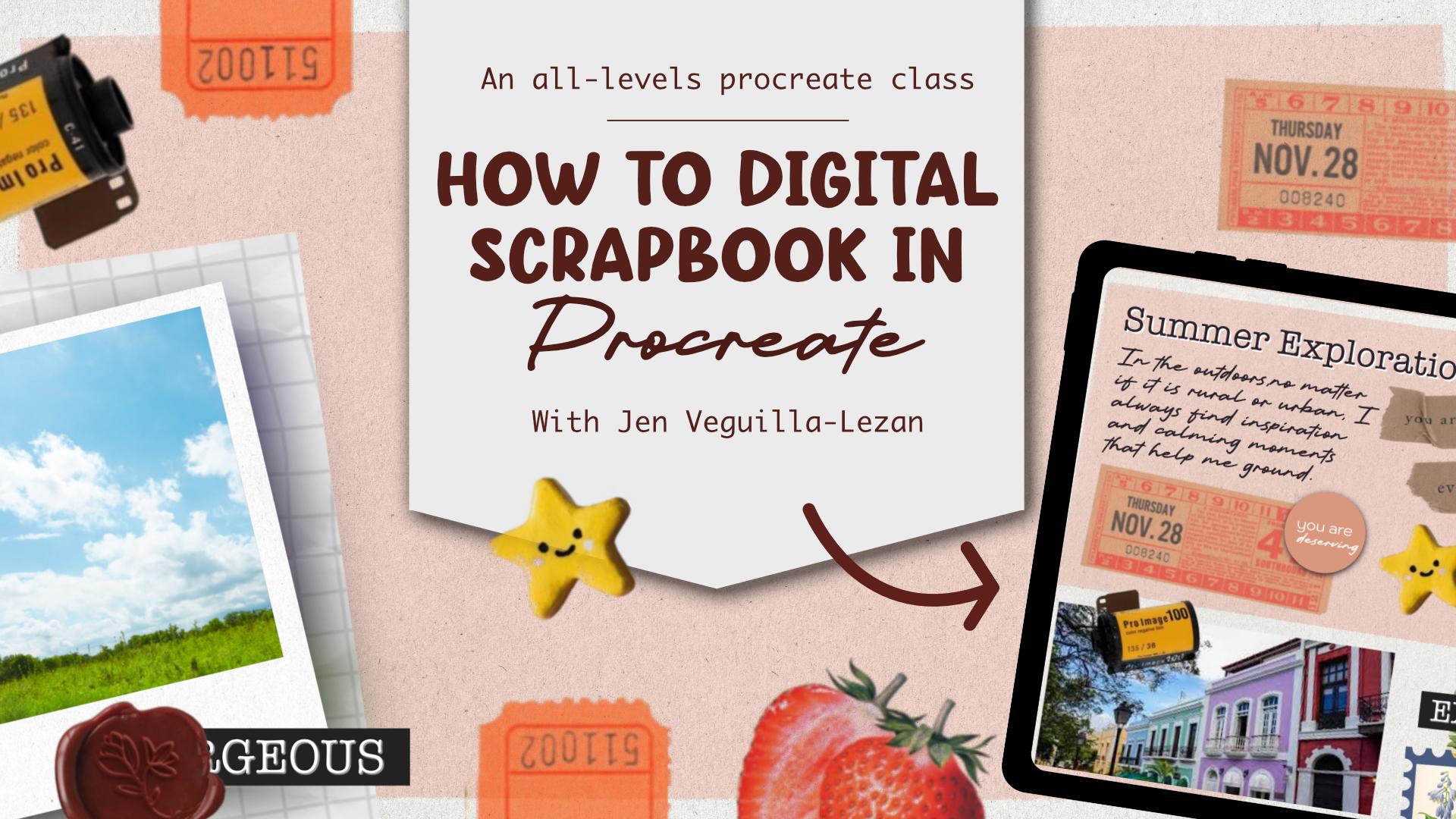
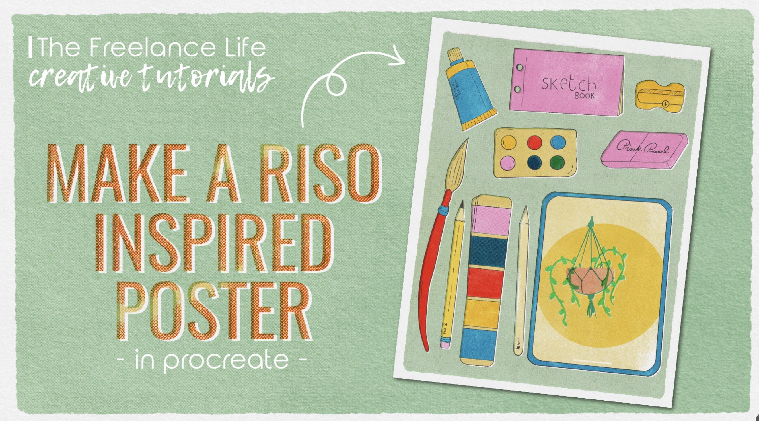
1. Course 39 Intro: Hi, everyone. Welcome to class. I'm Jen, and I'll be the one guiding you through
this creative course. I'm a freelance graphic
designer, illustrator, and educator based out of the Midwest and I run Bella
and Sophia Creative Studio. If you want to learn
more about me, you can find me online at
www.bellsophiacreative.com. You can also check
out my YouTube channel, the creative studio, where you'll get a behind the scenes view of the work that I do as a creative
freelancer and find a huge library of free tutorials cater to those of you interested
in graphic design, programs like Affinity and Procreate as well as
art and Illustration. So this month, I'm really excited to share a
new Procreate course. While you might be used to
using Procreate for drawing, it's such a versatile app, and I thought it
would be really fun to walk you through how you can scrapbook or create
a visual journal in the app. I love the idea of scrapbooking and creating memory books, but sometimes all of the supplies necessary can
make it cumbersome to do. So I found that I can do similar projects in
a digital version. No mass, no massive
supply halls, and I don't have to worry about perfectionism stopping
me from creating. When it comes to the skills that you'll
learn in the class, learning how to
scrapbook or create a visual journal in Procreate
involves a mix of creative, technical and
organizational skills. We will first learn a bit about scrapbooking slash
Visual journaling and we'll naturally work
through how to use the Procreate app while
creating our project. Here's a breakdown of a few of the central skills that we're going to learn in
the class together. A major portion of the class focuses on creative
and design skills. Composition and layout
design is really important. We'll learn how to
balance elements on a page like text,
images, stickers, and we'll also use some of the
principles like alignment, contrast and white space effectively throughout
our project. We're also going to touch
a bit on color theory, choosing harmonious
color palettes, understanding how colors set the mood or convey a
theme in a project. Then we'll look at typography. Choosing and pairing fonts
that work well together, maybe you can experiment
with hand lettering or digital calligraphy
for titles, quotes, or journaling entries,
but we'll also be utilizing the fonts
in the app itself. Then we'll also look at
visual storytelling. Communicating a memory, mood, or moment through visuals is really important in
these kinds of projects, as well as using
visual metaphors, symbols, and thematic imagery
throughout our layout. The other portion of skills
that we'll be touching on include technical skills
in the Procreate app. So things like brush handling, learning how to use
different brush types for drawing, painting,
different textures, customizing or importing
brushes for specific effects, whether you're looking for
things like watercolor, calligraphy or texture stamps. Also look at layer management to organizing layers
for different elements, like a background versus
photos and stickers and text and using
different blend modes, clipping masks, and even things like Alpha lock
throughout the app. We're also going to explore image importing
and manipulation. So importing photos and even creating your own
textures or stickers, as well as resizing, rotating, masking, and applying
effects in the app. At we'll look at the text tool. Using Procreate's
text tool efficiently for journaling and decorative
titles is really important. So we're going to
explore that a bit, as well as combining type text with different types of
variations of fonts, whether it be hand lettering inspired or
calligraphy inspired. And then finally this
whole project is really based on the concept
of digital collaging. So we're going to be combining various media paper
textures, images, drawings, and creating depth and
variety using things like different layer styles
or maybe you want to incorporate things like
shadows and textures. We'll also explore
different places where you can find
creative assets online for personal use if you don't feel as confident
with drawing them as well. When it comes to the tools that you'll need for this class, all you need is an iPad, the Procreate app,
and an Apple pencil. If you don't have
an Apple Pencil, it's not an absolute must have, but it does make the project
a little bit easier. So when it comes to who
this class for, honestly, it's for anyone who is creative or would
like to learn how to digitally scrapbook or visually journal within the
Procreate app. The class is geared
towards beginner learners as we're exploring Procreate
in a really basic way. I'm going to walk you through
the process step by step, and I'll help
familiarize you with the processes and
the different tools within the Procreate App. So when it comes to
your class project, you're going to be creating
one scrap booking spread or one dronal spread that you
can then export as a JPEG. And if you feel so inspired to, I would love for you to
upload it to the course Project Gallery to share with the fellow classmates,
as well as me. I would love to see
what you create once we get through this class and you have all the tools necessary to create your
own scrapbook page. Just a few things to note. Make sure you download
the class resources. I've included the
project template and a few files that you can
utilize for your class project. Also include a helpful
course worksheet, and this will kind
of get you going in the right direction as you begin the work once
you finish a class. Please make sure you also share your project in the
class Project Gallery. Or if you fill up for it,
you can also share it on social media and tag me on Instagram at Bella
Sophia Creative. I'd love to see
what you created or even offer some helpful
tips if you need them. And finally, once you
finish the class, if you've enjoyed
it, definitely, please consider leaving
a class review. These reviews are so helpful in ensuring teachers
get engagement, which in turn helps our
classes overall in search. I'm really looking forward
to creating with you today and seeing your
work. Let's get started.
2. Technical Skills - File Setup: Great. Hi, everyone. So today, we are going to get started on creating a scrapbook page or
maybe you like the idea of, like, visually journaling
or junk journaling, and that is what this
course is all about. I'm going to set you
up with the basics and then walk you through
a simple project that you can do on the
go or just kind of utilize creative time to help with managing stress or
coping and things like. So the first thing
we're going to want to do is set up a file. What I like to do
is usually group the different projects
that I'm working on in Procreate within their
own little folders. They call them stacks. So if I click on
this first stack, you'll see this is my stack
for my scrapbooking course. But what you can do is
just create a new file, and we're going to
keep this super basic just 8.5 by 11 so that if you wanted to print this out in the future, you could. So I'm going to scroll down to just the regular
paper canvas. And then it's going to
give me a new file, and it's going to open
it up right away. But what we can do is left in the upper left hand
corner, select gallery. And then we can tap
on that file with our Apple pencil
and then pull it into another file
that you may have, or if you need to create
an additional one, if you've never worked
and created in the past, you can just create
two new projects. And then you can tap on one and drag it on top of the other, and it's going to create
a new stack for you. So I'm going to actually take this whole new stack and pull it into my scrapbooking
course stack. And what's nice is that when
you are in these stacks, you can organize
yourself really easily. I like to rename them. So in this case, I'm going to tap where it says
scrapbooking course. Yours might just say untitled. And then you'll see this
little pop up come here. And you'll be able to edit and revise the label or
give it a new title. So I just called mine
scrapbooking course. Maybe you want a specific
scrapbook or journal set for a specific vacation
or moment in time, you can kind of utilize that as the basis for what you'll title it, and then you can hit done. And then I'll tap into it. You could also rename the different pages as
well in that same manner. So you would just want to tap on the untitled artwork
and rename it. That way, it's easier to find. And then I find it's also
easier to, you know, export them and print
them out as pages if you want to actually turn this
into something physical, as opposed to just keeping
it digitally on your iPad. Okay. Now, if
there's something in this stack or folder
that you don't want, you can also just hit the Select icon in the
upper right hand menu. You'll hit Select. You'll tap on the canvas that you
don't want to have. So in this case,
I have an example of some scrapbook layouts that I'm going to
show you guys later. But I don't want
that in this page. So I'm going to select that one. You'll see it'll have
a blue check mark. And then I'm going
to hit Delete. And then when I'm
done, I can just hit the little X button in the upper right hand corner and it'll remove
the select options. So now that we have
created our pages. So now that we've created our canvases and we're ready
to work on our first page, we can just select the page and then tap on it,
and it'll open up.
3. Layer Management: Basics: You can zoom and adjust your view by utilizing
hand gestures. So if you take your
finger on your canvas, you can pinch in to zoom out, or you can push out to zoom in. So I'm just going to zoom
it so that you can see the full page with some
gray border on the outside. And one of the big
things that I like to do when I'm working on projects
like this is stay organized. So that's kind of the beauty of Procreate. You work in layers. And what I find is that when I'm working on
scrapbook projects, it's nice to kind of
organize and keep my layers based on background, text, any stickers or ephemera that I'm adding,
and then pictures. So I like to kind of create
folders based on that. So I can basically create a folder or group
for each section. So we'll start with
this really quickly. So we're going to go
into our layer section. It is the little square icon right next to your color picker. So we're going to tap
on those two squares and you'll get your
layers pop up. So I am going to keep in mind
how many sections I need. So a background section, images, text, and
then any decoration. So I'm going to just create
four layers to start with. You're already going to
have an original layer, and then to add an
additional layer, you'll select a little plus icon that's to the right
of the layers title, and then it'll allow you to
add in additional layers. So I'm just going
to do four for now. And then I'm going to rename
each of these layers. So layer one, I'm going to
tap where it says layer one, and you'll get this
little pop up, and then I'm going
to select rename, and I'm going to rename
this background. And then I'm going to do the
same thing for layer two, tap where it says layer two. I'll get the pop up to the left. I'm going to select rename and I'm going to change
this one to images. And I'm going to do
the same process for layer three,
tap on layer three, select rename, and then I'm
going to name this one text, and then tap on layer four, and rename it and change
the title to decorations. And then what it'll do is add an additional layer
above each one of these. So I'm going to select
background, hit the plus icon. I'll give me a new layer, select images, hit
the plus icon. I'll give you a new layer
above that one, select text. Hit the plus icon. I'll give
me a new layer above that, and then the same thing for
the final decoration one. Then what we can do is
group these layers, and that will create a folder. So to create folders
for each of these, I'm going to tap on the new layer I
made above decoration, hold my Apple pencil, and then you'll see it kind of pulls out from
the background, and then I'm going
to drop it right on top of the decoration layer, and you'll you'll see the little left gray window turn blue or have
a blue outline. That's how you know
it's selected, and then I'm going
to release it, and it's going to
create that new group. So I'm going to rename
that group decoration now. And then I'm going
to do that same process with the text one. I'm going to tap on the
new layer I created, drag it above the text layer, wait for that gray box to be outlined in
blue, release it, and then I'll get a
new group folder, and then I'm going to tap on the new group and
rename it text. And then to close
these little folders, all you have to do is
select that little carat on the right side of
the folder selection. You'll see a little checkmark, and then right next to that, to the left of it is
a little carat. You can just tap on that carat and it'll close your layers. And you can do this
as you go as well. You don't have to start off with just two layers
in each group. Um, you could also just create your layers and then group them together and then rename them. It's just so that I
can stay organized, I kind of work in this process. But whatever you
feel comfortable, making sure that you still have some folders
and organizations, it'll make everything easier, especially if you want
to move things around in the future after you
finish your layouts. And then I'm going to close the layer groups by tapping
on the little carat, and now I'll have
everything that I need. And this also makes
it so that we can utilize different things like blood modes within the layers. I'll kind of show
you where that is. We will play with that
later into the project. But what I find is that if
I have different layers grouped together and I want to apply maybe a shadow just to, like, some of my stickers, I can go into the
decoration section. And then I can pick, you know, whichever layer I'm
working on that I want to have maybe a shadow. I'll click on that layer, and then you'll
see on that layer, like, a little letter that says, N. But if you tap on that, that is the different layer
options that you have, and you're able to change it from normal to
things like screen, color dodge, darken, multiply. There's all kinds of
different blending modes, and then other ways
they can create like clipping masks and
add Alpha locks. And that's why it
just makes it easier to have different things and different elements on
its own layer within its own folder so that you can apply different
things without having that effect change
the entire project itself.
4. Layer Management: Working with images: So obviously, if we're
working on a scrapbook, one of the main components
that we're gonna want to utilize is pictures. Visuals. You can import things very easily
into Procreate. So just to start,
I'm going to import some visual elements,
specifically photos. So to do that, we're
going to go into our upper left hand menu. You'll select this
little wrench icon, and this is your actions menu. You're able to add things
like images, files. You can adjust your canvases. You can share the final file. Procreate also allows you to capture video of
your work progress, and you can do that. You can adjust your
preferences as needed. Say, for example,
you are a lefty and you want to have a right hand interface as opposed to a left
hand interface. You're able to adjust
things like that. But just to start,
we're just going to select the ad option. And you can insert
files or photos. So I'm going to insert a photo. When you select insert a photo, it will basically pull up all of your photos
from the photo app. I'm just going to
pick a picture of the sky that I took when
I was recently on a walk, and when you place it in, it'll place it based on the
size of your original image. And you'll see these little
marching ants and all of these little dots that
allow you to kind of resize and adjust the
placement of the file. So I like to make
sure I resize things before I like finalize
the placement. You can, of course, go back in and adjust the placement and
adjust the size as well. But once I place it, I like to resize it to the size that I think
I'm going to keep it at. And then I can tap the
little selection icon, that little arrow in the
upper left hand menu. And it'll deselect it, and then you can kind of zoom
in and see how things look. But say, maybe you
didn't want it that small and you didn't want it in the upper
right hand corner, you can just go back
into your layer menu, making sure that inserted
image layer is selected, and then you can select
that move icon again, that little arrow, and
then you'll be able to move it and resize it as needed. You can also insert other elements outside
of just like photos. So I'm going to select
that wrench icon again. And I'm going to
select Add once more, and this time, I want
to insert a file. For this class, I've created
a bundle of ephemera and stickers just for the class that you'll get along with
your class resources. I have all kinds of different
things like frames, labels, as well as stickers, different ephemera
vintage papers that I've found and collected online that are part of a public domain, which means that
you can use them freely without repercussions
for things like copyright, and I've basically cut them out, adjusted them I've also added some stickers and
ephemera from things that I've scanned in and then
removed the white background for so they can use it for layering techniques
and things like that. But I have a whole slew of these in your project resources, and these are part
of the file system. So when you select Add
and insert a file, you'll get your file options
and you'll need to navigate. Typically, if you download
these stickers to your iPad, they'll be under
downloads or if you have stuff like saved specifically
in certain file folders, you'll want to navigate to that. So what I've done is I
just saved it on my iPad. I have a Procreate
folder where I keep different files related to procreate projects or
classes that I'm working at, and I've named it
scrapbooking course, and then I have the stickers. I just organized everything
for you based on type, whether it be a frame
that I can utilize to make this picture look
more like maybe a polaroid. I'll select that frame. I'll import it in, and
then I can resize this. I can then play around with how this is going to fit
into my picture.
5. Layer Management: Effects : One really helpful
tool that I find in Procreate is the
masking capabilities. So instead of trying
to clip it into the actual frame with
this set in particular, I'm just going to basically
create a rectangle that should fit around this polaroid, and then I can mask my picture
into that shape instead. So to do that, I'm just going
to select my arrow icon, my move icon, and just
kind of move this off to the side so I can
see what I'm working with. And then I'm going to create
a new layer above that. I'm going to hit the plus icon. In my layers menu. So now what I want to do is just basically create
a rectangle that is the size and shape
of my polroid image. I'm just going to use
the pencil tool to do a quick action and basically
create a rectangle shape. I'm going to use a simple
just monoline brush so it's all one size. It doesn't really matter
the color of the pencil, but just so that you
can see it better, I'm going to create
it in black ink, making sure I'm on
that new layer. I'm going to outline
the polaroid. It doesn't have to be perfect. You can see I'm a
little wobbly today. And then I'm not going to lift
my pen after I've created that so that it snaps
to a rectangle shape. But then I'm going
to put my finger down and it's going to
give me a perfect square. And then I'm going to
release the Apple pencil, I'm going to release my finger, and then I'm going to go into my transform tool, that arrow. And then I'm going to
adjust the size of this. You'll see it allows
you to adjust the size. And I'm going to actually select freeform because
if it's uniform, it's just going to adjust
it into a square shape, but I want it to be more
of a rectangle shape. And then that way
I can kind of line everything up with
my polroid image. I'm going to go into
my color options, and I'm going to drop it into the square so that it fills it. So to do that, I'm
going to tap on the color icon and then
I'm going to drag it out and then you'll see
a little black circle and then it'll fill
with color drop. I'm going to use
this black rectangle as my masking layer. I'm going to go back
into my layers. I'm going to select
my original picture. I'm going to tap on that image and then
I'm going to drag it above the layer with the black square or the
black rectangle on it. I'm going to select my move tool so that little black arrow, and I'm going to move
this picture so that it is right above that new layer, and I'm going to resize it a bit so that it'll
fill it nicely. To resize it with in proportion, you'll probably have to go back into your lower menu here. You'll go into the lower
menu of your transform tool, and you'll want to
change it from free form back to uniform. That way, basically will
resize in proportion. And then once I
resize it so that it'll basically cover
that new rectangle, I can then go in and I can
create a clipping mask. So I'm going to select that little icon to
the left of the layer, and it'll basically be
the icon of the picture, and I'm going to
select clipping mask, and it'll clip into that
rectangle that we've created. So it helps to kind of keep
everything in proportion. And then I'm going to select both of these and
group them together. So I'm going to tap on the inserted image that we've clipped into the layer below, and then I'm going
to drag right with my Apple pencil over the layer with a black rectangle, and
I'm just going to group it. I can tap where it
says new group. And in order to maintain the number of layers that I
have to kind of manage that, I'm going to then
tap on the icon of the new group and then
I'm just going to flatten it so that it
merges everything. And that way, I don't have
so many layers taking up space within my file. So once I've done that,
I'm going to then drag that picture underneath
the polroid picture. And if I need to do some fine
tuning, I can adjust it. I'll select that image,
select my transform tool, and then just kind
of adjust everything so that it fills the
space the way I want it. So once I've done that, I'm going to group
these two again, and I'm not going to
flatten these just yet, but I want to keep
them together. So I'm going to select the layer with the picture
and then swipe right over my polroid layer and
I'm going to select group and then I'm just going to rename
this polaroid picture. Then I can just tap
out when I'm done. What we can do then is
say I wanted to add some special effects to the ploid so it looks like
it's popping off the screen. You can add something
like a shadow. To add a shadow,
what we can do is duplicate the layer
with the photo on it. In order to add a shadow, we're going to use
something called gaussian blur and you need a color in order for it
to create the effect, which will essentially
look like a shadow. I've duplicated the photo and you can do one
of two things. You can fill this with
black, if you want it. So I'm going to pull this out so we can kind of see
what we're doing. I'm going to pull this
out of my layer group, and I'm going to select my
move tool so we can see it. And I'm going to show you
what it looks like applying the Gaussian blur without
it having a fill to it. So it's just going to utilize the colors that are
already in the picture. So I'm going to go to
my adjustments panel, and I'm going to go down
to once I've selected it, go down to Gaussian blur. And then I'm going to
take my Apple pencil and then just drag right. And you can kind of
see it blurs this out. If you go left, it'll remove. If you go right, it'll blur it until it kind of disappears. So we could do
something like this, and then you can bring
that underneath, and it'll kind of create like
this kind of fun effect, or we can undo. I'm going to take two
fingers and tap to undo. And then I'm going to make sure I have that new layer selected, and I can just drag and drop
color fill and basically colorize and darken
this whole image until I get it to be as
dark as I'd like it. And then I can go back in and go into my
adjustments tool, select Gaussian
blur, and then it'll blur it out so that it's
a little bit darker. And then I can go in and pull this layer back
into my grouping, select my move tool, and then I can add
that blur underneath, and it kind of gives you
this shadow to effect. So it looks like the image
is popping off the screen.
6. Layer Management: Text tool: So before we jump into, like, creating our full blown
layout and design, I want to highlight
a few other tools. So the other thing that you'll
likely want to use when you're working with creating
a scrapbook is text, right? You can have fun and
utilize the brushes, and there's tons of
calligraphy brushes. You can use your own handwriting and write on your layout design. Um, I kind of like to angle it because I tend to write angled, and then you can adjust the placement and
things like that. But you also might want
to utilize the text tool. So aside from just writing
things on your own, so you'd want to go
into your text layer. I like to bring this
all the way to the top. We'll go into our
actions toolbar, and then we'll select Add Text. And you can write in
whatever you want, and you can adjust the
different fonts you use. So I'm going to write nature. And right now, what
it's giving me is basically just like the basic I think it's
like an aerial font. But in your keyboard, in the upper right hand corner, you'll see like an uppercase
A and a lowercase A. If you tap on that, that'll give you all of your font
formatting options. So you can adjust the size. You can adjust the
font that you're using in order to change
it after you've typed it, though you'll want
to highlight it. So I just take my Apple
pencil and I double tap, and then you'll
get the selection, and you can drag over and
select any additional bits. But then you can go
into your font options. You can increase the
size, decrease the size. All of it is sliders, but then you can actually tap on the size options and type in
specifically what you want. If you have specific details
of what you're working with, you can adjust your attributes. You could do left align, center line, right
align, things like that. You can add stuff
like underlines, and then you can also
change your fonts. So I have lots of different
fonts that I have downloaded. So I'm just going
to find one that I think works well
for this project. I want something that
looks handwritten. I like this King share a lot. So what I'm going to do, though, is go back into my
keyboard by selecting the little keyboard icon that it takes me
back to my keyboard, and I'm going to change this
from all caps to, like, a regular written piece with a combination of capital
letters and lowercase. And I feel like I like
that a little bit better, but you can go in again and you can change this to
whatever you want to. If you want to, if you
don't like that effect, just double tap your text and then drag over
to select all of it. You'll know it's all
selected because it'll be in a blue outline, and then you can tap on your font options
on your keyboard, that little A and lowercase A, and then you can go back
in and change things as needed based on the kind of style that you're
going to be doing. We'll go back into
detail later in the course as we
go through kind of creating layout
based on the theme. So you want to keep
those kinds of things in mind as
you're creating because that could affect what kind of typeface
you want to utilize. I want something to feel a
little bit more organic, so I'm going to use
something more and drawn, but maybe you want it just
easy to read and simple, and you can use basic
fonts that you have already within your
Procreate app. I think this is a really
fun and simple way to kind of create and add some personality
to your layouts. Utilizing your texts
and the fonts is something that allow you to kind of add that extra bit
of detail as you're working. So now that we kind of
have the basics down, what we're going to do is
jump a little bit more into some of my helpful
tips when it comes to creating compositions
and layouts, which are kind of the
essential part of making pages that are visually
appealing and engaging. So let's jump into that video.
7. Composition & Layouts: Great. So before we actually start
creating our pages, I wanted to highlight
some inspiration and different
layouts that you can incorporate as you are
working on your file. I find that there's a variety
of different layouts, but I just wanted to highlight
some compositions that I think are kind of
helpful to kind of get you inspired and motivated and go into a little
bit more detail explaining why they work. The first two I'm
going to look at are the diagonal flow layout as well as the column slash grid layout. So when we're looking
at these basic layouts, even in something as
simple as black and white, we can kind of see
why this works. So essentially, anything
that's a square is a photo lines or
what might be taxed, the little shapes or what
could be utilized as stickers, and then you'll see
titles as well. So when we're looking
at the diagonal flow, typically when we're
looking at the structure, your layout elements
tend to flow diagonally across the page. It kind of creates a natural
movement for the eye, and it follows that
angle that creates this really dynamic
energy within the layout. You still have all the
information that you need. Visuals, the text. You have information.
But it's laid out in a really kind
of creative way. It's not what you would
typically think of, like, grids, which will be
the next one we'll look at. But this is really helpful
for conveying This is really helpful for conveying motion,
emotion or excitement. So things like traveling
or birthday parties. So these are all kind of keeping in mind things like
the principles of design. So things like balance and alignment, contrast,
white space. Another key thing
to keep in mind in terms of the design
principles that we're kind of working with as
we're designing layouts for scrapbooks
is white space. Typically, my rule of thumb
as a graphic designer is to not overcrowd visual space,
essentially white space. We see it as maybe, especially if you're
creative, you see it as like empty space
that you can fill, but sometimes it can be
really beneficial and helpful to allow your
page to breathe. And blank space can
also help emphasize key focal points and give the viewers eyes
a place to rest. The next design I want to
look at is the column layout. So this column layout is more like a grid layout
or it is a grid layout, keeping in mind grids on a page. But also you're looking at
things like columns and rows. How can we divide up the
space in an orderly manner? So in this case, within
the column layout, when we're looking at
this column layout, we're looking at
gridding that is essentially dividing your pages
in two different columns. Could also look at
the rows as well, and it helps to kind of keep things orderly and organized. Typically, within
the structure of, like, a grid or a column layout, your content is organized
into columns and rows, like you might see in a
newspaper or in a photo album. And it's very symmetrical
in terms of balance, and it gives a very
clean and orderly feel. You'll often have the eye
moving from left to right, so you have the most
important thing, the title of your page in
the upper left hand corner, and then your eye tends to naturally move
down into the right, down into the right,
kind of, like, when you think about reading,
we read from left to right. So we want the most
important elements, maybe to the left, and then you can kind of play
around with placement. Your alignment is very strong. The elements tend to
line up consistently. And typically, what I find
these are helpful for is for very photo heavy pages. So also, I find that this
can be really helpful too, if you like to journal, um, within these kinds of
designs or layouts journal alongside to kind of add your memories or
thoughts to the visuals. Basically, you can
do this within equal size boxes so that the text doesn't
become overwhelmed. And it tends to be seen a
lot within kind of clean, more modern designs and layouts. And remember to leave
consistent margins between the photos and text blocks so that you create that
natural white space. So we already see that
within this layout. I'm going to hide
the little lines. But you will have white space
in between each column, and things can be layered
and aligned nicely. All right, so let's go out
to our next layout concept. The next two we're going
to be looking at are the rule of thirds and
the visual triangle. So let's start with
the rule of thirds. I don't know if you've
heard of this rule before, but we see this a
lot in photography, keeping in mind, if you were to divide an image that you're
looking at into nine squares. So three rows and three columns. And putting
interesting, parts of that visual element
in areas that may intersect or that kind
of our focal points. So when we're looking
at the rule of thirds, the structure is about
dividing your layout or your visual area into a page with a
three by three grid, kind of like a ti tac toe grid. So I'm going to add a
layer here so we can kind of see what that
would look like here. Okay, so it's not perfect, but you kind of get the idea. So the point of this is to create something that is
asymmetrical but still grounded. So when we look at this,
our pictures aren't, you know, directly across. One is a little bit higher, the center one is lower, and the right one is
a little bit higher, but the right and the
left both still line. Um, so it just creates these interesting
key focal points, and it's not exactly
symmetrical, but it's balanced. And then the title information
to kind of draw you into what those areas
are and then below it, then you see, um, the text kind of as
a second thought. Typically, these are used for pages with a focal photo and
surrounding design elements. And like I said, it
really helps to add a dynamic flow and natural balance without it being overly
symmetrical. All right. So the next one
we're going to look at is our visual
triangle layout. So when we look at this one, we're looking at three key
focal points within a layout. So the structure is about three focal points
like embellishments, bold colors or images
that are placed in a triangle shape that then
draw the eye across the page. So in my case, I did my
large title as one point, an area for an image as another, and then another picture
towards the bottom, and it creates this
triangle shape, and then the embellishments
will be around it, and any text will go
underneath the title. So with this one, again, this is about asymmetry, but still being visually
balanced if we were to have a little bit of
text on one side of this large, like, floral shape, that would be an image, and we would have the title over to the title on top of that and another
picture underneath. I'll feel really
heavy on one side. So the idea is to
balance that weight, but still be creative in terms of how we're
getting the eye to move across the
actual page layout. Typically, what
you'll see within this is the use of contrast. So you'll see different
variety sizes, colors, or textures to define
those key triangle points, and you kind of see that within the sizing of these shapes. And then finally, I have two last layout designs that we can look at
the central focus, and then I kind of combined that column
and strip layout along with the rule of thirds
once more to kind of play around with that idea so we
can look at that as well. So when we're looking at a
layout with a central focus, it's all about a key moment or key element that is meant
to draw your attention. So in this case,
the picture itself, and then elements radiate around the center of
that focal image. So you'll see elements
on the side of it, a key title, and then
information below it. But essentially,
that large image is the centerpiece of this. When it comes to white space, there's often very
ample white space around that central image, which adds focus and pulls the viewer's eye to the
center and to this image. And it's often used for, like, a very special photo or memory that a person would
want to dominate the page. And a tip that I would suggest when creating
with something like this is utilizing framing or madding the center image for extra emphasis and contrast. You could even add
things like shadows, kind of make things
pop off the page. And then finally, we're looking at the
rule of thirds again, but I've also kind of combined
it with that column focus. So essentially, the
structure of this focuses on aligning content in
vertical or horizontal strips. So in this case, I
have them horizontal. But again, keeping in mind, those rule of thirds, I used three key areas
as opposed to four. So I've made a bigger,
wider space at the top that include an image
with some framing, the title, and the text, and then two additional supplemental images
at the bottom. So it's three sections, but you still kind of see
that gritting effect at play. It's very linear. It's great for combining text and pictures. Um, you'll often see white space between the columns and
the rows or the strips. And you'll often want
to use something like this for storytelling sequences, timelines, or even event recaps. And a really helpful tip
is to utilize things like washi tape or stitch lines between columns for
visual separation. And yes, you could use digital washi tapes and
you can create kind of, like, stitch line feelings with different textured brushes. Um, but you can still do
this in digital format, but you'll have that kind of tactical feel that you might get with the more traditional
analog style of scrapbooking. Alright, so that is it for our layout concepts
and overview.
8. Typography Tips: When it comes to choosing and pairing fonts and
scrap booking design, you want to keep
in mind that fonts are more than just words.
They're a design element. The fonts you choose should match the mood and the
style of your page. So some tips when it comes
to choosing your fonts, I suggest keeping
in mind your theme. You'll want to match your theme. So, for example, maybe you're creating a romantically
inspired layout. You'll want to utilize fonts like script or cursive fonts, things like grape vibes
or dancing script. If you are creating something that is meant to
be more fun or playful, perhaps you'll want to use more whimsical or chunky
fonts like Comic New. And say, for example, you want to create
something that is more vintage or
heritage inspired. Sara fonts or typewriter
styles can be really fun to add a bit of that vintage
style into your design. And finally, maybe you are creating layouts that relate to things like
traveling or adventure. Bold Sand serifs or
rugged fonts like Bebas Nu or Montserrat are
really great options for this. The most important
thing, though, is that you'll want to
prioritize readability. So body text text that you'll use for journaling should
be clean, simple fonts. Things that are Sanserf or light serif can
be really helpful because it's easy to read. Then you can play around
with your titles. These can be more decorative, but they should still
be legible at a glance. When it comes to pairing fonts, a good rule of thumb is
contrast book compliment. You'll want to pair
a decorative or a script font for things
like titles or quotes with a simple San serif
or serif font for the written parts of your
scrapbook or junk journal. I suggest using at max
only two fonts per page. This way it kind of avoids that overly designed feel
or cluttered feel. And you'll want to ensure
you keep in mind hierarchy. So the title should obviously
be the largest and boldest, followed by any subheaders or additional body text for
things like journaling. When it comes to hand lettering
or digital calligraphy, adding handcrafted
or personalized writing text to your projects
adds a bit of warmth, personality, and a tactile feel that digital text can't
always replicate. So you can utilize hand lettering for things
like title quotes, special phrases or accent words. It adds a bit of uniqueness
and artistic flair, and it's always nice to kind
of have your own personality imbued into your layouts because
that's your handwriting. Tools that I suggest you use
are things like brush pens, and what's great is
that Procreate offers a variety of different
brushes that can kind of um, replicate the effect
of things like Tambos or gel pens or
watercolors and markers. When it comes to hand lettering, you can variety different
kinds of styles. You can do things
like fo calligraphy, brush script, block letters, which is really fun and
simple if you don't feel like your handwriting is as nice as you would
like it to be, you could even add things
like whimsical doodles. That's what I love
about these kinds of digital scrapbooking projects that I can do and procreate. I can add a picture, and then
I can doodle on top of it, which makes it more
whimsical and fun. Tips I have are sketching in a new layer first so
that you can always go back in and change
and adjust and then add a new layer and trace over that so that you can
have a more solid piece, and then you can also move and space things if they
are on its own layer. I also suggest mixing
lettering styles. So things like combining
script with an all caps block. Style of calligraphy or fonts, it kind of helps to create
that fun juxta position that you often like to see
in layout designs like this. If you want to create your own font with your
own hand lettering, I suggest checking out
my font making class. You could even create
your own fonts as well in apps and tools, like
different software. Or there are apps that
are actually free to download and some that are paid and procreate that can be really helpful as well. Again, I'll share
some of those in the resources section
of the class. Some practical type tips. When it comes scrapbooking, I suggest for your
title elements, you utilize fonts that are
bold script or display fonts. For subheadings, they should be clean Sanserfs or Sara fonts
that are easy and legible. Can be read at a glance. Anything like journaling
or body text, I suggest using simple, highly readable fonts
that just make it easy for your eyes to read and
review blocks of text. And then finally, for
caption elements, I suggest using things like lighter fonts or
italics that are the smallest in terms of sizing
within your layout design.
9. Visual Storytelling Tips: So a big part of scrapbooking is essentially
visual storytelling. So communicating a memory, a mood or a moment
through visuals. Your scrapbook page should feel like the memory
it's representing. So using visual
elements intentionally to match that story you're
telling is really important. So how do we do this? I have some key tips to keep in mind as you
are accomplishing this. There are three things
to keep in mind. So the story elements,
the visual tools, and some examples that you
can work through for this. So when we're looking at the
story element of a memory. Maybe your visual tool could
be something chronological, so like a photo sequence. For example, a birthday party shown in three stages
like the setup, the cake, and then presents. If you're trying to evoke a mood within
your story element, a visual tool that
you can utilize are the color palettes
that you use or additional textures
that you incorporate. So, for example,
maybe soft pascels and floors for a gentle
and nostalgic vibe. The final story element you can keep in mind is the moment. A visual tool you can utilize
are focal key photos, journaling and emphasis on the ideas and the feelings
that you had during that time. So, for example, you could
use a single large photo of maybe a graduation with minimal extras to spotlight
that achievement. So just remember to choose embellishments that support and don't distract from the moment. And if your page is about
reflection or quiet reflection, too many bright or playful
stickers can confuse the tone, but if it's about
a moment that was exciting and bright and playful, again, utilizing
embellishments, stickers, ephemera that kind of match
that theme can be really, really helpful with your
visual storytelling. Also suggests utilizing
visual metaphors, symbols and thematic imagery. So visual metaphors can help your layout say more than
words or photos alone. They can connect
the emotional layer of the memory to
the actual design. So some examples could be a
theme like growth and change, and the visual metaphors
and symbols you could utilize could
include things like trees, leaves, arrows,
butterflies, timelines. Um, if you're like in a
theme of, like, love, things like hearts, roses, handwritten notes,
warm colored tones, adventure or travel, visual metaphors and symbols that relate to that
could include maps, compass, tickets,
planes, mountains. Theme of new beginnings could be showcased with visual metaphors and symbols such as sunrises, doors, windows,
seeds, blank pages. Or perhaps you're exploring
a theme of loss or memory, and some visual metaphors
and symbols that you could incorporate into
that include feathers, stars, soft light,
handwritten poems. These don't always
need to be literal. They can be subtle
background patterns, small embellishments
or color choices that really hint at that story. So now let's think about putting it all together before
we jump into designing. I want you to ask yourself as you're working
on your projects, what is the emotional
tone of the moment? What symbols or visual
cues support that feeling? And are the visuals adding to the story or just
filling up space? You want all of these
elements together to tell a cohesive story
that goes beyond here's a picture of the
first day of school or the night he proposed
or our big wedding day. So now that we
have covered that, let's jump into exploring these concepts within
our scrapbook layout.
10. Color Theory Tips: B So as I mentioned
in our section, all about creating or evoking a mood using
visual elements. Color can play an
important role in this. So when we're looking at color
theory and scrapbooking, we want to keep in mind choosing harmonious
color palettes that work for the thing that
we're going to create for. Harmonious color palette
brings unity to your page, and it keeps it from feeling
chaotic or mismatched. Some common color schemes that you could play
around with from traditional color theory within the art and design world
include monochromatic. Which are variations of a
single hue from light to dark. It tends to be more clean and
elegant and it's great for minimalist layouts
or soft moments like baby arrivals or weddings. For example, different
shades of blue for a peaceful ocean memory
or a beach visit. The next is analogous colors. So these are colors next to each other on
the color wheel. These have a more natural
and cohesive feeling. They're great for subtle variety without contrast overload. For example, yellow,
yellow, orange, and orange for kind of
a warm summer page. Next is complimentary. So these are opposite
colors on the color wheel, for example, red and green. These are very high
contrast and bold. They're great for festive
or dramatic layouts, such as holidays
or celebrations. A tip you can keep in mind
for this is use one as the main color and the
other color as an accent. So we see this a lot
with holiday themes like red and green
for Christmas. And then finally, there is
the triadic color scheme. So these are three colors evenly spaced on
the color wheel. These are very balanced,
colorful and playful themes. They're great for kids
pages or cheerfully events. And one great example
of this is red, yellow, and blue for a
primary color theme. A tip I have for you is to utilize a color
wheel or tools like Adobe color or coolers.co to experiment with
different palettes. Finally, keep in mind that
color isn't just visual. Colors can set the mood
or convey a theme, and colors can instantly evoke a feeling that
you're trying to capture. So there are tons of different color explanations or psychology of color examples
that you can tap into. I'll share more
in the resources. But some that we can talk about now include
the color blue. Typically, when we're looking at the mood and emotion this conveys their calm, peaceful,
reflective emotions. When we're looking at
this and scrap booking, you'll often see it for, like, beach projects, sympathy, perhaps babies in terms of I don't like to gender
colors very often, but you'll see these for, like, baby boys being born
and things like that. The color red tends to evoke the emotions of love,
passion and energy. You'll see this used a lot in romantic layouts, holidays
and celebrations. Green tends to evoke the emotions or the mood and emotion of growth,
nature, balance. You'll see it often used in outdoor layouts, new
beginnings, spring. Yellow tends to evoke the moods and emotions of joy,
optimism, sunshine. You'll see it often used in layouts and sprouts
about summers, birthdays, kids.
Purple is another. And the mood and emotions
you'll see evoked with this often are creativity,
nostalgia, and royalty. These are great colors to use in memory pages and layouts
with spiritual themes. Black and white tend
to be more elegant. They tend to reflect contrast, formality,
purity, clarity. You'll see these colors often
used in wedding layouts, heritage layouts, modern pages. Finally, colors like
browns and earth tones. These tend to reflect warmth,
tradition, grounding, and you'll see
them often used in layouts relating to
things like autumn, family heritage. Rustic themes. Here are some quick
color tips that you can keep in mind as you're
designing your layouts. Stick to three to five colors
max per page for harmony. Use color swatches or
inspiration boards. You can pull them
from your photos or even from Pinterest. Add contrast through
background versus foreground, so light photos on dark
backgrounds or vice versa. And finally, consider
seasonal palettes, pastels for springs, jewel
tones for fall, et cetera.
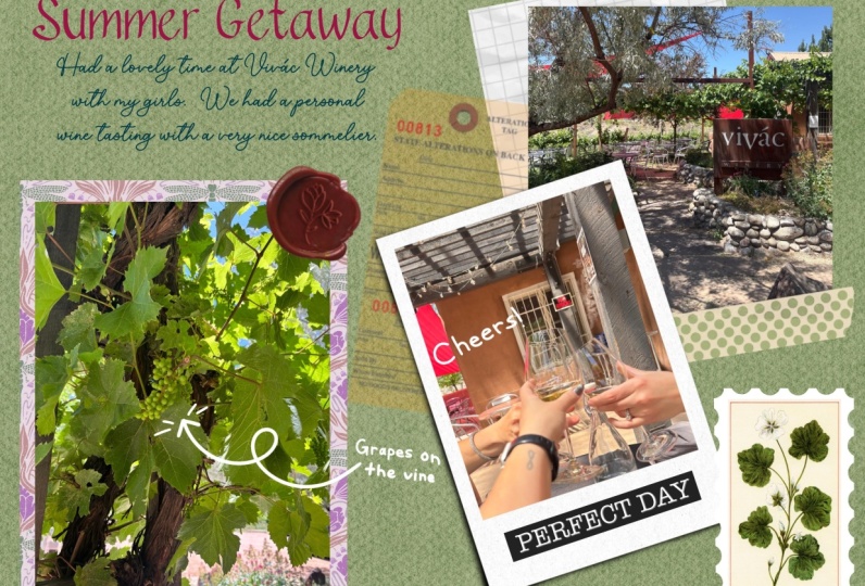
11. Digital Collaging-Background: Now that we're down with the
background of scrapbooking, details in terms of creating a project and some of the different styles of
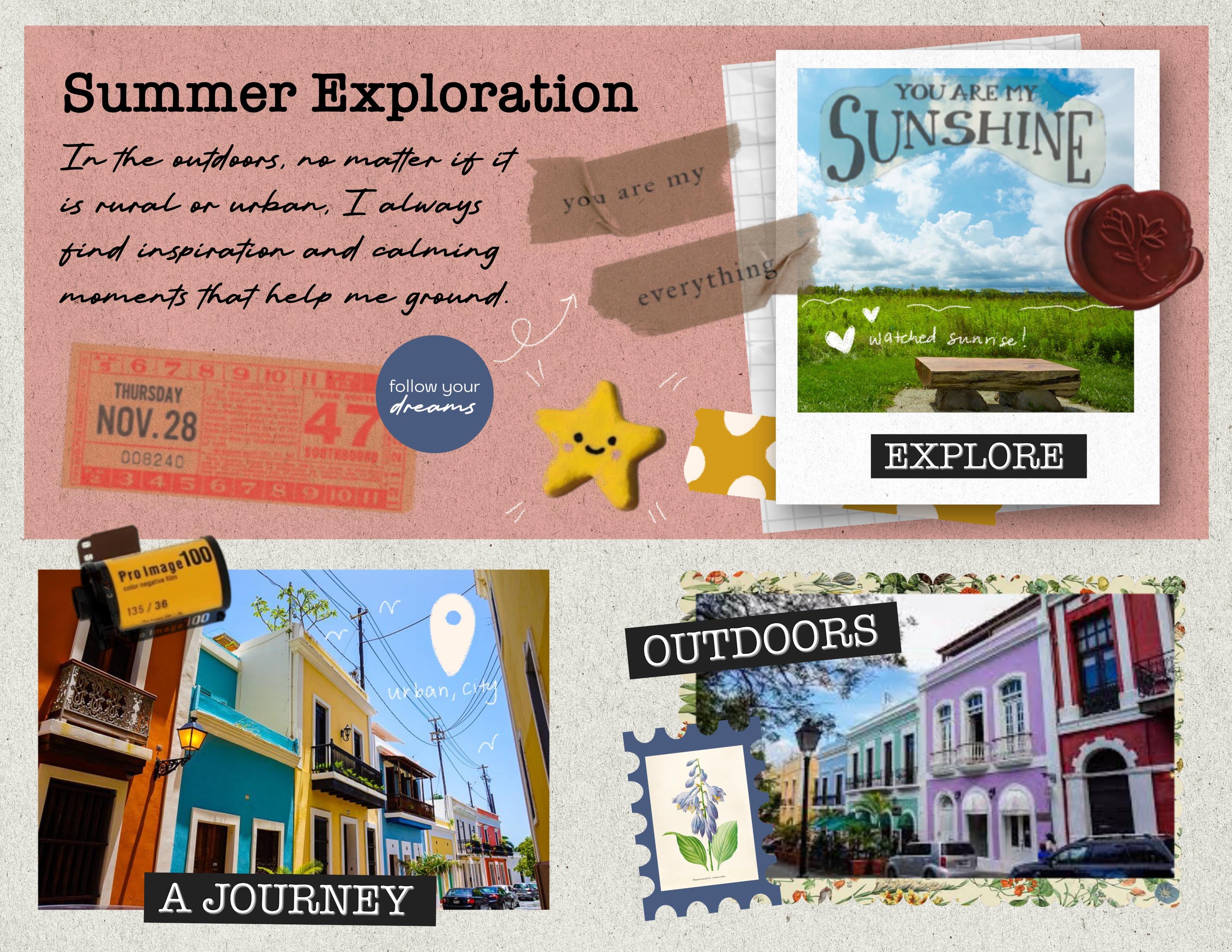
layouts that you can work on, I want us to create our own. So this is the final sample
of what we will be creating. We'll incorporate
photos, some text, as well as some of the scrapbooking stickers that I've put
together for you all. And I'm going to walk you through how to set
this whole thing up. It also has a really
nice paper texture that you'll see as
we zoom in a bit. I think it just gives it a
bit of that tectile feel. So we can go back into the
original file that we're working on or you can
set up a new file. You can just go into
your Procreate app, select that plus icon. And then I'm just going to
set everything up on an 8.5 by 11 plain page. Once you've done that, Bob, this is what your layout
should look like. So one of the first
things I like to do when setting this file up is kind of creating
my background, like we did in our
kind of practice run, setting up my layers for
the different elements. I'll go back into that
final file so you can kind of see how I
have my items set up. So I have an grouping for texts, decorations, images,
and background. So I have some files already from different
sets that I've purchased. So I'll show you how I'm
going to place that. But then there are
also a variety of different texture
brushes that you can utilize to kind of
get that similar effect. So I'm going to go
into my actions icon. I'm going to select ad, and I'm going to insert a file. I have a file already labeled paper with a variety of
different paper textures. So I'm going to go into that, and I'm going to
select this Frankintun paper basement paper
file that I have, and it kind of give this
really nice kind of textured feel to the background. You can keep it as it is, or you can go in if
you have any type of paper kind of textures
for something like this. You can go in and multiply them, and then whenever you
add a layer on top, that color will have that same kind of
texture show through. So let me find a pen to
kind of demonstrate that. So I'm going to add
a layer on top. I'm going to select
the little N icon that's next to the checkmark, and I'm going to change
this to multiply so that whatever is below
it will show through. So I have a brush now. I'm just going to
use the studio pen. I'm going to zoom in so you can kind of see that
texture already. And then what you'll find is
if you use that multiply, it will allow that texture
below it to show through. So we're going to do
something like that. So I'm going to
double tack to undo, and then I'm going to go
back into my color picker, and I'm just going to pick
this pink color that I had used originally for that
last layout that I did, making sure I'm on
that new layer. I'm going to just create a
shape using my rectangle tool, and I'm going to make it so that I kind of
have a little bit of, like, a frame effect, and then I'm going to go
into my color picker here, and then I'm just going to drag it into that shape that it made. And I'm going to fill it.
Once I'm done with that, I'm going to tap
on my arrow icon here and I don't want to
move this as much as I just want to adjust the
width and the height so that it is equal on each edge. It's giving me
this frame effect. Once I'm done with that,
you can either tap outside of your workspace or
tap on your layers. What I'm going to do now
is go into layer one, tap on it, and I'm
going to select rename. And I'm going to name
this paper texture, and then I'm going
to rename layer two. I'm going to tap on
it, select rename, and I'm going to
rename it color box just so that I know
what everything is. And then I'm going to
take that color box, and I'm going to drop it into my paper texture so
that it creates a new group, and I'm going to tap
where it says new group. I'm going to select rename, and I'm going to name
this background. That way, I kind of keep
everything organized, and then if I need to
go back to something, I can go back easily and adjust based on the
layer placement. So this gives us a nice, kind of, like,
paper like texture, so it feels similar to the
real thing of what you might do if you are
scrapbooking with real paper. If I needed to, if I didn't
want this bit so big, I could always go back
into that color box. I can select my arrow tool, and I can adjust the
size of this as well. And if I don't want it to
be adjusted in proportion, if I want to kind of
distort it or warp it, I can just select free form, and then I can adjust
it so that I have a little bit more space on the bottom for pictures
that I'm going to place. So I'm keeping in mind the
kind of layout structures that I showed you kind of playing around with
that rule of thirds. So once I've done
that, I'm going to go through and start adding
some of my pictures in, and then I will add details. So I'm going to close
that background grouping by tapping on that little carat
next to background, and it'll close the layer group, and then I'm going to select
the plus icon in my layer so that I can create a
new layer. All right. So before we move into adding
additional element to this, I kind of want to show
you how you can also utilize some of the
textures directly in Procreate to kind of get a
bit of that paper texture feel if you wanted
to if you don't have texture files like I have. So I'm going to turn
off my background in my layer studio checking by unchecking where
that checkmark box is. I'm going to go into a new
layer and I'm going to utilize some of these
textures to kind of give a bit of
that paper feel. So I have a set of brushes
that are specifically made to mimic texture brush or paper texture.
There's ten of them. I'll leave them linked
in the resources guide, but this is one way
to go about it, but then I'm also
going to show you how you can do the
same kind of thing using the brushes that are
already pre made in Procreate. So for example, I have
this paper to texture, and I can just color on the texture in a
color if I wanted to. But what I find is beneficial is using something like black or a dark gray and then coloring it so that I fill in the
whole entire space. I have colored that in. I'm going to go in
and I'm going to add a new layer on top of it. I'm going to change that layer
from normal to multiply, and then I'm going to go into my color picker tool and select a color that's
just a bit off white. And then I'm going to drag that in and I'm going to fill it. And then I'm going
to go back into my layer four with that texture. I'm going to keep it at normal, but I'm going to
adjust and play around with the opacity so that it allows me to bring
some of that color out, but then still get a
bit of that texture in. So that's one way you can go about doing
something like this. It might be hard
to see on screen, but I'm going to kind
of drop in a bit of a screen recording so
that you can kind of see how this gives us that
texture effect using brushes. And we can do that using premade brushes that are
meant to look like paper. You can also do the
same kind of idea with a with pre install
brushes from Procreate. So I'm going to
delete that layer. I'm going to select a new layer, and then I'm going to
pick a bit of, like, a darker gray color, and then I'm going to go
into my brush library. I'm going to scroll down
to the procreate brushes. They have a sketching
set that has, like, the Bonobo chalk,
the artist crayon, oil pastels, soft pastels. You can even use something like the soft pastel and
increase the size, and then just color it, and it'll give you that same
kind of texture effect, it feels kind of like a
higher end thick paper. But obviously, you
don't want that gray. So we're going to go in, tap on the layer, tap where the is, and then we're just
going to adjust the opacity so that it
takes the color away, but allows you to
still see the texture. So if you don't have any of these texture papers or you
don't want to purchase them, then you could do it
this way, as well.
12. Digital Collaging-Adding Photos: So I'm going to
delete these layers because I'm going to use
the one that I have, but those are just
additional options that you have access to. And there's also free ones that you can find
online as well. Obviously, you
can't resell them. They're mostly for personal use, but if you're doing scrapbooking or any kind of memory keeping, junk journaling, creative
journaling in general, that's personal use, and you
can access those things. So I'll have a whole
resource guide that you can utilize in the workbook
for this class. Right so now that we have
our background done, I'm going to go in. I'm going to create a new layer and I'm
going to start adding in some photos and also the elements that
incorporate photos. So the first thing I'm
going to do is go into my actions file, select, add, insert a file, and
then I'm going to go into my scrapbooking course file that I have already pre set up. And then I'm going to go
into my stickers file, and then I'm going to utilize
the frames that I have. Frames that kind of look like polaroids, so I'm
going to use those, and then I'm going to
adjust the size as needed, and I'm going to figure out
where I'm going to place it. So in my setup, I have everything
placed to my right. I'm going to add texts and
other things to the left. So once I've placed that, that can kind of
give me a guideline on the type of image
I would like to use. But even if I don't have an image that will
fit into that square, I can just utilize masking. Once I've done that and resize
everything as I want it, I can then tap on my arrow tool again to
deselect everything. And then I'm going to go in and I'm going to place a photo. So I'm going to
select the actions icon again insert a photo. Once I've found my photo,
I'm going to import it. I'm obviously going
to have to resize it, so I'm just going to drag in the corners with
my move tool here, and then I'm going to kind of figure out where this
is going to work. And then I'm going to go into my selection tool and I'm going to go down to my selection options here and I'm going to
select a rectangle again. And then I'm just going to
create a rectangle right above the polaroid outline
and make sure it kind of matches the shape and the width and
the height and when I'm done, it's going to give
me a selection. So I'm going to go into
my color package tool, and I'm just going to drag
color into that selection, and then I'm going to select that selection tool
to deselect everything. I'm going to select
my arrow tool to kind of adjust as I need. That's going to give
me a shape that I can then utilize to mask my wider picture into so that it matches the shape that I need for this
polroid picture. So I'm going to go
into my layers. I'm going to select
my inserted image. I'm going to select
the arrow tool, and I'm going to place the picture over that
rectangle where I want it. I'm going to go back
into my layers. I'm going to adjust my
layers and I'm going to pull the picture above that new layer with the square
that I've created, and then I'm going to tap
on the inserted image icon, and it's going to give me
these additional options. And I'm going to select clipping mask and it'll clip
it into that shape below. And then it fits
into the picture. Then what I want to do is once I've created that clipping mask, I'm going to select
the inserted image, and I'm going to select that
rectangle and I'm going to group it and I'm going
to rename that group photo. And then I'm going to take that group and I'm
going to layer it below the polaroids so that
it's not covering the edges. So once I've done that,
then I'm going to select the polroid layer, and then I'm going
to select the photo layer by dragging right, and then I'm going
to select group, and then I'm going to
rename that group polroid. And then I'll close that group, and now we have our picture. Since we're working on photos, I think I'm just going to add in the additional pictures just so that I can kind of group
all the photos together.
13. Digital Collaging-Layout Inspiration: Great. See I also found inspiration. I'm going to go
into photo gallery really quick and kind of showcase some
visuals that I kind of pulled for inspiration when thinking about
scrapbooking. I really like K dramas. It's very, very kind of fun and cheeky way
to use my time. Instead of reality
TV, I watch K dramas. So there's a new one that I've been watching
called Love Next Door, and I absolutely love
their opening credits. They basically have them
designed as a scrapbook. So these are just
some screen caps that I pulled from YouTube. Um and they kind of doodle
and add tape and washy on snaps that they
have from the show, and they've made them into
these fun, kind of, like, polaroid style scrapbooking
visuals for the show intro. So that's kind of like the idea of what I was playing around with when I was coming
up with this class. I've been utilizing journaling, as well as art journaling and scrapbooking in a
therapeutic kind of manner. So I thought this would
be a fun way to kind of showcase and utilize
those photos, but in a really simple and easy way that doesn't require too much
skills in terms of, like, art and drawing. It's very simple doodling of facts and things like
that on the visuals, aside from me utilizing this in a therapeutic way as a reason to kind of
use up my photos. But I thought this would
be a fun inspire like, this would be a fun way
to go about creating kind of like a junctournal
scrapbook kind of theme.
14. Adding Finishing Touches - Text & Type: Great. All right. Now that we've
added the pictures, we can go through
and start adding some of the decorative elements. So for this group polroid here, what we can do is actually add a shadow effect to
kind of make it pop out of the background. So what I'll do is I will go back into the
layers and duplicate the gray layer so
that we can use that as our base for creating
the shadow effect. So once I've duplicated that, I'm going to drag it out
of that layer grouping. And I'm going to close it, and
then I'm going to bring it above the polroid group so
I can see the shape itself, and then I'm going to go in
and I'm going to resize it. So I'm going to
select my arrow tool. I'm going to select free form, and I'm just going to
make it so that it's the exact same size as
the polroid itself. Alright, so once I've resize it, then I'm going to go
into my color picker, and I'm going to
change it to black because the gray
won't show up as easily when we when we go to blur it to create
that shadow effect. So I'm going to go
into my color picker. I'm going to select black, and then I'm going to drag
that into the square, and then I'm going
to just fill it. And then we're going to go
into our layer grouping. I'm going to select
the layer with the black square now
and drag it so that it goes underneath the polroid then making sure that
layer is still selected. It'll be highlighted in blue. We're going to go into
our adjustments tool, I'm going to select
Gaussian blur. And then I'm just going
to drag it to the side. And then you'll see it
kind of gives a bit of a bit of this shadow effect. And then I can go in and select my move tool and
adjust the placement, so it kind of has
more of an offset. We can even go in and adjust the opacity within that layer if we don't want it
as dark as it is. Now we can go in
and start kind of adding more of the
decorative elements. So now keeping in mind some of the tools that we work
through and the guidelines that we've created
through while we were working on the start of this class and keeping
in mind kind of like the vibe and the feel
that you're trying to go to within your
scrapbooking page. So in my case, I'm wanting this to feel a
little bit more handmade, so I might utilize script font, and I want to kind of keep it a little bit more fun and playful. But I want to make sure I
prioritize readability. But always remember that rules, creative rules, at
least in this sense, are kind of made to be broken. So while I would suggest, like, a San Sara for easily
readable text for, like, the written
portion, for me, I wanted something to
feel kind of handmade, like it might be my handwriting. So when I add text into this, I kind of want to utilize
something like a script text. So I'm going to go into my actions tool here
and I'm going to select Add Text and you'll see that
it'll give us a pop up here and currently it's set
at a rather large size, so I can go in and adjust the placement of this as
well and move it around. I'm going to keep the
title a little bit bigger, but I want to change the
type of font that I'm using. So when you add in text, you'll get these options up top that allow you to kind
of adjust the placement, the alignment, the type of font, and whether or not you
can see your keyboard. If you tap on that, you can adjust where
everything is placed. And then on the
bottom portion here, you should see your keyboard. You should see a little icon to the right in the upper
right hand corner of your keyboard that
gives you access to all of your character
and font options. So you can go in and
change your font. And in order to change it, you want to make sure that
the text is selected. You'll know it's selected
because it's outlined in blue. If it's not, you can just
double tap and then drag. And in this case, I want
to adjust this text to maybe something like I have an American
typewriter font. You can always go through and use what you have access to, but you could always
import fonts as well. And then I'm going to
change it to, like, a semi boold and then
I want to change the design so that the text
isn't as big as it is, but I still want it to
be large enough to see. So I'm going to
change this to 36, and then I'm going to
I'm going to hit done, and then I'm going to double tap it again and I'm
going to go back into my keyboard here and just type in summer exploration. And if you don't want
it on two lines, again, just zoom in you should
be able to access the adjustments here and you
can just adjust the border, the outline of the text box
so that it is on one line. Once I've done
that. I'm going to double tap again to
select everything. I'm going to go
into my color tool, and I'm just going to
select black just so that it's easier for me to see. And then if I want to
move the placement, I can just select my arrow tool and adjust
where I have this. I've done that, I'm going to start pulling things together. I've got my photos here, so I'm going to group
these all together. I'm going to select the
first photo, drag right, select the third and then drag
right on the polaridGroup, and I'm just going
to group everything. And then I'm going
to rename that group by tapping on where
it says new groups, select rename, and
I'm just going to change this to photos
and then hit Return. Then making sure all of the elements are
within that group. All right. So now I have
that I have my background. We're adding tax stand now. Since this is more
of a Serafont, you could do something like a basic Sansaraf like an aerial, but I want it to feel
kind of handwritten. So I'm going to utilize, in this case, more
of a script font. If you don't have a script
font or if you don't want to add a font and
you want to actually just write, you can
do that as well. You can go into your brush tool. You can find something
like a pencil brush, and then you can
add a new layer. And then you can
just write on top of that layer, however you want. When I write, it's
harder to read, and it's not as neat
as I'd like it to be, so I'm just going to double
tap and undo everything. And then I'm just going to add another text box, and this time, I'll adjust the size so
that I can fill more text, and then I'll change the font to something that looks
more handwritten. So more of a script font. So I'm going to go into
my actions toolbar here. I'm going to select add text. I'm going to move
this text around. Still highlighted, so I'm
going to go into that. Um, character options
for my font options. I'm going to resize
this first so that it's small enough that it feels like so that
it's small enough so that I can get
enough text in there. And then I'm going to scroll
through my options here, and I'm going to
find script font. I have this kingshare font that I think will
work really nice. Once I've done that, I can
go back to my keyboard by selecting the keyboard icon in the upper left hand corner. And then I'm just
going to type in some thoughts about maybe this little adventure
that I was on. Oh. Alright, I'm also noticing as I type this
that it's center aligned. So I'm going to select everything
by just double tapping, and then I'll get my
alignment options here, and I'm just going to
select left aligned, and then I'm going to tap on my keyboard icon in the
lower right hand corner, and it'll remove that. So once I've done that,
I can kind of, like, zoom out and see if everything is placed or as
big as I want it. And I think that works well. It still gives me some space
to add in some additional, like, visual creative
elements here as well.
15. Adding Finishing Touches - Digital Stickers: Okay. I've imported photos, scanned mementos, I've
added some drop shadows. I've added handwriting or text. Then we can start to kind of,
like, decorate creatively. So I think some of these I
might want to add, like, a little background
to the image, add some little stickers
here and there as well. So I'm going to utilize the set of stickers that I created specially
for this class. I have a whole bunch of elements that I just kind of scanned in, remove the white
background from, and then I can pull
them in like stickers. So usually really big creative
sets in Affinity Designer, but I'll utilize
Affinity Photo paper. You can scan paper
in and then cut it apart and use that
as layering pieces. You can access free
vintage visuals from different websites. I'll include that in
our resources as well. And then you can
creatively cut them out, layer them, things like that. That's how I can create some of these fun elements
that we can add. If you don't have access
to something like that, that's totally fine, and you can use what
I've created for. Oh, I'm going to go in
and start adding some of the creative elements to
this, some washi tapes, some of those little
icons, ticket stubs, just fun things that kind
of give off a vibe of, like, exploration, a little bit of photography, and
things like that. So I'm going to go in
to my actions icons, select, insert a file, and then I'm going to open up my scrapbooking
course stickers, and then I'm going to go in
and add some labels here. So I have, like, memories, explore. I think
that's a good one. And then you may have to
resize it depending on how big you want it
or don't want it. I want it to be a
little bit smaller. So I'm going to put that there. And then when I'm done,
I'm just going to select my black arrow tool,
my selection icon. And then I'm going to go in and add a few
more additional pieces, go into my actions icon, select, insert a file, and then go through
these stickers and see what else I have
that is interesting. I think I kind of want
to add a bit of, like, a textury background
here with this paper. So I'm going to resize it, and then I'm going
to make it so that I can place it behind this, again, just to add
visual interest. So I'm going to
make it so that it goes behind my
photos by tapping on the layer and highlighting
it in blue and then dragging it so that
it goes below the photos. And then it kind of gives a bit of an interesting
effect here. All right. I'm going to
go back to that layer. I'm going to adjust
the placement. I'm going to select on
I'm going to select my move tool here
that arrow icon. I'm going to adjust
the placement by playing around with
the angle of this. You can rotate. And then I'm going to pull
it up so that it's a little bit higher
because it's all about just creating
visual interest, right? Think about junk scrapbooking or layering and things
that you would, you know, typically do when you're working on fun projects like this when you're younger. So this is a fun way
to kind of, like, pull in different textures
and visual elements. I'm going to go back
into my actions icon, select, insert a file, and then I'm going to go
through some of these pull in some of these
additional elements. I have some tape here. I think this will be fun. We can put this up here
and layer as well. If you want it on top, just make sure you go into the layers and then drag them so that they go above the
text or above the photos. While we're in here,
I'm actually going to go into my text here. I'm going to edit text, and then I'm going to adjust the width of my
written text here. So I'm going to go
into my written piece, select the A icon, select edit text, and then kind of play around with
how wide I have this. Okay, once I've done that,
I can also play around with the placement and adjust
where everything is. And then once I have
everything where I want it when it comes to the
text, I'm going to go in, and I'm going to group these elements together so that I can just keep
everything organized. I'm going to select
both of my text layers, tap on the first one, and then drag right over the second one, so I can select both of them, select group, and then tap on the new group and select
where it says New Group, and then click on Rename. And then I'm going to rename
this Then I'm going to go back into that masking
tape that I've placed. I'm going to select
that Errol tool. I'm going to adjust the
size of this just a bit, keeping in mind how I want
things to look and flow. I think I want to add
a ticket stub here. I'm going to go into
my actions tool again, that wrench, select,
insert a file, and then go back through
some of these pieces here. Here's the ticket stub. I'm going to adjust this
rotation and the size. Once I'm done with that,
I'm going to select my arrow tool to deselect it, go back into my
actions, here, select, insert a file, and then add
some additional pieces here. I have, like, a wax seal. I'm going to resize that. I have some, inspirational
elements as well. So I'm going to go back in
and insert one of those. I have these little stickers, round icons with
different sayings. So like I have one that
says you are deserving. This blue will work nicely. I'm going to resize
it a bit, layer it. I have this cute
little star one, too, go back into
my actions icon, insert a file, go through these and just kind of pull in some of these
additional elements. Okay. Once I'm done with that, select my arrow to deselect it. And then I think I want to kind of add some interest down here. I might resize this image, but I think I want
to add some of a vintage texture paper that
I have so that I can again, you're not just taping pictures on the paper
and calling it a day, you're adding some visual
interests to allow the visuals to pop out
of the background. So I'm going to go into
my actions tool, select, insert a file, and I'm going to scroll through
and see what I have. Like vintage visuals that are
now in the public domain, and I added some fun
scallops to them. So I think we'll use this one. And then if I need to
resize this, I can. All right. Once I'm
done with that, then I can select that and pull it so that it's underneath that
image within the photos. And then I can select
that background as well as the picture, and I'm going to swipe
right over the picture, and they'll both be selected. You'll see them
highlighted in blue. Then I'm going to tap
on my MOTol here, and then I can kind of adjust the placement of this so that
it fits better on the page. And it just gives a fun, kind of interesting
background here. Alright, so once I've done that, I'm going to go in and start
organizing things again. So I'm going to organize all
of these creative pieces, and I'm going to select
them all and group them. So I'm going to tap
on my Explorer label, all of these other
additional images, and then I'm going
to select group, and then I'm going to tap
where it says new group, tap on the text New group
and then select rename, and I'm going to change this to stickers just so that I know where everything is and then hit Return, and
then I can close. Once I've done that,
I think I want to add some more of these labels. Like, the word journey is a
good one, and then move it. And if you find that
you're having trouble resizing or moving things, so remember pulling
from the corner will resize because I have
it set as uniform, it'll keep it in proportion. These little tails here
will allow you to rotate. And then if you want
to move the element, then you will want to take your Apple Pencil
outside of the visual, and then you can move it. And then when you're
done, just tap on the arrow tool and
I'll deselect it. Again, just keeping it
visually interesting. It doesn't all have to
be straight and uniform. You can play with rotating
and angling things as well. I have some additional
elements I want to add in. I have, like, some stickers
and then a polaroid, like, camera film rule that I think will be
fun to add over here. And then we can play around
with finishing touches. I
16. Adding Finishing Touches - Hand Drawn Washi: All right. So I've added all of the additional elements
I wanted to add in. I think I'm going to do
some finishing touches with some hand drawn pieces. But before we do that, what's
nice is within Procreate, you can sit there and add in your own visual
effects as well. If you like drawing, I'm going to go out into my
scrapbook course gallery, select a new file,
the basic paper one. You can sit there
and you can create elements by hand, as well. Say you want to draw washi tape. You can draw simple washi tapes and fill it and recolor it, and you can use
those on your files. So something as simple as this, and then you can
kind of use that as your outline and fill in with color and add some
fun effects to it. You just want to make
sure, especially if you're going to fill with
color that all of your lines are closed so that you don't
flood fill your page. So say, I'm just
going to use this as a simple base for my washi. I'm going to add in a new layer so I can kind of keep
everything separate. I'm going to go in
and select a color. Maybe I'll use some
of this yellow. So since I'm using this
sketch as my base, what I'm going to do is, um, make it so that this is the reference shape so that when I drag in color, it'll stay within the line. So I'm going to go into
the layer with the sketch, tap on the little icon to
the left of the layer name, and then I'm going
to select reference. So whatever I do to fill
on top of a new layer, it's going to reference
the layer below. So I'm going to go into this
new layer that I've added so that I can have the color
and the sketch separate. And I'm going to drag in color, and then I'm going to fill it. Then it fills in
that shape for me, and then you can turn
off your sketch, and it gives you, like,
this fun washi tape effect. You can then add like visuals or sketching
on top of this and make it so that it doesn't go outside
of this shape by tapping on the orange or the yellow layer and then selecting alpha lac. And basically, that makes it so that whatever
you draw on top, it won't go outside
of this shape. So I'm going to go
into a new layer here. So after I've done
the alpha lock, I'm going to go
into my brush tool, find a new brush, and then go into my color
options and then select a new color that is
going to pop up nicely. And then what's nice is that even if I go outside
of the line, because this layer
is alpha locked, it won't color outside of this. And it doesn't have to be like super fancy. You know,
you can take more time. But this is just a
really simple way to go about creating simple
elements like this. And then what we
want to do is turn off our background color. So
we'll go into our layers. There is the last
layer that'll say background color,
you'll uncheck market, and then it'll give
you a transparency. So once we've done that,
I'm going to go back to the layer with the
washi selected. I'm going to tap on
my selection tool. I'm going to select this. I'm going to go into free hand, and then I'm going to
select around this washi. And then I'm going to
go into my wrench icon, my actions tool and I'm
going to select Copy. And then I can go back
into my scrapbook page, and then I can go
into a new layer. Go into my wrench
icon, select Paste, and it'll paste that
washi on there, and it'll be transparent. So, you can not worry about having that white
space be behind it. I really like that you can go between different
projects, and say, you just do a whole page
of sketched washi tapes, and you can then select
those once you've removed the background and add
them to your file.
17. Tips for Brush Handling: B. So I'm going to go back through now now
that I've placed everything, and I'm going to make sure that any additional sticker
elements that I've added, I'm going to put them into
the sticker layer group. We've added visuals, we've added some creative elements,
we've added text. And then I can, you know, I've decorated
things creatively. You can even add in
splatters because there's fun brushes that you can incorporate
if you wanted to. So things like spray paints, you can add a splatter
if you wanted. You can add new you
can add a new layer, and then you can tap on maybe, like, the latter effect. Then update your color, and maybe you want to add some splatters and things like that, just so that you can get some additional texture and whatnot. But there's lots of options
for what you can do. But what I like to
do is kind of add little hand drawn
doodle effects. So like I said, I was inspired
by that that K drama. And then what they did is they doodled on top
of the pictures. I'm going to utilize just the basic sketching
brushes from Procreate, the Procreate pencil so that
it gives me a bit more of, like, a gritty texture effect
that looks like a pencil. I'm going to utilize the color white just because I have
a lot of color on here. So in order for it to pop out, I need a contrasting color. And I think white will also
look nice on the pictures. But you can do
whatever you'd like. I think it'll be
fun to kind of add details in a handwritten
format for the locations. My hands have been a little
shaky when I'm drawing. So what I like to do is go
into my brush settings. So I'll go into
my brush library, select sketching, go to my
procreate pencil tap on that. And then I'm going to
go to stabilization, and I'm going to adjust
my stabilization and my streamline just a bit so that my drawing in my writing isn't as shaky of because I've been having
some issues with my hands. But just highlighting the location,
I'm going to do one of those, location icons, and
then I'm going to fill it with color
right where this is. Okay. Once I've done that, I can do the same kind of
idea here as well. And
18. Saving and Exporting: Great. So, we played with putting all
of this together, incorporating our layout styles, visual storytelling by
showcasing different ways of incorporating creative
bits and pieces that flow with the theme
that you're going for, adding text, playing
around with text pairing, and then pulling
it together with final little bits and pieces
that are creatively yours. And now I want you
to take action and work on your own scrapbook page. So I have some examples
within the workbook, like a starter template idea, like a day in your life page with some inspirational
ideas and different tools you can
utilize to kind of work on creating this in
a digital format. And yeah, once you're
done with that, I would love for you to upload your final page into
the class gallery. So now that we're done, Um, I just want to quickly walk through how to export your file. In the Of chance, you decide to actually print this out and maybe put it in a folder or
some sort of memory book. So once you're done
with your project, you'll want to go into
your actions tool, and then you're going to
basically export this, so you're going to select share. And you're going to share
whatever file format you want. I suggest just either
a JPEG or a PDF. JPEG is really easy. And then I'll typically save
the image to my foto role, but you could also save it as a JPEG and then save
it to your files, or you can actually directly print from
Procreate. So I have like a Wi Fi printer, so
I can sit there and select my printer
and then send this page directly to my
printer and update my paper sizes and
things like that in order for it to fit, and then I'll have an actual physical copy
of what I've done. So once you're done with
that, you select print, and then it'll export it
and you can print it out. If you saved it as a JPEG and
you saved it as an image, it'll be in your photo gallery, open it up and see it. And it's complete final glory.
19. Course Outro: Thank you so much for
creating with me today. I hope this class has helped you get comfortable digitally scrapbooking in Procreate or creating visual
journals in the app, and I also hope that the
class has inspired you to experiment with the
different ways that you can create
digitally in Procreate. Remember to make sure to check out the class resources for your project template and the additional files that I made specifically
for this class. Also, please share your project in the Class Project Gallery. Or if you feel love for it, you can also share it
on social media on Instagram and tag me at
Bella Sophia Creative. I'd love to see
what you created or even offer some helpful
tips if you need them. Finally, if you
enjoy this class, please consider leaving
a class review. These reviews are so helpful in ensuring teachers
get engagement, which in turn helps our
classes overall in search. Remember, you can
find me online at www.bellasophiacreative.com
and on social is at Bella Sofia Creative. Thanks for joining me
in class this month. I will see you in
the next one. Bye.
 Jenny Veguilla-Lezan, Latinx Designer & Illustrator