Transcripts
1. Presentation: Hi everyone. My name is Richard Angeles and I'm an illustrator based in London, UK. In this new course, we're going to learn how to use free water catalytic links using procreate. We're now going to use any important or custom made brushes, but the ones that are in the brush gathering. So we're good to go using the default brushes that Calvin propagate. If you've watched my other courses, especially learn 15 isn't painting techniques. You already know that I briefly covered the watercolor technique there. But in this new dedicated cause, we're going to go deeper. I'll show you my way of structuring a watercolor illustration, starting from the setup of the document. And we'll explore how to create a color palette. But most importantly, you will learn how to paint and blend colors together in order to achieve something like this. Could be also learning how to create color harmony are to build up the terms by understanding the workflow behind this very special technique. And actually use some filters within the watercolor contexts, like the caution black, and liquefy. Lastly, we learn out of Analyze the illustration, going through cleaning a merging of layers and groups, sketch out some background ideas and see what we can do when an illustration is completed. In order to focus entirely on the painting process, I will provide you with a pencil drawing, and this is something I always do for all of my courses. If you joined my other courses, you will find the drawing ready for you. So if you're interested in learning a page traditional been notoriously difficult technique, don't be afraid if you follow along. I promise we can understand first and then master this method. Whether you are starting artist that begin the, maybe someone who knows already outer page biased, no clear idea on how to get added to water calorie restriction without any further ado. Let's dive into it.
2. Setting up the canvas: There are two or three options when it comes to create a document, and it basically depends what you're starting point is the most straightforward method is to create a blank custom document. You can choose any size. But for this project, we're going to create a canvas with a specific size, which is an A4. So when you're in the gallery, you can click on the plus sign. You might have a few options here. But if we click on the plus sign again, we can input some specific numbers. Because again, we want to create an A4 at 300 DPI. I will need to input here 2480, My Thirty-five zero eight, and then here 300. And you can see that with this settings delay is available only 57. So that's an A4 and that's a blank document. Another option is to import a document which is already the size that we wanted. And that's the case for this course. If you're following along, you can download the drawing that I made available. So if you go to the Resources tab, you can find the document that you want to download. So you click on the file, then you click Download. You wait until it's done. And when it's completed, you can launch procreate. We are here in the gallery and you can click on import. And you will have to navigate to the download folder. You might have different files, but this is the one that we want. And then we have the document opened. So we have the drawing at the top set to multiply the color palette related to the three flowers. And I'll show you how you can create them from scratch, given if you have them here already. And then the watercolor paper said to linear bad, these will give the overall effect of a watercolor. So it's important that everything that we are going to paint would be underneath this layer. As we will see. If you like this kind of background papers, you can download a collection of five from my website for free. So if you go to my website, which is married to the algae's dot com, you can see my medical illustrations or my shop where you can buy some prints if you like, or even participate in a project called, I am telling you where I send handmade postcard around the world based on customer requests. So check it out if you like. But to download the town paper, you need to go to online teaching courses than free download. And you can then now allowing this pipe background papers. And you can also see some examples here. Right? Having said all of that, these would be our starting point. In the next lesson, there is some procreate essentials. You can watch it if you are begin as I will explain all the basics and the function that we're going to be using. Or you can skip it if you already know how to use procreate. So let's dive in.
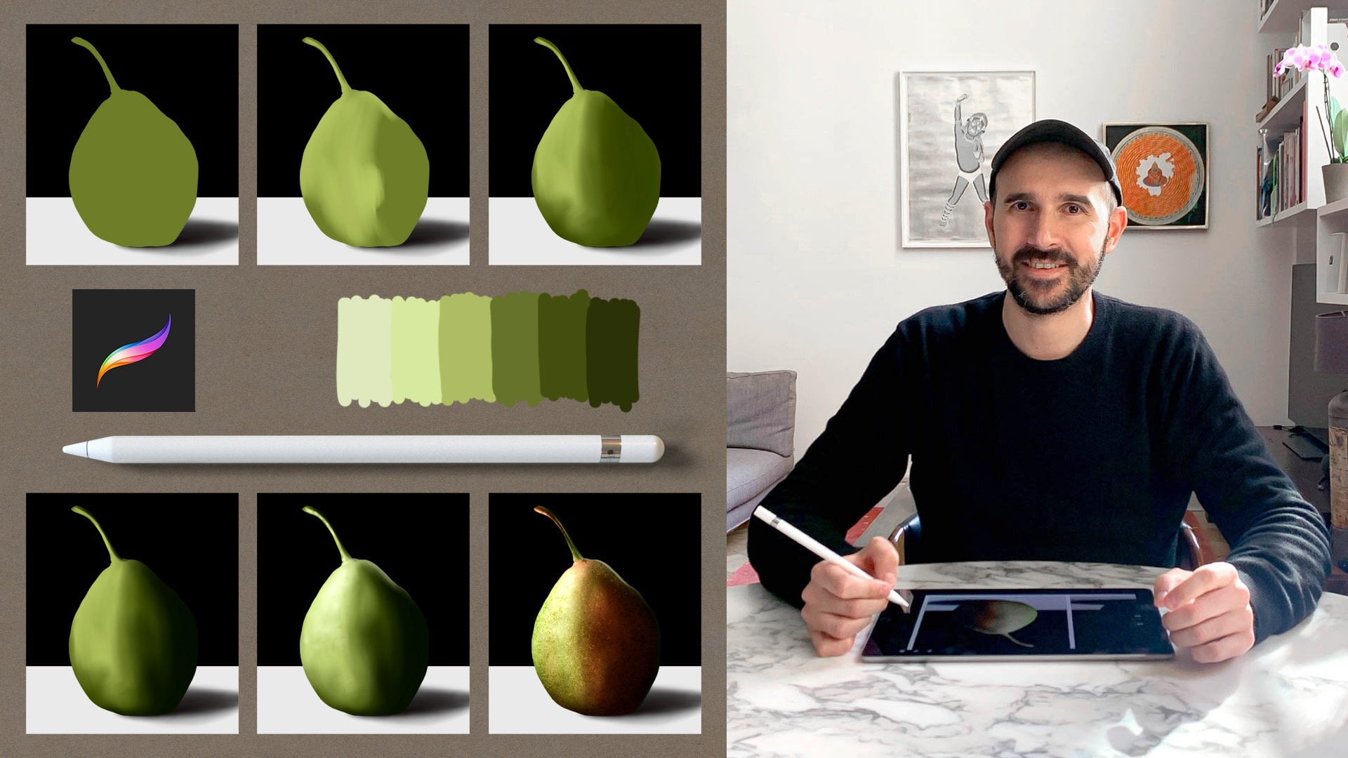
3. Procreate Basics (for beginners only): Okay, we're going to start by launching procreate. We can create a new document, pressing on the plus sign, and you can find some presets. Otherwise you can create your own canvas. Now we can create an HD size which is 1920 by 1080. So we click create. So that's the Layers palette. You can see there's a new layer and a background. You can change the colors of the background by selecting the background layer and then choose a color. But we're gonna keep it wide for the time being. We can create new layers by pressing the plus sign. To delete layers. You can swipe left and press delete. So this is the brush library where you can choose from a big variety of brushes. So for example, this is the hot air brush. So if you select this brush, you can then paint. We can change the brush size buys lining these up and down. And we can change the opacity of the brush using this slider here. And obviously if you reduce the capacity, you have less amount of paint on the canvas. If you want to change color, you press on this. And at the bottom of the color pallets you have few options. So that's the classic view where you can choose a color that goes from light to dark, and you can change the u using this slider here. So for example, we can choose these purple color. Then there is another way of choosing a color using the disc. Again, you can choose a color going from light to dark, and then you can spin around. Then there's color harmony in the color harmony panel. You have different schemes. You can choose complimentary. So if we increase the brightness, we have more vibrant colors. So you can choose a color and you paint. Then you choose the compliment, remake clicking on the other color and campaigns as well. Then we can choose Split complimentary. So you have three colors. Then this analogous, which is really nice when we have three colors that we know that they go really well together. So for example, we can select these violet, this pink, and this fuchsia. And we can actually see these color set is actually a harmonious and then there's a value panel. Well, you can decrease the saturation or increase the celebration and do the same for the brightness. And then you can supply food, a hue. And lastly, there's a panel for the pilots. You can use the default ones or important new pilots, right? So we can clear this layer. I'm going to choose a colour, can be one of the dark, violet. And isolate the hot air brush, which is the most basic brush. And I just paint a few strives to undo. You tap with two fingers on the iPad and to redo, you talk with three fingers. So it's undo and redo. Now if you want to duplicate the layer, you swipe left and you press duplicate and delay is duplicated. Now you can press the Move tool, which is the black arrow, and you can basically move what's inside the selected layer. Then if you want to protect your layer, you can decide to lock it so you swipe left or you press lock. So you are when you lock a layer and you try to Pang on the layer or arrays or move or do anything on that layer, that wouldn't be possible because delay it is locked. We can delete these. Then obviously you can choose from a big variety of brushes. So you can choose these and paint all Change brush. And obviously every brush has got a specific effect. Like these wet clays is very specific. Then we have this munching library or the blending library. And again, we have exactly the same brushes from the brush library. But if we paying with these brushes, we going to blend with induce much colours together. So for example, if I select wash and going to smash the color's going to mix them and blend them. So for example, if I add one color here, can be this kind of purple. And then I switch back to this mansion tour, to the blending tool. I can mix them together. Almost straightforward if I select the soft brush and paint with this color, let me clear the lay and do it again. So we've got this color here. Then I can choose a different color like this, violet up this color than I switch to this munching tool and I'm going to select soft brush. So we have soft brush for the painting and soft brush for the blending. And I'm going to blend in the middle where the two colors meat. Not always, but sometimes I duplicated the layer so the colors get more opaque. And then if you want to merge the layers together, you can do DES, you can pinch them and they merge together, right? So that's this matching tool. So this is the eraser. Again, it's the same library but for a raising. So if we have these airbrushed selected, we can erase part of the painting. I can increase the BRAF size. I can make a line. Then if I hold down with the Apple pencil, the line gets straight. Then if I put the finger down, the line would be constrained and snapped to the horizontal plane or to the vertical plane. So again, I can make a simple line, wait until the line guessed right, and then putting the finger down, it will snap. And you have something like this. Now, if we get rid of these, we can clear the layer. Ok, so let's have a look at something different now if I paint anything on the canvas. I can create a new layer. Then I click on the firm Noel and I select clipping mask. So the clipping mask is a layer that is created on top of an existing layer. And then you can see that these are arrows pointing down. So that means there is linked to, is connected to this layer. So if you paint on this clipping mask layer, the paint will be visible only in relation to the layer below. So if I unclick the mask, you can see the actual layer m. When I clip it back, it gets inside the layer below. And this is quite useful because if I now switch to the blending two icons, mage, I can blend this Calla without thinking about the perimeter. So the koala is not going to bleed outside. So have some practice with these because we're going to use this technique quite a lot throughout the course. I can merge the layer and the clipping mask layer together. Another thing that we can do is creating a mask. So now you can see a white layer on top of our layer and is linked to it. A mass gives the possibility to hide and show a part of the layer. So when you paying with black, you hide and then you can switch too wide and you can reveal the layer. If I now switch to the soft brush and I adjust the brush size, switch into black. Also, I can paint at the bottom of this gradient and then I can get something like this. But the most important thing is not, I'm not erasing so I can change my mind so he's not a destructive way of working. And then once again, when you happy with the result, you can merge the layers together. So let's have a look at something different now, if you have three layers, we can create three colours, 12. And three. You can swipe, right, and you have a multiple selection. So you can select multiple layers by swiping, right? And you can see that the layers change color. So when you have a multiple selection, you can decide to move the layers together, or you can group them. M1 is grouped, you can rename it. And then when you open the group, you can reassemble the layers inside so you can move them around. So you can select one holding down and then you move the layer. Then if we want to flatten them out, you can pinch them together, including the group. Or you can click on the phenomena and select flatten and this bond. If you select the black arrow, you have a few options there. Basically you can flip delay is horizontally, vertically. You can rotate the layers so you can transform them in different ways. Now we have a series of adjustments. In this course, we're going to use caution Blair, and hue, saturation and brightness. So if I select gosh, I'm glad I can swipe to the right and increase the level of blurriness. Otherwise there is another effect is called liquefy. There are a few options for this toolbar. If I use it, I normally use the Move option to slightly fixed stuff in there. Now talking about the Gaussian blur, again, if I create a mask and then I am going to mask some areas of my painting. Then select Gaussian blur. And then I can blow my artwork. But then if I select the mask, I can also blurred the mask. And this is quite useful. Im gonna go through these throughout the course. Another very important adjustment is hue saturation and brightness. We can change the color overlay or by cycling through the spectrum using this slider. Or we can decrease the saturation or increase it. And we can do the same for the brightness. Or you can slightly shift the colors using the color balance. But we're not going to use these in the course. I just want to show you a couple of additional things. So I can create two colors. Then if I want to select a color on the screen, can hold him down and I can sample this color. Or again, select these and then change color. So now in the very last thing is to duplicate one artwork and copy one layer from one document to another. And to do this, we will want to click on gallery. We can obviously rename the artwork. For example, my artwork. If I swipe left, we can share to duplicate and delete. If I duplicate, these are work and then I quickly change the color. Now, I want to copy this layer into the original artwork, and we can do this in two ways. The first one is to select the layer, moved the layer, all the layers in the middle of the composition without releasing, click on gallery. Select the other document, open up the Layers palette, and then drop the layer inside the Layers palette. And this is very useful when you have to copy more than one layer. And we're going to use these methods during the course. Otherwise there is a classic way, three fingers down and you have cat copy, copy and pays. You can simply copy this layer, select the previous artwork, three fingers down, and then paste. And I think I covered the essential for this course. We're going to go through all the steps during the individual lessons. So you're going to get quite familiar with all of the process. Explain here. So let's get started.
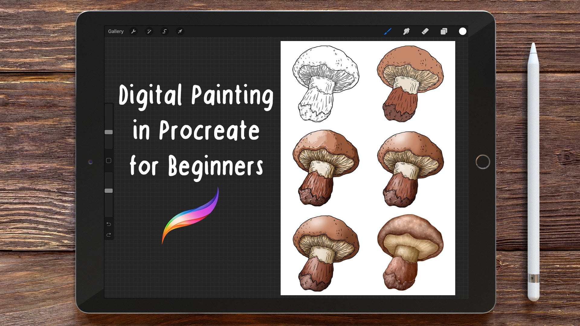
4. Making the Drawing: Okay, in this video, I just want to show you the way I made a drawing. As you can see, I'm at the drawing on paper, I'm using a mechanical pencil, which is 0.3 millimeters, and I'm using some standard printing paper, a full size. So normally that's the way I like to make a drawing, like on traditional paper. It doesn't have to be one way or the other. It's really up to you. You can feel comfortable making the drawing on paper or directly on the eye. But obviously if you choose a traditional technique, then you have to digitalize your artwork. So when you're done, you can take a photo of your drawing or even bacteria, you can use a scanner. So this course is not about drawing by, it's more about learning how to use water. Karla, him procreate, if you interested in understanding how to make a drawing and to see which options you have. You could watch lesson 67 from my whose pain? Like the old master with Photoshop and procreate. Otherwise, you could also watch Lesson 23 from Complete Guide to really seek oil painting. In those lessons, I explain how to make a drawing. I'm going to speed up this lesson, but if you want to watch it real time speed, you can always change the playback settings and choose to go half the speed. By the end of this lesson, I will get three flowers done. You can download this drawing because I made it available as a resource material for this course.
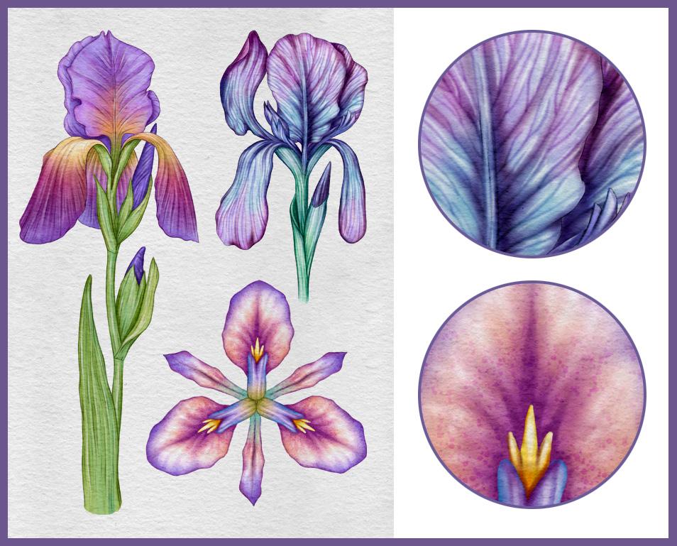
5. First Flower: The first thing that I normally do when I import a drawing into procreate or Photoshop is to duplicate the layer and set the blend mode to multiply. And in this way, the pencil drawing gets more visible. And what I want to do now is to create the color palette for the flower. So I'm going to switch to the hot air brush, which is a solid brush. And then I'm going to choose a purplish color, like a violet, purple color. So something like this. We're going to move the layer on top of the page. Otherwise, the color palette, we'll get this texture effect. And then I want to go brighter and put this color down. And then go darker. I go dark again. And I create four colors. So that would be for the petals of the flower, What I want to do now rather than create another palette, I want to duplicate the existing one. So I swipe left and duplicate. Then I can select the Move to move down the palate. Then from a drop-down list, you choose hue and saturation. And I can change now the color of this palette. So the brightness stays the same, but the color will change. So you can see there we can cycle through the colors. But for what we want to do, we want to create a green color for the leaves. Once again, we duplicate the palette and we want to create now a variation for the petals. So if you select you in saturation this down, we want to go towards the violet spectrum. So basically papel goes towards the red and violet goes towards the blue. So now we want to merge them together, so we pinch them. So we have one layer only. And I just want to resize the pallet so it's not too big in the middle of the composition. And now I want to actually create an additional color that would be a yellow. So I choose one of the yellow from the spectrum. And rather than playing with hue and saturation this time, I want to recreate the palette from scratch. And this is because the airline is always a bit of a tricky color, is always a bit difficult to get. A nice brilliant, pure yellow. Sometimes when you select the yellow color is kind of greenish, always kind of orangey. Please pass it to choose an average yellow and then adjust the color and the yellow that you like. At this point, I want to create a free form selection. I just want to select the yellows watches. And then I do hue and saturation because I want to increase the intensity is I want to increase a little bit the saturation of the yellow palette and also probably slightly change the color to be slightly warmer. There we go. Now, I can rename this palette layer into palette Dao suprising. And before we start painting, we want to create a custom brushed library. So if use wipe down the brush library list, a plus sign will appear. So if you click on it, you can create a custom brush library that we want to call watercolor. So the first brush is going to be script. Which is under the calligraphy library. So you select them, brush, you swipe left and you duplicate. The duplicated brush has got that icon on the right hand corner. Then we can drag and drop the duplicated brush into the watercolor library. And we want to do the same for another brush, which is wet glaze. Again, you select the brush, is wipe left. You duplicate this, and then you drag and drop into the water. Collaborate as crypt brush leaves a quite neat line, very nice vaguely every crisp. Why the white blaze gives something like this. We can just start painting now so we can undo this. And do we need to tap with two fingers? Undo is tapping with two fingers and redo is tapping with three fingers. We create a new layer. We want to place the drawing on top of the paper. So we select now the script brush. And we're going to choose the first color, which is the brightest from the violet palette. And what we want to do is to create the perimeter of this pixel. Here. You can see that the capacity of this brush is set to a 100%. And then I can close the perimeter. I have to be sure that there are no gaps because I want to feel these shape with these color. So I'll drop the color in. And the first Pedro is done on the same layer. What I want to do is to do the perimeter for the other Petro. So as I did before him to follow carefully the perimeter of this pestle, I want to maintain all the little calves of this password. And then again you close the shape. And the second pathway is done. Now I create a new layer. I'll place this new layer underneath the petals. And I'm going to pay in the petrol at the top. I'm going to speed up this process lightly, as is exactly the same as I did for the pattens below. Otherwise, this lesson gets really long. So I'll do the perimeter fast. I make sure I close the path and then I feel the shape with this color. And what I want to do now is exactly the same as before. I create a new layer. I move it at the bottom of the layer stack. And this is because I want to paint the petal which is in the back. So same process, perimeter fast. So I'll do also this bit and then I fill this in. Then what I want to do actually is to add a pestle in the background so I can switch to the day I went Penzu or any other pencil, FISA let the drone layer, I can add these additional patterns. So I can create a new layer. Now, switch back to the script brush and then do exactly the same as before. Structuring the illustration in this way can be slightly confusing because of the number of layers involved. But in fact, this gives you a lot of control over the illustrations. Now I can quickly fix this. So this is the base for the petals. So what we're going to do now is to create a new layer and a clipping mask for each shape. So I'll create the layer I tap on the farm now and then select clipping mask. So we did the same for each of them. And now we select new layer with which for the first time to the wet glaze brush. And we select the second dark has color for this palette. So you can see that the capacity for this brush is set to a 100%, is sensitive to pressure, so you don't want to press too much. You want to start painting with this brush. I want to add this dark color to the tip of the petals. Nothing too drastic. Now we want to choose the second darkest purple color and we want to add these new shade. Always quite gently. We want to increase the quantity of color inside the PESTLE. If we imagine if it's a real Waze, Kayla, we want to increase the amount of water. So we can basically add this trial session along the Pashto. And now we can do the same for the other Pashto. We're going to make the edge of the special darker. And then when we switch color, we are the striation. So we want to have the same level of treatment for each individual pixel. So we can increase the quality and the definition all together. Now we can choose for the first time, there's matching tool that much into is a really cool, really clever brush. There obviously blends colors together. You have the same brush library as in for the painting and for our needs, we want to choose wet clays. So we show that the effect of these managing of the blending is the same of the painting. And with this brush selected, we want to blend these colors together and have a kind of a nice transition between the colors. So you can see it resembles a watercolor quite well, is very convincing in a way. So basically, in real-world, if you use a real water color and you have the color still wet, you would have to add water to blend to soften the edges of the brush strokes. In this case, what we doing we use in the blending tool and we basically doing a virtual water. So we have these canals that they get one into Ananda and they blend and there is this nice transition between them, right? So are we ready for the other petrol so we can do the same with which to the wet glaze and we selected second darkest color. And we want to make the base of the patch will davka, as you would expect really, you know. And we can paint the lines, the striation of the petrol. Again, you don't want to press too much because you don't want anything too strong or too evident. We are building up the volumes and the shapes and the colors. Are we ready for and being the second column. And again, I want to start from the base and then propagate. This color is purple color along the surface of this pestle. I wanted to also make the margins of the Paschal dot-com or more intense in color. And then we can switch to the blending tool. And we'll go into software. We're going to add some more. And we're going to have some nice transition of colors. So the Fed is now down. Can change passwords. So we're going to pay the one. We're going to make this a little bit darker is we assumed it's more shadow is because it's in the back. So we kind of want to pay in some cast shadows that we switch to the PowerPoint. Now we switched the blending tool and we do as we did before. We just want to add some more. And then paying the last petal, which is fine in the back. So he's going to be dark. Then we add the purple color. So each individual patterns had been treated in the very same way. At this stage, you cannot say there is a one period which is more defined compared to the other. They are all the same quality or the same treatment. And this is what we want because as I said before, we want to increase the level of quality and D definition altogether all along, without giving any elements, any sort of priorities, uh, we increase these quality throughout. Now I can create a new layer and a place it at the bottom of the layer stack. Switching to the script brush, I'm going to make the shape for the blossom, which is disclosed flower here. Then I want to move the blossom on top of the password, which is in the back. And every time you move or you create a layer on top of a clipping mask, it gets clicked straightaway. So I moved the blossom, but then I have to unclick this layer. Now I want to pay in the other blossom, so exactly the same things before I create a shape first and then I fill in with this color. So I'm going to create a new layer and create a clipping mask. I switch to the dark as violent and paint with this color. So if you're paying towards the side of the blossom, so you, if you made the sides darker, you can get like a cylindrical effect. So that's what you want. You want to keep the central path and of untouched and the male, the sides darker. Now we can quickly blend these new colors. Blending darker colors is a little bit easier because you can't really see much. It seems that the blending is really more effective than when you blend brightest color. And now we can create a new layer. Switch to the script brush and select the second brightest green color because we want to pay in the leaves and the stem. So we're going to start from the biggest leaf. So we create the outline first, make sure there is a closed shape, and then we fill this leaf with this color. Now I can create another layer. And I want to make the outline. Obviously, I have to flip this. I want to create the outline for the stem, which also splits into two leaves. Gonna hide this IC beta. So that's done. Now in the same layer. I can also add these leave. And then probably if I create a new layer, I place it underneath the Stam and I can create the didn't leave incorporating the blossom. Again. I always forget to do that. And this is also done. We also need to pay in the base for the leaves enveloping the blossom, the other blossom. So do the outline first. And this is also done. Now, what I feel is that this green is too dark for my taste. I want to make it brighter. So to fix this, you have a few options. You can play with the UN celebration and change the brightness or using the calves, or you can create a new layer. And I do that for each leaf layer clipping Muslim, then I can choose the brightest green we have in our palette and manage them down. So imagine them together and for each of them, I'm going to create another layer with the clipping mask, because now we want to start painting. So I select the fad, darkest color or the second arc Haskalah, with which Back to the wet place. And with this brush we're going to do something very similar to what we've done for the pedals. So we want to start from the margin of the leaves and then create some striation. Again, we don't want to press too much. We want to build up our colors. So we have to keep it like soft and delicate because that's a watercolor. Was it had the nature of watercolors. That very gentle, very delicate color doesn't often really strong, otherwise, it becomes a wash. So there's a bit of a difference, I mean, quite big difference actually from a watercolor wash painting. So I'm wash painting is very opaque, while watercolors are very transparent, very pure. You know, you can see that the very delicate calories, because it's basically water is colored water. So that's basically simple as this. So we want to paint these striations, maybe going dark towards the margin. And then we can blend this. Right now, the same thing as before. I'm going to pay the loan, the sides of the Stam getting these kind of cylindrical effect. I can make it dark. The pace of the blossom. Then I switched to the planning to blend the profs drugs. Now we can pay in the leaves surrounding the blossoms exactly the same thing. We want to make it darker between the plus and the leaf, between the blossom end stem. As you can see, that we do these for the blossom at the top, for these leaves there. And we can simply blend these new process tribes. And as you can see, it's quite convincing as a watercolor is coming along nicely. So that means that we are on the right track. Now, if you want, you can add some additional color, some additional paint, let's say. And so we can increase the level of description. In this case, I'm adding some passion, some texture effect, which is typical of some plants in it. Some more definition. So I'll just paint and blend is kind of a second round of details. Now I can create a new layer. I place that layer underneath the stem and I unclick the layer. So I switched to the script and I choose the Bryce and screen. Why? Because the back of these patterns here are in fact leaves. There's a bit of a transition between the leaf and the path. Also, the backside of this pixel is going to believe, while the front side is going to be petals, going to be a flower. And then I'm going to close the shape. So I move this layer underneath and I again, I need to include this because he gets clipped straight away. If I share now the layers, I can see if the something which needs to be fixed. So I can create now a new layer. I clipping mask is, and I switched to the wet place. And as I did for the other green part, I need to paint with this color and create some shadows. Then it's going to be dark ways nested near the blossom part. And also is going to be dark because that's the back side. The surface kind of a cast shadow coming from the flower itself, from the petals. Right? And I think this is the, and I think we achieved the same sort of quality of the petals. So we can now create a new layer on top of the petals. And we clipping must this layer with which to the wetlands. And this time we select the dark has powerful. Now we want to do a second round of details and we want to increase the quantity of color on the paper. So we're going to define even better, even more each individual element. But as you can see on mainly painting the middle part of the petal, I'm not kind of reaching the edge as before. I'm basically stopping a little bit earlier. So we want to pay into that area a little bit more. So is the central body. So I do that full Dione, that pod on the other side. Now I move to the other petrol, so I create a new layer and a clipping mask. And again, I want to odd that this new color, again and not painting along the margins bomb more towards the inside of the PESTLE. Now I'll do the same for the pesto in the back. And then I can blend this. I just wanted to reinforce the base of the PESTLE where we would expect to be a little bit dark. That's fine. I can blend these additional brush strikes and having consistent with what I've done so far. Same treatment for the pesto in the background, we wanna create a new layer. I just want to add the striation. So he's not too dissimilar. Now I've got the feeling that I want to blend these path a little bit more. I just imagined that are also moves and soften these area. Right now I can select different petals layer. And I think I want to reinforce these reaction using this brush. Just want to make some new stria shin starting from the edge and not really connecting with the ones on top. Which gives a bit of a sense of dynamism. So I'll do this for the other PESTLE as well. Just point, make some lines. Right? I think that's fine. Now I want to add some details on the blossom so I can create a new layer and create the clipping mask as usual. So if I switch to violate, I can sum d does on the blossom. And also on the one above. As you can see, is more about adding some clever brush strikes and to some dark at times where the blossom is nested, it makes sense what we're doing because you would expect some cats shadow, some contact shadows from the leaves to the blossoms. So that's what we're doing. So for the pesos in front, I think I want to duplicate this layer and reduce the opacity. And then I can manage these four layers together, just one layer now. Then I think I can match the pattern in the back. And then merge the one in the far back. I can do the same for the green part, the green elements by the Stam and leaves. Now I want to duplicate the front petals. I'll create a clipping mask, and also I create a mask for the first time. So you click on the farm now and then you choose mask. So you apply a mask to these clipping mask layer. But before showing you what a mask is useful, we want to change the color of the petals. So if I select the layer, I can choose u in saturation. And you can then basically decide which color do you like the most. It can be any color. In my case, I think you're going to choose a yellow. I want to play with the saturation and also the brightness. Now we want to select the mask, we switched to the wet lies brush. So when you select the mask layer, the only options you have when you paint is using black and white. So basically, if you paint with black, you're going to hide a portion of the document. And if you pay in white, you are going to reveal it. You are going to show it back. So it's very different from the Eraser tool because when you use the eraser and erase something that ego is forever y. Using this method, the master method, you can show and hide and change your mind as many times as you want. And also because it is pressure sensitive, you can basically press a little bit less m, you get these sort of effects. Then if you select the mass, you can invert the mask. So basically the colors will be flipped otherwise. And that's the power of this method. You can Gaussian blur the mask. So if I select Gaussian Blur and a nice likely slide, you can see that the mask is getting blurred and I think this is fine. I can do the same for the remaining petals. I can start from the one in the far back. So duplicate the layer I clip in muskets and then create the mask. I can change the color. And then as I did before, I can hide the lower part of the petal and then probably Gaussian blur the mask a little bit so we have a consistent effect. Now, if you want to create another color between these two, you can do exactly the same as before. So let's go back to the front petals. I can duplicate this layer again, create the mask, and then change color again. This time I want to go powerful, so a reddish version of violence. And now selecting the mask. I just want to paint and all the edges that leave the baby can lead the mosque. And that's fine. And now I can do exactly the same food that patch will be in the back. So we'll have to duplicate the layer, create demand, change. Paying the mask. Blurry out. Now can do the same for the Pashto at the top. Same processes before to create the mask changecolor. Now what I want to do is to create another layer and create a clipping mask. I switched to a bright green. And I just want to paint the base of the PESTLE, like if it was transitioning from a leaf to a flower. Now I can probably pick some yellow color, can be from the flower I0 from this watch, and then paint with this color. Now blending slide me. What I wanted to do now is to change slightly the color of the leaves. So something like this. Now going to create a new layer and a clipping mask for each of them. And then I'm going to pi and with this new color. So I'm not changing the overall Coulomb, just adding a new team. And also want to add this new color palette. The yellow now can create a new Layer Mask. And these tint with a white glaze brush. Now the blossom. Just want to add some yellow tend not to match just to create some kind of variation. I can now some of these yellow to the Stam and create some stria. Again, not too much. And then maybe blend is a little pay. And then do the same for the rest of the leaves and the stamp. Now, moving back to the from petals, I'd create a new layer and a clipping mask. And without wet glaze, we switched to white. And what we want to do is to increase the level of details and add some new striations. So you can see that I'm applying some varies, more changes are the ones anything to present evidence at this stage, but it's more about caressing the surveys are things more details and make it nice and prettier. And watercolor painting is really a badass, especially botanical art. You want to get something nice, something delicate, and something sophisticated. I'll have this process using the brighter color wouldn't be that possible using real watercolors because you wouldn't be able to add some lines, strikes over a dark surface. In real water, Kayla, you want to go from light to dark. And when you reach a dark tone is not quite possible to go back to a lighter tone unless you add some wash painting on top. But obviously with a digital tool, we have the freedom to overcome these limitations. Now I can do exactly the same for this pesto here. Probably reinforcing some lines in that. And I think that's fine. Ok, and do the same for the other petals. Just wanted to add a few lines here. Not too many probably because it's a being the dog that pencil. So I don't want to do it too much. And now I can do the same for the very same way as I did. That can reinforce the mid line because you can see is a bit like capillaries. And that's TP going leaves and petals in the same repeating itself. Some few strives to dispatch, we'll hear in the back. Not too much. And probably some additional lines. A little bit more evident. So you can see that I press release in a press. So you have a line DE is modulated rather than a fake line. Now I can on some details on the blossom. Basically when we painted with a dark towns, we focus along the edges of these elements. And now using this Whitehead is Bryce and Carla. We want to paint along the line, along the central part. And I think that's enough. Now, I can actually merge some layers. There is getting a bit confusing. So I can merge all the green parts, all the leaves, and the stem into one layer. Only. Then I can create a new layer and the clipping mask and do exactly the same as ID for the petals and the blossom. Now for these leaves. And they're running these finer details. And now alone the Stam, especially I, reflection is where the light is called the strongest effect. And now I can pay in the big live just a few lines, nothing major. And also blend these lines is really not what we want to do is to use another brush, which is the ink bleed, which is under the inking library. So as we did before, we can duplicate this brush and then we can drop it into our library. I can now create a new layer. I switched to the dark as green and ink plate does something like this is called this irregular margin, sorry, this kind of bleeding effect, as you might expect, I want to reduce the size of the brush and also DO capacity. So we can get rid of this. So we have a very thin line that can simulate a small brush. And we want to add this colour to our palette. Now we can switch back to our ink blade, create a new layer. I can probably reduce the opacity and hide the drawing. And with this new branch, we want to make the outline for every shell. And this is an additional step if you like it, you can up these outline or if you think you want to have a more classic watercolor, you can skip this step and leave it like this. Anomaly lie to our the nap proline as the illustration gets more defined, more elegant. In real life painting, for example, if you want to do this, you would use a colored pencil or very tiny brush, or is very important during this phase, is to modulate the line. You don't want a 50K steady line here by you want to press more when there is more tension, like when two or more forms and shapes intersect. So you want to apply more pressure there and go lies and softer in, in areas. So you want to press and release, and press and release so you can create some movement along the line. That's the most important thing is to create this sort of dynamic line. I'm going to do this for the whole flower. For believes is quite self-explanatory. These phase and in the end of the lesson. So we are at the end of this process. We also want to the dog park or to our palate. So if you want to have the outline a little bit more visible, you can duplicate the layer and then probably reduce the opacity of delays or otherwise is still visible. So it's something around 50% probably. And then I can merge these layers together. And I can do the same for the petals. I can duplicate the layer. And again reduce the opacity and match the layers together. I can probably rename these layers into flowers strike and leaves stroke strike is a term that comes from Photoshop is very common in Photoshop to make a selection and create a strike meaning and outline. Now want to merge some layers together and finalize the illustration. So I can start by merging the clipping mask with the below layers and also the masks. And I end up having one layer for each element. And now the delay is a merge. You can change the color of the stem or the leaves or the petals. You would do that with you and saturation changing the hue. So meaning the color. And the saturation, meaning the intensity of colors. And I think our first cloud is now done. We can group these layers. So you select the first layer and then you swipe right to select the others. Now, you can group them. You can rename the group into flour. And now just for reference, or you, if you duplicate the flour and then merge the pedals together, you can change the colors and choose a totally different one. You can do the same for the leaves and the stem and go and be more creative. Obviously, you can do something it doesn't exist in nature if you want to use these for some pathogens, or you want to print this out so the sky's the limit. But for our purpose, our first illustration is done and we can now move to the second watercolour technique.
6. Second Flower: Right now that the first flower is done, we can focus on the second flower. The first thing that we want to do is to create a new layer. So we select the script brush and with the gray color or can be any other colour you like. I'm going to make the outline for the fast petal. And for this flower, we're going to use a slightly different technique. I'm going to close the shape and fill it with this color. Now I'm going to do the same for these other parts. Create the outline first and then fill it with the scanner. And now these little bits here. And then I call it dropped pits. Now I'm going to create a new layer for each of them and then create a clipping mask. I just want to feel the new layers with the white collar. And now I can merge the clipping mask, the layers. So amazingly hand up having the shapes filled in white. But I had to use a grey outline fast because I wouldn't have seen the wide stroke on a white background if that makes sense. Anyway, we have this shaped here and obviously are not visible because they're just white. Now I can pick a midterm, will create a new layer and put down the first column. Then we want to move to pilot on top of this row wing and the paper m. Once again, we're going to create a new layer and a clipping mask for each shape. Now we can select the first clipping mask and we're going to focus on these Paxil. We might want to use another brush from the water brush library. But I just want to show you today is not really about the brushy use, but more about the way a brushes used. So I'm going to select the most basic brush in the library, which is the hot air brush. And I'm going to paint with this. And this is just to show you that even with the simplest, most basic brush, you can get something very interesting. So as you can see, you pass it is not a 100%. And I'm just painting with this color up to this point more or less. Now we can switch to the blending tool and select wet sponge. If you click on the Brush, you access to the brush library. And if you increase the Gita, you can see that the shapes down throughout the stroke is scattered all around. And that can be very useful for what we want to do. So we increase the Gita probably too much. And I can also reduce your passage of the brush. And you can see that you're going to get some very nice, very convincing planting. So I obviously want to blend and soften this area here. Now I can change. I can probably be choose a kind of deep red. B may be Publish. I can now create a new layer and the clipping mask. And I want to pay in using this new color starting from the mid line is always the hot air brush. Some PESTLE structure, this ramification from the mid line. And then I want to use the blending tool will dispatch two. So you can see that it's gone up different effect from the previous flower. This is more LacA lose water color. Now I can create a new layer and put down the second color on the palette layer. And we're now ready for admin, the Fed Kayla say for these color, we want to choose a quite deep violet. We can choose the brush as we did before, and we're going to pay him with this new color. So with these new column, we just want to pay in the upper part of the petal, kind of read in some ramification towards the inside. And now we can use this tool to blend is in landings like if I adding some more. And I'm going to reinforce demand of the pestle and some veins in lines. And then blend is again. Right now I can create a new layer. I'm going to duplicate the wet sponge brush and I'm going to move it inside a library. I just want to move the West pan to the pace of the library. And I can do the same for the hot air brush. Want to duplicate this movie in southern library, plays a at the bottom of it. So we have the top part for the first flower, and the bottom part of the library relates to the second flower. I just want to move this trivial statements underneath the pistol because I won the pistol to be on top of everything else. And now I can stop painting with the perimeter fast, is lightly shade towards the inside. And I can say something not too dissimilar from what we've done before. Now I can create a new layer and a clipping mask. And then I'm going to choose this reddish color. I'm going to start from the top of the pesto and then create some texture to blend. Now it's time for a new layer and a new mosque because I12 violet color to treat these in the very same way. Starting from the period. And then we can probably blend so we keep it towards the outside rather than on the inside. Now create a new layer again. And nice times which to a green color. And I want to switch to green because I want to do exactly the same as I did before. I want to make a transition from the leaf to the petal. So we want to add this color at the Palace of the pistol and then blend this. I can also add color to the color palette so it's going to be consistent for the remaining petals. And I want to probably go dark. Cat is lively shift towards blue. So if I create a new layer and create a clipping mask, I can add a dark hat and create some striation and some texture is just tiny details, I think is very important. We don't want to overdo, we are not after an ABA realistic, photorealistic flower. So I'm happy with this amount of detail and description for water Canada illustration. Right? So if I hide the drawing, you can see the, it's getting along these dark green to the pilot as well. Now I can probably wanted to reinforce some striations and tech shop, which is at the base of it. Now we can pay in the statements which are these three little bits are going to choose some yellow color for this. And quickly pay these in. Because it's going to be quite fast as a very small area. So I paint and land and I also add these to the pilot. And now I can slightly shift towards orange. And if I create a new layer and the usual clipping mask, I can add these new Kayla and create a dark Cat town. Now I can blend the orange color and are these color to the pallets. Now what we want to do is to create a new layer and a clipping mask on top of each element. If we select the empty layer for the Paschal, we can select a new brush which is going to be bronchi and is under the calligraphy library. So blotchy does something like this. It's got this patchy. This was a kind of feeling to it. And if we switch to white, we want to add some highlights. So this Bryce as strokes. As I mentioned, Enya, in real life water color, this wouldn't be possible unless we use some quash as white in watercolor painting is not even contemplated because why it is given by the pain. Right? So I add this brighter strikes and I can do the same for the other path straightaway and before blending is just a few strikes they make sense to do altogether. So we are consistent with level of Stein, uh, we apply. Right now we want to duplicate this block shaped brush. Include these to our library. And now we want to blend these four blending. We can use water bleed blend as I did before. I'm going to concentrate more towards the margin so I softened the edges. I want to paint with some irregular strikes. Otherwise it's too linear. And then I do these for all the remaining why strikes. This is done. I can now switch to a new layer and clipping mask. Now I can switch to the water bleed brush, which is under the water library. And we selected I'm going to pass it along the perimeter, slightly shading towards the inside. And then I'm going to pay the central part. And the veins connected to eight. And some casts shadow at the bottom of the pestle. I can blend what I've just painted using the wet sponge, which is always under the water Library. And I'm going to solve all of these strikes. And now I do the same for the veins and the cast shadow at the bottom of the pesto. And now I want to do the same for the pistol so we can create a new layer and a clipping mask and do a similar work that we did for the petal till we don't want to overdo or do something complete different. Who wanted to be consistent in style and level of T. And now I can move to the statements. I create a new layer and a clipping mask, and I quickly this dark town. Now I can blend this just a tiny bit, not too much. And now if I show the drawing, we're going to pay in these special area. So I'm going to slide the same base layer of the bigger petal, switch to the screen, brush and select a grey color. And as I did before, I'm going to make the outline of the pestle. I make sure that the shape is closed and I drop the Carla and feel dizzy. And at this point I want to create a new layer. Switch to white, fill the layer we white and then manage the layers together. I can now switch to the hot air brush. Showed the palette. I can probably moved the pilot closer to the petal. And then basically I'm going to do the same things that I did for the upper PESTLE. So instead of creating new days, we're going to use the same layers and approaching this lower pass or in the very same way. So I can now switch to the blending tool is managing tool and soften this. Passage of the drawing layer, so he's less destructive. And I keep blending. Now I can move up and switch to the red color. And if I look at what I've done for the upper pestle, I want to pay. And also the meat line, which is the central part. Plan. This I want to make sure I create something pleasing to the eye. I shouldn't forget this is a watercolor, so we are after something that is pure and beautiful. The concept of Busey applies really well to watercolor paintings. Now I switch to violet color, going to paint the Paschal with this color. And then I'm going to smudge the paint to adjust the size if you need to. And I think that's consistent with the upper petals. So I can switch now to the white strikes layer. And I can quickly, these striations I am varying along the party of this Pashto and then blend them. I basically managed to get the same effect. I quickly want to dark hat red strikes around the managing of the patch tool and along the midline. And then blend days. Now I need to create a new layer for the green part that the pace of the pestle. And as I did before, I want to put down the bright green fast. Then land. Now switch to the dark and green. And these additional kinda quickly bland, as you can see that just a very few strikes, nothing major. Now what I want to do is to go back to the gallery, duplicate. These are work, so I have a safe copy. And now that I've crossed safe car, we have got the freedom to change the colors or manage the layers because I know that I, if I change my mind is a safe copy. In fact, I want to try now to change the colors of the petals using hue and saturation. Then I can change the violet color into something more bluish. And then also want to try and change direct color into something more bluish again. And then I go back to the base layer and change the color again. Most of the times, if not all the times, it's just about trying and sometimes it's just about meaningful changes. And that can make a big difference in terms of look. And that's why of course saved copy. So if I change my mind instead of undo all the steps, I can basically revert back to the original Our work. Now I think I want to merge some layers and I start from the big petals, so I match them all by pinching them. Then I merge the pistol layers and also the statements. So I end up with three layers in total. Now, I can write select statements and the petals and group the three of them into a group. And what we want to do now is to duplicate the group. Because we want to rotate the group and place it in the same position as the drawing underneath. So instead of painting the remaining Pareto's, we could to duplicate them. We're going to copy them and then you change the shape. We are not exactly the same. So it is a bit of a trick by is fairly hormone and illustration, if you have a repetitive pattern or repetitive elements, is fairly accessible to copy stuff multiple times and save some time. And in order to do this, we want to select the Transform Tool and going to rotate by 45 degrees and then adjust manually using the green handle. And now you want to duplicate this layer and flip it horizontally on to move it as best as I can in the right position. And now for the first time we want to use liquefy, which is a fantastic tool, very useful. It comes basically from Photoshop and you can push, you can 12, you can pinch part of the artwork. And I never really use anything else rather than push to be honest, and it creates something like that. This is extremely useful when you want to amend or you want to change the shape slightly. And this is exactly what we're going to do. And I'm going to slightly amend the petal and from the drawing underneath. And I want to differentiate that shape of the petals in order to lose the feeling that the I exact copies. Okay, now I can move to the other group and I'll select again, liquefy. And once again I can randomize the shape of the petals and little b, I can follow the drawing underneath or not. It's up to you. Just want to make something different from the previous step. So I can now do this other group. Once again, I select, liquefy and differentiate the shapes of these elements. Now I can create a new layer. I switch to the brush and I can pick directly from the illustration a Vionnet, dark blue and with this brush and I'm going to refine the central parts. So we make it a bit clearer. And now we find select this layer. I want to clean up some area. So I am going to erase this part of the path which is on top of the other. And I do the same for these other bay. Now, I want to reassemble the layers because I want to merge all the elements together. So I want to merge all the pentose together on the statements together and all the Pistols together. And then I can merge the groups. So I will have one layer for each part. So you click on the group and do flattened, resulting in three layers. And once again, at this point we can change the color of the elements at once. So I start from the petals and I can slide and choose a color that I like. It can be any color you like. In my case, I want to go to the published spectrum and I can do the same full pistols. And then I think I want to keep the statements Yammer is I'm not gonna change any law here. And now I want to create a new layer on top of the petals and make a clipping mask. I switched to the Flix brush, which is under the spray paints library. And I really liked this brush because it gives you a nice texture and it's fun to use and it's easy. How are we going to spray paint over our petals? Not too much. We just want to create some texture. Now we're going to change the blend mode for normal too. It can be any of them as long as you like it. But we want to reduce the passage of the layer so he's not too visible. Something around 40% of SAR. And now we're going to do exactly the same for the central part of this flower. We're going to pick this turquoise color from the center and on a new layer spray some flex against which to Kanban and reduce the capacity of this layer. I feel I just want to change the color here, often too drastic. So the second flour is basically done. What I wanted to do now is to combine the two flowers together. So I go back to the gallery, I duplicate the fast flower. You can move the position in the galleries you want. We go back to the second flower I select. O delay is related to the flower by swiping right on the layers. I drop them in the middle of the composition without releasing, and we might have the hand. I go back to the gallery, I select the first flower, I open up the Layers palette, and I dropped the laziest dare say, if you drop delay is in the middle of the composition, it won't work. You have to drop them inside the layers palette. At the end of this procedure, you're going to lose the clipping mask. So you will have to clip, you must delay is again, and I quickly do that. I agree. Select Color ban and set down the opacity. We can rename the first flower into flour. And then if I select the layers and I create group, I can rename the second flower into flower B. And this is it. The second flower is now done. In the next lesson, we're going to pay in the third flower using different brushes and achieve a new water kind of style.
7. Third Flower: Right here we are with the Fed flower. We are going to pay in these areas in a slightly different way. The first thing that we want to do is to create a new layer and place it underneath the watercolor paper layer. I'm going to switch to a like right? Not white. And we'll discrete brush, I'm going to make the perimeter of this path over here. Then as a one-D shape in white, I'm going to create a new layer. Switch to white and colored trophy again. Merge the layer and I have the first special, OK, and create a new layer now and make a clipping mask. For this special, we're going to use a new brush, which is under the water library, and it's the wash brush as we did before. I'm going to duplicate this brush and then drop the duplicated brush into our library. Now I'm going to select a midtown, or which is the one in the middle of the palate. And with these new brush, I'm going to define the structure of this PESTLE. You can see that the pressure passage is set to a 100%. And I'm able to control the level of pain flowing in. This brush is sensitive to pressure, is usually not going to find the pencil has, I'm painting on a clipping mask and a f m by now, I'm sure you're very familiar with these concepts. I am going to slightly reinforced the edges of these pestle. And also the mid line. What I want to do now is to pain another PESTLE. So if I create a new layer, has reached the discrete brush, I can make the perimeter. As you can see, it's not essential that you switch back to the light ray we use before. It can be in fact any colour. Because I can create a clipping mask layer and feeling we wind, so we end up with the same result. So I'll create a new layer. And because I don't want to have too many layers, I can actually merge these two petals together so that we shared a clipping mask. I switch back to the watch brush, select exactly theme colors before, and treat these new petals in the same way, trying to have the same kind of quality and quantity of paint. And I think that's fine. I can now move to another petal. So I'll create a new layer and switched to this crate brush. Doing the perimeter, drop it and make it y following the same procedure used before. I'm going to move toward the base of the layer stack, create clipping mask, reaching to the wash brush. I'm going to pay in this new petal. These PESTLE is probably slightly dark eyes. You can see this d psi flipping a bit which has root Posey create some cast shadows. Right now I'm new PESTLE, same thing as before. We're going to make these pesto in the background. Switch to white and colored tropics. I'm going to merge these two layers together as before, so we don't have too many layers to deal with. So I switched to the wash brush and select the meat time Papel and stop painting. I want to mention that the pen to in the foreground we've cast shadows onto these flower. So I wanted to make these area, especially when these next thing near the base, I create a new layer. Now on top of the other petals, I switched to this creek brush. And I'm going to make this pencil here, the one day's front facing towards us. And as usual, make it wide with a clipping mask, merge the layers and create new clipping mask layer. Now it's time to pay in these packs or with the wash brush going to start from the midline and create some ramification and define the structure of the ISO. I'm going to reinforce some parts of the Paxil, especially the central part and the base. Now we can switch to this munching tool using the web glaze brush. If I hide the drawing, I have a clear picture so I can better concentrate on what I actually see. The capacity is around 50%. And when this branch we're going to add some water as we did for the previous two flowers. Obviously, we just imagine that we are adding water. In reality, we want to soften the brushstrokes. We're going to do so by modulating the pressure on the screen, you might need to get used to these calibrating the amount of force and also the amount of data you use. I can know as much as we say. Also to this pesto here. It's definitely help. Nowadays. We want to get something consistent between the petals. Right now we want to create a new clipping mask layer for each petal. I also switch to the dark has color we have in our palette. And with this new quite deep in intense color, we want to reinforce the dark parts of the panels. We start from the most obvious area, which is behind the pedal in the foreground. And I'm going to move to the other. Definitely feasible. Now. The Accademia. And lastly the patent in the foreground has been done previously. So we can see. I wanted to extend some lines up to DH. Definitely the dog has passed in the house. And then maybe also on the other side as well. Now we are ready to implement another color. We select the brightest time, which is this line. And now we create a new array. And for each pixel, once again, we have the violet cannot divide brides within the bluish cool spectrum and the color days within the reddish spectrum, there are two sort of violent basically. And in this palette, in particular, we start from a light violet lilac color, so a cold, dry. But we end up to the other side of the spectrum and we get a dog rule Papel. And when the spouse, Laila, Kayla, we're going to pay in the air and then we left basically untouched. Now the from PESTLE, once again, the new clipping mask layer for each set of petals. And this time we select the brightest color palette, which is a very bright line, OK. And with this color, I want to create some details and possibly a bit of texture. As I mentioned previously, this wouldn't be possible using rewards economists, but only if we use some gorgeous colors. But procreate and other digital tools in general, allow us to overcome most of the physical barrier. For instance, we don't need to wait for the color to dry. While in real life it wouldn't be a fundamental aspect of the watercolour technique. We carry on with this. These funds I feel we can merge all the painting of a is not the wide. So we end up having one painting layer for each set of tools we can use a piece of history we can delay is lively. So we start from the paddles on the side. And just men. We can increase the effect my sliding, right? Something around 4% with do. We can now do the same for the paddles on the side pointing downwards. Same thing, Gaussian blur, again around 4%. And we can do the same for the pathway at the top. Now we can select the broadsheet brush, create a new clipping mask layer for each group as usual. Then we select the darkest partner, which is very saturated and full color, with which the layer mode to Linear Burn. And with this brush, we want to do a bit of graphical work. We want to create some lines that will simulate the striations. So some kind of filaments. We're going to start following the mid line and mainly the darkest parts of the petal. Then from the main lines we're going to create some notification so we can stop and then find a way. We want to undermines the flaw of this line, the spaces we can. In nature, everything follows a kind of pattern o, as a module. Within the pattern and the module, there's a lot of variation. So lucky in this case, there are many veins that follow specific direction, but every one of them is kind of unique. So it's impossible to implement this random luck. Otherwise it becomes two graphical. As you can see, some lines break up and not reached the edge, while some others do. And that's the kind of effect that we want to achieve. Now I can move this one here, for example, the new layer stopped painting. I actually need to switch to basically do the same thing that I did for the pixel at the top. Over this process is quite repetitive. I'm going to speed up this process lively and catch up with you at the end of it. Now we want to apply some gumption Blair effect to these lines. Just a very tiny amount, something in the region of 2%. And I do this for the remaining petals. Now I can create a new layer. Switch to Caledonia, select the segment brightest color palette. And with this new brighter color, we want to basically do the same thing we just did. We want to create some lines, some texture. This time maybe ten lines that seated next to the dock and consistent. And again, I'll do this for the remaining. Now. Before we do that for the remaining, wanted to create a new layer and place it at the bottom of the stock. And we can gladly say that the particles are now down. It's now time for the stem and the leaves, as we did before, we can duplicate the palette. And we queue in saturation, we change the color of it. For the leaves, I want to choose a slightly bluish green. As you can see, the two pilots are going really well together. So that seems to be a good manage. I'll show the drawing new layer at the bottom and unclick that. Now I'm going to treat this area in the same way I treated the petals. I'll create the shapes fast, fill them with a bright green. Then I create the entity layers that I positioned on top of each elements for the clipping mask. And we'll fill them with wind and merge them together. And once again, create a new set of layers. As part of our procedure. I can now select the green. As I have already described this process. I'm not going to commend the stamp and you watch this. Now it's time for Tom. What I've done so far. I can hide the drawing. And now I can create a new fresh clipping mask lay and f2 each block sheep brush, and I select the darkest green for the tech shot. Before I want to change the name. And I can start painting. And back to the find the stem and leaves. I can actually switch to us live and create some TechShop. I can now do the same for the path of the stand. And I want to fix this. I'm going to create a new set of layers to Color Dodge. And with a bright green and green to create some tools. We're going to apply some glue to soften the lines of B. And I'll do the same for the dock and lines. I think I can merge them together and get three separate lays, the blossom, so I create a new layer at the bottom of everything. I switched to discrete brush. I can probably symbol a random color from the artwork on a new clipping mask lay I create the perimeter. I fill it with this color. And then may you wind a match the layers? Then new clipping mask layer again, switch to the wash brush, I assemble the dark has powerful, we have in the pilot bar and then paint. I'm going to make the blossom considerably dark compared to the petals. Going to create a new clipping mask layer on top of this layer, switch to a meet tone color. And I want to blend these colors together using this much too and can manage them. Now, new layer again. And with the blood shoe brush, I'm going to define the perimeter of the blossom and some internal lines. It's now time for the column. As I wanted to highlight. And as I did previously, I can soften the new lines with some caution. Basically the illustration is almost finished, but before that I want to hide the drawing as the biggest structuring. And also want to merge all the clipping mask to the relevant base. So base alien will end up having one layer elements. If I now switch to the arrays of two with a solid airbrushed, I want to fix the insertion of the petals into the Stam. The easiest thing here is to erase the beats in excess. And at this point only need to fix these area by painting in green to the relevant layer. And I can probably create clipping mask to make things easier. And also blend these areas lively. Same thing for the blossomed. I just fun to erase some bits and make it nice and clean up. Clipping mask and sometimes struggle to reinforce this area. I wanted to quickly define the spot, even move. And finally me, this. Then I feel I want to reinforce the edge of the stem. And also on the other side. And these fun, we can select all the panels by swiping and create group. We can actually rename the group into petals. Now we swipe left or would duplicate the group altogether and we flatten the layers. Now wanted to do the same thing for the leaves and the stem and create a group, calling it stem, then duplicate the group and flattened layers. At this point, I want to quickly fix the blossom is I want to manage it with the Petros. So why can do is to click on the stem, family, click Select, and that will create a selection high the stem. And then I can simply raise the bottom part of the bros, so which was under the stamp. Now I can simply move the blossom on top of the stem and match it with the petals. Now the farm parts, I want to create a mask by tapping on the family and choose mask. Then I select the pentose layer, not the mask, and change color using hue and saturation. At this point, you can choose any color that you like. It's up to your taste and mood. In my case, I think I want to choose something around the bluish spectrum with a hint of violet. Same thing for the stem. I'll create a mask fast and then change the color. Again for me, a bluish turquoise will do the job. Now I go back to the petals, I select the mask, I choose a hot air brush, which is a solid brush. And I just paying towards the tips of the petals. So you can see that the regional patterns are revealed. I'll do the same thing for the upper petals. And again, funnily caution bled mask, so the transition will be softer. Now I'm going to do the same for the Stam. I'm going to reveal the lower part of it. And then caution bled mask. And if I do that, I get a nice transition between the green from the leaves and the blue from the petals. At this point, I can also change again, the Cal is lively and see if there's a better option or variation. Now I want to duplicate the artwork. I go back to the gallery and swipe left and click duplicate. I open up the duplicate an artwork, and I'm going to flatten the groups. So I'll click on the family and do flatten. And because nothing is really setting styling, I want to try and change again the color this time of the pinkish petals. And then I'll do the same for the stem that can be even more turquoise. Right? The flower is now completed. If you like, you can make a strike as we did for the first two flowers. And I'm personally appreciate having a more defined line running along the perimeters and campuses. And if we want to follow along, I'm going to select a quiet, dark, almost black, switched to the ink bleed brush and set the size to around 3%. I can probably delete the drawing and the pallets as we have a safe copy in the other hour. Now I create a new layer on top of everything, but always below the watercolor paper. And with this Prussian Green to remark the perimeter more or less in the same way we did for the first, second flower. As I mentioned before, that's an optional step. I personally love having these lines in real line. You would do these with the colored pencil, ink if you let something stronger, I'll have a pure classic watercolor technique doesn't only need of such a line. So again, it's up to you. I'm going to speed up this process into Dn, as you can see, is quite straightforward. And this is the flower is not completed. I can now match the masks. Select delays by swapping, grind, drag them over the composition without releasing. Go back to the gallery, select the document with the first second flower had been up the is palette and drop the layers at the top of the stack. Again, select delays and create a group which you'll want to rename into flowers. See, we now have three completed flowers together. They are kind of similar to each other, even though they were created using different brushes.
8. Background Ideas: In this short lesson, we're going to explore briefly out omega background using the watercolor brushes. If you duplicate the document, you have a safe copy and then you can play or mess around. I want to merge these groups so we can click on the family. I do flatten. We're going to start from the tool flower. So I can create a new layer. And we're going to choose a midtown blue. And one of the easiest thing is to just fill the background with a flat color as the watercolor effect will come from the texture. So if I make a selection, just because I don't want to feel the background entirely by just a portion. So something like this. And we can simply drop this blue color into this election. Then I can adjust these. Increase the brightness or increase or decrease the saturation. So there could be an option of a simple one, but quite effective. On top of these, we can create a new empty layer. Switch to the wet glaze brush or any other brush. Really, we can change the color slightly darker on the violin spectrum. We can simply add a shadow. And that's an easy way to add something going on in the background. We can also match what we done using the same brush mass reaching to this matching tool. As we did throughout the course, we mainly want to soften the painting stripes, edges so he's like until water and blend into the background. And then when this is done, we can change the layer blend mode. And this is just to show you that you can also play with the background as much as you do with anything else in the composition. I can probably choose multiply or limited to no move. The first one is now done. I can select these layers and place them at the bottom. I can now move to the second flower, going to hide the background so we don't get too confused. Altria New Layer and place it underneath the flower. We can probably move towards the path of spectrum. And again, we can select the wet relays brush. And he, as we did before, what campaign a sort of shadow behind or what kind of aura around the flower. I will mainly focus around the center and fading towards the outer perimeter. This time he said those munging, we can use gosh, maybe not too much is we can still perceive a painterly effect. Create a new layer underneath. Going a bit brighter. And maybe I'd be on the blue side. And I can the second color. At this point, I can use this munching tool. So you can see that there is always kind of similar. And because for this flower we created display effect, we can do the same for the background. So if I create a new layer, I can switch to the splatter brush, which is under the spray paints library. The splatter brush has got this Gita effect that affects the hue. And that means that if you select a colour like this lilac color that I selected and you paint, there's appeal that dynamic color changes. So it goes a bit Barnett beat blue b power, but always within that range. Now again change the blend mode of the layer. And once again, you can select the one you like and decrease the capacity is not too heavy and stays in the background. I think I'm going to erase a part of the spectrum here. And some water. And lastly, these flower, the Fed iOS. Let's try to do something different with this flower. I can duplicate the layer, which is a quite dark gray. Then I want to create a new KP must lay em feel delay. And with these grey, probably that's too dark. And I can match them together. Now, I'm moved these layer underneath the flour. And with the move to, I'm going to move these shadow effect on this side of it as reaching to this much into using the wet glaze brush, again to sulphides shadow effect. Now I can create a new layer at the bottom of the shadow symbol and meet Tang papel from the flour. And then put down these new cholera in the background. And basically do as we did before. This time we can use the Gaussian left field term. And that these spawn, we can switch these two multiply if we want something.com and we'll present on our paper, I'll maybe kinda bad, which is nice. And maybe reduce the passage is lively. And once again, you can change the background color. Choose something that pleases you. Let's say some fill it out. And this is, you can basically paint was heavy, liking the BEQ R1 or even leave a blank like in the traditional was honeycomb illustrations. In the next lesson there is the conclusion of this course where I show you what you could do when an illustration is completed.
9. Conclusion: Once you have the illustration completed, you can decide what you want to do with it, meaning that you can print it out for your own portfolio, or maybe even frame it by note. You can even decide to split the elements into single artworks. So you can have a separate illustration for each flower. You can create a pattern wallpaper. And for doing so, you have a few options. You can create partners in procreate, which is a bit of a manual process, or maybe use Illustrator, which hasn't indicated function just for making patterns. So these are some pattern examples. And you can see that the result can be very interesting. Right? Nowadays you can find a line many print on demand services that can actually print your illustrations or many things like Marx, not recall those fallen cases and even captains and pillows. If you want to generate some revenue, you can probably give it a go and upload your artworks using the many print on demand companies on the web like rat Babu or society seeks and many others, that several pros and cons for each platform. And probably you're not going to get rich overnight, but it's worth giving a shot. And basically this is it. We are at the end of this course. I hope you guys enjoyed and learned how to make convincing watercolor illustrations using procreate. If you have any questions or doubts, feel free to gain touch and also please share your artworks. We this channel, I wish you all the best and see you next time. Goodbye.
 Maurizio De Angelis, Scientific Illustrator and 3D Modeller