Transcripts
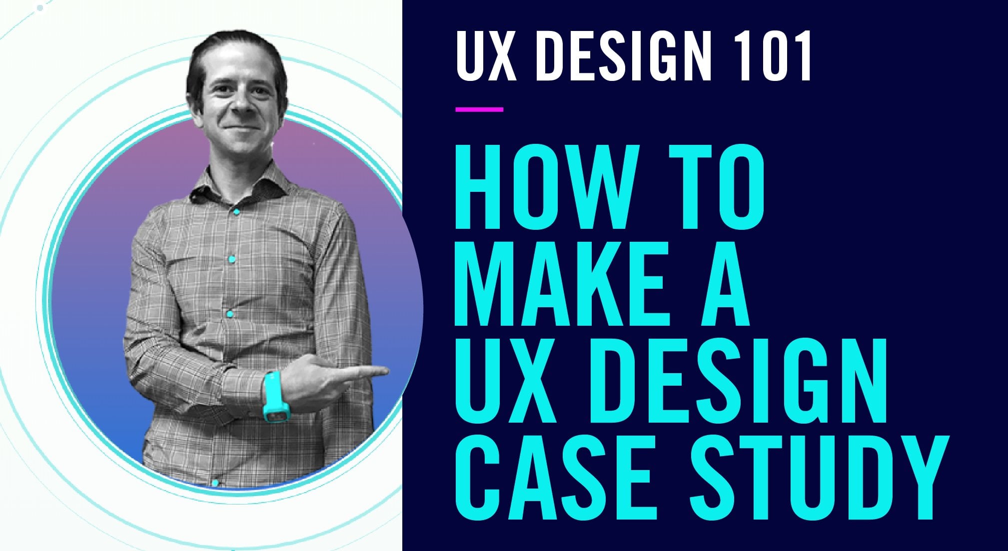
1. Intro to UX Design: welcome to enter to user experience design. My name is Margaret, and I will be your teacher for this class. For these videos, I will be a detached voice, but I wanted you all to know I am a real person. In this course, we will go over the thought process behind you. X decisions from persona creation to user journeys, how these translate into a strategy, and then to a quick look into wire frame style and prototype, we will just be scratching surface. It all starts with a question. As we gain insights, we can begin to former concept in order to create the best possible solutions towards a problem. What I'm most excited about is the class project. Think of an experienced digital or physical that could be improved. Who is the experience for and how would you go about creating a better experience for them ? The different lessons within this class will be persona. Who is this for user journey? How will the solution fit into their life? Wire frames? What are you making and how it works? Style guide. How will this engage the audience and finally prototyping using wire frame style guide to create a testable product. Different tips on how to approach this are choose an experience that is familiar. Don't worry about making it perfect. Be iterative. Don't be scared to change a design if it isn't working the way you thought it would and share the most fun. Part of this is seeing how y frame can translate until final looking product. This project is to show what you X has to offer to the creative process and that these practices could be applied towards any problem. I really do hope you enjoy this course and thank you for deciding to take a class.
2. Personas: people. People are confusing, and this is why it is so important. To start with percent you x person Zara characterization of a possible customer or user of a brand service or product. You may be asking, why is this the most important? It allows us to empathize with the people we are creating a solution for, and it can also lead to insights into what is the best solution. There are three things to consider when we start thinking about our personas. One. People are different. We are often designing for someone who is not us to design and function who they are, could help inform how to go about creating a stock or material design. And three people are designing for people as humans. We are bias that might work for some people might not work for others. This leads us to ask what is the problem we're solving? What are we making and what information do we need and want to know about the people? We're solving this problem for how, by using statistics and other research documents such as surveys, some assumptions from qualitative data, including interviews and then testing the qualitative and quantitative data in order to make sure assumptions are based on known information and not bias. This leads to two questions, which I believe are the most important. What do you want to know and what do you need to know when we think about people, we first have to think about what makes up a person their demographic, age, gender and geography. They're psychographic goals. Culture likes, dislikes and fears. The situation. Where, when, Why, what problem are we trying to solve for the person and the influences? How does the persona make decisions? What or who does the person trust the most? More now than ever, people tend to focus on the psychographic, the goals, likes and dislikes and fears that person that they're designing for may have. Having an image in your mind of a user allows us to empathize with the people we are creating a solution for it can also lead to insights into what is the best solution. The people are the most important part of this process. Some tips ask questions early. Don't be afraid to talk to people you think could be interested in your thoughts. Check your bias. Assumptions are OK. Checking your assumptions is great. Remember why I always keep in mind your goals for what you want to accomplish?
3. User Journey: How can we know what it feels like to be a person? We are not by walking in their shoes user journeys, the story of your personas journey using your product brand or service and their perspective of this experience. The most important part to take away from this definition is the story. What choices are they making as they go through this experience? We do this to identify opportunities, behavioral insights, pain points and feelings that they may be having at each touch point from the beginning to the end. Start at the beginning. The first touch point you may have with your user identify what's happening throughout their journey. What are the challenges they're facing or decisions they're making during this experience? On what possible endings will they have? Do they adopt your solution or ignore it? What ending do you want them to have? Not for this example, I'm going to get a little meta the journey to skill share. You may have thought about wanting to learn design, in which case you talked with a friend, search the web or maybe saw you too bad from here, your journey continues. You visited. The website began watching videos still deciding on what to learn because there are so many choices and you're deciding to subscribe. And if you did take that step and you did subscribe, you may be watch. Classes regularly have stopped watching, but maybe not because you're watching this video or you're thinking of un subscribing now we all like happy endings. But sometimes there are bad endings as well as a UX designer. It is just as important to identify possible bad endings as it is to identify the ending we want to achieve By identifying how a user may find themselves on an unhappy path, weaken strive to create a way to bring them back to the happy pass. Now remember, within that example, I did not show any of the feelings, opportunities or pain points or behavioral insights. Don't forget to identify the seat opportunities. Behavioral insides, pain points and feelings of a user may have on this journey every step, but most importantly, find your design style. There was no right or wrong way to display this information. You can be justice straightforward with it boxes, words and lines or full on design and make a whole infographic as long as you have the information you need displayed in the way you simple express
4. Wireframes: Wayne's skeleton of your concepts, the backbone of what you are making an important step in this is knowing what you need to build out. To be able to get your idea across. Map out your screens the first touch point till the last touch point remembering what your end goal for the user is. All the different things from Discover search add to cart. Purchase All of this have screens or functions we need to make wire frames for if this is all part of your idea. The information architecture is the structural design of shared information environments, the art and signs of organizing and labelling websites, Internet, online communities and software to support usability and find ability. Discovering what is the most important information and the best way to experience it. It effects navigation search data information in the overall layout of the site or up by identifying categories within the problem you're trying to solve. When information is the most important, and what could be grouped together on what information is important but can be found through discovery, we can begin to identify our bones after we know what we need to build. We can start to put together our bones, the information heart hierarchy, the flow navigation search in the animation scroll or pages from low Fidelity, which could be just drawing box on paper or whiteboard, toe high fidelity computer mock ups with more dimension and maybe even prototype wire frames. These are all great ways to get your concepts out of your head. Here is a quick example of a possible wire frame. As you can see, it is literally drawing boxes. Boxes facing Things will go. Here's the transition of that wife into a digital version. As you can see, it's all about seven. Known really wants to go being a big toe idea. All the things that
5. Style Guide: if y frames are the bones than the style guide is the face of your idea. This involves choosing colors. They helped give visual cues to the person using the product or application. They cannot emotions, allowing the user to become more invested. They give a visual identity to the brand of what you're creating. Each brand has a set of primary colors and secondary colors. A style guide Let's a designer know what colors can be used, where in a design and what the color represents when it comes to hierarchy. Within the product, we navigate the digital world mainly with words. The look and feel of the words can change based on the typeface that is used, and the way designer uses them can either hinder or enhance an experience with a product. We must be cognisant of the fact that colors don't all look the same to everyone, and that certain typefaces are harder to read than others. We must make sure to keep this in mind when creating our guides to keep accessibility top of mind in order to create a product that can be used by the most people. Possible components are buttons and shapes with. Yeah, we want to create a uniform look by making sure components match. These can be any shape that you believe represents. The brand or product Icons are a great way to add to the part son, but you must make sure that the icon meaning comes across clearly to user before adapting it into your design. Now, more than ever, people are choosing brands they believe resident with their identity. A brand isn't identity. The identity of the product or service, the more distinct it is, helps to become identifiable to possible users. Your resources that can help you build out your cell guy. Google fonts for the tech Face Adobe color for the color scheme material dot io for components and icons. This is also a great resource to continue learning about more about style guides. Material design in the non profit To see just how maney icons are possible, here is an example of putting a style guide towards a wire frame. As you can see what once felt like more of a suggestion of where things could possibly go, the app becomes more pink, allowing us to truly visualize this as a possible complete form of the product style guides help you achieve a look and feel for your brand service or product. This allows you to give a visual identity to your concept and to build your wire fames that it's not just bones, but an actual face. Not a user will like contract. Okay, okay.
6. Prototype: you have the wire frames, you thought of the wire frames, interactions and animations. Now it's time to blow them out. Prototype is a first or preliminary model of something. The prototype is just the beginning. You prototype to be able to test our concepts. UX is an iterative process. We build test, take test results and vote again until we have the best possible solution or product. The way we experienced tech is more fluid than you may think. There are many micro and macro interactions we have with the different APs or products we use. We prototype to identify and build examples of these possible attractions. How will the pages transition what we look like If something is loading how we notify the user that an error has occurred? All these are examples of in traction to think about when prototyping we know who this is for. We know why we're making it. We know what we're making, and now we are defining how this will function and interact with the people who will use it . Building out the different animations and interactions is just another way Dad personality to otherwise flat experience, a way to engage the people that are staring at the screen or what you've created. We want to prototype in order to begin user testing, to get our screens in front of the people who will be using our product in order to get their reactions and to begin to start theater it of process of this design. So we know what we have done right and what we have done in order to be the best possible.
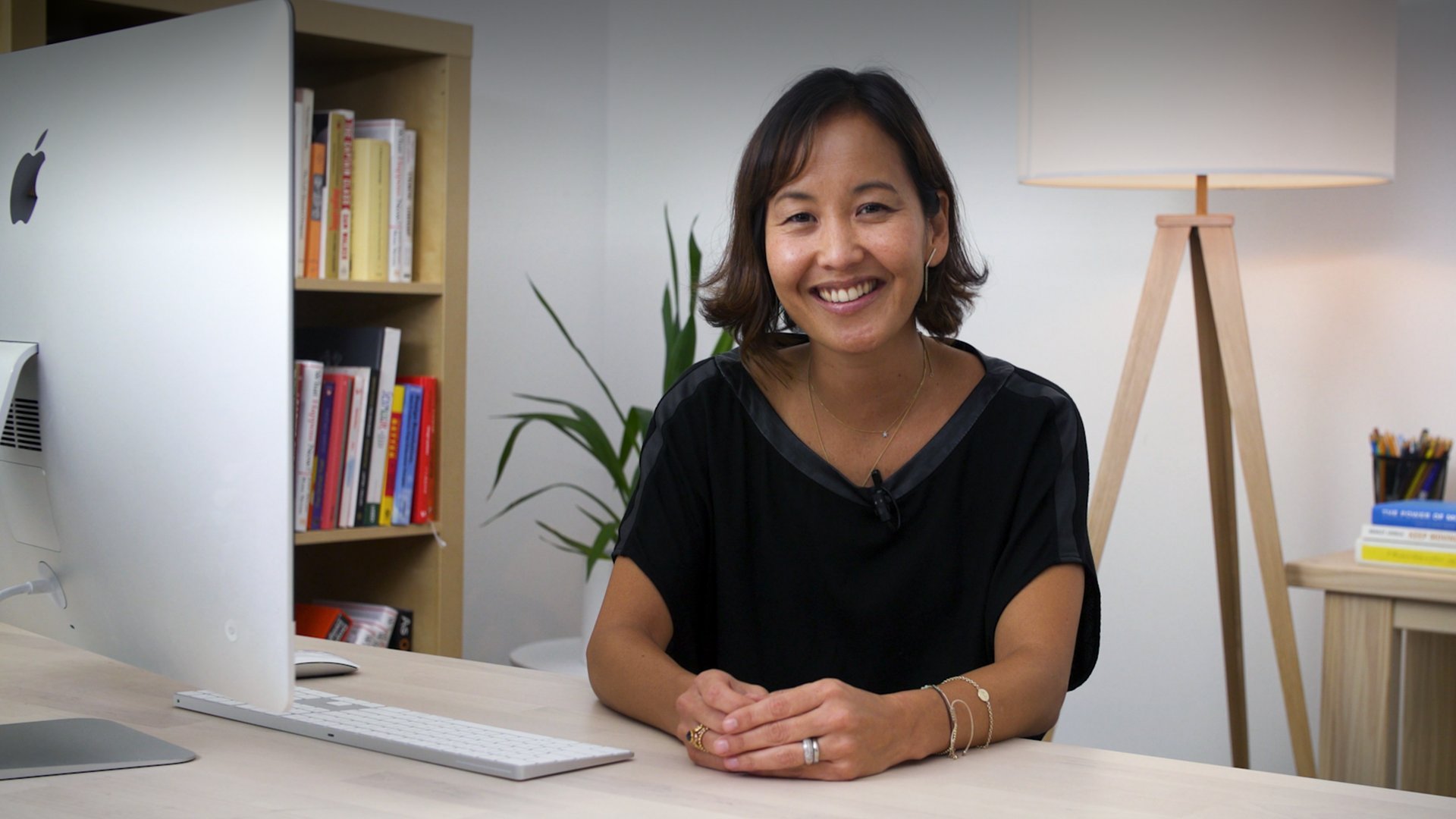
 Margaret Karles, Experience Designer