Transcripts
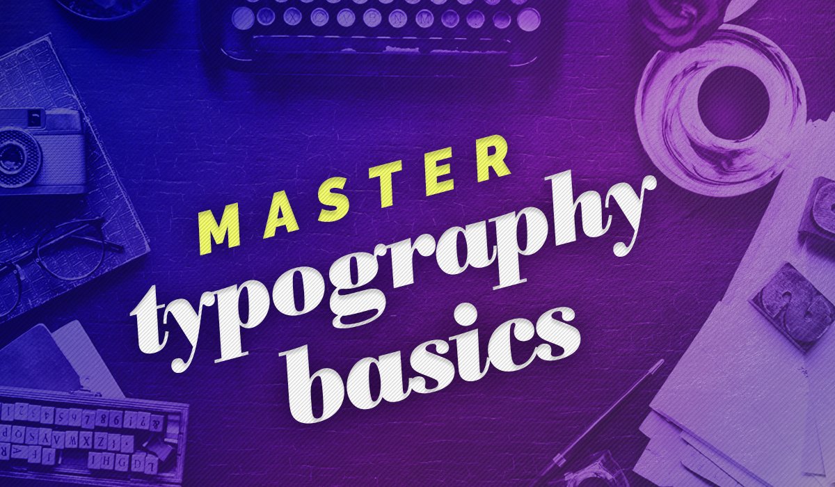
1. Introduction: Hello and welcome to injure modular topography. I'm such a Sharma, a motion designer with a special place in my heart for cool typography. If your total mama's a type modular typography is a great place to start and you'll be making fantastic typography work of your own in no time. This class teaches the basics off making modular type, and if you're unfamiliar with what that is, it is basically going to take when the letters are constructed out of a limited number of shapes called models. So, in essence, you could use a circle and erect. I go and make a whole typeface. That way, we're modular typography. The letters range from simple shapes into a few lines of cars to more complex ones were using intricate shapes, modules that are hard to discern and many different modules often want. You know type pieces are based on grits on everyone you love. Every letter, either alliance to the grid by millions of sections of your project through this class will be to make your very own modular typhus, including all traces letters of the Latin alphabet. This may seem overwhelming, but once you have a few shapes down you remarked at how similar letters like E L F I R on the typeface will practically gets through this project. You learn basic time structure information. How do you simplified illustration from what you check faces on a bit of basic adobe illustrator. This class is perfect for beginners. If you have no knowledge of type of being or knowledge of w straighter, that's totally okay. I will go through all the tools you need to successfully make your very for modular Taipei's If you want all along. But don't have illustrator, you can get a seven day free triumph. So why should you take this class? Well, once it's made, a modular typeface can be used anywhere you want. Depending on the complexity, you can use it for heading batter, Spoelstra specifications, print materials or digitally. And if you're feeling ambitious, you could even turn it into a fought most of all. It's really fun, and you cannot. Some paper real wasn't raised to some illustrations and and a political topics to share your projects on your explorations in the gallery so you can see all the cool work that the community is doing on. Get some great feedback. Have lettering
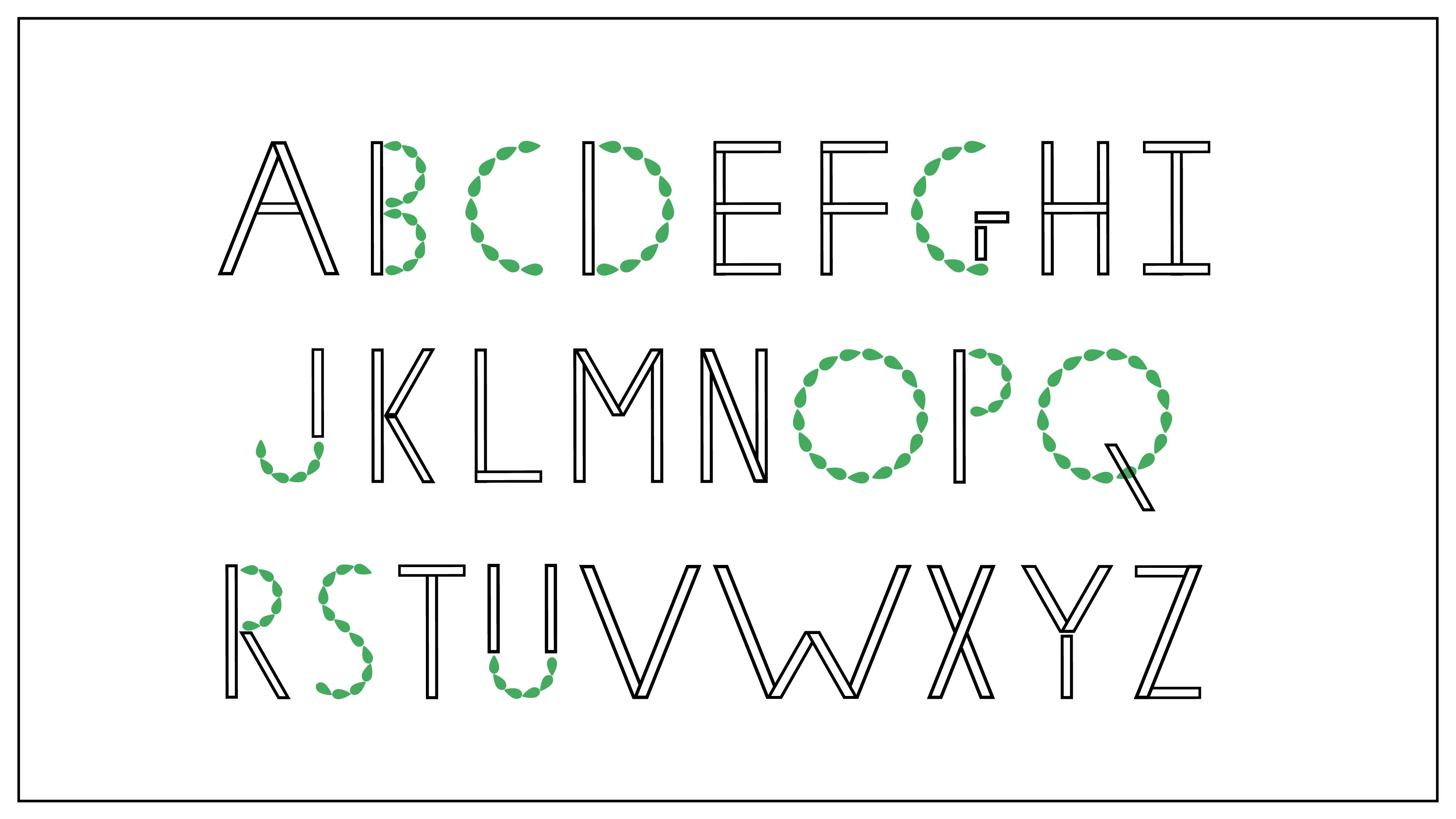
2. What Is a Modular Typeface?: So I'm so glad you're here and you decided to take this class. So before we jump into actually making our own modular typeface, let's talk a little bit about what makes typefaces modular and how to like, see that modularity and just what does it all mean? So, like I mentioned in the last video, audio typefaces have a huge ridge. They have a really simple models, you know, where it's so simple. That actually looks like a thought that you might find on your computer versus they could be really, really complex ones as well. Like for this really awesome with that, is that it? Inspired by the London Underground what that map looks like? So that is distinctly recognisable as letters. But at the same time, it's very much a map. Those modelers are so complex, you know, with the single lines and double eyes and everything and and complex models can be very different from each other. But this one, this school Steve uncle on everything is so intricate, like that V's. It's so intricate, but you can see things that are like repeating forms. You know, you have secular farm with these those books going out that turns up again and again like this isn't. Oh, that's a cue. You could see that similarity there. It still belonged to seeing typeface fighters to take an egg from this typeface and and from that one, and I put them in the same word. You would know that that's from two different types. But if I take a bunch of letters from the same type face, it looks like it's supposed to belong together because it's designed to work as a unit. You know, like that V and W where they have a similar farm to them. And so you could see that that W is basically just that he repeated twice on. So what we're gonna go through is how to recognize that modularity and how designed that to begin with, there is a restriction with these. Like if you consider something that's us simple is this kind of simple one dealer typeface ? I could write something long words. Maybe you get a sentence before that starts to get confusing hard to be. But the more complex you go, the more it needs to be It was really sparingly and really simplistically. I mean, if I was to write more than this in here or if I was to get any smaller, that would become really, really difficult to read. And let's just give you, like, a example over here like this. This is a nice typeface that I told you can see that that says, Type of. I feel like that's nice and big. But if I was to reduce the size, write whole sentences like that is really read. If I was looking at some kind of handout bank led or a book or anything like that, which I had a paragraph, I would skip that part if I'm not going to stand around and read it about how beauty typefaces cause that's just too confusing. But what's written is it's all English. It's relatively simple. If I was to turn that into the future or something that's easy to read, and that's the same stuff, so it really matters how you use your modular typefaces. It's more complex. You go to really important. Remember that headings on banners and big, big type is where you want to use stuff like this. You can't use it four paragraphs, so let's go back to this simple typeface. You can see that that same rectangle is kind of making this whole typeface. You can see that we're using the same units again and again to make the whole typeface. And like, if I was to cut off this bit of this Jake, I would get that I Or if I have to repeat this. I on decides this is making up the own and it's having a lot of reparative forms and you will see the less is always true for morning typefaces because you're using a unit as a model and you're designing a bunch and that you're repeating that and turn it around and designing it slightly differently so that you would end up with letters that look this two different from each other but might look at something this complicated and think, Oh, that's a regular night face, but it's not. The thing is that I can't read any one part of this letter and put it somewhere else on still get something that looks like it's part of the same type face. These all look really similar because it's illustrated in a similar style, and, you know, there's something cohesion going on over there. But I can't take this bar of this K and stick it into this l This is completely different, so you won't be tempted to call this modular. But you can't break it down. You can't see it s plaza pieces. So isn't it was treated time, basically taken a bunch off actual letters and done some really cool illustrations. It's really beautiful, but it's just not modeler. So it's a part of the watch out for those that is not a model or typeface. And that brings us back to like the last type of modular typefaces, which are the grid based ones now concede that this box grid that we have here this sea is made by making this kind of diamond shape. It's like I plus sign shape at different intersections on at someone's dying. Decided to, you know, really go ahead, Candid stroke. With these and other places, they've spectacle thing. But all of these crosses are sitting at an intersection off this grid, which is what is making this letter. So there's a point where this cross intersection is sitting in the middle of the square. It is always at, like an intersection that is already existed in this great. Similarly, for something like this and wish filling in different parts of this great different little holes, this greatest forming do make all of our typeface and you can still see like they're not just using the grid. They're making sure that parts of letters that look similar like this Brokenness that stroke. Let's see that stream stroking that e. They're using that same shape again and again. They could fill it in over the different. You know, they add this triangle as well for the sea, or they could decide to close the E by closing this, they're keeping that consistency and that design consistency a big and what makes your model type is looked really good and well designed. We're gonna get to that similarly over here. You know, you don't have to take one of thes established grids. You could make your own grip and they just filled in the right parts to make it the letters . And it likes to write like a heading in this. It would make sense to you, but a paragraph like I said again would just get too complicated. So basically, if you come across a typeface, and you're not sure if it's modular in nature. One of the best things you can do is you can look at it. Take this one, for example. You can think about it doesn't look like it's made off the same rebooting shape in any places. But this is repeated twice to make this tell you it's start upside down to make this M, and you see that same repeating shape and so that repeating shape is the module and we have a bunch of different modules and, you know, they're all arranged in different ways to make and make this whole typeface. But I just sit here and dissect this, and I would end up seeing puzzle pieces, and those puzzle pieces are joined together to make different letters. And those puzzle pieces are Montiel's grids are a great place to start because grids are by nature, a repeating form, the same box like over here, this box Great. This box is repeated again and again and again and again again, it's the same thing. Similarly, with this this form right here it's the same thing, repeated again and again. The reason of typefaces modular is because you are able to take the same forms and repeat them in certain places to make something that looks a little bit different, and you can take a bunch of other puzzle pieces. Put them together in different configurations and you end up with different letters and grids. Air such a great place to start because grids are by nature the same beating shape again and again. So if you feel it, you always feel in the same shape, or you align your shaped to that grid again and again. You automatically have something that is a beating form, which is what we want. You know, we want something that we can break down into pieces, and that's what great will give you. So now that we figured out how modularity works, let's move on to the actual typography and how typography works, what its structure is like. How do actually take be that alphabet? All the letters a dizzy and learn to see them all broken down into these kinds of modular puzzle pieces so that you can start to design your own
3. The Structure of Typography: No, I'm using a bunch of illustrator here, and that can get really overwhelming. But when we actually jump into exciting our own typeface, I'm gonna go through like, illustrator, all the basics, all the simple stuff that you need to know. If you don't know any illustrator at all, Don't get overwhelmed by what I'm doing here. This is just to explain how it all works. So now that we figured out modularity, let's move on to typography. Now the cool thing about the Latin alphabet is that the entire alphabet, I mean, all 26 letters. They can all be broken down into two kinds of strokes straight ones and curved ones. Now there's three types of straight strokes. You could have horizontal ones, comfortable ones, and you could have diagonal ones. And curved ones can be open or closed. And basically, with these five types of strokes, you can make any letter in the English off. So let's get that a shot every time. The entire alphabet right here, right? And so that is your font. That's Andiwal shine. But I have been able to take every letter and break it down into those puzzle pieces or strokes C. We have H made of two diagonal strokes and one horizontal one. There's a vertical wanted to open curved strokes and be similarly. There's one only one Open curve scope and see. And you can break the entire Latin alphabet down like this. The whole thing is made off these puzzle pieces. The entire Latin alphabet can be broken down like this. So like J u and s all used these open curved strokes. Right? So you have this J and open Armstrong is paired with one vertical one. Or is you despair a bit too. Vertical ones and s is too opener strokes with a diagonal. And so let's take a look at, you know, some Dagnall ones, the A and Z. He was thes Daigle strokes and repaired with these horizontal straight strokes similarly with em. And and you know, there's you they're using diagnosed with straight ones. VW next. They don't need anybody else. They just have diagonal street strokes and K and why they They're a little bit of a special case, because even though they're all using these diagonal strokes like thes air still diagonal strokes. Okay, But when you're designing wanted typeface you need to be careful off letters like these that use a certain kind of stroke. But maybe there are the same length for the same degree of curve on and are the same size because let's just take a look at this. If you designed a very nice dying, you know, design school, dad want you and you want to put it into all the letters that used I modules that you just make this long one right and you can plug it in into all of these letters and you can make like, a a Z. You know, you've got your ends and ends and your VW's and exes who are using anybody else you know, you've got you've got them. What happens when you could decay, or why? Why needs lengthy small and so does K. Can't put this one in K because what happens if you actually try to make K out of one of these? Still got a shot. If you try to make care one of thes, you're gonna end up with a huge K good size that thing do you? That is a big, big K. You consider Compare that to the size of your VW's nexus, and you're not really in the same vicinity anymore. What happens when you spell a word with this typeface? K is bigger than everything else that will look really, really bad. So what you do is you make sure that you have letters like these that are using smaller lengths or sizes off the same type of stroke design, a different model for it or Italy. Something really believes similar. So, like I was mentioning about the diagonal typefaces. Let's take another place where the problem might arise. You have an open curve stroke. This gets used much places in the Latin alphabet, for example, in sea or impede. But the problem here is that if you were C and P, the whole bettors are the same length than your curves. Stroke alone is a true different events, you know. It's fast the entire height of the letter in C, but only spends half died letter in key. And so there's a bunch letters that have this problem in PB and are it takes up half the height off a letter, and in C, D and G, it takes up the whole height of the letter Now you might say Why that a problem? It's done. Open curb stroke. Just design a module that works is an open curse stroke. And I was to get into the right letters. Okay, well, let's give that a shot. What happens if you design? You know, you've got this nice curve model over here, okay? Designed this audio, and you want to use it everywhere than open car stroke gets used in the English alphabet. Well, if you just designed this, and then you're like, OK, I need to be full. Let now. So I'm just gonna make it full length. Well, that looks terrible. You try to make a sea of that or a d are that it's gonna look much tener than all your other bettors, and it's not gonna look that good. So you're gonna need to make sure designed another model that couldn't works in the same design sense as your small one, but is designed to work in this size. There are only two places in Latin alphabet. Only two letters that used closed curtain stroke O and Q now in a 26 letter alphabet, two letters is not very much. That's 1 30 the entire alphabet. Now, if 1/13 such a small fraction off your whole typeface looks different from a meeting else, it's gonna look for the odd. Let's say you start word with O que Like octopus or queen. It might look pretty cool. My be the ghost, the capital. But what happens when O. R. Q. Turned up in the middle of the word? It's just gonna look on. So you need to make sure that whatever open curb module you decide to make, make sure the job closed curve module it should work in the same world in the same language . That looks like there's an open curve stroke and there's are closed curve one, and they look like they belong in the same time face. So when you actually start to design his things, design consistency is key. If your stuff isn't consistent, it's just gonna look bad. Like what happens if you have an open curve? Stroke Looks like this, but your clothes first row looks like this. It's just gonna look really out of place when you actually start to spell stuff so desired . Consistency is key. Similarly, for straight strokes, you design a nice vertical straight stroke. And you're like, OK, I'm done with this. I'm just gonna flip it on inside and make my horizontal straight stroke easy peasy like the problem with this is if I just use my vertical strokes and I combine it with, you know, simple black line. I've got my h five making an age. But what happens if I try? Use both these longs to make h I end up with a really, really wide h. It looks kind of odd. It just looked like an age anymore. And there's other letters that used this as well. You're easier f secure. Ages will get really wide If you end up trying to use the same left or the same will you just flipped on its side for a horizontal straits crook. So you want to make sure that your heights and your wits and everything are working properly. So you have You're easing. You're absolutely right. That looks so much better when it's just half the birth off your height, it actually starts to look like a like a decent typeface. Take all these letters, for example, E f h l t. And see all used this horizontal straight stroke, all these loans and big. So I could design the same mom you and fitted in on all these letters and it should work. But there's some special use cases when it comes to this horizontal straight strokes. You have G as was I. Jeanne. I used these horizontal streaks broke sometimes. And in the case of GM, you have a vertical one. That's the same then as horizontal ones, your vertical one that your design is probably gonna be this height because all of these letters are using them at this height. But G, it needs a shorter ones. And this one we haven't Sometimes the reason I say that is because I let's look at these typefaces. These are actually some fonts that I g and I am. And look at this G. In this case, it's using a shorter stroke horizontally and vertically and in this case is just gonna open curve stroke. But we just order something you don't need. A vertical street one here. Over here, it doesn't want to use a horizontal street one at all. We just have a vertical street one. So depending on your typeface and depending on what you want to design it like your G My change. Same thing goes for I. In some cases, I was just one vertical straight stroke. But sometimes you know, once a bar, the doctor bottom. And for that you need a horizontal streets. Rocca's well and sometimes that could be the same thing. But don't side with the high Charton. But in some cases, you might want to go a little bit different. Design wise, your cars off the streets, ropes are thinner than the vertical straight strokes. So your design might change that is entirely dependent on your typeface. And what kind of design your working towards, But just keep in mind that these air, some special case letters and you might need to design some special modules for them. Now we come to light the most special case. This is this little spiral guy that I've designed just to give you an idea what I'm talking about, your special use cases when you have stuff like why que que you know all these ones in paint? G A. I all of these ones that sometimes get used, But you know these kinds of let's are getting used in a lot of places. You could design some cool, decorative model like this and plug it in all these places. And the reason I say that you should probably even though you could design a very easily with your diagonal on your part is until one. You might want to consider using that decorative element in more places than just the bare minimum where it's needed, because the more places you use model on the type, it's the more it builds. That design consistency across the whole type is. So when you start writing letters are words, it's going to look like it open longs in the same typeface and in same world. So if I take my pyro guy putting him why or K or a Q and Jeans A and I, he's all look like they belong in the same vicinity, right? So you could make stuff like this and end up with something cool if I was just fell work with this. Okay, that's a work. But the only reason that works together and it looks like it belongs in the same world is because I've used the same spiral guy again again. Just go use some polishing. I mean, these diagnose strokes are not the same angle every time, and that's something we're gonna go through, but you can use him like this.
4. Designing Modules: so the time has finally come for us to make modules. As I mentioned in the previous video, there's fire basic kinds of strokes, and it's a good idea to make one model per stroke when you're starting out and then make any custom models that you need along the way, you want to start with a straight horizontal stroke, a street vertical stroke, a diagonal, straight stroke, an open curve stroke and a closed curve stroke. Once you have these in place, we can start to make customs strokes your model skin. Look, however you want them to. If you'd like to start for the team, that's what be OK. You can start with an artistic theme when Gothic or Art Deco. Or you can pick a central point of focus like something random, maybe clouds and designed typeface around that. Like I'd mention in the previous video. It's perfectly okay if you know nothing about illustrator coming into this class. But for the purposes of this video, let's start on paper. All you need is the pencil and paper. I suggest starting with every team or topic you decided to go with. You don't have to. This is just for fun, you can go purely decorative. That's not a problem, either, and making those sign models that you talked about. Once you have those, I'd suggest cutting them out and placing them in different configurations to try and make the letters. If you like the way things are going and you feel like you have enough modules, five is good. If you feel like you want to make extra modules such as shorter diagonal strokes for K and why or if you want to make special decorative modules like I had in the end of the last video to use in maybe the end of your cues or as accents on your eyes, this would be the time to do that. You can go for as many modules as you want, so I suggest trying not to go too overboard. But a minimum of five is required. If you find that you're getting stuck, I suggest speaking a theme. It doesn't have to be anything too complicated. Even something as simple as leaves will dio, perhaps the team like leaves. You would have one or two models that are distinctly leaf like, and the rest would serve as simpler accents, perhaps similar in color to leave or just is a nice, complimentary color around which you can design your entire Taipei's. As always, less is more. If you feel like you're putting too much into your typeface, you probably are. I might get difficult to read later on. Once your modules are all designed and you've placed them out into your different letters and you know how everything wants to look. Take a picture of each module separately with your phone or a camera that you're comfortable uploading images from onto your computer. From there, we will take it to illustrators so that we can start to design it digitally.
5. Building Straight Strokes: So now that we've designed our models on paper, we're gonna jump into illustrator. I'm going to go step by step through everything that you need. So if you are a little bit familiar with Illustrator, this might sing, but slow to you. But if you were completely nude, illustrator, I'm going to go through everything you need to build your own modular type pace. So this is what the home screen looks like. We are gonna go ahead and hit, create new button. Now, this is my interface. An illustrator. Once you got over your pictures from your phone or camera, you want to bring them into illustrator. For that, we're going to a file place or you can use the shortcut shift control P on. Simply place it. There's a picture. As you can see, I've taken a picture that just has one off each model. I'm going to use this picture for reference, So I'm going to my layers panel right here. If you need any of thes panels, you could go to window and click on the paddle that you need. I want to go to my layers panel and I'm going to double quick here which will be name it reference, and I'm going to look this layer now. I can't move it at all, and that's going to be really helpful because we're going to make other things on top of this, ongoing to move those so this won't come with us. I'm going to hit this button to make a new layer, and I'm going to start making my modules and illustrator this way. Unless you're wanting, is a very, very simple You're going to need more than just the rectangle tool or the ellipse to you're going to need something more custom. If you simply need a rectangle could just clicked on the rectangle, and you could drag and make whatever size fact I'm told that you want. If you want to make a perfect square, just dry hit shift at the same time and you're square will be perfect. Similarly, you can go to the Ellipse tool on driving tow any ellipse that you want again. If you would shift, you'll make a perfect circle. Chances are you're going to need more than these basic shapes, and that's where the pen tool comes in. All of these letters in brackets that appear next to the name. When when you hover over a tool are the keyboard shocker that you use to use it really fast . For instance, I could hit just pee on the keyboard and I get my petrol. The way to the pen tool works is I click wherever I want to make a point on drag to make the next one on the line forms between these points. This way I can make whatever sheep I want. And when I come back to the first point, you see this little circle and I click again and it becomes close shape. If I leave it open, it will keep trying to drag the next bit off the shape away from here. If you want to make curve things with mental, you can click on drag on. These will give you these handles. Thes handles are called busy A handles on, and you can use them to control the curve of something. These mathematical calculate what the curvature off the line ahead will be, and you get quick and dragon to make this curve, and you could make our chips like this. His so want again, I connect to select these tools, I'm eating the or you can click on the selection tool. This will select anything that you want. If you are picked away, you can click on it and it will click the whole shape together. This is different from the direct selection tool, which will allow you to kick individual points on move them just on their own. But you cannot do with this election toe. I can't move a single point. I'll have to move the whole shape, and you can use backspace or delete on your keyboard to get rid of anything. So with these basic tools, let's start to trace out our ships a little bit. I want my horizontal vertical and diagonal strokes. Three simple rectangles with no color in the center only strokes lines. So I'm going to go to my rectangle tool on. I'm something going to drag and trace over this. I'm going to let it go now. Have a rectangle, but I want Justin outline in Illustrator. A solid color in the middle is called a fail on an outline is called a stroke Up. In my color are my swatches panel. I can see that this fulfill on this is a stroke. If I click on the field, I can change it to whatever color I wanted to be. And if I don't want to fill, I can simply hit no feel on. And now we have a shape with no feel and no stroke. I want my stroke to be black, so I'm going to hit stroke. And then what? Hit black. Now if I hit my selection tool, which is V only keyboard and click away, I can see that it has a stroke around it. I can change thickness of the stroke by going to the straw panel and changing await an increase in weight. Wielding my stroke thicker. Right now, my stroke has sharp corners. If I click on it and change the corner, I'll get round corners. For now, I want to keep them a sharp corners on. If I use a similar technique to make my vertical stroke, the thickness of these two will not be the same. I want to stay consistent, so I'm not going to do it like this. I'm going to duplicate this, change it so that it is correct length to duplicate earlier on when you click on it. I'm going to take option or Ault on the keyboard and I will get these double arrows. That means anywhere I take this new shape people duplicated. So I'm going to just drag away and let it go and I'll have another shape. I can take this over to my vertical straight stroke. I'm going to rotate it 90 degrees. I wanted to be perfectly united degrees, so I'm going to shift. You make it perfect and good. Align it and I don't want to change the width at all. I just I want to change only the length. But because I'm so zoomed Outbreak now it's only showing me these diagonal controls on the with control. Because this is so long. So it resuming. I'm going to hit command plus on Mac or Control plus on a PC. And now I'm close enough that I can see these vertical manipulators. So I'm just going to drag this make it long enough. So now my with has stayed the same as my horizontal one. If I want to pan over, I can hit the space bar which would temporarily activate the hand tool, grab and move if I want to permanently activate the handle. I hit H and I can always be in the hand tool, but space is a nice trick. Can hit command minus to zoom out. I'm going to take this one and old and drag it here. Now if I simply rotate this by a little bit, I'm not going to get these flat buttons the way that I want. So I'm going to control Z that we're zooming so I can see what I'm doing. I'm going to go to my sheer tool and I'm going to click on Going to Hit Enter. So now I can control the house I wanted to share. I wanted to share a 30 degree angle. I'm going to review to make sure that it looks the way I wanted to. Good hit. OK, now my title is perfectly shared. 30 degrees. I wanted to be the other way around, though, so I want to use my reflect tool. I can use O on the keyboard or I can go to my reflects tool here again, I'm going to hit the center. I need to enter and it's reflected vertically. I could also reflect horizontally if I want. I want to make a copy of this because I want one side to go this way and the other side to go that way. So I would hit copy. And now I have to I could hit my selection tool. That's V on the keyboard. I move this away and now I have my two diagonal strokes facing Either way. Now put my diagonal straight strokes on my horizontal straight stroke on my vertical street stroke are all the perfect with the part. They're perfectly sheared where they need to be on approximately the correct lands. We can always adjust this leader as we're going to do in the next step.
6. Simplified Illustrations and Curved Strokes: now sent to make our curved strokes. Now I'm going to go with the leaf thing that Dr But from the previous video, this is my terrible sketch off lease. The first thing I'm going to do is actually unique. A leaf shape. So for that, I'm going to use my pen tool, Come over to this team piece of canvas here. I'm just going to take a default green just so I can see what I'm doing. It doesn't term is white, and I'm going to use the busy handles that I talked about to make half a leaf because I was perfectly reflect it so I could use shift so it stands perfectly straight and create, But I feel like it's perfect half leaf. Since this is going to get going, I'm going to hit V so that it holds its own even as an open shape and I will click away. Now I see I have half a leaf, but I need the other half a swell. So I'm going to take this again hit Oh, for my reflection tool. I'm going to use one of thes ends because this is the access one which I want to be reflective. I would hit option or bolt here. So it was perfectly reflected along this edge. I want a copy, so I could copy, and I'll have a perfect chief zooming in. However, I can see that this is still not closed shape, because when I selected different halfs are getting selected separately. I can always dragons elected together. But I want buy one leaf to be a warm shape so that I can manipulate it however I want. So for that, I'm going to have to weigh in on find the edges where these pieces connect. I'm going to take my direct selection tool, which is my a Andi, drag these two points together, I'm going to hit control J for join. Now, these two points have been joined at one. Now, if I pick this with my direct selection tool, I can see that it is one whole ship that gets made Similarly, if I pan down to this bottom one, I need to connect these two here as well. These are two separate paths. Somebody hit my a my direct selection tool drag over just these two points which had control J. And now this is one point as well. I'm going to zoom out again so I can see what I'm doing in bad over this whole leaf. Select this leaf, Andi, exchange my stroke and feel colors by using this little icon here. Now, I have no stroke on this leaf. And just to fill my leaf looks a little bit. Although somewhere to go back to my direct selection tool, just adjust this up a little bit by using the Iraqis. Now, I like the way that that looks, but I feel like this tip is too sharp. So I'm going to select this with my direct action tool. That's a on the keyboard, not my selection tool. So I'm going to use my direct selection tool to grab hold of one of these busy handles and I can move it away. But I wanted to be a perfect angle so I could move it at the same angle the other way. So I had shift sort of moving perfectly 45 degrees away. I'll do the same thing on the other side. Now you see this little I can hear, I can take this and I could just use it to soften my leaf up a little bit. Click away. I like that shape. I think it would repeat itself nicely. I can manipulate the color off this green, however I want By using my color panel, I can manipulate them on red, green or blue in this. Or I can go up here and change this to hue, saturation, brightness or even pretty colors. I'm going to put HSP really quickly. This way I can change simply the hue, but I want to stay in. The green spectrum can change how saturated my arenas are, how bright it is. This is a good green. I think it's not too bright, not too exaggerated. But it's nice and vibrant. Would you click away because my life is done? A good rule of thumb is when you make something that you like an illustrator, don't change it right away. Whenever you want to change it, move it around anything. Make a copy by doing ault and drag that weighs. Your original perfect shape stays unchanged, and if you mess up this one, you've been always drag another one away. Later, if you decide that you have more than you need, you can simply do it. So I'm going to try and make my open curve stroke now. So I want to take my copied ship. Could you zoom in so I can see what I'm doing? I want to scale this down. But if I just use this diagonal arrow, it's gonna flatten my shape and ruined the perfect shape we just made so going to hit shift again so that it scales down perfectly. This seems like a good size. I'm going to rotate this. I don't have my starting here, but I wanted to go from the bottom the way they don't leave normally, wouldn't nature. So I'm going to have it perfectly flat over here. And over time, I wanted to curve on, go perfectly flat to this point in a perfect half circle. Since I want to make perfect angles every time I'm going to use something called the appearance panel, which is really handy for making copies of things with perfect measurements. I'm going to go to this little effects button it distort and transform and go to transform . I'm going to preview this so I can see what I'm doing and make about eight coffees. You can't see my eight call these right now because they're all in one place on top of each other. If I move these, you can see that I have a lot of different copies now. I want them to move vertically upwards. I want them to move on in the other direction. They watched them to go a certain angle. If I want to control this angle more precisely, I can click here on use my scroll on my mouse to really change this very precisely. I like the way that this is going up were to make a few more copies so that it goes up perfectly. If you night now, you can see these are perfectly topping bottom. Have a nice set of leaves that are repeating themselves on. That can be my perfect open, curved stroke. So I'm going to go back to my close curve stroke. I'm simply going to option move this here cause I know it works so back in and I'm going to go back to my appearance panel. It transform so I can come back to the style of books and simply make more copies. May be 16. I want my 16th 1 to be perfectly aligned with my 1st 1 So I'm going to change this around a little bit, just to make sure that is happening. 21.1 seems to be the perfect angle here. Okay, I'm going to move my leaf to the side so I don't disturb it. And we're to hide my reference later because we're done with it. Now we have our closed course. Stroke are open. Her stroke are vertical, straight stroke, horizontal, straight stroke and diagonal. Straight strokes really to make copies as we go along. But for now, we like these models. So again, ribbon will look to the side and simply copy paste. Would we need them?
7. Constructing the Letters: The next thing we want to do is we want to expand. These shapes, as you can see that are close for strokes, are both being run by an appearance panel, and that is artificially creating copies. But I want this to be one shape, so I'm going to an option drag. So I'm going to object, expand appearance. And now my sheep is selectable with the director selection tool. All of my leads get selected. I'm going to do the same thing with my closed curve stroke object, expand appearance, and that works great. The next thing we need to make sure is that our heights are all perfect. So I'm going to use the pen tool to make a few straight lines shift, and I'm going to color this something very easy to see, like a bright blue. And I'm going to make three equal distant lines. As you can see when I drag holding shift, it gives me a little guy to make sure I snapped the lice in place. We're going to use this as a guy to make sure the heights of all our letters are correct in any actual font. When you type, I pressed tea right now to get to the type tool. If you type anything at all and you make sure that it is all capitals, everything is a perfect height by you'll see that my ease, my ours. The centres of these letters always align perfectly to this middle light forces. My tops and bottoms ally perfectly to the ends of these lines, and we're gonna make sure that our modular typeface follows the same rules so we can take with it later with selectees. Cut and paste them on a new layer and drop this layer so we don't accidentally move it like we did our reference. Now we need to make sure our open carved stroke is aligned to this height for our C's and D's, and they were to hit, shift and drag it. So it's a perfect height. I'm going to do the same thing with my closed curve stroke for my always an accused can snap to the lines. We need an open golf stroke that is half the height for bees in peace. Take it to my middle line, transform on the appearance panel to make sure that it perfectly curves to this point good . Seems about right. I need fuel copies. So pretty fewer. Some good to make this five copies. That should be right. Now we have our half court a stroke again. I'm going to make sure you have a copy of this. Unchanged. So now we have our full height. Open car stroke are full height, close group stroke are half height, open heart stroke. We need our foot versions of our open curved strokes as well. I'm going to get my current strokes out of the way really quickly. So now I can work on my street ones. I can select multiple shapes at a time by pressing shift. Going to copy these to bring them to our guide, going to drive this. And now we're a little short of height. Someone zoom in and make sure we use thes to the line perfectly to these edges. I don't want this extroverted black hanging out. I want all of the stroke to live within this system. But I can go to a stroke panel and I can say I want to align the stroke to the inside so not all of the stroke lives inside this box. I'm going to do it did this as well so that our rates remain unchanged. And I'm going to judge roughly how long I want this to be depending on how I might make an H from this from these two strokes. Copy this. See how my face looks? It looks I wanted to be this far away, but sister wide. So I'm going to make this a little shorter. That seems right. So now I know how long my cars are. Straits wrote, needs me fix our diagonals really quickly. I'm going to delete this for now so that we can fix one here. Aligned one inch shift, make it larger, but again lined the inside. But this has made this scene think are closer together than these, so I need to manually adjust it. So for that, I need to select individual points some kind of my direct sexual tool or a quick on this one point so not selected shifted quick this point as well. Now only these two points are selected, the others are not. And I can verify this by getting the right key and only the spiteful move. So now I'm just going to see that this wish is the same. That looks good. And I'm going to reduce the stroke by just a little bit. So it looks the same even if their mathematical insane sometimes shared anything is gonna make them look whiter than they actually are. And so we're just going to use our eyes to make sure that this looks right now like this, I'm going to duplicate it. But this is a very wide A. So I think what I'm going to do isn't going to change the sheer on this. I'm going to go back to my my sheer tool enter. Well, that's too much minus stand. Seems right. Oh, enter going to make a copy. Now we have our diagonal street strokes. So now that everything is the right height, we can actually start begging letters. And now comes the fun part. Let me just start making letters so far in a you know, we need to diagnose straight strokes and a horizontal straight stroke, so they're going to make copies of thes and bring them to our guy. We're just going to alive until you make our A. I don't want the corners of this to show so I'm going to make them a little bit closer together. And it descended the back essentially back. But that didn't make any difference. Because these don't have any, Phil, they're transparent. So what I'm going to do is going to fill them. No, we haven't. A That looks great. Syringe. Drag it and hit right click and group it together. And now with the selection tool, it always picks up one a. Together, we can move this aside, are raised up. It's like a bee. We know we need a vertical straight stroke, and this curve selects needs to bring them up here. I'm going to hope you this We want the wrists of our letters to be roughly the same or case . Of course, not the same because I'm gonna be as wide as a But I just use it as a guide. That was good. Good. Just like this. All together. Corbett, we have a B. We already have C for D. Let's take strike two here. It's good. Together we have a d alphabet is really starting to come together. E I like the way that these lines intersect. So I'm going to fill whichever one it requires to get the effect that I want. But you can change the designs the way that you like them. Depending on how you want to sign that, you can get very creative with these. Nice. I'm gonna make a copy because I can just remove one of these lines to make enough. So for that, I don't need toe group. This I can just double click on. I'll go into the group back in. I'll click thes pieces individually. So I'm going to move this. I have my wife now for a slightly different one G. If you remember from our last video, G requires a module that is not necessarily the same height as this right here. You might have designed a specialized model for something like this. I haven't. So I'm just going to change the height of this article model right here. And make sure it looks like it has the same stroke as everything else because the eyedropper tool to pick up the same effect. If I watch from any of these pictures up, it'll feel green. Exactly. Feels green. But this is stroked. Inter stroked black. I don't want to duplicate this. This specialized module put it on side to make my G. So now that this I have this new specialized put a copy of this and keep it here in case I need it again for Q me side. I could make a trip easily on e already 12. So go back and do a group to these ends. Copy this to Mitch. Can can I would ease. Well, hold center. We'll drive this to middle. There's night. So is he gonna see our alphabet is really starting to form here. And then we can start to spell words with this for this. I want my share. Open curve, stroke. We'll just take this on its side and use my vertical model. I don't like how that's intersecting here, so I'm going to change the height tech school that together you can also grew up using command G or controlled G now in able to far diagonal modules. But we need them to be half height for K. So let's see how that works out forever. Do side of this. What happens, huh? Looks much tenor, doesn't it? So a little go back to our trusty direct selection tools like these edges in the modular eyedropper. This so you get the same stroke? Still a little pin, So that's little think that looks good. You need this home. Flip this horizontally. A copy. Just trying into police. This is Samuel Little 10 compared to the rest of the letter. Song would make a small, stylized choice and drag these just these ends to be a little further away. Right now I'm eating the right arrow. So this looks likes the correct with. Now that I've made another specialized module, I'm going to save it here. I use it somewhere else. Me? Why? Using the e again for L. Now we can use this model again for our end. Unique infected. Copy of this. Having trouble aligning anything. You can use the alliance panel right here so that I want these plying their centers. And I want them all to align their tops. So now they're all perfectly aligned. I just hope she drag shift This I have a perfect him and what they used to be filled in. So I feel that I want looks good. And it's fairly simple. Do you realize, as I'm moving through these that I've created a few rules for myself. I'm always filling a diagonal stroke or an intersecting strokes if some lines are showing through, if I'm making a strange triangle or Cuban the middle, but I'm letting one of them show through because I think it's getting a nice, stylized effect. But I'm not ever changing that rule and not sometimes having them show through. I'm not sometimes having them not show through their always not showing through. So that weighs. We always get the perfect typeface you really haven't. Oh, it's R P. You can use our stylized module for Are cute, this one Good, you're effective. I don't get a copy. I can make it argues in my pee on one of these specialized models. So, like I mentioned earlier, s this meat off to open her strokes connected by diagonal. But that's not always true. It can just be Open Corp strokes as well, depending on how they're constructed. Think I'm going to rotate? He's just a little bit so that they look price, give myself enough space in the middle so that I could change the reputations of these individual ones so that they look nice connected to each other Here's something Tea is very easy as well. In fact, it could just be using I There's t you is simply a J with two particle eyes. I'm just going to forget this. You know that V will be these two diagonal lines together. So let's just lining up. We're to take RV. I take the lines that made in our end. Copy these using control. See? Gonna take out with this group. Begin to my B group Control V paste that that's fix this. I want all the bottoms of these to be alive, So I'm going to go back to my allying panel and a lithe bottoms together. You can use our veto. Also make our X. Just have a crossover, your sex. The videos are sterilized models. Why? Looking strange, he stayed over the overlapping look script again. The wished isn't off. This actually looks like some bench to the left. Even though it's not. It's a strange optical illusion, so I think I'm not going to use my large diagonal stroke here. It's just used the small ones on and the straight vertical stroke shorter one to make. Why? To think a little gap between looks kind of cool used together on a what is left is the sea . I'm going to love this individual lines so that it gets hidden. Fill this one, you see? And there you have it. There's our entire model For that we can arrange it nicely on a new are court to see how it all looks together. Good hit shift. Oh, for the art board tool. And could you make a new white board? Maybe Here, X Y c Copy them over here. It does look really cool. There's our offer, but our little leaf model off bet again. Like I said earlier, you can go with blood, everything that you want. But this is a nice place to start. You don't have to be very complicated. You don't have to make anything too difficult. Pick something simple and jump right into illustrator and do share your progress below. I would love to see the cool stuff that you paid
 Sanjana Sharma, Motion Designer