Transcripts
1. Introduction Clip Line Weight 101: Hi, my name is Joe. I've been working as a feeling and illustrator for about five years and I'm excited to transform a knowledge to anyone who's looking to start your adventure or to simply improve. This class in particular is mainly for beginners, but some fairly seasoned artist can benefit from this class as well. To quickly review, if you're not familiar with what line art is, Leinhardt consists of distinct straight or curved lines placed against a usually plain background to represent two or three-dimensional objects. We'll be focusing on how line weight can affect your overall line art. How using a guide can prove helpful towards sticking to a certain line weight style. After the class, I'll give you a rather quick project for you to do on your own so you can practice on simplified characters to improve your understanding of line weight. I'm very excited to see how you do. So I'll see you in the first lesson.
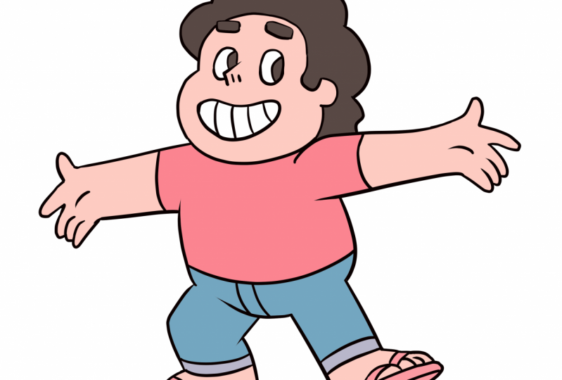
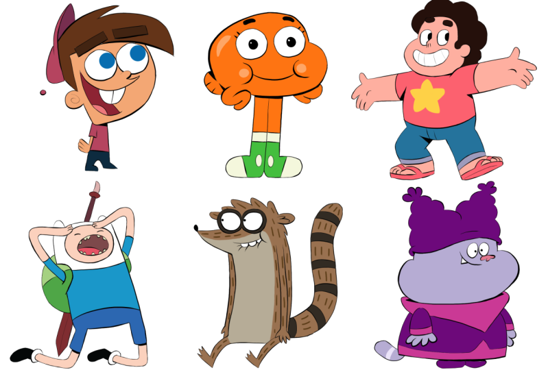
2. Class Briefing: Hello everyone, welcome to my line weight class. This lecture will be fairly brief but still informative and I'll be going over the concept of line weight when it comes to doing more interesting line art, depending on stylistic choices. Here to the left, I have an example of gumballs from the cartoon, the amazing world of gumballs. And you can notice that his line weight is a constant, ten pixels or so. That's just relative to the program that I'm using. But essentially his line art is constant. Langue is very flexible and can communicate certain visual aspects such as, of course, the weight of an object, light direction, A0 shadows, or simply as a stylistic choice, I personally like to use line weight when I do line art so that my drawing looks more interesting rather than stagnant. The left gun ball is cute, non menacing, and fairly simple. I'm going to try and show you how to make his line or look more visually appealing just by applying line weight, I made a little note to the side that expresses the language of the line weight I wish to use. In this case, i jus a sphere where the line art is thinner towards the top and thicker towards the bottom. I also specify that I'm using a twelv pixel brush. And if you're wondering why it isn't ten pixels like the example to the left. I personally like to use a bigger brush for line weight purposes since I utilize the pressure function of my pen to make my stroke's either big to small or small to big.
3. Lining the Head: I'm going to move the notes somewhere where it's easy to see and use it as a reference. You can do this as well if you'd like when applying line weight to your line art. Since I'm using clips studio paint, the stabilization feature comes in very handy when I tried to do line art, since I want clean strokes, I highly suggest you have this on while using the specific program because it'll make things look much better and it'll make things a lot easier. Let's start off with the head and remember user guide to the top right as reference. The top of his head will be thinner than towards the bottom of his head. The size of his head will also be slightly thicker than the top of his head beast because it's more of a gradual size different. It's okay to take a few strokes to get the shape right. I'd be fairly impressed if you could do each line in one, take everything in. It.
4. Lining the Arms and Legs: As we get to the arms, I'm still implementing the guideline here, even though we're dealing with a different shape entirely, It can be tricky, but try to stick to the guide as best you can. Thankfully, gumballs is of relatively round shape overall, so it's not too hard this time around. When you line things such as clothes or accessories, sometimes line weight isn't applied, are usually only use it for the outside edges of line art. You could definitely use line weight through the entire line art though, it depends on what style you're going for. And this is. And to do that.
5. Lining the Clothes: When the liner is done, you'll notice that gumballs looks a bit heavier in certain areas. This is because the thicker lines help communicate light direction and weight. His cheeks looks slightly weighed down along with his tail, his toes, and weird donut-shaped Billy. Those might be as hips. I'm not sure. I sometimes add thicker lines and clothing falls to indicate that that certain area is more heavily folded or less light is reaching there. Keep that in mind when drawing folds of any kind. Here we're at the ears and as the slope down towards the top of his head, I meet the line slightly thicker but not as thick as the line weight of the bottom of gumballs head.
6. Lining the Eyeballs and Eyebrows: The last of our line art is gumballs, eyes, mouth, and browse. These shapes will better apply to work guide since they're relatively round in shape, especially the eyes, the mouth, the top will be thin and the bottom will be thick. Same for the eyebrows. And they'll now look like they're a bit heavier than the ones on the left example. Because of the cartoon style, they kind of look like this sitting on top of his head. Lastly, we have the eyes which are spherical, just like our guide. So this should be the easiest shaped to apply line weight two. I don't apply line weight to the pupils because I don't wish to treat the pupil and the I is separate things. And also since the pupil is all black, line weight doesn't matter here. To save some time, I just copied and pasted the left eye and move the copy over to the right, making sure to erase a bit of it so it doesn't overlap the mouth.
7. Finishing the Lineart: On the left example, gumballs to perfect circles for resides and pupils. But in this case, we're gonna do a hand-drawn circle to make it more consistent with the rest of the line art style. It'll take a few tries, but you'll get it as long as there's relatively spherical. To save time again, I also copied and pasted the pupil over to the right eye. Afterwards, I add a bit of a thicker shadow underneath gumballs belly to imply that his belly is sticking out a bit. Those creating a shadow on it was dies. On the left example, the shadow underneath his belly takes over both his legs. But I wanted our stylistic example to be a sloped shadow, similar to the one over his neck. I also tweak the shadow under gumballs right ear to make it look like his head is basically in front of the ear. Now we have the whiskers as the last thing to line. These aren't consistent weight because as mentioned before, we want the line or to match with the guide and the stylistic choice, I used the pressure function so that my stroke starts from being big and ends smaller.
8. Coloring and Finishing Touches: We're all done with line art. So the finishing touch would be to color. That way. You can see how much of a difference line way can make to a character like gumbo. I use the eyedropper tool to specifically select Color Street, for example. There's no need to make a college for this case. I see now that the eyebrows are black filled, so I didn't really need to add line weight to them, but it's okay. An important tip when drawing loin art, if you don't want to deal with the Bucket Tool filling in the entire canvas accidentally. Make sure your lines are closed. Or if you want to keep them open for stylistic choices, then you can use a hard brush to close the lines with the color you wish to fill the rest of the shaping with. And remember, I'm using a separate layer underneath the line art layer to color. When calming the pants, I seem to forgotten his ankle costs would that's a quick fix. Now we go on to call it the rest of gumbo. I also mean choice to put a glint in his eyes for an additional cuteness factor. But it's unnecessary since its original design doesn't have highlighted his eyes. As a last second decision, I apply the same shadow underneath his belly, like the example to the left. Just thought it looked better. That's gonna be it for this class. I hope you guys learned a lot about how line we can affect the look of your line art when applied in different ways. As mentioned before, line weight can mainly attribute to a light direction, the weight of an object A0, or purely as a stylistic choice. Many animation studios choose to use consistent line weight and vectors to make production a little faster and easier. But if they're really going for more artistic and dynamic route and their work, you'll tend to see the use of line weigh a lot. Thank you for sticking due to the end of this class, and I'll see you in the next one. Keep on drawn.
 Joseffyne Robinson, Have you eaten today? :)