Transcripts
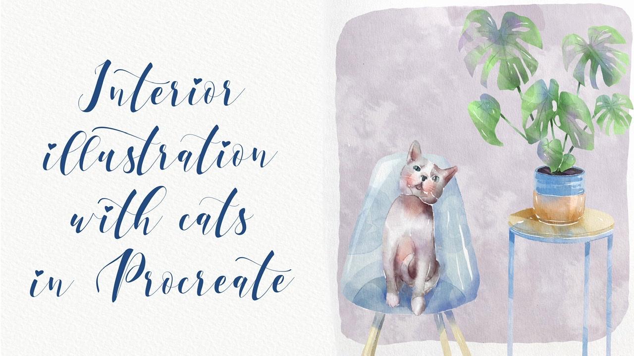
1. Introduction : Hi guys. Hello everyone. Welcome back to my class. During our today's tutorial, I will teach you how to play it live and illustrations of cat in a house. You're going to pay in some rooms. And it's the same time we're going to pay in some lovely botanicals. So I hope you are ready. I also created lots of previous procedure. So watercolor brushes, color palette sketches along this, my own pictures. I hope you'll like setback and you will find it pretty useful. So there's, I hope you are ready. You can prepare your IP, Apple pencil grip your watercolor paintings and paints, or just simply paper and pencils. Both ways are fine. And let's paint altogether. Guys, I'm a freelance illustrator. Welcome back to my class and let's paint altogether cool illustrations of cats in interior in vertical style. At the end of my class, you will learn more about Procreate, especially how to use layers, clipping, mask, selection tool, and how to add color variations to your picture. And most importantly, you'll learn how to paint your own house A-flat, using simple techniques. You can use the illustrations you create for Poisson and Instagram, edit to your portfolio or sell it on Etsy damn road and so on. Or just share it with someone whom you really like. I am sure they will be so happy to get an illustration that is created by you. Today. I want to show you that watercolor. It's so simple and it's a real fun. And in the end of my glass, you can see it. Today. I will teach you how to create texture paper and we haven't U1. How do you stem brushes? How to paint a picture froms and sketch. You can draw your own sketch or use mine. How to use my and default Procreate brushes for watercolor painting. How to apply my new watercolor technique? What as a new answers you need to know. If you want to create watercolor illustration, how to use selection tool. I will explain what is clipping mask and we're going to use it a lot of times. I will also show you two different techniques of AIG and shades and highlights. I will show you my whole process from start to finish. And as a bonus, I will share with you my new texture paper, lots of custom brushes to color palettes, sketches that I created. I will also add files of my pictures that I drew. Feel free to use them for your own art projects. This class is great for intermediate level. Also can define for beginners. If you watched my previous classes and can be useful for experienced artists. Probably here you can find an inspiration in new ways how to pay in cute cats in the house. Your class project. We will be next paying the composition with cat and some room using the Teams and brushes that I gave you today. I will use Procreate for this class is iPad and Apple Pencil. So if you have it or some other drawing paths or just regular watercolor paper and pains, please join our class and good luck.
2. Layers: Creating textured paper: So this is our sketch and I decided to paint kits at house. So I grab one part of apartments and I pay and say it enough to just simply place one of the kids that feel like insisted curations. So in this way, we will learn how to paint house, how to paint interior, what's inside house. Hence the same time we can paint our lovely cat. And I created for you to color palettes because probably you want to change your style. Maybe you want to grab some Azur killers. So I decided to give you some options and the freedom to choose which color you want to add to your own artworks. So first one is cats, one is this color palette. It's pretty lovely. 1 second, 1 is kids too. It's more yellowish and as you see, all colors image each other. So I hope you likes it and please guys tried to experiment and your own art Hawks tried to play with colors and choose which color you like most. Also I created for you special color pellet whose new brushes. So first one is blue sharp and soft time and in second branch is poor transparent shape eraser, you also can use this brush is a blender and it looks very smooth, very authentic. And one more paint in one more priors. This is what the gas temp six also brushes they came from. I knew what counts. Brush set, that is called trued colors is one where I shared loss of brushes and techniques, how to paint in a new cars. And also a grade for you and your watercolor paper. This is what? This paper is very smooth. And speaking about sketches, I pay in CS1, I decided to play in this interior. And this is our second sketch. So we're going to place cats in our interiors is fun. And saved. Kits is actually my kid. Cuz I was DAPI and you can pay into your lovely pet, or you can simply go to the website unsplash.com or Pexels com and search for an animals that you like. And you also can play this animal in our picture. So I hope you're ready now and let's create texture paper. I already downloaded this paper from my folder. So once again, where can you get all my freebies? So you need to open my class in a browser. If you want to download three V's. Of course, you can watch my class in the app. But when you go along with my freebies, you need to open my class in browser. And after said in the projects in sources section, in the right corner, you will have a headline as sources and undoes this headline in the right corner. You can download all my previous. So it sounds simple. And after zed value download my paper, it should be in downloads folder and call to action buttons, press, Insert a file. And after you need to go to the folder Downloads, finds a paper, tap it in after it will be automatically downloaded in our procreate file. Have to say to you to debilitate ahead and change the mode to Linear Burn mode and colorbar. Next step is replicate linear burn, merge to get her dedicate color burn, merge it together. After this, we can lovers out by today little bit in our linear burn mode and group and rename our group. I can now speaking about brushes and first of all of his startup is poor, sharp and soft diamond. I like this brush because it can be very soft and it's the same time. It can be very sharp. So you see has a shades if you press very gentle and if you press harder, you have very, very thick layer. If you press lighter, it's very, very soft and have to press harder. You will have 300k sheets. I liked this project. It's very smooth. So dependent on what you want to pay. It. Just be very gentle. And if you want to add more colors, just press Tab harder. Okay, this is our first brush. And second one, this is Blender. So I need to add some colors. So if you're going to go and grab with transparent Jade, eraser is actually mostly eraser by tried to use it as a blender as well. So as this brush school is a blender because you see it's very smooth in it can help you to add some tiny splashes so you don't blend everything entirely because this brush is gentle, but you can add some watercolor look like when you add the water. And if you want to blend more just tepid tissue types, you're going to use poor transparent JT resume as an eraser. And here it's actually like what color? So if you want to add some gaps, use this brush. If you tap harder, you will have more pigment. Okay, we have a database, this part. Now we go, gotta go and grab Bu oriental, try brush. Surprise that we use before. This brush is my from my previous watercolor brush set that I also share his heel and curricular. Pretty gentle, soft watercolor is sharp lines, sharp edges, and watercolor background for our city already know a lot. It can help us to add so swatter, watercolor splashes and it's very good for editing some shades. Cable watercolors, stamp brush that I created. This stamp is very thin. You can have rough edges and it's good to add texture. But what it got a stamp brush, we already use it in our previous classes. And if I'm over to colors temp, and you have six B pencil, this is authentic procreate brushes. One exam and Tara layer brush. This brush is school as a blend tool. And now if you need to erase this part, if you don't want to go and tap clear to the layer, use through three fingers. And after said, just Robert, click back and forth like this. We're ready to paint and I wanted to start his peak track. So let's go.
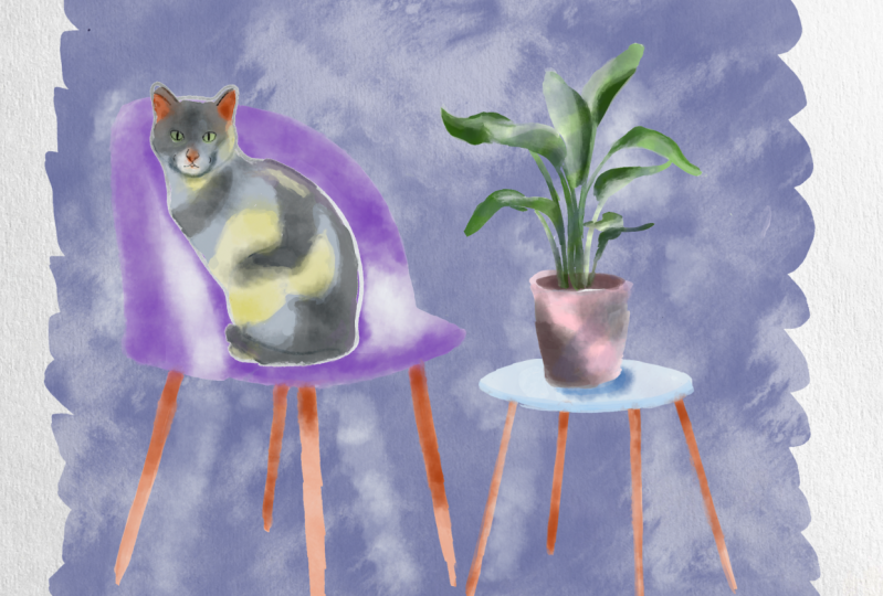
3. Selection tool: Painting purple room: So we're ready for painting our first picture end guys. Now we need to place our cat. This one hand, he already plays it. But once again, you can grab selection tools is one and place it in any way you like, like overs s, I'm already here so you might get another one and this is second cat. So it's all up to you. You might place your kit summary here. All once again, grab your own pet, grab finds a picture of your own kid and just simply pains at to say it, you need to lower SAT passage of hours kitchen layer. And that's significantly because you need to see what your pain do actually. And lovers have porosity of two of our layers. And we need to create a new layer that descend Denise of everything. And I will go and grab both sharpen saw diamond. And once again, if we need to have our reference picture, if you need to know which colors to it and so on. So I will go and grab at catalysts and press reference. So now we have our reference, but we don't have the true actually inside. So I will just download that from my photos folder. And you can tell from your downloads folder or also you can save your picture to photos. And after just simply tap image and import image. So the cell reference picture, we can just place it in a new way, like likes it. Grabs the slide blue color. So once again, dependent on what you want to have, you can tap harder, lighter, anything you like. Next part now is can contain either via IV halves here, some beige color. So in this way, we might switch to another branch, do nasa color palettes, this one. So just like go back and forth. And I will go and start with lighter color. So our aim is to feel everything with Sam particular color. And I'll say if you want to raise pretty sharp just crept selection tool after it, press freehand, select the areas that you want to erase. And after three fingers down and press cut. An example. Now we need to grab a darker color. And I will go and grab says, OK, well cool. Now let's switch to another color, blue and purple color. So my next step is I'm going to go and switch the color to this light blue color, something that in blue and purple. And I can increase the size of my brush. So dependent on an NGO, your brush mine did very thick, very thin. So just try to experiment with sad, tried to pay in different pictures under different angles. And you'll see that I get down is this part, the next part is you're going to pay it soil in signed. And I need to paint it on any layer. So in this way, I'll go and grab this dark brown color, increase the size a little bit. And as you see, I leave gaps between port, between soil. My next step is I went to paint all of those flavors in a pilot. And after we moved to can't trust the data, of course you'll add some tiny That's enough to show you the end. So let's start with is pretty bright color. If you call it a pretty bright green color. Now I need to start painting these. We can increase the size. So remember, try to separate each leaf runs from each other. And here I wanted to show you a magic trick, how you can color your leaf. And at the same time, if you need to spend too much time on. So just paint the shape of the head. We're going to go and grab selection tool and grab freehand. And now let's just select the areas that fit our needs and press Add. Same here at after the three fingers down and press Cut. So these sterile leaf, as I told you, after the blending tool, selection, tool, press, Add. This is my three fingers down and press cut. This monstera leaf is pretty loud. It next up is guys, if you want to save some time, you go. Select our monstera leaf, the selection tool. You see you press magic wand. You press selection tool, press free hand is selected areas that you want to choose and after zed, press Copy and Paste. Now our monstera leaf is, we have one momentarily and you're going to place it somewhere here. I think it's produced suitable. And after That's merchant together. Same, we will create one more layer and U1 because I want to paint one leaf and after copies and plays a second leaf here because actually this is almost the same, the same shape of a leaf. So after that we go and I'll go and grab brush. I'm sad that leakage our leaf and find leaf, turn it upside down. And we'll find lever here. And asked to see here we have some overlap pins. So you've got ongoing group selection tool, press freehand and fallen into line. Notice, erase this part, selected this area, three fingers down. After sad. Let's just merge all the layers together without planned. So we have a dopey and let's just start painting. So V out on a new layer, you're going to go and grabs the slide page color. A little bit cooler. Tap two times and we have white color. So if you're going to have fields that are asked of areas these wide color. Later we'll add some sheets just this area. Grab a dark color versus size as a practice. And amino A's black, almost black. Remember guys, I told you, is it in nature we don't have a natural black colored. They have just different shades, especially if we talk about nature. If you talk about closest yet you might have some dark shades, it's fine. But then you're going to paint sound like kids for example. It's not actually black. So they can be dark purple and dark blue, dark brown, but not entirely black. Okay, pretty lovely background and like so I have it looks. So. Next step is, as I told you, you should do dabbling Kate out as this layer, we can turn off the ground foil wild. So and after that we can lower sat by Sita till 60% enough to merge it together to same as our planned 60 percent merge together. Sam is our cat, 50 percent and merge it together. And once again, we can one more time go to lower layer. And after go to Adjustments, Hue, Saturation, Brightness and tap layer. And now turn your brightness to maximal, make it white. And duplicate it a few times. And Nash to merge it together and merge it together. Raise our background layer is our port and chair. Do same as our planned goal to lower layer Adjustments, Hue, Saturation, Brightness, tap layer, and turn your brightness into maximum. That blockade merge together and merge together. Those same without ket. Go to lower layer. A Jasmine's Hue Saturation Brightness, tap layer, turn brightness to maximum. Three times, merge together and merge together. So now when we turn on our background picture, I'll background layer, you see it's not transparent anymore. But of course you see we have some parts that are actually white sign-ins this way. What else we can do? We can first theme, we can grab white color and just go and fill this area. And the other option is just go to our background layers is one, grab selection tool, freehand and just select the area. It rarely have different colors. Press Add three fingers down. Cut. So now it's white again. So now our next step is we want to blend. You see is a gaps, a sharp lines here. How can we dose at Nagoya to all adopted our cat? After press grab, blending tool and guess you might use. First of all, we'll start this Terrell airbrush, this one. And you might get slightly don't blend everything entirely. And also one more thing. What else you can do? I can press Select, and now you can just blend the area which is selected. Actually this is our cat. That means you can't go beyond the lines. And if you blends apart, you can't you see removes this wide gaps because I actually like Sam and I wanted to keep it like sad. That's why it's very important to, It's very convenient to use selection tool or the other option you might use, alpha lock. So blended slightly, don't plan everything entirely. Buttons the same time you should you blend everything. You can lose if fill-ins is this is actually what to gather. Just tiny beat in some areas. And as you see, I don't cover everything. Nice to leave some, I left some of the gaps because in watercolor you can't be smooth all the time. Okay, Now let's go to our planned. And here I will press Select because it's so easy to go beyond the lines. And I don't want you to set, I want to keep this sharp lines, sharp edges. So just blend tiny B-D. Okay? Now you can go out from the selection mode. So our next step is I'm going to go and add some shades.
4. Clipping mask: adding shades : So I am on the layer, such as on a top of our cat, you see here, and I need to press clipping mask. What does it mean? It means that now when I paint, I can just spend owns the area of our cat. And unlike selection tool, if I don't like something, I can just remove or turn off this layer. And this layer will be same as like we had before. I will show to you now. So for example, I want to add some shades. I will switch the brush to be watercolor background. And now I want to go and grab a darker color. And you see, I control the size because it's brushes. Pretty huge. You see, I can just spin on a layer of is our cat here. But if I don't like sad, I will just turn it off. Let's keep it in some sheets from a site as well. So as you see here, we have the light source from the left side. It means from the right side we have shades. So it means it's this part, you'll be a little bit darker. So add more shades from this part. And after that, we'll create one more layer, I'll say in a Clipping Mask Mode because his between our main layer and you can now shapes. You can even duplicate it and make it even brighter, make it more saturated. I do like the way how it looks. So I will keep it like sad. And after I will merge it together and I am a new layer and I will go and grab your watercolor stem 6. And I will decide, decide to add a little bit of color variations to our cat. And you might think about the way where you want to place it. I actually like it and I don't want to change it anymore. You can create one more layer. Go to slightly reddish color. If you like, you might go and grab watercolors, temps simple. And place it summary here. And if you think it's too bright, just lovers up a little bit. Like exact same stamp. And I want to add some shapes here. Now I will just say envies arrest, and I will start with his chair. And after that, we have our cat, but just like merge it together and they merge together. So as its stamp say here, and they can help you to add some volume. If you want to have it brighter, you might make it brighter. I think for me it's finds a way how it looks right now. Just like sad. Aki. Now if you create one more layer on the top of our chair, also press clipping mask mode. So now we can just paint and our selected area. And I will start this stems. If you press harder, you will have more pigment. If you press lighter, you'll have less pigments are remembered, keeps it in mind. I can lowers the size a little bit and also create one more layer, speech, the brush to go watercolor background. And I want to show some parts I want to show. And also guys, you see here, in this part, we have some tiny shades. So I want to keep those shades buttons the same time. I don't want to have some too big. So in this way I will go to Adjustments. Keep in mind beyond our layer visible steps. After says press Adjustments and press liquefy enough to turn, to push, enough to say it. You can just push your stamp brush a little bit. And in the same time we can have our shades like here. So one more layer, new one we have for watercolor, regular watercolor background. And if you like to add some color variations, go and grab purple color. So I'm behind our CASB might have some shades and also see here from we have shades Brahms the right side. It means this part, you'll be a little bit darker. Let's go back to dark blue color. And of course we should add some shades like underneath the cat. And on the opposite side, Let's just add some white shades, some color variations in this part. And so next step, we can merge it together like to head. Next step we have our pot, flowerpot, then we have our small table. In this way either create one more layer is it's still in a Clipping Mask Mode. And I want to show some shades things to same brush but watercolor background. And we need to show the shadow from this part here. So show some shades into his part. Same Brahms's purple color, something we've been purple and blue color. We also have some color variations. And here once again, it from this side we have shadow problems is part. Now we can go to our flower pot and to all flower. So you'll create one more layer on top and press clipping mask. So now we can pay in jazz an Erebus, our flowers slightly darker shade. And let's just add some shades. And in this way, if you don't know. Some shades. In a place where two objects are close to each other, we will have some shadow. Let's grab blue color. And you might get some, add some color variations to say it, light highlights. And it's also important to show it to your picture, like sad and excess soil. I wanted to keep it that way. So now it's time to add some stamps, so I create one more layer. I grab my watercolor stem six, I'll grab slightly darker color. Go to each has cements, press hue, saturation, brightness and tap Layer enough to set his seed. You might play B's color variations. So why I decided to stick to this purple color? It's simply because we have purple background and I want to match some of the elements one to each other, flex it same. I want to add some stems to our port. In this way, I will create one more layer. And this layer also in a Clipping Mask mode. And I have set same size ten brush. And I will go and grab says, yeah, Lovely, same stamp. Anyone to show some color variations in this area? Disciplines this part like sad. Let's merge all of it together because I like Subway, how it looks, I don't want to change anything. So as you see this is without change this to squeeze our shades and let's just merge it together. Same as our planned and sames our cat. So now everything isn't a clipping mask is merged together. And we have all our layers separated one from each other. And now I went on my layer with a cat and chair and table. And I will go and grab selection tool and I will press freehand. And underneath our chair a table. I want to select some parts and add sheets here. And all. Since this area we also have some tiny shade. And let me think. Also you might add some shade and sees area. We can feathers at 20 percent to 2%, no mall after breast adjustments, hue, saturation, brightness and tet layer. After that, you can love yourself positive little bit. And as you see in this way, this bar will be in shadow. I can. And now I want to add some shades to our planned same. I'm on my layer visit planned. I will go and grab selection tool and I want to push a whole. I will show as a shade here. So Pfizer, 20 percent, hue saturation, brightness, lovers uprightness a little bit. And you see B shows the shades here and it looks amazing. So now I want to show some highlights and shades on leafs. 12 factors that may be just 2%. Hue Saturation, Brightness, tap layer. And I do like this color variations we have here. Now we can merge together everything, our cat and our elements here. And I want to increase the brightness. So in this way I go to adjustments and press curves and press layer. And now you see we can make it lighter and a little bit more saturated. This tool is very convenient because you can enhance your painting. And also last part that we're going to do is I want to add some details, tiny details before we turn off our sketch layer. And in this way I will create one more layer. I'll grab pull oriental dry brush. Now I think we're ready to turn off our sketch layer. I want to love herself paucity of our lines here because I don't want to have it said pride. And I'll say can brand blend some blending tool, grab blend tool, and blends sharpest lines. Tiny details that I wanted to show you said, I want to add some shades from our cat and our plant. In this way, I will go to background layer here. I will grab selection tool, press free hand. And here in this way I want to show some shades. So you just select some part in some shade from the chair. Summary here at at at same in this part. And also some tiny sheets from our plans. Thank you. So I wanted to fasteners, add hue saturation brightness law for SAP, pass it a little bit and increase situation. And today we have our paint and we have our picture with the shades. And I hope you like sad. And I think now we're ready to move to another part.
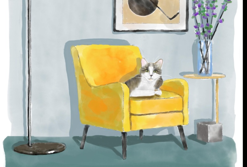
5. Composition and Painting of green room: Wow guys, That's our second painting. And this is our interiors, this is our house. And I'm going to place a cat inside. And I will grab this one. And I decided to place it somewhere. Like said. I think it's fine. Well, that's our reference picture and guess buys away. Actually. As you see, I cut our reference picture a little bit because I want to be focused more on our cadre of your one to focus more on actually the House and the design of a house you might pay in the whole composition. Or if you want to focus, we focused more on cat. My suggestion is to cut the lantern here and just paint Lexis. Finally, and I was featured on second color palette set default. And I will start. Please paint in our chair because it's so yellow, it draws our attention. Also bright color wheel differences side and from side. So he's into pains is chair because it has a rectangle shape, even square shape. And as you see we have the light side. The light source is from the right side. It means our left side will be in shadow. Okay, now you need to lower the size. One, brush and paint this part. Next, add Same here. Now it's time to grab a slightly darker color. Probably say turn our care. Keep databases one. Now, let's go and move tos is part of our chair. And we need two coins, perhaps this dark purple color. Size of our brush. And we have same color here and in this main circle, so I want to feel it is this color. We have very thin line, this one over z. So you might try to fans this line as well. So he wanted to paint very theme site. If you want to paint very thick paint like this, things to shape you can control to psi. So, so brash, I think now we're ready to finish the rest of our flowers. Okay. Now, I think it's time to paint ways. And I will grab this slide. Glucose increases size, Create New Layer. Grip darker shade and show shadows. Here actually, I want to change the color of our table and he took it. I don't want to have it wide because we already have a lot of bright shade. So I decided to grab slide beige color and start adding colors here. Like sad. And from this side I'm grips like a darker shade. Also, don't forget, try to leave some white gaps, which means the colors. In order to setup a separate one part from an asic. Great. Now, behalf, gold colored from this part. That's going craps is called color. And just paint and grab light color. Like purple because like an all shaded in so you have as a light source from the right part, it means objects are closer to the right part that are facing the right side will have lied to her. She's, so this device is part of a table, is actually predict pretty light. So now via a new layer and I went to fields this area, particular color here we have y change. So I'm going to feel that his white color. So I'm going to go and grab this white color. Have same brush it out, does that inside this bar title, go and grab this beige color. So I want to have similar color combination. A picture. Don't forget about cabs. So they need to keep so as shadings and we need to keep between colors. I came down to this part is bowed. So final detail, I went to add some shade to our, to our picture. I want to add some background and floor. In this way I'm create one more layer is a descendant of everything. I have same brash. I can arrange it in this way. The other option you can also add one new shade, was a CEO create one more layer. You need to go to slightly darker shade. Example here. But you don't need to blend everything entirely, just Spain parts. An octave said next part of what we did before, we'll just duplicate this layer. Hit a leg. So I how it looks, I love more two together. I'll do the same here. Maybe emerge TO admit, think, till 40 percent merged together. Enough to sad, I will create one more layer complicated code to logger layer, press Adjustments, Hue, Saturation and Brightness and layer turn. Brian has to maximum domesticated three times, merge together In March together with our first layer. I'll just say it. And that's the layer. I will go to. Lower layer, press Adjustments, Hue, Saturation, Brightness and tap layer, and turn brightness to maximum. Act as a duplicate. It's at the few times. Merge together and merge together. Lovely. Now we need to pay it out. Cat color palette, Tuan. And I have this brown color. I will go and grab light brown color falls AD lowers the size of our brush, of course. And I need to add some color variations. So it's fine if you add like predicting calorie, it's fine if you add some pink cheeks. Later, we'll blend all of it together with some other colors. So don't worry. I have to set slightly peach color. So our cat will have this bright yellow color, yellow eyes, dark shade, and now it's time to blend everything entirely.
6. Adding stamps and color variations: Dedicated one more time. Float lower layer, press Adjustments, Hue, Saturation, Brightness, and turn our brightness to maximum. Complicates it a few times, 3 times enough to merge it together. One within Audacity can do remember, we have our background layer and actually I here I didn't erase some part. So I wanted to set now, I will go and move to the parts that overlap is our background colors after three fingers down and cut. The same viz ways. Goes down and God, Same here. God, I need to go to each layer, press Select, go grab blend tool and blend some sharpest parts. Done brand, bend, everything entirely. You might leave some of the gaps like, like I did here. But very sharp ones that look not natural. You might just blend with your brush. Now let's do same. We spark, press Select tube. So now it's time to add different shades in details. And for sad, I felt go and create another layer on top of our cat press clipping mask. And now I can pee and Jasmine our area, please, our cat. And I want to add some Ration brushes and also shades. So I'll go and grab or what kind of background brash. Grabs this dark purple color. And I want to show sheets. And first of all, we have shade of Brahms each year because it's very close to our cans. So this area will be in a shadow. And also as I told you, you have the light source from the right side, it means the left side. We'll be in the shadows out. And this part to be very light. But also because we have to pose close to each other. It means is in the part by Zach close to each other, you also will have some shade. So I was like that. Now I, I'm pretty satisfied with Dorothy have we might replicates a layer lovers our capacity a little bit and have to merge that together, create one more layer. And now this layer is in a Clipping Mask Mode is, well, grandpa, what occurs 10, 6. And think about the colors that we wanted to add, maybe CS1. And think about allocation. Maybe somewhere like head after lower. So by subtle little bead. Darker color, a little bit darker shade, create one more layer. Together. I'll create one more layer. And I went to a show after this craft brew sharpen self timer and tried to show some shadow. In this part. Here. After the blend tool and blend some parts appeared. Now we can merge together. Now let's just see him as our chair ends and rest press clipping mask. And also I've included grep for watercolor background. Grab this yellow color a little bit darker. And we need to show some shades from this side. First TO like sad part is here. And also they have shade under the cat. Of course, slightly orange color and is adequate help us he see I liked the colors at now is created. So clipping mask option is very useful, thin, very useful tool that might help us to add some color variations. If you like, you can even add some little bit of blue color here. So I am satisfied with what we have. I don't want to change anything or likes a frame. And our next step is, I will create one more layer and I want to add some, some attempts. Orange color. And also in the same time you can loggers out positive. So it's not that saturated notes it feasible. And I'll say can add more stamp brushes. I'll go and grab says a red color. Same stamp. Also lowers have positive. Like said, No, I will not tolerate together. My next step is I want to add some shades, toes or as a part of our surroundings. And I want to add some shade to this part so other god grab political background. So it can help us dread this watercolor look a little bit upset and then muses part. Now you'll go and grabs his blue color. And I want to have some shades to add some shades to the bottle. I like this. Q, I don't want to change it. Just grab gold color, a little bit darker. And from this side we'll have some shadow gonna go and grab or to cause Tim. And some stats here. Hi axis. I'll go Boom. Cards. Temps, simple. Yep, and I want to add Rice here. Clever sandbox to slightly. Okay, So iodine is part. Now my next step is I want to talk at some shades. And in this way when you to go and use selection tool. And first of all, I want to add some shades to this part to chair, go and grab free hand. Select this bar, press, Add, and press at all. So same here. In this area. And does a cat press Add. I want Pfizer said Hue Saturation, Brightness, tap layer and just turn your brightness a little bit lower, increases situation if you want. And I will just same here. I have an edge shade this part ad and shade in this part, head. After the adjustments, hue, saturation and brightness. Law of her surprise. This great. And I think I wanted to add some shade to our vase as well. Because attrition brightness and add some shades to the ways I k I will turn off our sketch layer. I don't need that anymore. Not S21 to show some shade and our cat. And he's attrition practice nafta out yet. Right? Hi, I'm pretty satisfied his coterie have right. Run my thin white color and go and go and grab oriental dry brush. Like say, a final details, I want to show some shade and naff. Does that, need to go to our background layer, grab selection tool. And as you see here, we have some shade from the picture. And after that, we need to have some shade from our objects, of course, had to try to add some shade here at a 12, lead to slower SAP. Pass it a little bit. Hello. Thank you. Pretty cool. And final detail I want to show is a shade from our vase. Why I did it on a separate layer. Because I want to make it a little bit lighter. I press Add. I want to show some tiny shades problems as lovers swell. And little bit from that scientists while and guy's view can call this piece finished. I like the way how it looks at xy cat. And it's pretty cool. I hope you enjoyed my today's tutorial and now you know how to create this beautiful composition, this cat and our house action. And I will look forward to see what you're going to create. So this is end of our class, and I hope you enjoyed today's tutorial and now you know how to paint lovely cats or some other animals in the surround is in apartments in your own fled or your own house. And I will look forward to see what you're going to create us if you have any questions, suggestions, you might lead them in a discussion section. And you might share your own projects in a project section, and we'll see you guys in a new video. Bye bye.
 Inga Yoon, Digital illustrator and teacher