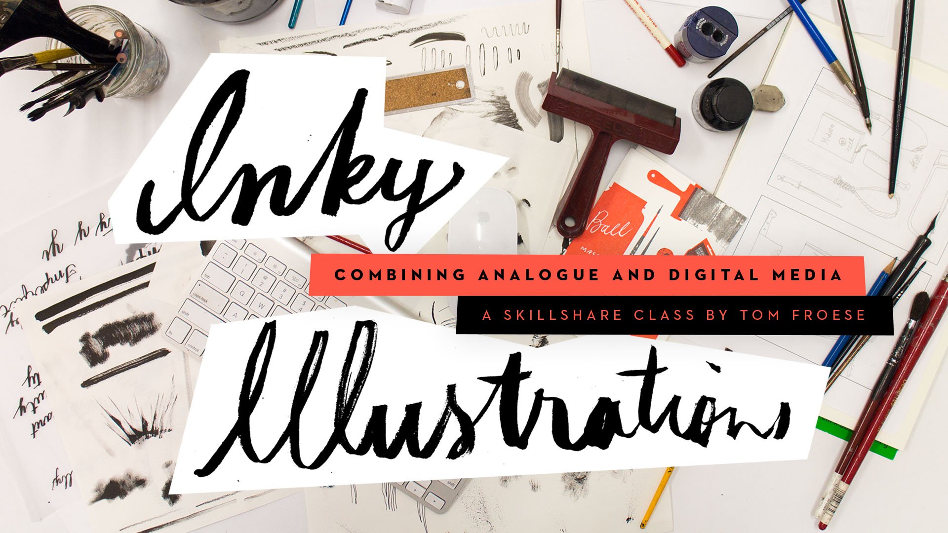
Transcripts
1. Inky.AF — Class Trailer: Hello, I'm air Tom Froese
I'm an Illustrator, writer, podcast host, and, of course, a top teacher here
on Skillshare. This class is all about making beautiful whimsical illustrations
using simple colors, flat shapes, and messy
inky textures and marks. But it's also about
learning how to do all this in Affinity. With this powerful and free
app becoming so popular, I thought it was
time to see what my Inky process could
look like here. If you want to learn
Affinity by doing, not just pushing buttons, but actually by making
something beautiful, this class is for you. Please join me in Inky
AF on Skillshare. I'll see you in class. O.
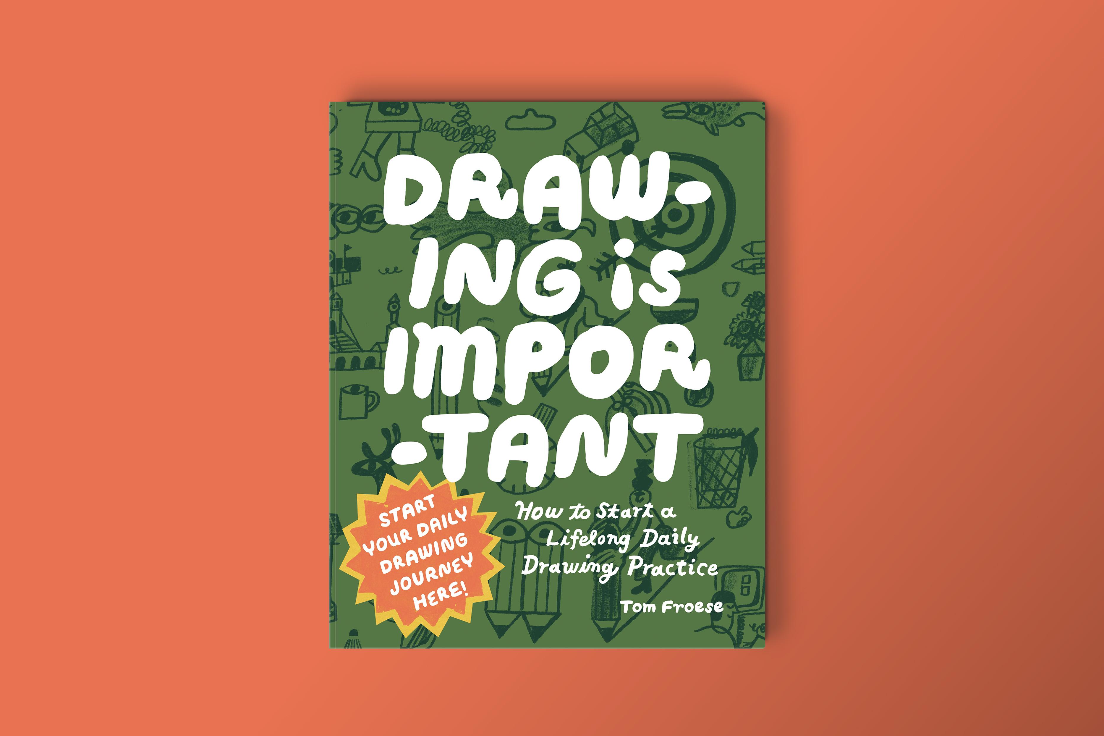
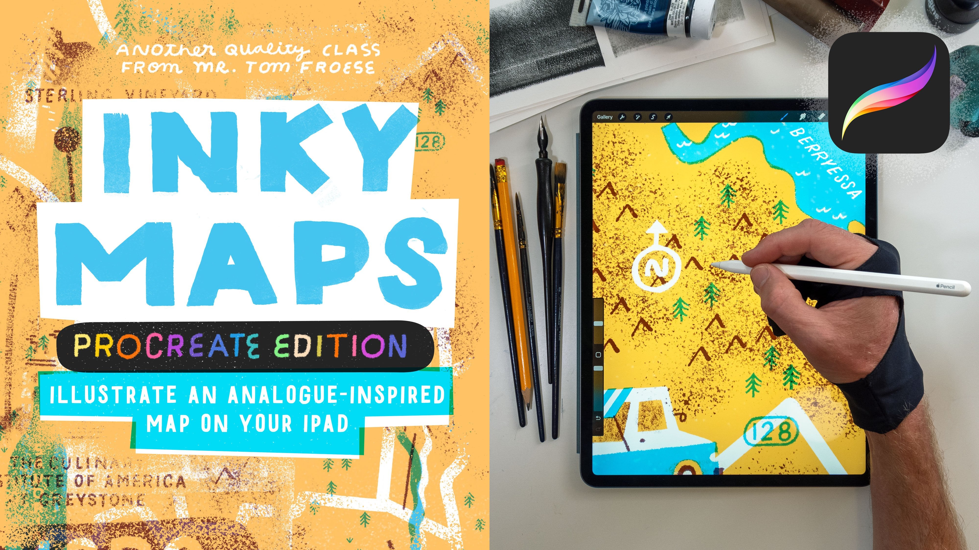
2. About the Class and Project: This class is for
anyone interested in learning how to use
Affinity for Illustration, especially those who
are used to working in Photoshop and perhaps
even an Illustrator. Some experience using creative apps like
Photoshop, Illustrator, or even Procreate
is recommended, but I'll do my best to walk
everybody through each step. We'll start with an overview
of the Affinity interface, going through some of
the key similarities and differences between
Photoshop and Affinity. And then we'll just jump into the project where we'll
learn everything else. Of course, you also learn some illustration
principles such as working with
color, composition, and stylization, for me, that means drawing things in
a more flat, playful way. For the class project,
we'll be making a series of five to ten spot illustrations using my popular inky
illustrations techniques. We'll be working with very
simple constraints as well. We're just going to be using
two colors plus black. We'll be learning a ton of digital skills within Affinity, but then we'll also
be doing a lot of our process on physical paper, which I think is the best part. We'll be doing our
sketches with paper and pencil and then we'll use black inky tools like pens and markers to create our
messy textures and marks. The gear you'll need for
this class is very simple. You're just going
to need a computer, either a Mac or PC with Affinity installed.
I'll be using a Mac. You also need a scanner to bring your drawings and textures
into the computer. A phone camera works in a pinch, but results will
v. I don't think you'll need a stylus
or a tablet for this. I'll be using a mouse
and I think that's actually the best
way to do this class because you don't have as much fine control as you do with a stylus and that makes for
more interesting results. In terms of materials, you'll just need plain paper or white sketchbook
paper and of course, a pencil and eraser
for sketching, and then for our inky marks, we'll be using black media. That might include
India ink with a nib pen or paintbrushes. Micron pens, markers,
or you could even use pastels and
crayons and pencils. Whatever dark media you
have, that's great. Let's experiment with
it. It will be fun. Now, if you're
working with ink and water and other messy materials, definitely have a jar of water and some paper towel
at hand as well. With all that out of the way, let's get into the class.
3. Affinity Orientation: So this is just a
quick orientation and an introduction to
the Affinity interface, and we'll just go
through some of the key features
and especially some of the similarities and differences between
Photoshop and Affinity. So if you're coming
from Adobe Apps, especially Photoshop,
Affinity is going to feel somewhat familiar. When you first open the app, you're going to see
this welcome screen, which, of course, you
can go ahead and close. And now we can just see the blank workspace that looks like a typical digital art app. Now before we get further on, it's useful to understand
what Affinity is. It's basically
Illustrator, Photoshop and InDesign rolled
into one program. Instead of switching
between separate apps, Affinity uses something
called studios, which you're going
to find up here in the top left corner. Each studio shifts the interface and tools towards a
different kind of workflow. Vector Studio would be the equivalent to
Adobe Illustrator. Well, Pixel studio would be closer to the things you're
familiar with in Photoshop. For this class we'll stay within the pixel and vector studios. This is one of the
biggest differences between Photoshop and Affinity, depending on whether you're
doing the vector raster work, you may need to switch
between these modes or it will sometimes just switch
without you doing anything. I don't know why it does
that, but sometimes if you can't find the tools you thought were
there a minute ago, it's because it
switched studios. Why don't we just start off by doing the most basic thing? We'll just go to File and
create a new document. Creating a new file is
very similar to Photoshop. The main difference is
simply that Affinity offers a lot more preset paper
sizes and templates upfront. You could ignore those for now. On the right side under
document settings, you'll see the controls you're used to things like
units width and height, DPI or PPI, color
mode, and so on. Let's just hit
Create document with these default settings here just to continue our
exploration of Affinity. So why don't we switch
over to the pixel mode. If you're not ready, click the Pixel studio and now
we are in pixel mode. Here we're going to
find something very similar to what you
find in Photoshop. You have a toolbar on the left, you have these
panels on the right, and then there's a
context bar across the top that changes based
on the tool you're using. So most of the tools in Affinity behave exactly
as you'd expect. There's MV, there's brushes, there's eraser, there's
a selection tool, Pen Tool type, and so on. Even the keyboard shortcuts are going to be mostly familiar. V for move, A for direct
selection, P for Pen Tool, and L for what would be
called lasso in Photoshop. We call that just
the selection tool, I think in Affinity. Actually, it's called
freehand selection Tool. So on the panel side,
you're going to find things like layers. I have this one broken out here, and then you have swatches. You can lump them all together just like
you can in Photoshop. It's almost identical. Now, if you don't see any of the panels that you would
expect to see in Photoshop, if you don't see your
swatches panel, for example, you would just go to Window and then go all the way down to general and in general are
listed all the general panels. I think by general,
that means these are universal to all
the different studios. Whether you're in vector
mode, color grading mode, pixel mode or whatever, these are the general
panels for Affinity. So there are lots of
small differences between Affinity and Adobe Apps, most of which is best to
learn by trial and error. The way I learned, what I'm
teaching you today is just by trying to do my Inky
Illustrations workflow, which I'm used to doing
in Photoshop in Affinity. It was a lot easier to just focus on learning
just a few things in Affinity for now
rather than trying to learn the whole
thing all at once. That's it. Congratulations.
You've been officially introduced
to Affinity. Now let's move on
to the project.
4. Project Brief and Brainstorm: Now it's time to start the
project and to kick off, I'll give you the brief and then we'll do a little bit
of brainstorming. The project for this
class is to create five to ten spot illustrations
based on a prompt using the techniques
that will be basically learning throughout
the lessons moving forward. So first, what is a
spot illustration? Spot illustrations are small standalone images
without backgrounds. You'll see them in
magazines, books, websites, postcards, and all kinds
of printed pieces. For this project, we'll
arrange all of our spots together on a six by
eight inch postcard. You can make that in horizontal
or vertical orientation, that's up to you. You can keep them as a
single composition or you can break them apart and use them in any other
way that you like. Now we have a few
constraints as well. First, we're going
to be working with just two colors plus black and we won't be
using any digital brushes. Instead, we'll be
building our base shapes using vector tools and
then we'll add lines, textures and lettering using real physical inky media.
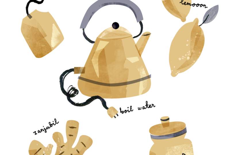
So here's your prompt. The theme for these
illustrations will be a few of my favorite things. You'll do a few of your
favorite things and I'll do a few of my
favorite things. Now, we'll be drawing
favorite things, of course, but that's
open ended and broad. I recommend narrowing
it down to something a little bit more specific and meaningful to you personally, such as a few of my favorite things for
the holidays or a few of my favorite things
to draw or perhaps a few of my favorite
things on my shelf. Whatever it is that you're
interested in drawing, whatever you have
favorite things about, that can be your theme. Now, I'll give you a few tips about choosing your objects. It helps to choose physical objects with
clear recognizable shapes. Spot illustrations need to communicate quickly and clearly and distinctive silhouettes
make that much easier. Here are just some tips
to help you choose some strong subject matter or objects for your
illustrations. First of all, avoid
generic shapes. Something like a
smartphone or a remote or a framed picture is
basically a rectangle. These are very generic and not very visually distinctive
or interesting. Another tip is to avoid
amorphous objects like piles of laundry or
crumpled pieces of paper. These are fascinating
to draw perhaps, but they're difficult to
illustrate in a clear, iconic way in the way that spot illustrations usually
need to be illustrated. So the next tip here is to choose objects with unique
silhouettes and parts. A good example of this
would be scissors. They have this instantly
recognizable shape and they have moving parts, and that can add to the visual
interest of your image. And in this case, they
have different materials. So we have the plastic
handles and the metal blades. So that can make for a more
interesting illustration, especially when
you compare it to something more like a rectangle. Other tip here is to
avoid objects where the defining feature is someone else's artwork or graphics. Just for example, a
record album cover is mostly just a rectangle
featuring someone else's design. It's not a bad thing to
illustrate in general, but for this assignment,
it's not ideal. These are guidelines to help
you succeed at the project. I want you to be able
to learn Affinity and make something beautiful. Without getting stuck on the exact details of
your illustrations, you're more than
welcome to color outside the lines, so to speak. You can break these
rules, but just know that if something feels
unusually hard to draw, it might be because it doesn't line up with the guidelines
that I've just given you. With that out of the way,
before we begin sketching, let's do a quick brainstorm. I have our theme here. These are a few of my favorite things and I'm going to make it about my favorite
things to draw. These are a few of my
favorite things to draw. These are objects and symbols
that I tend to draw a lot. They show up a lot in my doodles and my drawings and
my illustrations. I think that will make
for a fun and very meaningful and personal
set of illustrations. If you want, you can use the same theme that
I'm using here. You can also customize it by
narrowing it down further, my favorite things to draw in the kitchen or at the
beach or from childhood. The more specific
you make your theme, the easier it's going
to be to come up with the ideas of what
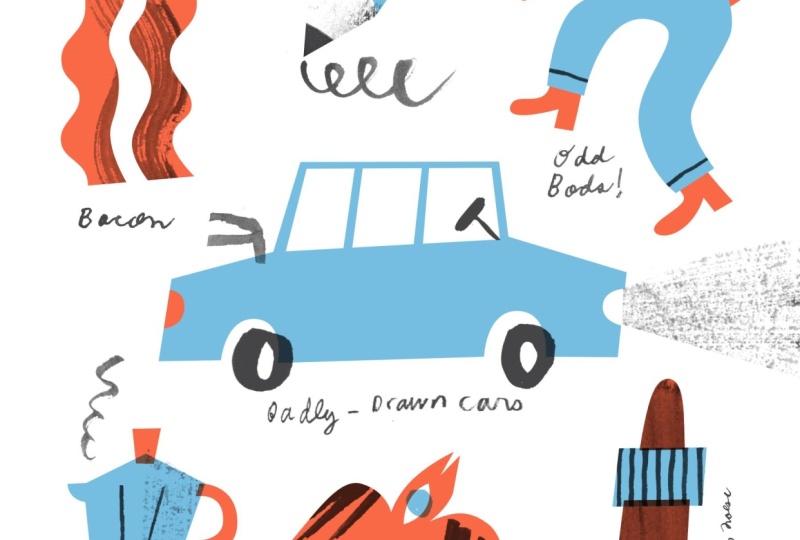
to draw within that. I'm just going to start listing down my things, just ideas, maybe come up with
ten to 20 things on this list and then later
I'll try sketching them out. Tree shapes, heads,
usually flat. And from the side drawing
hats, bacon, bottles, wine or beer, bikes, badly drawn cars, pink
erasers, pencils, ink pots. I just wrote down maybe 20 or so different
things that came to my mind that I tend to
draw or enjoy drawing, even if I don't draw
them all the time, and these will just give
me some starting points to start sketching from
in the next step.
5. Drawing Rough Sketches: So in this video,
we'll start doing some rough sketches of those things that we
made in our brainstorms. I have my brainstorm
list up here just in view and I have
another sheet of plain paper, and I'm just going to start drawing and filling my page
with these different objects. Because these are
things that I've drawn a lot and I'm
used to drawing them, I don't really need to
look at reference photos. But if you've made a
list of things and you want to know what they look like and you want
to draw from them, then feel free to go on to Google Image search
or go to Pinterest or find the objects actually in physical reality and look at
them while you're drawing. I'm going to try and
draw these from memory. That's just the added
little fun part that I'll see how I do in this
demonstration here. I tend to draw this
particular tree shape a lot. I think as I draw these,
I'm just going to add little labels just
for fun as well. I tend to draw side head
profiles in a flat way. Sometimes I do the
noses rounded, sometimes I do them pointy. Now, as you're drawing, you might feel a little bit
like drawing them perfectly. I would say draw them as freely as you
can without judgment. That's what I'm trying
to resist doing myself. I don't want to judge
my own drawings. I just want to draw
them. One tip as you're drawing is to
draw them simply in a way that will be
easy to trace with the vector or the Pen tool
in Affinity later on. That means keeping
things flat and having these nice clear
contour lines rather than little tentative
delicate sketching like that. If you need to illustrate
in a more sketchy way at first and then go over them later with more confidence,
that's totally fine. Just keep that in
mind as we go along. These are also just sketches, so they can be a
little bit messy. Again, just keep in
mind as we're drawing, we're not worried about our composition so
much at this point. I'm just drawing in a way that things fit and don't
overlap one another. But other than that,
I'm not thinking about how these are going to
fit in my postcard later on. We'll do that in the next step. All right. I just have
one more little sketch that I can squeeze on this
page and then I'll be done. U. I've spent about 10 minutes drawing from my list
of favorite things to draw and I've fit as many of
them as I can on the page. Some of them turned out
better than others. Some of them will
work better than others as spot illustrations. But I'm not worried about that. Right now, I'll figure
that out in the next step. Similarly, for you, spend about 10 minutes or
as long as you want, really, doing these
rough illustrations, make sure that they
don't overlap. Keep them separate because
we'll be cutting them out and making a composition
from them in the next step. Once you're done doing that, I'll see you in the next video.
6. Scanning Your Sketches: All right. Now in this video, we're going to scan in our rough sketches and then we're going to clean
them up in Affinity. I have my drawings here
and I'm going to put them in my scanner and go from there. If you have a scanner, you can scan this in black and white in your
scanner settings, and I'm going to scan
this at 600 DPI just so I have a lot of resolution
in case I need it. I probably don't, but why not? I'll do 600 DPI and I'll
just make sure that I get the entire sheet in
if you're using a camera, such as your smartphone,
that will do as well. Results will vary. I won't be as high quality as scanning it, but it's usually good enough. If you want some tips on how to use your camera
to scan things in, I actually have a funny
little YouTube video. I'll leave a link to that
in the class description. Basically, I show
you how to make a makeshift scanner
out of an printer box. You make a window box out of it. It's something that
you can use with your phone and it does a
pretty good job of it. Again, that's a link that
I'll leave in YouTube if you want to use
your phone or you have to use your
phone and want to get the best quality out of
that device for scanning. I've scanned my drawings. I have Affinity open, so everything from
now on is going to be on my screen here. I have my scan sketches
open in Affinity. Now what I want to do is
just clean this up and make some adjustments
that will make it easier to work with
in the next step. The first thing that
I want to do is just rotate the page because
it's in the wrong way. I'm just going to go
to document and then rotate 90 degrees
clockwise, and there we go. The other thing that
I'll do is just crop it. A good way to crop in Affinity I find is to use the
selection tool. I'm going to hit M to call up the rectangular
marquee and then just drag a box over the white
paper only and get as much as that and leave out the
rest of the image there. Then if I hit C,
that enters into the crop tool and I can just
hit Enter and there we go. It looks like there's
still a selection happening around there
and I'm just going to make sure that
that is deselected by going to Edit Deselect or you can hit Command D. Okay, so my goal here is to get rid of the
paper texture and make the pencil drawings
here as clean and dark and contrasty
as possible. I'm going to select background
in the Layers panel. You always need to make sure
that the layer you want to affect or do something on is selected in
the Layers panel. That is something that
Affinity is very picky about. The next thing that
I'm going to do is just make some adjustments
to the levels. Down at the bottom of
your layers panel, you'll have these little
buttons of different shapes. The one that's a circle
divided into two halves is the adjustments and you want to do a Levels adjustment here. When I do that, it calls
up this little dialog box, and we're going to adjust
the black level slider. And the white level slider to make this image as
clean as possible. Let's start with
the black Levels. I'm going to hold option
down on my keyboard, while dragging the black level
slider towards the right. As I do this, I'm going to
start seeing little bits of white start to enter
into the image. I'm going to continue
holding down option on my keyboard as I drag this to the right until I see all my drawings
as white outlines. Once I start seeing
like lots and lots of white fill in noise like
this, I've gone too far. I'm going to just go
back until I can just see the outlines of my
drawings in a clear way. Now, if I let go of option, I go back into this normal
viewing mode and of course, this is not at all what I want. I do want to get rid of
that background noise. I'm going to go to the
White level slider now in my Levels
dialog box here. I'm going to again, hold
down option and then drag the white level. To the left. As I do this, I'm going
to stop when I see all my outlines again
in a clear way. I'm going to see how this looks. I think that looks pretty clean, and so I'm going
to go with that. Just remember, these are just our rough sketches and
so they don't need to be perfectly cleaned up. But I do just want to show
you the idea here because we'll be using
this again when we start scanning our inky marks. So we're going to just get
out of the Levels adjustment. Since we're learning
about Affinity here, the Levels adjustment
that I just made is non destructive. It's actually its
own adjustment layer over top the original. My original file is
on the background, the Levels adjustment
is above it. If I were to hide that levels adjustment layer
or if I were to remove it, I'd see the original scan. So the next thing I want to do is remove the white background. All I have is these black drawings on a clear or transparent
background. Now, in order to do this, I do need to merge my levels adjustment and
my background together, they're just one
pixel based layer. Basically, hold down shift
and make sure that both of those layers are selected by clicking on each
until both are blue, and then you can right click on those selected layers and then merge selected
from the menu. O now we have one layer again called
background in this case. Now I'm going to go
to pixel filters, colors, and erase white paper. Just like that, I removed
the white paper and we have these really nice
dark pencil sketches on a transparent background. Now I'm just going
to save this file. I'm going to save it
in Affinity format. I'm just going to hit
Command Shift S to save as, and I'll just call it favorite
Things sketches dot AF. That's it for this step. I'll
see you in the next video.
7. Composing the Final Sketch: In this video, we're going
to create our composition. Basically, we're going to
take our rough sketches and paste them into a six by eight postcard
format and then that will tee us up to start
illustrating over later on. We're in Affinity. Let's
create a new file. I'm going to go to File and
new or you can hit Command N. I already have a preset here, six by eight postcard, but I'll walk you through how to do that from scratch in
the document settings. The first thing
you're going to do is just set your document units. I'll be working in inches,
so I'm going to set inches and I'll leave
DPI at 300 DPI. That's standard resolution. Some people call it
PPI pixels Princh, but Affinity uses
DPI or dots Princh. It's the same thing.
For page width, I'm going to make it 6 "
and height will be 8 ". You can do it the other
way around if you want, make it eight by 6 ". We can leave
everything else as is, as long as your settings
also say what mine say, RGB eight for color format, color profile is this SRGB, and all those
letters and numbers. You probably don't need to
worry about that for now. Let's just create the document. When I created this, it automatically sent me
into the vector studio. I want to be in
the pixel studio, so I'm just going to click
that and here we are. And the next thing
we want to do is just start pasting
in our composition. I had mentioned previously that we probably were not going to be illustrating
all of these. We're going to make maybe five, six, seven, eight, whatever,
some smaller number. I like odd numbers. And if you want to keep
this really simple, I recommend you just
stick with five. I'm going to see if
I can force myself just to do five
illustrations for this demo. I'm going to start
with bacon and I'm going to use the selection tool, the freehand selection
tool specifically, and I'll hit L. As a
shortcut to do that. You just want to make sure that your background is selected in the laris before
you start copying. As I said, Affinity can
be very picky about which layer you selected or whether you selected
a layer at all. Now I'm just going to copy this by hitting Command C. You can also just go copy
from the edit menu, and then I'm going to
switch tabs over here to my new postcard and
paste that in there. Before I go any further, I'm going to save this
as a new file. I'm going to hit
Command S or you can go File safe and I'm just
going to give this a name, I'll call it favorite
Things final sketch V one. And I will continue pasting some of my drawings here
into my new composition. I will definitely
include this Dv here. You don't have to
worry about making a perfect composition
at this point. Just start copying and pasting your rough sketches in
there just to start. You can figure out what
to keep or not later on. Again, I'm selecting
another one of my drawings. This is the espresso maker. I'll copy that, head back
over to my new composition. And paste. I have five sketches in my composition here. I'll see if that's enough. I probably want to
add a few more. But while we're here, let's just arrange these a little
bit and just start to get a sense of what we might need to add or whether
this is good enough. I'm just selecting
things with my mouse, just like you would in Photoshop to select things and
move them around. As long as things
aren't overlapping, it's easy to just click and select based on what
you see in your canvas. Now, if I want to make some
of these bigger, of course, I can just pull one
of the corner handles and that's how you resize
things in Affinity. It automatically constrains
the proportions, meaning you don't have to
hold shift in order for it to resize without distorting. Otherwise, if I do hold
shift, and then I pull this, then I can start distorting my sketch, but I don't
want to do that. I'm just going to undo Command C and see if I can go with that. I feel like this
is almost enough, but I'm just going to see if I can add a couple more
in here just for fun. I'm going to use my select
tool and find a few more that might be
able to fit into some of these shapes
in an interesting way. I'm going to see if I can
add this longer piece, the badly drawn
car, paste that in. I also have to keep in
mind that I probably won't have the
lettering that large, so I might just cut some of
that out or make it smaller. I'm on this badly drawn car
sketch and I'm just using my Lasso or my freehand
selection tool, a little bit of Photoshop
language coming out there. Then if I hit V and just select what's in the
selection there with my mouse, it creates a transform
box just for that area, it's pretty easy. Might go and do that
with all of my pieces, just make the text a little
bit smaller so I can get a better sense of how the illustrations themselves
are looking on their own. Sometimes it takes a few clicks to make sure you've selected the layer you want and that just takes a little
bit of trial and error. Make sure that the
layer you want to cut and paste from
is actually selected. Otherwise, you won't make
the selection you want. As I'm going between these different layers
in order to select them, I am using my move tool or hitting V and then
clicking on it, and then touching L on my keyboard to make that free hand
selection tool come up. You'll know your
layer is selected when there's a box around
it in your canvas. Now, if you have to
rotate anything, you can select your layer as
a whole or just part of it. When you're in your
move tool, you'll see this handle at the top
with a little circle. This is the thing that
you can rotate with. I think I have room for
just one more piece there. So when I'm using the
keyboard shortcuts, I find that sometimes
I have to tap my letter or shortcut twice. I'll know that I'm in the
selection tool when I see these cross hairs and then I can start
making my selection. This will be my
final adjustment. I'll just make this a
little bit smaller. Again, I'm not really
sure exactly what I'm going to do
with these labels, so I'll keep them in for now. I like them and then I'll make up my mind for sure later on. If I say don't overthink it, as long as you
have your elements evenly spaced apart,
that's the idea. Because we're making
spot illustrations, each one of these should be
independent and not overlap others because we're imagining these could be used
beyond the postcard. They could be used as spot
illustrations on their own. Okay, so I've ended
up with seven objects to include on my postcard or seven spot
illustrations in total, and the next step will be to start building our
illustration over these. Once you're finished making
your composition here, hit Save and then I'll see
you in the next video.
8. Creating the Base Illustration: The first thing we
want to do with our final illustration is start building out our shapes
using the vector tool. This is what I call
the base illustration because it's just
the flat shapes and color before we start adding those inky
details later on. The first thing we
want to do is just prepare our layers to
start illustrating in. We're still in the pixel studio. I'm going to go to
the layers and just select all of those pixel
based layers that we arranged. I'm going to just merge
those together as one. We won't need to move
them around anymore. The next thing we want to do is just create a group from those. Let's just go down to the
bottom that little folder thing in the Layers panel and
when you create it, it might appear
above your sketches. Take your sketches, which
is right now labeled just as pixel and you can drag
that into your group. Now we'll just double
click on the word group there and type a
name for this group. I'm going to call it
sketches and hit Enter. The last thing we want to do
is take our sketches, group, and just take the opacity
down to 20 or 30%. This will just make
it easier to see your illustrations as you're building over these sketches. Now we're going to create a new layer group overtop
the sketches. Without any of the
layers selected, you can just click
somewhere outside a bit, create a new group by hitting
that little folder icon, and we're going to
rename this to art. All of the art you're
going to be building, including your base layers, is going to happen
in this group. The next thing you
want to do is just set the blending mode of art to multiply and that will ensure
that we'll always be able to see the sketches through
the art we're creating. Now it's time to actually
start a base illustration. This will commence our
first introduction to using the vector
tools in Affinity. Before we do that, it's
probably a good time to start talking about how
color swatches and color selecting
works in Affinity. So what you see here
down at the bottom of the left hand tool bar are these two little
overlapping circles. Those are just like
the foreground and background color
things in Photoshop. If you hit X on your keyboard, you'll switch between background
and foreground color. Then, of course, to actually
create a color out of those, you just double
click in there and then you have not
a color picker, but a color chooser. And then you can choose
whatever color you want there and hit close and that becomes your active
foreground color. This might also be a
good time to think about the colors that you want to use in your
illustrations. Like I said before,
we are going to be using just two
colors plus black. Why don't I just show you some ideas for color
combinations that will work. I'm just going to do some quick stuff now with
the Pen tool and I'll show you what I'm doing
or explain what I'm doing more carefully in a bit. So we're just talking about
a color palette here. I recommend that you have two bright colors and
one dark color. I say black, but you can use any really dark
color as your black, and then the other
two colors should be brighter. Here's what I mean. Let's say color one is going to be something
like I don't know. Let's do some orange red
because I like orange red. It's one of my favorite colors. So I'll just choose that
as one of my brights and then I'll select my other box here and just give it
a different color. I often like pairing
my red with some cim. It has always been one of
my favorite color combos. I guess it's retro and they clash with each
other but in a good way. I like that. I'll choose
something on the brighter side. For my black, I'm
going to choose something black but
not all the way black. If I was going all
the way black, the RGB code would be all zeros or the hex
code would be all zeros. But I want to do something
a little bit like lighter. The reason for that will
be clear in a moment. I'm just going to go
in my CMYK colors here and I'm just going to make them all zeros except for the K, which stands for black,
and I'll make that 80. Now, I'm not actually working
in CMYK color space here, but I just know that 80% black in terms of CMYK is dark
but not all the way black. Now I'll just show you
why these colors work and you can choose your
colors in a similar way. You don't have to choose red and blue in this particular black, but what I'm about to show you will inform your
decision, hopefully. To start, I just want to
select each of these layers. I can actually hold
Shift and select them by clicking on
them in the Canvas or I could go over to the
Layers panel and click the top layer and then hold shift and click the bottom layer of
these three boxes. I want to just set
the blending modes of these to multiply. That just helps me see how they overlap with multiply set. The multiply blending
mode creates this transparent effect and we make a lot of use of
that in this technique. So as you can see, when red
is multiplied over the blue, it creates this darker
greenish color, which I like. And then you can
also see through this black to all of those other colors
happening down there. If this were all the way black, you'll see that you can't
really see much going through it and that's just
not as interesting to me. That's why I made it 80% black. Now, if you chose two
very similar colors, maybe a two blues, for example. Yes, they're both bright
and they're both different, but they don't really create an interesting
overlapping color. That's why you should
choose something more like complimentary colors if
you chose yellow and blue, you get a green,
or if you were to choose pink and yellow, you'll get a red in
the middle there. That's definitely going to
make your color palette in this very simple constraint
a lot more interesting. That's the extent of our color theory
lesson of this class. Let's actually go on to
building our base illustration. I'm just going to delete
these and proceed as we were. Remembering that
we're creating all of our base illustration
and everything else in the art group here, select your art layer, and we'll start by building one of our shapes
using the vector tool. Hit P for Pen Tool. You also find that in your tools are over on the left side. This is how we build
vector shapes. You can start your
shape anywhere. It's always easiest to start
on a corner of some kind. I'm just going to click
on this corner of my Bacon sketch just one
time and then you get a control node and then my next point is going to be
somewhere where this curve starts and I'm just going
to click and hold and pull until it's roughly
following the drawing beneath. Then I'm going to do
the same on this curve, just where the curve
bumps out the most. I'm going to click
and drag down. Until it follows
the contour below. I'm going to keep
doing this until the bacon shape is complete? All of these curves is very much the same movement until you get down to this
corner down here, and then I want it to be a hard corner so that I can go in a straight
line to this side. If I don't do anything and
I just click over here, it's going to make this awkward curve and I don't want that. I'm going to undo Command Z, and I'm just going
to click once on that last control point and now click over
on the other side. Now, I can't see my sketch
very well beneath and that's because for some reason when I started building
the spector shape, it was being made outside
of the art folder or group. I'm going to just move
that into the art group now there because art
is set to multiply, I can see through it
and I will continue. Just as we did before, but going up instead of down. Click and Drag, click and drag. It does take a little
bit of getting used to the Pen tool if
you're not used to it. There's just these very subtle
differences in affinity compared to Photoshop that
you also have to get used to, but it's hard to describe.
You just feel it. And now I'm just going to close the shape up and then I'm
done the bacon shape. Now you'll see in the shape that's not exactly
as I sketched it. I can actually now hit A, which is the node tool. In Photoshop, I believe that's called the
Direct Select Tool. You can actually go and select the nodes or what I've been
calling control points and move those a little bit so that
they keep their curve, but the curvy parts line up. Then in this case,
I find that it's a little bit too different
than my sketch. This is where we can use these extra control points over on the tangents
of these curves, and we can control
them independently to fine tune what those
curves look like. One thing that I am
going to do is I'm going to let the top
and bottom of my bacon, even though my
actual hand drawing is loose and curvy there, I'm going to leave those
as straight lines. That's the bacon shape. What
I'm going to do before we start the next shape
is I'm going to select it in the layers panel and put it in its own group. I've got the bacon shape there. I'm going to hit the folder icon and that creates a group and I'm going to call that group bacon. That will help me stay
organized and keep every spot illustration easy
to work on independently. I'll start building my pencil
shape in the same way. I'll start at a corner and my first part of the shape will just be that straight
line and same up here, I'll just click here, and then I'll do my curve by clicking and
dragging at the top of the eraser and then I'm
going to come down here. And then I'm going to get ready to do a straight line again. What I'm going to do here
is just click and drag a little bit so that I have the curve shape of the eraser
somewhat how I want it. I can refine that later. But this also ensures that the next line that I do will be a nice smooth transition
from that curve. I'm going to just click down at that corner and then
close up my shape. Always close up your shapes. Again, this got made
outside of my pencil group, so I'm just going to
make sure that's inside. And there it is. I'm going to make another group
outside of that, and I'll call that one car. Again, it made it outside
of the whole art group. I want this to be
in the arc group, but outside of the
other objects, pencil and bacon.
Here's our car group. It currently has no layers
in it. Let's start drawing. I'm going to hit P and just
start building that shape. These are all straight
lines, very simple. I'm about to do a curve, so I'll click and then at the top here, I'll just click and drag
and go down and continue. Again, for some reason, sometimes you select a
layer group to work in and Affinity decides to start
your shape randomly. I actually don't know how to predict when it's
doing that or not. That might be a bug, or
it could just be that I haven't quite figured out
what the rules are here. Anyway, I'm going to take that shape that I've started and just place it in the
car so I can see the sketch and then continue. So I'll just start down on
one of these easy corners. There's a straight line there, straight line there,
straight line there. I'll ignore the handle for now and I'll ignore the lid for now. Then when I get to the
tip of this spout, I'll just click once
and then when I get back to the body
of this coffee maker, I'm going to pull and drag
to create that curve. Now again, I want to be in
straight line mode after this, so I'm going to just
click on that node once and then it'll get me back out of curve mode and then I'll close
up my shape as usual. I think the handle and the lid
will be a different color, so I'll approach that later. Again, I want to place this path in my
coffee layer group. Create another group,
and I'll make sure that that is also within
the overall arc group. I'm going to call this one Dove and continue building my shapes. So I don't want the inside
of this wing to be so curvy. I curves too far in and makes this tight
little area here. With my node tool
selected or active, if I hover that over the line somewhere and creates
this little mark, and that just means that I
can actually start making an adjustment by clicking
and dragging it. If you double click it, it will start by giving you an exer control point
to work with as well. Then I just want to
zoom right in here and look at what's going
on in this little hit. I will just grab that
little control node there and um stretch
it out there. Some of this just
takes a little bit of getting used to and figuring out what your approach to building vector shapes is. I think we all have our
own little interior sense of what we like to see. That's how I'm making
my decisions here. Sometimes I like a little bit of a wonky corner like what you see here in this transition and sometimes I want
it to be more smooth. But along the way here,
I'm trying to show you how the Pentool and making vector
shapes works in Affinity. I'll leave the boxy part of the lid to be a different color, but I'm going to make
the rubbery part at the top here red
as well for now. I'll click on one corner to
start and click over here. Now I want to go up straight
and curve around the top. If I were to just click at
the top and start a curve, it makes the whole side a
bit too curvy and bulby. I can, of course, go back
with my node tool hitting A and just refine
that shape after. I just want to make
sure that nothing wonky is happening with my other control points and corners and stuff and something
did in fact happen here. Sometimes you do need to add another control point to get the fine tuning
control that you want. In the node tool, when
I see this little mark, I can just double click and at that very place it
will create a new node, and I can just use that
for extra control. Same on this side. I'm
going to create a new node. And just start pulling things around to make
these adjustments. Let's make sure these
two shapes that I just drew are in fact in the ink pot group and we have just one more shape to go. That is the odd body person. I'll start in a corner and
then start building my shape. I'll do the hands later and I'll just do the main body
with arms, legs. The head is simple enough,
so I can just go with that. I know that I can just refine everything after I
close up the shape. I decided to include the feet as part of the shape just because
it was easier than not. It's just the hand
looks like it'll be a little bit of an
extra challenge. Now I'm just using the
node tool to refine my shape definitely find the inside here a
little bit too even. Here's another skill if I
haven't showed it to you yet. I'm going to hold
option and then when I drag these
control handles here, it allows me to move
them independently. Now I'll add the hand here. Roughly going over my
sketch as best as I can. As you can see, there's some
wonky stuff going on here. I'll just double click on those and they become
a little simpler. It's just a weird little
cuspi bit down there. So I have all my shapes
outlined in red. I can change these colors later, but this is a nice start. Just a few things
before we move on, I want to make sure
that my shapes are in the right groups. I'll take these odd body parts and put them in the
odd body group. This would be a good time to
show you how to cut out of a shape if you have a hole
in it or in this case, the space between this body's arm and the
rest of the body. What you want to do
is select that layer either directly in
the layers panel, you can select the curve. You could also use the
move tool by hitting. And then just double
clicking over that shape until you see it selected in the Layers
panel, and there we are. I'm going to use the Pen Tool again to build a
shape right over top that in the shape of the hole or that space
under the arm there. I have this separate shape, just this abstract semicircle. I want to cut that out
of the body below. I'm going to make sure that both of those shapes are selected. The curve is on top and the body is below in
the layers panel, and I'm just going to
select both of those. You'll see the two brighter
blue layers there. Those are the selected layers. Then we're going to
do this thing called Boolean operations. This is the Pathfinder in Photoshop where you can
start cutting things out. This is another big
difference between using the Pen tool in
Affinity and Photoshop. In Photoshop, you can
just build a shape and hit subtract or minus and it will just take that
shape out automatically. This one, you have to do
everything a little bit more manually and it takes
a little bit longer. I'm going to go
to vector studio, and that's where
I'm going to see my Boolean operations in the context tool bar
at the top there. If you don't see those,
just right click on that context bar
at the top and go customized toolbar and you
should see Boolean operations, and then you just drag those down into this little
bar down below, or you can drag them
up literally up here and that's
how they do that. I seem to have done that twice and I can actually
just get rid of those. Now I just have
the one. So these are my Boolean operators. I'm going to go back
to my layers panel and just hit this second
one where you see the little word
subtract pop out. That's the second Boolean thing. It's the black circle
overlapping the white rectangle. You click that and then it makes this compound shape and that's
how you cut things out. Let's do that again
on a few more places just to get a feel for it. I'm going to cut out the
windows of this car. I'm going to go to the car
and just make sure that my car shape is selected
in the layers panel, I'm going to hit P for Pen Tool. I want to make sure
that I'm in pixel for some reason and not vector, and now I'm using the Pen Tool and start building the
shape of those windows. Because this is a
badly drawn car, I've given myself automatic
permission to do it badly. I just have this one
rectangle over the car shape. I'm just going to select both
of those as we did before. I'll go back to vector and use those Boolean operations to do a subtract and then
I'll continue doing it. Now Affinity is letting me use the Pen Tool
in vector Studio. I do believe that Affinity
is a little bit buggy in that it sometimes gives you an option to do something
and sometimes it doesn't. In different studios and
that's just a little thing to be aware of if something's
not visible to you, you can switch studios
and it might be there. It looks like this
is all one shape, but it's actually not. If you look in my car object, I have these two
lines and what I want to do is add those
to the car shape. If I actually select
all three layers here, the car and then these
two divider lines here, and then I hit Add from
my Boolean operations, it creates the one curve. That's just a nice
way of keeping all my shapes really tidy. It also matters for some
of the things we'll be doing later when we
bring in inky marks. I'm going to continue cutting out shapes in this way and
then when I'm done that, we'll start adding
a second color. We have our first color down. Now we can add our second
color and keep in mind that when we start doing our
black or darkest color, we will reserve that
for our inky bits. As much as possible, I want to keep all the things that
I'm going to make by hand later in terms of texture and lettering and all
that I want to be black. I'm going to use my second
color just for the shapes. Maybe to start, I'll choose
some of these shapes in my base illustration
to be my second color. I'll make the car a blue. And then maybe the
coffee pot can be blue, and I'm going to use all
the exact same blue, maybe the pencil as well, and we'll figure
things out from there. I want to make the
lid of my ink pot blue so I can just right away start clicking in a new shape and because blue was
already selected, it defaulted to that here. I can just fix it a little bit. As you can see, it
made this shape out of all of the groups. What I want to do is just
click and drag this shape down into the inkpot
group and there it is. I want to make sure that
that is multiplied over top. That's where you start getting these nice color interactions
I've been talking about. Let's add some extra details now to my odd body character. We'll go into that group, start building maybe
his shirt to be blue. Maybe the guy
himself will be red. Now, I'm just being sloppy and building this blue
shape over top, but I do want to conform or be masked within the
odd body shape. Let's see what we can do here. This will be our
first experience of using our vector
shapes as masks. What I want to do is contain this shirt shape inside
the shape of the body. I'm going to right click on the body shape and make
a duplicate of it. You can see duplicate there, and then just click that.
Now you have a copy. In order to mask that shirt shape and the
exact shape of this body, I'm going to take this
and just click and drag it onto the shirt to use as a clipping
mask and there it is. I think I want that to
multiply over top the rest of the body and that will give it a more interesting
color as well. I think what I want to do here
is have his jeans a little bit bigger than his actual body so they're not so tight on him. I'm just zooming in and using my node tool to line
things up nicely. That's cool. I like that. One problem, of course, is that the pants have occurred outside of all the groups
again for some reason. I'm going to just drag that into my odd body group,
and there we go. Now is a good time probably
to just make the sketches invisible for a moment so I can see what things look
like on their own. I really think this is cool. It's really satisfying to
hide the sketch and see your work all on its own as you go and I'll just save
that and continue. Now I want the pencil to be a few different
colors as well. I'm going to try something a little bit more advanced here, see if you can follow along. I want all these parts like
the sharpened part down here and the eraser to be contained within
the overall shape. I think one way of doing this is to create a group within
the pencil group. I'm going to create
a nested group. A group we're going to just call this pencil shape or
overall pencil shape, if you will, and just place
that in the pencil group. We're going to take that
original blue thing that we made for the pencil, the blue shape and make that our clipping mask
for the entire group. Now when I create any
shape in this group, it will take on
the overall shape of that mask. I'm
in my pen tool. I'm just going to
create the shaft part, which I want to be blue down
to these curvy undulations. Then I'll take this from
wherever it ended up getting made down into this pencil
shape layer group that I made. As you can see, it's
nicely all tight. Inside that shape. I'll now add the top eraser so you can see even more
what's going on here. I'll just create a
box and I'll make it red. In my recent color. I'll drag that into the pencil
shape group that I made. You can call that group
anything you want. I just called it pencil
shape just to be clear. I think what I'll
do here is take my red shape and bring it all
the way down to the blue, and I'll set it to multiply
so that the blue shape, where it overlaps the red will become the color of the ferrule, the little metal part that holds the eraser
onto the pencil. Then in terms of
the tip at the end, I will do that in black using an inky mark later on. Let's take a
look at the car. There's a few things
I want to do to this. I want to have a red light on
the back like a tail light, and a white shape cut
out for the headlight. For some reason, the white layer ended up at the top
outside of all the layers, so we'll put that down in
the car where it belongs. Then we're going to
do the same thing. I'm going to create a sub or a nested
group inside car. I'll call it car shape or overall car shape and
just plop that in there. Make sure that it's
actually within the car group so that everything stays
organized and together. I'll take that car shape, the original one and
just duplicate it, and then drag that onto
the car shape to use as a clipping mask
and then I'll take these head and tail lights and bring them also
into the car shape. And there we go. I think the last thing we
need to do here is just add some new parts
to the espresso maker. Again, just add some shapes, make sure that they're
the color you want. Sometimes when you
start drawing a shape, it will take on the most
recently used color. Obviously, I want this
to be a different color. I'll make it the red
and I'll bring that little handle down into
the espresso maker group. And this one, I don't
want it contained. I want it to nicely overlap, so I'll set it to multiply. Then I'll do the same
thing with the handle. It's going to be its
own separate part. Make sure I close that shape
and set it to multiply. I want these overlaps
to look intentional. I make sure that there's enough of an overlap to make
them actually stand out. When I look at the ink pot here, there's just this
awkward little sliver. It doesn't look intentional. I'm just going to change
the shape of that to just look a little bit
more like I meant it. Okay, so I think we're done
adding our second color. We'll probably want
to play around and balance things out
a little bit later on. But this is our
base illustration. Let's just hide the sketches
and see how that all looks. Obviously, it's incomplete, but it already looks really cool. I'm really excited about
what I have here and adding the inky marks next
is just going to make this come together
in a magical way. That's what we're going to
start doing in the next video.
9. Making Inky Marks: Now that we've completed
our base illustration, it's time to get inky. That means we're
going to get out our black ink pens
or pencils and whatever else you'd like to experiment with to
create the textures, lines, and other
details that are going to end up in our
illustrations later. So to begin, we're going
to need some paper, and I'm going to be using my nine by 12 inch sketch paper. This is Canson sketch paper. It's got a medium tooth, and that means it has a little
bit of a texture to it, definitely more than you'll
find in printer paper. Plus, I'm going to have
various pens, markers, brushes and stuff like
that for I'm making my inky marks and a few other things that
are handy to have on hand, of course, is the ink itself. This is just Higgins,
Black India ink, speedball or any
other brand will do. I'm not too picky about
the kind of ink I use. I also have a plastic tray here. I like to drop a
little bit of ink on at a time from
my ink pot here. And I prefer that rather than dipping my brushes into
the little ink pot. I also have a nice fresh jar of water for rinsing my
nib pen and brushes. As I go here, I'm going to have my sketches up on my screen so I can think about what kind of inky details that I need to add. To start, I'm going to get
a sheet of paper out of my sketchbook or sketch
pad, I should say here. The nice thing about
this sketch pad versus something
that has coils is that the pages are really easy
to take out. I like that. Just a start, I'm going
to open my ink here and I will just put a little bit
of ink there on my tray. I'm looking at my sketch and I see that there's the
bacon and the pencil, all the things that
we just went through, and I'm thinking about what specific marks
I'll need for each one. I'm going to start
with a brush and do some broader textures
and elements. Just for example, for the bacon, it's going to need some
like burn texture marks. I don't know what.
Sometimes I'm not very specific about exactly what's happening in these textures. It is experimental
and improvisational. Sometimes I make a mark and find that I can use it in ways I never expected once I get
it into the digital tools. That's something for the bacon, maybe some just random smears. Now for the pencil,
I know that I want to do something a
little bit more fine. I have this liner brush here. For the pencil, I know that I
want something for the tip. I'm going to contain that tip in that mask, that path mask. I don't need to be super
specific about that. Then there'll be that little doodle that comes off the tip. I might just make a
few line options. I'll do some of them more
carefully than others. Some of them will be thin,
some of them will be thick, and I might be able to use these for the ridges on the
pencil, for example. I might also be able to
use them for the ferrule. The ferrule is that
metal part at the top. I like to just make a few
different options and just see what happens once I
get these into Affinity. I keep wanting to say photoshop because that's of course,
what I'm used to. Another thing with a pencil there is I might want to get
a little bit of shading, I'm just literally
going to take my finger and make some smears,
some smudges. This is the fun and messy part that I love so much
about this process. If I need it, I have some
paper towel down here. Now, what about that guy's hair? I'm thinking about
the odd body guy now. I think in the illustration, I ended up putting a hat on him, but I'll make some hair. Maybe he wants to
have a striped shirt. I'll make some stripes that I
could use for that purpose. He also has a little hand there, so maybe I'll need some
lines for the fingers. I could use any of the lines I've already made
for that though. Now I'm onto the car. For the wheels, I
just want to have these nice loose wheels
that I could use and each one will be different
rather than just using one and copying
and paste it. Then there's the steering
wheel and the shaft there. Maybe I'll want to have some exhaust coming from
the car as well, so I'll just make a
little doodle there. It seems like I
have a few places to make those little
squiggle doodles. Now I'm on to the
espresso maker. And I've already
drawn the handle and the lid topper thing
using the pen tool, but these are just a couple
of options to replace those with using something
inky if I need that. Again, the Espresso pot also has these ridges on it that I
may or may not want to use, but some really lovely
accidents can happen here, just the way that brush
went across there and made some interesting little
marks there by accident. Might be interesting to include. This would be some
steam. As for the dove. This could be something
for its wings or its tail feathers. Use that for its pupil. And I might want to replace its beak with something made out of ink
just as an option. Now, I did forget
the odd body guy to do something for his face. I could just do a cute
little eye and the smile. A few options there,
maybe an open eye or just a pupil. Now
we're doing the ink pot. Again, it also has some ridges or lines on it that I could use. Then of course, the word ink. I like to try different options for lettering for
this kind of thing. This liner brush is just a really great all
round tool because it's long and flexible and thin. I can do really thin lines, but I can also do broad lines. For lettering, you can do what I just did there or
you can do things like let's just try
something with some serifs. A thin upstroke, a
thick downstroke, a thin upstroke on a letter N, for example, and
then thin serifs. I forgot the eye,
but we'll get there. Thick down stroke, thin
upstroke, thick downstroke. I'll just bring the eye
over here and I can re arrange them
later in digital. Then for the ink pot itself, I could use one of the
smudges I've already made. This is just a
little bit washier. Let's try some wash textures. If I have a broader
brush like this, this is a half
inch stroke brush, so it's flat, basically. If I do just a little bit of water on the page itself and then get some ink going on
there before it dries. You can get some pretty
cool textures going there and that could actually
work well for the ink, which is inky and
watery and so it might look more like what
it's supposed to represent. Now these are options that I can do for the
wings, for example, for the bird or for textures on the pencil or for the bacon. Every new tool use can present you with
different opportunities. Now, I have a NID pen here and I'm going to do some lettering. For this, I need a
deep well of ink, so I'll just dip directly into
the ink pot here for this. I'll prime it up
with some water. I always have a little bit of paper or something to dab it with so it's not too wet
and too loaded up with ink. Then we can try some lettering
here, smaller lettering. This will be labels
for each illustration. This is an optional part, but I love lettering and labels, so I'm going to include them. I can also use this particular
tool for some thin lines. Maybe for the lid
of the ink pot. Another thing you
can do if you want something a little
less controlled is you can make these a
little bit inkier and do smudges of those dots to create
these smudgy lines. Let's try a few versions of that. Went out of control there. But that's part of the fun
for that odd body guy, perhaps some thinner
lines would be better. Maybe for that badly drawn car, I'll add a boomerang
style TV antenna. I was a bit too inky that'll never dry. I'll try it again. I might use a different tool, but when I was a kid
growing up in the 1980s, I thought that limousines with boomering antennas
were the coolest thing in the world to have
a TV in your car. That was my dream. I still have not achieved that
dream technically. Now, another thing
that's optional to include in your series of
spots is a title of some kind. Of course, this would
be a great opportunity to include your signature here if you want to include that in your final series of
illustrations as well. So these are my inky marks. I've limited myself to just
making one page of them. Honestly, I could go on for two or three pages or
more and just have fun making a mess and
imagining how I might use all the different
options I've given myself. But I don't want to get too
carried away right now, this is what I'm
going to stick with. The next thing that I'm
going to do is scan this and get it onto my
computer in Affinity. Of course, what we're
going to do there is very similar to what we did when
we scanned in our sketches.
10. Scanning Inky Marks: I'm just going to scan
my inky marks in. I'm using image capture on my Mac just like I did
the last time and I'll just scan the whole
thing in in black and white with 600 DPI, just so I can zoom
right into those and they'll still be nice and
sharp and full of details. Just like we did
with the sketches, we want to adjust
the levels first. I'm going to go down to
my adjustment layer, little button down there on the Layers panel and hit Levels. And then just like I
did the last time, I'm going to hold
option down while I drag that black level slider to the right until I see most of my marks in detail
in white, I should say. But before the whole page
starts getting white. I'm going to back up a little bit to about there
and have a look. That's looking really dark. For now, I'll leave
that and I'll go to my white level
and do the same thing, but moving the white
level lever thing towards the left until
I got a similar thing. I just want to see everything in white without the page
getting totally white. So this is what we have. It's very, very contrasty, so contrasty, in fact, that there's almost no
subtle gray details left. I want to bring some
of those mid tones back into the scan here. I'm going to go to my
black level slider and just pull it back to the left a little bit.
I'm not holding option. I'm just now looking with my eyes at the actual
results that are happening. If I bring it even
way down like this, you start to see all the nice, subtle grays and mid
tones and some of those smudgier washier bits
and that's what I want. Look at that beautiful
bacon smear there. There's a nice grays in there and those are what
I want to preserve. The way we'll preserve
those aside from doing this Levels adjustment is by doing the white paper removal. I will close one of
these before I do, I will just save it as
an Affinity document. I'll just call it scan one. The next thing I want to do is flatten this so that
there's only one layer. I'm going to just hold
Shift to make sure that both of these layers are selected or blue in
my layers panel. I'm going to right click
and hit Merge selected. Now I can go to pixel filters, colors. Erase white paper. This particular filter
allows us to remove all that white background while preserving all
these mid tones, these dark tones and everything else that I created with my ink. I'll just save that again. At this point, I'm
done this step and now I'm going
to start bringing these into my base illustration and that's what we're going
to do in the next video.
11. Masking Practice: Now before we get into
the final illustration, I wanted to do a little bit of practice because we're
going to be doing what I'm about to show you here a
lot and I want to make sure that it's clear for
everyone what's happening. I have these three pieces here. I have two vector shapes, a bird shape, a starbur shape, and then a pixel based inky mark that I took
from one of my scans. The first thing I'm
going to show you is just something that
we've already done. Which is using one
shape to mask another. We did this with the odd body, particularly with his shirt. We have these two shapes. Now, if I take one of
these shapes and drag it onto the other it becomes
a mask for the shape. Whatever shape you start
with and drag over another, that first shape
becomes the mask. It's the shape that the
other one takes on. I'll do the opposite now, just so you can see that principle at work in
the opposite direction. I have the dove now and I'm going to
drag it onto the star, the dove is going now to
contain the star shape. That's the first thing
and we've already done that with the odd body guy
in the base illustration. I'm just going to create
a whole other shape here just for a sac and we'll make it a totally different
color just so it's clear. So let's just say I want this yellow blob and this blue starburst to both be contained in
the same dove shape. We did this with the pencil. What I'm going to do is
just create a group, an empty group and I'll bring it down into the group
we're working in. But the point is that
I've made a blank group. Nothing's in it
yet. I'm going to mask this entire group
using the bird shape. I'm now going to
take the bird shape and drag it onto the
thumbnail for the group. Now we have still something
that looks blank. But like I said, I
want this star and this yellow blob to end
up in that bird shape. I'm going to start
with my blue star. I'm going to bring
it into the group, making sure that
it's being placed inside and I can't see it because it's
outside of the bird shape. But if I bring it to
where the bird shape is, you can see wherever
that bird shape is, the blue of the star
is coming through. We're going to do the same
with the yellow blob. I'm going to drag this shape and bring it into the
group and make sure that it's getting placed inside
and then I'm going to move it so that it shows through this little
dove shaped window. Okay. So let's just
say I wanted to multiply one of these
things over the other and do some jazzy
stuff with the shapes. Everything I do inside of
this clipping masked group, shape is the shape of the bird. That was the second
thing. Now you see me do one shape,
masking over another, and you've seen
one shape masking an entire group containing other shapes or elements,
whatever those are. And now I'm going to show
you something more funky. This is the basis of so much of what we do
with Inky illustrations. That's why I'm taking a
moment to show you this separately before we get started on the
final illustration. I'll take everything
that we've just done. I'll just move it down here
just to stay organized, and I will re enable the
original shapes here. What I want to do is get this inky mark masked
inside this bird shape. You might have guessed
already that you can take the bird shape and just drag it over the pixel based layer, and then you mask that shape. Good job. You figured that out. But what if we want to change
the color of the inky part? What if we want that color to be blue or teal or even that 80% black that I chose for my base illustration?
Nothing's changing here. I'll show you the
ultimate trick here, which is how to do what
I've just described. Our goal is to contain it in the bird shape as well as to be able to change the color to anything we want just
by clicking the swatch. Here's what we're going
to do. Instead of dragging the bird shape
on the inky texture, we're going to drag
the inky texture over the bird shape.
Here's what we do. We drag the inky mark that
we made onto the dove shape. Just like that, it's
contained in the dove shape and can be recolorable
just by clicking a swatch. Now, there's one extra step that I'd like to show you here, which is also really important
because we often don't just want our inky mark
contained in a shape. We also want that
contained inky mark to go over a solid area
with that same shape. I'm going to undo a few
steps to where we had the ink and the bird
separate. It's pretty simple. We just duplicate the shape so that one of them will remain, and then the other will mask and combine
with our inky mark. Just so it's clear, I'll
do it one more time. I want this bird shape to
be red and I also want this inky mark to go over it in the exact same shape,
but a different color. I'm going to take that pixel based layer drag it onto
my duplicate of my shape, and even though it looked like
it disappeared, it didn't. I just made it the exact
same color as that red, and I'll make it
the color I want, making sure that I've selected the left thumbnail and
the layers panel there. You can see that this
new masked layer is the exact same shape and can
go over top the colored one. Then what I'll also
be doing a lot of in our final illustration is using multiply so that those
colors interact even more. Just to summarize,
now we've done one shape masking over another. We've done one shape
masking an entire group, and now we've done
a pixel based mask over a vector shape, and importantly, it's
easy to recolor. By that, I mean, the pixel
part is easy to recolor. Now, as a bonus, there's
one more thing we can do. We can basically do
what we've done with the one shape masking
an entire group. And that group can contain these pixel based mass vector
shape layer things as well. I can actually just go and use the group that
we've already made, and then I can drag the other
little configuration that I added and place that inside and that can appear
inside that entire group. So once you figure out these
different ways of using vector masks and
pixel based masks, as well as grouping in
these different ways, it becomes a very powerful tool in your hands as an Illustrator. This is all stuff that's
been fairly easy for me to do in Photoshop because
I do it all the time. But learning how to do it in these exact ways in
Affinity took me, like I said, quite a long time. Even so I get a little bit mixed up in what the exact steps are. It could be that
I'm just so used to Photoshop that I'm
stuck in my old ways. But, I believe that after repeated use of
these techniques, they'll become second
nature to me as well. I
12. Completing the Illustration: All right. In this video, we are going to add all
of our inky bits into our base illustration
and basically create our final series of
spot illustrations. So let's head over to our scans and pick
one to start with. So I will begin with
the bacon shape, and I like this big
broad brushstroke here. I think that will
make a great texture inside that bacon shape here. I'll just make sure
that in my layers, I'm somewhere near my
bacon and hopefully the pixel based
layer will end up somewhere near it or
inside of it even, and so that's looking
pretty good to me. I want to do is contain
that in the bacon shape. So I'm going to take this original bacon
shape that I have down here in the Layers panel
and I will duplicate it. This duplicate is what I'm
going to be using with this shape in order for that
shape or that inky mark, I should say, to become one. I'm going to drag
that pixel based inky mark into my
duplicated shape to use as a clipping mask. Now it does look
like it got lost, but it just took on the red
color of that vector shape. I'm now going to make
that 80% black that I picked out earlier on in
the class, and there it is. Nicely contained in the
shape, just to show you, I can change a color of
that to anything I want, but I want it to be black. I want all my inky
marks here to be black. I also want to set
the blending mode of these particular inky bits to multiply so that you
get more interaction between those two layers
and those colors. So just one thing to note with the bacon is because that shape basically was two halves
with a gap in between, the inky mark also has
that gap in between it. Later on, maybe I'll
go and fix that. The inky mark actually goes over that gap and it feels
a little bit messier. But for now, I'm
going to leave it. Maybe I'll come around to
liking it just as it is. So why don't we move on to the car start with the tires
or the wheels of the car. I'll just copy those two using my selection tool
and then Command C and then I'll switch
back over to the car. I'll make sure that the
layer group is selected. Now, you can see that I
have a car shape mask, but I want to put those
wheels outside of the car, not mask within the shape. If I select this layer within
car and I just press paste, it will put the
pasted element above that layer group that
was formerly selected. I'm going to use my move
tool. To bring this down. But if I'm having
trouble selecting that, I can always just go
into the layers panel and manually select it this way. These tires are a little bit rounder than what
I do in my sketch, but that's okay. That's
part of the fun. What I can do here
is just break this apart into two inky elements. I'm going to hit L and it seems to me
that I'm in vector mode, so it's not letting me use
a direct selection tool, so I'm going to head
back into pixel mode, and there we go. I've hit L and I'll use my move tool. To
move that over here. Now I want these tires
just like everything else in ink to be a
little bit lighter black. The way I'm going to
do that is just draw a box with my pen tool overtop those tires and it's already in this black color or this 80% black color
that I want to use. I'll just make sure that that
is also in the car group. I'm going to take this
pixel based layer. This is the one you can't see, but these are my tires
and I'm going to drag them overtop that box, and now they take on the
color of that box and I can change that
to anything I want. But I want to keep
it in that 80% black and I will set
that also to multiply so that if any of it overlaps
the blue color of the car, you'll see that and that
will have a nice effect. I think what I might do is make the whole thing a
little bit bigger. By using my move tool and pulling up one of
those handles there. Now, in this case, for some reason, not holding shift makes it
possible to distort like this. I'm going to hold
shift to constrain the proportions,
which is better. I'll just move that back tire a little forward. I'll
see if I can do that. I'm using my direct
select tool on just the clipping mask
and that seems to work. I'm working just on the
clipping mask itself and that's allowing me to move
just part of this inky mark. Now I'll add that
steering wheel in there. Again, I want this mark
to be the lighter black. The way to do that in a way that I can easily
recolor it later is just to draw a box of the color I
want over top and then drag the pixel base layer over top the shape and we'll
multiply that as well. Now I can also use that shape to clip off part of the inky
mark if I want as well. Let's now go on to the pencil. I'll start by adding the
shaft lines, those ridges. I'll use these two
lines here because they're already about the
right length and in parallel. I'll just select those and
copy those with Command C, head back into my
illustration file, make sure that my pencil
layer is selected, and I'll just click a group somewhere in there
and then paste and these lines will end up somewhere close to where
I want them to be. First, what I'll do is just make sure they're
positioned properly. I'm going to hover my mouse over one of the corners so I get this curvy arrow
and then rotate it. By the way, I'm in the
move tool to do that. I can now shrink it down. I can just do that without
holding shift in this case. I think it's because when
you have a single object, then you don't have
to hold shift, but if you have two
objects grouped together, then for some reason,
you have to hold shift to constrain
the proportions. Why? It's because that's Y. Next thing is that I want
these to be recolorable. I will draw a box in that 80% black that I like over top and then drag
the pixel based layer, the inky mark onto that shape. And then I'll set
that to multiply, and now I want to get this actually inside
of that pencil shape. This is one of the
other ways we can get one of our inky
marks into a shape. For this pencil, if
you'll remember in the previous step when we
built the base illustrations, I created a group that was masked and you could
put things inside that group and
they would take on the shape of the
mask altogether. That's going to happen
here. I'm going to take this line element
that I just made now and put it in the
pencil shape group Now, along with the other shapes, that red square and
that blue shape, they all get masked together. Now I do want to
get rid of some of this extra length.
How can I do that? I have this box that
I drew around these, that's the box that I
made for the shape. If I use the node
tool and just use shift to select just these
two corners of the top, I can cut off the top of these and I can do
the same down here. I can hold Shift and use my node selection tool and get them roughly ending where
I want them down here. You don't have to be that
precise in this technique. Ways get the lead in there and the squiggle. We'll
start with the lead. I think what I'm going to
do is use this shape here. I'll just select that, copy it and then I'll be somewhere in
this pencil shape group. Where are we here? I'll
paste it. There it is. Now, the one thing is that I
want this to be recolorable. Before I'm going to
create a shape over it, I'll make sure that it's
in that pencil shape at least and then take
this pixel layer. This is the lead mark
that I wanted to use. And there we go
and we'll set that to multiply, like
all the others. Now, just for fun, I
want to get the top of that eraser looking
like it's been used. I'll use one of these
smudgy marks from my inky marks and then get that into the
pencil shape as well. Ended up down there,
and I will just drag that into the pencil shape so it's contained properly. And of course, we'll
do the same thing. I'll draw a box generally over that area that I want it to color and drag that smudgy
mark into that shape, set the blending
mode to multiply, and there you go. Then for the feral, I'll maybe
use these marks up here. I'll hit Command C, then go somewhere in
this pencil shape. For these, maybe I'll see what happens if I
make these white. Instead of a black
box like this, I'll make it white and then I'll drag those
lines onto the white and now those lines have
taken on the white color. I just want to make sure
that that is contained in the pencil shape,
maybe resize it. Okay, so I have just one more
thing that I want to do is just get something
in this white area, just a hint of something
to suggest wood texture. I can probably get
this smudgy texture up here that I have in the eraser and repurpose
it for down there. So I'll just make
sure I can locate it in the pencil shape, and I think this is it here. So why don't I just duplicate this one layer and
bring it down here. And rotate it so that just
the part of it is showing. I think what I'll do is
expand the shape around it so that I can get more of
that inky mark included. I'm using my node
selection tool. Basically, wherever
this inside shape is, it's basically letting that
inky mark show through. By having just a little
bit of that texture there, you get a sense of not just
being a blank white area, but by not having it
filled all the way, it creates an interesting
visual effect as well. Your mind closes the shape where it isn't actually closed. Now one thing that I
want to do is just get this blue part just
above that corner. I've edited the blue shape
that's contained deep within this layer group just by
clicking until I got it. I almost forgot to add the little squiggle
for the pencil. Let's get that going. That's this little
piece right here. And of course, I want that to appear outside of
the pencil shape. So being mindful not to
put it within that group. I'll surround it with a box of color that I want to
make that squiggle, grab that squiggle,
pixel element, and drag it on to the color
and now it's recolorable. It's not over any other color, so I don't need to multiply it, so I'll just leave it as it is. Let's get on to the
espresso maker. Now for the espresso maker, I want to use lines. I'll use the same lines that I use for the pencil just
for consistency's sake. That will create more
visual harmony if I have a repeated line quality throughout the series
of spot illustrations. Let's make sure we're in
the coffee maker group. I'll get those lines pasted down somewhere there
and just make sure that I have the precise layer that I want to work
with selected. I'll make it just a little
bit smaller, and of course, I need to turn on my sketch so that I can see where
these need to go. Before I do any of
the masking stuff, I'm going to do a little
bit of surgery here just by using selection and move
operations down here. I can actually just take part of these lines to end up down here. And so I'm being more
careful to make the lines kind of in the center of
the coffee maker where I want them to be and then I
can mask off the ends with the shape of the coffee maker or actually with the shape
I'm about to make now. So I think what I'm going to do is use the Pen tool and just mask those lines with my black color and the
way we've been doing. And I'll just make sure that
that's set to multiply. And of course, the vector path here can be used to mask
off part of those marks. I'll use this mark here
as my steamy line. Make it just a
little bit smaller and also make that
the right color. If I tilt it a little bit in, it will point back into
the illustration a bit. Perhaps for this, I'll add
a little bit of texture as well to give a
sense of shading. Maybe I'll use these look interesting because
they remind me of the way the coffee maker
facets would look anyway. Let's see what
happens. Let's go into the coffee maker group here and see what happens. You will make it a
little bit bigger. Traced over it, a little
less precisely with my black and drag that over top, set to multiply.
How does that look? That looks cool, but at
something's not right about it, so I'm going to see
if I can fix it. Something's not
right about that, so I'm not going to keep that. I'll just delete
the whole thing. I think what I'll do instead is something a little
more random feeling. Maybe this stroke is random enough. I think that's better. It's just a little
bit more subtle. Now let's do the bird. Let's just select all of those marks and see if
they can work as a group. We'll just place
those in that area. And shrink it down a bit. Sometimes having things
way less precise will give you way
more energy and an interesting result
than if you try to do it exactly the way you envisioned it or try and
control the shapes too much. So for this one, I'm going to let those
marks be where they are. I will, of course, just duplicate the bird shape because I'm going to
use that as my mask. If I want, I can actually
pre color this to the right color that
I want to use and now drag that pixel element onto it for the desired result. I'm going to leave that exactly as it is for now and just get a little eyeball.in there. I don't think any masking
will be required here, the color masking but
not the shape masking. Maybe that would look good
in a different color. I like that. Let's get
the ink going now. We'll start with just
the ridges on the lid, and I will just go for the
ones that I originally made. For this one, I will duplicate
the curve or that shape. Again, I'll just
make it the color I want it to be ahead of time and then drag
my pixel marks. Over it and then seems
to already have been multiplied and that's
because that blue lid is already multiplied. Now for the ink pot itself, I want these two shapes
to be one shape and then I'll mask a texture
with both of them. I'll go to my vector
mode with those two selected and just add them
using my Boolean operations. As you can see in the layers, they are now a single shape, and I'll head back over to
pixel and I'll go back to my inky marks here and I'll use this nice big washy
texture for the ink. I'll paste that somewhere
around where I want it to be, get some of those
nice colors in there. I feel like this needs
to be the other way. I actually think it
looks better horizontal and I will duplicate this because I want to have
it cover the whole shape. I'll select both of
those duplicates of that inky mark and just merge those together by right clicking and
hitting merge selected. I'll just drag that
into my inkpot group just above the inkpot shape. I'll duplicate that shape and I will pre color
it as gray or the dark black and then drag that washy texture to use as a
clipping mask, hit multiply. I didn't hit the right
part of the layer, so I'm going to click
on the whole layer, not just the mask and try
that again and there we go. That's a really cool effect. I wonder if I can move that around a little
bit in there just to play around and see
what else is possible. Now I'm going to get the
ink lettering on there. I'll just go with this one here. Before I get going too far, I'll mask it over with
the color I want, do the clipping mask thing, do the multiply thing. I told you we'd be doing this process over
and over again. It looks like we're getting
close to being done. I'll turn back on
my sketches to see what else I might want to do. Let's finish the odd body guy. So I did make some stripes
for his shirt here, so why don't we take
advantage of those? I'll just copy and make
sure I'm in the odd body grouping here and
I'll just contain those as they are inside
his shirt somehow. I think the easiest
thing to do with this because the layers are
a bit of a mess is I'll just redraw shape over
top of those shirt lines. We'll use that instead. I'll just bring this into
the odd body group here, and I will drag the pixels into the shape that
is interesting, but I want those shapes to
either be black or white. I will make them white. Since
they're going to be white, I'm not going to multiply them because if I multiply
them, they will disappear. That's how the multiply
blend mode works with white. I'll continue finishing off
the rest of the figure here. We have some bits
for the fingers. Looks like I have one too many, so I'll just remove one of them, make those the right
color, multiply. I'll do the same for his face. I'm actually going to use the
same mark for his mouth as for his eye just because I can. I will just merge those together the same way we've done before. Then I will create
a color that will just mask out the extra
piece of mouth there. Just as we've been doing before. There we have an
almost completed guy. I did make a piece of hair for him. Why don't we use that. Yeah. I love that. We'll just create some
color for that and do the same thing we've
been doing this whole time. I'm just going to
get rid of the hat. I'll put a little bit of
something in his pants there. I think I'll just use a bit of this washy texture
for his pants. Duplicate that shape because
I want to go over top, change the color, multiply. There's something not
quite working about this one for me anyway. I'm just going to start again. I'm going to take this whole
thing out just delete it. It maybe do something
a little more subtle. I'll just take a single line
and use it for his cuffs. I can just merge those together and then
do the pixel thing. This is looking pretty good. I'm really happy with how
things are turning out. I just want to add a
few extra things for some finishing touches and that includes some
of the lettering. I'm just going to go and do that and I'll see
you once I'm done. Now that I have
my text in place, I want to make it
the right color. I want it to be the black that I've been using
everywhere else. Now, I could do the
thing where I create a shape over top and make a
clipping mask and all that. But what I'm going to do here is just show you
another way to do this. I'm going to hit FX down
here in the Layers panel. This is the layer Effex because my lettering layer
is selected there, I can just make all of that a new color by
hitting color overlay, selecting the right color
from my color swatches, which I already
have going there. And then close and then my
lettering is the same color. Now, this works here
because the lettering does not overlap
any other color. If I wanted to have them overlap and then
do my multiply thing, unfortunately, the
multiply doesn't work when you have a
color overlay effect. So you know, I will put the lettering
into the art group at least and rename that to
lettering. For labels, I guess. Then I almost forgot one of
the most important parts, which is my boomerang
TV antenna for the car, which I guess is a limousine. I'll put that there. You
could just a little bit smaller and that's
looking pretty good. Now, if I want to give that
car a little bit more room, I can now show you why everything being
in groups is a good idea. Let's go find the car
group. There it is. I could just select the
entire car group and move everything down as one
spot illustration. That just makes it easier
to separate them out for using on their own in any
other situation that you like. If you wanted to include your signature, you
can, of course, add that to close things
off because for me, sometimes I don't
know when to be done with something by putting my signature on something
to me that says I'm done. I just have one final touch
because I can't resist. I have finished my illustration. I have all my textures over my base illustration
and I did forget to include my label for the badly drawn cars
in my ink bits. I just borrowed the scroll
that I made in my sketch. I'm just going to
use that for now. And I'm just going
to call it a day. I did plan most of the shapes
and the textures here, but there was a little bit
of improvisation happening with how I made extra little
messy marks on the pencil, for example, or change the hat of the odd body character guy. And I was really excited to add the finishing
touch here with the car just to fill this little bit
of space in front of it with some headlight beams
using the inky texture. That is the whole process
from start to finish. I hope you were able
to follow along, and I know that using
this technique of masking these raster or
pixel based inky marks does take some getting used to even just using the
Pen tool if you're not used to using a vector tool like this in any digital app, Photoshop, Affinity
or otherwise, that can take some
getting used to as well. But hang in there,
practice, practice, practice, and you will
get the hang of it, as you can see, I
got the hang of it. A month ago, I had no idea
what I was doing in Affinity, other than that I
knew I wanted to do something like I was
able to do in Photoshop. Thank you very much
for following along. I hope that you are enjoying the process as you're making
your finish illustration, don't forget to post that up onto the projects
page of this class. Oh, that, of course, reminds
me before you can share, you need to be able to save
this as a JPEG or a PNG. The way you do that is you
go to file and you go to Export and it's through
the Export tool here. That's how you can export to
your preferred file format. That's different than Photoshop. Photoshop will just let you
use the Save As command, but in this case, we're using the export
command from the menu.
13. Class Wrap-up!: Thank you so much
for taking Inky AF. By now, you've learned
the full process sketching your ideas on
paper, scanning them in, building clean vector
shapes in Affinity, and then bringing
everything to life with your own inky textures. If this was your first
real project in Affinity, I hope you really enjoyed it, and I hope that you really feel a sense of
accomplishment because you've learned a
lot and then you made some pretty
awesome illustrations. Once you've exported
your final image, I'd love for you to share it in the projects and
resources section. Seeing your process, and
that includes your sketches, your inky marks,
your experiments, I really helps other
students feel inspired, and I always enjoy seeing
the different ways that people apply this technique
in their own way. I've also included a few
downloadable resources to make the process easier, and that includes a simple
color palette Builder, a six by eight
postcard template, and some sample inky textures
and sketches you can experiment with inside Affinity before you get started
on your own project. Free to explore those as
you continue practicing. If you want to keep up
with what I'm working on, including my upcoming
classes, my podcast, and, of course, my new
book, Drawing is Important. You can find all of
that on my website. I also offer one on one coaching if you want
more in depth personal feedback on your work
or career guidance or anything related to illustration that isn't
covered in this class. Thanks again for joining me. I hope this class
helps you loosen up, enjoy the beauty and messiness
of working in an inky way, and I hope you feel
more confident in working in Affinity. I can't wait to
see what you make. Classes dismissed. I'll
see you in the next one.
 Tom Froese, Illustrator and Teacher