Transcripts
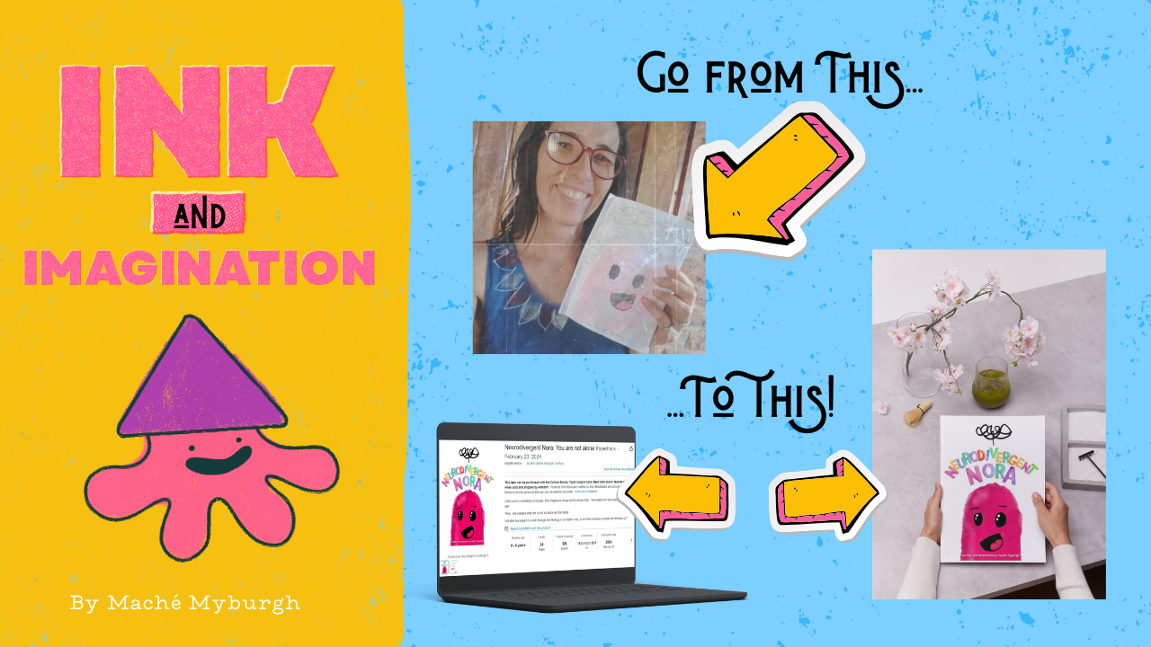
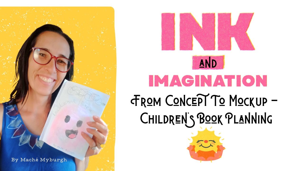
1. Intro: Hello. Hello my dear friend. I just want to welcome you to the second installment
of Ink and Imagination. I'm so excited to have
you with me and we're going to have so much
fun in this class. So what we're going
to be doing is, I hope you've watched
part one where we take your idea
to a book dummy. Now book dummy looks a little something,
something like this. It just has all of your writing
and all of your artwork. But I've already in there
so you can digitize it. Now, this part two where
we're going to take this and we're going to turn it
into a proper digital, self published book
on Amazon, KDP. So you can send your
link to your friends and family and they can
go and buy your book online and of finally going
to be a published author. So I'm so excited to have
you on this journey with me. By the way, I'm she, I am an author and artist and
a homeschool mom of four, and I am fanatical about
learning new stuff. I also have ADHD. I tend to go on rabbit
holes, down rabbit holes. And I love love, love learning new stuff. And I even love teaching
more than I love learning. So I'm excited to have you. Yeah. Go find me on
all the socials. Youtube I still call it Twitter, Facebook, Patrion, Cherburg. You can find my link
also in bio on Patrion. Go follow me so you can get
updates on future classes. And let's get into
it. Let's have fun. I cannot wait to see you in the first class.
Let's get started.
2. Supplies: Let's talk about your supplies. What are you going to need
to do this class now? Not much, really, to be honest. You need your book dummy that you made in
the first class. Mine is still the same. You're going to need
this because we're going to be working off of this. You also need some pains. I love this one.
Calligraphy pain. It just feels good When you're
going to need a notebook, I've just got a
spiral bound notebook that works perfectly
because you're going to be one of you're
going to want to take notes. You're also going to need
something to draw on. Now, either if you're
doing physical media, if you're just
scanning your stuff, then you need traditional art
supplies like watercolors, pin, whatever else you're
going to be working in. If you're going to be
working digitally, I've got my tablet, just the android
that I use paint on. And I've also got my, or this is my drawing
pad, It's a carrot. I'd love a Wc on, but
I don't have one. So this does the job and
it also comes with hoping, okay, it also comes
with the pin. Can't find the pen
you could use that, you don't need it though, it won't make that much of a difference. You
don't need a lot. Use what you have,
we work with that. See you in the next class.
3. Assess What You Have: Now that you have all
of your supplies ready, we need to talk about assessing
what you've already got. You've got your handy
dandy book dumping. Go through it and
see what you love. See what you want to keep, See what you want to get rid of. And we're going to trim it down. So it's what you want, it's what you're envisioned. You also want to assess
what feel you want for it. I do like the traditional feel, but I do not want to
do traditional media. So I do want to do digital
because there's a undo button, but I still want the
bleedy water colors. I do want to go for this
playful hand drawn, looked mob, look at
what you've got. See where you need
to trim and change. And then I'll see you in the next class where we're going to talk about digitizing.
4. Digitizing Your Art: Now we need to
start talking about the practicality of this
whole thing, right? We need to now
digitize our stuff, but before we even get
to actually drawing our things digitally or
scanning the stuff or whatever, we need to know page dimensions. When we make our
canvas page thing, we didn't draw an element that's way too big
to fit, right. That's partly why we
did our book dummy, so that we can see what
needs to fit on the page. Now you need to see how big your book is going to be that you
would know by now. After your book dummy you
need to have in mind, obviously if you're
doing a children's book, you're probably going
to do color, right? So, we need to now go to the KDP guides and I will
drop the link for you below. And while in, what
do you call it? In the Resources tab, I'll have everything in a nice
little guide for you, right? So you can
click the link. You can go, yeah, and you
put in all of your details. Let me take you to
the page and see what you'll see what I mean. So now this is our
page that we get to. You can Google KDP, book guidelines or
something like that too. You'll get to this,
but like I said, I'll drop you the link now. They've got to print
options and things. Ink and paper type, you can read through
all of this trim size. Okay, so this is what we want. Trim size specifications with a minimum and
maximum page counts. Just go the top one now. This gives us the whole thing. We can also go and
download a templates. Okay, so here we are on
the page where we're going to get the link to do our sizes. You can read
through all of this. It gives you a lot
of information about how to format your stuff, so none of it gets cut
off and so it looks good afterwards. But
we're going to go here. If you want to set up
your file yourself, try our cover calculator
and template generator. We're going to click there
because this is what we want. Now you're going to select your binding
hardcover paperback. We're going to go paper
back interior type. We want premium
color because you want your kids book
to really pop. I don't think you can
even do standard color on very short books like
we're planning paper type. I'll go white paper page, turn direction, left or right. This one always confuses
me, left or right. Yes. Measurement units,
we're going to go inches. And then interior trim size. Now this is going
to be 69 for me. You can choose something
else depending on what size you want
your final book to be. So I've got 24 pages, so I'll put that in there. Then we say calculate
dimensions. Now it's going to
tell me exactly how big this whole
thing needs to be. I'm going to keep this page open so I can refer back to it. But we can also download this. You say download template. Now, what you can do is
you can use this template inside Canva and you put it
all the way to the back. And you lock it so you
don't move it around. And then you can layer
stuff on top of it so you make sure that you
stay within the bleed lines. You make sure that you don't put important stuff over the back binding or you don't put anything where the
bar code is going to be. So you download
this and this will give you your guidelines
that we're going to use in Canva a little bit later when you are
doing one page. So if you are
drawing, for example, just one of these pages or
you're doing this page alone, then you need to see how big
the inside over here is. So what you can also do is to import this into whatever program you're
using to design, blow it up and just
draw within the lines. You are sure that you
don't cut anything off. When in doubt, roll the draw smaller so that you can
blow it up a little bit later and also work on a big canvas size so that
it doesn't pick slate. When you blow it up,
roll the scale down, Then have to scale up. All right? I hope that makes
sense on your dimensions. Draw it small, but have
a very big canvas size. Eventually you can stretch
and fit your thing, don't have 45 canvas size, and then draw too small
to have to blow it up. Okay, so now let's get on to the next laws where
we're going to start digitizing your work.
5. Scanned Art: So before I actually
show you how to digitize your traditional artwork
using Cam scanner, I want to show you my set up. So I've got some old
ice cream containers here that I've stacked up. I've got a box on top of it. I've cut a slit into the box, and I've got my phone on
top of that so that I can get a nice top down view of what's going on
underneath here. I've got some natural light
coming in from that side, and I've also got my
ring light up here. So that's the set up. Now let's get into the
actual digitizing of it first, you take your photo. Once that's done, you're
going to crop your image. It doesn't have any weird
fold marks or anything in it. Once that is done, it will open up this page where
you can select different filters and see
which one works best. I tend to go with the no
shadow one or the magic color, depending on what works
for that specific piece. Then you can also
use the slider to fine tune things a little bit like brightness and
contrast and so on. Over here I try to make
it lighter or darker, but I do end up leaving it
somewhere in the middle. The contrast, you can go way up, all way down, depending
on how bright you want your colors to be and how
realistic you want it to be. Once you're happy
with your changes, you just click the check mark and that will save your image. Now your image is
ready to be sent to yourself or to a
different device and you go to share.
At the bottom. Over there you can share PDF. Because a time scanner is normally used for
things like documents, it gives you a
bunch of options or you can say share and then send a J peg to your computer or whatever you are going
to be using Canva on. I normally choose to
do mine via e mail. Now we have taken a
photo of our picture. We have scented cam scanner and now we need to erase
the background on it. Now if you have a map count, you can use that to
erase your background, or you can go to Adobe
Background Remover. Literally, you can
Google for it. And this is where you will get, this is what you will get. You click on that and it
takes you to this page. And then you say, Upload Photo. Now I'm just going to use the photo that
I've sent to myself. You can drag and drop, there we go, I'm just going
to drag this over here. And then you say
remove background. And this works really, really well because I feel the quality on
this is way higher. And see I didn't do
that weird croppy thing over the lighter
parts of my picture, which I really like about it. And then you just say download. You have to sign up
with an account. I do have one, but I haven't logged in on this computer yet. You sign up for an account, you download your stuff, and it will download as a
really high quality image that we're going to be using in Canva a little bit later on. That is how you digitize your traditional artwork
using the phone method. If you have a
scanner, obviously, it's going to work way better. And then you can play with your brightness and contrast and a whole bunch of
other things too. But this is, I don't
have a scanner. Let's just make it work
with the phone version of how to get your
traditional art digitized. See you in the next class.
6. Art in Ibis Paint X: Firstly, we want to go into Ivs. We want to set this to
6.125 but unfortunately, we cannot add a five over here, which is okay by 9.25 because I'm doing a
six by nine inch book. We also want to
set it to 300 DPI because we want it
to be good quality. Now we're going to make this
custom canvas size and say, okay, this is going to open
it inside Ivis for us. Now my style is broke. This just shows you don't
need fancy equipment. You can just literally use your finger to draw,
which is fine. So I'm going to go to my brushes and I'm going
to select watercolor. Now you can play
around with us and see which watercolor you like most. My main issue with Iwis is
that it's not as lifelike and realistic when it comes to watercolor as Fresco
or traditional. But it's okay,
we'll work with it. Unfortunately, it doesn't bleed
as well either as fresco. But I want to show
you how all of them look and we will play
around with it and see. So I want this color. I'm going to try and go
a little bit more pink and I want to have it a
little bit more over there. I want to get as close
to this as possible. This is close, Yes, I like it. We want to go bigger
on our brush shies. Now, you will find with Ibis, when you go really big
on your brush eyes, it does tend to lag. I'm not crazy about
it, and as I said, it doesn't bleed as well
as fresco or traditional, but we'll see how it turns out. Let's give it out best. There is a water
color I've selected, I have selected
watercolor bleed. There is also a water
color water brush, which pretty much just
blends everything. I'm trying to look
under my custom. If you go to basic, you
can find something Yeah. That you like and
you can add it to your custom brushes so
you can find it faster. Let's quickly go to
the water colors. There's a whole bunch of water color options that you
can play around with. But this is the water
color water brush. This one just blends things. This is just like adding water
to your traditional art. Sea Heart makes
everything bleed nicely. It also tends to lift
the stuff lower, so it does make it lighter. If you want to add more color on top of this
and you want to blend it, you're going to have
to add a separate, another layer to be
able to work on that. I'm just going to go
back to this layer. Okay, I like those you will find sometimes depending
on which brush you use. So let's go back to basic. I'm working watercolor and ink. If I'm going to select an
ink brush from over here, let's just find a
nice ink brush. Let's say we want to do, let's have a look. Genius, pain, This
is not what I want. The dip pens I do like, but I'm looking
for the Japanese. Okay, here's an ink pin, a rough layout pin blurring. Okay, let's go in. No, because this is one that I do not like. What we could also do
is just search for the ink pen and this is the
one that I like to use. Now, I'm going to
go black on those. But now you will see
that it looks a little different depending on which
layer you're working on. If we're working
on the top layer, it's not going to potentially bleed, which is what we want. I'm going to turn the intensity
higher because I want this to be high intensity and this is looking really good. Now we can add, this is too big. Let's add our little mouth. I like the fact that this ink
brush is a little bit more, it has a little bit more of
a traditional feel to it, which I can really appreciate. Now if you want to just
fill this quickly, what you can do is
turn off this layer, go back to this layer,
to your select tool. What we can do is go to magic
one select and select that. Now just the inside of
the mouth is selected. If you check over on
the selection layer, you can see only the inside
of the mouth is selected. We can go back over and we can drop in bucket drop
just black in here. But then you will find,
you have to go back to the selection tool
and say deselect. Now you'll see sometimes
it doesn't blend properly. So you have to go back in with
your inking brush and you have to go over the lines again after you've
de, selected it, just to make sure
that it doesn't do this weird line thing over here that shows
you that it's f, it doesn't look
traditional at all. Just go over that so
it looks more natural. Okay, that's looking
pretty curd. I like that that's my little mouth and then
I just want my eyes. Then I'm going to
turn this layer back on so I can
see what I'm doing. I like how the little
tongue is speaking through the same
color as little a. Then I'm going to add my eyes. Now you can, what you can do is to duplicate the
things that you are making. I prefer not to. If you
do want to duplicate it, you can go to the Select
to make sure that you're on the right layer
on this inking layer. Then you can, up top you
can go copy and paste. Now it puts it right
over the previous one. You can say y, but also note that it puts it
on a new layer De select. And then you can
go to this layer, which is where it
put my new now. And you can flip it, and you can move it if you would
like to do that. Now, You can make it smaller, bigger, you can play around
with it a little bit. Let's make Nora look
a little funky, like that. I'm like that. Okay? Then we say, yes. Then what I'm going to
do, I make sure that I've got all of my
ink on one layer. I can press down that layer
so everything's on one layer. So I've got a watercolor
layer and an inking layer. Then I just want to add one
more layer, full highlights. I'm going to go
back to my brushes. I want to stay on
my Japanese inks. I'm going to leave this, then
I'm going to go to white. So I can add just a
few little highlights. Just a little bit of light
reflection in the eyes. Okay, like this. You can again, select
things and move them around because we're
on a different layer, it's not going to
select the blade. Then we can move that down a
little bit and even make it bigger so that it fits with
what I've done on the left. And then you just
have to select yes every time the green
check mark to make sure that everything
saves de select that before you go and move
or select other things. Now the difference between
the magic wand and the lasso select is with this you can select
specific parts, whereas with the lasso, whereas with the magic wand, it selects a block
of area at a time. Some like this. Now, when I want to go and export little Na that I've
made inside Ivas, I go to the little
arrow at the bottom. So I select there,
she looks great. And then you can say save us PNG or save us
transparent PNG. Now I would say save this
as a transparent PNG. Then we can use this inside
cab without a background. You can also fiddle around
with a background just to see how much of it
would come through. How transparent is
your water color? See there we can see it's
a little bit transparent. Now, again, if you say
export is transparent, PNG, it will not export
the background, I tend to just
leave it on white. Okay. And that is how
we do this in Ibis. I'll see you in the next class where we're going to
go through Fresco.
7. Art in Fresco: Now what we want
to do again is go into Fresco and then
say custom size again, and we want to make
this the correct size. I'm going to be doing
a 69 inch book, so I need to go over year, instead of pixels,
we want to go 2 ". And then width, I need to be at 6.125 And my height I need to be at 9.25
Now these things, again are very specific. You can't just go six on nine because you need to
factor bleed in two. Then we're going to
again go over the year. Let's see if we can
make it like that. And then background white,
transparent in state. And then of the side
you can select. I am going to name this Nora. Let's name it Nora Cover, because we are going to be doing more Nora's
because I just like Fresco Morris and I'm
going to be doing all of my illustrations
inside Fresco. Then we say it's going to
create a new document for us. Now we're inside Fresco. Now on top you've got
your pixel brushes, and then just below them
you've got your live brushes. Now what I really love
about the live brushes is the fact that they work very much like the traditional media. If you're busy working
with watercolor, you can click on the
little arrow and you can select which thing you want. There's oil and
there's water color. Now, I like the watercolor
wash because the soft one, because this blends
very nicely for me. And then you can build
up your colors like you were traditionally water color. I want to go back to
in the same color, I want like a reddish pink. So I think this one works well. You can also adjust your flow, which is going to be pretty
much your intensity of it. And then you can also adjust
this, your water flow. Now, I like to
have mine on most. And you can adjust
your size too. We can go big on those.
Let's just start drawing. I'm using my pen again. You can use your mouse, and
we're just going to draw. I think I can go definitely
bigger on my brush size. Another thing that I like about Fresco versus Ibis is that I feel this blends in a
way more lifelike way. You have an undue button, which obviously you do not
have with traditional art. That is, in my opinion,
definitely a plus. I'm just trying
to get my outline of little nora over here. You'll also find that in fresco you tend to have less lag, even when you go really big on your canvas size and
on your brush size. Whereas in Ibis you tend to
have quite a bit of lag, especially when you go very
large on your brush sizes. Another thing that I
like about fresco is you can dry your paint
in between layers, like you would traditionally
wait for your paint to dry. You can dry your
paint inside Fresco. Now, bottom right over here, you can go and select dry layer. Now when we paint
over it, again, it's almost as if we left our
traditional paint to dry. See it doesn't bleed like
weight and weight over here, which is quite lovely. There we go, I like
the intensity on this. This is a pretty color. Now, we can again go another
layer on top of this. But if you want to
limit your layers, you can literally
just dry your layer. I'm going to use this
as my inking layer. And then over here I'm going
to go to pixel brushes. Over here I'm going to select, there's a whole bunch of things
that you can choose from, but I'm going to go
to ink over here, I'm going to go, I like a gritty ink. So let's go on this and
see how this looks. Wait, we need to first control
to learn your shortcuts. I'm going to go on black. And then we want to
see how this looks. Okay. That actually
looks really good. I like the grittiness of it. Okay, So let's undo that. Let's make this bigger. And then we're going to
draw in little Nora's eyes. If you want to pan with this, you just hold spice bore, and you can drag and pan. Okay, let's finish
up her eyes quickly. Remember, if you want your things to look a little
bit more traditional, don't worry too much
about perfection. Okay. I do need to do oh, I love the Undo button. All right. Nope, that's
not what I want. I'm going to go a little bit smaller on my brush
slides again because I do want the tongue to be
the same color as that. Then we can go bigger again. I don't really use
lelect anything in here, but if we want to
turn this layer of, let's turn this one off. Then we can go and select, now over years your
lasso selection, we can lasso this or we
can go magic one select. Now I'm going to just
magic one select this. We need to see it's
selecting everything though, because we're on
the wrong layer. That's why deselect it. Go back to the correct layer and then we're
going to magic one. Oh, I like this. All right. Go back to our brush now. Wrong brush control Z, and then go back to
that, the inking brush. Let's go bigger on it
again because I do want some of that graininess
peaking through to. That's great. Just see, I'm not sure if
it's going to have some graininess peaking
through de selected. When you zoom in, let's
just pan and zoom. You see it's still got that little bit of a line over here. Same thing that happened
in Ibis that we can just get rid of by brushing over it. Make sure that your
selection tool is not selected anymore. And then we just quickly
go over that line. I do want this stuff yeah, right by the tongue to kind
of peek through still, because I think that
adds a little bit of whimsy to it, you know. Okay, we can switch
this back on and then just see how this looks
when we've got it like this. Ooh Norah is looking glorious. Now I'm going to, on
my very top layer, still with the inking brush, just go with white so we can
add a few little highlights. This is a little bit, it'll work size wise. I think it'll work. All right. Let's go and add a little bit
of highlights over there. Absolutely lovely. Okay, so play around in a few of the programs and see
which one works for you. See which one you
feel based about. See which one really works with the field
that you're going for, for your artwork and
have fun with it. Play around. There's
so much to explore, there's so much to do,
there's so much to learn. And I personally love
learning new programs. In the next video, we'll
do a quick side by side comparison of
all of our artworks, how they all turned out. And then we'll carry on
doing the rest of our book.
8. Canva & KDP Part 1: Ok jokes. We are currently
in our Canva dock. I use the dimensions
that I got from the website that I've linked in the document that we
get with the Plas. I have taken all of
my assets that I've uploaded and I've simply
put them into my documents. See, all of them are movable. Well, I've locked this one, now you can unlock it. And then you can move it around. Lock, there we go. Okay. So, now I can
move this around. All of these are actually
assets that I got from inside Canva because I do think this works better than just
having static text. And I've got my little
picture that I chose. And I've done that
with every page. I've included all of my pages. So this is going to be because the book type that I'm going to be printing
doesn't have a hard cover, so I just need one end page. So this is going to be, as you
open the book on the left, it's going to be at
the back of this page. It's going to be clean because
they don't add anything. My printers don't
add anything to it and KDP also doesn't. If you're doing a
soft cover book, this is going to be the
first page on the right. This is going to be
the back of this page. This is going to be
page on the right. Again, this is going
to be on the left, on the right, on the left, on the right, on the left, on the right and left,
right, left, right, left, right, left, right
and again left, right. You see how to cut this one. So it works, left, right. And then we have
again, left, right, left, right, blank page. And then it's going
to be the back cover. The back page comes
in over here. This is also, I use
the dimensions from that document that I downloaded so that I know that
the size is correct. On this to the right
here, I've got my cover. I literally took this
cover and I just, I downloaded it as a PNG. So it's one picture that
I can move around and I've got my little blurb at the back year
along with a photo, so you can have a bit of a sum, a little bit of an
extended summary. And then about you and I've got a little
picture of myself. And I'm keeping
this open because KP is going to add your
bar code over here, so you don't want to go too low down on the back of your cover. So just keep all
of those in mind. This, I save it as
transparent PNG in case I wanted to do anything
with this color, in case I wanted to change
this color on the background. But I do want to keep it white because I like it that way. Also figure out what
your workflow is. What you do best if you want
to do all text at once. If you want to do text per page and your picture per page. Or if you want to
do all the pictures first and then the text or just find something that
works for you that's going to simplify your
life a little bit. So now first we want to go to KDP, Kindle, Dark Publishing. You want to go log
in and you want to go to your bookshelf,
which is over here. So go to Bookshelf over here. You're going to click on Create. Now, just save a
little bit of time. I've already clicked
Create online, and I've started
filling in something. Over here, you'll see
neurodivergent Nora and I am going to say
continue, set up. But I will show you
from the beginning what I've done with this. So, firstly, you select your
language, your book title. I've added the subtitle. You do not have to this is optional series if you're
doing neurodivergent Nora 123. If you have a series, then
you add series details. Yeah, this is not going to
be a series addition number. If this is the second time
you're publishing your book, you will say this is
addition two author you put yourself in
over year contributors. If somebody else
did the artwork, you put their names
in over year. You have a little
description over here, I've pretty much duplicated
what I've got on the back of my cover. Then publishing rights. If you own the rights, your
work, then you say yes, Primary audience,
Is it explicit, minus no reading level? Reading age, I'm
saying from babies can read it because moms can
read it aloud to their kids. And Mac's age says
around eight because then it becomes a little
bit babyish for older kids. Primary marketplace, I like to keep this as Amazon.com and then categories over year and hunt through the categories. I went, books, children's books. And then I went growing up, fact in life, friendship, social skills, because I do think this falls
in there nicely. And then I've also gone literature and
fiction in general. You can go more in
depth on this in where your book is more likely to
turn into a base seller, but that's stuff I
know nothing about. So I'm not going to try
and coach you on it then. If you have a low content book, for example a journal,
you take this. But if you're doing a
storybook like we are doing, then you do not take this. And it's also not a
large print book. This is mostly for older people that need a bigger size print. Then over here you
add in keywords. Now these are things that people are likely to search for. I've got ADHD, near
diverse emotions, life skills, most understood, coping, and then
publication date. You can. Take this. If your book has been previously published and
you're republishing it, mine is publication date and
release date of the same. When I hit Publish, then it's going to show that as
my publishing date. You can say you can schedule release or you can release
it as soon as you upload it. I like to just leave it on, make it full sale as
soon as I upload. And then you click
Save. There we go. And then we're on
to our next part. I always get a free
KDP IB because I do not have my own ISBN. You say there, yes, assign me an IB. This is just the code that's going to go on the
back of your book. Okay, got my ISBN. Good stuff. Print options, you want to go? Not
black and white. I want to go premium color with white paper because see the color difference
for children's books. For storybooks, go
with the good stuff. Do not try and keep your price low by
going for bad print. Keep it like this. My book
is going to be six by nine. You can select a different
size if you want to bleed. Settings bleed or no bleed. If it bleeds, it
goes off the page. No bleed, it's going to
put a white border around it then paper back cover finish. I like Matt. You could go gloss. I like Matt. And then a manuscript, so this is where
we're going to go back to Canva because
this tells us, upload your manuscript,
make sure the file matches the trim size and
bleed settings accepted files. A PDF or some other
things. We want PDF. So now we're going to go back
to Neurodivergent Laura. We are going to go share, we are going to
download her as a PDF. Pdf. Print is what you want. You can say flatten,
I always do. It just means that it flattens all of your assets like this. It's not going to
show layers on it, it's just going to flatten
everything to the page. I don't want to
include crop marks and I don't want
to include notes. This is perfect
color profile? Yes. Okay. Now, this is downloading. As soon as this is ready, we're going to pop it right ear. They just cut this whole
down Doading thing out on bro, are you downloading? Are you almost a still
talking bananas? I got cut back in 321. So now I've got my
neurodivergent. Okay. Cut back game 321. Now we're going to click
on Upload Manuscript, and you're going to select
your PDF that you would like to upload Carter again, we're going to cut
back runs to upload. Cut back in 321. There we go. Our manuscript
has been uploaded, now you see it saying, processing your file, this
normally takes a little while. Just leave it to do its thing. Let's move on to the
book cover over here. You can say, launch book
book cover creator. I never do this
because I don't know. It just looks a little
bit more low quality. And we went through
all the effort of designing our own
book cover, right? So why not use upload a cover? You already have print
ready, PDF only. We need a print F.
Now let's go back to our cover that we've gotten in the correct
dimensions and we say share. We say download. We click again, PDF print, and we say flatten. And then we download this. Our cover has been downloaded. Now we say, upload
your cover file, and we go to Nora Cover, and we pop that in there.
9. Canva & KDP Part 2: Now you'll see it
also says you cover uploaded successfully
processing your file. Again, this takes
a little while, this one is still processing. Does your cover
include a barcode? If left unchecked, we'll
add a barcode for you. We do not have a barcode on yet. We want them to add a barcode,
so you do not check this. Did you use AI to make
your things If you did use an AI program to make your
art or to write your book, which I do not recommend, do your own staff peeps. Then you say yes,
I'm going to say no. And then preview. Then we click over here to preview what's
happening over here. Now you'll see it says
preparing your files. It's pretty much
taking everything that we've uploaded to turn it into a bit of a flip through
example of what it's going to look like
once it's ready for sale. We want to double check that everything over here is fitting, that it's all within the
bleed lines and that it's looking good now. It's busy saving. It should open momentarily
and there we go. You see this red line. This red line tells me that
this is the edge of it. Now I see that my needs
to move in a little bit. My T is outside the
lines and I also need to squidge and move
this down a little bit. It says you're on
the left error. If your book has errors, it won't meet the
quality standards. This image is
outside the margins. There's a wait. Let's go back to
the first patch. Let's look through
this whole thing. And then we need to go see
what we need to move this. I'm firstly going to go
back and we saw that this is a little bit outside the lines
which we do not want. I think instead of
just moving it, I'm going to make it
slightly smaller. What I can actually do
is just to do this, this might solve our problem. Let's just make it a
tiny but smaller then. That should work quite nicely. I'm going to re download
this and then we have this ready to go print download. In the meantime, while
that's downloading, we are going to go
through the rest of the book over here. We definitely have some issues. This is I just realized
something that I did. I was not supposed to
download this first page. That is something that I need to fix and remember to do
my redownload this. Okay. So my page numbering
system is out of whack now, but this is how
you troubleshoot. Okay. This one tells me that
it's outside the margins, which we can tell it no bleed. And then that should fix it. These pages All right. These pages are no outside of
the bleed, so that's okay. This is okay. We just need
to make sure that none of our important words and things
get cut off. All right. This again, we're
going to have to take a different setting on
because all of these are supposed to bleed off
the page. All right? Okay, the rest of it
looks pretty good. Then we go back to
exit print previewer. We do need to adjust something and then
I just need to get my new cover and
download this other one without the
cover page included. This is still good. Still good. We say bleed because I do want my stuff to bleed off the
page. I take the wrong one. Previously over year, we want to upload our
new cover file. This is this one
and then this one. We need to download again, but I'm going to download
it from page two. So I'm going to say page two. Print PDF, flatten, okay. We want everything except page one and we say
done and download. Now, it's going to not download
the first page for us, which is what we want now. It's busy processing our new
cover that we've uploaded. And I'm also going to upload my new manuscript as soon
as it's done downloading. Now I'm going to upload
my new manuscript. There we go. This is the one without the cover page included. And we're going to go
and do a quick check on it again and make sure that
everything display is fine, this time with us also
changing the bleed settings. So now we've got
our new manuscript and our new cover uploaded and we are going to go take over. Yes, my changes are accurate, my answers are still
accurate and we're going to launch our
previewer again. Now you see that this
is clear quality check. Once it's submitted, what? This looks so good, this isn't getting
cut off Our cover. Our new cover looks really good. Let's just check the rest of our inside of our book quickly, But we didn't get any errors, which is exactly what we want. These pages are displaying
beautifully. There we go. You see, it's not giving
us the error anymore with these things slightly
going out of the lines, which is fine because there's
no important information. It's okay if some pieces
get bound close there. I should have moved, when I was drawing
this, I should have moved this a little bit. I've made this blob a little bit fatter, but
we didn't do that. And I'm not going
back to redraw. I'm happy with that the
way it is right now. And that is the end of our book. And then this is going
to be our back page is going to go onto
the end there. Then we say proof. It takes a little while and then we are
back on this page. We've gotten our ISBN. We've selected our paper. Our size bleed is
what I selected. Matt. We've got our
manuscript uploaded. We've got our cover file. It's not generated. We've checked the previewer, and now we are over here
where we can choose how much we're going to
sell our book for. This is the fun part. You can go and read all of this. I, okay. This gives you all of
the price breakdowns per area and we say
save and continue. Now we're going to
set our price and we're going to publish our book. It's really as simple
as that over here. We say territories, I'm going to keep it on
all territories. You can, again, read the pros and cons of
everything over here, but this is just
the way I do it. And then Primary Marketplace, Amazon.com Now we're
going to set our price. Now they said that it costs about approximately $4
to print this book. We can only make a minimum
price of $6 max of 250. Don't go that high.
Let's make our book $10 This is going to
tell you at a 60% rate, This is going to be your
royalties on the book. This is going to be expanded
distribution some moment. This is where it goes
to Universities, booksellers, and so on. We can select that. Why not? Okay. But I do want the 60% rate coming
from the other places. Then we decided it takes
up to 72 hours to approve. I get on approval e mail
quite quickly actually, after publishing, usually
recurse the proof book. When you click over,
you're going to cancel. Yeah, let's continue. Let's see how much a proof
book is going to cost us. Your proof book
normally says authors copy across the front and you get them or a better price. You see the total cost excluding shipping in taxes
is $3.60 So pretty much you get your own proofs at cost price instead of
paying more for it. I'm going to go back because I'm not going to be
shipping my proof right now. And we are back over here, we say publish your
paperback book. Now the cool thing about
this is you can literally take all of the information that's in your paperback book, and you can use that
for a Kindle book too. Now if you have hyperlinks, if you have things
that pop up and so on, then you need to go and install the Kindle Kids Creator,
what do you call it? It's like an app thing that
you get on your computer. You can make everything pop
the way that you want it. I don't have any poppy elements, so I think this is fine, so successful. There we go. And then when you go
back to your bookshelf, you will see that
your new book that you've just uploaded
is over here, So it says your
paperback in review. This means that they will send me an e mail once it's ready. And we have an option over
here to create a hard cover, but you need a lot of pages to be able to make
it a hard cover. And we can also create
a Kendall ebook. It's going to use most of the
information from over here, but you need an additional
Kendall book creator up on your computer to turn
what you just did into the format that they
want for the Kendall book. You can do that
at a later stage, but for now, your
paperback is published. Congratulations, good
job and well done. I'll see you in the final class, so we can talk about
what comes after this.
10. Final Thoughts: And my friends. That is it. I'm so incredibly proud
of you. Well done. You have taken your
book dummy from the first class to a fully
totally published book. I'm so proud of you. Now you just need to order
your own copy. Share it with all your friends. Give it to birthday gifts to
all the kids in your family. And get the word out
there that you are now a properly published
author. So well done. I hope to see you in some
of my future classes. I'm going to be doing
a lot more animation, drawing, that type of thing. And also definitely book related things, writing
related things. So make sure to follow
me over here on skill share and go follow
me on all the socials. I'm on Patriot, I'm on
Facebook, I'm on Instagram, I'm on X everywhere
on the socials. Youtube included. I am he Iburg. And yeah. Good job. I'm proud of. You see
you in the next class.
 Maché Myburgh, Artist, Writer and Creative Weirdo