Transcripts
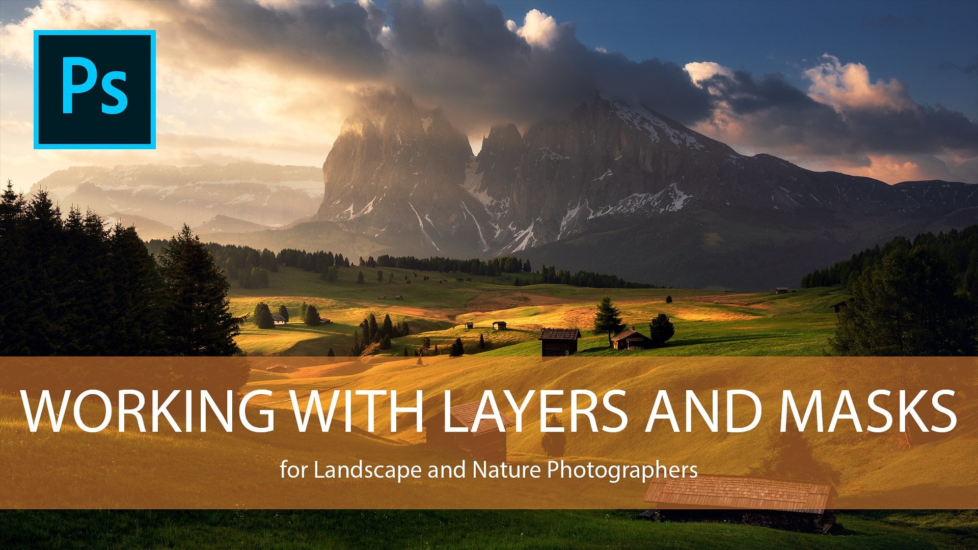
1. Intro - Advanced Color Adjustments: Hello, everybody. Welcome to my already third sculpture class, where I will teach you everything you need to know about color. Have you ever wondered why some images on the Web look better than others? Or let's say colors are simply more pleasant to look at. Then don't worry. I will show you how to do it. We will work on three different images. I will guide you through step by step, show you all the techniques I like to use, which I have in my own toolbox to work with every single color check. I think it's always really helpful to see how the same techniques work on different images because every single voter's different and also every single colors different, whether it's a burning sunset or sunrise. Bossem colorful autumn leaves or just a simple blew our short I tell you, every single scene needs its own color. Just my name is Daniel Flash, aka and I'm a professional photographer for over six years now, and at the same time I've been a photo shop teacher for almost my entire career. I wish I had a tutorial actus in the past, because I struggled a lot of colors I think it's such a complicated topic. You can do so many things wrong, but also a lot of things right. And that's what you will learn here. So who is this class for? I would say it's for the intermediate to advanced landscape or nature photographer who wants to bump his own images finally, to the whole level. So I wish a lot of fun. Guys, I hope you will enjoy watching this class free. Free to shoot me any questions you have. And I'm really curious what you can do with my techniques on your own images. So don't hesitate. Post them in the project section here on skill share. And I'm always there to critique but just give you a thumbs up. So, like a set, guys, have fun and see you later Bye.
2. Basics of Color Management: Hey, guys, welcome to the first chapter off my once color management or color adjustment class. Um, so he and the first chapter we will first of all talk about how important it is to pick the right color space. So even if it's advanced, but it's an advanced tutorial, I think it's still important to talk about it a little bit. And I will also introduce you real quick to my adjustments. I like to use the most. They're not too many, but I will show you what I like to do. And then we will work on three example images. And I think it's important to show you the techniques on different files because, yeah, every single photos different, like, say, a lot of times. But it's true. And, yeah, not every single technique is to ride for yeah, every image. So I guess it's cool to see what you can actually do on different files. Okay, so yeah, enough talking. Let's get started here. Um, all right. So first of all, um, yeah, this is one off the example Images, but we won't talk about it right now. I will first of all, show you the three main color spaces, which I think are the most important, but I actually use only two, but yeah, I would still show you. And to find that out, we will go to edit, convert to profile. All right. And my basic setting is S RGB. It's not because I think as RGB is the best color space, it's actually the Let's go burst. I mean, it's the the smallest, but it's the best forward output since almost every single website uses s RGB there only a few which support Adobe RGB, which we'll talk in a second about. And so when you want your viewers on the on line to see the image is close to what you see on your computer, then it's important, I think, to use S RGB. So that's the reason why I do it. Um, you can also use it for printing because there are certain laps, laps which only support as RGB, the smallest color space, and it's actually a fine color space. It's it's okay, but when you want to get, like, really, really detailed about your colors and you want to see every single fine etch and transition , then consuming in like 200%. And this can be, let's say, can be a case when you are printing like huge files, huge images, um, with really different and complicated colors like a burning sunset, for example. Then you can see a difference, of course. But like I said for Web output, I like to use as are to be. And that's the reason, by a habit, as my default from in my whole process from start to finish. Only when I have the attention to print something, then I like to use like a said another kind of space, so we will look a bit further into it. Um, so, like I said, S RGB is the default. And then there are two other actually a lot of color themes and so on. But yeah, the most important are here. And they are like I said, s rgb and then adobe RGB and pro for Laci be and I like to use adobe rgb for printing Pro photo RGB is like the biggest color space you can pick. It's huge. I can tell you their rights numbers how huge it actually is. But it's really big on a I think that is that even the monitor out which shows which can represent I don't probe a photo out to be. I don't think so. No. So, Well, there are a lot off. Um, let's say this place out, which show 100% of that we are to be already, which is awesome because it's also a really huge color space, which represents, which shows a lot off color, fine color transitions. But PRA photo, like I said, is even bigger. And you can actually you can imagine Ah, a let's say hr have been How do you say it in English? Something you can where you can put something inside and like s RGB is like a really small bidden when when you through color into it, it gets full really quick. Uh, no, we ought to be is a bit bigger, the more colors which fit in. And then there's pro Ford RGB, which is like, huge there. You can put a lot of colors inside there, and it's you actually see even better. What? I mean when you look at the history am So let's check here. Um, so at the top, right? You see the history Graham It basically represents all the tonal values in this image here . But since colors also have tonal values, since there are dark colors and also bright colors like blue is a dark color and red or it's a yellow is a bright color. Let's say a brighter color. Um, when I pick Adobe ought to be and take Okay, then you see the history Graham changes. It's not as contrast anymore because there are more blue tones fitting inside. Okay, lets go back. You see, it's not as contrast anymore. They're more colors which fit in, and we can do this even further. We can also pick pro photo on TV, and then there's even less contrast. E. As you can see, it's not peeking as much anymore. Here in the mid tones. You see, there's a different behavior in color. Space is also you see that Adobe RGB handled stock tones a bit better, and pro photo handles the mid tones of it better. But you see that there's a huge difference compared to s rgb. And let's say first of all, I have to go back to commit to profile sa to be again perfect. You can off course. Process your images in, Let's say adobe RGB or pro photo RGB from the beginning to the end. This will give you really fine transitions in your image. You will have awesome colors, especially red and magenta czar. Quite complicated. Um, with nice. Yeah, looking warm tones. But at the end, when you converted for the VIP two s RGB, you've suddenly shrinking. You been down to, like a really small one and then all the colors which were let's say there were there was barely enough space and you're been for the colors in pro photo because you had so many colors and when you then shrink it down to S R to be everything is splashing out and then you will see like blown out red tones and blown out agendas. And it doesn't look good. It doesn't happen with blue colors and red green colors that much. But like a said, especially riff red and magenta is and yellows, so you can get a really ugly surprised after you Yeah, changed the color space from Pro photo s RGB. So, like I said, if you intend to add edit only for the web use s rgb from the beginning to there to the end . In my opinion, when you have the intention to print, then use Adobe RGB or even pro photo are chubby, because when you convert from pro photo to Adobe RGB at the end, you don't see depth much off a different since your computer. Let's say you're display doesn't show pro photo colors anyway. Or let's say not that much. So yeah, I think it's understandable, Right? So here in my class, we will work with s RGB. We, of course, have to watch out for colors more in this yeah, color space. But it will be nicer to look at for a weapon for it. So that's it for the color space. And in the next chapter, I will show you real quick what selections are not selections. What adjustments? I like to use the most to work of color. I will show you the Yeah, the function. And then we will stop processing. Finally. All right, so see you next chapter
3. My favourite Color Adjustments: all right, So welcome to the second chapter here. We will talk about the techniques I like to use as I mentioned before, so let's just jump right into it. Um, so let's get started with this image here again, I won't go into the editing process to Deep. I will simply show you first of all, all the adjustments I like to use. So since it's an advanced tutorial or intermediate whatever you want to call it, I won't explain all the functions off the different. Well, let's say why adjustment layers are adjustment layers and pixel based players are pixel baseball players. That's something I explain really detailed in my other skills. Share class you, which you will find online. They you will learn everything you need to know about that. Okay, So, back to this one, um, so they're actually to now the actually two different ways you can work with color. First of all, you can yeah, use color adjustments, as they say, but you can also work color when you use contrast adjustments because when you talk and let's see the highlights, Photoshopped works this way that you're also enhancing, or let's say, saturating the colors in the highlights, and it's the same with the shadows. So when you talk in the shadows, you also saturating the air, the darker colors, and when you're brighten the shadows, you're also a little bit de saturating the darker colors, but it works stronger of highlights and metals. So that's something we have to keep in mind. And there are different, different different blend modes, which you can use toe overcome this effect. So let's say, for example, well, we're not working with contrast in this imaged in this tutorial too much. But let's say you want to only add contrast, no color. Then you can, uh, pick on, Let's say, yeah, use a curves adjustment here. Then you can pick the luminosity blend mode, and that means you're only adjusting the luminosity. And when you keep it on normal, then you're actually doing everything so color and a little bit cool off color and mostly contrast, and that you can do the same of color adjustments. So let's delete this. I know what they needed. Um, when we use a hue saturation adjustment and when you bumped the color up way too strong now , then you see also enhancing the contrast because blue is a dark color and red is a brighter color so that both getting pushed. You can also see that when you look at the history graham up here. When I reduced the color, I'm flattening the contrast because it's moving away from the left side from the doctor side. And when I bump it up in a yeah, increase the contrast. And to overcome this, I can also use the blend mode color. And then I'm only adjusting the color as you can see. And when I used normal, then adjust the contrast as well. So that's something to bear in mind to keep in mind. And that's the reason why I also like to use some ah contrast adjustments to work of color . Okay, so I already showed you. I like to use curves because when a doctor in the highlights, I also enhance the color a bit. So that's what I like to use one of my favorite things to use our color balanced layers because there you can work separately in the mid tones, the shadows and highlights and you all. You already see all the conch complementary colors so read to CNN Green to magenta blue to yellow. And when you have, let's say, in an image which has a lot of red and scion in it, then it's a nice, pleasing looking image. Because there are complementary colors can be complicated. To have, like a lot of reds and greens that's not so fitting and so on, like green and blue is also can be tricky. So it's always nice to know that complementary colors. So when there are the opposite of each other, they're looking fine. It would also looks finest when you have, like two combinations off complementary colors like Let's say you have a lot of red since I n and yellows and blues looks also nice, but it doesn't look too nice when you have only this side in your image or only decide in your image. Yes, so they're not fitting toe well, but that's just the general rule from thumb. It can, of course, always it always depends on the image itself. Let's say when you have, like a really cool looking landscape and you have crazy colors and and it can still look nice, But yet that's just talking. In general in this case, you see, we have a lot off scions and Ritz, and what does it do? I think it looks really nice and it's OK. When like that, say the science drift a little bit into the blues and the reds drift a little bit into their Let's say, yellows because it's a mixture is always good. It's just not, let's say it's just not good to have, like pure blue and pure green, a pure blue and pure ads or something. It's like a Yeah, it's always like this. It's the same, like with tonal values. You don't have only highlights and shadows. You also have mid tones, and it's the same colors. You always have something in between, all right, So, like I said, I like to use this one. What I also like to use is hue saturation, because there I can yeah, at saturation and econ also decrease it. But at the same time, I can also broke with the different colored channels itself so I can work with red. I can only increase, read or decrease it on so on. Yeah, and I can also broke with the hue off the different colors so that the appearance, let's say I can make a little bit more yellow or a little bit more, even more red or magenta, which looks bad in this case, and I can do this with every single color tone. So that's also what I like to use. And, yeah, but I also really like is selective color. That's actually actually a quite advanced ah adjustment layer course. There you can work with the different colored tones again, but you can add colors in the color tone. So that means when I have, say, an you see, you have the color tones again. So that's say, when I add Scion and the science. Yeah, I, of course, enhanced them and, yeah, increase them. But at the same time, I can Ah, I can also decrease i n. That means, yeah, I'm adding red. So the opposite and so on. So the opposite of magenta screen I can add green to the Cy ends, or I can add magenta to a science or eso on. I can make them more yellow, more blue. Yeah, and when I work with black than that means I'm talking them or I'm brightening them. That's what I can do with every single color and that it's one a really powerful adjustment . I can also work with white neutrals and blacks. That's basically highlights mid tones and shadows. Also something really nice to use. Okay, one more thing or two more things. What I like to use is a color channel. We won't talk too much about channels this ah class. There will be another one in the future about the Minahasa team asking, but he I will show you what I like to do for color adjustments. It's Ah, I can click on the different channels up here, and they represent the tonal values based on the color. So that means when I click on the Red Channel, I see all the tonal values which our, um, which include red or have the opposite of red, in this case, scion and red and same with the greens. It picks a bit of the mage enters and a lot of the green tones all. It's a greenish tones and, you know, Red says, you can see, since that's not a complementary color and same with the blues. I have a lot of blues and yeah, there are no yellows, actually, but let so on. And let's say I want to work only with the the Waves. Here I can pick the blue tones. So when I control click on it, I have a selection. There it is. And now I can, um, click on color balance. When I know at Blue, I'm only mostly affecting the rapes and the sky. Because usually when I add blue to the mid tones, I also added to the mountain here, since they're also mid tones inside there. Okay, so that's what I also like to use. And one more thing is actually a, uh, plug in what's called the new collection. You have it by D x O mark right now, I think, but I still have to guru version, but there shouldn't be too much of a difference. I like to use contrast color range. When I click on that, it opens the filter, and it's based on a pixel based layer. Takes a while, all right, And the powerful thing here is first of all, we have to decrease the contrast and at 1% off brightness. So there there's a little buck inside there. Sometimes it doesn't work properly. Maybe it works are now. Indeed, so the d extroversion since they upgraded it. But in the old Google version, you have to add 1% of brightness. So the whole filters actually working properly down the wife. Okay, and now when I pick up here, this slider I can work with the contrast in the different tone in a color ranges. As you can see, it changes a lot, and that's one of my favorite filters I like to use in the new collection. For example, when I want to work with the contrast in the Reds, you can see I can go something around that's a 100 and then there really shining. And when I don't like it in the other images and the other part of the image, I can click on OK and at a black mask to it. And now I can simply pick a Grady int with a white color on let's say, 77% capacity and drag it over there, and now I have it only in the upper part, as you see really cool. So that's also what I like to use. So to sum it up I like to use contrast adjustments to enhance the color. I like to use color, balance, use hue, saturation, selective color, the color channels and some filters in any collection. All right, so yeah, this chapter was actually just to show you real quick. Like I said, what I like to use. And now we will finally get started with editing some off the images. So you see how different color adjustments apply to certain photos. All right, see you there.
4. Editing sample Image No. 1: All right, So now let's get finally started off the editing. Let's just jump right into it. Uh, have to watch out that I don't hit this microphone too often. I'm sorry when I did before, Um all right, So, like I said, no, we'll get started. This is the first image, and I have two more in the other chapters, so we won't edit it, like from the beginning to the to the end, since this is only only about colors, So I will show you how our enhanced colors in this shot. Good. So what do I like to you? What did what do I like to do? First of all, we will enhance the reds, and we will, um you're talking the waves by editing the scion color inside there. And I also want to do more drama to the clouds by adding color there. And then we actually find Okay, So a good starting point in this case, First of all, we will press control J and we will convert it to a smart object. Takes a while, and we will call it contrast color range. Yeah. Now we go to filter the collection. Color affects pro cause. There you find the contrast color range filter. As I mentioned in the other chapter, that's what we will do here. So, first of all, yeah, I think it's still the same. Like we didn't the example before, so that's fine. Okay, so I want to enhance enhance the Reds in the mountain, and it looks already really cool. So he was something around 103 degrees. I always pick. Let always leave night, 69% in the color contrast as a default. That's fine for me. And the arrest is brightness. One contrast. Zero. All right, and now it's press OK, takes a second. There it is. Now we will add a black mask and use a Grady int by pressing G, and then we will drag it from the bar top to the bottom. Can always redo, Dig radiant. That's the cool thing on and yeah, there. We already enhanced the mountains and also the clouds, but that's fine, since I like the color in the clouds, and now we will use another layer because I want to mask it differently. Convert to smart up checked, and we'll also call it contrast color range and yeah, I don't know after Britta Filter, because otherwise it's creating a new takes, the base layer. And we will basically look now how it works with the waves if there's actually a nice way to do it. All right, we're only watching the waves. I don't want them to be too bright, because then it loses all the texture. And I also don't want him to be too dark. But maybe something like this. Yeah. Perfect. That's press, OK, And it's too blue now in the waves. But that's okay, because I will show you when we use the luminosity blend mode, it only darkens them without adding too much blue. And that's what I like to use. So we will add a black color, a black mask. Sorry. And use our Grady int again. Something like that. Maybe a bit more over here, 77% is fine. And then we have a bit more contrast and less scion in the waves. All right. Really cool. So that's it. With our contrast color range adjustment And now we will jump into our selective color layer. Yes, we will work with the science in this case. I want to add blue by reducing the yellows because blue is the opposite color, and I also want to talking them a bit more. So I had black and maybe add some magenta, so it's not too greenish and also some aretz, So it's reflecting the color off the sky of it Better. Something like that. I mean, it turns on and off. You also see you already see a nice difference. Ah, I like to use separated selective color adjustments. Same as I like to use separated color balance adjustments, because even when you work with every single color tone itself, it can sometimes happen that it bleeds into other parts, often image. And then I want to mask it out. But when adjusted other color channels as well, I'm ask them out also. So that's bad. So that's the reason why I like to use it separately. So, yeah, like I said, another selective color, and now we will see what the Reds do, and it's always It's like I don't have a master plan all the time. It's a lot of trial and arrow. You, of course, have some basic steps You always do, but it's always good to try things out and see how it looks, how it doesn't look, because that's also way how you involve the wolf as a photo editor, because then you always know, learn new things and how they look on your photos. All right, so let's see, When I wrote with the red Tones, I, of course, want to add more red by reducing the science I'm gonna at black. Ah, do I want to do that? Maybe a little bit, but not much. That's it. And maybe some magenta hopes. So some magenta all red. And now let's also check the blues, since we have a lot of blues inside there. No, that does. When we add read to the blues. Yeah, I like that because it's working with the light in the sky really nicely and maybe also some magenta tous and also some blacks to talking it a bit more So by this. When I do this, I actually toned the image because I could, of course, just go into the blue tones and at Blue. That's it. But then I don't have to use a selective color layer because then I can just simply go to the hue saturation layer at blue, and that's it. But when I want to tone the colors, then I led by adding different colors to them. That's a good way to use selective color, all right, and maybe one more. One more. And let's work with the neutrals. So the mid tones and we will add bit of red to them and also is a magenta and it's dark and them a bit more. Maybe that's a bit too much red and a bit too much magenta, something that God yeah, looks cool because I want to maintain this magenta, red looking tone because then we have this nice sunset feeling when it's too scion. Then it's a colder yeah, colder look, which is also fine sometimes. But in this case, it doesn't fit to the yeah, red sunset light. So, yeah, we will keep it like how it is right now and now we will group all those files by pressing control G, and we will call it select if puller toning. All right. And what did this do? Already? A lot, in my opinion. Perfect. Now I think it's a bit too bluish purple in the waves, and it's happen. It happens sometimes that you make some adjustments and you like them in general. But in some parts you don't. And then it's good to overcome it with a different adjustment. In this case, we will use a hue saturation layer and we will go to blues. And then we will work with the color tone inside there. And we won't let Saito. We want to add a little bit off sigh and back, but not everywhere. So So we will invert it. And now we will simply paint it where we actually want to add a bit off Scion Beck. So it's not too purple. It's a big issue in the sky. Okay, Yet it looks nice that I could Perfect. Let's call this blue, Hugh. It's always good to name your adjustments. So you know what they actually did, cause it can stack up really quick. And then you have no clue what you actually did before. All right? What do you want to do next? Next? We want to go to the Channel section and we will pick blue again. No, no, no, not blue. We will pick the Reds by pressing control on it. I mean I now use a levels adjustment. I can first of all, brightened them a bit. So it's a bit, Yeah, it was a bit more light. And then I can go to Reds and now to the Red Channel. And when I now and highlights you see, I'm bumping up the Reds more. When a group this now and add a mask. I don't destroy the selection because when I paint on this selection with Black, it gets destroyed. And it's say when I want to redo things because it may be the used too much black color and I repainted. Then I don't get my selection back, so that's bad. So that's the reason why I like to use a group. And then I campaigned on it separately without destroying the selection below it. No, I can add those great tones to my mountain here, maybe a bit to the sky. All right, really cool. I like that. Let's call this adding red too mountains, and you know one more thing we want to do with color, and then we're done with this image based on the color adjustments, so we will use color balance and let's say It's a bit tomb agenda now in the waves. So we want to add a bit of greenback and maybe a bit of scion and yellow. And now we will inverted user Grady int. And he was only in the race. Yeah, I want to keep those magenta colors in this guy because, yeah, that's at some nice sunset looking effect to it. Okay. And maybe one more thing, I think it's a little bit too blue down here. So what we will do, we can either just reduce the blue with the saturation. And maybe there also some Miss Scion tones, which we don't like, so we can use this hand here and use the eyedropper to actually target the color tone. We want to adjust, and then it picks it by itself. So let's say here, uh, first of all here we have to write a master. Here's C. It's change. It's using this color range down here and rent a beer using it again. Down here, you see, it's using the bluer color range, and now we will simply reduce the saturation inside there. But we don't want to reduce the contrast, so we will go to the blend mode color, and now we only reduced the black and the black, the blue color on returning on and off. You see, it's cool, but I don't like it everywhere, so we will invert it. And now we can actually use a channel mask. That's, Ah, this one. We have it selected, and we don't have to add it to the whole image. But we can paint now based on this selection. And when we pressed control H, we hide it, but we don't deactivate it. And now I can paint on the Braves down here. So basically on those parts, But there are the most off the blue tones. All right now, after press control de sorts actually de selected, I'm gonna turn its on off. You see it especially down here and now I can actually further reduced the saturation because the channel mask guided that already. Nice. So it's not too strong on the whole image. Something like that when I'll click on it. There, you see, we have some nice feathering. All right, that's it. And it's group it now, and it's quoted color adjustments. Let me turn it on off. We see a huge difference. I mean, it's too strong. We can always real gift capacity of the group. All right, so that's it. With this image, you see how I used some of my favorite techniques and D alone? Let's jump into the next one to that.
5. Editing sample Image No. 2: all right, so let's get started with the next image. Uh, you see a mixture off for colors, and that's an example, which I talked about before in the color balance adjustment layer. So we have a mixture between yellow and blue. So you the complementary and also CNN red. So that's quite cool, actually. And when you mix it together, it's some some Let's a bright blue and orange looking colors, so they match really nicely. And that's what. Yeah, we will actually work with here the most. So, first of all, we start with a selective color layer again. Well, let's say no. Let's start with a contrast color inch filter were converted to a small object so we can redo it if you don't like it. In this case, one should be enough. But we will see contrast Color range. It's got a filter. The collection I gotta fix pro food. There it is. Everything is how we need it. And now we can work with the certain color tones, and I think it's a lot of times that 100 actually, or let's say something around 100 looks totally fine. In this case, I like 101 on one of 21 A lot. Yeah, really cool. It also doesn't bump the blues too strong, so that's a really nice effect. It's press OK, and you see, when you have a lot of complementary colors in it already than ah, color contrast color contrast adjustment s. It has a good job working with them when you have, like, colors from variety of tones like yellows, blues, reds, greens, everything and when you then use the contrast color range filter, it has trouble adjusting everything perfectly So you might use. You might have to use more and paint them into certain tones because that's a when it enhances green. Really nice. It can mess up, Brett. Totally. So, yeah, you might have to use different ones, but in this case we have complementary colors. So it actually works really nice. Yeah, really cool as you could see on the Leafs. So what we also want to do is I want to work with those yellows in the leaves, and I could check first of all, if there's a right channel mask for it. When I only want to add blue, you see, it's really separating them nice from the Leafs. That's cool. But in this case, uh, yeah, maybe. But it's also important to understand that you don't have to use everything on one image. Let's say you have eight tools in your toolbox and you want to use those eight tools all the time. That's the wrong approach, So it might be that you have to work on a lot off contrast on an image. But you need only like two. Or, let's say, one color adjustment so it looks fine but can be different from file to file. In this case, it's actually quite easy file, but I still wanted to show your since I liked the separation from the red and the blue tones. So much so. What we will do is he will go to Hue saturation, and let's zoom in here and watch only the yellow leaves, and we would go to yellows and never changed the Hughes groups. There was a little leg we could add green to the Hughes off the yellow, but it looks bad, so, but we want to make them a bit more orange, so they're not standing out too much from the rest off the colors, but we don't want it in the other Leafs, so we will invert it. And now we will simply paint it inside the Leafs on the leaves here with, like, 50% of pass it e and a soft brush. I think that can also work with the sky. Sometimes when you have, like, a yellow sunrise or sunset here, we don't have to be like too concerned about the masking, since we're adding yellow tones and there are almost no yellow tones. Yeah, in the water or something. So because simply paint on it referred messing up our image. All right. There is something here, and they're they're here. They're already a nice and red, but yeah, I wanted to get a reiterate of this green tint. All right, so that senators on off enough to swim in? Yeah, you see, big difference. Cool. I like that. And yeah, it's called it Hugh Yellow. And sometimes it can be also helpful to simply be separate colors. So others shine more this case, I want to be separate the dirt. Or is it even dirt water plants? Whatever it is, I want to de saturate it. So it doesn't distract too much from the Leafs, so I will use the hue saturation again. Click on my yeah, hands and pick the color tone. And then we d saturated something like that and it's inverted. And no, we check our color channels, which one selected the most? It's actually the Retz, but the Reds also select the leaves here. So let's try something out. I think we will use this one. You might wonder why, and I will show you. All right, so let's control click on it. And now you see, we selected all the blues and no reds at all. But we won't actually the opposite, so we will invert the mask. We can do this also with channel masks. So we press control shift I to invert. And now we will save it by using this icon here when you know, look at it. We have this bottom part here selected, but we don't want everything. We only want the bottom part, or let's say mostly the bottom part, so we will shrink it down a bit more. And to do this we will press control. All shift. First of all, we have to control click on it. And now we press control all shift. And there you see this little X on my hand, and now we're making it more precise, but clicking it on it each time, save it again. And there you see, I selected this really nicely, and that's what we will use now. So I control click on it, hide the selection, and now I can simply paint in the adjustment which I made before and now I actually also can reduce the old wall saturation because I have a mask, which is like super precise, and it's only targeting bottom part here, minutes to strong. I can, of course, redo it and changed your capacity. - All right, that centers on off. You see the watch out for the Leafs. Big difference. And it's a bit too strong, cause now it looks really dirty. So we will reduce your passage with something like 45 or so. That should be five. All right, really cool. Now it's not standing out too much anymore. Perfect. So that's actually there was a good example how you can use the channel mask that, of course, other ways, too. And I will show you so First of all, let's go to the Blue Channel here again, let's control click on it and at a mask. There it is. And now weaken. Shrink it down a bit more control, All shift, let's say only by one step. And there you see. And now we have basically only the clouds and a bit off the reflection selected when we control, click on it again and use a hue, saturation mask. No and beer at saturation. As you can see, we are only saturating, mostly the sky, and when we decrease that, we do the opposite. In this case, you want to decrease it a bit, so it's not too blue, since Blue is a really strong color and it gets oversaturated really quickly. And I think this image is mostly about the Leafs, so we will reduce the saturation a bit here and no, we can use the same again. We click on the red tones, maybe. No, I think I like the inverted blue tones better, which we had before. So let's delete all those channels. He again. So it's not too confusing, and I will show you what I mean. So we will add used a blue channel here, control click on it and then be inverted by control shift. I save it, shrink it down a bit by control. All shift clicking, maybe two steps. Yeah, there it is. We will select it. Use hue, saturation. And now we can bump up the saturation in beliefs, fraud affecting the sky and when a press controlled G and group it at a mask. And now I paint black on the bottom here. So it's not true. So saturated there again, refiled, Destroying my selection. And it's also like a said, a really cool way to use channel masking for colors. Grittiness. All right, maybe one more adjustment. Let's pick selective color and picked the blues. And I think we want to talk in them a bit. So there are more dramatic and also at some more yellow. So it's not too blue. All right, really cool. And let's save. And this year gets too saturated because it's also it also wants selected with the the opposite. Yeah, blue mask. We have to paint here in the back. Also sorts, you know, to orange. All right, but that's it. A cool way to add color. Let's rupe it and let's call it, yeah, again. Color adjustments. When we Carlos doesn't matter, we turned on off. You see, while huge difference, I really like the color. And we can, of course, also now for the reduced capacity. If you want, let's say 85 again. It's always something good, because with color, your eye gets, um, adapted to the scene. You are editing really quickly. So let's say you're bumping all the saturation up and it looks so cruel. And then you go to toilet or grab a coffee or whatever and come back and then you're like, Well, what did I do? And then you might have to back it off a bit. And there's actually one mawr cruel step, which you can use to work with to saturated images. But that's something I will show you in the next chapter. All right, so yeah, so you there by
6. Editing sample Image No. 3: so we'll come to the last chapter off my color adjustment tutorial. Congrats if you made it so far. I talked a lot, I know, but it's Yeah, it needs some explanation, and there's so much you can do. I mean, I am probably only used like a small part of photo shop to enhance my color. There's so many different ways. But I think you don't need everything to know. Let's say if you really interested, you can know everything, but you don't need to use everything. So yeah, it's actually enough when you have, like 546 let's say seven things in your toolbox, in my opinion, which I already mentioned a couple times. So yeah, let's just jump right into the last image here. Ah, here. It will be basically about removing a strong color caste because it can happen sometimes when you Ah yeah, when you shoot blew our images, which have a lot off artificial lights in it that the and then, uh, white balance off your camera gets messed up really quickly. And it can be tough to, let's say, work with the white balance, only to get rid of the color caste and sometimes I actually like this one warm color cast in blue our shots. But a lot of times it's also pleasing, more pleasing to the eye when you have, like some cool scion looking image. So it has this night feeling to it. And that's what we are aiming here in this shot aiming for. So, first of all, I want to show you what you can do with the white balance itself. Sold its press control J and go to filter camera raw filter. Usually do you do this and there are processing before already, but here we are. You are working before the shop, so I show you my technique or, let's say the steps based on the camera raw filter. So of course we want to reduce the the warmth. And also a bit of the Mage enters. So it's not too warm anymore. Something like that. So simple, isn't it? And now repress. Okay, so it already made the image a little bit cooler, and of course, we could overdo it and add even more blue. But then it happens that the sky and everything is like way to saturate it so we don't want to do that. In this case, it wasn't enough to fix everything. So the two ways I like to use for to get rid of color casts the first is a pro contrast filter in the color effects section from the new collection, and it's actually really simple to use course. There is a correct color caste slider, and when you use that, it's mostly does a really good job reducing the color caste as you can see no use dynamic contrast to brighten the image a bit. So we actually see what it's doing and its press OK, so simple and easy way. So, yeah, it got rid off the red tones. There were too strong, and we have made it look a little bit cooler. But of course, there's also not a way you don't need all that. You don't need the new collection all the time. Maybe you don't even have it, but I strongly recommend you get it. I'm not sponsored by them. I'm just saying, because they're really cool. So but another way is to use a curve slayer, because usually we associate curves with contrast adjustments, but you can also broke of color because here is the RGB drop down menu. I mean, you pick, you are to be your work with everything, all the tones. But when you pick certain Qala tones, yeah, you only work with them. In this case we want to pick Guerette and now it's pretty much the same. Like when you want to work with highlights. In this case, we have a lot of red in the highlights. So what do we do? We turn them down and there's also read casting the shadow, so we will also shrink it down now. We would increase it, as you can see. But we want to decrease it something like that. And we can also pick the greens because it say it's too green now. So we want to turn down the greens in the highlights and add back some magenta going to be turned down the greens. All right, this you see, and then we turn this on and off. Now you see, we got rid off the color caste, so it's actually always a counter interacting like with the selective color adjustments. You could also use selective color here, but I think curves are easier to remove color casts. Yes, you just saw, because usually color casts are, um, across the whole image. Or let's say at least they bleed into the mid tones and a bit into the shadows. And then it's actually easier to remove red completely in certain parts cause, let's say, let's look again when we, um, reduce red here. You also see that I'm also affecting the mid tones a bit because the curve office Yeah, it's like reducing its moving down here. The reds are moved, turned down not only here, not on the top, but it also is now. There's a separation from the middle line here. That means we also reduce the reds in the mid tones and a bit in the shadows. And when you selective color than you have to pick every single color channel. And that's a bit too you have. Yeah, it's not so easy to use, so I like to use curves for that. Okay, so what we can also do is let's say we want to make it even a little bit cooler. We can Sorry, you can go to cuffs again. Pick the blue tones, and now we want to add blue to the middle. Oh no, no to the mid tones to the highlights antonym, atones. Something like that makes it even cooler. That's some nice effect, in my opinion. So now when we let's get rid of the pro contrast, let's group this and call it remove color caste. And now let's turn it on and off. As I already said, huge difference. But as you see, it already affected the brightness. And if we don't want this, we can simply have to change the blend modes off our layers to color. So it's yeah, only affecting the color, but not the contrast, because it darkened it a little bit. And I don't like that. Okay, cool. And now we will work a bit with the blues and also bid with the rats. And then we're done here, and I also want to get rid off this light from the full moon. Here on the top, the moon is a bit too to warm. Still, in my opinion, So first of all, we recorded color balance go to highlights and adds i n to the highlights because, like a set that to one and blues to contract and now we're inverted and it see if there's actually a channel which helps us, and I think it's directional. So control age to hide it. And now we paints Yeah, in the red tones here so they become a little bit cooler, but without affecting all the other sky because it's already really blue. Yes, this and it saves to read on top here, so we might want to paint there without using the mask. And it looks like it's also the mid tones. So we use another color contrast color balance layer and had some more Cy end to it and blue inverted and painted refer soft brush with, like 55% capacity. And we painted Onley in this little cloud part, or it you don't have to use like Sorry. We don't have to use, like, super precise masks all the time, as I already showed him my basics of layers and masks. Oftentimes, it's just fine when you use a smooth brush and painted locally. You don't have this. Yeah, let's see. You don't mess up things when you do it like this, but a mask can be useful when you let's say, really only want to adjust in this case, the moon. If I would let it let it bleed into the sky, then position mask is fine. So what we also want to do is we go to another hue, saturation and use yellow because now there's too much green in the yellows. I don't like that. I hate green and yellows. It looks bad as a good example. Here again. Oops, sorry. A good example Here. Green has nothing to do with yellows, so it looks mostly bad. I mean, of course, when you adjust the LoC also affect the greens a little bit. But when there is a green cast in in yellow now, not my taste. So I like to remove it by adding some Retz again. But only here, maybe here. Oh, sorry. Wrong. Later. I mean, here I was wondering already. Do you see? Maybe a bit here, too. All right, That looks much better, but it's darkening. So I only so used to call a blend mode again. So it only effects the color. Okay. And now we will go to selective color and we will pick the Ritz. And when I bump up the blacks, that means I brighten the Reds. I mean, bump down the blacks. Sorry. And I want to add red. So the houses are a little bit more saturated. Yeah. And now we will also pick Ah, blue. And let's see what we can do with that. Yeah, with the blues, I think we will darken them a bit more. So it's contrast year and also at a little bit off sigh end to it. So it's cooler. Something like that. All right. And now let's pick our hue saturation, Go to reds and let's bump up the saturation off the Reds. Quite a lot. Turn it off. You. So, uh, read General Mask? No, I actually don't actually need it. That's just paint it in locally through the houses. So the stand out in the dark knight because that's actually what this image is about. The red Houses, maybe not to you, and also bid shit down in the reflection. So, as you see, when I add a little bit more Saiyan to the blues, I get this nice effect here again. Blue wins red and say and have a nice contrast color contrast. And it works. Yeah, nicely together. So let's add a bit more so I end to the blues and broke with to say ends here Really, really nice. So what did I basically do? I enhanced the color contrast with the complementary colors. So I added more red and more CNN and we removed the color cast, which was really important with curves. And there's no one more step I want to show you That's called saturation masking. That's based on the sentence, I said in the last chapter, when you let's say at color and work referred and it's all cool and then you go and grab a coffee and come back and you're like, Whoa, what did I do? So you could basically group everything and work with capacity, but then you. But then you work with everything and you don't want that all the time. You could also go to hue. Saturation reduced the saturation overall because it's yeah, who saturated or pick certain channels and de saturated. But that's also a lot of work sometimes. So we use a saturation mask and saturation mask, basically targets the most saturated colors, and then you can decrease it to create a mess like this repressed control. Old shift E to create a new layer pixel based. And we will delete this layer in the second be only needed to create the mask. Now we go to filter its I don't have explanation why we have to do this. I'm sorry. I just simply show you how to create it. So go to filter other hs BHS l So you're basically ah converting our image from from age rgb two a HSB image and now it will look already funky as you see. Uh oh, look, that looks like yeah, Painter was on crack or something. I really now, when we look at the color channels, they also changed. And the Green Channel is still the channel which now targets the most saturated colors. And when we control, click on it and save it. We can now delete this funky layer and have our original image back. And we also have this mask which you see it targets the most saturated colors. And let's say when it targets too many colors, we can, of course, shrink it down by control, clicking on it and then control all shift click to shrink it down. Something like that. Control click hue, saturation and now we really only want to work off the saturation. So we picked the blend mode saturation when we now reduce it. You see, it basically works with the Reds in the house and so on. And 70% in an overall hue saturation mask does a lot more than 70% in this mask. We will call it saturation mask. And I like to use this technique at the end off my yeah, workflow. I did all the contrast, adjustments, all the color adjustments. Everything looks cool and fine. And then a day later or so I think, Well, it's too saturated. Then I create a saturation mask and the only targets the most saturated colors. That's it. Alright, guys. So yeah, we're now done. And I hope you learned something. Something Knicks work what it wants. I hope I wasn't too fast, but like I said, it's at once tutorial. So it didn't explain every single step in detail. Therefore, I have my basics off layers and mass class here on skill share. So yeah, I hope you will check it out if you want to learn something from the basics. But in this case yeah, it was a bit more. It wants to intermediate. And I'm waffling on. I'm sorry. I hope you liked it and feel free to share your thoughts and your results. I'd be really happy if you give me a thumbs up and a good review if you like it. If you learn something new and don't hesitate to post your project, I want to see how you added your shots using my techniques. And I'm here to critique them and maybe only give her thumbs up when they're already awesome. So, like a set, guys have fun and, yeah, see you later by
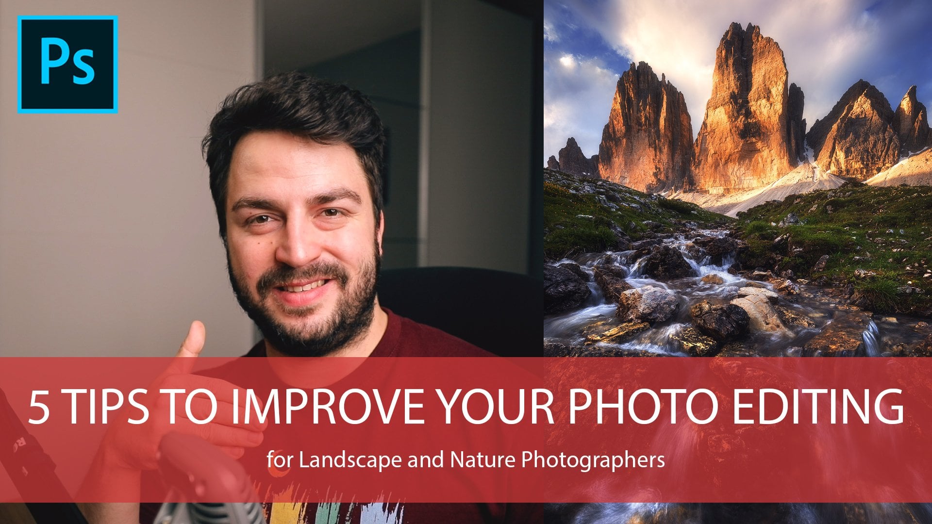
 Daniel Gastager, Professional Landscape Photographer