Transcripts
1. Introduction: Hi, I'm Monica stood all ski and I'm a freelance artist teacher and now oracle deck creator. I love using Oracle decks or affirmation decks because they not only provide beautiful artwork to look at with the messages have always provided me with the guidance I seem to be seeking at the time. This class will walk you through the method that I used for creating handcrafted illustrated cards that can be used as a tool to provide affirmations throughout your day. Or maybe you want to create a special gift for someone. Will talk about the supplies you'll need for this class. And I'll give you a few different ways to get text on your card without a lot of graphic design knowledge. Then we'll move on to creating a cosmic theme deck together. I'll show you how to create the background. Provide you with different methods for creating the artwork on the front of the card. How to add all of those little shiny bits that US artists loved so much, and how to turn the paper into cards. After I walk you through the cosmic theme deck, I'll show you how to paint a variety of backgrounds so you can create multiple styles of decks. I'll show you some mixed media techniques and how to really embellish your cards to make them uniquely you. This class is a no pressure way to have fun with your art supplies while creating something you can use on a daily basis. Painting cards is also really relaxing and it's a great way to engage in creativity if you're feeling blog to or maybe you're just in between projects. So join me and let's illustrate an oracle deck together.
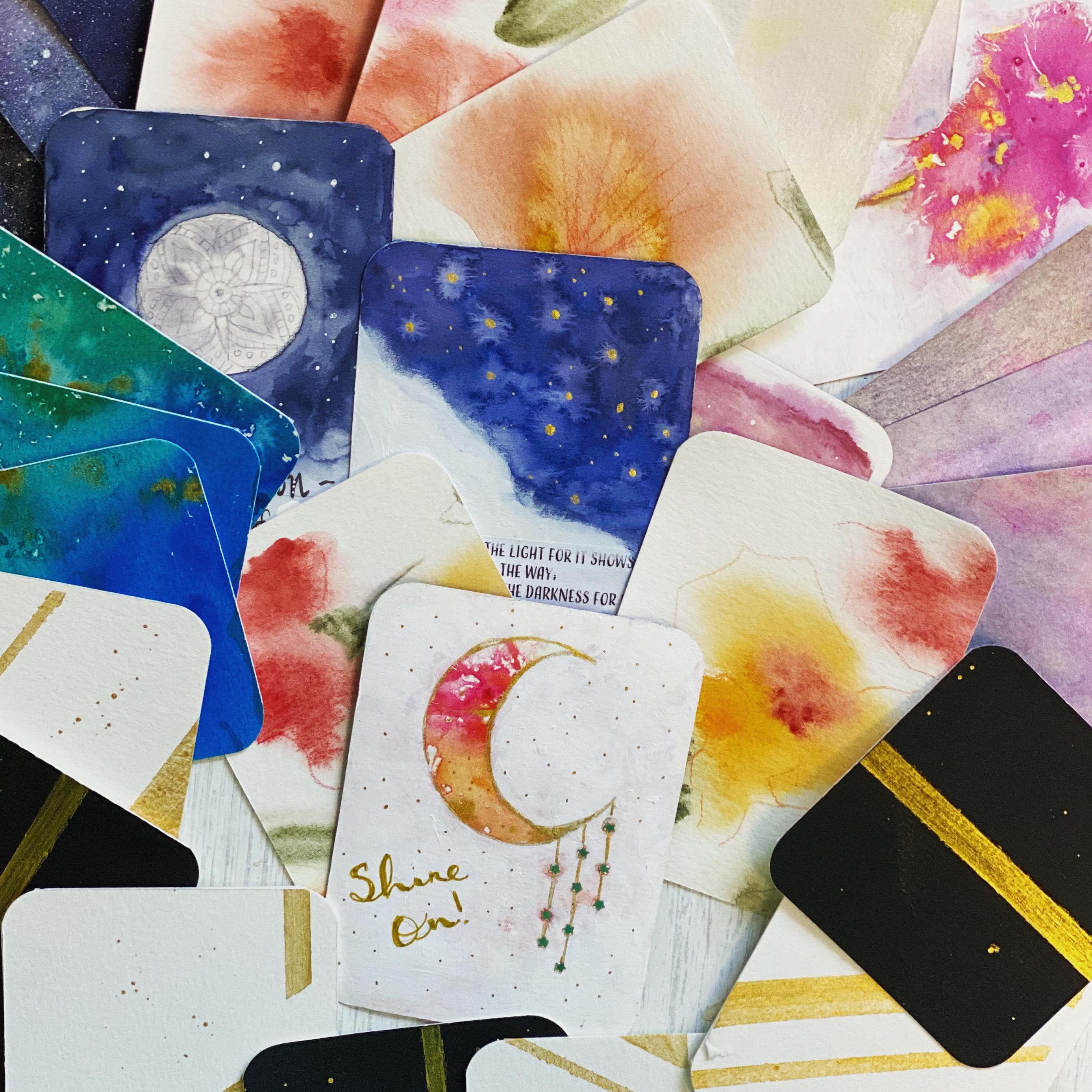
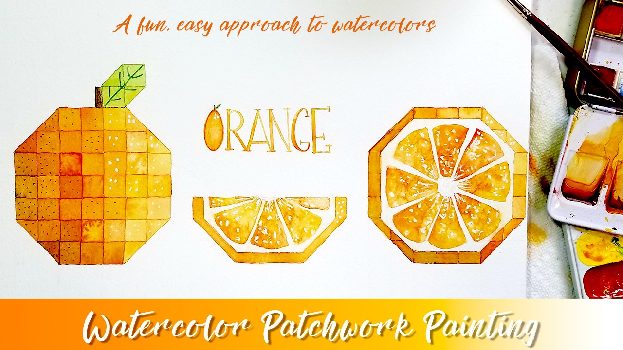
2. Supplies: Let's talk about some supplies that you'll need for this class. So the first part of this class, we'll be making these cosmic cards. And it'll have this kind of a night sky background on them. So for that you'll need some watercolor paper. And I'll be using this paper for everything that I create in this class. And the reason for that is that when you create an oracle deck, you'll obviously have more than just one sheet of paper can provide you. So if you want 20304050 cards to oracle deck, this paper is really great because it's inexpensive and it's quality paper and you get either 30 or 36 sheets, whichever block you can find. But I would recommend a nine by 12. It's just easier to work with at this size and it's divisible by three. So we know we can get three by four cards out of this and we'll be painting all the way to the edge on this paper. So we won't be, won't be taping it down. It will buckle a little bit, but once it's dry, you can always flatten it out with some books or something like that. So this is the first thing you'll, you'll need. You'll also need whatever type of water color set that you have and you can excuse the mess here. But this is my set of Daniel Smith. I have these in tunes and I just squirted some and created my own little pan. Now, I have several different types of watercolor, whatever type you feel most comfortable with, definitely use those whenever you have. You can work out if pans or you can work from Tubes doesn't matter. And we'll also be needing a paintbrush. So if you have whatever kind of watercolor brush you have, and I did want to show you this big mondo brush here. Don't feel like you have to go out and buy this. I'll be using this to create some of the other backgrounds. And it's just easier to use a big flat brush to create a wash really quickly or to add some interest to the back of our cards, which I'll show you later. But this is a royal and laying nickel jumbo. It's a number 50. And I do believe I bought this set my goals. It's the largest brush I think I own. So this is a good one. And I also have Princeton Neptune, round number ten. And just feel free to use whatever type of watercolor brush that you have. I would recommend, you know, nothing smaller than attend just because we'll be creating large washes and you don't want to use a tiny brush. So next up we have some acrylic wash. And I really bought this more out of curiosity, I think. And it's not necessary to buy acrylic guage. If you have acrylic paint in white, you can use that. And also if you have some sort of a white ink, you can use that. What we're looking for is to create our stars on our night sky background. And you want something that is opaque. It dries opaque, and this does a good job and it's relatively thin. I don't have to add a lot of water to it to get it to come off the brush. So white ink, whitewash, white acrylic, anything that's white and opaque will work. I also have here some doctor ph Martin's silver ink. And I also have all-purpose Inc. in platinum. And if you look at the difference between these two, you can really see I liked this lighter one a lot better. It shows up. There's a little bit more contrast on the back of these cards. So I use this just to do a little bit of embellishment on the back of the cards and to make it a little bit extra special, I also have a white gel pen and you can go in and really embellish the bag and create larger stars or a shooting star or anything that you wanna do. I have that and we also will be meeting a paper cutter. And here's what I have. I have this paper cutter made by fiscal years. They're not really that expensive. And my goals and I know I'm talking about Michael's alive and I know that not everybody has a Michaels near them. Whatever crafts store and that you can find and you can order this on Amazon as well. But it is an invaluable tool. I have used this thing so much for cutting prints and I always get a straight edge. It's a great tool to have. And the nice thing is, is that these little blades here, they pop right out. And I don't know if you can see that or not, but it has a blade on it that cuts on both ends. So the blade is on either side. They just fit right in here. So you can cut this way and you can cut this way. And these replacement blades are fairly inexpensive to, there's like two or three to a pack. You just slide your paper in there, shut this little flap, you can lock it down. And then you just zip the edge right off. And that will help us create a really nice edge for our cards. So if you don't have this though, feel free to use. I have I spent most of my time in art school working with this, a craft knife, and I've cut mat board and all sorts of things. So if you don't have this, so you don't want to run out, just use a craft knife and a cutting mat and a straight edge ruler to get your cards a nice straight edge. I wouldn't recommend scissors just because that can get a little wonky. I can't, I can't cut a straight edge with a scissor to save my life. So those would be the two things that I recommend. And then probably one of the most fun things ever is this little corner cutter for. For paper, and I have never had one of these. I actually bought this and I found it on clearance. Again, this is made by whiskers and it has like little trap door down here where you have all your little pieces that it's cut off. And I have no problem cutting through this thicker watercolor paper at all. It does a beautiful job. And I originally bought this because I have an oracle deck that had square corners and they were because of the card stock that was used. They were actually pretty dangerous. I had like poked myself several times in an actually hurt. So I modified an oracle deck that I already have and I just clipped off the corners. And that is really going to make our cards look like cards when we're done. So I love this. And this little triangle here indicates the kind of cut that it'll make. So that's what you need to look for if you're shopping for one of these, and if you don't want to get this right now, you don't have to. I would just create your cards. And then maybe later down the road. If you happen to see one of these and pick it up, then you can always go back and cut the edges off your cards. Okay, now I've got some pens and most of these are Micron pens. And we'll be doing some, you know, some writing on our cards. And I would recommend getting any sort of pen that any sort of ink pen that you have. These are Jayne Davenport pens, which I really love because they come with so many different types of tips. But any type of ten that you have works fine as long as it's waterproof. And the reason I say that is that if we end up going back over something, you don't want any, any of your ink to smear. So now I also will be using later in the class the way I've set this clause SOP is I'll be walking you through how to make this cosmic deck. And then towards the end, we'll talk about some different ways to create other backgrounds. And that's where this ink comes in. And I have acrylic ink, and I also have Indian ink, and either one of these is fine. The reason that I chose Inc. is that it once it dries, it won't really wet. So we'll be applying white acrylic paint. And you'll need a white acrylic paint as well, will be applying this on top of this. So we just wanna make sure that whatever we put down for our color isn't isn't going to pick backup when we apply the acrylic paint over it. Now, I have done this process with watercolors instead of ink, and you can't do it. It will just re-read the watercolor ink and kind of mixin with the white, which can give you a really beautiful result too. So if you have these great, if you don't, no worries. The acrylic paint that I use is kind of like a it's kind of a heavy body. And I like it because it's inexpensive and the coverage is really great. And I believe this is a Michaels brand, this artist's lofts, but I think this tube was like five bucks or something. Any paint, any white acrylic paint will do if you have craft paint. That will work. It will be thinner and you may have to apply two coats, but you can still you can still use that. And after that, I would say that, you know, kinda look around and see what you already have. A white gel pen is a good thing to have to embellish your cards. Any sort of metallic pens that you have will also work. I have some glitter glue pens, and I use that on one of my cards to kind of embellish the front. I was just playing around and I wanted to see what it would look like. So anything fun that you have will work. Perfect. So I also wanted to talk a little bit about ceiling are cards and I have a couple of different sealers here that I dug out of my cabinet. And I will be using this mat acrylic sealer for the front of my cards. And for the back, I would use the same thing. Or you can use a different type of finish. You can use a glossy finish. I don't know if you can see that or not. Or you can use a sentence type finish, it's completely up to you, whatever you prefer. I'm gonna keep mine mat on the front end for the bags, maybe I'll try a gloss sealer. And I have this sealer and I thought I would just throw this out there so that, you know, it exists. But I have this glitter Blast, which is a spray paint that they make that is full of glitter as you can see. And I use this to paint some tins that I had for making water color palettes. And I wanted to seal it. And this type of sealer goes on and it doesn't get cloudy and it doesn't dole the glitter. So if you have chosen to create a deck and you're using a lot of glitter than I would suggest something like this, so it doesn't dole the shine of your glitter. And I just thought I would throw that out there because they found it in my cabinet and I thought that, you know, sometimes we don't know things exist. Somebody shows us. So those are the supplies that you'll need. And one extra little tidbit is, I have often use a disposable palette to put my acrylic on or to see all my cards or anything like that. And basically what it is is just freezer paper. It's a wax paper. That's all this is. And it's always good to have, if not, I've used plastic cutting boards before as well, the real flexible ones as a like an art Matt to keep my surface clean. So that's another little helpful tip if you haven't grade, if you don't, no worries. So that's about it for supplies, I'll be sure to include a supply list in the about section of this class that you can download. And let's move on to painting the backs of our cards.
3. Adding Text: So before we get started painting the backs of our cards, I wanted to talk a little bit about text. And when you start putting text on your cards, you have a couple of different ways to do it. As you can see here, I've got two different ways. And of course, the last way would be actually handwriting your quote or words on the front of your card. This method, I actually took my watercolor paper. I set my printer at a custom nine by 12 setting and printed out my text right on the paper. And this is the backside of the watercolor paper because we're gonna keep this side for painting. The way that I do this is to print everything out, all of my quotes onto a watercolors sheet. I leave it hole and then I flip it over and paint the back side. And only after I've painted the backside do I cut the cards apart, it makes it a lot easier. The only reason that I would probably print out my texts like this is if I were creating something for a group of people may be and they all had to have the same number of cards. Let's say I was creating some sort of a how-to thing or something on these on these cards. And they're each going to get ten cards and they all said the same thing. This will save you a lot of time. And in this next little segment, I'll run through really quickly how I set this up in Adobe Illustrator. It's super quick. And you don't really have to have some serious graphic design skills to do this because we're just popping in text, putting our paper in the printer and printing it out. And the next method, if you don't want anything to do with the computer, is to simply print out your text, cut it out, and glue it onto your card. And you can always disguise these edges by maybe collaging or painting these edges will play with this in, in a little bit in another video when we talk about adding artwork to the front of our cards. And of course, the last method is to handwrite your cards. And I think that's probably what I'm gonna go with, but I wanted to show you both of these methods before we get started creating our cards so that you have the option of doing it this way. Before we head into creating the artwork. We are back here and we are in Adobe Illustrator. And I just wanted to show you how to set up a really quick template if you decide that you'd like to print the text on your cards and be sure when you feed your watercolour paper through your printer that it will one and take it. And so definitely do a test sheet. Before you start setting all of this up, and also make sure that you don't feed any, any paper through your printer that has been painted on the back. You don't want to junk up here printer. So always make sure it's a clean sheet. And if you'll be printing the text on your card, chances are good that this is, this will be the side that is not textured. And just make sure that you put your watercolour paper in your printer correctly. So I have created a new document, new art board, and my paper is at nine by 12, and I just left it at the RGB color settings. And I have this setup in portrait, and we're gonna create a little template here so that we know where to place our text. And I know that my cards are three inches by four inches. And I get this little dialogue bugs by going over here and selecting the Rectangle Tool. And I just clicked once on my board and this will pop up and you can just put in the exact measurements. I click OK. And here I have a little bugs. And if you look up here in the left-hand corner, this is my fill and this is the stroke. And all I want is a stroke. And I'm going to select the Move tool. And we're going to place this up here. Actually. Well, we'll place this in the upper left-hand corner. And I have my smart guides turned on and you can do that by selecting View and going down here and check marking your smart guides. Or you can also hit control you if you're on a PC. So go ahead and select your rectangle, and I'm going to hold the Alt key down while it's selected. And I'm going to click, and I'm going to drag. And I'm going to line this up with this bucks. And I'm going to let go. And I'm gonna do the exact same thing down here. And now you can either draw a marquee with your Move Tool around all three of these boxes. Or you can shift click and it will select all three of these rectangles. And I'm going to hit control a G. Now these three rectangles are grouped as one object, and I can click on it. A hold down my alt key again, and we're gonna make it another duplicate. But this time we're just gonna make a duplicate of the entire bar. Make sure that they're lined up. And let go. And we'll do this one more time. And there you go. So now I have a template here and I know exactly where I'd like to, where where each card will be and I can place my text accordingly. So let's see. I'm going to select a quote here and select my Text tool. And I'll draw a box because this is obviously longer than a word, it smartly paragraph text. So I'm going to control V. And let's say that I want to center this. Meaning get out of that and try that again to our center that, and I'll select my, well, try something like that. And maybe, and think maybe I wanna take this text and make it a little bit smaller. I think actually I want to bump this down just a little bit. And it can do that right here in my, in the character box over here. So the really nice thing about working like this is that you'll be able to format, not format, but kind of align your text how you would like in the boxes. Just makes sure that when you're working, you're not working from the entire group. And I've already ungrouped most of these. I think this last one however, is not. So what I'll do is I'll go up to object and I'll click Ungroup, and I'll collect off of this. And I'm gonna take my text and drag this over here, just so that I can show you. So now each one of these is back to being its own little single rectangle. And let's say that I want to, I want this quote to be right, smack dab in the middle. So I'm going to select my text and then I'm going to shift click on the rectangle so that they're both selected. And I'm gonna go up here to the align, bucks and click aligned to. And I'm not sure sometimes why that aligned to key object. Now you can see how this is highlighted in blue. And what that's telling me is that this is the key object. So what it will do is align this rectangle to my text. And I actually want that to be the other way around. I want this text to align to the rectangle bucks. So I'll hold down my alt key and I'm going to select my rectangle now that's the key object. I'll go back up here to my align and I'm going to select the horizontal alignment tool or vertical alignment, I'm sorry. And then that will bump it right into the middle of the card. And so I know that I'm I'm exactly in the middle. And you can do that with the horizontal alignment as well. And I know that that's already aligned because I have my smart guides on. You can see it'll you can see the pink line. I'm right in the middle. So that's how that works. And this is a great way if you're not comfortable with your own handwriting and you have some experience with graphic design and Adobe Illustrator. You can see this is not a difficult process. Once this is all set up with all of your text in here. Me personally, I don't like to print anything with these boxes. This is just something that I would use to set up my text. But if you don't want to have to set this up every time you print out a watercolor sheet, you can just save this file as an Illustrator file, call it four by three Oracle Cards and you'll never have to set this up again. You can just go in here and use the template. And before you, I always save my Illustrator files prior to printing as PDF file. And so what I would do prior to saving it as a PDF is I would select all of my rectangle boxes and I would just get rid of them. And I don't want to take the chance of these black lines showing up if I miss cut any of the cards. So I would just go in file, save as select my title and click PDF and safe. And once you have your PDF file saved, you can bring it up and then make sure that when you put your watercolour paper in your printer, that is a clean sheet and that you're printing on the side that is not textured because you're probably going to want to paint the other side on the correct side because we do the whole sheet as one piece of art. So I would make sure that this is done on the backside of the watercolor paper and that there is nothing else on the paper. You don't want to feed paint through your, through your printer. And make sure that when you do set up your printer, that you set up your settings for the correct measurement. I have a custom setting for nine by 12 papers, so I think that's it.
4. Cosmic Background: So let's start with our watercolor paper. I'm not taping it down because I'm gonna paint all the way out to the edge. It will definitely buckled. Just don't let that freak you out. So I'm going to start with some clean water. I have a jar of clean water, actually of two jars. Usually I use one to clean my brush and the other one I use, so I have clean water and after about five minutes of painting, I usually end up cleaning my brush and clean water and it ends up not mattering anyway. So having a little bottle of clean water works well because you can create a nice little puddle over here. It's a little bit easier than dipping your browser and going back and forth. So what I'm gonna do is I'm going to wet my page. I'm just going to apply some water with this big flat brush just to get it web. And where I live, I live in upstate New York and I'm painting this right now in the summertime. And usually I have a fan going in here. And it dries my paper out really, really quick. And obviously you don't have the fan on right now because you wouldn't be able to hear me talk. So I'm hoping that this will maintain some of the witness. And we start going in and adding adding our watercolor in here. And this just makes the paint flow a little bit better. And it's a, it's a great way to avoid any sort of hard edge. And I'm just gonna kinda light this up a little bit. And I've already started to buckle. I'm going to add some water right here. And a great way to tell if your entire page is wet is to lift it up on its side and kind of look at it at an angle to make sure that you've got the entire page wet down. I'm going to mix up a couple of puddles of paint. I'm only really going to use three colors of paint. And you can really, you can do anything that you'd like here. You can pick your own colors. But the best thing to do is to create a background that's dark. And I believe what I'm using here is a it's a Payne's gray and type of Payne's gray. And it's actually a Paine's blue-gray. And I'm gonna create a nice big puddle. And I'm just gonna go ahead and start laying this in and letting it spread. Now something when you're creating your backs of your oracle deck. Don't worry if this page that you're creating doesn't look totally cohesive, or maybe you have something that you don't really like because these are going to be cut up into cards and this won't be viewed as a single piece of artwork. So you can really have fun and kinda let loose here. It's, it's very forgiving when you cut, when you cut these, it always it always looks good. Now for me I have to work kind of fast. Like I said, my paper seems to dry off really quick. So I'm just going in here and laying in this color. And I want to get this on all of the edges. I think I'm gonna go and pick up a little bit more water just so this stays wet. And I'm just trying to avoid any hard edges right now. So this is just kind of my base layer. And then I'm kind of stumbling. And here I just want to get some paint on the paper. And then I can start going in and adding other other colors. All right, so I'm gonna go ahead and mix up another color. Actually, I'm gonna go for this. This is called Indian thrown blue and blue that I really love this blue. It's very saturated and don't worry about putting anything onto dark. There is no such thing really, I think in watercolor. And it will always dry lighter. And if you feel like your piece is to light, you can always go back over and do another layer. And I think I'm gonna go ahead and grab some. I believe this is shadow violin. And I've got some hematite right here. And this is a really kind of a cool gray because it granulate so nicely. And I'm just kinda going right into the pan, picking up these colors. My paper is wet. So I want to add in a lot of paint to a lot of pigment. I don't want to water this down because it's already going to lose some of its vibrancy when it hits the paper because the paper is already wet. And you'll notice that some colors will spread more. Easily than other colors. This is an amethyst. And with this genuine, I believe so. I'm just going to drop in a color here and there that I think is pretty. And try to do this all over the page. That way you'll have some unity in your cards. And as you're painting the backs of these cards, and I know you're probably thinking, well, this looks really sloppy. It all kind of comes together at the end. Which is one of the reasons I love this technique. We can be as loose and As free with this as you want to be and feel, feel free to add it in any colours that you above. You know, I'm a big fan of pinks and purples. So I'd like to add those in here and they're trying to add them, like I said, in different spots around the page. Because you want to create some overall unity with these colors and with this deck. So I'm gonna go back in here. And that was the Payne's gray blue that I picked up. I'm just picking up dark colors because when we add the white splatter zone for the stars, you're obviously want them to show up so the dark is, dark is better. And I'm going to go around and just add this in randomly. So I have this little bitty, cute mini pellet from etera lab, which I really love because you can take this anywhere. And these are little porcelain, the pellets. But I have some white in the middle. Well, that created kind of a cool little texture. Okay, so I'm gonna go in here and get some way just so that I can show you what this looks like. You've got some fuzzies now from here, but you can kind of drop this in and just let it bleed. And it's great for going around these darker areas and kind of defining the edge a little bit. And it just add some more interest, really. Yeah. And if I add this up here, then I'm gonna try and add it in a couple of other spots. Like I said, we're just trying to create some unity throughout the paper. So that when you cut them up into cards that they look like they go together and have to be exact, but grab a little more blue and maybe a little bit more. Pink. Like I said, this is just really kind of a free, free play kind of thing with the water color. And I wanted to do it this way because this method is really accessible to everybody, whether you're watercolor painter or not. And the key to this is just to whet the page what the entire page, and just start cropping and colors and let the paper due, let the paper and paint do what it wants to do. And I think I'm gonna add a little bit more of that weight. If you don't have this white in your palate, no worries, you don't have to do this. Something you can do and you don't need whitewater colored to do it is just cleaned your brush off really well and pick up some clean water. And you can go in here and you can actually take your brush and kind of splatter it. Or we can just make these little dots all over and it will push the pain away. And it does make a really cool kind of a celestial star effect. And this is just clean water. And this is really kind of a neat look too. You can also add salt into any of the wet areas. I like doing this because it's along the same lines as far as the result that you get. And I have a bad habit of trying to brush salt away when it's still wet underneath and then I smear it. So I'm not gonna do salt for this, but you most definitely can use these backs as kind of experiments for and some of the art techniques that you've been wanting to try. This is your deck and you can do anything you want with. So, all right, we're going to let this dry. And when we come back, we're going to add in some stars. Okay, so I am back and this is dry. And something I wanted to mention is if you flip this over, you'll notice that we've got some watercolor bleed on the edges, on the backs are the fronts of our cards. Now I am not really worried about any of that. For instance, I know that this will be clipped off with my corner clipper. And I think I actually just did that by accident, but you can always try and what this down a little bit. If you don't like it with your brush, with some clean water and take a paper towel and blend it up and see how much of that you can get off. I think it's a waste of time. Actually, if you don't like this, then my suggestion would be to take your paper down and tape it very close to the edge and you can zip off that little edge. As you can see, I have put some wax paper or a disposable palette underneath my paper. And that's because we're getting ready to splatter some paint. And I have a The pallet somewhere. I'll just put my paint right in there and I don't need very much. And I need to water this down. And I use a I usually use a really junky brush. Something, something I've had for a long time and it's, the bristles are really stiff on this. It's not a super like soft brush. I find that like bristle brushes or a toothbrush works really good too. So I'm going to add a little bit of water to this and get it to the point where it's like the consistency of like melted ice cream. You know, I don't want it to running because I want it to be opaque still, but I want it to come off the brush when I start sputtering. So what I'll do is I'll just start flicking and make sure that you vary the angle of your brush. You don't want all of the spotters to go in one direction. So so we'll let this dry and when we come back, we're gonna go ahead and cut our cards. So I'm back and this is nice and dry. And when I hit this with a blow dryer, it started to buckle this way. So what they did is they just flipped over the piece of paper and I dried the back and that helps to flatten it out. So I'm going to grab my cutter. And I already know that because this is a 9-12 piece of paper. And that nine is divisible by three and so is 12. That, that's how we're going to cut these cards. So we'll put the long edge through here. I'm actually going to flip this over just so that I can not be distracted by the background, I guess. So I have put the long edge through here, that's the 12 inch edge. And I'm going to cut these at four inch intervals. And I can lock this down. And you can see where the blade is going to cut. There's a nice line right there and I'm just going to run that up like that. And I actually usually just hold this down. I don't usually snap this. Merry go. And I'll do this again. And I'll put this out at four. And it looks like my blades getting a little bit on the adult side because I've been cutting a lot of paper lately. And just make sure that you've got a nice sharp blade in there. I love this thing so much. Okay. Now I'll take each one of these pieces and I'm going to cut these at the three inch mark. Okay, so you can see we've got nine cards out of one sheet of paper and I lay these out. You can see these are all really unified because we painted the whole sheet of paper at one time. And if there's anything like this and you don't really like it, go back and with your watercolour and you can just take that. And if you don't like it and just kind of run your brush along the edge and get rid of any of the white areas that you don't really care for. Us like that, just make sure that you let it dry really good before you start cutting off corners. But as you can see, we've created a unified background for our cards, and now we're going to clip the corners off. And this is my favorite part actually. So you just stick this in here and line it up against the edges and flip it off. And that's all there is to it. So there's our first card. And I think that looks pretty great. We're actually going to go back in here and add a couple more embellishments. And the reason that I didn't do this when the sheet was at full size is that you really don't unless you mark it with a pencil, this is just easier. I think you can go in and embellish as many of these as you want or as few of these. So maybe you just want to add a couple of little silvery stars, which is what we're gonna do. Or maybe you want to add another design element on the back. Like maybe you want to put a moon on the back of each card, at least this way. Now you can have a better idea of where to center it on the individual card as opposed to trying to work with a big sheet of paper and mapping everything out. I think it's just easier this way. And that's another reason why we didn't see a lot of cards either. We're not going to seal the entire sheet until after we have embellished all the bags and we'll lay our cards out. We'll take him outside and lay him on some cardboard and then hit him with this sealer. So in the meantime, I'm gonna flip these really quick and we'll be right back. Okay. So now we're going to embellish the backs of these cards. So I have my acrylic guage that I'm gonna use still. I still have a little puddle of it here, which should be enough. And I also have, I also have this silver ink. And I think what I might do is I might splatter some of that on the backs of these cards. Something else I wanted to show you. And I mentioned this in the supply list. It's this glitter glue and it's washable, and it's made by Crayola and can get us set really cheap. And these are a lot of fun. And what I like about these is they have this awesome little tip so that you can go in and add just these little, these little fun blobs and it is glue. So it does have kind of this raised appearance when it dries. But you can and I don't know if you can see that. That's not showing up really well. But this is something fun to have. But they come in all sorts of different colors. You have gold, I really like the iridescent and I like this silver a lot. The silver shows up really well. It's glitter. So so you can do something like this, right? And you can also take your brush. I'm gonna lay out my I'm going to lay out this wax paper again just so don't make a huge mass. And if you plan on splattering individual cards, like I'm gonna do some silver ink on this one and I might do a little bit of a splatter on it. Just make sure you've got your other cards out of the way. So if you don't want those splattered, they won't be in any danger of. And this just gives it a, something else, a little special. You can also grab a brush or you can take the back end of a brush. And this would be too big, I think. Actually. So I'm gonna grab just gonna grab a small little brush and go into my ink, my solver Inc. And I'm just gonna make some bigger, more noticeable stars. Alright, I think we can move onto the next awesome.
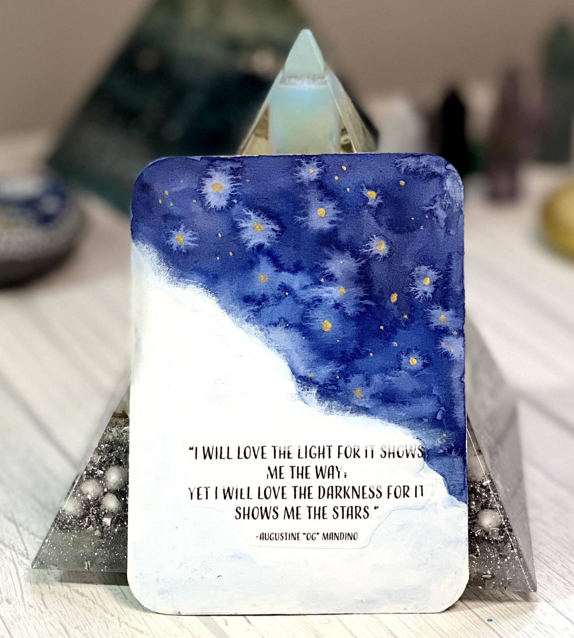
5. Cosmic Front Artwork #1: So now that we've created the backs of our cards, let's talk about creating the artwork that goes on the front. And we've already talked about how to add some text to your card, especially if you either don't like your handwriting or you need it to be printed out. We talked about how to do that, and I'm gonna show you how if you choose to do this little collage method. And I guess if you glue your wording on how you can kind of hide these edges. And we'll do that by painting around the edge of this with some acrylic. And I really loved the quote, and it talks about the light and the darkness. So I was thinking about kind of splitting out this card diagonally so that this half will be dark and this one will be light. And hopefully we can try and get this blended right into the white. And then we can go in and we can add some fun stars and things like that. So the first thing I'm gonna do is I am going to what my watercolor brush and I'm gonna go in and I'm going to pick up some of this in didn't thrown blue that I love so much. And I might mix it with a little bit of yellow. And I'm just going to kind of really start going in here and just painting this. And I'm kind of being careful with the edge, even though at this point, since the other side is already painted, it's really not going to matter much. And I think I'm just gonna go right over here like that. And then I'll fill in the rest of this. And if you want to avoid that hard edge with a watercolor, and you just have to be kind of quick about filling this in. And you can always go in and you can add in a different color as well. And picking up a little bit of this amethyst just to darken up this corner. And I can pick up some more of that and drop it in since the surface is already wet. And it gets a little cards buckle a little bit, especially if you're using watercolor. And I'm probably going to pick this up and make sure I get this edge really well. And I might just take some clear clean water. And I'm trying to get rid of those hard edges. And since I have clean water on my brush, it's going to make these little blooms, which is fine. It just adds to it. I think. I'm going to pick up a little bit more of the Clean Water Act. I'm gonna make little drops in here. And I'm gonna go ahead and just leave that to dry. I might do this with a blow dryer or a little bit. And I think I'm going to just clean up this edge a little. Ok. Now I could very well just leave it like that. But I wanted to kinda show you what we're gonna do with the edge. And I'm just gonna take some paint and kind of go in. And I'm going to hit this with a blow dryer and I'll be right back. So this is dry now and I've squirted out a little bit of this heavy body acrylic. And I'm going to grab one of my not so nice brushes. And I've got this little scrubby brush. And I'm picking this smaller brush simply because we'll be working in a little bit of a smaller area. And I'm just gonna go in here and start painting this edge. And something else you can do. Take some of your acrylic and I'm gonna pick up a little bit of my water color on my brush here and mix it into my acrylic. That way I have a little bit of a color variation going on. And I'm working on my disposable palette here. So you get a really nice daytime, nighttime kinda of a thing going on with this. And you can most definitely decide how you want this edge to look right here. You can kind of carve that out with the acrylic paint as your painting. And I like these little wispy edges. And the way to get that is just kinda dry off your brush a little bit, get as much of the paint off. And, you know, it reminds me of clouds. And it gives it a nice soft edge. Now if you would like to, you can always see all your text before you go lit on. And I would recommend just printing out all of the quotes that you want to use on a sheet of paper. And then taking it outside and spraying it, letting it dry and then cut it out and glue it on with some blue or manage pod. Sure. Some sort of an all-purpose craft glue. And you can add other colors in here too. If you have acrylic paint or you can like I'm doing, I'm just picking up my watercolor to tint the acrylic. And okay, so I think I'll leave it like this. And I'm gonna grab some, I think I'm going to grab some gold to ink because I think gold and this kind of indigo blue look really good together. So this is already dry. So I can go ahead and lay in some of these stars. So I've got a little brush right here and you could even use a toothpick or the back of the back of a brush and could use this and to dip into paint, make dots. I would use something a little bit smaller than that end. And my brush seems a little wonky here, but we'll give it a shot. And we'll go ahead and add in the stars. And something I wanted to say too about creating the fronts of your cards were kind of sticking with a whole cosmic theme because that's what we painted the back of the cards. Feel free to do whatever you like. You can always brainstorm some ideas. Make yourself a really big list. If you have an idea of, of a certain theme. I like to write them down. That way you don't lose my ideas. And if you have an over overall big arching theme like nature, think about it for a second and kind of create yourself some subcategories you could do an entire deck for yourself based entirely on, let's say, insects or butterflies or animals in general. And the list goes on and on. And I thought the cosmic theme would be a lot of fun for everybody because it's very forgiving. And I think everybody can do this no matter what level of are your ad. And the results turn out really nice. So kinda keep that in mind when you're creating your own. You know, maybe you want to theme your entire deck. Maybe you can do one that's nothing but plants or one that's nothing but flowers or medicinal herbs or anything really there. So I think that looks really cool. And, and it also kind of reflects the quote. And those edges aren't quite as noticeable as they were. And we're going to move on to doing another front and want to show you another method that you can use to create the front of your card.
6. Cosmic Front Artwork #2: So for our second front, I wanted to show you another method. We had talked about. What happens when you get something like this on your card. Well, you know, I keep saying that we try to make our mistakes look intentional and that always helps. And I think the way that I would fix this is to create a maybe a little landscape scene. I'm really not sure of the quote that I want to use yet, but I'm sure that I can find one that will fit once I'm done. And I don't even need to use a quote. Honestly, I can just use a keyword or a mantra word. Something like that. Something like the word inspire or reach for the stars or anything like that will work. So you can definitely paid the artwork. I think it does help to have a quote in mind. It gives you a little bit of direction. But I think we'll be okay if we just paint a little abstract kind of landscape right here. So I will grab some clean water. And I'm just gonna kinda, I wanna go all the way. That's not really clean is a Alright, so that's a little bit better. I'm gonna go all the way out to this edge because my intention is to get this to bleed into that. So I'm gonna go out as far as I can to the edge with my water. And we're just going to let our paint run. And I think I'm going to grab a little bit of pink because I have this kinda already mixed up on my palette. And I'm going to drop this in at the top very carefully and just kind of go ahead and push this around a little. And I might pick up a little bit of that blue that we just used. And I'm going to and it looks like the color on the other side was that Payne's gray. So I'm gonna go a little bit darker up here in the foreground and hopefully we can get all of this to kind of blend in. So it's not quite as noticeable right. Now. I'm going to pick up a different color, really dark color with a little bit of green makes ten, I think. And I'm just gonna make a line. Right here. And I'm just going to maybe give the indication of some trees or something. I think I might pick up a little bit of yellow that is connected ONE gold. And I might drop it in here. And I'm sure my brushes nice and clean. And pick up a little bit of this yellow, lemon yellow also kind of makes that around a little bit. And I think I need to push this blue drop in little bit more blue right here. And I'm going to pick up a little bit more of that dark. And I'm just adding a little bit more dark right in the middle there. And I'm gonna pick a little clear water up. And I'm gonna make some of those drops, some of those little bits of water in just right with the point of my brush. And then I'm going to let that dry and we'll come back and we'll add a couple of little fun things. Okay, so I'm back and this is dry. And I have a white gel pen and I'm just going to drop in a couple of little stars here. If these are really kinda feign, I'm just dropping these in where we made those little water blooms. And then I'm gonna take my job pen. And I'm gonna create a little bit of a like a shoreline. It's kind of like that that little white edge of the water that you see along the shoreline. The only trick with this is to make sure that you keep it as horizontal as you can, right? And it's kinda this little stumbling motion back and forth. And you can add a few more in like that too, if you want to. And I think because we have some water in this card, I think the only thing that I'm going to put on this card is the word reflect. And you can always take a straight edge like this. I would suggest to ruler actually sort of got handy right here. And you can, depending on how dark you're watercolor is, just try not to go in super, super dark with your graphite pencil. In fact, I think I might grab a little way charcoal pencil and just make a line. That gives me a little bit of a guide. So we're gonna start off. The l should be in the center. And I am eyeballing this. This is not an expect science. I really don't like to meticulously plan out stuff like that. I think it really takes away from this hand created look. So now we just need to decide how I want to let her this. Do I want to print it out or do I maybe want to do some cursive? And I think that's what I'm gonna do, I'm just gonna do. And this is my cursive. This is an this is by no means any sort of fund hand lettering. So you'll have to take another class from somebody else if you want to practice that because that's really not my jam. So and then I'll go in with my white gel pen and hopefully I can get the same I can get the same time as my so I would do something something like that. And I can always wait till this dries definitely. And then kind of erase my little white line there. And I would leave that card just like that. So you can do all sorts of things. If you don't have a white gel pen, you can use a metallic one. You can also use white ink or you can use some acrylic paint or guage to add these little details in. So we're finished with that one. And let's move on to another type of front that we can do.
7. Cosmic Front Artwork #3 : So for this next card, I have picked out a quote. It says the full moon, the Mandela of the sky. So I'm going to let that kind of inspire what we're gonna be doing with this. And I thought it would be kind of cool. We can just make ourselves a full moon or pencil then in, and I have a little roll of washy tape. And the inside makes a really great template for a struggle. Otherwise, you can pick up those little plastic circled templates or just find anything laying around like if you have a cap to something that works fine. So my idea is that we're going to put this right here. And we'll take our pencil, just make a little circle. Like so. And I'm going to pick up my watercolor and we'll be painting around this. And then when I get down here to this edge, we're going to kind of wedded and let it run, create some drips. And then we'll take our full moon and kind of add some fun little Mandela type doodles in here. So we'll start off and I'm going to pick up some more of that Indian thrown bloom. And I'm probably going to mixed, mix this in with some of this panes blue-gray. And as you're painting this, you can you can definitely pick up other colors if you want to vary the look like I just picked up a little bit of that blue. And you do have to work kind of quickly if you want to avoid those hard edges. And I'm gonna make this edge down here are really soupy. And then I'm going to clean off my brush, pick up some clear water. And I'm going to kind of go along here and help this along into this pencil edge. And we're gonna get some watery blooms and that kinda thing. And I would rather do it like that first and then go back in and drop the paint in. Instead of trying to be super quick about it. And messing up my edge. And you can see I'm just kinda going back over so we can get all of this blended in together. Okay? And I'm going to pick up some more water and go along this edge again. And then I'm going to hold this up and kind of feed it some more water until it gets to the point where it starts dripping. And you can hold your card up like this to get it to drip and just keep feeding it more water. Okay. So this is dry. And before we go in and clean up this edge, I think I want to add something into this moon. I don't want to leave it quite that white. So I'll just take my brush and I'm gonna add some water in here. And I think I'm gonna go in and add, let's see. I actually love this paint and it's called Moon glow. It's a Daniel Smith paint. And I think I'm just gonna go ahead and drop some of that in there. I don't want it to be super dark. And I just wanted it in a couple of areas. But I wanted to give it a little bit more interest. And you can kinda push that paint to the outside edge a little bit. And we'll let that dry. And in the meantime, I can take my white gel pen and go in here and start adding a few of the stars. I'm going to blow dry this really quick when I come back, I'll clean up this edge. So this is try now and I have some colored pencils. Feel free to use whatever you've got. These were polychrome most. And this is just an indigo blue. And I'm just gonna go around this outer edge really lightly, just so that it looks a little bit more like a circle. And I would do this. Don't need to press down really hard with your pencil. This is just a really light a light layer. Just to help shape it a little bit more. If you've lost your circle. Okay, so we've cleaned up our moon a little bit with our colored pencil. And since the quote says the full moon is the Mandela of this guy, I'm going to go in here and I'm gonna create a Mandela inside this moon now these are rocks and my mother paints, she paints rocks. And so I'm going to use one of these as a reference to kind of guide me. And I think I might even go over this with a little bit of a kneaded eraser. I still feel like it's a little bit too dark. So I'm just going to put my kneaded eraser down and kind of pick up some of these darker areas because I want this moon, that shadow violet paint that we put down. I want that to kinda show through. And the final thing that I would do would be to add in my quote and add a couple of lines here so that I can say somewhat straight. And I'm just gonna go ahead and write this nth. Now I know that the next line is going to be a little bit longer than this. So I'm going to start way over here on this edge. A kink up again and embellish this a little bit more if you want with some metallic inks or you can even take your gel pen and then grab the one that works. And we're gonna kinda mimic what I have going on in the stars And I'll just add some dots to my letters. Okay, so we've got another front of our card done. There's just, there's another method you can use. And I'm going to show you one more method you can use for the front of your cards. And then we'll call our cosmic deck finished.
8. Cosmic Front Artwork #4: So for this next card, I think I'm going to kind of make this a little bit on the abstract side. And I think I want to paint a crescent moon. Or they want to show you this method. It's really fun and it's really pretty. And I'll be using ink process magenta, and this is lemon yellow. And I'm gonna grab this pink. And I'm just going to kind of drip someone that the card, I have not wet this yet. So we're gonna kinda let the use mix together. Sometimes these properties don't work really well and are know what the deal is without. So I'm just very gently, you gonna miss some water on here. Get that go in. And then I'm just going to let this run. And I am working on my disposable palette here, or a piece of wax paper, freezer paper. And I'll grab my paper towel because this gets really messy. Since very much like one of the banks that we're gonna create later. And I think I'm going to draw up a little bit more of this yellow in here. Now that we've got plenty of water on our card, it will spread. And I think I think maybe for fun, let's grab some of our gold, Inc. And I'm just gonna stick whatever brush. And I'm going to drop some of this golden here. And my idea for creating this crescent moon, this moon is gonna live kind of like in the center. That's why I'm putting my gold ink kind of in the center. Because I want to be able to see that. And I think we need some more magenta. Now, could you leave your card like this? Absolutely. Is makes a great abstract background and when it's dry, you can go right over this with a pen and write whatever you want. So I think I'm going to leave it like this and I will get this dry with a blow dryer. And then we'll come back in and I'll show you how I'm gonna make this crescent moon. So this is drying out and I'm gonna grab my little washy tape roll. And I'm gonna go ahead and find a spot that I think would make an interesting crescent moon. So think I'm gonna go up high because I like this area in here. And feel free to flip your Carter round to if, if the more interesting parts on the bottom. As long as it's as long as the back of your card goes either way, you can do that. Not a problem. So the easiest way to make a crescent moon, I'm going to trace around the outside of this washy tape. And then I'm going to move my role over here and find a shape that I like and just going to kind of double this up. And then I'll erase the outer line. I'm gonna trace on the outside. Ok, and there's my crescent moon. So I'm gonna go ahead and take my eraser and gently erase this outer line a little bit. We're gonna go over this with acrylic paint. So won't be too big of a deal. If you leave your line. I am going to extend this just a bit because I feel like it's too it's a little bit too shallow. To edges are the points, I should say. I really like it when they have these really pretty longer points. So essentially I'm just creating a guide for me, so free now because we're gonna go and kind of carve out this moon shape with white acrylic paint. And I think something else I might do is I'm gonna create a couple of little lines here. And I can create these little circles like jewels that are kind of hanging off of the end of this moon. And I'm going to try and preserve this by painting around it with my acrylic paint. And I may lose it simply because it's really small. And make sure if you're gonna do something like this though, you vary these lines. And actually I'm gonna make the middle one longer. And this one. So something like that. Like I said, if I lose these, not a big deal, I'm more interested in keeping these circles. And I can go back in and add the lines at the end after we've gotten our acrylic paint down. So I'm going to pick up my acrylic paint and I think my blob over there's dry cement to lay down a fresh blob away from my blue mess over there soon will pick any of that up and I'm gonna grab my little brush again. Sorry about the ambulance there. I live in a rural area and you'd be surprised how often that ambulance runs. So we're gonna just follow the edge of our Moon. And I'd like, instead of going using the side of the brush to kind of make this outline or to make this edge. I kind of like going in with the front edge of my brush and pulling away because it gives it this softer edge kinda look. And to me it kind of almost mimics the look of an oil painting. And these edges, you know, they don't have to be super perfect. Soft, soft edges are really pretty and you can always vary between this off to edges and a hard edge. And if you do mess up and you feel like you don't like the edge, you can always go back in here with a little bit of colored pencil to kind of redefine some of these edges. And don't worry if this first pass is still kind of transparent because we can go back over and add a second coat. Okay, so I have the first coat done. And as you can see, a kind of lost a little bit of my circles there, which is not a big deal. I'll go in after the fact and I can add these CN. And I'm going to let this dry. And then I'm probably going to go ahead and add another coat of white. Okay, so I have added a second code to this, and it's looking pretty plain right now. And we're going to go in and add some embellishments once this is dry. So my acrylic is dry and I'm in a breakout, my gold ink, a breakout, my IQ, and a little brush. I'm gonna go back and add this edge. And, and I think I'm gonna do that with some of this gold paint very carefully. If you have a gel pen, a metallic gel pen, which is what I might switch to. If I don't like how this is going. I really wanted to use the same metallic gold that's already in here. Now. I wanted to show you this. This is not on the supply list. I can I will definitely add it under the optional supplies, but I saw this ad. I think my goals. And it has all of these different little hearts and stars and here. And they're really fun. They're a little bit difficult to work with. But I thought it would be kinda cute to add these right onto our moon. So I'm going to select the gold stars. Since that's kind of the theme are going with, and I'll just shake out a couple of those. But my ink away before a spill it everywhere. And I'm gonna grab a little bit of mod podge and just put a little bit on my palette here, my wax paper. Now, I usually just use my finger. They stick pretty well. It can get a little tricky doing this and getting them placed right. So you may want to use a tweezer if that works better for you. And I think I got that one on there. Okay. Okay, so I got all of my stars on there and you can see that I switched to that little brush and just lead the glued down where I wanted the stars and then very carefully picked up the stars with my brush. As I was putting those stars on a kind of thought that the phrase shine on kind of came to me. And so I think that's what I'm going to write right here. And I m going to probably pencil this in so that it got a little bit of a guide. And I think this is, you know, it's a great thing to remember sometimes. And I'm gonna use this this goal gel pen. And I can go back and add a little bit of weight so that this stands out a little bit more. And I'm just doing that fig calligraphy again and kind of thickening letters where there would be a downstroke. And you can also kind of go back in here and add some little gold dots into your Moon if you wanted to. And you can even do that on your card. Give that some time to dry definitely before you touch it. Because I'm doing this right on kind of a shiny acrylic surface, it will smear really easily. So you really have to give this some time to dry, especially before you spray it with your varnish. Okay, so I think these look really great and I've given you four different ways now that you can approach the rest of your cosmic deck. And we've done this watercolor to kind of hide any mistakes that we made by painting the back of the card. This is where it bled. And this one we let the quote kind of inspired the design. This one. We worked on covering up this text painting over the edges. So it's kind of disguised within the painting with some acrylic. And we use some watercolor and some gold ink. And this one we used some, I used acrylic ink on. There's acrylic paint, a jaw pan, and some of these fun little stars. And this should give you enough of an idea to complete the rest of your, your deck. And in the next few lessons, I'm going to show you several different ways that you can approach the backgrounds if you want to create some different backgrounds for your cards, I'll show you a couple of different ways that you can do that. So stay tuned.
9. Iridescent Background: For these next few lessons, I'll be showing you how to create a couple of different backgrounds. And that way you can kind of mix and match, or you can start exploring the different kinds of texts that you'd like to make. And this will just help spur your creativity, I guess so. And what I'm doing is just, I want to wet my page because I want this to be a really light wash. So I'm just willing everything down. And I do still have a little bit of yellow left on my brush, which is no big deal. And you can see that I've put a paper towel under my my piece of water color paper this time. And hopefully that will absorb it any of the excess. So I'm gonna go in here and just grab my yellow. And it seems like I've grabbed some blue there too. And I'm just going to start laying this in with no rhyme or reason really. And I'll go over here and grab some of this opera pink. And if you, if you do this method, pick two colors, pixel colors that are not gonna create mud. So stay away from complimentary colors and I really love yellow and purple. But if I put the purple down now and it mixes with the yellow, it will turn into a brown. It will get really muddy looking. And so one of the ways to avoid that is to wait until this dries. And then we can glaze over it with another color. And that will help. So I'm gonna put my flat brush down somewhere. And I will grab just my round brush a little bit easier to work with so that I can spread some of this color around. So I'm going to let this dry really well, uh, probably hit this with a blow dryer and then I'll come back in and I'm going to lay in like a light wash of like a lavender or purple. Ok, so this is dry now and your paper will probably start to curl a little bit. Do you use a blow dryer? And if you just let it naturally dry, it'll probably still do the same thing if you always kind of lay a book on it or something before you start the next round of the glaze. So I've made a puddle over here. I mixed together a little bit of this lavender color and a little bit of the blue and some imperial purple, just a very, very small amount. And I want this just to be kind of, I mean, I want this to be a really whitewash, so I'm just gonna start and make sure that this is really wet so that we don't get any super hard edges. And you can see what I'm doing now is I'm just picking up a little bit of this lavender straight out of the pan because my papers wet. So it will bleed. And if I were to pick up a real soupy mixture, it'll be even lighter. But this is always fun. So I'll let this dry. And once this is dry, We're going to put on the finishing touch, which will be, I have a little bit of iridescent watercolor. And no worries if you don't have that. It's something that you can always add on later if you do happen to pick up some iridescent watercolor and we didn't talk about this in the supply list at all, but I did just want to show you what kind of effect it gives. And if you leave your cards unsealed on their back, then you can always go back in and start adding extra things as you pick up supplies. So don't feel like this is something that you have to, you have to go out and purchase. But it is really kind of a cool look. And it just adds a little bit of extra to the back of your cards. So like I said, I'll let this dry and when I come back, I'll add on the iridescent wash. So this is pretty dry now and I'm just gonna give us a little bit of a then so that I can work on it a little bit better. And I wanted to show you this. This is not Egyptian cigarettes, even though the ten still smells like close. This is where I keep my metallic watercolors and they all have a magnet on the back. So they stick nicely to these vintage tens. And I collect the use and turn them into water color palettes. And I sell these in my Etsy shop actually. So but this one, I love this chin so much he couldn't I couldn't sell it. I kept it for myself and I wanted to show you I have two different two different companies here. Basically. These are from hydro color. And some of these other ones, and I know the iridescent ones came from river veil, watercolor and you can find both of them on Instagram or ETC. And they make really great, great stuff. And I'm going to be using, I have to decide if I want to use this blue iridescent or the pink. I think I'm gonna go with the pink iridescent because the last batch I did, I think I did the blue. So what I'll do is I'll mix up a puddle of this just easier because these need to be wet a little bit. They kind of really like Activate. So I'm just going to get a puddle going over here. And I'm just gonna go ahead and add in the same way that we did are are blue and our purple. I'm just gonna go right across the page and try to create the most even wash I can. And you probably can't really see the iridescent right now, but you will when it dries. And this is a really fun way to embellish the back. So these, I've seen some really cool Oracle decks out there. And I just finished self-publishing my own deck. And I have another class on that if you're interested, it's more about the graphic design and the scanning and finding a publisher and how to upload and that kind of thing, and how to set up your cards in Photoshop. So it's not, It's not really super art-based Because we just use art that you already have. If you create some of these backgrounds, you can really definitely scan these in and use these. If you're planning on self publishing your own oracle deck, it would be fantastic. I would just scan this in probably SCANA minute a really high resolution, then you can have options as far as your card size goes ON something else. If you do plan on scanning this, obviously the iridescent part of this is not going to show up when you scan, neither will the metallic. There is a way around that, but that's another class. So I think that looks pretty good and mine just some water in there. That looks pretty good and I think I'll let this dry. So this is dry now. And I think if I tilt the paper like this, you can get a good idea. You can see that iridescent glaze over the top. So now I'm going to cut these into cards. And I did want to show you that. I do have another one here. And I also have some other ones that I created. Here and I can most definite way, but all of these together because it's really the same kind of look. So I'm going to get these cards cutoff and share how they all fit together. So here are the three different sheets there. There were all done in the same way. I just went in a little bit darker, but it was the same process. I just made several different glazes. And I do, I wanna say maybe three or four passes on this. And then at the very end, I added in the metallic. And this deck. We made a little bit lighter. And it's definitely more yellow. But I think that the US would all look really great together. Now I know you're probably looking at these white edges going, OK, well that doesn't look very good. Well, this was kind of a test sheet for me and I did tape this one down. And if I try to go back in here with watercolor, it will never match up. And it will look like I'm trying to cover up a mistake. So my fix and I'm definitely not gonna throw these away. I'm going to keep these, but I can definitely use these. And the way I would get around doing this is by making it look as intentional as I could possibly make it. So maybe, maybe you get out a gold gel pen and you just start adding a fun little border in here. And then you have so many options as far as gel pens go or pens in general? That's what I would do. I would finish these off all of the weight edges with some sort of decorative border. And definitely I would keep these. So keep that in mind. If you make a mistake and, um, you thinking about covering it up, ask yourself if it would look better covered up or would it look better if I just kind of made it look like it was part of the design. So that's it for this deck. And I think we'll move into the next background, which is going to be totally different from this.
10. Black & White Background: So I am back now and we're on to our next background. And this one's going to be completely different. I'll be working with a little bit of black acrylic in a minute. And even though this is not included on the main supply list, it is included in the supply lists that can be found in the download section of this class. And all of these backgrounds are, are obviously just to give you a little bit of an idea of what you can do with a, with a sheet of paper and whatever supplies that you have laying around. So for this one I'm going to kind of work half and a half. I want to measure this out. And I'm gonna put a piece of masking tape or a piece of washy tape. You can use masking tape as well. And that's just to keep this nice and neat. So I'll be working on this half of the page first. So I'm just gonna run a little piece of tape just to keep my paint from drifting over on the other side. So now what I'm gonna do is I'm gonna take my washy tape and I'm just gonna start kind of applying it in in different areas to create. We're going to create lines going through this card set. And I will try to keep it as straight as I can. And I am eyeballing this, so and this probably isn't the best tape that I've chosen because of the because of the diagonal lines on it. That's OK. And let's see, maybe we wanna do some that go across like this. And like I said, I'm just doing this randomly. And I'm varying, I'm varying the size of these lines in here because this is where we're gonna paint and these will be cut up. So like I said, don't get hung up on the idea of looking at this as a whole piece. And you can even skew them if you want so that the lines are, are really abstract. And maybe I'll just do. A few like this. Ok, so I think I'm going to add one more down here. Ok. Now for this half of the paper, I am going to paint it black. So I have just kinda junky brush here and my acrylic paint. And I use this craft paint by Americana. And the reason that I like in is that it dries fairly flat. It doesn't have a really glossy sheen to it and it makes it a lot easier to go over it with other types of mediums to. So now I will say that when you do put acrylic on watercolor paper, what happens is the paper has a tendency to feel a little bit leathery, plasticky. And if you don't like the way that that feels, then you can always do a wash with black ink or you can also use watercolor. I will say though, that when the watercolor gets wet, it will drift. And if you use ink, then you don't have to worry about that as long as you're using like India ink or curly King, something like that. And the reason that I'm using black acrylic paint is that I just wanted to show you some different options. So I'm just going to squeeze it right on to the paper. I'm gonna paint right up to this line. Now we know that we put our we did put our masking washy tape right up to the central line. So this is, I'm going to have this white stripe which will just live on this side of the paper, which is not a big deal that I am doing this all at the same time. When I could have done, you can always do typically I would do this all one method on one sheet of paper so I can get a whole bunch of cards. I wouldn't split the paper like this, but I just for demonstration purposes, wanted to show you kind of how this, how this will look. And I don't know why I've got these acrylic Googlers in here. I can just pick that up with my with my brush. And I'm trying to hold my paper down like this so that I'm not getting a bunch of black on the other side, which is actually another reason that I'm using the acrylic paint because Inc. is it has a tendency to bleed really easily. And I'm I'm trying to keep my stroke's going in one direction so that I'm not going back up like this and risking getting this black on the other side. And I think one more square, it will do it. And really what I love about doing this is the experimentation. Really. Sometimes I see an oracle deck and you start thinking about how you can recreate it yourself. And it's a really great way to try out any new art supplies that you have to. Ok, I think that's pretty good. It looks like I've got everything covered. Train get your brush, run stout really well, or you won't have a brush. So the next thing I'm gonna do is I'm going to start painting the other side with my gold ink. And like I said, I like to use this all-purpose Inc. You can feel free to use anything that you have as far as gold and you could even fill these in with the gel pen if you wanted to. Or you can fill this in with watercolor, metallic watercolor, and get myself a brush here. And I'm just going to start filling in some of these areas here. If you get a little bit of a dot there, I'll show you how we're going to fix that. If I go in here with water and try to wipe this out or blotted, I'm just going to make the dot bigger. So I'm going to fix that in a very simple kind of way. And I'm just kind of randomly picking which lines I want and, and which ones I don't. And this will be cut up so I don't have to worry about, you know, how's this going to look as one piece altogether and won't matter? Okay, so I think I'm going to leave out like this. And so we talked about how am I going to fix that? And this is how I'm going to fix that. I'm going to splatter the rest of my paper. And if you watched the last video, we talked about making, making mistakes look intentional. And this is really how you do it. By just adding in some more of your mistake. And spidering looks really great anyway. And I've got some splatter is going on over here. Not a big deal because these are going to use are gonna go together. So I get my brush and rents and make sure I put the lid back on this. And I'm going to start peeling off some of this Washington State and make sure that my fingers are somewhat clean. For we laid the tape on the acrylic side and acrylic does usually dry really fast. Mind still a little bit wet here, and I missed a couple areas up here. So I will grab my black and touch that up really quick. And I'm going to hit this with a blow dryer will click so that it dries. And then we'll lay our tape over here. So this is really dry. And I'm gonna grab my washy tape. And I'm gonna do the same process that I did over here. And they did change out my paper towel just TO that I don't rub my arm in anything. And the backside of this looks really good. I did get a little bit of a tear here when I was pulling up the washy tape. And I'm just going to kind of leave that alone because I will be ceiling all of this with a spray. So this will kind of fix itself and hopefully that will stick right back down. So I'm gonna give this a minute to dry, and I'm gonna add another coat of the gold simply because it's a little bit translucent. And I want the goal to really stand out on the black. So as you can see, my gold ink bled a little bit because I didn't push my washy taped down. And if I wanted to be like a bit of a perfectionist with those, I could take my block acrylic ink and I can clean up those edges. So there's usually always affects to stuff like that. I'm going to leave mine because I'm going to cut these up into cards anyway. And I don't think that it will really make a big difference. So let this dry. And then when I come back, I'm going to cut these up into cards. So now I'm gonna take this sheet and I think we're pretty dry. Just make sure that if you've got these bigger kind of blobs of ink that they're dry before you start cutting. We'll find out in a minute. I think mine are a little bit tacky, but I'm going to show you what the smaller card size looks like. So I'm going to cut these into three-by-three squares. Okay, so now we have these really cute black and white cards. And it would be really fun to make any sort of little quote or affirmation, Maybe just right in gold on the back. I really liked the way that these look. I like them because of the simplicity. And I love the abstract shapes also. And I did lose a little piece because I hadn't really centered These and these were just for demonstration purposes. If I, we're actually gonna do this and make a deck like this, then of course, I would do one a whole sheet of black and one whole sheet of white. I would actually do more than that. But you get my you get what I'm saying. So the next thing I would do is I was just CLV's and make sure that this gets down in the process so it doesn't rip it any further. And let's move on to the next background.
11. Inky Ocean Background: For this next lesson, we are going to make another background, and this time we'll be using ink. So I wanted to use some really beautiful watery kinda colors. And I have a teal green and a blue. And if you don't have Inc., then you can use acrylic ink. You can use watercolor. But you colours won't be quite as saturated. And I've got my gold ink sitting here also, which I might use. So I've got a little spray bottle handy. I'm actually going to miss my paper first before I drop any of this ink. And that'll help just getting the ink to move around on the paper. I'm going to kind of spread this out. Now the real challenge with using the ink is that it has a tendency to bleed and you'll probably get some of it on the other side. So if you want to challenge yourself, this is the background for you. And that's why you have several layers of paper towel underneath to hopefully absorb some of the ink. And I am just going to randomly draw up on the ink all over the paper. And I'm going to do all three colors. And then we're gonna get this ink moving around the page. And I think this is probably one of the most fun backgrounds that you can make. As you can see, I'm not super careful. I really do love this teal color. So I'm going to add a little bit more of that over here. And I'm gonna go in and I'm going to start missingness before it kind of sets up. And this is another abstract background. And I'm trying to be a little bit controlled with this so that it doesn't bleed onto the other side. And then we're going to start kind of tipping my paper around. And I can use my brush to kind of help that along. I don't want this line here obviously. And this gets extremely messy. So if you're somebody that likes to create a mess when they're working with this one's probably not for you then. But it is a lot of fun. And I'm just going to let this go bleed right off of the page like this. I might add in a little bit more of this teal over here. Just because I have that big white spot. And you can just grab a paper towel. If it starts getting a little if it starts pulling on one of the edges. Okay, now you can see it's kind of like all blended together and it's starting to look a little bit too uniform for me. So I'm just gonna kind of spatter some other colors in here to give it a little bit more variety. And I'm just going to let that bleed. Now I'm gonna take my goal to ink and grab a little brush. And just to round brush. And I'm just gonna drop this in here wherever I want. And I might give this one more little spurts of water before it's completely dry. And that gives us a little bit more texture. And you'll get some interesting things going on. And it's always different. It doesn't matter if you use the same colors over and over, you're always gonna get a different result. So if you plan on making a deck that looks like this, you can just use your color palette to keep it cohesive. And all of the backs will look different. And yet the same will still fit together. So I'm going to let this dry and will cut the cards up so you can get a better look at what they look like as cards. So this is pretty much try, I have, I think, a little bit of gold ink that's still a little bit tacky. So I wanted to show you the back of this and the ink because of the way that we're putting it on the paper, it's really difficult to keep the back edge clean. And since I'm making these for myself, it's really not a big deal. If however, this is a technique that you really want to use, but you have to have this back clean because you're giving them out. You can always work on a large sheet of watercolor paper and make sure that you take it down. And when you work on a larger sheet, then you'll be able to get more cards and you'll be able to cut off your white edge. So I'm gonna go ahead and get these cut. So there you have it. We have a little bit of a mermaid water ocean kind of theme. And this is probably one of my favorite methods for doing the background because you just really can't mess it up. And it always looks great. And I love all of these little white areas that we have left. I feel like it's almost like a bird's eye view of the ocean. And it's really beautiful. And I would suggest that you give this one and try. It may be messy, but I guarantee you, you'll absolutely love the results. So we're on to the next background, the next and final background.
12. Watercolor Floral Background : For our final background, will be working in watercolor and we'll be working with a wet in wet technique, which means that first we're going to add a layer of clear water onto our paper. And then we're going to start dropping in some colors. And I would suggest that you maybe pick for three or four colors. I'm gonna be using a green because this will be like a floral motif. So I'm gonna pick one green that I have here and the rest I think I might. And I think if I go with kind of a warmer pallet, so I'll be choosing some reds and oranges and yellows. I'm gonna stay in the warm side of the color wheel. So the first thing we'll do is we'll add some, some clear water and we'll get our page completely web. Now, I know for myself that like I said, I usually have a fan going or the air conditioner or something. So my studio is really dry and my paper tends to dry really quick. So I have to work kind of fast when I'm doing this method. Okay, so my paper is really nice and coded here. I just want to make sure I don't have a bunch of puddles. And now what you're gonna do is you're going to load your brush up with some paint. And I go straight into the pan and do this and I don't really dilute it simply because we already have so much water and I want the colors to really kinda pop. So I'm gonna start off with the red and I'm just going to drop in. I'm going to drop in some color and just kinda let the paint do what it wants to do. Don't try to coax it into a shape. Just kind of let it, let it flow. And you can go back in and add a little bit more into the center. And I'm gonna do this like I said pretty quick. And when I pick up some yellow and I'm gonna go in kind of right next to. And hopefully they'll kinda bleed in together. And when you're doing this kind of think about the shape of a flower. I mean, you have round of course, but you may want to think about what it looks like from this side. And I'm gonna add a little bit into the center here and let that go. And make sure that you kind of vary the shape. And definitely you want to vary the size. I'm gonna go and pick up some domain Green and just start laying in some, some leaves. And it's okay if they bleed into each other. And you can see that my paper, I mean, you watched me wet this. It's pretty much try on that side already. So I'm going to reset this. And it might just bump right up to this edge so that these plead a little bit. Something else you can do is dry off your brush. We talked about this in a, in a different lesson. And if you feel like there's not a whole lot of definition, you can start pulling out some light areas. Just make sure that your brushes pretty dry. And then you can soak up that paint. Can. Okay. So I think I'm just gonna leave that like it is. And I'm going to blow dry those rolling quick. And I'm gonna show you a couple of other things that you can do with this. Okay, so this one is dry. And I also have this one, and it's a little bit of a different color palette. But I wanted to show you a couple of different things. If you're not that proficient with watercolors, this wet on wet technique is really easy to do. And it's kind of a fail safe way to play around. And then you have something to do with your practice sheets really. And when I tell you that these look great as cards, they look great as cards. And I wanted to show you a couple of other things that you could do with this. So if you have some colored pencils, you can always grab. One of your pencils and go in and kind of hold the pencil bag and maybe make some little lines in here to give it just a little bit more detail. And this is kind of scribbly looking. I don't wanna do anything really tight and detailed because it just wouldn't go with this whole loose kind of feels. So I'm kind of going in here and doing this whole sketchy kind of thing. That's really lose Senate fits with this loose style. So for this one, you'll notice that there's quite a bit of whitespace on those. And if I were going to use this, and these were going to be part of the same deck. I would use this same technique with the pencils just in different colors. And then I could use all of these cards together. I'm going to show you what I would do with a pen. And if I did this one with a pan, I would just make a separate deck that had the pen work. And then I would have a separate deck for the flowers that had the pencil work. So it's really the same kind of idea. You can just kinda go in really loosely with your pen. And you can define some of these edges of your flower. Not getting too tight or too crazy. But it's a great way to show the direction of the pedals and to add some of these stamens in the middle. And it'll give it a more graphic look. Something else that you can do. You can also go on to the white of the page, which is why I left this. And you can start adding in some other Encke flowers and have them all kind of just overlapping each other. So I'm going to cut up these cards really quick and so that you can see them and how they look as actual cards. Okay? So you can see how these LOT cutoff as cards. And I think they're really beautiful. And because we kept them really low, loosen, flowy, it has kind of this abstract floral look to it. And yet it's still, you can tell it's watercolor. And you could continue this theme on the other side of the card. And you could pick out quotes about flowers or maybe herbs or something like that. So that is our final background. And I hope you enjoyed this and that it inspires you to create all sorts of different types of Bach's for your cards.
13. Class Wrap Up: So that wraps up this class and I really hope that you had a good time creating all of these different types of cards. And you have plenty of tools now in your toolbox that you can create the type of deck that you envision for yourself. And just a couple of notes, Be sure to spray these front and back. You want to make sure that all of the hard work that you've put into these is protected. And if you're interested in digitizing your deck, I do have another class. It's how to self publish your oracle deck. And it walks you through the process that I use to publish my own tag. And you'll get a lot of information about how to set this up in Photoshop and work in Illustrator and how to upload these cards to a publisher or manufacturer of cards. And I think that's about it. I can't wait to see what you guys do and please upload your project, even if it's just the cosmic card, one-year cosmic cards that you've created or anything else that you've created. I hope you have a lot of fun and I will see you in the next round of skill share classes. Thanks again for joining me.
 Monica Stadalski, Artist, student, maker of things