Transcripts
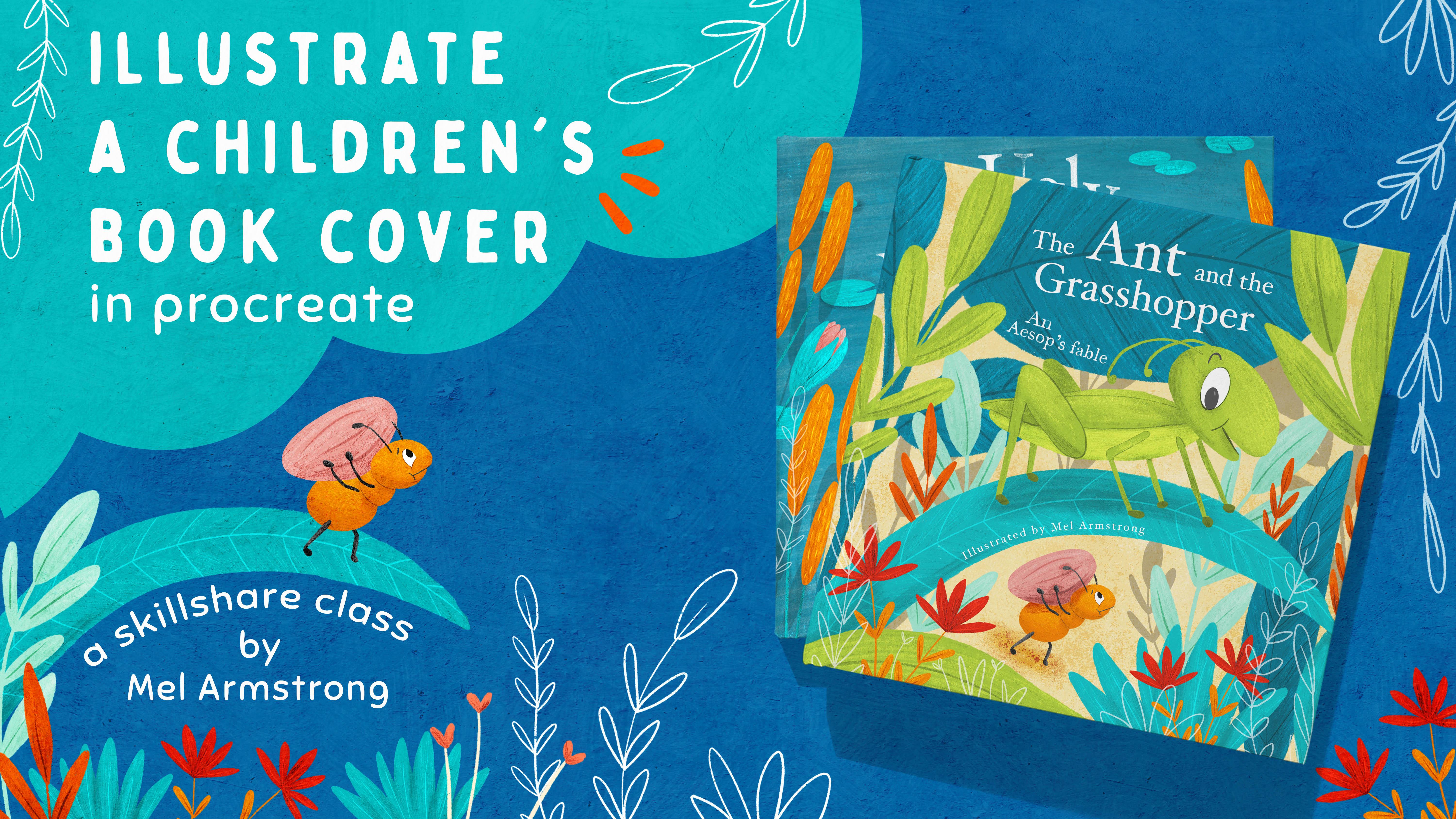
1. Introduction: Hello, my name is Mel Armstrong. I'd like to welcome you back for my 15th Skillshare class. I'm a professional illustrator and surface pattern designer living in Wellington, New Zealand. I illustrate children's books, baby board books, kids novelty products, and licensed designs for home with clothing and fabric. The past couple of years, a lot of my focus has been illustrating children's books. I also get asked often to just illustrate a book cover. Book covers are so important for so many reasons. We all know that people judge books by their covers. You're going to have the most amazing story and illustrations in a book but if you don't have a well-designed cover, people will look past it and move on to the next book. Today I'm going to share with you my process for creating a children's book cover. I'll be using Procreate on the iPad, but you can use whatever you would normally use for your illustrations. You're going to learn all of my best tips for designing and illustrating a book cover that we'll get noticed and may even get you more work. Before we get started with drawing, I'll show you how to plan your design, starting with the layout and composition, color theory including value studies, before moving on to color and texture. By the end of the class, you'll have a well-designed children's book cover which you can add to your portfolio. As a small bonus, I'll also be providing you with some fabulous freebies, including some color palettes and procreate shape brushes. Also if you're new to Procreate, I highly recommend you take one of my other classes first that will teach you specifically Procreate skills or one of many great Procreate classes on Skillshare. In this class, I'm primarily focusing on the design aspect of book covers and not how to use Procreate. If you haven't already, don't forget to follow me on Skillshare by clicking that button up top and how about we just dive in and get started.
2. Book Size & Format: Let's talk about book size and format. I'm going to show you some different book sizes, and formats that can be used when creating a book cover. Let's start with board books. These are aimed at very young children. They typically have rounded edges, and either rectangular or square. They have simple illustrations that are not overly complicated. They don't often display the author or the Illustrator. This is what I did for Random House Kids. You can see this one also has cut outs, allowing the child to look through, peek through the pages to the critters on the other side. Next, we'll have a look at picture books. Picture books can either be square or rectangular. This is one I did for New Frontier Publishing. This is a square one. The rectangular books can either be portrait or landscape. Picture books that have wonderful landscape illustrations, we use a landscape format. Like this book here, We're Going on a Bear Hunt. As you can see, it has beautiful landscape illustrations, which wouldn't work that well if you were to do it on a portrait book. Like this one here, I Want My Hat Back. You can see here, Jon Klassen's very tall bear works perfectly on the tall format. Then when you go through the book, you can see he looks quite tall, and the little animals that he made along the way looks small and vulnerable, which you can only really do with a tall book. Another thing to remember when creating book covers is that they are often created as full spreads that cover the back as well. As you can see in this book, Into the Wild, the spread goes right across to the back. Another thing to keep in mind is that covers need extra blade as when you have this hardcover like this, they wrap over in pages. You can see it just there. It's wrapped in. They need quite a bit extra blade than the illustrations inside the book. This one here doesn't. Actually, no, it does. Sorry. It goes all the way as well. Some of the technical aspects that I'm talking about, you don't really need to know them if you're just creating a cover for your portfolio. But if you do create a cover for publishers, good to know these things up front. You generally work with a book designer anyway, who would guide you through the dimensions, and ensure that you've got them all correct. I also like to create my canvas quite a bit larger than what they're asking for, as long as I have the right aspect ratio, then they can then resize it down to fit the book, and it will be nice and crisp with a high resolution image for them. Next up, we're going to talk about book composition. See you there.
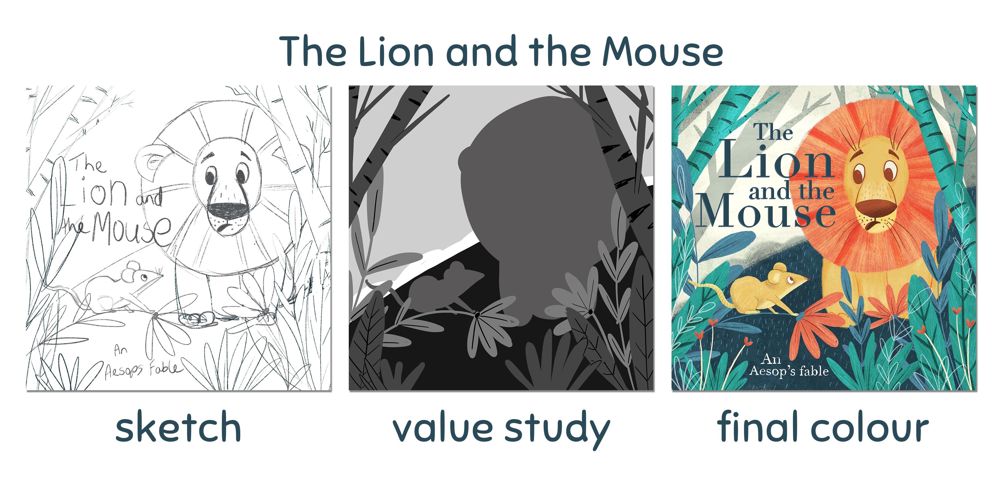
3. Composition: An effective way of elevating your artwork is to apply the rule of thirds. The rule of thirds is an off-center composition that will make your illustration more appealing and give it an interesting structure. The rule of thirds involves dividing the composition into nine equal sectors using two horizontal and two vertical lines. The idea is to place key elements along the guidelines and intersection points. Placing key elements at intersections can really increase the strength of a focal point. In this example of the line and the mouse, I have placed the line and the mouse on two intersections as I want them both to be a focal point on the cover. Again on this illustration cover of Little Red Riding Hood, you can see how placing the wolf and the Little Red Riding Hood on intersections has given it strength. Westerners read left to right, top to bottom, which means when we are looking at an illustration, eyes naturally start in the top lift and move diagonally down to the bottom right. In fact, it can really hurt our brains to do otherwise. It's a really good idea to remember this when planning out the layout of your illustration. The Gutenberg diagram demonstrates this well by showing you the western eye falls as it moves through the information on the page. The circles indicate the areas our eyes are most likely to look. There are four quadrants with the top left and bottom right having the highest likelihood of visual contact. The top right and the bottom left have the least. So you wouldn't want to put something important like your title in the bottom-left. Book covers can still be visually appealing without applying the preferred diagonal scan. A layout such as my secret garden cover that centered and has no diagonal movement can also work. But it's important not to reverse the preferred diagonal scan as they can confuse the eyes and make it uncomfortable for the reader. Another important design tool is creating a focal point. There are five ways that you can do this. Number 1, size. Larger elements will pull more focus than smaller elements. Having two elements of similar size will just compete against each other. When creating your children's book cover, decide if you want the title or the character to be the focal point. Two, centering. Objects at or near the center of the design tend to grab attention more than similar sized objects in other areas of the page. Three, isolation. It helps to have white space surrounding an element to help it stand out. If there is too much clutter going on around them the main element, it may be harder for the reader to focus on it. Four, contrast. You can create contrast by doing a value study, which I will demonstrate in an upcoming video. Basically a broader object will put out if surrounded by Della colors. You can also use complimentary colors placed next to its opposite color from the color wheel to create contrast. Will learn more about color theory in a video coming up. Number 5, convergence. Try to make a point of positioning the direction of a character's gaze into the illustration not off the page. This can also be used to create a good perfect diagonal scan. In my Little Red Riding Hood cover, you can see my main character is looking directly towards the wolf. Now that you have a basic understanding of composition, let's start sketching out our cover.
4. Sketching: I'm going to start by creating a new canvas in Procreate. I'm going to create a 10 by 10. I'm just going to change my color here and get started with the sketching. Now I've decided for this video that I'm going to create a book cover for the book The Ant and the Grasshopper. Now if you need some inspiration on books that you could design a cover for, have a look in the Resources section and I've got a whole heap of children's books that you can take inspiration from. The 1st thing I'm going to do is divide my canvas up into the rule of thirds. I've actually created a shape brush for this. This is also available in the Downloads Resources section. I have got one he called rule of thirds square. So I'm going to select that. I'm going to select actually a red color. Then I just put that there and then click on "Fit to Screen". It will resize it to the screen. I'm going to change that to multiply, just bump it down a bit and lock it. Then I can start my sketch underneath. For my sketch, I'm just going to use the standard 6B pencil. I'm going to remove my hand for this so that you can see it a bit clearer. The1st thing I'm going to do is align my key characters, my key elements up along the lines and at the intersections, I want my grasshopper and my ant to be the focus. Here I'm going to align the eye of the grasshopper on one of the intersections and I want him to be looking towards the ant as well just to get that directional flow. I'm keeping the eye on the canvas rather than off the page. I'm going to flip this around a little bit I think. It looks a bit better like that. Then I can possibly put the title up in the left hand corner. I think the ant needs to be carrying something like a seed or a nut. I think that's looking pretty good. Next up, we're going to talk about color theory before moving on to coloring our cover. See you there.
5. Colour Theory: A basic understanding of color theory will allow you to make better choices with your art, and it will allow you to make adjustments to your color palettes. First, let's start with the color wheel to learn how different colors can relate to each other. To begin, we have three primary colors: red, yellow, and blue. If you mix the primary colors together, you get secondary colors: purple, orange, and green. Then if we mix primary and secondary colors, we get tertiary colors. On the right are the warm colors, and on the left side are the cool colors. When creating color palettes, we should always consider how colors relate to each other. Complementary colors are opposite each other on the color wheel and have the highest contrast. Monochromatic colors use a variation of the same color. Analogous are side-by-side on the color wheel. You can also have triadic colors, which use three colors that create an equilateral triangle, creating a nice balance of contrast and harmony. Here's just another name for color. It's the pure color. Saturation is how vibrant or muted a a color is, the degree of intensity. Value is often referred to as the brightness of color, or how light or dark the color is. It's probably the most important when considering a color palette, as it's what our eyes prioritize when making sense of what it sees. Value is important because having clear differences in value will help ensure that the various elements of your illustration stand out neatly and attractively against each other. Weak value differences often lead to an unattractive illustration. In the next lesson, I'll show you how to create a value study so that you can select the best values for your illustration. Then later on, I'll show you how to do a color study from your value study, before going on to the final color. You can have strong, moderate, or subtle value differences in your illustrations, as they will communicate a different feeling. For example, strong value difference will emphasize energy through vibrant hues. Whereas, a more subtle value may communicate a more subdued feeling. Take these two examples. The one on the left is colored with strong values, and it's bright and vibrant. Whereas, the one on the right, I've used more subtle values to create a more subdued and muted color pellet. Both work well, but they tell a different story. Now that you've got the basics of color theory, let's put it to practice.
6. Value study: To ensure we have some good contrast in the final illustration, we're going to create a value study. A value study is a gray scale painted sketch. By doing this, we can decide where the lightest and the darkest parts of our illustration are, which will help us identify the areas that need more or less contrast to help the elements stand out. I generally do this by splitting the artwork into three layers of similar value so that you'll have a light, middle, and dark. Before we start the value study, let's create a value palette. I'll show you what I mean by that. In my palettes, I have a value scale from darkest to lightest. Let me show you how I created that. If I go to the gallery and we'll just select this blank canvas here, or you can just create a new one. Go to your color picker. I'm going to use the classic panel and drag my picker down to the far bottom left, and that will select the darkest color. I can then just pick a different paint brush here. On the left I'm going to create a circle and then I'm going to go back and select the lightest color. I'm not going to go all the way to white, I'm just going to keep it off white. Another thing to check is that there's no saturation. So this middle bar here, if I drag that up it's going to add some saturation. If I take it all the way down it will go to zero. If I went to this value panel here, you can see that the S here for saturation is zero. That's very important. Let's go back to the classic one and let's draw our circle down here on the right. Next, we want somewhere in the middle. If I just drag that down to approximately the middle, and we'll create a circle in the middle. Now we just need to fill in these gaps here. Now once you've got all of your circles there, I'm going to create a new palette and you could call it value scale. Then using your finger, you can add each of these to your palette, and then you've got them there for future reference. Let's get started with the value scale. I'm just going to go back out to my sketch, and I'm going to create three layers and put my sketch on the top. I'm going to change that to multiply and knock it down a bit and lock it. I'm going to start with my darkest and I'm not going to pick the very darkest, I'm just going to go one less than that. You can use any brush you like for this. This is really just a rough sketch. I'm now going to fill in the dark areas, and now some mid-tones. I'm going to add in some lighter tones and then I'm going to go back and forth to mix it around a bit. That's looking pretty good. You can see that there are some really nice contrast that we can work with when we do color blocking, which is what we will do next. See you then.
7. Creating a colour palette: Now that we've finished our value study and we have the basics of color theory, I'm going to show you some tricks and online resources to help you create a color palette. When creating a color palette, we have to take into consideration balance in the variety of colors. We also need to think about mood and temperature. You can see in these examples, that the one on the right is colored with strong values and it's bright and vibrant, whereas the one on the left, I've used all subtle values to create a more subdued and muted color palette. Both work well, but they both tell a different story. Where do I get my colors from? Well, a number of places. Sometimes I take colors from a photo and sometimes I will find some interesting palettes on Pinterest. My other favorite tool is Coolers, which is a palette generator. Now, you can download an app to your iPad or you can access it online. Now, to pick colors from a photo, let me demonstrate. Let's go out to the Gallery. I'm going to just create a "Blank canvas", and I'm going to bring in a photo. Now, this is just a bunch of items that I collected around the house, which stood out to me. I liked the colors. To pick the colors and create a color palette, all you have to do is hold down your finger. Now, if you move it around, you can change the tone or the value and pick the color. Then I just draw a little circle within, let's pick this yellow. I love the pink on this little notebook, this rustic color, and I think we need a blue. Then if I want to create and save this pellet, I just go into my Palettes, click on the "Plus" and create a new palette. I'll go up to the top. We've got a blank one here, you can give it a name by clicking on here. Just going to pull a sample for the moment. Now, to add them, just click on the "Color" and then place it in. I generally stick to a smallish amount of colors, probably five, but sometimes I will branch out to about 10 colors, it depends on what I'm working on and the mood or vibe I'm trying to create. Another tool I use a lot is the Coolers app. Let me open that app. In here, you can explore palettes that other people have created, you can filter them. If you want to look for warm colors or monochromatic. You can also generate palettes by just clicking on this button and say, you like that color there. You can lock it and it will generate colors around that. You can also export them and it gives you the option of exporting it to Procreate. Otherwise, you could just create an image and then sample the colors from the image, but exporting it to Procreate is fantastic. Let's go back up, I've saved some in my Library. I've created one here called The ant and the grasshopper that I want to use for my book cover. If I click on the little dots there, "Export palette," and then click on "Procreate", and then click on the "Procreate" icon. If I go into my Palettes it likes to put them right down the bottom, and there it is. Now that we have picked our colors, let's jump into our illustration and start coloring. See you then.
8. Adding Colour, detail & Texture: Let's begin by creating a copy of our sketch. I'm going to export my value study as a JPEG and save it to my photos. Then inside here I'm going to edit as a reference. If you go to your Canvas panel, turn on Reference, click on Image, and then Import Image. Then I have that there available for me. Then I can move that out of the way and start coloring. This allows me to see where my different values are going. I'm going to start with the dark. Let's create another layer, put it underneath my sketch. My sketch is on Multiply, and the opacity is turned down, and I might lock that as well. Let's find my palette. I'm going to set that as the default, and start with green. At the moment, I'm just blocking in color, I'm not adding any data or texture. I'm going create another layer and change to a different color. Locked in all her color, I'm going to add some detail. I've just noticed this one here, this leaf looks a bit out of balance. I'm going to change it to this dark blue. I'm going to cut it out, put it down here. Now if I put on Alpha lock, select the blue, and then fill layer. I like to add texture with my Sparse Bristle detail brush. But you can do it any way you like. I like to use the blend in modes as well. The next thing I'm going to add the title. I'm going to use an existing font, but if you like to hand draw your text, go for it. We've run out of layers. So I'm just going to flatten a couple of layers that I know I don't need. I'm going to make the ant word stand out. Because I want it to pull focus. Then the grasshopper will be the same size. There you go. I may add in a few more touches, but basically that is my process for creating a children's book cover.
9. Thank you: Thank you for watching my class. I hope you got a lot out of it and I can't wait to see your book covers. So please do upload them to the project area. If you're posting on social media, don't forget to tag me #melarmstrongskillshare. If you haven't already, please click that "Follow" button on Skillshare so that you can be notified of my next class. That's it for now. Stay safe and I'll see you again soon. Bye.
10. BONUS: Timelapse: Ok. Okay. Yes. See
 Mel Armstrong, Illustrator, Pattern Addict & Teacher