Transcripts
1. Introduction: Colors are your most
powerful design element if you'll learn to
use them correctly. In this course, I will teach you how colors work and how to apply them to your own interior as a professional
interior designer. Hi, I'm a Dutch
architectural designer, engineer and maker with over ten years of experience
in designing architecture, such as tiny houses,
cabins, and interiors. My work is mainly
focused on minimalistic, sustainable and timeless design made with natural materials. Together with my wife and kids, we're constantly looking
for new adventures. We love to live a
lifestyle full of creative expression
by sharing or ideas, skills, and designs with you. This course is part of the Interior Design
Essentials series. And in this course I will teach you everything you need to know about how to use color
in interior design. Color is your most
powerful tool that is often underestimated
and misunderstood. But if you know how to apply color in an anterior
the right way, you can create
harmony and elegance. A playful and vibrant mood, or a calm and peaceful
atmosphere isn't hard at all. I will translate the theory into practical design tools that you can use as an interior designer. This course is perfect
for anyone who wants to learn how to apply color
in their own interior. Like a professional. People who are
decorating their home, interior architects,
stylists or decorators. We will start with how color
works to create a base. Then I'll tell you
about combining colors based on the color wheel, which practical examples so that you learn to make
a color scheme. Then what colors
does to you about deep psychological effects of color and about the
visual effects of color. How to make space bigger, smaller, or higher,
and just with color. By the end of this course, you will be a color
expert who can provide color advice to
others like a professional. We'll end the course
with the class project called the color quiz to test
your knowledge about color. I'm sure this course
is going to inspire you and help you to get
started right away. So let's get started.
2. The Color Wheel: The color wheel. When
you doubt about a color, turns into color wheel. This is a rule that even
professional interior designers follow and can be used to guide the design
of your interiors. The color wheel is designed in such a way that if you
choose any colors from it, they will look great together. Over the years, many
different variations have been created. But the most common version
is the color wheel, which consists out of 12 colors. The color wheels roots
back to the mid 1600s when Sir Isaac Newton's
work with white light led him to discovery of the
visible spectrum of light. Newton observed that light
split into different colors. And then when the
color is recombined, they would make
white light. Again. His experiments led to the
theory that's red, yellow, and blue, where
the primary colors from which all
other colors exist. The color wheel will
help you to create appealing color combinations by applying the
underlying theory of the color wheel with
the way we see color. You can use it like a roadmap with certain formulas and rules. If you can remember these
rules as an interior designer, it can help you
enormously to put together color
schemes for a client. It's a way to keep color
selection less overwhelming. To understand this properly, I will shortly explain the
theory behind the color wheel. The color wheel shows all 12 colors divided into
equal segments on the wheel. There are three sets of colors. Primary colors. The color wheel consists
of three primary colors, yellow, red, and blue, from which all
other colors exist. You need these colors to
make all the other colors. That's why we call
them primary colors. Secondary colors. Then comes to second
set of colors. These are colors created by an equal mixture of
two primary colors. On the color wheel. Secondary colors are located
between the primary colors. According to the color wheel. Red and yellow make orange. Red and blue make purple, and blue and yellow make
green tertiary colors. And then the last set of
colors of the color wheel. That surgery colors,
tertiary colors or combinations of primary
and secondary colors. Tertiary colors are important to artists because they provide variety and a lot more subtle and software than the primary and
secondary colors. Alright, this all sounds
very logical, right? And you've probably seen
this theory before. But now comes the fun part. By understanding the theory
about the color wheel, we can make certain
combinations. This way you can quickly
and easily select a red color combinations that will fit perfectly together. Because of the theory behind it. I will name some of
the most commonly used and well-known
combinations. Some may surprise you
and look a bit extreme. But when you see the
colors together, it makes sense and you will see why they go well
together in an interior. These first few steps will
be a bit theoretical, but I want to challenge you
to remember this information as best you can and
repeat it for yourself. This way, you will be able
to easily distinguish the right color combinations
during a design process. The projects folder, I've placed an overview with the most
important facts about color. So as you can easily find
them while designing. The end of this course, you will find a test. You can test your
knowledge through a quiz with practical examples
and exercises. This will be your class project. Alright, now let's talk
about color combinations.
3. Color Schemes: Color schemes. Okay, now we know the principle
in theory behind the color wheel and how
colors are related. We're going to play with
the color combinations. Which colors you can
create a certain mood, draw attention, or
make a statement. They can be exciting
or depressing. But color combinations
are much more powerful. Choosing the right color
combination allows you to create a peaceful atmosphere and
playful or elegant vibe. Or a dramatic or
romantic interior. Colors are your most
powerful design element. If you learn to use
them correctly. You can find these perfect
color combinations or color schemes by applying certain formulas in
the color wheel. These coming nations
will always work and will have a certain
effect on your interior. So you can use this as a
design tool or as a guideline. I will now named
some of the most well-known and used
color schemes. The first game you can find in a color wheel are the
cool and warm colors. As you can see from the diagram, warm and cool colors split to color wheel with the
warmer colors of yellow, orange, and red on the right. And the cooler colors of green, blue, and purple on the left. I go deeper into the effects and the psychological value of the warm and cool colors
later on in the course. But it's useful to know they are bundled together
into color wheel. Analogous color scheme. Analogous color scheme
involves three colors which are positioned next to each other on
the color wheel. Older colors match because
they are slightly different. Is also works very
good with plants by using greens and blues. It's a fun way to work and
the colors in a septal, natural and organic way. The darker you use the colors, the more moody divide becomes, and the more light or
neutral domain colors are, the more inviting, calm, and cozy space becomes. Sometimes it's
only small details in the interior that'd
be long to this scheme. As you can see here
in the plants, flowers, pillows, and carpet. Complimentary color scheme. Alright, this is a very common
and use color combination. And when you can remember
these combinations, you will see them
everywhere from now on. Complimentary colors
are colors that are directly opposite of each
other on the color wheel, like yellow and purple, e.g. complimentary colors
are usually used as accent colors in
small quantities, but also work perfect
as a wool paint color with furniture in the exact
opposite color, like this. Complimentary colors are dynamic
and pleasing to the eye. This is because of
different types of cones. The photoreceptor cells in your eye that contribute
to your color vision, perceive different
colors of light. You can experience this if
you stare for a long time at a color and then quickly
look at a white wall. You will see a contract
after image in the opposite or
complimentary color. Same thing happens when
you use both colors. It means that combinations of complimentary colors are
especially dynamic together. Since they play up
each other's intensity at tiny bit of purple really pops and stands out in a yellow room because your
eye wants to see that color. It's easy for the eye. Another big benefit of using complimentary pairs
is that you are going to be able to create visible tension or the
relief of that tension. A little bit of orange
in a sea of blue, makes this space more exciting and brighter versus the calm, relaxing feeling of blue. This little bit of
simultaneous contrast. That's a lot of visual
interests to his space with the eye naturally drawn
to the complimentary color, especially when it's done in a minimalistic approach, e.g. here with this orange chair. Also red and green
is a common use, complimentary color
and interior design. As you can see here
in this picture. Complimentary colors
create a balance between cool and warm colors. Use neutral colors to
balance out the space. These examples may look a
bit extreme and normally do real colors you use in an
interior are ways softer, saturated, lighter, or darker, but the root color
stays the same. Also in this picture, new route colors are red and green, which
are complimentary. But a real color, green, maybe olive green, and
an earthy red, e.g. so when you look to a picture, try to find the root collar and find out if they
are complimentary. Split complimentary
color scheme has split complementary color
scheme takes up a base color and two
secondary colors. It is similar to the
complimentary color scheme. Would one of the
complements is split? The split complementary
color scheme is versatile, pleasant, and easy to use. It offers the same advantages of a complimentary color
scheme in terms of contrast and balanced between warm, cool
color temperatures. But the colors are more subtitle
and create less tension. This will create a
balanced contrast rather than an overwhelming one. You will still get the
visual impact of bold color, but you will be
able to use it more often instead of
relying on neutrals. Split complementary
colors works best when the base shade is a
mute as dominant color, using other colors as bold accent shades to highlight certain
parts of the room. Double split, complementary
color scheme. This scheme consists of two pairs of
complimentary colors. Double split complementary
color schemes offer a lot of contrast,
interests and variety. But the downside is
they can become busy and mismatched if not
balanced properly. If you're not experienced
in working with colors, take extra care and
not to overdo it. A contrast, saturate, Leiden or toned down two colors for
a more sophisticated effect. Focus on one or two colors and use the rest
for details like an interior triadic
color scheme. Triadic colors, or three colors that are evenly spaced
around the color wheel. Because triad colors
are evenly spaced, there are only four triad color combinations
on the color wheel. So red, yellow and blue, purple, green and orange. Blue purple, red orange
and yellow green, red purple, yellow,
orange and blue green. They say triadic colors
out of choice of the bolt. And this is quite true. This scheme is extremely
daring and combines colors located an entirely different
parts of the color wheel, but still fit together. The combination
allows you to achieve strong visual contrast
to when you want to use the triadic
harmony successfully. The color should be carefully balanced and only
one should dominate, while the other tools should
be used as an accent. Square color scheme. The square color scheme is
similar to the triadic scheme, and that it is composed of
four colors made in a square. You can also see this as two sets of
complimentary colors, like in this example. One room has the
complimentary colors, yellow and purple, and
a room in the back. As to blue-green chairs
and red orange wallpaper. You want to pay
attention to achieving an equal number of
warm and cool colors, but greater than given equal attention to
both color parish, you should pick one shades
to dominate the space. Use the other three as accents, like you can see here, with the purple wolves. Monochromatic color scheme. Monochromatic color
schemes in interior design use a single base
color for the room, but incorporate
different shades, tints, and tones of the menu within
the rooms color scheme. This creates a very bold, dramatic Luke, while still being quite soft and
elegant to the eye. With this, it's easy
to create a sense of harmony and balance in the room. If you apply a
monochromatic color scheme to your entire home, you can create beautiful, harmonious transitions
from one room to another. That doesn't visually confused when you're walking
from room to room. Especially when you use
complimentary colors. Monochromatic color
schemes are easy to use, but look dramatic and
make a big statement. If you like colorful rooms, you will laughed as late as
joyful trends, you see a lot. You can create
immersive spaces by painting the entire
room one color, including the
ceilings, which works particularly well in
the smaller rooms. When using monochromatic
interior design, it's important to make sure that the color doesn't totally
overwhelmed a room. You can use areas of white
and black as blank space or a whitespace to break up the monochromatic colors and give your eyes
area through rest. Use of white and
black and also create a bit more NRG interior
monochromatic colors, and adding a bit more
life into the room. Alright, like I mentioned, a monochromatic color scheme is made out of different shades, tints, and tones
of the same color. In the next lesson, I will explain how
this works and how to use them to create more color combinations
and harmony in a space.
4. Tints Tones & Shades: Tints, tones, and shades. As an interior designer, you often stare at
the color strip with hundreds of colors trying to
find the right paint color. These colors trips consist of different variations of
a particular colour, be aided by tones,
tints, and shades. These things are very often
confused and misunderstood. But if you understand
how they are made, they become a
powerful design tool. Let's talk shortly about
tints, tones and shades. Simply put, tins are created
by adding white to a color. Shades are created by
adding black to a color. And tones are created by
adding white and black. So gray to a color, which will change the
saturation of the color. Tint. As I mentioned before, a tint is created when you add white to a color
which will lighten. It, is also sometimes
called a pastel color. Tints can range from nearly the full
saturation of the color. So when you add a
little bit wide to practically white with
a little bit of color. Tinting a color also makes
the color less intense. So ret, when tinted becomes pink and blue when tinted
becomes baby blue. Tinting or color makes
the color more soft, calmer and quieter,
is why you see a lot of pastel colors in newborn or children bedrooms
and accessories. Pastel colors can also
have a vintage Luke. So they also work
well in homes with older, classic
architectural styles. Shades. A shade is created
when you add black to a color. This will darken the color. Just as with tins, you can add black to any of the 12 colors of
the color wheel. Colors become a bit more earthy when you darken
them with black. A bit of black can turn
a normal blue insulin. Deep ocean like color. Sheets are often combined with neutrals or lighter
colors to create balance. And they prevent a darker color from overpowering the room. Tone. Tone is created
when you add gray, which is both white and black, to a color and tone it
down or desaturated. This is almost a middle
ground between the shade and tint is especially helpful when trying to decrease
the intensity of it too bright colors such as purple or orange to make
it a bit softer. Most commerce we see in our daily environment
have been toned down. To some extent. They are desaturated colors
and more subtitle. Colors at full saturation
are usually too heavy and overpowering to make a statement like we saw in the
lessons before. Because tones or more subtitle, they're also easier to combine with other colors
and pleasing ways. Tones can either be lighter or darker than the
original color, depending on the
amount of black, white, and the
original color used. We call this the
value of the tone. Value is the relative lightness
or darkness of a color. Value includes the extreme
range of light and dark of a color with black and one extreme and
white at the other. Next to value we
have saturation. Color saturation refers to
the intensity of a color. As the saturation increases, the colors appear
to be more pure. Saturation decreases. The colors appear to be more
washed out or grayed out and eventually disappear and makes a black and white image. Also to fully saturated colors in the color wheel has
a different value, as you can see in the image, which is important to remember and can be
a handy design tool. E.g. when you want to make
a room lighter, use yellow. Or when you want to
make a room darker, use blue undertones. To make choosing the right
color even more difficult. You can also blend
certain colors, e.g. blue with a green tint,
making turquoise. But this is also where
it becomes tricky. As an interior designer, it's important that you know which colors are in
the paint color. So you know which
combinations you can make in the interior based on
the color wheel theory. However, some of the use stones are not always
immediately visible. We call this the undertones. The overtone mass tone, or dominant color is the color that you clearly
see and experience. They have a warm, cool, or neutral tone. E.g. here you see a tone
which clearly has blue in it, which is a cool tone, that there is a second tone. What do you think the
undertone of this color is? If you look carefully, you see a warm tint of orange. Here are a few tips to
identify the undertone. Don't look at colors
on their own, but put it next to a pure
white to compare it. If you look to this white
color itself, it looks wide. Hold it next to a pure white and blue undertone will show up. Or hold the color next
to our color wheel. And the undertone, we'll
quickly reveal itself. And look at colors
on a color strip, and then look at the darker
colors on the color strip. It will be much
easier to identify the undertone then the
lighter colors at the top. Okay, now we know
how colors are made. We go to the more practical
and fun part of the course. We're going to use
the theory you just learned and apply
it to a project. Pardis, we need to
understand watercolor. Does emotion or feeling
gifts a certain color? And what are the psychological
effects of this?
5. Psychological Effects of Color: Psychological effects of color. This lesson is about the
psychological effects of color. So how can it make you feel? Did you know your surroundings can influence your emotions? You may have experienced it. You walk into a room and you suddenly feel
irritated or rushed, or you suddenly feel
calmer and more relaxed. Well, there is a
good chance that the colors in those
spaces are playing apart. Each color has its
own unique meaning, which is often based on culture, religion, or
personal experience. But in this lesson,
I want to focus on the psychological and
emotional effects. So not so much on the
meaning of the color. Understanding these
psychological and emotional effects can be used as a powerful design tool to give a space a certain feeling or mood. In the next lesson, I will teach about the
visual effects of color. How you can create a bigger
or smaller space with color. The color red. Red is one of the
most intense colors. Red creates energy
in a room and is a good choice when you want
to stir up excitement. Rad also stimulates conversation and creates a strong
first impression. It's one of the most powerful
colors that can even influence a person's
mental or physical state. Studies have shown that
some people looking at the color red resulted in
an increased heart rate, which then led to
additional adrenaline being pumped into
the bloodstream. Rat is never boring and it's
an excellent accent color. A red accent can change the
way a room is perceived. So you can use it, e.g. to make a cool room warmer. Red is known to
increase appetite, therefore, great for
kitchens or restaurants. Some of the psychological
and emotional effects rent can create our love. Passion, energy,
power, strength, warmth, desire, courage,
attention, stimulating. But a color can also
be associated with negative emotions like anger,
danger, and aggression. So to make this practical, how great is it to be aware of these effects as a designer? E.g. when your client says, I would like to create a
cozy dining area to chat and eat with my family because I love quality time
with my family. Then you can say, great. Let's then use some red
because it stimulates your appetite and encourages compensation and
those quality time. I really love how you
can use color for this. The color yellow. Yellow is the color of sunshine
and associated with joy, happiness, intellect,
and energy. Yellow isn't uplifting color. Would you want to
make sure it's not too bright or too muted? Make sure you pick the right
shade and don't overdo it. Studies show that people
are more likely to lose their temper in an
all yellow interior. So it should be used sparingly. On the other hand, bright yellow evokes
optimistic feelings. Like yellow is associated with intellect, freshness, and joy. In hallways. Yellow
can feel welcoming. When you may get out
to dull or dingy. Yellow can represent
caution, decay, sickness, and jealousy, and is therefore rarely used
in interior rooms. So be aware of that. It is an excellent
choice for kitchens, dining rooms, and bathrooms. Some of the psychological
and emotional effects, yellow can create our bright, sunny, energetic,
warm happiness. Joy, optimism, welcoming,
freshness and positivity. And a negative emotions can be irresponsible,
unstable, and jealousy. The color green. Green is of course, the color of nature considered the most
restful color for the eye. Green creates a sense of
calmness and security, and therefore it's great to
use and interior design. Green symbolizes
growth, harmony, freshness and fertility
and generating makes people feel
emotionally safe. Alcohol is dad. Green is well suited for every room in the
house and can have a calming effect when used as the main color for decorating. Combining light green with gray. So when you tone it down, can create a modern feel. Dark green is associated with ambition, greed, and jealousy. Well, aqua is associated with emotional healing
and protection. Yellow-green can
indicate sickness, discord, and jealousy. Well, olive green is the
traditional color of peace. Queen can be used in different shades
throughout the house. You can use a lighter shades
on the walls and create contrast with dark shades
of green plants, e.g. like you see in this picture, the effect of the dark
shade is neutralized as plants automatically
remind people of nature. Some of the psychological
and emotional effects green can create our harmony. Freshness and environment. Fertility, healing,
Earth, growth, safety, calmness, and ambition. Negative emotions can be
n vi, guilt and jealousy. The color blue. Blue is a very
popular color because it's associated with trust, loyalty, wisdom,
confidence, intelligence, faith, truth, and heaven. So all good things. Blue is the only color
that has a lot of positive effects and little to no negative effects
on your emotions. It is said that blue
will help bring down blood pressure and
slows the heart rate. Blue also slows down the metabolism and
has a calming effect. So it's considered to be
beneficial to the mind and body when use in your
bedroom or offers e.g. blue is often used in
offices because research has shown that people are more
productive and blue rooms. Light or pastel blue can create tranquility and is associated
with health, healing. Understanding, and softness. Dark blue represents knowledge, power, integrity,
and seriousness. Although using blue
in dark rooms with small spaces can create an creepy feeling
like being trapped. You can add a touch of warm colors to
neutralize the effect. Most dark shades of blue, like deep midnight blue, can create a feeling of luxury when you use
in a bedroom, e.g. blue can also lower the pulse
rate and body temperature. So it can make you feel cold. In contrast to red. Blue is one of the least
appetizing colors. So better not use it too much in a kitchen or dining area. Some of the psychological
and emotional effects, blue can create our calmness. Inspiration, security,
integrity, piece, trust, loyalty, intelligence,
healing, and productivity. And some of the
negative effects can be coldness, fear, and envy. Okay, These were the
most important colors. But of course there are many
more colors to discuss, like orange, purple, and pink. But to keep this course
practical for now, it's important that
you understand with color affects
your emotions. You can use this in
your interior design as a design tool. But if you want to know the emotional effects
of the other colors, I made a cheat sheet for you. You can download in
the projects folder. You can find it under
projects and resources. On the right side, you see a list of the main colors with a positive
and negative emotions or color can bring warm
and cool colors. Maybe you already noticed, but you can group to color
emotions almost in two groups. Warm and cool. Warm colors reminding us
of warmth and sunshine. Intense emotions, passion,
joy, and playfulness. They can be stimulating. So they work great for social rooms and rooms that
see a lot of activity, such as a living room, dining room, and the kitchen. They also attract attention
and are generally perceived as energetic or
exciting as a feeling. They create comfort, coziness
and give a positive energy. Cool colors. They have the ability to create a sense of calmness and peace, reminding us of calming natural elements like
water and the sky. Cooler colors are perfect for private rooms where important
to this concentration. Focus, tranquility and rest like a bedroom,
office, and nursery. Alright, great. In the next lesson, we're going to look
at the space itself. So how can you use color to
make a room look bigger? E.g. we do it is by understanding the visual
effects of color. We can also use this as a
powerful design tool that I use a lot in my designs to give a space a total
different feeling. So let's go to the next lesson.
6. Visual Effects of Color: The visual effects of color. To provide the desired
spatial experience. There are elements which
changed the perception of a space without changing the
dimensions of the space. It's important to be aware of these optical effects to avoid making the choice that gives an undesired effect for the
space that we're designing. And on the other hand, it's a powerful design tool to use. The arrangement of
colors or textures in environment changes
the perspective, making the room appear taller, longer, wider, or highlighting
a certain element. In this lesson, I will discuss the most important
facial effects of color. A quick reminder in
the end of the course, you will find a quiz so you can test your knowledge
about color theory. If you can, ends to
test with 100% score, you know you've gained
a new skill and they're able to use color theory
in your own designs. I believe when you understand the theory and are
able to remember it, it becomes a powerful design
tool for you as a designer. So try to remember these optical effects
as good as possible. I've made a cheat sheet for you. You can download in the
projects folder where you can find all the visual effects
you can use as a guideline. So here you see a
space of five by 5 m and 3 m high as an example, with all white walls and a white ceiling and
a wooden floor. Okay. In general,
lighter colors making materials field larger
and more spacious. Wide on the walls and ceiling, you create a feeling of
spaciousness in an environment. The light colors will reflect natural light and make surfaces appear
larger to the eyes. Minimizing contrast and
using lighter colors, two walls and ceilings
maximizes reflection of light. This creates the
impression of a larger, more open space ideal for
living areas are dark, internal rooms that may otherwise
feel cramped and small. There's also a downside when
you use too much white. And especially when you
use white on the floor, space can feel
disorienting and lonely. Like you're floating
in the emptiness. Makes sure you
balance it out with warmer colors when you want
to use white on the floor. So lighter colors make
the space feel larger. But sometimes you
don't want that. Sometimes you wanted to create
a cozy, intimate lounge. Well, you've guessed
it. Darker colors makes us space more intimate. So when the idea is
to make them appear more compact,
smaller and closer, they will absorb most
of the natural light, giving a feeling of
enclosure that can be beneficial for cozy living
rooms and bedrooms. Same thing as with
the lighter colors. There is a downside when
you use dark colors on the walls and ceiling and the
light color on the floor. This space can feel unstable, like if you're floating. So be aware of that. Applying a dark
color to the ceiling reduces reflection
and brings it down. So does ceiling fields lower. Lowering the height of the ceiling can make
this space more pleasant and provide
a welcoming feeling. This can also have the effect of making the room look wider. Culmination of a dark floor
and a dark ceiling can make the room seem less tall and can transmit a
sense of oppression, especially in spaces
that are already low. On the other end, you
can improve a room with relatively low ceiling by adding lighter colors
on the ceiling, which makes it feel
like a higher ceiling, especially with dark
contrasting walls. Painting to back wall
and the ceiling. We just same darker colors. And leaving the sidewalls
lighter will make the space appear wider
and more spacious. This is a technique
widely used in corridors or narrow,
very long rooms. This space appears shorter. Wider painting to two opposing sidewalls
with dark colors. And leaving the background
and the ceiling in light colors will make the
space more narrow to the eyes. This improves the proportions
of overly wide rooms. Applying dark colors to the sidewalls brings
them in closer, making the room appear
narrower and taller. To highlight a wall,
it's important to keep it a lighter color, while others have a darker tint. This causes the eye
to be drawn to it. The eye is drawn to
the brighter element, much like in a theater
or the stage or screen, is brightly illuminated
by the surrounding walls, floor and ceiling
are darker in color. If you have a very
large space in your home and wanted
to feel more intimate, invest in dark tones on the back wall in contrast to
lighter colors elsewhere. Applying a darker color to
an end feature wool has the effect of bringing it closer and reducing their perceived
depth of the room. Also, cool colors make this
same won't seem farther away. And warm colors McDowell seem closer and
add more intimacy. Another method of reducing HIV is to make the walls appear shorter by applying
a darker color or material to the lower
proportion of the wool. This was commonly done in older style buildings
where rooms typically had very
high ceilings and was achieved by introducing
timer pedaling or wallpaper to the lower
proportion of the wolves. Okay, great. We've learned that the
arrangement of colors or textures in an environment
changes the perspective. Making the room appear
taller, longer, wider, or highlighting
a certain element. So in general, darker, warm colors make a space feel more intimate and
make it smaller. And lighter, cooler colors
make us space larger. This has to do
with the amount of light the color is absorbing. In the next lesson, I want
to tell you about maybe the most important part of experiencing color in his space. Daylight. You may have
experienced at a color, it can look totally different in daylight than in the
shadow of a room. In the next lesson, I will explain you
exactly how this works. So let's go to the next lesson.
7. The Effect of Light on Color: The effect of light on color. As we learned in
the first lesson, color is created by light, is therefore not surprising
that daylight and artificial light
have a big impact on how you experience
a color in his space. The effect of natural
light on color can vary greatly depending
on whether the season, the sun's position in the sky, and a time of day. Understanding these
factors can help you to anticipate how natural
land will affect colors. First about the
position of the sun. We all know the sun comes up and the East goes over the
South and sets in the west. This has a big impact
on the color in a space, Northern Light. So here you see a space
with a window to the North. So the light comes only
in from the north. And the rooms that
face and North. The natural light
coming into the room. We always tends towards cooler tones and has a
subtle hint of blue in it, meaning that it's best
to afford colors of half cool undertones tending
towards green or gray, e.g. best to use colors
with warm tones in the lighter shades to attract
as much light as possible. But on the other hand, you can also choose to use slightly darker shades
with warmer tones to create a more cozy
atmosphere that gives a greater feeling
of comfort to the space. Northern Light is indirect
and can make colors appear darker and
less saturated. Gray or muted tones
will become more gray and darker and
don't work very well. If you paint a north-facing
room, cool gray, blue, green, or purple, you risk to room
feeling extra cool. White on the wall can
make the room look gray. So I'll make sure there are warm tones in the white color. The color of Northern Light
is indirect and therefore the most diffused light remains relatively consistent
throughout the day. Which is why the colors of your paint and fabrics
in a room with a northern exposure will look the same color
throughout the day, which can be a handy thing. Eastern light. Here you see the same space with
Windows to east. That's where the sun comes up. East facing the
rooms have a soft, bright light in the morning
that is slightly warm, but not that the
warm and intense like afternoon Western light. It casts a yellow to orange yellow tint that it will change throughout the day. As the sun moves across the sky. In the afternoon, he's facing rooms become more
gray and subdued. Acting a bit more like
north-facing rooms, but not as bright and blue. Using warmer and less
muted colors will help during the day when the sun doesn't shine directly
into the space. Southern light. So here you see the same space, windows to the South. So the light shines directly in from the South
into this space. South-facing rooms
have a warm yellow toned light coming in. This light gets warmer
and more red orange close to the evening. Rooms with southern
exposure benefits from beautiful warm light, but it can be too
intense or glaring because of the direct
exposure to the sun. To solve this problem, use colors that are muted
with a bit of gray. Darker gray tones will
absorb some of the light, making the room feel more
comfortable and balanced. Painting as south-facing room, a warm color will increase the facial
warmth of the space. Southern light creates a lot
of shadows in the interior. That's why colors
changed a lot during the day in contrast
to Northern Light, western light, here you see a space with
Western face windows. This is where the sun goes down. We all love the red orange
sunrise and sunset, right? West facing rooms tend to be a bit flat and gray in
the morning hours. But in the afternoon
and things start to lighten and brighten. The light that comes
from western exposure is warm and it goes more
to red, orange to red. Light coming in
appears warmer and warmer as the sun gets
closer to his setting. Both slightly warm
and cool colors work great on West faced rooms. But keep in mind that
the warm colors will increase in warmth
in the afternoon. So northern light adds a
little blue to the colors. Eastern light adds a little
yellow to the colors, especially in the morning. Southern light as
both yellow and red, orange to the colors and are very intense with
a lot of shadows. And Western lead is the most warm and adds red
orange to the colors, especially in the afternoon. So when you are aware
of these effects, you can use them as a design tool to make a
room warmer or cooler. You will find a summary in the Projects folder of the above effects
of natural light. Alright, great, that
you've made it this far. You now have a whole collection
of design tools that you can use when choosing a color
for a room or interior. To turn his information
and tools into a skill. I've put together a short
quiz with questions about the most important
topics of this course. I'm sure these
questions will help you remember the
information better. So your class project is to take the quiz and
test your knowledge. I'm really looking forward
to see your results. So please let me know in the discussions what
your score was. It would also be very nice
if you would leave a review, if you've completed
the course this far. Learn more about
interior design. Architectural design
are funded yourself. Projects follows,
and this way we will keep you informed
about new courses. Thank you so much for
taking this course, and good luck with the quiz.
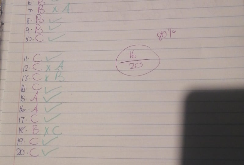
8. The Color Quiz - Test Your Knowledge: The color quiz, test
your knowledge. Alright, here is the
last part of the course. Is Quiz consists of 20 questions about the most important topics
we covered in the course. I'll read the questions
out loud first. And at the top right, you see a timer for about 10 s, after which I give the correct
answer to the question. Write down on a piece of paper how many questions you got, right and shared his
in a discussion step. Good luck. Here comes
the first question. Question one. Which colors are split
complimentary colors, a, B, or C. The correct answer is B, orange, blue, and purple. Question two, what would
you call this color scheme? Hey, monochromatic,
complimentary or seen analogous? The correct answer is C. Analogous. Question three, which
complimentary color would work great
with this interior? A blue, green, red, or purple, or see blue, purple? The correct answer is C. The complimentary
color is blue, purple. Question four, how would you
call this color combination? Hey, complimentary, be
analogous or see monochromatic? The right answer is
C, monochromatic. Question five. Which color is a tint? A, B, or C? The correct answer is c. Question six, what
kind of color is this? A. Attend. And be a
tone or see a shade? Correct answer is B. Questions seven. What is the undertone
of this color? A, B, or C? The correct answer is a. A little bit of orange. Question eight, which color
can make you feel jealous? A. B, or C? Correct answer is B. Yellow. Question nine, which
color would you add to this interior to
create more calmness? A, B, or C? The correct answer is B. Green creates more calmness. Question ten, How can you give
to space a wider feeling? Hey, make the ceiling darker, be made to backfill darker. Rc, make them back
wall and the ceiling darker. The correct answer is C. When you make the back wall
and the ceiling darker, it creates a wider
feeling to the space. Question 11. Which
color would you give to his wool to make
it feel closer? A yellow, green, or red? The correct answer is C, rat, warm color feels closer
than a cold color. Question 12th, how can you get this space a higher feeling? Hey, make the ceiling lighter. E, make the floor lighter. Or C, makes a ceiling darker. The correct answer is a
make to ceiling, lighter. Questions 13. What happens when you use these colors
to a North Face room? It makes it feel smaller. B, it makes it feel colder, or see, it makes
his face too dark. The correct answer is B. Blue makes a North
Phase Rule holder because of the blue light
coming in from the north. Question 14, which color works best for his
south face room? A, B, or C? The correct answer is C, a shade of blue. Question 15. What is the psychological
effect of this interior? A NRG? Be safety or sea healing? The correct answer is a rat. As more energy. Questions 16. Why don't you call this color
a tint tone or see a shade? The correct answer
is a pastel color. Is it tint? So there is a
little wide ad is to the color. Question 17. What
color would you use for a wall to the
right of this office? A, B, or C? The correct answer is C. A light blue makes
his room field wider because cold colors feel
farther away and blue, That's a feeling of productivity and calmness to the space. Question 18, what is the
effect of the yellow color? It makes the space higher. B, it makes it feel welcoming. Or see it makes it both feel
higher and more welcoming. And the correct answer is c. Question 19. Which orientation? That's most red orange
light to the interior. A, east face rooms
be south face rooms, or C west face rooms. The correct answer is C, west face rooms at most, orange lights to the interior. And it's the last
question, question 20. Here you see a
picture of my office. Which color which you give
the chair in my office? A yellow, purple, or see green? The correct answer is C, green. Because you see a lot of
orange and a rat into space. Green is a complimentary
color through this. So Greenwood work
great in the space. All right, you've made it, you've reached the very
end of this course. Please let me know how your test went by sharing the
results with us. And let me know
what you thought of this course by leaving a review. I hope you'll learn a
lot in this course. I'm sure you've learned a valuable skill in a
short amount of time. You now know how colors work and how to use
them in your interior. If you want to
stay updated about new courses, follow us here. You can also follow us on Instagram to see all
of our projects. We keep making new courses
on interior design, fun do-it-yourself
projects, woodworking, tiny house design,
and many more things. Thank you so much for watching this course and
hopefully see you soon.
 Auke & Jildou, Designer & Maker Architecture & Interior