Transcripts
1. Introduction: Hello, and welcome to this
class all about how to turn your artwork into
bookmarks. My name is Alex. I'm a pet portrait and animal artist specializing
in acrylic paints. Over the past seven years, I've created hundreds of pets and animal
portraits for clients. Recently, I've started
turning some of my favorite paintings
into bookmarks. Creating cheaper
price point products from your artwork is a really, really great idea in order
to reach a wider audience. This class, I sharing
everything you need to do in order to turn one of your
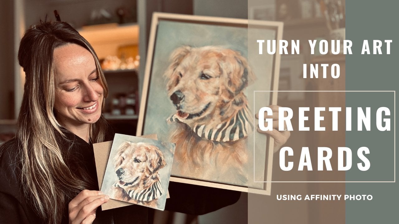
paintings like this. Into a bookmark like this. I'm really excited that you've joined me for this class and I'm looking forward to
seeing the bookmarks you create from your artwork. Without further ado, let's
talk about the class project.
2. Class Project: For the class project, I would love for you to
have a go at creating a bookmark template from one
of your favorite paintings. For this, I'll be showing
you how to create the template using the photo editing software Affinity Photo. If you have a different type of photo editing
software like Adobe, it's completely fine to use. A lot of the principles will
apply to both programs. If you don't already have
a photo editing software, then I can highly recommend
using Affinity Photo. It's only a one off payment, so it makes it a really,
really affordable option. You buy the software
once and then you have it on your computer
for as long as you want. I actually got my
Affinity Photo software on the Black Friday sale, so just keep a lookout for
sales throughout the year.
3. Photographing Your Artwork: So the first thing you
want to do is choose which painting you'd like
to turn into a bookmark. I really, really
love this painting. It's one that I did for fun, so it wasn't a commission, and I knew that I wanted to make cards and bookmarks
from this one. So once you've decided, you then need to photograph your artwork in order to have a digital file that
you can work with. My tips for taking photos of artwork is to do so
in natural lighting. You don't want to use any
artificial harsh lighting like spotlights or overhead lights when
you're photographing. Just make sure that
you photograph on a light but overcast day, so you don't want
any direct sunlight hitting the painting either. Also make sure your camera
is facing the right angle. You don't want it to
be tilted in any way. You want it to be
flat so you can get a really nice photo
that isn't distorted. For taking the photos, I use my iPhone. It's got a really
great camera on it. If you did have a DSLR
or other similar camera, then by all means, use that. But as I say, I
just use my iPhone. Particularly if you're
taking a photo and then making products that are
smaller than the painting. If you were going to
take a photo and try to produce fine art prints that were bigger than
the original painting, I would probably suggest
going for a better camera. But for the purposes of
creating a bookmark, they're going to be smaller
than the original painting, so your phone camera
should work just fine.
4. Creating the Bookmark Template: Now going to show you how I
create the bookmark template. The first thing you'll
need to do is determine the dimensions of the bookmark
that you want to create. For this demonstration,
I'll show you where I order
my bookmarks from, so I'm heading over
to printed.com. This is where I typically
order my bookmarks and I'm going to navigate to
the bookmark section. Reason for doing this as a first step is you
want to find out the dimensions you need to use for your bookmark template. On this particular website, they offer two different sizes. I normally go for
the smaller size, which is 52 millimeters
by 148 millimeters. I'm going to head back
over to Affinity Photo and create a new document with
the bookmark dimensions. I'm going to make sure that my document units are
set to millimeters. I'm going to add in
those two measurements for the page width
and the page height. The page width was
52 millimeters and the page height
was 148 millimeters, I'm going to set my DPI to 300. This is now your blank
bookmark template. The best thing to do is export the file and save
it onto your desktop. Click File Export. Just make sure that
you've got it set to the highest quality and
then click on Export. I'm going to save the file on my desktop as
something memorable. I'm going to call it bookmark. Template. That way
you've always got a blank master copy if you wanted to create
more than one design. I found the best way of doing
this is to then close down that document in
affinity photo and then reopen your saved file. If you've also called
your bookmark template, then reopen that file. Next open a second tab with
the image of your artwork. You have two tabs open, your bookmark template and the file containing
your artwork. Now you want to copy and paste your artwork onto the
bookmark template. To do this, select
this arrow icon, which is the move tool and click somewhere
onto your artwork. You'll notice that you get a blue outline around the edge. To copy the file on my laptop, it is Control C. Just use whichever command is
correct for your keyboard. Then go to the
bookmark template tab, select the move tool again and click anywhere in the
white area to select it. Again, you'll see the blue
border appear around the edge. Finally, paste the
artwork by pressing Control V or the appropriate
command for your keyboard. This will then paste your artwork over the top
of that bookmark template. As you can see, if I zoom out, paste it ginormous
for some reason. I'm just going to minimize
it, make it smaller, and then zoom back in and
you want to play around with your artwork now and position
it in the best place. I like to have my
artwork at the bottom of my bookmark and then have
some white space above it. I think at the
moment, the artwork is a bit too small
on the bookmark, so I'm going to make
it slightly bigger. I'm not too fussed if it cuts off either side of the artwork. I quite like the
effect of having a little bit of the ear
or neck chopped off. Just have a little play
around with your artwork. You may find that yours covers
the entire white space, which is very, very lucky. Mine never does, so
I'm going to show you a bit later how I overcome this and I like to have a plain white background
on my bookmarks. You might also like to
have a plain background, but you could also choose different colors, you
don't have to have white. Once you're happy with the
placement of your artwork, you then want to
export the file again, head over to File export and make sure you're exporting
it in the highest quality. Then again, save it as
something memorable. I'm going to call mine Golden Retriever
bookmark template. You then want to close that file down again and then re open it. It may seem like a bit of a long winded way
of doing things, but it's the way that I
found just works best with minimal errors and
mistakes happening. I'll go ahead and reopen the exported file that I've
just staved onto my computer. In the next lesson,
I'm going to show you how you can
refine this design.
5. Refining the Bookmark Design: I'm going to show you how to refine your bookmark design now. As I mentioned, I love having
a plain white background. It's clean, simple, and it means all my bookmarks have a
consistent look about them. If your artwork already
covers the whole white space, you can obviously
skip this step. But if you'd like to create a white background like mine or maybe try a different color, I'll guide you
through the process. To remove this blue background, the first thing
I'm going to do is select the flood select tool, the little magic wand icon
on the left hand side, you'll see you get a cross on your cursor and you
just want to click that anywhere in the area of background that
you want to remove. What that flood select
tool is enabling you to do is to select pixels
of a similar color. So if you have a similar
color on your background, this will work
really, really well. You'll then want to hit delete on your keyboard
and as you'll see, it just takes away that whole
area that was selected. Now going to work my way around and delete some more
of the background. A couple of things that
I want to show you which you may experience if you're doing
this for yourself. If your flood select tool is selecting tiny areas
rather than large areas, then you may need to play
around with the tolerance. I'll show you how I do this. On the top menu bar here, there's the tolerance setting and you can change
this up or down. If the area that the tool is selecting is
very, very small, may mean that the
tolerance is too low, so you might want to try
turning it up slightly. And vice versa, if the area
that you are selecting is too big and it's cutting into the area you want to keep, then your tolerance
setting may be too high and you may want
to make it a bit lower. I set my tolerance
slightly higher, and as you can see, it's
selected a much bigger area. You also want to check
that you're not cutting off any of the area
that you want to keep. Just make sure that
you're zooming in and checking the outline
that it's not going too far in and
cutting off any of that artwork that you want
to remain on your bookmark. Going to continue
working my way around the rest of the bookmark and just doing that same process. I'm now working on the
bottom, as you can see, I'm clicking and it's selecting
very very small areas. I'm going to slightly
increase my tolerance 6-7%. As a general rule of thumb, I never normally go
over 10% tolerance. Normally stick to
the ranges 6-9. As you'll notice,
pressing delete doesn't quite get
rid of all the blue. There are still quite a
few blue pixels left. Don't worry, though.
I'll show you how to remove them
completely later. Now I'm going to keep
working my way around, so I just speed up this part. I think I'm happy with that now, so I'm going to export the file before moving
on to the next step. Go to File and then
export and I'll save it as the same golden retriever
template once again. Once that's done,
close the window and open up the file again
in affinity photo. This ensures we've
got a nice clean file to work with before we
carry on to the next part. You can see, there are still
some of the blue pixels left that didn't get deleted
with the flood select tool. I'm going to use the paintbrush
tool to get rid of these. On the left hand menu, select
the little paintbrush icon. That's the paintbrush tool. To adjust the size of the brush, go to the top menu
and change the width. I'm setting mine 250. Also, don't forget
to change the color. At the moment,
mine set to black. I'm going to switch it
to white down here. If you want a different
color for your background, now's the time to change it
to whatever you would prefer. Next, I'm going to
work my way around and paint over those
remaining blue pixels. I've set the hardness of my
brush to naught percent. Let me quickly show you what
happens if I set it to 100. You'll notice it gives
a much harder edge. If you prefer that look, feel free to go for maximum hardness. Personally, I love
a softer edge, so I keep mine at 0%. Of course, you could
always set it somewhere in the middle depending on the
effect you want to achieve. Then I'm going to work
my way around just using that paintbrush tool to get rid of all those pixels
that I don't want. To reach these tighter areas, I'm going to adjust the width of my brush and make it smaller. This will help me get into those spots more easily without accidentally cutting
off any parts of the artwork that
I want to keep. There's one final tool
I use in my process, which you might want
to try as well. It's called the blur brush tool. I use it around the edges of my artwork to blend them
in and to get rid of any stray background pixels that I couldn't reach
with a paintbrush tool. Also helps me to create a lovely soft transition between the artwork
and my background. I'm setting the width of the blur Brush
tool to around 27, and then I just work my way around the outline,
just blending it in. After spending a bit more time refining the bookmark
design with those tools, I ended up with
something like this. Now I can export
the template for the final time and use it to order the bookmarks from
my chosen print house. In the next lesson, I'll show you how the bookmarks
look when they arrive and how I
get them ready to sell through my Etsy
shop and a craft fairs.
6. Selling the Bookmarks: This is how my bookmarks arrive from my print
house that I use. They come in a cardboard
backed envelope. These are actually
a few different designs I had made recently, and I'll show you the golden
retriever one in a bit. I get the choice of various different types
of paper to print onto. Personally, I really love these slightly
textured surfaces. So I normally go with
a hammered finish. I then finish off the
bookmarks with a tassel, and I let my customers choose from a selection of
different colors. To attach the tassels
to the bookmarks, I measure the halfway
point with a rule use a single hole
punch to make the whole and then thread
the tassel through. To protect each of the
individual bookmarks, I place them into a glacine bag. I found ones that are a
perfect size from Amazon. And I also make sure that I photograph each of the bookmark with its different
tassel color options. I usually set up a little area with a nice background
for the photos. These come in really, really
handy for my Ex listings, and I also create
pintss pins that link directly to the
listing on my ES shop. That way, it directs people
straight to the item.
7. Thank You: Thank you so much for
watching this class. I hope I've given you lots of information that
you can now go away with and decide on a painting that you want
to turn into a bookmark. I would love to see the
templates that you create. Please just post either
the file or a photo with a watermark on it down below in the projects
and resources section. If you've got any
questions or queries, then please just let me know.
Just ask me a question. Also, if you want to
follow me and my journey, then I'm on Instagram and
YouTube as Alex Godard. Once again, thank you so much and I look forward to seeing
you in my next class.
 Alexandra Goddard, Pet Portrait and Animal Artist