Transcripts
1. Trailer: Welcome to this class on painting reflective surfaces. This is a class designed to introduce you to the often tricky world of replicating metallic, glossy and gloss surfaces in our paintings and illustrations, we're going to not only figure out how to paint these surfaces, but learn why they get so shiny and reflective in the first place. So we're going to break it down step by step, starting with how light behaves on the surfaces, followed by how we should be applying it practically. Before moving on to doing a series of demonstrations where it will paint several different reflective objects. The lesson will be kept off with an assignment for you to complete. So if you've ever had trouble painting reflective materials, then this is the class for you. So let's get painting.
2. The Laws of Light: Before we put P9 on to Canvas, we first have to cover a little bit of technical information about the laws of light. The reason we can see any object around us is because of how light works. In order for us to see an object, lot has to first strike that object. This light then bounces off that object and reflects into our vision. This is going to be true if we're talking about highly mirrored surfaces or far more diffused surfaces. The thing about light is that it's actually fairly predictable. This is because of two things. The angle of incidence and the angle of reflection. Whatever angle L lot comes from is going to result in a reflection that bounces off at the same angle. For instance, if our light is hitting a flat surface at approximately 45 degrees, the reflection is also going to bounce off at an angle of 45 degrees. The light hitting our surfaces out angle of incidence, the resulting bounce light is the angle of reflection. So that seems pretty straightforward so far, but the truth is the only time we're going to get such a predictable outcome is with a mirrored surface. This is because different materials are going to influence how a lot beehives. In order to understand why this is the case, let's zoom right into our mirror and have a look at things at a micro level. What we're going to find with our mirror at the scale is at its surface is completely flattened, smooth. We have a nice smooth surface with nothing to interfere with either our angle of incidence and angle of reflection. Whether the light is coming from 60, 70, or 80 degrees. And reflection is going to be equal to this with nothing to disrupt this formula, our life is going to behave in a very predictable manner. Predictable manner will result in a mirrored surface. But what happens when we don't have a perfectly flat, smooth surface? Well, this is where things get a little bit interesting. Let's zoom into a piece of paper now compare it to a mirror to see how lot beehives. What we're going to see with this rough a texture of that Piper is it's going to eat a fee with the direction of our lights reflection. If you also for snow has all these little tiny peaks and valleys, then the light is going to start reflecting in different ways depending on what part of the service it hits. Let's focus on a small area to see this better. If we have one ray of light striking a flat a pod about pipe is surface, then it's going to bounce off as we've seen with them Mira. But if another ray of light strikes one of the more mountainous pigs on the Pipe ID surface, the reflection is going to change relative to this more elevated area. Nothing has changed mathematically for a light, but the position of this area of the pipa has now altered the direction to which the light reflects to the rise of light hit these different peaks and valleys, the mole, the light starts to scattered all over the place. This scattering will result in less reflection of the surrounding environment. If we compare a mirrored material like Chrome with a slightly rough a service like brush steel. We can see that our steel does reflect some of the surrounding environment, but the image isn't nearly as clear. And if we have a look at the pipe and next to her, we can see that the pipers even more diffuse to the point where there's no shine whatsoever. What this means is that the RAF of the material is at a microscopic level, the less of the environment it reflects back the flat of the material is, the more mirrored the surface becomes. So what we're going to find with all these textures and services that we want a pint is that they're going to range from being highly reflective to highly diffused. But there's little more to build on top of this. So let's take a look at that next.
3. Coloured and Textured Surfaces: Now you might be very well asking yourself off to the previous video. This makes sense if we're talking exclusively about comparing metallic surfaces to something like pipe a book. What about materials that are not metallic yet still reflected? What about glossy colored objects? So what about something like plastic will polish the leather. These are similar to out more mirrored surfaces, but unlike those, we can also see the object's color quite clearly. So what's going on here? Well, lot behaves on this material almost like it does with a mirror, but the objects call it, interferes with the behavior. It not only disrupts the angle of reflection, it also absorbs some of the colleagues from the environment. If we take a look at things at a micro level, what we're going to see is the light that bounces off from something like plastic reflects in a similar degree to our angle of incidence, but not nearly the same degree. The result is something that is not nearly as scattered as a diffused object, but also not quite as reflective as a mirrored one. Essentially plastic type of materials sort of a recombination of both. This disruption not only affects how much reflection we see, it also causes whatever environmental reflections we do see to take on the object's color. For instance, if our billiard ball here is blue, whatever reflection from the environment that we see will also start to shift towards the blue colors out crime bull in contrast, will reflect the colors as they are. Now, what you might notice here when we compare our different materials together is that they all contain different levels of form shadow developing. The mirrored surface has a really low level of form shadow. That diffuse surface has a real high level of shadow and the colored gloss surface sits somewhere in the middle. Why is this something that we have to look out for? Well, what it boils down to is that when we approach painting different materials, we have to really come at it with two layers in mind, the underlying form of the object and the spicules of fixed layout covering this. For instance, if we want to paint Polish Stein, we really want to paint the stones form color and texture first, and then overlay the environmental highlights and reflections as it's unlikely up. If we were to give ourselves an easy formula to remember, we can say that surface is equal to form plus reflection. So we're going to have to learn to analyze these different materials we had trying to duplicate and tried to set but write them into these two layers. When we start to think of reflective surfaces as really being this sliding scale between these two lies. It starts to make approaching these different materials far more manageable.
4. Environmental Distortion: Let's now talk about how reflections react to the shapes that hitting. When the surface is flat, we more or less get an exact mirror image. Where things start to get interesting, yet often confusing though, is when things start to become more cylindrical or spherical, well we're going to find is that the moment l surface starts to bend or curve is where things start to get pretty interesting in terms of distortion. In fact, what we're going to find is that in all instances where the surface becomes curved, we start to get more of the environment reflected back to us and what we think there is, Let's take a look at the top of a mirrored cylinder first to get an idea of exactly what its area reflection is and compare it to that of a mirrored books. Without box, we're only going to have a small area that reflects back. Wall steel cylinder is going to have a much wider area that reflects back. We'll subsequently going to see that this much wider environmental reflection will gradually distort and compress itself to fit the cylinders shite. The areas further out will compress more and more along the cylinder is age, whilst the areas closer to the middle will be less distorted. What we're also going to find is that our cylinder is always going to be pulling the surrounding environmental reflection up its length, almost in a U-shape, regardless of what position objects in the environment are in. This is how we get those long streaks of light and dark and things like metal pipes and canes. But what about spherical objects? Things get even more interesting here. Much like as cylinder, spherical object is going to reflect back far more of the environment than what we think, how that distortion bee hives on this form will depend entirely on where our eye level is in relation to the speed. If we take a look at our examples here, if I level is right in the middle of the sphere, then we're going to see everything above and below the eye level compressed in a similar white above the horizon. It will compress an arch upwards, below will compress an arch downwards. If we shift the PS500 below our eye line, then what's going to happen is that everything below the horizon is going to bend and warp into itself. Our sky is now one big circle merging into itself. The more we look at it from above, the most circular the sky is going to become. And if we take a look at things from below the horizon, will start to see the opposite effect. Everything below the horizon starts to become a little more island like surrounded by a big blue sky. Now of course, all of this is for mirrored surfaces, but the ID is going to remain true even if we start to diffuse their objects. The main difference is the shapes and forms from our reflections will gradually start to lose the sharpness. The truth is, though, we don't necessarily need to always be that super accurate with their reflections. We're much better off creating the illusion of gloss and reflection, then getting bogged down with the mathematical stuff. So let's break away from this now and start to look at using this stuff in practice.
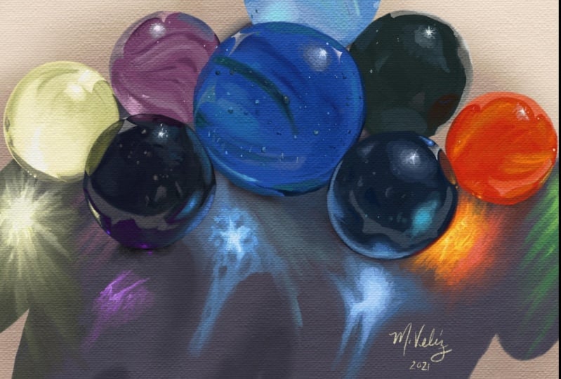
5. The Illusion of Reflection: With the technical stuff out of the way, let's move on to how we should be approaching painting reflective surfaces. Let's start with the metallic bowl first. Now the first thing we're going to have to be aware of is that painting a metallic surface is going to require a little bit of buildup. In most instances, a surface like metal doesn't come out exactly like you'd expect strive to wipe. So we're going to have to be a little bit patient with ourselves as we go back constructing these types of forms. A shortcut that many people sometimes use if we are painting with real pigments, is to use a metallic biased pint. Or if we're working digitally using something like the gradient tool. This might seem like a nice little shortcut, but it often doesn't get us the results we actually want, nor does it help us understand how to construct a metallic surface. What we wanna do is learn how to create the illusion of reflection. To do this, we really only need two high contrasting value shapes on a ball to stop fooling the audience's eye into thinking that they are looking at something reflective. If we compare the surface on the left to something more diffused, we'll see I'll diffuse bowl has a fog gradual transition of values. It's light and dark shapes slowly blend into each other. And more metallic surface here on the left, we'll see a more defined boundary between its light and dark areas. In fact, we only need a small area of strong contrast to stop creating this illusion. If we compare these two examples together, we get the sense that the bowl on the left feels far more reflective than the one on the right, even though the only thing we've added so far, up to little white strokes, it looks almost like an ICT bowl. So what this means is that the more reflective we want to make the surface, the shop of the boundary between these two contrasting shapes needs to be. Now, you might be saying to yourself, This makes sense so far, but what about those more really mirrored surfaces? Well, I have to imagine and draw all those tiny little details from the environment. Our best option in this case is to simply approximate the surrounding environment. If we've got a crime surface outside, we are much better off hinting at the shapes and colors in the environment, then try to think of every tree, Cloud, and rock. In fact, in most cases, painting more abstract shapes is going to be better because adding in white too much detail can start to make things look too distracting. Again, as long as there's enough information of the surrounding environment on the surface, That's all the audience really needs to know. The information is clear. Our minds are quite capable of filling in the blanks. Another thing we can do to help sell this illusion is to ensure that there are some lumps and bumps going along the horizon that will make the environment look far more organic. So again, it's going to be far more important to create the illusion of reflection then tried to be 100% accurate. Let's move on to our final video where we'll talk about transparency.
6. Transparency: Let's finish off by covering transparency and see how something like gloss compares to more opaque surfaces. We've still got our angle of incidence and angle of reflection apply. But what we also have in this case is some of the light traveling through the surface at the same time. That light hits out transparent surface and changes direction in a process called refraction. You've probably seen this effect in science class before. Way you partially submerge a pencil and a glass of water, which reflects to us and illusion that the pencil is being broken. What this means is that whatever environments sits behind, our transparent object is going to result in its image being distorted by this effect in some white. Now the thing is how dense that transparent object is will play a role in how the image is distorted. For instance, if we have a gloss filled with water, our environment will in most instances, either reverse, it will be flipped upside down when it refracts. If the glass is empty, then we'll still get that warping, but the image will remain right-side up when it refracts. So we want to think about this when we paint is material. If we want to paint a crystal ball for Al fantasy sorcerers character, we're going to have to decide whether it's a dense piece of gloss, transparent bowl with a hollow interior. Now, when it comes to painting our transparency, I'll best bet is to focus on the docket areas first, which is normally going to be located near the edge of the object. This is going to give us some bikes to work with. Now, it's going to be super tempting to just dive into the highlights here. But before we do that, we are much better off looking to construct the distorted background and environmental reflection first, again, lockout other surfaces. We don't need to be a 100 percent mathematical heap. A little bit of distortion of the image behind is all we really need to help sell the illusion. Once all of this is mapped out, we can then introduce the broader areas over the top. One thing we are going to have to look out for with transparent objects happens on the shadow side. What we're going to find is that transparent objects, Ada clear or colored have a really bright spot that appease in its shadow. This is called the coasting effect. A little bit of a bright spot that acts like a lens and creates this rippling stream of light in the shadow. This effect will vary from shape to shape, but in most instances we can get away with a simple brought spot on the ground. What we might notice with the college transparent object is that it looks almost like it's the reverse of an opaque object. A bright area in the shadow and a DACA area near to where the light sources. So if you ever forget how to construct colored gloss, for instance, just think that essentially being the reverse of a diffused object, the only difference is this still going to be a small speck of light coming from the light side. And that's going to do it for our reflective surfaces. There's a lot of information he, and in truth, it's going to take some time and practice to get used to pining. But when we start to understand how all this works, it can really start to elevate our work to another level with the lecture out of the way, let's move on to doing some demonstrations.
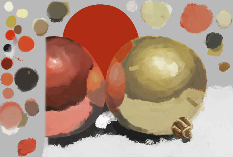
7. Demo 1 - Gold Ornament : Okay, let's get started first with a gold bowl. Now, the first thing we wanna do with these colored objects is to putting the base color first. So just getting in this sort of nice warm goldfish color in at the moment. And we're going to break down each of these areas separately here we've got four different light sources really. And of course we've got the deep shadowy parts as well from the reflected environment. So that's pretty simple shape to begin with. We've got enough of a reflection here to make things look nice and gold, but it's also not too reflective. Ada, the more mirrored surfaces tend to be a little bit more problematic. So we'll eventually get to that later on when we start to look at crime. But again, just starting off for these bicycle first. So as we said during the lecture, that's going to be a little bit of buildup required with metallic surfaces. So we'll start off with the dock areas first. And it's always a pretty good idea to start with a dock areas to try to start defining these boundary lines a little bit. That's the main thing that's going to separate the more reflective surfaces from the more diffused Manza. These shop a boundary lines and even though they're not super sharp here, we've got very noticeable changes in value happening here. And what we're going to find is that the more reflective the surface is, the more noticeable does boundary lines between values up. It's going to be a good idea to map all these things out one value at a time. So now moving on to our brightest area, just getting this value in here. And we're going to say really a series of full reflections happening here. We've got the main light source, of course, but we've also got reflections coming from the Red Bull to the side. They, we've got the floor reflection right here as well. And we've got a little bit of an environmental reflection coming from the top-left 2. So we've really got a series of four different areas of law that we're going to have to consider as we construct this bowl here. Now, what we're going to notice with this flow reflection is that it's going to get slightly lighter the closer it gets to the edge of that gold bowl. So these are the little things that we're going to have to look out for was still got these environmental factors that we have to think about. But as again, as we said during the lecture, we don't need to be to mathematically correct t. In fact, these top of diffused surfaces allows us a great deal of freedom to play around with the environment. So if we're not a 100 percent happy with how the reflection this bowl looks, maybe we think it looks a little too plain and boring. He, we can put a few little lumps and bumps along certain areas just to make things look a little bit more interesting. But again, it's going to require some buildup at the moment, you can probably see things are still looking quite messy at first. So it's really going to have to be a case of slowly working your way up to this because metal reflections or any type of reflective surfaces really died. Don't really come out exactly how you have any MOND. We all sort of have a rough idea of what metallic reflections or gloss reflection should look like. But it's not really until we stop putting pipe down onto Canvas way, we realize there's a lot more that we have to consider. And it's often quite easy to stop becoming disheartened and frustrated simply because it's not coming out quite as we planned. It's going to be super tempting to take shortcuts along the Y, but we really have to knuckle down and do a lot of analyzing of the surfaces. The best tool we're always going to have to differentiate reflective surfaces for more diffused ones is to simply ensure that those contrasting shapes are really noticeable. So always keep that in the back of your mind. Those contrasting shapes don't necessarily need to be just light and dark shapes. They can be different columns as well. So it will say with crime lighter on how we can apply that in more detail. But right now, just thinking about trying to blend these areas together now of different values here. And this is really what's going to start to sell the illusion of what type of material is this surface is supposed to be. So sort of a brushed brushed metal type of leukemia. It's not quite clear whether it's actual metal, whether it's been spray painted with a metallic surface. So a gold starting to take shape. Now, what's going to really help elevate that to be more reflective later on is when we start to add even brighter highlights. Now, we really want to be careful with just how, what we make this bright area here. In fact, we don't really want to use just pure white paint most of the time. We always want up mixing a little bit of that local color, a little bit of that base color in with our white, we only want to use pure white for our highlights very sparingly and in very small amounts as well. Now, we need to talk a little bit about the reflection from the Red Bull here, and I'll get to that in a second. But what we're going to find is that the color of the gold object is going to actually shift the reflection color from that Red Bull. So what's going to happen is, is that because the gold is on the yellow side of the spectrum and the bowl at prison is sort of in the magenta side of things. The reflection of that magenta bowl is going to merge in with that more yellowy go call up. And it's going to shift its reflection more to the orange side of things. We have two approaches a little bit logically, if we've got sort of a pinkish red surface and it reflects onto a more yellowy service. It may just going to find common ground somewhere around the orange side of things. So these more pinkish magenta highlights on our red bowl, a guide to start shifting towards more of the warm of reds on the spectrum. Colors that sit within the same sort of range is our goal bowl. He really going to illuminate and intensify a little bit more, whilst colors that are on the opposite side of the spectrum, we'll stop to neutralize. So oranges and reds will probably start to be a lot brighter and more yellowish if it hits a surface like gold, whereas blues will start to become a bit more grinding greenish in color. So when in doubt, always refer to your color wheel to try to help figure out which direction the reflection colors should go. So this gold is coming together, could probably work on it a little bit more. But as you can see, gradually we've built up over time to get to this place nail where it starts to feel like gold medal. So let's finish this one off here and we'll move on to doing some lead up.
8. Demo 2 - Leather Belt: All right, moving on to let us put some base colors down just to get things going and save a little bit of time. So this one's going to have to require us to think a little bit about form first, the underlying form structure. Now, as we saw during the lecture, when it comes to these sort of more glossy a type of surfaces, we really need to start approaching them with sort of two layers in mod, we've got the underlying form lie up. And of course the specular reflects light which is going to be on top now with the surface like leather. But it's also important that we caught him get the texture surface right as well first. So we really want to just have the brush drugs do a lot of the work for us here. Be very loose and rough with their hand and not worry too much about trying to get things nice and smooth. Now, in the same way that we're trying to create the illusion of reflection without more metallic objects for something like this, we also want to try to create the illusion of texture too. So whether that is through sort of dabbing new y across the surface like I'm doing here with just small little strokes. Or if you're working digitally in something like Photoshop or Procreate with oldest textured brushes. Our goal is to get across to the audience that there's a lot more going on here than what we've actually put down. If we were to actually zoom in more on this piece of Linda, hey, we'd see all these tiny little cracks across its surface. Now, there's no real point in trying to duplicate that tap affected because in most instances people are simply just not going to notice it. So our goal is to be a little bit more randomized without brush strokes just to give that illusion that there's all these little bumps in dense and little crevices that are forming here. We can come back later on and do some little fine details, little cracks here and there just to further sell the illusion. But for the most part, we don't want to be getting too crazy with the tiny details. So I've got this top part looking nice and rough at the moment. So I'm going to start thinking about, well, how do I start applying this more reflective highlighted area? So the trick is with this is to actually follow along with these sort of debbie brushstrokes. And I've got already and start to apply the highlights in a similar way. Now these type of glossy surfaces are going to probably take a little bit more practice than the metallic service that we just went over in the last video. Hey, because as we said, we've got to try to break them down into two separate layers and that's not always, necessarily easy to do. So it's going to take a little bit of practice to determine where exactly do these highly reflective surfaces end and these form surfaces begin. So again, just going to be a little bit of trial and error, and that's not just a surface like leather. He is going to be something like wooden stone as well. We've got something like stein, we want to be focusing on that. Well, those little dense and bumps and the checks to you before worrying about any of that glosso Sean that might be present. Maybe the stone is wet or maybe it's being polished. So it's going to be the similar type of effect that we're trying to go for he. So gradually building up these reflective areas now, you might be able to see the brushes a lot smaller than what I started with. So as we gradually build up these more highlighted areas, we want our brush to get smaller and smaller. And this is going to help sell the illusion that we've got all these little details he will these little cracks in the surface happening. So really just kick the brush moving and dabbing along like this to really start to create all those little mountainous areas that usually forming with lambda. Now working digitally, of course, we've got an array of options when it comes to texture brushes in software like Photoshop or Procreate, we're working practically out. Best bet is to try to find some really interesting textured brushes into C. What effects like and Mike, old brushes are really good for something like this. So I don't throw out old brushes that you've used up. Keep some of them around because they are quite good at creating these interesting textures. Another thing we can use is something like a pipe, a tail as well. They've got all these little bumps and dense online which if you apply paint to them and applied to the canvas, can really start to create some really cool and interesting sort of stony and would type of effects. So I'm reasonably happy with how things are looking at the top part of the boat right now it's getting off that nice reflective surface. See that nice glossy look, and it's coming across quite literary, which is exactly what we want. So I'll start to move down to the rest of the leather belt. Now, as we said during the lecture, these type of more glossy surface is a sort of a combination of both l, highly mirrored surfaces and ammo diffused ones. You may have noticed in the last demonstration without gold bull that there wasn't actually a great deal of form being generated by the gold bullets self. It was mostly the reflections from the environment that we're hoping to sell the illusion that the bowl is spiracle. With this one, we've got a lot more form shadow present and we've also got a lot of color that's being absorbed as well. We are getting some level of environmental mirroring happening here, but it's mostly the brightest areas of the environment. And we're going to find that true for most glossy objects, not just things like leather and Stein, but the things like plastic as well. You can see it especially in something like a billion book. Those tiny little squares of lot that appear on a billiard ball are generally the only mirrored image we get of the environment. They're all going to be exceptions of course, which is why we want to approach this with two lays in mind. Every surface is going to be on a sliding scale between being highly diffused and highly mirrored. So it's just going to require a little bit of analyzing and a little bit of study to work out where exactly on that sliding scale does this leather ticks just sit? Well, that stone takes just sit. So starting to look quite leathery now. So we might finish this one up here. So just remember keep the strokes had nice and loose and rough. And think of this as being two layers that we have to work with, the Form Lab and the reflective lab. Let's move on to our next object.
9. Demo 3 - Semi-Transparent Die: All right, so onto something a little more challenging now we've got a translucent object is semi translucent object and nice glossy green dye. And again got the green Maya foundations in place for those just to save a little bit of time and you really want to focus on getting the DACA areas first for these more translucent objects. Generally when we start to get two objects, it a little bit more clear or gloss like all the rules that we've sort of laid out for ourselves without more metallic objects or more glossy objects seem to go out the window. So we tend to have a lot of lighting effects that shift in wall Paran and y's, that would not necessarily used to. So all of a sudden that was relatively straightforward rules that we learned without glossy objects and L, metallic ones, they don't really apply in the same way he, if there is a comparison to be made, it is probably with them more glossy objects because especially for something that is Khalid translucency like this, it's going to have similar behaviors to that of what we saw with the letter effect. The main difference being with this one is that of those two layers of form and reflection that we saw, the reflective layer is going to play a more important role in this type of object. But again, a large portion of this is going to come down to simple observation and practice. If we take a look at this green dye, the most noticeable thing we're going to find compared with some of the other objects does that, we've got this bright green area happening in the shadow side. In a more diffused or more opaque object. We're not going to get that type of affected. All this really bright area in the corner here is what's going to help sell the illusion to the audience that what they're looking at is clear. All might have some type of transparent material. It's an effect called the caustic effect. Essentially what's happening is that light is passing through add die he, and it's causing this area to brighten up and act almost like a lens. So I've got the DACA areas constructed now I'm going to work on the lighter side of things. Now, what you might notice here is we've still got that bright light hitting it on the right day. But this top plane is getting more and more desaturated compared to that caustic effect which is happening in the bottom-left. A, take notice of how much more saturated that bright green spot is compared to where the light is hitting the top of the surface. So in some cases weren't going to get some very big shifts in saturation and value for these type of gloss objects. So I'm going to now develop this broader area in the corn here to really help sell the illusion that it's something that's made of glass or transparent. And you can really go to town here a little bit with the saturation levels. Normally you wouldn't want to have any talk or brightness on any object with the saturation levels get that intense. But for something like this going a little bit over the top is actually not a bad idea. What about helps us to sell the illusion that this is green gloss or green transparency. Whether it's leather or gold or whatever texture it is we are working on. In some cases, better off going to the more extreme place than playing it down too much if we don't have enough of glossiness and glowing us for these areas like this, then it's not really going to come across to the audience that we're trying to create gloss or something similar. I translucent like this. So in most instances we are better off taking things too, a little bit more of an extreme place, having some real extreme changes in value along the y. And that's really going to help get it across to the audience that what they're looking at is something that is highly reflective. It's really going to be shot value changes which are going to help sell that illusion for us. If things start to get to blood, then the reflectiveness is not going to come across to the audience. And they're going to assume it's a completely different surface than what we're trying to do. So always remember the shop of the changes in value. The more reflective the more translucent things start to become. So as you might see here, the highlight that I've got on the dice I fall has got a little bit of that green color that we put in for L bytes. And as we said earlier, we really want to be super careful with using pure whites. It's going to be super tempting to really just dive in with that pure white paint and stop putting in strokes of highlight every way that we want. So really avoid just diving in with the purest whites. And that's going to go to for something like a CLIA gloss surfaces. Well, we always want to have a little bit of the local color, or in the case of CLIA gloss, a little bit of the background environment mixed in with its white. That will just really help to naught the entire composition any purest what we want to leave for the smallest of smallest highlights. And it's going to be a little bit similar for the DACA areas too. We don't want to get a pure black with any of this, but we do want to put a little bit of black excellent throughout. They had just to really, again, help sell the illusion of reflectiveness that we're looking for. Even though we usually looking for strong areas of contrast, we have to be a bit more careful with how we get there. So it regardless of its gloss or if it's metal or something gloss, we have to have it in the back of our mind that there's going to be a bit more development required compared to other surfaces. We starting with relatively simple shapes here. And that is by design, when we start to get to more complicated stuff, that's when we're usually going to have to do a lot more research and a lot of referencing of images because we simply can't always contemplate exactly how long it is going to behave, especially if there's multiple reflective objects in the environment as well. They might very well be bouncing off of one another, creating all sorts of reflection C, and it just ends up being a white, too confusing for our minds to interpret. It's going to be super important to be kind with the soap and you stop painting these things, especially when the shapes and forms start taking on really old organic shapes. For instance, if you're designing a fantasy character like a knight in shining armor, you'll not necessarily going to know how old those little shapes across the nights are going to react to the lighting conditions. So reference images for reflective surfaces really going to be required if we want to start doing more fantasy related stuff, or at least stuff from our imagination. So I'm pretty happy with how things looking overall for the dice. I want to turn my attention to the shadow side and first all start to blend in with the background. He at first, and then I want to pay attention to where that coasting effect is now happening. As you can see in the shadow side, we're not getting the brightness happening in the bottom of the die, but we're also getting light passing through that into the cast shadow of the dye itself. That's the caustic effect. Now, what type of light patent emerges on the ground and the shadow is conjugated depend on what shite the translucent object is. And it's usually going to be some type of wavy patent. But in most instances we can kinda get a y of just doing a little bit about highlighted color in the background. If you have a look at different types of glosses around you and you shine light on them, then you'll actually see this effect happened with all these different types of right, Patents stock to happen. You'll see the same effect on the water as well with all those sort of streaky light rays that you see in videos and photographs. So just working on the docket areas now a little bit just to have a little bit more of an x in here to help sell the illusion, but I think this will do for now. So let's move on to our next demo.
10. Demo 4 - Glass Orb: Okay, so moving on to something more difficult now this is probably going to be the surface that's probably going to slow you down the most. When we stop coming towards clean, transparent objects like this, it's very easy to start getting loss, so we want to break down things lie up by Leah. And the first layer we want to start with is working on the darkest areas first. Now, it's not going to be super important that we follow the doc shapes exactly. He, we just need some type of foundation in place to work with. And the DACA areas are going to be perfect for that with gloss on lockout, other surfaces we kind of have to work in three layers. We've got the DACA formula first, we've got the distorted imagery which happens behind that. And of course, the specular reflections which are going on top of all of this. The reason we have so much difficulty with gloss is usually because we just simply not used to analyzing what's happening. We've got all these highlights and Dhaka areas and warping that sort of getting in the y. And it's sometimes a little bit difficult to try to figure out where exactly do I start with this? So this is why we want to break it down into these three layers and get these dark areas to work for us as some type of structural foundation. From there we can start to slowly develop the other areas. It's going to be super tempting to dive into the highlights to try to create the illusion of gloss, but we have to get the warping and our background done first before we worry about that, that's really something that can come lost. So at the moment I'm just focusing entirely on this rocky surface and trying to get the sense that it's warping up the sides of the sphere. Now, one thing we're going to notice see in particular is that there's going to be some level of desaturation happening because of these Gloss. If you take notice of the colors in the background of the stone heat that's outside the glass, you'll see it's far more warmer and it's color. The part of the rock being distorted by the glossed is not only shifting to a slightly cooler temperature, also shifting in its saturation as well. So we might think because the glosses clean it, that it's not going to affect the temperature of the areas of the background, it's warping. But the truth is always going to be getting some level of changing color within our hue value and saturation, even with a clear transparent object like gloss. So I'm just working in the background now. And again, I'm thinking about that level of desaturation that's going to happen here. We're not going to get that bright green tree that we might envision. Instead, we're going to get this overlay, which is going to start to shift it more to a neutral gray green color. So all these additional little things that we're going to have to look out for, even though we are dealing with something that is clear and transparent, we still want to approach it in a very logical way. So if we know that our glosses going to D saturate things, we're going to have to take that into account with the color choices that we make. So I've got things mapped out reasonably well so far. So now I'm starting to think about all these more highlighted areas. Now, we do have the specular highlights, which really obvious of course. But then again, we've also got these more mirrored pots, which are very subtly being light over the top of our gloss as well. So this is where things can start to get a little bit confusing if we ever feel like we're running into trouble and there's just too many elements in the Y2, many shifts in color and light. Then the simplest thing we can do is actually blur our eyes and to cancel out a lot of the in-between colors and values when we blur is what that's going to do is it's going to cancel out all these little shifts in color in-between. It's going to leave us with our brightest brights, darkest shadows, and our areas in-between. Once we start to map all of that out, those three main areas, then we can start to worry about the more details on top of this. So I'm looking at this now. I think the tree is just slightly warped enough, so I'll start to come in now with the highlights lie. Um, so this is really our third lab. We started again without shutter lay off first, then L background with black. And now this is our third layout which is going on top of that. So if we create these high rocky for ourselves, then gloss dots become a little bit more easier to manage. So it's a good idea to work a bit subtly with the highlights and gradually build up to them. So what we might also notice, as we saw in the last demonstration, is that the effect is in play. Again. Take note of just how luminous the shadow side of this bowl is compared to the loss transparent object. It's almost as high in value as the light hitting the rock on the left-hand side. Note only that, but we can actually see the shift in temperature between these two light areas quite noticeably. Take note of how much more desaturated that light looks compared to the light that's hitting the rock directly from the sun. So again, we're getting a shift in temperature, a shift in value, and a shift in saturation. And of course, if the gloss is colored and we're going to see those shifts even more dramatically. But we can start to see already how quickly we can get the illusion of gloss going once we start to approach it in this light effect, we haven't even started putting any of the real highlights yet. And already this is enough to really sell to the audience that what they're looking at is a transparent object. So we've got a pretty decent enough foundation for ourselves from here. It's really just about refinement, paying attention to where we want to stop putting in a little bit more data. Now, I'm taking note of the mirrored reflection that's happening here. We've got a slight translucent reflection from the environment that's covering the surface of the globe. So I'm going to have to think about, well, exactly how much of this reflected surface, this mirrored surface do I actually want to appear on this object? And it's just going to end up being a little bit of trial and error. He is. So, so just putting in a little bit of these sort of circular patents first, and that's really all I'm looking for, what the moment is to try to look for patterns more than specific details as to what's actually being reflected here. And that's just going to make life a little bit easier. So I'm seeing right now they sort of streaks which a kind of wrapping either in this sort of a, an upside down, horseshoe shaped that's sort of appearing on the top as well. So again, just trying to think of these things as basic shapes. Things are starting to come together now and this is where I really do start to think about, well, is it time to really focus on the highlights now to really bring this to the next level. And that's ultimately what I'm gonna do now I think is just to focus on all these little specks of light which are appearing all over the surface of our globe. And just bring out the brightest areas here. And again, not using pure white. And it's really when you get to this stage that the illusion of glosso transparency really starts to be seen. But it's also about now or I start to think about, well, what else can I do to the skin? I think I want to make this surface warping just a little bit more noticeable. So again, like our other materials that we've gone over throughout this lesson, it's going to be a lot of development involved to really start to create this effect. So this is just a short little demo to try to get the point across here. We could spend a lot more time on this, of course, but hopefully this gives a good idea of how to approach this rather tricky service. So again, we want to work with three layers here, the DACA add allies around the form, the background warping lat and of course the highlights layer on top. So let's finish this one up here and we'll move on to our final demonstration where we'll cover some Chrome.
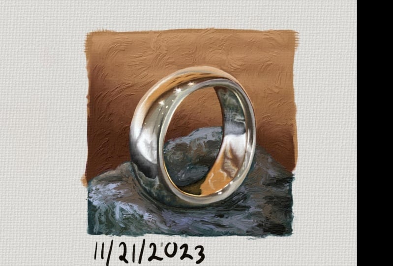
11. Demo 5 - Chrome Ring: All right, onto our last demonstration, we've got some crime that would go into pint up. We've got a beautiful, shiny reflective chrome ring. Now Chrome is going to be a lot different because we don't have a great deal of form heat to help guide us. We're going to have to rely a lot on the mirrored reflections into its surface to help to develop its shape. So this makes it a little bit more challenging than the other services. But once we start to get an idea of roughly how crime is developed, then it actually becomes a lot of fun to paint with. So just focusing in particular on this mirrored reflection that's coming off from the stone surface here. And using that as my guide to help to construct the basic foundations for this crime form. Now crime is going to benefit from having its light source come from above. And that's mostly because we used to sing shiny reflections, mostly happened outside. So in most instances, when we see a shiny surface like crime, the sky is always coming from above. Now, there's going to be exceptions of course, but for something like this, it's not really going to be much easier for us. It's going to help sell the illusion of shine a little more. So in the same way that we will focussing on the docket areas for L gloss open the last demonstration. I'm doing something similar here for this demo. And I just want to focus entirely on getting these DACA shapes first and then worrying about the more mid-tones and highlighted areas. And again, just trying to keep things nice and simple. We've got all these little ripples of light and color from the environment, but just trying to ignore all of that for a moment and work on little areas at a time. Now, unlike our previous surfaces, we're going to get some very sharp and very defined boundaries between all l value shapes. Now the main thing that we have to take note of, especially when reflecting the surface area up to a, a ring. He is that whatever shapes and colors that we choose really do have to relate to the texture and the environment that's being reflected into it. Now with Chrome window often going to see huge changes in value saturation and hue. And that's because it is a mirrored object. And so it's moralists going to be reflecting back to us exactly what's in the environment. What's great about these hot ages already is that we've already got a sense here that this is a highly reflective material, even though we haven't even bothered with the lot of side of things. So I fog. So that just goes to show how making l value changes that much shop just increases the reflective illusion for our objects. Now if we wanted to give this more of a brushed metal look, all we'd have to do is to start to blur these edges of these contrasting areas. And that's really just the secret sauce to old days reflected surfaces. If we were to break it all down into simple terms, we could say that it's really just a combination of light and dark shapes and strength of boundary between those two shapes. The more mirrored the surface, the heart of that boundary becomes, the more brush tool, the more diffused the software it becomes. But that is lightened. Dark shapes don't have to sit on the gray scale. We can introduce a light area that is one column and a DACA area. There's another call. So if this room was outside, for instance, we would want the law to areas to be a blue to reflect the sky. And for the DACA areas, probably something like a brown or a tiny color to represent the ground of all the surfaces that really benefit from the outside crime is probably the one that benefits the most. So if you're looking to do things like vehicle design or maybe some type of mic warrior outfit for a sci-fi character. Try to think about the environment that the character is. Crime suit all the chrome plating of the car is in, in most instances, it's going to really pop if it looks like it's standing in an outside environment. As we said earlier, at brains, it just simply used to associating crime with that type of environment. So always keep that in the back of your mind when you start using Chrome from imagination. So putting in these orange areas now, now if we zoom in on crime ring with a lot of little details that are appearing in its reflection here it looks like we've got some windows and maybe some paintings as well in a couple of different light sources to that are appearing on what looks to be a ceiling. So we're going to have to make some decisions about what details we want to keep and how much detail we want to put into this. It's going to be super tempting to dive into all those details to sell the illusion. But in the same way that we don't want to put every strain of hay on a character's head. We don't want to put every little highlight and shadow in these areas. Ada, we're going to have to pick and choose our battles heat. But the truth is that we don't necessarily want to be that accurate anyway, even though we're trying to give the illusion that we're reflecting the environment into the surface heap. We still want to have a lot of artistic license to be able to manipulate things to our Thyestes. So that might mean making subtle color changes on the ring that aren't necessarily in the environment. If that's going to give us a better result, then that's always going to be the better option for us. At the end of the day, we don't want to be held down by what's happening in the environment. Working on these highlighted areas on the edge of the ring now. So this might seem right now we've got some pretty decent foundations in place, but there's a lot more that we can do to this. There's a lot more subtle reflections that we now want to come back and take a look at. We've pretty much got all the basic doc, lightened midtone areas in place. So now it's really just a case of analyzing what reflections are coming from the environment. Starting to think about what exactly is it that I want to keep and what's really going to help to develop a formal bit more because we are relying on the environment to Hopcroft this ring really. So I'm looking at this slightly lighter area that's bouncing off from the surface and thinking that's a pretty good shape to start developing with an old. A sudden you can start to see just how much mole this starts to make things look even more mirrored. Just one tiny shape of a slightly different value and a slightly different color has automatically shifted this to looking even more Myriad. Really, that's just the process for the rest of the image. Just looking at what areas can I improve on? What little shapes can I add to this to really start to make it pop. So it just he just adding a little bit of a darker area starts to really make this metallic crime surface really start to stand out more. So contrast and sharpness is going to be the kapha, shiny objects like this. So now I'm thinking about the smallest details now and thinking about that, I'm going to have to pick and choose my battles. He, Which of these small details that are reflecting onto this ring am I going to start to focus on and got a couple of little tiny light sources there that we might look at putting down. And there's some stuff that looks like it's hanging on a wall as well that we might consider two. So this is kind of way you start to see that finish line. We started with a pretty big mess of just random shapes to begin with. And to be perfectly honest, it never looks that good at all when you stop putting the paint down. But gradually as you build this up, it starts to come into focus. So try to ignore the initial frustration that you'll likely to get at the start here. And just put a little bit of faith in yourself that you can get to this point. Now, there's a little bit of an aha moment that comes about suddenly old eyes, random shapes and colors and forms that you putting down here suddenly start to come into focus. The Chrome starts to emerge from this mess of shape and paint strokes that you've put down. So again, keep going three, push through the pine. Eventually, you'll get to the point where it starts to come into focus. And that's when it really starts to become fun to paint. Because once we sort of understand this process, HE, we can kind of start to apply it to other objects as well. There's a lot of great fantasy artwork out there which creates a chrome plated armor will contemplated people as well, those type of characters. And all they're really doing is using the exact same methods that we've gone over in this demonstration and throughout the entire listen. So I'm just thinking about these tiny little highlights and I'm seeing in the reference image and I think those are pretty importance of all the details that are going to be reflected back onto this surface here. I think those are the ones that are really going to be needed. So we're going to have to pick and choose our ballsy what we cape. So we could spend a lot longer than this obviously, but hopefully this gives you a general idea of what to expect with creating crime surfaces and really older reflective surfaces that we've covered in this lesson. All the images painted as well as the references that we used, I'm going to be available in the class notes, so feel free to take a look at those in more detail. So let's finish this up here and we'll move on to the assignment.
 JW Learning, Drawing the Body, Head and Hands