Transcripts
1. Introduction: Hello, I'm Julia. I'm an illustrator
and field sketcher, and I love watching
clouds and painting them. In this class, I will
show you basic techniques for sketching clouds and
skies in watercolor. We will take a look
at how to paint simple but realistic
clouds in watercolor, learn a bit about composition, and how to mix interesting
colors for skies. I will demonstrate
step-by-step how I paint different types
of clouds and skies. Sketching the sky is
also a vital part of capturing landscapes and it's
relaxing and a lot of fun. Painting the sky
and clouds are also great ways to get to know
our watercolors better. This class is great
for anyone who loves to look at the
sky and the clouds, and who would like to paint
them more effortlessly. The class is perfect
for beginners and intermediate watercolorists, and anyone who wants to include more detailed clouds into
their landscape sketches. You will only need basic
watercolor materials, a small palette, a few
brushes, and some paper. I hope you'll join me in
this class to observe and sketch lots of skies and
clouds scopes. Let's dive in.
2. Tools You Need: Let's go over the
materials you will need. I will do all of
my demonstrations with these three brushes. They are very similar
to the brushes I also bring to my
field sketching. These are synthetic brushes,
rather inexpensive. I just make sure that
the round brushes that I have form a really nice
tip when they're wet. This is a Size 8, then I have a Size 4. As for the flat brush, this is around a Size
10 or a half-inch. As for the paints, I will simply use my small field
palette for this. There are many colors in it, but you don't really need all of them to paint nice clouds. I would say you will get
away with other greens without the black and probably with some
of the others here. What I would say is do make sure that you have a balanced
palette available to you, and that it has at
least two blues. An ultramarine blue
is really crucial. Then another lighter blue, maybe a cerulean blue. I also like to use cobalt
blue a lot for skies. Sometimes I like to have
additional blues in my palate like indanthrone
blue or manganese blue. These are entirely optional. I would say the absolute
minimum is really ultramarine, cobalt, and cerulean blue. The other part of your palate that's really going
to be essential for painting clouds
are the earth tones. I have a burnt sienna
and raw sienna. Then I also have this here. This is a raw amber. You don't really
need this one if you have burned and raw sienna. What can be nice to paint? Sunsets or sunrises are a
few of these other colors. I like to have a
cool and warm red, so this is more like a
pink or quinacridone pink. Then I have this
warmer red vermilion and two different yellows. Lemon yellow and a pure yellow. I also like to have an
orange in my palette so that I don't have to mix
too much of this. Also essential for cloud
painting will be a white. I usually have this
little pen off-white here that I can just
reactivate with water. For the paper, for painting clouds where lots
of water is involved, I think, it's really
important that you use cotton watercolor paper. Make sure that it's
at least 300 GSM or 140 pounds so that
it isn't too flimsy. There's this thinner
watercolor paper that will just warp when you
add lots of water to it. Make sure that it is a
bit sturdier than this. For this course, I would
say use cold press paper. I also use it for
the demonstrations. You can also use
hot press paper. It's what I use in
my sketchbooks, but it doesn't distribute
the pigments as nicely, so it's a bit harder to control. Cold press paper has
this light structure, whereas hot press paper
is entirely smooth. Cold press paper is
generally easier to handle and it gives these
interesting effects for clouds. If you like granulating pigment, then you can get
beautiful effects with them on cold press paper. I will be using mostly
this paper here. This is Arches cold pressed
and it has 100% cotton. Whatever paper you choose. There are other papers that
are quite nice like this one, Winsor and Newton, professional
watercolor, cold-pressed. Make sure that it says, where is it here? 100% cotton because if you
use wood cellulose paper, then you will notice it
doesn't absorb the water as readily and as smoothly
into the surface. Then you will probably
run into problems. The other materials that you
will need are, of course, a water container of some kind, then a mixing area,
a painting rag. I like to use these
soft cloth rags and also have a
paper towel around, which is sometimes can be nice for certain types
of clouds to blot out paint and that's essentially it.[OVERLAPPING]
want to try out.
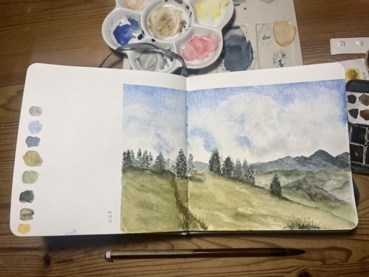
3. Examples From My Sketchbook: Before we dive into
mixing and painting, I'd like to give you an
idea of how I approach painting clouds and
also talk quickly about my paper and
pigment choices. I mostly work in these
sketchbooks and I like to paint quick and loose guys
and very often my clouds sketches only
have one or two layers. In my sketchbooks I still
use cotton paper that takes a bit of water
and these sketchbooks, I use hot press paper. Let's look at the difference. This is a piece of cold press paper maybe
you can already see this. It has a slight bit of texture as opposed to
the hot press paper. Cold press paper will always show more texture and it will also bring out the granulation
and pigments more. I use hot press paper because I don't really like this
in my field sketches, particularly for very
delicate flowers so I prefer hot press paper. I'm going to show you the
difference between these two. Here you have hot press paper with two different pigments. I'm going to talk about
this in a minute. Here you have cold press paper. You can already see
that you will get smoother washes with
hot press paper and this is why I prefer this. It doesn't produce these
dramatic granulation effects. You can also get beautiful
skies out of this, as you can see here, and very smooth
washes if you want. These are different
ultramarine and I've chosen to use an ultramarine blue
that is non granulating. This is called
ultramarine finest or often ultramarine
green shade. This is a pigment that's
very finely milled, so it has almost no granulation. It's not as obvious for
the hot pressed paper. As you can see, it produces less granulation than on the cold press paper. But if you look at these two, then you can see that
the French ultramarine, which is just your
standard ultramarine, that you get in every
basic palette so to speak. It produces a lot
more granulation, especially when you
add lots of water. The ultramarine finest has really subdued
granulation effect. I prefer this, you don't really have
to choose between those or be as meticulous
about it as I am. I also have a few other blues
that granulate lightly like cobalt blue or cerulean blue and this is really an
individual choice. If you enjoy this kind of granulation then
absolutely go for it. Just pick French ultramarine
or any other ultramarine, this will probably give you nice results on
cold press paper. Let's finally take
a look at a few of my recent sketches
with clouds in them. Very often in my sketches, the clouds are
really kept simple and I painted with one or
two layers at the most. Sometimes when the sky
is not the subject, I leave out clouds
or sky entirely. This is one more. Generally, I like to paint loose and quick
skies and clouds. These are done in two layers, one for the blue and
then I let everything dry and add the
cloud charts later. We will look in detail
at how this is done. Here's another example for very quick fluffy
clouds that I did in probably one-and-a-half
layer probably. This is another example for a really nice quick sky with
really basic brushstrokes, basic clouds and here's
another page with examples for clouds and skies that are done with mostly
one or two layers. Just this very quick approach. What I find most important for these sketches is not
to overwork washers. I find you often get the
best results when you go in with your paint and place
a few decisive strokes, and then leave the paint
alone until it's dry. I find that watercolor
sky sketches are an area where
less can be more. I try to keep my skies
as simple as possible to avoid any overworking. Of course I will touch up an
area sometimes if I dare. [LAUGHTER] But I try to get in and out with as few brush
strokes as possible. That's my philosophy about this. Often means planning
ahead a little bit, for example deciding
where I want to leave white-space for the
big fluffy clouds because these wide parts here, that's actually the
paper white and I leave that free until I can go over these white areas
with my shadow color here. Then sometimes you see a lot of overlapping clouds
in the sky and it can make sense to add several layers so this
was painted like this. I applied a wash with this blue and the
orange part and then I waited until it dried and then I went over it again with
this darker wash here. This is useful if
you want to achieve really hard edges
and make the cloud and the foreground
stand out really. This was done in a similar
way and often clouds have this combination of hard
and soft edges and this is also something that we
will take another look at. You can see this here
slightly where we have clouds from the foreground
floating into the background. The quickest way to
sketch a skyscraper or a cloud scape is
to sketch very small. I love these small
landscapes sketches that to me they're more an
idea than a finished sketch. Very often I just want to make a quick observation
or record an emotion. For this, I often keep a
separate page in my sketchbook. This is actually the first page in this particular sketch book. Sometimes I find, I add a few
words are the dates around these small drawings
and for me this is a great way to
try new techniques, experiment with pigments and
when a page is finished, I have a collection of these seasonal skies
and cloud formations. It's pretty interesting too. Now that we've looked
at different ways to sketch clouds and the sky, let's take a look at the different blues that
we can use for that.
4. Choosing Blues And Painting the Sky: We've already talked about the different ultramarine
varieties and why I choose this less granulating
one for my palette. But there are more blue pigments out there and it's
worth taking a look. Most palettes have different
choices for blues in them, and this can be very
useful to paint skies. Skies don't always
have the same blue, and choosing a darker
or a lighter blue depending on the color or
type can be the first step. I personally always have
ultramarine blue in my palette. We've already talked
about the varieties of ultramarine in
the last lesson. This is a beautiful, dark, warm, blue which you
can mix very well. Two other blues that are also always in my palette
are cobalt blue, which is a nice middle blue, and cerulean blue, which is
a lovely, very light blue. With these three blues, you can get a nice range
between dark and light skies. Very often the sky can look
like it has a gradient with dark blues overhead and then it changes to a lighter blue
towards the horizon. Often you can even see a slightly yellow band
right at the horizon. Using different blues in this graded wash can look
very nice and convincing. I would say, let's
just try this out now. I'm going to do this with this ultramarine and
the cerulean blue. What I want to do first is
pick up a nice amount of paint and then lay it in. My paper is slightly angled, so the natural way for the water here is to move downwards. When I've applied
this first wash, I will clean up my brush. Then with a clean brush with just a little
amount of water, I will pick up the paint
and move it down slightly. I'll just do this again, reintroduce a bit of the darker paint at
the top so that it can slowly move down and
do a nice even wash. I can introduce
the second color. I will simply put it on my brush and continue
with the second color. Then like with the ultramarine, I want to fade this
out slightly so that I end with an almost clear
wash at the bottom. As long as this is
still really wet, you can definitely
drop in more paint. You need to be a little bit careful because it can
get streaky very easily, so don't add too
much water to this. Also, blot away excess
water at the bottom. There's what beam
high graded wash. If you don't want
to mix your colors, you can also do a wash
with just one color. Let's use cobalt blue for this because we haven't
really used it yet. Again, I would mix a
big puddle of paint and then just apply a
lot of it to the top. Then add a bit of water
to your brush and just try and fade it out. This should be a bit easier than the first one because you don't have to think about
introducing a second color. You can always add a bit more at the top as long as you make
sure that it's quite even. These are two easy ways to
get realistic-looking skies. These are also great ways to learn how to
control watercolor. These are two ways to
do basic graded washes. By practicing how
to paint skies, you will also practice basic
watercolor techniques. Another technique that I like to do for these graded washes in skies is to add yellow
band at the horizon, like I talked about earlier. What I would do in this case is do a blue wash
like I did before. I start at the top
and then fade it out at the bottom
and then I would let it dry and go over
just the part at the bottom near the horizon with a very light layer of
yellow or raw sienna. I'm going to use a flat brush this time
to show you that it can also be very useful
for this graded wash. Picking up just a little bit of cobalt and the slide
cerulean blue. With a flat brush, you will get these nice clean brush strokes. My wash is dried. Now, we're just going to pick
up a little bit of yellow. Just make sure it's really a thin wash. Then I will
just start from the bottom, clean my brush, and work my way up till I come to the area
where the two colors meet. You don't want to overlap them
too much because otherwise the gradient can
turn a bit green. It's very unlikely
that you will see a green gradient like this if you're not
watching the North Lights. Then you can let the
second wash dry too. You'll have a
beautiful graded wash with this nice
gradient from blue to lighter blue to this nice shine at the horizon that
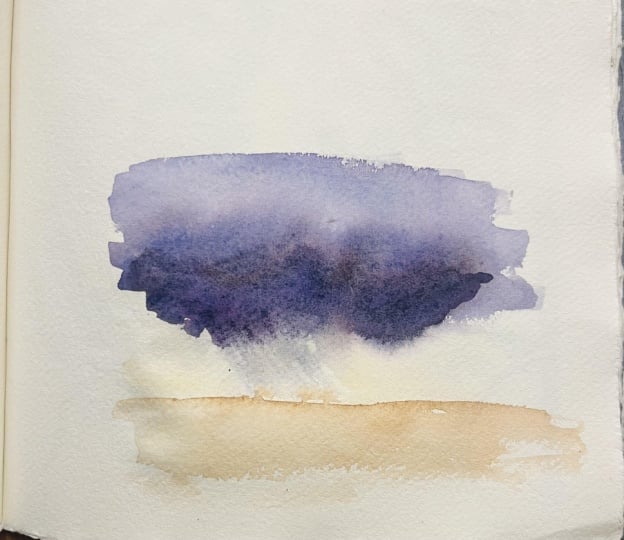
indicates the sun. For a darker, more
dramatic feeling sky, you could either use a
dark blue if you have one like the Indian thrown blue, or you could simply mix a dark earth tone into
your ultramarine blue. I will start with a generous
amount of my ultramarine. Then what always works
very nicely is to pick up small amount of burnt sienna
and just mix this in. You can see this turns
into a nice dark blue. If you add even
more burnt sienna, then it will turn into gray and then into
a brownish tone. But I think just as it
is now, it's very nice. This is a nice
dark dramatic sky. Stormy sky might look like this. Then maybe morph into something
that has more gray in it. I've simply mixed a bit more of the burnt sienna into this. This to me looks like
a really bad weather. You will see that when
I go over this again, then the the pigments begin to be quite unsettled and
it will get uneven. With these kinds of washes, it's really best to go in and do your stuff
and then leave it all alone until it's dry because
you can see that this doesn't really look like
a nice gradient anymore. But this is another possibility
to do a more darker, a more dramatic sky.
5. Mixing Sky And Cloud Colors: For painting stormy
skies or clouds, you will need grays. For this, it's a good idea to know a few good
mixing combinations. In this lesson, I'd like
to further explore this. You will very often need gray when you want
to paint the sky. You probably will have to
mix that because usually palettes don't have a gray and even if they come with
a pre-mixed gray, it's often quite dull and flat. Cloud colors can
also range from blue over gray to almost
purple or reddish colors. Of course, the sky itself
comes and many shades of blue and can sometimes be
gray or pink, or yellow. You will need to learn
a bit about mixing. I would suggest to test out your paints to see if you can get nice sky
colors from them. I do this in a sketchbook that I reserve for these
mixing experiments. I just explore my paints like this and see what I
can get out of them. What I always do is I take notes about the
colors that I use, and sometimes about
the amount of colors so that I can
replicate what I found out. I would like to explore these mixing experiments in
this lesson a little bit and hope that you can explore
your colors a bit from there. Let's start with the
all-time favorite of watercolor painters, ultramarine blue
and burnt sienna. You already saw this mix in the graded wash in
the last lesson. I'd just like to
show you what a huge variety of colors you can get out of this
particular combination. It will make for a nice neutral or for a
slightly darker blue but you can also go into
the other direction and get an almost
brown color out of it. Of course, the more burnt
sienna you will add, the more brown
tones you will see. If you dilute this, then you can get really
nice soft graze too. It's really nice to see
these different colors. Of course, for clouds, you will want more
organic-looking mixes. Let's take a look at
what we can get out of all our cobalt blue here. Again, cobalt blue is slightly
lighter than ultramarine. If you start mixing
it with burnt sienna, you will get this really nice middle gray or middle
stormy blue out of it. I really love that
color, I have to say. It's a bit less dramatic
than these darker mixes. Generally what you can
say is that the darkness of your grays depend on
the darkness of your blue and of the other
color, the earth tone. If you choose a dark blue, then, you will likely get very
dark gray mixes out of it. If you choose a lighter blue, like a cobalt blue
and cerulean blue, then you will get lighter
grays out of these mixes. That's also something
to keep in mind. Of course, the more
water you add, the lighter your
gray will be too. I'm running out of space here, but I'd like to show you
the third combination. We add burnt sienna
to cerulean blue, it will start to
turn almost green. What can be helpful here
is to add a bit of red to the mix so that it will
get more neutral result. You can get really lovely
light mixes from this too. Sometimes with these
granulating blue pigments, you can see they are already
separating on the palette. If you add lots of water, then sometimes you
can already see them separating
on the paper too. It's starting to happen here. It can be quite nice
if you have clouds that have different
colors in them and these cloud shadow gradients These would be the most classic and standard mixes so to speak. You could also use
unusual pairs to try out for example maybe a
warm red and a green, or an Indian red, which is a very
intense earth tone, or an indigo, which
is really dark blue or dark yellow like
connector on gold. You can also do all of
these mixes or try out all of these mixes by
adding raw sienna. Depending on your variety of raw sienna this will also
turn slightly greenish. You will need to mix in
a little bit of pink. I just want to encourage you to really try out your palate and really try out combining different colors
with each other. If you have difficulty seeing
the potential colors in your clouds or if you don't
really feel experimental, then you could also use for example your phone or
change the colors of your photo on the computer and just exaggerate the
cloud colors a bit. Very often just slightly
exaggerated colors like heightening the
saturation can help you to find interesting
color combinations. Just don't overdo it, [LAUGHTER] but keep it really
interesting and subtle. Like these combinations, there's a little bit of red in here, there's a little bit of blue. These contrasts will help you to get a more interesting
sketch in the end.
6. Painting White Clouds And Cloud Shadows: Let's take a look
at how you can show the white part of clouds
and also cloud shadows. I'll start with this
type of really fluffy, good weather, white clouds which are also called
cumulus clouds. For these big white clouds, I like to paint around the
white areas with blue paint. I find it really helps
with watercolor to leave some parts of the paper white because it's really the
whitest that you can get. It looks really more
convincing to me than painting everything blue and then blotting out paint again. For small areas, you
can definitely use this and for other types of
clouds, it's also fine. But for these big clouds
I find it's best to leave wide areas of clouds and then go in later and
paint in the shadows. Let's try this out. I have a nice amount of
blue, this ultramarine. I want a big puddle of
blue so that I don't have to re-mix my paint in
the middle of painting. I will simply start by painting
around the white parts, and just imagining what
this could look like. Then adding a nice
amount of paint around this as the sky part. As I'm leaving one area, I want to make sure that there's a puddle of really wet
paint so that I can go into other areas and actually
paint those and then come back to this without getting
any weird drying lines. I'm also trying to make this
bottom part a bit lighter. We've talked about that often, the sky is darker on the top, and a bit lighter near
the horizon so I'm trying to be mindful of this. As I'm painting, I'm
also trying to keep these bumps really irregular. I'll actually go back in here and try to change
this up a little bit, because they're not like
these cartoon clouds where all of the bumps
are really the same size. In nature, everything is
always a bit irregular, and this makes it
look a bit better. I think that looks nice, I'm going to soften the
edge down here a bit more. Then I'm going to let this dry. When the layer is dry, we can add in the cloud shadow. Another thing before I
go and let this dry is, I want the edge a
bit softer here. What you can actually do
is plot this out slightly. If you want to make your
cloud shape bigger, then this is one
technique you can use, but you need to make sure that the paint is still
wet in this stage, so that you can actually
remove the paint. I've smudged a bit here
with my blue paint, but not to worry because
it will be covered later by the cloud shadow. In the meantime, I will
start a second sketch in which I will start with
the shadow of the cloud. This is another
technique to do this. I'll quickly mix up a bit of ultramarine and burnt
sienna to get a nice gray, adding lots of
water to make this really soft and nice gray. Then I will start
by imagining what the cloud shadow
might look like. Again, I want to
keep this irregular. I can also pick out
some of the areas and add water to the edge
to make them feather out. I could also blot some of the areas to achieve
these soft edges. Up here, I want a few
of these boulders to show and maybe a bit of
a softening effect here. Now that my paper is
more or less dry, I can go back in and add
some clouds shadows. I'm going to do this with the
same mix I used down here. What I want to try is
wetting a few of these areas so that I can get a
really nice soft mix. I don't want too much water, just a little bit so that it
will spread around a bit. Down here, I want the shadow or rather
the edge to be visible. Then with a clean brush, I can go back in and soften
the edge again slightly. This is one great
method to paint a cloud with a
shadow in two steps. Now for the other one, a lot of ultramarine here. I just need to figure out a way to paint around everything
here that makes sense. I don't want the cloud
to be too small, and I don't want it
to be too regular. After some of these lines, I will need to have
to paint around it. When you do it like
this try to think about these negative shapes
that are forming here, instead of just
focusing on the blue. In that way you will get really
nice round fluffy clouds. I'm okay if some of these
areas overlap a bit. I can even try to soften
this effect a bit more. I've cleaned my
brush in water and then dabbed it on
a painting rag, so that it's dry. Then I can soften these
edges a little bit. I don't want to do
this everywhere, just in a few areas. These are two methods to get
more or less the same result a fluffy cloud with a nice gray shadow
painted in two layers. Try both techniques,
they're really interesting. Depending on how
I feel that day, I might go for one
or for the other.
7. Composition For Sky And Cloud Sketches: I'd like to talk a bit about
composition and how to frame a sketch that's mainly
about the clouds or the sky. In essence, sky sketches are really very simple
landscape paintings and you will want to bring this part of the
landscape into focus. So if it's about the clouds then make it about the clouds. Keep the ground very, very simple or leave
it out entirely. You can see in these
small sketches that's definitely a possibility. Always place the
horizon line rather low than making it a big part of the picture so that
you will have a lot of room to show your
sky or your clouds. Of course, other compositional
rules still apply. So Take care to balance out bigger and smaller elements and arrange them into
interesting patterns. Don't group everything
directly in the middle, but rather distribute it so
that it has a nice flow. With these really dynamic
subjects that clouds are, you can take a lot
of creative freedom to actually do this and change a few of the shapes
that you can see. Create interest by having a
foreground and a background. Clouds also have
perspective rules. So you have big clouds
and the foreground and then smaller clouds that are layering into
the background, and you can take
advantage of this. So you can show their
diminishing size by making them smaller
and flatter near the horizon and like here, bigger at the top. So sometimes finding a
pleasing composition is not so easy since some skies appear
very smooth and flat, and in that case, you can definitely move elements or make them
up if you need to. So clouds are really
very variable shapes. Another thing that you could
try out is to bring in small elements like a tree at the bottom or maybe two
birds passing in the sky. These are small points
of interests and they will usually be enough to guide the eye
through the picture. Like in this sketch, I
thought it would be nice to frame the sunset scene and these dramatic dark clouds with just a few small buildings and the skyline that
you can see here. This adds a bit of contrast, but it also serves as an
anchor point for the eyes. Whereas in these small sketches, I decided to forego the
entirety of any kind of horizon line and I
simply focused on just the sky and the
clouds as they are. So you decide what
your sketch is about. Another thing I would
like to add is that watercolor sky sketches are an area where less
is often more. I always try to keep
my skies as simple as I possibly can to avoid any kind of overworking
or fiddling too much with paint layers
and stuff like that. I will definitely
touched up areas if I see the need for that, but I tried to get in and out of the painting with as few
brush strokes as possible. I always try to remind
myself too that it's okay if any of
these shapes don't really look exactly like I
saw them because clouds are really variable and morphing
and moving all the time, and so for me, it's
more about capturing how a scene fields than about being exact in
every little shape. So I hope these
compositional tips and also how I approach these kinds of sketches helps you for your own compositions.
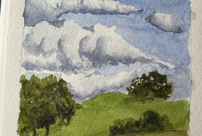
8. Demo: Fluffy Clouds: In this lesson, we'll paint these classic good
weather cumulus clouds, and we'll start by pre-wetting the entire page with water, then letting the water
sink in a little bit. I'll have mixed a big puddle
of ultramarine blue and I'll just going to drop it onto the wet paper and it
spreads wonderfully, but I try to make sure I leave big wide areas for the
actual clouds to be in. I'll drop in more pigment
at the top to make that sky a section
of a bit darker. I try to sculpt out the white
parts of the clouds here. I try to make these
cloud shapes a bit irregular so they don't
all look the same. This will be more and more pleasing composition in the end. Again, I'm dropping in a
bit more paint at the top. Then I start while the
paper is still wet to blot away blue
paint that spreads into the white to preserve these nice big wide
spaces on my paper. As I work my way
down with a blue, I try to fade it out slightly so that it's softer and
paler near the horizon. You can also see this
in the reference. I also try to make my clouds space slightly
smaller and flatter, because again, this
is what happens to the clouds when you see
them in perspective. I do all of this while
my paper is still sufficiently wet so that
I have nice soft edges. Again, I'm blotting out pigment so that I can have
nice big fluffy clouds. Then I'll let everything dry. I've pre-mixed the
soft gray here for my clouds from ultramarine
blue and burnt sienna. Now I'm pre-wetting
those white areas again so that I can
have feathered edges, soft edges for these
cloud shadows. I don't want any harsh
lines in these clouds. I drop in the pigment, my gray mix, and I blot it out where
I think it's too harsh. This technique relies on a lot of blotting
with paper towel. If you don't blot it away, then you will get
a few more edges, which doesn't have to be bad. You can see in the reference
that you will have more defined clouds
depending on the weather. There are several
possibilities to paint this and also depending on
the time you might have. This takes a bit longer
pre-wetting the areas. I'm being very careful
with the paint and I'm working my way down
the entire page here. Again, as I work my way down to the horizon
with the cloud shadows. Remember, the clouds fade
out in the distance. You have smaller clouds, you have flatter
and paler shadows. I will just go over
these areas once, and I know that I have to darken my cloud shadows at the top a little bit
more when they're dry. Again, I'm feathering
out these clouds here. I'm going over these edge
areas with clean water. Now that the top layers
have almost dried, I'm dropping in a bit more pigment to darken
my cloud shadows. I'm doing this as the
paper is still wet, as the wash is still wet so that it can spread
nice and evenly. This technique relies a
lot on knowing when is the right moment to drop
in paint onto your paper. I would say if you see a sheen, like you can see
right now on camera, if you see this glistening
area on your paper, then it's okay to
still drop in paint. If it's not moist anymore. If the wash is already
starting to dry, then you will get weird effects. You will get these
cauliflower backgrounds if you drop in pigment
at that stage. This is something that might
look nice for these clouds, but it also can look a
bit weird and unintended, so I try not to do it. The mix that I'm using
is still very light. I try to be very subtle with these clouds shadows not
to make them too strong, so that they don't look
like storm clouds. This is the most intense
pigment concentration that you will see in
this demonstration. It still spreads around, so it will not be as
intense when it's dry. I'm trying to be very
careful about this. It's a nice and relaxing
process to paint these clouds. As you saw, you can
always wet an area again to soften the clouds
and their shadows, so you can definitely correct areas after they've
dried, if you like.
9. Demo: Airy Clouds: In this lesson, we're going
to paint cirrus clouds, these high and airy clouds. This is going to be fun. The first thing I'll do is I'll fill my entire paper
with graded wash. I'll start with ultramarine
blue at the top, and then I'll fade that
into cerulean blue, so slightly lighter near the
bottom and near the horizon. I make sure that my
page is evenly filled, that I have an even graded wash. We practiced this in
an earlier lesson. I'm taking my time to do this
nice even blue rectangle. I want almost no paint, no pigment at the bottom here. As I'm finished,
I'm just dropping in a bit more pigment
into the wet layer. I try to do this evenly so that I don't get any
unsightly streaks. I think this looks very nice. As long as the area
is still moist, I can blot out the pigment
with a paper towel, and I'm trying to crumple
it together in a way that reflects these
interesting cirrus clouds. I try to get these slight
curves in the clouds. This take a bit of
experimentation to get it right or get
it to look nice. Another thing that
you could do is use a brush handle with a paper
towel wrapped around it, and then just draw
into the wet paper. If the paint is still too wet and you're applying
too much pressure, then you will get dark streaks. You can see this here
in my demonstration, but I could have
waited a bit longer. But, you can see
this effect here. Make sure to wait
a bit longer than me to apply this effect. But all in all, this is a very simple but
effective technique and it's also a
lot of fun to do, so make sure to try it out. Easy way to paint some
nice cirrus clouds.
10. Demo: Rainy clouds: For this lesson, I have chosen rainy or mixed
weather clouds again. I now want to paint them a bit differently with a lighter blue. As a base for my gray, I have chosen a
cerulean blue this time and again I've mixed in burnt sienna and then water down the mix to a
nice light gray. You can already see
on the paper that the cerulean blue
is bringing out this nice amount
of granulations, really a lovely pigment. For this area, in the
middle I will just add this dense block of gray
paint and then in a minute, we will start and blot it out again a
little bit so that it is broken up and you can
actually see different layers of clouds like you can
see in the reference. I'm continuing my wash right to the horizon and then right
down at the horizon, I'm adding a bit of a darker layer to fade
into the rest of the gray. This will indicate
this horizon line. I'm spreading the gray
around a bit more, introducing a bit more
cerulean blue at the top. I'm also dropping in a bit of yellow ocher and gray in the middle there to make
it more interesting. You don't necessarily see these colors always
in the reference, but I think they make
for a nice addition. Now that the paint
layer is almost dry, almost but not quite, I can go in with my paper
towel and pick out white area. So it doesn't matter
that they don't end up completely white, it's gray day. Now I can blot out these few storm clouds in the middle there and
they stay in place. They just fade a little
at the edges so I have really nice soft
feathery edges like that. In the same way with the paper, almost dry, I
introduce new paint. In this stage, it doesn't
spread around as much. It still does a
little bit again, for these soft edges. In this stage you have
to be a bit careful. You don't want to go in
with a lot of water, so you have to have
a fairly dry brush. This is a dry
brushing technique. You brush in these soft
clouds shadows with just a bit of pigment on the brush and not
too much water. I also try to keep
it simple so I don't go over the same
areas more than once. Here I'm adding straight
lines for these smaller, less defined clouds
near the horizon. That's essentially it. I
don't want to overwork this. I think it looks fine
as it is and I can now add some faraway mountains
near the horizon again, to frame the sketch and give it a little bit more contrast
and substance at the bottom. I'm adding those
mountains in the back with a mix of ultramarine
blue and burnt sienna, the same mix that you could
use for cloud shadows. I'm just keeping
it a bit bluer to show the paleness
of the mountains. Right near the edge, the closest to the viewer, I'm adding a bit more blue to show this aerial perspective, this landscape that is
coming towards the viewer and having more substance
and more color in it. Now that this is dry, I think I could add one more element to make this
sketch more interesting. I've decided I would
like to add a few birds. I'm tentatively sketching
them in with pencil first to see if the positioning
is right and I like it. I can go over this with the same dark cloud
mix from before and add the birds
in this dark gray. As a last step, I'm reducing
the contrast a bit and blot away a bit of the
color for the birds so that they blend into the sky.
11. Demo: Sunset: In this lesson, we're
going to paint a sunset, and I've prepared by mixing a puddle of ultramarine
blue and burnt sienna, a very dark mix for this dark
dramatic sky at the top. I've also another puddle of this bright orange that you
can see near the horizon. I'm starting to apply the paint with really
decisive strokes, this dark mixture here. I'm adding more
water to my brush to fade this out slightly
towards the lower middle. So this is another example
for a graded wash. I'm adding a bit more of
the ultramarine here. I'm making sure I have
enough water on my paper, and I want to fade out this mix. So I'm lightening the mix, and bit for bit, I'm working
my way towards the horizon. I'm leaving a bit of
space so I don't fill the entire page with my blue mix because I still want to
have space for the orange. Before it dries entirely, I want to have this
really dark mixture right there at the top. So it's really supposed
to be a night sky. I want this really
dark contrast. Again, be careful with this, don't introduce too much water, otherwise you will
get backgrounds. I'm making these large
swiping motions with my brush to distribute the
paint really evenly, and to have this
nice graded wash that goes from very dark, almost black blue to
almost transparent. Then I let this dry entirely, and now I can go
back with my orange. I've mixed an orange with just a tiny amount of quinacridone pink to
make it a bit redder. I want to apply this really bright
orange near the horizon. So I want to fade this
into the other direction. I want to start with a really intense color and then add a bit of water to my brush to
fade this towards the blue. I don't overlap these
two layers too much to avoid any weird
glazing effect. So if I overlap orange and blue, then it will likely
turn muddy or greenish or grayish and I don't want that in this sunset situation. I want to show that the sun is still glowing
behind these hills. I'm introducing just a
tiny bit more of the pink, and then working these two
layers into each other. Again, I'm letting
everything dry, and I premixed a dark purple. So this is ultramarine blue,
quinacridone, magenta, and a bit of burnt
sienna to make this interesting
purple dark cloud. Then with just a few decisive
strokes with my flat brush, I'm applying and
brushing in the cloud. I don't want to
make it too dark. So the darker and the
top, that's fading out. Right there at the bottom where it goes into
this orange area, I think my paper is
still a bit wet, so the paint spreads and softens the cloud edge at
the bottom a bit. This wasn't planned, but it's really okay. It's looking quite
nice actually. Then I rush in some lighter clouds below
with this same mix, a bit more diluted so
that it's lighter. I don't want to overpower
this with a really dark mix, and I also want to
keep it simple. So just a few cloud banks in
front of this orange mix. Again, I let this dry. Then I come back with this
really dark mix of again, ultramarine and burnt sienna. I add the dark trees and houses. So the silhouette really
brings out the contrast and it accentuates the brightness of the setting sun and this
is really what I'm going for. With the flat side of my brush, I'm adding in trees and houses, and again, I'm looking
for irregular shapes, not too much of the same to make this more interesting
and pleasing to look at. I'm trying to balance out
the composition like this. Adding chimney, and then just a bit more of this on the trees, and that's essentially
it for this sketch. So the orange stands out against this dark silhouette
very nicely I think. This makes for a
great sunset sketch.
12. Demo: Sunrise: In this lesson, I want
to paint a sunrise with very soft pink sky and
some clouds in front of it. The sun just peeking through. I've pretty wet my paper, and to let the water
sink in a bit, I can mix my colors
in the meantime. I have this very
diluted purple mix here with cobalt
blue burnt sienna, and a little bit of
Quinacridone Magenta to induce this purplish color, which is very subtle. I'm adding in more
of the blue and the burnt sienna now to make it darker and near the horizon. Now I have a pastel pink mix
with a bit of Quinacridone rose and this Naples
yellow and a bit of white so that I have
this really baby pink. I'm applying this in very light strokes to get
this very subtle color. With these subtle pinks, I need to have a
really clean brush. At the top I want to have another band of this
more purple color. I'm also leaving out
a bit of space for these brighter clouds that
are illuminated by the sun. I noticed that I need to add a bit more concentrated
pink and Naples yellow mix so that I can really see where the sun breaks through
these morning clouds there. I intensify a few of these
colors while everything is still nice and
moist on the page. After everything has
dried you can see I cross some background by adding
paint that was a bit too wet. I can probably add a few clouds over that so it's
not the end of the world. At the top, I'm starting by adding a few clouds in this
light Naples yellow mix. I don't want to overwork
this as always. I'll just go in there with my round brush and try to get these small
cloud shapes right. Very soft touches. Nearer to the sun I will add in more pink to show that
the light changes. Then right in front
of the rising sun, I add a very diluted mix
of these darker clouds. This purple mixture, and luckily I can paint
over the areas where I dropped in the Naples
yellow earlier to show the sun peeking through. This cost these backgrounds that I don't quite like for
this morning situation. I can just very lightly
paint over this. You can see from the reference, I don't follow the reference
too closely rather I put the clouds where I think they will look nice
[LAUGHTER] in my picture, if that makes any sense. I'm taking a bit of artistic
license here to compose my sketch in a way
that's pleasing to the eye instead of blindly
following the reference. You can absolutely do this
in your own sketches too. I'm also making sure to keep
the cloud shapes irregular, to keep my brushwork light. Here in this lower area, the clouds are flatter so I can just use a flat brush strokes. They were a bit too
slanted for my liking, so I blotted them out and try to do a nicer version
[LAUGHTER] of them again with this very
light and diluted mix of Quinacridone purple and
the gray that I used before. What I also try in this sketch
is to vary the colors of the clouds a bit and make
them pleasing to the eye. Basically, I think that's it. A nice serene morning
scene with the sun just coming up and a few
clouds in front of that. I think the sketch is basically
finished at this point.
13. Demo: Thunderstorm: For this lesson I want to paint a dark thunderstorm cloud with
lots of rain in the back. I don't have a
reference for this, but I have this picture in my mind of how I want
it to look and I'm actually starting with
the lightest area with the horizon
line and I mixed this light Naples
yellow white mix with a bit of this bluish gray. I fade this out to the top, I need a lot of water for
this because this is going to be almost entirely wet and wet. I have this dark mix of ultramarine blue and
burnt sienna as always; it's trusty mix, and I'm introducing it, I'm dropping it down
onto the wet paper here. I want it to be really
intense at the end. I noticed that my paper wants to tilted and the paint
runs down too much. I don't want this,
so I keep it level by tilting it a bit into
the other direction. We're changing the
angle like this. You can control how much the paint flows
into any direction. Right now I want it to stay
where it is basically. It will still fade out a bit because the paper
is wet, but yeah. I want to have this really dark, dramatic cloud there, this thunder storm,
rainstorm cloud. With a clean dry brush, I can pick up excess water. I don't want to have too
much water in this area. The paint will flow back
into this, but that's fine. I just want this to be a bit more controlled if
that's possible at all. This light line of
yellow ocher will be the ground level
later, the horizon line. At this stage, I want everything
to flow into each other. I don't need any defined lines. This will come in
the second step. I'm adding a bit
more of the light gray to this middle part here, and I'm dragging out
the edges on the left for this effect of heavy
rain and the distance. You can see there's this
big cloud at the top, and then you have this effect of heavy rain that you can
see in the distance. I don't know if you've seen this at any
point in your life. It looks really amazing and this is just the
effect that I'm going for. I feel I need more of these dark dramatic
thunderstorm clouds, so I'm charging in with more
color and I have added a bit of purple actually for these really dark almost
black rain clouds. Again, since these things tend to disappear
with wet-on- wet, I'm dragging out a bit more
of these darker areas here. On the right side, I don't
want any rain effects. I just want it in one place, so I'm picking up paint with
my almost dry brush here. This always comes to down to
a bit of trial and error. You can't do too early, but also not too late. It always depends on how much water is on the
page and on the brush. Try it for yourself and
see what you can learn from the reactions of
the paint and the water. I really like how
this turned out, the dramatic clouds
and the rain effect. Now it's time to just
redefine the horizon line a bit with the yellow ocher
and this shows the land. I'm also adding a bit of raw amber to have a
bit of variation, but essentially, this ground, this landscape is just a few
straight lines that show there's actually a bit of definition in this
entire thunderstorm. Here comes a bit more of my
gray mix that will just flow into the yellow ocher and
this is the finished sketch.
14. Your Project + Final Thoughts: I hope you followed along
with me and have tried out how much fun it can be to paint quick watercolor
clouds and skies. We've tried out different
techniques from very simple braided washes to multi-layer watercolor
clouds. Now it's your turn. I'd love to see some
clouds or sky sketches with the techniques that we
practiced in this class. Make sure you upload your watercolor sketches
in the project section and you can either post
the finished painting or your explorations
and studies, which is also always
really interesting. Make sure you follow me on
Skillshare so that you get notified about my new sketching
classes, and of course, in the meantime, feel free to explore my other classes which can help you to practice your sketching and
painting skills. I'd be super happy if you could leave a review
for the class. This helps me and the
other students a lot. That's it for now. I'll
see you very soon. Bye.
 Julia Bausenhardt, Nature Sketching & Illustration