Transcripts
1. Introduction: [MUSIC] Hello, I am Stephanie. I have been a professional
artist for over 10 years. In today's class, I am going
to show you how to paint and draw caterpillars,
moths, and butterflies. It's going to be a very fun, colorful class that is
absolutely fit for beginners. I will guide you through some very basic anatomy so you
can understand what you're actually drawing and
painting and then go over the few techniques
I use in watercolors, I can assure you
it's very simple. Then I'm going to show you
four different paintings, one caterpillar, two moths, and one butterfly so you
can better understand how I approach the work I do
and hopefully get inspired. Do not worry if you don't like to draw and
just want to have some color fun and just relax and unwind after
a long day of work, I am going to add all the outlines of the four
painting so you can also simply trace and have fun painting and
practicing watercolor. I am going to give
you lots of options, I'm going to talk a little
bit about pigments and color mixing but I
really encourage you to work with what you have at home and just have fun with it. I really hope you're
going to take this class, but most importantly, that you're going to have
a lot of fun with it.
2. Materials: [MUSIC] I prefer hot pressed paper in 100 percent cotton. This is the paper I will be using in today's demonstrations. We will be needing
watercolor paints. I would suggest you use what
you already have at home. However, if you want to start a palette and you
don't have any colors, here would be my
personal six colors I cannot live without. These are all from Schmincke
but feel free to pick another more local
to you brands. Transparent yellow, PY150, yellow orange, PY110,
purple magenta, PR122, ultramarine finest, PB29, pthalocyanine, a phthalo
blue green shade, PB15:3, and Lamp Black, PBk6. This is almost a split
primary palette. But for proper one replace
the block with a warm red like vermilion
pyrrole red, PR255. A split primary
palette is basically two versions of
each primary color, yellow, red, and blue, one each in warm and
one each in cool. I will also be using four different waterproof and
light fast inks today but, of course, you only
need one black ink. I have a few deep
pens with writing nibs and one very
small comic nib. Another option that is better on the go is a fountain
pen with a converter. I have the detrimental
ink in there. Just know that
waterproof ink will clog a fountain pen in time. Be sure to either
use it often or clean it thoroughly
if not in use. Also, I would suggest
to remove the nibs from your nib holders as they tend
to rust if left in place. We will also need
watercolor brushes. I mostly use round, pointed brushes and have
one mop brush from Leonard. I will also be
using some gouache, only Ultramarine blue
and white today, but here a minimal selection. We will also need water
and a towel and I prefer to have at
least two water cups. For the drawing, a
pencil and an eraser. I tend to favor tubby
but use what you've got.
3. Basic Anatomy: [MUSIC] Before we dive into the class and the demonstrations a little
bit about anatomy, so these are caterpillars
and they might look quite different about the structure and anatomy is quite the same, so we're going to
see that you gather. Basically, if I simplify
a caterpillar a lot, you're going to have a head. You are going to have three
segments, each with legs. Of course you have
two legs for each, which you don't really see them as they're on the other side. This is the hand. You have the torso and this is how usually
most insects are built. Then you have the abdomen. The abdomen with
many caterpillars, and certainly those three, you're going to have two
segments and then four, and to these four segments, you're going to have fake legs. These are not actual proper legs in the sense that these
will become legs. But these are simply
appendages of the segments that will be used as feet from the caterpillar. You have two more segments and then the last segment
with again some legs. This here is the abdomen. Now once you know that, you can twist and turn the
caterpillar as you wish. If you have a pen like this, you could have the
head like here, and then the tiny legs. Three pairs, then two segments. Here the proto legs are attached
to the pen for instance. You can see I'm drawing
fairly quickly. You would want to put a little bit more
effort, of course. It's a lot easier to start with a pencil drawing before
going directly in with ink and then another two
segments, no proto legs. The last one, again with the
little proto legs and feet. Then you have a caterpillar. It's going to be a lot easier when you work from
pictures to understand what you see so you can draw it even though it is not
strictly necessary, but it's just easier
for you to see and understand what you're
actually drawing. Here for instance,
the head is here. The legs are just those
little three ones. This is the hornworm. The first three segments
are here, almost hidden. You're under the impression
that this is the head, but actually the head is
just here and this is the torso and all of
this is the abdomen. With those four
legs which aren't just coming from the abdomen
and which are used as legs. But strictly speaking,
these are going to be legs once the
caterpillar morphs, for this one is going to
be a moth or a butterfly. Here again, you
can see the head. Here the three first
segments with the legs. Two segments with a few roles in there because it's squished. Again, the four segments
with the proto legs, two more segments and the
last two are the same. Head, three legs, two segments, four segments with those proto
legs, two more segments, and one last with
those tiny full feet. It's pretty easy. But if you
understand this basic shape, it's going to be a lot easier
to work from pictures. Now the other type
of caterpillar that exists are loopers. Those usually go into
the period day family. Loopers are quite
different because they use their actual
legs from the torso, here in the front leg torso. All of this is the
abdomen and you just have some forelegs and
the end of the abdomen. I'm sure, you know, those, you know they move
very funnily in a way. These are called loopers. The anatomy is a bit different. I'm not exactly sure
how many segments they are because
you don't really see them as clearly as with
those chubbier caterpillars. Anyway that basically
it's for caterpillars, a very quick simple anatomy. Of course you can
dive into far more, but we're not going to
use a lot more than that. I would suggest to work from pictures, possibly
from Pinterest. I always encourage you to use several pictures and to
create your own caterpillar. I'm going to add also outlines of the demonstration
I'm going to show you. In this class, we're going
to do four demonstrations, one caterpillar, two
moths, and one butterfly. If you don't want
to draw at all, and just want to relax
and paint, that's fine. Now, for the
butterflies and moths, you are likely going to work
from reference pictures. This is a natural history
book that I have at home. But you can find a lot
of pictures online. As long as you don't copy them exactly or
trace them exactly, it's mostly fine to use. You really want to change
a lot of things when you use photograph in your
own work as reference. Now as you can see,
butterfly shapes are quite different and moths as well. But basically to make it
very simple, and so again, you can understand
what you're actually looking at and what
you're actually drawing, you're going to have
certain insects. Insects are always done the
same thing which is a head, a torso to which are
attached six legs and we're going to go
back on it in a minute. You don't see them, they're on the other side or just the torso with the six legs and then an abdomen
that is segmented. Now the wings of
butterflies are attached to the torso and that
is always like this. To make it very simple, you have two triangles,
rounded shapes. More of a lemon shape for
the hind wing that is cut. Again, I am simplifying. You're going to have a lot of different shapes and in
symmetry on the other side. Most of the time the
upper wing is on top of the bottom wing. What is important is then
these will move like this from top view and of course like so if you will
have it from the side. If you have it from the side, you're going to have to see
once I probably almost flats. The other side, it's going
to be maybe just a line. When it comes to the
cells of the wings. Again, rough approximation, but it's going to be easier
for you to understand. Usually you have two
bigger cells on the top, something like this, and on the bottom one bigger, that is more central. You have cells that
will go from there. The same on both
sides, of course. Here they are going
to go down like this. Often, they will split
at certain moments. It depends on each
butterfly of course. Again, very rough approximation. I also forgot, but butterflies
and moths have antennas. Butterflies, it's very easy
to just a straight line and it's a bit
thicker at the end. For many moths, it's
actually something that looks vaguely like this. Then you have hillers that go
from one side to the other. Now as I mentioned, the wings can go
more or less down. Some butterflies, you're going to have
the torso, the abdomen, the head, and the wings
are going to be almost flat on top and go down. The bottom wing is just
going to remain where it is. Usually the bottom
wing really goes down. That doesn't really move all that much more
so than the other in small the upper wing
that is possibly moving. Sometimes you're going to
see butterflies like that. A lot of moths are actually
pretty flat on top. Then the wing goes down. Again, torso, head, abdomen, and then
the other wing. Something like that
with the antenna. Last thing is if you want
to be anatomically correct. Now, I said that
insects have six legs. However, butterflies,
a lot of them only have four visible legs. Imagine this is your
butterfly and your wings go up like so here in the abdomen. You're going to have
two pairs of legs. The third pair is
actually not visible. It's just an appendage
that is resting. Moths have always six legs and often the front legs you can
see them stick in the front. If I'm taking a
few examples here, you have two moths,
two butterflies. As you can see the
butterflies have those very thin antennas
with a little bubble. The antennas of the
moths, are thicker. Now, moths tend to have their wings flatter
and they go more down. Here, the butterfly
is from the side, so you have one wing that
goes a little bit up. Usually it's a lot easier
to draw them like this because you don't
really have to think too much all of the movement. As you can see, and it's always thin, you're going to see
head with antenna, the torso to which the
wings are attached. Notice how the wings on
the downside are always really close to the abdomen and that's true for all of them. The other wings, however, are not always quite
at the same angle. Almost flat, go down, up and slightly up as well. On moths, you don't always
see the cells because moth's tend to be fuzzier so you don't
always see the cells, however, butterflies, they have scales a so you do see
the cells much more. That's the basics that I
wanted to show and explain. Again, I am going to give you
outlines for the classes. We're going to paint
those two later on. You don't have to worry. But if you're working
from reference pictures, at least you understand
what you are seeing. Head, torso with
the wings, abdomen. That's pretty much it you
have to understand to be able to draw them and replicate them easily
from your own pictures, from references, from
books or from life.
4. Basic Watercolor Techniques: [MUSIC] Now let's talk a little bit about
the watercolors. I'm not going to use any
very complicated techniques. Basically, what
we're going to do in this class are two things. One is gradients and the
other one is layering or glazers and there are
many ways of doing so, so I'm going to show you a few. The one that I use the most
is to simply start with the color and then add water to it to make a gradient
and eventually rework it slightly
and let it dry. [NOISE] Now another
way to work on gradients which is going to be more useful for bigger washes, is to first wet your paper and then the color on top of it. This is going to ensure that
you're not going to have any hard lines when you
arrive on the bottom, but this technique I find for smaller painting like the
ones we're going to work on. You can see the paintings are fairly small and I
don't really use that because it's too cumbersome for something as small as this, but it is easier
to work with that. If you want to go from one color to the
other, it's like this. You start with one color and then you start
adding the other one, and you can go back and
forth to mix it [NOISE]. Now, I tend to work
in many layers, so my first layer is never
too precise and then I always wait for things to dry
before adding more layers. I would suggest to
use the same paper as an exercise sheet or to try out how you
water colors work, then the paper you're
going to use to paint. This might seem like some ways because good-quality
paper is expensive, but it's going to save
you time in the long-run. I'm just going to make
another wash. [NOISE] Another technique
that I sometimes use is to work wet-on-wet. Here this is still quite wet and we can add
another color. Here I'm just going
to add a blue. If I add it there, then it's going to be half
blue and half purplish. I tend to work wet-in-wet but in the same chroma more less, Here here I'm having
quinacridone magenta. I'm just going to make
wash slightly gradients. Then if I knew I
already want something that is slightly different
or more interesting, I can add some touches of
the other color in places. This of course
looks like nothing, but you're going
to see later on in the class why I want to
sometimes add spots in there. Just to give a bit more
interest in the wings, I did that a lot. I did the first wash and added a few touches and this is just going to add a
little bit of color. [NOISE] Now this one here is dry enough since
we're going to use the same color which
is ultramarine blue. It might have been in the mixture before,
but that's fine. I tend to work in
layers because I don't want anything
to be too strong. Here I'm just adding another layer and then
watering it down basically. You can remove water and
paint on your towel, and then you simply lay on top until you have the
desired strength. I can also add a
little bit of purple, so my purple is
basically a premixed. I made that myself, mixing ultramarine blue
and quinacridone magenta. If I go wet-on-wet, I can add another
layer of [NOISE] color and make it darker. Now, glazing can be really
interesting because you can have unusual mixes. Here this was quinacridone
magenta with some of that. It was actually a purplish mix; it wasn't just ultramarine, but if I go over and glaze it, it can change the color slightly while still letting the color underneath
show through. As you can see the
pink shows through quite a lot but you have the
added ultramarine on top, so that can be as well
quite interesting. Sometimes I will glaze certain colors to make
certain colors more vibrant, but that's pretty much it. Gradients, and glazing, and nothing more
fancy for this class. We are going to have a quite
controlled way of working. Don't worry too much, start with very light washes, and then build up with
layers until you have something that is vibrant enough and colored enough
to your own liking.
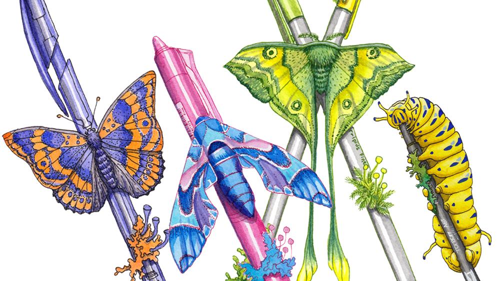
5. Painting: Swallowtail Caterpillar: In this demo I will be
showing you how I drew and painted a
Swallowtail caterpillar. On the left you can see
another caterpillar that is a little bit
more complex in shape. I was having fun with various shapes and
thought it would be useful to at least see different versions
of caterpillars. After drawing with a pencil I am now inking the caterpillar. Here I used a school writing nib I have had for
over 20 years, so I'm not exactly
sure what it is now. It's not flexible and
it holds a lot of ink. Writing nibs are usually
what I personally prefer as the nib is generally not too flexible which ensures
the lines are straight. The ink I used is the Indian ink from a
Rohrer and Klingner. It's also called
Ausziehtusche which is made waterproof with the use of shellac instead
of acrylic resin. This ink is plastic-free
and in that regard it's the least detrimental to the environment of all my inks. It's a great ink and
it's an ink that I have used the most
in my own work. However, you can only use
this one with Depens. This ink is too thick
for fountain pens. Once the inking is
done, let it dry, erase the pencil marks, and it is time to
add watercolor. I started with a wash of Nickel Azo Yellow PY150
over the caterpillar. If you do not have
the specific yellow you might want to mix whatever cool yellow you have
with a tiny bit of ocher. Now, wait for the yellow wash to dry especially if
using azo yellow. Azo yellow jumps all
over the place in washers and will outrun
most of the colors. I then painted the lichen
in various greens, loosely mixing my
Transparent Yellow PY150, Phthalo Green Yellow shade
PG36, and Viridian PG18. But any green mixes will do. If you're used to using yellow and blue or ocher and blue, just go with that. There are many ways of mixing greens and we all
have our preferences. I also like to work
wet-on-wet and then glaze over the right paint to
obtain the results I like. I painted the pen in a diluted lamp black in
order to get light gray. Now, I personally use black
a lot in my own work so I always have it on my palette
no matter how minimal it is. However, you can
also mix your own black using two
complimentary colors. Then I started to
lay a washers of yellow where the shadows
of the caterpillar are. Basically at the junctions
of its segments. I personally like azo
yellow because the more you layer the
moodier it gets, almost turning ocher, but always keeping
its transparency. Again, if you don't
have azo yellow you can mix a cool
yellow with a bit of ocher and use that mixture
to create a similar effect. No need to buy another paint. I let the yellow dry and
then added a wash of diluted lamp black to strengthen
the shadows even more. Then again, another layer
of azo yellow which is now starting to turn into
that golden yellow color. The brush pen, I continued
to paint with layers of diluted black until I got
the look I was going for. Same applies for the lichen. Simply layer on various greens
making the mixtures flow. It helps to slowly
up all shadows together so the whole
painting stays coherent. Once the watercolor
was dry I added blue spots onto the
caterpillar using gouache. Here I used ultramarine PB29
and some titanium white. Finally, I also wrote some details on the
plastic brush pen. I used a very small brush for the details and
Vinci and size 10.0. I had to go over the
lines a few times until the white was
strong enough to show. Once happy just let it dry.
6. Painting Butterfly: [MUSIC] Here I will be showing you how I made
a butterfly inspires by the Lesser Purple
Emperor, Apatura Ilia. This butterfly actually
changes its color quite drastically depending on how
the light hits it scales. Of course, I decided to go
with it's brighter appearance. After drawing the butterfly on its disposable plastic pen, I inked it with
black Indian ink and the fountain pen from
Faber-Castell with an XS nib. The ink I use in
my fountain pen is the DeAtrementis ink in black. This is waterproof ink that
is meant for fountain pens. Please bear in mind, however, that waterproof inks
will eventually dry out in the fountain
pen clogging it. You want to either use it
often or clean it thoroughly. [MUSIC] For the butterflies pattern, I went with stippling, which makes for
graphic look that also reminds of the scales
that make the wings. [MUSIC] Once inked and dry, remove the pencil
drawing with an eraser. I'm using a kneaded eraser, but any eraser will do. Now it's time to
color the butterfly, I mixed two main mixtures, a purplish blue made from
ultramarine blue PB29, and just a little bit of quinacridone magenta PR122 and muted orange made of orange, yellow PY110 and
quinacridone magenta, PR122. I also did mix those two mixes
together for neutral tint. The key here is to color
all the blue first, let it dry properly and then add all the
orange in-between. You want a smaller
brush with a fine tip. I'm using a size 2 designer
brush from Rosemary& Co, but any good pointed
watercolor brush will do. After adding the purplish
blue where it belongs, and while the paint
was still wet, I also added some ultramarine blue
touches here and there. [MUSIC] While I was waiting for the
butterfly itself to dry, I started to paint
the plastic pen. The key for pens or any
tubular shape is to keep a central line untouched by paints to mark the highlights. [MUSIC] I also painted a few parts of the butterfly
with the neutral tint that I mixed from the blue
and the orange mixes. [MUSIC] Once I was certain the blue parts of
the butterfly where dry, I started to add the orange mix. Since the errors are small, this is where you really
need a fine point. I also painted the
lichen on the pen in orange to unify the whole
painting even more. [MUSIC] The pen also got a
few more layers to strengthen the shadows
and the paints presence. [MUSIC] I then glazed the orange
parts with a wash of only orange yellow PY110. This really helped make the orange a little
bit more vibrant. [MUSIC] After letting it dry yet again, I also added some cast
shadows of the upper wings on the in-wings and
pushed the shadows and darks just a little
more until I was happy. Then let's try everything. [MUSIC]
7. Painting: Luna Moth: [MUSIC] For this first moth, I use the Malaysian moon moth, Actias maenas as a reference. This moth is normally in shades of yellow, oranges, and browns. However, I went for
yellows and greens. Feel free to choose whatever
colors you like best. After drawing the
outline with a pencil, I went over the lines with ink. Here, I used the cheopsgrun. It's a green ink from
Rohrer and Klingner and a dip pen with a
nikko 240 school nib. I tend to prefer writing nips
as they tend to be stiffer, which I prefer for
straight lines. You do not have to use
colored ink at all. Most of the time I use black
Indian ink for outlines. However, make sure the ink
you pick is waterproof, as we will be painting
over the drawing. If you are unsure if
your ink is waterproof, simply draw some lines, wait until they are dry, and brush some
water on the top to see if everything
stays into place. [MUSIC] I drew the moth over two disposable pens as this is a project I
currently work on. Feel free to transform
the pens into tree branches or remove
them altogether. I also drew the
geometry of the wings with a pencil and then
inked those lines. I have added an
outline to the class. If you don't want to draw, you can use that. When drawing the pattern on
the wings, I favor stippling. It replicates the scales on the wings better and
it looks more natural. I also really like
the graphic look. You do not have to draw
the pattern with ink. You can also go straight to painting with watercolors only. Once the ink drawing is done, clean your nib by
dipping it into water, and tapping it dry. It is a good idea to remove
the nib from the holder as the nib tends to rust if left at all times in the holder. [MUSIC] For this moth, I started with a wash
of diluted yellow. Now, the yellow I use is
Nickel Azo Yellow PY150. It is my main yellow, however, use the yellow you
have on your palette. While the wash is still wet, I painted the moth's body in a bluish-green and I added touches of grass
green on the wings. I also added the same bluish-green on the
hinge wing tails. Now, the bluish-green is
Sennelier forest green, a convenience mixture of
phthalo green-blue shade PG7, yellow ocher PY42, and the carbon black PbK7. The grass green I
mixed myself using Nickel Azo Green PY129, and phthalo yellow shade PG36. I also painted the
lichen and moss I drew on the disposable
fine liners. [MUSIC] You do want to let
your first wash dry thoroughly before adding
the next layers of paint. Now when you start
to layer the colors, the goal is to slowly get to the vibrancy you
are looking for. Now if you have a gentle touch, it might take several
layers to go there. But some artists will reach the correct color in just two
or three layers of colors. There's no right or wrong here. Simply paint how it feels
most natural to you. You can either dilute
your paint and go slowly adding a lot of layers, or you can be bold and go
full in with just a few. Now for the layers here, I am using the same colors and mixers I detailed previously. [MUSIC] Since I am also
painting the pens, let me explain quickly
what I am doing here. The pen caps I painted in the same shades of
green than the moth. Generally speaking,
using the same colors on a painting will really
help to unify it. [MUSIC] The gray is diluted,
lamp black PbK6. I only add washers of the diluted black on the
two sides of the pen, leaving the paper shine
through for the highlights. [MUSIC] Also make sure to wait
for the layers to dry properly before
adding a new one. If you do not let
it dry properly, you might lift off colors
from the previous layers or mix the colors instead
of glazing over them. Last touches are the shadows and giving more strength
to the pattern. If your moth is standing
onto something, don't forget the cast
shadows it makes. [MUSIC] I also added some shadows
onto the wings for the folds. Wings aren't truly flat, and they tend to have a slight fold along
the discourse sales. Once you're happy
with your painting, let it dry. [MUSIC]
8. Painting: Hawkmoth: For the second mouth, I use Daphnis nerii and oleander
hawk-moth as reference. Now, the oleander
hawk-moth is in shades of dark green, beige, and black. But I went for combination of
blues and a touch of pink. After drawing the
outline with a pencil, I went over the lines with ink. I use the fuchsia ink
from De Atramentis and a dip pen with the
Nikko 240 school nib. The technique I applied here is very similar to
the previous moth. I use stippling for the pattern on the wings for graphic look. While I tend to stay close to the general autonomy
and pattern reference, I don't always follow
it scrupulously. For the colors, I always change them to fit
the idea I have, a particular mood or the bigger painting it
will integrate into. There are no rules when
it comes to creation. Feel free to paint
as anatomically correct or as
fantastical as you wish. [MUSIC] Once the drawing
is done and dry, it's time for the
watercolor fun. Here I used three blues:
cobalt turquoise PG50, phthalo blue green shade, PB15, and ultramarine
blue, PB29. The central blue
is phthalo blue, but I did mix the other two in places to keep the
pattern more interesting. Because I wanted to
keep the pattern clean, I painted the areas so
they would not touch. Then let them dry, then paint the areas just
next to them and so on. [MUSIC] I also added a streak of pink, which is a mixture
of quinacridone red, PR209, and titanium white with a bit of
quinacridone magenta, PR122. Then it's simply a question of layering until you get
the desired colors. I also used a purple mix of
ultramarine blue PB29 and quinacridone magenta PR122 for
certain areas and shadows. [MUSIC] The pencil I painted in a
vibrant pink mixture of quinacridone Rose PV19 and
quinacridone magenta, PR122. There are many reds out there. Use a cool red for bright pinks. Quinacridones usually
are a good choice. Sometimes the color
name is different. It can be carmine, magenta, ruby, and so on. It's a good idea to learn
about pigments if you are starting to get serious
about watercolors. But if you're just starting out, pick the cool leaning red on your palette and you'll be
all right for bright pink. Cool reds look closer to purple, whereas warm reds like cadmiums
look closer to orange. [MUSIC] To write the tiny
label on this pen, I used an extra fine comic nib. The one I have is a speedball 107 and it has a tubular shape, so needs a special dip pen
with a small tubular fitting. [MUSIC] Like with the previous mouth, I kept on layering until I
had the results I liked. Then added the cast shadow and also the shadows
on the wing folds. Then I simply let it dry. [MUSIC]
9. Final Words: [MUSIC] Thank you so much for taking this class. I hope you loved it. The class project for this is
extremely straightforward. I'm going to ask you to make either a caterpillar painting
or a moth or butterfly. You can go wild, you can go as
realistically as you want, but you can also go
more as realistic. Really just find your way, find a what feels right to you, find the colors you like best, just to have fun with it really. If you want to share it on
social media, you can do that. I go by the moniker @petitplat
pretty much anywhere, but I'm most active
on Instagram. Please share the project
with the class as well. You can add it in the
tabs below on project, I love to see what
you come up with and it also really helps
other students to see the possibilities
that can go with this class instead of only focusing on my personal vision. I really hope you enjoyed
it and thank you for being there and I hope to see
you in my next class. Bye.
 Stephanie Kilgast, Contemporary artist.