Transcripts
1. Introduction: [MUSIC] Hello, I am
Stephanie Kilgast. I've been a professional
artist for the last decade. In today's class, I'm going
to show and explain to you how to draw and
paint red roses. Red roses are a classic. Most people love them, and it's going to be
a really fun class. I'm going to show you in
depth how to approach this painting, and
most importantly, drawing because this
class is going to focus a little bit more
on the drawing part, which is the hardest
part of any painting. I really would like
to encourage you to give it a go to
give it your best, [NOISE] and not just
use the outline. Now, if you prefer, of course, you can use the outline
and trace it directly. I will add all the pictures
that I used myself, my own photos of red roses, the final picture that
you can trace over, so you're going to have access to all of
that in this class, but I really encourage you
to try and draw everything by yourself using either
my references or you own. You can use a real rose
and have it next to you, or use pictures, or use my pictures. After the whole drawing
and inking process, I'm also going to show you
color mixing for that lashes, dark deep red and the greens. I'm going to show you how to mix these colors with
a minimal palette, and really try to make the
most out of your own palettes. I really encourage anyone
to use what they got at home rather than buying new supplies with
every new class. That being said, this class is absolutely fit for beginners. Roses are not that
difficult to master, and it is a very
fun class if you're interested in florals or
botanical illustration. I really hope that you're
going to take this class, learn a lot from it, but most importantly, that
you're going to enjoy it.
2. Materials: For this class, we will
need some watercolor paper. I favor 100 percent cotton
paper in hot pressed. That is the smoothest
paper you can have. Just go with whatever brand
is most local to you. A graphite pencil. I am using a 2B. An eraser. I prefer
a kneaded eraser. Waterproof ink. I am using a fountain pen with converter and De Atramentis ink. You can also use a
dip pen and a nib. Watercolor paints. I will get more in-depth on which pigments you might
need in the class. Round pointed brushes. These are synthetics. A ceramic palette. I use [inaudible] plates, at least two water
cups, and a towel.
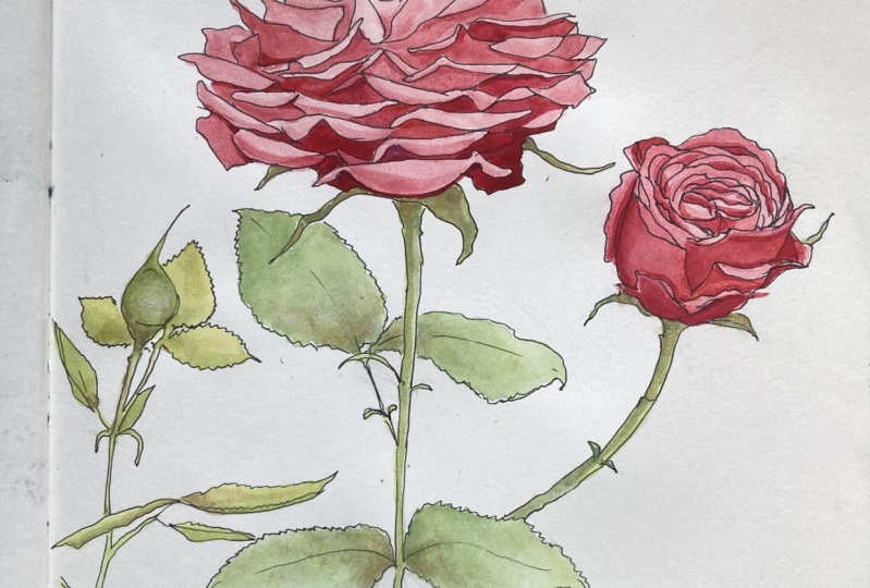
3. Drawing The Rose: [MUSIC] I took pictures of a rose or roses that
I have on my trust, so these are going to be
my reference pictures. Using your own
reference pictures is generally easier
because you have them. You have all the rights as well, so there's no issue about copying someone else's artworks. You have to remember that
photographs are artworks in their own rights
and copying them exactly is fine for studies, but if you want to
sell your artwork then you have to be a little
bit careful about it. I'm going to put the pictures of these roses attached
to the class with some outlines as well
so you can easily use those if you don't have
any rose pictures at home. However, you can also use
whatever you want as pictures. It doesn't have to be my roses. For this pencil sketch, I'm going to roughly place the roses how I
want them to show. I want the opened
rose in the center, so I'm going to have this in
the center and then I want the rose that is starting
to open on the side. I'm just doing the very
rough shape of each. I'm working directly
onto the final paper. This is not strictly
speaking accessory, you can also work on
a cheaper paper and then transfer it to
your final paper. I never do that. I know many botanical
artist do it, so there's absolutely
no shame or anything. I just happen to find
it cumbersome to do so. On this side I'm just going
to have a flower bud; a rose bud, so we can have
all stages of the rose. I'm using a simple
graphite pencil. I use a 2B and this
is an extensor. I have other graphite pencils, but I always go back to the 2B. It doesn't matter too much. Use what you have at home. Many people swear on HB or B. It doesn't matter too much, you just want to have
a light touch so you can erase the lines later on. I have the picture and I do
the general shape of it. The central one is squarish and I'm just using
the reference picture, so there's no need to
think it through too much. I'm going to add some leaves. I didn't do any pre
composition sketches, I just thought about
it and went with it. I would suggest to make some doodles off your piece
before going right in, but at the same time I just
want to show you that I don't do that and
this is fine too. I have personally been working
on building up confidence on not pre-sketching too much. When I work in a
sketchbook or when I travel and just have fun, I don't even do the pencil park. I go right in with the ink because it teaches me to be more precise with my lines and
to build up confidence. This is also why I
don't do the whole transferring one picture
to the final paper. While I understand the use
of it and I understand that it is common practice
for students, I would highly suggest to trust yourself because you might realize you're much better at drawing than you
thought you were. When drawing you really want to look instead of thinking, so you have to
deconstruct what you see into simple shapes and just adjust what you're
seeing and drawing. At all times you want to
adjust where the lines sits. You have to look is this
line more in the middle? For instance, here
this is too high, so I want to put it back down. You want to get the general
proportions rights, right away and then you
can go into details and you just refer to your general proportions
to add the lines. If I'm adding a line is it higher or lower than this here? Is it this hits about
middle of the whole rose? If I'm going to do a line is it going to be in the
center of this, or in the center of
this, and so on? If you're working with your
reference right next to you, you can also measure
with a ruler and check the exact proportions if it's too difficult you
just do it by eye, but I would really
suggest to learn trusting your eye and following what
you see onto your paper. With practice it's
going to be easier to do [NOISE] the right lines and in the right proportions. Remember to not stress
too much about it, this is just a painting. If it ends up being
not quite what you wanted or not as
pretty or whatnot, it is perfectly fine. If you're looking at this
class it is for practice and practice is an important
part in any artist's work. Sometimes we get it right
and sometimes we make mistakes and you can always
learn from your mistakes, so just trust the process and don't worry
too much about it. [MUSIC] Also now that we are
going into the details of all the little petals
inside the rose, you don't have to actually count them and make all of them. What you want to
keep in mind is to draw out the most peculiar one, so in this case here you have some that fold
in here in the front. Those are very
visible and you want to be sure you get those right, however, here in the
back you just have an accumulation of petals. You are free of course to do this exactly and count them, but in this case since they are so many I
personally will not. I'm just looking at them, replicating the shapes, and so when I look and see a shape I'm just
replicating that one so it looks natural gut
I'm not going to bother counting
the exact amount. I'm just going to do so it
looks like the rose without being too long to make
every single petal. If you keep looking
back and forth between your drawing
and the photo, the reference picture
you will end up with probably a very similar
amount of petals. But it is vastly
different to simply look, adjust the sign that this is not quite accurate than to actually count the number of leaves. It's not going to change
all that much anyway in the end result you just want
to get the shapes right, so don't do something
that is too strict. You want to adhere to the reference but no
counting is necessary. Another thing that I
wanted to show you is this eraser sheet. If you're doing precise
drawings it can be very useful to remove
certain lines that you made, but that shouldn't be here. Now once you're happy
with your pencil drawing, it's time to ink it. Now I would still
suggest to keep your reference picture just
next to you because usually when you start adding the
ink lines you still need to double-check with your picture if you didn't make
some mistakes. Here I'm using a
fountain pen with an S size nib and I'm using the De Atrementis ink inside which is a
waterproof ink. You absolutely need a
waterproof ink to draw as we're going to
color everything with watercolors later on. Here we are just focusing
on the outlines, so don't worry too much
about shadows and lights. You can also use a dip pen
with ink or you waterproof. If you're making a
mistake while adding the lines, don't fret. Most of the time it's
going to be all right. You're probably
going to see some of my mistakes when I draw this because I see the mistakes I make but
I just go with the flow. Usually small proportion
mistakes are not going to make a huge difference in your
final painting drawing, so this is why it doesn't
matter all that much. The importance is the main
proportion and all the rest is the details as long as their general shape and their general
proportions look right. It doesn't matter
if your leaf or your petal should actually
be slightly higher or lower, or the shape's
slightly different. [MUSIC]
4. Drawing The Full Bloom: [MUSIC] Now, this central
rose that I picked, I think is a good
example of look and don't think because if
you deconstruct it, it's a very rectangular shape. It's not very rounded. What you want to start up
with is to check the size. The width is two
times the height about and so this is the first thing that
you want to do is to have your general proportion of your drawing of your rose. This is the one I personally picked because I really liked how it looked. Then you go in. Usually, I find it
easier to start in the center or in the middle and see what
is in the middle there. That helps you then get the right proportions and the right shapes where
they have to be. This is mostly going to be
rolled up petals on this one, but of course, it's going to depend on your own reference picture
if you're using another one. Drawing is usually
the hardest part. When you see mistakes, correct them right
away otherwise, you're going to
forget about them. Always try to gauge if the
line is straight or diagonal. You can hold up your
pencil next to the image if you cannot see it
like this easily. Sometimes it's tricky because
our brain thinks the line should go up and down
and it's the opposites. When you draw, you
always fight your brain. What you brain analyses
and things he sees versus what is actually
the truth [LAUGHTER]. Sounds a bit conspiratory. But there's really a struggle between what you think you're seeing and what you're
actually seeing. That really is the whole
challenge of drawing. This is also why studies, especially in the beginning, are very helpful
because you learn how to see and how to base your work on reference pictures because you are going to use reference pictures
in your own work until a certain point, and most likely
all of your life. Because it's rare that you can draw everything
from imagination, especially because they are subjects that you're
rarely going to work on so you're not going
to remember every detail. Working from
references also really helps to add realism
to your work, even if it's not meant
to be realistic, if you're working
on hyper realism, of course, that's crucial, but if you're working on
surrealism or fantasy then it's the little details
that are going to make your work
more believable. [MUSIC]. Once you're happy with
your pencil drawing, you can go in and start to ink. Again, I would suggest to
keep the reference picture or the reference flower if you're working directly from life, which is even better. Just keep the reference
close to you so you can double-check while
you draw the lines, if everything seems correct. Now, unless you are a
botanical artist and you need your plant to
be perfectly accurate, you don't need to worry
too much about accuracy. You just want it to look
like a rose in the end, that's why it's easier to
stick to the reference, but if a few lines
here and there are not completely at
their right place, if the oval still
looks like a rose, then you made a great job. [MUSIC]
5. Drawing The Rose Bud: Now the last drawing I'm going
to make is the rose bud. If you are doing
the drawings and paintings in a similar way
that either you're going to see the root spot is
a lot easier to draw than the roses with
all the petals. The way I compose
this image is very close to what botanical
artist might do, as in, I am showing different
stages of the same plant. We have the rose bud, the starting flower,
and the full bloom. We also have a few leaves. Now, ideally, in
botanical illustration, you also want to
dissect a flower. But since this is not
a botanical class, I am not really a
botanical artist. I just have a keen
interest in botany, but I just wanted
to tell you that in case you want to go further. Once you're happy with
your pencil drawing, you can go, and ink it, I cannot stress that enough, but keep your reference
close to your working table. [MUSIC]
6. Color Mixing: [MUSIC] For this class, we are going to need a rich
dark red, and some greens. Depending on what you
have on your palette, you're going to make
different mixes. The idea for deep dark
red is to use some red that you have
and darken it down. A spray bottle with
water is super helpful to waking up your colors. I personally, the two reds
I use the most in my work are pyrrole red and the
quinacridone magenta. If I just use them
straight out of the pen, you can see the quinacridone
magenta is very pink, and the pyrrole red
is quite orangey. Now, if I start mixing
those two together, I'm going to get something
that is closer to the red of the rose
we're working on. However, it's still too pink, so we do want a
little bit more of pyrrole to get it darker. This is more what
I'm looking for. Yeah, I like that color. Now this color, if I layer it a lot, it's going to be dark
but not super dark. I still need to darken it up a little bit more
for the shadows. Now, you have two options. You can either use
black or sepia. Black is something that
most artists do not have on their palate,
watercolor artists, because most watercolor
artists tend to have something that is lighter. But I do find black to be super helpful for darkening up colors. Here it was still wet, so I'm just adding a bit
of the mixed in black. As you can see, we're going into the really dark reds,
and this is fine. Another option, and again it's going to depend
on what you have, is to use either
brown, burnt umber, which I don't have, I know staple on most
watercolor palettes. This one, which is
perylene maroon. Perylene maroon is naturally looking very much
like a deep dark red. Now, the hue is going to shift a lot when it is lightening up. If you use it straight, it's going to look nice
but not as deep red. You do want to mix it
to your original mix. Again, you want some
quinacridone magenta, a bit of pyrrole red, then the quinacridone maroon. As you can see, I'm
mixing very freely. It's not perfectly accurate, but now you have a really nice, rich red, and this is the red
we are going for the rose. Now as I said, feel
free to experiment. This has the quinacridone red. If you have gone that, you can use that trait. This is too light. But if you mix that with
the perylene maroon, you're going to have something
that is nice as well. It's cleaner maybe. Sepia works too. So if you mix sepia, sepia is very dark brown. But if you mix, so I prefer the
pyrrole quinacridone. Make some, just going
to go with that again. Also, pyrrole red and
quinacridone magenta are two colors that I tend to recommend for
what color palettes, because it makes for a good
split primary palette. With those, you can really
mix whatever you want. I'm just going to
add a bit of sepia. Now the black is coming in, it's going to be too dark. Yeah, it's definitely too dark. We need more of the red. Basically, if you
want a lot of chroma, you're going to go lighter. But other than that, you have to try a bit. Here are a few options for
you to play around with, and to darken your color. Another option, but it's going
to mute your color down, is to use green. I would not really
recommend that because you're going to go
into black black. But if you don't have any
black, this is viridian. But if you have phthalo,
that works too. If you use that
with our red mix, you really want to go a bit. You're going to get something
that is a little bit more purplish, but still dark. Now, this can be nice too to add maybe a bit
more of pyrrole red. With a bit of more pyrrole red, we get the color that we want. As you can see, it's
pretty close to that one. As you can see, many options. I would really encourage you to find out what works best
with your own palettes. Likely is you're going
to have enough colors. Now I have a lot of
colors on there. Don't be impressed by that. Usually, in my classes, I work with a limited palette, with a split limited palette
with two yellows, two reds, and two blues, and either
black or some phthalo green. You don't need a lot of colors. I'm just giving you options
depending on what you have. If you have a quinacridone
maroon, go with that. It's going to be the easiest, fastest way to get
a nice dark shade. If not, you can use black, sepia, some other dark brown, burnt umber for
instance works well, or some greens, some
blue-leaning green. Just be a little bit
more careful with that. You do not want to neutralize
the color too much, you want to darken it up. Now for the green mixes, we are going to use only blues, two blues and one yellow, so we can stay within the
split primary palette. Now the yellow I use is
nickel azo yellow PY15O. I really like that yellow
because it's very versatile. You can see it goes from almost
ocher to a lemony yellow. The two blues are going
to be ultramarine, a classic, and a phthalo blue. Now generally speaking,
when you're mixing greens, you're going to use a lot
more yellow than blues. Now I would suggest to start
with ultramarine blue, which is a much easier
blue to mix for greens, because ultramarine blue is
coming with a little bit of red and it's going to mute down your colors for a much
more natural look. Another option would
be a cobalt blue, which also is going
to be more neutral. Now, phthalo blue is great. However, it is
very, very strong, and it tends to mix greens that are more vibrant in general, so sometimes that's a
bit more difficult. We are going for
green that is pale, but we will need to
mute it down a little. Again, I would suggest you
rather go with ultramarine, and work from that, because you're going
to be able to make more ranges of greens
as you can see. The greens of our leaves
are pretty yellowish. You can also try and mix
everything together, and see what that gives. This is way too greenish, which often happens
with phthalo blue. This is why phthalo blue
is a bit tricky to use. You really want to
use just a bit. If you're working in that
split primary palette, you're going to also have that transparent
yellow-orange, which is, well, it looks like orange, but it's technically
a yellow pigment. If you mix greens with that, I'm going to put it
aside and mix that with the phthalo
blue, just a bit. You're going to have also really interesting
greens, and more muted. Basically, to have nice greens, you really want to
have a touch of red. If you use ultramarine blue, you're going to have
a touch of red. If you use that, you're going to have
a touch of red and then you can work around that. Greens in general look
nicer whenever we mix, so I really encourage you to mix freely and add
layers on top of it. Let's pretend we're
going to make a leaf. Usually, always start
with a light wash. If this is the leaves, then I would go ahead and
do a first wash. You can already add some variations
inside the leaf. If you can see, this part is more yellowy, for instance, or something like that, and maybe that part is darker. You can work wet and wet
already with leaves. It's going to make the leaf
look a lot more natural. Then of course, the first
wash needs to dry and then you go back in
and add more details. But basically,
this is the way to make greens look very natural. Always have a touch of red. So either in your yellow, if you use more of an
orangey-yellow or an orange, very light orange, you can also mix your own orange by simply using neutral
yellow and red. That is the first option, or you go towards a blue that is leaning to the reds
like ultramarine blue. With that run,
you're going to get more muted colors and it's going to be more
natural in your work.
7. Basic Watercolor Techniques: [MUSIC] Before we dive
into the painting, let me show you a few basic
watercolor techniques. I'm just going to make some random complex shapes to show you how to make washes. The first wash is going to
be pretty straightforward, you're just going to mix quite some water with a
little bit of your color, and you always start on the top. Ideally your paper
is slightly tilted, I have it at an angle. Simply put it on
the palette on top. Then you always start
your wash with the top, because the water going
to flow down slightly. You do want to work a
little bit more fast. I'm not doing a super great job at this wash, but that's okay. You really start from
the top and go down, and you do not want to overwork your wash. You
leave it like that. Here you have some ink that
wasn't completely dry. I should have waited
[NOISE] a bit longer. The second option that you have is to start with just water. You basically are the
water where you're going to add your wash later on, and this is going
to be useful for you to avoid having hard edges. It's not absolutely necessary, but if you are planning
to do bigger patches, then this is certainly helpful. We're not going to use it all that much in today's class, but I use it for
backgrounds mostly. First add the water before adding the different
washes to the paper. You don't want to add too much water but just
enough to wet the paper. That is pretty much the same. We're going to mix bits of pigment with
quite a bit of water, and then you go right back in. As you can see, the color
behaves differently this time. It migrates on its own, and that's because there's
already some water, so we're basically
working wet and wet here. As you saw here, there was a bit of a pool. You don't want a pool
of water in pigment, so when that happens
remove it with your brush. Patch your brush dry, and then remove the
excess water if needed. That's the [inaudible] function, which is a sort of wet and wet. Now the next thing
we could do is to start with a wash and
to work wet and wet. This time I'm going to start
with a very light greenwash. I'm working directly
on the paper here, I'm not doing the whole
water first approach. For these smaller shapes
it's not really necessary. It's more useful for bigger
shapes or backgrounds. Now we are not going
to wait for it to dry. I'm going to go back in, but this time with a
bit of a dryer brush. You don't want as much water as the first time once
you go wet and wet, and then you simply go in. As you can see, the pigment
is going to migrate. This is a good way to make
very smooth gradients, if you so wish to do. [NOISE] But you can also play around and mix
the color wet and wet, so it's dry already. You see you have to work quickly here the red
in the wet and wet. Depending on the pigments you use it's going to
spread more or less. Every time you add
a new color it pushes the rest outside, so as you can see,
the more red I add the more red it stays. We're not going to use that
all that much because I find color control is
more difficult with that, [NOISE] but a lot of people
like it because it's fun. Now what we're using the most today is going to be layering, so once [NOISE]
your wash is dry, you can start by adding another more pigmented
wash on top. In this class I'm going
to keep it very simple, and we're not going
to do any gradients. I'm simply going to
layer things, like so. It's going to give us
a very graphic look. This is not quite [inaudible]. However, if you want
to have something that is more fluid, more smooth, [NOISE] then you can start
with a wash of color, and then you add just
water next to it, not as much, and you go back and forth
between the color and the water to create a smoother
gradient, so this works. [NOISE] Another thing that is interesting that we are going
to use today is glazing. You can glaze with
the same color, or you can use another color, like this green, for instance. If I glaze over the red, I'm going to have
bit of a mixture, [NOISE] and I also can
glaze red over red. Glazing really works well
with transparent colors, and this is also
how you're going to have very vibrant colors, just by building them up. This is really all we're going
to use in today's class, so fairly basic, washes, layers, glazing, possibly a little bit wet and
wet, and that's about it.
8. Coloring Roses: [MUSIC] Now everyone is very different when it
comes to watercolor. I personally like to start with a light wash. Have a
piece of paper next to your actual painting to be
able to lay down the color before putting in
on the paint so you know what to expect, and the first thing
I'm doing is a very light wash all
over the flower. Now depending on your
reference you might want to keep some white
showing through, but the rose I'm working
on is actually very dark red and I want to show
that in the final painting. [MUSIC] I should also note that my
paper is slightly tilted, I made a drawing table myself. It is an angle and the
water tends to flow down. For the first wash,
you really want a watered down version of your color mix that
we did previously. You don't have to go for red, you can also decide to do a
completely different color. I'm showing you red because that's the color
of my reference, but you should know
that in my own work I often change the color
of the reference I have. Let it like that, now
the wash. You really want to do the wash at once, let it sit and dry. One mistake I see
students do often is to go over the wash. You want
to do the wash in one go, so you start on the top
and you simply go down. As a general rule, I would say more
diluted is better. Always do a wash that is very watery because
you are going to be able to layer up and add more colors later on
with layers glazing, but if your first wash is too dark you cannot ever go back. [MUSIC] I would suggest you wait
for the red to dry before doing the washes of
greens on the leaves, so I'm going to go with
a very light green wash. I'm going to put it everywhere. I realize I forgot
an incline here, I'm going to add it later on. For now everything that is greenish or that
is not the rose, we're going to do that
very light wash. You might notice that the
stem is actually a bit reddish but we're going to add layers of red colors later on. Don't worry too much about it, this is just the first wash. It's going to be
just a base color. [MUSIC] Now this next stage that
I'm going to do is to add all the shadows and here I'm starting with the
non-gradient shadows, so I still use fairly a
lot of water in there. I always prefer to use
a lot of water and add more layers rather than go
right in with a dry brush, but you do not want it
to be too watery either. Here I'm looking closely to my reference picture to
get the shadows right, to know where they are. [MUSIC] Now using the same color
mix but more diluted, I'm going to work on the shadows that are a
little bit less dark. [MUSIC] On this specific rose
the darkest shadow are really down there and when
you go up you have shadows, but they are lighter. This is what we are doing here using the same color
mixture and it is the one that I showed you
in the previous exercises, just slightly water them. Here I'm really focusing
on the darkest shadow, so just do that. There are of course a
lot more variations, but we're going to do
that in a second time. For the lighter shadows
like here you can see, it's a lot more watered down really on shadows
where you see them. Same for the smaller rose. [MUSIC] Now for softer shadows
you want to do a wash like so and then add darker color. We need it to be wet-on-wet. Let the paint flow wet once, once you've added
and it's going to go for a rather natural look. [MUSIC] You will most certainly
need to go over certain shadows again
to make them darker. Lay as many times as you need until you get
the desired results. [MUSIC] Once the paint is dry, you might see like here
that the roses and colors are overall too
muted to your taste. To bring back higher chroma, you can glaze over
the rows using the payroll red
Quinacridone Magenta mix. You certainly do want a
transparent high chroma red, so I would suggest that you stay in the Quinacridone family. Now, don't glaze
the whole flower. Be careful to keep highlights
on the top of each petal. We will be exaggerating
highlights in comparison to the pictures as this will
make for better results. Now keep in mind
that in realism, you often make artistic choices, removing certain parts
and adding others. Now, pushing certain shadows
and light can really help. The goal is to have
an end result that is believable and fits with what
you want to communicate. As for the shadows, I personally decided against doing wet and wet gradients, because it felt
like too much work. I simply build up the
shadows layer by layer. This gives a more graphic look, which I happen to prefer. If you want very smooth shadows, you will want to work
each shadow wet and wet, starting with a lighter, not too watery wash, and adding some darker
colors where the shadow is. I honestly don't think
it's worth the effort, but feel free to go down your own path or simply
follow your own habits. [MUSIC] Now for this part, I mostly use the high
chroma red mixture to glaze over
petals and shadows, and get it to the vibrant
red I was looking for. However, I did push the shadows a little
bit more as well, using the darker,
deep red that I showed in the color mixing
part of this class. Now I kept the
general rose a little lighter than the
actual reference as I found it to look better on the stark white
paper background. You could also
push the color and chroma more and add a dark, maybe even black background
for striking result. [MUSIC] For the leaves and stem, I started adding
a light red wash over the parts that needed it, always checking my
reference picture for that. From there on, it's a matter of layering greens and reds
to the needed colors. As the main focus are the roses, I kept the leaves
intentionally simpler. [MUSIC] I did paint the green wash over the darker cells of the
leaves and the shadows. Then let them dry and
repeated this to get the right texture and
shadows onto each leaf. [MUSIC] The stems and certain
brownish looking parts of the flowers are only a layering
of red and green washes. Now, red and green
creates a brown color if you mix them together
on your palette. But when you glaze
red over green, you will get a much more
interesting mixture that shows brown, but also red and green
at the same time. Now glazing is really
the way to go to work on the green
parts of these roses. I also added a more
yellowish green wash over all green to pop the brightness
a little bit up again. Just keep layering, and glazing, and slowly building up the
colors always referring to your rose or reference picture until you are content
with your painting. [MUSIC]
9. Conclusion: [MUSIC] Thank you so much for
taking this class, and now it's your turn. I will ask you to make your
own rose illustration. Pick the reference
that I'm giving you, use your own rose, change colors, make it
more or less realistic. It's really up to you. I want you to really try and
make your own drawing from reference so you can become a better, more confident artist. Once you're done
with the project, please share it with the class. I love to see what
you come up with and it also helps students a lot. If you want to share it on
social media, you can do so. I go by the moniker @petitplat,
pretty much anywhere. But I'm most active
on Instagram. I'm also on TikTok under the
moniker Stephaniekilgast. Again, thank you so much
for joining me today and I hope to see you
in my next class. Bye.
 Stephanie Kilgast, Contemporary artist.